RSS
 

Posts Tagged ‘Photoshops’

Video: How Photoshop’s ‘Color Adaptation’ setting can improve Content Aware Fill accuracy

09 Dec

Photoshop’s Content Aware Fill tool seems fairly straightforward, but a recent tutorial shared by Adobe shows a clever little trick that could result in more accurate edits.

Shared on its Photoshop YouTube channel, the one-minute tutorial shows how changing the default ‘Color Adaptation’ setting within the Content Aware Fill workspace can result much more accurate fills working with images with gradients in them.

As Adobe’s Meredith Stotznere explains, this setting controls the brightness and contrast of the filled area to better match the surroundings when the default setting is too rough an edit. By default, the setting is on, but not at its highest strength. To improve the feature, Photoshop offers a ‘High’ and ‘Very High’ setting for smoother transitions, as well as an ‘None’ setting for when you’re working with hard edges with overlapping colors.

It’s a small change, but could result in much more pleasing edits when you need to remove objects from an image. You can find more 60-second tutorials on the Photoshop Magic Minute playlist.

Articles: Digital Photography Review (dpreview.com)

 
Comments Off on Video: How Photoshop’s ‘Color Adaptation’ setting can improve Content Aware Fill accuracy

Posted in Uncategorized


How to Enhance Colors Using Photoshop’s Color Range Tool

08 Dec

Luminosity Masks have become a go-to technique for many photographers wanting to make selective adjustments on their images. While it’s a great way to create precise masks, it’s a mask solely based on the luminosity of a pixel and it may not be ideal when you only want to make adjustments to a specific color. Perhaps you want to enhance that beautiful sunset you photographed last night or maybe you want to change the color of your subject’s eyes. Regardless of what color based adjustment you want to make, there’s a simple and quick method of creating a precise selection based on the color value using Photoshop’s Color Range Tool.

Why Use Selective Adjustments

Before we jump into how you can create a precise selection based on a color, I quickly want to talk about why you should be using selective adjustments in your post-processing.

My area of expertise is landscape photography but this topic is important no matter what type of images you capture or your ambitions. If you have a desire to make your images look better, you need to be making some selective (local) adjustments to them.

It doesn’t need to be anything super-advanced, but start by at least making some selective color adjustments. The main reason you’d want to do this is to get rid of the unwanted color cast. The color cast can come as a result of your previous post-processing or it can come straight from the camera and it’s something that sticks out as a negative when viewing the image (the exception is when it’s a deliberate color cast that serves a purpose).

How to Enhance Colors Using Photoshop's Color Range Tool

I used Selective Adjustments to keep the shadows cold in this image.

It’s also quite common that you’ll want to make an adjustment only to a specific area of an image (known as a local adjustment). A normal adjustment will affect the entire image (known as a global adjustment). Instead, create a mask that selects only the part of the image you want to affect (for example the highlights, a color, or maybe just a specific subject) and make your adjustment. Now, you’ve kept the majority of the image untouched but have made a visible adjustment to that particular area – no global color cast and no unwanted effects.

Create a Mask Based on Color

Okay, let’s jump into it and start making a few adjustments based on a color. In the example below, I want to increase the saturation and brightness of the yellow flowers in the foreground. A typical way of making a similar adjustment would be to use the Hue/Saturation adjustment and increase the saturation of the yellows. Yes, the flowers are saturated and brighter now but so are the cliffs, areas in the sky, and even some of the water.

How to Enhance Colors Using Photoshop's Color Range Tool

First of all, make sure that you’re on a Stamp layer – in other words, one which is all the layers below it merged into one (you can delete this layer later but you’ll need it for the next step). Now, go to Select > Color Range… A new box should now appear and it’s here that you’re going to create the mask.

How to Enhance Colors Using Photoshop's Color Range Tool

For the best results, make sure that Sampled Colors is selected in the top drop-down menu. It’s possible to work with the other options as well but I find the mask to be much more accurate by manually sampling the colors you want. Next, with the Eyedropper Tool selected, click on the color in your image that you want to select. For me, that’s one of the yellow flowers in the foreground. Notice that the image within the Color Range box now has changed and it’s mostly black. This represents the selection we’re making (only the white parts of the mask will be affected).

Refine the mask

The Fuzziness slider is a useful tool to make the selection more or less refined. By pulling the slider towards the left, you’re creating a more restricted mask and it affects less of the similar colors to what you’ve selected. Pulling it towards the right has the opposite effect and the mask starts including similar colors. I prefer to use a fuzziness of approximately 70-80 but I recommend you play around with it for each shot.

How to Enhance Colors Using Photoshop's Color Range Tool

That’s it! Click OK and you’ve created a precise mask based on that color. Now, you choose the adjustment you want to use – I’ll use the Hue/Saturation slider for now.

Adding Colors to the Selection

Before we continue and start enhancing the image, I want to show you how you can add more colors to the mask. Let’s say that I also wanted to make the same adjustment to the bright parts of the sky. Before clicking OK and creating the selection, I would simply hold shift (or select the second Eyedropper Tool named “Add to Sample) and click on the sun. You’ll see that the mask has changed and the area around the setting sun is also whited out.

How to Enhance Colors Using Photoshop's Color Range Tool

Unfortunately, this step also included some of the cliffs in the lower right corner which I don’t want to be affected. The best way to remove that from your mask is to paint directly on the mask with a black brush after creating an adjustment layer.

Making the Adjustment

The last thing I’m going to do is to increase the saturation and brightness of the flowers. With the mask we created active (you know it’s an active mask when you see the marching ants around your selection), create a new Hue/Saturation Adjustment Layer. Since we’ve already created a mask that targets only the yellow flowers, we don’t need to go into the yellow channel, instead, we continue using the Master channel.

Now just drag the Saturation slider towards the left until the colors are saturated to your taste. I also increased the Lightness slightly to make the flowers pop even more.

Before

How to Enhance Colors Using Photoshop's Color Range Tool

After

This technique of creating a precise mask can be used with any adjustment layer that you want. I often combine it with any color-based adjustments such as Hue/Saturation, the Photo Filter, and Color Balance. For adjustments that affect the brightness and contrast of the image, I prefer using Luminosity Masks.

The post How to Enhance Colors Using Photoshop’s Color Range Tool by Christian Hoiberg appeared first on Digital Photography School.


Digital Photography School

 
Comments Off on How to Enhance Colors Using Photoshop’s Color Range Tool

Posted in Photography


How to use Photoshop’s Quick Selection Tool to Change a Background

20 Jan

It’s the question I get asked the most in my workshops and classes – “How do you change the background of an image?” Or “How can I cut my subjects out of an image and place them on a new background?”

A quick capture of my parents at a coffee shop.

A quick capture of my parents at a coffee shop. The BEFORE image.

Perhaps, despite your best efforts at placing your subjects in a pleasing, non-distracting environment, the situation made it impossible. Maybe you used your smartphone to capture a spontaneous moment and now the image needs a little background work? Maybe you want to cut your subjects out of the background to isolate them or use them on a website banner or other marketing material? Whatever the reason, this task has challenged every photographer, beginner or pro, since the invention of the camera! I’m going to show you how to use one of Photoshop’s most underrated tools for easily extracting your subjects from the background.

This photo (above) was a very spontaneous iPhone capture of my mom and dad, the photo itself isn’t great (lots of things wrong with it technically) but it has big sentimental value for me. It’s the last photo I have of my parents together.  But it also has a busy background which typically causes problems for many photographers when trying to use Photoshop’s Selection Tools to remove it. In previous Photoshop versions, selection tools like Magic Wand and Lasso would get confused by the similar colors, and patterns of this type of background, making it a difficult and frustrating project. But with a relatively new selection tool it’s pretty straight forward, so this is a good example photo for learning the technique.

In this demonstration, you can make this a stronger image by removing the cluttered background to make it less like a snapshot and more like a portrait. The secret of any image editing is to use the right tool for the job. In this situation you want to use the Quick Select Tool to remove your subjects from an image and place them on a different background.

How to use the Quick Select Tool

In the past, you may have avoided most of the Selection Tools in Photoshop because they were not easy to use. The Quick Select Tool has changed all that. It has never been easier to make selections that don’t look like they were “cut and pasted.” There are two, or sometimes three steps.

Choose the Quick Selection Tool from the Toolbox palette:
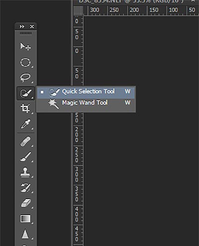
tool

It works like a Brush so you can change the size of the tool by using the [ –  ] keys on your keyboard (  [ to make it smaller, and ] to make it larger).  Give the tool a size that makes it easy to select your subject.

Step 1: Make your selection

Just drag the tool over your subject and stop when the “marching ants” get to the edge. The tool is smart and can detect the change in pixels so most of the time it will stop on the edge correctly. If it selects something that you don’t want it to, just click on the Alt key to switch to “deselect” mode and drag the selection back to where it should be.
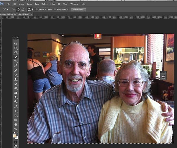
selection

The Quick Select Tool selecting the subject with the “marching ants” outline.

Step 2: Refine the Edge

Once you’ve got everything selected as you want it, click on the Refine Edge button on the top menu. In this area, you’ll adjust the pixels around the edges of the selection. This will make the “cut” more smooth and realistic.
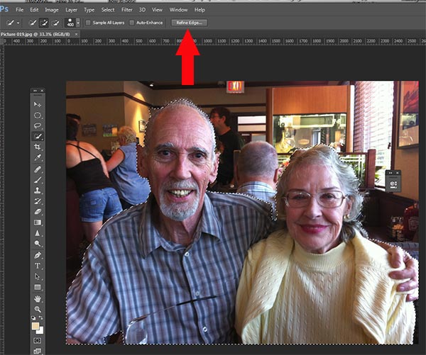
refine-edge


The refine Edge tool opens a pop up that looks like this:
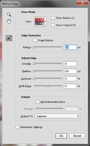
refine-edge-palette

From here you can select how you want to view your selection against a few background options. You can select the Mask overlay which you may be familiar with if you’ve used layer masks before. This view allows you to see the background as well as your selection. But you can also check it against a black background, which I like, so you can clearly see how your edge looks and if you have selected everything accurately. To change views, click the drop-down to get the View Options box. Scroll through these to get a feel for how they display your data. The Adjust Edge sliders give you many options to smooth, feather, and further refine your edge if needed.

For now, select Black & White view mode. Hover over the Black & White Box and click.
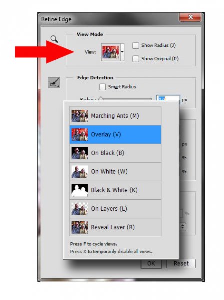
popup

You should see something like this (below). You can see your edges very well against the black. You can see that the edges look okay, they are well defined, and not pixelated or blocky. But what about that hair? My poor dad with his fine and wispy (almost no hair), and my mom who had recently undergone chemo also has fine baby-like hair, making the hair selection task a bit of a challenge. But the Quick Selection Tool has a method for this too!
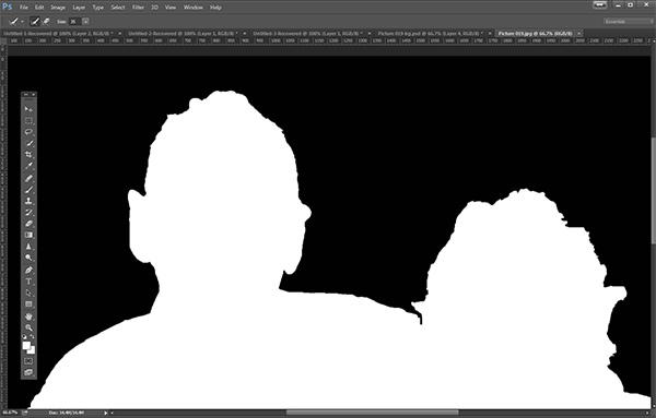
b+wmask

Click the Edge Detection Smart Radius box and move the slider to the right just a bit. watch how the edge around the hair change to be a bit more transparent. Be sure to watch the rest of your edges to make sure they don’t change too much.

Step 3: If needed, use the Edge Detection Brush

If you still need to get more transparency for hair, make sure the brush icon on the left is selected and carefully brush around where you need more transparency. You can switch between the View modes to see what is being displayed or removed. If you remove too much you can click and hold the Refine Edge brush to reveal the Eraser which lets you undo your brush strokes, much like a regular layer mask.
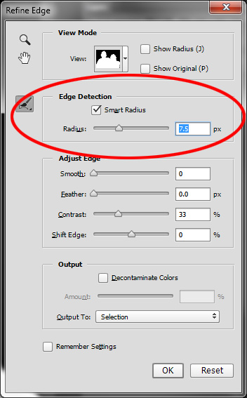
Untitled-2

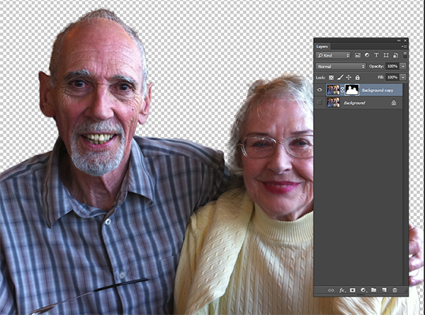
When you’re happy with your results, Look for the Output section at the bottom of the Refine Edge box, and click on Decontaminate Colors and select a small number as the amount, 2 is usually good, depending on your image.  Change Output To: New Layer with Layer Mask.

This is what you should see now:
layermask

Note: to see the transparent background you must turn off the visibility of the bottom layer.

Your cluttered background is gone!  You have a nice transparent background and all on new layer. This will be your main image.

Add your new background layer

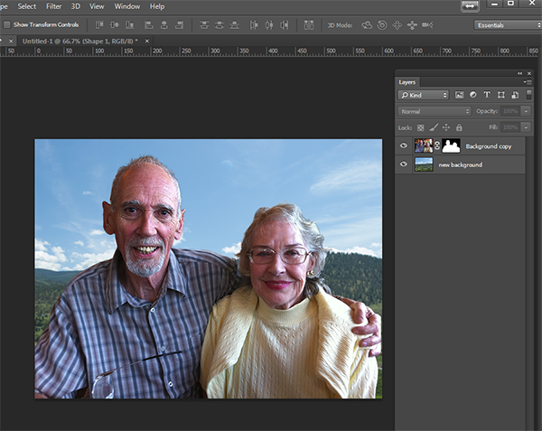
Open the image you want to use as your new background, and using the Move Tool, drag the new background into your main image. Voila! You have a great new background layer and your subjects look very realistic and not like cut and paste paper dolls.

You may have to drag the new background layer under the subject layer – the one with the mask. I’ve deleted the original Background layer and replaced it with the scenery background and called it new background. You could also make any existing background layer invisible if you don’t want to display it.
almost-done

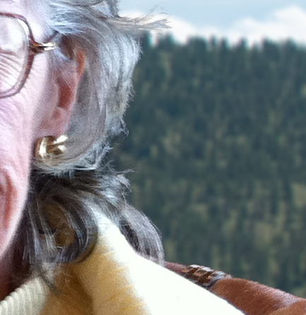
Here’s a 100% close up look at the job the Quick Select tool and Refine Edge brush did on my mom’s hair (yes the image is a bit shaky at 100%, but I think you can see that took works pretty well to give you very realistic extractions, with the right amount of transparency and detail preservation).
100crop-hair

The finishing touches

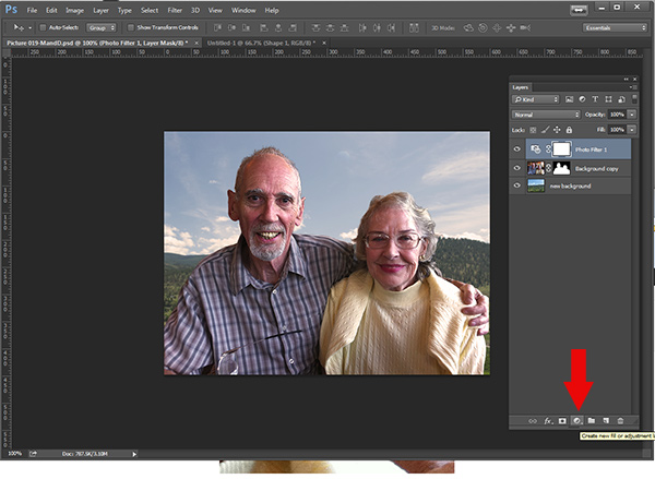
So for the final image, let’s balance the colors a bit and give this photo a nice warm tone, by using a layer mask and a warming Photo Filter.
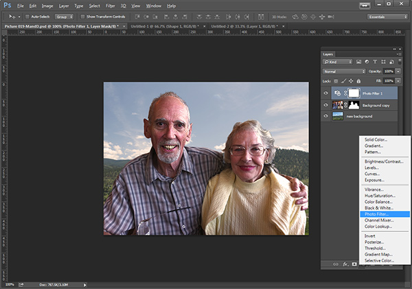
layermaskto-photofilter

photofilter

And here is the final image:

final-warming-filter

Final image AFTER changing the background. Not a snapshot any more!

What do you think? Is it better than the original? Was it worth the 10 minutes to edit and give it a new background? Just imagine, with a well captured image (not a shaky iPhone capture) think  of all the new possibilities you will have if you master this process.

Why not give this nifty tool a try and post your results here – I’d love to see how you use this. If you have questions or problems, just let me know, I respond to my comments and questions regularly.

googletag.cmd.push(function() {
tablet_slots.push( googletag.defineSlot( “/1005424/_dPSv4_tab-all-article-bottom_(300×250)”, [300, 250], “pb-ad-78623” ).addService( googletag.pubads() ) ); } );

googletag.cmd.push(function() {
mobile_slots.push( googletag.defineSlot( “/1005424/_dPSv4_mob-all-article-bottom_(300×250)”, [300, 250], “pb-ad-78158” ).addService( googletag.pubads() ) ); } );

The post How to use Photoshop’s Quick Selection Tool to Change a Background by Alex Morrison appeared first on Digital Photography School.


Digital Photography School

 
Comments Off on How to use Photoshop’s Quick Selection Tool to Change a Background

Posted in Photography


When Photoshop’s Content-Aware Fill Made My Mouth Drop Open

25 Sep

When Adobe began demonstrating Content-Aware Fill in Photoshop CS5 it generated 2 reactions on average. The first fear about the removal of watermarks identifying the work of photographers and the second was an enthusiastic roar about the creative possibilities. Adobe of course was aiming for the later response.  Since the release of Content-Aware Fill I’ve often used it to fill in gaps when my canvas is rotated to straighten an image, remove objects creeping into the edge of my image, etc. With each subsequent version of Photoshop released Content-Aware Fill has seemingly been able to handle more and more complex scenes.

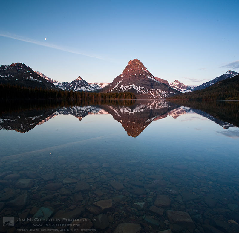
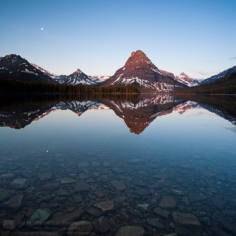
During a recent edit using Photoshop CC I went back to work on some images with contrails reflected in water where the rocky bottom was still visible. At the time the photo was taken I thought it was ultimately unusable, as I wasn’t about to release an image with reflected contrails. For fun I decided to put Photoshop to the test to see how well it could fill in a complex pattern such as this. I was blown away that it took care of the contrails in a single shot.

Unedited – Zoom View

Content-Aware Fill Employed – Zoom View

If you look closely in the zoomed version of the image, the rocks have an organic pattern while the contrail is completely removed. While I expected that the upper right section of the contrail would be handled easily due to its transition to a nearly pure colored gradient, the random rocky pattern on the left  I figured would be too complex to be addressed cleanly. I was pleasantly surprised when I zoomed in at 100% and 200% to see that all the rocks had continuous edges and didn’t have any obvious signs of being edited. It was at this point my mouth dropped open in amazement.

Unedited  – Full Image 

Content-Aware Fill Employed – Full Image

Sunrise at Two Medicine Lake with Sinopah Mountain reflected in the calm water – Glacier National Park

Adobe’s Original Content-Aware Fill Demo

Copyright Jim M. Goldstein, All Rights Reserved

When Photoshop’s Content-Aware Fill Made My Mouth Drop Open

The post When Photoshop’s Content-Aware Fill Made My Mouth Drop Open appeared first on JMG-Galleries – Landscape, Nature & Travel Photography.


Comments

  • nice content aware is mostly his and miss. often miss for me … by Tor Ivan Boine

Related Stories

  • When Photoshop’s Content-Aware Fill Made My Mouth Drop Open – Enclosure
  • Talking Lightroom & Photography
  • Talking Lightroom & Photography – Enclosure
Feed Ads by FeedBlitz
powered by ad choices


JMG-Galleries

 
Comments Off on When Photoshop’s Content-Aware Fill Made My Mouth Drop Open

Posted in Equipment


ColorTime Out Photoshops Photoshop On Mobile

07 Jan

If you love mobile device camera filters and special effects, you need not keep reading. This post takes a look at a new photo app for iOS (sorry Android users, it’s not ported there yet) devices that got me to switch off of using Photoshop Express, my previously preferred image editing app.

The app is called ColorTime. Yes, a little campy, but it’s what’s on the inside that counts. At first ColorTime looked to me to be yet another gimmicky app to ‘play’ with photos and then share them to the world. I don’t need one of those so I ignored it….then kicked myself when I saw what it can do for my mobile photos.

How It Works

While a fine, free app in its own right, what I find most lacking with Photoshop Express is the ability to control different areas of the image differently. It’s an all or nothing proposition, much unlike all of Adobe’s programs for desktop/laptop computers. I can’t bring up shadow detail or tone down highlights. I also can’t adjust the color temperature in shadows, something Adobe introduce in its latest version of Lightroom 4.0.

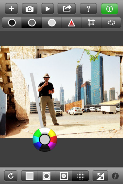
ColorTime achieves the ability to control different tonal areas while also attempting to simplify the process. A problem with adding too much functionality into a mobile app, especially for a phone, is the real estate available for controls. Think of all the icons for tools in Photoshop CS6, for instance, and then try to fit those on an iPhone screen. ColorTime skirts around this problem by allowing for multiple controls with one tool. It looked like this:

That circle allows for cooling or warming of colors as well as lightening and darkening of tones. It is fairly simple to use and once over the initial understanding of the function, it is fun to use. Tap once on the screen and then move around the circle to emphasize each color or tone. Drag away from the circle to increase that effect. Stack changed on top of each other with first applying one, then tapping and applying another effect.

The icons across the top allow users to adjust shadows, midtones and highlights. There is also “play” button where a range of changes will be shown as something of a movie and users can stop the show at any point when they see a rendition they like, without having to figure out all the enhancements to get there. Also on the top panel are tools to adjust saturation and to perform crops.

Along the bottom are icons to select the whole image, edges or just the middle areas. Photographers can also paint an area they want to change with the circle tool and it’s this function that has me switching sides away from Adobe. I can paint in an area where I want to increase the brightness, but leave the rest of the image alone. This is a more finite way to adjust than using only the Highlight tool at the top. I really like this feature and it is what I have been waiting for from Adobe.

The ‘camera’ part of the app simply uses the iDevices built in app to take pictures. Nothing ground breaking here and on par with Photoshop (although Photoshop Express does have some extra features that can be purchased). Sharing functions use the standard set of iOS tools to push your images onto the world.

In Real Life

I haven’t had a lot of time to shoot with ColorTime, just about a week, but I certainly have a large amount of photos to edit on my phone. And that’s the joy in using this app. I have been wary of most apps as they rely heavily on filters and flat out changing the original image toward anything that is not what appeared before the camera. That’s not ColorTime.

ColorTime fills my desire to edit images closer to what I saw when shooting. This is, of course, highly subjective territory but having that control to change just one area or the other, fixing what y iPhone’s camera didn’t get right the first time, is key for me. It’s not for every user. If you’re looking for more wonkiness, you can surely create it with ColorTime but that’s not where this app excels.

Some Gripes

Nothing’s perfect and there are some improvements I would like to see come to ColorTime.

1) The ability to undo. Right now, as far as I can see, I have to start completely over with the Reset tool. I can’t just take one step back after making a mistake.

2) I’m not always a straight shooter. I want the ability to rotate my images. Just a little. Or a lot.

3) Sometimes it’s easy to do the wrong thing. Such as, I don’t know what I want to change the very moment I put my finger to the screen, I end up waiting a fraction of a second too long and I activate the “Select” tool to paint in an area instead of using the selection I just had. This took some practice before I was accustomed to the flow.

Examples

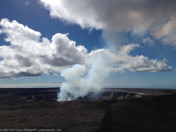
Now then, what can it do? All these shots are starting with the iPhone 4s camera. I will first show the original and then my edit. I used a mixture with every image; selecting one area for adjustment then changing saturation differently for different areas. Removing some blue or magenta color cast by selecting the opposing color to highlight.

At the Taj Mahal, Agra, India.

Waipio Valley, Hawaii, The Big Island

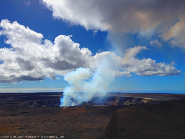
Kilauea Caldera, Hawaii, The Big Island

Conclusion

ColorTime is something I have been waiting for. Mind you, I’m the type of guy who doesn’t like 5,000 filters and effects. I want to adjust the light and dark areas differently and make somewhat finite changes. Colortime gives me control over my images on my iPhone in a way that is intuitive and useful.

You can find ColorTime for free at the Apple App Store.

Post originally from: Digital Photography Tips.

Check out our more Photography Tips at Photography Tips for Beginners, Portrait Photography Tips and Wedding Photography Tips.

ColorTime Out Photoshops Photoshop On Mobile


Digital Photography School

 
Comments Off on ColorTime Out Photoshops Photoshop On Mobile

Posted in Photography