 If you love mobile device camera filters and special effects, you need not keep reading. This post takes a look at a new photo app for iOS (sorry Android users, it’s not ported there yet) devices that got me to switch off of using Photoshop Express, my previously preferred image editing app.
The app is called ColorTime. Yes, a little campy, but it’s what’s on the inside that counts. At first ColorTime looked to me to be yet another gimmicky app to ‘play’ with photos and then share them to the world. I don’t need one of those so I ignored it….then kicked myself when I saw what it can do for my mobile photos.
How It Works
 While a fine, free app in its own right, what I find most lacking with Photoshop Express is the ability to control different areas of the image differently. It’s an all or nothing proposition, much unlike all of Adobe’s programs for desktop/laptop computers. I can’t bring up shadow detail or tone down highlights. I also can’t adjust the color temperature in shadows, something Adobe introduce in its latest version of Lightroom 4.0.
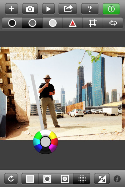
ColorTime achieves the ability to control different tonal areas while also attempting to simplify the process. A problem with adding too much functionality into a mobile app, especially for a phone, is the real estate available for controls. Think of all the icons for tools in Photoshop CS6, for instance, and then try to fit those on an iPhone screen. ColorTime skirts around this problem by allowing for multiple controls with one tool. It looked like this:
That circle allows for cooling or warming of colors as well as lightening and darkening of tones. It is fairly simple to use and once over the initial understanding of the function, it is fun to use. Tap once on the screen and then move around the circle to emphasize each color or tone. Drag away from the circle to increase that effect. Stack changed on top of each other with first applying one, then tapping and applying another effect.
![]() The icons across the top allow users to adjust shadows, midtones and highlights. There is also “play” button where a range of changes will be shown as something of a movie and users can stop the show at any point when they see a rendition they like, without having to figure out all the enhancements to get there. Also on the top panel are tools to adjust saturation and to perform crops.
The icons across the top allow users to adjust shadows, midtones and highlights. There is also “play” button where a range of changes will be shown as something of a movie and users can stop the show at any point when they see a rendition they like, without having to figure out all the enhancements to get there. Also on the top panel are tools to adjust saturation and to perform crops.
![]() Along the bottom are icons to select the whole image, edges or just the middle areas. Photographers can also paint an area they want to change with the circle tool and it’s this function that has me switching sides away from Adobe. I can paint in an area where I want to increase the brightness, but leave the rest of the image alone.
Along the bottom are icons to select the whole image, edges or just the middle areas. Photographers can also paint an area they want to change with the circle tool and it’s this function that has me switching sides away from Adobe. I can paint in an area where I want to increase the brightness, but leave the rest of the image alone.  This is a more finite way to adjust than using only the Highlight tool at the top. I really like this feature and it is what I have been waiting for from Adobe.
The ‘camera’ part of the app simply uses the iDevices built in app to take pictures. Nothing ground breaking here and on par with Photoshop (although Photoshop Express does have some extra features that can be purchased). Sharing functions use the standard set of iOS tools to push your images onto the world.
In Real Life
 I haven’t had a lot of time to shoot with ColorTime, just about a week, but I certainly have a large amount of photos to edit on my phone. And that’s the joy in using this app. I have been wary of most apps as they rely heavily on filters and flat out changing the original image toward anything that is not what appeared before the camera. That’s not ColorTime.
ColorTime fills my desire to edit images closer to what I saw when shooting. This is, of course, highly subjective territory but having that control to change just one area or the other, fixing what y iPhone’s camera didn’t get right the first time, is key for me. It’s not for every user. If you’re looking for more wonkiness, you can surely create it with ColorTime but that’s not where this app excels.
Some Gripes
Nothing’s perfect and there are some improvements I would like to see come to ColorTime.
1) The ability to undo. Right now, as far as I can see, I have to start completely over with the Reset tool. I can’t just take one step back after making a mistake.
2) I’m not always a straight shooter. I want the ability to rotate my images. Just a little. Or a lot.
3) Sometimes it’s easy to do the wrong thing. Such as, I don’t know what I want to change the very moment I put my finger to the screen, I end up waiting a fraction of a second too long and I activate the “Select” tool to paint in an area instead of using the selection I just had. This took some practice before I was accustomed to the flow.
Examples
Now then, what can it do? All these shots are starting with the iPhone 4s camera. I will first show the original and then my edit. I used a mixture with every image; selecting one area for adjustment then changing saturation differently for different areas. Removing some blue or magenta color cast by selecting the opposing color to highlight.
At the Taj Mahal, Agra, India.


Waipio Valley, Hawaii, The Big Island


Kilauea Caldera, Hawaii, The Big Island


Conclusion
ColorTime is something I have been waiting for. Mind you, I’m the type of guy who doesn’t like 5,000 filters and effects. I want to adjust the light and dark areas differently and make somewhat finite changes. Colortime gives me control over my images on my iPhone in a way that is intuitive and useful.
You can find ColorTime for free at the Apple App Store.
Post originally from: Digital Photography Tips.
Check out our more Photography Tips at Photography Tips for Beginners, Portrait Photography Tips and Wedding Photography Tips.
ColorTime Out Photoshops Photoshop On Mobile
You must be logged in to post a comment.