RSS
 

Posts Tagged ‘Patterns’

Baked In: Laser-Etched Rolling Pins Imprint Edible Patterns

06 Jul

[ By WebUrbanist in Design & Products & Packaging. ]

laser printed pin designs

Laser engraving wraps all the way around these clever and customizable pins, creating anything from robots and dinosaurs to mazes and words to liven up your edible creations.

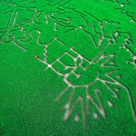
laser maze pin

laser rolling pin array

laser cut rolling pin

In addition to animal, geometric and typographical themes, Valek Rolling Pins offers fully-custom options as well as designs sorted by holiday and season, including Christmas, Valentine’s Day and Mother’s Day.

laser made by pin

laser cat print

The pins are placed on a rotating spindle and then laser-engraved with a choice of patterns, the process leaving the wood char-darkened in the resulting voids against the lighter starting surface.

laser etched engraved wood

laser pattern pin dough

Aside from the appealing marks they make on dough for cookies, pies and otherwise, the patterns also add a display dimension for those who keep their rolling pins visible when not in use. In addition to the cute effects in this case, this array of options is also a good reminder of the non-standard creative possibilities for laser-etching technologies.

Share on Facebook


[ By WebUrbanist in Design & Products & Packaging. ]

[ WebUrbanist | Archives | Galleries | Privacy | TOS ]


WebUrbanist

 
Comments Off on Baked In: Laser-Etched Rolling Pins Imprint Edible Patterns

Posted in Creativity


Aerial Rugs: Images from Above Converted to Carpet Patterns

06 Oct

[ By WebUrbanist in Design & Furniture & Decor. ]

aerial dimensional carpet design

Created by an architect and landscape enthusiast, this limited edition series of custom textiles derives its geometries and colors from aerial views shot around the world.

aerial landcarpet custom series

aerial urban suburban image

Florian Pucher, an Austrian designer now based in Beijing, has long traveled by day to take in as many sights from the sky as possible. Since 2007 he has collaborated with graphic designer Sophia Liu Bo to redraw and abstract images shot from above, turning them into unusual rugs using high-quality New Zealand wool.

aerial carpet close up

aerial carpet urban center

Each LANDCARPET creation is 1 of 88, signed and numbered in the spirit of traditional artistic prints.

aerial carpet with cow

aerial carpet cow scale

The subjects cover the globe, from Europe and the USA to Africa and Asia, urban settings to rural sites.

aerial carpet signed dated

aerial rug design detail

There is a rich variety from one to the next, showcasing an array of lines, curves, organic land forms, urban topographies, and other natural and man-made patterns and features.

aerial carpet city grid

aerial carpet grid pattenr

Each edition takes approximately five weeks to produce, combining real depth and hand-tufted textures.

aerial rug topographic detail

aerial rug colorful topography

The source images range from aerial photographs and satellite images to maps and other views from above. His work as an architect exposes Pucher to all kinds of site maps, master plans and other inspirational materials.

Share on Facebook


[ By WebUrbanist in Design & Furniture & Decor. ]

[ WebUrbanist | Archives | Galleries | Privacy | TOS ]


WebUrbanist

 
Comments Off on Aerial Rugs: Images from Above Converted to Carpet Patterns

Posted in Creativity


Spinning Zen: Real-Time Patterns Painted on a Potter’s Wheel

04 Apr

[ By WebUrbanist in Art & Sculpture & Craft. ]

spinning circle works of art

Like a hypnotist’s pendulum, this fifteen minute visual experience will charm you with its rich variety of mesmerizing patterns, all drawn by hand before your eyes.

An amazingly meditative trip, this work by Mikhail Sadovnikov is entirely dynamic and temporary. Each addition necessarily involves subtraction as new shapes continuously erase and overwrite what you see.

spinning hypnotic circle fingerpainting

Using the clay residue left on the wheel between throwing pots, the artist moves between a series of sequences set to music of various styles and speeds.

spinning potters wheel art

Sometimes symmetrical, other times abstract but always contained in a simple circle, the pacing and control are amazing – but you really have to watch the video to see for yourself and witness where sand mandala making meets fluid finger painting.

Share on Facebook


[ By WebUrbanist in Art & Sculpture & Craft. ]

[ WebUrbanist | Archives | Galleries | Privacy | TOS ]


WebUrbanist

 
Comments Off on Spinning Zen: Real-Time Patterns Painted on a Potter’s Wheel

Posted in Creativity


Civic Secrets: Urban Patterns Revealed in Street-Side Snow

14 Feb

[ By WebUrbanist in Architecture & Cities & Urbanism. ]

urban sneckdown intersection image

Ingenious and contagious, the idea is spreading: after it snows, document where cars do not go, then use that to understand where sidewalks and other public areas can be expanded without any spatial cost to vehicular commuters.

urban public space activism

Jon Geeting of This Old City shows how these so-called ‘sneckdowns’ can work after a snowstorm in Philadelphia. Starting with simple phone-camera photographs, he added colored-line highlights that illustrate actual traffic patterns. These captures implicitly suggest ways to eliminate  car parking, introduce pedestrian plazas and potentially much more.

urban snow implied space

As for the strange name, he explains: a sneckdown “is a clever combination of “snow” and “neckdown” – another name for a curb expansion – that uses snow formations on the street to reveal the space cars don’t use. Advocates can then use these sneckdown photos to make the case to local transportation officials that traffic calming interventions like curb bumpouts and traffic islands can be installed without any loss to car drivers. “

urban post snow photos

Bypassing cumbersome urban planning studies, this approach is a free, easy and highly visual way for people to first understand and then communicate possibilities for future usage to local politicians and business owners. Simple cell phone photos provide the backdrop, allowing activist citizens to argue for everything from sidewalk and green space extensions to the creation of entire urban islands, outdoor seating for restaurants or other civic functions … all in places where, as the snow shows, no one generally drives anyway.

While the phrase and phenomena are gaining all kinds of fresh traction, the idea is not new to those in the know – Street Lessons from a Blizzard (above) by Streetfilms talked about the same process a few years back, and others have discussed it before as well. With the rise of Instagram and Twitter, however, more and more ordinary citizens are snapping shots locally, tagging them and spreading the word.

Share on Facebook


[ By WebUrbanist in Architecture & Cities & Urbanism. ]

[ WebUrbanist | Archives | Galleries | Privacy | TOS ]


WebUrbanist

 
Comments Off on Civic Secrets: Urban Patterns Revealed in Street-Side Snow

Posted in Creativity


Magic Cement: Hidden Concrete Patterns Appear with Water

27 Nov

[ By WebUrbanist in Design & Furniture & Decor. ]

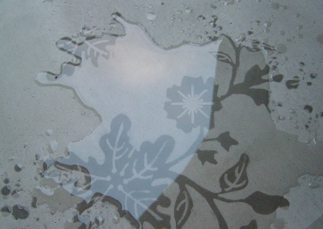
water activated concrete decor

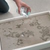
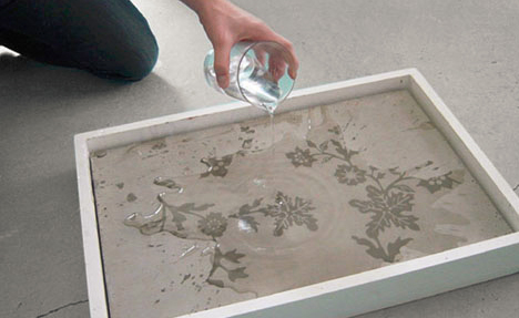
The writing is on the walls, but only when they get wet – that is when the secret messages or hidden designs appear in these seemingly innocuous concrete surfaces, like a durable and built-in version of Neverwet graffiti.

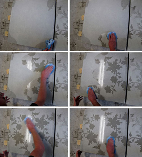
water time lapse reveal

The project is called Silent Poetry and its creators, Frederik Molenschot & Susanne Happle, have started with a high-contrast approach: organic forms hidden in strict geometric slabs, but any other patterns are equally compatible with the approach.

water applications cement design

water hidden cement pattern

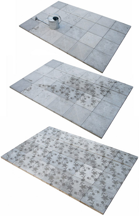
The underlying magic-caliber, moisture-sparked trick works whether the material is drizzled on by the rain, doused in running water, touched by steam or impacted by condensation on a hot and humid day, making for innumerable creative possibilities both inside and outdoors.

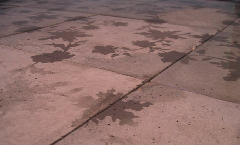
water reveals secret patterns

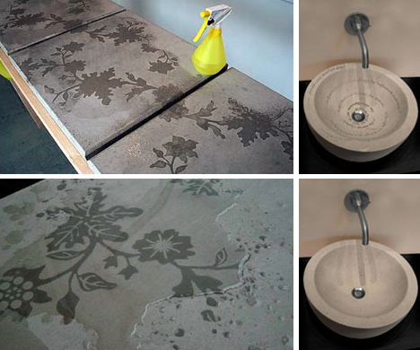
Picture a public sidewalk, parking lot or city center on the one hand or a private walkway or concrete-tiled bathroom on the other. But also consider the range of applications from wayfinding in urban settings to domestic decorations on front decks or walkways that appear with the morning dew, using either modular precast tiles or larger poured-in-place slabs.

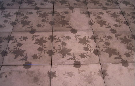
water pavement art design

water revealing floral repetitive

From the designers: “The possible applications of solid poetry are various: either at home in the bathroom, in the garden, in saunas and dance clubs, where the humidity is high or public spaces like bus stops or pavements. All forms of solid poetry have in common that they change the whole setting; they are surprising and have a life of their own.”

Share on Facebook


[ By WebUrbanist in Design & Furniture & Decor. ]

[ WebUrbanist | Archives | Galleries | Privacy | TOS ]


WebUrbanist

 
Comments Off on Magic Cement: Hidden Concrete Patterns Appear with Water

Posted in Creativity


Starry Light: Hand-Crafted Shell Lamps Cast Stellar Patterns

11 Sep

[ By WebUrbanist in Design & Furniture & Decor. ]

lamp ball of light

Innocuous spheres by day, the carefully handmade holes dotting these coconut shells are hard to even see until they light up at night, morphing from muted balls to bright orbs.

lamp 2

lamp 6

lamp 4

lamp 3

lamp 5

lamp 7

Once illuminated, these subtle spheres are themselves beautifully lit up from within, but also project amazing patterns on surrounding walls, furniture and furnishings, whether set on the floor or placed on a bookcase or nightstand.

lamp 14

lamp 15

lamp 18

lamp 19

Creator Vainius Kubilius explains their constituent parts in anatomical terms – bones (of metal wire) to create a strong and flexible stand, wrapped with skin (of various ropes) to create a tactile exterior, with a head and brain (custom drilled coconut) unique in each case and giving personality to the whole.

Next Page:
Starry Light Hand Crafted Shell Lamps Cast Stellar Patterns

Share on Facebook


[ By WebUrbanist in Design & Furniture & Decor. ]

[ WebUrbanist | Archives | Galleries | Privacy | TOS ]


WebUrbanist

 
Comments Off on Starry Light: Hand-Crafted Shell Lamps Cast Stellar Patterns

Posted in Creativity


Transportation planner creates beautiful visualizations of flight patterns

30 May

Screen_Shot_2013-05-29_at_4.15.47_PM.png

Michael Markieta, a transportation planner at global engineering and design firm Arup, has created a series of beautiful visualizations of aircraft flight paths as they span the globe. Using different shades for short and long-distant flights, the images map the world in a ghostly spiderweb of connections from airports small and large. Markieta has marked more than 58,000 flightpaths and the results are stunning. Click through for images (via BBC.co.uk)

News: Digital Photography Review (dpreview.com)

 
Comments Off on Transportation planner creates beautiful visualizations of flight patterns

Posted in Uncategorized


TEST PATTERNS

29 Dec

A few nice visual art images I found:

TEST PATTERNS
visual art
Image by ALL CHROME
Inspired by drug rugs, analog tv test patterns and moist kittens……….

More visual ka-ka: allchrome.tumblr.com/

:—- )@(

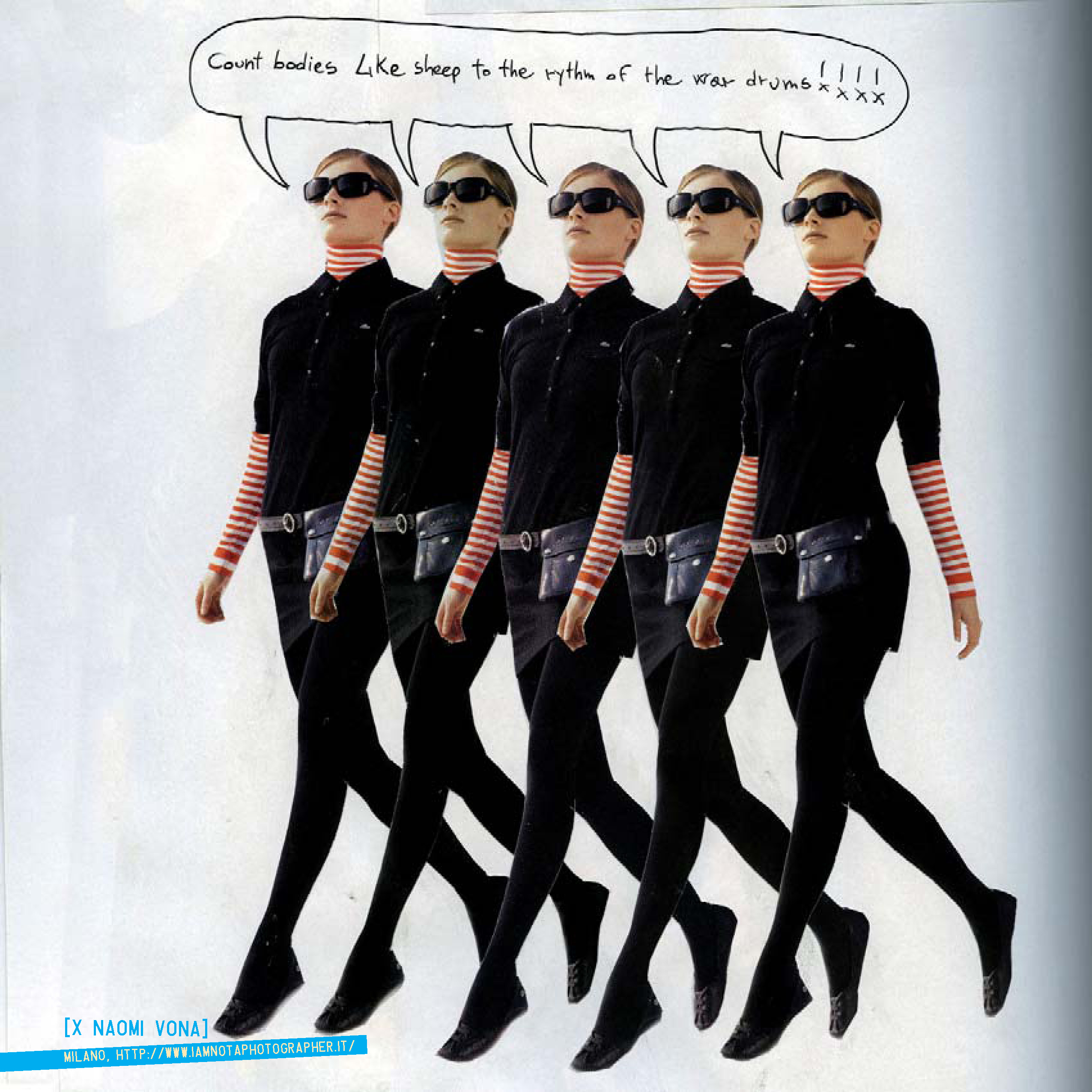
ysinembargomagazine16_Page_30 (naomi vona)
visual art
Image by fernandoprats [@Ignasi Terraza photos]
"du-champ-i-ssue"
jun.jul.ago.2008 | inviernosurveranonorte

ON PAPER (new! second edition! 25/09!)
PDF (new! second edition! 24/09!)
NAVIGATE it (new! second edition! 24/09!)
Hi-Res PDF (new! second edition! 24/09!)

Un número dedicado a explorar la visión y propuestas de Marcel Duchamp.
No su vida, no su obra; tan sólo algunos de sus conceptos.
Realizado con aportes de artistas, pensadores y diseñadores de todo el mundo
combinados con la explícita intención de producir a su vez un objeto duchampiano.

-el medio como instrumento intelectual que transpasa su especificidad y se burla de ella
-la obra independientemente de su carácter representativo e interpretativo
-”arte”, en términos de convenciones, lo más “amorfo” posible
-”obras” en las que la obra no es una finalidad en sí misma sino una excusa
-interpretaciones o, mejor dicho, lecturas que pueden convivir a pesar de ser aparentemente excluyentes
-objetos “anestesiados estéticamente”, anulados en su probable complacencia de la mirada, “rectificados”,”asistidos” para otorgarles una nueva -a menudo, insólita- significación. Como en la elección de los “ready-mades”: “basada en la indiferencia visual y en la ausencia total del buen o mal gusto”
-obras “definitivamente inacabadas”
-rrose sélavy, su alter(-)ego
-ajedrez, máquinas ópticas, matemáticas, geometría, “artefactos”
-la “pintura mental”, “pintura de precisión”, el rechazo de cualquier elemento en el que la mirada se pueda recrear con fruición

-texto, – bloques, – fotografías, + mixed-media, + pintura, + ilustración.
-toda la revista está en castellano e inglés.

(descárgala gratis y comienza felizmente el verano -o el invierno-)

# # #

This issue plays around the conceptual universe of Marcel Duchamp. Not his life, nor his works, just some of his concepts.

– the medium, as an intellectual tool which goes beyond its specificity mocking it.
– the work, regardless of its representative and interpretative character.
– “art”, in terms of conventions, as “amorphous” as possible.
– “construction”, in which the work is not it’s purpose, but an excuse.
– interpretations, or rather readings which can coexist despite being seemingly exclusive.
– objects “aesthetically anesthetized,” lapsed in their likely sight complacency; “rectified”, “assisted”, to give them a new –often unusual- significance. As with the choice of “ready-mades”: “based on visual indifference and a total absence of good or bad taste”
– works “definitively unfinished”.
– rrose sélavy, his alter (-) ego.
– chess, optic machines, mathematics, geometry, “artifacts”.
– “mental painting,” “precision painting”, the rejection of any element in which sight can be delighted.

– aesthetics: – text, – blocks, – photographs, + mixed-media, + painting, + illustration.
– the whole magazine, in spanish and english.

(download it. it’s free. and start enjoying summer -or winter-)

# # #

edit(ing), direct(ing) + complements
fernandoprats
art direct(ing) + design(ing)
estudi prats
insistAnçao, correct(ing) + additional stuff
r | v
listen(ing)
hernán dardes
musicaliz(ing)
albert jordà
translat(ing)
kiddo | emilia cavecedo
frontcover(ing) concept fot
une autre sensualité
backcover(ing) concept borrador
UU – dou _ ble _you et aa
open(ing) concept
nacho piédrola + salaboli & fp porta

-structure:
accesories, lisa kehoe { kiddo | emilia cavecedo, lisa liibbe lara, josean prado, oriol espinal, mark valentine sullivan, hernán dardes, alfredo de la rosa, jonathan minila } => meta
{ pepo m.-the secret society, r | v, leah leone } => hilarious
{ pancho lorenz, natalia osiatynska } fernandoprats => rage

=> meta kiddo | emilia cavecedo, nacho piédrola, salaboli, lisa kehoe { lisa liibbe lara, mark valentine sullivan + shari baker, oriol espinal, gabriel magri, naomi vona, mara carrión }
=> hilarious { d7, olivier gilet, jef safi, special spatial guests }
=> rage { brancollina, gabriel magri, natalia osiatynska, bill horne, UU, christy trotter } simon fröehlich

ysinembargo#16… sensualmente inacabada.

a b r e l a m u r a l l a
antwerp · barcelona · basauri · boulder · bruxelles · buenos aires · carlsbad · collioure · coyoacán · grenoble · holden beach · iowa city · lawrenceville · lansing · london · madrid · mendoza · mexicali b.c. · milano · san francisco · san rafael · sào paulo · tarragona · warsaw

# # #

YSE #16’s Original Music | YSElected videos

# # #

Official WEBsite | MySpace | Flickr Group

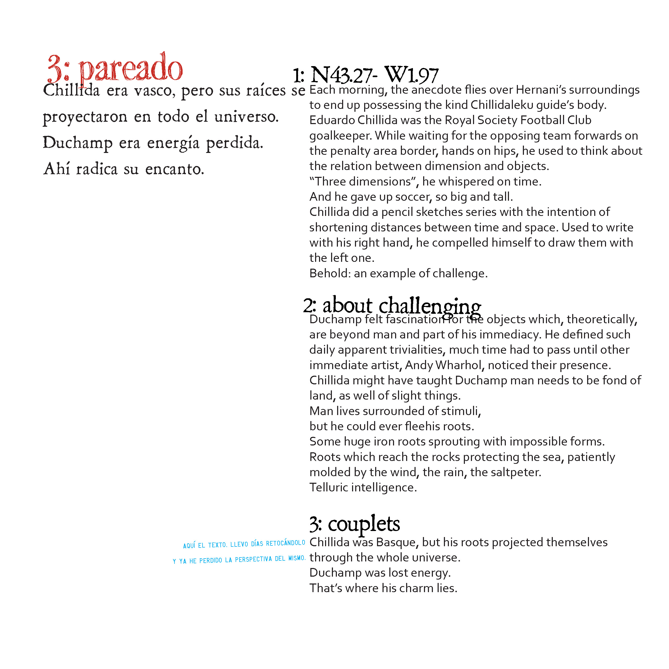
ysinembargomagazine16_Page_23
visual art
Image by fernandoprats [@Ignasi Terraza photos]
"du-champ-i-ssue"
jun.jul.ago.2008 | inviernosurveranonorte

ON PAPER (new! second edition! 25/09!)
PDF (new! second edition! 24/09!)
NAVIGATE it (new! second edition! 24/09!)
Hi-Res PDF (new! second edition! 24/09!)

Un número dedicado a explorar la visión y propuestas de Marcel Duchamp.
No su vida, no su obra; tan sólo algunos de sus conceptos.
Realizado con aportes de artistas, pensadores y diseñadores de todo el mundo
combinados con la explícita intención de producir a su vez un objeto duchampiano.

-el medio como instrumento intelectual que transpasa su especificidad y se burla de ella
-la obra independientemente de su carácter representativo e interpretativo
-”arte”, en términos de convenciones, lo más “amorfo” posible
-”obras” en las que la obra no es una finalidad en sí misma sino una excusa
-interpretaciones o, mejor dicho, lecturas que pueden convivir a pesar de ser aparentemente excluyentes
-objetos “anestesiados estéticamente”, anulados en su probable complacencia de la mirada, “rectificados”,”asistidos” para otorgarles una nueva -a menudo, insólita- significación. Como en la elección de los “ready-mades”: “basada en la indiferencia visual y en la ausencia total del buen o mal gusto”
-obras “definitivamente inacabadas”
-rrose sélavy, su alter(-)ego
-ajedrez, máquinas ópticas, matemáticas, geometría, “artefactos”
-la “pintura mental”, “pintura de precisión”, el rechazo de cualquier elemento en el que la mirada se pueda recrear con fruición

-texto, – bloques, – fotografías, + mixed-media, + pintura, + ilustración.
-toda la revista está en castellano e inglés.

(descárgala gratis y comienza felizmente el verano -o el invierno-)

# # #

This issue plays around the conceptual universe of Marcel Duchamp. Not his life, nor his works, just some of his concepts.

– the medium, as an intellectual tool which goes beyond its specificity mocking it.
– the work, regardless of its representative and interpretative character.
– “art”, in terms of conventions, as “amorphous” as possible.
– “construction”, in which the work is not it’s purpose, but an excuse.
– interpretations, or rather readings which can coexist despite being seemingly exclusive.
– objects “aesthetically anesthetized,” lapsed in their likely sight complacency; “rectified”, “assisted”, to give them a new –often unusual- significance. As with the choice of “ready-mades”: “based on visual indifference and a total absence of good or bad taste”
– works “definitively unfinished”.
– rrose sélavy, his alter (-) ego.
– chess, optic machines, mathematics, geometry, “artifacts”.
– “mental painting,” “precision painting”, the rejection of any element in which sight can be delighted.

– aesthetics: – text, – blocks, – photographs, + mixed-media, + painting, + illustration.
– the whole magazine, in spanish and english.

(download it. it’s free. and start enjoying summer -or winter-)

# # #

edit(ing), direct(ing) + complements
fernandoprats
art direct(ing) + design(ing)
estudi prats
insistAnçao, correct(ing) + additional stuff
r | v
listen(ing)
hernán dardes
musicaliz(ing)
albert jordà
translat(ing)
kiddo | emilia cavecedo
frontcover(ing) concept fot
une autre sensualité
backcover(ing) concept borrador
UU – dou _ ble _you et aa
open(ing) concept
nacho piédrola + salaboli & fp porta

-structure:
accesories, lisa kehoe { kiddo | emilia cavecedo, lisa liibbe lara, josean prado, oriol espinal, mark valentine sullivan, hernán dardes, alfredo de la rosa, jonathan minila } => meta
{ pepo m.-the secret society, r | v, leah leone } => hilarious
{ pancho lorenz, natalia osiatynska } fernandoprats => rage

=> meta kiddo | emilia cavecedo, nacho piédrola, salaboli, lisa kehoe { lisa liibbe lara, mark valentine sullivan + shari baker, oriol espinal, gabriel magri, naomi vona, mara carrión }
=> hilarious { d7, olivier gilet, jef safi, special spatial guests }
=> rage { brancollina, gabriel magri, natalia osiatynska, bill horne, UU, christy trotter } simon fröehlich

ysinembargo#16… sensualmente inacabada.

a b r e l a m u r a l l a
antwerp · barcelona · basauri · boulder · bruxelles · buenos aires · carlsbad · collioure · coyoacán · grenoble · holden beach · iowa city · lawrenceville · lansing · london · madrid · mendoza · mexicali b.c. · milano · san francisco · san rafael · sào paulo · tarragona · warsaw

# # #

YSE #16’s Original Music | YSElected videos

# # #

Official WEBsite | MySpace | Flickr Group

 
Comments Off on TEST PATTERNS

Posted in Photographs


Wallpaper Paint Rollers: Cool & Classic Patterns, DIY Style

30 Oct

[ By WebUrbanist in Design & Furniture & Decor. ]

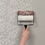
Applying wallpaper is nothing if not frustrating – you have to line everything up just right, and if you ever want to take it down, it is nowhere near as easy as painting over an existing color on primed drywall.

But what might be more amazing than this nifty do-it-yourself patterned paint roller tool is that it is nothing new, as explained on The Painted House: “When I stumbled across these paint rollers in a market in Romania I was so excited ….”

“They have been used there for the last 100 years or so as an alternative to wallpaper. As an ardent upcycler I have been using them ever since to bring unloved fabrics and wonky old walls back to life.“ The resulting new-version rollers can put patterns to paper, walls and fabrics, adding substantive decor to more than just mere walls.

The company is beyond enthusiastic about their product and its various applications: “So far we have made metres of fabric, curtains, bunting, cushions, stationary, lampshades and wrapping paper, covered books and furniture, printed on walls, and someone is in the process of rollering the inside of their bell tent!”


Want More? Click for Great Related Content on WebUrbanist:

Wild Wallpaper: Interactive Decor You Can Rip & Color

Hanging wallpaper is made much more fun when you get to paint and peel it, revealing intricate geometric patterns that won’t be found on any other wall.
Click Here to Read More »»


Inside Out: Print-Crazy Wallpaper Made for Exterior Surfaces

Outdoor wallpaper brings bright colors and bold prints out to exterior walls in an eye-popping series by Italian design company Wall & Decó.
Click Here to Read More »»


Share on Facebook


[ By WebUrbanist in Design & Furniture & Decor. ]

[ WebUrbanist | Archives | Galleries | Privacy | TOS ]


WebUrbanist

 
Comments Off on Wallpaper Paint Rollers: Cool & Classic Patterns, DIY Style

Posted in Creativity


Patterns with Photoshop and the Offset Filter

10 Aug

In this tutorial, we’ll learn the basics of making and using simple repeating patterns in Photoshop. We’re just going to cover the essential steps here to get things started, but once you understand how repeating patterns work and how easy they are to create, you’ll quickly discover on your own that there’s virtually no limit to their creative potential in your designs, whether you’re building a simple background for a scrapbook or web page or using them as part of a more complex effect.

This tutorial will cover the three main parts to working with repeating patterns. First, we’ll design a single tile which will eventually become our repeating pattern. Next, we’ll learn how to save the tile as an actual pattern in Photoshop. Finally, with our new pattern created, we’ll learn how to select the pattern and make it repeat across an entire layer! In the next set of tutorials, we’ll take repeating patterns further by adding colors and gradients, using blend modes to blend multiple patterns together, creating patterns from custom shapes, and more!

I’ll be using Photoshop CS5 here, but the steps apply to any recent version of Photoshop.

Step 1: Create A New Document

Let’s begin by creating a single tile for the pattern. For that, we need a new blank document, so go up to the File menu in the Menu Bar along the top of the screen and choose New:


Go to File > New.

This opens the New Document dialog box. Enter 100 pixels for both the Width and Height. The document’s size will determine the size of the tile, which will affect how often the pattern repeats in the document (since a smaller tile will need more repetitions to fill the same amount of space than a larger tile would). In this case we’ll be creating a 100 px x 100 px tile. You’ll want to experiment with different sizes when creating your own patterns later. I’ll leave my Resolution value set to 72 pixels/inch. Set the Background Contents to Transparent so our new document will have a transparent background:


Enter the width and height of your document and make sure Background Contents is set to Transparent.

Click OK when you’re done to close out of the dialog box. The new document appears on your screen. The checkerboard pattern filling the document is Photoshop’s way of telling us that the background is transparent. Since the document is rather small at only 100 px x 100 px, I’ll zoom in on it by holding down my Ctrl (Win) / Command (Mac) key and pressing the plus sign ( + ) a few times. Here, the document is zoomed in to 500%:


The new blank document, zoomed in to 500%.

Step 2: Add Guides Through The Center Of The Document

We need to know the exact center of our document, and we can find it using Photoshop’s guides. Go up to the View menu at the top of the screen and choose New Guide:


Go to View > New Guide.

This opens the New Guide dialog box. Select Horizontal for the Orientation, then enter 50% for the Position. Click OK to close out of the dialog box, and you’ll see a horizontal guide appear through the center of the document:


Select Horizontal and enter 50% for the Position.

Go back up to the View menu and once again choose New Guide. This time in the New Guide dialog box, select Vertical for the Orientation and again enter 50% for the Position:


Select Vertical and enter 50% for the Position.


A vertical and horizontal guide runs through the center of the document.

Changing The Guide Color (Optional)

If you’re having trouble seeing the guides because of their light color, you can change their color in Photoshop’s Preferences. On a PC, go up to the Edit menu, choose Preferences, then choose Guides, Grid & Slices. On a Mac, go up to the Photoshop menu, choose Preferences, then choose Guides, Grid & Slices:


Select the Guides, Grid and Slices Preferences.

This opens Photoshop’s Preferences dialog box set to the Guides, Grid & Slices options. The very first option at the top of the list is Guide Color. As I mentioned, it’s set to Cyan by default. Click on the word Cyan and choose a different color from the list. You’ll see a preview of the color in the document window. I’ll change mine to Light Red:


Selecting Light Red as the new color for the guides.

Click OK when you’re done to close out of the Preferences dialog box. The guides in the document window now appear in the new color (note that Photoshop will continue to display guides in this new color until you go back to the Preferences and change the color back to Cyan or choose a different color):


The guides now appear in the new color, making them easier to see.

Step 3: Draw A Shape In The Center Of The Document

You can create very complex patterns in Photoshop, or they can be as simple as, say, a repeating dot or circle. Let’s draw a circle in the center of the document. First, select the Elliptical Marquee Tool from the Tools panel. By default, it’s hiding behind the Rectangular Marquee Tool, so click on the Rectangular Marquee Tool and hold your mouse button down for a second or two until a fly-out menu appears, then select the Elliptical Marquee Tool from the list:


Click and hold on the Rectangular Marquee Tool, then select the Elliptical Marquee Tool.

With the Elliptical Marquee Tool selected, move the crosshair directly over the intersection point of the guides in the center of the document. Hold down Shift+Alt (Win) / Shift+Option (Mac), click in the center of the document, then with your mouse button still held down, drag out a circular selection. Holding the Shift key as you drag will force the shape of the selection into a perfect circle, while the Alt (Win) / Option (Mac) key tells Photoshop to draw the selection outline from the center. When you’re done, your selection outline should look similar to this (don’t worry about the exact size as long as it’s close):


Hold down Shift+Alt (Win) / Shift+Option (Mac) and drag out a circular selection outline from the center.

Step 4: Fill The Selection With Black

Go up to the Edit menu at the top of the screen and choose Fill:


Go to Edit > Fill.

This opens the Fill dialog box, where we can choose a color to fill the selection with. Set the Use option at the top of the dialog box to Black:


Set the Use option to Black.

Click OK to close out of the dialog box. Photoshop fills the circular selection with black. Press Ctrl+D (Win) / Command+D (Mac) to quickly remove the selection outline from around the shape (you could also go up to the Select menu at the top of the screen and choose Deselect, but the keyboard shortcut is faster). Keep in mind that my document is still zoomed in to 500%, which is why the edges of the circle appear blocky:


The selection has been filled with black.

Step 5: Duplicate The Layer

With just this one circle added in the center of the tile, we could save the tile as a pattern, but let’s make it look a bit more interesting before we do that. First, make a copy of the layer by going up to the Layer menu at the top of the screen, choosing New, then choosing Layer via Copy. Or, if you prefer keyboard shortcuts, press Ctrl+J (Win) / Command+J (Mac):


Go to Layer > New > Layer via Copy.

Nothing will happen yet in the document window, but a copy of the layer, which Photoshop names “Layer 1 copy”, appears above the original in the Layers panel:


The Layers panel showing a copy of Layer 1 above the original.

Step 6: Apply The Offset Filter

When designing tiles to use as repeating patterns, there’s one filter you’ll use almost every time, and that’s Offset, which you can get to by going up to the Filter menu at the top of the screen, choosing Other, then choosing Offset:


Go to Filter > Other > Offset.

This opens the Offset filter dialog box. The Offset filter moves, or offsets, the contents of a layer by a specified number of pixels either horizontally, vertically, or both. When creating simple repeating patterns like the one we’re designing here, you’ll want to enter half the width of your document into the Horizontal input box and half the height of your document into the Vertical input box. In our case, we’re working with a 100 px x 100 px document, so set the Horizontal option to 50 pixels and the Vertical option also to 50 pixels. At the bottom of the dialog box, in the Undefined Areas section, make sure Wrap Around is selected:


Set the Horizontal and Vertical options to half the dimensions of the document and make sure Wrap Around is checked.

Click OK to close out of the dialog box. In the document window, we see that the Offset filter has taken the copy of the circle we made in the previous step and split it into four equal parts, placing them in the corners of the document. The circle remaining in the center is the original circle we drew on Layer 1:


The image after running the Offset filter.

Step 7: Define The Tile As A Pattern

With the tile designed, let’s save it as an actual pattern, a process Photoshop refers to as “defining a pattern”. Go up to the Edit menu at the top of the screen and choose Define Pattern:


Go to Edit > Define Pattern.

Photoshop will pop open a dialog box asking you to name the new pattern. It’s a good idea to include the dimensions of the tile in the name of the pattern in case you design several similar tiles at different sizes. In this case, name the tile “Circles 100×100″. Click OK when you’re done to close out of the dialog box. The tile is now saved as a pattern!


Name the pattern “Circles 100×100″.

Step 8: Create A New Document

We’ve designed our tile and defined it as a pattern, which means we can now use it to fill an entire layer! Let’s create a new document to work in. Just as we did back in Step 1, go up to the File menu and choose New. When the New Document dialog box appears, enter 1000 pixels for both the Width and Height. Leave the Resolution set to 72 pixels/inch, and this time, set the Background Contents to White so the background of the new document is filled with solid white. Click OK when you’re done to close out of the dialog box. The new document will appear on your screen:


Create a new 1000 px x 1000 px document with a white background.

Step 9: Add A New Layer

We could simply fill the document’s Background layer with our pattern, but that would seriously limit what we can do with it. As we’ll see in the next tutorial when we look at adding colors and gradients to patterns, a much better way to work is to place the repeating pattern on its own layer. Click on the New Layer icon at the bottom of the Layers panel:


Click on the New Layer icon.

A new blank layer named “Layer 1″ appears above the Background layer:


The new layer appears.

Step 10: Fill The New Layer With The Pattern

With our new layer added, let’s fill it with our pattern! Go up to the Edit menu and choose Fill:


Go to Edit > Fill.

Normally, Photoshop’s Fill command is used to fill a layer or selection with a solid color, just as we did back in Step 4 when we used it to fill the circular selection with black. But we can also use the Fill command to fill something with a pattern, and we do that by first setting the Use option at the top of the dialog box to Pattern:


Change the Use option to Pattern.

With Pattern selected, a second option, Custom Pattern, appears directly below it, which is where we choose the pattern we want to use. Click on the pattern preview thumbnail:


Click directly on the Custom Pattern thumbnail.

This opens the Pattern Picker, which displays small thumbnails of all the patterns we currently have to choose from. The circle pattern we just created will be the last thumbnail in the list. If you have Tool Tips enabled in Photoshop’s Preferences (they’re enabled by default), the name of the pattern will appear when your hover your cursor over the thumbnail. Double-click on it to select it and exit out of the Pattern Picker:


Select the “Circles 100×100″ pattern in the Pattern Picker.

Once you’ve selected the pattern, all that’s left to do is click OK to close out of the Fill dialog box. Photoshop fills the blank layer in the document with the circle pattern, repeating the tile as many times as needed:


Layer 1 is now filled with the repeating circle pattern.

And that’s really all there is to it! Obviously our black and white circle pattern won’t win us many awards, but the important things to take away from this first tutorial are the steps we used to create it, designing a single tile, defining the tile as a pattern, then using Photoshop’s Fill command to fill an entire layer with the pattern.

Any suggestions, ideas? Feel free to comment on this article!

Back to Top

BlogPhoto

 
Comments Off on Patterns with Photoshop and the Offset Filter

Posted in Equipment