RSS
 

Posts Tagged ‘Patterns’

The Weekly Photography Challenge – Patterns

18 Jul

The post The Weekly Photography Challenge – Patterns appeared first on Digital Photography School. It was authored by Sime.

We see patterns in many places, repetition in shapes and objects, buildings, fences, patterns are everywhere! This week we want you to find and photograph a pattern a pattern a pattern a pattern! (sorry, dadjoke)

You must take a new photograph for this weekly challenge, how else are you going to sharpen your skills! Make sure you post it on social media and share it with the tag #dPSPatterns or share it in the comments below this blog post.

Make sure you revisit any weekly challenges that you haven’t been able to complete, you can see them all over here

The Weekly Photography Challenge – Patterns
Photo by Victor Garcia on Unsplash

Patterns come in many shapes and sizes, above on a building, in architecture you’ll generally find patterns, and below, in the sand at the beach… Where will you go to find your pattern for this week’s challenge?

The Weekly Photography Challenge – Patterns
Photo by Maria Afanasyeva on Unsplash

Or this epic pile of tyres! Some great photos by the myriad of creators on Unsplash, I’ve had to resort to that website this week as none of mine were any good! I pledge to find and photograph a ‘pattern’ this week! — Simon

The Weekly Photography Challenge – Patterns
Photo by Imthaz Ahamed on Unsplash

As ever, some help with sharing your photo in the comments below (don’t click on this photo to upload your photo, scroll down to the Disqus section, log in, THEN click on the little camera icon in the comments)

Simply upload your shot into the comments field (look for the little camera icon in the Disqus comments section) and they’ll get embedded for us all to see. Or, if you’d prefer, upload them to your favorite photo-sharing site and leave the link to them.

Weekly Photography Challenge – Looking Up

Thanks for joining in! We can’t wait to see your photos!

–Simon

The post The Weekly Photography Challenge – Patterns appeared first on Digital Photography School. It was authored by Sime.


Digital Photography School

 
Comments Off on The Weekly Photography Challenge – Patterns

Posted in Photography


6 Portrait Lighting Patterns Every Photographer Should Know

25 Jul

The post 6 Portrait Lighting Patterns Every Photographer Should Know appeared first on Digital Photography School. It was authored by Darlene Hildebrandt.

lighting-patterns-2.jpg

In classical portraiture there are several things you need to control and think about to make a flattering portrait of your subjects, including: lighting ratio, lighting pattern, facial view, and angle of view. I suggest you get to know these basics inside out, and as with most things, then you can break the rules. But if you can nail this one thing you’ll be well on your way to great people photos. In this article we’re going to look at lighting pattern: what is it, why it’s important, and how to use it. Perhaps in another future article, if you enjoy this one, I’ll talk about the other aspects of good portraiture.

Lighting pattern I’d define as, how light and shadow play across the face to create different shapes. What shape is the shadow on the face, in simple terms. There are four common portrait lighting patterns, they are:

  • Split lighting
  • Loop lighting
  • Rembrandt lighting
  • Butterfly lighting

There are also Broad and Short lighting which are more of a style, and can be used with most of the patterns above. Let’s look at each of them individually.

1. Split Lighting

split-lighting-pattern1.jpg

Split lighting is exactly as the name implies – it splits the face exactly into equal halves with one side being in the light, and the other in shadow. It is often used to create dramatic images for things such as a portrait of a musician or an artist. Split lighting tends to be a more masculine pattern and as such is usually more appropriate or applicable on men than it is for women. Keep in mind however, there are no hard and fast rules, so I suggest you use the information I provide here as a starting point or guideline. Until you learn this and can do it in your sleep, default to the guideline whenever you’re not sure.

split lighting by Darlene Hildebrandt.png

To achieve split lighting simply put the light source 90 degrees to the left or right of the subject, and possibly even slightly behind their head. Where you place the light in relation to the subject will depend on the person’s face. Watch how the light falls on them and adjust accordingly. In true split lighting, the eye on the shadow side of the face does pick up light in the eye only. If by rotating their face a bit more light falls on their cheek, it’s possible their face just isn’t ideal for split lighting.

NOTE: any lighting pattern can be created on any facial view (frontal view showing both ears, or ¾ face, or even profile). Just keep in mind that your light source must follow the face to maintain the lighting pattern. If they turn their head the pattern will change. So you can use that to your advantage to easily adjust the patten just by them rotating their head a little.

What the heck is a “catchlight”?

Catch-lights-example.jpg

Notice in this photo above that the baby’s eyes have a reflection of the actual light source in them. It shows up as a little white spot, but if we look closer we can actually see the shape of the light I used in this portrait.

Catch-lights-closeup.jpg

See how the bright spot is actually hexagon with a dark centre? That’s the light I used which was a small hexagon shaped soft box on my Canon speedlight.

This is what is known as the “catchlight”. Without the eye of the subject catching this light, the eyes will appear dark, dead and lifeless. You need to ensure that at least one eye has a catchlight to give the subject life. Notice it also lightens the iris and brightens the eye overall. This also adds to the feeling of life and gives them a sparkle.

2. Loop Lighting

Loop-lighting-pattern.jpg

Loop lighting is made by creating a small shadow of the subjects noses on their cheeks. To create loop lighting, the light source must be slightly higher than eye level and about 30-45 degrees from the camera (depends on the person, you have to learn how to read people’s faces).

Loop-lighting-pattern-example.jpg

Look at this image to see where the shadows fall, and on their left sides you can see a small shadow of their noses. In loop lighting the shadow of the nose and that of the cheek do NOT touch. Keep the shadow small and slightly downward pointing, but be aware of having your light source too high which will create odd shadows and cause loss of the catchlights. Loop light is probably the most common or popular lighting pattern as it is easy to create and flatters most people.

loop lighting by Darlene Hildebrandt.png

In this diagram the black backdrop represents the bank of trees behind them. The sun is coming over the trees but they are completely in the shade. A white reflector is used at camera left to bounce light back into the subjects’ faces. The reflector may or may not be in the sun but you can still pick up light even if it’s not. Just play with the angles, by changing the placement of the reflector you can change the lighting pattern. For Loop lighting it will need to be somewhere around 30-45 degrees from the camera. It also needs to be slightly above their eye level so the shadow or loop of their nose angles down towards the corner of the mouth. That is one mistake I often see beginners make with reflectors is to place them down low and angle it up. That lights up the bottom of your subject’s nose and does not create a flattering pattern.

3. Rembrandt Lighting

Rembrandt.jpg

Rembrandt lighting is so named because the Rembrandt the painter often used this pattern of light in his paintings, as you can see in his self portrait here. Rembrandt lighting is identified by the triangle of light on the cheek. Unlike loop lighting where the shadow of the nose and cheek do not touch, in Rembrandt lighting they do meet which, creates that trapped little triangle of light in the middle. To create proper Rembrandt lighting make sure the eye on the shadow side of the face has light in it and has a catch light, otherwise the eye will be “dead” and not have a nice sparkle. Rembrandt lighting is more dramatic, so like split lighting it creates more mood and a darker feel to your image. Use it appropriately.

Rembrandt-lighting-pattern.jpg

Rembrandt lighting by Darlene Hildebrandt.png

To create Rembrandt lighting the subject must turn slightly away from the light. The light must be above the top of their head so that the shadow from their nose falls down towards the cheek. Not every person’s face is ideal for creating Rembrandt lighting. If they have high or prominent cheek bones it will probably work. If they have a small nose or flat bridge of the nose, it may be difficult to achieve. Again, keep in mind you don’t have to make exactly this pattern or another, just so long as the person is flattered, and the mood you want is created – then the lighting is working. If you are using window light and the window goes down to the floor, you may have to block off the bottom portion with a gobo or card, to achieve this type of lighting.

4. Butterfly Lighting

Butterfly-lighting-pattern.jpg

Butterfly lighting is aptly named for the butterfly shaped shadow that is created under the nose by placing the main light source above and directly behind the camera. The photographer is basically shooting underneath the light source for this pattern. It is most often used for glamour style shots and to create shadows under the cheeks and chin. It is also flattering for older subjects as it emphasizes wrinkles less than side lighting.

butterfly lighting by Darlene Hildebrandt-1.png

Butterfly lighting is created by having the light source directly behind the camera and slightly above eye or head level of the subject (depends on the person). It is sometimes supplemented by placing a reflector directly under their chin, with the subject themselves even holding it! This pattern flatters subjects with defined or prominent cheek bones and a slim face. Someone with a round, wide face would look better with loop or even split to slim their face. This pattern is tougher to create using windowlight or a reflector alone. Often a harder light source like the sun or a flash is needed to produce the more defined shadow under the nose.

5. Broad Lighting

Broad lighting is not so much a particular pattern, but a style of lighting. Any of the following patterns of light can be either broad or short: loop, Rembrandt, split.

Broad-lighting.jpg

Broad lighting is when the subject’s face is slightly turned away from centre, and the side of the face which is toward the camera (is broader) is in the light. This produces a larger area of light on the face, and a shadow side which appears smaller. Broad lighting is sometimes used for “high key” portraits. This type of lighting makes a person’s face look broader or wider (hence the name) and can be used on someone with a very slim face to widen it. Most people however want to look slimmer, not wider so this type of lighting would not be appropriate for someone who is heavier or round faced.

broad lighting by Darlene Hildebrandt.png

To create broad lighting the face is turned away from the light source. Notice how the side of the face that is towards the camera has the most light on it and the shadows are falling on the far side of the face, furthest from the camera. Simply put broad lighting illuminates the largest part of the face showing.

6. Short Lighting

Short-lighting.jpg

Short lighting is the opposite of broad lighting. As you can see by the example here, short lighting puts the side turned towards the camera (that which appears larger) in more shadow. It is often used for low key, or darker portraits. It puts more of the face in shadow, is more sculpting, add 3D qualities, and is slimming and flattering for most people.

short lighting by Darlene Hildebrandt.png

In short lighting, the face is turned towards the light source this time. Notice how the part of the face that is turned away from the camera has the most light on it and the shadows are falling on the near side of the face, closet to the camera. Simply put short lighting has shadows on the largest part of the face showing.

Putting it all together

Once you learn how to recognize and create each of the different lighting patterns you can then start to learn how and when to apply them. By studying your subject’s face you will learn which lighting pattern will be best for them, and for the type of portrait and mood desired. Someone with a very round face that wants to appear slimmer in a grad portrait, will be lit very differently than someone that wants a promo shot for their band that makes them appear mean or angry. Once you know all the patterns, how to recognize and master quality of light, direction of light and ratio (we’ll discuss that in a future article) then you will be well equipped to handle the challenge.

Of course it is much easier to change the lighting pattern if you can move the light source. However if the main light source is the sun, or a window – it’s a bit tougher to do that. So what you will need to do instead of moving the light, is to have the subject rotate in respect to the light to change the direction it falls on them. Or change your camera position. Or change their position. So basically move the things you can move in relation to the light, if you cannot move the light source itself.

Practice Exercise

Corral yourself a subject (as in a real live person, not your dog) and practice creating each of the lighting patterns we just discussed including:

  • butterfly lighting
  • loop lighting
  • Rembrandt lighting
  • split lighting

Remember to show both broad lighting and short lighting – for each of the different patterns, where applicable. Don’t worry about any other aspect (ratio, fill light, etc) for now, just concentrate getting the patterns down pat first. Use light from a window, a floor lamp with a bare bulb (take the shade off) or the sun – but try and use a light source that you can see what’s happening (I’d suggest that you do not try using flash until you’ve got more experience, it’s harder to learn with because you can’t see it until after the photo is taken) This also works best to start out with the subject facing the camera directly, no turning except to create the broad and short.

Show us your results please and share any challenges or problems you encountered. I’ll try and help you solve them so you and others can learn from it, and get better for next time.

If you’re on Pinterest – here’s a graphic to save this tutorial.

6 Portrait Lighting Patterns Every Photographer Should Know

The post 6 Portrait Lighting Patterns Every Photographer Should Know appeared first on Digital Photography School. It was authored by Darlene Hildebrandt.


Digital Photography School

 
Comments Off on 6 Portrait Lighting Patterns Every Photographer Should Know

Posted in Photography


Weekly Photography Challenge – Patterns

25 Jul

The post Weekly Photography Challenge – Patterns appeared first on Digital Photography School. It was authored by Caz Nowaczyk.

This week’s weekly photography challenge – PATTERNS!

Weekly Photography Challenge – Patterns
unsplash-logoKate Ausburn

Patterns are everywhere – in nature, in everyday objects around the home and yard. They are in cities – in architecture and roadways. They can be color or black and white. They can be taken with your good camera or your smartphone (as mine are).

Play with post-processing too, if you like.

The choice is yours! I look forward to seeing what you share ?

Check out some of the articles below that give you tips on this week’s challenge.

photography with food coloring and milk. Pictures by Megan Kennedy.
Photography with food coloring and milk creates some interesting patterns. Photos by Megan Kennedy.
Weekly Photography Challenge – Patterns
Pattern photographs by Rick Ohnsman

Tips for photographing PATTERNS

How to Use Pattern and Repetition in Photography Effectively

Tips for Photographing Patterns in Nature

How to Turn Your Images into Kaleidoscope Patterns

How to Use Rhythm and Pattern to Create Stronger Compositions

How to Create Kaleidoscope Patterns from Your Photos

Creative Abstract Photography with Food Coloring and Milk

Simply upload your shot into the comment field (look for the little camera icon in the Disqus comments section) and they’ll get embedded for us all to see. Or, if you’d prefer, upload them to your favorite photo-sharing site and leave the link to them. Show me your best images in this week’s challenge.

Share in the dPS Facebook Group

You can also share your images in the dPS Facebook group as the challenge is posted there each week as well.

If you tag your photos on Flickr, Instagram, Twitter or other sites – tag them as #DPSpatterns2020 to help others find them. Linking back to this page might also help others know what you’re doing so that they can share in the fun.

The post Weekly Photography Challenge – Patterns appeared first on Digital Photography School. It was authored by Caz Nowaczyk.


Digital Photography School

 
Comments Off on Weekly Photography Challenge – Patterns

Posted in Photography


Weekly Photography Challenge – Patterns

12 Oct

The post Weekly Photography Challenge – Patterns appeared first on Digital Photography School. It was authored by Caz Nowaczyk.

This week’s photography challenge topic is PATTERNS!

Image: Diogo Nunes

Diogo Nunes

Patterns – a repeated decorative design – are all around us in nature, architecture, technology, and human-made objects.

So go out and capture anything that has patterns. They can be color, black and white, moody or bright. Just so long as they have patterns! You can also manipulate them in your favorite post-processing software. You get the picture! Have fun, and I look forward to seeing what you come up with!

Image: Levi Midnight

Levi Midnight

Image: Kate Ausburn

Kate Ausburn

Image: Christian Bisbo Johnsen

Christian Bisbo Johnsen

Check out some of the articles below that give you tips on this week’s challenge.

Tips for Shooting PATTERNS

Tips for Photographing Patterns in Nature

How to Turn Your Images into Kaleidoscope Patterns

How to Create a Kaleidoscope and Make Unique Abstract Images

Master Repeating Patterns in Photoshop

Using Repetition and Patterns in Photography

33 Inspirational Images that Feature Patterns and Repetition


Weekly Photography Challenge – PATTERNS

Simply upload your shot into the comment field (look for the little camera icon in the Disqus comments section) and they’ll get embedded for us all to see or if you’d prefer, upload them to your favorite photo-sharing site and leave the link to them. Show me your best images in this week’s challenge.

Share in the dPS Facebook Group

You can also share your images in the dPS Facebook group as the challenge is posted there each week as well.

If you tag your photos on Flickr, Instagram, Twitter or other sites – tag them as #DPSpatterns to help others find them. Linking back to this page might also help others know what you’re doing so that they can share in the fun.


The post Weekly Photography Challenge – Patterns appeared first on Digital Photography School. It was authored by Caz Nowaczyk.


Digital Photography School

 
Comments Off on Weekly Photography Challenge – Patterns

Posted in Photography


Tips for Photographing Patterns in Nature

24 Apr

Photographing natural patterns is a fantastic project to work on as a outdoor photographer. The process of exploring patterns not only gives a wealth of photographic opportunities, but also provides a perfect opportunity to concentrate your mind on composition, shape, line and form aiding your development as an all-round photographer.

Reed patterns in nature

Gear

One of the best things about photographing patterns in nature is that it doesn’t require any specialist equipment to get started. Any camera from a smartphone to a top-of-the-line DSLR will give you options for capturing wonderful images of natural patterns.

Standard DLSR lenses such as an 18-55mm often have a decent close-up facility to help you fill the frame with larger patterns. While the macro feature on a compact camera can be a great benefit for those wanting to travel light in their photographic pursuits.

Macro lens and camera - patterns

To take things a step further, however, investing in a macro lens is a great way to explore some of the smaller and more obscure natural designs. That will allow you to focus in close on small bark, leaves, and shell designs to explore the natural work in miniature.

Often it’s recommended to pick up a macro lens with a focal length of 100mm or above in order to allow a greater working distance. That will help you to stay out of your lighting as well as give you room to compose. If you are on a tighter budget, shorter length options can still be a great alternative such as a 40mm or 60mm macro.

Alternatively, you can even look into purchasing extension tubes to reduce the close focusing distance of your current lenses. These are affordable ways to get into macro and close-up photography.

Feather patterns

Outside of macro, long lenses can also be put to great use to pick out patterns within a landscape. Working with a long telephoto such as a 70-200mm can help you pinpoint and explore repeating elements within a larger frame. This will help you to extract patterns and textures from wider landscapes, something that can be highly effective for making creative images.

Aside from the camera and lens, tripods are especially handy for slow shutter speed work as well as ensuring maximum sharpness when working with higher magnifications. Alternatively, working with flash can be liberating, allowing you to be more flexible in your approach and light subjects as you see fit for added impact and interest.

Subjects with patterns

Bark details - patterns in nature

When out in the field look for subjects that have repeating shapes or tones. Obvious choices are tree bark, leaves or rocks as they often contain repeating forms and shapes, as well as strong lines to aid composition. Extending from this, look at the wider field of view, repeating trees, sand, and reeds also make for great images.

When looking into your chosen subject, stare at it for a decent amount of time and don’t rush to bring your camera to your eye. What areas strike you as interesting, are there any lines you catch yourself following? These are all important characteristics that make a great pattern picture.

Picking your area of focus, working with standard composition rules can be highly effective. A line or break in the rule of thirds, or a repeating design with a contrast or stop point on one of the intersecting locations can make a simple and highly pleasing image.

Bird nest pattern - Tips for Photographing Patterns in Nature

One of the great things about photographing patterns is often the subjects don’t move hastily, so feel free to really spend some time fine-tuning your composition for utter perfection.

Within subjects, also look for other pictorial qualities that can manifest as patterns. Pay careful attention to the light and shadows. Often the contrast of harsh shadows can make less interesting subjects take on a whole new form, making unique patterns for intriguing images.

Reflections can also offer good opportunities for pattern shots. Ripples in the water reflecting light and color for some pleasing effects can make some stunning abstract compositions.

Rock details - Tips for Photographing Patterns in Nature

Technique

In terms of shooting technique, often you’ll want to maximize your depth of field to ensure the greatest level of detail within your images. This can be done in a number of ways depending on your subject.

Tree patterns - Tips for Photographing Patterns in Nature

Getting sharp images

The simplest method of gaining a large depth of field is to use a small aperture. Shooting above f/8 to ensure a large amount of your frame is kept in focus will help bring out the details of your chosen subjects. If you are working handheld, you might need to use flash or increase your ISO so as to not fall into slow shutter speeds that will see you encounter sharpness issues.

If you are working at an even closer scale, often stopping down won’t be enough to get the depth of field needed to showcase an entire pattern (especially with macro photography). So another method that can be deployed is focus stacking.

This is the process of shooting multiple images, each one in the sequence focused incrementally apart, then brought together in software to maximize the depth of field. This is a more advanced technique, that due to its precision requires a tripod to ensure critical sharpness. If the ultra-close perspective is something you find intriguing, focus stacking is certainly worth exploring.

Web Patterns - Tips for Photographing Patterns in Nature

Finally, sharpness isn’t always a necessity for photographing patterns in nature. Using slower shutter speeds offers fantastic ways to explore shapes and form, rendering obvious structures into abstraction for intriguing images.

One classic example is panning with trees to create a smooth line effect. Simply working with a slower shutter speed of a 1/2 a second and then by panning up and down the tree trunks you can render them into strong and simple abstract line compositions that can be fascinating.

Additionally, anything that moves in the wind can also be worked with slower shutter speeds. The effects of the elements have a marvelous impact for creating stunning patterns in nature pictures.

Tree lines - Tips for Photographing Patterns in Nature

Conclusion

Photographing natural patterns is great fun. Once you’ve started to train your brain to see the variety of striking repeating and abstract patterns in nature, they will soon become visible everywhere.

Exploring them can make the basis of a photographic project or a great way to create images when things just aren’t going to plan with your other subjects. It’s a great way to make the most of any day out with the camera and return home with some striking and interesting frames to boot.

The post Tips for Photographing Patterns in Nature appeared first on Digital Photography School.


Digital Photography School

 
Comments Off on Tips for Photographing Patterns in Nature

Posted in Photography


Fractal Fruit: Produce Carved into Elaborate Geometric Patterns

20 Apr

[ By SA Rogers in Art & Sculpture & Craft. ]

S

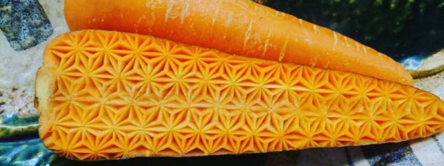
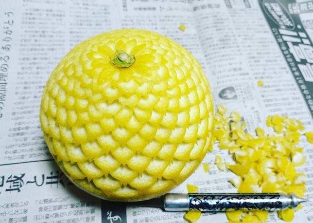
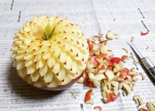
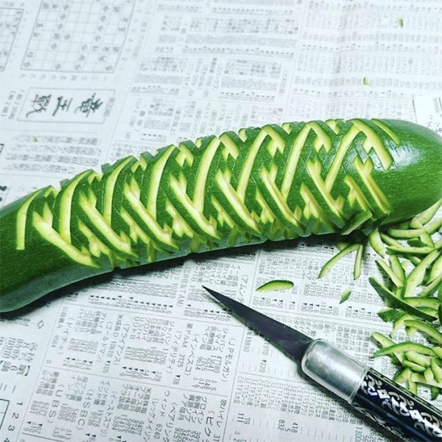
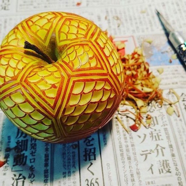
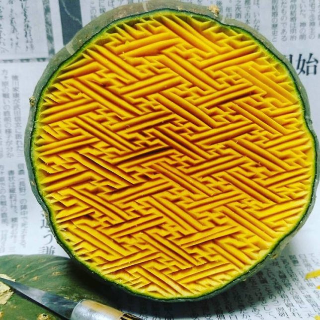
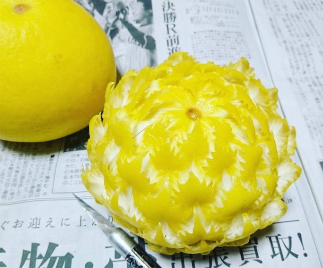
The mathematical precision of the patterns cut into raw fruits and vegetables is almost too perfect to be real, but on top of that, Japanese artist Gaku has to work as rapidly as possible to capture a photo of the finished product before it starts to turn brown. Imagine how hard that is with apples and avocados! ‘Mukimono’ is the Japanese art of food carving based in the idea of taking time to appreciate food before it’s consumed. But while many people are dazzled by the elaborate carvings, others are disturbed.

Clearly, it takes a practiced eye and a steady hand to deftly carve out each temporary masterpiece, especially considering that the patterns are so perfectly sized and spaced, they could be computer generated. Gaku says he learned the art five or six years ago, and that he’s a chef by trade, but rarely gets to use his carving skills at work.

You could say it’s too beautiful to eat – or maybe you’d say it’s terrifying. Buzzfeed rounded up a bunch of hilarious Twitter reactions to the work, ranging from “This kind of pisses me off and I don’t know why” to “I want to punch this food.” Perhaps these folks have undiagnosed cases of trypophobia (irrational fear of holes), intensified by the fact that it’s something you’re supposed to put in your mouth?

See more of Gaku’s work on his Instagram.

Share on Facebook


[ By SA Rogers in Art & Sculpture & Craft. ]

[ WebUrbanist | Archives | Galleries | Privacy | TOS ]


WebUrbanist

 
Comments Off on Fractal Fruit: Produce Carved into Elaborate Geometric Patterns

Posted in Creativity


Plant Patterns: Living Roots Manipulated Into Nature-Based Art

02 Feb

[ By SA Rogers in Art & Sculpture & Craft. ]

plant-root-art

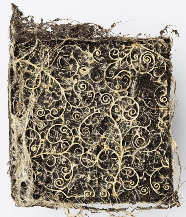
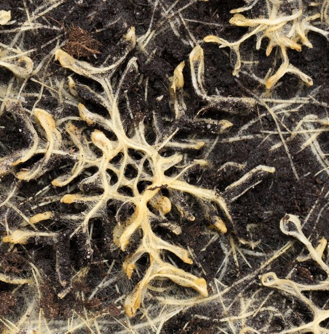
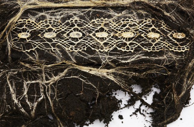
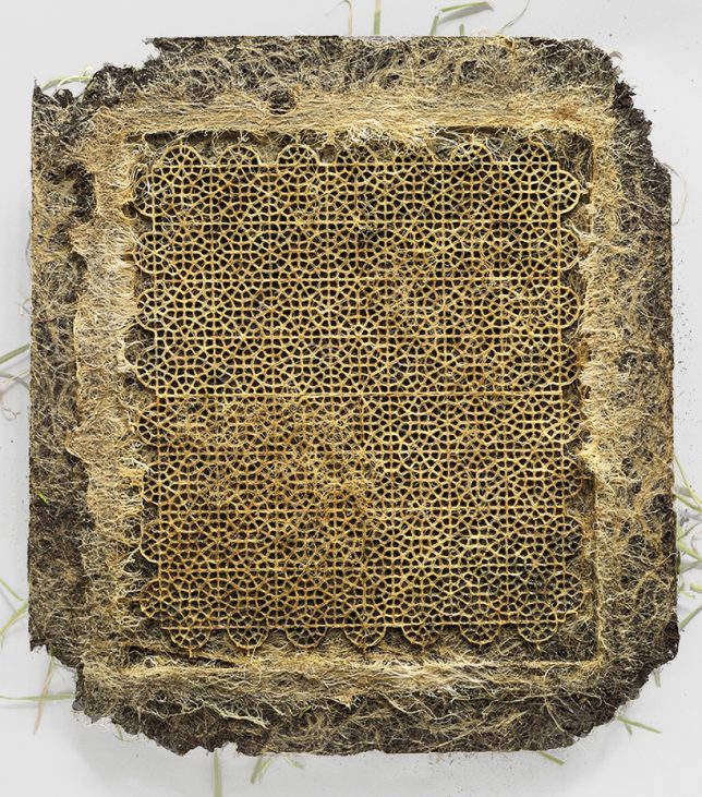
The intricacies of a plant’s secret life beneath the soil, where its roots grow and change almost constantly, become a true work of art when manipulated into specific patterns. Artist Diana Scherer collaborated with biologists and ecologists at Radboud University in Nijmegen, The Netherlands to develop a system that can create the same kinds of spirals and other motifs found in traditional woven textiles.

plant-root-art-2

Subterranean templates act like molds as the root systems expand, channeling them in certain ways to form thick mats, almost like living fabric. As the roots grow, they curl and braid around themselves, becoming stronger and reinforcing the patterns.

plant-root-art-3

plant-root-art-4

“In my work I explore the relationship man has with his natural environment and his desire to control nature,” says Scherer. “For the past few years my fascination has mainly been focused on the dynamics of below ground plant parts. I’ve been captivated by the root system, with its hidden, underground processes; it is considered to be the brain of the plant by plant neurobiologists.”

plant-root-art-5

“Charles Darwin was the first to watch the behavior of the plant roots. In his book The Power of Movements of Plants, he describes how roots do not passively grow down, but move and observe. A root navigates, knows what’s up and down, observes gravity and localizes moisture and chemicals. Darwin discovered that plants are a lot more intelligent than everybody thought. For contemporary botanists, this buried matter is still a wondrous land. There is a global investigation to discover this hidden world. I also want to explore it and apply the ‘intelligence’ of plants in my work.”

Share on Facebook


[ By SA Rogers in Art & Sculpture & Craft. ]

[ WebUrbanist | Archives | Galleries | Privacy | TOS ]


WebUrbanist

 
Comments Off on Plant Patterns: Living Roots Manipulated Into Nature-Based Art

Posted in Creativity


How to Turn Your Images into Kaleidoscope Patterns

29 Nov

This tutorial is a lot of fun, transforming photographs into kaleidoscopic wonders, often with surprising results. The resulting kaleidoscope patterns make fantastic desktop backgrounds and wallpapers too.

Remember kaleidoscopes? Those curious tubes with an array of mirrors and colorful beads inside? As a kid, I would while away sunny weekends straining my eye against the viewing aperture, hypnotized by the endless combination of shapes, patterns, and colors. Although I now spend most of my time looking through the viewfinder of a camera, the magic of the kaleidoscope remains in my mind as an early foray into image making.

Step 1 – Setting up the canvas

kaleidoscope-01

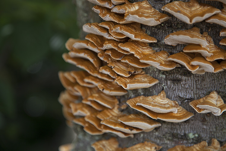
First, select a photograph. I’ve chosen this photograph of some fungi growing on an old tree stump. From my own experimentation I’ve found images with bold, contrasting colors and negative space result in the best kaleidoscopic images.

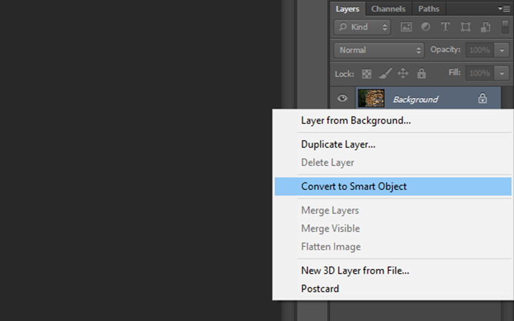
Once you have selected an image and opened it in Photoshop, right click on the image in the layers panel and select Convert to Smart Object. This will enable you to move the image around the canvas.

kaleidoscope-02

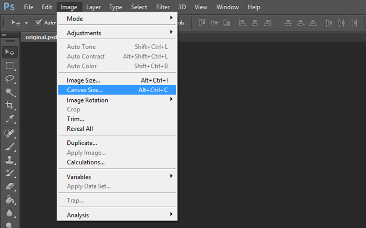
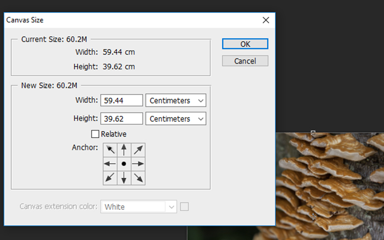
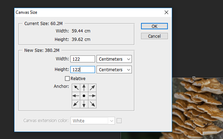
Now we need to add some space around the image. Go to Image > Canvas Size and a window will pop up with the dimensions of your current image.

kaleidoscope-03

To calculate the dimensions of the canvas, look at the largest side of the image, double that figure and add four. For example, the image I selected was originally 59.44 x 39.62cm so I multiplied 59 by 2 to get 118m then added 4 to get 122. Add the same value to the smaller side of the image so that the canvas will be square. Click OK.

kaleidoscope-04

kaleidoscope-05

Step 2- Creating the template

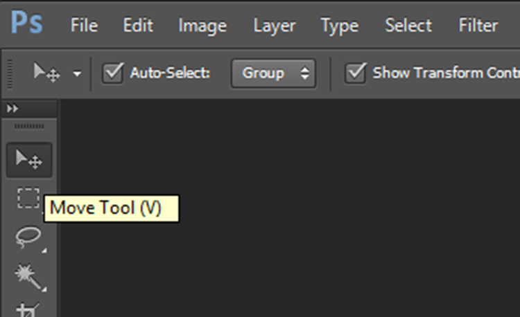
Zoom out so you can view see the entire canvas and select the Move Tool located at the top of the left toolbar.

kaleidoscope-06

kaleidoscope-07

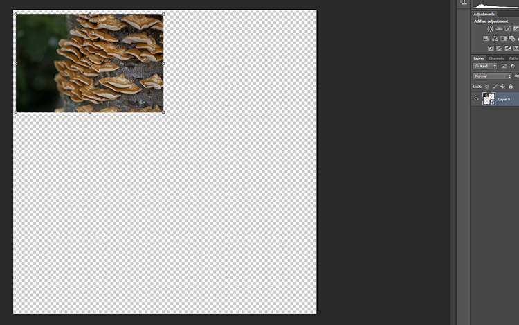
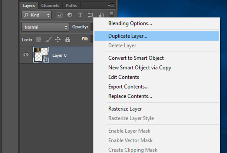
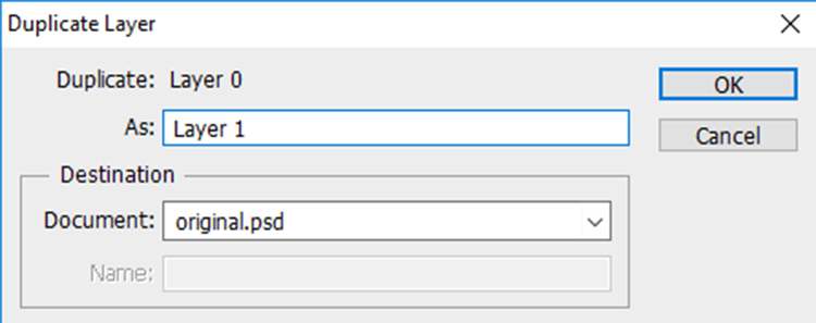
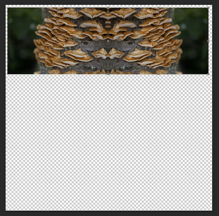
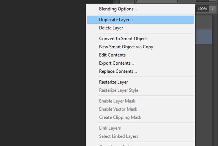
Click on your photograph on the canvas, and with the left mouse button depressed, drag the image to a corner of the canvas. Leave a few centimeters between the image and the edge of the canvas. Don’t worry about making this too exact as we will crop it to more exact proportions later. Now, duplicate this layer by right clicking it in the layers panel and selecting Duplicate Layer (or use the keyboard shortcut Cmd/Ctrl+J).

kaleidoscope-08

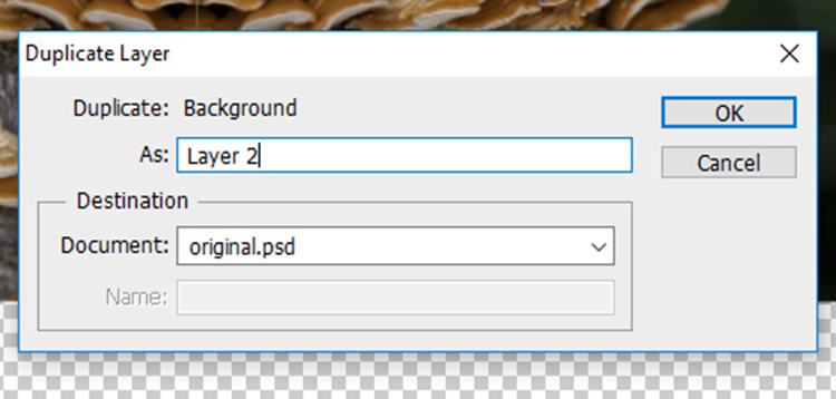
In the Duplicate Layer prompt, rename this layer as “Layer 1” as we will be duplicating a number of layers over the next few steps. Click OK and a new layer will appear in the layers panel.

kaleidoscope-09

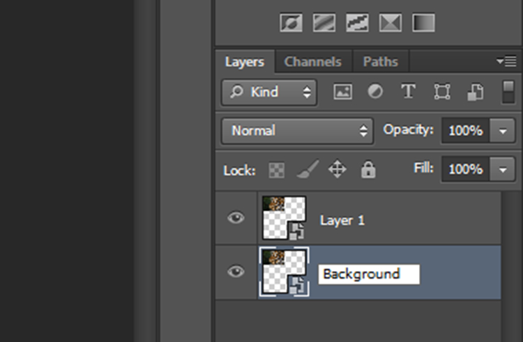
Rename the original image layer as “Background” by double clicking on the name “Layer 0” in the layers panel. This will help avoid confusion later.

kaleidoscope-10

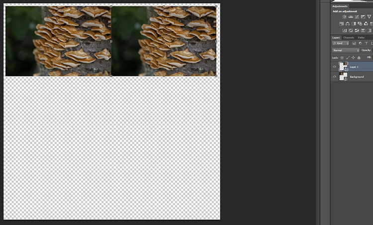
At the moment, both layers will be in the same spot on the canvas, with Layer 1 sitting on top of Background. With the Move Tool selected, click on the top layer, and with the left mouse button depressed, drag Layer 1 next to the Background image.

kaleidoscope-11

kaleidoscope-12

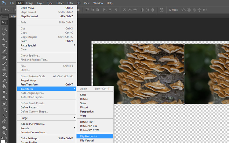
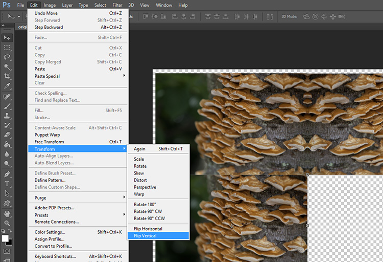
Keeping Layer 1 selected, click Edit on the main toolbar and then Transform > Flip Horizontal. Layer 1 will flip to create a mirrored image of the Background.

kaleidoscope-13

Your image should look something like this now.

Just two more to go!

Duplicate the Background layer again, and when the prompt window appears, rename it “Layer 2”.

kaleidoscope-14

kaleidoscope-16

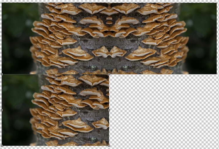
With the Move Tool selected, click on the newly created Layer 2 (which will be over Background). Keep the left mouse button depressed, and drag Layer 2 underneath Background.

kaleidoscope-17

With Layer 2 selected, click Edit on the main toolbar and then Transform > Flip Vertical. Layer 2 will flip vertically to create a mirrored image of Background from below.

kaleidoscope-18

kaleidoscope-19

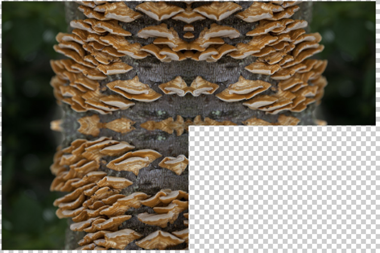
Duplicate Background one more time, this time naming the layer “Layer 3”. With the Move Tool selected, click on the newly created Layer 3 (which will be over Background) and with the left mouse button depressed, drag Layer 3 into the remaining slot to complete the rectangle.

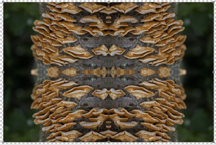
With Layer 3 selected, click Edit on the main toolbar and then Transform > Flip Horizontal. To complete the pattern, keep Layer 3 selected click Edit on the main toolbar and then Transform > Flip Vertical.

kaleidoscope-20

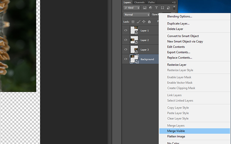
The next step is to merge the layers of the rectangle you have made so that it can be moved around as one layer. To do this, right-click on the layer titled Background in the layers panel and select Merge Visible.

kaleidoscope-21

If it hasn’t done so automatically, it is a good idea to rename this merged layer as “Background” so it will be easier to keep track of which layers are where. You now have the template for your kaleidoscopic image!

Step 3 – Creating the kaleidoscope

Select the Background layer, and with the Move tool selected, drag the layer into the center of the canvas. Right-click on Background in the layers panel and select Duplicate Layer. Rename this layer as “Layer 1”.

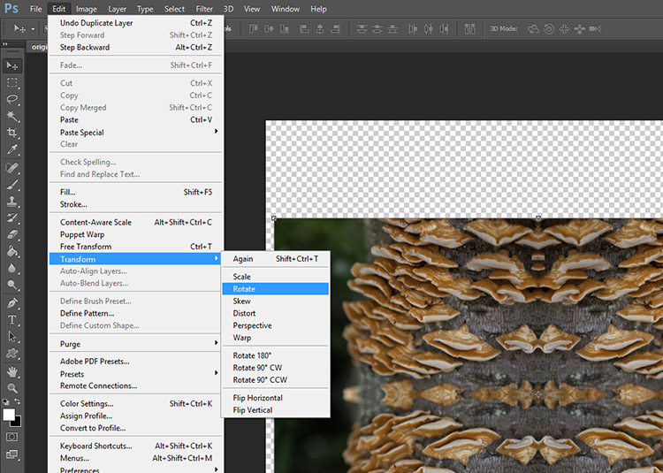
With Layer 1 selected, click Edit > Transform > Rotate.

kaleidoscope-22

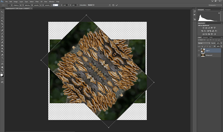
In the Transform settings panel, there is a text box next to the symbol of an angle. In this text box, type 45 and press enter. Layer 1 will be rotated to a 45-degree angle.

kaleidoscope-23

kaleidoscope-24

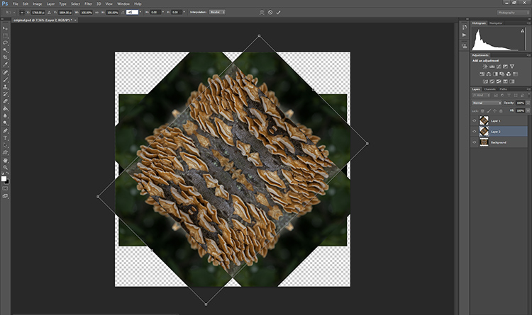
Duplicate Background again, this time renaming the layer “Layer 2”. With Layer 2 selected in the layers panel, click Edit > Transform > Rotate. In the Transform settings panel, in the text box next to the angle symbol, enter -45 and press enter.

kaleidoscope-25

kaleidoscope-26

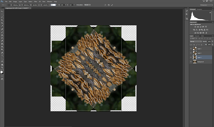
Duplicate the Background layer one last time, renaming the layer “Layer 3”. With Layer 3 selected in the layers panel, click Edit > Transform > Rotate. In the Transform settings panel, in the text box next to the angle symbol, enter 90 and press enter. The layer will be rotated 90 degrees.

kaleidoscope-27 kaleidoscope-28

Step 4 – Blending Modes

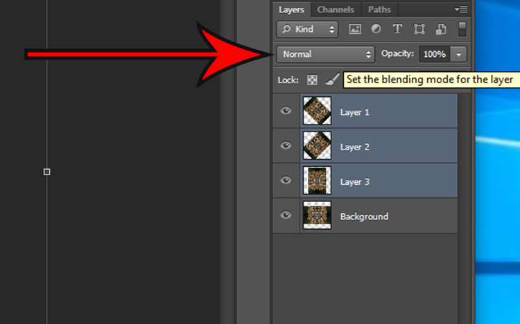
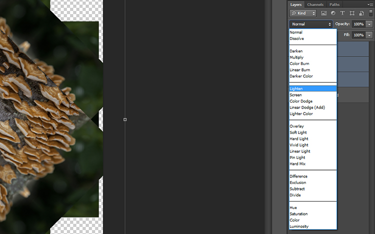
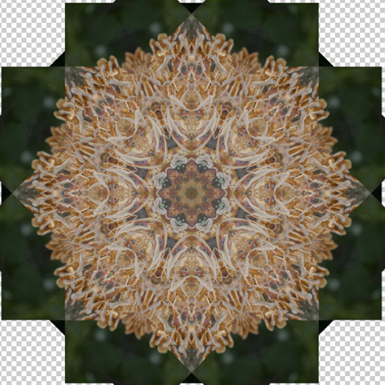
Select the top three layers in the layers panel by holding down the shift key and clicking on Layers 1, 2, and 3. With the layers selected, click on the Blending Mode drop down menu (red arrow below) and select the Lighten option. The selected layers will blend to form a kaleidoscope pattern.

kaleidoscope-29

kaleidoscope-30

kaleidoscope-31

Crop it

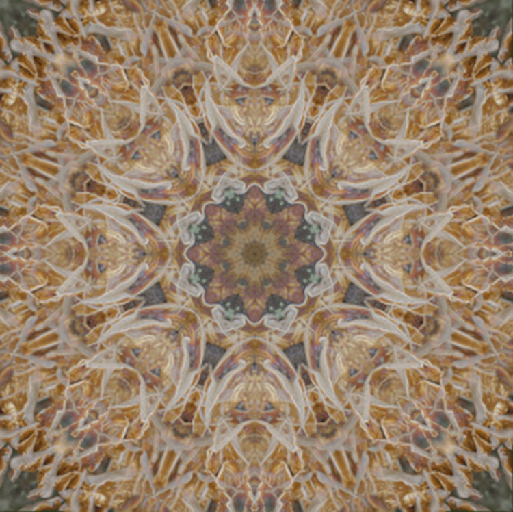
To neaten up the image you can crop the edges of the kaleidoscope down to a square or rectangle. With the Crop Tool selected, hold the shift key on your keyboard and drag the corners of the Crop Tool over the image to create a square or rectangle. When you are happy, press enter and save the image via File > Save As.

kaleidoscope-32

Step 5 – Making a desktop background

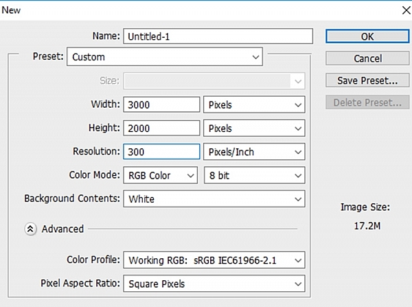
To make a wallpaper effect, open a new Photoshop document by selecting File > New and entering the dimensions 3000 pixels by 2000 pixels in the text boxes. Make sure the resolution set to at least 300 pixels/inch, so it will look nice on a large monitor screen.

kaleidoscope-33

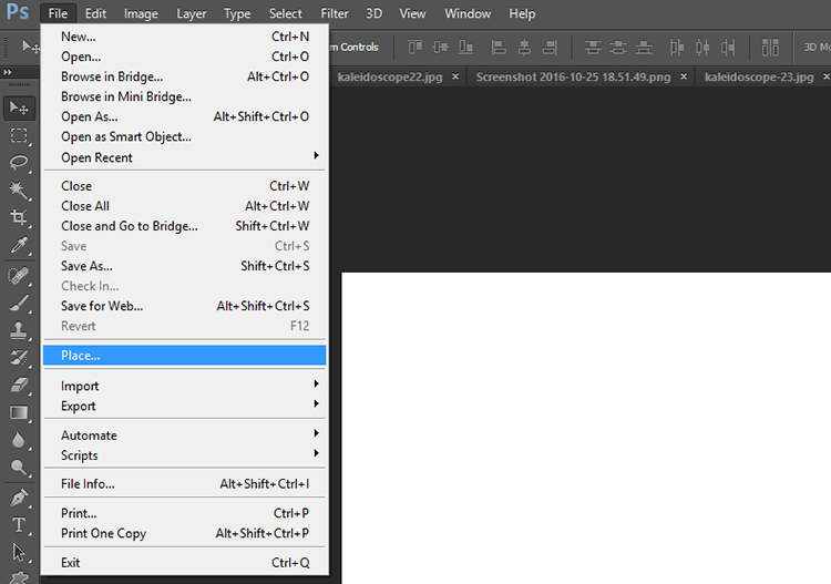
Select File > Place… and select your new kaleidoscope file.

kaleidoscope-34

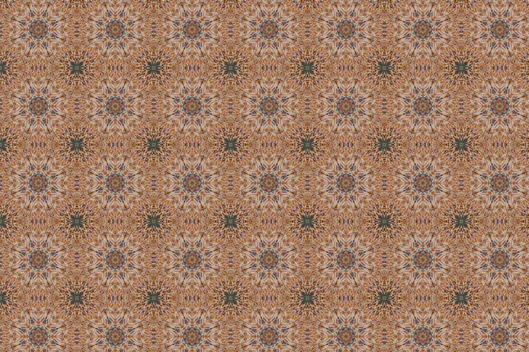
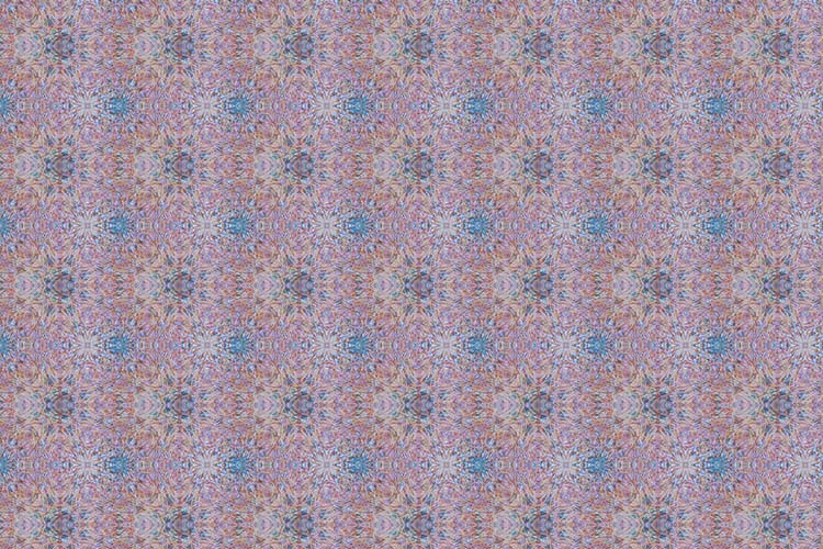
Once placed in the Photoshop canvas, you can choose to duplicate the image any number of times to create an interesting pattern, or add layers on top of one another and have fun experimenting with more Blending Modes. The possibilities are endless! Here are a few ideas.

Have you done this technique before to make a kaleidoscope pattern? Please share your results in the comments section below.

desktop

desktop-01

desktop-02

googletag.cmd.push(function() {
tablet_slots.push( googletag.defineSlot( “/1005424/_dPSv4_tab-all-article-bottom_(300×250)”, [300, 250], “pb-ad-78623” ).addService( googletag.pubads() ) ); } );

googletag.cmd.push(function() {
mobile_slots.push( googletag.defineSlot( “/1005424/_dPSv4_mob-all-article-bottom_(300×250)”, [300, 250], “pb-ad-78158” ).addService( googletag.pubads() ) ); } );

The post How to Turn Your Images into Kaleidoscope Patterns by Megan Kennedy appeared first on Digital Photography School.


Digital Photography School

 
Comments Off on How to Turn Your Images into Kaleidoscope Patterns

Posted in Photography


Literal Streetwear: ‘Pirate Printer’ Lifts Patterns from Urban Objects

29 Jul
[ By WebUrbanist in Design & Products & Packaging. ]

street wear clothes

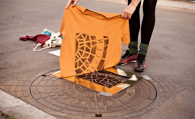
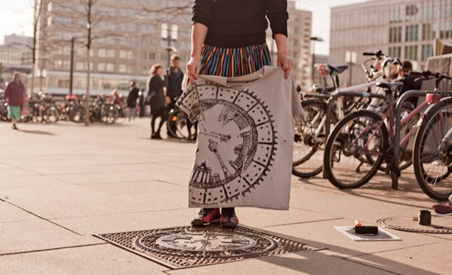
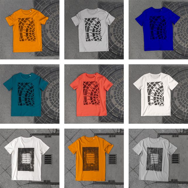
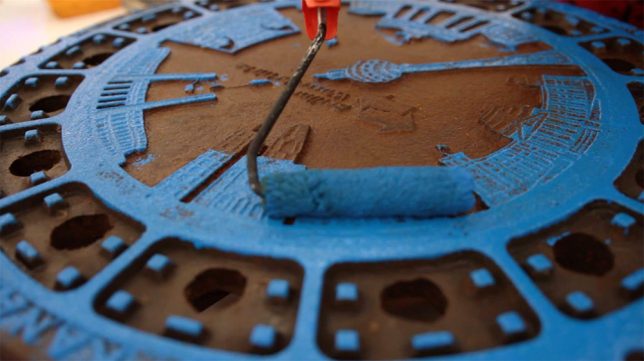
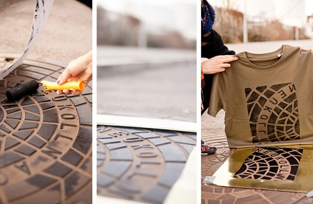
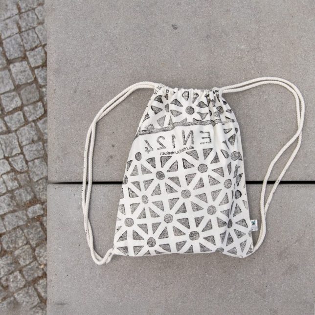
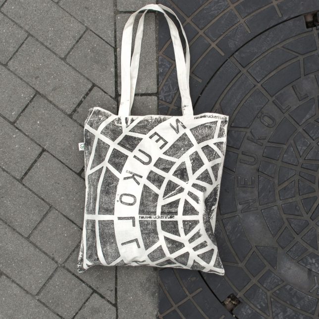
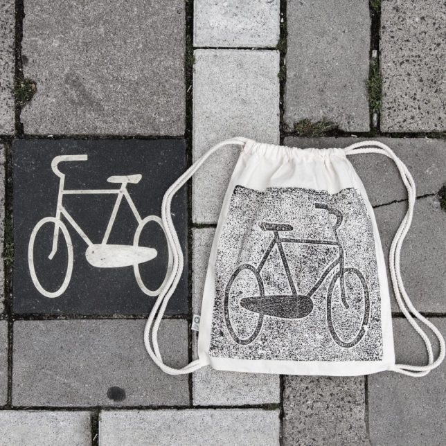
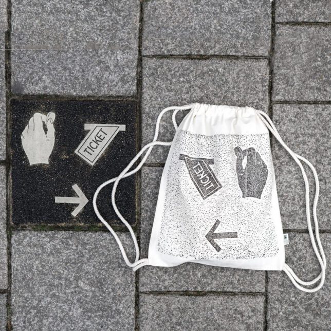
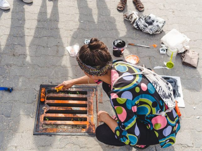
A Berlin art collective has taken to the streets, inking urban infrastructure and laying down shirts and tote bags to create a line of unique prints … their patterns directly lifted from city streets.

print process cover

pirate pressed tshirts

Raubdruckerin (AKA Pirate Printer) press apparel to painted manhole covers, utility grates, etched signage, vents and other objects that have depth differences (and thus themselves to the relief-printing process, like woodcuts or letterpress).

painted manhole cover

pirate clothing urban collection

painted city grate

The group rolls out different colors of ink, much as one would with any kind of etched or raised printing process, then lays cloth down and applies pressure. Depending on the size and type of the object in question, the prints are partial or complete pictures of a given urban artifact.

pirate patterned bag

manhole cover bag

bike path sign

ticket sign

The crew has traveled to Amsterdam, Lisbon, Paris and other iconic cities to capture some of their least-noticed but still-beautiful urban artifacts, transferring overlooked parts of these places to a new style of streetwear. Naturally, each one is a little different – even when the same street fixture is used, the re-inking process results in variegation from one print to he next (via Colossal).

Share on Facebook


[ By WebUrbanist in Design & Products & Packaging. ]

[ WebUrbanist | Archives | Galleries | Privacy | TOS ]


WebUrbanist

 
Comments Off on Literal Streetwear: ‘Pirate Printer’ Lifts Patterns from Urban Objects

Posted in Creativity


Mosaic Murals: Tile Patterns Spray-Painted in Deserted Spaces

04 Mar

[ By WebUrbanist in Art & Street Art & Graffiti. ]

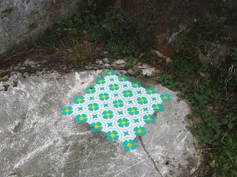
tile artwork abandonment

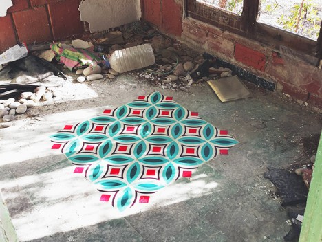
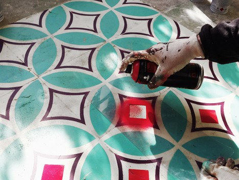
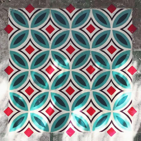
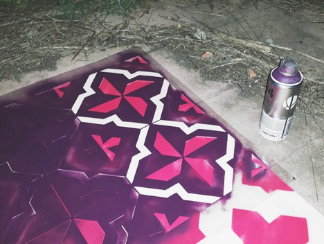
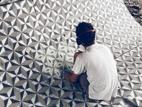
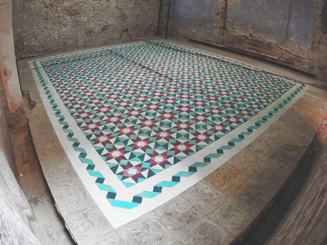
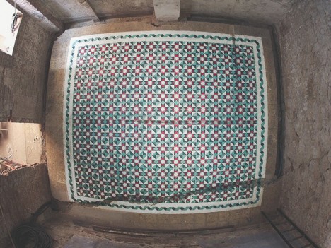
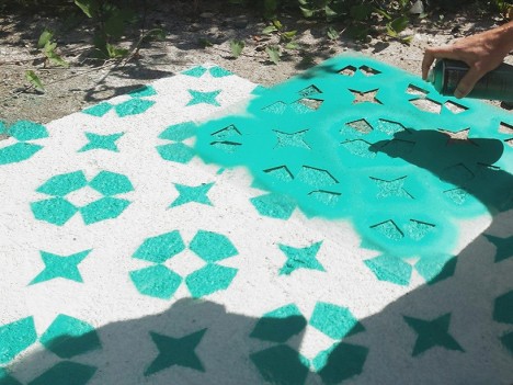
A puzzle of layers rather than pieces, each of this spray-painted works takes aesthetic cues from historic Barcelona, deploying them in novel contexts using unexpected materials.

tile floor spraypaint stencil

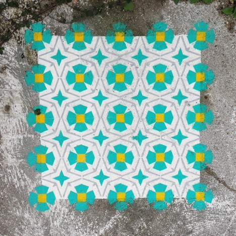
tile finished piece

tile in progress

tile exposed exterior

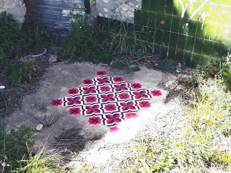
Catalan artist Javier de Riba creates these vibrant works with stencils, one of the original tools of the street artist, bringing them to life so well they could be confused for glass or ceramic tiles.

tile wrapping skate park

tile curved surface stencil

tile floor mural

tile floor art spraypainted

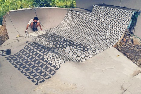
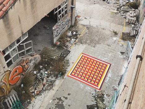
His target locations vary, but his pieces can sometimes be found on sidewalks or the ramps at skate parks, though the floors of abandoned buildings are a popular pick. Deserted places make it easier to take time with a given work, but also add to the element of surprise when discovered by others.

tile painting

tile graffiti stencil outline

tile work floor ground

tile demolished house barcelona

Some are composed in square frames, though many break borders and some even wrap curve surfaces or sweep across entire floors. Currently, some of his work is on display at the Miscelanea gallery in Barcelona, including a large site-specific installation.

Share on Facebook


[ By WebUrbanist in Art & Street Art & Graffiti. ]

[ WebUrbanist | Archives | Galleries | Privacy | TOS ]


WebUrbanist

 
Comments Off on Mosaic Murals: Tile Patterns Spray-Painted in Deserted Spaces

Posted in Creativity