RSS
 

Posts Tagged ‘panel’

How to Use the Luminar 4 Pro Tools Panel

29 Mar

The post How to Use the Luminar 4 Pro Tools Panel appeared first on Digital Photography School. It was authored by Christian Hoiberg.

How to Use the Luminar 4 Pro Tools Panel

Luminar 4 is an intuitive photo editor that’s used by both complete beginners and advanced photographers. Their popular Artificial Intelligence tools such as the AI Sky Replacement and AI Enhance have been talked about a lot, but I want us to take a closer look at the Luminar 4 Pro Tools category.

Don’t be fooled, though. Despite being named ‘Pro Tools’ and containing more advanced tools, most of them are still easy to use. There aren’t any AI tools in this category, so you will need to do a little more manual work.

Luminar 4 Pro Tools

The Professional Tools category is the final tools category marked with the ‘Pro’ icon. Click it to expand the Professional panel and reveal 7 tools.

Let’s take a closer look at the tools in Luminar 4 Pro Tools panel:

The Advanced Contrast Tool

This is a tool that I recommend you learn and take advantage of. In fact, it’s one of my most used tools in Luminar.

Contrast is important in photography, but it can be difficult to apply it correctly. Globally applying contrast can lead to shadows becoming too dark and highlights becoming too bright.

Luminar 4 Pro Tools

The ‘Smart Contrast’ tool (found in the Essentials Tools), does a good job avoiding this by taking the histogram into the equation. But you’ll often want better control over where contrast is introduced.

That’s where the Advanced Contrast Tool comes in handy. It allows you to manually adjust the amount of contrast introduced to specific zones in the photo.

I find that the Highlights and Midtones sliders work best for landscape images. Midtones contrast is something I regularly work on in my images and this is an easy method to do so.

Remember that each image might react differently to these adjustments, so make sure to experiment a little with the sliders before to find what suits a particular image the best.

The Adjustable Gradient Tool

The next tool in the Luminar 4 Pro Tools panel is the Adjustable Gradient Tool.

This tool is useful when you want to make a quick adjustment to the top or bottom part of an image. It’s also a useful tool for those who prefer an easy solution, but it lacks the possibility to create multiple gradients in different orientations (for this you need to create different gradients on individual layers).

In other words, this is a good tool for more default adjustments if you just need to darken the sky or desaturate the foreground.

The Adjustable Gradient Tool

Top/Bottom defines which area of the image gets affected by the adjustments. You can use both at the same time – applying individual adjustment settings to areas above the gradient and below.

The smoothness of the transition between the two adjustments depends on the distance between the top and bottom line in the gradient.

Luminar 4 Pro Tools

The Dodge & Burn Tool

Dodging & Burning has been around since the beginning of photography. The fact that it’s still used in the digital darkroom is a testament to its effectiveness and a great reason why you could implement it into your post-processing workflow.

Luminar 4 Pro Tools

Click Start Painting to reveal the Dodge & Burn tool tab above your image. This is where you choose to Lighten (Dodge), Darken (Burn) or Erase the effect. You can also adjust the brush size and intensity.

You can switch between the Lighten and Darken brush at any time. If you want to brighten places in the image, simply click the Lighten button and adjust the brush size and strength.

You can now brush along the areas you want to brighten. Should you accidentally brush somewhere you weren’t supposed to, you can use the Erase option to remove it.

When you’re finished with dodging and burning, click the Done button. You can use the Overall Amount slider to adjust the global intensity of the adjustment. Reduce the amount to lower the opacity of the adjustment.

The Dodge & Burn Tool
Before Dodge & Burn
The Dodge & Burn Tool
After Dodge & Burn

The Color Enhancer Tool

Several tools impact the colors in your photos, but none of them are quite as advanced as the Color Enhancer Tool. Here you get several options that give you precise control over both the global and local colors.

You can target Shadows, Midtones, and Highlights individually by selecting them from the Range Selector buttons. Note that the sliders below are linked to the individual tonal region, allowing you to make adjustments to each of them.

Use the sliders to adjust the balance of the Cyan-Red, Magenta-Green and Yellow-Blue colors. You can use these to, for example, correct the colors in your image or to give a creative look to it.

Luminar 4 Pro Tools

The Photo Filter Tool

Another tool in the Luminar 4 Pro Tools panel is the Photo Filter. You can use this filter to add extra warmth or cool down an image by simulating a color filter placed in front of a camera.

You can apply it in order to make a sunset sky ‘pop,’ or to give your image an artistic look; it all depends on how you choose to use it.

Luminar 4 Pro Tools

The Split Toning Tool

The final tool found in the Luminar 4 Pro Tools Category is the powerful Split Toning Tool. It can be used to either introduce color toning to Black & White images or to add a color cast to the shadows and highlights individually.

Amount controls the overall intensity of the applied color toning.

Highlights Hue lets you adjust the colors found in the bright areas of your image.

Highlights Saturation increases the intensity of the colors in the bright areas.

Shadows Hue lets you adjust the colors found in the darker areas of your image.

Shadows Saturation increases the intensity of the colors in the darker areas.

Balance shifts the balance between highlights and shadows and how they’re affected.

The Split Toning Tool
Before Split Toning
The Split Toning Tool
After Split Toning

Conclusion

The Luminar 4 Pro Tools category contains a bunch of powerful tools that can help take your post-processing to the next level. There’s no need to be intimidated because of its name. However, I do recommend spending some time playing and experimenting with the tools.

Several of the tools can quickly become a bit ‘too much’ and need to be applied with some caution. However, when used right, these are the tools that can help your images stand out from the crowd.

Are you using Luminar 4 and would like to learn how you can create professional-looking images with it? Then make sure to have a look at my popular eBook ‘A Photographer’s Guide to Luminar 4′. Here you’ll learn everything you need about mastering this popular photo-editor.

If you have any questions or comments, pop them into the comments section.

The post How to Use the Luminar 4 Pro Tools Panel appeared first on Digital Photography School. It was authored by Christian Hoiberg.


Digital Photography School

 
Comments Off on How to Use the Luminar 4 Pro Tools Panel

Posted in Photography


Unlocking the Power of the Basic Panel in Lightroom

16 Aug

Lightroom is anything but intuitive for new photographers. Its multitude of panels, sliders, menus, and buttons are enough to make your head spin. But fortunately, there’s hope for even the most beleaguered beginner.

Amid all the options and icons is a single panel in the Develop module that can handle most of the basic editing tasks you are likely to need on any given image. Appropriately titled “Basic,” this one panel contains a plethora of sliders each with its own unique effect.

Once you get the hang of these you’ll start to feel right at home with the way Lightroom works. The first step in becoming familiar with the Basic panel is understanding what each of the sliders does, so let’s examine each of them in detail.

maternity photo - Unlocking the Power of the Basic Panel in Lightroom

You and Lightroom: A match made in heaven

The Lightroom Basic Panel

The Basic panel is broken into three general areas; WB (or White Balance), Tone, and Presence.

Each has a few sliders that control specific types of edits and it’s not uncommon for 95% of your editing to be done right within this one panel.

Despite its meek-sounding name, the Basic panel is a powerful and highly effective tool that you can use to give your images the type of punch visual appeal you need.

Unlocking the Power of the Basic Panel in Lightroom

These sliders are in the Basic panel, but they can do quite a lot.

The Temp Slider

Lightroom’s nomenclature can seem somewhat daunting, especially if you don’t have a background in photography or image manipulation. Temp is the abbreviated form of Temperature, though a true beginner would be forgiven for thinking it simply meant Temporary (Lightroom is not good at helping people learn these sorts of things.)

The temperature of an image, broadly speaking, is how warm or cool it appears. If you really want to dig deeper with White Balance this article is a good place to start.

Move the slider to the left and it will give your image a blue tint, but move it to the right and it will appear to have a yellow cast. If you are editing a JPG image this slider will let you change the value to ± 100, whereas shooting in RAW lets you go from 2,000 to 50,000.

The reason it’s called Temp is that you are adjusting the degrees Kelvin temperature of the white level of the photo. But you don’t need to know all the technical terminology to get good results. If a picture feels too cold or too warm, adjusting this one slider can go a long way towards fixing your photo.

Unlocking the Power of the Basic Panel in Lightroom - white balance temp slider

The Tint Slider

This slider works in tandem with Temp to give your image just the right color cast. As you slide Temp back and forth, your White Balance will get closer to where you want it, but it might result in an image that looks somewhat green or red. You can then use the Tint slider to fix that, giving your image just the right look and feel.

If you prefer Lightroom to do a bit of the heavy lifting for you, you can use the large eyedropper icon in the top-left corner of the Basic panel to get your image most of the way towards a proper White Balance and Tint.

Click the eyedropper and then click on a light gray (not pure white) area of your image. Lightroom will adjust the Temp and Tint sliders to what it thinks are the best values for your image. It’s a good starting point and will often get you pretty close to the look you want.

tint slider magenta to green - Unlocking the Power of the Basic Panel in Lightroom

Exposure Slider

Move this slider and you’ll quickly get an idea of what it does. It simply makes your picture brighter or darker. This is a global adjustment that affects all areas of the image including the light parts, mid-tones, and dark portions all get brighter or darker when you move the slider left or right. (Note: The Exposure slider mostly affects mid-tones although other tones are also affected.)

You can see this reflected in the histogram above the Basic panel. Move the slider to the left or right and the entire graph moves to the left or right.

Exposure is often used to compensate for when a picture doesn’t come out right from the camera. This usually happens if the camera wasn’t metering the scene properly or exposure compensation was enabled by mistake.

Exposure is like a blunt instrument that goes a long way towards making dark images lighter or light images darker. Then you can use additional sliders in the Tone section to fine-tune your picture.

exposure slider - Unlocking the Power of the Basic Panel in Lightroom

Contrast Slider

You might have seen a slider like this on your TV. If you have ever adjusted the values, you probably noticed that as contrast increases, the picture also gets more vivid and punchier. That’s because higher contrast results in a greater degree of variance between light and dark areas.

The same holds true for the Contrast slider in the Lightroom Basic panel. Move the Contrast slider to the right and the bright areas will get brighter while simultaneously making the dark areas darker.

Contrast can also have a negative value which makes your image seem almost hazy since the farther you move the slider to the left the less difference there is between light and dark areas.

Most photographers don’t find negative contrast values particularly useful. But it can come in handy depending on the type of style you are going for in your image editing.
contrast slider - Unlocking the Power of the Basic Panel in Lightroom

Highlights Slider

This slider, in conjunction with Shadows, works especially well if you shoot in RAW format. That is because much of your image data that might be discarded in a JPG file is still available to you when editing RAW files.
When you move the Highlights slider to the left it makes only the bright parts of your image darker. Conversely, when you move it to the right the bright parts get even brighter.

This works wonders on images where some parts are properly exposed but other parts are blown out and you want to decrease the exposure of just the bright parts.

Highlights slider - Unlocking the Power of the Basic Panel in Lightroom

Shadows Slider

Whereas the Highlights slider only affects the bright portions of an image, the Shadows slider lets you adjust the degree to which the dark areas get lightened.

Many photographers begin their editing by moving the Highlights and Shadows sliders, often by moving Highlights to the left just a bit and Shadows to the right. This will make dark portions of the image brighter while simultaneously making bright portions darker.

Some image editing programs only allow you to bring the highlights down and shadows up, but Lightroom takes a slightly different approach. You can, if you so choose, make the bright areas even brighter and the dark areas even darker by moving the sliders to the right and left, respectively.

Most photographers don’t take this approach but it’s nice to know you have it available if you want to use it.

Shadows slider - Unlocking the Power of the Basic Panel in Lightroom

Whites Slider

While the Whites slider might seem somewhat similar to Highlights, it doesn’t actually adjust the brightness of lighter portions of an image. Rather, it makes the whiter areas more white. The effect might seem subtle, but careful adjustment of the Whites and Blacks sliders can have a similar effect to the Contrast slider but it offers you more fine-grain control over the outcome.

I often begin with a +25 adjustment on the Whites slider just to give my images a bit more punch and brightness and then adjust it as needed.

It’s easy to overdo it when adjusting the Whites slider. You might find that going much past 50 will give your images a strange and unnatural look so take care when editing that you don’t overdo it.

You can also get good results by moving the Whites slider to the right while also moving the Highlights to the left. This tends to result in a bit more even-handed editing while giving your images the added spark you might be looking for.

whites slider - Unlocking the Power of the Basic Panel in Lightroom

Blacks Slider

The Blacks slider works just like the Whites slider but in reverse. It makes the dark portions of an image more pure black which can give a nice sense of contrast and tone to a photo.

When you first adjust this slider it might seem like it has the same effect as the Shadows slider, but careful examination reveals a subtle difference in that it is not actually making the dark portions brighter or darker, but adjusting the intensity how black the darkest portions are.

Similar to the Whites slider you might get good results by lowering the black levels and then increasing shadow detail just a bit.

blacks slider - Unlocking the Power of the Basic Panel in Lightroom

Clarity Slider

Of all the sliders in the Basic panel, Clarity is probably the one that is the least understood and depending on who you talk to, the most abused. Clarity does not adjust the overall contrast of an image but instead, it adjusts what’s known as edge contrast.

Whenever there are harsh lines or edges, adjusting the clarity slider to the right will make them stand out and have a little more pop or visual punch than they otherwise might. Moving it too far to the right will result in images that look artificial and unnatural, but it can be useful to use high values if they get you the result you want.

Conversely, you can move Clarity to the left to make your images appear softer and almost a bit ethereal.

Keen image editors will note that the Adjustment Brush tool contains an option called Skin Smoothing which is merely a -40 Clarity adjustment that you can paint in wherever you want. Using this on a person’s face has the effect of removing the appearance of pores and even small hairs that can, if overused, lend an unnaturally smooth look that you might see in magazines or other media.

Clarity slider - Unlocking the Power of the Basic Panel in Lightroom

Dehaze Slider

Arriving a few years ago for Lightroom Creative Cloud users, the Dehaze slider does pretty much what its name suggests, although the results are not always as good as what users might want.

The idea of the Dehaze slider is that by moving it to the right on images with a bit of a foggy or hazy appearance, you can mitigate some of the issues causes lens imperfections or atmospheric intrusions.

It’s not a perfect solution, but if used in the right conditions it can go a long way towards fixing an image that might have otherwise ended up in the rejected pile.

dehaze slider - Unlocking the Power of the Basic Panel in Lightroom

Vibrance Slider

Have you ever taken a picture that you thought would look awesome, but after importing it into Lightroom, just seemed kind of dull and boring? As if the lifeblood had somehow been sucked out of its colors? Vibrance aims to fix that and it works especially well on images of nature and landscapes.

Whereas saturation adjusts the overall color intensity of an entire image, Vibrance works by making duller colors more vivid. It’s also smart enough to leave skin tones alone which means you can make a scene look a little more interesting and colorful without resulting in portraits that are unnatural or oversaturated.

Vibrance slider - Unlocking the Power of the Basic Panel in Lightroom

Saturation Slider

This option can take even the dullest and most boring image and add a massive punch of color. Or it can be used to turn vibrant pictures into faded black-and-white versions.

When you slide the Saturation slider to the right it increases the value of all the colors in an image, whereas moving it to the left has the opposite effect and can eliminate all color entirely.

Similar to the clarity slider, saturation is powerful but easy to overuse and I find that it’s best when adjusted in relatively small amounts.

saturation on a portrait - Unlocking the Power of the Basic Panel in Lightroom

Conclusion

If you are new to Lightroom and unsure of where to even begin, the Basic panel is a great way to get you where you might be trying to go.

Even though the goal of this guide was to give you a good understanding of the sliders in this panel the best way to learn is to try it out for yourself. Open up some images and start using the sliders and see what you can do with them. You might be surprised at your results!

Remember that Lightroom is non-destructive so you can always undo your changes which makes it even easier to edit or just experiment for fun.

The post Unlocking the Power of the Basic Panel in Lightroom appeared first on Digital Photography School.


Digital Photography School

 
Comments Off on Unlocking the Power of the Basic Panel in Lightroom

Posted in Photography


How to Use the Lightroom HSL Panel for Landscape Photo Editing

12 May

If you are a landscape photographer, you might already be using various lens filters to get desired colors and saturation in your images. What if you do not own these filters or forget to carry them along? There is a tool in Adobe Lightroom can help you.

The HSL (Hue, Saturation, and Luminance) tool is a savior for all photographers, especially those shooting landscapes. This is because the HSL tool allows you to adjust the hue, saturation, and luminance in your photos very efficiently.

Where is HSL Panel located in Lightroom?

First, you have to make sure that you are working on the Develop module, in order to access the HSL tool.

How to Use the Lightroom HSL Panel for Landscape Photo Editing - develop module

Once you are in the develop module, you can now see all the toolbars on the right-hand side of the window. Simply scroll down a bit until you see the “HSL / Color / B&W” panel. As you will be working on the HSL tool, just click on the “HSL” tab.

How to Use the Lightroom HSL Panel for Landscape Photo Editing - HSL panel

Using the Hue Sliders in HSL

The first tool that we shall be discussing is the Hue tab, which as the name suggests allows you to adjust the hue (or color tint) of a photo. Hue enables you to adjust the tones ranging from -100 to +100. In simple language, you can change the tone/tint of a particular color in a photo, but within the hue range. By default, Lightroom allows you to play with the hue of eight default colors as shown in the photo below.

For example, if you look at the comparison below the original color of the sky was blue (middle image below). So if I adjust the blue slider and take it all the way to -100, the color shifts from blue to a somewhat greenish color. Similarly, if I take the slider all the way to +100 the color shifts towards a magenta tone.

hue adjustments - How to Use the Lightroom HSL Panel for Landscape Photo Editing

Hue adjustments with the Blue slider.

I know it looks disastrous, but this extreme example gives you an idea of how you can use the Hue tool when required. Let me share a perfect example with you that I achieved using the Hue adjustments.

How to Use the Lightroom HSL Panel for Landscape Photo Editing

LEFT: Original image RIGHT: Color corrected using the Hue tool

Using the Saturation Sliders in HSL

Now once you are done adjusting the hue of the colors that you desire, you can move on to the saturation tab in the HSL panel. We all love saturation in landscape photos especially in the sky, don’t we?

Using the saturation tab, you can adjust the intensity of a particular color from the list of eight default colors. Unlike the saturation slider in the Basic LR panel where the whole photo gets affected, here you can selectively adjust the saturation of a single color.

Suppose you want to boost the saturation of blue color in the sky, simply drag the blue slider towards the right and see the magic. If you wish to make it less saturated, mode the slider towards the left and experiment with selective coloring effect.

Similarly, you can perform repeated actions using different colors in your frame and get a well-saturated photo.

How to Use the Lightroom HSL Panel for Landscape Photo Editing - blue saturation slider

The blue saturation slider on the HSL panel in action.

Using the Luminance Sliders in HSL

The last tool from the HSL panel is Luminance, which allows you to adjust the brightness of a particular color tone. So basically you can increase or reduce the brightness of a color by adjusting the Luminance slider.

There are situations when the sky is way brighter than the mountains or your subject, or maybe your subject is brighter than other elements of your frame. Using the luminance sliders, you can balance the brightness of the scene.

For instance, in the photo below, the sky is overexposed and I want the blue color to be dark in order to get more contrast in the sky. Using the Luminance tool I adjusted the blur color slider to -80 to get the desired result as shown below.

How to Use Lightroom HSL Settings for Landscape Photo Editing

Choosing Colors Manually in HSL

There are chances that the color that you want to choose to adjust the Hue, Saturation, or Luminance is not amongst the eight default colors. No worries, you can still adjust the HSL settings using a special feature called the Targeted Adjustment Tool which is located on the HSL toolbar itself (as shown in red below).

How to Use Lightroom HSL Settings for Landscape Photo Editing

The targeted adjustment tool is highlighted in red.

Simply tap on the icon and take it over to the exact spot where you wish to adjust the hue, saturation,  or luminance. Now click and hold at that point in your frame and drag the mouse up/down to adjust the sliders automatically.

Some colors are a mix of two or more primary colors, so you may see multiple sliders being adjusted when you click and drag the mouse. For example, green grass isn’t always just green, it usually has a lot of yellow in it as well.

Final Words

Hue, saturation, and luminance play an important rule in landscape photo color correction, do you agree? Using the HSL sliders, you get a lot more flexibility as you can perform better color correction based on particular colors.

Be it changing the hue of trees from green to orange, boosting the saturation of the sky, or adjusting the luminance of the scene, the HSL tool in Lightroom takes care of it pretty well.

The post How to Use the Lightroom HSL Panel for Landscape Photo Editing appeared first on Digital Photography School.


Digital Photography School

 
Comments Off on How to Use the Lightroom HSL Panel for Landscape Photo Editing

Posted in Photography


Polaroid unveils flexible LED panel you can bend into different shapes

29 Sep

Polaroid has been on a lighting spree of late, and the brand continued that trend this week by launching a lightweight, flexible LED light panel that can be bent into various positions and shapes.

The 12×12-inch (30.5 x 30.5cm) panel offers flicker-free 5600K color temperature light at a thickness of just 16mm / 0.6in. Inside are embedded 256 total LEDs that output 4500 lumens of light, which Polaroid says makes it nearly as bright as direct sunlight; however, the panel does include a diffusion filter to produce a softer “dreamy glow.”

According to the product’s Amazon page, Polaroid’s new panel includes a remote control for toggling the light’s channels and settings, it is dimmable, and it’s being described as durable, though Polaroid doesn’t detail the exact materials it used to make the product.

The Polaroid flexible LED panel is available now for $ 125 USD.

Press Release

Polaroid Announces the Polaroid Flexible LED Lighting Panel; Brings Bendable, Controlled Lighting to Photographers and Videographers

Super-bright, featherweight LED light that folds and bends into the perfect shape for every shot

Edison, NJ – September 26, 2017 – Polaroid today announced the Polaroid flexible LED lighting panel, an incredibly lightweight, bendable light source that is a must-have accessory for any photographer or videographer. Mold the light to the desired form and position, as the pliable flat-mat material can be reshaped to give focused control over the light’s direction and fall-off. Anyone from professional photographers to casual enthusiasts can use the simple wireless remote control to quickly dim the daylight balanced light source, making it perfect as a main light or as a versatile fill light in larger set-ups.

The Versatile Light That Fits Any Situation

Perfect for both indoor and outdoor use, the 5600K color temperature light source delivers flicker-free brilliant light wherever you take it. Bright and flexible enough to be part of a larger professional shoot, the Polaroid flexible LED lighting panel is also light enough for use at solo outings, weddings and location shoots. The compact design and bendable material make this the perfect accessory for the photographer on-the-go.

Perfect Lighting for Portraits, Products or Macro Photography

Measuring at 12×12” and just 16mm wide, the super slim Polaroid flexible LED panel mat weighs a mere one pound, making it easy to arrange and mold the light into your ideal position. Even at this ultra-portable size, the Polaroid flexible LED lighting panel delivers superb color reproduction similar in comparison to a natural light source; with 256 LEDs it can produce up to 4500 Lumens – nearly the brightness of direct sunlight. For those looking to achieve a softer look, the included special diffusion filter turns the brilliant LED light into a dreamy glow – perfect for portraits and product shots!

Photographers and videographers can purchase the Polaroid flexible LED lighting panel from Amazon for 124.99 USD.

Articles: Digital Photography Review (dpreview.com)

 
Comments Off on Polaroid unveils flexible LED panel you can bend into different shapes

Posted in Uncategorized


How to Use the Folders Panel in Lightroom

12 Jul

The web is full of articles about Lightroom’s Develop Module. It’s the flash part of Lightroom, making our images look so much better. It truly is the heart of Lightroom, but if you can’t find images when you need them, you may as well have never shot them. That’s where the Folders Panel in Lightroom. Because if Develop is the heart of Lightroom, then the Library module is definitely the head.

The Library module is all about managing your images. It uses a range of tools to do this. Key among these are Folders and Collections. In this article, we’ll be looking at the Folders Panel.

The Folders Panel

"<yoastmark

The Folders panel shows a hierarchy that represents folders on your drive which have been imported into Lightroom, either directly, or created when importing images. Because it only contains imported folders, it may not include or show all folders or subfolders available on the drive.

Show/Hide Parent Folder

Don't Import Suspected Duplicates in the Import Dialog

Don’t Import Suspected Duplicates in the Import Dialog

The key feature of Folders in Lightroom is that they only allow an image to be located in one folder only. This is controlled by the “Don’t Import Suspected Duplicates” checkbox in the Import dialog. There are good reasons for this.

First, physical duplicates take up space on your hard drive, and in backups. Secondly, how do you know if you’re looking at the right file to export if there are only subtle differences between them? You can, of course, create different versions of an image using Virtual Copies (without duplicating the file). The beauty of this is the copy only exists as a preview on disk, taking up very little room, but still allowing a managed set of versions to exist.

With the hierarchy in the Folders panel, you can move up and down the folder tree by using two commands available on each top level folder (the folders in which subfolders reside). These commands are; Show Parent Folder and Hide Parent Folder. The former reveals more of the folder tree on your hard drive, while the latter hides it.

Show/Hide Parent Folder

Show/Hide Parent Folder

Add Folder/Subfolder

Click the + Icon for more Folder options

Click the + Icon for more Folder options

Generally, most of the folders in Lightroom are created outside Lightroom, or as part of Import, but there are also tools to create them within Lightroom. Click the plus (+) icon in the Folders panel header to access the Folders menu. From there you can create a new folder or even a subfolder inside the current folder. When creating a subfolder, you can include images to move into it after its creation.

Find Missing Folder/Update Folder Location

It’s important you remember that Lightroom is a database, so it depends on the information collected upon import to do its job. One important bit of information is the folder’s physical location on your hard drive. If you move a folder outside of Lightroom (or even rename it), Lightroom will lose track of it. You can relink the folder using the “Find Missing Folder” command, but it’s generally best to move single folders and images inside Lightroom. If you want to move an entire tree somewhere else, use the Show Parent Folder command until you’re at the top of the tree. Then in the OS copy the whole tree to the new location.

Click the + Icon for more Folder options

Click the + Icon for more Folder options

You can quickly get to the top folder on your hard drive by using the shortcut Cmd/Ctrl + R for Show in Finder/Explorer. Once the copy is complete, right-click on the top-level folder in Lightroom, and choose “Update Folder Location”. Browse to the new location and select the top level folder. Lightroom will now associate all the catalog information with the new file location. This is great for when you outgrow a drive but still want all your files together, as it allows you to move everything safely without losing any of your work.

Drives in Folders

Folders Drive Icon

Folders Drive Icon

Speaking of drives, each disk also has a tab in the Folders panel, showing the name of the drive, and information about it. A graphical LED shows a color to represent remaining space on the drive. Green means okay, orange means it is almost full. Red means critically full, especially for the drive that contains the catalog file. Black means the drive is disconnected, and the drive bar will be dimmed.

Video with More Info

To expand on this article check out my video on the Folders panel. It’s a pretty in-depth look at Folders in Lightroom and covers more than what I’ve gone through here. If you’re a visual learner, you’ll get more from watching. Check it out below:

If you’ve specific questions, don’t be afraid to ask in the comments below.

The post How to Use the Folders Panel in Lightroom by Sean McCormack appeared first on Digital Photography School.


Digital Photography School

 
Comments Off on How to Use the Folders Panel in Lightroom

Posted in Photography


Panda Power Plant: Shaped Solar Panel Array Forms China’s National Animal

06 Jul

[ By WebUrbanist in Drawing & Digital & Gadgets & Geekery & Technology. ]

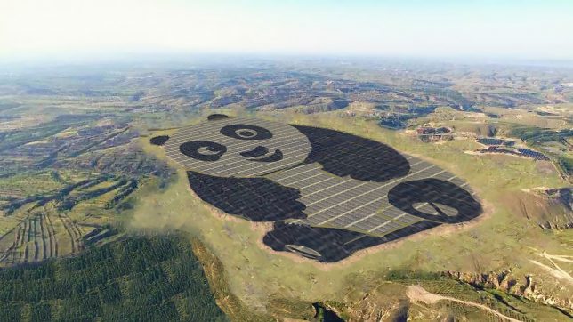
The world’s largest solar power-producing nation is showing off its record-setting green energy production through an adorable new array shaped like a giant panda bear, the national animal of China.

This Panda Power Plant in Datong, China, is the brainchild of Panda Green Energy in partnership with the United Nations Development Program. And this first sections of this huge creature-shaped station mosaic have just been hooked up to the grid.

The plant also going to grow — currently at 50 megawatts, the installation will have a capacity of 100 MW upon completion. Over the next 25 years, the array is estimated to provide as much power as a million tons of coal and to reduce CO2 emissions by over 2.5 million tons.

The whole panda figure is part of the power production process: darker parts of the animal shape (like legs and arms) are made up of monocrystalline silicone solar cells — gray areas (face and torso) are thin-film solar cells.

An educational center alongside the Panda Power Plant aims to teach children about the advantages of solar power and other forms of sustainable energy. Meanwhile, more panda plants are in planning phases as well across China, and some may also end up outside the country.

Share on Facebook


[ By WebUrbanist in Drawing & Digital & Gadgets & Geekery & Technology. ]

[ WebUrbanist | Archives | Galleries | Privacy | TOS ]


WebUrbanist

 
Comments Off on Panda Power Plant: Shaped Solar Panel Array Forms China’s National Animal

Posted in Creativity


Enlaps Tikee time-lapse camera packs two lenses and a solar panel

08 Jan

Tikee by French company Enlaps aims to simplify time-lapse photography by combining a 4.5W solar panel, wireless connectivity and a pair of lenses into a single capture device. The device itself is described as completely self-sufficient, weatherproof and accessible via a Web application.

The idea behind Enlaps is that long duration time-lapse photography can be difficult depending on location due to potential power source and weather issues. Tikee and its more sophisticated counterpart, Tikee Pro, solve this by providing everything necessary for time-lapse photography in a single wireless and weatherproof product.

The small solar panel powers Tikee, assuming it is placed somewhere with sufficient sunlight, while a pair of lenses capture 220-degree panoramic images. A related Web application is available from a computer or mobile device; it automatically stitches the images into a time-lapse, and includes features for ‘advanced users’ like Pan & Zoom and Time Period. Content is stored on a microSD card.

The Enlaps Tikee features Bluetooth LE and Wi-Fi, and saves content in JPEG format, while the Tikee Pro includes those features as well as GPS, GSM support, and both JPEG and Raw file format options. Both products were launched on Indiegogo, where the campaign has successfully resolved with €238,687 in funding. The company is demonstrating the devices at CES 2017.

According to TechCrunch, the Tikee will be priced at $ 750 and the Tikee Pro at $ 900 and will be available in April.

Via: TechCrunch

Articles: Digital Photography Review (dpreview.com)

 
Comments Off on Enlaps Tikee time-lapse camera packs two lenses and a solar panel

Posted in Uncategorized


Attach a 1000 Watt LED panel to a drone and magic happens

20 Oct

Drone photography has become hugely popular in the past few years and people are finding new, creative ways to utilize drones. Photographer Daniel Riley attached a 1000 Watt LED light panel to his Freefly Alta-8 Drone and filmed the entire process. The results have us impressed – take a look for yourself.

Articles: Digital Photography Review (dpreview.com)

 
Comments Off on Attach a 1000 Watt LED panel to a drone and magic happens

Posted in Uncategorized


Tips for Understanding the Lightroom Adjustments Panel

28 Sep

Lightroom can be an intimidating program. Even longtime users sometimes find themselves confused at all the options or unsure of exactly what to do to achieve a specific type of look for their pictures. Fortunately much of this can be mitigated by learning new things slowly and carefully, and taking the time to master just one new tool, option, or set of sliders at a time. The first thing I usually recommend to beginners is the Basic panel because, as its name implies, those sliders can go a long way towards improving your pictures. However another set of sliders in the Develop module, called the Adjustments panel, can take your images to a whole new level if you learn to use it properly.

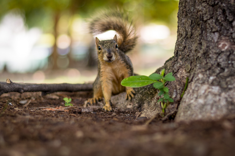
lightroom-adjustments-panel-squirrel

What is the Adjustments panel?

While the Basic panel allows you to adjust global settings on an image related to things like white balance, overall tint, and highlights/shadows, the Adjustments panel lets you get much more specific with selective color editing. To access this panel click on the Develop module and then look on the right-hand side of your screen. If you do not see it (it’s the third one down), right-click (ctrl-click on a Mac) on any of the Develop panels and make sure the Adjustments option in the pop-up menu is checked.

lightroom-adjustments-panel

Right away you might be a little confused because the options have odd-sounding acronyms with no explanation. But once you understand how they are related it should get a little easier. For starters, here’s a brief explanation of the three main categories of HSL / Color / B&W.

  • HSL: Allows you to control the Hue, Saturation, and Luminance of all the main colors that make up a picture (Red, Orange, Yellow, Green, Aqua, Blue, Purple, and Magenta)
  • Color: This is essentially the same thing as the HSL panel, as you will see shortly, but the options are organized in order to help you focus on specific colors, and then specific types of adjustments within those colors.
  • B&W: This panel is often the most misunderstood, but one of the most powerful tools available in Lightroom when it comes to converting your images to black and white.

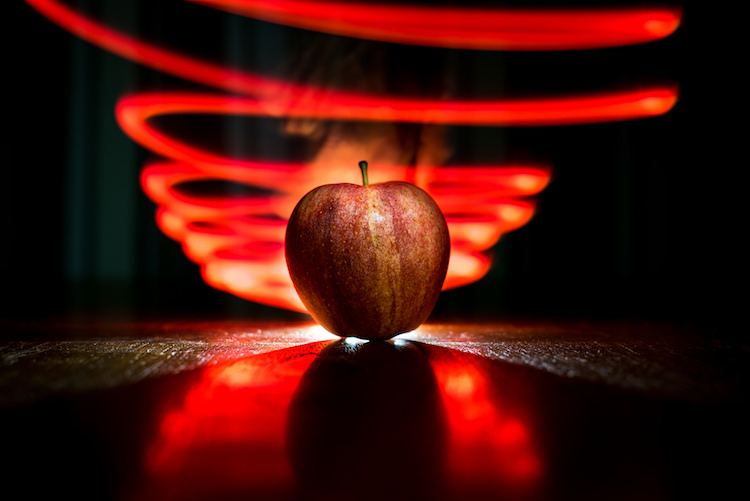
lightroom-adjustments-panel-apple

The HSL tab

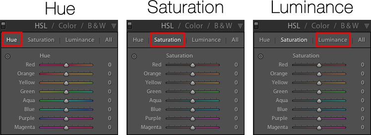
This abbreviation stands for Hue, Saturation, and Luminance and allows you to control these parameters all at once for the various colors in your image. When you click the HSL option in the Adjustments panel you can then choose each of these three options to control, or you can click the “All” option and have access to all of the parameters at a glance.

lightroom-adjustments-panel-hsl

Hue sliders

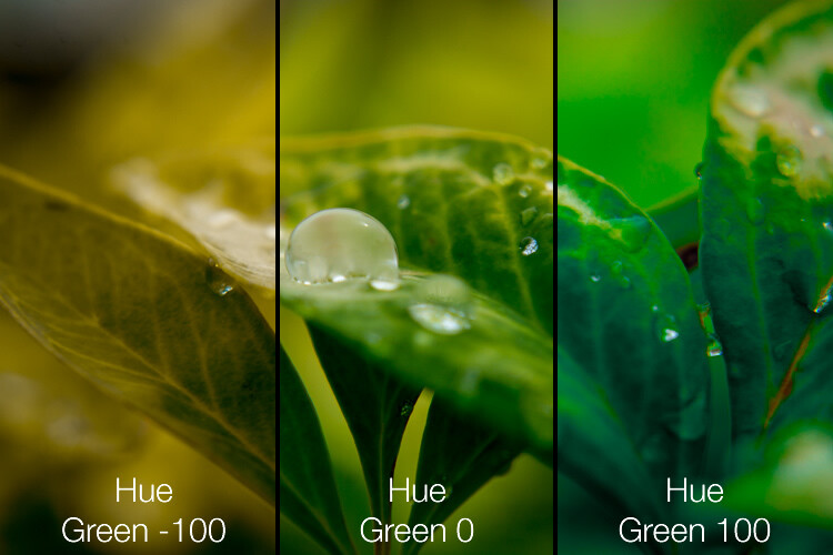
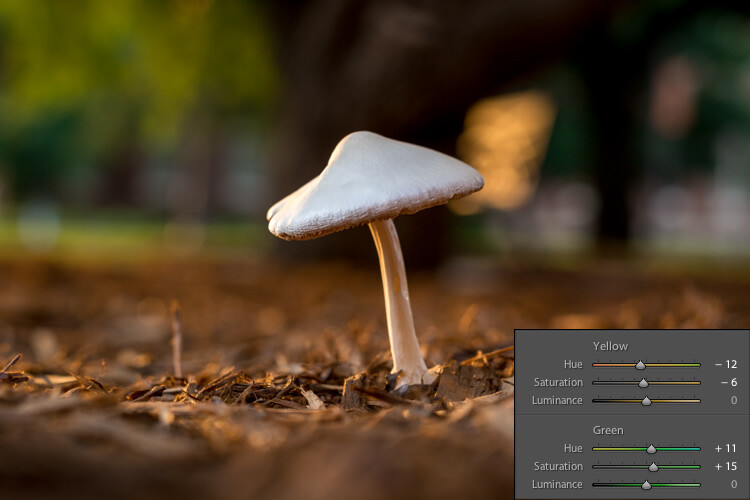
Click the Hue option and you will be able to change the look of specific colors such as Red, Green, Yellow, etc. for the entire image. For example, you could make your greens have more of a yellow tint to them, or make them look almost fluorescent just by changing the Green slider. You can give your skies a deep, rich blue or tone it down to make them look a bit pale. Your purples can be anywhere from reddish to deep violet, all with the click of a mouse button.

Simply adjusting the green hue can give your nature photos an entirely different look and feel.

Simply adjusting the green hue can give your nature photos an entirely different look and feel.

Adjusting the hue, as is the case with many editing decisions, can be most effective when used subtly and in combination with other options such as the tone curve or white balance. Too much editing can come across as obvious and give your images a look that seems overly processed, especially when it comes to portraits. Still, it’s a powerful and valuable adjustment that can greatly affect your pictures.

If you are not sure exactly which color option to select from the ones that are available to you, you can click the target button in the top-left corner of the Hue panel (circled in red below) then click and drag on a specific point in your image. This will adjust the hue that matches the target area, and all similar colors for your entire photo.

lightroom-adjustments-panel-hue-click-drag

One tip I like to use when adjusting the values is to click on the 0 and enter numerical values using my keyboard. I’ll start with something small like 5 and then press the up and down arrows on my keyboard to raise the value in increments of 1. Or you can hold down the shift key while tapping the arrows to raise and lower values in increments of 10. It’s a good way of making more precise adjustments rather than moving the slider with your mouse.

Saturation and Luminance

The Saturation and Luminance tabs function in much the same way. You use sliders or enter numerical values in order to adjust how much of each color is present (Saturation) or the brightness of each color (Luminance). Finally, clicking “All” will let you edit all three parameters at once. I find that a bit overwhelming but others can think is quite useful. See what works best for you.

Subtly editing the HSL values on this picture helped me bring out more vibrant colors and produce the final image I was really going for.

Subtly editing the HSL values on this picture helped me bring out more vibrant colors and produce the final image I was really going for.

The Color tab

At first when you click on the Color tab of the Adjustments panel you might be hit with a feeling of déjà vu. The options look remarkably similar to what you might have already seen in the HSL tab, in that you can once again change the Hue, Saturation, and Luminance. The difference here has to do with how things are organized, and it’s why I find myself working more often in the Color tab than the HSL tab.

Here all three adjustments are available to you at the same time for each individual color, which makes it very easy to work with your image on a per-color basis as opposed to a per-adjustment basis. If I’m shooting portraits and want to tweak the color of my subject’s purple shirt I will probably want to adjust all three parameters at once, but just for the color purple. This tab gives me the option to do exactly that, and once again you can click on the All option to see all the colors, along with all their corresponding adjustment options, at the same time.

Working in the Color tab of the Adjustments panel let me tweak various parameters of the greens and yellows to get the final image I was going for.

Working in the Color tab of the Adjustments panel let me tweak various parameters of the greens and yellows to get the final image I was going for.

The B&W tab

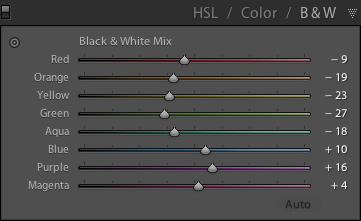
lightroom-adjustments-panel-bwThis part of the Adjustments panel is often the most confusing because as soon as you click on it, your image turns grey, and yet you still have all the same color sliders as on the other tabs. What’s going on here?
The answer lies in how Lightroom essentially tries to mimic the effect of black and white filters on color pictures. What you are doing with this panel is turning your image into a grayscale version of its colorized counterpart, then adjusting the tone of each of the individual colors as the image is processed. Incidentally, if you open this panel and then click on one of the Black and White filter presets in Lightroom (in the presets panel on the left side of LR) you will see the sliders move around because they are really just specific values for the sliders you see here.

An example B&W conversion to see how the sliders work

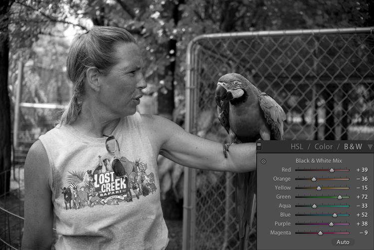
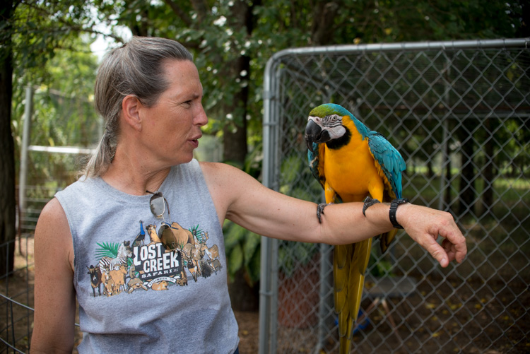
To demonstrate how these Adjustment options work, here’s an image of a woman who owns a wildlife refuge in Oklahoma holding a macaw.

lightroom-adjustments-panel-macaw-color

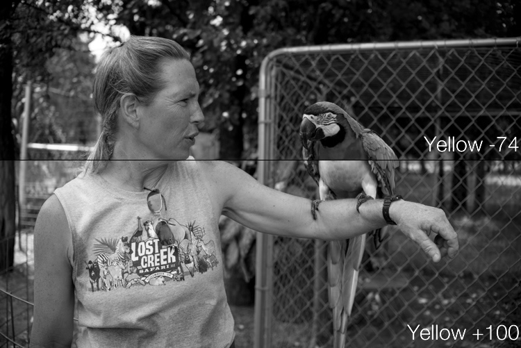
There are several distinct colors in this image such as yellow, aqua, and green, which makes it an ideal candidate for understanding how the B&W adjustments work. In this first example I have clicked the B&W filter and left all sliders at their default values, but changed the yellow option for two different results.

lightroom-adjustments-panel-macaw-bw-yellow

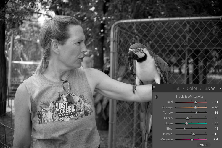
Most of the image remains unaffected except for the bird’s bright yellow chest, which is starkly different depending on the values I have selected for the Yellow slider. Increasing the numerical value of yellow has made the corresponding areas much lighter, and decreasing it has made them appear significantly darker. Once again you will likely find that in this B&W panel the best edits are the most subtle, and you can use the sliders to creatively adjust the look and feel of a monochromatic image. To further illustrate the effects of these sliders, compare the following images. The first one has higher values of colors that correspond to the skin tones of the woman and the chest plumage of the bird, and darker greens for the foliage in the background.

lightroom-adjustments-panel-macaw-bw-all-1

Be careful not to go too far

In the next example, the colors of the bird’s chest have been significantly darkened while the background is much lighter, and the woman’s skin tone has been toned down quite a bit as well. I find the top image much more natural and pleasing, whereas the bottom one significantly alters the appearance of the bird and makes the woman look almost as though her face has been burned, particularly if you look where her jawline meets her neck.

lightroom-adjustments-panel-macaw-bw-all-2

As you play around and experiment with the B&W sliders you will start to get a feel for how you might prefer various adjustments in your images. If you are the type of person who likes to try black and white photography this panel is significantly more useful than just clicking on a preset or using built-in filters in a program like Instagram.

Conclusions

I hope this article has helped you understand a bit more about some of Lightroom’s useful editing options. If you have never used the Adjustments panel before go ahead and try it out! Lightroom is non-destructive which means your edits are not permanent and can be undone at any time, so it never hurts to try something and see what happens.

If you find the Adjustments panel to be useful, or have your own tips to share, please leave your thoughts in the comments below. I’m sure other readers would enjoy hearing them.

googletag.cmd.push(function() {
tablet_slots.push( googletag.defineSlot( “/1005424/_dPSv4_tab-all-article-bottom_(300×250)”, [300, 250], “pb-ad-78623” ).addService( googletag.pubads() ) ); } );

googletag.cmd.push(function() {
mobile_slots.push( googletag.defineSlot( “/1005424/_dPSv4_mob-all-article-bottom_(300×250)”, [300, 250], “pb-ad-78158” ).addService( googletag.pubads() ) ); } );

The post Tips for Understanding the Lightroom Adjustments Panel by Simon Ringsmuth appeared first on Digital Photography School.


Digital Photography School

 
Comments Off on Tips for Understanding the Lightroom Adjustments Panel

Posted in Photography


Leica S firmware update improves top LCD panel info, adds Adobe-compatible image rating

14 Sep

Leica has released new firmware for its S and S-E medium format cameras that improves the quality of information displayed on the top plate and in the viewfinder. Firmware versions 4.0.0.0 for the S (Typ 007) and 2.5.0 for the S-E (Typ 006) also allows users to mark images with a rating that can be displayed in Adobe’s Lightroom and Bridge applications. With the firmware loaded the cameras will also remember the degree of magnification last used in review mode and automatically default to that next time the magnify button is pressed.

The information panels now provide more icons to indicate what modes the camera is using, and critically offer a measure of how much time capacity is left on the memory card when shooting video and how many more shots are left in the buffer for high-drive shooting in stills mode.

The new firmware is available for download now for customers who like to update for themselves, while others can take their camera to their nearest Leica store or service center.

The firmware can be downloaded from the support section of the Leica website.

Press release

Firmware updates for Leica S cameras now available

New firmware updates are available today for the Leica S-System. Registered owners can log in to the Leica Owners’ Area and download the new firmware version 4.0.0.0 for the Leica S (Typ 007) and 2.5.0 for the Leica S/S-E (Typ 006) medium format cameras, or take their camera to a Leica Store or Leica Customer Care in the UK for a complimentary update service.

Leica works in close collaboration with users on the continuous development and optimisation of its products. As a result, a number of improvements in this latest firmware update are based on the direct recommendations and suggestions of professional photographers.

The new features of Firmware Update 4.0.0.0 include a revised layout for the top plate display panel, which now provides even more information for the user. The new ‘Rating Function’ is supported by Adobe Photoshop Lightroom CC, Photoshop CC and Bridge CC software, and improves the workflow of selecting images – giving users much faster access to the images they have tagged.

With this firmware update, the most recently used zoom setting in review mode is now saved, enabling faster assessment of image sharpness/focus when reviewing a specific part of a picture. Distances displayed on the top panel can also be shown in feet, and it is now possible to see the remaining recording time when shooting video. Also new in this update is the ‘PC’ symbol, which indicates when the camera is connected to a computer. In addition to the above, the first resistance point of the shutter release now displays the number of exposures remaining for sequential shooting (maximum buffer memory) in the viewfinder, and the new ‘mirror-up’ icon appears on the camera monitor screen.

Articles: Digital Photography Review (dpreview.com)

 
Comments Off on Leica S firmware update improves top LCD panel info, adds Adobe-compatible image rating

Posted in Uncategorized