RSS
 

Posts Tagged ‘painting’

Tips for Doing Digital Painting with the Mixer Brush in Photoshop

26 Jan

If you have ever felt the need to be a bit more creative with your photos, then Photoshop contains a multitude of ways to make that happen. In fact, it offers such a variety of options it can be a bit overwhelming to figure out which one might be the right one for you in a given situation. In this article, I will go over a method of digital painting using Photoshop to give you one technique you can add to your toolbox.

Mostly you can get some great effects without having to purchase any other software or features, but those options are available and can extend your portfolio of choices.

Perhaps you might want to create a birthday card or give someone an extra special present. This digital painting technique is ideal for use on an image which is not 100% in focus. Everything else might be perfect but if it’s a tiny bit blurry, apply a painting technique and no one will notice.

Tips for Doing Digital Painting Techniques with Photoshop

NOTE: Please be advised I am using CS6 so things may be in different places if you are using the CC subscription model.

Mixer Brush

The Mixer Brush is a very effective way of getting a painted look for your image because you actually paint over your image in Photoshop. It can be quite fiddly and time-consuming but the end result can look really good. My recommendation would be to do this with a graphics tablet and a pen, otherwise, you will get a cramp in your hand from the mouse. Plus you have more control in areas of fine detail with a tablet.

Any image can be used, but because the mixer brush picks up colors from your image and adds paint texture, you need to keep that in mind. All the brush strokes will be visible so the direction in which you paint may affect the final visual outcome. It took me 2-3 goes before I finally got the hang of this, so stick with it.

STEPS

Step #1. Open your image, add a new layer and select that one as your active layer. You can delete this later if you need to without affecting the original image.

Step #2. The Mixer Brush is found on the toolbar, left mouse click on the Brush icon, it should be in the drop-down box.

Mixer Brush open, showing settings on Adjustment Tool Bar

Step #3. On the top toolbar, you can make adjustments to the settings. Set them up as follows (as a starting point):

  • The drop-down box set to Custom.
  • Wet: 100%.
  • Load: 1% (this sets the paint color load on the brush to a minimal setting).
  • Mix: 100% (this uses the color from the original file – Load and Mix work opposite each other that way).
  • Flow: 50% (medium pressure on the brush).
  • Airbrush set to OFF.
  • Sample All Layers must be ticked – this is important as it allows us to pick up the color from the original image.

NOTE – all these settings are adjustable depending on what works for you, so feel free to experiment.

Choose your brush, make sure you are working on the new layer, and begin to paint.

Tips

  • Start with the dark areas of the image first.
  • Use the textures in the image to help direct the flow of the brush strokes.
  • The paint is very wet and colors will mix and blend readily which can be used to your advantage where colors change in the image. It can be a bit tricky to get the hang of at first.
  • Adjust your Flow value to get harder or softer strokes.
  • You may want to use a layer mask to show fine details like eyes or whiskers after painting to bring back a bit of sharpness in those areas.
  • Adjust the brush size to suit the areas you are working in, fine detail needs a smaller brush, and larger areas may support bigger brush strokes (a bigger brush covers more area quicker which is an added bonus).
  • If the background is not ideal, you can also replace it with a painterly texture instead. This is a great treatment for when you have a really good shot but not the cleanest background. So do a background replacement, add the painting and it becomes artistic instead.

Image results using the Mixer Brush

Tips for Doing Digital Painting Techniques with Photoshop

Photo of a Jabiru bird, with digital painting done over the feathers.

This image of a Jabiru I quickly painted for this article. The lovely colors in the feathers, plus all the different directions they lay in made it a good choice for digital painting.

Tips for Doing Digital Painting Techniques with Photoshop - Jabiru bird

Original Jabiru image

This is the original photo for comparison. You can see how the feathers around the eyes are much smaller and finer and you can see the different directions in which the feathers lie. In the painted image where the rainbow colors are on the top of the head, it’s visible how they have blended in softly, even picking up the hints of gold in the purple feathers at the top.

Tips for Doing Digital Painting Techniques with Photoshop

When you view the digitally painted layer by itself, you can see all the brush strokes, plus the areas that might have been missed. This is a useful step to check and make sure you have enough coverage. Additionally, this layer can have its opacity adjusted down if you wanted to bring back some of the original feather detail.

I tend to adjust the flow down to around 30% and fill in the gaps. It can also help to soften the transitions in direction as well. Also useful for extra blending across areas where colors change.

My first experiment with using the Mixer Brush was this portrait of my cat Cognac. You will notice I have left the whiskers, eyelashes and fine hairs around his ears unpainted as I felt it looked better that way. I was careful to follow the flow of the fur so it looked natural and picked up the subtle color differences.

This was probably my third go at this technique – so be patient with yourself if you aren’t happy with the first one you try. Keep at it.

Summary

This technique isn’t complicated, is fully contained within Photoshop and requires only one extra layer. A graphics tablet will make it much more comfortable to do as it is a lot easier to use than a mouse. The thing you need most is time and a careful steady hand. With those things you can elevate your photo to a new creative level, perhaps print it out on canvas as a gift.

Have you tried this method of digital painting before? Please share your results in the comments below.

The post Tips for Doing Digital Painting with the Mixer Brush in Photoshop by Stacey Hill appeared first on Digital Photography School.


Digital Photography School

 
Comments Off on Tips for Doing Digital Painting with the Mixer Brush in Photoshop

Posted in Photography


Weekly Photography Challenge – Light Painting

14 Oct

Earlier I rounded up a couple videos on how to do two very different styles of light painting. You can see them here. Below are two images of my own where you can see the two different techniques and the results.

In this image, I have light painted the building with a regular flashlight.

This shot is a combination of 3 people doing the light painting to make this happen. One on the building with a flashlight, another on the train tracks with an orange colored wand, and me on the wagon making the funky shape.

Note: the image above was done using some special tools. Read this for more info: Review: Light Painting Brushes – Tools for Creativity.

Weekly Photography Challenge – Light Painting

Before you give up before you even start, assuming this is too hard for you – wait!

Light painting does not have to be hard at all, and I’ll give you some articles to check out that can help you. But you can keep it simple and try a sparkler like this:

Or a cell phone which was used to light up the car in this shot.

If you need more help try these articles:

  • How to do Light Painting with a Piece of Fruit and a Cell Phone
  • Beginner’s Guide to Light Painting
  • Light Painting Part One – the Photography
  • Light Painting Part Two – Photoshop
  • How to Make Unique Portraits Using Light Painting
  • How to do Light Painting Photography Art with Endless Possibilities
  • How to Create Beautiful Light Painting Images With an Illuminated Hoop
  • Fire Spinning with Steel Wool – A Special Effects Tutorial

Share your images below:

Light painted train caboose.

This was created using gloves that glow different colors. My husband did the light painting, it’s the name of his favorite beer in Nicaragua.

The ultimate light painting is fire spinning.

Simply upload your shot into the comment field (look for the little camera icon in the Disqus comments section) and they’ll get embedded for us all to see or if you’d prefer, upload them to your favorite photo-sharing site and leave the link to them. Show me your best images in this week’s challenge. Sometimes it takes a while for an image to appear so be patient and try not to post the same image twice.

Share in the dPS Facebook Group

You can also share your images on the dPS Facebook group as the challenge is posted there each week as well.

The post Weekly Photography Challenge – Light Painting by Darlene Hildebrandt appeared first on Digital Photography School.


Digital Photography School

 
Comments Off on Weekly Photography Challenge – Light Painting

Posted in Photography


Video Tips – Two Light Painting Techniques for you to Try

13 Oct

I personally love night photography and one of my favorite things to do at night is light painting. There are a few ways to do it depending on the look you want. Here are two completely different techniques for you to try out.

Make a Light Spiral

In this first video photographer Jason Rinehart shows us how to create a light painted spiral. So there is no subject you are adding light to, the light itself ends up being the subject. See how he does it here:

Light Paint an Old Barn

In this second video, you see a different approach where a flashlight is used to light paint the subject, in this case, an old barn in Ireland. There is a right and a wrong way to do this, and they give good examples of both.

Have you tried light painting before? Which of the two methods do you like better, or do you enjoy doing both styles? Tell us in the comments below.

The post Video Tips – Two Light Painting Techniques for you to Try by Darlene Hildebrandt appeared first on Digital Photography School.


Digital Photography School

 
Comments Off on Video Tips – Two Light Painting Techniques for you to Try

Posted in Photography


Cooling Cities: L.A. is Painting Streets White to Combat Heat Island Effects

15 Sep

[ By WebUrbanist in Architecture & Cities & Urbanism. ]

Thanks in part to heat-absorbing materials and colors, cities tend to be warmer than their natural surroundings, and in hot places with lots of dark roads like Los Angeles that can prove a serious public health hazard.The mayor has pledged to reduce temperatures in the city by 3 degrees over the next 20 years, in part by dealing with urban heat island effects in new and different ways.

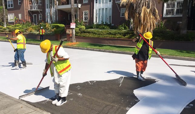
As part of this promise to help make bring down temperatures for its millions of residents, LA is trying something that could dramatically change its urban landscape: repainting roads in white. The aim is to reflect rather than absorb heat and so far the results are extremely promising.

“We found that on average the area covered in CoolSeal is 10 degrees cooler than black asphalt on the same parking lot,” said Greg Spotts, the assistant director of the Bureau of Street Services for San Fernando Valley, an area with particularly severe heat problems.

It’s not just about open public spaces either: reducing exterior temperatures has impacts on adjacent interiors. Heat reductions outside and mean cooler spaces inside area homes and businesses. In turn, this can help residents and owners save on cooling costs. It also isn’t just a daytime problem: heat captured during the day is released into the night air, keeping things hotter around the clock.

The process doesn’t come cheap, however: each coat lasts for around seven years but prices out around $ 40,000 per linear mile. If it works, though, the cost could be offset in part by savings on other fronts, in addition to making for a more healthy metropolis all around. Meanwhile, other strategies are also in play — the city is looking to make roofs brighter, for instance, and bring more green into the mix. (via Inhabitat and L.A. Times, images by Greg Spotts and Giuseppe Milo).

Share on Facebook


[ By WebUrbanist in Architecture & Cities & Urbanism. ]

[ WebUrbanist | Archives | Galleries | Privacy | TOS ]


WebUrbanist

 
Comments Off on Cooling Cities: L.A. is Painting Streets White to Combat Heat Island Effects

Posted in Creativity


Painting with Light on a Canvas of Night: Alien Blooms by Hannu Huhtamo

17 Jan

[ By SA Rogers in Art & Photography & Video. ]

light-painting-1

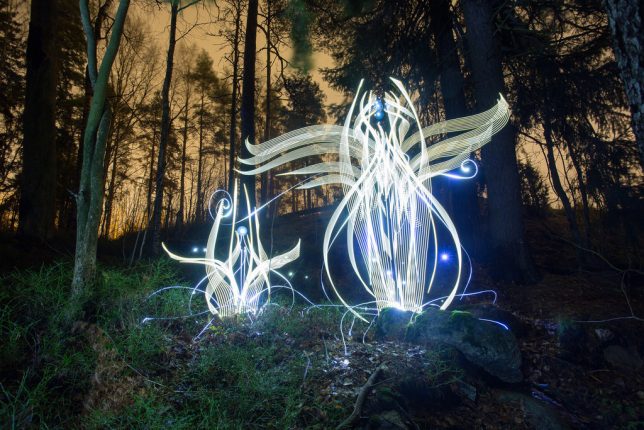
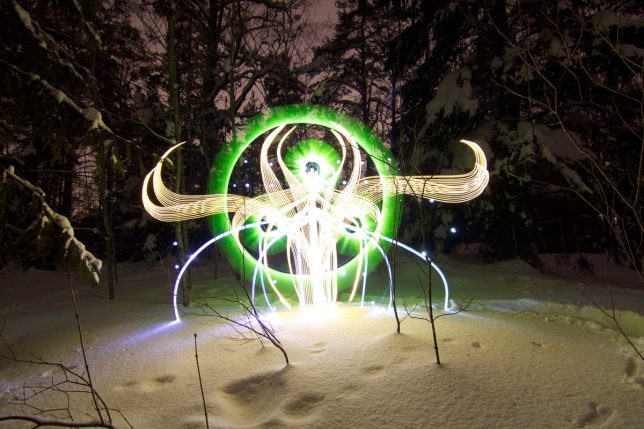
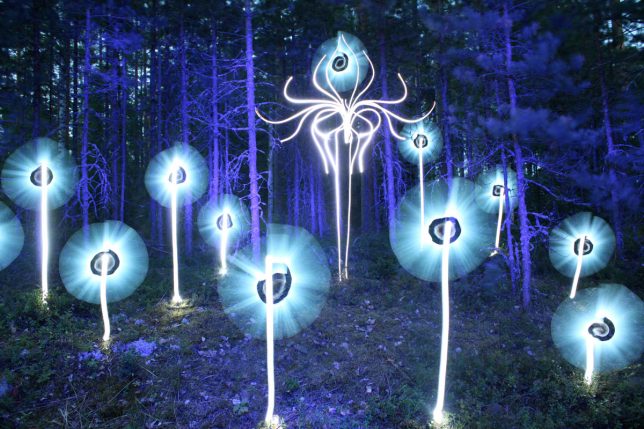
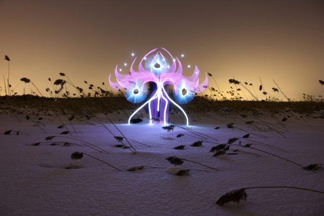
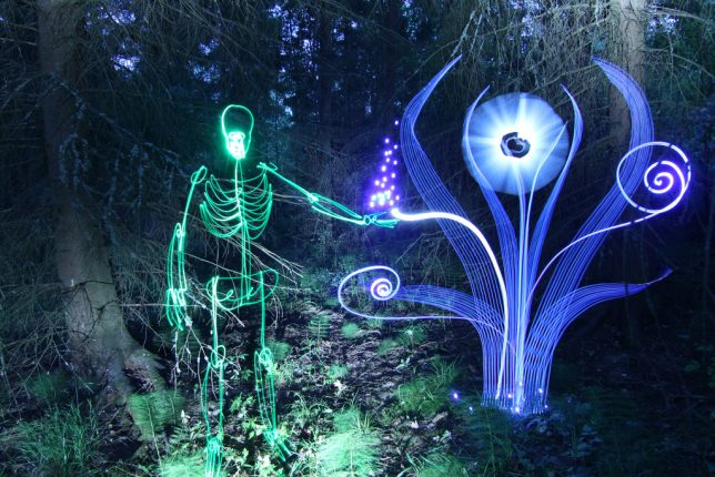
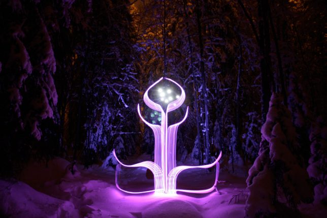
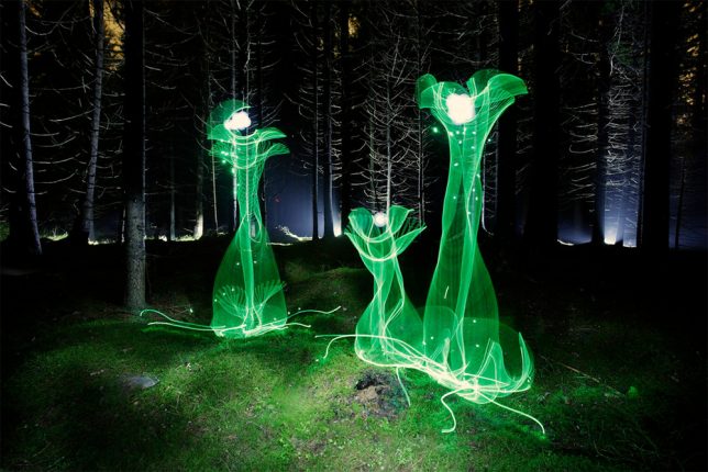
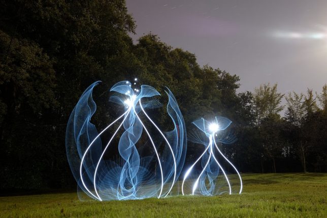
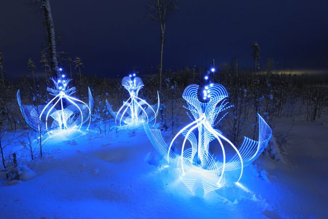
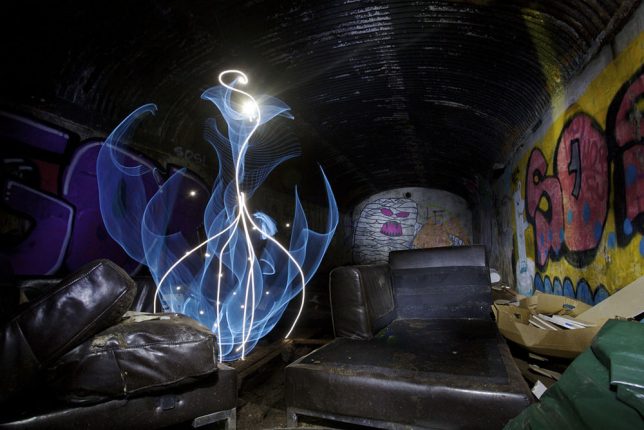
The strange glowing figures in these images are so complex, you might think they’re screenshots from a digital animation, or created in Photoshop – but there’s no computer-based trickery here. Just the same long exposure techniques light artists have been using for decades to create and capture ethereal compositions, albeit applied in an unusually creative manner.

light-painting-2

light-painting-3

light-painting-4

Hannu Huhtamo’s bizarre shapes glow against twilight landscapes and abandoned interiors, often looking somewhere between a plant and an alien insect. They sprout up in snowy fields, appear from inside giant teacups at theme parks or take shape in darkened living rooms.

light-painting-5

light-painting-6

light-painting-7

A musician by training and hobbyist photographer, the Finnish artist first experimented with lighting techniques when taking promotional photos for a death metal band and deciding he wanted a long-exposure pentagram made with the flame of a lighter. Years later, when he met light artist Janne Parviainen and got a look at his work, Huhtamo decided to revisit the technique from a new angle.

light-painting-8

light-painting-9

light-painting-10

All of his work is created ‘SOOC’ or straight out of the camera, and he uses no special light equipment other than El-Wire (electroluminescent wire) and modified LED flash lights. “Darkness is my canvas and the light is my brush,” he says in this behind-the-scenes video produced by Great Big Story.

Share on Facebook


[ By SA Rogers in Art & Photography & Video. ]

[ WebUrbanist | Archives | Galleries | Privacy | TOS ]


WebUrbanist

 
Comments Off on Painting with Light on a Canvas of Night: Alien Blooms by Hannu Huhtamo

Posted in Creativity


How to Use Light Painting to Take Incredible Car Photos

28 Nov

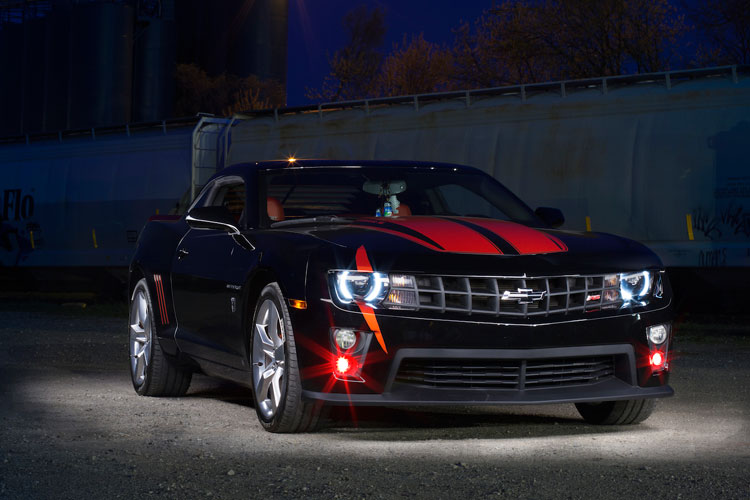
Whether you drive a beat up station wagon from the 80s or a finely tuned Porsche, light painting is an excellent way to photograph your car and truly make it shine! Light painting results in incredibly unique and impressive images. With a bit of persistence and creativity, you can create pictures that look like commercial photoshoots – even without heavy editing.

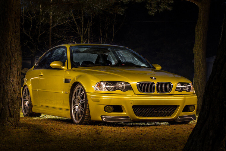
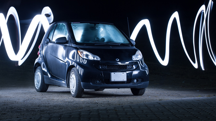
A photo of a car taken using the light painting style

The reason that a light painted picture looks so incredible is because the light is literally wrapping around the subject. Normally, we see objects lit from only one angle, often the sun, which can get a bit dull at times. In addition, there will be cool reflections on the body of the car that trace the path of your light, giving the shot a highly commercial look.

Getting started

What’s the first step? Clean the car! Light makes every speck of dirt and grime become immediately visible. Unless you are going for a grungy style, you’ll want to make sure the car is squeaky clean.

Since light painting involves leaving the shutter of the camera open for some time, you will need to wait until it is dark outside. If you try light painting during the day, you will get a completely white image as the sensor collects all the sunlight.

Alternatively, if you have room in your garage, you could park your car in there and cover all windows so that there is no ambient light.

Your light source

One of the cool things about light painting is that you don’t need to invest thousands or even hundreds of dollars in equipment to get started. Literally, any light source can be used, whether it is a professional video light or simply a flashlight app on your mobile phone.

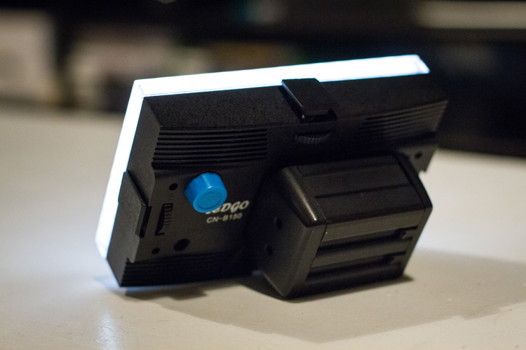
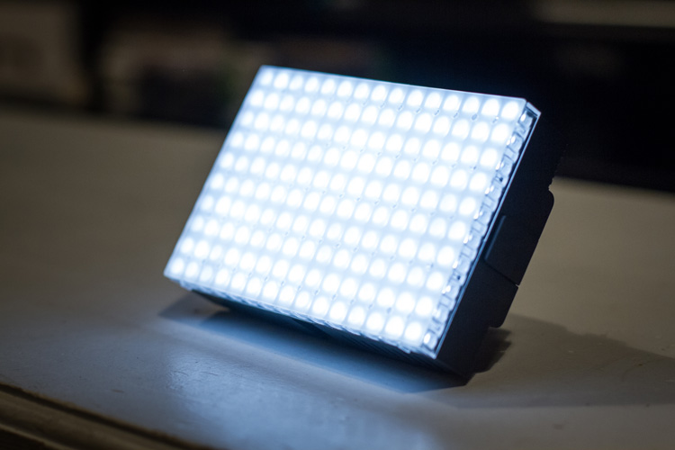
For my example picture, I will be using an LEDGo Portable Video Light, which is a small but powerful light that I can hold in my hand.

video-light-for-light-painting-1

video-light-for-light-painting-2

One drawback of this type of light source is that it throws light everywhere, including back at the camera. If possible, you will want to find some way to shield the light so that it is directed only at your subject. Professional light painting lights, like the Westcott Ice Light, have flaps that prevent the light from spilling everywhere.

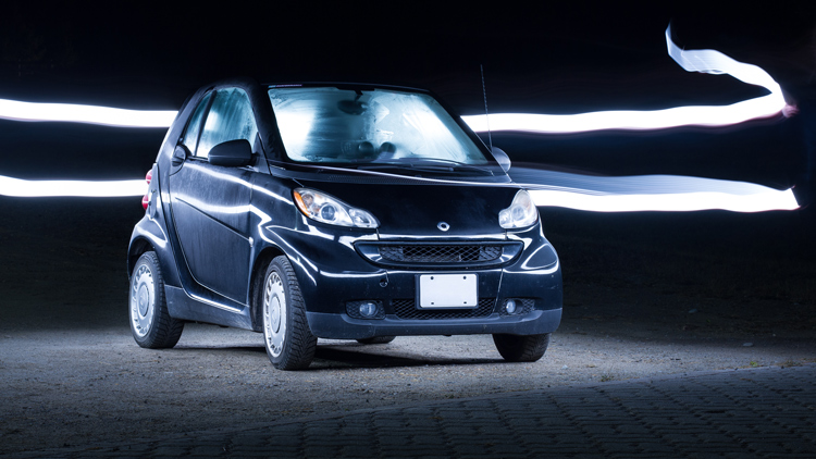
A light painted car where the light source is visible

In this example, the light source was seen by the camera, which created a unique halo effect around the car.

A light painted car with the light source not visible in the final image

In this image, the light was shielded from the camera and pointed only at the car, so that the light path isn’t visible.

Setting up the shot

Perhaps the most important piece of equipment you will need for light painting is a sturdy tripod. This is because you will be taking a picture that lasts for many seconds. A tripod that shifts over the course of the picture, or that is blown around by wind, will result in some serious frustration and blurry images.

You don’t need a special or expensive lens for light painting – any lens will do! When you are setting up your tripod, remember how zoom influences a picture. Shooting from close with a wide angle lens will make the car look fatter. Shooting from a distance with a bit of zoom will lessen the distortion.

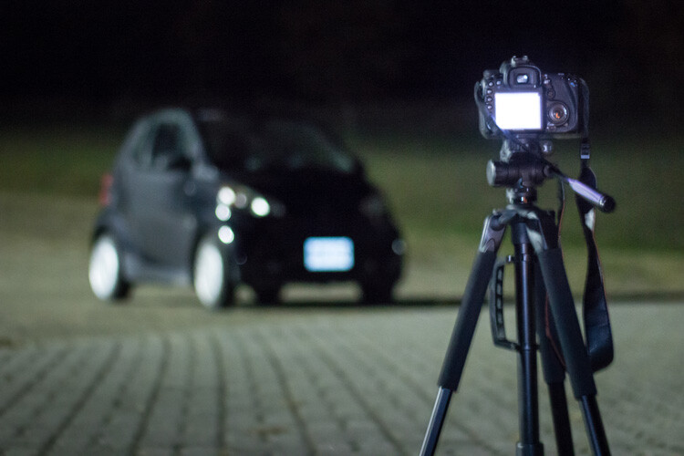
Behind the scenes of light painting car photography

Behind the scenes of the setup. There is some light filtering in from the left from a streetlight, but I can use my camera settings to reduce the effect of that ambient light.

Exposure settings

The first goal will be to get a base exposure. This requires that you go full manual on the settings. If you leave the camera on auto, it will try to compensate for the low light and may pop up the flash.

To make an image with a black background like the one in my example, you will want your base exposure to be very dark. If you want more of the surroundings to be visible, you can make your base exposure lighter. Be aware, however, that will mean that you are more likely to show up in the final image as you walk around the car with your light.

  1. First, select a low ISO so the sensor doesn’t collect much light from the surrounding area. As an added benefit, using a low ISO will also result in a very high-quality image.
  2. Next, you will want to choose a fairly narrow aperture. This will keep a large portion of the image in focus. It will also help to make the image darker, as needed.
  3. Last, choose a shutter speed that gives you a bit of time to paint the car. For my purpose, I chose 25 seconds.

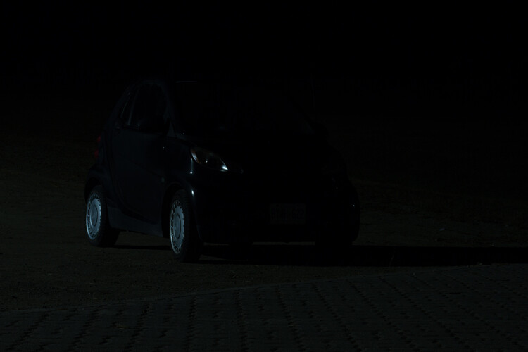
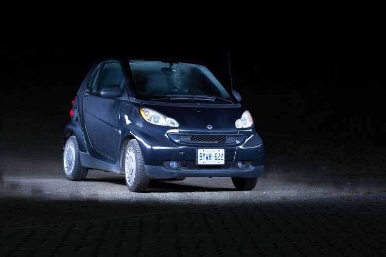
As you can see below, this base image is nearly completely dark. This is perfect. Now the final image will only be what I paint with my light.

The base exposure for a light painting car image

The base exposure for my image was ISO 100, f/9, 25 seconds.

Let there be light (painting)

Now we’re ready to start painting!

You can either have a friend press the shutter button, or you can put the camera on a short timer so that you can start light painting immediately after the shutter releases.

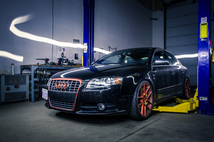
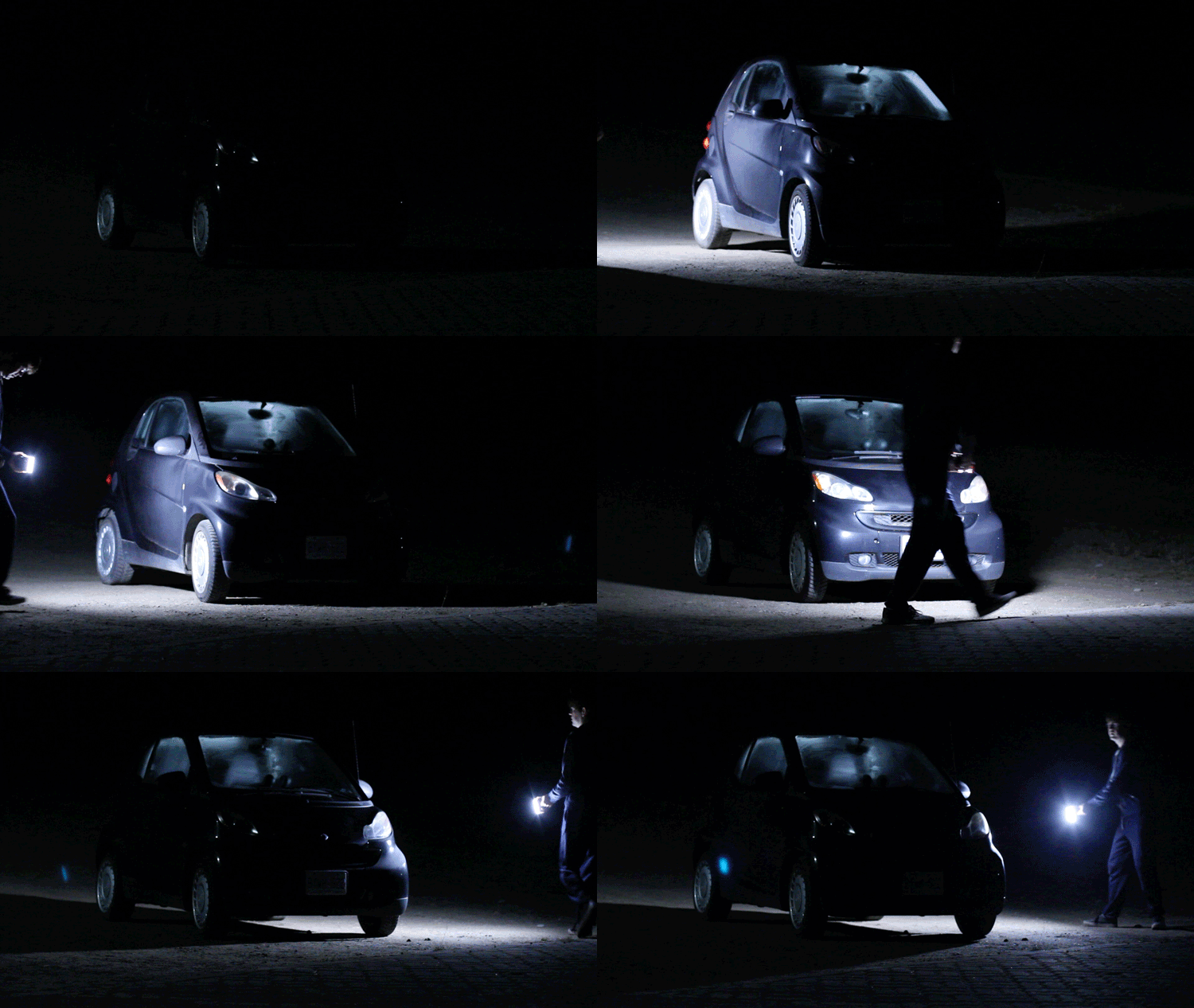
There will inevitably be a bit of trial and error as you try to find the right angles at which to paint the car. Pay close attention to how the light is reflecting in the body of the car and try to find ways to make it look flattering. Typically this involves moving the light at a uniform level so that there is a clean and crisp line of light reflected on the car.

light-painting-example

Chances are you’ll have to throw away a lot of images because parts of the car weren’t lit well enough, or the reflections looked messy. Don’t let this discourage you. The more you practice, the more you will get a feel for how to move the light.

Don’t forget to play a little bit. Waving your light around in circles, for example, can make some cool light trails and some memorable images.

A light painted car with light trails

A light painted car with light trails

How come you don’t show up in the final image?

A camera can only see objects that have light shining on them. When you aim the light source away from yourself and keep moving the entire time the picture is being taken, you simply won’t be in one place long enough for the camera to record your image.

If you do see yourself faintly in the final image, this can be due to one of three things:

  • You might have been caught in the light reflecting off of the car (or accidentally lit yourself up).
  • There might be too much ambient light. Try adjusting the settings to make your base exposure a bit darker.
  • You stood still in one place for too long, keep moving.

Typically, these ghostly appearances can be fixed easily enough with Photoshop later on, though you may want to adjust some settings to save yourself some time in the editing room.

Controlling the power of your light

If you find that your light isn’t having so much of an effect on the final image, there are two ways to control this.

To effectively make your light more powerful, you can choose a wider aperture (lower f-stop number) or raise the ISO. Either of these options will make the camera more sensitive to all light, including the light in your hand. Be aware that these changes will also affect your base exposure for the ambient light conditions. So you may also need to change the length of the shutter speed in order to keep the image properly dark.

If all else fails, your last option might be to simply to purchase a more powerful light. Yes, it is possible to do light painting with a small flashlight, but if you are serious about light painting, it might be a good idea to upgrade to something with a bit more power and control.

Making some final edits

Often, light painted pictures look pretty awesome right out of the camera. By pulling the picture into an editing program like Lightroom, you can make some simple tweaks to complete the image.

The original, straight from camera image of a light painted car

This is the image straight from the camera. It has a really unique look, even before we do any edits. You can see that my feet were caught in the reflected light and will need to be edited out.

It’s a good idea to shoot your light painting images in RAW. Shooting in RAW as opposed to JPG gives you some extra flexibility when it comes time to edit.

General adjustments

First, you’ll want to find a nice looking white balance. Light painted cars often look very sleek with a steely, cold white balance, but you can experiment to find a nice balance for the car you are working with.

As I mentioned earlier, it’s important to make sure the car is clean before you photograph it. Any minor imperfections or dirty spots that might still be visible can be removed using the spot healing tool in Photoshop or similar editing programs. You may also want to use this tool to reduce or remove bright and distracting glare reflecting off the car. I used this method to remove a harsh reflection in the example picture just above the front wheel.

Selective adjustments

Next, you may want to take some time to selectively lighten or darken parts of the image. In the course of your light painting, it is possible that you might have spilled some light into an area of the picture that you wanted to leave dark. You can control this by using gradients or adjustment brushes to precisely control the amount of light on different areas of the image.

For my picture, I wanted the light to quickly fall off around the car. I was able to emphasize this by using gradients and a vignette to darken the edges of the image.

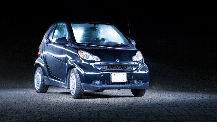
The final edited image of a light painted car

As you can see, the final image isn’t drastically different than what came out of the camera! This final image in a combination of two of the images, borrowing some features from both shots.

Get out there and start light painting

Light painting is a very fun, simple and rewarding style of photography. It doesn’t take any special equipment to get some incredible and truly creative results that will amaze your friends. Give it a try and share your light painted car images in the comments below.

googletag.cmd.push(function() {
tablet_slots.push( googletag.defineSlot( “/1005424/_dPSv4_tab-all-article-bottom_(300×250)”, [300, 250], “pb-ad-78623” ).addService( googletag.pubads() ) ); } );

googletag.cmd.push(function() {
mobile_slots.push( googletag.defineSlot( “/1005424/_dPSv4_mob-all-article-bottom_(300×250)”, [300, 250], “pb-ad-78158” ).addService( googletag.pubads() ) ); } );

The post How to Use Light Painting to Take Incredible Car Photos by Frank Myrland appeared first on Digital Photography School.


Digital Photography School

 
Comments Off on How to Use Light Painting to Take Incredible Car Photos

Posted in Photography


How to do Light Painting by Rotating the Camera

22 Nov

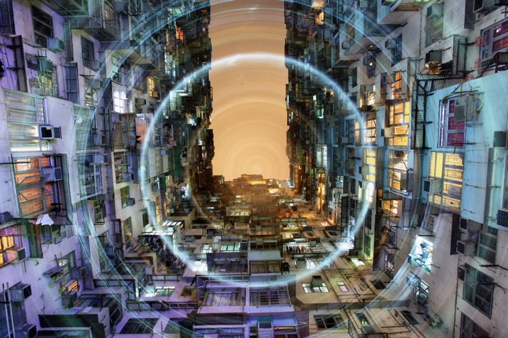
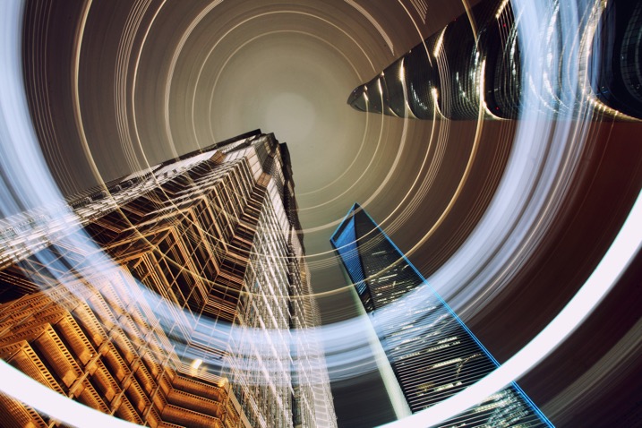
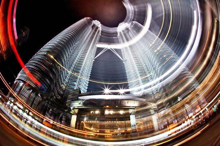
Circular lines are a great way to draw your viewer into the photo. The animation artists knew what they were doing with the Looney Tunes design. A similar effect is possible in photography through a process known as kinetic light painting. This technique involves moving the camera around in front of stationary lights, creating a pattern in your photo. If you use camera rotation you can create circular light lines.

rotation-light-painting11

This photograph in Hong Kong has been taken many times now, the use of rotation during the long exposure gives the photo a different aesthetic.

How to take rotation light painting photos

  1. Scout a location which has lots of light, you are looking for tall buildings or big architectural structures.
  2. Set up the camera on a tripod, looking straight up. You can set the camera at an angle between 45 degrees to straight up. The worm’s eye view works very well for this technique.
  3. Choose a wide-angle lens, or even a fish-eye for this photo. A kit lens will work but use the widest focal length.
  4. Now compose your photograph, and focus the image. Use an angle finder or live view to help you do this.
  5. Make a mental note of the position of your camera on the tripod, if your tripod head shows the number of degrees of rotation jot this number down. The aim is to rotate the tripod head, starting and finishing in the same position.
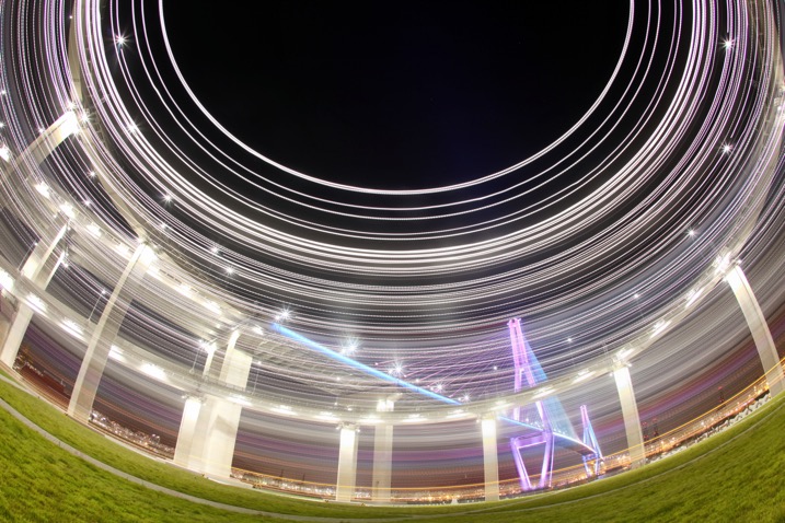
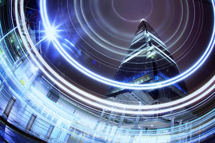
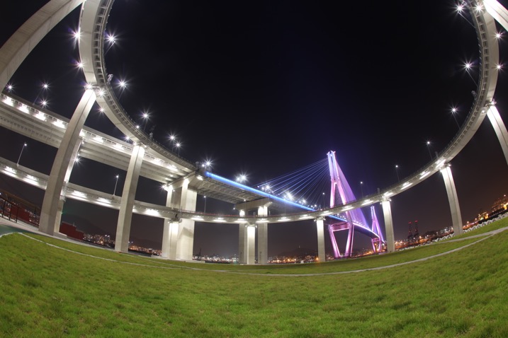
A bridge in Busan is photographed using a fish-eye lens in conjunction with kinetic light painting. A shallower angle was used here, perhaps around 45 degrees.

A bridge in Busan is photographed using a fish-eye lens in conjunction with kinetic light painting. A shallower angle was used here, perhaps around 45 degrees.

A bridge in Busan is photographed using a fish-eye lens in conjunction with kinetic light painting. A shallower angle was used here, perhaps around 45 degrees.

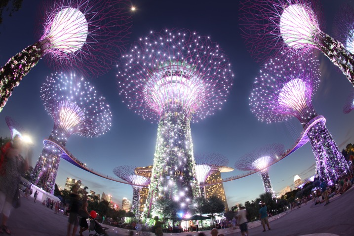
The same scene without the rotation.

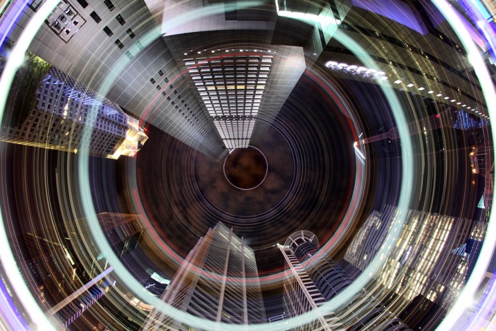
The CBD area of Singapore has many locations where a worms eye view looks good. The light rotation adds an extra element to this photo.

The CBD area of Singapore has many locations where a worm’s eye view looks good. The light rotation adds an extra element to this photo.

  1. Set the camera to expose for 30 seconds, and adjust the aperture and ISO to get the correct exposure value in the photo. The exposure value should be 0 or +1, this is because you’ll lose some of the light exposing the buildings during the light painting.
  2. Use the camera’s self-timer to start the exposure, and set it to 10 seconds.
  3. Start to rotate the camera around the axis of the tripod just before the exposure begins. The rotation has to me smooth, and last for between two and five seconds.
  4. Make sure you finish the rotation at the same position where you started by watching the degrees of rotation on your tripod.
  5. The camera then has around 25 seconds to capture the structures in your scene.
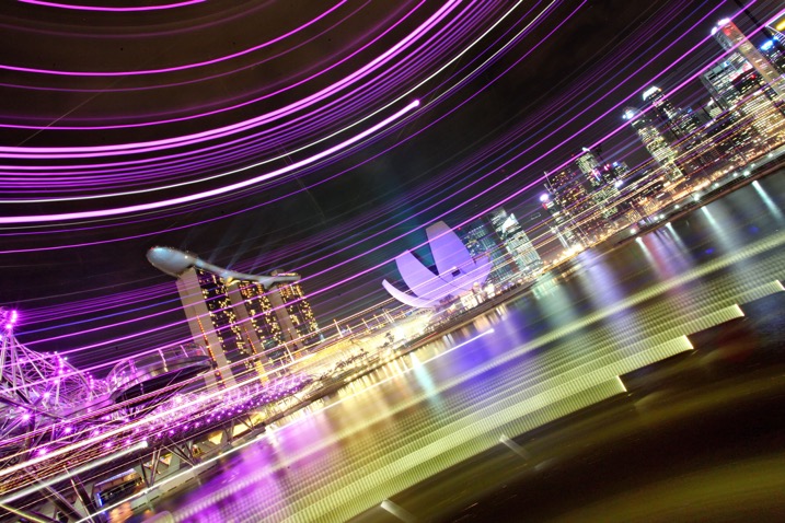
Using a more horizontal angle allows you to paint light through the scene, again this is a unique way of capturing the iconic Singapore skyline.

Using a more horizontal angle allows you to paint light through the scene, again this is a unique way of capturing the iconic Singapore skyline.

If you prefer to see how this is done visually, watched the video below:

Why use circular light painting?

Those who like long exposure will know about light painting, though not everyone is familiar with kinetic light painting. Getting great photos requires a bit of experimentation, hence the need to try out new techniques from time to time.

Kinetic light painting is a great way of creating dynamic photos, which have a futuristic feel. The image you take is likely to be from a worm’s eye view, in an urban setting. Therefore using a technique that adds lights and patterns to your scene can look good. You will also find that many people have already taken photos from the most popular locations. So techniques like this allow you to give your photo a different slant.

rotation-light-painting13

The light patterns in this photo have given this scene a lot of energy. A slightly shallower angle than straight up was used here.

rotation-light-painting12

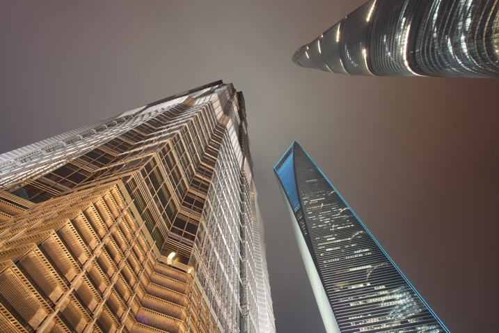
This is a worm’s eye view of the same skyscrapers in Shanghai, without using any light painting.

rotation-light-painting04

Where can I try this technique?

The best place to try this type of technique is near skyscrapers, though if you don’t have any near you then tall apartment buildings can work as well. Any tall architectural structure that’s lit could work for you, as long as you can get underneath it, and it shows in the frame with a wide angle lens.

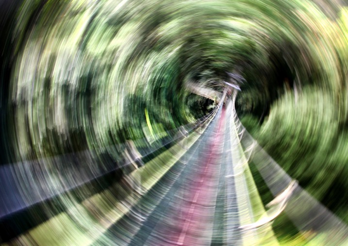
You don’t live in the city? No problem you can head to your nearest forest and use the trees in place of skyscrapers. If you use trees the shot will be daytime, and you’ll be painting the sunlight shining through the leaf canopy. There may be too much light during the day to make a long exposure; therefore consider using an ND filter to reduce the amount of light coming into the camera.

It's possible to use this technique under, or in this case in a leaf canopy. This is the Jungle at Mulu national park, Malaysia.

It’s possible to use this technique under, or in this case in, a leaf canopy. This is the Jungle at Mulu national park, Malaysia.

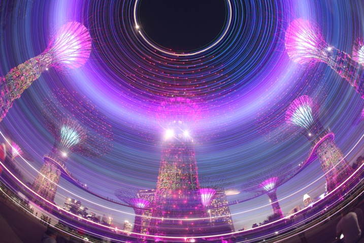
Another photo from the super trees in Singapore, this time aiming strait up.

Another photo from the super trees in Singapore, this time aiming straight up.

rotation-light-painting01

Malaysia’s Petronas twin towers, partial rotation.

Get kinetic, and get light painting!

It’s a great idea to experiment with photography. Trying out long exposure techniques such as this one will only improve your work. It can help you to get unique images that other people won’t have seen; therefore you’ll generate a lot more interest in your work. Having a tripod, and access to a city is really a prerequisite of a style like this one. I look forward to seeing your work. If you have any other idea’s of how you can light paint using your camera please share them in the comments section below.

I look forward to seeing your work. If you have any other idea’s of how you can light paint using your camera please share them in the comments section below.

Scene without rotation.

Scene without rotation.

The super trees found in Singapore's garden by the bay make a great subject for kinetic light painting as they have so many lights.

The super trees found in Singapore’s garden by the bay make a great subject for kinetic light painting as they have so many lights.

googletag.cmd.push(function() {
tablet_slots.push( googletag.defineSlot( “/1005424/_dPSv4_tab-all-article-bottom_(300×250)”, [300, 250], “pb-ad-78623” ).addService( googletag.pubads() ) ); } );

googletag.cmd.push(function() {
mobile_slots.push( googletag.defineSlot( “/1005424/_dPSv4_mob-all-article-bottom_(300×250)”, [300, 250], “pb-ad-78158” ).addService( googletag.pubads() ) ); } );

The post How to do Light Painting by Rotating the Camera by Simon Bond appeared first on Digital Photography School.


Digital Photography School

 
Comments Off on How to do Light Painting by Rotating the Camera

Posted in Photography


PABLO is a long exposure and light painting app for the iPhone

17 Sep

Czech photographer Miroslav Tichy once described photography as painting with light. Now there is an app for that, but instead of naming it after Tichy, its makers decided to call it PABLO for Pablo Picasso, who created some of the first notable light art images with photographer Gjon Mili in 1949.

PABLO has been developed for light painting with the iPhone. You can create pictures and video by moving a light source in front of the camera while capturing a long exposure. Alternatively, you can illuminate a subject, shine a point of light directly at the camera, or move the camera itself during exposure.

In the app’s ‘live view’ you can watch as light paintings are created and a community feed lets you see a continuous gallery of light images by PABLO users around the world. Additionally, you can create light paintings by uploading existing video clips. Any lights in the video will freeze to create light trails.  You can find more information in the video below and on the PABLO website. How-to videos are available in the PABLO Youtube channel and if you’d like to try the app yourself you can now install it for free from the App Store. 

Articles: Digital Photography Review (dpreview.com)

 
Comments Off on PABLO is a long exposure and light painting app for the iPhone

Posted in Uncategorized


How to Create Stunning Architecture Photography by Painting with Light

15 Sep

My name is Mike Kelley. I’ve been lucky enough to travel the world and see incredible architecture while working for hotels, architects, designers, and developers.

Architecture tips 04

Architecture tips 07

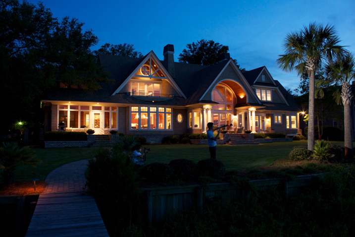
In this article, I’d like to share with you one of my favorite techniques for photographing architecture. If you’ve ever tried to photograph a building at twilight, you know how tough it can be to properly expose all parts of the scene. You know how some areas tend to fall into darkness.

When this happens, many photographers will just try to recover the shadows with a brighter exposure or some dodging and burning. Unfortunately, that can lead to muddy results which often display a lack of texture and color.

Although this article touches on my basic processes, a full tutorial on my workflow is $ 100 off right now over at Snapndeals – Mike Kelley’s Where Art Meets Architecture Course

Light painting for architecture photography

One technique that I’ve adapted to use with modern photographic tools is light painting. Back in the old days, depending on how old you are, there were many photographers who painted with light. They would literally stop down the aperture, wear an all-black outfit, and wave a light around for a 30-60 second exposure to fill in shadows and give the image some nice snap.

Luckily, things are a bit easier these days (to me, at least). You can use a single Speedlight and see the results instantly. All without burning through expensive sheets of 4×5 film, or having to dress like Steve Jobs to keep yourself from showing up in the exposure.

I personally use either a Lowel GL1, Yonguo Speedlight or Profoto B1 light to pull it off, depending on how much power I’ll need. The aim here is to add light in spots that appear to have natural light falling on them – either from landscape lighting or interior lighting. Adding flash or hot light will dramatically clean up the quality of light, by giving it direction and fall off. Whereas the ambient light may create a muddier appearance due to having no directionality, incoherent color casts, or being mixed with the falling light of the day.

Architecture tips 01

So you’re all set up for your twilight. You’re waiting for that perfect balance between falling ambient exterior light and interior glow. Before, during, and after twilight, you should have the camera set in one place on a tripod and every couple of minutes, shoot a bracketed set of images at 0 EV, -2, and +2, or something similar, whatever your preference may be.

Shooting at twilight

When the time for the perfect twilight has arrived, and the falling ambient exterior light and interior glow from the practical lights are perfectly balanced, it’s time to add your hot light or flash. Moving quickly (it helps to have a plan ahead of time for what you’ll flash) add light to areas that you think have fallen into too much shadow or places that could use a little texture and color.

I also recommend adding a CTO gel to your lights to warm them up so that they match the interior glow of the house or any exterior lighting that may be present. This process should take no more than five minutes and should be shot tethered, whether to a computer or a wireless solution like a CamRanger, so you can see what you’re doing immediately and adjust accordingly.

Architecture tips 12

Architecture tips 17
Architecture tips 27

After you’ve gone around and added light, continue to bracket exposures to cover your bases. Sometimes I’ll use an exposure from when it’s completely dark outside and the only light in my scene is from the interior glow to remove any distracting reflections or color casts that popped up.

Processing the images

When in post-production, try to keep it simple. I used to think it was a source of pride to edit these photos and have to use 50, 70, or even more layers. But the fewer layers there are in Photoshop, the less of a chance there is for something to go awry. Depending on the subject, 10-15 flash pops should be more than enough to get this amazing effect on your images. You may want to add or remove some color using curves, and it would also be wise to make sure that everything blends together seamlessly by setting the blend mode of your flash pop layers to Lighten.

Replace the sky if necessary

Lastly, in many of my images I end up replacing the sky. Don’t underestimate what an amazing impact a new sky can have on your image – but only when it’s done perfectly! If there’s anything that takes people out of an image and ruins the moment, it’s a poorly composited sky that doesn’t match the color and brightness of the rest of the image So choose your sky carefully. I personally like to vary the opacity of my sky layer to taste so that things all blend seamlessly.

No architectural photo would be complete without nice, straight verticals lines, so use CMD/CNTL + alt + shift + E to stamp all to a new layer. Then drag out some ruler lines and make sure there’s no distortion – we don’t need people thinking our clients can’t build straight homes.

Architecture tips 08

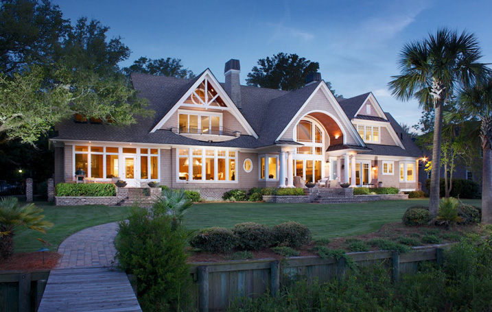
Here is the final image

You can watch a video of this entire process below and see me in action:

Summary

I hope you enjoyed this quick tour through one of my favorite techniques. The more you use it, the more flexible you will become with adding light and mood to make your photos really stand out.


If you would like to go more in depth with this technique and learn how to build your own business in real estate and architectural photography, Kelly’s full-length tutorial is currently 33% off over at Snapndeals – grab it before the sale ends September 27th, 2016.

googletag.cmd.push(function() {
tablet_slots.push( googletag.defineSlot( “/1005424/_dPSv4_tab-all-article-bottom_(300×250)”, [300, 250], “pb-ad-78623” ).addService( googletag.pubads() ) ); } );

googletag.cmd.push(function() {
mobile_slots.push( googletag.defineSlot( “/1005424/_dPSv4_mob-all-article-bottom_(300×250)”, [300, 250], “pb-ad-78158” ).addService( googletag.pubads() ) ); } );

The post How to Create Stunning Architecture Photography by Painting with Light by Mike Kelley appeared first on Digital Photography School.

Digital Photography School

 
Comments Off on How to Create Stunning Architecture Photography by Painting with Light

Posted in Photography


Painting with Paper: Quilled Portraits Reveal the Expressiveness of Aging

13 Sep

[ By SA Rogers in Art & Sculpture & Craft. ]
brodskaya quilled paper 4

Expanding upon a previous body of work that’s more graphic in nature, paper artist Yulia Brodskaya presents a new portrait series capturing the expressive qualities of aging faces in vibrant hues. The Russia-born artist and illustrator is known for rolling strips of paper into ‘quills’ and painstakingly gluing them together into colorful, three-dimensional designs. The new portraits are named Jade, Topaz and Amethyst, and reveal a more painterly method that tightly packs folded pieces of paper into each composition.

brodskaya quilled paper 7

brodskaya quilled paper 5

The effect mimics the look of brushstrokes, with wrinkles, folds and other sculptural details rendered in lush jewel tones for an expressionistic result. The former graphic design major discovered her love for the tactile qualities of paper art and abandoned computer programs, producing hundreds of projects and commissions over the last 7 years.

brodskaya quilled paper 8

brodskaya quilled paper 3


“The new expressive way of using the strips of paper that I discovered recently (and first time used as a primary technique in the Wimbledon artwork) is really exciting – it allows me to achieve more ‘sketchy,’ artistic look for the paper art and I’m excited to keep experimenting with it (though it’s a shame that this method is not much faster than the neat and refined way of gluing strips one by one)… Despite the slow process I enjoyed working on this portrait tremendously: the abundance and richness of colors makes me feel good,” says Brodskaya.

brodskaya 9

brodskaya 10

brodskaya 11

brodskaya 12

“I used to say that I’m ‘drawing with paper’, now I found a way of ‘painting with paper.’ These artworks are all about color and the unique tactile feel that paper strips add to it. The portrait resembles an oil/acrylic painting (especially from the distance,) but with a paper twist…”

Share on Facebook


[ By SA Rogers in Art & Sculpture & Craft. ]

[ WebUrbanist | Archives | Galleries | Privacy | TOS ]


WebUrbanist

 
Comments Off on Painting with Paper: Quilled Portraits Reveal the Expressiveness of Aging

Posted in Creativity