RSS
 

Posts Tagged ‘Objects’

How to Remove Objects and Add Punch to Your Images with Photoshop

31 May

In this article, we’ll look at an image I reprocessed after my initial edit. I’ll also share with you some tips on how to use Photoshop to remove objects from your scene that are unwanted and add some punch to your image.

Original processed version

Have you ever created an image, processed it, shared it with the world, and then decided it wasn’t quite finished? I have! In fact, I do it more often than I’d like to admit. A while back, I created a video tutorial for On1 Software showing how I used that software to process an image I took at Queen’s Bath on the island of Kauai. I was super excited to share the image because it was an incredible sunset, at an incredible location, shot during some incredible conditions, with a completely random and unscripted local in the scene to top it all off. Here’s a look at the image after processing it and creating the initial video.

How to Remove Objects and Add Punch to Your Images with Photoshop

After watching the video and looking at the final image, I decided I wasn’t 100% satisfied with the edit. I’ve used On1 Software for nearly a decade now, and still use it in my everyday workflow. It wasn’t any fault of On1, I just felt the image could be taken up another notch so decided to take it over into Photoshop to give it another go. I decided the image needed two adjustments…

#1 Remove the local at the bottom climbing up the rocks.

  • Queen’s Bath is notorious for the massive waves that crash against the shore in the winter. Nearly 30 people have drowned at this location from being washed out to sea and this guy was close to being added to the list! I decided to remove him because his movements caused him to become blurred and I felt he ended up being more of a distraction in the image than a complementary part of it.

#2 Add a bit more contrast and punch to the overall image.

  • I felt the sky and rocks were still a bit too washed out and needed a very subtle boost to bring it all together.

Second edited version completed in Photoshop

After a few minutes in Photoshop, I came up with this final (really this time!) result.

How to Remove Objects and Add Punch to Your Images with Photoshop

After working extensively in Photoshop over the past decade, I’ve developed a few tricks along the way. I’m not sure how mainstream some of them are, so I like to share them in hopes that they’ll help you as well. One of those tricks is how I remove objects that are up against other objects(as opposed to being out in the open). To do this, I use a combination of the Quick Selection Tool, Masking, and the Clone Stamp. Adding contrast and punch to the image is a bit more basic in this case, but still advanced if you aren’t super familiar with masking and brush techniques.

Here’s the video where I walk through the process step-by-step.

Let me know what you think and if you have any questions please put them in the comments section below.

Get James’ video course POST II where he walks through his entire workflow in Lightroom, Photoshop, and more from start to finish with 10 of his favorite portfolio images. Be sure to use coupon code DPS25 at checkout for an exclusive DPS discount!

The post How to Remove Objects and Add Punch to Your Images with Photoshop by James Brandon appeared first on Digital Photography School.


Digital Photography School

 
Comments Off on How to Remove Objects and Add Punch to Your Images with Photoshop

Posted in Photography


How Including People or Manmade Objects in Your Landscapes Can Add a Sense of Scale

25 May

My natural instinct as a landscape photographer has always been to keep people and manmade objects out of my images. I want to create images of nature that are pure and free (or at least appear to be free) of human interference. That said, over the past few years, I have started to backtrack on this a bit, especially when the camera fails to show the true scale of a landscape. In this article, I’ll share a small collection of images from my portfolio that include situations where allowing people or objects into the scene made the image a success.

Add a manmade object to show size

Na Pali Coast Sunset Sony A7RII and Sony 16-35 f/4 | ISO 500, f/4.5, 1/800th.

Here is (quite possibly) the most beautiful and rugged stretch of coastline on Earth, the Na Pali Coast of Kauai. I’ve photographed it from land, sea and air and still there is just no way to truly capture how incredible it is in person. On my most recent trip to the Garden Isle, I took my workshop group on a sunset cruise up to photograph whales and the Na Pali Coast.

As we were taking in the incredible scenery, I noticed one of the many helicopters that tour the coastline cutting through the scene. Using my Sony FE 16-35 f/4 lens, I framed a shot with the helicopter (flying right to left) on the right side of the frame (it’s the tiny little white spot) with plenty of space on the left side to see where it was headed. Take away the helicopter and it’s still an incredible scene, but without the helicopter, there’s just no way to accurately communicate how massive these cliffs are.

Use tourists to show scale

Balanced Rock Sunset Sony A7 and Canon 16-35 f/2.8 | ISO 100, f/11, 1/20th.

One of the easiest to reach landmarks in Arches National Park (located in Moab, Utah) is Balanced Rock. You just drive to the parking lot, and you’re pretty much there. But to get the sunset in the background, you’ll need to walk to the other side.

As our group was getting into position for what was turning out to be a beautiful sunset, a tourist climbed right up onto the rocks and started taking selfies. Ugh. Well, instead of getting upset, I decided to make lemonade out of the lemons and yelled over to him, asking if he’d mind throwing his hands up in the air. We were able to get a shot showing just how huge this sandstone rock formation really is, and the pose of the tourist turned out quite nice.

Go with the flow

Grand Canyon Lookout Sony A7RII and Sony 16-35 f/4 | ISO 100, f/7.1, 1/10th.

Like the previous image, sometimes you just have to go with the flow. As Bruce Lee so famously said, “Be water, my friend.”

As the sun set over Grand Canyon National Park in Arizona, I was in position to walk away with some really nice shots of the pink glow over the canyon. And just like in Moab, I saw a tourist walk right into the frame as I was about to press the shutter. This time though, he was much closer to the camera and as luck would have it, he was dressed in a cowboy hat, boots, and a leather backpack. Perfect! I never said a single word to this guy, he just stood there looking out over the canyon holding onto the tip of his cowboy hat. I assume he posing for someone else, but I was plenty happy to steal a few frames for myself.

Add yourself into the shot

Delicate Arch Beneath the Milky Way Sony A7S and Sony 16-35 f/4 | ISO 4000, f/4, 30 seconds.

You can’t always have people walk into your frame at the perfect time, wearing clothing that perfectly matches the location you’re photographing. Sometimes you have to take matters into your own hands, as I did here at Delicate Arch in Arches National Park.

My workshop group and co-instructor Mike were down inside the “bowl” beneath the arch and I stayed up top to light paint the arch for them during their 30-second exposures. We had walkie-talkies and Mike would give me a countdown to begin painting the arch in different ways. Since I couldn’t really concentrate on getting any of my own shots, I set my Sony A7S on a tripod, put it in time-lapse mode and just hoped to come out with one or two shots at the end of the night.

In the image above, that light shining under the arch is yours truly. I was standing beneath it, wearing a headlamp, so the students could get a silhouette of me looking up at the arch. After the shot, I looked over toward my camera (not on purpose though) and the direct light caused a starburst effect. This turned out to be my favorite image I’ve taken at this location by far. Not bad for the “set it and forget it” method!

Conclusion


Sometimes there just isn’t a good way to transfer a three-dimensional landscape to a two-dimensional photograph. Things always get lost in translation to some extent. At the end of the day, we are part of nature and if including a human or manmade object into an image help give the viewer a more accurate sense of scale, I say go for it.

The post How Including People or Manmade Objects in Your Landscapes Can Add a Sense of Scale by James Brandon appeared first on Digital Photography School.


Digital Photography School

 
Comments Off on How Including People or Manmade Objects in Your Landscapes Can Add a Sense of Scale

Posted in Photography


Google demos technology that scrubs objects from photographs

19 May

During its I/O 2017 conference yesterday, Google demonstrated a new algorithm-based technology that can remove unwanted objects from existing photographs. The demonstration showed the technology removing a chainlink fence from the foreground of an image, with the final result offering no discernible indications that the fence had ever existed (around 10:45 in the video below).

The technology was demonstrated on stage by Google’s CEO Sundar Pichai during a conversation about the company’s expanding visual technology. ‘Coming very soon,’ Pichai explained, ‘if you take a picture of your daughter at a baseball game and there’s something obstructing it, we can do the hard work and remove that structure and have the picture of what matters to you in front of you.’

It looks to be an evolution of the research Google and MIT have been collaborating on for some time – in fact, their demonstration from 2015 includes a very similar chain-link fence demo. This method takes advantage of the parallax effect to identify and remove obstructions from photos. 

Unfortunately, Pichai didn’t elaborate on when this technology will be made available aside from ‘very soon,’ nor did he specify where the technology will be available. Given the company’s Google Photos announcements, however, it seems likely the technology will be implemented within that product.

Via: Google

Articles: Digital Photography Review (dpreview.com)

 
Comments Off on Google demos technology that scrubs objects from photographs

Posted in Uncategorized


Conductive Design: 10 Objects Transformed Into Touch Pads & Circuits

11 May

[ By SA Rogers in Gadgets & Geekery & Technology. ]

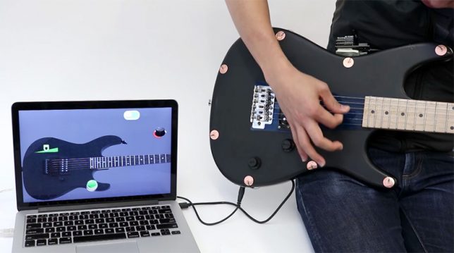
Conductive paint, ink and thread can be drawn, woven or even tattooed into objects like denim jackets, carpeting and leather iPad cases to make them into electrical circuits, adding a new layer of functionality as well as cool-looking graphic patterns. Draw circuits in any shape, create smart objects that interact with apps, and answer your phone while biking by swiping your finger across your sleeve. These 10 projects – some of which are available commercially – show how far conductive designs have come in less than four years.

Conductive Wallpaper by UM Project

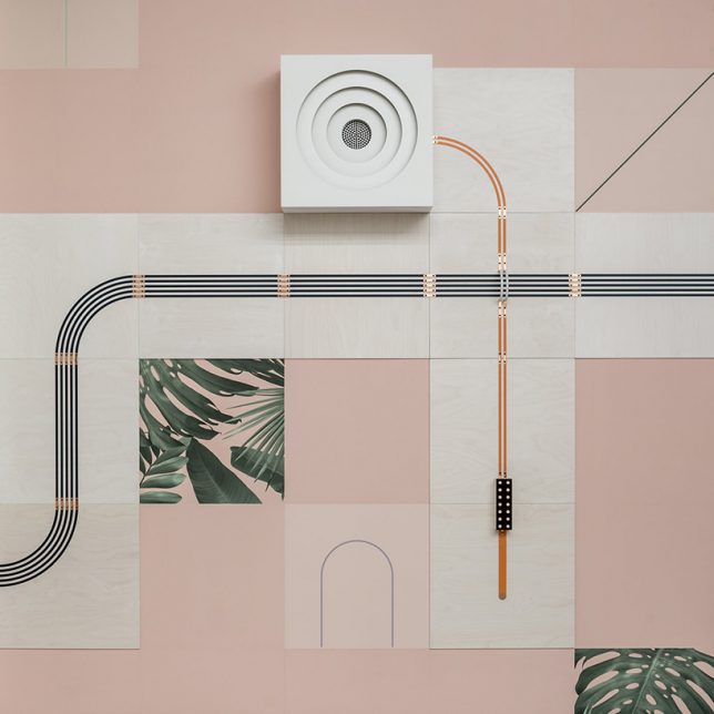
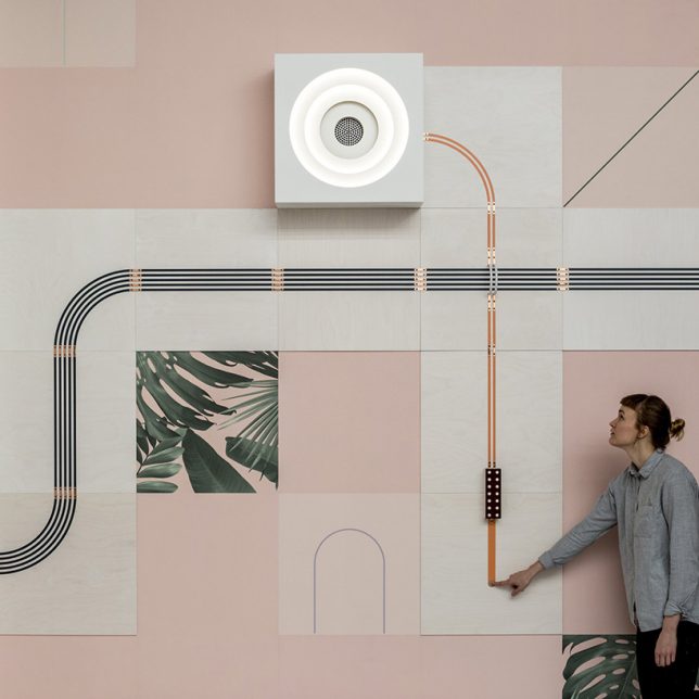
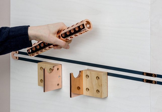
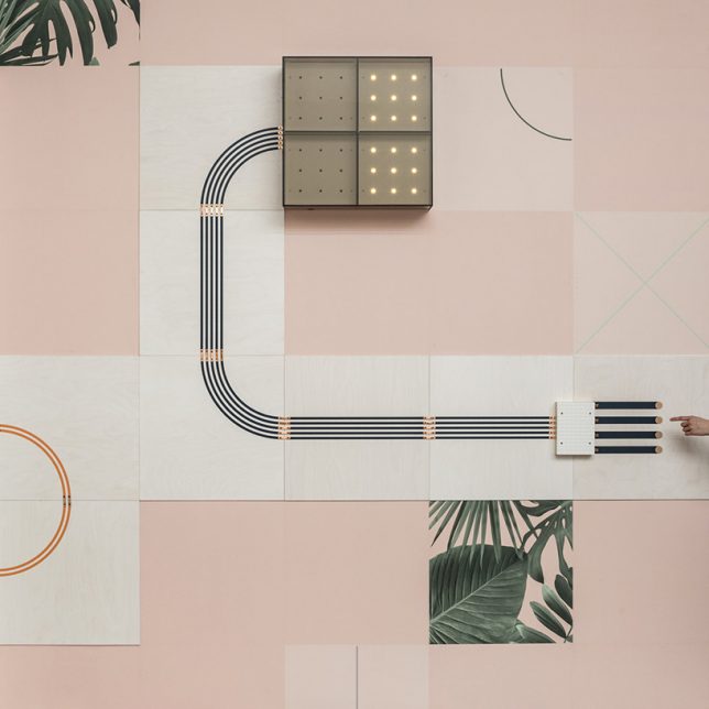
Instead of hiding wiring for lights away within walls, ‘Conduct’ by UM project and wallpaper company Flavor Paper lays it all out as part of the wall’s design using conductive inks to create decorative circuitry. The circuits control a lamp, fan, speaker, light box and hinged mirror, activated them when someone touches the copper dots, using their body to complete the electricity circuit.

Jacquard by Google: Conductive Levi’s Denim Jacket

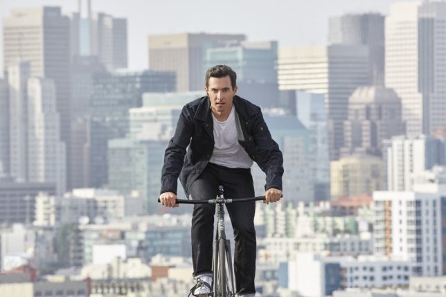
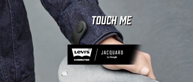
Jacquard by Google teamed up with Levi’s to create a smart denim jacket made with woven conductive yarn, designed specifically for bike commuters. The aim is to seamlessly integrate technology into textiles, prioritizing the garment over the gadget and making it ultra-wearable. The threads connect to a smart tag on the sleeve that communicates with your mobile device, turning the jacket into a gesture-controlled canvas so you can get directions, adjust the volume on your music or answer a phone call using finger swipes on your sleeve. The Commuter will be available this fall for $ 350.

Circuit Scribe Conductive Ink Pen

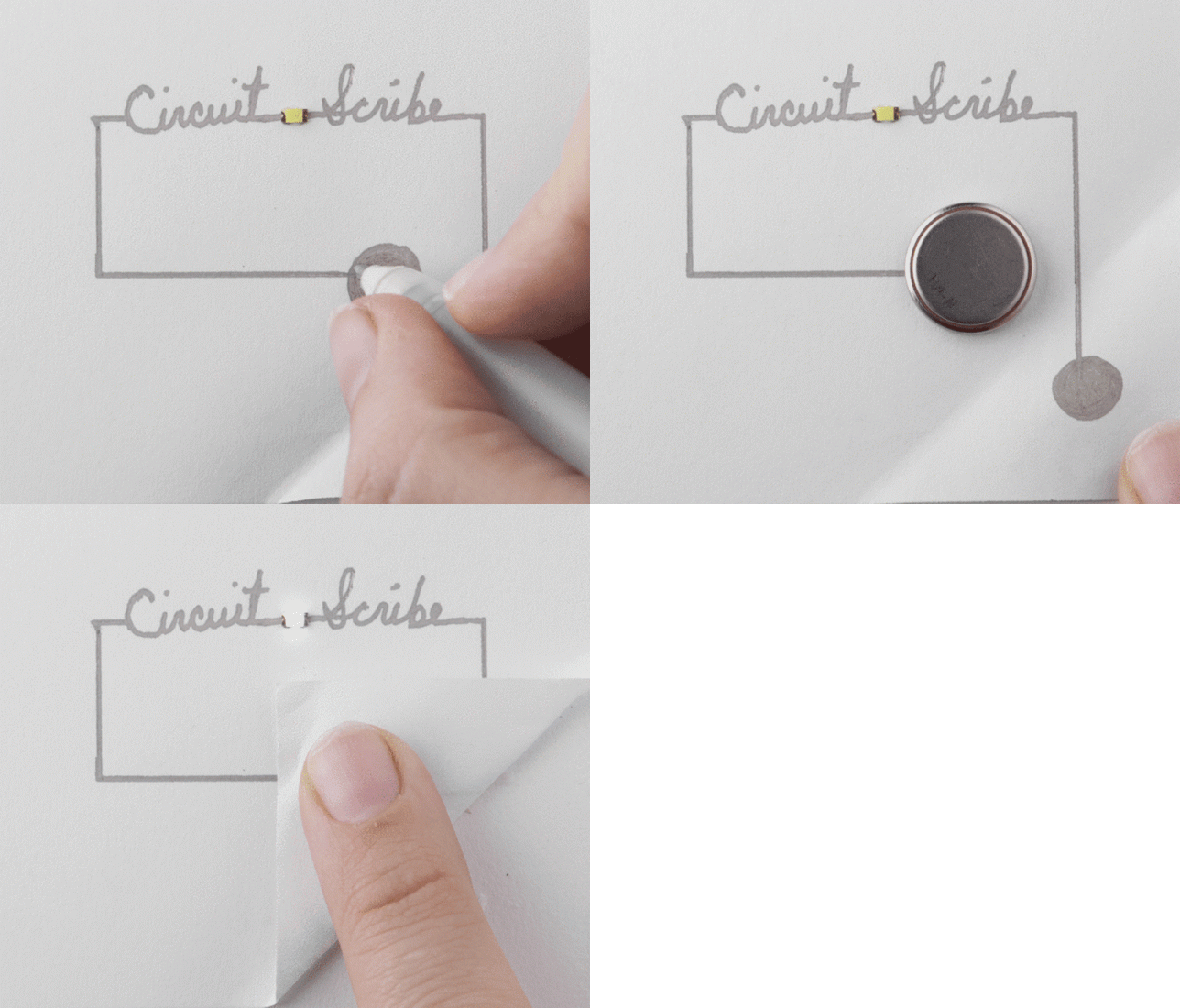
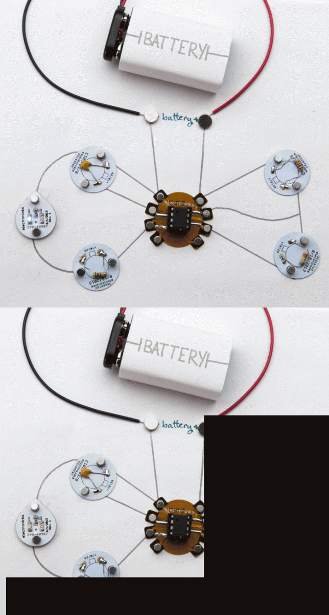
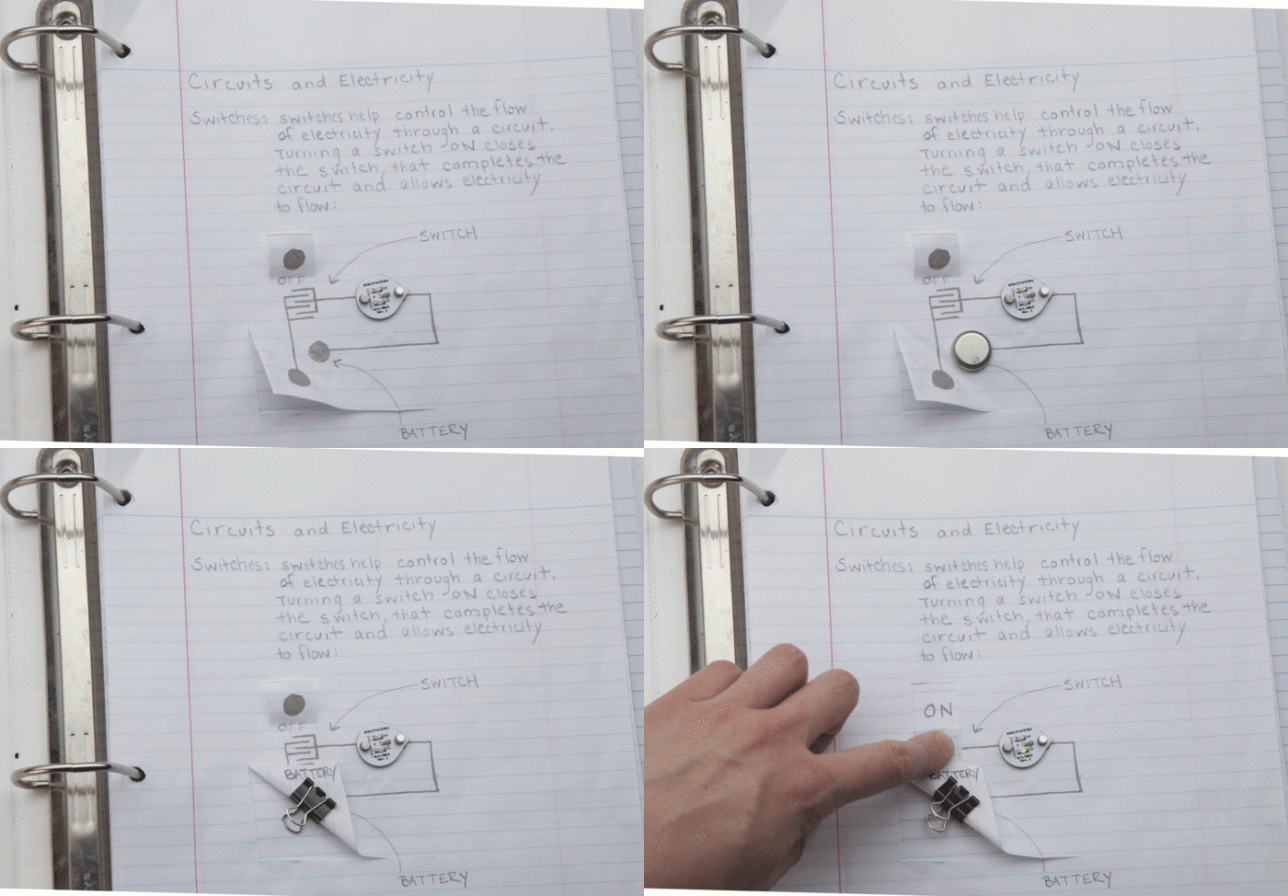
The ’circuit scribe’ ballpoint pen allows you to draw circuits in any shape using a quick-dryings conducting ink, connecting them to a coin battery, paper clip and LED or more complex parts. While similar conductive pens have been offered before, this one differs by producing just the right amount of ink flow to achieve an ideal conductivity of 50-100 milliohms/square/mil. You can buy kits starting at just $ 10.

‘Electrick’ Conductive Paint Turns Anything Into a Touch Pad

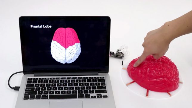
This conductive paint from Future Interfaces Group (a research lab within the Human-Computer Interaction institute at Carnegie Mellon) turns virtually any surface into a touch pad when you add an electric current over the painted conductive surface using a pair of electrodes. When you touch the surface, the current is disrupted, and the ‘Electric’ program detects exactly where the object has been touched, showing it on a screen. The technology could potentially help engineers test prototypes of touch pad gadgets.

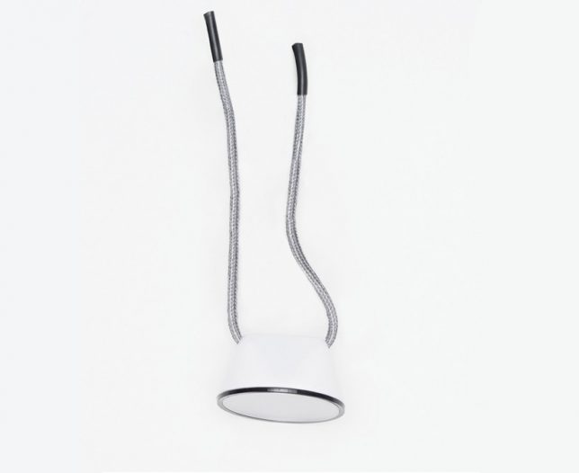
Conductive Knot Lamp by Celia Torvisco

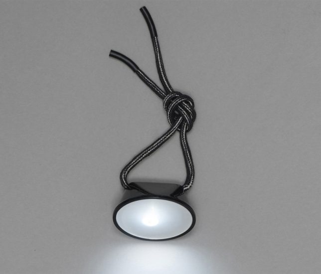
Tie the threads dangling from this minimalist lamp together, and you’ll complete the circuit to turn it on. Designer Celia Torvisco, who’s also known for her conductive ceramic radio, envisions the flashlight for use while camping, riding a bike or reading a book.

Next Page – Click Below to Read More:
Conductive Design 10 Objects Transformed Into Touch Pads Circuits

Share on Facebook


[ By SA Rogers in Gadgets & Geekery & Technology. ]

[ WebUrbanist | Archives | Galleries | Privacy | TOS ]


WebUrbanist

 
Comments Off on Conductive Design: 10 Objects Transformed Into Touch Pads & Circuits

Posted in Creativity


Picasso in 3D: Famous Paintings Transformed Into Physical Objects

13 Apr

[ By SA Rogers in Art & Drawing & Digital. ]

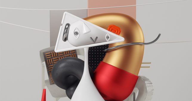
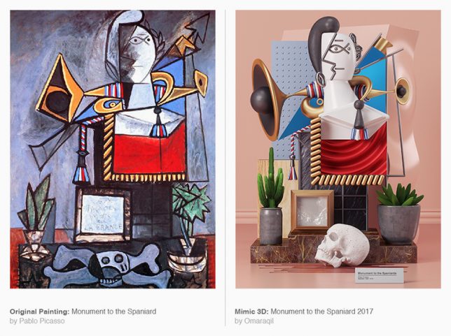
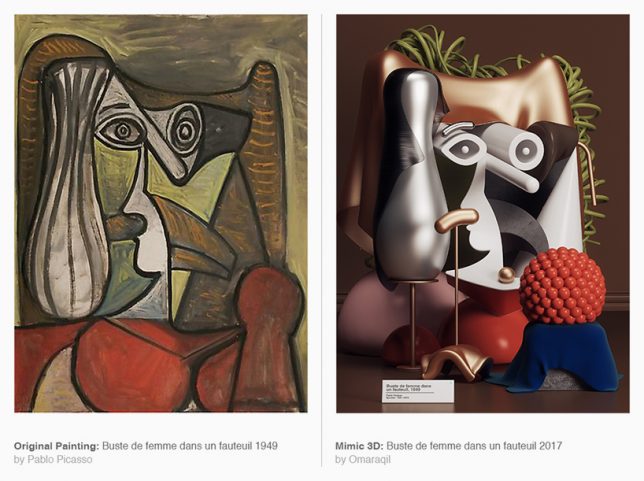
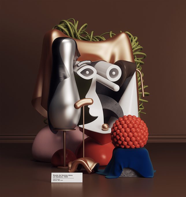
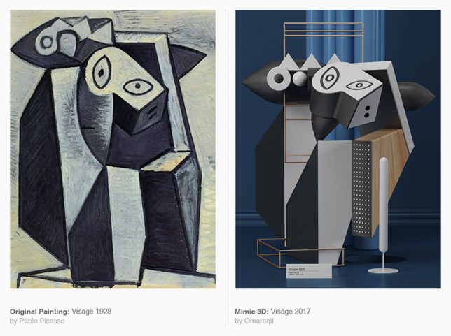
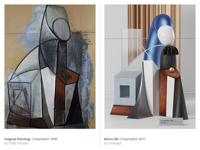
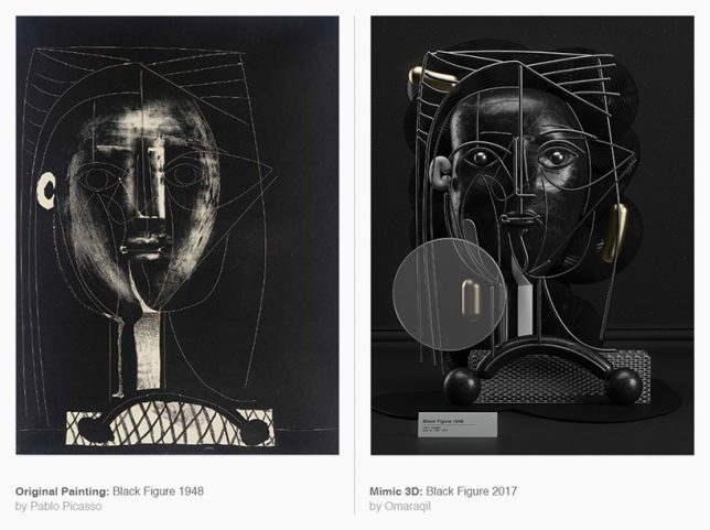
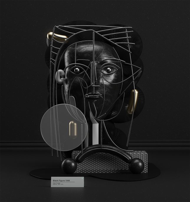
What would Pablo Picasso think if he saw that another artist had transformed his two-dimensional Cubist works of art into three-dimensional form? While the MIMIC series by Omar Aqil was created digitally and doesn’t exist as physical objects, it’s easy to imagine each piece as a sculpture you can walk around and examine from all angles, and it certainly offers an interesting perspective on the originals.

Aqil used Photoshop, Illustrator and Cinema 4D-Ray to reimagine six of Picasso’s most dynamic, angular paintings, including Buste de femme dans un fauteuil (1949), Seated Woman (1930), Black Figure (1948), Visage (1928) and Composition (1946). Aquil explains that he’s been studying Picasso’s work since beginning his career in art, and has always found the abstract visual language inspiring.

“MIMIC is a series of new visual experiments using art from the past,” says the Pakistan-based artist. “In this project I have randomly picked 6 paintings from the Pablo Picasso’s (one of the greatest and most influential artists of the 20th century) work and recreate them into modern 3D visuals. In this visual mimicry I have shown, how the skill responds when it come across the complexity of someone’s thought and how the meanings of the shapes and forms have been changed and create new physical realities. It’s propose to give a new implication of Picasso’s artworks with a series of hyper-realistic visuals.”

The choice of ‘materials’ used in the renderings is interesting in and of itself; while some might have given them textures and finishes resembling more classic sculptural materials like stone, Aquil’s sculptural visions seem to be made of plastic, as if they could be sold as tchotchkes in museum shops.

Considering that Picasso is famously quoted as saying “Good artists copy, great artists steal,” perhaps he wouldn’t have minded.

Share on Facebook


[ By SA Rogers in Art & Drawing & Digital. ]

[ WebUrbanist | Archives | Galleries | Privacy | TOS ]


WebUrbanist

 
Comments Off on Picasso in 3D: Famous Paintings Transformed Into Physical Objects

Posted in Creativity


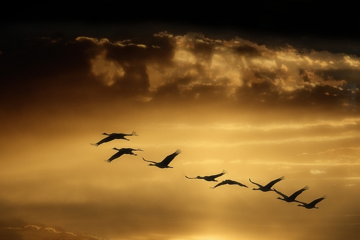
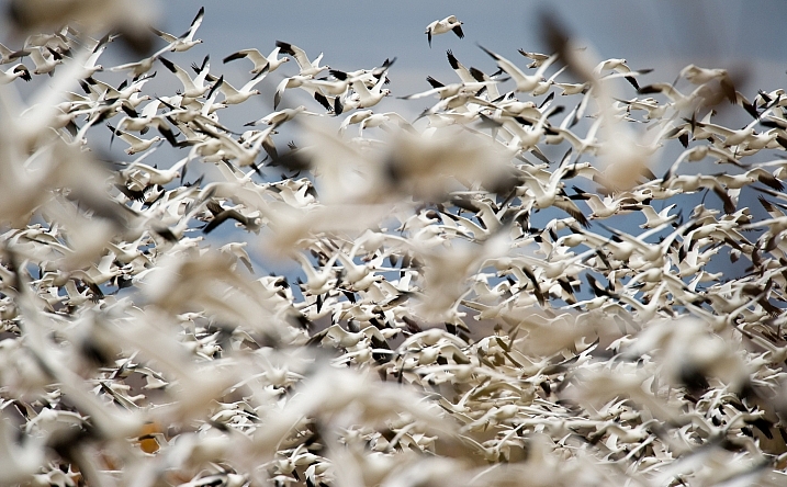
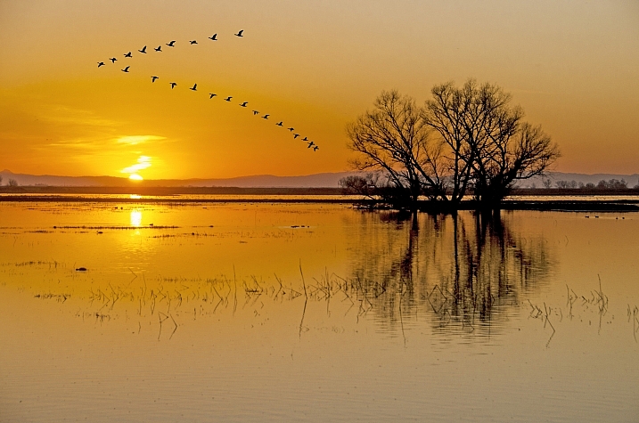
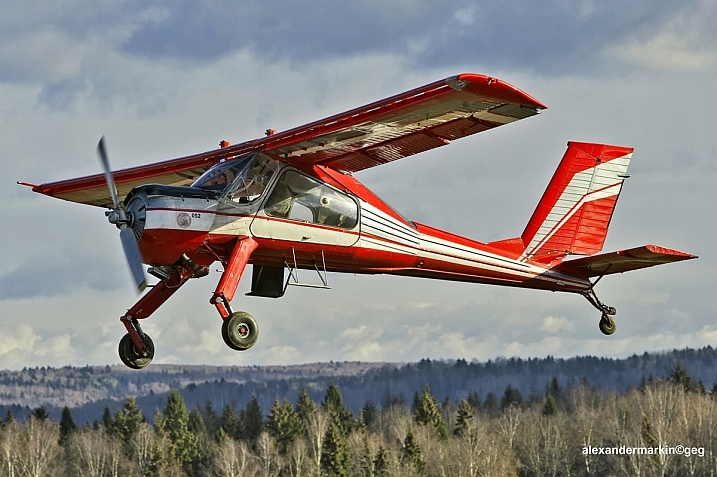
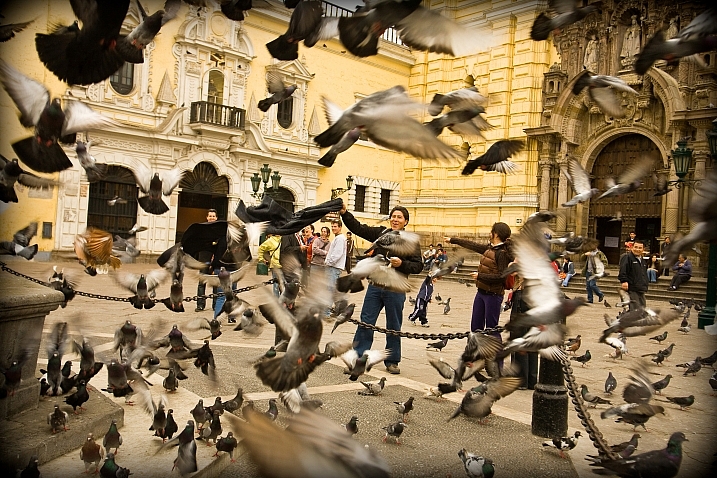
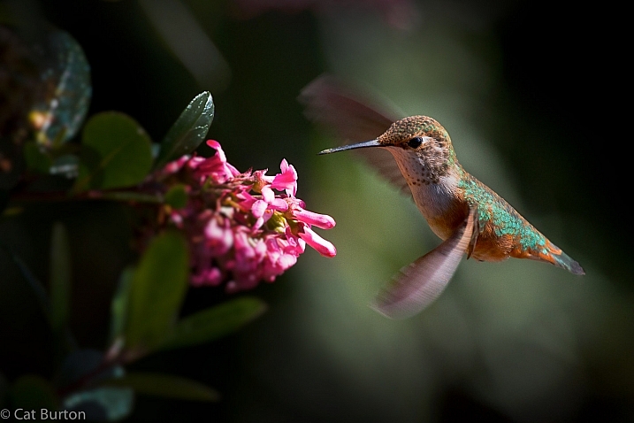
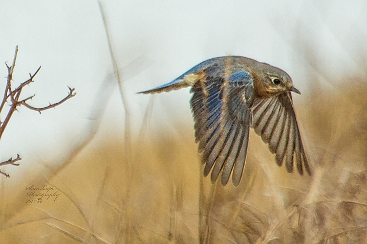
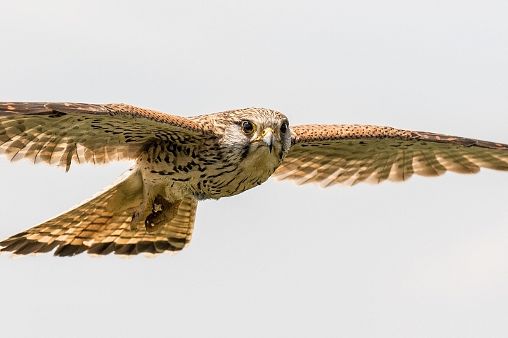
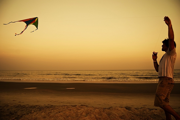
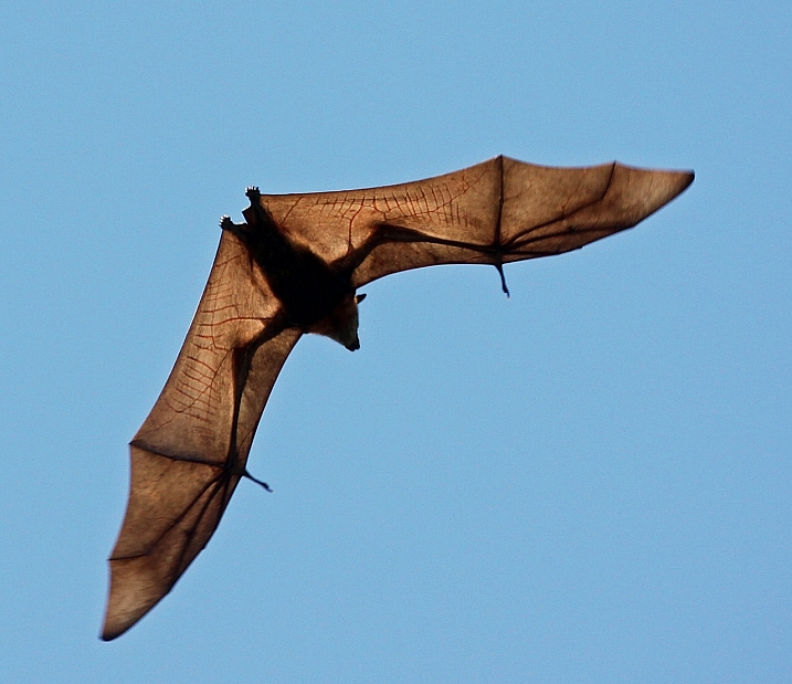
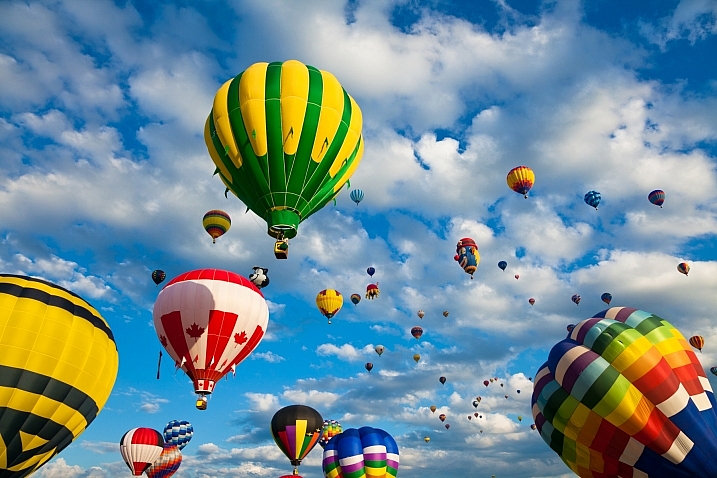
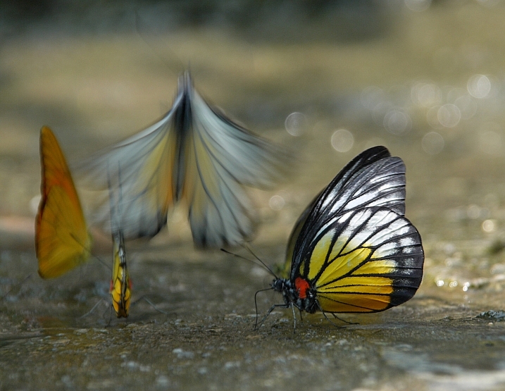
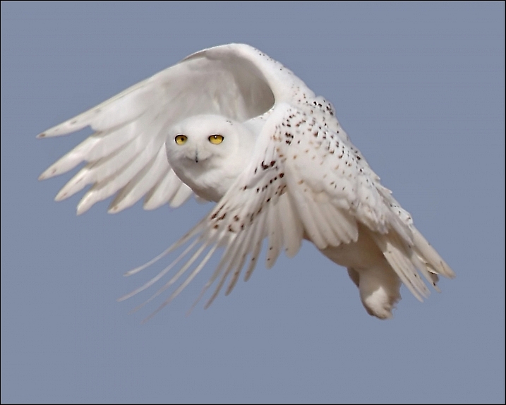
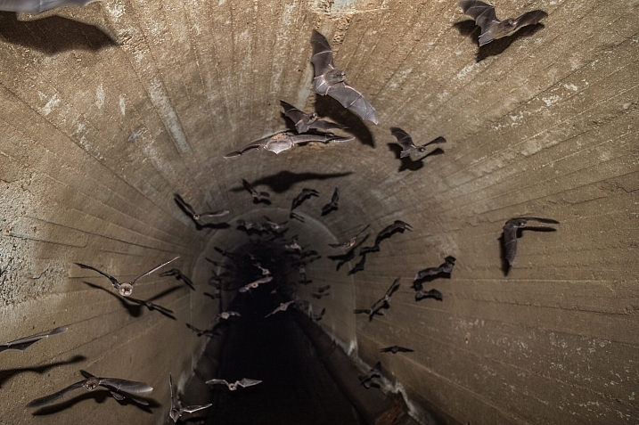
20 Airborne Images of Objects in Flight

14 Dec

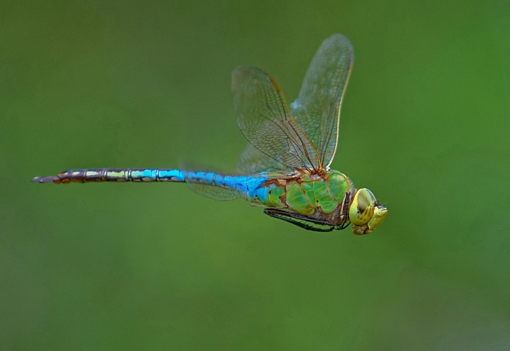
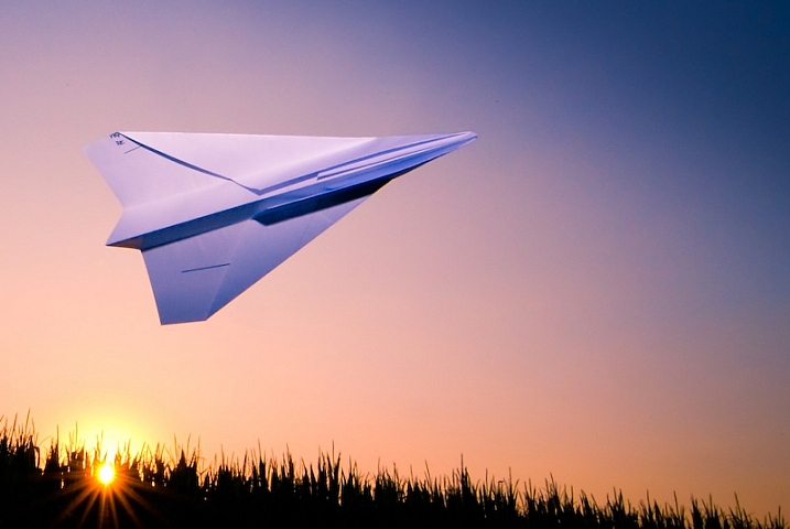
There are many things that take to the air in flight. Humans need a device like a plane or glider, whereas other creatures take off on their own steam.

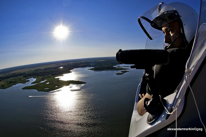
Flying things can be hard to photograph. Photographers have to make choices to freeze their motion or create a blur. Let’s see how these 20 photographers decided to photograph these flying objects.

Aleksander Markin. ????????? ??????

By Aleksander Markin. ????????? ??????

Jim McCulloch

By Jim McCulloch

Gianluca Micheletti

By Gianluca Micheletti

Steve Corey

By Steve Corey

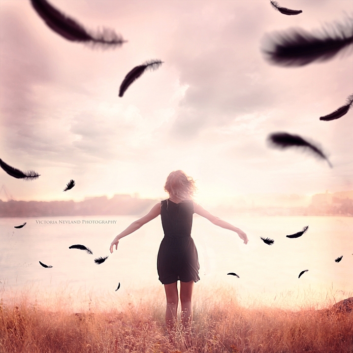
Victoria Nevland

By Victoria Nevland

Howard Ignatius

By Howard Ignatius

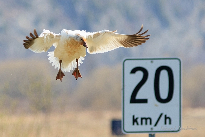
RejeanJ Deschenes

By RejeanJ Deschenes

Steve Corey

By Steve Corey

Aleksander Markin. ????????? ??????

By Aleksander Markin. ????????? ??????

Darlene Hildebrandt

By Darlene Hildebrandt

Cat Burton

By Cat Burton

Stan Lupo

By Stan Lupo

Andy Morffew

By Andy Morffew

Jblaha

By jblaha

Michael Jefferies

By Michael Jefferies

Nicolas Raymond

By Nicolas Raymond

Farrukh

By Farrukh

Pat Gaines

By Pat Gaines

ERIC SALARD

By ERIC SALARD

Darkday

By darkday

googletag.cmd.push(function() {
tablet_slots.push( googletag.defineSlot( “/1005424/_dPSv4_tab-all-article-bottom_(300×250)”, [300, 250], “pb-ad-78623” ).addService( googletag.pubads() ) ); } );

googletag.cmd.push(function() {
mobile_slots.push( googletag.defineSlot( “/1005424/_dPSv4_mob-all-article-bottom_(300×250)”, [300, 250], “pb-ad-78158” ).addService( googletag.pubads() ) ); } );

The post 20 Airborne Images of Objects in Flight by Darlene Hildebrandt appeared first on Digital Photography School.


Digital Photography School

 
Comments Off on 20 Airborne Images of Objects in Flight

Posted in Photography


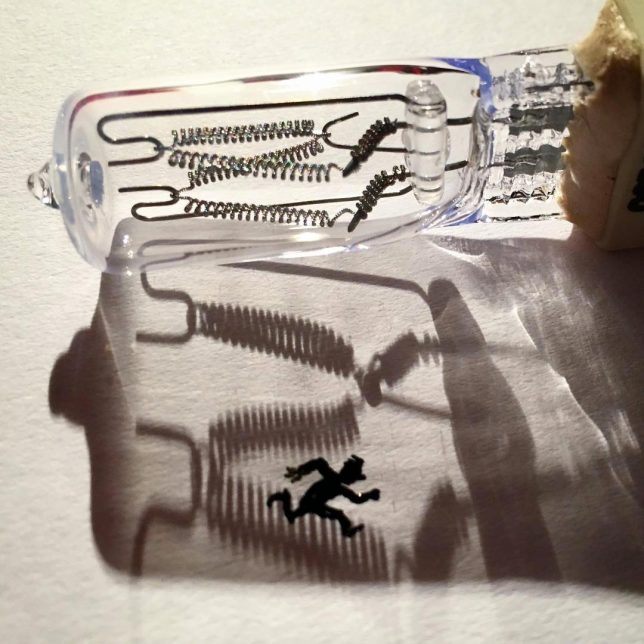
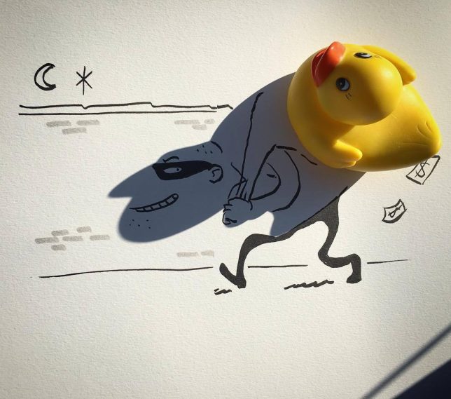
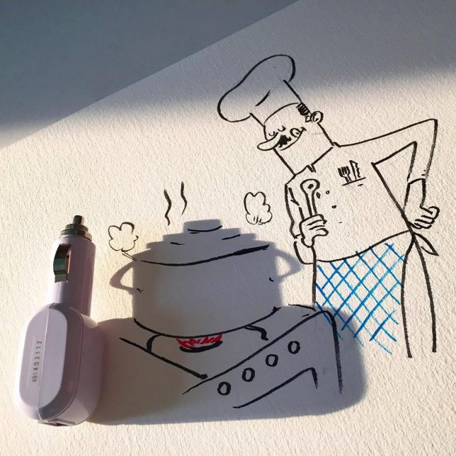
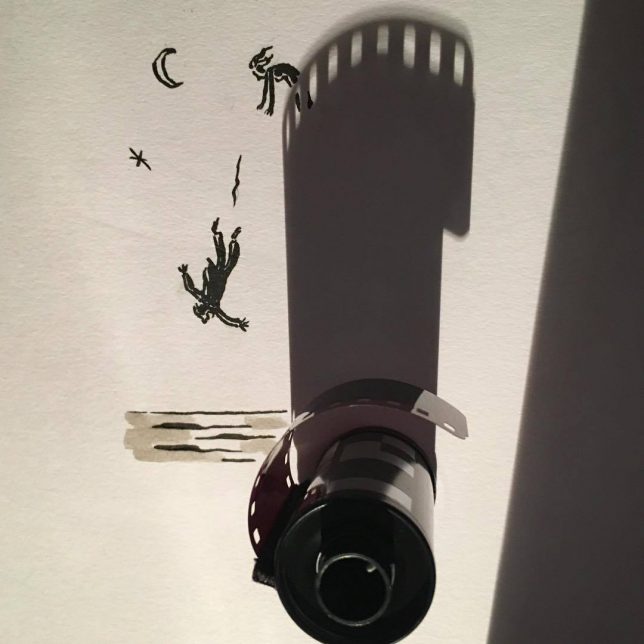
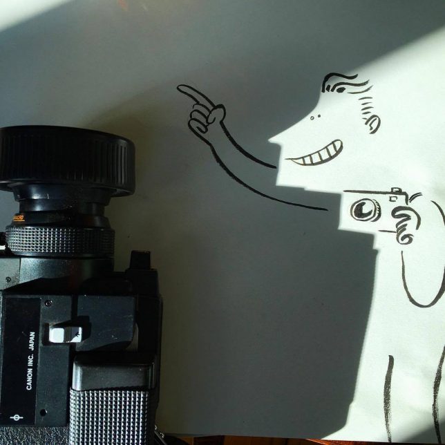
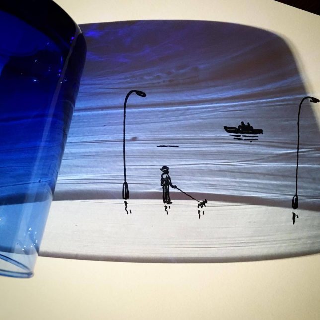
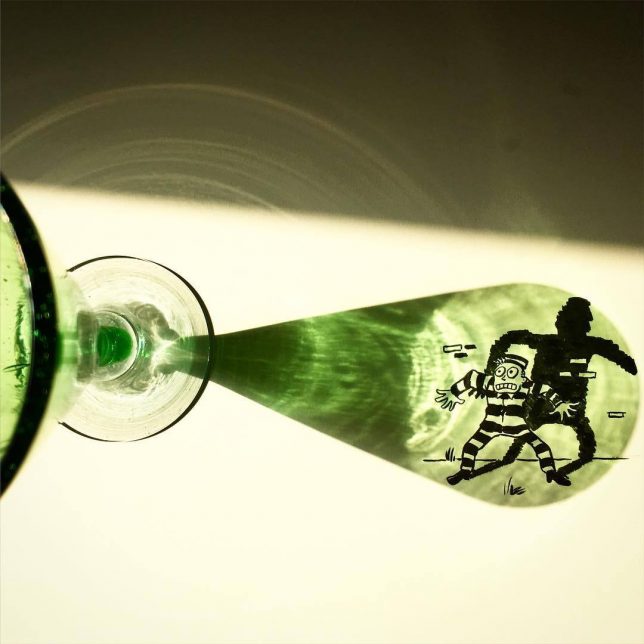
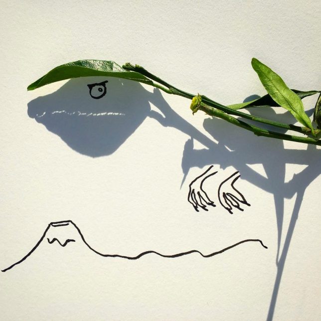
Art in the Shadows: Everyday Objects Cast Unexpected Shapes Onto Paper

10 Dec

[ By SA Rogers in Art & Drawing & Digital. ]

art-in-the-shadows-3

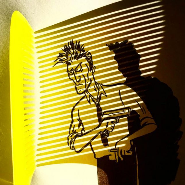
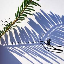
Has doodling ever been more creative than this? While most people wouldn’t give a second’s thought to the shape an everyday object’s shadow casts upon adjacent surfaces, artist Vincent Bal looks at them and sees the beginnings of a character or scene. It might be a phone charger, a fallen leaf, a drinking glass or a Christmas ornament, but in its shadow, Bal sees far more than the object itself.

art-in-the-shadows

art-in-the-shadows-2

art-in-the-shadows-5

art-in-the-shadows-6

art-in-the-shadows-7

Each of Bal’s quick and clever illustrations is a testament to the creativity of an artist’s brain. Calling his work ‘shadowology,’ Bal plays around with silhouettes and light sources to find inspiration for sketches most people would never dream up. It takes the game of finding shapes in the clouds and applies an artist’s hand to the process, embellishing the shapes into something more.

art-in-the-shadows-8

art-in-the-shadows-9

vincent-bal-2

vincent-bal-1

Calling himself a ‘filmmaker and doodler and procrastinator from Belgium’, Bal shares his work on his popular Instagram account and sells prints on Etsy.

Share on Facebook


[ By SA Rogers in Art & Drawing & Digital. ]

[ WebUrbanist | Archives | Galleries | Privacy | TOS ]


WebUrbanist

 
Comments Off on Art in the Shadows: Everyday Objects Cast Unexpected Shapes Onto Paper

Posted in Creativity


How to Use Smart Objects in Photoshop

17 Aug

We have all felt the frustration of editing an image either in Lightroom or Adobe Camera Raw (ACR), only to remember that we forgot to adjust the white balance, or tweak the sharpening after we’ve spent hours of editing the image in Photoshop. If this has happened to you, let me introduce to you to something called a Smart Object.

Smart Objects give you greater flexibility in your editing workflow inside Photoshop. You can create a Smart Object when opening your image from Lightroom or ACR into Photoshop, and you can also create Smart Objects later on in your editing process, which can be very helpful – especially when you are applying a sharpening (or other) filter.

Smart Object

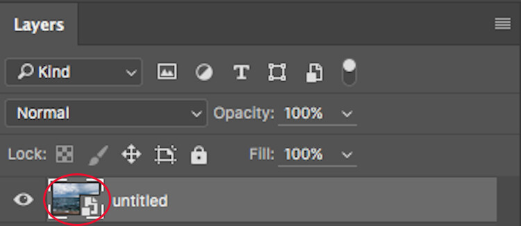
The icon over the preview of the layer indicates that this is a Smart Object.

So, what does a Smart Object do?

Smart Objects preserve an image’s source content with all its original characteristics, enabling you to perform nondestructive editing to the layer. When opening an image in Photoshop as a Smart Object, you have the ability to double-click the background layer (the base layer) which will open the image in ACR with all the adjustments you previously made, and enable you to make any alterations to the image. These alterations will then be pushed through to the image open in Photoshop.

So for example, say you adjusted an image in ACR and then opened it in Photoshop. After editing the image, you decide that the colour temperature is a little off. If you opened the image in Photoshop without it being a Smart Object, you would have to re-edit the image in Lightroom or ACR, then re-open the image in Photoshop, and finally, move any of the adjustments layers across to the new image. But if it were opened as a Smart Object, all you would need to do is double-click the background layer, make any of the desired adjustments in ACR and you’re done. The Smart Object will update in Photoshop and you can carry on.

Another way Smart Objects can help you is when applying a filter, such as Unsharp Masks or High Pass filters. By creating a Smart Object to apply these filters you will be able to double-click and adjust whichever filter has been applied.

How to Create a Smart Object

In Lightroom:

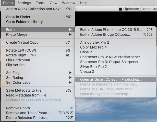
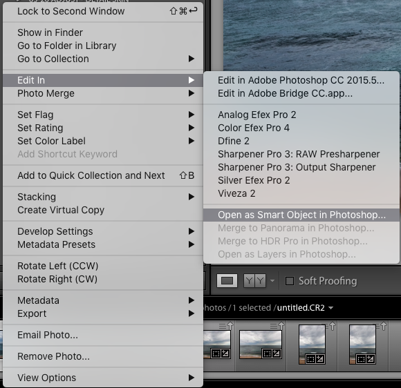
Inside Lightroom (with your image selected) go to the top menu and click: Photo > Edit In > Open as Smart Object in Photoshop… (see below)

Lightroom-Create 1

OR Right click on the image you want to open in Photoshop. Then select Edit In > Open as Smart Object in Photoshop…

Lightroom-Create 2

Through Adobe Camera Raw:

At the bottom of the ACR window you will see something like this:

ACR Create-1

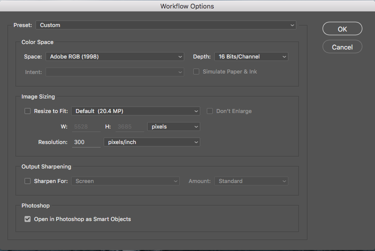
Clicking on this will open this dialog box. Make sure you have the Open in Photoshop as Smart Objects box checked. If you do not wish to do this (it is set as a default), you can also hold down the Shift key and the Open Image button will change to Open Object at the bottom right of the screen.

ACR Create

These are the two methods for creating a Smart Object before being opened in Photoshop. But what if you want to create one after you have already made adjustments? To do this, follow these steps:

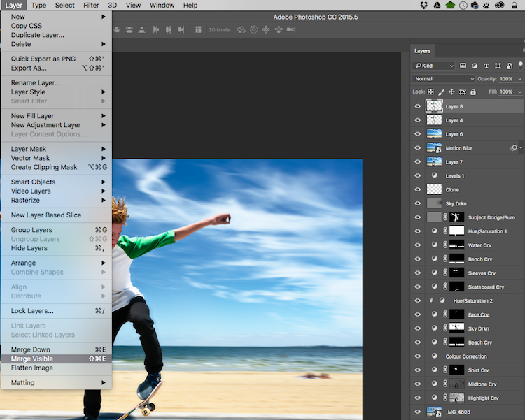
Step 1: You need to create a new layer with all the adjustment layers combined (stamped) into that one layer – but you don’t want to flatten the image. To do this, select the top visible layer (visible layers are denoted by the eye icon directly next to them), hold down the Option/Alt key, and select Layer > Merge Visible. Or you can use the keyboard shortcut: Then do one of the following: Press Shift+Ctrl+Alt+E (Windows) or Shift+Command+Option+E (Mac).

Photoshop will create a new layer containing the merged layers. So you will now have a layer at the top of your Layers panel which has all the visible adjustments made below, stamped into it (the rest will remain untouched).

With the top visible layer selected, go Layer > Merge Visible.

With the top visible layer selected, hold the Alt/Option key down, and select Layer > Merge Visible.

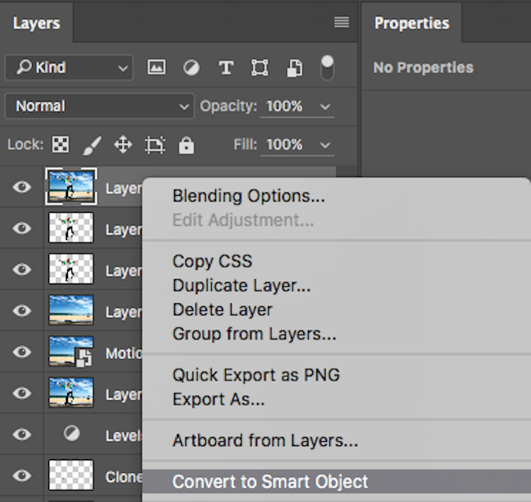
Step 2: With this new top layer selected, right-click and choose Convert to Smart Object. Now any adjustments you apply to this layer such as; motion blur, gaussian blur, any sharpening, etc., you will be able to alter again later by double-clicking on the Smart Object.

Convert to Smart Object

Creating Smart Objects is that simple, and the flexibility they give you is tremendous!

A couple of things to know about Smart Objects:

If you do not open the image in Photoshop as a Smart Object, creating a Smart Object in Photoshop will not give you the same editing abilities. If you want these editing abilities on your background layer, you must open it as a Smart Object.

Next, if you have made adjustment layers with masks applied to them, I would highly suggest that you do not crop the image through the Smart Object. This will crop the background image (your base image) and any masks that you have will not adjust to the new crop so you will have to go do your masking again. I would recommend doing any cropping before opening in Photoshop, or after you are finished in Photoshop.

Don’t be scared of Smart Objects. They are dead easy to make, and offer a massive amount of flexibility. Do you use Smart Objects? Have they helped you in your editing workflow? Let us know in the comments below.

googletag.cmd.push(function() {
tablet_slots.push( googletag.defineSlot( “/1005424/_dPSv4_tab-all-article-bottom_(300×250)”, [300, 250], “pb-ad-78623” ).addService( googletag.pubads() ) ); } );

googletag.cmd.push(function() {
mobile_slots.push( googletag.defineSlot( “/1005424/_dPSv4_mob-all-article-bottom_(300×250)”, [300, 250], “pb-ad-78158” ).addService( googletag.pubads() ) ); } );

The post How to Use Smart Objects in Photoshop by Daniel Smith appeared first on Digital Photography School.


Digital Photography School

 
Comments Off on How to Use Smart Objects in Photoshop

Posted in Photography


Literal Streetwear: ‘Pirate Printer’ Lifts Patterns from Urban Objects

29 Jul

[ By WebUrbanist in Design & Products & Packaging. ]

street wear clothes

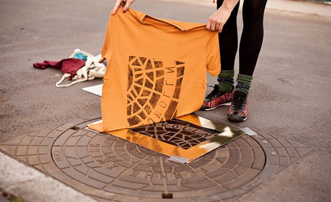
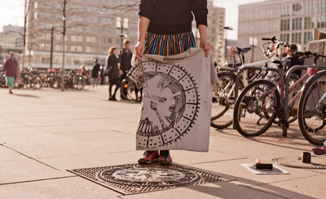
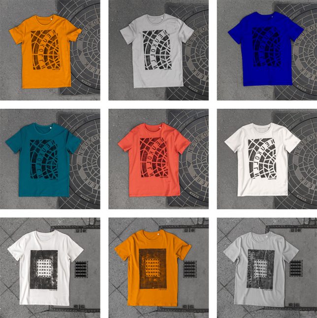
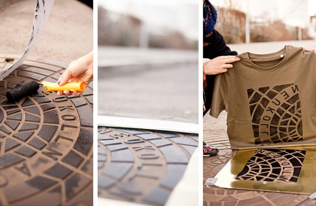
A Berlin art collective has taken to the streets, inking urban infrastructure and laying down shirts and tote bags to create a line of unique prints … their patterns directly lifted from city streets.

print process cover

pirate pressed tshirts

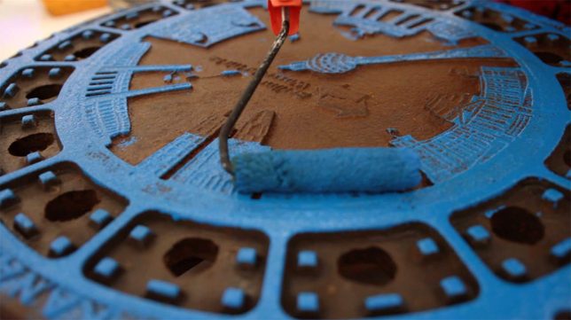
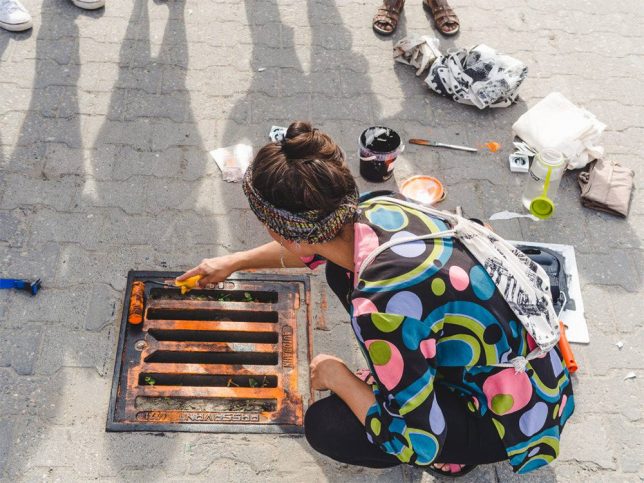
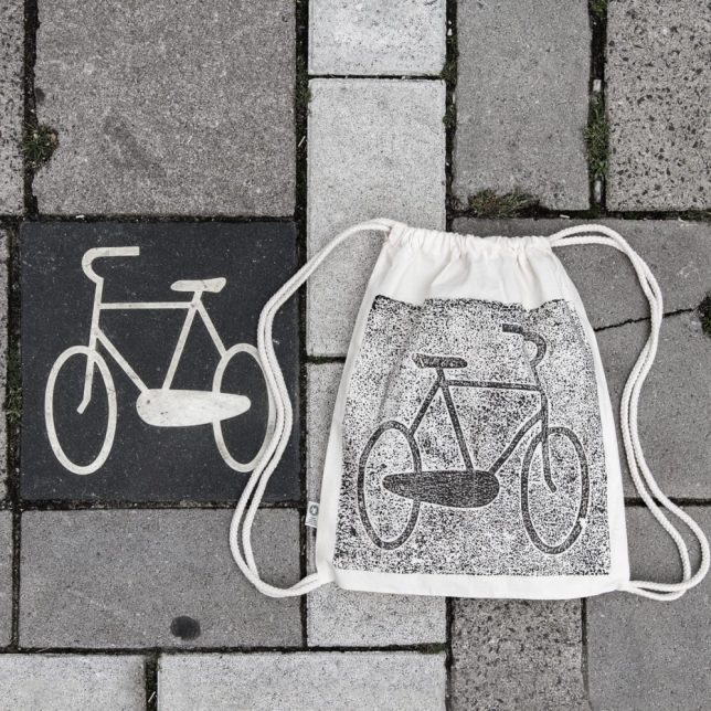
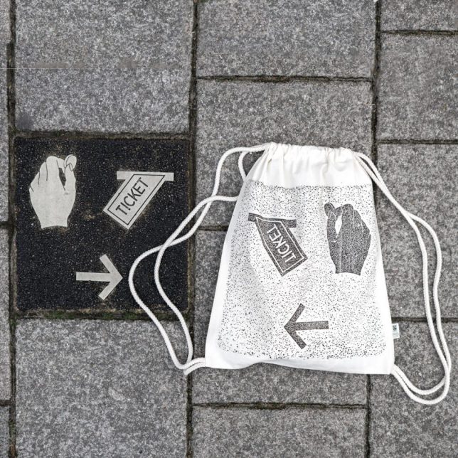
Raubdruckerin (AKA Pirate Printer) press apparel to painted manhole covers, utility grates, etched signage, vents and other objects that have depth differences (and thus themselves to the relief-printing process, like woodcuts or letterpress).

painted manhole cover

pirate clothing urban collection

painted city grate

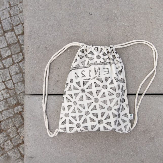
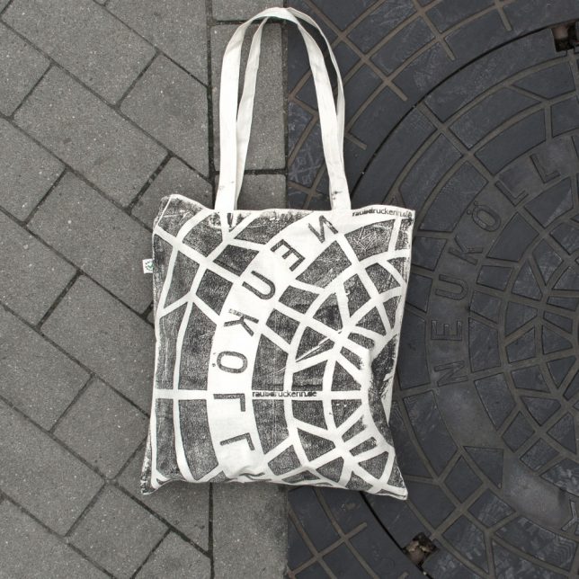
The group rolls out different colors of ink, much as one would with any kind of etched or raised printing process, then lays cloth down and applies pressure. Depending on the size and type of the object in question, the prints are partial or complete pictures of a given urban artifact.

pirate patterned bag

manhole cover bag

bike path sign

ticket sign

The crew has traveled to Amsterdam, Lisbon, Paris and other iconic cities to capture some of their least-noticed but still-beautiful urban artifacts, transferring overlooked parts of these places to a new style of streetwear. Naturally, each one is a little different – even when the same street fixture is used, the re-inking process results in variegation from one print to he next (via Colossal).

Share on Facebook


[ By WebUrbanist in Design & Products & Packaging. ]

[ WebUrbanist | Archives | Galleries | Privacy | TOS ]


WebUrbanist

 
Comments Off on Literal Streetwear: ‘Pirate Printer’ Lifts Patterns from Urban Objects

Posted in Creativity


Tips for Shooting Through Objects to Create a Special Effect

19 Mar

Photography is as much a study of the creative, as it is a study of the technical. Often, knowing all the technical ins and outs of your camera, still does not guarantee a stellar image – an image that evokes emotion, one that makes you stop in your tracks and take a second look. Such images are created by thinking outside the box, by experimenting with new techniques and ideas that may seem crazy, ridiculous, or even somewhat unbelievable! Lucky for us, we photographers are known to be a little bit crazy, so trying new and innovative techniques should not surprise us too much.

One such really cool and innovative technique, to add a little bit of creativity and flare in our imagery, is shooting through objects. This technique is, quite literally, to have a small object between the front of the lens and your subject. This is often used to frame the subject, in order to draw attention to it/them, soften the edges of the image, or add a cool color special effect, to an otherwise ordinary image.

Memorable Jaunts DPS Article Shooting through objects for special effects 01

The whole idea of shooting through objects, is to have an out of focus foreground and be able to shoot through it, but at the same time keep the subject sharp. This effect is best achieved by placing the object close to the lens, either by hand holding it, or by resting it against the lens. Placing the foreground object further away from the actual subject and closer to the front of your lens, makes it easier to blur.

Although any lens will work, the shorter your lens focal length the closer the foreground object will need to be to the front of the lens, making it much easier to hand hold. If the object you are shooting through is large, it is easy to miss the focus on the actual subject. In these situations, it is best to focus on the subject, lock focus by switching to manual focus (MF/AF toggle buttons are located on the lens body in most cases or using back button focus) and then bringing the foreground object close to the lens for the blur effect. Sometimes it is possible to use the out of focus foreground to hide distracting things in the background.

Memorable Jaunts DPS Article Shooting through objects for special effects 06

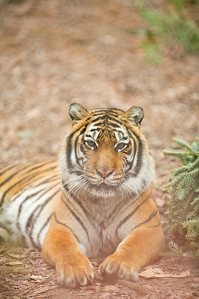
In the above image, this tiger in North Carolina’s Tiger Rescue facility, was holding a perfect pose and staring dead straight at me. Thankfully, I had a fence between me and the tiger (I am sure he was viewing me as a tasty snack!) and I loved the blur shapes seen in the top of the frame. I also handheld a piece of candy wrapper towards the bottom of the lens to give a little pink tint to the bottom of the image. The only post-processing done here, was to bring up the blacks and add a little contrast to the image.

The shoot-through technique works especially well with leaves, flowers, and even small pieces of glass. The possibilities are quite endless when it comes to finding things to shoot through. If you are feeling uninspired, sometimes bringing something as simple as a small strip of fabric, or a piece of clear plastic, can completely change the outcome of your final photograph. Look around your photography location and you are bound to find something to shoot through. Even if you often shoot in the same location, you may find something new each time. Flowers bloom at different times of year, leaves change color, and sometimes even dry twigs add an element of interest.

Memorable Jaunts DPS Article Shooting through objects for special effects-SidebySide01

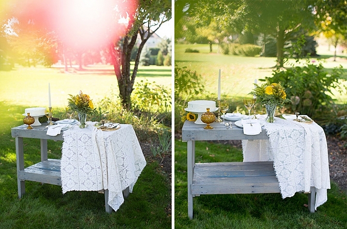
Always use these effects to taste. In the side-by-side above, I initially used a pink flower to see if I could get a cool, light leak effect in the frame. But somehow that did not appeal to me. So in the next frame, I took a leaf and held it up to the top of the lens. I loved this effect, as if I was shooting through the bushes but still retaining the details in the bottom half of the image.

Memorable Jaunts DPS Article Shooting through objects for special effects-SidebySide02

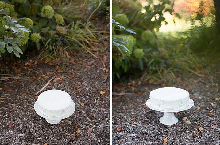
In the images of cakes above, the first is a standard, run-of-the-mill, top shot of the cake. But when I changed my angle and used a leaf to shoot through, I loved the blur effect it produced at the top of the frame.

Shooting through objects adds an element of interest to photographs. When you use colored pieces of glass or flowers, you get an effect similar to a light leak (from film days). Some photographs also appear to have been processed with unique filters, except all these effects are straight out of the camera (SOOC), not added during post-processing. When you use clear glass, plastic bags, or even sheer fabric, photographs appear to have additional texture and depth.

Memorable Jaunts DPS Article Shooting through objects for special effects-SidebySide03

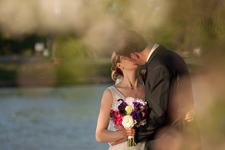
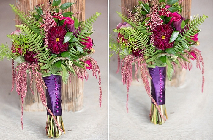
The bridal bouquet on the left is a straight shot. The one on the right has a clear piece of plastic (it was used to cover the cake topper) – I held it to the bottom on the lens to add a little texture and interest.

Memorable Jaunts DPS Article Shooting through objects for special effects 05

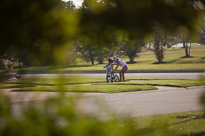
I love this image of my kids – my daughter is teaching my son to ride his bike. By shooting through the bushes, I caught them unawares, as well as used the bushes to frame the subject (in this case my kids!).

Memorable Jaunts DPS Article Shooting through objects for special effects 03

The sun was setting in my backyard, and to exaggerate its warmth, I added an orange piece of plastic (my flash gel cover). No post-processing needed!

While this is not a technique that should be used on every photograph, there are so many options for framing, introducing texture, and adding interest when you add an unexpected element into your photographs. Use this tool when you want to break free from the mundane and the ordinary, you might be pleasantly surprised with the results!

This week on dPS we are featuring articles on special effects. Check out the others that have already been published here:

  • How to Photograph the Full Band of the Milky Way
  • Fire Spinning with Steel Wool – A Special Effects Tutorial
  • Special Effect – How to Create Multiple Flash Exposures in a Single Frame
  • Stacking Light Trails for Night Photography Special Effects
  • 26 Unique Special Effects Photos to Spark Your Creativity
  • Weekly Photography Challenge – Special Effects

googletag.cmd.push(function() {
tablet_slots.push( googletag.defineSlot( “/1005424/_dPSv4_tab-all-article-bottom_(300×250)”, [300, 250], “pb-ad-78623” ).addService( googletag.pubads() ) ); } );

googletag.cmd.push(function() {
mobile_slots.push( googletag.defineSlot( “/1005424/_dPSv4_mob-all-article-bottom_(300×250)”, [300, 250], “pb-ad-78158” ).addService( googletag.pubads() ) ); } );

The post Tips for Shooting Through Objects to Create a Special Effect by Karthika Gupta appeared first on Digital Photography School.


Digital Photography School

 
Comments Off on Tips for Shooting Through Objects to Create a Special Effect

Posted in Photography