RSS
 

Posts Tagged ‘means’

Opinion: Why I’m excited about the D780 and what it means for the future of Nikon

07 Jan

As a Nikon D750 owner who’s been using the camera for 5+ years, I’ll admit I’m excited about the D780. The refreshed model is, essentially, a DSLR version of the Nikon Z6 and I fully expect it’ll be relevant for another 5+ years.

I’m also excited because the D780 proves Nikon is still committed to DSLRs in 2020. And it might point to a continuing strategy, at least for now, of releasing ‘companion’ DSLR/mirrorless products, like the D850 and Z7 or the Canon EOS 90D and closely related 6D Mark II.

A proper replacement for the D750 provides the perfect stepping stone for folks interested in the Z6 or Z7, but who are still not ready to fully commit to a new system

A proper replacement for the D750 – which the D780 looks to be – also provides the perfect stepping stone for folks like me, interested in the Z6 or Z7, but still not ready to fully commit to a new system. That said, in another three to five years I very well may be ready to make the jump: especially if replacements for the Z6/Z7 fill in the gaps where Nikon’s DSLRs are still superior, like autofocus.

Why does the D750 continue to be such an excellent stills camera for the money? Because it offers still-competitive dynamic range/image quality (this image was pushed 2.25-stops), highly reliable autofocus (with great tracking ) and great ergonomics in a well built, small/lightweight DSLR body. Which is all to say, the D780 has some big shoes to fill.

ISO 3600 | 1/320 sec | F2.2 | Shot on Nikon D750 + Nikon 35mm F2 D

Nikon’s 3D Tracking autofocus in the company’s DSLRs is still better implemented and more reliable than the tracking in Z-series cameras, even with recent firmware updates. And though the number of AF points is unchanged from the D750 to D780, the new model inherits the AF algorithms of the flagship D5, so users should expect further improvement to what is already (and still) a top performing AF system.

Nikon’s 3D Tracking autofocus in the company’s DSLRs is still better-implemented and more reliable than the tracking in Z-series cameras

I have no doubt in my mind Nikon will continue to dial in the reliability of AF tracking in Z-series cameras (and fix the clunky implementation). And for enthusiast photographers curious about mirrorless, the Z6 is a sensible camera to consider as-is. But for folks like me who rely on their camera for freelance work, or for those entirely making a living behind the lens (bless your souls), sticking with something that has a proven track record is a no-brainer. Not to mention, the D780 offers dual card slots, something many professionals insist on. The Z6 does not.

While I would’ve appreciated a small bump in sensor resolution in the D780, no increase means I don’t have to worry about the camera out-resolving my aging collection of AF-D lenses.

ISO 6400 | 1/500 sec | F3.2 | Shot on Nikon D750 + Nikon 85mm F1.8 D

Still, the camera does fall short of my hopes in a few areas, most notably the continued lack of an AF joystick and/or a touchpad AF implementation (the latter is offered in the mid-range D5600). I also would have liked to see some bump in resolution, though the updated sensor (likely the same as the Z6’s) does offer some image quality improvements. Still, I’m jazzed as heck for 4K video (with usable video autofocus!), a touchscreen, faster burst shooting and better AF, even if Nikon did remove my precious pop-up flash (truly handy as a fill for back-lit portraits).

By giving the D780 the same live view implementation as the Z-series, Nikon is gradually guiding traditional DSLR users to appreciate its virtues

Ultimately, I know there will likely come a day semi-professional DSLRs are phased out completely. Thankfully the D780 is proof Nikon is taking its time and not forcing users to switch too quickly. By giving the camera the same live view implementation and performance as the Z-series, Nikon is gradually guiding traditional DSLR users to accept and appreciate the virtues of a good live view experience, something current D750 users know nothing about. All while allowing us to keep our familiar DSLR form factor and precious optical viewfinder.

At the end of the day, this is a hugely important camera series for Nikon, having successfully straddled the line between professional and enthusiast cameras ever since the D700 debuted more than ten years ago. There’s a reason these cameras are so popular and find their way into the hands of so many photographers: they offer good reliability and good bang-for-the-buck in the long run. Heck, I still use my D700 from time-to-time. With the D780, the legacy of this series continues on. And if the days of the DSLR are truly numbered and this is the final chapter in the D700-saga, it seems to be a proper finale… unlike ‘The Rise of Skywalker’.

The Nikon D750 has and continues to serve me well.

ISO 3200 | 1/500 sec | F10 | Shot on Nikon D750 + Nikon 35mm F2 D

Articles: Digital Photography Review (dpreview.com)

 
Comments Off on Opinion: Why I’m excited about the D780 and what it means for the future of Nikon

Posted in Uncategorized


Banding means Nikon Z7 can’t match D850 dynamic range

01 Oct

Testing and real-world shooting show slight banding and striping patterns in Nikon Z7 images, undermining its otherwise excellent dynamic range. We demonstrate when you’ll encounter the effect so you can assess its importance for your photography.

Articles: Digital Photography Review (dpreview.com)

 
Comments Off on Banding means Nikon Z7 can’t match D850 dynamic range

Posted in Uncategorized


You probably don’t know what ISO means – and that’s a problem

06 Aug

Whatever camera or phone you have, it’ll report the ISO value it used to take its photos. Despite its ubiquity, ‘ISO’ probably doesn’t mean what you think it does. Worse still, it may be holding your camera back, both in terms of the images it takes and in the tools it provides you. This means it’s potentially holding your photography back, too. Part of the problem stems from the fact that ISO sounds like something you were already familiar with.

At first glance, ISO settings look just like the sensitivity ratings used for film (to the extent that there are some people who still refer to ASA: the US standard incorporated into the ISO standard for film). But ISO in digital isn’t the same as film. it’s essentially a metaphor for the way film sensitivity worked, if you got it processed in a minilab machine. This is a problem.

It causes confusion

The apparent familiarity and simplicity of ISO setting leads to a number of common misunderstandings. Despite what you may have heard or read, changing the ISO of your camera does not change its sensitivity.

ISO changes the lightness of the final image but it doesn’t change the fundamental sensitivity of your sensor. Nor is it an indicator of amplification being applied: although many cameras do increase their amplification as you increase the ISO setting, this isn’t always the case.

“Why can’t I use ISO 100 in Log mode?” The answer is that a log gamma curve is so flat that it requires very little light to achieve middle grey, which means it’s considered a high ISO. Strictly speaking, though, you can’t really calculate an ISO value for log at all, since the standard is based on a different colorspace and gamma. It’s a similar story for Raw.

This may sound like semantic nit-picking, but it causes a lot of misunderstandings. It’s widely thought that the additional noise in high ISO image comes from the ‘background hum’ of the sensor’s amplifiers. This feels right: we’ve all heard more hum if we turn up the volume on an audio amplifier. Unfortunately it’s simply not true: most noise actually comes from the light you’re capturing, so it primarily depends on your shutter speed and aperture*.

The ISO standard doesn’t specify that amplification needs to be used, nor does it specify what happens in the Raw file

The ISO standard doesn’t specify that amplification needs to be used, nor does it specify what happens in the Raw file. All it does is relate initial exposure to output JPEG lightness, however that is achieved. The only sure difference at the Raw level from an increase in ISO is that the change in ISO setting almost certainly led to less exposure, which means less light and therefore more noise for each tone from the scene.

There’s an ISO standard that’s slightly more pertinent to Raw files, which looks at when the sensor becomes completely saturated, but this doesn’t correspond to the standard used by your camera. So next time you see a graph comparing ‘Manufacturer’ and ‘Measured’ ISO, what you’re actually looking at is the ‘JPEG ISO’ vs ‘Saturation ISO.’ Any differences between the two mainly tell you how many stops above middle grey the manufacturer’s JPEG tone curve is designed to deliver.

It encourages poor exposure

As well as giving a false sense of simplicity, ISO’s increasingly tenuous attempt to mimic film ratings can mean making poor use of sensor response.

Film (particularly negative film) has a very distinctive response curve that gives lots of latitude for recovering highlights. Digital is very different: it offers a much more linear response but with a hard, unrecoverable clipping point in the highlights. And no, your favorite software doesn’t really recover completely clipped highlights from your Raw file**.

This graph shows the signal-to-noise ratio (essentially the noisiness) at different brightness levels of film and digital. The film response peaks and then gradually declines, with plenty of scope for recovering highlights from the right-hand side of the curve. The digital response rises to much higher levels than the film, then cuts-off abruptly. So why would you expose these two media in the same way?

Illustration based on DxO’s analysis

And yet, despite these differences, the digital ISO standard is based around ‘correctly’ exposing JPEG midtones***. A 2006 update to the standard gave manufacturers some flexibility in terms of how many stops of highlights they wanted in their JPEGs above middle grey****, but it still encourages exposure based on midtones, with a pre-set number of stops above this for highlights.

That’s not the best way to expose digital. The best results are achieved by giving as much exposure as possible without clipping the brightest tones you care about: a process called ‘exposing to the right.’ This maximizes the amount of light, and hence signal which, in turn, optimizes the signal-to-noise ratio (essentially ‘noisiness’).

And yet, by worrying about the JPEG middle grey, cameras end up giving every image the same number of stops for highlights, even though this is wasted in low DR scenes (that highlight space isn’t used and exposure is lower than optimal) or insufficient in high DR situations: the lovely colors of the sunset you’re shooting are lost, unrecoverably, to clipping.

Fujifilm’s DR modes essentially give you a choice of amplification and tone curve combinations that include different amounts of highlight information. These end up being rated as different ISO settings.

The ISO 200 / DR 100 example on the left has the least noise. The ISO 400 / DR 200 image has a shorter exposure, bringing more noise, despite having the same amount of amplification as the ISO 200 image. This low level of amplification means it has retained more highlight information than the ISO 400 / DR 100 image on the right, which used the same exposure but more amplification.

This problem isn’t easily solved: there are times that exposing-to-the-right will result in noisier midtones than you want. In these situations, you have to let the highlights go. However, fixating on JPEG midtones isn’t helpful.

It warps camera development

This brings us to the biggest problem with using a clumsy metaphor for film sensitivity as the way of setting image brightness in digital: it means we aren’t given the tools to optimally expose our sensors.

ISO ends up conflating the effects of amplification and of tone curve, meaning you have to do your own research to find out what your camera’s doing behind the scenes, and what the best way to expose it is.

We aren’t given the most basic tools: Raw histograms or Raw clipping warnings that would help optimize exposure

The preview image your camera gives, the histograms it draws and the exposure meters and guides it offers are all based on JPEG output and their midtones, because ISO says that’s what matters. This means we aren’t given the most basic tools we need: Raw histograms or Raw clipping warnings that would help optimize exposure. It means no development has been done to create more sophisticated tools that would help you judge the quality implications of exposing to the right, and when to let the highlights go.

In short, ISO is an increasingly shaky metaphor that promotes misunderstanding, obscures what your camera is doing and robs us of the tools we need to get the most out of our cameras. Isn’t it time for something better?

Thanks to Bobn2 for feedback and fact-checking

* This misunderstanding possibly stems from another misunderstanding. The hum you hear when you turn up the volume on an audio amplifier isn’t caused by the amplifier itself, it’s the hum of the mains electricity, made audible. [Return to text]

** Highlight recovery sliders usually rely on only one of the color channels having truly clipped, and try to guess the value of the clipped channels, based on the remaining, unclipped one, so tend to be limited in their effectiveness. [Return to text]

*** We put the word “correctly” in inverted commas because the more you think about it, the harder it becomes to pin down what ‘correct’ exposure might be. If you’re certain that you know what ‘correct’ exposure means, then you should probably check through the assumptions that underpin it. [Return to text]

**** This change is why the JPEG ISO ratings used by manufacturers don’t need to coincide with clipping-based Raw ISO numbers. We’ve previously written an article about how it works. [Return to text]

Articles: Digital Photography Review (dpreview.com)

 
Comments Off on You probably don’t know what ISO means – and that’s a problem

Posted in Uncategorized


Disney’s 21st Century Fox acquisition means it will now own National Geographic

16 Dec

Earlier this week, a major entertainment industry merger was announced: Disney is planning to buy 21st Century Fox for a whopping $ 52.4 billion. But while this might seem unrelated to the world of photography at first blush, a closer look reveals something pretty important.

If the purchase is allowed to go through, Disney will be the majority stake holder in National Geographic, taking over the 73% controlling share that Fox purchased in September of 2015.

In the scope of the entire deal, Fox’s share in National Geographic might seem like small potatoes—the entertainment giant bought Nat Geo for just $ 725 million (less that 1/50th what THEY are being bought for) and immediately set about cutting costs further by slashing 9% of Nat Geo’s workforce. But fans of the iconic brand will pay close attention to see what Disney plans to do with it.

For now, all we know is that National Geographic will join Pixar, ESPN, Marvel and many more well-known brands in Disney’s so-called “swollen portfolio” of entertainment assets.

Articles: Digital Photography Review (dpreview.com)

 
Comments Off on Disney’s 21st Century Fox acquisition means it will now own National Geographic

Posted in Uncategorized


Apple is releasing its Live Photos API, which means more moving photos in more places

21 Apr

Apple has revealed the API for its Live Photos feature, meaning more app and web developers will be able to support the company’s short 1.5 second video ‘moving photo’ video clips. Apps like Facebook are already able to display Live Photos for users running iOS 9, but making the API available will allow any developer who wants to put a Live Photos viewer on their website or in their iOS app to do so.

Live Photos debuted in 2015 with the iPhone 6S. Owners of recent iPhones including the 7 and 7 Plus can capture the moving images in the stock camera app, and anyone running iOS 9 or later can play the video clip by pressing and holding the image.

Articles: Digital Photography Review (dpreview.com)

 
Comments Off on Apple is releasing its Live Photos API, which means more moving photos in more places

Posted in Uncategorized


Weekly Photography Challenge What Winter Means to You

06 Dec

Earlier I shared a set of frosty images to get you in the wintery mood.

Now it’s the time for the weekly photography challenge, so it’s your turn to get out and shoot winter. Since winter means different things and looks different depending on where in the world you live – this challenge is about winter and what it means to you.

If you’re in the northern hemisphere that might mean:

  • Snow
  • Ice
  • Frost
  • Fog
  • Winter sports
  • Frozen things
  • Cold

Here are some examples:

@Doug88888

By @Doug88888

Sharon Mollerus

By Sharon Mollerus

Mathias Erhart

By Mathias Erhart

Samuel John

By Samuel John

Alexey Kljatov

By Alexey Kljatov

Dorena-wm

By dorena-wm

Dorena-wm

By dorena-wm

If you are in the southern hemisphere or close to the equator (as I am currently writing this from warm and sunny Nicaragua where I’m living and working for two months) that might mean the beach, sand and sun.

Share your winter images here:

Simply upload your shot into the comment field (look for the little camera icon in the Disqus comments section) and they’ll get embedded for us all to see or if you’d prefer upload them to your favourite photo sharing site and leave the link to them. Show me your best images in this week’s challenge.

googletag.cmd.push(function() {
mobile_slots.push( googletag.defineSlot( “/1005424/_dPSv4_mob-all-article-bottom_(300×250)”, [300, 250], “pb-ad-78158” ).addService( googletag.pubads() ) );
} );

The post Weekly Photography Challenge What Winter Means to You by Darlene Hildebrandt appeared first on Digital Photography School.


Digital Photography School

 
Comments Off on Weekly Photography Challenge What Winter Means to You

Posted in Photography


What the Android 4.4.1 update means for Google’s Nexus 5 shooters

12 Dec

nexus_5_2.JPG

A major software update promises to fix the bevy of camera issues Nexus 5 users started complaining about as soon as they got Google’s newest smartphones in hand. So does the Android update make for a more responsive camera? We put our refreshed Nexus 5 through its photographic paces on connect.dpreview.com.

News: Digital Photography Review (dpreview.com)

 
Comments Off on What the Android 4.4.1 update means for Google’s Nexus 5 shooters

Posted in Uncategorized


Matching the Production Style to the Image – High Energy Means High Contrast

31 Oct

Introduction

The Following is an excerpt from the SLR Lounge Lightroom Preset System v5 and accompanying workshop from the Lightroom Workshop Collection v5.  The Lightroom Preset System is designed to take you from Ordinary to Extraordinary photos in just a few seconds and clicks within Lightroom 4 and Lightroom 5.

Overview

One thing that we like to do within our studio is match the post production style to the overall emotion and story within the image. We feel that doing so leads to a much stronger overall image.

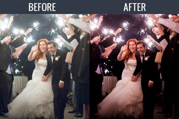
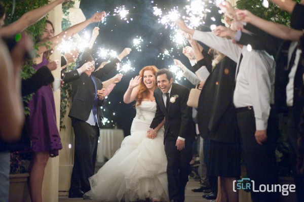
So in scenes that have a lot of energy, we want to emphasize the excitement with a colorful, high contrast production style. For this tutorial, we are using this sparkler exit photo which should be well complimented by the high contrast edit. The SLR Lounge Lightroom Preset System v5 has presets specifically for high contrast portraits which we are going to apply to this photo. Not to worry, we are going to demonstrate all of the settings below.

Here is what our image looks like before and after our presets are applied.

beforeandafter

Lightroom Preset System v5 Mixology

For those who have the Preset System, you can follow the Mixology Recipe below to get to the same results. If you don’t have the Preset System, please read the article or watch the video below to see exactly how this look was achieved.

Develop Mixology
01-10 BASE-SOFT: 14a. Heavy Crush – Skin Desat

Local Adjustment
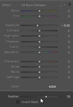
Radial Filter: 03 Burn (Darken) -0.5 Stop (watch video tutorial for reference)

Written Tutorial

Step 1: Checking the EXIF data

Screen-Shot-2013-08-12-at-3.40.04-PM

The first thing we generally do is take a look at how the image was shot. Doing so, gives us a lot of information on things we need to look out for when post producing. To check the EXIF data press ”i”.  This image was shot with a Nikon D700 at ISO 6400. This is important to keep in mind because Nikon cameras tend to shoot skin tones slightly green, and this high of an ISO might also present a noise issue.

Step 2: Apply Preset

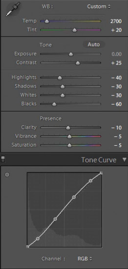
After we adjust Color Temperature and Tint to taste, we apply the “01-10 BASE-SOFT: 14a. Heavy Crush – Skin Desat” preset. This preset adds contrast to the photo and makes adjustments to desaturate skin tones.  The Contrast is being raised and the Shadows and Blacks are being dropped in order to boost overall image contrast. To flatten out the highlights over skin tones, we have dropped the Highlights and Whites.  In the Tone Curve we have a subtle “S” shaped contrast boosting tone curve to add a bit of contrast back specifically where we need it.

Here are the final Basic and Tone Curve Panel settings:

developpanal

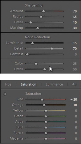
We have our standard Sharpening and Noise Reduction adjustments applied to this image. Even though this image was shot at a high ISO,the D700 takes such great photos at ISO 6400 that we don’t have to raise any of the Noise Reduction Luminance beyond what we already have.

In the HSL our Reds and Oranges are slightly dropped in order to desaturate heavy reds and oranges that can appear within skin tones when we are doing a high contrast edit.

developsettings1

Step 3: Add Radial Filter

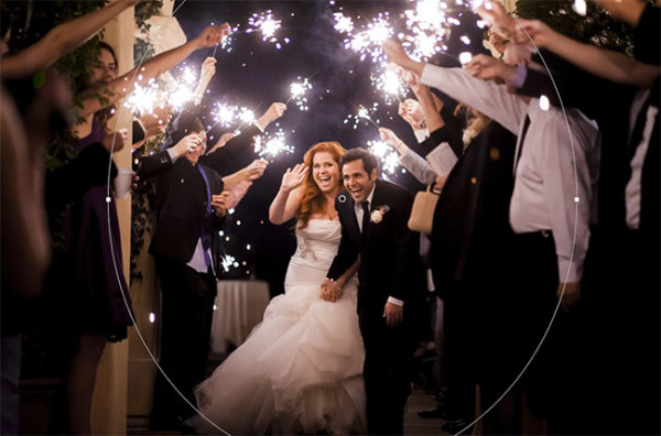
The last thing we’re going to do is add a Radial Filter to this image. This filter is unique to Lightroom 5, but Lightroom 4 users can get the same effect by adjusting the vignette settings, or by using an Adjustment Brush and painting around the outside of the image.

radialfilter

We’re pairing the Radial Filter with our “03 Burn (Darken) -0.5 Stops” preset to get a nice vignette around our couple. We adjust the Feather to 70 to make the effect more subtle.

radialfiltersettings

Some people may comment that shadow details are being clipped, but that’s okay for this image. Remember, we edited this image to fit the mood and energy, not for it to be technically “color correct.” Making this high energy photo a high contrast one is a stylistic choice, and we love the way it looks. Here’s what our photo looks like before and after our edit.

Before

lightroom-5-tutorial-high-contrast-portrait-0001

After

lightroom-5-tutorial-high-contrast-portrait-0002

Watch the Video Tutorial

If you would like to see exactly how all of the settings and adjustments were applied, please watch the video from the SLRLounge youtube video channel.

Conclusion and Learn More

We hope you all enjoyed this tutorial. If you are interested in learning more or purchasing the SLR Lounge Lightroom Preset System v5 or the newly released Lightroom Workshop Collection v5, please click any of the links in this article.

Post originally from: Digital Photography Tips.

Check out our more Photography Tips at Photography Tips for Beginners, Portrait Photography Tips and Wedding Photography Tips.

Matching the Production Style to the Image – High Energy Means High Contrast

The post Matching the Production Style to the Image – High Energy Means High Contrast by Post Production Pye appeared first on Digital Photography School.


Digital Photography School

 
Comments Off on Matching the Production Style to the Image – High Energy Means High Contrast

Posted in Photography


When Bad Weather Means Great Photography

19 Aug

CKP_Landscape_Clare128.jpg

Landscape photographer Carsten Krieger is no stranger to poor weather, but in this article he explains how you can get great shots even when the sun is hidden from view. His three-page article features several images taken in his native Ireland which should provide plenty of inspiration for those damp, rainy days that are just around the corner. Click through for a link to the full article. 

News: Digital Photography Review (dpreview.com)

 
Comments Off on When Bad Weather Means Great Photography

Posted in Uncategorized


What the new Nexus 7 tablet means for photographers

26 Jul

TS520x0~cms_posts-1397955347-SocialNexus7-24Web.jpg

Google debuted the second iteration of its popular Nexus 7 tablet yesterday at a San Francisco press conference, inciting excitement amongst fans of the Android device and plenty of comparisons to Apple’s iPad mini. Of course we’re most interested in how this second-gen device might fit into a photographer’s workflow. Click through for our opinion on connect.dpreview.com.

News: Digital Photography Review (dpreview.com)

 
Comments Off on What the new Nexus 7 tablet means for photographers

Posted in Uncategorized