RSS
 

Posts Tagged ‘masks’

How to Use Layers and Masks in Photoshop to Add Text to Your Photos

02 Feb

Do you want to make a photo-card for your loved one? Or maybe a flyer for your business? Or add some personalized notes to your photos that turn your album into a scrapbook? If you ever tried to add text on your photos and ended up just covering up the image, this article is for you.

How to Use Layers and Masks to Add Text to Your Photos

Although Photoshop is not a software specially-made for design, it does have some design functions, one of which is the text tool. You don’t need to learn any extra software to integrate text into your photos, you’ll learn how to use layers and masks in Photoshop to overlap the text and the image so that they interact which results in integrated and elegant images.

Since Valentine’s Day is so close, I’ll give you some easy-to-do examples to make a card for your loved one. However, you can apply the same steps to any image to add text for any other purpose.

Overlapping

In this first technique, you won’t apply any effects to the text itself, therefore the result is a clean and simple design.

First open an image of your choosing in Photoshop, one that goes well with the message you want to convey. You can later move the text to make some final arrangements, however, you do need to start with an idea for the text placement. This is because you need to select the part of the subject that you want to overlap with the text. I used the Quick Selection tool, but you can use whichever is best for you.

Selection - How to Use Layers and Masks to Add Text to Your Photos

Then duplicate the layer by dragging it to the new layer icon at the bottom, or by going to Menu > Layer > Duplicate Layer (you can also use the keyboard shortcut Cmd/Ctrl+J). Then you will need to add a mask to the new layer by clicking on the layer mask button from the bottom of the Layers palette.

Whatever was selected is now the only thing visible from that layer. You can also refine the edges of this selection if you right-click the layer and select Refine Edge.

Layer mask - How to Use Layers and Masks to Add Text to Your Photos

Add your text

Then, select the Text Tool and write your message. You can choose the font, size and color from the menu as you would in any word processor like Microsoft Word. Now your text is blocking your image but all you need to do to create the overlapping is to drag the text layer in between the background and the selected layers.

Text tool - How to Use Layers and Masks to Add Text to Your Photos

You can move or transform the text to make it fit better as well. Finally, if you want to have a part of the text appear to be behind the image and part in front, to make it more integrated, you can paint on the layer mask with a black brush (black conceals – white reveals) to hide the parts “behind”.

I love you - How to Use Layers and Masks to Add Text to Your Photos

Picture in Picture

Another way to integrate text and image is to use the same background photo as a pattern for the letters and just change the blend to give it a personalized effect.

Open an image of your choosing in Photoshop. Then using the Text tool, write your message in a font that is wide enough to show the image inside, in this case, I used Braggadocio.

Text Love - How to Use Layers and Masks in Photoshop to Add Text to Your Photos

Add the photo

Now go to Menu > File > Place and choose the same photo that you are using in the background. Adjust its size to fit the text.

Place - How to Use Layers and Masks in Photoshop to Add Text to Your Photos

Go back to the Layers palette and right-click the text layer. In the drop-down menu choose “Make a work path”. Then from the Path palette, right-click the work path and click on “make selection”. This will create a selection around the letters, but it will keep the path to make the selection later in other layers where you are going to need it.

Path Selection - How to Use Layers and Masks in Photoshop to Add Text to Your Photos

Then go back to the Layers palette and select the layer with the second image (the one you placed and added a layer mask to); this will have the shape of the letters.

If you want to rearrange the image inside the letters you can make the original text invisible by clicking on the eye icon on the left side of the layer name, and then unlink the mask by clicking the chain in between the thumbnails. That way you can just drag the photo until you are satisfied with how it looks (see below).

Unlink - How to Use Layers and Masks in Photoshop to Add Text to Your Photos

Once the image is placed the way you want it, you can apply any effect that you like. In this case, I added an adjustment layer with a Gradient map, this can be done by going to Menu > Layer > New Adjustment Layer > Gradient Map; or by clicking the shortcut button at the bottom of the palette. From there I chose a greyscale gradient.

Finishing up

Finally, I changed the blending mode of the layer to Multiply. You can do this or choose any other blending mode from the drop-down menu on the top part of the layer palette. Then I activated the original text layer (which was white if you remember) and I moved it a little bit so that it would show underneath and it gave it a border to separate it.

Love - How to Use Layers and Masks in Photoshop to Add Text to Your Photos

The post How to Use Layers and Masks in Photoshop to Add Text to Your Photos by Ana Mireles appeared first on Digital Photography School.


Digital Photography School

 
Comments Off on How to Use Layers and Masks in Photoshop to Add Text to Your Photos

Posted in Photography


How to use Filter Masks in Luminar for Powerful Local Adjustments

07 Nov

Luminar is a powerful, full-featured photo editor, with a massive array of features and editing tools. A great deal of its workflow is built around the fairly simple concept of applying filters. It’s much like the way you might edit a photo in Instagram or other similar programs – but you get much more power and control with Luminar.. You can use Luminar to add one or more filters to a picture in order to change properties like color, brightness, saturation, or even add fog effects or convert it to black and white.

However, this is where the similarities between Luminar and simple phone-based editing tools stops. Luminar’s filters are far more than just surface-level adjustments. They can be combined, layered, and customized in infinite combinations for photo editing far beyond what you might be used to in other programs. Add to that the use of filter masks to selectively choose where the edits to a filter are applied, and you have the recipe for a program that can become a very important part of your photography workflow.

How to use Filter Masks in Luminar for Powerful Local Adjustments

Understanding Filters

Luminar is built on a foundation of powerful editing algorithms that let you tweak every aspect of your photos. But unlike some other image editors on the market, it is extraordinarily simple to use the tools available to you. Rather than hundreds of confusing options, tiny buttons, and labyrinthine menus, many of the editing options in Luminar are available within a few clicks as Filters. Or you can access them by opening an image and clicking the “Add Filters” button on the upper-right portion of the user interface.

How to use Filter Masks in Luminar for Powerful Local Adjustments

Clicking “Add Filters” opens a menu that allows you to select from dozens of filters such as Clarity, Color Balance, Soft Focus, Tone, Vignette, and many others. If you’re unsure as to what all these filters actually do, just hover your cursor over one. A brief description will pop up along with a small sample image illustrating the type of editing that filter will do.

How to use Filter Masks in Luminar for Powerful Local Adjustments

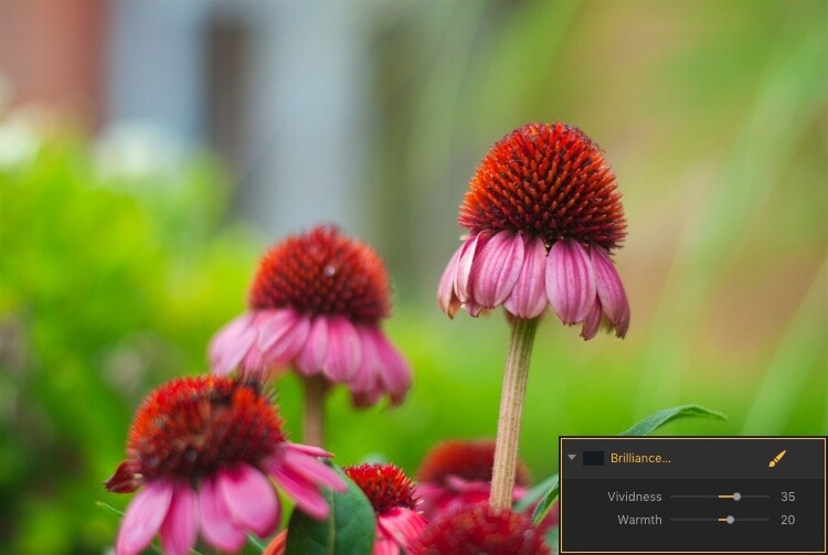
The easiest way to apply one of these is to simply click it and adjust any of the parameters available for that filter. For example, if you click on Brilliance/Warmth, you can adjust two different aspects of the filter; Vividness and Warmth.

How to use Filter Masks in Luminar for Powerful Local Adjustments

A few quick adjustments with a single filter made this bland RAW file go from ho-hum to frame-worthy.

Using Multiple Filters

You can combine as many filters as you want. You can even use layers, just as in Photoshop, to apply one or many filters. Then you can edit all of them at once with options like layer masking, which shows and hides everything on a single layer, and layer opacity.

It may sound complicated, but in actual use, the process is very simple: Load an image, add a filter, adjust the filter, and you’re done. The procedure only starts to get complicated if you want it to, at which point Luminar has a deep enough feature set to accommodate even the most highly demanding photographers.

Controlling the Effects with Filter Masks

Filters are all well and good, but the ace in Luminar’s sleeve is in the way it lets you apply them selectively with filter masks. If you have ever used a filter on Instagram you know that all your edits are applied across the entire image. That can be good but can also be quite frustrating if you only want to edit specific portions of the photo.

That’s where the simplicity and brilliance of Luminar’s approach really shine because you can control exactly where your edits are applied when you use a filter. To illustrate how this process works, I started with this photo (below) of a squirrel that was clearly in need of some editing.

I shot it in RAW in order to give myself the most amount of flexibility when editing the image, but Luminar works fine with JPG files too. Just know that you won’t have quite the same degree of control when editing JPG compared to RAW files.

How to use Filter Masks in Luminar for Powerful Local Adjustments

Apply Global Edits First

Before I started doing selective editing with filter masks, the first thing I did was to use two filters on the entire image. I used the Brightness/Contrast filter to make the picture brighter and then used Highlights/Shadows to lower the highlights a bit.

How to use Filter Masks in Luminar for Powerful Local Adjustments

So far so good, but I wanted to really make the squirrel stand out from the fountain in the background. Next, I added a Color Temperature filter but here I used the Brush icon in the top corner of the filter control box to apply it only to the squirrel.

Add Local Adjustments

This lets you literally paint in the filter adjustment in the same way you might use the Adjustment Brush tool in Lightroom to selectively edit an image. As you’re painting, you can use the toolbar at the top left of your screen to control the size, softness, and opacity of your brush as well as other settings that will feel right at home to most photographers.

How to use Filter Masks in Luminar for Powerful Local Adjustments

Click the Show Mask icon in the top left corner of the Luminar interface to show where you are applying (painting) a filter to the image.

By far, the most useful option here is Show Mask which you can select by clicking the eye icon in the top left, or by pressing the / key on your keyboard. This lets you see exactly where you are applying your adjustments in real-time while you paint. It is highly useful for making sure your edits are only applied where you want them to show up.

You can use the scroll wheel on your mouse to zoom into the image while brushing your filter adjustments. This allows you to fine-tune your editing to be exactly where you want it applied.

How to use Filter Masks in Luminar for Powerful Local Adjustments

With Show Mask enabled your filter adjustments show as red markings on the photo.

Add a Vignette on the Bottom Only

After editing the color temperature of the squirrel I used the Vignette filter. But instead of applying it to the whole picture I brushed it in just on the bottom corners (something users of Apple’s now-defunct image editing program Aperture might remember doing years ago).

How to use Filter Masks in Luminar for Powerful Local Adjustments

The icon in the top left corner of the filter window shows a black-and-white preview of where the mask has been applied. White reveals, black conceals – just like Photoshop. So anything shown in white is where that filter will be showing.

The ability to brush on filter adjustments is a huge game-changer for anyone who is used to the limited brushing options in Lightroom or overwhelmed by the prospect of doing this type of granular editing in Photoshop. And I say this as someone who uses both Lightroom and Photoshop!

Sometimes I just need a quick and simple editing workflow and the more I use Luminar the more it has replaced much of the work I do in those and other programs. To add a bit of icing to the editing cake, Luminar ships with full plugin support for many popular image editing programs including Photoshop and Lightroom. So you can still use those for your traditional workflow while simply hopping over to Luminar if you want to make use of that program as well.

Filter Mask Options

While my favorite aspect of filter making is the ability to brush adjustments precisely where I want them. But there are two other options that can be quite useful depending on the type of editing you want to do. In addition to a brush, you also have the option of applying Luminar filters with a Radial Mask, Gradient Mask, or Luminosity Mask.

Radial Mask

This applies the filter in a circular pattern which can be rotated, expanded, and contracted. It allows you to apply a filter in an even and controlled fashion. It works almost exactly like the Radial Filter in Lightroom. But instead of only letting you adjust the basic exposure, color, sharpness, and noise you can use it to apply any of Luminar’s dozens of filters.

Think of it like the Lightroom Radial Filter but much more powerful and customizable.

How to use Filter Masks in Luminar for Powerful Local Adjustments

The Radial Mask in Luminar can be used with any of its powerful Filters.

Gradient Mask

Similar to the Radial Mask, the Gradient Mask lets you apply a filter smoothly across an entire image while gradually changing the degree to which it is applied. Once again it works just like its Lightroom counterpart but for filters. Once you have either of the Radial or Gradient masks applied you can choose several additional options such as Disable, Invert, Density, and Feather.

How to use Filter Masks in Luminar for Powerful Local Adjustments

Luminosity Mask

This is an option that is somewhat unique to Luminar. Even though you can re-create this type of mask in Photoshop and other programs I have never seen it implemented so easily and smoothly as it is here.

When you enable a filter and click on the brush icon you have the option of creating a mask that applies the filter only to the brightest portions of the image. This is incredibly useful if you want to make changes and edits quickly without zooming in and painstakingly brushing in your adjustments at a granular level.

This feature is especially useful for landscape photographers who frequently have images with a lot of contrast between the lightest and darkest parts of the image. They often need to edit the sky separately from the rest of the image.

Luminosity Mask in Action

As an example of how this works, I have used the following image of a sunrise that I took in Nebraska one chilly winter morning.

How to use Filter Masks in Luminar for Powerful Local Adjustments

I wanted to make adjustments to the sky while also brightening the dark portions, but not have my edits interfere with each other.

The first step was to add a Brilliance/Warmth filter and then generate a Luminosity Mask. That would make sure any changes would be made just to the sky and not the foreground. I confirmed this by showing the Mask Overlay which gave me a clear idea of where the mask was being applied.

How to use Filter Masks in Luminar for Powerful Local Adjustments

I edited the values of the Brightness/Warmth slider to get the sky looking just right, then added a Highlight/Shadow filter to brighten up the foreground. After that, I finished with a Color Temperature filter which I applied only to the ground by using an inverted Luminosity Mask. That ensured it would apply only to the shadows and not the highlights.

The final image gave me a result that would have been much trickier to create in Lightroom, and require a lot of complicated selection editing and layer adjustments in Photoshop.

Note: the new version of Lightroom (Classic) that Adobe just released now has the ability to add a Luminosity mask to local adjustments as well. 

How to use Filter Masks in Luminar for Powerful Local Adjustments

Simply Powerful Editing

The real advantage for me when using Luminar’s Filter Masking is that it’s a way for me to do creative, complex edits to my images in a simple and efficient manner. Some people have asked me if it’s better than Photoshop and Lightroom, and my answer is a rather vague. “it depends”.

I think there is room for all three programs in a photographer’s workflow depending on that person’s individual needs. But there certainly is a lot to be said for how Luminar gives you access to such powerful and highly customizable image filters while making the adjustment process so easy to use.

If you just want to click a few filters and save your image, as you would in Instagram, then you can be on your way in seconds. However, if you want more fine-grain control over which parts of your photos that those filters are editing, then using Filter Masks in Luminar might be the answer you’ve been looking for.

Have you tried Luminar’s filter masking feature? I’m curious to know about your experience and any tips or tricks you might have uncovered. If you have not yet given these tools a chance you might be surprised at the results you can achieve.

Disclaimer: Macphun is a dPS advertising partner.

The post How to use Filter Masks in Luminar for Powerful Local Adjustments by Simon Ringsmuth appeared first on Digital Photography School.


Digital Photography School

 
Comments Off on How to use Filter Masks in Luminar for Powerful Local Adjustments

Posted in Photography


How to Create an Antique Photo Look Using a Lemon and Layer Masks in Photoshop

17 Mar

Layers were presented for the first time in Adobe Photoshop in version 3.0, which launched in 1994. We take them for granted nowadays, but they were a total game changer at the time as they allowed image composites to be taken to a whole different level with image stacking and transparencies.

Layer Masks may seem like a scary monster for a Photoshop newbie, but they are in fact quite easy to understand as they work the same way as layer transparency. But layer masks use a non-destructive way to reveal or hide portions of a layer by defining pixel opacities without affecting the original data.

It all happens with greyscale data: think of black as transparent, white as opaque and gray as different levels of opacity depending on if they are lighter or darker. Following this theory, this also means that you can convert any greyscale image into a Layer Mask and use it to create many types of effects on your image.

This tutorial is a step-by-step example on how to use this technique.

How to create your own Layer Mask

Create an old school effect

For this particular image, I wanted to create an old-school or antique effect, like an alternative darkroom process of developing a black and white image with a brush. This mask could be done in many different ways, but, because I wanted to make it really textured and as authentic as possible, I used an oxidation process.

Prepare the paper first

To give this process a try, you will need a paper sheet and some lemon juice.

02 How to create your own Layer Masks

Brush the paper with the lemon juice and create you mask area

03 How to create your own Layer Masks

The lemon juice will oxidate upon contact with air, but it will take a long time. To accelerate the process, you can put the paper near a heat source like a tungsten lamp or if you want it even faster, you can use an oven at a low temperature setting like I did here.

04 How to create your own Layer Masks

The lemon juice will start to turn a brown color. Remove the paper from the oven when you get the color and texture you intend, and your paper sheet is ready to be scanned or photographed to create an image file like this:

05 How to create your own Layer Masks

Photoshop technique

Now open Photoshop and the image on which you want to create the mask.

06 How to create your own Layer Masks

Convert the layer to a mask

Now click on the layer mask icon on the bottom of the layers’ palette and your background layer will be converted into Layer 0 with a white mask next to it.

Press the alt/option key on your keyboard and click on the white mask to make it visible and active. This is a very important step! If you miss this step the image itself will be active and visible instead of the mask, that is what you will be working on.

Once you have done this, the image itself will not disappear, it will just be hidden.

07 How to create your own Layer Masks

Convert to greyscale

Now it’s time to open your mask image and convert it to greyscale. One easy way to do it is to use the desaturate function located in: Image > Adjustments > Desaturate (or keyboard shortcut Control/Cmd+Shift+U)

08 How to create your own Layer Masks

The final image you want to create is white around the edges, so your mask should be the opposite. You can use the invert function for this: Image > Adjustments > Invert (Control/Cmd+I)

09 How to create your own Layer Masks

Put the image into the mask

Next, it is time to paste the image into the mask with these simple steps:

  • Select > All (Control/Cmd+A)
  • Edit > Copy (Control/Cmd+C)
  • Now click on the original image where you created the layer mask and go to: Edit > Paste (Control/Cmd+P)
  • Click on the eye icon on the left side of the layers’ palette to see the image and the mask working together.

10 How to create your own Layer Masks

Add a white layer

As you can see the mask creates different levels of transparency on the image. To be able to see the transparency as white we can create a new white layer to use as a background.

  • Go to: Layer > New > Layer (Control/Cmd+Shift+N)
  • Edit > Fill > Contents: White; Mode: Normal; Opacity: 100%

11 How to create your own Layer Masks

Now just drag the new white layer to the bottom position of the layers panel, and you will have a full view of the final image appearance.

12 How to create your own Layer Masks

Fine-tune the effect

Now it is just a matter of a few adjustments to fine-tune the effect you want. In this particular image, I will adjust the size of the mask. Click on the mask icon in the layers’ palette and then click on the chain between the image and the mask icon to unlink them.

13 How to create your own Layer Masks

Next go to: Edit > Transform > Scale (Control/Cmd+T). Drag the image edge lines to transform the shape of the mask and adjust it to the image size.

14 How to create your own Layer Masks

The size of the mask is right, but the image looks to washed out. We can increase the contrast of the mask to make the blending with the image look better.

Go to: Image > Adjustments > Levels (Control/Cmd+L). Adjust the sliders on the levels dialogue box to create the effect you want.

15 How to create your own Layer Masks

Lastly, for the old image look, you can use the black and white function. Click on the image icon in the layers’ palette so that you are editing the image and not the mask, then go to; Image > Adjustments > Black & White (Control/Cmd+Alt+Shift+B). Adjust the sliders on the Black & White dialogue box to create the effect you want.

Note: You can also add the black and white as an adjustment layer to keep your editing non-destructive. Additionally, you can paint on the mask with a black brush, over any areas you want to keep clear (such as her eyes or face). 

16 How to create your own Layer Masks

There it is, a quick and easy way to create your own layer masks. Give it a try and share your images with us in the comments below.

The post How to Create an Antique Photo Look Using a Lemon and Layer Masks in Photoshop by Ivo Guimaraes appeared first on Digital Photography School.


Digital Photography School

 
Comments Off on How to Create an Antique Photo Look Using a Lemon and Layer Masks in Photoshop

Posted in Photography


How to Enhance Urban Night Photographs Using Luminosity Masks in Photoshop

19 Jun

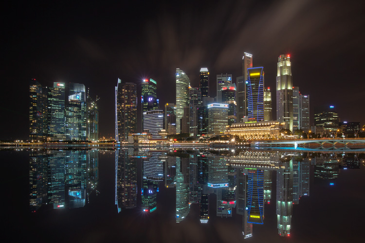
As the sun sets on a city’s skyline, thousands of lights come flooding the concrete jungle, turning every urban scene into a photographer’s paradise. Every corner around the city suddenly seems too irresistible not to be photographed.

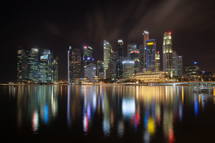
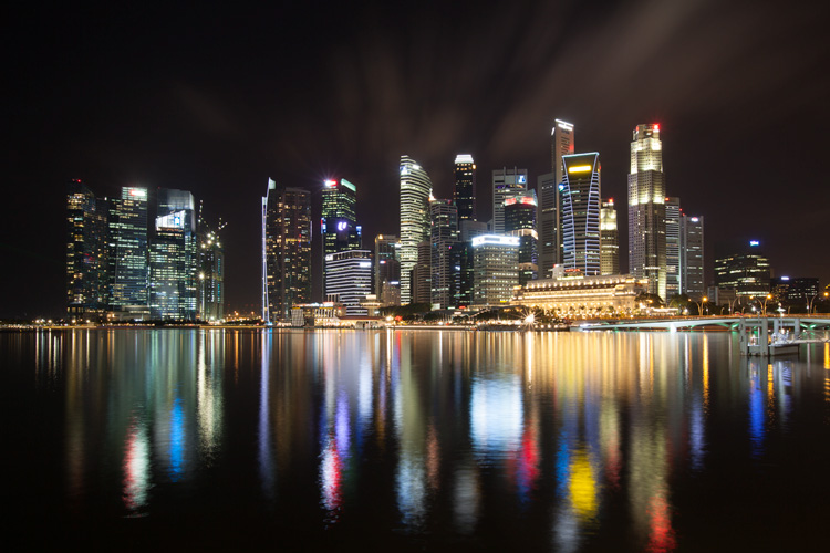
Image 01

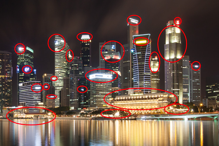
Urban night shots is probably one of the most common photos taken at night. The way most people shoot cityscapes at night is to keep the camera still, press the trigger, and snap the shot. The result is often an uninspired image, with overexposed highlights due to the long exposure. This problem can be fixed by blending multiple exposures, to recover details in the highlights with luminosity masks.

Image 02

Overexposure of highlights circles in red.

Using Luminosity Masks is a way of making a selection based on the luminosity (or brightness) value of the pixels. The main advantage of luminosity masks over other selection tools is its ability to feather the edges, which makes the transition seamless. One of the earliest articles detailing how luminosity masks works was published by Tony Kuyper. You can learn more about luminosity masks here.

In this tutorial, I will show you step by step, how you can recover detail in the highlights of your urban night shots, using luminosity masks in Photoshop. There are two parts to this: taking the multiple exposure, and editing them in Photoshop with luminosity masks.

Part one: How to take multiple exposures

  • Step 1: You need a tripod, and a camera that has aperture priority and manual mode.
  • Step 2: Mount your camera on the tripod and compose your image. In aperture priority mode, set the aperture and ISO settings you want, and take a shot with the default metering mode (usually matrix metering).
  • Step 3: Review the image on the LCD screen and take note of the shutter speed. Switch your camera to manual mode and dial in the ISO, aperture, and shutter speed that you used for the first shot.
  • Step 4: Speed up your shutter speed by one stop and take a shot again. For example, if the initial shutter speed was 30 seconds, stopping up by one stop would be 15 seconds (the shutter speed halves).
  • Step 5: Repeat step 4 until you can see details in the highlights by zooming in on the LCD screen on your camera, and checking the histogram for clipped highlights (blinks).

Tip: Use a remote release and/or enable mirror lockup (in a DSLR) to ensure the sharpness of your photos.

Part two: Recovering the highlights using luminosity masks in Photoshop

Step 1: If you use Adobe Lightroom, select all the images you want to blend. Right click on the mouse, choose Edit in > Open as layers in Photoshop. Otherwise, you can open them individually in Photoshop, use the move tool and drag each image into a single file as layers.

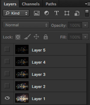
Step 2: Make sure the images are arranged such that the brightest exposure is at the bottom of the layers. To make sure all images are absolutely aligned, select all layers, then go to Edit > Auto-Align Layers. You may have to crop the image a bit after alignment.

Image 03

The layers are arranged so that the brightest image is at the bottom.

Step 3: Make sure you have luminosity masks Photoshop Actions to add and remove luminosity masks. If you don’t, you can download it here (the file is zipped, so make sure you unzip it first, then follow the instruction on how to install it here).

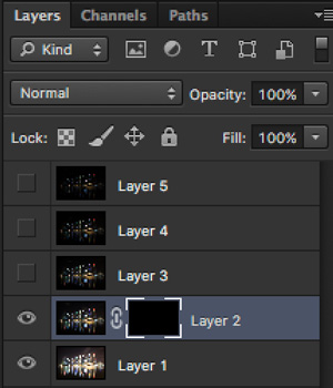
Step 4: To start off, make all layers invisible except the bottom two (layer 1 and 2). You can do so by unchecking the eye icon next to each layer. Next, create a mask for Layer 2 and fill it with black.

Image 04

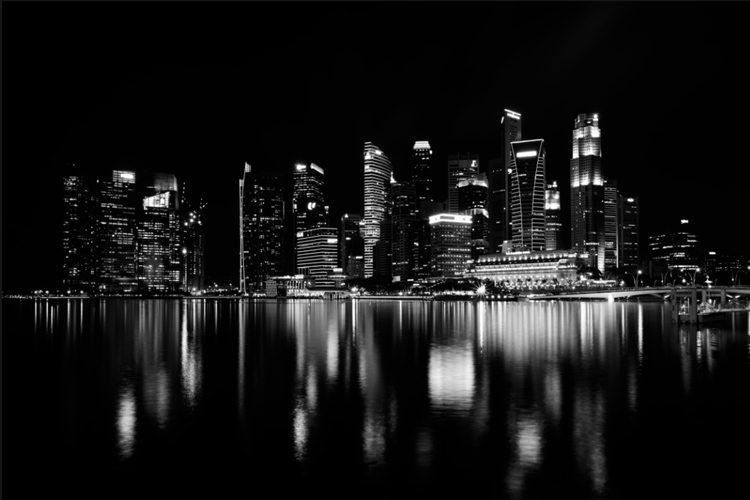
Step 4: Next, generate luminosity masks based on Layer 1 (the brightest exposure). To do that, select Layer 1 on the layers panel, and generate the luminosity mask with the Photoshop Action.

Step 5: Go to Channels panel, select a Brights luminosity mask that targets just the highlights. In this case, Brights 2 seems like a good choice because it is not too restrictive and has good feathering on the edges.

Image 05

Step 6: Select Brights 2 luminosity mask by holding down CMD (Mac) or CTRL (Win) and left click on the mask. You should see marching ants appear on the image. Depending on your image, if you do see a pop-up window that says “Warning: No pixels are more than 50% selected…”, don’t worry about it and just click ok.

Step 7: Go back to the layers panel and click on the mask on layer 2. Select the brush tool, set the opacity to 50%, color to white, and paint over the layer mask to blend the darker exposure (Layer 2) into the brighter exposure (Layer 1 below). Depending on your image, you can choose to paint just the brightest highlights or all of them. In this example, I chose to paint all the highlights. If you find the marching ants annoying, hit CMD (Mac) or CTRL (Win) + H key to hide them.

Image 06

Details in the highlights are gradually recovered.

Step 8: Delete the luminosity masks generated previously because you now need luminosity masks based on the brightness of Layer 2, where you have just blended in the darker exposure. To do so, remove the current luminosity masks with the Photoshop Action.

Step 9: Now select Layer 2 and generate luminosity masks with the Photoshop Action.

Step 10: Select Layer 3, add a layer mask, and fill it with black.

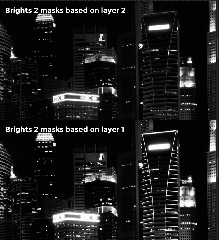
Step 11: Go to the Channels panel, select a brights mask that targets the highlights. In most cases, selecting the same mask should do the job. In this example, I have chosen the Brights 2 mask again.

Image 07

Comparison of Brights mask for Layer 1 and Layer 2.

Step 12: Hold down CMD (Mac) or CTRL (Win) and click on Brights 2 mask to select once again. Go back to layers panel and click the mask on Layer 3, then use a white brush as before, and paint over the highlights again. You should see details being recovered gradually. At this stage, you should consider painting over the brightest highlights only instead of the whole image. In this example, I only painted the highlights as circles in the illustration below.

Image 02

Step 13: Repeat Steps 8 to 12 until you are done with all the layers. Your final image should have a more balanced exposure, with details in the highlights. You can then apply further tonal or color adjustments, and sharpening to your image.

Image 08

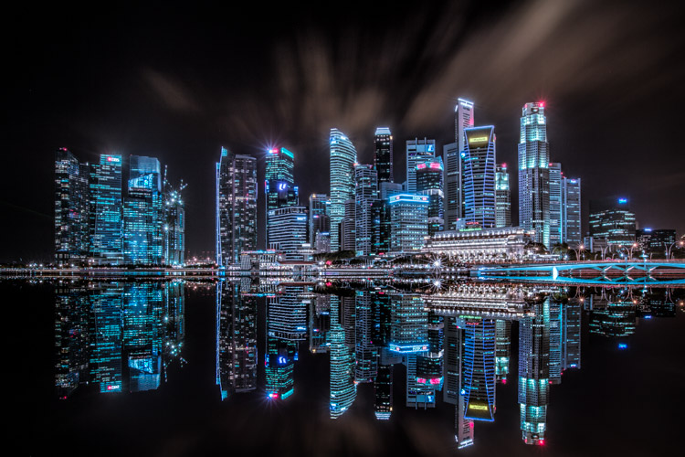
Final image.

Bonus: Adding a reflection and color to the lights

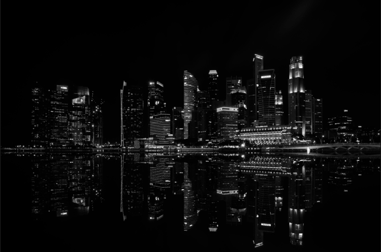
This involves a lot of editing, and may not be for everyone. For those of you who are into post-processing, you can clean up the image by removing unwanted objects, add a reflection, and change the color of the lights.

Adding a reflection

This only works if you have an empty foreground in your image like the example here.

  • Step 1: Use the rectangular marquee tool and make a selection of the city’s skyline. Then, copy and paste it as a new layer.
Image 09

Copy and paste the selection as a new layer.

  • Step 2: Select the layer of the copy, hold CMD (Mac) or CTRL (Win) + T to transform. Move your cursor to the image, right click and select > Flip Vertical. Use the move tool to position the flipped image lower to align the border.

Image 10

  • Step 3: You can add a ripple effect to the reflection by going to the top menu and selecting Filter > Distort > Ripple. Keep the size of the ripple to medium, set the amount you like, and press ok.
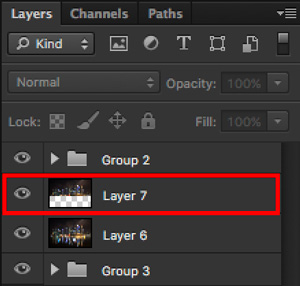
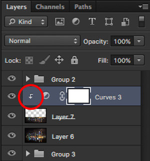
  • Step 4: Increase the contrast of the reflection by adding a curves adjustment layer, and clip it to the reflection layer only. To do that, right click on the curves layer and select Create Clipping Masks. You should see a little arrow on the curves layer pointing down at the layer below it. You can also reduce the opacity of the reflection layer if you like.
image-11

Clipping curves adjustment to the layer below.

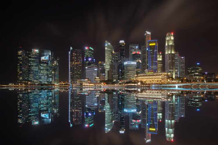
Image 12
Final image with reflection.

Adding color to the lights

  • Step 1: You need a visible layer to begin with. If you don’t have one, you can go to the menu on the top and choose Layer > Merge Visible.
  • Step 2: Generate luminosity masks based on this layer. Remember to delete any luminosity masks you had before this.
  • Step 3: Select a brights luminosity masks that targets the highlights. In this example, I know from before that brights 2 mask works very well, so I’m going to choose it again. Select it by holding cmd (Mac) or ctrl (Win) + left click on your mouse.
Image 13

Brights 2 luminosity mask.

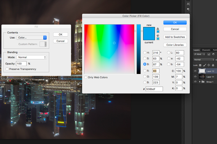
  • Step 4: Add a new layer, and change the blend mode to soft light. The selection should be automatically loaded onto this new layer already.
  • Step 5: Now fill the with the color of your choice by holding down Shift + Backspace, select a color, and press ok. You should now see the color of the lights have changed subtly.

Image 14

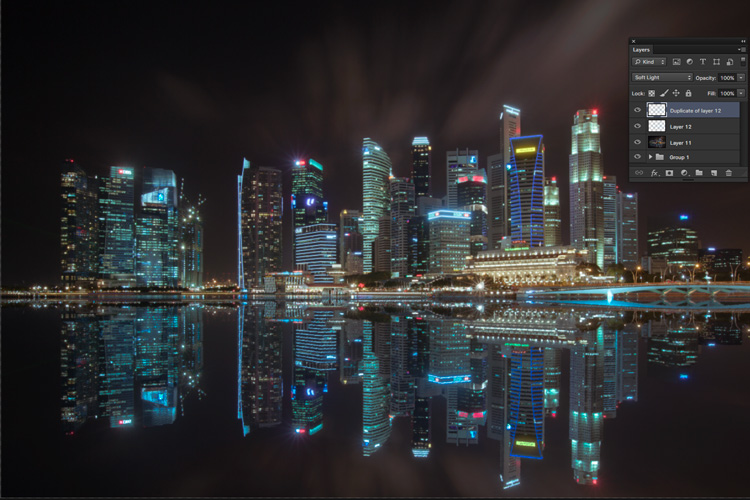
  • Step 5: If you want the effect to be stronger, duplicate the layer once or twice until you like it.
Image 15

Duplicate the layer for a stronger effect.

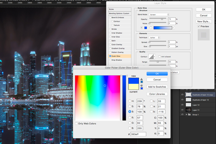
  • Step 6: The final step is what makes the lights glow. Double click on the top layer to bring up the layer style. Check the box for outer glow, and pick a color that is slightly darker than the one you have used before. Click ok and your done!
Image 16

Apply outer glow for the final touch.

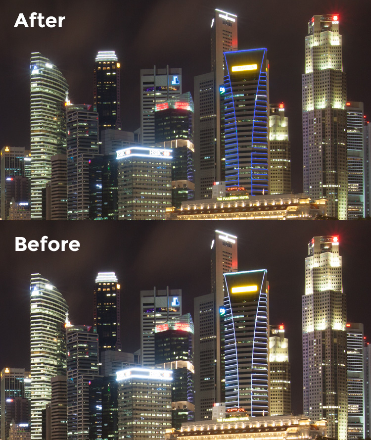
Apply a few other tweaks and sharpening and you’ve got yourself a cool urban night cityscape!

Before

Before

Image 01

After


googletag.cmd.push(function() {
tablet_slots.push( googletag.defineSlot( “/1005424/_dPSv4_tab-all-article-bottom_(300×250)”, [300, 250], “pb-ad-78623” ).addService( googletag.pubads() ) ); } );

googletag.cmd.push(function() {
mobile_slots.push( googletag.defineSlot( “/1005424/_dPSv4_mob-all-article-bottom_(300×250)”, [300, 250], “pb-ad-78158” ).addService( googletag.pubads() ) ); } );

The post How to Enhance Urban Night Photographs Using Luminosity Masks in Photoshop by Yaopey Yong appeared first on Digital Photography School.


Digital Photography School

 
Comments Off on How to Enhance Urban Night Photographs Using Luminosity Masks in Photoshop

Posted in Photography


Broncolor launches range of softbox edge masks for rim light effect

26 May

$ (document).ready(function() { SampleGalleryV2({“containerId”:”embeddedSampleGallery_2696643628″,”galleryId”:”2696643628″,”isEmbeddedWidget”:true,”standalone”:false,”selectedImageIndex”:0,”startInCommentsView”:false,”isMobile”:false}) });

Swiss lighting brand broncolor has announced a range of diffuser panels for its softboxes that help to create a rim light effect when the subject is positioned in front of the softbox. The Edge Masks feature a large black panel in the center of the diffuser that prevents light from passing, but leaves strips all the way around the panel for the flash to pass through. The idea is that people posed in front of the panel will appear on a black background but highlighted with a rim of light all around them.

The panels are designed to replace the usual white diffuser of the softbox, which is removed when the Edge Mask is in place. The effect is relatively easy to achieve using any softbox and a panel of black material, but these are a bit more convenient and look more professional.

The company has also launched a 110cm parabolic umbrella that can be used to vary the focus of the reflected light. The umbrella has a particularly long arm that allows the light source to be placed at a range of distances from the reflective material.

The Edge Masks come in a range of sizes and are available now, as is the Focus 110 umbrella. The Edge Masks are priced from £42/$ 54 to £84/$ 113, while the umbrella costs £150/$ 210.

For more information visit the broncolor website.


Press release:

New Light Shaping Tools – Edge Masks & Focus 110

Hot on the heels of the new Siros L battery powered studio monobloc, broncolor have also released two brand new lights shaping tools – the Edge Mask diffuser and Focus 110 umbrella.

Edge Masks
Using the broncolor range of softboxes just became even more creative and flexible. The new Edge Mask helps turn the rectangular sizes of the softboxes in to a rim light, allowing for subjects to be photographed in-front of and against the softbox, with the light wrapping around the subject from behind. This is a popular technique previously only created by flagging off the softbox with a board, but the Edge Mask provides a professional, easy and uniform method for creating the effect. Simply attach the Edge Mask to your existing softbox as you would an external diffuser.

Focus 110
The new parabolic Focus 110 umbrella (110cm diameter) provides a quick an easy way of producing a focusable parabolic light effect. Simply pop it up and use the lamp heads umbrella holder to slide and focus the shaper.

Pricing and availability
The new Edge Masks and Focus 110 are ready and available to ship now!

33.612.00 – Edge Mask for Softbox 35 x 60 – £35 ex. VAT
33.613.00 – Edge Mask for Softbox 60 x 100 – £40 ex. VAT
33.614.00 – Edge Mask for Softbox 90 x 120 – £50 ex. VAT
33.615.00 – Edge Mask for Softbox 120 x 180 – £70 ex. VAT

33.576.00 – Focus 110 – £125 + VAT

Articles: Digital Photography Review (dpreview.com)

 
Comments Off on Broncolor launches range of softbox edge masks for rim light effect

Posted in Uncategorized


Getting Started with Layer Masks in Photoshop – a Beginners Tutorial

09 Mar

Barn-DPSexample

Much of the power of Photoshop comes from its use of layers, which can best be thought of as transparency over your image. Layers have lots of benefits, like the fact that you can work on your image without affecting the pixels in the underlying image. But perhaps the most powerful aspect of layers, is your ability to affect exactly where, how, and how much of your changes will affect the underlying image. That is all done through layer masks. In fact, it might be fair to say that layers are really only effective because of layer masks.

What are layer masks? Think of them as filters that let you control the impact of the changes you make to your image. Just like you can change ordinary filters to determine what gets through them, so you can adjust a layer mask to control what changes. If that sounds confusing, don’t worry, and I will walk you through the basics of layer masks now.

How Layer Masks Work

To understand layer masks, it is best to start with the simplest form. A mask that does nothing – that is, it lets absolutely everything through from the layer you are working on, to the layer underneath – it is represented by solid white. This is referred to as a “reveal all” layer mask in Photoshop. When you look at your layers palette with a white/reveal-all layer mask, it will look like this:
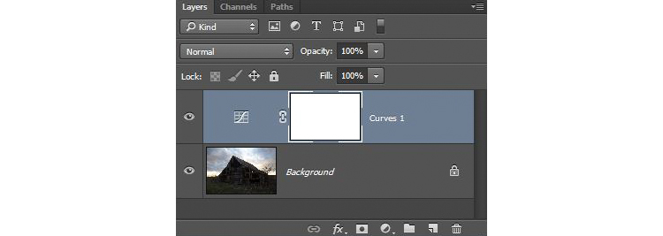
Graphic1-WhiteLayerMask

When your mask is all white, any change you make on that layer, will apply to the underlying image. How do you create an all white image layer mask? Very often – as in the case of adjustment layers – one will automatically be created for you. Or, to add one yourself, just go to Layer > Layer Mask > Reveal All. You can also click on this button at the bottom of the layers palette to create one on the layer you have selected

Graphic2-LayerMaskButton2

An all-white layer mask is actually pretty useless. The utility of the layer mask comes when we start masking (hiding) things off. Before we get into that, however, let’s talk about how to create an all-black layer mask. As you might expect, a black layer mask works the opposite way as a white one, and lets absolutely nothing through to the layer underneath. You can make all the changes you want to this layer, and it will have no impact on your underlying image. Here is how it will look when you create one:
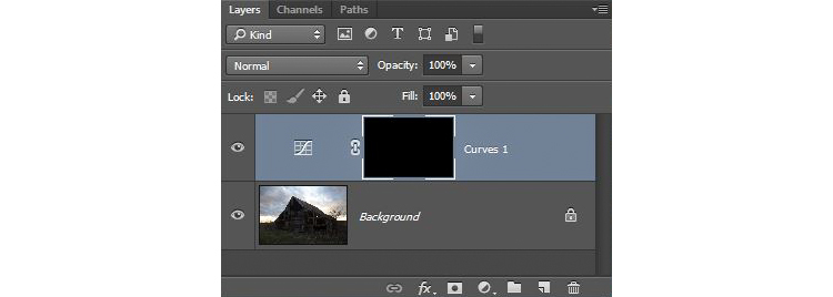
Graphic3-BlackLayerMask

To create an all-black layer mask, just go to Layer > Layer Mask > Hide All or press ALT while clicking on the same button used in the graphic above to make a white layer mask. Now that you know what layer masks are, and the basics, we can get into the real fun of them, which is where you have blacks, whites, and even tones of gray in the same mask.

Masking

Layer masks allow you to apply changes to some parts of the image, but not others. Just remember that wherever your layer mask is white, it will let the changes you made to the layer through, so that they apply to your image below. Wherever your layer mask is black, it will not let the changes through, so they will not apply to the image. Before we get into how to do that, let’s talk about when you might want apply changes to only part of your image.

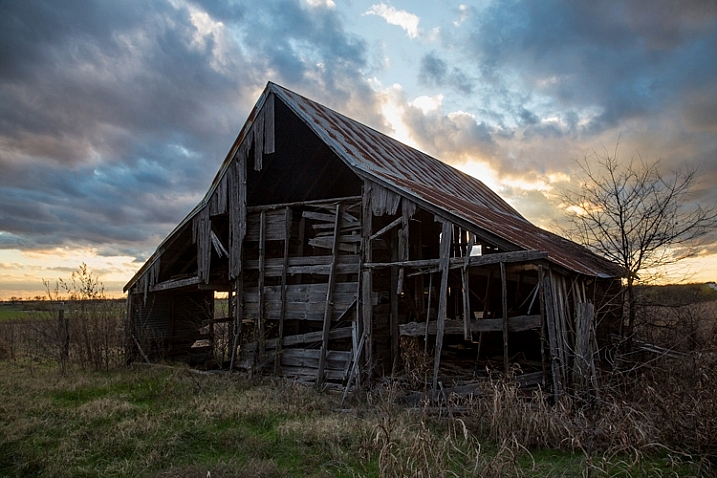
Let’s take this picture of an old barn. I’m choosing this image because it will be simple to adjust using masks, as it only involves two main areas. As you can see, the sky is too bright, while the barn and foreground are too dark. In doing this for yourself for the first time, use a simple picture like this to get started.
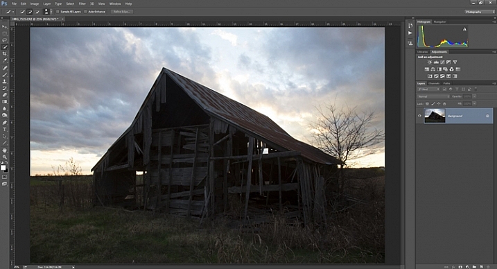
Graphic4-BarnOriginal

As you probably know, you do not want to edit these two areas in the same way, so a global adjustment to the whole image won’t help. You can, however, use masks so that edits only apply to the areas you want. For example you might darken the sky like this:
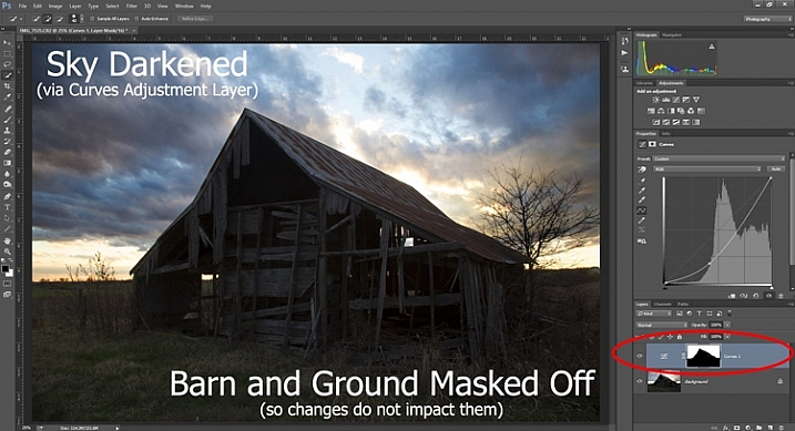
Graphic5-SkyDarkened

Here I masked off the barn and foreground so that the darkening only applies to the sky. I used a quick Curves Adjustment layer to darken the image. As you can see, the mask of the sky is white (so the changes affect the image in that area), while the mask of the barn and foreground is black (so the changes do not affect that part of the image).

Now let’s do the opposite to brighten up the barn and the foreground. Once again, I’ll use a layer mask so that my changes only affect the barn and the foreground, so that it looks like this:
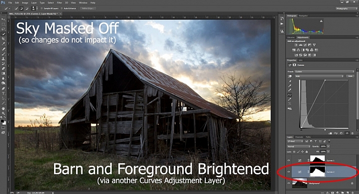
Graphic6-ForegroundBrightened

This is the same move I made above, but in reverse. I created another Curves adjustment layer to brighten up the image. Now the layer mask is white over the barn and foreground, which means the brightening effect shows through in those areas. The layer mask is black over the sky though, so the brightening effect does not impact the sky (which is already bright enough).

But how do you do go about creating these layers and masks? Let’s find out now.

Creating a Layer Mask with Defined Edges

There are different ways to mask off portions of your images. Sometimes you will want to create a mask with a hard or definite edge, while other times you will want to gently blend in the effect to a portion of your image. In this article I will cover how to create a mask on an image with a hard edge (I will get into blending in changes in a later article). The photo of the decaying barn used above will work just fine for this, so let’s stick with that photo as our example.

Step 1: Make Your Selection

To darken the sky in the image, the first thing you need to do is select the sky. To do so, click on the Quick Selection tool from your tools panel. Then click anywhere in the sky, and while holding the mouse button down, move around where you want to select pixels for your selection. Photoshop will automatically detect edges. To make the Quick Selection tool larger or smaller, use the square bracket ( [ and ] ) keys. If you end up selecting pixels you don’t want for your selection (and you inevitably will), press the ALT key (Option on a Mac) while clicking and it will remove them.
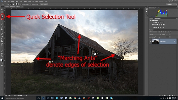
Graphic7-MarchingAnts

Photoshop is famous for providing several different ways of accomplishing the same thing. Making selections with hard edges is just such a case. You don’t have to use the Quick Selection tool. You can also use the Magic Wand tool, which will select similarly-toned pixels. Or you could use the Pen tool, or the Magnetic Lasso tool to draw the edges yourself. I could actually see a good case here for the Color Range command (Select > Color Range), which selects pixels of similar colors. Any one of those tools could work. While I want to point that out, I don’t want to get bogged down covering each of them. For now, just know that while I typically use the Quick Selection tool and did so here, there are other tools you can use to make the selection.

Step 2: Refine Your Selection

Once you make your selection, you can refine it a bit if you wish. Just bring up the Refine Edge dialog box and make adjustments there.
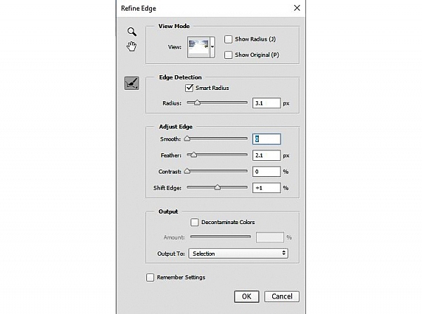
Graphic8-RefineEdge

If you do not like the selection, you can always clean it up a bit later. Once you have made the adjustments, you can use the Brush tool to add or subtract parts of the image from the mask (more about that in a minute).

Step 3: Apply the Effect

Now that your selection is created and refined, you are ready to put it into action. What we want to do is darken the sky. There are different ways to go about doing that, but what I’m going to use is a Curves adjustment layer. You don’t have to use this tool though, this same process will work when you create any sort of adjustment layer. If you are more comfortable using Levels or Brightness/Contrast, for example, use those.

In any case, all you will do now (with your selection still active) is click to create the Curves adjustment layer (or whatever type of adjustment layer you are comfortable with) and voila, the layer is created with a mask that has hidden the pixels you don’t want to change. It will look something like this:
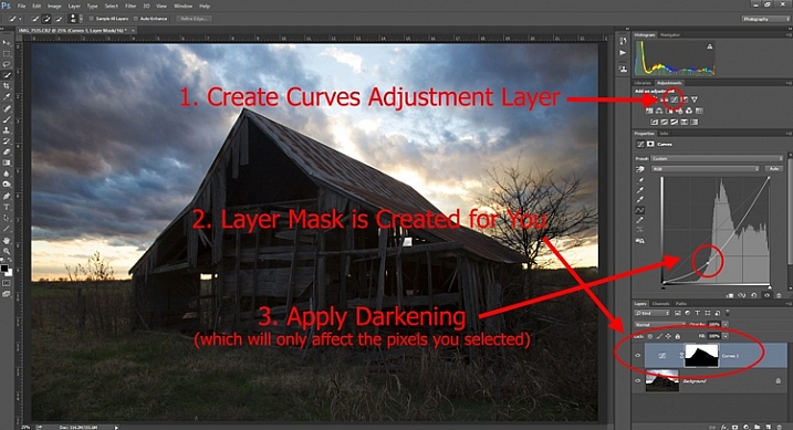
Graphic9-HardEdgedLayerMask

If you use a Curves adjustment layer like I did, you just pull the line down to darken the picture. Pull it down to the left of the main cluster of pixels so that the curve is steepened through that main cluster. Of course, you may be using Levels or some other darkening tool, so just use those in whatever way you are comfortable.

Step 4: Repeat for Other Areas

In our example, we have now darkened the sky, but there are other problems with the picture. In particular, the barn and foreground are still too dark. How do we go about changing that? Pretty much the same way we did for the sky.

Start by making the selection. You can do it the same way as you did for the sky if you want. Just grab the Quick Selection tool and click around in the dark areas to create the selection. In this case, you can also just create a selection that is the opposite of the selection we previously created. That is, you previously made a selection of the sky and left everything else alone. Now you want to make a selection of everything else and leave the sky alone. To do that, you can just call up your old selection (Select > Reselect) and then tell Photoshop to reverse it (Select > Inverse). You now have a selection of everything but the sky, which is what you want.

From there, just create a Curves adjustment layer (or whatever tool you prefer to use) and apply the effect. Once you brighten the foreground, here is how it looks:
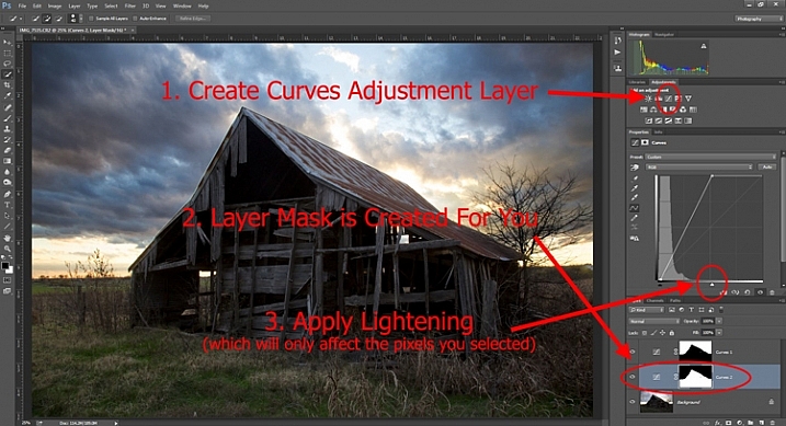
Graphic10-Lightening

Step 5: Cleaning up Your Masks

You may find, when you are done, that there are parts of the image that don’t look quite right. Perhaps there are pixels included in one of your masks that you didn’t want, or conversely you missed pixels that should have been in the image. You can clean up the mask after the fact. I find that the easiest way is to use the Brush tool.

Graphic11-Brush

Select the Brush tool on the tools panel. Once you do so, pay attention to the foreground color, that which the brush will use. If you set the brush to white, it will add to a selection (show the layer through the mask). If you set the brush to black, it will remove pixels from the selection (hide the layer with the mask). Some keyboard shortcuts to keep in mind are B to bring up the Brush tool in the first place, then D to make sure the colors are set to the default (black and white), and finally X to switch between black and white.

Graphic12-BrushControls

The Brush tool is great because you can set the hardness of the edge. Start by keeping it at its softest setting, and just changing the size of the Brush by using the bracket keys [ and ]. Use it to touch up the selection (mask) where needed (make sure you are painting on the mask NOT on the actual layer). Another tip is to press ALT (option on a Mac) while clicking on the mask in your layers palatte, which will cause the screen to display the mask only. That way you can see exactly where your mask is being applied. Press ALT again while clicking on the mask to go back to normal view.

Moving on From Here

This exercise will get you started using layer masks to make adjustments to portions of your pictures. Once you have done this a few times and start to master it, there are a lot of other additional techniques you can add to further enhance your photos. For example, while this article showed you how to use masks where you have defined edges, you can gradually blend in effects using masks as well. Further, while in this article we only affected brightness, you can use layer masks to affect color, brightness, and contrast to a great degree.

Of course, masks are not just for adjustment layers either. You can make changes on layers and control where and to what extent, the change gets applied. For example, you might sharpen or blur a layer, and then use a mask to apply that effect to only a portion of the picture. It also works well by making changes with a plug-in to a duplicate layer, then creating a mask to control the application of that plug-in’s changes.

When you use layer masks, you are well on your way to unleashing the full power of Photoshop. Get started with the techniques in this article, then you can add on other aspects from there.

googletag.cmd.push(function() {
tablet_slots.push( googletag.defineSlot( “/1005424/_dPSv4_tab-all-article-bottom_(300×250)”, [300, 250], “pb-ad-78623” ).addService( googletag.pubads() ) ); } );

googletag.cmd.push(function() {
mobile_slots.push( googletag.defineSlot( “/1005424/_dPSv4_mob-all-article-bottom_(300×250)”, [300, 250], “pb-ad-78158” ).addService( googletag.pubads() ) ); } );

The post Getting Started with Layer Masks in Photoshop – a Beginners Tutorial by Jim Hamel appeared first on Digital Photography School.


Digital Photography School

 
Comments Off on Getting Started with Layer Masks in Photoshop – a Beginners Tutorial

Posted in Photography


How to Light Creepy Halloween Masks for Added Drama

28 Oct

It’s October again and that means Halloween is around the corner. This is good news for you as a photographer, Halloween is a visual holiday like no other. With all of the decorations, theme shaped food, Jack-o-lanterns and costumes you have more potential for photography than you can shake a selfie stick at.

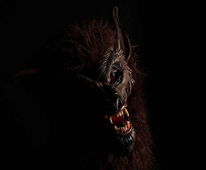
One of my favorite parts of Halloween are the masks. Many of the better quality masks available are extremely detailed and creepy, lending themselves well to visceral imagery.

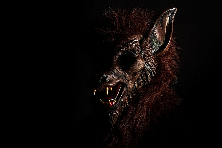
halloween-lighting-tutorial-1923

Because of the monsters they often portray, they also tend to be suited for a more cinematic approach to lighting, which will give you the opportunity to explore ways to create mood and drama in your images. This tutorial covers how to light using a basic side-lighting technique that will allow you to create heavy shadows, to shape and accentuate the creepiness in your masks.

What you need:

  • Studio strobe or speedlight fitted with a softbox or a window
  • Black paper – enough to cover the edges of the softbox (heavy, non-transparent curtains will work with a window)

Optional but useful extras:

  • Seamless paper, black background
  • Black reflector/ flag or a piece of black poster board

Setting it up

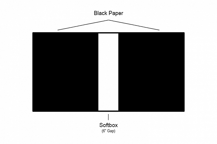
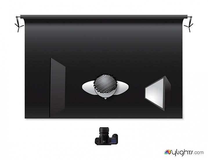
The first thing you need to do is turn your light source into a strip light. This will create a very narrow shaft of light that will skim the front of your subject, creating a lot of contrast that will emphasize all of the fine details.

To do this with a softbox, tape a few pieces of black paper over the sides leaving only about 6” (15cm) of white showing. You can make the gap smaller if you like, but for this technique you shouldn’t go for more than 6”.

halloween-lighting-tutorial-softbox-setup

Tip: If you use seamless paper backgrounds, save the scraps whenever you trim the ends. They always come in handy at times like these.

If you’re using a window with curtains, simply draw them closed until you have a six inch gap.

Execution

Once your light source is modified, you’re ready to go. To side-light, place your light so that it is pointed directly at the side of subject. If you start with the light aimed at the front of the mask, you can then fine-tune as your images require, by moving it an inch or two forward or backwards. Because the light source is so narrow, moving it in tiny increments will result in drastic changes to the final images.

halloween-lighting-tutorial-lighting-diagram

Pay careful attention to any light falling on the background. The narrow beam of light shouldn’t allow much light to spill over, but if it does, try moving your subject and light source a few inches forward (away from the background).

When working with detailed subjects like this, I like to use a smallish aperture like f/11. This ensures that all of the fine details are sharp in the final images. However, if you’re working with window light it may be a struggle to stop down that far without setting a high ISO (or using a tripod, which is a good idea for maximum sharpness anyway). Feel free to use whatever aperture provides you with the best quality results.

halloween-lighting-tutorial-1940

Flagging

When you’re attempting to get really deep shadows with a technique like this, sometimes things like white walls reflect a lot of light back onto the shadow side of your subject. This is where having a black reflector, known as a flag, comes in handy. By holding your flag to the side of your subject, you are blocking the light from reflecting off of other objects that can affect your images.

In the end

Even though this an easy technique, hopefully you can see that with some simple, but careful manipulation, you can take control of even the most basic lighting equipment to create bold and evocative imagery.

If you do decide to give this technique a go, I’d love to see the results you get with your masks. Happy Halloween!

googletag.cmd.push(function() {
tablet_slots.push( googletag.defineSlot( “/1005424/_dPSv4_tab-all-article-bottom_(300×250)”, [300, 250], “pb-ad-78623” ).addService( googletag.pubads() ) ); } );

googletag.cmd.push(function() {
mobile_slots.push( googletag.defineSlot( “/1005424/_dPSv4_mob-all-article-bottom_(300×250)”, [300, 250], “pb-ad-78158” ).addService( googletag.pubads() ) ); } );

The post How to Light Creepy Halloween Masks for Added Drama by John McIntire appeared first on Digital Photography School.


Digital Photography School

 
Comments Off on How to Light Creepy Halloween Masks for Added Drama

Posted in Photography


Geometric Monsters: Download, Print & Make DIY Halloween Masks

12 Oct

[ By WebUrbanist in Design & Products & Packaging. ]

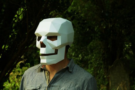
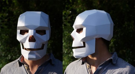
diy skull mask

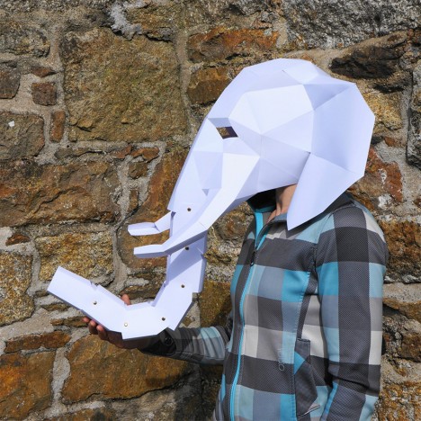
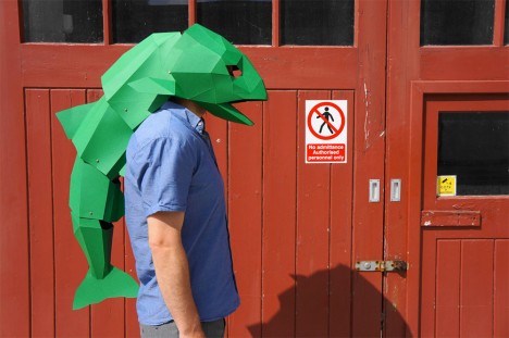
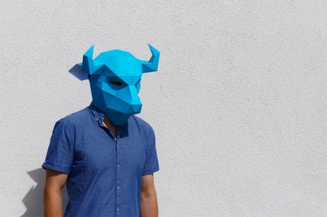
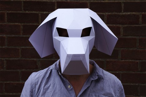
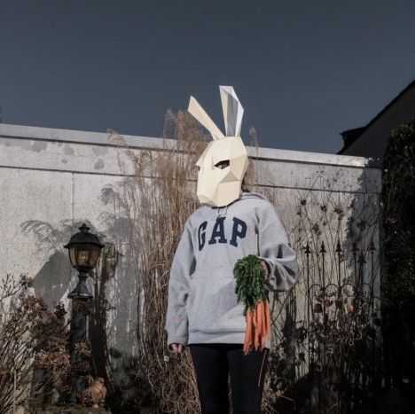
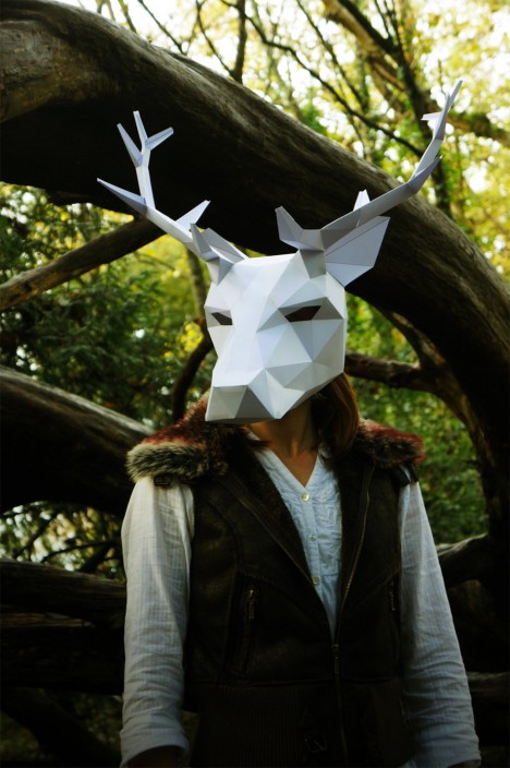
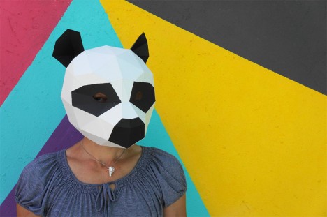
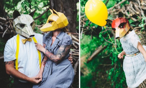
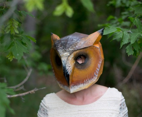
This holiday season brings fresh printer-compatible designs of low-poly skeletons, monsters, animals and more for the do-it-yourself costumer, all scaled to fit an adult or resizable for children.

diy skeleton paper cardboard

diy articulated dragon

diy tiger head

Like a polygon mesh in 3D computer graphics (that has a relatively small number of polygons), these masks are leant a haunting effect unique to the digital age, looking otherworldly and surreal like low-resolution computer renderings.

diy elephant trunk

diy tailed fish

Some models are more complex than others, involving sets of articulated parts that rotate on simple hinges or pivots, like the tail of a fish, trunk of an elephant or the hands of a dragon.

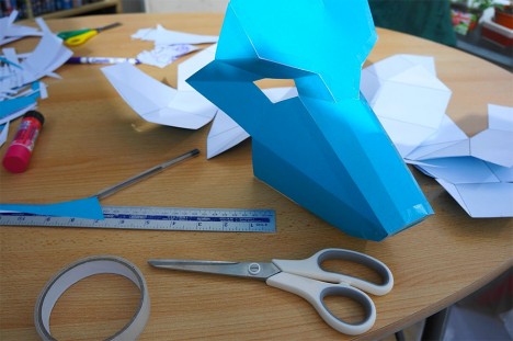
diy maskmaking process

diy bull horns

The key ingredients: a printer, some paper of applicable color, glue sticks, craft knife, tape, cardboard and an elastic headband. If you have more time than money, or simply enjoy the process, these models provide a great balance of personal work and creativity within a ready-made outline.

diy dog face

diy bunny rabbit

diy antler antelope

From their maker, Wintercroft on Etsy, who sells the plans online:  “The instructions and templates are designed to be quick and easy to follow. The finished masks are pretty robust due the their polygon construction and will survive the wildest of parties.

diy panda bear

diy fox people

diy owl mask

More on Steven Wintercroft: “By nature I am obsessively creative and starting making things as a kid with my granddad. I studied Art and design, then furniture studies and have been designing and building custom surfboards since I was a teenager. I’ve worked as a cabinet maker but have spent most of my time as a full time surfboard shaper. I believe that the urge to create is a fundamental part of being human and these masks provide an excuse to sit down, get out the scissors, tape and paint and make something” (via Colossal).

Share on Facebook


[ By WebUrbanist in Design & Products & Packaging. ]

[ WebUrbanist | Archives | Galleries | Privacy | TOS ]


WebUrbanist

 
Comments Off on Geometric Monsters: Download, Print & Make DIY Halloween Masks

Posted in Creativity


Luminosity Masks Versus HDR Software For Creating Natural Looking HDR Images

27 Aug

Jimmy’s Luminosity Masks Tutorials – Art of Digital Blending Course For Photoshop is on sale now at 15% off over at SnapnDeals. Only until September 6th, grab it now!

If you type the term ‘HDR’ into google images you’ll very quickly see why HDR photography has a bad reputation. While we all differ in our tastes, in recent years, those strongly saturated, blurry and noisy HDRs have fallen out of fashion, even amongst HDR photographers.

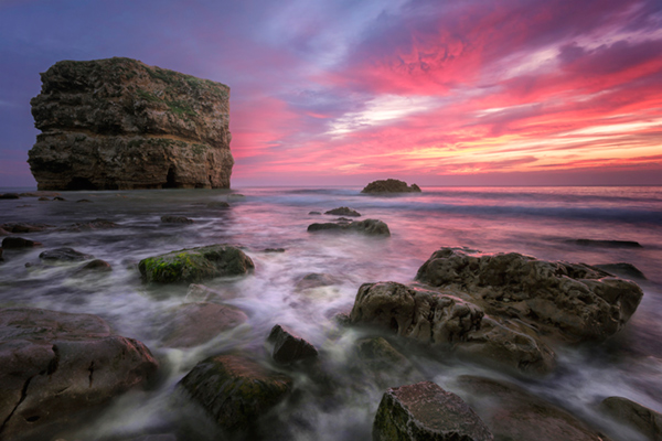
Pink seascape

Luminosity Masks Versus HDR Software For Creating Natural Looking HDR Images

The goal, among many, is now a clean HDR look. HDR programs are attempting to tidy up their processes to meet the needs of the demanding HDR photographer. However, a large number of photographers are beginning to take the blending process into their own hands, and produced beautifully balanced HDRs using luminosity masks, probably the cleanest alternative to HDR software.

In fact, luminosity masking has become an exciting buzz-term in the world of digital photography, and there’s good reason for that.

If you’re new to luminosity mask exposure blending, you can see a beginner’s tutorial on dPS in my previous article: Exposure Blending Using Luminosity Masks Tutorial

In this article we’ll take a look at the benefits and challenges of luminosity masks versus HDR software.

Benefits of Luminosity Masks

1. Image quality

We’ve all seen over-saturated, noisy, messy, HDR images. One guaranteed way to avoid the poor image quality we normally associate with HDR is to manually blend your exposures in Photoshop using luminosity masks.

When exposure blending with luminosity masks, you’re working only with the RAW files to restore highlights and shadows. You do not affect any other part of the image. In other words, your final blended image will be, more or less, exactly the same image quality as your RAW files.

You do not affect any colour changes, you retain absolute sharpness, you don’t flare up noise (which means you can shoot at a much higher ISO), and you will not exaggerate chromatic aberration.

This is the major reason why so many are turning to luminosity masking to create natural, balanced HDRs.

Chilean sunset

Sunset at Puerto Natales, Chile

2. Complete control over what we blend

Artists of any genre fight for complete control over their ability to express themselves. And so it is in photography. One of the problems with using HDR software is that we have very little control over the blending process.

We rely on an algorithm to choose which areas to blend with which exposures. Then we’re given some sliders to adjust. Although this gives us greater control over the process, it isn’t giving us 100% control.

Through luminosity masking, we begin with a base exposure, and we then decide for ourselves which exposures we wish to use in the blending process, and which areas we wish to adjust, and at what opacity.

The image below is a good example of how you can make very precise changes with luminosity masks.

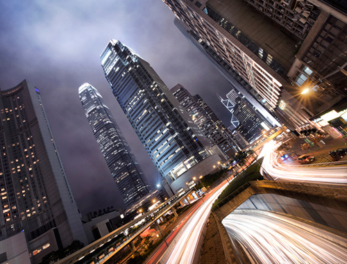
Hong Kong Light Trails

Hong Kong Light Trails

This image is made up of 11 exposures; six of which were used for the light trails, four were used for exposure blending, and one was used as the base exposure. You can learn how to create light trails like this here: How To Add Dramatic Car Trails To Your Photos In Photoshop

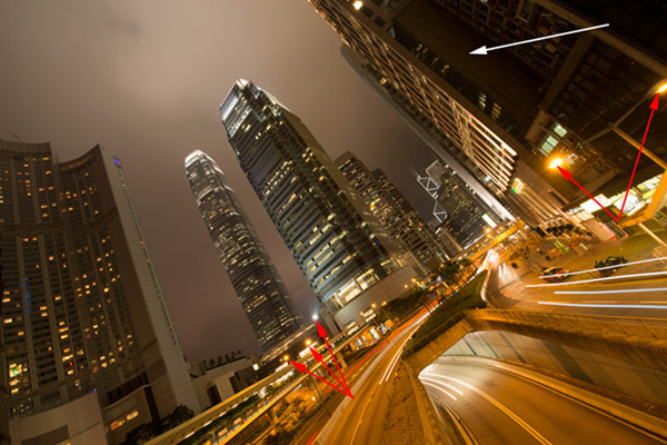
Below you’ll see the RAW file used for the base exposure.

HK Light Trails

Base Exposure

The only highlights I wanted to control in the image were the street lights, and even then I still wanted them to be bright. Through bright lights like this night cityscapes are able to give off a lot of energy and dynamism.

I very gently blended in three darker exposures to gain a little bit of control in those areas, without darkening them too much. If I ran my exposures through an HDR program, all of the highlights in the image would have been affected to some degree, which is exactly what I didn’t want.

For the darker areas, I only wanted to bring back information in one area, the side building to the right, which is noticeably dark. I used an exposure two stops brighter and, with luminosity masks, I easily painted details back into this area.

#3. No more halos and fewer ghosts

Halos simply don’t exist in luminosity mask exposure blending if you’ve done it correctly.

As for ghosts, you will rarely encounter a moving object that is difficult to blend. Since you use a base exposure, which will be done for most of your images, and simply reduce specific highlights and shadows, there shouldn’t be any ghosting.

The only challenge you may have, which is also a challenge when using HDR software, is if you have moving leaves on trees, for example, between exposures. Then the blending process is a little bit trickier.

#4. Become a better photographer

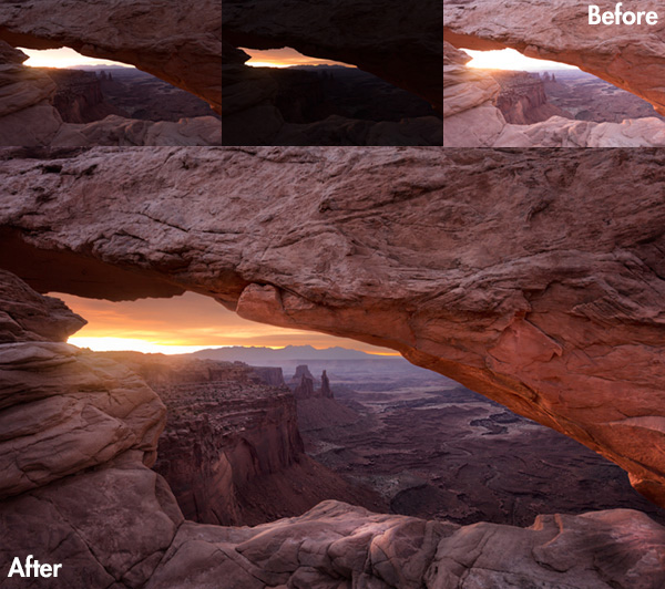
Mesa arch

Mesa Arch, Before and After Exposure Blending With Luminosity Masks

In my early days I was a die hard tone mapper. I’d approach a scene and think, “this would be a cool HDR subject”. I’d fire off some brackets and take them into Photomatix when I got home. I had a predefined routine of what to do, what result I wanted, and how to get there. I had tunnel vision.

When I began exploring luminosity masks, everything changed. I began to read a scene, not as an HDR subject, but in terms of its unique beauty and mood. I started to grasp more fully the use of light in controlling mood, whereas previously I was simply relying on getting the ‘HDR effect’ each time.

Rather than shooting off a set of automatic brackets, for a complex scene I will often bracket manually, changing the aperture, ISO and shutter speed to capture different elements of the scene. Then I’ll blend in each of the elements to hopefully get the best out of that scene.

In the Hong Kong Light Trails image above, the base exposures and brighter exposures, the light trails, and the darker exposures were all shot manually with different settings to achieve different effects.

It is through using luminosity masks, and taking my imagery into my own hands, that I have pushed myself in the field to achieve more.

#5. Combine with other HDR processes

One of the beautiful things about luminosity masks is that you can combine them with other exposure blending methods to complete the blending process. 32-bit processing is becoming an interesting way of blending exposures cleanly, but we are a long way off before the process is good enough and our monitors can handle true 32-bit files.

However, we can overcome the limitations of 32-bit processing by combining it with luminosity mask exposure blending. The tutorial below will show you exactly what I mean. The video is taken directly from the Art of Digital Blending course:

Challenges with Luminosity Masks

HDR software is simpler

Luminosity masks require more patience and a steeper learning curve than HDR software. The concept takes a little bit of time to get used to, and it will certainly challenge you to re-learn a few things.

While HDR software will take all of the leg-work out of it for you, luminosity masks require you to really think about your exposures and deepen your workflow.

Luminosity Masks don’t work on every occasion

Every now and then you’ll come across an image where luminosity masks won’t create a smooth blend between exposures. This happens because there isn’t enough contrast between the areas you wish to blend and the areas you don’t wish to affect.

In which case, using 32-bit processing or HDR software would be a good alternative.

Luminosity masks work in 8-bit mode

Like all live selections in Photoshop, luminosity masks work in 8-bit mode. They don’t affect the bit depth of your image, so if you’re working at 16 bits that won’t change. But there may be a chance of posterization in some cases.

A quote from Photoshop staff on the Adobe forum claims:

“The selection mask is 8 bits, regardless of the document precision. That fact has no affect on the precision of the image.

No, it won’t change the image or cause future posterization — the image data is still the same precision as it always was.”

So while this shouldn’t be an issue, it is something to be aware of.

Hong kong the peak view

Conclusion

HDR images don’t have to be messy, garish and overdone. There are many ways to cleanly blend exposures to create a beautifully natural and balanced HDR. Having luminosity masks in your arsenal, will give your workflow a superb cutting edge, that can quite literally change your imagery over night.

It will require a little bit of extra work on your part, but often the best things in life do.

Jimmy’s Luminosity Masks Tutorials – Art of Digital Blending Course For Photoshop is on sale now at 15% off over at SnapnDeals. Only until September 6th, grab it now!

  • Getting Real with HDR – a Step by Step Tutorial for Realistic Looking HDR
  • Is the Death of HDR Photography Coming?

The post Luminosity Masks Versus HDR Software For Creating Natural Looking HDR Images by Jimmy McIntyre appeared first on Digital Photography School.


Digital Photography School

 
Comments Off on Luminosity Masks Versus HDR Software For Creating Natural Looking HDR Images

Posted in Photography


Adobe announces new ‘Focus masks’ feature in CC update

19 Jun

adobe_cc.jpg

Following last week’s video teasing the release of a new feature coming to Photoshop CC, Adobe has made the update official. In addition to the ‘Focus Masks’ feature that we already knew about, today’s official announcement brings a host of mostly minor new features including new blur effects, updates to content aware fill, and improvements to tools like smart guides. Read more
News: Digital Photography Review (dpreview.com)

 
Comments Off on Adobe announces new ‘Focus masks’ feature in CC update

Posted in Uncategorized