RSS
 

Posts Tagged ‘Maps’

How to Create Cool Effects Using Displacement Maps in Affinity Photo

17 Feb

The post How to Create Cool Effects Using Displacement Maps in Affinity Photo appeared first on Digital Photography School. It was authored by Kevin Landwer-Johan.

create cool effects with displacement maps in Affinity Photo

Adding natural-looking text to a photo can be challenging. But with displacement maps in Affinity Photo, you can easily produce awesome-looking text blends.

In fact, it takes just a few clicks to merge text with a second photo, so that it looks like the text was there all along.

There are a couple of different ways to achieve this look in Affinity Photo. If you’re used to other image manipulation software, you may be familiar with some of the steps. And if you’re new to Affinity Photo, you may not be aware of the features that make creating cool effects using displacement maps even easier.

So let’s dive right in!

Blend overlay example of displacement maps in Affinity

What are displacement maps in Affinity Photo?

Displacement maps in Affinity Photo allow the texture of an image to be mapped onto another layer.

Displacement maps are commonly used to add natural-looking text to an image. You can use them when you want to place a logo or text on a t-shirt or make text look like a natural part of a scene.

example of displacement maps in Affinity

How to create a displacement map: Step-by-step instructions

As with pretty much any editing effect, there is more than one way to reach your end goal.

In this article, I will show you a simple, step-by-step method I use to create displacement maps in Affinity Photo.

Specifically, I’ll use Affinity Photo’s Displace filter.

Using the Displace filter is a great way to work with displacement maps. It’s quick, easy, and non-destructive.

This means you have a great deal of control. You can apply your Displace filter and tweak it as much as you like – without permanently altering the underlying photo.

Step 1: Open your mapping image

Select the image you plan to modify. Open it in Affinity Photo.

Locate the file with your text or logo, then drag and drop it onto the underlying image file.

You can use a TIFF or PNG file with transparency. Alternatively, type in the text you want to use, as I’ve done in my example file (below).

Position your image or text where you want it to appear. If you’ve chosen to type your text, pick the font and color you think will best suit your needs.
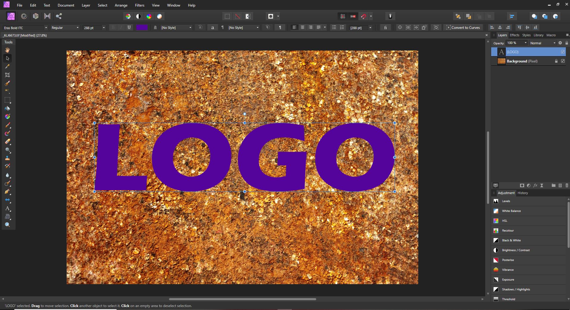
Screen grab from Affinity Photo showing displacement maps in Affinity

Step 3: Create a live filter layer

In the top menu, choose Layer.

Then go down to New Live Filter Layer>Distort>Displace Filter

Screen grab from Affinity Photo

In the Layers panel, you will now see a live displacement map filter added to your logo or text layer. 

Screen grab from Affinity Photo showing displacement maps in Affinity

Step 4: Choose a displacement map

In the displacement map dialog box, you will have the option of loading a map from a file or loading it from other layers. Sometimes you may have a separate image you want to use as your mapping layer. In this example, I will show you how to use the lower layer to create a displacement map, because this is what will typically provide you with a great result.

Click on the option to Load Map From Layers Beneath. At this point, depending on the resolution of the photo you are working with, you may begin to see the effects of the mapping filter.

(But don’t worry if you can’t yet see this; we’ll work on the effect in the next steps.)

Step 5: Adjust the displacement strength

Use the slider in the Displace filter dialog box to increase or decrease the strength of the filter.

Adjust the filter intensity until your top layer merges naturally with the image below.

Note that this is just the first level of adjustment. In the next steps, you’ll discover how to fine-tune the result, so don’t be concerned if you can’t yet get your image looking exactly how you want.

Screen grab from Affinity Photo

Step 6: Rasterize the text layer

At this point, if you are working with a text layer or some other non-rasterized layer, you need to rasterize it so the next step will work.

Right-click on the text layer and select Rasterize.

Step 7: Control your blending options

Now it’s time to further adjust how your text or logo blends with the layer beneath it.

Click on the cog icon in the Layers panel. (It’s between the blend mode drop-down and the padlock icon.)

A new dialog box will appear; this lets you control the blending options for your layer. Note the two curves graphs:

Screen grab from Affinity Photo

You’ll want to use the rightmost curve, labeled Underlying Composition Ranges. But before you start, make sure to uncheck the Linear box below it. 

Now click and drag from the top left of this curve. Watch as your text or logo further blends with the layer beneath. Continue to click and drag on the curve until you have a look you’re happy with.

Step 8: Tweak the displacement amount

If you’ve merged an image rather than text, you can now go back and tweak the Displace filter.

(If you merged text, this option won’t be available, because the filter is combined with the text layer when it’s rasterized.)

Step 9: Change the blend mode

For further control, you can select a different blend mode for your text or logo layer.

Scroll through the options in the blend mode drop-down box until you find one that best fits the look you want.

You can also decrease the opacity of the top layer so the underlying texture shows through more.

displacement maps in Affinity example

Using displacement maps in Affinity Photo: Conclusion

The key to success in all photo manipulation is experimentation.

So if you want to create a stunning result, use these steps as guidelines, but don’t be afraid to play around. Push the boundaries!

Using displacement maps in Affinity Photo is fun and non-destructive. This means you can try as many options as you like without permanently affecting your images!

Now over to you:

How do you plan to use displacement maps? Share your thoughts (and images) in the comments below!

The post How to Create Cool Effects Using Displacement Maps in Affinity Photo appeared first on Digital Photography School. It was authored by Kevin Landwer-Johan.

Digital Photography School

 
Comments Off on How to Create Cool Effects Using Displacement Maps in Affinity Photo

Posted in Photography


SLC-2L-09: Google Maps as a Visa | BTS 360

17 Sep

Today in Lighting Cookbook, using Google Maps as an entré to meet new subjects, and improvising with a skeleton pack of lighting equipment. Read more »
Strobist

 
Comments Off on SLC-2L-09: Google Maps as a Visa | BTS 360

Posted in Photography


How to Create and Use Gradient Maps in Photoshop

11 May

The post How to Create and Use Gradient Maps in Photoshop appeared first on Digital Photography School. It was authored by Glenn Harper.

We often perceive color in digital photos to be “correct” when the neutral tones – if they exist – are indeed neutral. But in the real world, light always has some color cast or other that affects the areas it illuminates. A camera sensor ruthlessly reproduces these uninvited hues, but still, we try to edit photos to reflect our own vision. Gradient maps can either correct color or spin it to your advantage.

Using a gradient map to correct color

A blue gradient map removes the reddish color cast of artificial lighting (as per right of picture). Your choice of hue, saturation and brightness gives you fine control over the result.

You can use gradient maps for dramatic black and white conversions or create different monochromatic effects, but this article focuses on color gradient maps to:

  • Use them to subtly improve photos
  • Separate elements within your compositions using color contrast
  • Make subjects stand out
Color gradient map on a black and white image

This image was originally black and white. Because the fog in the picture creates smooth transitions in tone, you can clearly see what the “robin egg to orange peel” gradient is doing.

What does a gradient map do?

A gradient map at its simplest is a smooth gradation between one color (or tone) and another. Let’s say you have a gradient map that goes from green to orange. When you apply that to an image, the shadows would have a green tint and highlights an orange one. The mid-tones are typically least affected except with more complex multi-color maps.

how a color gradient map works

Here, a black and white gradient occupies the lower half of the image. Above that is a color gradient map, and above that is the effect it has on the lower half once an “overlay” or “soft light” blending mode is applied (soft light tends to be more subtle). Don’t worry if you can see banding.

You might be wondering at this point: why would I want to twist the color of a photo and effectively give shadows and highlights a color cast? This, after all, is virtually the opposite of a white balance correction. One reason is to enrich the colors that already exist in a photo.

Using a color gradient map to enhance colors

For this picture, I’ve created a custom gradient map that emphasizes the orange brickwork and the deep blue sky. This is one way of warming up the building without forfeiting the color of the sky.

Another good reason to use gradient maps is to harness the power of complementary or analogous colors and create more eye-catching pictures. Sometimes, the feel of a photo is more important than the truth, which only ever exists in degrees to begin with.

an old color wheel - complementary colors

An old color wheel illustration. Opposite colors are complementary colors, so they’re a good choice for gradient maps.

If you imbue your shadows and highlights with complementary colors, you will often make the photo a little more eye-catching. It might be subtle, but it still works in your favor. This isn’t a magic bullet that makes all photos great, but it’s fun to experiment with. You’re becoming a colorist.

Creating gradient maps

The simplest way to create a gradient map in Photoshop is to go to your toolbar and set the background and foreground colors to the ones you want at either end of your gradient. Then, when you open the gradient map, the colors are already in place.

If you want to use precise colors in your gradient map – perhaps complementary colors you’ve found on the Internet – you can enter the hex numbers into the color picker pane instead of randomly sampling.

gradient maps in Photoshop - cold hues

Gradient maps don’t have to include radically opposing colors. This one has a cold effect all the way through.

Method 1

This is one method for creating a gradient map:

  1. Open your image in Photoshop.
  2. Go to the toolbar and set the background color (click on the rear of the two squares to bring up the color picker pane). This will be your highlight color, bearing in mind you can reverse the gradient in Photoshop anyway.
  3. Do the same with the foreground color by clicking on the front square. This will be your shadow color.
  4. With the shadow/highlight gradient colors chosen, open a gradient map adjustment layer. At this point, the photo looks drowned by color, but we’re not done yet.
  5. Choose either soft light or overlay blending modes and adjust the opacity to taste.

Needless to say, not all gradient maps suit all pictures. One way to create useful gradient maps is by looking for color schemes on the Internet. There are also websites that discuss the color palettes used in movies or movie scenes, which you can “borrow” for your own photos.

Adobe color themes - complementary colors

You can use “Adobe Color Themes” to find the perfect complementary color for one that you’ve chosen. Create a gradient map accordingly. In this case, the yellow-green hue in the little squares is the opposite color to this patch of purple.

Method 2

A more tailored way to create a gradient map is as follows:

  1. Open your image in Photoshop.
  2. Open a gradient map adjustment layer.
  3. Set the blending mode to soft light or overlay.
  4. Click on the gradient to open the gradient editor.
  5. Click on the left color stop (square slider at lower left), then click in the color window that activates.
  6. At this point, you can adjust the shadow color and see its effect in real time on your photo as you move the color picker around.
  7. Do the same with the right-hand highlight color stop.
  8. Now you have a custom-made gradient map for that image.

Note: you have to use the preset manager in Photoshop to save your gradient maps if you want to use them again. Otherwise, they vanish when you close the program.

Color gradient - layer mask - selective editing

If you use gradient map layers rather than direct edits, you have a layer mask built in. In this picture, I wanted the deep blue-green of the water that contrasts well with the reflecting lights, but I didn’t want to lose the warm shadows in the buildings. I brushed those back in, so the gradient map only affects the water and sky.

Gradient maps vs color LUTs

An alternative to gradient maps is color LUTs (look-up tables), which you can also find in Photoshop and other programs. Rather than applying color according to the tone of the image as a gradient map does, a LUT shifts hues numerically.

The latter often causes a radical change in mid-tone subjects like skies and trees, whereas simpler gradients tend to leave those areas relatively unscathed. But it depends. LUTs, like gradients, vary a lot in their effect.

Comparison between color luts and gradient maps

This is a comparison between an orange-teal color LUT (left) and an orange-teal gradient map. Both are more atmospheric than the neutral image I started with, though the LUT has completely altered the color of the trees to the right. Mid-tones are less changed in the gradient map, but highlights are decidedly more orange.

The starting point: white balance

Whether you apply a gradient map or a LUT, the end result is affected by the preexisting white balance in the image. As photographers, we don’t always want to drain a photo of warm or cold light with a white balance adjustment. It’s frequently this light that makes the picture – adds to its atmosphere. However, such an adjustment ensures a purer result with gradient maps and LUTs.

Color LUTs and gradients are usually designed from a white-balance-corrected starting point. So, if you want to see them as the author intended, consider correcting white balance at the raw stage. This isn’t anywhere near compulsory: you can simply lay these edits over photos and they’ll act as filters. Just know that their effect can be exaggerated, skewed or diminished if the photo already has a color cast.

If you customize a gradient map to suit the image, the need for a prior white-balance adjustment obviously disappears. But this is time consuming compared to having a set of tried-and-tested presets at your fingertips.

Enhancing colors and color contrast

The color in the red lens at the front is brought out by this gradient map and the tone of the wood becomes darker than the original. There’s some cool-warm contrast going on here between wood and glass.

Creating multi-color gradient maps

I find simple two-tone gradient maps more useful and certainly more versatile than complex ones, but you can add further colors to the gradient if you wish. You might add a separate color to mid-tones, for instance.

Use analogous colors (sets of three closely related hues) or triadic colors to inspire you, or customize a gradient to enhance the colors that exist in a photo.

triad colors - triadic colors

I probably wouldn’t go for this look, but it illustrates the effect of a three-color gradient map (violet, green, orange – a triadic combo). The different tones in this abstract architectural shot bring all three into play, albeit with a very subtle orange in highlights.

Here’s the method for adding a further color to your gradient:

  1. Open your image in Photoshop.
  2. Create a two-color gradient map as above (steps 1-7).
  3. Click under the center of the gradient in the gradient editor to create a third color stop.
  4. Click on the newly created color stop to activate the color window, then click in that window.
  5. Choose a third color that complements the image (e.g. for mid-tones) and adjust its effect by changing the position of the middle slider. The small outer sliders alter the area affected by this color regardless of its position along the tonal range.

The more colors you add, generally the muddier and less “realistic” the photo appears, but that may be an effect you’re going for.

mullti-color gradient - Photoshop preset

I can’t think of a useful role for this multi-color gradient map. However, it does serve to show you how colors are distributed across different tones. By initially viewing the image in “normal” blending mode, you get a clear idea of how colors will affect the photo before you switch to overlay or soft light.

Using restraint

You can add gradient maps to photos and many people won’t notice you’ve done it. But that’s not to say they don’t have the desired effect.

Just like in the movies, you’re using color to create a mood or make the subject or foreground stand out from the background. You’re not necessarily trying to draw attention to the color itself, even if it pleases your eye.

Many photographers think in terms of light and dark to create impact, or saturation boosts, but color contrast is a rarer consideration.

Although gradient maps (and color LUTs) are powerful tools for making pictures stand out, it’s easy to get carried away with them. After a period of overdosing, you’ll come to recognize the types of images they work best on and which of your gradients to use where. Here are five free gradients you might like to try out. Happy colorizing!

Try out these techniques and share your images with us in the comments below.


The post How to Create and Use Gradient Maps in Photoshop appeared first on Digital Photography School. It was authored by Glenn Harper.


Digital Photography School

 
Comments Off on How to Create and Use Gradient Maps in Photoshop

Posted in Photography


Halide update adds ‘blazing fast portrait mode,’ depth maps and more to the iOS app

10 Mar

Halide—the feature-rich third-party camera app for the iPhone—just released version 1.7 which adds support for the dual-camera setups of the iPhones 7 Plus, 8 Plus, and X, using the two lenses to “see” in three dimensions.

When shooting a photo, you can now apply a background-blurring portrait effect or darken the background, similar to Apple’s ‘Portrait Lighting’ effect. But this isn’t just Apple’s portrait mode pasted into Halide, the app allegedly does it better:

In an App Store first, Halide’s Portrait mode uses a combination of smart facial detection and point-of-interest detection to allow Portrait mode with zero waiting; users can snap a shot at any time to get beautiful background blur effects on a subject.

Additionally, the app is capable of storing the actual depth map as a separate .png-file for later fine-tuning of the results in an image processor, and a new ‘Augmented Reality Depth Photo Viewer allows you to “place Depth-Enabled captures like images shot with Portrait Mode in AR.”

Once placed into 3D space, you can walk around and through the captured scene and ‘explore’ your depth map. It’s gimmicky… but actually really cool:

Halide 1.7 is already available to purchase on iTunes for $ 3. To learn more about the app’s new depth mapping feature set, head over to the Halide blog. And if you’re curious about Halide in general, you can read our hands-on of the app’s launch version here.

Articles: Digital Photography Review (dpreview.com)

 
Comments Off on Halide update adds ‘blazing fast portrait mode,’ depth maps and more to the iOS app

Posted in Uncategorized


Dream Deep: Trippy Maps Reenvisioned by Google’s Artificial Neural Network

29 Jun

[ By WebUrbanist in Art & Drawing & Digital. ]

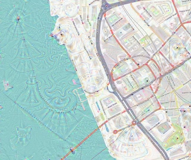
FaceApp and similar reality-warping applications are especially fun to use in ways their designers never intended. Along similar lines, Google’s DeepDream (designed for photo manipulation) creates fascinating results using photographs but is even more stunning when applied to representations of cityscapes.

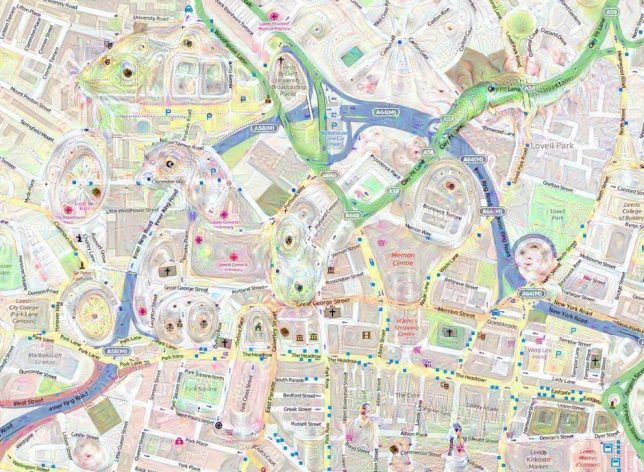
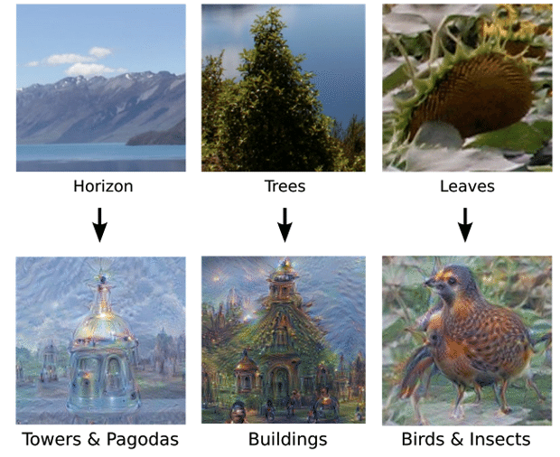
While training DeepDream (a neural network that adapts like a brain to new inputs) to identify, differentiate and understand images, Google researchers discovered it could “over-interpret” results as well. In short: it could start to “read into” images from previous experience, resulting in an array of beautiful (if disturbing) hybrids.

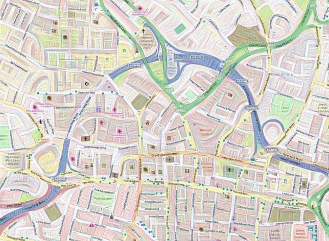
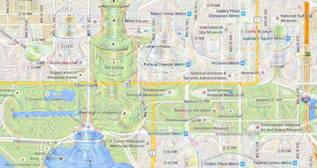
Once it went public, mapmakers were among those intrigued by the possibilities of geo-visualization, turning flat maps into seemingly living landscapes. Tim Waters, a geospatial developer, began taking OpenStreetMap data and running it through the system, generating these strangely psychedelic urban environments.

He discovered that a short run could create fractal and quilting effects, while longer and reiterated processing started to introduce faces and creatures to the mix.

Above: monkeys and frogs seem to emerge from the grid, while a coastal region forms the head of a bear, making the landscape look like a giant bearskin rug. Overall, the effects are quite beautiful, creating a sense of depth and adding character to what would otherwise be fairly generic representations.

Share on Facebook


[ By WebUrbanist in Art & Drawing & Digital. ]

[ WebUrbanist | Archives | Galleries | Privacy | TOS ]


WebUrbanist

 
Comments Off on Dream Deep: Trippy Maps Reenvisioned by Google’s Artificial Neural Network

Posted in Creativity


PhotoSpots uses Google Maps to pinpoint photography hotspots

13 Jan

When you’re traveling, it’s always a good idea to scope out shooting locations ahead of time. Here to help is a newly launched online service called PhotoSpots. With PhotoSpots, photographers can find so-called ‘photography hotspots’ highlighted around the globe using Google Maps and the image hosting website 500px. The service was created by photographer Mike Wong, who recently detailed his creation on Reddit.

‘I thought that it would be interesting to see where and when other photographers were taking photos,’ Wong explained in his Reddit post, ‘so I decided to create a small website that shows exactly that.’ The photography hotspots are presented as a heat map, with red areas representing heavily photographed regions. A bar beneath the map shows thumbnails for images taken in a particular region and uploaded to 500px.

Clicking PhotoSpots’ menu icon opens a slider that filters photos by month, while hovering over a specific photo thumbnail reveals the precise location it was taken via the map. “I’m also planning to make a filter for categories (e.g. nature, cities etc.) to make it more personalizable,’ said Wong, though he didn’t provide a timeframe for when that feature will be added.

Via: PetaPixel

Articles: Digital Photography Review (dpreview.com)

 
Comments Off on PhotoSpots uses Google Maps to pinpoint photography hotspots

Posted in Uncategorized


Seeing Space in New Ways: 13 Creative Maps & Navigational Guides

03 Oct

[ By SA Rogers in Art & Drawing & Digital. ]

map-art-topographic-3

With the advancement of technology, the ways in which we perceive information have become increasingly visual, interactive and all around multi-dimensional – so why shouldn’t maps evolve to reflect it? These map concepts, installations and renderings in a variety of materials and forms let navigational data pop off the page into 3D creations, or blend the information with functional objects to tell a story.

3D Tube Map of London Made of Pipes

map-art-london-tube-1

map-art-london-tube-2

British designer Nick Fraser used a network of copper pipes on a black wall to create a map of London’s tube system, making the nickname literal. To differentiate the different lines, Fraser uses a series of colored washers.

Neon Subway Lights by Petr Koll

map-art-neon-1

map-art-neon-2

london_gif

Subway maps for various unnamed cities are rendered in vivid neon lights by designer Petr Koll for this fun series. What you can’t see in the still images is that the lines light up one at a time and then blink together.

‘Philadelphia Explained’ Installation Art by Paula Scher

map-art-philadeliphia

map-art-philadelphia-2

map-art-philadelphia-3

A hand-drawn map of Philadelphia is fitted to the interior surfaces of a gallery using dimensional modeling, immersing visitors in a navigational experience as “a personal reaction to information overload.” Famed designer Paula Scher worked with students at her alma mater, the Tyler School of Art, to create the installation.

Rijksmuseum Paper Pathfinder

map-art-paper-pathfinder-1

map-art-paper-pathfinder-3

How do you explain to visitors in clear visuals how they can navigate 8,000 objects spanning 800 years of art spread through 80 individual galleries in the same building? Graphic designer Marjin van Oosten came up with a refreshingly simple analog solution: a pop-up paper model of the building with color-coded and labeled ‘floors.’ It lets you see the whole building at once and physically hold a model of it in your hands to get a better idea of where things are.

3D Map of Tokyo’s Subway System

map-art-tokyo-subway-1

map-art-tokyo-subway-2

The surprising number of dips and turns in Tokyo’s subway system, hidden from sight, are revealed in this rollercoaster-like model by Takatsugu Kuriyama. Different colored liquids pulse through the various tubes to show movement in each line.

Next Page – Click Below to Read More:
Seeing Space In New Ways 13 Creative Maps Navigational Guides

Share on Facebook


[ By SA Rogers in Art & Drawing & Digital. ]

[ WebUrbanist | Archives | Galleries | Privacy | TOS ]


WebUrbanist

 
Comments Off on Seeing Space in New Ways: 13 Creative Maps & Navigational Guides

Posted in Creativity


Google Earth and Maps updated with higher quality satellite imagery

30 Jun

$ (document).ready(function() { SampleGalleryV2({“containerId”:”embeddedSampleGallery_8496580915″,”galleryId”:”8496580915″,”isEmbeddedWidget”:true,”standalone”:false,”selectedImageIndex”:0,”startInCommentsView”:false,”isMobile”:false}) });

Google has updated both Google Earth and Google Maps with higher-quality satellite imagery using images mostly taken by NASA and the USGS’s Landsat 8. According to the company, the refreshed imagery provides truer colors and greater detail in comparison to the previous content captured by Landsat 7, helping provide what Google calls its ‘freshest global mosaic to date.’

The company pored over more than 700 trillion pixels’ worth of Landsat images to choose the clearest photos. Before this imagery refresh, Google’s mapping products included satellite imagery captured, in same cases, nearly two decades ago. Google has rolled out the new images to all of its mapping products; the content can be viewed on both the ‘satellite’ layer on Google Maps and on Google Earth.

Via: Google Lat Long Blog

Articles: Digital Photography Review (dpreview.com)

 
Comments Off on Google Earth and Maps updated with higher quality satellite imagery

Posted in Uncategorized


Get Creative with Displacement Maps in Photoshop

09 May
Creating a film noir look with a displacement map in Photoshop.

Creating a film noir look with a displacement map in Photoshop.

What is a Displacement Map?

If you are new to Photoshop, the mere mention of displacement maps can be daunting. The purpose of this article is to give you an introduction to them; guide you in easy-to-follow steps on how to generate simple grayscale displacement maps from an existing image, and show you how to effectively implement them using the Displace Filter in Photoshop.

A displacement map is a grayscale version of the same image that you are working on, saved as a Photoshop (.PSD) file. This displacement map is then used to apply a texture to a flat graphic via the Displace filter, and it distorts the graphic to conform to the shape of the map. This gives the flat graphic, or 2D object, a more realistic 3D look. You may have seen images online where a texture is mapped onto someone’s face or a logo contoured onto a textured surface.

Why use Displacement Maps?

Displacement maps are a great way to map texture onto 2D objects, such as logos or text, add give depth and a 3D perspective. I hope to illustrate that displacement maps are not as daunting as they might appear, although, I do realize that this article may suit intermediate users of Photoshop rather than complete novices.

How to implement a Displacement Map?

Once a displacement map has been generated. You need to use the Displace filter to distort the 2D object, or flat graphic, onto the map. The Displace filter has been in Photoshop since version 2.0. It hasn’t changed much since then, however, it’s still a filter worth getting to know. It may appear to be a convoluted process to use, but when you have tried it a couple of times, it is straightforward. What it does is move the light pixels up and to the left and the dark pixels are moved down and to the right. This creates an illusion of depth through light. This is why your displacement map needs to be quite contrasty.

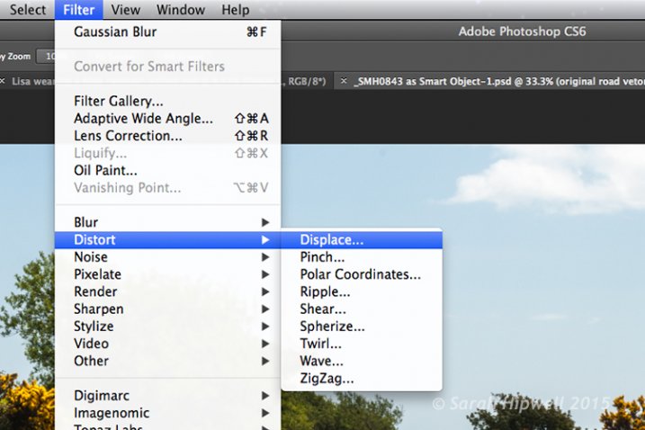
Filter-Distort-Displace

How to access the Distort filter in Photoshop.

The first method I describe below shows you how to use a vector shape to create a road marking and map this onto a road surface. This process would be the same for applying logos or text on any textured background. In the other two examples, I describe how displacement maps can be used to create shadow effects. Let’s take a look.

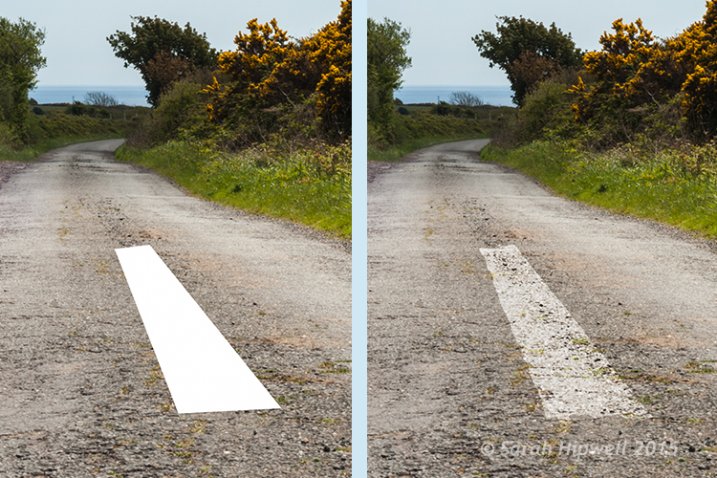
1. Adding a realistic road marking

Before-after-road-marking

Before and after where the road marking has had a displacement map applied.

Aim: To create a realistic road marking from a vector graphic.

Let’s start with the base image of the road. The displacement grayscale map will be created from this image. The third image is the flat vector image of the road marking. I used the Polygonal Lasso Tool to draw a shape similar to a road marking and filled it with white. Convert this to a Smart Object, then hide this layer.

Displacement map process:

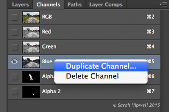
Open your Channels panel and click on each of the red, green and blue channels to see which has the most contrast. In this example, I chose the Blue one. Click and Duplicate this channel.

Duplicate-channel-panel

Duplicating the blue channel to create a displacement map.

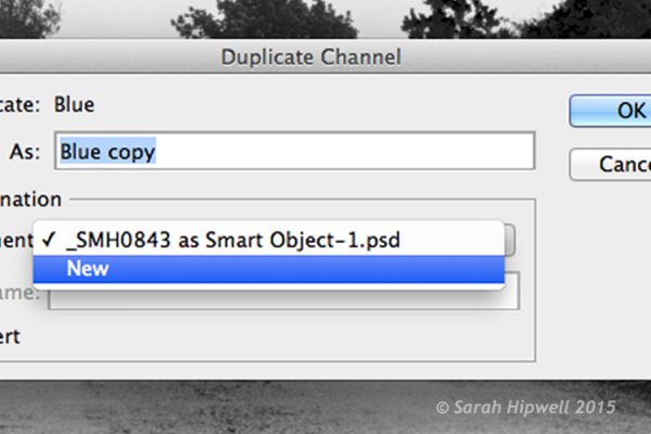
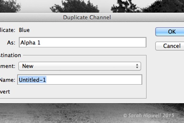
This brings up another dialog box (see below). Where it says Document, click on the tab and choose New. Name this file Displace road or whatever you want and click OK.

Duplicate-channel-new

Clicking on the Document tab to select New to create a new document for a displacement map.

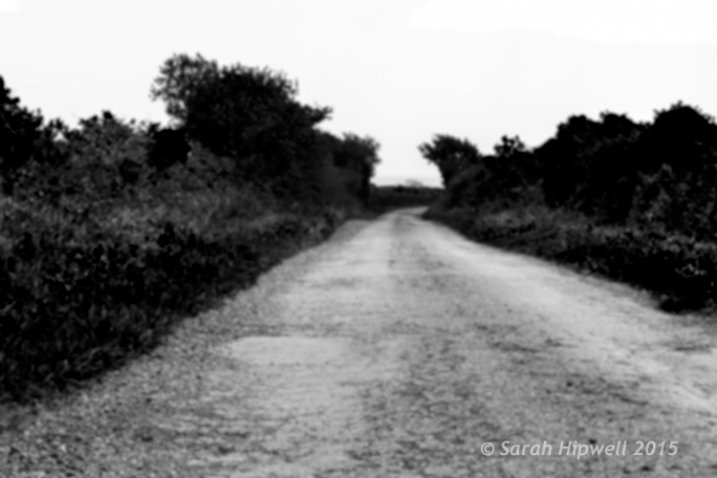
This creates a new document with the layer named Alpha 1. Before you save this document out as a grayscale PSD (Photoshop) file. You need to add some more contrast, go Menu> Image>Adjustments >Levels, then add Gaussian Blur of 9.9 pixels. This will allow the edges of the road marking vector shape to hug the contours of the road, rather than have a jagged edge. Convert this image to Grayscale and save it out as Displace road.psd. Close this document.

Duplicate-channel

This dialog box appears directly after selecting New in the previous step.

Displace-road

A grayscale displacement map of the road image.

Go back to the original document where we are still in the Channels panel and the blue channel is still highlighted. Click on the RGB layer, to bring back the image to colour.

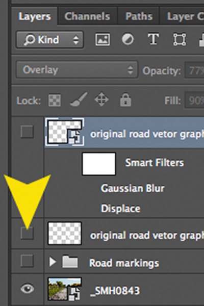
In the Layers Panel (I normally have this nested beside the channels panel) click on the square to the left of the layer thumbnail to bring back the visibility of the road vector shape that I had drawn before making the displacement map. See image below.

Layer-visibility

With this layer highlighted, go up to Menu>Filter>Distort>Displace. A small dialog box appears. The amount of distortion that you apply will depend on the values that you enter in the Horizontal and Vertical scale boxes. It defaults to 10 in each box. These values represent percentages.

The higher the values the greater the distortion. Experiment to see the desired effect that you want. When you convert your layers to Smart Objects, any adjustments that you make can be done easily and non-destructively. For this image, I chose 55 in the Horizontal scale and 80 for the Vertical one. I wanted more distortion on the road marking so that it would match the worn look of the road.

At this point your image may look a bit odd, follow the next step to make it look more blended and realistic.

Zoomed-in-road-marking

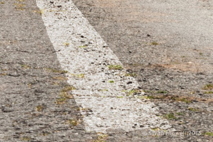
Close-up of the road marking after the displacement map and final tweaks have been applied.

Final tweaks: To give the road marking a more realistic look.

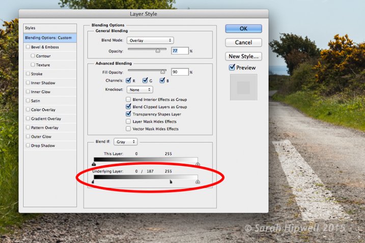
I added Gaussian Blur of 4px to get rid of the ever so slightly pixelated edge on the shape. Double-click anywhere to the right of the layer to bring up the Layer Style box. I changed the Blend Mode to Overlay, reduced Opacity to 77% and Fill to 90%. In the Blend If section, I moved the black slider to 187 on the Underlying Layer.

Tip. If you hold down the Alt/Option key when dragging the black or white sliders, this splits the slider arrow into two which makes the blend more smooth.

Layer-style

The black slider is split on the Underlying Layer in the Blending Options dialog box.

2. Shadow Effects – Water

Displace-in-water

Displace-in-water-map-applied

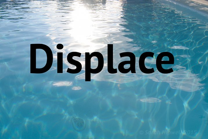
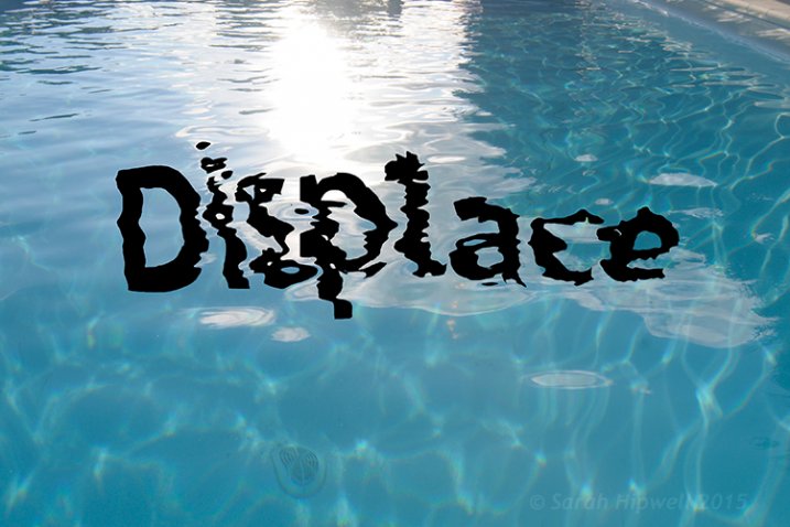
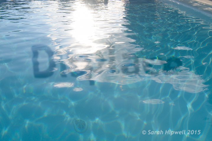
Before and after images showing the distortion on the word “Displace” when a displacement map has been applied.

Aim: To create a realistic reflective shadow in water with text.

I used the word “Displace” to show how a shadow in water can look quite effective and realistic. The displacement map I made for this image worked really well in distorting the text to wrap around the ripples of the water. I followed the same steps to generate the displacement as above but I applied a Gaussian Blur of 5.4px for this image.

The values I added in the Displace dialog box for the Horizontal and Vertical scales were 80 respectively.

For the final tweaks, I added Gaussian Blur of 10.1px. I changed the Blend Mode to Softlight, reduced Opacity to 78%, and Fill to 80%. In the Blend If section, I moved the black slider on the Underlying Layer to 148.

Displace-in-water-final

The word Displace distorted using a displacement map.

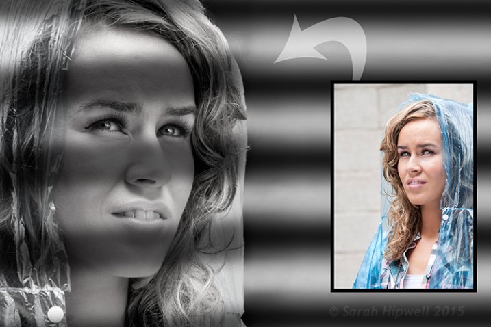
2. Shadow Effects – Film Noir Look

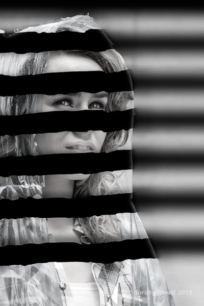
Woman-film-noir

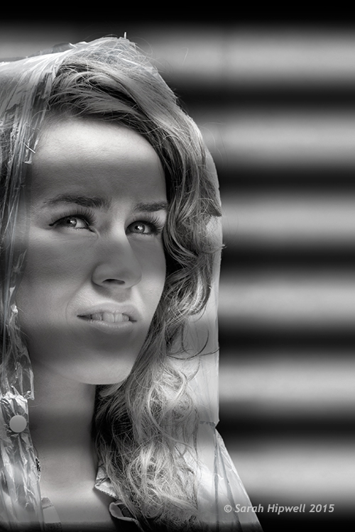
Using black horizontal lines and a displacement map to simulate light shining through window blinds.

Aim: To create a film noir look or the effect of light coming through blinds.

For this image I had to do more work in Photoshop to get the final look. The process to generate a displacement map is the same here as in the other examples. Just bear in mind that the blue channel is not the best choice for subjects as the skin tones look awful.

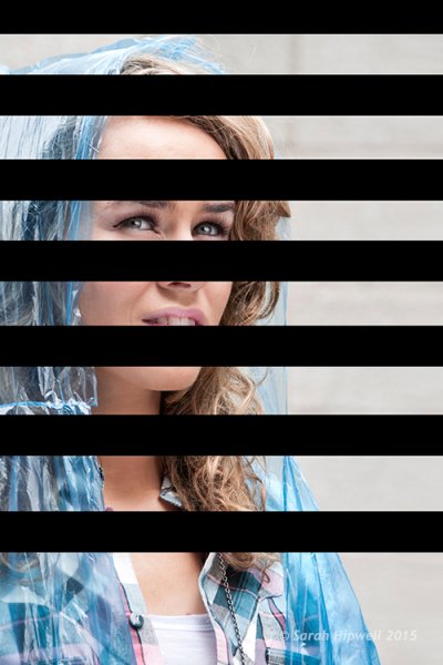
I isolated the model from this image and put it on a separate layer with a layer mask. I added a Black and White adjustment layer, then created thick black horizontal lines using the Rectangular Marquee Tool to resemble window slats on a separate layer. Next, I duplicated that layer. I used one for the background layer and added a significant amount of Gaussian Blur. I then moved the other layer above the model with the layer mask. I wanted to angle the black lines (window blinds) across the model’s face. I did this using the Free Transform Tool.

Woman-black-lines-film-noir

Black lines created using the Rectangular Marquee Tool.

I made a displacement map and distorted the slats over the model’s face using 15 and 20 as the values for the Horizontal and Vertical scales.

Woman-displacement-map-applied

The black lines have been distorted via the Displace filter using a displacement map.

This is only a brief description of the final tweaks: I applied a Gradient Overlay and some Burning to darken the left side of the model as the light source is coming from that directoin. I added Gaussian Blur of 28.9px and reduced Opacity to 40%.

Tips

  • Blue is the worst channel to choose if you are making a displacement map where skin tones are involved.
  • The green channel usually shows the most contrast.
  • Make sure to use Gaussian Blur when generating displacement maps.
  • Displacements maps must be saved out as a grayscale .PSD file.

I hope I have inspired you to start making displacement maps and use the Displace Filter if you have never tried it before.

googletag.cmd.push(function() {
tablet_slots.push( googletag.defineSlot( “/1005424/_dPSv4_tab-all-article-bottom_(300×250)”, [300, 250], “pb-ad-78623” ).addService( googletag.pubads() ) ); } );

googletag.cmd.push(function() {
mobile_slots.push( googletag.defineSlot( “/1005424/_dPSv4_mob-all-article-bottom_(300×250)”, [300, 250], “pb-ad-78158” ).addService( googletag.pubads() ) ); } );

The post Get Creative with Displacement Maps in Photoshop by Sarah Hipwell appeared first on Digital Photography School.


Digital Photography School

 
Comments Off on Get Creative with Displacement Maps in Photoshop

Posted in Photography


Street Style: Apparel Custom-Printed with Scalable City Maps

05 Dec

[ By WebUrbanist in Design & Products & Packaging. ]

custom map skirt design

Taking customized couture to the streets, Monochome allows you to turn any urban grid at a scale of your choice into a unique tank top, t-shirt, flare or pencil skirt.

figure ground urban grid

custom cool urban grid clothes

Using OpenStreetMap, the company lets you select between a black-on-white figure/ground representation or more traditionally-gridded white-on-black map. Ordered now and these should arrive by Christmas – a perfect holiday gift to compliment some urban grid dog tags.

example zoom custom shirt

The user-friendly selection tool allows you to get incredibly precise with your pick, creating a composition that is both personalized and aesthetically pleasing through a combination of panning and zooming. The above set of four examples, for instance, are simply variations on the same location at different scales.

street style map skirt

custom shirt steps process

street style skirt two

A number of standard cities are presented but you can also search for your own location or address or your choice. Due to the nature of OpenStreetMap, you are encouraged to add data for any place not already in the system.

Share on Facebook


[ By WebUrbanist in Design & Products & Packaging. ]

[ WebUrbanist | Archives | Galleries | Privacy | TOS ]


WebUrbanist

 
Comments Off on Street Style: Apparel Custom-Printed with Scalable City Maps

Posted in Creativity