
Boneyard Beach, Botany Bay Plantation, South Carolina. Edited in Macphun Intensify Creative Kit.
My philosophy on photography has always been that photography starts with the push of the shutter button, but it does not end there. Back when film was king, I spend a lot of time in the darkroom, learning and mastering darkroom techniques, and printing my work. With the advent of the digital age, those processes moved to the digital darkroom. Always one for working smarter, not harder, I have often employed plugins with Photoshop to make the work of editing my images a bit easier. I’m a big fan of plugin suites that offer a soup to nuts solution for editing images, so when Macphun released its Creative Kit 2016, I was excited to give it a try.
Note: all Macphun products are made for Mac only.
Macphun’s Creative Kit 2016 includes six plugins for Photoshop or Lightroom. This is a comprehensive collection that can handle all aspects of image editing, from color and contrast adjustments, to black and white conversion, to removing unwanted elements, sharpening, and noise reduction. The six modules are Intensify, Tonality, Snapheal, FX Photo Studio, Focus, and Noiseless. I’ll explain each one individually to give you an idea of the capabilities of each. Macphun Creative Kit, as the name implies, is only for Mac users, and is currently on sale at Macphun for $ 129 (USD)
Intensify CK
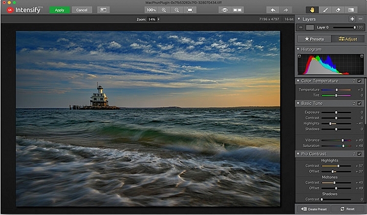
The Macphun Intensify CK application window.
Macphun Intensify is a plugin in the same vein as Topaz Adjust. You can adjust everything from color temperature and saturation, to contrast, structure, and details. When you open Intensify, your image will be in the center of the screen with a tool bar on the right, which can alternate between presets and manual adjustments.
The list of presets is broken down into groups: Architecture, Black & White, Creative, Detail Enhancement, Image Tune, Landscape, and Soft. Within each group is a list of presets that pertain to the subject of the main group. For instance, within Landscape is Aerial Photo Enhance -2, Gloomy Day, Natural Enhance, Structured Scape, and Warm Day. When you select a preset, an amount slider appears underneath so you can adjust the amount applied to the image. You also have the option of manually adjusting all the sliders to tweak the preset to to your tastes.
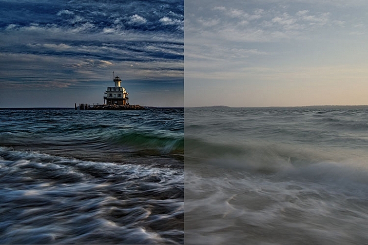
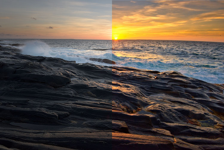
Comparison of an image edited in MacPhun Intensify, before (right) and after (left).
While I found many of the presets to be a bit heavy handed, manual adjustments are easy to make, and gave me a much more satisfying result than simply clicking a preset. For a more in-depth look at Intensify, read MacPhun Intensify Pro Software Review. While Macphun Intensify CK is a newer version, the controls and presets are largely the same and Andrew Gibson does an excellent job of breaking them down.
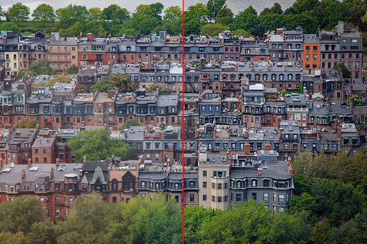
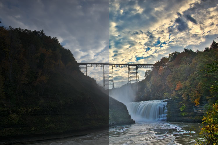
Before (left) and after (right) Intensify CK
Snapheal CK
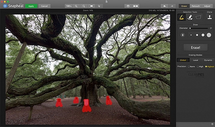
The Macphun Snapheal CK application window.
Snapheal CK may very well be the crown jewel of this collection. Think of the healing brush or clone stamp on steroids, and that’s what Snapheal CK is like. Snapheal CK is an amazingly simple way to remove unwanted objects from a scene. When you open Snapheal CK, You’ll notice a tool panel on the right, and a menu bar across the top. You’ll see zoom and move tools, an eyeball icon, which shows the object you’ve removed, a comparison button, arrows to step forward or backward, and finally – Erase, Retouch, or Adjust, which are the different modes you can work in. The selection tools at the top are a paintbrush, an eraser, and a marquee selection. There is also a cloning stamp tool.
Once you have your image in Snapheal CK, if you select Erase mode, you can either use the paint brush or the marquee tool to select the object you want removed from the scene. A red mask will appear over the object you’ve selected. The size of the paintbrush can be adjusted using the slider, or the bracket keys on the keyboard. If you paint in an area you don’t want removed, simply select the eraser tool and erase the painted area.

An image before using Macphun Snapheal CK. The signs in the scene were not allowed to be moved, so I was resigned to having to clone them out.
Underneath the selection tools, you’ll find the options for each tool, such as brush size, polygonal or free marquee, and for the clone stamp, diameter, softness, and opacity. Beneath the options, is a very large button clearly marked as Erase! Under the erase button are three erasing modes: Global, Local, and Dynamic, as well as three Precision options: Norm, High, Highest.
Once you’ve made your selection, you simply press the Erase button and Snapheal CK goes to work. While you wait, the status bar displays a variety of interesting facts to keep you entertained. It does take a few minutes to do its thing, even on my 2015 Macbook Pro with 16GB of RAM. After the process has finished, if the result is not to your tastes, try changing the erasing mode to one of the other modes. Each one behaves a bit differently and will produce a different result. The same goes for the Precision setting.

The same image after being edited in Macphun Snapheal CK. The signs and other unwanted objects have been removed.
Retouch mode works similar to erase mode, but instead of erasing, it allows you to adjust the selected area for color, contrast, and more. Adjust mode is similar but instead of working on a selected area, it makes global adjustments to the entire image.
Even without the Retouch and Adjust modes, the object removal mode of Snapheal CK makes it worth the price of admission in my book, saving me time every time I need to clone or remove an object from an image for whatever reason.
Note: if you are a Lightroom user and want a more powerful cloning and healing tool without having to purchase Photoshop, this may be a good option for you to look at.
Tonality CK
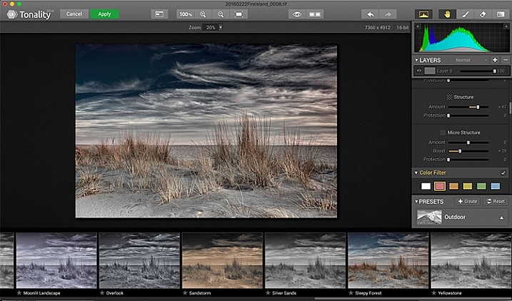
The Macphun Tonality CK application window.
Macphun bills Tonality CK as, “The world’s most advanced black & white photo editor.” With hundreds of presets available to you, as well as the ability to work in layers and adjust virtually everything about the image, there’s a lot of truth in that statement.
As you open Tonality CK, you will be presented with your image in the main window, a menu bar across the top, tool palette on the right hand side, and preset preview bar across the bottom. The palette on the right hand side features all of the settings, including; layers, a histogram preview, adjustment sliders for color temperature, tone, clarity and structure, color filter, tone curve, split toning, glow, lens blur, texture overlay, vignette, grain, photo frames, and layer properties. There are a lot of variables to adjust to get exactly the look you want. Beneath these adjustments is a drop-down menu to select various presets, from groups including Basic, Architecture, Portrait, Dramatic, Outdoor, Street, Vintage, Film Emulation, Toning, HDR, a Favorites group, and a group for user defined presets.
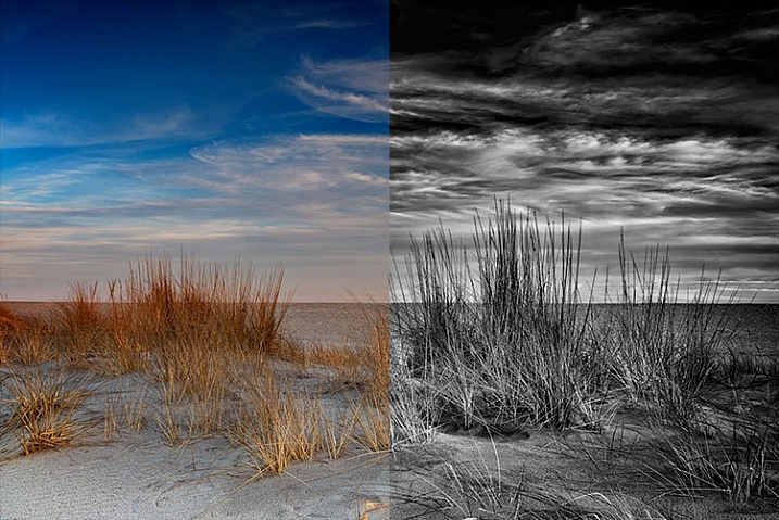
Before (left) and after Macphun Tonality CK (right)
With the use of layers and individual adjustments, there are literally endless combinations and looks that can be creative with Tonality CK. I really like the amount of freedom I have in the editing images, and the ability to create layers with different effects, and mask them off if desired, takes that freedom to a whole new level. For a more in depth review of Tonality, Product Review: Macphun Tonality Black and White Photo Editor goes in depth. As with Intensify CK, Tonality CK is an update to the version reviewed, but both are similar enough that I found the review helpful when I first began using Tonality CK.
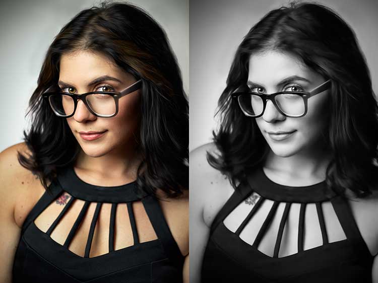
Tonality CK applied on a portrait
Focus CK
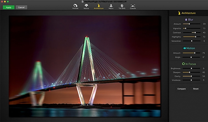
Macphun Focus CK application window.
Macphun Focus CK is a plugin that allows you to create lens focus effects easily and quickly. The interface when the plugin is opened is a minimalistic one, with only six presets across the top of the screen, and your image in the main window underneath. The presets are as follows: Portrait, Nature, Architecture, Macro, Tilt-Shift, and Custom. Truth be told, Nature, Architecture and Tilt-Shift are all similar, in that the blur is similar to that created when using a tilt-shift lens. There are subtle differences in each preset, with the most notable being the angle of the blur. This is user-adjustable, however, as are several settings sliders, which are adjusted slightly differently according to the preset selected. The same can be said for the Portrait and Macro settings, except instead of a parallel blur field, they create a circular blur field.
When you select a preset, a series of sliders appear on the right side of the screen, in three groups. The first group is Blur. This set of sliders, as you may have deduced, adjusts the image in the blurred area. The settings include amount of blur, vignette, contrast, highlights, and saturation. The next group of sliders is Motion, which allows you to add motion to the blur, rather than simply a normal blur. Here you can adjust the amount and the angle of the motion. The final group of sliders is for the In Focus area of the image, and allows you to adjust the brightness, sharpness, clarity, and vividness of this area of the image. Beneath these sliders are a Compare button, to allow you see before and after the blur is applied, and a Reset button, to allow you to start over if you don’t like what you’ve done.
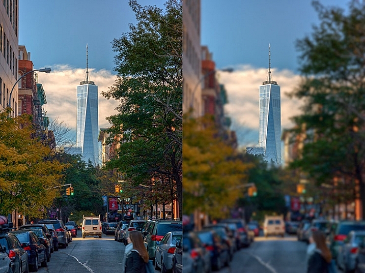
Before (right) and after (left) Macphun Focus CK.
The most fun part of Focus CK is the Custom setting. The custom setting allows you to mask off the areas of the image you wish to remain sharp, using the paint brush. As you paint, you’ll see the effect on the image. There is an eraser tool if you paint in an area you’d like to remain blurred. This custom setting allows you to really create different looks within your image. Have two objects at different depths, and want them both sharp and everything else blurry? No problem. Simply mask each object and adjust the blur of the out of focus areas to taste.
The biggest drawbacks in Focus CK is in this custom mode. There is no ability to zoom in on the area you are masking to do fine detail work, and the brush will not go smaller than 20 pixels, making it very difficult to mask off fine detail, such as the antenna on the building in the example above. If those two deficiencies could be rectified, I could see using Focus CK much more in my personal work.
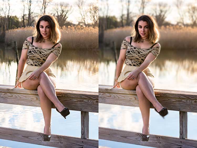
Focus CK applied to a portrait
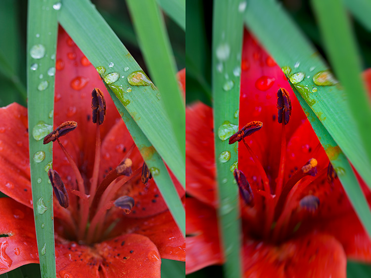
Focus CK applied to a macro image
Noiseless CK
Noiseless CK is Macphun’s entry into the digital noise removal arena. Like the other plugins in the Macphun Creative Kit, the interface features a large window for your image, a button bar across the top, and a palette of sliders on the right, that allows you to adjust a wide array of settings and customize the noise reduction to your preference.
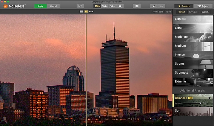
Macphun Noiseless CK application window.
To test out Noiseless CK, I dug out an image I created several years ago that has the worst noise I’ve ever had in an image. It was a four minute exposure, and I had neglected to turn on long exposure noise reduction. I found Noiseless CK was able to subdue the noise pretty easily.
Noiseless is simple to use. Open your image in Photoshop or Lightroom and start the Noiseless Plugin. On this image, I started at the Lightest preset, just to see how that would do with the noise, knowing that most likely it wouldn’t come close to reducing it enough for my taste, due to the heavy noise within the image. As I worked my way down the list of presets, I found that once I hit the Strong preset, it really reduced detail in the image, which I wanted to try and avoid. In addition to the presets ranging from Lightest to Extreme, there are also two additional presets, called Balanced and Soft. The Balanced setting seemed to work the best on this image. There is also an Amount slider to adjust the application of noise reduction using that setting. From there, I could also select the Adjust tab, and individually adjust the settings individually to get a look I was happy with. If I wanted to save those settings, I can create a custom preset of my own for future use.
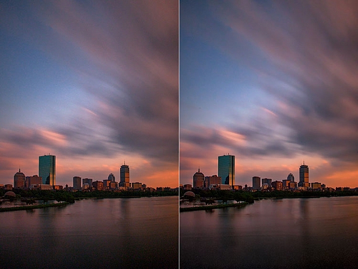
Before (right) and after (left) comparison of an image edited in Macphun Noiseless CK.
I found that using some of the presets resulted in a greater loss of detail than I was happy with, but once I went into the Adjust tab and started using the sliders, I was able to get some detail back, and get a look I was happy with. As I said, this was an extreme image I was using to test, and I have to say Noiseless CK did a great job with it. The ability to adjust the noise reduction using both the amount slider and individual settings sliders, gives me the confidence that Noiseless CK can handle almost anything I need it to.
FX Photo Studio CK
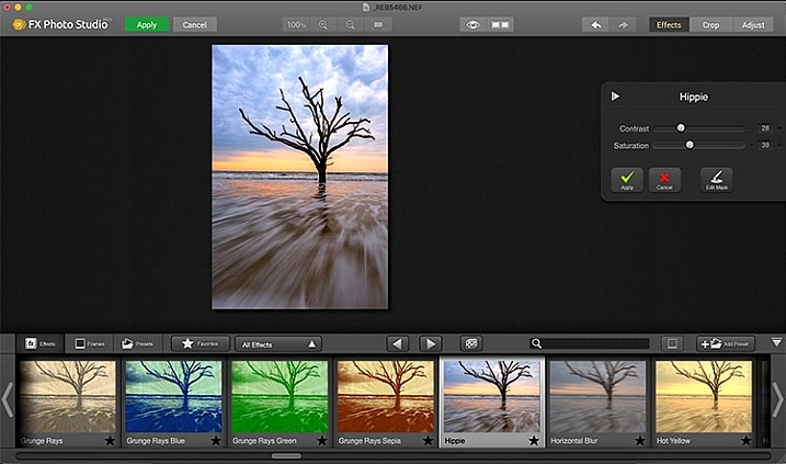
Macphun FX Photo Studio CK application window
FX Photo Studio Ck is a special effects generator and photo editor that, at first glance, looks relatively simple and easy, but doesn’t offer many options. However, if you dig a little deeper, you’ll see there is more than meets the eye here. It offers over 200 different effects and frames, as well as the ability to create your own.
When you first open an image in FX Photo Studio CK, you’ll see your image in the main window, and underneath is a preview bar of presets. You will also notice the menu bar above, and on the right end of that, a mode selector, allowing you to select from Effects, Crop, and Adjust. The presets for Effects include Effects, Frames, and Presets, with Presets in this case meaning user-defined presets. The Effects tab also features a drop down menu with 20 groups of effects. These include Art, Black & White, Blur, Color Fantasy, Color Lenses, Color Strokes, Color Temperature, Cross Processed, Distortion, Glow, Groovy Lo-Fi, Grunge, Hollywood FX, Hue, Photo Styles, SFX, Sketch, Symmetry, Vignettes, and Vintage. When you select the Frames tab, you’ll be presented with a preview of frames below, and a drop-down menu to select different groups of frames appears, allowing you to select between Art, Classic, Grunge & Analog, and Photo Borders.
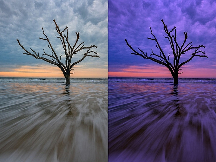
An image before editing in Macphun FX Photo Studio CK on the right, and after, on the left.
To be honest, most of the effects and frames do not appeal to me. But there is more to FX Photo Studio CK than just presets and frames. At the right of your image are adjustments for the various effects. These adjustments will vary depending on the effect chosen, and is usually a minimal control of one or two sliders to adjust the effect. You can combine effects, by selecting one, applying it, and then selecting another one to apply to that. FX Photo Studio CK lacks the layer capabilities of Tonality, which would really make it easier to combine multiple effects and adjust how they are applied together. As it stands now, you must commit to one effect before adding another. One great feature of FX Photo Studio CK is the ability to edit the mask on the image, so you can apply the effect only to areas of the image you want, and hide the effect in other areas.



If you wish to make further adjustments, you can select the Adjust tab, which opens a palette of sliders including Temperature, Saturation, Hue, Exposure, Brightness, Contrast, Shadows, Highlights, Sharpen, Red, Green, and Blue. There are fewer controls available than in Intensify CK, so I’m not sure I see the usefulness of FX Photo Studio CK for in-depth editing, but for someone looking to quickly add an effect or frame to their image, FX Photo Studio CK may be just what they need.
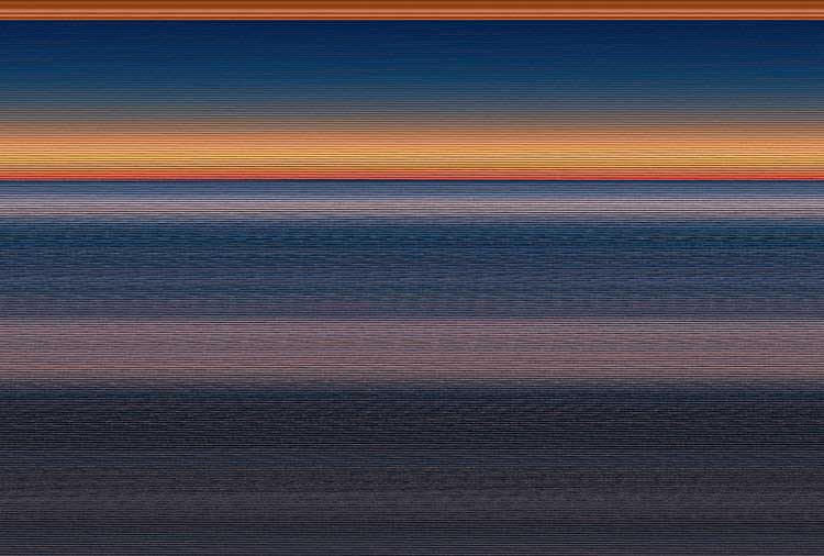
Error using frames
Note: I could not get FX Photo Studio to give me a clean image. Every frame I tried, every file I tried, gave me the same result when I tried to use the Art Frames and Classic Frames. I was able to use a Grunge Frame, and have shown examples above. Not sure if this is a greater bug with MacPhun’s software or a problem with my system specifically.
Conclusion
The Macphun Creative Kit is a full-featured, well thought out, suite of image editing tools that would be welcome in any photographer’s tool kit. While I would prefer more control in certain areas of the suite, Macphun has continued to develop the software for the past several years, and I have no doubt they will continue to make improvements as they move forward.
Overall rating: 3.5 out of 5. I really liked MacPhun Creative Kit and think it has a lot to offer, but I ran into a bug with the FX Photo Studio when trying to add a frame to an image, and I think Focus CK needs a zoom feature and a finer brush to allow for more precise masking. Fix the bug with the frames and add the zoom and finer brushes to Focus CK and I’d give another star.
googletag.cmd.push(function() {
tablet_slots.push( googletag.defineSlot( “/1005424/_dPSv4_tab-all-article-bottom_(300×250)”, [300, 250], “pb-ad-78623” ).addService( googletag.pubads() ) ); } );
googletag.cmd.push(function() {
mobile_slots.push( googletag.defineSlot( “/1005424/_dPSv4_mob-all-article-bottom_(300×250)”, [300, 250], “pb-ad-78158” ).addService( googletag.pubads() ) ); } );
The post Software Review: Macphun Creative Kit 2016 by Rick Berk appeared first on Digital Photography School.

Digital Photography School










You must be logged in to post a comment.