RSS
 

Posts Tagged ‘Luminosity’

5 Scenarios Where You Should Use Luminosity Masks

21 Jun

The post 5 Scenarios Where You Should Use Luminosity Masks appeared first on Digital Photography School. It was authored by Christian Hoiberg.

The world of post-processing is a big world with endless possibilities. Every photographer applies photo editing tools in their own way, and we all have different purposes of what we want to convey through our photography. For me, post-processing is a way to overcome certain limitations found within the camera and to better represent what I experienced in the field. For this purpose, I use both Adobe Lightroom and Adobe Photoshop.

I used Luminosity Masks to selectively process this image

While I do most of the work in Lightroom, there are several techniques I apply that can only be done in Photoshop. Some of these techniques are quite popular, while other techniques are the result of spending too many hours playing around and trying various things. The one thing I often notice when viewing images from aspiring photographers, or when talking post-processing with my workshop clients, is that every effect is applied globally. I believe that is a BIG mistake.

Certain effects should only be applied to specific parts of an image. That’s where Layers and Masks in Photoshop come in handy. However, I like to make my selections more accurate than just painting with a black/white brush on a Layer Mask, which is why Luminosity Masks have become an important part of my workflow. I’m not going to get into what they are and how to create them in this article. If you don’t know how to create them, I suggest you read this article first so that what I discuss in this article makes sense to you. I will be covering 5 scenarios where you should use Luminosity Masks.

1. Use Luminosity Masks to apply contrast

Let’s step out of Photoshop and into the Lightroom RAW editor for a moment to take a look at what happens when you increase the contrast slider:

Pulling Lightroom’s Contrast slider to the right brightens the brights and darken the darks, without taking into consideration how dark the darks are and how bright the brights are. That will quite often result in shadows becoming pure black and the brightest highlights becoming pure white. Yes, you can avoid this by adjusting the slider more gently or playing with the Highlights/Shadows sliders (which I often do in addition). However, there’s another way that’s even better: apply contrast using a Luminosity Mask.

I’ve already applied contrast and made basic raw adjustments when opening this file in Photoshop. So when I now keep working with the contrast, I don’t want to affect the brightest highlights or the darkest shadows. That means that I only want to apply contrast to the midtones. This is easily achieved in Photoshop by creating a Midtones Luminosity Mask (I often go for Midtones 2, but make sure to create the other masks as well) and applying it to the Curves Layer Mask (you can also use a Levels or Contrast Adjustment Layer):

The Midtones 2 Luminosity Mask applied to the Curves Layer Mask

Looking at the mask above, we can see that we’re not affecting the darker parts of the image when adjusting the contrast. The effect will also be less visible in the brightest parts. If you’re not quite sure what you’re looking at above, remember this phrase when talking about Layer Masks: White Reveals, Black Conceals.

2. Selectively work on color balance

The second adjustment that should be done through a Luminosity Mask is Color Balance. Globally working with color will often result in strong color casts.

Let’s say that you want to cool down the shadows of an image by using a Color Balance Adjustment Layer. The common method would be to set the color balance tone to Shadows and pull the cyan slider to the left and the blue slider to the right, such as this:

Doing this simple adjustment has given a nice cold color cast to the shadows but, unfortunately, it’s affected more than just the darker parts of the image. Also, less dark areas (areas which are not considered bright), have been affected more than I wanted. Even the highlights seem slightly faded.

If I make this exact same adjustment through a Darks 3 Luminosity Mask, the result is quite different:

Notice that the colder color cast has been applied to the darkest parts of the image, which is what I initially aimed for. The midtones and highlights are entirely left alone and remain the same as they did before applying the adjustment.

3. Darken a bright sky with Luminosity Masks

Another good use of Luminosity Masks is to darken a too bright sky (in this scenario, it’s important that there’s still information to be pulled out of the bright parts). A quick look at the RAW file below shows us that the left side sky is slightly too bright. I still want it to be brighter than the right since the sun sits just left of the frame. However, I want to get some of the details back from the overly bright areas.

Using a Curves Layer Adjustment without a mask will affect other parts of the image too. So, again, let’s do it through a Luminosity Mask. The Brights 4 mask seemed best for this particular image:

Remember, only the white parts of the mask will be affected by the adjustment. As you see above, that means that the majority of the image won’t be affected whatsoever.

With the Brights 4 Luminosity Mask selected, create a Curves Adjustment Layer and darken by pulling the middle part of the line downwards. We’ve now successfully darkened the bright sky:

4. Blend multiple images using Luminosity Masks

Digital cameras have had a great boost in improvement in a short time, but there’s still one thing that they struggle to do: capture the full dynamic range when working with bright skies and dark foregrounds. This certainly is something camera manufacturers are working on. I’m blown away by how far its come, but it’s still not good enough for many of the scenarios landscape photographers work in.

The workaround is to capture multiple exposures of the same frame with different shutter speeds. Typically, you capture one dark, one base, and one bright image. You then blend these images in post-processing where both the foreground and sky is correctly exposed.

There are a million ways to do this, but one of the most accurate is to use Luminosity Masks in Photoshop. It might sound advanced, but let me show you just how easy it is.

Let’s say we want to blend these two images to get back the lost information in the blown out sky. (To keep this simple, I only blend two exposures here. But, I strongly recommend the 3rd exposure as well to use in the brightest part):

I prefer to have the bright layer on the top and paint in the darker exposure, but either way is perfectly fine. If you prefer having the dark exposure on the top, just do the opposite of what I explain in the next few steps.

Here’s how you easily blend the images using Luminosity Masks:

  1. Place the bright exposure on the top
  2. Align the layers to avoid ghosting (select both layers and go to Edit -> Auto-Align Layers)
  3. Add a white Layer Mask to the top layer
  4. Create a Brights Luminosity Mask (the exact mask depends on the image. I used Brights 3 for this example)
  5. Use a black brush at 0% hardness and 50% opacity and brush repeatedly on the areas where you want to reveal the darker exposure. Repeat until you’ve got a smooth blend.

That’s it! Not to hard right? In a matter of minutes I was able to blend the two images above into this:

As mentioned, this image still needs one darker exposure to be painted back into the brightest area close to the suns’ position. This is quite easy, and all you need to do is have another darker layer at the bottom and use a more restricted Brights mask on the middle layer to reveal it.

5. To apply Glow Effects

The final adjustment I strongly recommend doing selectively rather than globally is any glow effect. There’s no need to add a strong Orton Effect to the shadows of a picture, right?

There are two “guidelines” that I follow when creating a glow effect:

  1. Never apply it to the closest foreground (keep the foreground sharp)
  2. Avoid adding too much to the shadows

Since there might be highlights in the foreground, I’m going to combine a Luminosity Mask and free painting on the mask in this scenario. Again, this is quite easy and you can achieve it by following a few quick steps:

  1. Create a glow effect on a new layer
  2. Create a wide Brights mask and apply it onto the layer
  3. Grab a soft black brush at a medium opacity and remove the adjustment from the immediate foreground by painting directly onto the layer mask

By following these simple steps we have added a nice soft glow to the highlights of the image.

The point of adding a glow effect, in my opinion, is not to make the entire image look soft and hazy but to add a little extra depth and atmosphere. I have achieved this by selectively applying it.

What next?

These are just a few adjustments that I recommend applying through a Luminosity Mask. They have become an essential part of my processing workflow during the past several years. I use them in one or another way for the majority of my images. Sometimes I apply to sharpen through them, other times contrast. There really are endless opportunities.


5-scenarios-where-you-should-use-luminosity-masks

The post 5 Scenarios Where You Should Use Luminosity Masks appeared first on Digital Photography School. It was authored by Christian Hoiberg.


Digital Photography School

 
Comments Off on 5 Scenarios Where You Should Use Luminosity Masks

Posted in Photography


Making Photoshop Luminosity Masks Easy with Lumenzia

31 Oct

As you advance with your photography, you may want to edit your photographs with more precise control. In this article, I discuss how to use Lumenzia Luminosity Masking Panel to easily edit sections of your image using Luminosity Masks in Adobe Photoshop.

These masks allow you to control different aspects of your image without affecting others. You can manually create these luminosity masks, or you can use a product such as Lumenzia to make them for you automatically, as well as applying many commonly used adjustment layers in Adobe Photoshop.

Making Photoshop Luminosity Masks Easy with Lumenzia 2

Hoar Frost on a River Stone after Using Luminosity Masks

Lumenzia is a luminosity masking panel that is an add-on application that works within Adobe Photoshop. It allows you to quickly create and efficiently use a wide range of luminosity masks for your image editing. To understand how Lumenzia works, because it is a little technical, you need to understand how Photoshop layers work.

Lumenzia, in its most basic terms, is used within Adobe Photoshop to allow you to manipulate images with layer masks. For this article, all the references and images are for Lumenzia V6.0.  Lumenzia appears as a panel within Photoshop.

Making Photoshop Luminosity Masks Easy with Lumenzia 3

Lumenzia Panel

Luminosity Masks

Luminosity masks, also known as Luminescence masks, are a way of making advanced selections in Photoshop based on luminosity values. This method is particularly useful for images with a high dynamic range.

For example, let’s say we are looking at the hoar frost ice ball image. It is a bright object on a dark background, where the exposure is likely to have been selected for the darker areas rather than the ice ball, making the ice ball more gray than white. The image is uneven because the white section (the ice ball) is underexposed. We could make a second exposure, this time exposing to account for the ice ball and then smoothly blend the area of the ice into the darker background.

Making Photoshop Luminosity Masks Easy with Lumenzia 4

Underexposed Original Hoar Frost Ice Ball

There are many ways to make selections in Photoshop, but in this particular example, Luminosity Masks would allow us to select the over-exposed area because it targets luminosity values (i.e., the brightness of an area), and smoothly blend in the darker exposure. The image below shows the luminosity histogram for this image.

Making Photoshop Luminosity Masks Easy with Lumenzia 5

Ice ball histogram

Luminosity masks are incredibly powerful because you can manipulate specific parts of your image. As with all masks, the key to remember is that white reveals and black conceals. There are multiple uses for these types of masks including fine-tuning images, highlight recovery, HDR images, black and white imagery, and general masking uses.

Lumenzia is an add-on product for Photoshop CC that allows for the automation of using Luminosity Masks. The limits of what you use this tool for is related to your imagination and how far you want to manipulate images.

Making Photoshop Luminosity Masks Easy with Lumenzia 6

Bonavista Harbour at Night – High Dynamic Range

What is a Luminosity Mask?

In general, there are two fundamental characteristics of the data contained in the photographic information in digital form: Chromatic (color, hue, and tint) and Luminosity (brightness). Luminosity masks focus on using the brightness of the information contained in the image data to allow you to manipulate portions of the image selectively.

There are some other great articles on dPS regarding Luminosity Masks. This being a fairly advanced concept, understanding how layers work in Photoshop is vital, or you may not understand much of this article.

Why use Luminosity Masks?

In times past and to this day, many photographers use techniques such as a white seamless background behind a portrait subject to allow for the background to be changed in post-production. Some other photographers use color to allow the background to replaced.

Making Photoshop Luminosity Masks Easy with Lumenzia 7

Cute Puppy on White Seamless Background

The distinction between the two backgrounds is that the white background has different luminosity levels, making it easier to mask out the background manually. Colored backgrounds can create problems due to the color of the clothing worn and color from the background affecting the edges of the subject in the foreground. The lighting on the subject can also affect this. The colored background is a chromatic mask rather than a luminosity mask. Luminosity masks are used to solve this issue.

Again, layer masks always work on the premise that white reveals and black conceals.

Let’s look at three masks for the Ice Ball image:

  • ‘Lights’ (L2) Mask (just from the high end)
  • ‘Mid-tone’ Mask (just from the middle)
  • ‘Darks’ mask (just from the darker end)

It’s the same image using the different masks. By using these masks, you can modify the image in those specific areas. The white areas are the selected areas of the histogram and the further you get from the selection, the darker the mask is. For the ‘Highlights,’ only the light values are white. For the ‘Mid-tone’ selection, only the mid-range values are white, making the highlights dark as well as the dark range. Finally, the ‘Darks’ selection shows the dark range in white.

Making Photoshop Luminosity Masks Easy with Lumenzia 8

Lights 2 Mask

Making Photoshop Luminosity Masks Easy with Lumenzia 8

Mids 2 Mask

Making Photoshop Luminosity Masks Easy with Lumenzia 9

Darks 2 Mask

How do you create Luminosity masks?

There are three ways to create luminosity masks. Firstly, you could create your own (time-consuming) and then automate this process. Secondly, you could purchase Lightroom or Photoshop presets that have someone else create an automated process for you. The third way is an add-in product that works within Photoshop. Lumenzia is an add-in product that works well.

There are two issues with the first two methods of generating Luminosity Masks; the time it takes to set up and automate them and the size of the files that have them applied with layer masks. Using presets or actions to generate Layer Masks can significantly increase the size of the files within Photoshop because each layer is effectively an image. This process takes up hard drive space and can place extra processing power on your computer.

Lumenzia uses Vector Masks instead of Layer Masks to rapidly create the Luminosity Masks. It allows for the rapid manipulation of images and discarding of masks is easy. All while keeping the image size smaller and more flexible.

How does Lumenzia work?

Lumenzia is an exciting product on its own as it allows you to efficiently control and automate many tasks related to Luminosity Masks. It integrates into Photoshop CC as a panel with simple button commands – many of which have instructions as you hover over them.

It is a powerful tool, and while the initial concepts are simple, the learning curve for using the product efficiently may be steep for some. Luckily, there are also integrated video tutorials that are launched from within Photoshop directly from the panel (you require an internet connection for these to function). The purpose of this review is to give you a bit of an overview of how it works so you can see if it’s right for you.

The Lumenzia Panel

The majority of the panel shows the selections of the luminosity ranges you need – once you understand how to select the various luminosity levels. To illustrate, consider a standard histogram for an image.

The RGB histogram shows the distribution of all the luminosity levels from pure black on the far left and pure white on the far right. The Lumenzia panel is divided up into sections. The top portion of the panel is the luminosity mask selection and preview area that allows you to see what you have selected.

Making Photoshop Luminosity Masks Easy with Lumenzia 10

Selection Portion of Lumenzia Panel

This top section divides up the luminosity ranges based on the ranges you are looking to use. Visually, the buttons give you a clear idea of the luminosity range that the buttons select. The buttons can be combined and inverted.

Once you press a selected range, a temporary selection appears and the layer buttons show.

Look at the luminosity histogram and notice the buttons visually show (on the same horizontal line) an approximate distribution of the luminescence values being selected.

The line of numbers (0-10), just above the bottom, is the zone values that Ansel Adams made famous as part of his processing technique.

Once you select a range, a preview appears with a set of orange tabs. These are just temporary to show you how the mask looks.

Making Photoshop Luminosity Masks Easy with Lumenzia 12

Orange Preview Tabs

The second section is the ‘Apply Panel.’ This panel allows you to use the mask on a common set of adjustment layer commands within Photoshop, such as curves, levels, contrast, brightness, HSL, and selective color. It applies the masks you have selected by creating an adjustment layer with the layer controls set up from the mask. The properties of the adjustment layer can then be modified.

Making Photoshop Luminosity Masks Easy with Lumenzia 13

Lumenzia Apply Panel

The third section is the ‘Refine Panel’ for refining the mask you have selected. It allows you to group and combine your selections as well as work with edge refinement. This section of the Lumenzia panel is suited for more advanced users.

Making Photoshop Luminosity Masks Easy with Lumenzia 14

Refine Panel

Conclusion

Once you get familiar with Lumenzia, creating adjustment layers that work on your images with precision is fantastic. The online tutorials provide a wide array of examples of how to control all aspects of your images. The panels mentioned come with the full add-in program ($ 39.99 US), but there is also a basic free panel that helps you get a feel for how it works. The Lumenzia website can be found here.

Using Lumenzia to control your images can help you produce dynamic results for your images.  Happy processing!

Have you tried Lumenzia? What results have you had with it? Please share with us in the comments below.

Making Photoshop Luminosity Masks Easy with Lumenzia 15

Wansford Bridge


The post Making Photoshop Luminosity Masks Easy with Lumenzia appeared first on Digital Photography School.


Digital Photography School

 
Comments Off on Making Photoshop Luminosity Masks Easy with Lumenzia

Posted in Photography


Luminosity Masks: What They Are and How to Use Them

16 Oct

Post-processing can make or break an image. It doesn’t matter how much you change in your photo editor of choice, even a small adjustment can damage your image if it isn’t applied correctly.

A common mistake I see with post-processing is applying all adjustments globally (i.e. to the entire image). It’s something we rarely want, which is why we tend to use Lightroom’s Highlights and Shadows sliders to adjust the exposure rather than the Exposure slider. And once you bring your image into Photoshop you can apply more advanced techniques and adjustments.

More than ever, you need to know how to make these adjustments correctly.

And that’s where luminosity masks come into the picture.

What are Luminosity Masks?

If you’ve read any of my previous articles you may have seen me talk about selective post-processing – making adjustments that only affect specific areas rather than the entire image.

Luminosity masks are selections based on a pixel’s luminosity value. This means you can accurately select only the bright, dark or midtone pixels. We can refine these selections to affect only the brightest brights or the darkest darks, and use them as layer masks for our adjustments.

Since they’re based on the pixel’s brightness, we can get extremely accurate selections that target only the specific pixels we want. Having an accurate selection means we avoid certain unwanted artifacts you might otherwise experience.

You won’t find luminosity masks in a list or menu within Photoshop (although third-party plugins can automate the process). Instead, you need to create them manually by making selections based on the RGB channels.

How to Use Luminosity Masks

Now that you know what they are, the next thing you need to know is how to use them. As you probably know they don’t adjust the image themselves. Instead they’re a selection you can apply to any layer or group you can use a layer mask on.

Before we look at how to use them, we need to look at how to create them. You can do this either manually or by using a third-party plugin. I strongly recommend you learn how to create them manually before you start using a plugin to speed up your workflow.

How to Make Luminosity Masks

Let’s create a Brights mask, which will select the bright areas of the image but leave the midtones and darks untouched. Keep in mind this is the broadest brights mask, and you’ll probably need to refine it to target more specific pixels. (More on that another time.)

Start by opening an image in Adobe Photoshop, and follow these steps to create the mask:

  1. Hold down Ctrl/Cmd and click the RGB thumbnail in the Channels Tab. You should now see marching ants around several areas of your image.
  2. Save the selection by clicking the Save selection as channel icon. The selection is saved as a channel and given the name Alpha 1.
  3. Double-click the name of your new channel ‘Alpha 1’ and rename it to ‘Brights 1’.
  4. Hold down Ctrl/Cmd and press D to deselect the selection.

Not too hard, right?

This is what the Brights 1 Mask looks like

We’ll make the Darks mask next. It’s pretty much the same process as making the Brights mask except we need to invert the selection:

  1. Hold down Ctrl/Cmd and click the RGB thumbnail in the Channel Tab.
  2. Hold down Ctrl/Cmd and Shift, and press I to invert the selection.
  3. Save the selection.
  4. Double-click the new channel’s name and rename it to ‘Darks 1’.
  5. Hold down Ctrl/Cmd and press D to deselect the selection.

This is what the Darks 1 mask looks like

Finally, we’ll create the Midtones mask. This one is made slightly differently to the first two masks.

  1. Select the entire image (hold down Ctrl/Cmd and press A).
  2. Subtract Brights 1 (hold down Ctrl/Cmd and option/alt, and click on the ‘Brights 1’ channel’s thumbnail).
  3. Subtract Darks 1 (hold down Ctrl/Cmd and option/alt, and click on the ‘Darks 1’ channel’s thumbnail).
  4. Save the selection and rename the new channel to ‘Midtones 1’.

This is what the Midtones 1 mask looks like

We’ve now created the three basic luminosity masks. The process might seem confusing at first, but soon you’ll find creating masks as easy as one, two, three.

How to Apply and Use a Luminosity Mask

Now that we have our masks, let’s look at how to use them. As I mentioned earlier, you can apply luminosity masks to any layer or group you can use a layer mask on. This includes merged layers, adjustment layers, groups, smart objects and more.

I want to brighten the darkest parts of this image but leave the highlights alone

A typical processing scenario is the foreground being is a bit too dark while the sky is perfectly exposed.We can fix this by increasing the exposure using a Curves Adjustment. But using a Curves Adjustment without a mask will brighten not only the shadows,but also the areas that are already well exposed.

So let’s use the Darks mask.

Hold down Ctrl/Cmd and click on the Darks channel’s thumbnail to activate the selection. (You’ll know it’s active when you see the marching ants.)

With the selection active, create a Curves adjustment layer. Since the selection is active, the Darks luminosity mask will be applied to the Curves’ layer mask. Any adjustments you make on this particular layer will only affect the areas represented by white on the mask.

Now simply pull the Curve up to brighten the darks. You can toggle the mask on and off by shift-clicking the layer mask to see the adjustment with and without the mask. (It makes a huge difference.)

With the luminosity mask applied


Without the luminosity mask applied

What Now?

This is just one way you can use luminosity masks. When processing an image I use them several times with a variety of adjustments. They can even be used to blend multiple images.

And while third-party plugins can automate the process for you, you really should learn how to create them manually first. Understanding how they work makes it easier to know how and when to use them – and when not to.

If you’re interested in this subject, take a look at my eBook A Photographer’s Guide to Luminosity Masks where I teach you everything you need to know about them, as well as a variety of other masks and advanced selections.

The post Luminosity Masks: What They Are and How to Use Them appeared first on Digital Photography School.


Digital Photography School

 
Comments Off on Luminosity Masks: What They Are and How to Use Them

Posted in Photography


How to Create Silky Split Toned Black and White Photos Using Luminosity Masks

22 Mar

Have you ever found it hard to choose between processing an image in color or black and white? It can be a tough decision. Enriching colors that instantly captivate your attention versus a timeless black and white photograph full of texture and complex shadows.

There’s every chance you’ll process both versions because you can’t have the best of both worlds, right? Well, with split toning, maybe you can – sort of.

1 How to split tone black and white images using luminosity masks

Split Toning 101

At its core, split toning is a pretty simple editing technique. You can create a split tone effect by simply introducing color into the highlights and/or shadows of your photograph.

It’s often used by photographers (and extensively by film makers) to recreate a film look and to create a consistent style across a series of images. In recent years, it’s become renowned for creating the ever so popular “orange and teal” look.

These days, the mere thought of split toning your photograph is greeted with groans of “not another Insta-image”. But for all of its popularity on social media platforms, perhaps split toning is most effective when applied to black and white photographs. This is where its subtle tones combine with texture and luminance to create sumptuous results.

2 How to split tone black and white images using luminosity masks

Black and White Versus Color

Colors are powerful. Not only do they add excitement and interest, but they also set the tone for your images. By default, colors come with a little extra baggage – they’re moody, symbolic and represent a preconceived tone.

3 How to split tone black and white images using luminosity masks

Tones such as reds, yellows, and oranges are usually associated with warm, gooey feelings of love and comfort.

4 How to split tone black and white images using luminosity masks

Whereas the cooler tones such as blue, cyan and magenta are typically associated with melancholic feelings of calmness and reflection.

You could almost think of color as a way of spoon-feeding the viewer with the tone, style, and mood of your images. Essentially, colors can make your job of storytelling a lot easier.

With this in mind, you’d be forgiven for wanting to enhance the emotion of your photographs by pumping up the saturation of your colors. But there’s a consequence. They’re too powerful.

Color Can be a Distraction

For all of their excitement and emotional qualities, colors have the potential to be overly dominant and cause major distractions. I’m not going to pretend I know the science behind why this is, but have you ever noticed that black and white photographs appear to offer a little more oomph? A particular grittiness.

It’s almost like they have a 3-dimensional quality that seduces your eyes and encourages them to roll around in the graduating tones. Okay, maybe it’s just me.

The theory goes that the presence of strong color can make it more difficult for your eyes to detect luminance, perceive depth, and absorb the finer detail in your images. A problem black and white photographs need not worry about.

5 How to split tone black and white images using luminosity masks

You may notice that your primary focus flickers from color to color instead of exploring the shapes and textures of the building in this image.

6 How to split tone black and white images using luminosity masks

Removing the color helps your eyes to journey through the maze-like building to explore the textures, lines, and shapes.

Enter Split Toning

Without color, your eyes turn into luminance seeking missiles as they journey deep into your image to revel in silky graduating tones, land on interesting shapes, and explore complex textures.

So how do you combine the moody nature of color with the textural qualities of a black and white image?

This is where split toning makes its grand entrance. Applying a subtle color to the highlights and shadows of your black and white photographs gives you a slice of the emotional qualities that color can offer, without disguising the depth and texture of your black and white photograph.
Who said you can’t have the best of both worlds?

7 How to split tone black and white images using luminosity masks

Basic Color Theory 101

Before you dive in and start splashing color around as if you’re celebrating the Holi festival, it’s a good idea to have a basic understanding of color theory. Then you’ll know exactly what colors to combine when you split tone your black and white photographs.

The Adobe color wheel is a great tool that represents the relationship between primary, secondary, and tertiary colors. Photographers, designers, and artists often apply basic color theory to the color wheel to create visually appealing color palettes for their work.

8 How to split tone black and white images using luminosity masks

Here are three common color schemes you can use to develop a subtle, harmonious, or contrasting color palette for your split toned black and white photographs.

Analogous Color Scheme

An easy way to understand the analogous color scheme, which also avoids you having to pronounce it, is to think of it as a really good set of next-door neighbors.

9 How to split tone black and white images using luminosity masks

Analogous color schemes use colors that are directly next to one another on the color wheel. They are naturally harmonious and can often be found in nature.

Triadic Color Scheme

10 How to split tone black and white images using luminosity masks

Triadic color schemes use colors that are evenly distributed around the color wheel. This type of color scheme is typically more vibrant and interesting than an analogous one.

Complementary Color Scheme

11 How to split tone black and white images using luminosity masks

Colors that are directly opposite one another on the color wheel are known as complementary colors.

If you have watched almost any movie in the last 10 years or scrolled through your Instagram feed in the last 10 minutes, it’s highly likely you would have noticed a strong presence of orange and teal colors. This is a perfect example of a complementary color scheme.

Brief Recap

So far I have briefly covered the advantages of color and black and white photographs and how, in theory, it’s somewhat possible to combine their qualities to get the best of both worlds using a split toning technique. I’ve also introduced a basic level of color theory, so you will know how to create visually attractive color combinations in your split toned images.

At this point, you might be wondering how to apply all this wonderful information and actually split tone your photographs. So, let’s dive in and bring it all together.

How to Create a Silky Split Tone Effect

A common and very easy way to split tone your images would be to use the Lightroom Split Toning tab in the Develop Module.

12 How to split tone black and white images using luminosity masks

This allows you to select a specific hue for the highlights and shadows, adjust the saturation, and the balance of the effect.

13 How to split tone black and white images using luminosity masks

While this method is extremely fast and produces acceptable results, it lacks the ability to infuse your images with a triadic or analogous color scheme. More importantly, it doesn’t allow you to control how the split toning effect is applied to the different tones in your image.

Using Luminosity Masks in Photoshop

Having more control can help you to create a silky split toned black and white photograph that makes you want to instantly hit print and proudly publish it for all to see. To gain this level of control you’ll need to take a deep breath and join me as we take a big brave step into Photoshop.

Step 1: Creating Luminosity Masks

To get started you’ll need to open up Photoshop and load a series of luminosity masks.

If you’ve just exhaled that deep breath with a, “Huh!? What is that!?” there’s no need to run a “What’s a luminosity mask?” Google search. All the basic information you need (and a free action that does all the work for you) is available right here.

Originally developed and thoroughly documented by Tony Kuyper, luminosity masking is regarded as one of the most effective techniques to control your images in Photoshop.

Despite its complex sounding name, luminosity masking is a relatively easy technique you can use to apply subtle adjustments to your images in a clean and effective way.

14 How to split tone black and white images using luminosity masks

Several tonal adjustments were applied to this image using luminosity masks to gradually build contrast and depth in this image.

Luminosity masks are commonly used among landscape and architecture photographers to seamlessly blend bracketed exposures, gradually build contrast, and create silky black and white photographs. They work by creating a series of selections that isolate the highlights, mid-tones, and shadows on a granular level, which allows you to target specific tones based on their luminance (brightness) value.

Sadly, the process of creating luminosity masks is nowhere near as fun as using them. So, to save you (and me) from:

  • Death by 100 confusing screenshots detailing how they are created
  • Spending 15 minutes creating luminosity masks every time you want to split tone an image in Photoshop

Here’s a link to download a Photoshop Action that includes all the information you need to install and create luminosity masks in a just a few clicks.

15 How to split tone black and white images using luminosity masks

Luminosity masks in Photoshop.

Essentially, having a selection of luminosity masks at your disposal gives you ultimate control over your photographs. It means you’re able to work with the highlights, mid-tones, and shadows independently of one another. Which, if you’re partial to the odd black and white photograph, provides you with the perfect system to create a beautiful split toning effect.

Step 2: Create a Color Palette

With your luminosity masks created, head over to the Adobe color wheel to create a visually attractive color palette. Note down the hex value of your desired colors, as you will need these in the next step. For this example, we’ll create a complementary color scheme.

16 How to split tone black and white images using luminosity masks

Step 3: Apply your Shadow Color

Create a Solid Color Adjustment Layer and enter the hex code of the color you’d like to introduce into your shadows.

17 How to split tone black and white images using luminosity masks

Step 4: Color Blending

Change the blend mode of the Solid Color Adjustment Layer to “Color”. As you do so, you’ll notice that your entire image will be colorized with the hue you selected. Now select the default white layer mask and delete it by dragging it to the trash can icon.

18 How to split tone black and white images using luminosity masks

Step 5: Select a Luminosity Mask

Navigate to the Channels tab and locate the luminosity masks you created using the Photoshop action in step one. You’ll notice that seven luminosity masks with varying degrees of intensity have been created for your highlights, likewise for your shadows, and two luminosity masks will target the mid-tones of your image.

15 How to split tone black and white images using luminosity masks

Luminosity masks are stored in the Channels tab.

The aim here is to apply one of these luminosity masks to the Solid Color Adjustment Layer you just created. This will restrict the effect of the adjustment layer to only appear in specific areas of your image.

Clicking on each of the luminosity masks allows you to preview the target areas of your image.

Luminosity masks work much in the same way as regular masks. The white areas of the mask will reveal the effect and the black areas of the mask will conceal it. The grey areas of a luminosity mask will partially reveal the effect which helps to create a subtle and clean finish.

19 1 How to split tone black and white images using luminosity masks

Clicking on a luminosity mask allow you to preview what areas of your image it targets.

The general aim is to select a luminosity mask with just enough white (and gray) in the areas where you’d like the color to be visible. As a rule of thumb, when choosing a luminosity mask to add color into your highlights, selecting the “Lights 2” or “Lights 3” mask usually works well.

If you intend to introduce a color into the shadows of your image (like in this example), then you may find that using the “Darks 2”, “Darks 3” or “Darks 4” luminosity masks will provide you with a silky-smooth finish.

19 2 How to split tone black and white images using luminosity masks

The white areas represent where the blue tone will be revealed.

Step 6: Load Luminosity Selection

With your chosen Luminosity Mask selected click on the “Load mask as selection” button at the bottom of the Channels panel. Upon doing so, you’ll notice that the marching ants appear to indicate the selection.

20 How to split tone black and white images using luminosity masks

Step 7: Create a Layer Mask

Navigate back to your layers tab, select your solid color layer and click the “Add Layer Mask” button. This will create a layer mask using the luminosity selection which will restrict the Solid Color Adjustment Layer to only be visible in the white areas of the mask.

In the example, you can see that the blue color tone is now only visible in the darker areas of the image.

21 How to split tone black and white images using luminosity masks

Loading the “Darks 4” luminosity mask helps to restrict the effect to the shadow areas only.

Step 8: Refine Your Color

At this stage, there’s every chance the effect will look a little too strong and not very subtle. This is where working with adjustment layers and masks gives you complete control.

To refine the effect, double-click on the Solid Color Adjustment Layer to reduce the saturation and brightness. If need be, you can also adjust the overall opacity of the Solid Color Adjustment Layer to soften the effect.

22 How to split tone black and white images using luminosity masks

Reducing the saturation and brightness helps to create silky smooth shadows.

If your effect is still too strong then you may want to consider deleting the layer mask and repeating steps 5 and 6 to select a luminosity mask with a softer selection.

Step 9: Housekeeping

To help keep your layers neat and tidy, you can rename the Solid Color Adjustment Layer to “Shadows”.

23 How to split tone black and white images using luminosity masks

Step 10: Mid-tones

Repeat steps 3-8 to apply your desired color to the mid-tones. Only this time, when you get to step 5, you’ll need to select the “Midtones 1” luminosity mask.

25 How to split tone black and white images using luminosity masks

Note: When you load the “Midtones 1” luminosity mask as a selection, Photoshop will display a warning which states “No pixels are more than 50% selected. The selection edges will not be visible.”

24 How to split tone black and white images using luminosity masks

You can safely ignore this warning. Your mid-tones will still be selected, this message is just Photoshop’s way of saying, “Woah there! You are making a selection so subtle that the marching ants can’t show you where it will apply.”

Step 11: Highlights

Finally, you can now introduce a color into your highlights.

26 How to split tone black and white images using luminosity masks

To do this, you’ll need to repeat steps 3-8, modifying step 5 to select a “Light” luminosity mask. Often the “Lights 2” or “Lights 3” masks will create subtle results.

27 How to split tone black and white images using luminosity masks

Here’s an example of the shadow, mid-tone, and highlight layers combining to split tone the image.

28 How to split tone black and white images using luminosity masks

Before and After

14 How to split tone black and white images using luminosity masks

Here is the image prior to applying the split toned effect.

1 How to split tone black and white images using luminosity masks

Here is the image after applying a complementary split toned effect.

As you can see, the subtle toning helps to add a little emotion to the cityscape without losing the sense of depth of the original black and white image. And because the toning has been applied with luminosity masks and layers, you’re able to tweak and control the precise tone until it has a silky quality that makes you want to jump inside the image and roll around in its graduating tones.

Examples

Here are a few examples of different color schemes applied to the cityscape using the exact same process.

Warm Analogous Color Scheme

29 How to split tone black and white images using luminosity masks

Warm analogous color palette created with the Adobe color wheel.

30 How to split tone black and white images using luminosity masks

A Cool Analogous color scheme

31 How to split tone black and white images using luminosity masks

Cool analogous color palette created with the Adobe color wheel.

32 How to split tone black and white images using luminosity masks

Triadic color scheme

33 How to split tone black and white images using luminosity masks

A vibrant Triadic color palette created with the Adobe color wheel.

34 How to split tone black and white images using luminosity masks

Conclusion

Whether you are looking for a way to add a little more emotion into your black and white photographs or simply trying to work out if you prefer an image in color or monochrome, you may find that split toning a black and white image can often give you the best of both worlds.

35 How to split tone black and white images using luminosity masks

And besides, in a world full of heavy saturation, smartphone filters, and HDR, it can be refreshing to strip away excess color and produce a sumptuous split toned black and white photograph.

I hope this encourages you to play with the color wheel and experiment with split toning effects. If you decide to give it a try, I’d be delighted to see your photographs in the comments below.

The post How to Create Silky Split Toned Black and White Photos Using Luminosity Masks by William Palfrey appeared first on Digital Photography School.


Digital Photography School

 
Comments Off on How to Create Silky Split Toned Black and White Photos Using Luminosity Masks

Posted in Photography


How to Enhance Urban Night Photographs Using Luminosity Masks in Photoshop

19 Jun

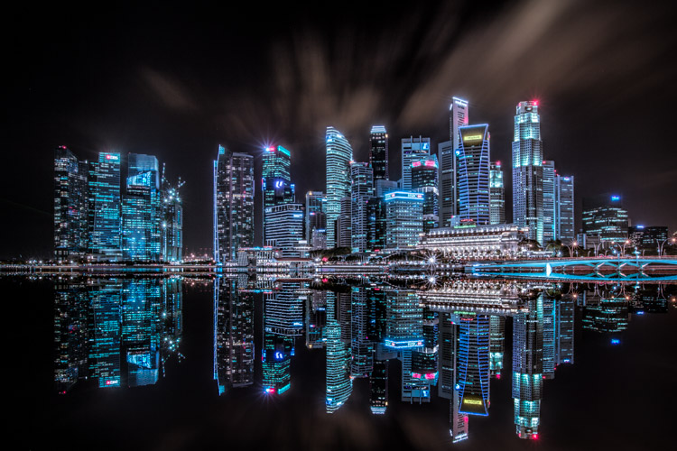
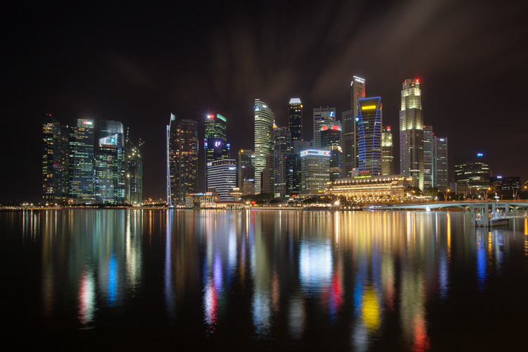
As the sun sets on a city’s skyline, thousands of lights come flooding the concrete jungle, turning every urban scene into a photographer’s paradise. Every corner around the city suddenly seems too irresistible not to be photographed.

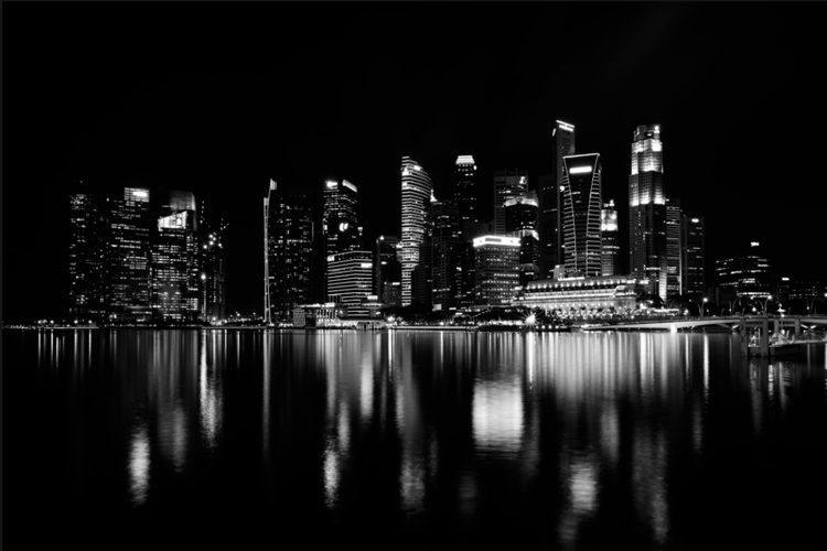
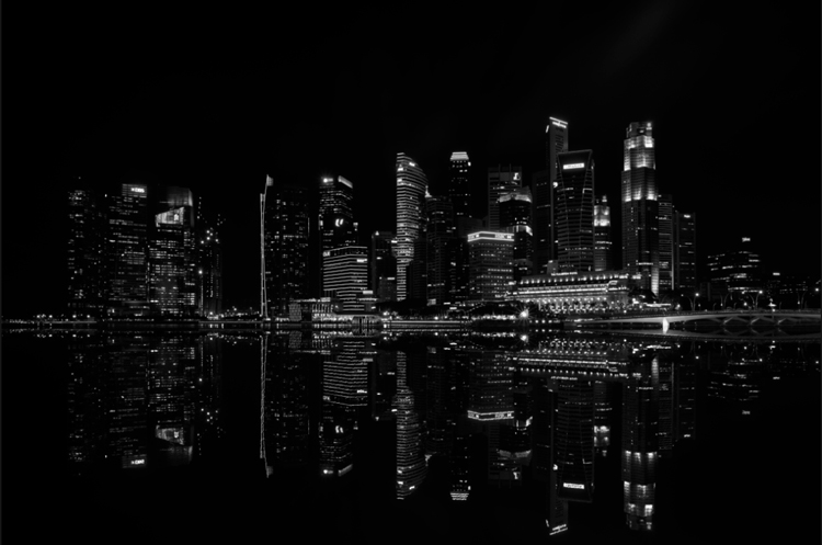
Image 01

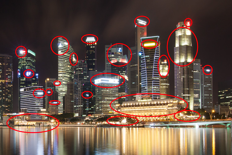
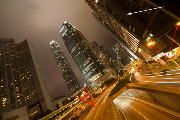
Urban night shots is probably one of the most common photos taken at night. The way most people shoot cityscapes at night is to keep the camera still, press the trigger, and snap the shot. The result is often an uninspired image, with overexposed highlights due to the long exposure. This problem can be fixed by blending multiple exposures, to recover details in the highlights with luminosity masks.

Image 02

Overexposure of highlights circles in red.

Using Luminosity Masks is a way of making a selection based on the luminosity (or brightness) value of the pixels. The main advantage of luminosity masks over other selection tools is its ability to feather the edges, which makes the transition seamless. One of the earliest articles detailing how luminosity masks works was published by Tony Kuyper. You can learn more about luminosity masks here.

In this tutorial, I will show you step by step, how you can recover detail in the highlights of your urban night shots, using luminosity masks in Photoshop. There are two parts to this: taking the multiple exposure, and editing them in Photoshop with luminosity masks.

Part one: How to take multiple exposures

  • Step 1: You need a tripod, and a camera that has aperture priority and manual mode.
  • Step 2: Mount your camera on the tripod and compose your image. In aperture priority mode, set the aperture and ISO settings you want, and take a shot with the default metering mode (usually matrix metering).
  • Step 3: Review the image on the LCD screen and take note of the shutter speed. Switch your camera to manual mode and dial in the ISO, aperture, and shutter speed that you used for the first shot.
  • Step 4: Speed up your shutter speed by one stop and take a shot again. For example, if the initial shutter speed was 30 seconds, stopping up by one stop would be 15 seconds (the shutter speed halves).
  • Step 5: Repeat step 4 until you can see details in the highlights by zooming in on the LCD screen on your camera, and checking the histogram for clipped highlights (blinks).

Tip: Use a remote release and/or enable mirror lockup (in a DSLR) to ensure the sharpness of your photos.

Part two: Recovering the highlights using luminosity masks in Photoshop

Step 1: If you use Adobe Lightroom, select all the images you want to blend. Right click on the mouse, choose Edit in > Open as layers in Photoshop. Otherwise, you can open them individually in Photoshop, use the move tool and drag each image into a single file as layers.

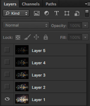
Step 2: Make sure the images are arranged such that the brightest exposure is at the bottom of the layers. To make sure all images are absolutely aligned, select all layers, then go to Edit > Auto-Align Layers. You may have to crop the image a bit after alignment.

Image 03

The layers are arranged so that the brightest image is at the bottom.

Step 3: Make sure you have luminosity masks Photoshop Actions to add and remove luminosity masks. If you don’t, you can download it here (the file is zipped, so make sure you unzip it first, then follow the instruction on how to install it here).

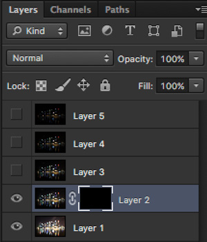
Step 4: To start off, make all layers invisible except the bottom two (layer 1 and 2). You can do so by unchecking the eye icon next to each layer. Next, create a mask for Layer 2 and fill it with black.

Image 04

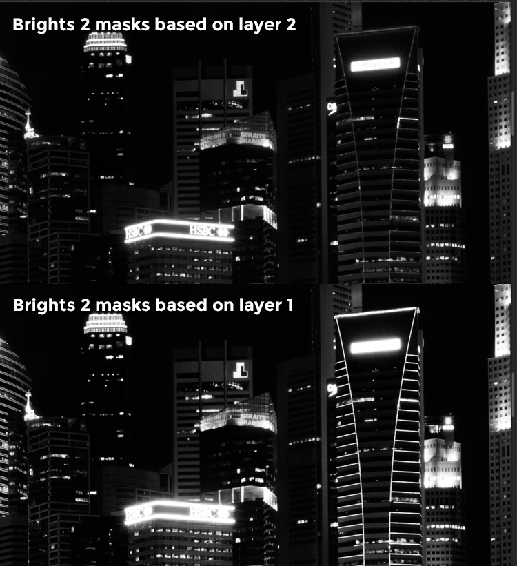
Step 4: Next, generate luminosity masks based on Layer 1 (the brightest exposure). To do that, select Layer 1 on the layers panel, and generate the luminosity mask with the Photoshop Action.

Step 5: Go to Channels panel, select a Brights luminosity mask that targets just the highlights. In this case, Brights 2 seems like a good choice because it is not too restrictive and has good feathering on the edges.

Image 05

Step 6: Select Brights 2 luminosity mask by holding down CMD (Mac) or CTRL (Win) and left click on the mask. You should see marching ants appear on the image. Depending on your image, if you do see a pop-up window that says “Warning: No pixels are more than 50% selected…”, don’t worry about it and just click ok.

Step 7: Go back to the layers panel and click on the mask on layer 2. Select the brush tool, set the opacity to 50%, color to white, and paint over the layer mask to blend the darker exposure (Layer 2) into the brighter exposure (Layer 1 below). Depending on your image, you can choose to paint just the brightest highlights or all of them. In this example, I chose to paint all the highlights. If you find the marching ants annoying, hit CMD (Mac) or CTRL (Win) + H key to hide them.

Image 06

Details in the highlights are gradually recovered.

Step 8: Delete the luminosity masks generated previously because you now need luminosity masks based on the brightness of Layer 2, where you have just blended in the darker exposure. To do so, remove the current luminosity masks with the Photoshop Action.

Step 9: Now select Layer 2 and generate luminosity masks with the Photoshop Action.

Step 10: Select Layer 3, add a layer mask, and fill it with black.

Step 11: Go to the Channels panel, select a brights mask that targets the highlights. In most cases, selecting the same mask should do the job. In this example, I have chosen the Brights 2 mask again.

Image 07

Comparison of Brights mask for Layer 1 and Layer 2.

Step 12: Hold down CMD (Mac) or CTRL (Win) and click on Brights 2 mask to select once again. Go back to layers panel and click the mask on Layer 3, then use a white brush as before, and paint over the highlights again. You should see details being recovered gradually. At this stage, you should consider painting over the brightest highlights only instead of the whole image. In this example, I only painted the highlights as circles in the illustration below.

Image 02

Step 13: Repeat Steps 8 to 12 until you are done with all the layers. Your final image should have a more balanced exposure, with details in the highlights. You can then apply further tonal or color adjustments, and sharpening to your image.

Image 08

Final image.

Bonus: Adding a reflection and color to the lights

This involves a lot of editing, and may not be for everyone. For those of you who are into post-processing, you can clean up the image by removing unwanted objects, add a reflection, and change the color of the lights.

Adding a reflection

This only works if you have an empty foreground in your image like the example here.

  • Step 1: Use the rectangular marquee tool and make a selection of the city’s skyline. Then, copy and paste it as a new layer.
Image 09

Copy and paste the selection as a new layer.

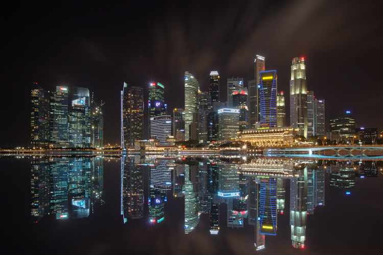
  • Step 2: Select the layer of the copy, hold CMD (Mac) or CTRL (Win) + T to transform. Move your cursor to the image, right click and select > Flip Vertical. Use the move tool to position the flipped image lower to align the border.

Image 10

  • Step 3: You can add a ripple effect to the reflection by going to the top menu and selecting Filter > Distort > Ripple. Keep the size of the ripple to medium, set the amount you like, and press ok.
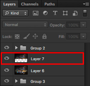
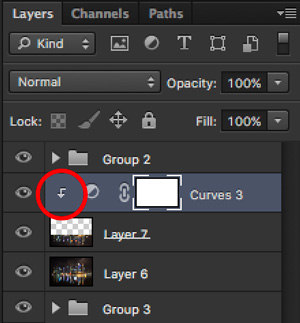
  • Step 4: Increase the contrast of the reflection by adding a curves adjustment layer, and clip it to the reflection layer only. To do that, right click on the curves layer and select Create Clipping Masks. You should see a little arrow on the curves layer pointing down at the layer below it. You can also reduce the opacity of the reflection layer if you like.
image-11

Clipping curves adjustment to the layer below.

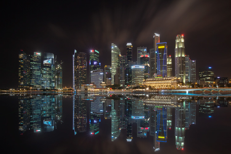
Image 12
Final image with reflection.

Adding color to the lights

  • Step 1: You need a visible layer to begin with. If you don’t have one, you can go to the menu on the top and choose Layer > Merge Visible.
  • Step 2: Generate luminosity masks based on this layer. Remember to delete any luminosity masks you had before this.
  • Step 3: Select a brights luminosity masks that targets the highlights. In this example, I know from before that brights 2 mask works very well, so I’m going to choose it again. Select it by holding cmd (Mac) or ctrl (Win) + left click on your mouse.
Image 13

Brights 2 luminosity mask.

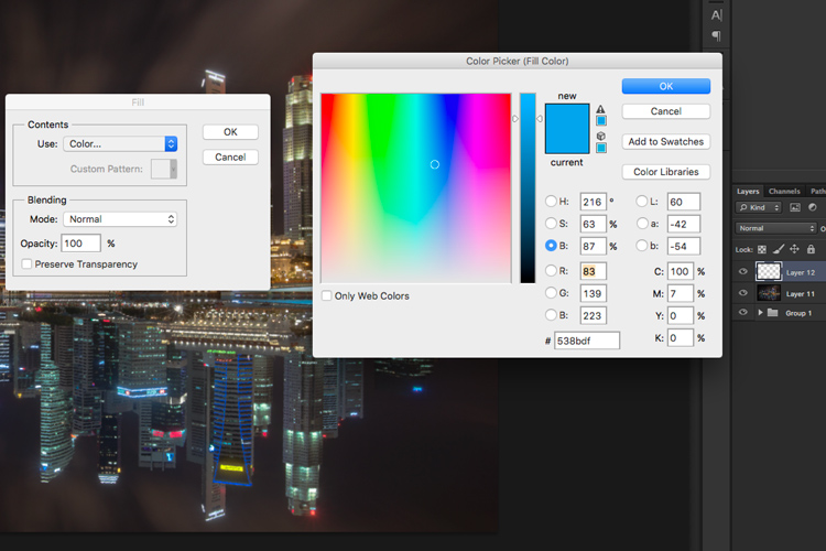
  • Step 4: Add a new layer, and change the blend mode to soft light. The selection should be automatically loaded onto this new layer already.
  • Step 5: Now fill the with the color of your choice by holding down Shift + Backspace, select a color, and press ok. You should now see the color of the lights have changed subtly.

Image 14

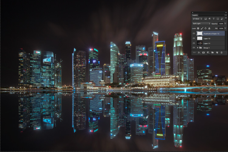
  • Step 5: If you want the effect to be stronger, duplicate the layer once or twice until you like it.
Image 15

Duplicate the layer for a stronger effect.

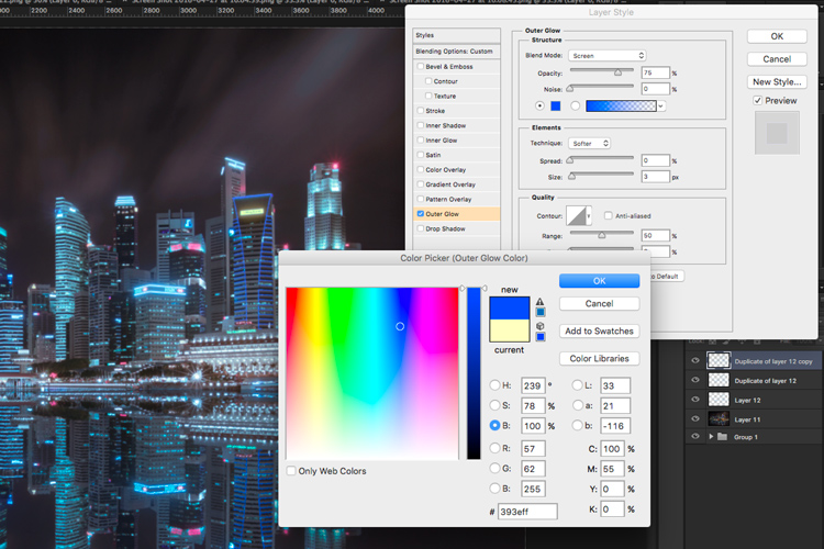
  • Step 6: The final step is what makes the lights glow. Double click on the top layer to bring up the layer style. Check the box for outer glow, and pick a color that is slightly darker than the one you have used before. Click ok and your done!
Image 16

Apply outer glow for the final touch.

Apply a few other tweaks and sharpening and you’ve got yourself a cool urban night cityscape!

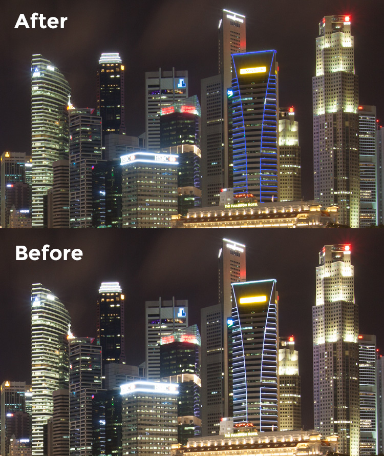
Before

Before

Image 01

After


googletag.cmd.push(function() {
tablet_slots.push( googletag.defineSlot( “/1005424/_dPSv4_tab-all-article-bottom_(300×250)”, [300, 250], “pb-ad-78623” ).addService( googletag.pubads() ) ); } );

googletag.cmd.push(function() {
mobile_slots.push( googletag.defineSlot( “/1005424/_dPSv4_mob-all-article-bottom_(300×250)”, [300, 250], “pb-ad-78158” ).addService( googletag.pubads() ) ); } );

The post How to Enhance Urban Night Photographs Using Luminosity Masks in Photoshop by Yaopey Yong appeared first on Digital Photography School.


Digital Photography School

 
Comments Off on How to Enhance Urban Night Photographs Using Luminosity Masks in Photoshop

Posted in Photography


Luminosity Masks Versus HDR Software For Creating Natural Looking HDR Images

27 Aug

Jimmy’s Luminosity Masks Tutorials – Art of Digital Blending Course For Photoshop is on sale now at 15% off over at SnapnDeals. Only until September 6th, grab it now!

If you type the term ‘HDR’ into google images you’ll very quickly see why HDR photography has a bad reputation. While we all differ in our tastes, in recent years, those strongly saturated, blurry and noisy HDRs have fallen out of fashion, even amongst HDR photographers.

Pink seascape

Luminosity Masks Versus HDR Software For Creating Natural Looking HDR Images

The goal, among many, is now a clean HDR look. HDR programs are attempting to tidy up their processes to meet the needs of the demanding HDR photographer. However, a large number of photographers are beginning to take the blending process into their own hands, and produced beautifully balanced HDRs using luminosity masks, probably the cleanest alternative to HDR software.

In fact, luminosity masking has become an exciting buzz-term in the world of digital photography, and there’s good reason for that.

If you’re new to luminosity mask exposure blending, you can see a beginner’s tutorial on dPS in my previous article: Exposure Blending Using Luminosity Masks Tutorial

In this article we’ll take a look at the benefits and challenges of luminosity masks versus HDR software.

Benefits of Luminosity Masks

1. Image quality

We’ve all seen over-saturated, noisy, messy, HDR images. One guaranteed way to avoid the poor image quality we normally associate with HDR is to manually blend your exposures in Photoshop using luminosity masks.

When exposure blending with luminosity masks, you’re working only with the RAW files to restore highlights and shadows. You do not affect any other part of the image. In other words, your final blended image will be, more or less, exactly the same image quality as your RAW files.

You do not affect any colour changes, you retain absolute sharpness, you don’t flare up noise (which means you can shoot at a much higher ISO), and you will not exaggerate chromatic aberration.

This is the major reason why so many are turning to luminosity masking to create natural, balanced HDRs.

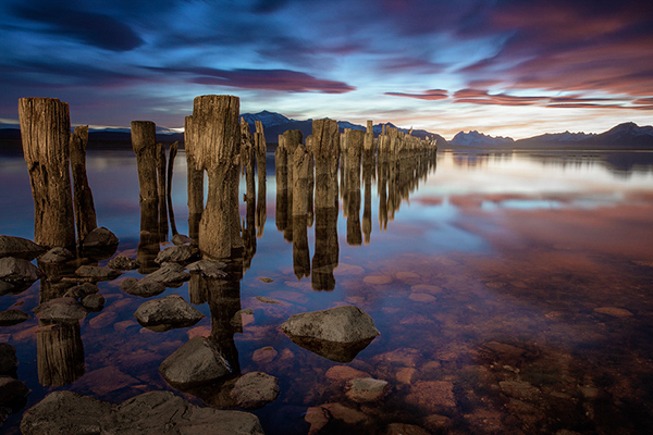
Chilean sunset

Sunset at Puerto Natales, Chile

2. Complete control over what we blend

Artists of any genre fight for complete control over their ability to express themselves. And so it is in photography. One of the problems with using HDR software is that we have very little control over the blending process.

We rely on an algorithm to choose which areas to blend with which exposures. Then we’re given some sliders to adjust. Although this gives us greater control over the process, it isn’t giving us 100% control.

Through luminosity masking, we begin with a base exposure, and we then decide for ourselves which exposures we wish to use in the blending process, and which areas we wish to adjust, and at what opacity.

The image below is a good example of how you can make very precise changes with luminosity masks.

Hong Kong Light Trails

Hong Kong Light Trails

This image is made up of 11 exposures; six of which were used for the light trails, four were used for exposure blending, and one was used as the base exposure. You can learn how to create light trails like this here: How To Add Dramatic Car Trails To Your Photos In Photoshop

Below you’ll see the RAW file used for the base exposure.

HK Light Trails

Base Exposure

The only highlights I wanted to control in the image were the street lights, and even then I still wanted them to be bright. Through bright lights like this night cityscapes are able to give off a lot of energy and dynamism.

I very gently blended in three darker exposures to gain a little bit of control in those areas, without darkening them too much. If I ran my exposures through an HDR program, all of the highlights in the image would have been affected to some degree, which is exactly what I didn’t want.

For the darker areas, I only wanted to bring back information in one area, the side building to the right, which is noticeably dark. I used an exposure two stops brighter and, with luminosity masks, I easily painted details back into this area.

#3. No more halos and fewer ghosts

Halos simply don’t exist in luminosity mask exposure blending if you’ve done it correctly.

As for ghosts, you will rarely encounter a moving object that is difficult to blend. Since you use a base exposure, which will be done for most of your images, and simply reduce specific highlights and shadows, there shouldn’t be any ghosting.

The only challenge you may have, which is also a challenge when using HDR software, is if you have moving leaves on trees, for example, between exposures. Then the blending process is a little bit trickier.

#4. Become a better photographer

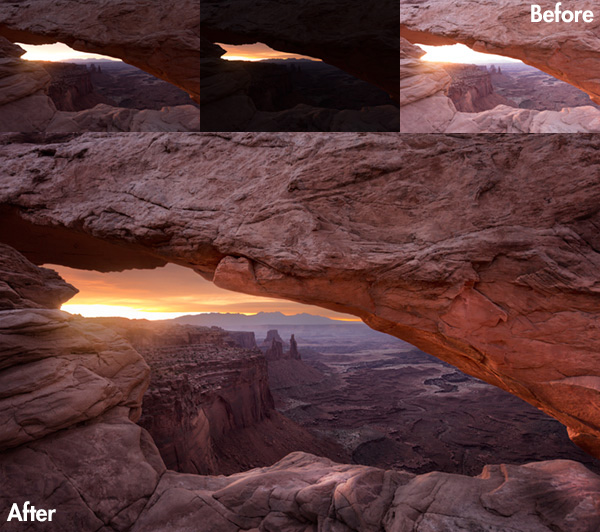
Mesa arch

Mesa Arch, Before and After Exposure Blending With Luminosity Masks

In my early days I was a die hard tone mapper. I’d approach a scene and think, “this would be a cool HDR subject”. I’d fire off some brackets and take them into Photomatix when I got home. I had a predefined routine of what to do, what result I wanted, and how to get there. I had tunnel vision.

When I began exploring luminosity masks, everything changed. I began to read a scene, not as an HDR subject, but in terms of its unique beauty and mood. I started to grasp more fully the use of light in controlling mood, whereas previously I was simply relying on getting the ‘HDR effect’ each time.

Rather than shooting off a set of automatic brackets, for a complex scene I will often bracket manually, changing the aperture, ISO and shutter speed to capture different elements of the scene. Then I’ll blend in each of the elements to hopefully get the best out of that scene.

In the Hong Kong Light Trails image above, the base exposures and brighter exposures, the light trails, and the darker exposures were all shot manually with different settings to achieve different effects.

It is through using luminosity masks, and taking my imagery into my own hands, that I have pushed myself in the field to achieve more.

#5. Combine with other HDR processes

One of the beautiful things about luminosity masks is that you can combine them with other exposure blending methods to complete the blending process. 32-bit processing is becoming an interesting way of blending exposures cleanly, but we are a long way off before the process is good enough and our monitors can handle true 32-bit files.

However, we can overcome the limitations of 32-bit processing by combining it with luminosity mask exposure blending. The tutorial below will show you exactly what I mean. The video is taken directly from the Art of Digital Blending course:

Challenges with Luminosity Masks

HDR software is simpler

Luminosity masks require more patience and a steeper learning curve than HDR software. The concept takes a little bit of time to get used to, and it will certainly challenge you to re-learn a few things.

While HDR software will take all of the leg-work out of it for you, luminosity masks require you to really think about your exposures and deepen your workflow.

Luminosity Masks don’t work on every occasion

Every now and then you’ll come across an image where luminosity masks won’t create a smooth blend between exposures. This happens because there isn’t enough contrast between the areas you wish to blend and the areas you don’t wish to affect.

In which case, using 32-bit processing or HDR software would be a good alternative.

Luminosity masks work in 8-bit mode

Like all live selections in Photoshop, luminosity masks work in 8-bit mode. They don’t affect the bit depth of your image, so if you’re working at 16 bits that won’t change. But there may be a chance of posterization in some cases.

A quote from Photoshop staff on the Adobe forum claims:

“The selection mask is 8 bits, regardless of the document precision. That fact has no affect on the precision of the image.

No, it won’t change the image or cause future posterization — the image data is still the same precision as it always was.”

So while this shouldn’t be an issue, it is something to be aware of.

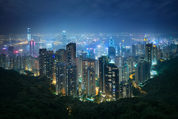
Hong kong the peak view

Conclusion

HDR images don’t have to be messy, garish and overdone. There are many ways to cleanly blend exposures to create a beautifully natural and balanced HDR. Having luminosity masks in your arsenal, will give your workflow a superb cutting edge, that can quite literally change your imagery over night.

It will require a little bit of extra work on your part, but often the best things in life do.

Jimmy’s Luminosity Masks Tutorials – Art of Digital Blending Course For Photoshop is on sale now at 15% off over at SnapnDeals. Only until September 6th, grab it now!

  • Getting Real with HDR – a Step by Step Tutorial for Realistic Looking HDR
  • Is the Death of HDR Photography Coming?
The post Luminosity Masks Versus HDR Software For Creating Natural Looking HDR Images by Jimmy McIntyre appeared first on Digital Photography School.


Digital Photography School

 
Comments Off on Luminosity Masks Versus HDR Software For Creating Natural Looking HDR Images

Posted in Photography


Exposure Blending Using Luminosity Masks Tutorial

18 Apr

There will be a time when the wizards behind your camera technology conjure up a sensor so powerful they will swallow up any scene and spit it out just as it was – no over, or underexposed areas. Until then, in order to produce an image with a high dynamic range of light, you have to work with the sensors available to you and create your own post-processing magic.

Pink sunset

Image created by blending two exposure with luminosity masks, one for the sky and one for the foreground.

While you, and many photographers, may have relied heavily on HDR programs in your exposure blending quest, many more are now beginning to turn to luminosity masks as a cleaner alternative. Through the use of luminosity masks you can create stunning, balanced images that encapsulate a vast dynamic range of light. They give you incredibly fine control over your imagery in almost every area.

While some HDR programs nowadays produce very natural, clean HDR images, luminosity masks do not affect the original files at all, so there is literally zero image degradation during the blending process. That is why so many digital photographers are beginning to make luminosity masks a staple in their workflow.

What are Luminosity Masks?

Luminosity masks break an image down into various channels of luminosity. In other words, they allow you to make very specific selections in Photoshop based on how bright or dark an area is. Let’s say you were looking at a beautiful nighttime cityscape shot. Everything is exposed correctly apart from the street lights, which are completely blown out. You also have a darker exposure in which the street lights are ideally exposed.

Through luminosity masks you can make an accurate selection of the street lights because you can hone in on their brightness, or luminosity values. With this selection you can simply replace the overexposed streets lights with the correctly exposed ones in the darker image.

What You Need to do Luminosity Masking

Firstly, creating your own luminosity masks is a complex and cumbersome process. However, I have a free Photoshop Luminosity Mask Action Set that will do all of the work for you. You can download it here: Free Luminosity Mask Action Set.

Secondly, it is imperative that you have a good understanding of Masking in Photoshop. If you’re a little bit unsure of the process, you can visit Adobe’s site which has a useful video tutorial for you to follow: Masking in Photoshop.

Which exposures to blend?

Ideally, the exposures you choose to blend should cover the full range of light in a given scene. Your brightest exposure should contain information in the darker areas, while your darkest exposure should contain information in the brightest areas. You are not limited to the number of exposures you can blend. Sometimes, in scenes of extremely high contrast, you may need to use as many as five to ensure a smooth transition between exposures and to cover the full range of light in the scene.

The order you choose to layer the exposures in Photoshop is dependent on your personal preference and the exposures you’re working with. Usually working with your normally exposed image as the base layer will derive the best results, but sometimes you may need to work with a darker or brighter exposure as your base layer.

Once you’ve decided on your exposures and have layered them in Photoshop, you now must decide which exposure you will run the actions on. Generally this will be done on your normally exposed image because it will offer the widest range of usable masks. For example, if you ran the luminosity mask actions on a darker exposure, you would gain a full range of dark and mid-tone luminosity masks, but very few, if any, workable bright masks, because the darker exposure is lacking in highlights. The converse is true for a strongly overexposed image.

Blending Exposures Using Luminosity Masks Tutorial

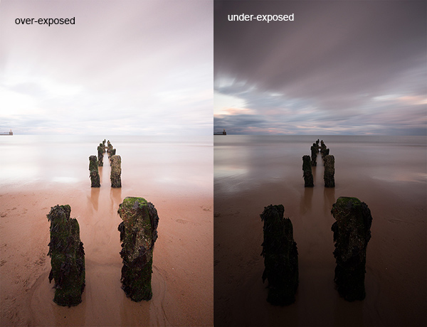
Today you’ll work with two exposures. One is ideally exposed for the sky and sea (download the underexposed image here), while the other is exposed for the foreground elements (download the overexposed image here).

Original files

You want to combine the sky and the sea in the underexposed image with much of the foreground in the overexposed image. To do this, you need to find a way of selecting the sky and the sea (i.e., the blown out areas) in the overexposed shot. Once you’ve done that you just need to replace it with the sky and sea of the darker exposure.

Steps in Photoshop For Blending Exposures

1. Install the Photoshop Action set

Instructions on how to install actions can be found here: Get Creative With Photoshop Actions

2. Import your two images into Photoshop

Bring both images into Photoshop as layers, placing the underexposed image on top. Align the images by selecting both of them on the layers panel, and going to Edit > Auto-Align Layers.

3. Turn off the top layer

Uncheck the eye on the layers panel next to the underexposed layer. This will make it invisible and ensure that the luminosity mask actions will run on the overexposed layer only.

4. Run the Masking Action

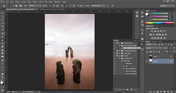
Go to your Actions panel, which looks like a Play button on the toolbar. Open it up and go to the set called JM Luminance Masks. Click on the arrow to the left of that. You will now see an option called Generate Luminance Masks. Select it and press the Play button at the bottom of the Actions panel to begin the process.

Luminosity mask actions

5. Add a Layer Mask to the Dark Underexposed Layer

Now, check the eye next to the underexposed layer, so that it is visible again. Make sure that layer is selected, then go down to the bottom of the Layers panel and, while holding Alt (Option on a Mac), left click the Add a Mask icon. This will create a black layer mask on the underexposed layer, making it invisible again.

6. View Luminosity Masks

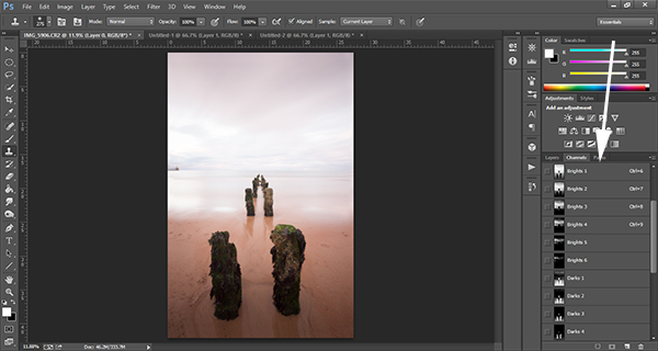
To see the Luminosity Masks that you’ve generated, go to your Channels palette, next to the Layers panel (if it is not showing go to: Window > Channels and it will appear). You’ll see 18 monochromatic channels, ranging from Brights 1-6, Darks 1-6, Midtones 1-6. Every one of these channels is a potential mask.

Luminosity mask channels

7. Comparing and Selecting a Luminosity Mask

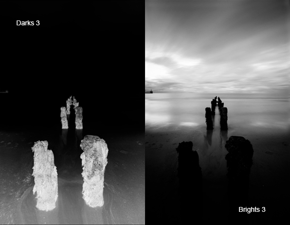
For this set of images, you only need to use one mask in order to blend the sky from the darker exposure into the overexposed image. In this instance, you’ll need to select Brights 3.

Comparing Masks

Just as with normal masking, the brighter the pixel the stronger the selection. In other words, in the image above, if you used Brights 3 you are selecting much of the sky and sea, but none of the foreground which is completely black. Conversely, if you selected Darks 3, for example, you would only be making a selection of the foreground sand and the poles that lead out to sea.

When choosing the appropriate mask, you are looking to isolate different areas. Therefore, it’s important that the mask you choose has the greatest contrast between the areas you wish to select and the areas you wish to ignore.

For example, if you were working on an image of a nice green field on sunny day, but the sky was blown out and you wished to exchange it with the sky from a darker exposure. You would run the luminosity mask actions and choose the mask where the field was black and the sky was white. This would ensure you would only select the sky and not the field in the foreground.

To turn Brights 3 into an actual selection, you just need to hold Control (Command on a Mac) and click the left mouse button on the thumbnail of the Brights 3 channel. Marching ants will appear to indicate your selection. Press “Control + H” to hide the marching ants.

8. Get Ready to Paint on the Mask

Now switch back to your Layers panel and select the underexposed layer. Make sure you select the mask, and not the actual layer itself.

9. Set up the Paint Brush Tool

Choose the Paint Brush tool on the toolbar and make sure the foreground colour is set to white. Choose the correct brush size. This will depend entirely on the area you’re working with in a given image, but usually, a larger brush is better. A brush size of 2,000 pixels was used here. Set the opacity depending on the strength of the masking you wish to use. For example, with this image, you will mask the sky with an opacity of 100%, but the overexposed areas in the water and foreground will only be masked at 40% opacity. This is because you don’t want to darken the sea too much.

10. Painting or Applying the Mask

Now you’re ready to begin masking. Freely move your paint brush around the areas you wish to affect. Since you are masking with a luminosity mask selection you don’t have to worry about going over the edges. Try varying opacities in different places. Even if your brush opacity is set to 100%, you can still run your brush through certain areas a few times to strengthen the effect.

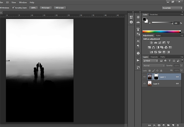
By holding Alt (Option on a Mac) and clicking on the layer mask you’re working on, you can see exactly what the mask now looks like. The image below is the final layer mask after you’ve finished painting. Remember that white equals visible and black equals invisible. So the sky in this layer is completely visible, the sea is grey so it is partially visible. Since the foreground is black, which means invisible, you will be left with a foreground that is 100% from the overexposed layer below.

Final Mask

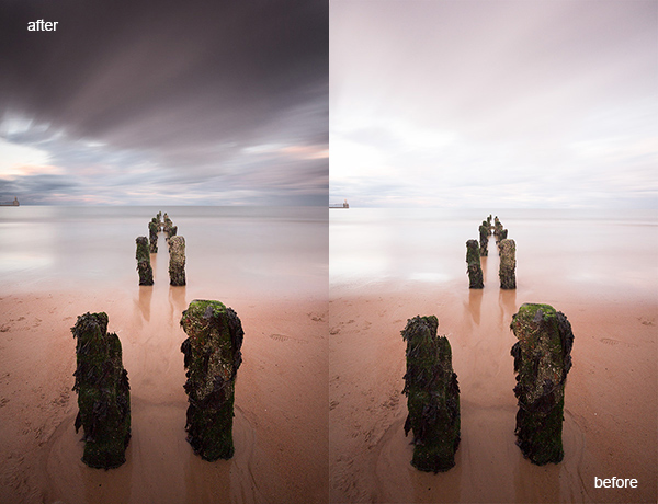
After a small contrast adjustment and a selective vignette added, here’s the final image along side the original overexposed image you were working with.

Final images

You now have a nicely balanced image with a good range of dynamic light and tones.

Deleting the Luminosity Masks

While working in Photoshop, the more layers you work on, the larger the demand on Photoshop and your system. Large workflows can seriously slow down your operating system. To ease the load, you should delete the luminosity masks once you’ve finished working with them.

To do this, go back into your Channels palette and select Brights 1. Then hold down Shift and press your left mouse button on Brights 2 to select this too. Do the same with each luminosity mask below. Once all are selected, click your right mouse button on any of the selected masks and choose the Delete Channels option. This will remove the selected channels.

Summary

At first, luminosity masks seem complex and sometimes daunting, but in truth, this whole workflow took less than 5 minutes. After a little bit of practice you begin to get an intuitive sense of how to use these powerful tools, and once you do, you gain extensive control over your images that can change your photography forever.

Have you tried this method of blending images, if so share your thoughts or images in the comments below. Or do you prefer the HDR tone-mapping process? Do you think HDR is dead or maybe it should be? Or perhaps you are somewhere in the middle in the 10 steps every HDR photographer goes through? What are your thoughts?

Check out the newest dPS ebook – Loving Landscapes A guide to landscape photography workflow and post-production – a brand new dPS ebook by the authors of Living Landscapes

The post Exposure Blending Using Luminosity Masks Tutorial by Jimmy McIntyre appeared first on Digital Photography School.


Digital Photography School

 
Comments Off on Exposure Blending Using Luminosity Masks Tutorial

Posted in Photography


Black and White Conversions: An Introduction to Luminosity

06 Jun

A Guest Post by Nick Rains.

Black and white conversion luminosityWarningthe following is quite advanced (even geeky) and I must assume the reader has a working knowledge of channels, levels, curves, blending modes, tools etc as well as how the main color models work (RGB, Lab, HSB).
Much has been written about converting colour to Black and White: we all know that there are a great many different ways to do this, some more effective than others. Differences between the various methods are usually explained in terms of visual appeal or the ability to blend the various colour channels to emulate traditional B+W filters. What has not been mentioned is exactly why different greyscale conversions give different results, and more importantly, the fact that this principle can be used to make more accurate adjustments to colour images.

This last point seems quite contradictory; what has greyscale conversion got to do with colour adjustments? Well, quite a lot really when you remember that all RGB colour images are comprised of three different ‘channels’ of greyscale information, each of which represents the lightness values of each of the three colours and that it’s the relationship between them which give us the illusion of ‘colour’.

If you alter a colour image by, say, using the dodging or burning tools, you are actually altering 3 greyscale channels at the same time and unless the relationship between those 3 channels stays exactly the same, there will be a shift of hue or saturation which is of course not the aim of the adjustment. Many of Photoshop’s tools, used at face value, operate on a composite of all three channels – not an ideal situation.

How we see Luminosity

Photoshop very rarely uses the term Luminosity. It is not Brightness in the Hue, Saturation, Brightness (HSB) colour model. It is not the Lightness channel in Lab mode and it is not the K value when you use the colour picker in Greyscale mode.

Luminosity is the perceived brightness of a colour, not it’s numerical or measured value under the above colour models. Look at this image – 3 patches of full strength RGB. Each has a 100% Brightness and a 100% Saturation, all that differs between them is the Hue. However, I think all would agree that the green is perceptually lighter, or more luminous, than the red which is in turn lighter than the blue. So, whilst the numbers show a 100% Brightness, you see quite different tones.

ColourPatch

Here is the same image converted to B+W using Image > Adjust > Desaturate. All the colour contrast disappears because the Hue (colour) is removed and the new lightness of the greys in the top row is exactly 50% (127) because the Saturation and Brightness are both equal.

ColourPatchDeSat

Here is the image converted another simple way : Image > Mode > Greyscale. This is better because the conversion is a little more like our eye sees colour with an emphasis on the Green. In fact the colour weighting is very close to 60%G 30%R and 10%B where the Green lightness as double that of the Red, much like our eyes see and tipping a nod to the fact that there are double the number of Green sensels on a camera’s Bayer array as compared to Red and Blue. The conversion still looks a little lacking in contrast however, and good B+W images really need good impact or contrast to look their best.

ColourPatchGrayscale

Even the Lightness channel in Lab, shown below, does not really depict the relative tones of the colours as we experience them. It is actually a lot closer to the perceived luminance but is perceptually ‘lighter’ overall than the simple Mode > Greyscale conversion.

ColourPatchLab

The most accurate conversion is via the Channel Mixer using these values taken from the sRGB definitions developed by Hewlett Packard (http://www.w3.org/Graphics/Color/sRGB)

71%G 21%R and 8%B.

ColourPatchChMixAdvanced

This gives a slightly more punchy look and it is a good starting point for converting your images to B+W. The Red looks a little dark to my eye, and the Blue a bit dark, but since there is very little pure colour in nature, this combination works well in the real world.

So why the fuss? Why do we need to know all these different methods?

The point to understand is that when you are removing colour information and having your image rely only on greyscale tones you need to control how those tones relate to one another. Do you want the blue of the sky to become a darker greyscale tone than the green grass? Or vice versa.

As an example, for the Australian flag – which greyscale version looks better?

Australian flag

Australian flag desat

Australian flag ChMix

There is no definitively correct answer – it’s the one which looks best. Personally, I think the one with the darker blue looks best because it maintains the perceived brightness of the blue as well as keeping good contrast between the blue and the red.

You need to take control and make sure the colours in the original capture translate to good meaningful contrast in the B+W version. This is the secret of good B+W conversions – not the precise method, but being aware of the tonal distributions and which greyscale value a colour is converted to relative to the other colours’ subsequent greyscale values.

Just to leave you with an advanced ‘teaser’…

What if you duplicated a colour layer and added a monochrome channel mixer adjustment layer to that new layer? You could then change the new layer’s Blend Mode to Luminosity and use the Channel Mixer to adjust the Brightness and Saturation of the colours in the image without affecting the Hue in any way.

If you try doing this directly with Curves or Levels you’ll get a small Hue shift as you adjust the Brightness and Saturation. If you don’t believe me try setting the Info Tool to HSB instead of RGB and read off colours as you make a direct Curves adjustment. You’ll see all three numbers change, including the Hue.

I’ll discuss this further in a future article.

Portrait 1

Portrait 2

In converting to B+W the green of the jacket and the blue of the cap have darkened whilst the red skin tones have slightly lightened. The face and hands now stand out far better – a good example of a situation where the colours in the original were simply a distraction, adding nothing to the shot, and so were removed.

Nick Rains is a Queensland based photographer who has been shooting professionally since 1983 and has seen first hand many changes in the photographic industry, from manual to auto focus in the late 1980s through to the shift to digital in the past decade or so.

Nick currently shoots feature work for companies like Australian Geographic and Orion Expeditions as well as writing for magazines and blogs around the world. Nick is both a Canon training consultant and a Leica Ambassador, as well as a Master Photographer with the AIPP and a national judge. You can see more of his work at www.nickrains.com or add him to your circles on Google Plus.

For more in-depth photography writing, try Nick’s iPad app “Photique”. It’s a free download.

Post originally from: Digital Photography Tips.

Check out our more Photography Tips at Photography Tips for Beginners, Portrait Photography Tips and Wedding Photography Tips.

Black and White Conversions: An Introduction to Luminosity


Digital Photography School

 
Comments Off on Black and White Conversions: An Introduction to Luminosity

Posted in Photography


Photoshop Tutorial: Adding Contrast using Luminosity Masks.mov

04 Jul

Photoshop editing tutorial showing a technique for adding contrast to an image using Luminosity Masks.