Shooting interiors can be tricky. Spaces tend to either look cold and empty, or warm and inviting. While we always strive to capture what the eye sees, the complexity of the human eye will never be matched by the lens of any camera. Still, there are things you can do before, during, and after shooting an interior space that will go a long way in improving your chances of ending up with stellar photos.
Not sure where to start for improving your architectural photos? Here are my favorite tips for photographing interiors, plus some tricks for touching them up with Adobe Lightroom.
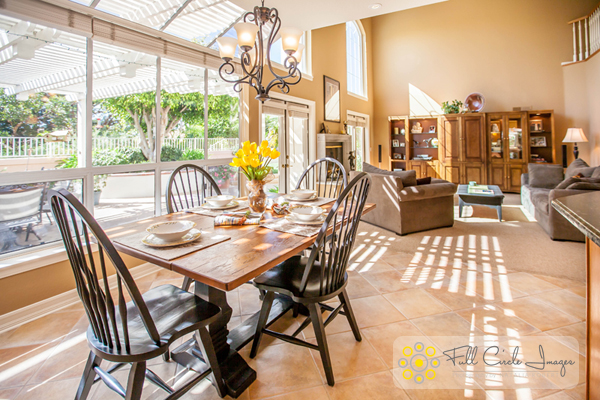
How to Shoot Your Best Interior Photos
Grab your favorite camera and use these tips for snapping more professional-looking photos every time.
1. Prepare the space
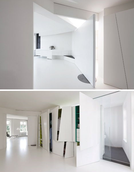
Set the stage by taking the time to de-clutter and open up the space. Clear all flat surfaces and floor areas. Open all blinds and curtains. Clean any dirty dishes in the sink and put them away. Be sure to clean the space much more so than you would for yourself. We get used to clutter and become blind to it, but a bit of clutter in a photo goes a very long way.
2. Add warmth and life with personal touches
The space should feel lived-in and inviting, like the kind of place you can imagine yourself spending your days.
You can create those feelings in your photos, by adding personal touches. Set the dining table for two and place a vase of fresh flowers in the center. Transform an empty breakfast nook into a great spot to lounge by adding a newspaper, coffee cup, and a plate or bowl of light (and pretty) snacks. Hang a fluffy bathrobe on a hook next to the bathtub.
When it comes to decorations or color palettes, you want to either fill the space with personality to play up the uniqueness of it, or keep everything neutral with pops of bright color.
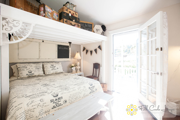
3. Fill the room with light
All interior lights MUST be on. While they’re not necessarily helpful in actually lighting the space, they help to create the ambiance. The absence of interior lights will give the space a cold, empty feel.
When using flash, never directly point it into the space. Instead, bounce it off the ceiling or walls, depending on what the space offers. If you can help it, always use flash as a source to fill in shadows, rather than as a main source. That said, if there is enough ambient light (which is your ultimate goal), skip using flash altogether.
Also, play with the strength of your flash. For my Canon, I like to slightly overexpose by about 1/3 of a stop and push the flash to about +2/3 in ETTL mode. Each camera can be different, so don’t be shy about experimenting with what works best with yours.
For outdoor shots, consider setting your flash to manual mode and using it as the fill light. I tend to set mine at 1/16th of full strength, but again, experiment with what works with your camera’s setting and your personal preference.
4. Shoot low
Keep verticals as truly vertical as possible by shooting from a slightly lower camera angle. If you’re going for a graphic composition, watch your horizontals as well. It’s quite easy to fix these issues in Lightroom during your final edit (see more in the first editing tip below).
5. Strike a balance
When composing your shot, focus the viewer’s attention on where you want it to go. Consider using staged items to add depth and interest in the foreground. Try blurring the background to make foreground objects really pop. Avoid flat looking photos by contrasting different elements in the foreground, middle-ground and background. Remember to aim for balance, not distraction.
Using the background to show a connecting room is also a great way to give the viewer a sense of space. This will add interest and make the viewer feel like they can visualize walking through the home.
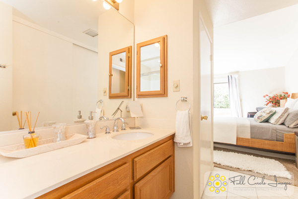
How to Edit Your Interior Photos
Import your photos to Lightroom and follow these basic editing steps to create more powerful images. Tip: You can also use Photoshop for many of the steps laid out below.
1. Straighten out the lines
Doing this will instantly polish up your photos. If you shot at a height of roughly five feet from the floor and kept the camera level, the amount of straightening you have to correct should be minimal. In Lightroom, you can find this tool under Lens Correction under the Manual section (tab).
2. Fill in and even out the light
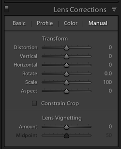
Before doing any adjustment to brightness or exposure, be sure to correct any lens vignetting that may have happened. This is when the corners of the image are a bit darker, and is a common effect in wide lenses. You can find the slider for this setting in Lightroom under Lens Correction, Manual, then Vignetting.
Once your corners are corrected, use the Adjustment Brush to correct the exposure in bright or dark areas. This is your time to “dodge and burn.” I find that erring on the side of overexposure actually has a more natural feel to the space. I recommend pushing the overall exposure up slowly, then when it feels too bright, start pulling back.
You can also lighten dark areas slightly with the shadows slider in the top (Basic panel) section. However, be careful not to lighten so much that you bring out grain (noise) or that the image looks fake.
3. Perform color corrections
Adjust the overall temperature as needed. You’re aiming for warmth, not yellow. Also, bump up the Vibrance a bit instead of messing with the saturation. Oversaturating can quickly make a photo look too fake, while Vibrance is a more subtle tool that helps give the color a little extra kick. Again, playing with the sliders on these settings, and seeing what your eye is comfortable with, will go a long way toward honing color-correcting skills.

4. Adjust the clarity and sharpness
Push the Clarity slider up (to the right) slowly. Clarity is a great way to polish up a photo without going overboard on contrast; plus, it gives the photo an overall crisp look. Depending on the image, you may want to simultaneously play with darkening the blacks a bit, too.
Lightroom has two great presets built-in for sharpening: faces and scenic. I use scenic for architectural mages because it sharpens a bit more than the preset for faces. It’s a subtle, but vital, touch.
5. Clean up with spot removal and cloning
Use the Spot Brush tool to remove any dust spots or other anomalies that may have gotten onto the photo. You will see two options in Lightroom for the brush: Clone and Heal. Healing is a great option when correcting small spots, as it will have a softer blend to it. Next, use the Cloning tool to remove any glares or reflections of you in the photo. You can also use it to remove address numbers, if requested.
While I typically use Lightroom for editing photos, my personal preference for cloning is Photoshop’s stamp tool. It seems to allow for more control over the brush itself, therefore making it easier to clone in a way that looks natural.
How do you shoot and edit interior spaces? Share your tips and photos in the comments section below.
googletag.cmd.push(function() {
tablet_slots.push( googletag.defineSlot( “/1005424/_dPSv4_tab-all-article-bottom_(300×250)”, [300, 250], “pb-ad-78623” ).addService( googletag.pubads() ) ); } );
googletag.cmd.push(function() {
mobile_slots.push( googletag.defineSlot( “/1005424/_dPSv4_mob-all-article-bottom_(300×250)”, [300, 250], “pb-ad-78158” ).addService( googletag.pubads() ) ); } );
The post Vital Tips for Photographing and Editing Interiors by Natalia Robert appeared first on Digital Photography School.










You must be logged in to post a comment.