RSS
 

Posts Tagged ‘Interiors’

Tips for Styling and Photographing Interiors

27 May

The post Tips for Styling and Photographing Interiors appeared first on Digital Photography School. It was authored by Lily Sawyer.

dps-how-to-style-interiors-for-photoshoots-lily-sawyer-interior-design

On Instagram, I run a page called Layered.Home that’s focused on interiors: design, styling, home improvements and lifestyle in an interiors setting. Here, I work with brands on their brand awareness campaigns and product placements. All these involve styling and photographing products and spaces, sometimes with a specific brief to adhere to and at other times I have the freedom to style as I wish.

The unprecedented rise and popularity of social media platforms has paved a way for a new photography niche: personal brand photography. This is where photographers shoot content for brands to use on their website, promotional materials and social media posts. Whilst this is not my niche, I have photographed businesses, interiors and products both for clients and for my own social media page and continue to do so.

Here are some articles I have written on this topic before: shooting interior spaces , taking better photos for Instagram and photographing mixed lighting for interiors.

Whilst I hope the above articles will give you some photography techniques, this article will focus on some techniques when styling interiors for photoshoots and some tips for photographing them at the end. Let’s dive in.

dps-how-to-style-interiors-for-photoshoots-lily-sawyer-interior-design

Purpose of the photoshoot:

Before you can style interiors successfully, first you have to ascertain the purpose of the photoshoot. Who is it for? What is it for? Are there any targets to meet? Regardless of the answer, bear in mind that the styling must always be on-brand.

Whatever the purpose may be, it is imperative that you understand your client’s branding first and foremost and that you style to strengthen the brand, not to dilute it.

Some purposes of styling might be for the following:

  • client’s website – images for landing pages, blog posts, slideshows etc.
  • social media feed – styling content for Instagram, Facebook, Twitter etc
  • seasonal promotions – spring, summer, autumn, winter, etc
  • advert in a magazine
  • feature in a magazine – magazines also have their own niches and styles so stylists match interiors to appropriate magazine brands
  • product placement
  • brand awareness campaigns

The latter two usually allow scope for styling off-brand. It may be because the client wants to reach your audience. Therefore, they may want you to style the product for your brand instead of theirs to reach your audience and as a result, expanding their customer base.

dps-how-to-style-interiors-for-photoshoots-lily-sawyer-interior-design

Style

There are many styles with now trendy names coined to describe them such as Scandinavian or Scandi, Bohemian or Boho, Scandi-Boho, Modern, Mid-century modern, Minimalist, Maximalist, Eclectic, Mediumalist(!), Retro, Vintage, Contemporary, Traditional, Transitional(!), Industrial, Country, French-Country, Rustic, Shabby Chic, Hollywood Glam, Period (eg. Victorian, Edwardian), Coastal. And it goes on.

Play it safe by reading up on the style or mixtures of style and nailing down the accessories and pieces that are appropriate for them.

Understanding both purpose and style will help make you an effective stylist.

Styling Tips

1. When it comes to styling, there are two general camps: hero or layer?

Hero styling is putting a piece in the spotlight, the piece that takes all of the attention. Nothing else surrounds it that might take away any of that attention and make the piece disappear. The aim is to evoke a strong response from the viewer and create maximum impact.

Layering is the opposite type of styling. This is where you carefully style a piece within an arrangement of various other pieces, often varying in texture and form. Layering creates a cohesively styled space that evokes a strong response – the same aim as hero styling, but as opposed to hero, it doesn’t do so alone.

If you think about it, the aim for many, if not all images, whether viewed on print or digital media is the same: the scroll-stopping, track-stopping, breath-taking response from the viewer. I’m sure there are many other ways to get there, but the aim is the same.

dps-how-to-style-interiors-for-photoshoots-lily-sawyer-interior-design

2. Evaluate what goes on the 6 walls!

In a space, there can be up to 6 walls; the latter two are almost always forgotten! When one walks into a room or space, the first things we see are usually eye level surfaces and spaces, and that means the walls in front of us and around us. We notice pictures, mirrors, tall lamps, and accessories at eye level.

A successfully designed space invites the viewer’s eye to wander everywhere and notice, not just eye-level design, but all-levels design. This includes the 4th and 5th walls – the floor and ceiling. A rug can do wonders to a floor in the same way a statement light or a painted/wallpapered ceiling can draw attention upwards.

Regardless of the style you are creating, bear in mind the 6 walls in your space.

dps-how-to-style-interiors-for-photoshoots-lily-sawyer-interior-design

3. Play with scale

Whether you are styling a Minimalist Scandi space or a Maximalist eclectic interior, do not underestimate what playing with scale can do to a space. You may be designing an all-white Scandi minimalist room with only six pieces in the room. Imagine having all of those six pieces at all the same scale – all small, medium or large.

Alternatively, imagine playing with scale using those six pieces so that you are putting an oversized light arching towards the center of the room or hanging low from the ceiling and an oversized rug on the floor. The rest of the pieces are a mixture of medium and small. Immediately you are upping the interest level and increasing the dynamic of the space.

dps-how-to-style-interiors-for-photoshoots-lily-sawyer-interior-design

4. Arrangement

In a Maximalist interior, it is easier to play with scale because you are dealing with so many decorative items often in varying sizes. The challenge is not so much the “what” as it is the “how.” How do you group and arrange together all these items so that there is order in the madness? Or so a full room does not look cluttered, and somehow there is a tidy structure to it all?

You can arrange by size, color, theme, in rows, or you can mix-and-match and group items, so a busy space gets punctuated by quieter spaces in between. I find that having such a structure helps with how the space is received.

dps-how-to-style-interiors-for-photoshoots-lily-sawyer-interior-design

Photographing interiors

Finally, you have finished styling. It is now time to photograph your space.

Photograph wide so that you show the entire space. Be careful of going too wide where distortions are disturbing or cannot be corrected, especially when shooting at 24mm and wider. A focal length between 35mm – 50mm is easy on the eye and won’t give you distortions.

Although interiors favor a wide-angle view of the space, close-ups are just as important. Use them to focus on specific features of the space or product. Get closer in and photograph vignettes and interesting compositions. Use mantle pieces or shelves for horizontal bases and alcoves or chimney breasts or sofa arms for vertical lines. Think of strong compositional framing and use elements in the space to achieve them.

dps-how-to-style-interiors-for-photoshoots-lily-sawyer-interior-design

Spaces look better when there is a contrast between light and shadow. This is why the use of flash (especially head-on, and flash that creates flat light illuminating an entire space) is often frowned upon and natural light is more favored. Choose a time of day where the light is at an angle, and you can photograph light and shadow. It looks natural and evokes emotion from the viewer.

That is what really makes an image successful.

dps-how-to-style-interiors-for-photoshoots-lily-sawyer-interior-design

I hope these tips help you style and photograph spaces and interiors.

Do comment below if you have tips to share, or if you would like to share some of the spaces you style after using these tips.


The post Tips for Styling and Photographing Interiors appeared first on Digital Photography School. It was authored by Lily Sawyer.


Digital Photography School

 
Comments Off on Tips for Styling and Photographing Interiors

Posted in Photography


3 Tips for Photographing Mixed Lighting in Interiors

17 Jan

The post 3 Tips for Photographing Mixed Lighting in Interiors appeared first on Digital Photography School. It was authored by Lily Sawyer.

For many photographers, photographing mixed lighting scenarios can be painful. At weddings, for example, several lighting sources provide constantly changing colors such as DJ lighting, candles, fairy lights and up-lighters in the venue. It’s not too dissimilar in your home. Say you have your indoor tungsten and incandescent lights on in your lounge while the bright natural daylight streams through the windows. You get two different light sources with different color temperatures, which is a mixed lighting scenario.

dps-tips-mixed-lighting

Mixed lighting scenarios

This scenario is the reason why, for interiors, the general advice is to turn all artificial lights off and stick to one light source – natural light. I am aware that some photographers use flash for interiors, and in most of those cases, they make sure they are using daylight color temperature for their bulbs to match the ambient light.

Natural light, even if there is very little of it, can still be perfectly fine for interiors. As long as you can mitigate the amount of available light by using a slow shutter speed with your camera mounted on a tripod because nothing in the picture moves. It is more difficult to achieve when you are photographing portraits because you have subjects – people – who are living, breathing and cannot hold still for an extended length of time.

This is why artificial lighting such as strobes and electronics flashes get used as primary lighting for portraits to provide a light source with a color temperature you can control.

dps-tips-mixed-lighting

However, sometimes, you want to break the rules and photograph for fun or to capture what the eye sees regardless of the types of lighting in the scene. Sometimes, it is appropriate to embrace it all, just like what I have done in the photo above! When you decide to do this, here are my tips for you!

1. Ensure there is even lighting

My easy tip is matching light with light such as this photo on the below-left, where these fairy-light-lit Christmas tree with other string lights are all placed in a very bright space. The same could work with dark as in the photo on the right. A lot of dim lighting to even out the room lighting.

dps-tips-mixed-lighting

If you have a room that has a very dark corner and a very light corner, you will inadvertently overexpose the light section to expose the dark area correctly. Also, vice versa.

Photographers get around this problem by doing a composite where they put two properly exposed photographs of each corner together in Photoshop to create a perfect scene. This method is commonplace in a backlighting scenario where you are facing a very bright window and not using flash.

dps-tips-mixed-lighting

However, if you don’t have or want to use Photoshop, instead of putting your artificial lighting, such as a neon light or a lampshade, in a dark corner, put it in a light corner. Doing so evens out the lighting in a space.

For example, when placing neon in a dark corner, to correctly expose the darkness surrounding it, the neon lights are overexposed. Conversely, underexposing the neon light means losing the details of the dark area such as in the shot above. However, if you have to, ensure there are other lights to illuminate the dark area as well. That way, the neon is not acting as the sole illuminator in the dark area. Balancing the amount of light makes it easier to photograph a space.

2. Shoot deep using a small aperture and slower shutter speed

Use an aperture upwards of f/5.6. My preference is f/8 and if need be f/11. These apertures help you get all the details in focus. However, if you are aiming for background bokeh as shown in the photo below if using standard lenses, you need to use either a wide aperture. Moreover, if you are using macro/micro lenses both wide and small apertures should be applied. Play it safe by shooting with at least an f/5.6 opening. These shots below were taken with a 24-70mm lens at f/2.8.

dps-tips-mixed-lighting

Shooting with a small aperture helps alleviate the problem of overexposing a bright source in a very dark corner especially if it’s the only light source. You can see an example of this in the below-left photo, with the living room corner illuminated by the incandescent bulb lampshade. Just to the right of the image, you can see the daylight seeping through from a different room. It looks so much colder and whiter compared to the warm yellow light in the left corner.

dps-tips-mixed-lighting

3. Ditch the rules and embrace all the fun

The above kitchen photo contains all sorts of lighting: natural daylight from the windows, warm lamp lights on the floating shelves (the darkest part of the entire space), red fairy lights on the foreground left and more warm tungsten on the top-left. This scenario is what one sees in real life so why change it to conform to the rules? Why not embrace it instead and aim to take an excellent realistic photo rather than change reality to fit the other people’s expectations!

I hope you found this little article helpful, albeit it’s not what’s expected and out of the ordinary! As always, comments and options welcome below. After all, we are all entitled to have our own!

The post 3 Tips for Photographing Mixed Lighting in Interiors appeared first on Digital Photography School. It was authored by Lily Sawyer.


Digital Photography School

 
Comments Off on 3 Tips for Photographing Mixed Lighting in Interiors

Posted in Photography


Tips for Photographing Real Estate Interiors

17 Apr

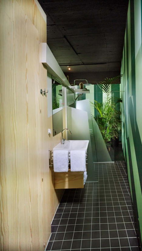
In this article, we’ll address the challenges you may face when photographing real estate interiors and a few ways to combat the issues. Shooting bracketed images is the most common and effective way to handle high contrast interiors. Read on below for tips on how to shoot and process interiors.

The problem

Most real estate photographers have entered a room at some stage in their career and thought, “Ah… a dark room with a bright window. Just what I do NOT need!”

Using straightforward post-production techniques to fix either over or underexposed parts of a photograph is practically impossible. So walking into this kind of scene can make your heart sink. The good news is that it’s not so hard to get around the problem posed by these scenes once you are equipped with the right techniques.

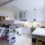
Achieving a well-exposed photograph of a dark room with a bright window initially seems impossible. Expose for the interior and the windows are blown out. Expose for the windows and the darker parts of the room are plunged into shadow.

Photo exposed for the interior (1/4 second at f/8), notice the windows are overly bright.

The difference between the brightest and darkest areas, known as dynamic range, is just too great. This is a High Dynamic Range scene, or HDR for short.

Photo exposed for the windows (1/125th at f/8), now you can see the inside is almost completely black.

Our eyes cope with HDR scenes by adjusting the size of our pupils, letting in more or less light as we encounter darker or brighter areas. The brain balances it all out and everything seems well lit.

Unfortunately, when it comes to a dark interior with a bright view, even the best DSLR cameras can’t capture the entire brightness range with a single exposure.

Photo at normal exposure (1/30th at f/8), here you can see some areas are too dark, and the windows are too bright. The camera cannot hold detail in the entire scene, the contrast is too great.

There are two ways you can resolve this issue

  1. You can add light to brighten the room and reduce the dynamic range.
  2. You can take multiple exposures and combine them using software to emulate what our eyes and brain do.

Adding light

To brighten the room, you’ll generally need to supply extra lighting. Just turning on all the available lights is unlikely to solve the problem.

One option is to bring along portable lighting. However, this is another skill to master, another thing to carry, and even though the cost of lighting is falling it’s still another expense. You may also need to bring an extension cable, and hope that the property has power.

You could also use professional flash units, mounted off-camera and triggered remotely. The term professional is important here because less powerful flash units rarely deliver enough light to solve this particular problem.

Effective use of flash units also requires skill. You’ll probably need several flashguns, and the knowledge of which units to use and where to put them. Again, it’s more expense and a lot more kit to carry, especially when you include stands for the units too.

Taking multiple exposures

So what about multiple exposure approaches? One method is the Photoshop approach where you take only two photographs, one correctly exposed for the room and one for the windows, and open them in separate layers in Photoshop.

Once you have manually aligned the two layers (using the Difference blending mode to guide you, zooming in may help as well), with the darker image on the bottom, you then select the blown-out windows on the top layer (the image exposed for the inside of the room). Using a layer mask, make the window areas transparent, and the properly exposed windows in the second shot will show through from underneath.

Unfortunately, this approach rarely results in a convincing and realistic looking image, as two exposures are not enough to cover the entire range of brightness that our eyes perceive. Additionally, the photo exposed for the window will underexpose the window frame and any ornaments on the windowsill, making them look darker than they should be.

A more effective approach involves taking multiple exposures to capture different lighting levels (bracketed photographs) and using HDR software to merge them into an image that’s well-exposed throughout. Shadows are corrected without additional lighting, and bright areas are pulled back without appearing artificial.

Bracketing is very popular with real estate photographers because it overcomes the problems associated with the alternative approaches. All without the cost and inconvenience of more equipment on location – except for one good quality tripod!

Bracketing exposures

Correctly capturing the exposures is key to obtaining the best results with this approach. So let’s look more closely at how professionals do this when photographing real estate interiors so that you can master it yourself.

Essentially, you take a series of identical shots at the same aperture – but using different shutter speeds. A constant aperture keeps the depth of field the same while changing the exposure allows you to capture well-exposed images for all the different lighting levels in the scene.

It is called exposure bracketing because the varying exposure settings are “bracketed” between the slowest and fastest shutter speeds needed.

The Automatic Exposure Bracketing (AEB) function, built into most DSLR and mirrorless cameras, greatly simplifies the process, allowing you to take three or more bracketed exposures with just one shutter release.

In many situations, especially outdoors, it will also save you having to use a tripod. Any camera movements during shooting (inevitable in hand-held shots) are small enough that software with robust alignment features can automatically correct them.

Camera settings

You start the AEB setup by selecting Aperture Priority (Av) mode.

The rest varies between camera models, but typically involves three steps: selecting AEB and continuous shooting mode, choosing the number of bracketed frames, and choosing the number of EV steps between each shot.

Your camera’s user manual will cover the steps needed for your model.


Exposure bracketing techniques for interiors

Lighting differences in an interior scene with views through the windows are so great, that taking bracketed exposures may involve more than just setting up AEB and taking the shots, especially when you want the highest quality results.

The main problem comes from the camera’s choice of shutter speed for the baseline or “normal” exposure (0 EV). Bright light through a window can influence a camera’s automatic exposure, resulting in a photo set that is skewed towards underexposure.

Another problem is that capturing the scene could demand more exposures than your camera’s AEB provides. Also, since a low ISO is best to minimize noise in the shadows, you may need quite long exposures. Without a tripod, that will result in blurred images that could ruin the shot.

Quick technique

Even though exposure bracketing is more involved when photographing interiors with window views, you can use a relatively quick technique when the lighting differences aren’t too great and your camera offers a broad AEB exposure range. This is how it works.

After selecting Aperture Priority (Av) mode, point the camera at an area of the room that is neither too dark nor too bright, just ‘average’, and well away from the windows.

Note that the shutter speed when the camera is pointed at the sofa is 1/10th.

Take note of the shutter speed your camera displays for that area. Then switch to Manual mode, make sure the shutter speed is the one you noted, activate the AEB function and take the photos.

While this will certainly be better than a single exposure, you lack control with this technique and you can’t always select the right number of photographs to be taken.

Advanced bracketing technique

When you want to maximize output quality, use this advanced bracketing exposure technique to ensure that you take all the exposures needed to cover the entire lighting range. This gives you far more control, although it takes a little longer and the process is slightly more complex.

This video steps you through the technique, from camera setup to determining what exposures to use, through to taking the photos themselves.

One of the main advantages of this technique is that it establishes precise shutter speeds that match the maximum levels of darkness and brightness in the room. It does this by determining the shutter speeds for both extremes of the lighting range.

This is important because misjudging the correct exposure for the darkest areas can result in an image where the interior isn’t bright enough. While failing to capture the brightest areas results in washed-out looking windows.

How to find the shutter speed for both extremes

You can choose between two methods to find the shutter speeds for the darkest and brightest parts of the scene:

  • Spot Metering method.
  • Histogram check method.

Spot metering method

This is the quickest way to find your needed shutter speeds. Start by selecting Aperture priority, or Av mode, then choose the Spot Metering option from the camera menu.

Spot Metering mode.

Find the longest shutter speed by focusing on the darkest part of the room. While watching the exposure meter in the camera’s viewfinder, adjust the shutter speed until the camera shows it to be the best exposure for that part of the room. Make a note of the recommended shutter speed.

Find the shortest shutter speed by focusing on the brightest part of the room, and repeat the process to find the best shutter speed. Again, note the recommended speed.

Histogram method

The second method to determine the two shutter speeds is more precise and works like this:

  • Set the camera’s LCD screen or image preview to display the brightness histogram.
  • Take a test shot of the darkest area of the room, then examine the histogram.
  • If the left side of the histogram shows a vertical line at the start of the graph, then there are dark areas you’ve not yet captured.
  • Take another shot with a longer shutter speed and repeat the process until the histogram trails off to a flat line on the left. When you see that, you’ve identified the slowest shutter speed needed.

  • Now take a test shot of the brightest part of the room, and again examine the histogram.
  • This time look for a vertical line on the right of the histogram. If you see one, then you’ve not yet captured the brightest parts of the scene.
  • Keep taking shorter exposures, checking the histogram after each one until it shows a flat line to the right of the graph. When you see that, you know the shortest shutter needed.

Many DSLR cameras have a feature that shows overexposed parts of an image. When activated, the highlight warning system makes overexposed areas blink or flash when viewed on the LCD screen. If you see this, increase the shutter speed until the blinking areas stop flashing.

How to bracket your exposures

Once you know these two shutter speeds you can use them in two different ways – one that uses the camera’s built-in Auto Exposure Bracketing (AEB) option, and one that does not.

The full manual method

  • Switch the camera to Manual mode
  • Set the shutter speed to the shortest of your measured shutter speeds and take a photograph.
  • Decrease the shutter speed by one stop (EV) and take the next photograph.
  • Keep reducing the shutter speed by one (EV) stop for each photograph until you reach the longest of the two shutter speeds you measured.

The semi-automated method

  • Open the HDR Exposures Calculator app from HDRsoft.
  • Enter the shortest and longest shutter speeds into the app.
  • Select the maximum number of bracketed frame your camera supports.
  • Select an EV Spacing of 2 if your camera supports it, otherwise go with the highest EV spacing it offers, then click “Get Exposures”.
  • Follow the instructions given by the HDR Exposures Calculator, making sure you have set the camera to AEB mode and selected Continuous Shooting mode before taking a bracketed set.

Additional tips to take the photos

You now know how to measure the longest and shortest exposures you will need, and how to set up your camera to take all exposures between them. Correct technique is important too, so here are some steps to follow to make sure you get good results.

  1. Securely mount the camera on a tripod, and ensure the camera is level.
  2. If the camera is mounted on a tripod, switch off Auto Image Stabilization.
  3. Set the built-in flash to Off if your camera has one.
  4. Attach a remote shutter release to reduce the risk of blur.
  5. Select Manual mode and set an aperture suitable for the lighting and depth of field required.
  6. Set the ISO value, 100 is ideal. Digital noise (the electronic equivalent of grain) increases as the ISO value increases, so keep it as low as possible. Try not to go beyond ISO 400.
  7. Determine the shutter speed required to best expose the darkest part of the room and the shutter speed to best expose the brightest part. See the section above on finding the shutter speeds for both extremes.
  8. Take the exposure bracketed photos as detailed in the previous section.

Once you’ve returned from the shoot, process the images in HDR software. There are various photo applications that can merge multiple exposures to HDR. Photomatix Pro is the first choice among many real estate photographers because it offers presets optimized for interiors, achieving the natural look they strive for.

Using Photomatix Pro with real estate interiors

Photomatix Pro is designed to be easy to use, so you should get comfortable using it pretty quickly.  Here are a few tips to help you get the best out of it for your interior photographs.

Check the Align Source Images option with On Tripod selected (even when you use a tripod, there can be some small camera movement between shots).

Don’t activate the option to remove ghosts. This is important in real estate images as adjusting for ghosting when there isn’t any reduces image quality. If you absolutely must use de-ghosting, for example, because something moved outside a window, be sure to use the selective de-ghosting option, so it can be applied to just the affected window.

When you adjust the merged HDR image, use the drop-down list above the preset thumbnails to show just those related to the Architecture style (or “Real-estate” depending on your Photomatix version).

Lastly, you can use the Finishing Touch panel’s straightening tool to correct sloping floors or walls that aren’t upright. Finally, use the cropping tool to remove edge areas of the photo affected by wide-angle lens distortion or chromatic aberration.

Conclusion

Although getting good photographs of real estate interiors can seem daunting, particularly when bright windows are involved, the right techniques and software make it is achievable without bulky, expensive equipment.

The main points to remember are:

  • Exposure bracketing is the key technique.
  • For simple scenarios, you can bracket based on an average exposure.
  • For other situations, work out the brightest and darkest exposure along with the shots in between.
  • Spot metering or the histogram can help you determine these exposures.
  • You can take the exposures manually, or using AEB and the HDR Exposures Calculator app.

Do you have any questions you’d like to ask about the tips in the article and taking bracketed exposures of interiors? If you do, please let us know in the comments below. If you have any tips of your own, you’re welcome to share them too.

Disclaimer: HDRsoft is a paid partner of dPS

The post Tips for Photographing Real Estate Interiors appeared first on Digital Photography School.


Digital Photography School

 
Comments Off on Tips for Photographing Real Estate Interiors

Posted in Photography


High Design: 10 Blazing Hot Marijuana Dispensary Interiors

27 Apr

[ By SA Rogers in Design & Fixtures & Interiors. ]

Moving way beyond grungy illegal sources and the psychedelic hippie aesthetics of head shops, modern marijuana dispensaries often look more like luxury hotel lobbies, high-end speakeasies and Apple Stores. As more states within the U.S. legalize medical and recreational marijuana, a whole new world of cannabis-adjacent architecture and design lights up. Here are 10 standout dispensaries, including a couple proposals for rooftop pop-ups and even a Cannabis Cruise.

Barbary Coast Dispensary, San Francisco, California

Called “the most decadent pot smoking lounge in the West” by the San Francisco Chronicle, the Barbary Coast Dispensary is modeled on luxury speakeasies in the city’s old red light district, and features a hash bar, smoking lounge and dab bar among stained glass, dark leather and red flocked velvet wallpaper. The owners wanted the space to have a San Francisco flavor, as opposed to the clinical ‘Apple Store’ look favored by a lot of other dispensaries.

New England Treatment Access (NETA), Brookline, Massachusetts

Set into the historic Brookline Bank building, the NETA dispensary features original design by Swiss-American architect Franz Joseph Untersee, who’s best-known for his Roman Catholic Churches. The traditional interiors are definitely a stark contrast to the places people often procured marijuana before it was legal.

Serra Dispensary – Downtown Location, Portland, Oregon

The third location of the Serra dispensary chain to open in Portland, this Old Town gem is set into an 1889 historic-landmarked building with a black-painted facade. Recalling the aesthetics and feel of neighborhood apothecaries, the space features 16-foot ceilings, elegant display cases, high-end smoking accessories and a lush green wall.

Ajoya Dispensary – Louisville, Colorado

You’d almost think the Louisville, Colorado location of Ajoya was a nightclub walking in, with its dimly-lit interiors designed by award-winning firm Roth Sheppard. Customers sit on single-leg stools to consult with bud tenders over a glossy white counter. If some aspects remind you of an Apple store, that’s intentional; in this age of marijuana emerging from illegality in many states, the owners wanted to project an image of safety and health.

Level Up Dispensary – Scottsdale, Arizona

Scottsdale’s Level Up essentially looks like a high-end jewelry boutique, fitted with chandeliers, backlit display cases and a lounge full of leather seating. The dark grey and green color scheme directs the eye right to the product on the shelves.

Next Page – Click Below to Read More:
High Design 10 Super Stylish Marijuana Dispensary Interiors

Share on Facebook


[ By SA Rogers in Design & Fixtures & Interiors. ]

[ WebUrbanist | Archives | Galleries | Privacy | TOS ]


WebUrbanist

 
Comments Off on High Design: 10 Blazing Hot Marijuana Dispensary Interiors

Posted in Creativity


Cold Yet Comfortable: 13 Surprisingly Inviting Concrete Home Interiors

06 Apr

[ By SA Rogers in Architecture & Houses & Residential. ]

brisago 4

It may be cold to the touch, but concrete doesn’t have to make a home feel uncomfortable and unwelcoming, even when it makes up most of the surfaces throughout the interiors. In fact, concrete proves to be surprisingly versatile – polished to a mirror finish, molded with wood or given a rocky, irregular texture for visual interest – and setting it off with timber, glass, greenery and natural light strikes just the right balance.

Courtyard House by NOA Architecture

noa concrete house

noa concrete house 2

noa concrete house 3

noa concrete house 4

This stunning intergenerational house by NOA Architecture is programmed “as an inhabited landscape contained within a modernist slab,” with a single glass-wrapped layer between a floor and roof plane, so the concrete floors, walls and other surfaces are offset with views straight out onto the lush green landscape of Aurora, Oregon. The best part is that oculus-style atrium in the center of the living room.

Pitch House by Iñaqui Carnicero

pitch house 2

pitch house 3

pitch house 4

The dramatic ‘Pitch House’ of Madrid by Iñaqui Carnicero uses textured concrete to transition visually into its sloped, rocky surroundings. Using wood as formwork for concrete, and leaving the resulting textural imprint behind, lends a richness that the material usually doesn’t have. Glazed walls reflecting a crystal-clear swimming pool on the terrace don’t hurt, either.

Casa Dem by Wespi de Meuron Romeo Architetti

concrete wespi 1

concrete wespi 2

casa dem

casa dem 3

From street level, this blocky concrete house doesn’t look like much, but its beauty is hidden on the other side of the slope. Casa Dem by Wespi de Meuron Romeo Architects was made with several different types of concrete, including smooth, minimalist textures and rougher, more gravelly textures for an unexpected and beautiful contrast. The house is defined by its many square- and rectangle-shaped cutouts, from the smaller ones on the facade to the openings for windows and doors.

Low-Cost Modernist House by Terra e Tuma Arquitetos

vila matilde

vila matilde 2

vila matilde 4

vila matilde 5

Cement blocks are more commonly associated with prisons than residential architecture, and when you hear that they’ve been used to create a remarkably low-cost home, your expectations might be low. But Terra e Tuma Arquitetos pulled off quite a feat with Vila Matilde, an ultra-affordable modernist home in Brazil. Despite these cheap and typically ‘cold’ materials, the space feels comfortable and homey, with special thanks to plenty of natural light and a clever design incorporating a plant-filled courtyard.

Casa Brutale Cliffside Concept

casa brutale i

casa brutale ii

casa brutale iii

casa brutale iv

On the other side of the spectrum is Casa Brutale, a residence so luxurious and dramatic it seems like it could never be real. But this modern villain’s lair cut directly into a cliffside by OPA is actually under construction, with most of the interior spaces tucked beneath a glass-bottomed swimming pool for lots of watery reflections.

Next Page – Click Below to Read More:
Cold Yet Comfortable 13 Surprisingly Inviting Concrete Home Interiors

Share on Facebook


[ By SA Rogers in Architecture & Houses & Residential. ]

[ WebUrbanist | Archives | Galleries | Privacy | TOS ]


WebUrbanist

 
Comments Off on Cold Yet Comfortable: 13 Surprisingly Inviting Concrete Home Interiors

Posted in Creativity


Inner Space: 14 Modular All-in-One Living Cubes to Organize Interiors

09 Feb

[ By SA Rogers in Design & Fixtures & Interiors. ]

kammerspiel cube 1

No shelter is too small or too basic to accommodate a comfortable lifestyle when everything you need, from your bed and kitchen to walk-in closets and mini theaters, is contained in one compact, mobile, modular ‘living unit.’ Often fitted out for plumbing and boasting their own internet and sound systems, these rooms-within-rooms can instantly make warehouses and other typically uninhabitable spaces into cozy apartments or save an astounding amount of space when square footage is severely limited.

Kammerspiel Unit by Nils Holger Moormann

kammerspiel cube 2

kammerspiel cube 3

Designed for people living in micro apartments, Nils Holger Moormann’s ‘Kammerpsiel’ contains just about everything you need in an apartment, in one compact and highly efficient package. The bed is lofted above the walk-in closet, while important functions are located along the perimeter, like the couch, storage, desk, dining are and even a place to display and store your bike.

Cubitat by Urban Capital and Luca Nichetto

cubitat 2

cubitat 1

cubitat 3

Measuring 10 by 10 by 10, the Cubitat by Luca Nichetto and urban Capital is designed to be a ‘plug and play’ living space containing a built-in kitchen, living room, bed, bathroom and closets. The idea is that you could move into virtually any kind of building and instantly make it inhabitable without the need for further renovations.

Living Cube by Ken Isaacs

ken isaacs living cubes

ken isaacs living cube 2

The first designer to come up with this concept seems to have been Ken Isaacs, whose 1974 book ‘How to Build Your Own Living Structures’ still serves as a roadmap to modular room systems today. Isaacs reportedly came up with the idea when he was a poor Chicago student needing a place to live and work. The whole book is downloadable here.

The Hub by Kraaijvanger Architects

the hub

the hub 2

the hub 3

Another all-in-one apartment system, the Hub by Rotterdam-based architects Kraaijvanger, contains everything you need to make a warehouse a comfortable place to live – even plumbing. It measures just a little more than 160 square feet, hooks up to existing water mains through an access point in the floor, and has its own internet, heating and sound system.

Wooden Mountain Hotel Suite, Volkshotel

photo: Arend Loerts

photo: Arend Loerts

Not all modular living systems are cubes, though. The Wooden Mountain in the Volkshotel’s Edmund Suite packs just as much function into an amorphous wooden structure, including a wardrobe, double bed, shower, toilet, full-sized soaking tub and even a cactus garden. Photos by Arend Loerts.

Next Page – Click Below to Read More:
Inner Space 14 Modular All In One Living Cubes Organize Interiors

Share on Facebook


[ By SA Rogers in Design & Fixtures & Interiors. ]

[ WebUrbanist | Archives | Galleries | Privacy | TOS ]


WebUrbanist

 
Comments Off on Inner Space: 14 Modular All-in-One Living Cubes to Organize Interiors

Posted in Creativity


Time Capsule Apartments: 10 Perfectly Preserved Interiors

02 Feb

[ By Steph in Culture & History & Travel. ]

time capsule chicago

Never-updated interiors may be considered ‘dated’ within a decade or two of being in style, but give them some more time and they become vintage time capsules capturing the essence of their particular era, from swinging ’70s penthouses and pristine ’60s kitchens to luxurious Parisian apartments abandoned during World War II. Frozen in time, some of these interiors lay abandoned for decades before being rediscovered, while others have finally been sold after never being updated by their elderly original owners.

Chicago Condo Untouched Since the ‘70s
time capsule chicago 2

time capsule chicago 3

time capsule chicago 4

time capsule chicago 5

time capsule chicago 6

Untouched for decades, a swingin’ 70s penthouse in Chicago’s Winston Towers condo recently went up for sale for just $ 158,000, with the original furniture, decor and even bottles of perfume on the bathroom shelves still intact. The 1,877-square-foot three-bedroom condo would have been considered garishly dated in the ‘80s, but over forty years after it was furnished and decorated, it’s like a living snapshot of the tastes that were popular at the time and has big appeal for vintage enthusiasts.

Paris Apartment Untouched for 70 Years
time capsule apartment paris

time capsule paris 2

time capsule paris 3

time capsule paris 4

Thanks to a wealthy estate that paid its bills without checking on anything too carefully, an apartment in Paris was left isolated for 70 years after its owner fled the city during World War II. The interiors are exactly as she left them, full of vintage Parisian treasures, including a 19th century painting by celebrated Italian artist Giovanni Boldini of the owner’s grandmother, actress Marthe de Florian. The time capsule was discovered after the woman’s heirs decided to take an inventory of her possessions.

Scott’s Hut & Shackleton’s Hut, Antarctica
time capsule scotts hut

time capsule scotts hut 2

time capsule scotts hut 3

time capsule shackleton's hut

100 years after explorers built their own wooden shacks on the freezing, windy, desolate continent of Antarctica, the structures are exactly as they left them. British adventurers Ernest Shackleton and Robert Falcon Scott and their crews created the dwellings and stocked them with whiskey and brandy, which can still be seen on the shelves and tables today. It’s a wonder that the shacks – made to be temporary at the time – are still standing, but conservators have restored the landmarks to eliminate damage from decades of water seepage, age and abandonment. The extreme cold preserved artifacts like newspapers, scientific equipment and cans of food.

Garage Full of ‘Brand-New’ ‘60s Cars
time capsule car warehouse

time capsule car warehouse 2

time capsule car warehouse 3

Imagine opening an old, seemingly forgotten garage to discover a treasure trove of ‘50s and 60’s cars in near-perfect condition, some of them driven less than 10 miles. Long time owners of a dealership in Pierce, Nebraska, a couple who are now in their nineties had been storing the vehicles for decades, and finally decided to liquidate their inventory in 2013. The collection includes Impalas, Chevelles and a 1956 Chevrolet Cameo Pickup. All were ultimately auctioned off to the tune of $ 2.8 million.

Next Page – Click Below to Read More:
Time Capsule Apartments 10 Perfectly Preserved Interiors

Share on Facebook


[ By Steph in Culture & History & Travel. ]

[ WebUrbanist | Archives | Galleries | Privacy | TOS ]


WebUrbanist

 
Comments Off on Time Capsule Apartments: 10 Perfectly Preserved Interiors

Posted in Creativity


Origami Apartment: Instantly Shape-Shifting Micro Interiors

17 Dec

[ By Steph in Design & Fixtures & Interiors. ]

origami apartment 1

Origami-inspired folding screens stretch and retract in many different ways to transform one 312-square-foot micro apartment for a variety of uses, separating the spaces for different functions or opening to create one big room. The Biombombastic project by Madrid’s Elli Architects offers an innovative and affordable solution to customizing existing apartments so they’re more livable despite their small size.

origami apartment 4

origami apartment 5

origami apartment 7

In a mission to renew an aging flat in the center of Madrid, the architects combined two strategies: knocking down the existing walls to create an open space that can be divided as desired, and creating an L-shaped arrangement of built-ins holding a complete kitchen, fold-down table, fold-down bed, washing machine and access to the bathroom.

origami apartment 3

origaim apartment 11

origami apartment 12

The system revolves around a three-paneled folding door reminiscent of a shoji screen, with diagonal timber supports and a translucent upper portion for the transmission of air and light. The door is designed to work in conjunction with other hinged and foldable elements in the space, hooking onto wooden rails in a variety of configurations.

origami apartment 14

Even the lighting is strategically positioned to work with the system, illuminating the various ‘domestic stages’ even when the partitions are closed. Create a cozy bedroom with the screen pulled tight around the bed or a larger sleeping and lounging space, and pack it all away to transform the apartment into a social space for hosting parties.

Share on Facebook


[ By Steph in Design & Fixtures & Interiors. ]

[ WebUrbanist | Archives | Galleries | Privacy | TOS ]


WebUrbanist

 
Comments Off on Origami Apartment: Instantly Shape-Shifting Micro Interiors

Posted in Creativity


Insanely Creative Tips ForShooting Gorgeous Interiors

03 Sep

Looking for roommates? Putting your place on the market?

Maybe you just wanna show your IG followers your sweet new setup?

Good thing we’ve got a few simple tricks to help you present the best features of your home! You’ll receive compliments from potential roommates, buyers, and followers in no time.

Read on and your house will be the star of the real estate listings!

(…)
Read the rest of Insanely Creative Tips For
Shooting Gorgeous Interiors (532 words)


© Taylor for Photojojo, 2015. |
Permalink |
No comment |
Add to
Shooting Gorgeous Interiors”>del.icio.us

Post tags:


Photojojo

 
Comments Off on Insanely Creative Tips ForShooting Gorgeous Interiors

Posted in Equipment


Smart Space Solutions: 14 Innovative Japanese Home Interiors

03 Mar

[ By Steph in Drawing & Digital. ]

japan interiors house na 1

Extremely narrow lots and busy urban locations are no big deal for ingenious Japanese architects creating comfortable, daylight-filled residential interiors with a few crucial design tricks, like the use of staggered open platforms instead of closed-off rooms. Interior courtyards, faux facades concealing secret gardens, strategically placed windows and totally transparent walls make the most of limited space.

Transparent House NA by Sou Fujimoto
japan interiors house na 2

japan interiors house na 3

Few Japanese houses are quite as eccentric as this one – a multi-story, glassed-in home with no stairs, no closed-off rooms and no privacy. House NA by Sou Fujimoto is built on a thin, split-level steel frame full of small platforms that don’t have a preset function, so they can be used however the inhabitants like. The house is almost more like an experimental installation than a real residence, given all that glass – you’d have to be quite an exhibitionist to live there. The further you walk into the home, however, the more complex and opaque all of those built-ins become, obscuring the vision of neighbors and passersby at least a little bit.

Translucent Rooftop Shed Skylights by Tato Architects
japan interiors shed 1

japan interiors shed 2

japan interiors shed 3

The need to extend the availability of daylight in an area of Japan that stays dark for much of the winter led to this novel solution by Tato Architects: placing transparent sheds on the roof of a partially subterranean home to act as giant skylights. From outside, the sheds look like greenhouses, while inside, they are bright, light-filled spaces for working, playing and lounging.

Treehouse Residence by Ryo Yamada

japan interiors treehouse 1

japan interiors treehouse 2

japan interiors treehouse 3

Envisioned as a treehouse in an urban context, this home by Ryo Yamada doesn’t actually look anything like a treehouse from the outside. The interiors, however, bear that tacked-together, DIY feel, especially given the wooden walkways that connect one open upper-level platform to the next. Located in Sapporo City, the house is essentially a large shell filled with individual ‘treehouses’ that can be moved around within the space, added to or removed altogether.

Courtyard Home with Street-Like Hallways by Suppose Design Office

japan interiors buzen 1

japan interiors buzen 2

japan interiors buzen 3

This unusual house by Suppose Design Office is set up like a neighborhood block rather than an enclosed residence, with individual disconnected rooms under a large glass roof. The resulting spaces between the rooms function more like streets than hallways, with each room feeling like its own little house.

House H by Hiroyuki Shinozaki Architects

japan interiors house h 1

japan interiors house h 2

japan interiors house h 3

A stark white house on the outskirts of Tokyo conceals a complex, completely open interior in this project by Hiroyuki Shinozaki Architects. Eschewing interior walls, the design uses Y-shaped supports stretching from the pine floors to the ceilings and a series of staggered platforms to create individual spaces.

Next Page – Click Below to Read More:
Smart Space Solutions 14 Innovative Japanese Home Interiors

Share on Facebook


[ By Steph in Drawing & Digital. ]

[ WebUrbanist | Archives | Galleries | Privacy | TOS ]


WebUrbanist

 
Comments Off on Smart Space Solutions: 14 Innovative Japanese Home Interiors

Posted in Creativity