RSS
 

Posts Tagged ‘instantly’

5 Post-Processing Effects to Instantly Enhance Your Photos

03 May

The post 5 Post-Processing Effects to Instantly Enhance Your Photos appeared first on Digital Photography School. It was authored by Jaymes Dempsey.

awesome post-processing effects featured image

Do you want some quick and easy ways to improve your images with post-processing effects?

Look no further.

Because this article will give you 5 excellent post-processing effects to take your photos to the next level, instantly. And best of all: You can use them in pretty much any editing program and on pretty much any photo!

Sound good?

Let’s dive right in.

lightroom post-processing effects

1. Increase the contrast and saturation for more powerful photos

This effect is extremely easy, and yet sometimes easy is best:

Boost the contrast.

And then boost the saturation.

Because here’s the thing:

Most photos suffer from a lack of tonal contrast and a lack of color richness. This makes the photos look flat. They look uninteresting. They’re, well, boring.

But they can be quickly and easily spiced up…

…by doing a little work with the contrast and saturation sliders.

palm tree saturation and contrast adjustment
This image required a bit of a saturation and contrast boost before it really popped.

Note that pretty much every photo editing program offers both of these options in a basic form, though, you can choose to selectively edit tones and colors, as well. And while there’s definitely value in doing more careful tonal editing (via a curves adjustment, for instance), I like to start with the basic contrast slider. It gives me a sense of what the contrast will do to my image, and it’s a great starting point.

The same is true of the saturation slider. Sure, it’s possible to do more advanced adjustments by selecting individual colors. But it’s not necessary for this editing step. Instead, just push up the saturation slider a tad, and see how it looks.

Now, when working with the saturation slider, you do have an alternative:

Vibrance.

Vibrance is a smart saturation. It enhances colors by selectively saturating colors that are less saturated, while also leaving skin tones alone. So if you’re hoping for a more subtle look, the vibrance slider may be the way to go.

dog with contrast and vibrance adjustment
I boosted both the contrast and vibrance to make this image stand out.

(In fact, feel free to try both. There’s no reason not to experiment!)

At the end of the day, it pays to start with basic edits (such as contrast and saturation). Just a little bit of editing can go a long way!

2. Pull up the darker tones for a nice cinematic fade

This is one of my favorite editing effects, however, it’s very easy to overdo (so be careful).

It’ll give you a faded, cinematic look, like this:

leaf with cinematic fade

Start by accessing your tone curve, and placing points at the center and toward the bottom left:

tone curve in Lightroom

Then carefully drag up the end point, watching the darkest areas of your photo as you do.

When you do this right, the deepest blacks in your photos will lighten, giving you a beautiful fade.

You can also experiment with the amount you actually pull up the tone curve (the more you pull, the stronger the effect). And you can try pulling down the tone curve just before the leftmost edge, to create a more contrast-heavy look:

contrast-heavy tone curve

The key is to experiment and see what you can come up with. No look is necessarily better than the others, just different. So test out many possibilities; you can even create presets out of your favorites.

3. Split tone with blues in the shadows and gold in the highlights

Split toning is all the rage in photography these days, especially with more fashion and portrait-focused photography (though you can definitely use split toning in landscape, street, and most other forms of photography). The idea is that you add different colors into the highlights and the shadows, giving a more creative feel to the image.

Here’s the split-toned look:

split toned flower example - post-processing effects

Do you see how the shadows are slightly bluer, and the highlights are slightly gold? While this is a look that is often overused, it can be a great addition to your photos when used with restraint.

In fact, I recommend you use the split tone I’ve previewed above as a starting point:

Blue shadows, gold highlights.

From there, you can start experimenting with other split tone options: yellow shadows, green highlights, orange shadows, teal highlights, even pink highlights, blue shadows (and so much more!).

Many of the best split tones use complementary colors (colors that sit opposite one another on the color wheel). Complementary colors contrast heavily with one another, which adds impact and depth to your photos, hence the popularity of those split-tone combinations. But bear in mind that you can also use analogous colors, which sit next to one another on the color wheel and bring a sense of harmony to your photos (blue and green are a great example).

In fact, the key to split toning is to think about the mood you want to evoke, and then choose color combinations that convey that mood!

Note that split toning is offered by most editing programs, but it may be a bit difficult to find. For instance, Lightroom puts its split toning panel just above the Detail module:

split toning panel Lightroom

Once you’ve found it, have fun experimenting!

4. Selectively saturate the blues and greens for added impact

I’m a huge fan of selective color editing.

Why?

Because it allows you to both simplify and enhance the composition, which results in better, more powerful compositions overall.

Plus, it can just look plain cool.

Generally speaking, it can pay to selectively saturate the colors of your subject, especially if your subject is struggling to stand out against a colorful backdrop.

(Note that you can also desaturate the background colors, or even do both at once for an enhanced effect.)

But for a really neat effect, I recommend you focus on two specific colors:

Blues and greens.

That’s what I did for the image below:

black-eyed susan with blues and greens enhanced - post-processing effects

You see, blues and greens tend to look really, really good when saturated more deeply. They’re not close to skin tones, so you don’t have to worry about messing up portrait shots. And they’re mostly in the background, so they just add a bit of pizzazz to your photos.

Of course, saturating blues and greens won’t always look good. There are situations where it just won’t work.

But generally speaking, richer blues and greens will serve to enhance your photos.

Now, to do selective color adjustments, you’ll need to work with individual colors. In Lightroom, this requires using the HSL sliders in the Develop module.

HSL sliders in Lightroom

Just remember:

Don’t saturate just to saturate. Instead, do it if it improves your photos. Saturated blues and greens are nice, but only to a point. As with any good post-processing effect, don’t get carried away!

5. Use exposure gradients to add depth to your photos

Exposure gradients aren’t difficult to pull off, but many photographers never bother to learn how to create them.

Which is absolutely a mistake, because exposure gradients can take your photo from boring to life-like in two seconds flat.

flower image with gradient applied - post-processing effects

First things first:

An exposure gradient simply lightens or darkkens a part of your photo in gradient fashion. So the effect gradually dissipates as it moves across your photo. Like this:

gradient overlay dissipating

Now, this may seem like a silly effect, but think about what you could do if you put the gradient in the corner, just below where the sun sat in the sky. You’ll get an artistic, flare-like result.

Neat, right?

You can get even better results by warming up the gradient. That way, the light is slightly golden:

lightroom gradient example - post-processing effects

Flare-like effects are cool, but my favorite thing about gradients is how they add depth to images. The gradient gives an element of three-dimensionality that’s hard to produce otherwise, and for that reason alone, gradients are worth trying out.

Here’s the bottom line:

While you won’t always end up using the exposure gradient in your final image, it’s often worth a try. Because gradients can make a huge difference to your photos.

Plus, they’re very cool!

5 post-processing effects to instantly enhance your photos: Conclusion

Hopefully, you now feel like you can do a lot with post-processing, even if editing isn’t your strong suit.

And, as I said, these effects aren’t actually hard to use. Just give yourself a bit of time to learn how to produce the effects, then start practicing.

You’ll soon be processing gorgeous photos!

lightroom gradient example - post-processing effects

Do you have any other post-processing effects tips you’d like to share? If so, please share them with us in the comments. We’d also love to see your post-processing effects results, so feel free to share those too.

If you are interested in further post-processing tips, why not try out Jim Hamel’s Lightroom course.

The post 5 Post-Processing Effects to Instantly Enhance Your Photos appeared first on Digital Photography School. It was authored by Jaymes Dempsey.


Digital Photography School

 
Comments Off on 5 Post-Processing Effects to Instantly Enhance Your Photos

Posted in Photography


5 Basic Post-Processing Tips to Instantly Improve Your Photos

02 Sep

The post 5 Basic Post-Processing Tips to Instantly Improve Your Photos appeared first on Digital Photography School. It was authored by Nisha Ramroop.

Are you a beginner looking to improve your post-processing skills?

That’s what this article is all about. In it, you’ll discover five post-processing tips that will immediately take your photos to the next level. Best of all, these tips aren’t even difficult to follow, and they require nothing more than the most basic image-editing program.

Let’s dive right in.

post-processing tips boats on water edited

1. Straighten your horizon for professional-looking photos

When the horizon isn’t straight, even the untrained eye picks up that something is off. They might not know exactly what’s wrong, but they’ll be aware that the scene seems out of order.

Which is why you absolutely must make sure your horizon is straight.

Fortunately, it’s very easy to correct the horizon; you can do it in any post-processing program.

Here are the instructions for straightening the horizon in Photoshop:

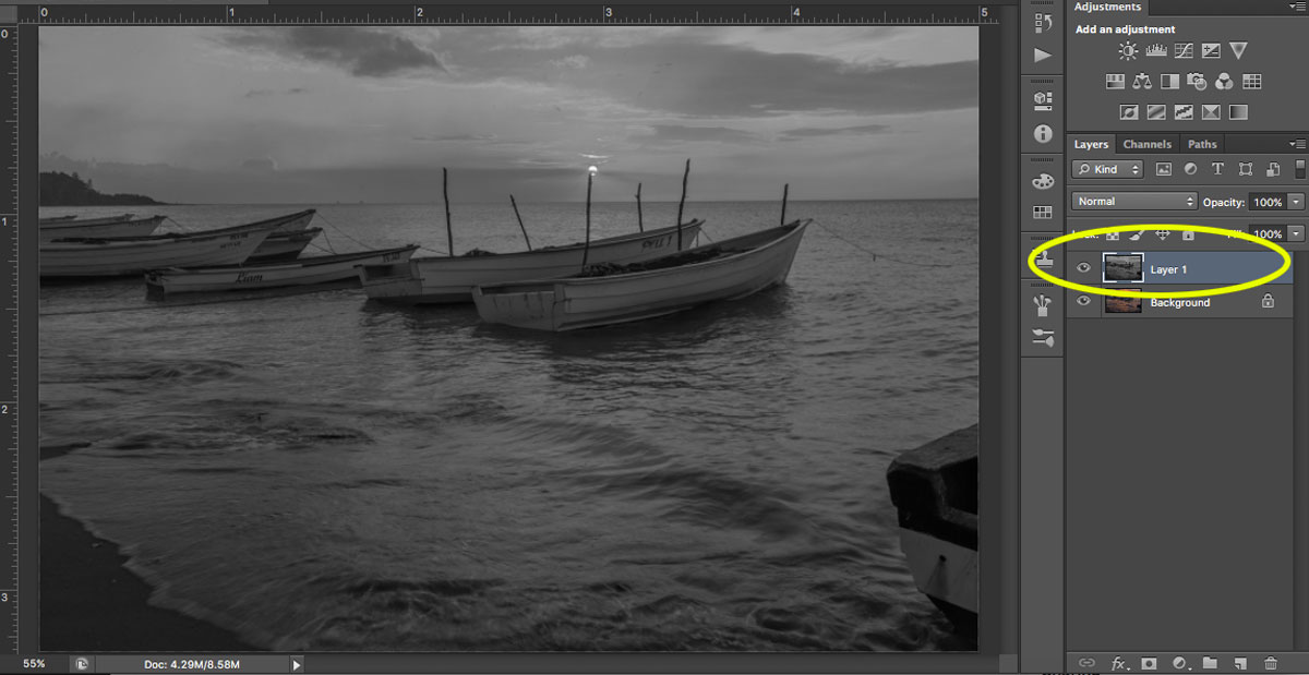
Step 1: Select the Crop tool

Step 2: Click the Straighten option at the top

Step 3: Click one side of your horizon and drag across the horizon line before you release

Your horizon will instantly straighten!

straightening boats in photoshop

2. Adjust the white balance for natural-looking images

White balance is a setting used to balance the color of the light you shoot, in order to get it close to a neutral white.

You see, when the color of your subject is distorted by the existing lighting conditions, you need to use the white balance setting to save the day.

Now, one way to set the white balance correctly is to get it right in-camera. However, some photographers prefer to shoot in RAW with an auto white balance setting, and then adjust the white balance afterward.

If that’s your preference, then you’ll need to choose your white balance in a post-processing program. It’s generally easy to select a white balance option that adjusts for the lighting of your shot. You’re also free to experiment with different white balance options so you can choose the one that most reflects your creative vision.

For instance, the scene below has a Fluorescent white balance applied to it using Adobe Camera Raw.

adobe camera raw white balance

And here’s the same scene but with a Shade white balance applied:

white balance adobe camera raw post-processing

3. Boost your contrast to create images that pop

Do your images look a little flat?

One of the simplest ways to make your photos pop is to adjust the contrast. A contrast adjustment further separates the darkest and brightest areas of your image. In other words, it makes the dark tones darker and the light tones lighter.

beach scene

Increased contrast, therefore, makes tones stand out and gives your photos a more three-dimensional feel. Compare the image above to the image below; I added contrast to the second image, which gives it a subtle pop.

beach scene with increased contrast

Pretty much every image editor has a contrast slider. And boosting the contrast is often as simple as pushing the slider to the right.

So just remember:

If you’re struggling to make your photos more lively, try increasing the contrast. It’s a simple post-processing tip, but one that really works!

4. Boost the saturation or vibrance sliders for better colors

The saturation and vibrance adjustment sliders usually sit next to each other and can be confusing. Both of these add an extra color punch to your image, but they do so in different ways.

You see, saturation adjusts the intensity of all the colors in your image at once. If you push the saturation slider, you’re going to see color saturation increase across the board. Therefore, it’s an adjustment you want to use sparingly.

Vibrance, by comparison, is a “smarter” saturation tool, one that adjusts only the duller colors in your image. Increasing the vibrance will boost the less-saturated colors, but won’t affect colors that are already saturated.

Look at these two photos:

lighthouse with increased colors

I boosted the saturation of the photo on the left, and I boosted the vibrance of the photo on the right.

Note that when you lower the saturation of your colors, your image takes on a more muted effect, like this:

reduced saturation lighthouse

In general, boosting the vibrance or the saturation will instantly improve your images.

5. Sharpen your photos for the best display on the web

Your images are most likely going to be displayed on the internet.

However, when you export your photos from most image-editing programs, you’re going to end up with blurry photos. Unless you sharpen for the web, that is.

There are a few ways to sharpen in Photoshop. Here is one you can try:

Step 1: Resize your image to the size you want it displayed. (If you sharpen your high resolution/original image and then resize it, the image will appear to lose its sharpness. Sharpening an image at your display resolution works better.)

resizing images post-processing tips

Step 2: Duplicate your layer.

Step 3: Desaturate your new layer (from Menu, Image > Adjustments > Desaturate).

sharpening your images

Step 4: Change your blend mode to Overlay. (Alternatively, you can use the Soft Light blend mode for a more subtle effect.)

Step 5: Now apply a High-Pass filter (from Menu, Filter > Other > High Pass) and choose a radius around 2.0 for an image of 730 pixels (on the long side). The Overlay option you chose above allows you to see how the radius affects the image so you can play around with it.

Note: The bigger your image, the larger your radius will be.

If the sharpness doesn’t look good on the entire image, you can use a layer mask and paint black over the areas where you want to hide the effect.

Step 6: Save for the web (from Menu, File > Save for Web). Check the Convert to sRGB box if unchecked.

Conclusion

If you’ve just begun your photography journey or if you’re looking to improve your basic editing skills, then these post-processing tips are a great place to start.

In fact, basic editing is often all you need to dramatically improve your photos.

So follow these tips, and watch as your images improve!

The post 5 Basic Post-Processing Tips to Instantly Improve Your Photos appeared first on Digital Photography School. It was authored by Nisha Ramroop.


Digital Photography School

 
Comments Off on 5 Basic Post-Processing Tips to Instantly Improve Your Photos

Posted in Photography


NVIDIA Research project uses AI to instantly turn drawings into photorealistic images

21 Mar

NVIDIA Research has demonstrated GauGAN, a deep learning model that converts simple doodles into photorealistic images. The tool crafts images nearly instantaneously, and can intelligently adjust elements within images, such as adding reflections to a body of water when trees or mountains are placed near it.

The new tool is made possible using generative adversarial networks called GANs. With GauGAN, users select image elements like ‘snow’ and ‘sky,’ then draw lines to segment an image into different elements. The AI automatically generates the appropriate image for that element, such as a cloudy sky, grass, and trees.

As NVIDIA reveals in its demonstration video, GauGAN maintains a realistic image by dynamically adjusting parts of the render to match new elements. For example, transforming a grassy field to a snow-covered landscape will result in an automatic sky change, ensuring the two elements are compatible and realistic.

GauGAN was trained using millions of images of real environments. In addition to generating photorealistic landscapes, the tool allows users to apply style filters, including ones that give the appearance of sunset or a particular painting style. According to NVIDIA, the technology could be used to generate images of other environments, including buildings and people.

Talking about GauGAN is NVIDIA VP of applied deep learning research Bryan Catanzaro, who explained:

This technology is not just stitching together pieces of other images, or cutting and pasting textures. It’s actually synthesizing new images, very similar to how an artist would draw something.

NVIDIA envisions a tool based on GauGAN could one day be used by architects and other professionals who need to quickly fill a scene or visualize an environment. Similar technology may one day be offered as a tool in image editing applications, enabling users to add or adjust elements in photos.

The company offers online demos of other AI-based tools on its AI Playground.

Articles: Digital Photography Review (dpreview.com)

 
Comments Off on NVIDIA Research project uses AI to instantly turn drawings into photorealistic images

Posted in Uncategorized


6 Practical Tips to Instantly Make Travel Photography Easier

17 Mar

Documenting exotic places, capturing priceless memories, and recording once-in-a-lifetime experiences are just a few of the pleasures travel photography affords us. But it can also throw up challenges. Time constraints, logistics, and lack of portable storage can make getting the perfect shot far more difficult. Here are a few tried-and-tested tips to help you make those challenges a little more surmountable.

Travel photography tips 01

1. Eliminate the unnecessary

Lack of storage, dubious safety, and the sheer weight of equipment may put the kibosh on your plans of bringing two DSLRs and five lenses to adequately capture your trip. By thinking about how you tend to shoot, you may be able to hone down your kit to just one camera and lens.

Some photographers opt for a fixed focal-length camera like the Fuji X100T. It’s compact, versatile, and good for all-round shooting. But for a photographer who shoots at long focal lengths, it would be a constant source of frustration.

Bridge cameras may provide an alternative, with their versatile zoom ranges in one neat package. Consider your individual needs based on your preferences and narrow down what kit you really need to have with you from what you merely want.

Travel photography tips 02

If you just can’t decide, try this; take one entry-level DSLR with a lens that has a varying zoom length from wide-standard to telephoto and a constant aperture of f/2.8 which is ideal for most situations.

Travel photography tips 03

2. Pick a lens with IS or VR

Each lens manufacturer offers some form of in-built stabilization. Canon has Image Stabilization (IS); Nikon has Vibration Reduction (VR). Choosing a lens that has in-built IS or VR helps when you can only shoot handheld.

When traveling, there are so many times when the perfect shot can only be captured on-the-fly. Unpacking a tripod and fiddling with camera settings may even be entirely out of the question. For moments when the light is low and shooting handheld is all you can do, IS or VR can help reduce shake and potentially save a photo.

Travel photography tips 04

3. Carry a mini-tripod

Slinging a folded down Manfrotto over your back may not be possible, but it also might not be something you’d want to do if you are taking photos in between relaxing moments on your family vacation. Having a portable, mini-tripod in your pocket or bag is a cheap and easy way to get around that issue. A flexible option like the Joby GorillaPod can even help get stable shots from unusual angles without adding too much undue weight to your bag.

Travel photography tips 05

4. Invest in memory and charge those batteries

Don’t come back from your holiday with 700 amazing shots from the first three days and absolutely nothing to show for the remaining week and a half because you ran out of memory. It’s now easier than ever to get lots of data and a fast write speed on one reasonably-priced SD card, so hoard a few of them before you go!

Do the same with batteries. Planning to re-charge every night is a great habit to get into, but don’t rely on that alone. When you end up in a hotel that has no power sources or you realize that you left your adapter in the last place you stayed, you’ll wish you’d invested in a few extra batteries and charged them before you left home.

Travel photography tips 06

5. Shoot for post-processing

We all want great results straight out of the camera. But if you don’t have all the equipment that you need or the time to nail your exposure by toying with intricate histograms, shooting a certain way to enable post-processing can be what helps you get the shot.

Bracketing your exposures and post-processing the final image into HDR when shooting the dimly lit walls of medieval ruins might be the only way to save the deep blue of the hot Mediterranean sky outside the cracked windowpanes. Without that, the blown-out highlights may not be salvageable.

If you don’t have a tilt-shift lens on hand and you can’t sprout wings and fly, shooting wider than usual and then correcting perspective in post-processing may be the only way to save that great shot of the iconic tower you visited.

Travel photography tips 08

6. When in doubt, take the shot

There are many times when you feel that it’s not worth taking the shot. A thousand other photographers may have captured the same view before; you may not have the equipment you need to get the results you want; the weather may have turned sour on the one and only day you got to visit. But regardless of how you feel, take the shot.

If it turns out to be a dud, you just delete it when you get home and you’re in the exact same position as if you hadn’t taken it. But if it turns out to be better than you’d thought, you could have a hidden gem that you hadn’t been expecting. Don’t miss a shot because you feel trapped by circumstance. Just shoot, and the magic will happen.

Travel photography tips 07

Conclusion

I hope these 6 tips have given you some ideas for your travel photography to make your next trip a bit easier.

Do you have any others to add to this list? Please share in the comments below.

The post 6 Practical Tips to Instantly Make Travel Photography Easier by Laura Hexton appeared first on Digital Photography School.


Digital Photography School

 
Comments Off on 6 Practical Tips to Instantly Make Travel Photography Easier

Posted in Photography


5 Things That Will Instantly Improve Your Photography

09 Mar

On now until March 21st (AUS time) get Anthony Epes’ Online Light Monkeys Photo Group – Yearly Membership – 55% OFF at Snapndeals. 

Having run photo workshops for several years now, I have noticed some familiar traits that many people share with their photography. So I’ve put together some tips that I feel will help you improve your photography – straight away. These little ideas have the potential to make a huge impact on your image creation.

5 Things That Will Instantly Improve Your Photography

1. Have patience

“Genius is patience. – Isaac Newton

Patience is a skill I think many amateur photographers sorely lack. This matters because photography is often a waiting game – waiting for the subject to get into position, for the light to change, or working the elements of your photo into a perfect composition. If you are not prepared to be patient, you’re not going to get many shots you like.

Many amateur photographers are so driven by the desire to have a full memory card at the end of the day that they don’t take the time to set up or wait for a great shot.

5 Things That Will Instantly Improve Your Photography

This could involve recognizing that the light isn’t great now, but it might change in an hour. Or it might be setting up a great composition and then waiting until the right person stands in a precise spot. It could be shooting a person or a scene over and over until you get an expression or angle that reveals something unique and interesting and creates a more impactful photo.

“You get more by waiting than you do by moving. You wait for the light to come and it will change the world in front of you.” – Peter Fiore

I believe a lot of it comes down to people’s expectations. For me, getting one amazing shot in a day’s shooting is a good result. Sometimes I go out and get nothing, sometimes I get a half a dozen, sometimes I just get one.

5 Things That Will Instantly Improve Your Photography
You need to be patient and take the time to work your scene and build a fantastic composition. Forget the next spot and the next subject. If you find something that really inspires you then stop, be patient, and work the scene until you’ve made the best photo possible. Take 10, 20, even 50 photos if you need to!

“Patience is not passive; on the contrary, it is active; it is concentrated strength.”– Edward G. Bulwer-Lytton

2. Free yourself from fear

“Everything you want is on the other side of fear.” – Jack Canfield

5 Things That Will Instantly Improve Your Photography

When you are involved in a creative act, you will at some point be faced with one of the greatest forces known to man – fear. It is pervasive in our lives, and it can create havoc with your photography.

For example, most of the photographers I teach have a fear of photographing strangers; this is very common. Now, you can either give into that fear and not photograph the subjects you really yearn to – or you can deal with.

I still get fearful sometimes after twenty-odd years in the business. Sometimes I go to new places and feel self-conscious, or get intimidated to shoot someone whose look I like. It doesn’t really matter what it is, fear is always fear and it can stop you from taking action if you don’t face it.

5-things-improve-your-photos-31

I deal with fear by just recognizing that it’s there. That fear has decided to show its face, and I just let it be there, knowing that eventually, it will drift off. I don’t let it stop me, that’s the key. After all, I love photography. I love the whole process of taking photos. Although this was said by an athlete, it is so relevant to photographers, and it’s worth reminding yourself that:

“You miss 100% of the shots you don’t take.” – Wayne Gretzky

Remember – on the other side of fear is possibly an amazing image.

3. Think geometrically

5 Things That Will Instantly Improve Your Photography

“The only joy in photography is geometry. All the rest is sentiment.” – Henri Cartier-Bresson

I read recently that Henri Cartier-Bresson would choose which images to print by examining his contact sheets and work out which have the best geometric composition. By looking at them when they were printed small, he could see the shape and form of the photo, rather than the subject. He would then choose his photos based on which of them had the best geometric composition.

Of course, the subject is important, their expression, the light, etc., but I like this idea of concentrating on the geometric elements of the photo. The reason being that all elements of the photo count, and having a strong organization of the shapes and forms, which is essentially the geometric elements of the photo, will create a strong composition.

“I like form and shape and strength in pictures.” – Herb Ritts

4. Stop fixating on your subject

5 Things That Will Instantly Improve Your Photography

I have noticed that many people learning photography become totally fixated on a subject that they love, but forget to compose the other elements of their photo.

For example, you see someone you think is awesome-looking. You start photographing them, without consideration for rest of the frame. You don’t look all the way into the corners of the composition, you overlap your subject with telephones or trees coming out of their head, nor do you notice lines running randomly out of the photo drawing the eye away from the subject.

Even though the frame may feel pretty small, often people don’t look at every part of the composition to see if the whole is working together. It is always about the whole image, not just what is currently fascinating you! It takes practice and concentration folks – all of the elements in your frame need to be relevant and work well with the subject.

5 Things That Will Instantly Improve Your Photography

5. Learn to become an observer

“To me, photography is an art of observation. It’s about finding something interesting in an ordinary place… I’ve found it has little to do with the things you see and everything to do with the way you see them.” – Elliott Erwitt

This tip is important. The best state of mind in which to take photographs is one of complete creative freedom, in the creative flow, where you are undistracted by your life outside of that very moment. Where you have forgotten about your to-do list and the thousands of emails you need to answer. You are just standing in the moment, looking around, noticing everything, and empty of thoughts about what else is going on in your life.

That’s easy right?

5 Things That Will Instantly Improve Your Photography

No, not always. For many, it’s super hard because what you do in your work and rest of your life requires skills which are exactly the opposite. Holding tons of small pieces of information, remembering, doing and rushing around with the business of life.

Much as we may like to think that photography is all about technique and kit, it is actually an inner game. I don’t really much care what gear you have, even though I love a new camera as much as the next person. The best photographers I’ve come across are completely in tune with their environment. They study the world around them and don’t constantly try to be in it doing, but instead, they look and observe.

This might be something you need to cultivate – and it’s totally possible to attain, even if it doesn’t come naturally. Something in you has been drawn to photography, to the visual world and to express yourself visually. So you already have potential inside of you to become a great observer.

5 Things That Will Instantly Improve Your Photography

Conclusion

Hopefully, these ideas have helped point you in the direction of deepening, developing and improving your photography. It’s so rewarding to work on simple ideas that have a great impact on your photos.

I’d love to know what you think of these tips, please comment below.

On now until March 21st (AUS time) get Anthony Epes’ Online Light Monkeys Photo Group – Yearly Membership – 55% OFF at Snapndeals. 

The post 5 Things That Will Instantly Improve Your Photography by Anthony Epes appeared first on Digital Photography School.


Digital Photography School

 
Comments Off on 5 Things That Will Instantly Improve Your Photography

Posted in Photography


Horror House: Real Estate Listing Instantly Infamous for ‘Terrifying’ Decor

15 Oct

[ By SA Rogers in Design & Fixtures & Interiors. ]

horror-house-3

Had Buffalo Bill escaped Clarice Starling and moved into a quaint suburban Connecticut home, his interior decor might have looked a little something like this. At 24 Brentwood Drive, an absolutely amazing color palette in shades of dried blood, glistening internal organs and Exorcist vomit green adorns every available surface in the form of hand-painted designs. And the best part is – all of this could be yours for just $ 339,900.

horror-house-1

horror-house-2

horror-house-5

Believe it or not, this is an actual real estate listing on Zillow.com, described by listing agent Ernie Rossi as a “unique one of a kind finishing completed by a professional!” The agents provide a full 51-photo tour on the site, showing off room after room filled with decoupaged stair rails, musty-looking floral curtains, decorative stamped paint in rust red and squiggly designs in shiny copper.

horror-house-7

horror-house-8

horror-house-9

Naturally, the listing went viral on social media upon discovery, with people describing the interiors as “serial killer chic,” “deranged” and “a portal to hell.” The real estate agents told The National Post that the sellers are artists, and remain optimistic that someone out there will fall in love with their designs. The home has only had one interested party in thirty days online, however.

horror-house-10 \

horror-house-11

horror-house-12

Who knows – maybe it’s actually some kind of viral horror marketing for a horror movie or a Halloween attraction, given that it’s mid-October and the house is located near the ominously named Mount Horr and Secret Lake – but there are elements of the home that feel earnest. Check out the full listing to decide for yourself.

Share on Facebook


[ By SA Rogers in Design & Fixtures & Interiors. ]

[ WebUrbanist | Archives | Galleries | Privacy | TOS ]


WebUrbanist

 
Comments Off on Horror House: Real Estate Listing Instantly Infamous for ‘Terrifying’ Decor

Posted in Creativity


Create a Photography Business Marketing Plan in 3 Days (+ Save $30 Instantly)

25 Apr

Starting a photography business these days is quite a challenge. It takes courage. You need to push yourself constantly to go out of your comfort zone and learn a whole pack of new things. While there are no shortcuts to success, there are accelerated ways. Read on to learn about one of them and build a photography business marketing plan Continue Reading

The post Create a Photography Business Marketing Plan in 3 Days (+ Save $ 30 Instantly) appeared first on Photodoto.


Photodoto

 
Comments Off on Create a Photography Business Marketing Plan in 3 Days (+ Save $30 Instantly)

Posted in Photography


10 Ideas to Instantly Improve Your Photography Composition

14 Apr

It is an illusion that photos are made with the camera; they are made with the eye, heart and head. – Henri Cartier-Bresson

My photography training took place back in the early 90s, at an intense technical photo school in California. I love tech in all forms, and I love reading my camera manual. I love the precision and procedure of processing my own colour film, and I love learning the ever-advancing skills on photo software – I am a total tech nerd. But technical knowledge will only get you so far; it’s really the second part of the story in photography. Photography composition is the first part.

EPESTENIDEASDPS 01

The first part is your vision of what you want your photography to be, and learning the ability to compose compelling images. Your technical knowledge will only give you the ability to execute your vision, and make the most of the composition that you have created. It can’t replace the ability to see and to compose stunning compositions.

So all things should flow from a good composition. And when we are learning about composition I like to keep in mind that quote that may or may not have been spoken by Picasso (it’s under dispute on the internet): “Learn the rules like a pro and break them like an artist.” Rules, guidelines, ideas about composition will give you a place to start, help develop your skills and propel you out of a rut. But they should not be followed slavishly or forever.

Here are my ideas on what you can do to make your compositions more captivating. But, bear in mind that creating totally unique compositions comes down to creating your own style . So don’t be swayed too much by other photographers’ advice on this subject. Photography is an examination of the world through your eyes, it’s totally subjective, totally about connecting with what inspires and excites you. Just pick up ideas that make sense and motivate you.

EPESTENIDEASDPS 02

To practice, pick one concept from below that jumps out. Don’t take all these ideas and try to incorporate them into your photography all at once. Pick one and really embrace it – then the results will come.

So here are my 10 favourite tips on how you can instantly improve your composition.

1. Light

“Light makes photography. Embrace light. Admire it. Love it. But above all, know light. Know it for all you are worth, and you will know the key to photography.” George Eastman

For me more than anything, photography is about light, and learning to identify interesting light is one of the best skills to learn. Light that is doing something interesting, or is beautiful or colourful; will take a good subject and turn it into something completely amazing.

Light is my starting point when I am taking photos. It is the thing I consider first, and what affects me the most when deciding what to photograph. Look for light doing strange and wonderful things – creating long shadows, diffused light falling over a broken wall, reflecting, creating bursts of colour. Look for the colour of light, too: the cool blue light before dawn, the cold, almost transparent light of a winter’s afternoon, the rich orange light of near twilight – and how that affects your subject. Think always: how can I get the best out of the light that I am photographing?

EPESTENIDEASDPS 03

In the photograph above, the beautiful light is obvious. I have used the silhouette of the column, to contrast the dappled light which is illuminating the clouds beautifully. This contrast makes the light look spectacular because it’s showing off its range of colours and depth against the heavy dark column.

Learning to notice light in all its forms and colours is an excellent way to improve your compositions.

When you see a subject you wish to photograph, look at the light around it. If it’s not interesting light – if it’s flat, boring, or draining the sense of colour – have a look at what else is happening with the weather. Maybe you can wait for clouds to pass, come back later or earlier in the day, see if you can organize the composition to incorporate light from other sources. It doesn’t have to be natural light. Artificial light, and particularly the play of natural and artificial light, can make an inspirational combination.

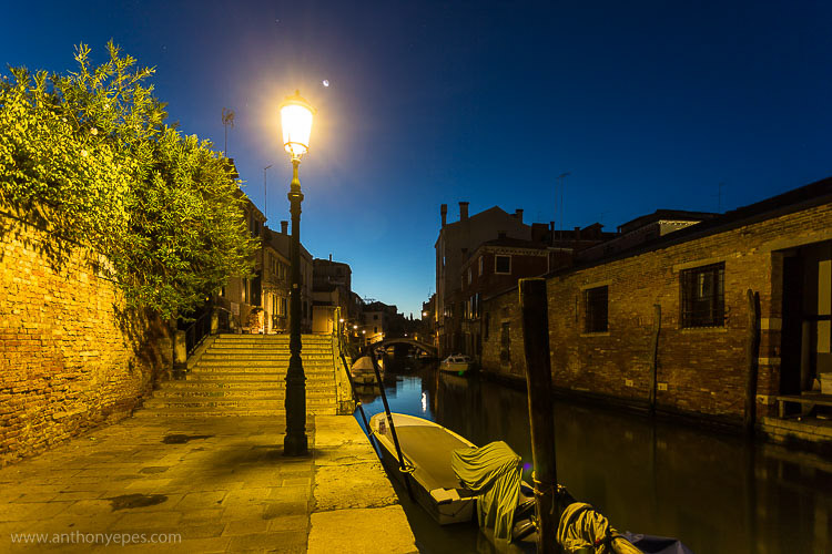
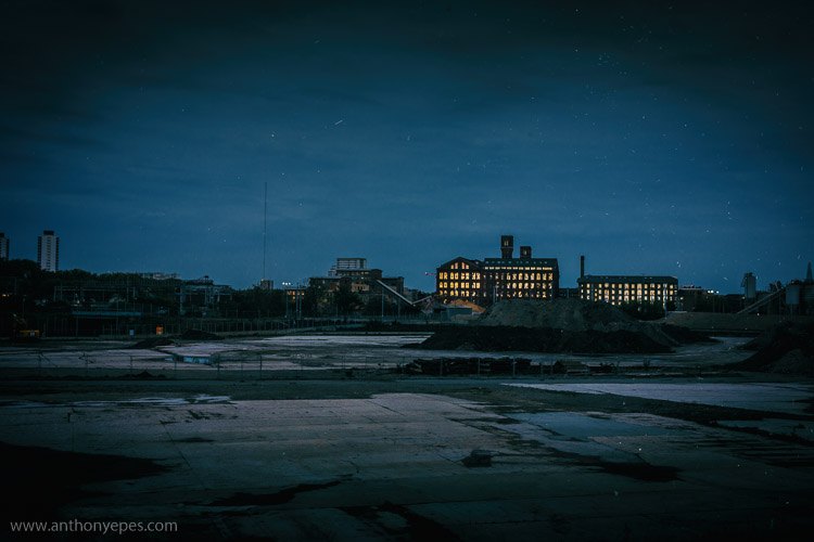
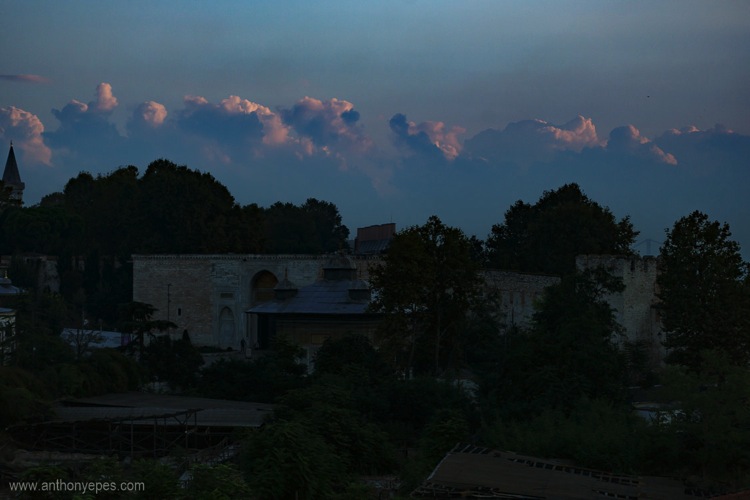
Here’s another photo where the main subject is the light, but this one is more subtle. The absence of light is most pronounced in this shot, and then all of sudden the glow of dawn light is reflected in the windows. Again, there is a contrast of darkness against light.

EPESTENIDEASDPS 04

There is lots of negative space in this photo, an overload of industrial blandness, wastelands. And then these two buildings and the sudden glow of the charming light.

2. Simplicity: think in threes

“The ability to simplify means to eliminate the unnecessary so that the necessary may speak.” Hans Hofmann

Simplicity is often very hard to accomplish, and can be more challenging than more complex compositions. I find there can be a misunderstanding about how to achieve simplicity in your photos. People often think it’s about taking a photo of one subject. But actually I rarely take photos which contain only one subject. Usually there has to be one subject with at least one, but usually, two supporting elements. So I like to say – think in threes.

Humans love to think in threes – (breakfast, lunch, dinner; past, present, future; and small, medium, large). We like to find rhythms and patterns in everything.

EPESTENIDEASDPS 05

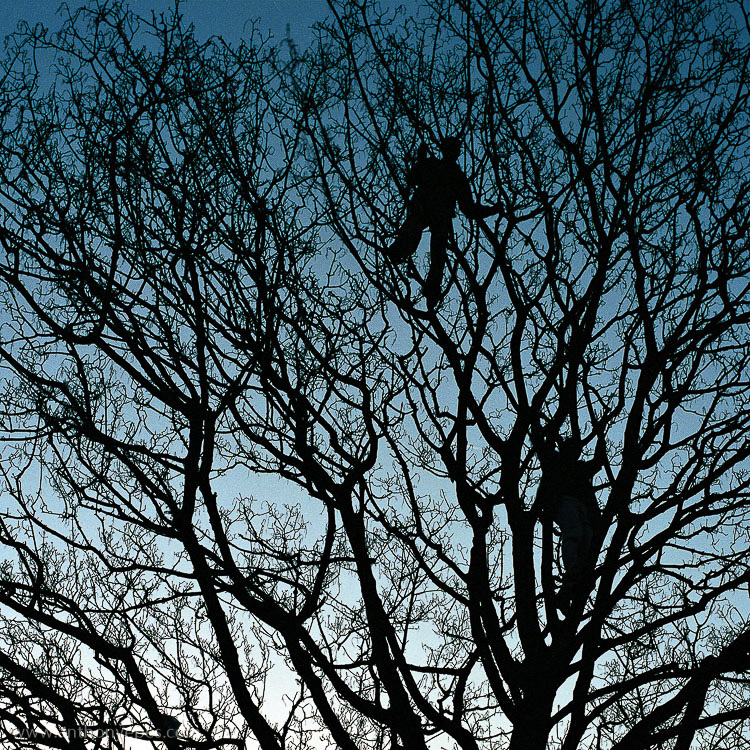
This photo above is a very good example. How many elements make up this photo? Well, first you have the beautiful blue gradated sky, then the wild, chaotic pattern of the bare branches. That’s all very nice, but it’s the third element that is the subject, and that really makes the photo – the two men blending into the branches, while creating distinct human shapes. The photo without any one of the elements wouldn’t be as interesting.

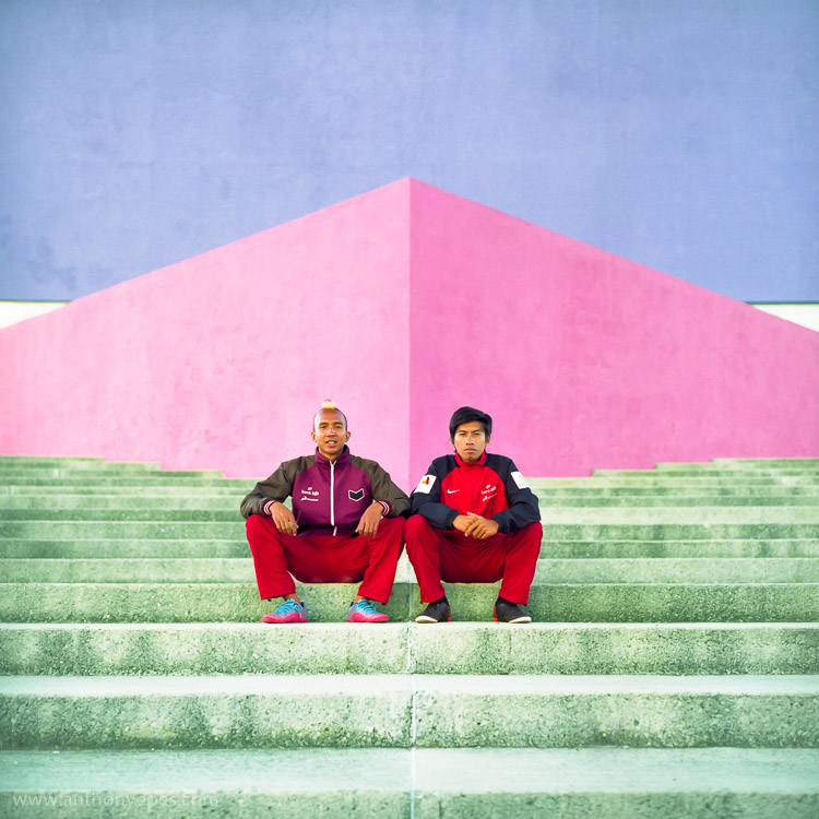
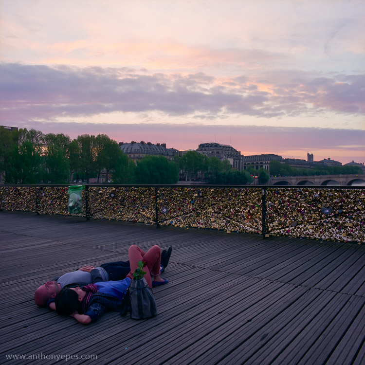
I am a particular fan of very simple compositions when photographing people and I often use plain and colourful backgrounds. In the photo below, again there are three strong elements: bright pastel colours, the two guys and the strong lines.

EPESTENIDEASDPS 06

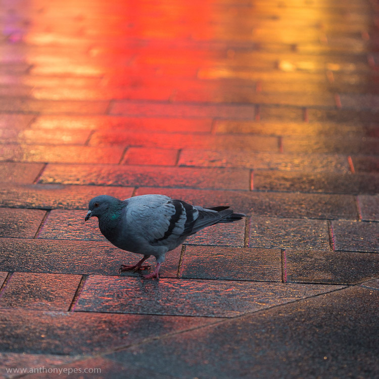
It also works when photographing pigeons! Another photo with three elements: the grey, slightly dishevelled pigeon, the wash of colour, and the texture and lines of the wet paving stones.

EPESTENIDEASDPS 07

3. Move your feet

When you are looking at a professional photographer’s work, one thing that they do more than an amateur photographer is move. You may have a killer shot laid out before you, but you still have to find the killer angle that will make the shot really special. Every shot has a perfect angle, and it’s your job to find it. If you are shooting a subject you love and then look at your images and are disappointed with what you find, I guarantee it’s because you haven’t found the perfect angle.

Get up on that roof, lie on the floor, move your feet around until what you see in frame is the best possible angle, the best possible position you can manoeuvre yourself into. Get dirty if you have to. This requires patience (and good knees), and patience is one thing I think most amateur photographers need to develop more of.

EPESTENIDEASDPS 08

There is one particular culprit in our kit that discourages us to move, and makes many of us lazy – a zoom lens. This should NEVER be a replacement for moving around a scene and finding the best angle. Do not fall into the trap that just because you have the subject in frame you can just zoom in to get it. Compose your best possible shot in frame, zooming in only if it’s totally the right thing to do , and not as a default option for moving. My best advice for zooming is pick a focal length, then move your feet and find the angle you need.

4. Get closer

Robert Capa said – “If your pictures aren’t good enough, you are not close enough.”

This concept reminds me of when I once read about a famous chef, who believes that the difference between home cooks and professionals is that home cooks are afraid of heat, and don’t turn their gas hobs up high enough. It’s the same with photography – obviously!

EPESTENIDEASDPS 09

If you feel yourself not wanting to get closer, then this is definitely an idea you should explore. You will almost be able to notice in your images that barrier of fear you set up of getting closer because there will be a distance to your subject. Push through that fear, and your images will benefit from more intimate images. The iconic travel photographer Steve McCurry always photographs subjects within a few feet of himself. For him that is the distance that feels most intimate. That is his style.

Take a deep breathe, hold your fear in check, and just get closer. Investigate as though nothing is holding you back.

5. Build your photo

When I am out wandering around looking for things to shoot, I am looking for elements that I can combine. Often it starts with one thing; it could be anything – an odd looking person, a beautiful shaft of light, a piece of amazing graffiti on a pockmarked concrete wall. If one thing strikes me, I start to look around to find something else to build on that first element to make it more interesting.

EPESTENIDEASDPS 10

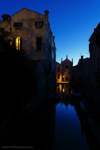
In this photo above I think you’ll agree that if you took away the light in the window you’d have a perfectly lovely shot. But that light is what makes it work. It’s that additional element, creating another layer of depth, and providing an echo almost of the church light of the same colour. I passed this spot on many mornings and often took this particular shot, but one morning the window light was on and it changed it from a beautiful scene into a great image.

6. Look behind you

I shoot in places where I often find myself surrounded by other photographers – the Eiffel Tower at Dawn, sunset on Westminster Bridge – and it continuously stuns me that almost every (or even every) photographer will be pointing the same way and shooting the same thing. Now of course a purple pink sunset over the Houses of Parliament is gorgeous – but that light will also be doing incredible things to everything around you. So, while everyone is going nuts at the obvious, do something different – turn around, walk down that alley way, do what everyone else is not doing.

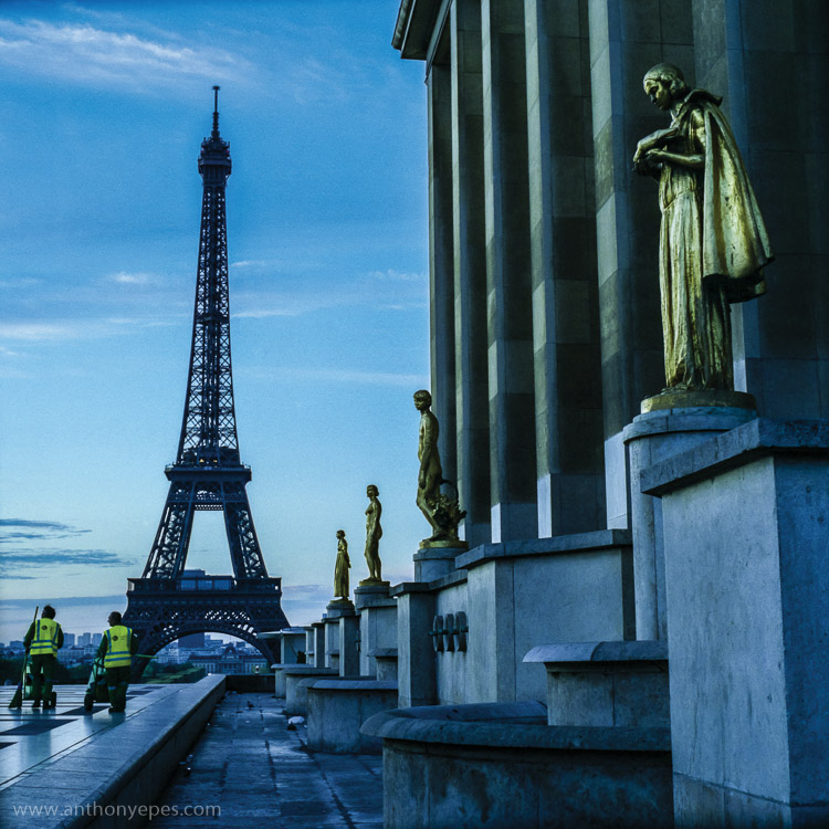
When I was in Paris I was intimidated about shooting the city. It’s the most visited city on earth (hence the most photographed). It is a small city and much of what’s amazing to photograph has been shot to death. I wanted to shoot the Eiffel Tower differently. Here is one shot I liked. You’ve got opulent gold, beautiful dawn sky, the iconic Eiffel Tower – all pretty so far – but then you have this injection of something that most photographers would have avoided – the cleaners.

Have the patience to explore other angles.

EPESTENIDEASDPS 11

The streets cleaners are a vivid contrast against the opulent gold, and while I kept the iconic Eiffel Tower in the shot, it’s really only as a background. Paris is obsessed with tidying itself, so this is also a nice little comment on the city.

7. Simplify your kit (and get really familiar with it)

I think most people generally have too much kit. If you have a lot and you don’t use it daily or even weekly, you’re not going to have that intimate knowledge of how it responds to situations and subjects. Try reducing to just one lens for a while and really get to know it.

When you have a lens that you know exactly what it will do in every situation, you’ll be able to execute even more interesting compositions, as you aren’t leaving things to chance. Chance is something that professional photographers will go out of their way to avoid.

8. Find beauty in the mundane

It’s easy to get a spectacular shot when you have a spectacular subject. But to make simple, boring, or mundane things look interesting – now that’s a challenge! But it’s a challenge I invite you to take up, because it’s an amazing way to train your eye to reveal the beauty of any subject.

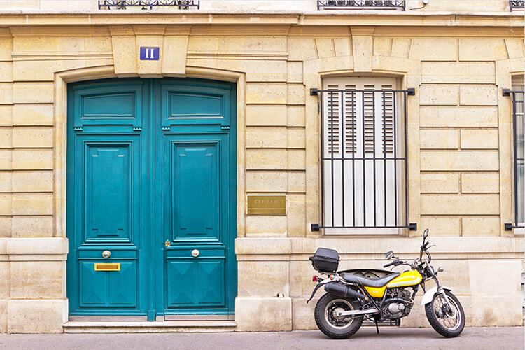
This for me is a good example. There are three things that are interesting in this photo (can you guess?) You have the bold colours, and then a little bit of light falling on the wall to create a contrast, and the lines. Now if light was falling on the whole wall, or if there was no light at all, the photo would be totally boring. But can you see how just three simple elements working together can make a photo?

EPESTENIDEASDPS 12

And as I am obsessed with colour and light, I admire this shot.

EPESTENIDEASDPS 13

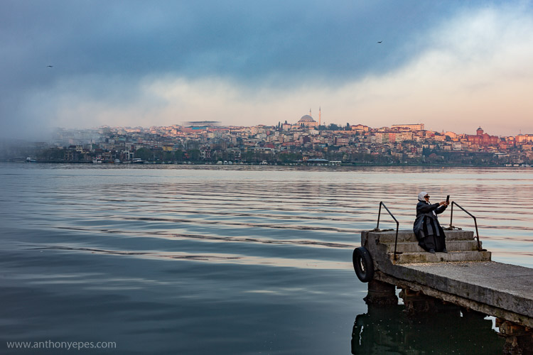
It’s part of a longer story I am working on in Istanbul at dawn, but to me it shows that there is no subject that isn’t worthy of attention from your camera.

9. Pre-visualize

I love my digital camera, but I also still use film, and now that I’m mainly digital I appreciate the discipline and grounding I received from training in film. I use these skills to help me now.

One super important skill that will really help your compositions is pre-visualizing. It’s a skill you had to have when you shot film, because otherwise you were just shooting randomly.

Pre-visualizing is, “the ability to anticipate a finished image before making the exposure” (Ansel Adams said that, not me). What I love about this, is that it’s about creating space between seeing a shot, and taking it. It’s about being prepared, thinking through what you want to capture, looking at all of the elements of light, positioning, etc., and then picturing in your mind what the final image will look like. For example, imagine your final output was a print. Imagine the print in your hands. What would it look like? If you can see it clearly then your are pre-visualizing. If not, then keep working at it until you see the image in your head. When you have a solid picture in mind, take the shot.

EPESTENIDEASDPS 14

You can also use pre-visualization when you think about timing. A lot of landscape photography is really about waiting around for the perfect moment, that great light. Here is one situation (above) where I knew the scene had potential, but was pretty flat, and if nothing else happened it wouldn’t be interesting. So, I waited for the sun to rise just that little bit more and ping, the clouds were filled with pink light giving the photo more depth.

10. Look for patterns

EPESTENIDEASDPS 15

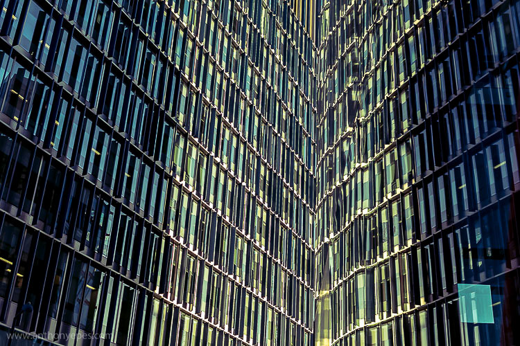
Patterns come in many forms, and are extremely pleasing to the eye. A pattern is anything that is repetitive, that turns your subject from its innate quality, into something more abstract. So people will look and respond more to the pattern and shape that it makes, and less to the subject itself.

“Whatever emotional response a single design element arouses is multiplied when it is repeated in a pattern.” – Bryan Peterson

Patterns are particularly effective when you fill the frame with your subject, and totally cut off the rest of it. These are particularly interesting to look at.

EPESTENIDEASDPS 16

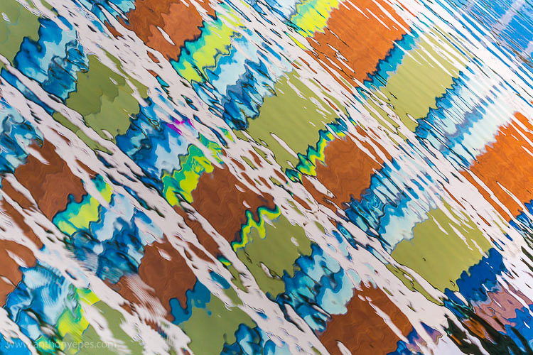
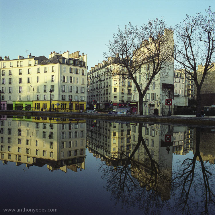
Another way to create patterns is reflections. I love playing with reflections. Anywhere you have a bit of water, even just rain on the street, or shiny surfaces, you have the ability to play with reflections.

EPESTENIDEASDPS 17

Once you start looking out for patterns you’ll start seeing them everywhere.

Time to practice

I’d love to know what you think of these ideas, and if you put any into practice. Which compositional techniques do you use to enhance your photos?

googletag.cmd.push(function() {
tablet_slots.push( googletag.defineSlot( “/1005424/_dPSv4_tab-all-article-bottom_(300×250)”, [300, 250], “pb-ad-78623” ).addService( googletag.pubads() ) ); } );

googletag.cmd.push(function() {
mobile_slots.push( googletag.defineSlot( “/1005424/_dPSv4_mob-all-article-bottom_(300×250)”, [300, 250], “pb-ad-78158” ).addService( googletag.pubads() ) ); } );

The post 10 Ideas to Instantly Improve Your Photography Composition by Anthony Epes appeared first on Digital Photography School.


Digital Photography School

 
Comments Off on 10 Ideas to Instantly Improve Your Photography Composition

Posted in Photography


Origami Apartment: Instantly Shape-Shifting Micro Interiors

17 Dec

[ By Steph in Design & Fixtures & Interiors. ]

origami apartment 1

Origami-inspired folding screens stretch and retract in many different ways to transform one 312-square-foot micro apartment for a variety of uses, separating the spaces for different functions or opening to create one big room. The Biombombastic project by Madrid’s Elli Architects offers an innovative and affordable solution to customizing existing apartments so they’re more livable despite their small size.

origami apartment 4

origami apartment 5

origami apartment 7

In a mission to renew an aging flat in the center of Madrid, the architects combined two strategies: knocking down the existing walls to create an open space that can be divided as desired, and creating an L-shaped arrangement of built-ins holding a complete kitchen, fold-down table, fold-down bed, washing machine and access to the bathroom.

origami apartment 3

origaim apartment 11

origami apartment 12

The system revolves around a three-paneled folding door reminiscent of a shoji screen, with diagonal timber supports and a translucent upper portion for the transmission of air and light. The door is designed to work in conjunction with other hinged and foldable elements in the space, hooking onto wooden rails in a variety of configurations.

origami apartment 14

Even the lighting is strategically positioned to work with the system, illuminating the various ‘domestic stages’ even when the partitions are closed. Create a cozy bedroom with the screen pulled tight around the bed or a larger sleeping and lounging space, and pack it all away to transform the apartment into a social space for hosting parties.

Share on Facebook


[ By Steph in Design & Fixtures & Interiors. ]

[ WebUrbanist | Archives | Galleries | Privacy | TOS ]


WebUrbanist

 
Comments Off on Origami Apartment: Instantly Shape-Shifting Micro Interiors

Posted in Creativity


The Instax Wide 300, Big Bold Prints Instantly

12 Jan

Extra photos for bloggers: 1, 2, 3

Your bright smile and flashy style means making friends is easy, but you need a camera that can keep up.

Introduce your crew to the Instax Wide 300, a smart and classy cam ready to snap pics anytime and share real prints instantly!

Whether you’re out on an adventure, meeting new friends, or throwing a big ol’ party, the Instax Wide 300 will capture the moment and give you instant memories to print.

Easily load your camera with film, adjust lighting on the fly, snap pics, print and share!

With this fun new instant camera in tow, you’ll just need to make sure that you can keep up.

Imagine the Print-abilities
$ 129 at the Photojojo Shop


© Britta for Photojojo, 2015. |
Permalink |
No comment |
Add to
del.icio.us

Post tags:


Photojojo

 
Comments Off on The Instax Wide 300, Big Bold Prints Instantly

Posted in Equipment