RSS
 

Posts Tagged ‘gray’

Tips for Doing Photography On Gray Gloomy Days

10 Apr

Few things dampen photo-taking spirits more than rainy and gloomy days. Especially if you are on a trip to an exciting location and the clouds and wind are conspiring to keep the sun from those beautiful, but hidden, landscapes you know exist.

Tips for Doing Photography On Gray Gloomy Days

Fear not, intrepid photographer, there are still many subjects for you to capture on gray, gloomy days. They may not be what you typically shoot or what you really want to be shooting. But that doesn’t mean you can’t stretch your creative muscles a little and create some memorable photos.

Express the mood

The first mistake is assuming that when your mood doesn’t match the mood of the weather or scene in front of you, you should pack it up and go home. Viewers connect with photos because of emotion and emotions are highly tempered by mood.

While gray moods are not as popular to express as say, a sunny golden sunset, they are just as prevalent. I like to highlight the relative emptiness of a scene when the color has been sucked out of it and show a sense of loneliness when possible.

Tips for Doing Photography On Gray Gloomy Days

Washington State Ferry alone in the gray of Puget Sound.

Add some grit

In the days of film, the higher ISO emulsions (think ISO 1600 and more) allowed for photography in low light but was a trade off for what most of us consider image quality. The emulsion accomplished the low light performance by having larger grains of silver, which were far more visible than their ISO 50 counterparts, which tended to blend smoothly and be almost invisible. That grain didn’t do well for fine art landscape photos, but it worked wonders for conveying the grit of a scene.

Grit is a hard thing to define. It’s not necessarily dirty, but it’s not sharp and clean, either. It’s a little muddled and it’s more real than posed. It’s more of a feeling than anything else and it is available more on gloomy days than when the sun is bright.

Tips for Doing Photography On Gray Gloomy Days

Lighting candles in Kathmandu to chase away the gloom.

It can also be added to photos in post-production. Lightroom has a section to add grain back into a photo with three different sliders to show just the right amount of grit you are looking for.

Think on the Grayscale

With all the wonderful colors we experience in the world, I think the thing we like least about the gloomy weather is that it compresses our palate to fewer options. Or so we think. Just because the colors aren’t popping like they do in bright sunshine, doesn’t mean you don’t have a range of options.

Enter the grayscale and zone system. For a primer, check out this article. The idea is different colors and patterns get accentuated differently when seen in just grayscale. Even composition should change a little when considering grayscale photos. Contrast can be enhanced if you like.

I’d start by using the monochrome setting on your camera. Most cameras have a scene or profile mode to shoot images in black and white. That will give you instant feedback on your LCD screen and is an awesome gateway to shooting black and white images that don’t need blue skies and sunshine.

Zero In

Tips for Doing Photography On Gray Gloomy Days

Flowers and plants are especially happy to be photographed on gloomy days.

“Get Closer” is a common refrain in the photography world, and for good reason. It’s a tried and true method of finding more interesting subjects, or for framing subjects more interestingly.

If the background of your subject is drab and dull, work to crop it out in-camera. It’s a bit of forced tunnel vision and it can help bring out new subjects when the skies are gray. Plants, I find, are especially happy for a nice close-up on gray days when their colors seem more saturated.

Tips for Doing Photography On Gray Gloomy Days

Look For Patterns and Abstracts

You might not have that bright, sunny landscape you were looking for but that doesn’t mean you are without subjects. Besides getting closer, look for patterns and abstracts.

For instance, yesterday the weather was threatening (and later delivered) snow. I was itching to get out and shoot something. I found some birds but they were too far off for decent photos. Then I found some old bridge pilings crossing over a lake and was instantly excited.

Tips for Doing Photography On Gray Gloomy Days

The gray of the sky reflected in the lake and the gray of the pilings helps the moss and grass pop out.

Likewise, lower light makes for easy purposeful abstract blurring. I covered this before in a dPS article (6 Tips on How to Create Abstract Photos) and I love the simple technique of camera movement, coupled with low light and low ISO, to create unique images.

Tips for Doing Photography On Gray Gloomy Days

Streaks of gray and steel cut across a black background in striking abstract patterns.

Conclusion

The gray gloomy days don’t need to keep you inside feeling uninspired. They are a challenge to us all to get out there and see the world in a different light. Then express that world through photos.

I’d love to see your gloomy day and gray work, please share in the comments area below.

The post Tips for Doing Photography On Gray Gloomy Days appeared first on Digital Photography School.



Digital Photography School

 
Comments Off on Tips for Doing Photography On Gray Gloomy Days

Posted in Photography


Canon is selling a gray version of the Rebel T6

11 Nov

$ (document).ready(function() { SampleGalleryV2({“containerId”:”embeddedSampleGallery_3918519169″,”galleryId”:”3918519169″,”isEmbeddedWidget”:true,”standalone”:false,”selectedImageIndex”:0,”startInCommentsView”:false,”isMobile”:false}) });

A gray edition of the entry-level Rebel T6 has appeared in Canon USA’s online store. The kit includes a gray strap and standard-issue black EF-S 18-55mm F3.5-5.6 IS II lens, and the camera grip features a brown, leather-like finish. Like the black Rebel T6 the gray edition is listed at $ 550, but Canon is currently offering a $ 50 discount on the original kit that isn’t extended to the new version.

Read our Canon EOS Rebel T6 Review

Articles: Digital Photography Review (dpreview.com)

 
Comments Off on Canon is selling a gray version of the Rebel T6

Posted in Uncategorized


Leica introduces ‘Titanium gray’ version of its Q compact camera

20 Oct

Leica has announced that it will release a new version of its Q (Typ 116) full-frame compact camera that will be finished in a gray paint instead of the usual black. The Leica Q ‘Titanium gray’ will be essentially the same camera as the black model, but its metal areas will be a light gray. The material body cover will be a dark gray. The company says that there are other ‘striking design features’ that make the camera different to the standard model, but all that’s evident is the distance scale markings on the lens are picked out in red paint, like the Rolf Sachs Summilux-M 35mm F1.4, instead of Leica’s usual yellow. The strap will also be made of a different material.

The ‘Titanium gray’ model will be available from the middle of November and will cost £3800. The black version usually sells for around £3200/$ 4250, but is rather short supply.
For more information see the Leica website.

Press Release

Leica Q ‘Titanium gray’

A perfect fusion of technology, design and style

Leica Camera has revealed the Leica Q ‘Titanium gray’, bringing a brand new, alternative design to its successful, high-performance compact camera, the Leica Q, which features a fixed fast prime lens and full-frame sensor.

In contrast to the discreet black of the body, lens and leather-style trim of the original Leica Q, this stunning new model offers a titanium grey paint finish on the top and base plate and back of the camera, combining the premium look of precious metal with classic black elements.

Elegant, yet extremely durable, the Leica Q ‘Titanium gray’ includes a series of striking design features not found on the standard model. For example, the distance scale in feet and the focal length on the lens are highlighted in red. Furthermore, the colour-coordinated carrying strap supplied with the camera has been manufactured from strong, robust material most commonly used to make climbing ropes.

Offering the same impressive performance and technical specifications of the black Leica Q model, the Leica Q ‘Titanium gray’ features intuitive handling and an exceptionally fast lens. The perfect camera for street, architectural and landscape photography, its Leica Summilux 28mm f/1.7 ASPH. lens makes the Leica Q ideal for available light shooting and has an angle of view that reproduces scenes with natural perspectives and proportions.

With a 24 MP, full-frame CMOS sensor precisely matched to its lens, the Leica Q ‘Titanium gray’ delivers richly detailed exposures with low noise at optimum quality, at ISO sensitivities of up to 50,000. This outstanding camera allows the greatest possible creative freedom for even the most demanding photographic ambitions, enabling the photographer to switch effortlessly between macro, automatic and manual focusing.

Ensuring the decisive moment is never missed, the Leica Q full-frame compact camera has the fastest autofocus in its class and offers precision focusing almost in real-time. Furthermore, its Leica ultra-fast Maestro II image processor enables continuous shooting at up to ten frames per second at full resolution. Allowing reliable control of subject composition at this speed, the Leica Q also features an integrated viewfinder with a resolution of 3.68 MP – displaying even the finest details without any perceptible lag, as soon as the camera is brought up to the user’s eye.

All functions of the camera are clearly laid out and logically placed, making it exceptionally ergonomic to use. The clear and logical menu provides rapid access to all essential functions and also enables photographers to programme their own personalised settings.

In addition, the Leica Q delivers movie recording in full-HD quality. Depending on the scene and subject, users can choose between 30 and 60 full frames per second for video recording in MP4 format. The camera also features an integrated Wi-Fi module for wireless transmission of still pictures and video to other devices, and remote control by WLAN from a smartphone or tablet.

The Leica Q app enabling these features can be downloaded free of charge from the Leica web site. As well as providing a remote release function and display of the viewfinder image, the app also allows the setting of parameters such as aperture and shutter speed from the device employed.

Full product specifications can be found at: uk.leica-camera.com.

Pricing and availability

The Leica Q ‘Titanium gray’ is scheduled to be available from mid-November 2016, at a suggested retail price of £3,800 including VAT.

Articles: Digital Photography Review (dpreview.com)

 
Comments Off on Leica introduces ‘Titanium gray’ version of its Q compact camera

Posted in Uncategorized


How to Enhance Portraits Using Gray Layers to Dodge and Burn in Photoshop

24 Jul

What is dodging and burning?

The techniques of dodging and burning are hand-me-downs from the days of the darkroom. The idea was to manipulate parts of an image while the paper was being exposed to light from the enlarger, where the negative was fitted. In order to decrease the exposure (lighten) on parts of an image, the paper had to be exposed for less time, which was dodging. To increase exposure (darken) it needed to be exposed for more time, which was burning.

Before dodging and burning

Before dodging and burning

After dodging and burning (it’s subtle, look at her hair and cheeks – don’t overdo it with this technique)

One way of doing this, was by holding bits of paper or card over the parts of the image that didn’t require manipulation. Because these adjustments only applied to certain parts of an image, it required a certain amount of dexterity (as well as a lot of paper) to get right. Because of this complexity and precariousness, dodging was used primarily to lighten dark areas. Burning was then used to darken highlight areas.

The Photoshop version of the technique; however, is far more forgiving. Photoshop allows very fine control over an image and even allows pixel by pixel retouching. The versatility this provides turns the traditional darkroom method on its head. It allows you to use small brush strokes to brighten and exaggerate small areas of highlights, or darken shadows, instead of applying to only broad areas.

This technique is very easy to learn, but it does require some practice to get down, as it’s very easy to go overboard with it, and overcook your images.

Why dodge and burn?

Tools like curves and levels give you control over the tonality and contrast of an entire image (excluding the use of layer masks). This is called a global adjustment, but they aren’t always effective for most images.

Dodging and burning allows you fine control over the tonality of your images in small, concentrated areas. These are called local adjustments. This allows you to pick out small parts of an image to work on, while leaving areas that need no work untouched.

While useful in all genres of photography, the use of local adjustments comes into its own in portraiture. If you think in terms of contrast alone; hair, eyes, skin, and clothes all require very different treatments in order to look their best. For example, if you pump up the contrast in an image to make a pair of jeans look punchy, that will wind up destroying the skin tones in your portrait. One of the easiest ways to overcome this is using a local adjustment technique like dodging and burning.

This tutorial will get you started with a two layer dodging and burning technique, that will give you far more control over your images than you would have with global adjustment tools alone. This is an intermediate technique and you need to have a basic understanding of how to use layers in Photoshop.

For this demonstration, I am going to go beyond what I would normally consider acceptable and overcook the image, to ensure that it is visibly clear what is happening at various stages of the process.

Setting up the layers

Before you start this technique, I suggest that you first finish any blemish removal in your image.

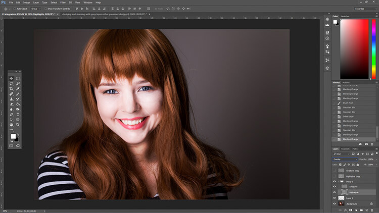
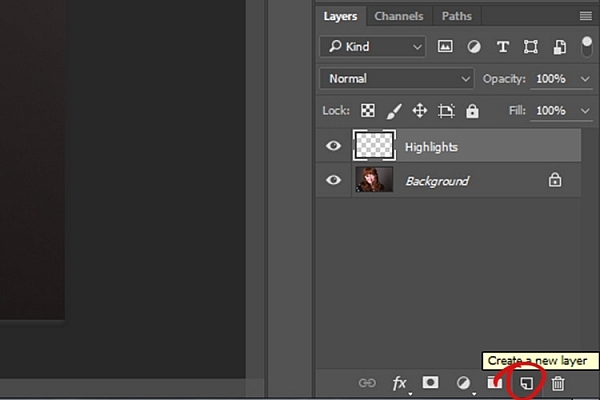
That said, the first step in Photoshop is to create a new layer by going to Layer>New Layer or by pressing ctrl+shift-n. Rename this layer, “Highlights”.

dodging-and-burning-with-grey-layers-newlayer

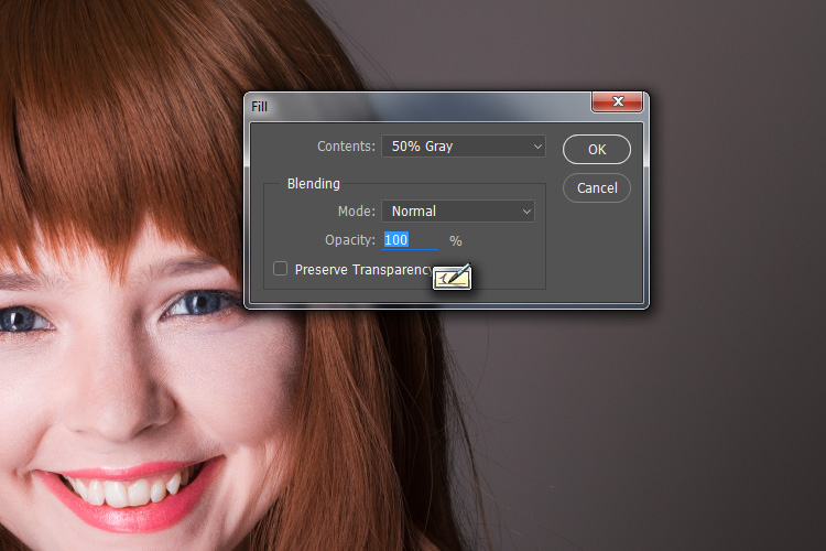
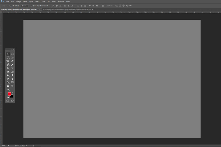
With this new layer selected, go to Edit>Fill or shift+f5 and choose 50% gray from the menu. Press OK. Your image should now be entirely gray.

dodging-and-burning-with-grey-layers-fill

dodging-and-burning-with-grey-layers

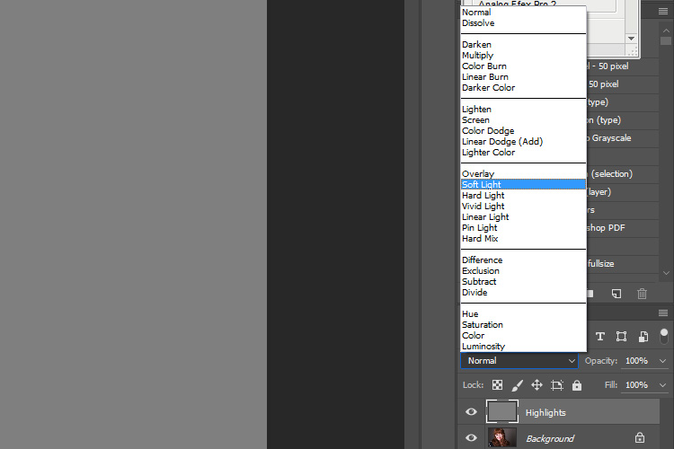
The next step is to change the blending mode of your gray layer. From the drop down menu in the layers palette, choose Overlay or Soft Light. Either choice is fine, but using Overlay will result in a far more pronounced effect than Soft Light. Experiment with both, see how it works for you, and which you prefer. Once the blending mode is changed, you should be able to see your image again.

dodging-and-burning-with-grey-layers-softlight

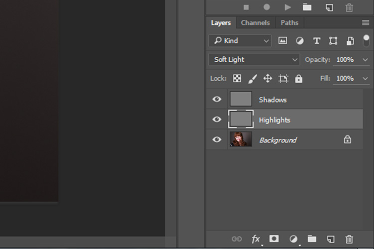
Next, create another new layer. Layer>New Layer or ctrl+shift+n and rename it to “Shadows”. Again, fill it with 50% gray. Edit>Fill>50% Gray or shift+f5

dodging-and-burning-with-grey-layers-layers

Set this layer’s blending mode to the same as the one you chose for your Highlight layer.

That’s the preparation work done. Once you’re used to it, this whole process only takes a few seconds. It’s also possible to set it up as an action, so Photoshop will do it for you at the press of a button.

Dodging

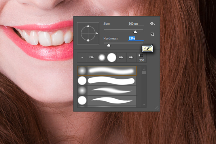
To start, select your Highlight layer and choose the brush tool. Pick a large, soft brush (Hardness number is low and edges are fuzzy). You can change the brush settings by right clicking within your image.

dodging-and-burning-with-grey-layers-brush

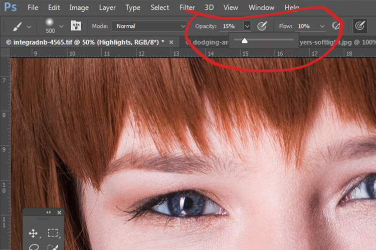
With the brush selected, look for the tool settings at the top of your screen. You’re looking for a pair of sliders labeled opacity and flow. Set your brush’s opacity to 15% and the flow to 10% (see below circled in red). You can change them later, but this is a good starting point.

dodging-and-burning-with-grey-layers-brushopacity

Make sure that your brush colors are set to white and black. You can press D (default) on your keyboard to do this. Also, you can press X to swap between them. Knowing these shortcuts will save you an incredible amount of time.

Now you’re ready to dodge.

Assuming you’re working on a portrait, find a highlight area on your subject’s skin that you would like to emphasize. With white set as your foreground color, paint into that area (make sure you are on the Highlight layer not your image). Because the brush’s opacity is so low, you may not notice a difference at first. Just keep brushing into it, and build up strokes until you have the desired effect. Do this for all of your highlight areas.

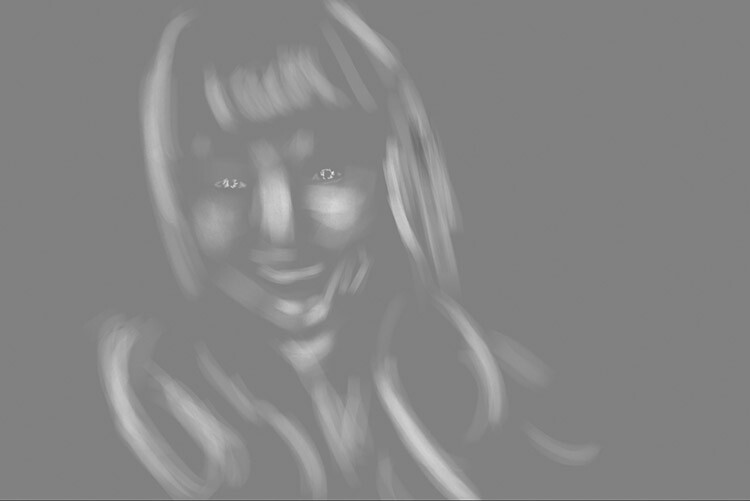
With the blending mode set to normal, your highlight layer may look something like this.

Note: If you decide that you’ve gone too far, just fill the layer with 50% gray again and start over.

Burning

With your highlights done, select your Shadow layer by clicking on it in the layer palette. Select black as your foreground color and paint into the shadows in the same manner you did for your highlights (make sure you are painting on the Shadow layer not your image).

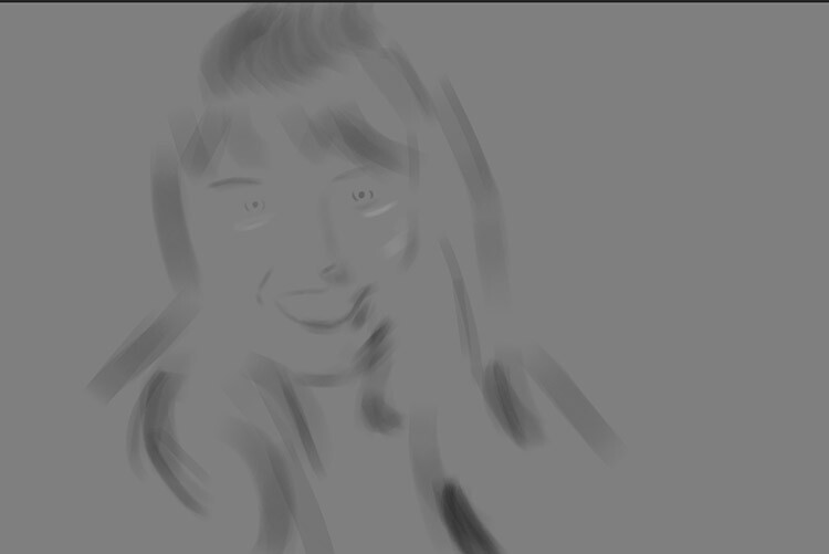
With the blending mode set to normal, your shadow layer may look something like this.

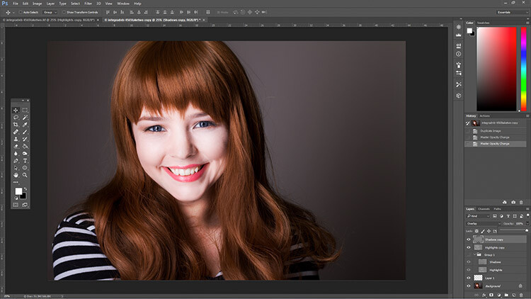
After dodging and burning is complete, you may have something that looks like this.

Add Gaussian Blur

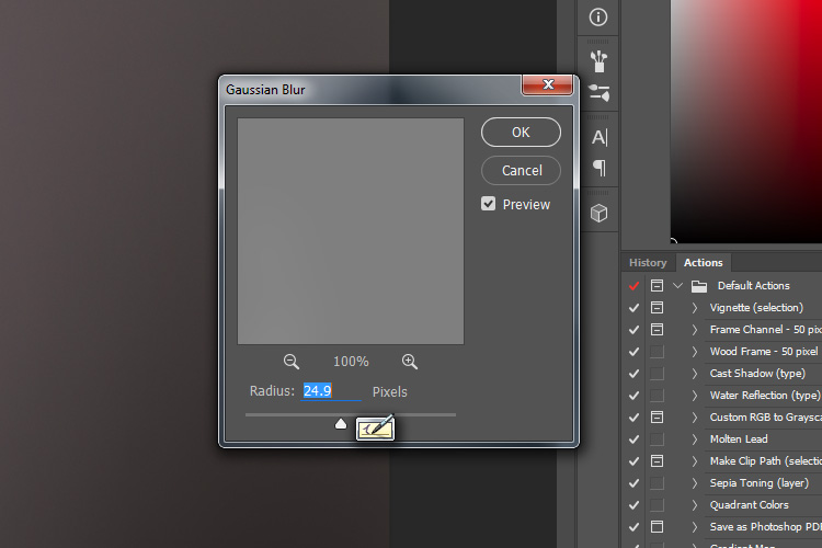
The next step is to smooth out your brush strokes. Select your Highlight layer and select Filter>Blur>Gaussian Blur. Choose an amount between 20 and 40 pixels, and press okay.

dodging-and-burning-with-grey-layers-gaussian

After the Gaussian Blur filter is applied.

Do the same for your shadow layer.

Final Steps

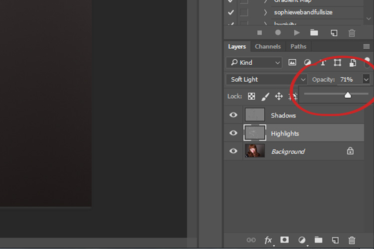
The last thing to do is is change the opacity of your layers. It may not seem like it, but at this point the effect is probably way too strong.

Select one of your painted layers. Find the opacity slider in the layer palette, and drag it to the left. Watch your image as you move the slider and stop once you’ve reached the desired effect.

dodging-and-burning-with-grey-layers-layeropacity

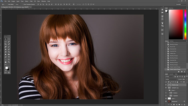
Do this for the second layer, and that’s it! You have dodged and burned.

The final image after the opacity of the dodge and burn layers has been reduced.

It's really easy to overcook an image with this technique. Use low opacity brush strokes and take your time to avoid having your images look like this one.

It’s really easy to overcook an image with this technique. Use low opacity brush strokes and take your time to avoid having your images look like this one.

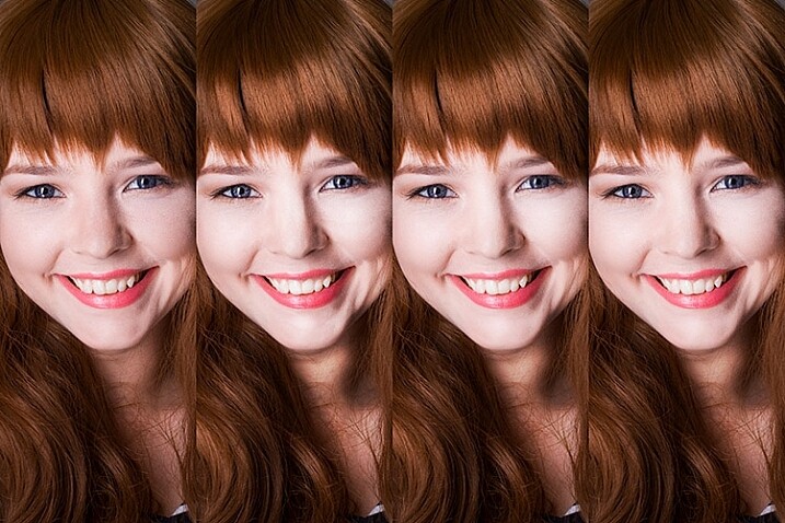
From Left to right: 1) Before 2) Dodge and burn with no blur. 3) Gaussian Blur filter applied. 4) Opacity of dodge and burn layers reduced.

Tips and Notes

  • Like most retouching techniques, subtlety is key. At first, overcooking your images with this technique is inevitable. Keep practicing and you’ll figure it out in no time.
  • Always zoom in to 100% or closer when working on small areas like eyes.
  • A graphics tablet will help with smooth, natural brush strokes. If you can only use a mouse or trackpad, experiment with more liberal use of Gaussian Blur to mask the brush strokes.
  • When painting shadows or highlights, try to match the light in the image. You can paint white (dodge) into your shadows, but this will probably look very strange in the end.
  • Change the brush size often, and appropriately, to the area you are working on. Keyboard shortcuts make this a breeze (use [ and ] to increase and decrease brush size).
  • Experiment with different brushes until you find one that suits your taste.
Before dodging and burning

Before dodging and burning

After dodging and burning

More Tips and Notes

  • It’s all too easy to concentrate on the face, but try not to forget other parts of the image like your subject’s hair, clothes, and the rest of their body.
  • Both dodging and burning can be done on a single gray layer. Feel free to do this, but the two layer technique grants you even more control, without much extra effort.
  • Consider setting up a keyboard shortcut for Gaussian Blur. This saves a lot of time.
  • You can create as many sets of gray layers as you want. For example, if you want to use very small brushes to dodge and burn the eyes, you might choose to do this on a separate set of layers in order to use less blur at the end. If you use a lot of layers sets like this, consider using layer groups to keep them organized and don’t forget to name your layers.
  • If the shadows and highlights you are working with have very hard edges, try using a harder brush and a lower amount of Gaussian Blur.
  • Consider watching and trying some digital painting and sketching tutorials for Photoshop. These can really help to increase your brush control and lend to more natural results.

googletag.cmd.push(function() {
tablet_slots.push( googletag.defineSlot( “/1005424/_dPSv4_tab-all-article-bottom_(300×250)”, [300, 250], “pb-ad-78623” ).addService( googletag.pubads() ) ); } );

googletag.cmd.push(function() {
mobile_slots.push( googletag.defineSlot( “/1005424/_dPSv4_mob-all-article-bottom_(300×250)”, [300, 250], “pb-ad-78158” ).addService( googletag.pubads() ) ); } );

The post How to Enhance Portraits Using Gray Layers to Dodge and Burn in Photoshop by John McIntire appeared first on Digital Photography School.

Digital Photography School

 
Comments Off on How to Enhance Portraits Using Gray Layers to Dodge and Burn in Photoshop

Posted in Photography


How to Use a Gray Card to Get More Accurate Exposures and Color

15 Jan
how-to-use-a-grey-card-1597

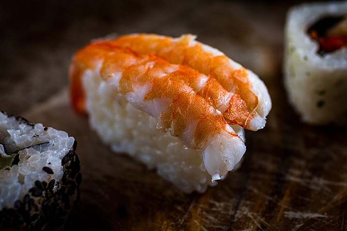
High contrast scenes with delicate colors can prove tricky for your camera’s meter and white balance settings.

If you’re familiar with the fundamentals of camera technique, then you know how much of an effect white balance can have on your images. Also, you probably have a basic understanding of how your camera’s meter works, or at least how to react to its output to change your settings appropriately.

Just beyond these basics, there are a few simple techniques that will allow you to fin- tune your white balance, and get more accurate meter readings from your subject. To take advantage of these techniques, you only need to add a single cheap piece of equipment to your camera bag: a gray card.

These humble accessories start at less than $ 10, yet the amount of control they give you over the final image, can be invaluable in tricky situations. For example, they allow you to obtain a good white balance reading from mixed light sources, or get an accurate exposure reading from your camera’s meter in a high contrast scene.

What is a gray card

A grey card is exactly what it says it is. A card that is gray. More specifically, it is middle gray, or 18% gray. This number is important because 18% gray is what your camera’s meter is trying to calculate when it meters to expose for a scene. This means if you put a grey card in front of your subject, and take a meter reading off it, you will get a correct exposure regardless of any tonal contrast in the scene.

Additionally, when used in conjunction with a camera’s custom white balance feature, you can manually set a perfect white balance for everything you photograph. This becomes especially important when you need to faithfully recreate colors in your images, whether that may be for commercial purposes or record shots.

Metering

The more useful of these two techniques is metering. In this case, a gray card is the closest thing you’ll get to a magic bullet that will allow you to get a near perfect exposure, in almost any situation.

Spot metering

To get started, the first thing you’ll want to do is to set your camera to the spot metering mode. While this is not absolutely necessary, the fact that the camera will only be metering from a small section in the centre of the frame will help a lot, especially in circumstances where you cannot fill the entire frame with the gray card. It will also save you a lot of time if you use manual mode.

Metering

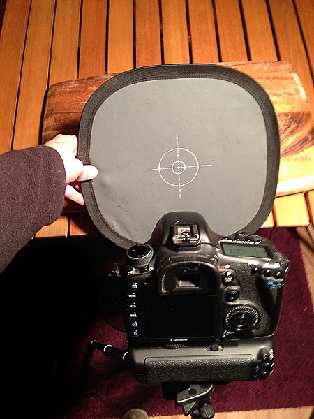
With your metering mode changed, all that you have to do now, to take advantage of this technique, is put the gray card in your scene, point the centre of the frame at it, dial in the exposure your meter gives you and then just take the gray card away. Providing that the light doesn’t change, you will now have an accurate exposure for any subsequent shots that you take in this setup.

Taking a meter reading with a grey card.

Taking a meter reading with a gray card.

Hints

There are a few things can do that will make this process easier and more accurate.

First, you should make sure that your subject remains in a similar position relative to the light source, from where you took your gray card reading. For example, if you’re taking headshots outdoors and the sun is lighting your subject from the front; that is one exposure reading. If you turn your subject to the side, or completely around, that will affect your exposure and you will need to take another reading.

The second tip is when you’re taking the exposure reading; fill the frame with the grey card as much as possible. This will help to ensure that your meter is only trying to expose for the card, and not anything around the edges.

White balance

Although the basic white balance settings in cameras can be pretty good, they do tend to struggle at times. For example, tungsten bulbs can vary greatly in color temperature, depending on their quality and power output. This may lead to the basic tungsten setting on your camera failing to give you an accurate representation of colors.

There are two ways to use a gray card to set your white balance. The first is to use it to set your camera’s custom white balance. The second method will allow you to use Lightroom to set a white balance for your images after they have been taken. You can also use Adobe Camera Raw (inside Photoshop) if you don’t have Lightroom.

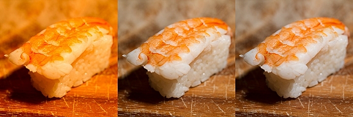
Shifts in White Balance - Left: Daylight Center: Tungsten Right: Custom

Shifts in White Balance – Left: Daylight – Center: Tungsten – Right: Custom

In-camera custom white balance

The technique described here is for Canon users. If you use Nikon, Sony, or any other brand, you will need to consult your manual for instructions on setting a custom white balance.

  • Step 1:  Take a photo of your grey card, ensuring that it fills the frame entirely. Try to make sure that it is flat in the frame and that it is lit evenly, and in the same way as your subject.
  • Step 2: Open the camera’s menu and find the option labeled “Custom White Balance” (or Custom WB). Press the select button and choose the photo of your gray card. Press select again and you have set your custom white balance. Set the camera’s white balance to use the new custom setting and start taking photos.

how-to-use-a-grey-card-canon

If something in your scene changes, such as the lighting, just repeat the steps above and all of your images should have an accurate white balance.

Post-production custom white balance

how-to-use-a-grey-card-1626

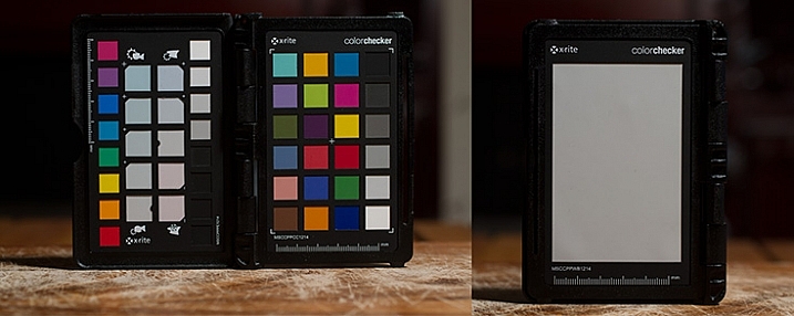
The ColorChecker Passport offers even greater control over white balance, and also has a section for setting a custom white balance in-camera.

For the post-production option, the only thing you need to do with your camera is to take a photo of your gray card in all of the scenes that you’re photographing. It may help with organization if you start off any sequence of photos with the gray card image. This way, you will always know which image to use to take a white balance setting from.

Once you’re on the computer, and have your images loaded into Lightroom, the steps are quite straightforward:

  • Step 1: Select the photo of a gray card that you want to take a white reading, from and enter the develop module.
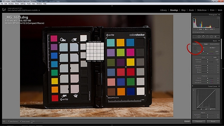
  • Step 2: Select the eyedropper tool that’s next to the White Balance sliders in the right hand panel, and click anywhere on the image of the grey card. You should now have an accurate white balance setting.

how-to-use-a-grey-card-lightroom-1

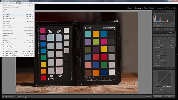
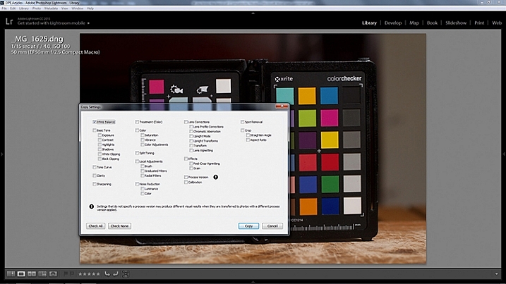
  • Step 3: In Lightroom, to copy your settings, press ctrl+shift+c (CMD+C on Mac) and check the White Balance boxes. Leave all of the other boxes unchecked.

how-to-use-a-grey-card-lightroom-2

how-to-use-a-grey-card-lightroom-4

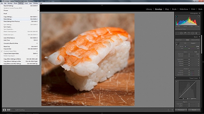
  • Step 4: In Lightroom, select all of the photos you want to correct (using the filmstrip at the bottom) the white balance on and press ctrl+shift+v (Cmd+V on Mac). Now all of photos you took should have a corrected white balance.

how-to-use-a-grey-card-lightroom-3

Summary

All of the techniques outlined here are simple, and not very time consuming, yet the amount of extra control they give you over your camera makes a gray card one of the most cost effective accessories in any camera bag.

Have you used one before? Do you have any other tips to add? Please share that or any questions you have below.

googletag.cmd.push(function() {
tablet_slots.push( googletag.defineSlot( “/1005424/_dPSv4_tab-all-article-bottom_(300×250)”, [300, 250], “pb-ad-78623” ).addService( googletag.pubads() ) ); } );

googletag.cmd.push(function() {
mobile_slots.push( googletag.defineSlot( “/1005424/_dPSv4_mob-all-article-bottom_(300×250)”, [300, 250], “pb-ad-78158” ).addService( googletag.pubads() ) ); } );

The post How to Use a Gray Card to Get More Accurate Exposures and Color by John McIntire appeared first on Digital Photography School.

Digital Photography School

 
Comments Off on How to Use a Gray Card to Get More Accurate Exposures and Color

Posted in Photography


Photo prodigy: The images of 17-year-old Taylor Gray

17 Oct

Taylor Gray may be young, but he’s serious about photography. After taking a borrowed DSLR on a backpacking trip, Gray was hooked on photography and found a new love for adventure and travel. See some of the young photographer’s work. Read more

Articles: Digital Photography Review (dpreview.com)

 
Comments Off on Photo prodigy: The images of 17-year-old Taylor Gray

Posted in Uncategorized


Setting Your White Balance with a Gray Card – a Tip from Phil Steele

15 Dec

Setting your white balance can be done two ways: in camera when you’re shooting or later in post-processing. In this short video tutorial Phil Steele shows you how to do both methods.

Part one is using a gray card to set a custom white balance. Read more about that topic with: Get your White Balance Right in Seconds Using Grey Card.

Part two is how to adjust the white balance using a gray card in Lightroom. Read more here: Adjusting White Balance in Lightroom.

Phil also mentioned where to buy gray cards, you can find several options on Amazon:

If you liked this tip, you can find out more about Phil’s Lightroom course or his brand new Event Photography course here.

googletag.cmd.push(function() {
tablet_slots.push( googletag.defineSlot( “/1005424/_dPSv4_tab-all-article-bottom_(300×250)”, [300, 250], “pb-ad-78623” ).addService( googletag.pubads() ) ); } );

googletag.cmd.push(function() {
mobile_slots.push( googletag.defineSlot( “/1005424/_dPSv4_mob-all-article-bottom_(300×250)”, [300, 250], “pb-ad-78158” ).addService( googletag.pubads() ) ); } );

The post Setting Your White Balance with a Gray Card – a Tip from Phil Steele by Darlene Hildebrandt appeared first on Digital Photography School.

Digital Photography School

 
Comments Off on Setting Your White Balance with a Gray Card – a Tip from Phil Steele

Posted in Photography


D300s Custom White Balance with 18% Gray Card

16 Dec

D300s Custom White Balance with 18% Gray Card

 
Comments Off on D300s Custom White Balance with 18% Gray Card

Posted in Nikon Videos


Darkening Gray Hair

06 Aug

Photoshop Tutorial


3d test gray anaglyph

10 Feb

3d test gray anaglyph. 1 of 4 test to check quality
Video Rating: 4 / 5

 
7 Comments

Posted in 3D Videos