RSS
 

Posts Tagged ‘Graphic’

How to Use Low Graphic Style as a Compositional Tool

05 Jul

In the never-ending search to improve photographic skills, it’s important to push the limits and try projects that push you outside your comfort zone. That’s why a project that involves studying and creating images using low graphic style is an important undertaking that can help to stretch the imagination and push your photography skills to another level.

Low graphic style is not often discussed, but it is worth exploring. The elements of low graphic style often contradict the formal rules of photography. The big question, however, begins with a definition for low graphic style or rather a discussion of the psyche behind creating this style of image.

Low graphic style evolved as a reaction to traditional composition rules and ideas found in photography.

How to Use Low Graphic Style as a Compositional Tool - b/w street scene

This image presents a typical eye level view of a city street in Montreal.

How to Use Low Graphic Style as a Compositional Tool - silhouette at dusk

Compare this image to the one above. Here the horizon is centered but the bold colors and the deep shadows of the silhouettes definitely add some bold graphic elements to the picture.

Low graphic style attempts to create an image that is free of manipulation. The goal is to create an image that shows the plain truth which could have been altered by the use of traditional compositional rules. Whether low graphic style achieves this goal is a philosophical discussion is not suited to this article, but the basic elements of low graphic style should be studied like any other style of photography and understood to push your photography skills to a higher level.

It’s impossible to attempt to photograph in a certain style without completely understanding the elements that make a photograph fall into the realm of low graphic style. So without wasting any more time let’s compare low graphic to the more common high graphic style.

1) Static Balance

Static balance is in contrast to the Rule of Thirds. The idea is that the photographer focuses on creating compositions that utilize symmetrical compositions. The photographer also avoids including dynamic elements like diagonals which might add energy to the image.

2) Square frames and centered horizon lines

The use of a square frame or placing the horizon on the midline instead of alone one of the 3rd lines also helps to create an image that is far more in line with low graphic style.

3) A feeling of passivity

Images which fall into the realm of low graphic style often feel very soft or passive. You won’t find an image in this realm which depicts intense emotions. An image of a group of people running aggressively through the street will not fit into low graphic style.

How to Use Low Graphic Style as a Compositional Tool - b/w of a boy in the road

With the exception of the diagonal shadow, the image fits well into low graphic style. The boy is centered in the frame and the focal length is 50mm. There’s no feeling of movement so a sense of passivity is present within the photo.

How to Use Low Graphic Style as a Compositional Tool - b/w portrait of a woman with sunglasses

Consider the look and feel of this portrait in comparison to the one above. There are many differences and a huge contrast in the effect each image has on the viewer.

4) Normal focal lengths

Typically images that utilize low graphic style use normal focal lengths that mimic the normal range of the eye. Focal lengths like 15mm won’t be used when creating low graphic style photos.

5) Bland colors

Bold bright colors and high contrast are out when trying to achieve a low graphic look. Keep the colors bland and the contrast minimal. The goal is subtlety, not boldness.

How to Use Low Graphic Style as a Compositional Tool - low contrast image

In this image, there’s very little contrast. Also, the colors and lighting are flat. The idea is to plainly portray this hillside without attempting to add emotion or drama.

6) Monochrome

Focusing on black and white conversions will remove any of the emotional content that colour often provides to an image.

monochrome image of Montreal - How to Use Low Graphic Style as a Compositional Tool

Monochromatic images help to remove any emotions that could be evoked by colors.

7) Repetition

Using repeated patterns helps to reduce the possibility of evoking emotion with an image. Also, images that utilize one uniform texture can be considered low graphic style.

rock pattern on a roadway or path - How to Use Low Graphic Style as a Compositional Tool

In this image, we hit several elements of low graphic style. The image is monochrome, depicts a uniform pattern and texture throughout.

Conclusion

Low graphic style might not be for everyone. It suits the aesthetic taste of many, but there are those of us who love bold colors and bright emotional images. There are those of us who love constructed images that push the boundaries of reality.

Whatever style you prefer, trying something out of your comfort zone is never a bad thing. For those who love this look in their photography, by all means, share with us your tips of the trade. We want to hear all about the differences between high graphic style and low graphic style.

How to Use Low Graphic Style as a Compositional Tool - parking garage in b/w

The simple flat view of a parking garage ticks off many of the compositional elements of low graphic style.

The post How to Use Low Graphic Style as a Compositional Tool appeared first on Digital Photography School.


Digital Photography School

 
Comments Off on How to Use Low Graphic Style as a Compositional Tool

Posted in Photography


Downloadable Deco: Art Archive Puts 200 Graphic Design Classics Online

09 Aug

[ By WebUrbanist in Technology & Vintage & Retro. ]

Some great institutions are becoming even greater in the digital age — places like museums continue to scan high-quality paintings and photographs for distribution and agencies like NASA put vintage pictures and video footage online for everyone to access.

Joining the cool kids’ club, the Minneapolis College of Art and Design (MCAD) has taken its Art of the Poster collection from the Golden Age of graphic design (late 1800s through the early 1900s) and put it up on the web for anyone to share.

“Featuring over 200 printed works, Art of the Poster 1880-1918 presents a look at lithography’s rise in popularity during La Belle Époque,” reports MyModernMet. “It was during this time that artists like Alphonse Mucha, Jules Chéret, and Henri de Toulouse-Lautrec popularized the art form, which gained public prominence thanks to new methods of production.”

In the late nineteenth century, lithographers began to use mass-produced zinc plates rather than stones in their printing process. This innovation allowed them to prepare multiple plates, each with a different color ink, and to print these with close registration on the same sheet of paper. Posters in a range of colors and variety of sizes could now be produced quickly, at modest cost.

At the time, many of these masterpieces were essentially commercial in nature, designed to promote products, stores and restaurants. Today, they have made their way into the archives of art history, helping to bridge the gap between popular culture and the closed-door art world of museum exhibits.


Share on Facebook


[ By WebUrbanist in Technology & Vintage & Retro. ]

[ WebUrbanist | Archives | Galleries | Privacy | TOS ]


WebUrbanist

 
Comments Off on Downloadable Deco: Art Archive Puts 200 Graphic Design Classics Online

Posted in Creativity


Photographer’s Guide to Using Graphic Tablets for Lightroom Editing

24 Nov

There are several gadgets we can use to improve our performance in Adobe Lightroom, if our intent is to post-produce images quickly and neatly with professional results. However, there is no better tool for a talented photographer than a good graphic tablet. Read on to learn how a graphic tablet can be used with Adobe Lightroom and how it can Continue Reading

The post Photographer’s Guide to Using Graphic Tablets for Lightroom Editing appeared first on Photodoto.


Photodoto

 
Comments Off on Photographer’s Guide to Using Graphic Tablets for Lightroom Editing

Posted in Photography


24 Architecture Images with Graphic Powerful Lines

25 Apr

Architecture photographers strive to get the lines all perfectly straight and up and down. But sometimes converging lines, or bending ones can create more powerful images.

Note: Check out our Using Lines in Your Photography series for more on this topic.

Let’s have a look at some architecture images that have graphic, powerful lines which are not always straight:

Photograph blackbox by markus studtmann on 500px

blackbox by markus studtmann on 500px

Photograph The Haunting by Michael Woloszynowicz on 500px

The Haunting by Michael Woloszynowicz on 500px

Photograph Manhattan Tower in Paris La Défense by Julien Batard on 500px

Manhattan Tower in Paris La Défense by Julien Batard on 500px

Photograph The Lightscraper by  M. Rafiee on 500px

The Lightscraper by M. Rafiee on 500px

Photograph Curvation by Aaron Yeoman on 500px

Curvation by Aaron Yeoman on 500px

Photograph Illumination XXV by Roland Shainidze on 500px

Illumination XXV by Roland Shainidze on 500px

Photograph Symphony of Lines by Roland Shainidze on 500px

Symphony of Lines by Roland Shainidze on 500px

Photograph Curve II by Roland Shainidze on 500px

Curve II by Roland Shainidze on 500px

Photograph SPACE WARP by SEPEHR GHASSEMI on 500px

SPACE WARP by SEPEHR GHASSEMI on 500px

Photograph Time's up by Julien Delaval on 500px

Time's up by Julien Delaval on 500px

Photograph Butterflies by Alfon No on 500px

Butterflies by Alfon No on 500px

Photograph From the 80th Floor (2) by PhotonPhotography -Viktor Lakics on 500px

From the 80th Floor (2) by PhotonPhotography -Viktor Lakics on 500px

Photograph *Telepathy* by Manita Goh on 500px

*Telepathy* by Manita Goh on 500px

Photograph Real world Tetris by Beboy Photographies on 500px

Real world Tetris by Beboy Photographies on 500px

Photograph Staircase by Sus Bogaerts on 500px

Staircase by Sus Bogaerts on 500px

Photograph *Visual Resonance #3* by Manita Goh on 500px

*Visual Resonance #3* by Manita Goh on 500px

Photograph Vertiginous by Daniel Cheong on 500px

Vertiginous by Daniel Cheong on 500px

Photograph Pure by Sébastien DEL GROSSO on 500px

Pure by Sébastien DEL GROSSO on 500px

Photograph The Stanley by Benjamin van der Spek on 500px

The Stanley by Benjamin van der Spek on 500px

Photograph Lines by Mason Noteboom on 500px

Lines by Mason Noteboom on 500px

Photograph Let there be light! by PK  on 500px

Let there be light! by PK on 500px

Photograph shell by Christian Richter on 500px

shell by Christian Richter on 500px

Photograph Sexy by Grant Orbeta on 500px

Sexy by Grant Orbeta on 500px

Photograph Black and White by Mike Orso on 500px

Black and White by Mike Orso on 500px

googletag.cmd.push(function() {
tablet_slots.push( googletag.defineSlot( “/1005424/_dPSv4_tab-all-article-bottom_(300×250)”, [300, 250], “pb-ad-78623” ).addService( googletag.pubads() ) ); } );

googletag.cmd.push(function() {
mobile_slots.push( googletag.defineSlot( “/1005424/_dPSv4_mob-all-article-bottom_(300×250)”, [300, 250], “pb-ad-78158” ).addService( googletag.pubads() ) ); } );

The post 24 Architecture Images with Graphic Powerful Lines by Darlene Hildebrandt appeared first on Digital Photography School.


Digital Photography School

 
Comments Off on 24 Architecture Images with Graphic Powerful Lines

Posted in Photography


Automotive Acid Trip: The Graphic 3D Art Of Chris Labrooy

08 Dec

[ By Steve in Art & Drawing & Digital. ]
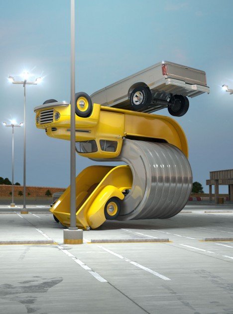
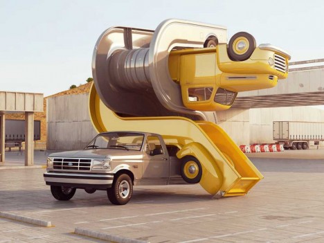
Chris-Labrooy-Ford-truck-graphic-art-interlock-1a
Chris Labrooy loves vintage vehicles, but with a twist: the digital artist’s far-out 3D illustrations are an automotive acid trip into the 4th dimension.
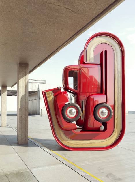
Chris-Labrooy-Ford-truck-graphic-art-interlock-2

Born in Aberdeen, Scotland, Chris Labrooy graduated from the Royal College of Art in London and embarked on a prolific career in the graphic arts medium. His expansive and growing body of work has brought him international recognition; chiefly for his automotive-themed folios titled “Tales Of Auto Elasticity” and “Auto Aerobics”.

Chris-Labrooy-truck-graphic-art-Ford-F1-pickup

Labrooy pays homage to the singular style expressed by vintage vehicles such as the red Ford F1 “Woody” pickup above. While the comparatively primitive paint technology employed by automakers over a half century ago had its drawbacks, Labrooy’s digital graphic illustrations bring out the best in these vehicles’ rich, deep, non-metallic hues.

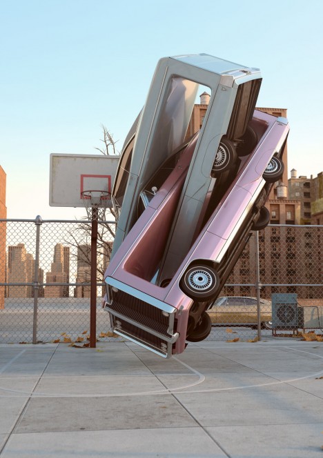
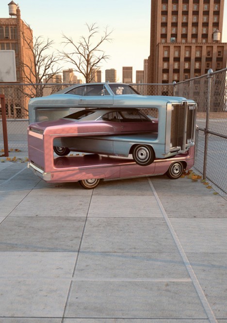
Chris-Labrooy-car-truck-graphic-art-auto-aerobics-pink1

Chris-Labrooy-car-truck-graphic-art-auto-aerobics-pink2

One wonders whether Labrooy was influenced by Mike Ross’s Big Rig Jig, an interactive construction made from two actual 18-wheelers displayed at the 2007 Burning Man festival – check out this video. Not that it matters; while Big Rig Jig explored one facet of modern society’s fascination with the automobile, works such as Labrooy’s Auto Aerobics series shake, rattle & roll our perceptions in a way only made possible through creative 3D modeling and state-of-the-art digital graphics techniques.

Next Page – Click Below to Read More:
Automotive Acid Trip The Graphic 3d Art Of Chris Labrooy

Share on Facebook


[ By Steve in Art & Drawing & Digital. ]

[ WebUrbanist | Archives | Galleries | Privacy | TOS ]


WebUrbanist

 
Comments Off on Automotive Acid Trip: The Graphic 3D Art Of Chris Labrooy

Posted in Creativity


Graphic Stock’s 7-Day Free Download Extravaganza

28 Apr

As a photographer—whether an amateur or a pro—you know that you can more than appreciate having a huge supply of stock images ready to use. You usually never know when they can come in handy, but you know well how they can come in handy, more than you think. That’s why it’s a comforting thought to realize that Graphic Stock Continue Reading

The post Graphic Stock’s 7-Day Free Download Extravaganza appeared first on Photodoto.


Photodoto

 
Comments Off on Graphic Stock’s 7-Day Free Download Extravaganza

Posted in Photography


Philography: Complex Philosophy Meets Graphic Simplicity

24 May

[ By WebUrbanist in Design & Graphics & Branding. ]

philosophy postcard simplified designs

The bigger the idea, the harder to understand, let alone distill. That is the idea and challenge  behind this growing set of graphic designs that seek to capture big ideas in simple shapes and single-sentence explanations.

philosophy flash cards simplified

Dubbed Philographics by their creator,  Genís Carreras, the original set contained just 24 designs, but has grown into a series of 95 (so far). Idealism, Dualism, Existentialism – if you can think of an ‘ism’ from philosophy, you can almost certainly find it represented here.

philosophy isms summary poster

And consider the alternative, hundreds, thousands, maybe tens of thousands of words in the dictionary definitions of such terms – a great way to flesh out your knowledge, but hardly the place to get started.

philosophy posters graphic designs

In fact, philosophy schools often force students to better understand philosophers and philosophies by condensing and summarizing – having to articulate long thoughts in short form helps the brain process and codify that information.

philosophy tongue in cheek

As for the forms these are taking: the Kickstarter project (funded at nearly four times the initial goal) has been such a success that what started as posters has branched into postcards and, in pre-production, softcover,  hardcover and electronic book editions as well.

Share on Facebook


[ By WebUrbanist in Design & Graphics & Branding. ]

[ WebUrbanist | Archives | Galleries | Privacy | TOS ]


WebUrbanist

 
Comments Off on Philography: Complex Philosophy Meets Graphic Simplicity

Posted in Creativity


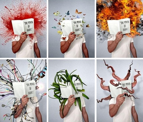
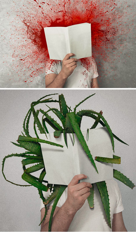
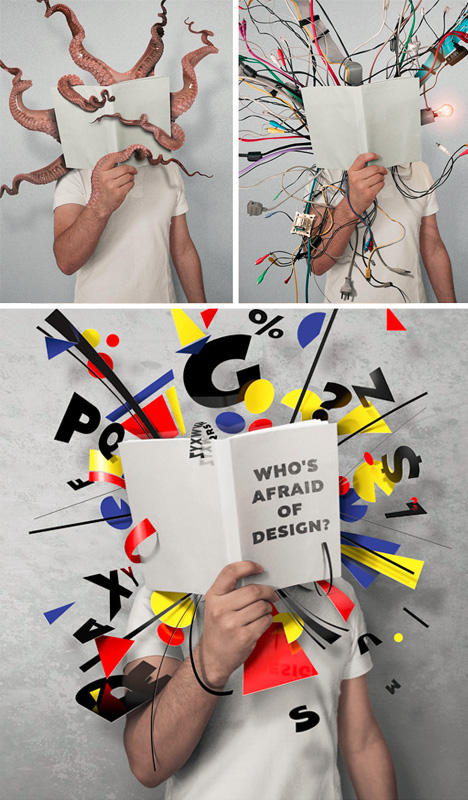
Power of Books: 6 Graphic Illustrations of Literal Imaginings

10 Jan

[ By WebUrbanist in Art & Photography & Video. ]

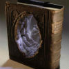
book graphic art project

Ever get done reading a chapter and feel like the book is more real than the room around you? Now, what if that were literally true of your favorite volume? What might that look like?

books power of art

Mladen Penev does photography, retouching, but also takes some liberties that go beyond mere editing, like this series entitled the Power of Books, which gives graphic reality to the imaginations of authors and readers.

book powers graphic series

This award-winning Bulgarian artist has graduated from the University of Applied Arts in Vienna, working in various internships, putting up exhibitions and participating in publications ever since – would would have guessed his love of books?

Share on Facebook


[ By WebUrbanist in Art & Photography & Video. ]

[ WebUrbanist | Archives | Galleries | Privacy | TOS ]


WebUrbanist

 
Comments Off on Power of Books: 6 Graphic Illustrations of Literal Imaginings

Posted in Creativity


Free seamless graphic pattern for Friday, 24 July 2009

16 Dec

Some cool visual art images:

Free seamless graphic pattern for Friday, 24 July 2009
visual art
Image by bonojerry
A grey and white motif, visual jazz improvisation…

Gwen Lux, American sculptor and designer, 1908-1986, in her studio
visual art
Image by Smithsonian Institution
Description: Gwen Lux was a sculptor, designer, lecturer, writer and teacher. Her sculptures combined abstraction and realism, and were usually constructed from polyester resin concrete and metals. She taught sculpture at the Arts & Crafts Society of Detroit.

Creator/Photographer: Peter A. Juley & Son

Medium: Black and white photographic print

Dimensions: 8 in x 10 in

Culture: American

Persistent URL: http://photography.si.edu/SearchImage.aspx?id=5832

Repository: Smithsonian American Art Museum, Photograph Archives

Collection: Peter A. Juley & Son Collection – The Peter A. Juley & Son Collection is comprised of 127,000 black-and-white photographic negatives documenting the works of more than 11,000 American artists. Throughout its long history, from 1896 to 1975, the Juley firm served as the largest and most respected fine arts photography firm in New York. The Juley Collection, acquired by the Smithsonian American Art Museum in 1975, constitutes a unique visual record of American art sometimes providing the only photographic documentation of altered, damaged, or lost works. Included in the collection are over 4,700 photographic portraits of artists.

Accession number: J0001886

Starting a pour
visual art
Image by bettlebrox
Mass Art’s Spring 2009 Iron Pour.

www.eworksfestival.com/index.php?page=events/4_10
The Iron Pour has a strong history at Massachusetts College of Art, beginning as a fundraiser for the Metals Department, it has grown into a celebration of art, music, and performance. Recently, the Iron Corps., the group that organizes the event, has been working in conjunction with Eventworks, who will be kicking off their annual Art Festival. This spring, we will be invoking themes of outer space and the explosive demise of stars and planets . Aside from the spectacular sculptural performances by the Iron Corps. , activities will include face painting, fire dancing, visual shows, and four musical acts throughout the course of the night.

 
Comments Off on Free seamless graphic pattern for Friday, 24 July 2009

Posted in Photographs


Architecture Gets Graphic: 13 Ornamental Building Designs

22 Oct

[ By Steph in Architecture & Public & Institutional. ]

Modern architecture is not exactly known for being ornamental, but some architecture firms are beginning to pick away at the close association of modernism and minimalism. Led by Herzog & De Meuron, many practices have begun pulling bold, graphic and sometimes typographic elements into their building designs. Here are 13 examples of ornamental modern architecture.

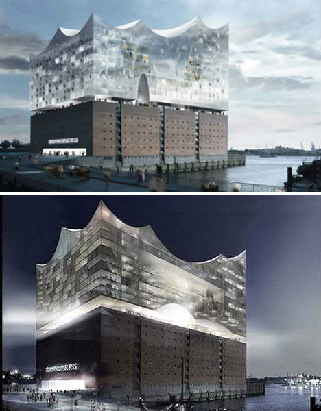
Elbe Philharmonic Hall by Herzog & De Meuron

(images via: design boom)

Architecture firm Herzog & De Meuron is one of the main forces bringing some ornamentation back into modern architecture, and the Elbe Philarmonic Hall is a prime example. This concert hall, hotel and apartment complex in Hamburg, Germany looks like a wave shooting up out of the river, blending with its surroundings yet at the same time, standing out as a dramatic glassy pinnacle in the landscape. The building is currently under construction and expected to be completed soon.

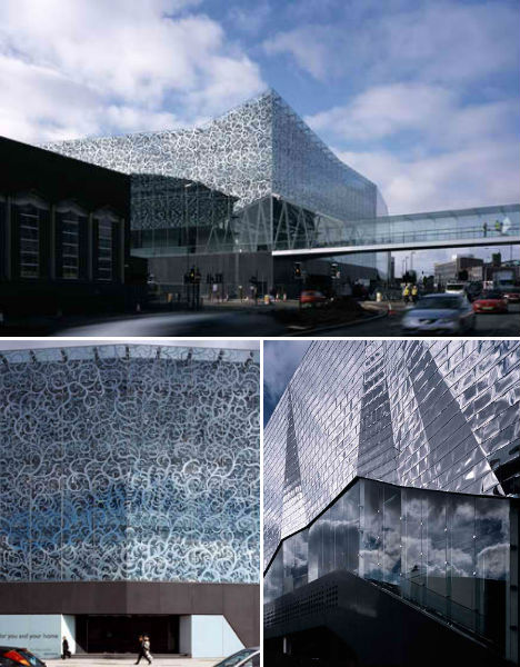
John Lewis Department Store and Cineplex, UK

(images via: archinect)

A shimmering geometric silver facade meets glass printed with a beautiful abstracted vine print at the John Lewis Department Store and Cineplex by Foreign Office Architects. The glass allows light to stream into the store section of the building, while the monolithic back end keeps the theaters dark. The design on the glass pays tribute to Leicester’s textile heritage as well as that of the department store.

Lycee Louis Bleriot Extension, France

(images via: archdaily)

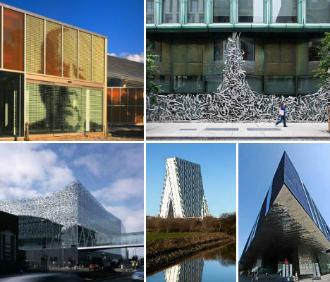
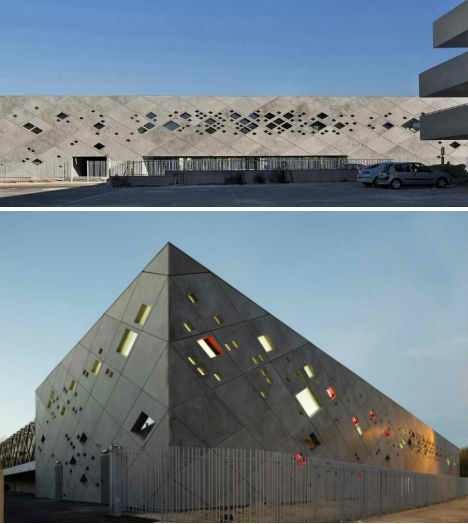
What could be an extraordinarily harsh, brutalist concrete rectangle is livened up considerably by a perforation of small diamond-shaped windows. The Lycee Louis Bleriot Extension by Christphe Gulizzi is a gymnasium that had to fit into a very limiting plot.

Scottish Parliament Building by Miralles Tagliabue EMBT, UK

(images via: galinksy)

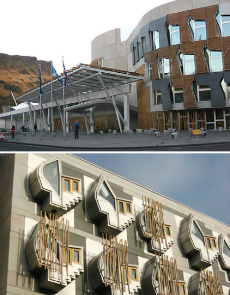
Divisive and eclectic, the Scottish Parliament Building certainly doesn’t shy away from complexity. Designed by EMBT (Enric Miralles and Benedetta Tagliabue), the building cost an astonishing $ 750 million to construct and is ‘metaphorical’ in design. Explains Miralles, “The Parliament sits in the land. We have the feeling that the building should be land, built out of land. To carve in the land the form of gathering people together… Scotland is a land… The land itself will be a material, a physical building material…”

Tate Modern Expansion by Herzog & De Meuron, UK

(images via: dezeen)

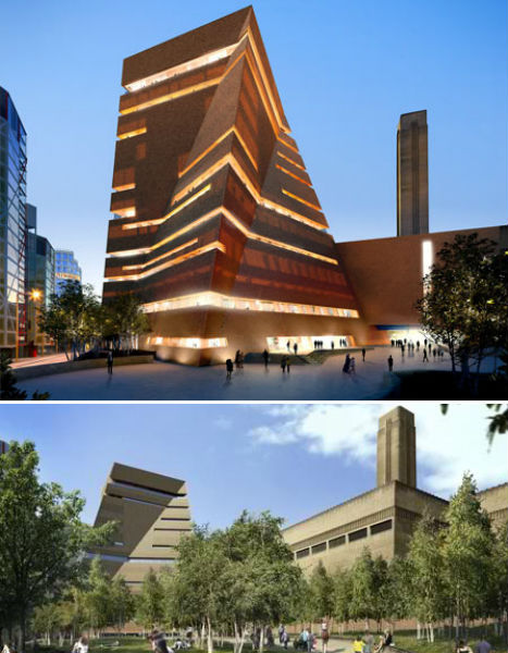
Herzog & De Meuron’s extension to the Tate Modern art museum in London will add a new wing, as well as converting underground tanks previously used to store oil for a former power station into new gallery space. The main volume of the extension resembles a conventional rectangular building shape that has been twisted and skewed.

Art’otel Hoxton by Squire and Partners, UK

(images via: archiscene)

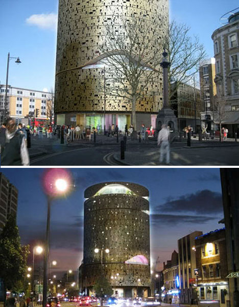
Squire and Partners designed the flagship hotel of Art’otel in London as a gold column covered in a perforated facade full of abstract patterns and rounded cut-outs that make the whole structure shimmer at night.

Forum by Herzog & De Meuron, Spain

(images via: arcspace)

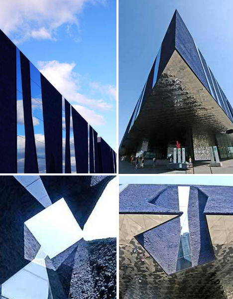
Jutting above a public square like the bow of a massive ship, ‘Forum’ is an elevated triangular structure in Barcelona that invites the public into its reflective silver underbelly. Though the building looks darka nd intimidating approach, it holds a series of courtyards open to the sky that bring in light.

Bella Sky Hotel by 3XN Architects, Denmark

(images via: design boom)

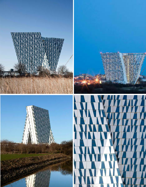
In both its shape and in the complimentary pattern of windows on its exterior, the Bella Sky Hotel by 3XN Architects looks almost typographic. Newly open in Copenhagen, the hotel consists of two asymmetrical towers and looks entirely different depending on your vantage point.

40 Bond by Herzog & De Meuron, NYC

(images via: archdaily)

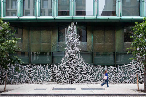
The standout feature on Herzog & De Meuron’s 40 Bond luxury residence in New York City is unquestionably this graffiti-inspired gate. A one-bedroom apartment in this building reportedly costs $ 18,000 a month.

C42 Citroen Flagship Showroom by Manuelle Gautrand Architecture, France

(images via: openbuildings)

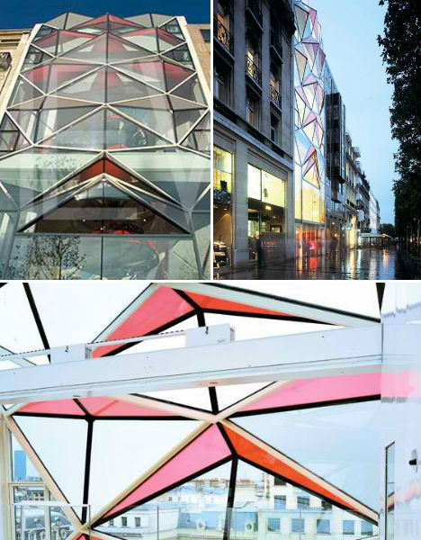
Diamond-shaped glass in soft shades of pastel pink that compliment the golden light streaming out of the interior characterize the new Citroën showroom on Champs Elysées in Paris. Once inside, that pink turns to red. Say the architects, “We originally conceived the use of red, the brand’s signature colour, in the glass panels but we decided it would be too bright from the outside. There were some concerns about the building not harmonising with its neighbours on the Champs Elysées, so we’ve created a filter that on first sight, masks the red colour from the exterior. This totally original filter, which is cleverly constructed inside the finished glass, also minimises the heat of the sun passing through, and will also create a diaphanous pearly white atmosphere inside the building.”

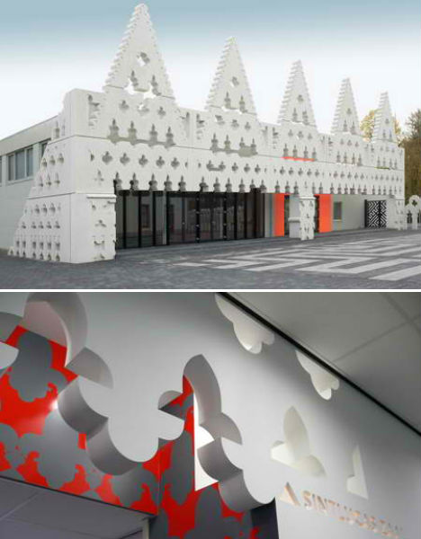
Sint Lucas Art Academy by Fashion Architecture Taste, Netherlands

(images via: dezeen)

A 1960s building was given a dramatic makeover with a decorative facade inspired by both Dutch gables and the Doge’s palace in Venice, Italy. Architecture firm ‘Fashion Architecture Taste’ gave the Sint Lucas Art Academy an entirely new visual identity.

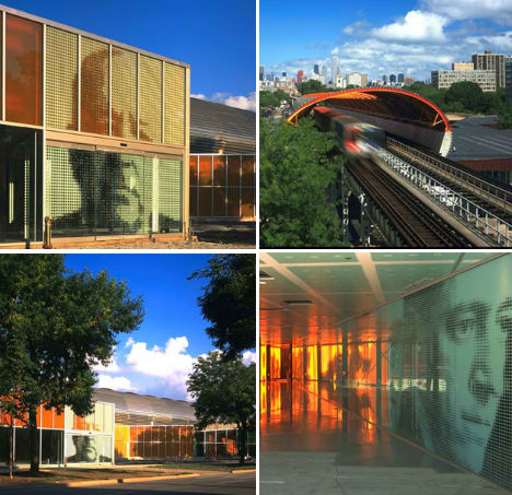
McCormick Tribune Campus Center by OMA, U.S.

(images via: arcspace)

Working around a pre-existing elevated railway, OMA/Rem Koolhaas created a sound-isolating stainless steel tube that would form the basis of the McCormick Tribune Campus Center expansion at the Illinois Institute of Technology. The campus was originally designed by Mies Van der Rohe, whose portrait is emblazoned large on exterior and interior walls.

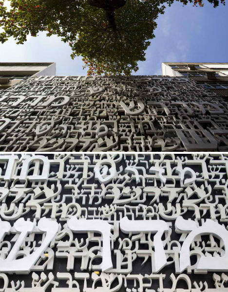
Midrash by Isay Weinfeld, Brazil

(images via: openbuildings)

Designed to house the Jewish Congregation of Brazil, the Midrash Building by Isay Weinfeld in Rio de Janeiro has a fiberglass mesh facade made up of Hebrew words.

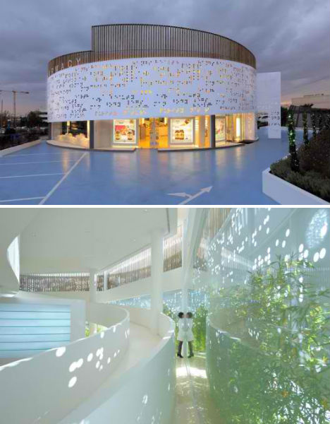
Placebo Pharmacy by Klab Architects, Greece

(images via: archdaily)

The shape and decorative elements of Placebo Pharmacy by KLab is about as far from Walgreens as you can get. In this case, the perforated mesh facade on the exterior is covered in braille.


Want More? Click for Great Related Content on WebUrbanist:

15 Cool High School, College and University Building Designs

If only more school buildings were as creatively designed as these 15, perhaps attendance rates would be higher.
32 Comments – Click Here to Read More »»


Black Buildings: 15 Examples of Monochromatic Architecture

These 15 buildings are brave and bold in solid black, from modern private residences to museums and offices.
Click Here to Read More »»


Share on Facebook


[ By Steph in Architecture & Public & Institutional. ]

[ WebUrbanist | Archives | Galleries | Privacy | TOS ]


WebUrbanist

 
Comments Off on Architecture Gets Graphic: 13 Ornamental Building Designs

Posted in Creativity