[ By Steph in Architecture & Public & Institutional. ]
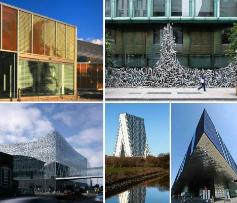
Modern architecture is not exactly known for being ornamental, but some architecture firms are beginning to pick away at the close association of modernism and minimalism. Led by Herzog & De Meuron, many practices have begun pulling bold, graphic and sometimes typographic elements into their building designs. Here are 13 examples of ornamental modern architecture.
Elbe Philharmonic Hall by Herzog & De Meuron
(images via: design boom)
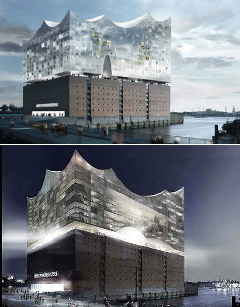
Architecture firm Herzog & De Meuron is one of the main forces bringing some ornamentation back into modern architecture, and the Elbe Philarmonic Hall is a prime example. This concert hall, hotel and apartment complex in Hamburg, Germany looks like a wave shooting up out of the river, blending with its surroundings yet at the same time, standing out as a dramatic glassy pinnacle in the landscape. The building is currently under construction and expected to be completed soon.
John Lewis Department Store and Cineplex, UK
(images via: archinect)
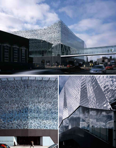
A shimmering geometric silver facade meets glass printed with a beautiful abstracted vine print at the John Lewis Department Store and Cineplex by Foreign Office Architects. The glass allows light to stream into the store section of the building, while the monolithic back end keeps the theaters dark. The design on the glass pays tribute to Leicester’s textile heritage as well as that of the department store.
Lycee Louis Bleriot Extension, France
(images via: archdaily)
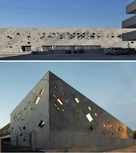
What could be an extraordinarily harsh, brutalist concrete rectangle is livened up considerably by a perforation of small diamond-shaped windows. The Lycee Louis Bleriot Extension by Christphe Gulizzi is a gymnasium that had to fit into a very limiting plot.
Scottish Parliament Building by Miralles Tagliabue EMBT, UK
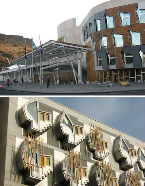
(images via: galinksy)
Divisive and eclectic, the Scottish Parliament Building certainly doesn’t shy away from complexity. Designed by EMBT (Enric Miralles and Benedetta Tagliabue), the building cost an astonishing $ 750 million to construct and is ‘metaphorical’ in design. Explains Miralles, “The Parliament sits in the land. We have the feeling that the building should be land, built out of land. To carve in the land the form of gathering people together… Scotland is a land… The land itself will be a material, a physical building material…”
Tate Modern Expansion by Herzog & De Meuron, UK
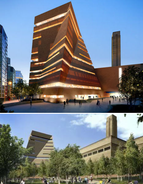
(images via: dezeen)
Herzog & De Meuron’s extension to the Tate Modern art museum in London will add a new wing, as well as converting underground tanks previously used to store oil for a former power station into new gallery space. The main volume of the extension resembles a conventional rectangular building shape that has been twisted and skewed.
Art’otel Hoxton by Squire and Partners, UK
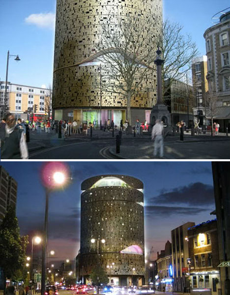
(images via: archiscene)
Squire and Partners designed the flagship hotel of Art’otel in London as a gold column covered in a perforated facade full of abstract patterns and rounded cut-outs that make the whole structure shimmer at night.
Forum by Herzog & De Meuron, Spain
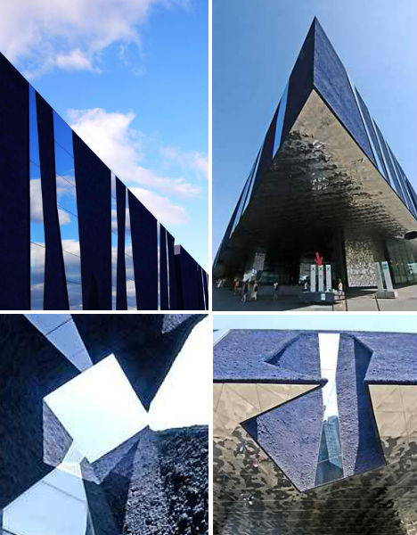
(images via: arcspace)
Jutting above a public square like the bow of a massive ship, ‘Forum’ is an elevated triangular structure in Barcelona that invites the public into its reflective silver underbelly. Though the building looks darka nd intimidating approach, it holds a series of courtyards open to the sky that bring in light.
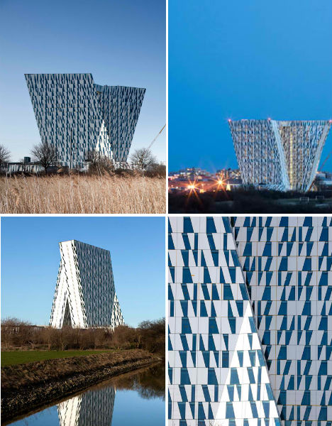
Bella Sky Hotel by 3XN Architects, Denmark
(images via: design boom)
In both its shape and in the complimentary pattern of windows on its exterior, the Bella Sky Hotel by 3XN Architects looks almost typographic. Newly open in Copenhagen, the hotel consists of two asymmetrical towers and looks entirely different depending on your vantage point.
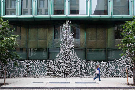
40 Bond by Herzog & De Meuron, NYC
(images via: archdaily)
The standout feature on Herzog & De Meuron’s 40 Bond luxury residence in New York City is unquestionably this graffiti-inspired gate. A one-bedroom apartment in this building reportedly costs $ 18,000 a month.
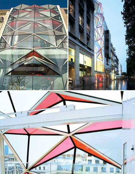
C42 Citroen Flagship Showroom by Manuelle Gautrand Architecture, France
(images via: openbuildings)
Diamond-shaped glass in soft shades of pastel pink that compliment the golden light streaming out of the interior characterize the new Citroën showroom on Champs Elysées in Paris. Once inside, that pink turns to red. Say the architects, “We originally conceived the use of red, the brand’s signature colour, in the glass panels but we decided it would be too bright from the outside. There were some concerns about the building not harmonising with its neighbours on the Champs Elysées, so we’ve created a filter that on first sight, masks the red colour from the exterior. This totally original filter, which is cleverly constructed inside the finished glass, also minimises the heat of the sun passing through, and will also create a diaphanous pearly white atmosphere inside the building.”
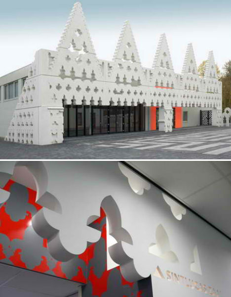
Sint Lucas Art Academy by Fashion Architecture Taste, Netherlands
(images via: dezeen)
A 1960s building was given a dramatic makeover with a decorative facade inspired by both Dutch gables and the Doge’s palace in Venice, Italy. Architecture firm ‘Fashion Architecture Taste’ gave the Sint Lucas Art Academy an entirely new visual identity.
McCormick Tribune Campus Center by OMA, U.S.
(images via: arcspace)
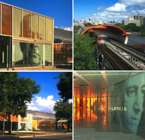
Working around a pre-existing elevated railway, OMA/Rem Koolhaas created a sound-isolating stainless steel tube that would form the basis of the McCormick Tribune Campus Center expansion at the Illinois Institute of Technology. The campus was originally designed by Mies Van der Rohe, whose portrait is emblazoned large on exterior and interior walls.
Midrash by Isay Weinfeld, Brazil
(images via: openbuildings)
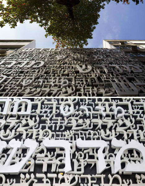
Designed to house the Jewish Congregation of Brazil, the Midrash Building by Isay Weinfeld in Rio de Janeiro has a fiberglass mesh facade made up of Hebrew words.
Placebo Pharmacy by Klab Architects, Greece
(images via: archdaily)
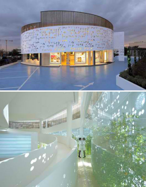
The shape and decorative elements of Placebo Pharmacy by KLab is about as far from Walgreens as you can get. In this case, the perforated mesh facade on the exterior is covered in braille.


[ By Steph in Architecture & Public & Institutional. ]
[ WebUrbanist | Archives | Galleries | Privacy | TOS ]


You must be logged in to post a comment.