RSS
 

Posts Tagged ‘Experimental’

GoPro releases GoPro Labs, a beta update that adds experimental features to your HERO8 Black

06 Jun

GoPro has announced the release of GoPro Labs, a new program that allows GoPro HERO8 Black owners to sign up as beta testers to test out experimental features that haven’t yet made their way into final products. In GoPro’s own words, ‘Think of GoPro Labs as an insider look at innovative features our top engineers are playing with.’

The first release of GoPro Labs includes a pair of features that were first developed via internal [hackathons](https://en.wikipedia.org/wiki/Hackathons: ReelSteady GO optimization and QR Codes for camera control.

Earlier this year, GoPro acquired ReelSteady, a team of FPV drone operators and visual effects experts that have developed some of the most advanced stabilization and image correction software out there for GoPro cameras. Nothing has come from the acquisition as of this time, but the ReelSteady GO optimization in the GoPro Labs firmware update will allow GoPro HERO8 Black owners to optimize the in-camera rolling shutter correction to better work with ReelSteady’s post-production software.

Below is an example video from ReelSteady showing their image stabilization technology at work:

The QR Codes for camera control in the GoPro Labs firmware update is exactly what it sounds like. By creating custom QR codes with embedded commands, GoPro HERO8 Black owners can add new functions to their action cam without the need for Wi-Fi connectivity. Below are a few examples of features you can tweak via QR code:

  • Wake-up timer for remote start capture
  • Save favorite modes as a visual preset/QR code Motion detection start/stop — only capture video when something is happening
  • Speed detection start/stop — use GPS to determine your speed and automatically start capture at a defined speed
  • Camera scripting — e.g. shoot a time-lapse of a construction site but only during daylight hours (and many other detailed camera controls)
  • Personalize your GoPro with owner information Larger chapters for fewer files when taking long video captures — e.g. 4GB chapters will increase to 12GB.

GoPro has created and shared ten pre-built command QR codes with variables, but if you’re feeling adventurous, you can also create your own using GoPro’s list of action commands and settings commands. Additional support can be found on the GoPro Labs community within the GoPro forums.

To show off what’s capable with the new functionality, GoPro showed how the QR code camera control feature was used by GoPro Technical Fellow (and creator of the QR code feature), David Newman, worked alongside Northrup Grumman Corp. to capture the launch of a resupply mission to the International Space Station. Since the GoPro’s had to be set 72 hours in advance and not touched, he teamed up with his daughter to trigger each camera with a QR code before securing them to the launch pad. As the below video attests to, the results worked perfectly, despite none of the action cams having external power or displays.

View this post on Instagram

GoPro rocks. Raw video. Raw audio. Straight from the camera. Just some simple cuts. That’s a wrap! #gopro #antares #northropgrumman #iss #rocket #nofilter #okaymaybetherewasaNDfilter

A post shared by John + Sara (@reedpi) on

GoPro says these features could one day be unveiled alongside a new camera, but also notes there’s a chance ‘these features may never make it to a camera release.’

If you happen to have a GoPro HERO8 Black on hand, you can read through the installation instructions and download the GoPro Labs firmware update on GoPro’s website. Below is a great rundown of the new features from YouTuber DC Rainmaker:

If you end up creating anything interesting with the GoPro Labs firmware, let us know in the comments below or contact us via our feedback form!

Articles: Digital Photography Review (dpreview.com)
 
Comments Off on GoPro releases GoPro Labs, a beta update that adds experimental features to your HERO8 Black

Posted in Uncategorized


Apple mounts 32 iPhones XR on bullet-time rig to shoot experimental video

30 Jan

Apple posted an experimental video on its Youtube channel today that was edited using footage from 32 iPhone XR devices mounted on a circular bullet-time rig.

In the video you can see all sorts of different materials and objects, such as dry ice bubbles, slime or burning metal balls, filmed from varying angles, using creative lighting techniques and a range of the camera’s special modes, for example the 240 fps slow-motion mode.

A making-of video gives you a behind-the scenes look, showing how the rig is being assembled and how a team of technicians is working to achieve the desired special effects.

We’d assume most of the editing for the video done was done on a desktop or laptop computer rather than a mobile device, but still, the results are stunning and show in an impressive way what smartphone cameras are capable of these days.

This isn’t the first video of this kind. Apple shared a similar video last year and back in 2014 photographer Paul Trillo and Microsoft mounted 50 Nokia Lumia 1020 on a rig to achieve a bullet-time effect.

Articles: Digital Photography Review (dpreview.com)
 
Comments Off on Apple mounts 32 iPhones XR on bullet-time rig to shoot experimental video

Posted in Uncategorized


Demo: Adobe’s experimental ‘Cloak’ tech is like Content Aware Fill for video

21 Oct

Yesterday at Adobe MAX, the lucky attendees got to see a few of Adobe’s signature “Sneaks”: sneak peeks at crazy features that are in development. And chief among them this year was something code-named Adobe Cloak.

In essence, Adobe Cloak is the video-editing counterpart to Photoshop’s Content Aware Fill. Simply outline the portion of your video that you would like removed—be it a stationary object or a couple walking through your scene—and Adobe Cloak will intelligently erase them from the shot. This is, of course, something VFX artists have been doing for ages, but automating the process to this degree is impressive to say the least.

Adobe sent us a few demo videos of the feature in action, which you can check out above. And if you want more details about how Adobe Cloak works/was developed, Engadget got to sit down with Adobe research engineer Geoffrey Oxholm and VFX product manager Victoria Nece to talk about the technology, which is still “in the experimental stages.”

The bad news is, there’s no current plans to implement it. The good news? They wouldn’t be working on it if they didn’t plan to implement it some time, right!?

Articles: Digital Photography Review (dpreview.com)
 
Comments Off on Demo: Adobe’s experimental ‘Cloak’ tech is like Content Aware Fill for video

Posted in Uncategorized


Et tu, Brutalism? ‘Experimental Home’ Now a Modern Roman Ruin

30 Dec

[ By WebUrbanist in Abandoned Places & Architecture. ]

experimental house ruins rome

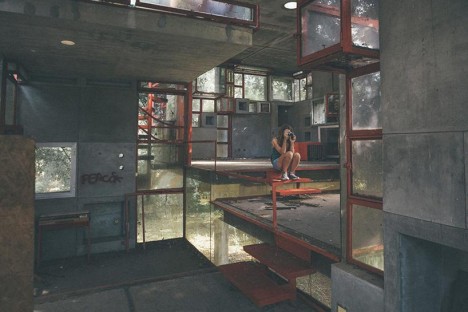
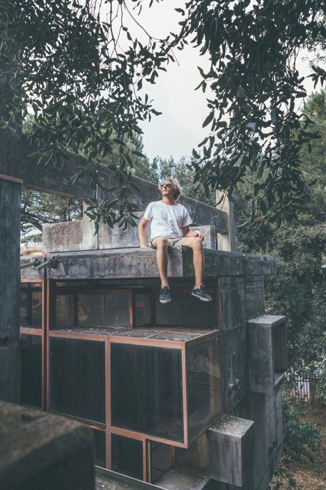
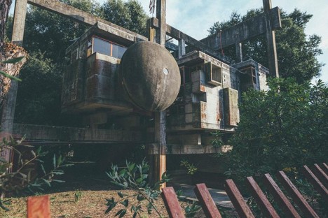
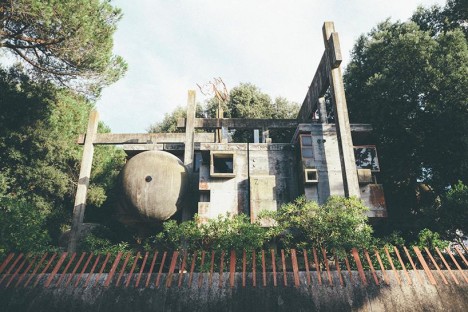
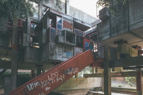
Photographers traveling to photograph the ruins of Rome are generally so distracted by ancient remnants they naturally overlook this unique decaying structure on the outskirts of the city: the ‘Casa Sperimentale’ (Experimental House) created as a model to study interactions light, space and geometry at 1:1 scale.

experimental geometric brutalist abode

experimental home concrete sphere

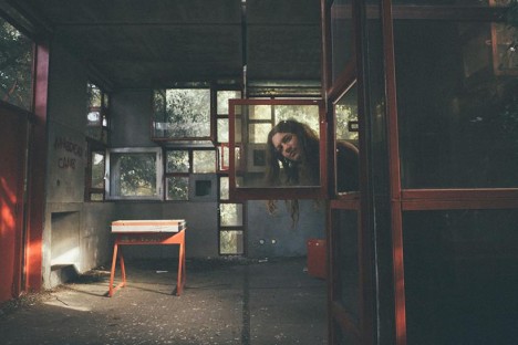
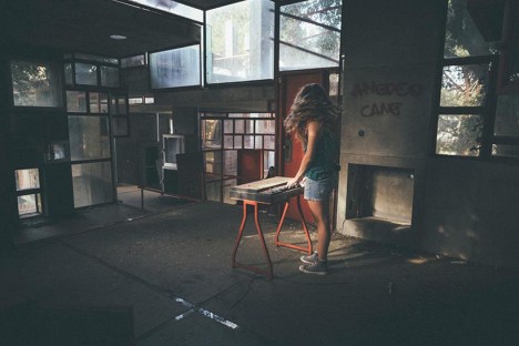
Designer and shutterbug Oliver Astrologo sought out this decaying relic, which has gone into further decline since the death of its designer, Giuseppe Perugini, in the 1990s. A work of concrete, metal and class, the asymmetrical dwelling pushes out in unexpected directions and frames surprising spaces.

experimental playground study architecture

experimental scale model modernism

experimental window details

experimental desk interior design

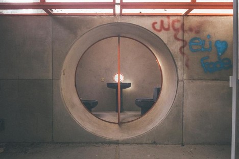
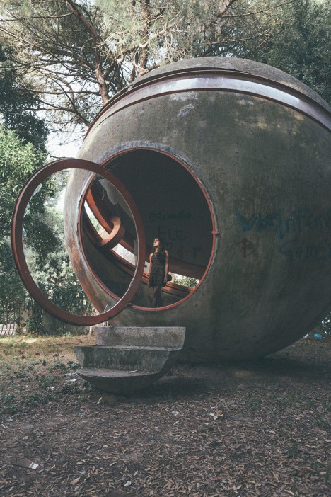
As with many abandonments, signs of decay are showing, vandalism has further deteriorated the site and structure while wild plants continue to encroach as well. Figures in the photographs both help give the unusually-sized spaces and details a sense of scale, while also adding a layer of human emotion to the shots.

experimental circular bathroom window

experimental climber urban explorer

The building is a product of its times, drawing on planes-in-space Modernism and thick concrete Brutalism, almost as if famous architects from these stylistic traditions got together to make a pavilion or playground. And today, that is what it effectively is: a semi-enclosed space for urban explorers to climb and document.

Share on Facebook


[ By WebUrbanist in Abandoned Places & Architecture. ]

[ WebUrbanist | Archives | Galleries | Privacy | TOS ]


WebUrbanist

 
Comments Off on Et tu, Brutalism? ‘Experimental Home’ Now a Modern Roman Ruin

Posted in Creativity


Picturesque Pavilions: 12 Experimental Temporary Structures

23 Jul

[ By Steph in Drawing & Digital. ]

pavilions korean 1

Each year, architects around the world design and construct temporary structures for events like the Milan Expo, showing off their skills in a setting that enables them to be more bold and experimental than they can be with more traditional architecture. Often interpreting a set theme, these pavilions use unexpected materials, play with spatial relationships and incorporate multimedia for an immersive experience.

Korea Pavilion: The Ways of Folding Space & Flying
pavilions korean 2

pavilions korean 3

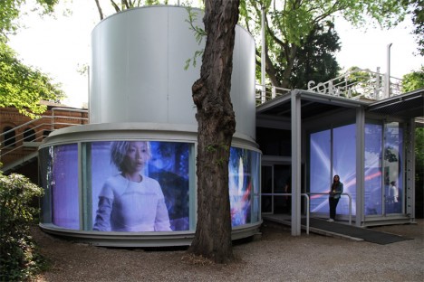
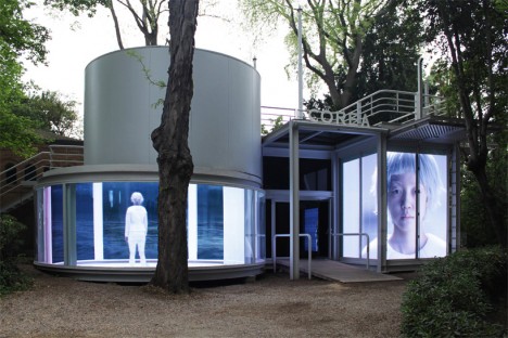
“An archaeological quest into human civilization,” this pavilion entitled ‘The Ways of Folding Space & Flying’ enchanted visitors to the 56th International Art Exhibition. Representing Korea, the pavilion by Moon Kyungwon & Jeon Joonho is part architecture, part film installation juxtaposing the past, present and future and can be experienced from both outside and in.

Serpentine Pavilion by Selgascano

pavilions selgascano 1

pavilions selgascano 2

pavilions selgascano 3

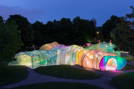
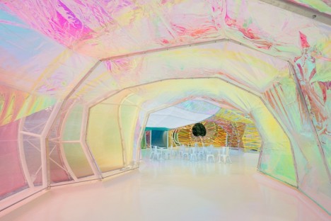
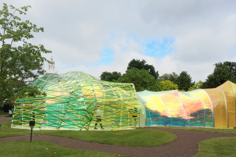
This year’s Serpentine Pavilion by Spanish studio Selgascano looks a bit like a stretched-out glow worm, glimmering in iridescent pastel shades. The polygonal frame is covered in panels of translucent florins-based polymer. “We sought a way to allow the public toe experience architecture through simple elements: structure, light, transparency, shadow, lightness, form, sensitivity, change, surprise, color and materials,” say the designers. “The spatial qualities of the pavilion only unfold when accessing the structure and being immersed within it. Each entrance allows for a specific journey through the space, characterized by color, light and irregular shapes with surprising volumes. This is accomplished by creating a double-layered shell, made of opaque and translucent fluorine-based plastic (ETFE) in a variety of colors.”

Vanke Pavilion by Daniel Libeskind

pavilions vanke 2

pavilions vanke 3

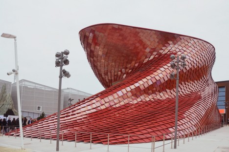
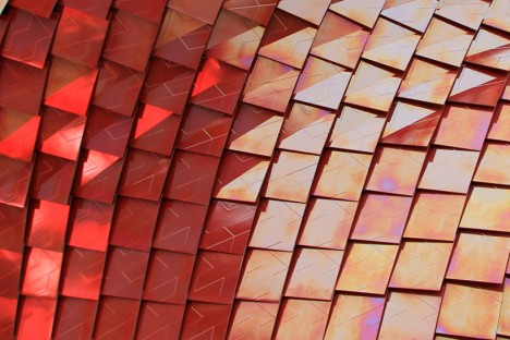
Representing China at Milan’s Expo 2015, the Vanke pavilion by renowned architect Daniel Libeskind explores the theme ‘feeding the planet, energy for life’ through the lens of Chinese culture. The design is influenced by the shi-tang, a traditional Chinese dining hall, as well as natural landscapes and the dragon, which is associated with farming. The pavilion is covered in over 4,000 red scale-like tiles with air purification properties, and inside, 200 screens are mounted to bamboo scaffolding, displaying video of city life contrasted with the slow-motion of a meal being prepared and consumed.

UK Pavilion at Expo Milan 2015

pavilions UK 1

pavilions UK 2

pavilions uk 3

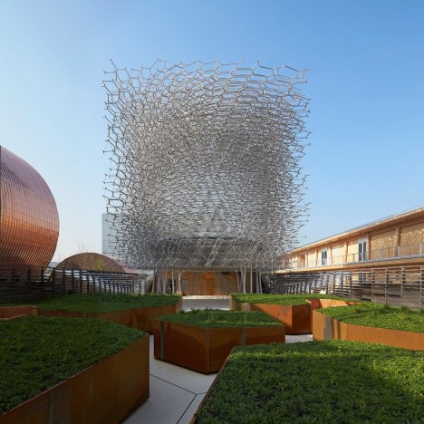
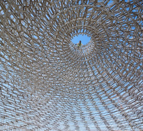
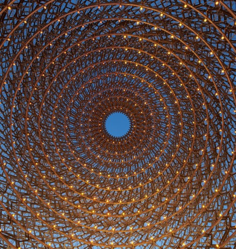
On display in Milan though October 31st, 2015, this pavilion representing the United Kingdom at Expo 2015 reflects the theme ‘Grown in Britain and Northern Ireland’ through a spiraling mesh of metal lattice. As visitors pass through it they experience five different settings inspired by orchards, meadows, terraces, the architectural program and the ‘hive.’ The whole thing buzzes, pulses and glows thanks to accelerometers and other audio-visual devices embedded in the structure, taking live signals from a real beehive.

The Orangery in Northern Denmark

pavilion orangery 1

pavilion orangery 2

pavilion orangery 3

pavilions orangery 4

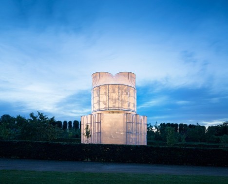
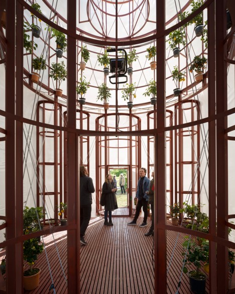
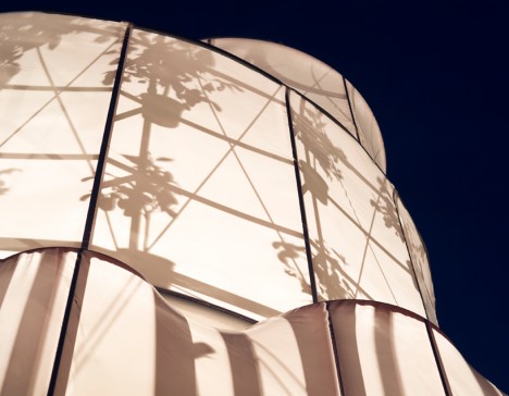
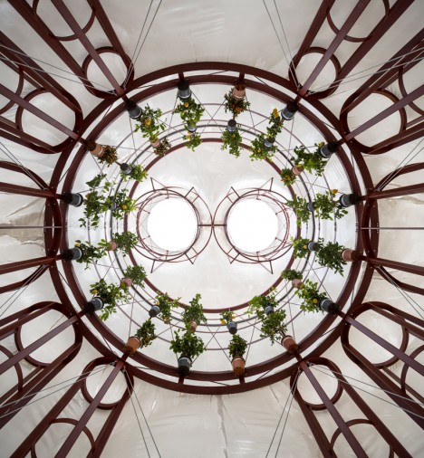
Translucent white fabric stretched across a wooden frame puts the silhouettes of a bunch of potted citrus plants on display once the interior is illuminated after dark at ‘The Orangery’ by Lenschow & Pihlmann and Mikael Streström. Taking inspiration from the floor plan of Rome’s San Carlo Alle Quattro Fontane Church, the interior is appropriately cathedral-like with its circle of suspended plants.

Next Page – Click Below to Read More:
Picturesque Pavilions 12 Experimental Temporary Structures

Share on Facebook


[ By Steph in Drawing & Digital. ]

[ WebUrbanist | Archives | Galleries | Privacy | TOS ]


WebUrbanist

 
Comments Off on Picturesque Pavilions: 12 Experimental Temporary Structures

Posted in Creativity


Experimental Architecture: 14 Boundary-Pushing Pavilions

03 Jul

[ By Steph in Architecture & Public & Institutional. ]

Experimental Architecture Pavilions

Before a new form of architecture can be executed on a large scale, it has to be demonstrated through smaller structures, making temporary pavilions an ideal way to experiment. These 14 pavilions represent novel and often radical designs and construction methods, from carbon fiber structures woven by robots to living architecture made by silk worms.

Evolving Pavilion Made by Silk Worms
Pavilions Silkworm 1
Pavilions Silkworm 2

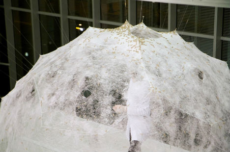
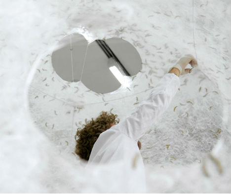
Nature and technology work together on a pavilion that grows and transforms like a living organism. The Silk Pavilion by the MIT Media Lab features a basis of silk threads made by a CNC machine, which grows into a cloud-like structure with the addition of natural netting from dozens of silk worms. The worms were essentially deployed as a biological ‘printer’ to create the secondary structure on top of the geometric base. If the sculpture were to remain in place indefinitely, it could reproduce on its own, with new generations of silkworms constructing up to 250 additional pavilions.

Serpentine Pavilion by Sou Fujimoto
Pavilions Fujimoto 1

Pavilions Fujimoto 2

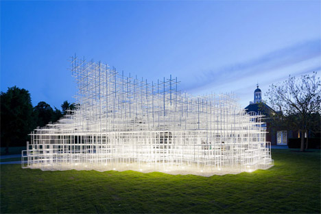
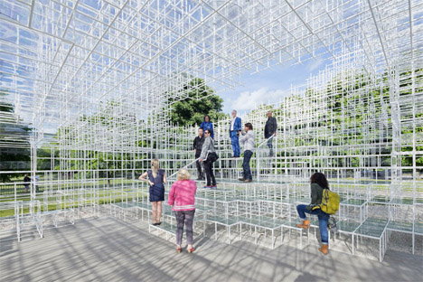
This 2013 Serpentine Gallery Pavilion by Sou Fujimoto is a contradiction in form, translucent yet solid. 20mm pipes are arrange din a lattice form to create a cloud-like appearance, inviting visitors to enter and climb the framework.

Abstracted & Faceted Bloomberg Pavilion
Pavilions Bloomberg 1

Pavilions Bloomberg 2

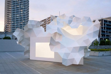
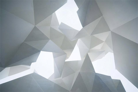
Looking like an oversized piece of paper origami, the Bloomberg Pavilion by Akihasa Hirata is actually inspired by a tree and constructed from pleated metal. “I wondered what would happen if the walls were to keep growing upwards and present an uneven surface like ‘pleats’. Pleats resemble a tree in the way that they spread out and capture the sun and I felt that they would produce a bright, impressive exterior. I also thought that the space beneath this surface would present a relaxed atmosphere, similar to that of tree shade that would be an ideal quality for an exhibition space.”

Carbon Fiber Pavilion Based on Beetle Shells
Pavilions Beetle Shell 1

Pavilions Beetle Shell 2

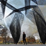
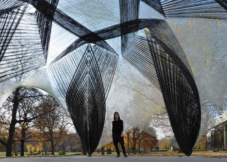
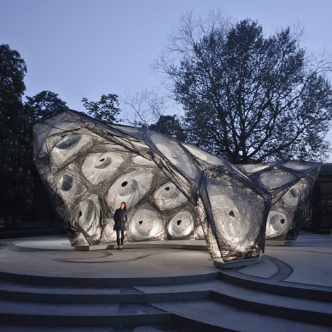
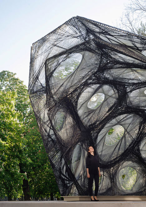
This incredible carbon fiber pavilion inspired by the lightweight shell encasing the wings and abdomen of a beetle was woven by a robot. Installed at the University of Stuttgart, the ICD/ITKE Research Paviliion 2013-14 was fabricated using a custom-built system of robotics used to create a series of modular fiber-composite components. Says team member Marshall Prado, “”It offers not only a unique architectural expression and spatial experience, it is also extremely lightweight and resource efficient.”

Next Page – Click Below to Read More:
Experimental Architecture 14 Boundary Pushing Pavilions

Share on Facebook


[ By Steph in Architecture & Public & Institutional. ]

[ WebUrbanist | Archives | Galleries | Privacy | TOS ]


WebUrbanist

 
Comments Off on Experimental Architecture: 14 Boundary-Pushing Pavilions

Posted in Creativity


Testbericht: Lomography Experimental Lens Kit

11 Feb

Ein Beitrag von: Tamara Skudies

Seit Oktober 2013 bietet Lomography ein Linsenset für Micro-Four-Thirds Kameras an. Es soll mit drei Linsen und bunten Farbfolien für lomografisches Feeling und für mehr Möglichkeiten zum Experimentieren auch beim digitalen Fotografieren sorgen.

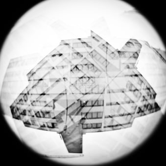
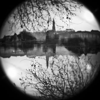
Das Set beinhaltet eine Fisheye-Linse für fantastische 160°-Aufnahmen, eine Weitwinkel 12mm-Linse und eine Standard 24mm-Linse. Sie bestehen alle aus Kunststoff – nicht nur das Äußere, sondern auch das Wichtigste, die Linsen selbst, sind aus Kunststoff.

© Tamara Skudies

© Tamara Skudies

Jede davon ist mit einer festen Blende von f/8 ausgestattet und besitzt die zwei Verschlusszeiten N (1/100) und B (Bulb). Mit dem T-Blendenverschlusshebel kann man die Blende dauerhaft öffnen, um der Kamera die Belichtungszeit zu überlassen oder die Blende schließen, um an der Linse selbst mit einer der beiden Verschlusszeiten auszulösen.

Letztere Einstellung nutzt man am besten für Mehrfachbelichtungen, indem man an der Kamera eine lange Belichtungszeit einstellt und an der Linse mehrfach auslöst. So fällt nur dann Licht auf den Chip, während man an der Linse auslöst und man erhält direkt in der Kamera Mehrfachbelichtungen, auch wenn die Kamera keine eigene Funktion für Mehrfachbelichtungen hat.

© Tamara Skudies

© Tamara Skudies

Bei jeder Optik gibt es je eine Entfernungseinstellung für unendlich und eine für den Nahbereich. Bei der Fisheye-Linse sind es 5cm, bei 12mm sind es 20cm und bei 24cm sind es 60cm. Zu den Linsen werden noch fünf Farbfolien in gelb, blau, orange, grün, lila und zwei unterschiedlich starke ND-Filter mitgeliefert.

Die ND-Filter sind für die Mehrfachbelichtungen wie oben beschreiben (Kamera auf lange Belichtung, an der Linse auslösen) sehr gut geeignet, da es sonst schnell zu Überbelichtungen an hellen Tagen kommt. Ebenso kann man auch die Farbfilter benutzen, um die einfallende Lichtmenge zu reduzieren.

© Tamara Skudies© Tamara Skudies

Dieses Feature der Linsen, direkt an ihnen auslösen zu können und so echte digitale Mehrfachbelichtungen erstellen zu können, ist meines Erachtens das absolute Highlight an den Linsen. Man ist nicht mehr an die Einstellung seiner Kamera gebunden und kann einfach wilde Mehfachbelichtungen schießen.

Während des Fotografierens bleibt der Monitor der Kamera natürlich schwarz, was den Überraschungseffekt, wie das Bild am Ende aussieht, erhöht. In der analogen Fotografie werden gerne HQME (High Quantity Multiple Exposure) Fotos vom gleichen Objekt gemacht. Das ist jetzt Dank der Linsen und den ND-Filtern auch mit den Micro-Four-Thirds Kameras möglich.

© Tamara Skudies

© Tamara Skudies

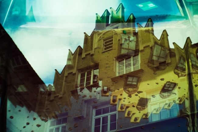
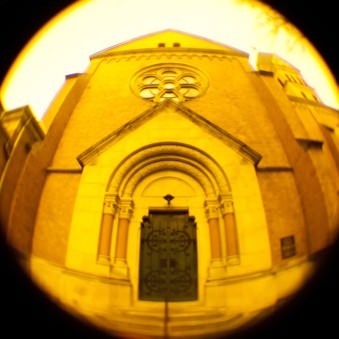
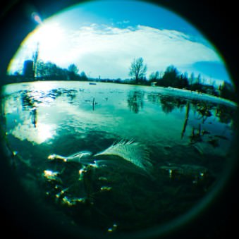
Im hinteren Teil der Linsen setzt man die Farbfilter ein. Man kann den Bildern dadurch einen Farbtouch geben, ohne am PC das Bild großartig nachbearbeiten zu müssen. Am liebsten mag ich die orange und grüne Folie. Bei Benutzung der orangen Folie sehen die Bilder fast aus wie die eines Redscalefilm und mit der grünen wie bei einem cross-entwickelten Fujifilm, wenn man den Kontrast am PC noch etwas erhöht.

Zusammen mit dem Lomography Colorsplash Flash nahm ich meine Olympus und die Linsen in die Disco mit. Die feste Entfernungseinstellung ist an den Linsen wirklich praktisch, wenn man beim Weggehen mal Partyfotos machen möchte.

© Tamara Skudies© Tamara Skudies

© Tamara Skudies

Man muss nicht mehr warten, bis die Optik in der Fast-Dunkelheit endlisch scharf gestellt hat, wenn sie es denn überhaupt schafft. Somit sind der spontanen Fotografie im Dunkeln mit Blitz, bunten Farbfolien und Doppelbelichtungen keine Grenzen gesetzt.

Zusätzlich habe ich sie noch mit den Holga Close-Up-Linsen getestet, da ich gerne Nahaufnahmen mache. Das Ganze funktioniert am besten bei der 24mm-Linse, da man bei 12mm gern mal den Rand der Nahlinse im Bild hat. Natürlich kann man auch jegliche andere Nahlinsen damit nutzen.

© Tamara Skudies© Tamara Skudies

Die Linsen machen wirklich sehr viel Spaß. Auch, wenn sie für mich niemals eine analoge Kamera ersetzen können, würde ich sie mir kaufen. Am liebsten ist mir die 12mm-Linse, die eine schöne Unschärfe im Randbereich hat und weil ich einfach ein großer Weitwinkelfan bin. Im nächsten Urlaub werden mich die Olympus und die 12mm Linse auf jeden Fall begleiten.


kwerfeldein – Fotografie Magazin

 
Comments Off on Testbericht: Lomography Experimental Lens Kit

Posted in Equipment


Lomography announces ‘Experimental Lens Kit’ for Micro Four Thirds

21 Oct

fisheye.png

Forget the Zeiss Otus 55mm F1.4, Sony Alpha 7R and RX10, Nikon 58mm F1.4 or the tiny Panasonic GM1 – last week’s real news was Lomography’s introduction of an ‘Experimental Lens Kit’ for Micro Four Thirds. Comprising a 24mm F8 standard lens, a 12mm F8 wideangle and a 160° F8 fisheye, the kit costs £79 / €89. Each of the lenses even has a built-in shutter with speeds of 1/100sec and Bulb, allowing in-camera multiple exposures, plus a T mode to hold the shutter open for normal live view. In addition all three have a slot for colour gel filters. Click through for full details.

News: Digital Photography Review (dpreview.com)
 
Comments Off on Lomography announces ‘Experimental Lens Kit’ for Micro Four Thirds

Posted in Uncategorized


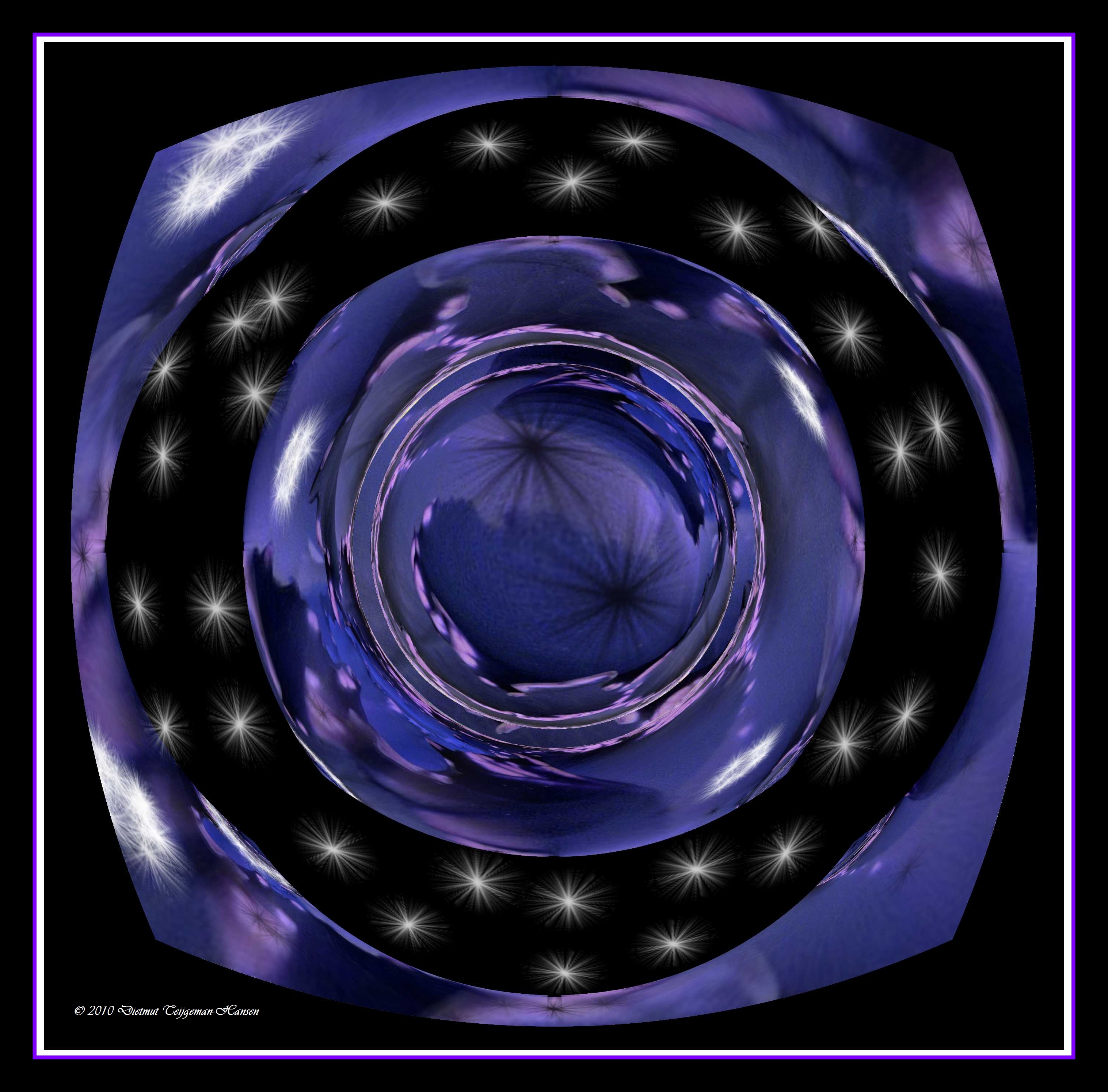
experimental art

21 Jan

A few nice visual art images I found:

experimental art
visual art
Image by dietmut
sterren

Pyromanics playing with Molten Metal @ MassArt
visual art
Image by bettlebrox
Mass Art’s Spring 2009 Iron Pour.

www.eworksfestival.com/index.php?page=events/4_10
The Iron Pour has a strong history at Massachusetts College of Art, beginning as a fundraiser for the Metals Department, it has grown into a celebration of art, music, and performance. Recently, the Iron Corps., the group that organizes the event, has been working in conjunction with Eventworks, who will be kicking off their annual Art Festival. This spring, we will be invoking themes of outer space and the explosive demise of stars and planets . Aside from the spectacular sculptural performances by the Iron Corps. , activities will include face painting, fire dancing, visual shows, and four musical acts throughout the course of the night.

 
Comments Off on experimental art

Posted in Photographs


Experimental Anaglyph 3D Film With Motion Effects.

01 Jul

YOU WILL NEED RED/CYAN 3D GLASSES TO VIEW THIS FILM CORRECTLY! At the moment YouTube’s compression has made the film unwatchable at full screen, I’ll try uploading it in Divx format when I get the time. Be warned, this film contains a rather unpleasant reversed vomiting scene (that’s tea in his mouth by the way) This is the first time I’ve experimented using 2 cameras to create a 3D effect. This film is not meant to be a great artistic statement or anything it’s just a muck about to see what works and what doesn’t. It seems to work, though some things must be considered. Due to rendering errors (it was too late to do anything about this) the edges of moving objects are jagged which dulls the 3D effect as well as looking ugly. For effective, smooth 3D, the camera(s) must be kept as static as possible, especially horizontally. This did not happen very often. All the shots are poorly framed and lit. I am aware of this. It’s partly due to the fact that to ensure both camera’s images are identical the settings must be set to “auto”. Also editing 3D footage is really hard work, wearing coloured glasses while rearranging 2 overlapping bits of film causes blinding headaches and nausea after an hour or so. Anyway, this proves that I can make the concept work so hopefully I can make a much more polished film in the future. I’m not a skilled musician. Would have been nice to spend longer on the soundtrack. That’s half an hours work on Orion and Reaktor.