RSS
 

Posts Tagged ‘Edit’

How to Edit Landscape and Nature Photos with the Lightroom Gradient Tool and Range Mask Features

05 Jan

The post How to Edit Landscape and Nature Photos with the Lightroom Gradient Tool and Range Mask Features appeared first on Digital Photography School. It was authored by Simon Ringsmuth.

Lightroom has always had a rich set of tools to allow photographers to get the most out of their images. However, until recently the ability to edit landscape and nature photos was a bit lacking.

While, global adjustments, like changing white balance and exposure have always worked great in Lightroom, fine-tuning edits can be problematic. Recent updates have seen incredible improvements to the Filter tools in Lightroom. An added tweak called Range Mask makes all the difference for photographers who need complete control over the precise implementation of their edits.

Lightroom Gradient Tool and Range Mask

The three most common ways to edit specific parts of an image in Lightroom are through the use of the Graduated Filter, Radial Filter, and Adjustment Brush. If you want to smooth the skin on your portraits, increase the saturation of your skies, or change the color cast of your clouds these tools can be just the ticket. But what if you have a tree that sticks up into the sky or an uneven horizon dotted with buildings and power lines?

The usefulness of the filter tools is somewhat restricting when you want to limit your edits to particular sub-parts of a picture. Until recently the Auto-Mask option was the best way to confine your edits to certain colors or locations within an image. Landscape and nature photos are especially tricky because of the uneven edges and jagged borders that exist between sections of the photo that need editing. However, the Range Mask option solves almost all of these issues with ease.

How it works

To illustrate this, I’m going to walk you through the editing process of the following image. My brother Andy took it while he was on a tour of the swamps in Louisiana, USA, with his family last summer. The initial image has a nice composition but feels dull and uninteresting, which is a far cry from the real experience.

Adjusting White Balance with a Graduated Filter

One change to punch things up is altering the white balance of the sky to bring out the bright blues and make the image more vibrant.

The first step is to click over to the Graduated Filter panel. Dial in a white balance that skews more towards the cooler end of the spectrum and reduce the exposure just a bit. Next, click and drag from top to bottom on the image to put the filter in place.

The sky is now a rich blue, however, a big problem becomes evident: the color cast of the trees has changed too. This result is not what I want. Clicking the Show Selected Mask Overlay button in the bottom left corner under your image reveals that the graduated filter has been applied to everything including the trees as well as the sky.

Fine-tuning the Graduated Filter using the Range Mask

Fine-tuning a tool such as the Graduated Filter, used to involve a series of steps. These steps included brushing out the mask in places you didn’t want it in combination with the auto-mask feature. It worked, but results were often a little sketchy. They also required a great deal of tweaking and fine-tuning. That’s not to say the brush option is useless-far from it! I have an example later in this article that shows how useful it can be.

However, all this has changed in recent versions of Lightroom. You can now use the Range Mask to apply any of the three filter tools to specific parts of an image based on lightness or color similarity.

The default value for Range Mask is Off, but with one of your Filter adjustments selected you can then choose to enable Range Mask for Color, Luminance or Depth.

  • Color applies the filter to specific parts of the image based on how similar they are to color values that you select.
  • Luminance applies the filter to specific parts of the image based on how light or dark those parts are.
  • Depth works only with cameras that record depth information and applies the filter to specific parts of the image based on how close or how far away they are. Some mobile phones have this feature but most traditional cameras do not, so Depth will often be disabled unless you are editing images taken with certain mobile phones.

Range Mask – Color

For this image, I’m going to use the Color option, though Luminance works great in many nature and landscape photos as well.

With Color selected, you can either click and drag on your image to select a range of colors or can click multiple points by shift+clicking. This selection is where the mask gets applied. I find that shift+clicking generally works better, although your mileage may vary depending on your editing goals and the type of picture you are working with.

You can click up to five spots on the image to refine your color selection. Use the slider in the Range Mask panel to fine-tune things further. This slider hones the edges of your Range Mask. If you find that the border between the edited and unedited portions of your image is a bit stark, adjusting the Amount slider will help mitigate this issue.

The result of this one Gradient Filter, along with the Range Mask, is an image that is already much improved from the original.

Looking at a 100% crop of a portion of the image reveals just how precisely the Gradient Filter has been applied thanks to the Range Mask. Here is a portion from the top-right of the original unedited image.

Here is the same portion with the Gradient Filter applied, using the Range Mask to apply the Filter to only selected color ranges. In this case, the color of the sky.

Notice how precisely the edits were applied, and how intricate the edges around the tree leaves are. This illustrates why the Range Mask option is so useful for landscape and nature photos. There are many tricky edges and small parts of the image that can take a very long time to fix without it.

Range Mask – Luminance

Another way to use the Range Mask is with the Luminance option. This option only applies the mask to the brightest or the darkest portions of the Gradient, or other Filter, that’s applied.

The overall idea here is the same, but the implementation is a tad different. Instead of selecting colors where you want the Range Mask applied, you use the Range sliders to concentrate the mask on the lightest, darkest or mid-range parts. One of the most useful things here is the Show Luminance Mask box which gives you a real-time preview of where your mask application. This helps you as you are adjusting the sliders.

Here’s an image I shot while hiking in the mountains near Seattle. It’s not bad, but a few edits would help improve the picture. Edits may help it look a little closer to how it appeared when my wife and I were tromping around in the wilderness that day with my cousin.

I want to bring out the color in the foreground trees in this image. A Graduated Filter with Luminance Range Mask is perfect in this scenario because the edits can be applied just to the darker portions of the image. With the filter in place and the mask tweaked to be applied only to the darker parts, I can ensure my edits are going to show up just where I want them to by checking the Show Luminance Mask option.

Fine-tuning using Brush

As demonstrated above, the Range Mask is extremely useful for nature and landscape photographers. It applies the Graduated Filter to just the right portions of the image and not the entire picture evenly. If you want to customize your Graduated Filter further, click the Brush option (not the Brush Adjustment Tool) and proceed to add to, or erase, the Filter wherever you want.

In this case, I’d like to remove the Graduated Filter from the lake in the foreground. Even though I can tell from my Luminance Mask overlay that it’s not being applied too heavily to that area, removing all traces of it with the brush will help me get the exact picture I want.

The end result is a photo with much warmer green tones in the trees and a lake that reflects the blue sky above, which is just the look I was aiming for.

Conclusion

Hopefully, these examples give you an idea of how powerful the combination of Graduated Filters and Range Masks are for nature and landscape photographers. I’m always eager to hear from the DPS community. Have you found this particular tool useful? Are there any other tips you’d like to share about using the Lightroom Gradient Tool and Range Mask? Leave your thoughts in the comment section below.

The post How to Edit Landscape and Nature Photos with the Lightroom Gradient Tool and Range Mask Features appeared first on Digital Photography School. It was authored by Simon Ringsmuth.


Digital Photography School

 
Comments Off on How to Edit Landscape and Nature Photos with the Lightroom Gradient Tool and Range Mask Features

Posted in Photography


How to Edit Old Images with Your New Skill Set

14 Aug

This article is going to be a little different from some of the others I’ve written. It’s going to be more like a journal entry or a reflection. It’s very personal in some ways but the ideas within will have universal value for everyone.

The idea is to show a personal exploration of my editing skills, which will hopefully inspire you to explore your skills and progression as a photographer as well.

How much can experience change your editing workflow?

I was recently cleaning up my catalogues and image storage when I ran across a bunch of my older work. I looked at the images and how I had processed each pic. Looking back, I can see how my tastes and skills have evolved.

Over time we become better photographers, but we also become more adept at using Lightroom, Photoshop, Luminar or any other editing programs we might love to use. So as our skills evolve so does the way in which we process each image.

It was at this moment that I decided to go back and edit some of my old images. The goal was to compare the ways my skills have changed as well as my personal aesthetic. You can do the same thing. The results may be surprising.

You might also learn something about the way in which your work has evolved over time. Perhaps you were totally into creating monochromatic images way back when. This might contrast with your recent images in which you’re into creating brilliant warms tones in your work. You may also have become more skilled at cloning, utilizing layers, or using plugins. It all depends on what you have learned over time.

So without any further rambling, let’s take a look at an older image of mine.

How to Edit Old Images with Your New Skill Set - photo of a path and steps in a forest

Here’s the initial image with my original edits. This was framed and sold a number of times during my earlier years.

This shot was one of the first I processed and created for sale in a gallery. It sold quite well. I was very proud of the work but what if I went back now and edited the RAW file again. How would my more refined skills change the look and feel of the photograph?

This image was edited fairly simply. I used Lightroom, and at the time I didn’t have anything else in my arsenal to utilize. I’m pretty sure I adjusted the blacks and whites in this image and added a little bit more saturation to the greens.

At that time, however, I didn’t have much of skill set, and edits were pretty basic. This doesn’t mean that what I did was bad. It was just simple and created a pretty clean and attractive image.

So now it’s time to see the difference and how my workflow has changed.  Here are the steps I took to re-edit this image some six years after it was first shot.

Searching for ideas and inspiration

One of the first things that changed about my workflow is how I begin to create my final image. These days I tend to surf through a large amount of presets searching for some ideas.

Part of this is experience, and part of it is time-saving. Over the years I’ve collected a large amount of presets, some of which I’ve created others I’ve purchased. I’ve also acquired a few plugins and I also use the presets available in these as inspiration.

Most of the time, however, I have a pretty good idea of the type of image I want to create already stored in my brain. As time has gone by, there’s far less trial and error associated with my work. Instead, my work is now far more purposeful with specific goals.

How to Edit Old Images with Your New Skill Set - inside NIK Analog Efex

I took the image into Nik Analog Efex just to see what kind of looks I could create. I didn’t use anything from the plugin but I did get the idea to use a radial filter to focus attention on the path.

In the case of this old image, I studied the previous look and decided I wanted to change it. I feel the first edit was flat and a little too dark with not enough warmth or contrast. I also searched through some presets and decided I wanted more emphasis on the pathway leading to the stairs.

The following edits were made to create the look and feel I wanted specifically.

The Workflow

Step #1 – Sharpening

I ran the image through a RAW sharpening plugin. I wanted to have nice sharp details on the pathway. The image was also shot long ago with a very basic kit lens which I felt was softer than my newer 50mm lens.

Step #2 – Histogram

The histogram was adjusted so that the image touched both ends of the spectrum for black and white tones.

Step #3 – Local Adjustments

Next, I applied the adjustment brush to several different parts of the image. I wanted the pathway to have a brighter light that leads the viewer’s eye back through the image. More clarity and sharpness were also added to certain parts of the image.

How to Edit Old Images with Your New Skill Set

I used the adjustment brush to add more highlights to the pathway.

Step #4 – Presets

I used a preset to quickly deepen shadows and also to warm the tones within the image.

Inspired by a film preset I added a small bokeh to the image by using a radial filter and pulling the clarity and sharpness down. The filter was inverted and applied to the outer edges of the image.

How to Edit Old Images with Your New Skill Set

Here’s a quick screenshot after I used a preset to deepen shadows in the image.

Step #5 – Vignette

Finally, to create a little bit of depth, I added a small vignette to the image.

How to Edit Old Images with Your New Skill Set

Here’s a side by side comparison of the initial jpeg image and my updated edit.

The editing of the image didn’t take an overly long time. These are all fairly simple steps to take, but they have changed to look and feel of the piece. I didn’t use Photoshop with this image, and as per usual it was edited solely in Lightroom.

When I first edited this image Lightroom was the only program I used, so it seemed appropriate to keep all edits within the same program for a fair comparison.

The look and feel of the new version are certainly bolder and brighter. It’s a subtle change from the first edit. There’s nothing hugely drastic but I think what it shows is how our skills evolve and we become more polished in our editing work.

When I first created this image all those years ago, I loved the look. Now I find it a little flat so the edits that were applied this time adjusted what I now find to be a fault in the work.

How to Edit Old Images with Your New Skill Set

Here’s the final image. This was edited fully in Lightroom with the exception of the RAW sharpening, for which I used a plugin.

It’s always good to reflect on things

Sometimes it’s interesting to dig through the past and see what you can find. It’s worth it to experiment and explore how your work has changed. Don’t be afraid to go back and rework some of your old photographs, who knows what you’ll discover.

If you’ve done some experimenting, then please share it with us. We want to see how your skills have evolved or maybe the ideas you’ve come up with as time has passed. I’m sure there’s someone out there with a really dramatic edit.

Let’s see what you can cook up to inspire the rest of us.

The post How to Edit Old Images with Your New Skill Set appeared first on Digital Photography School.


Digital Photography School

 
Comments Off on How to Edit Old Images with Your New Skill Set

Posted in Photography


How to Edit Food Photography Images Using Lightroom

22 Jun

To edit food photography it requires a bit of a different approach than you might take with other types of photography, like portrait or landscape. The objective is to keep the food looking as fresh and appetizing as possible, which can take a subtle but considered hand.

How to Edit Food Photography Images Using Lightroom

Before and after a subtle edit of a food photo.

Although there is always room for style and artistry, the more real your subjects look, the better. Lightroom is the program of choice for most food photographers. It’s intuitive and relatively easy to use and offers most of the tools required to make great food photos.

For this article, I will walk you through how I make global adjustments to a food image in Lightroom’s Develop module. Workflow is something that is individual to each photographer. This is how I approach editing my food photography, however, you may opt to do things differently. Hopefully, you will find some takeaways that will help you edit your own images.

I’ll be editing this image of an apple pie. This is the shot straight out of the camera. Like all RAW images, it lacks contrast and needs a bit of pizzaz.


How to Edit Food Photography Images Using Lightroom

Final image.

The Histogram

It’s important to have a basic understanding of the histogram in order to make adjustments to the exposure and tones in your image. The histogram is one of the key tools available for analyzing your image. It provides a graph of the density values of a given image. The histogram shows the relative quantity of pixels at each density value.

The far left point of the histogram is pure black and the densest, and the far right point is pure white with no density. A big peak in any of these regions means that the image has a lot of pixels at that particular density. An open gap in the histogram means that there are no pixels at that density.
How to Edit Food Photography Images Using Lightroom - histogram

The distribution of these tones will tell you about the overall exposure of the image. Most images look best if they contain both dark and light values. Generally, without some dark and light values, the image may lack contrast and look flat.

If you have a strong peak at the black or white end of the histogram, your image could be under or overexposed. However, it really depends on the individual image and the desired aesthetic. For example, blown out whites has become a “thing” in recent years. A dark and moody shot will have a lot of pixel density at the dark end of the spectrum.

Cropping

Before you can start making global adjustments to your image, it makes sense to crop and straighten it first. One tip is to shoot a bit wider than what you want for your end result so you can tweak your composition in post-production. You also may want to crop it to a certain aspect ratio – say 4×5 or square for Instagram.

First,  make sure that your horizon line is straight.

My horizon line in the apple pie image was already pretty straight. I used the crop tool to check it and also brought the crop in slightly on the left-hand side to cut off a little bit more of the pie. To access the Crop Tool in Lightroom, click on the grid symbol under the Histogram in the top panel (or just hit R, the keyboard shortcut). This will allow you to crop your image by bringing in the corners with your cursor.

While this tool is activated you can click “O” for the shortcut to bring up several compositional overlays like the Phi Grid or Golden Spiral to help you get the most out of your composition.

How to Edit Food Photography Images Using Lightroom - crop your image first

Lens Corrections

How to Edit Food Photography Images Using Lightroom - lens corrections panel in LR

The Lens Corrections options fix optical distortion caused by the position of your subject in the frame, or where your camera is positioned relative to your scene. Lightroom supports a variety of lenses to automatically calibrate with this function.

I always check off Enable Profile Corrections before I start making adjustments to my image. Checking this box automatically brings up the camera profile for the lens used to create the image, in this case, the Canon EF 24-70mm.

White Balance

I recommend setting your White Balance in-camera or shooting with a gray card and adjusting it in post-processing. This removes incorrect color casts and ensures that your whites and colors render accurately.

How to Edit Food Photography Images Using Lightroom - eye dropped for WB in LR

You can correct your White Balance in Lightroom by taking the eyedropper tool (circled in red below) and clicking on an area in the image which appears neutral. This will the adjust the color temperature in the whole image, and you can tweak afterward if it’s not quite as you desire. It’s not as precise as the other options but can work well for food your food images.

Also, in food photography, White Balance can be used creatively, depending on your image. I tend to favor a cooler approach to my food photography. Cool colors give a crisp and fresh feeling to the image, which means I tend to edit more towards the blue or cyan.

Using the white balance eye dropper tool in Lightroom to color correct - How to Edit Food Photography Images Using Lightroom

Using the white balance eyedropper tool in Lightroom to color correct

Keep in mind that the goal is to make the food look as fresh and appetizing as possible, so you don’t want the food to look blue. Food photography looks best when there is a balance of tones. I keep my surfaces and props on the cool or neutral side and work with my food subjects individually to keep it as realistic looking as possible.

When composing my apple pie image, I chose a vivid blue background to complement the golden tones of the pie. Not only does this create a balance of tones, blue and yellow are opposite on the color wheel and are a great combination of colors for food photography.

How to Edit Food Photography Images Using Lightroom

After White Balance color corrections.

Exposure and Contrast

The next slider is Exposure, which affects the brightness of the range of tones in your image. To see bright or dark details, pull the Exposure slider to the left, or the Blacks slider to the right. If the bright areas look muddy, or the shadows still need more light, move the sliders to points where the image looks good overall.

I often make this adjustment initially and then may scale it back once I have made some other adjustments.

Contrast can be boosted in the Basic Panel or in the Tone Curve panel, which I will get to in a moment. It’s important to add some contrast, as RAW digital files are flat by nature.

How to Edit Food Photography Images Using Lightroom

After slight Exposure and Contrast adjustments.

Highlights, Shadows, Whites and Blacks Sliders

How to Edit Food Photography Images Using Lightroom - basic panel sliders

This panel is where you may end up doing a lot of tweaking before you settle on a look that you’re satisfied with. It will give you a more precise balancing of tones than simply relying on the Exposure slider.

In my shot of the apple pie, the highlights were too bright, and the shadows too light for the look I was aiming for, which was a darker mood. My style tends to be dark and moody with bright food.  I brought the highlights down and boosted the whites, while also bringing down the shadows and blacks to create the ideal balance for the aesthetic I was going for.

How to Edit Food Photography Images Using Lightroom

After Highlights and Shadows were tweaked.

Clarity, Vibrance, and Saturation

Clarity is a most important slider in Lightroom when editing food photography. Clarity gives your image contrast in the mid-tones (edge details more specifically) and adds detail. You probably wouldn’t edit a portrait with +50 clarity, but you can easily do so with food photos. Keep in mind that overdoing the clarity can make food look dry and unappetizing. For this edit, I put my clarity at +42.

Vibrance is also an important slider in food photography post-processing. It’s a better tool for your edits than saturation because it’s is more subtle. It tends to adjust the less saturated colors without intensifying the ones that are already saturated.

The difference between Vibrance and Saturation is that it affects the intensity of the colors. Red becomes redder, green becomes greener, and so on. Vibrance will first boost the saturation of the muted colors and then the other colors. It adjusts the less saturated tones without over-saturating the ones that are already saturated. Whether you use Saturation depends on the image and the look you are going for, but in general, a conservative approach is what works best when editing food photography.

How to Edit Food Photography Images Using Lightroom

Clarity, Vibrance and Saturation adjusted.

It’s easy to quickly overdo the Saturation and make your image look ugly. If I use the slider at all, I might only nudge it up a tad to about +5 or +6. You’ll notice that I actually brought down the Saturation slightly in this image, so the blue looks a little less intense.

Tone Curve

The Tone Curve is often challenging to new users, but it’s one of the most powerful tools that Lightroom has to offer. Getting in-depth with it is beyond the scope of this article, but let’s look at the basics.

The Tone Curve is a graph that maps out where the tones in your images lie. The bottom axis of the Tone Curve starts with Shadows at the far left side and ends with Highlights on the far right end. The mid-tones fall in the middle, in a range from darker to lighter. The tones get darker as you move lower, and brighter as you move up the axis.

Assess the mid-tones in your image. Are they bright already? If not, click on the middle of the tone curve and bring the point up. If they are already bright or too bright, bring the curve down slightly. Move on to the rest of your image. Typically you will find that your curve looks somewhat like a soft S (see screenshot below).

You can control the lightness and darkness of your tones by adjusting the Point Curve itself or by Region Curve. The Region has sliders for each part of the tonal range. As you drag each slider, the curve and the image both change.

To make adjustments with the Point Curve, click on the area you want to affect to create an anchor point at which to control the tone. Dragging the point up lightens that tone; dragging it down darkens the tone.

After Curves.

You will also notice that there is an RGB option in the lower-right portion of the point curve. This helps you to individually edit the Red, Green, and Blue channels. It performs the same types of adjustments to brightness and darkness, but on each separate color. This can be utilized if you want to edit a color individually, or give your image a certain type of color overall.

To choose tones directly from the image, there is a handy tool called the Targeted Adjustment Tool. This is located in the top left of the Tone Curve.

Click on it and move the cursor over the image. The tool shows you the tones under the crosshairs. If you click and drag it up and down the image, you will affect the tones like those under the crosshairs. For example, if you drag vertically on an area with light pixels, all of your image’s highlights will be adjusted.

If you’re getting started with learning the Tone Curve, play around with the Region sliders and take note of how the various sliders affect the curve. Whichever approach you choose, be sure to watch the histogram as you make changes, to ensure that you are not losing important detail.

HSL Adjustments

HSL stands for Hue, Saturation, and Luminance. This is where you balance the colors in Lightroom. However, color adjustments are usually more subjective than tonal adjustments, as color gives a photograph a sense of mood.

There are two ways to make color adjustments in this panel; you can adjust them all at once under HSL/All, or each color individually under the Color tab at the top of the panel.

The Hue tab or section is where you choose how warm or cool you want each color in your image to be. For example, I find that greens almost always look off, so I slide the greens slightly more towards the left or right to get them looking more realistic. To add more warmth, that is, more yellow to your greens, slide it to the right. For a cooler hue, sliding it to the right will add more blue.

Whereas the Saturation slider in the basic panel adjusts the color of the whole image, the saturation sliders here adjust each color individually.

If you adjust a color to be more saturated, then it will affect the saturation of that particular color throughout the whole photo. Whether you’re working in the basic panel or the HSL panel, saturation requires a light hand.

In the image of the apple pie, I thought that the blue looked a bit more on the magenta side, so I slid it towards the left. This hue gave me a blue that worked better with the orange tones in my picture.

Lastly, Luminance affects the brightness of the color. I find these sliders more valuable than the saturation sliders and work with these first.

How to Edit Food Photography Images Using Lightroom

After HSL adjustments have been applied.

Working in Lightroom is all about balance, and the same goes when working with the Hue, Saturation, and Luminance adjustments.

Noise

Noise is the grain that can appear throughout an image. It’s not often a problem when you are shooting with artificial lights, but when working with natural light, grain can appear in your images if you are shooting at a higher ISO or you didn’t get enough light onto your sensor.

Working with the Noise slider in Lightroom will minimize the grain and give your image a smoother look. But, be careful not to push the slider too high, as it can result in a plastic look. For the apple pie, I set the Noise at +20, as it was shot in studio with a strobe.

Post-Crop Vignetting and Dehaze

If you are editing a darker, moodier image, Post-crop Vignette is a must. By darkening the outer corners of the frame, you draw the viewer’s eye towards the center of the image and your subject.

To darken, move your slider to the left. The midpoint slider controls how far in the dark edges get to the center of your photo. Feather controls how soft or hard your vignette will look. A softer vignette looks more appealing than a hard, “spotlight” effect.

How to Edit Food Photography Images Using Lightroom

Vignette applied.

Sharpening

Sharpening should be the last editing step. It adds contrast between pixels and edges, thereby adding definition and creating a more refined look.

NOTE: It’s not meant to make a blurry image look sharp!

Also, sharpening should not be applied to the whole image. In food photography, there is not much of a point in sharpening the props and the background, etc. The focus is on the food, therefore, this is what we sharpen.

To do this in Lightroom, mask out the image to select the areas of the image you want to sharpen rather than sharpening the whole image. You do this by holding down the Alt/Option key (it will show you where the sharpening is being applied, the white areas) while clicking on Masking in the Sharpening panel. Slide it to the right. The farther right you go, the less of the image it will sharpen. For my image, I left it at +76.

Also read: How to Make Your Photos Shine Using Clarity, Sharpening, and Dehaze in Lightroom

In Conclusion

So here is the final image! Not drastically different than what I began with, but overall a more balanced and refined looking photo and consistent with my style of food photography.

How to Edit Food Photography Images Using Lightroom

Before and after editing. Note how subtle the differences are here.

When it comes to post-processing your food photography, the best advice I can give is that whatever your style, strive for a natural look for your subject. Ask yourself this question, “Looking at this image, do I want to eat that food?”

The answer should unequivocally be yes! If so, you’ve done a good job.

The post How to Edit Food Photography Images Using Lightroom appeared first on Digital Photography School.


Digital Photography School

 
Comments Off on How to Edit Food Photography Images Using Lightroom

Posted in Photography


Demo: How to edit professional beauty images with GIMP on Linux

24 Apr

Though Photoshop remains the most recognizable image editing application out there, open-source alternative GIMP is still around, still free, and still receiving updates. In this video tutorial, photographer Shane Milton spends around 25 minutes demonstrating how to use the software to apply a pro-level beauty edit to an agency’s model image.

If you want to go fully open source for your photo editing, Milton is a great resource. His YouTube library offers numerous other videos on GIMP and free Lightroom alternative Darktable. In this particular video, Milton uses a Wacom Intuos Pro Small tablet with GIMP 2.9 running on Linux. He previously demonstrated optimizations that users could make to this version of GIMP, as well as setting up the Wacom tablet for use with Linux.

GIMP can be downloaded at this link for Windows, macOS, Linux, BSD, and Solaris.

Articles: Digital Photography Review (dpreview.com)

 
Comments Off on Demo: How to edit professional beauty images with GIMP on Linux

Posted in Uncategorized


Long Exposure Photography 201 – How to Edit a Long Exposure Seascape

10 Mar

In case you missed it, in an earlier article I introduced you to the 101’s of Long Exposure Photography, provided a checklist of the essential equipment, and detailed the exact steps to follow so you can capture a long exposure photograph.

In this article, I will share a precise workflow that you can use to process your long exposure photographs.
01 Long Exposure Photography 201 How to edit a Long Exposure Seascape

Long exposure seascape after editing.

Straight out of the camera (SOOC)

Long exposure photographs, when imported straight out of the camera are, in many ways, a lot like rough diamonds. Sadly, in most cases, the price tag usually isn’t one of them.

Straight out of the camera, it’s inevitable that your long exposure photograph will have a color cast and a degree of undesirable noise. Particularly if you miscalculate the exposure time and underexpose your image by accident (nobody’s perfect right?).

02 Long Exposure Photography 201 How to edit a Long Exposure Seascape

Underexposed, blue, and noisy RAW image straight out of the camera.

After taking one look at an image like this, it would be easy to feel a little disheartened. You’d probably reject the image, write your time off, and hope for better luck next time.

Noise, color casts, and the occasional exposure miscalculations happen – it comes with the territory. Fortunately, with a little sprinkle of post-processing magic, you can correct these mishaps.

Now, to be clear, I’m not suggesting you adopt a “fix it in post-production” approach. Like any genre of photography, you want to capture your subject as best as you possibly can in-camera. But, unlike more sensitive photography genres (portraiture, commercial, beauty, etc.), the atmospheric and surreal nature of long exposure photographs provides you with greater tolerance for post-processing corrections.

The chances are there’s a diamond hidden among all those imperfections. Here’s precisely how you can uncover it.

Processing Steps for Long Exposure Images

Step One – Basic Edits

01 Long Exposure Photography 201 How to edit a Long Exposure Seascape

Step one: Dust it down.

After importing your RAW image into Lightroom, it’s likely it will look a little flat and may have a handful of imperfections. The most common being color noise and color casts.

03 Long Exposure Photography 201 How to edit a Long Exposure Seascape

This image has a significant amount of Color and Luminance Noise.

Before you can tackle the corrections, polish your image off, and proudly display it for the world to see, you need to be able to see what you’re doing.

Regardless of whether your image is underexposed or overexposed, it’s a good idea to use the Lens Corrections and Basic Tone Panel in Lightroom to strengthen the basics of your image. Doing so will make correcting those imperfections much easier in the next step.

Here’s an example

Load your image into Lightroom’s Develop Module and navigate to the Lens Corrections tab.

Enable the “Remove Chromatic Aberration” and “Profile Corrections” checkboxes. These features will detect the lens you used to capture your image and load a profile to correct any distortion. This is particularly efficient at removing the vignette caused by any ND filters.

04 Long Exposure Photography 201 How to edit a Long Exposure Seascape

Before and after comparison of the Lens Corrections.

With the Lens Corrections in place, navigate up to the Basic panel. The general aim here is to refine your image as a whole using global adjustments. A good rule of thumb is to correct your exposure, restore detail in your highlights and shadows, and retain a good degree of overall contrast.

The specific values will vary for each image. Here you can see that increasing the exposure slider helps to correct the underexposed image. Further adjustments to the Shadows and Highlights were applied to restore detail. Finally, the Contrast, White, and Black sliders were fine-tuned to boost the overall contrast.

05 Long Exposure Photography 201 How to edit a Long Exposure Seascape

Before and after basic global adjustments.

Step Two: Correcting Color Casts

Long exposure images are prone to blue or magenta color casts, often caused by using ND filters. Provided you captured your image in RAW, correcting the color cast couldn’t be simpler. Simply adjust the White Balance sliders to counter your color cast.

In this case, the blue color cast is easily removed by adjusting the White Balance to almost 10,000 K.

06 Long Exposure Photography 201 How to edit a Long Exposure Seascape

The White Balance tool can be used to remove the color cast caused by your ND filters.

Step Three: Correct Noise

Noise can be problematic in long exposure photography. It’s caused by a variety of factors – ISO setting, the length of your exposure, and the heat of your camera sensor – none of which are terribly exciting to talk about.

In short, there are two variations of noise. Luminosity noise and color noise.

Luminosity noise creeps its way into your long exposure photographs through a combination of your ISO and the heat of your camera’s sensor. Essentially, the longer your exposure, or the higher your ISO, the more luminosity noise it will generate. Luminosity noise is colorless and typically shows up as small bright pixels.

07 Long Exposure Photography 201 How to edit a Long Exposure Seascape

The small bright pixels are known as Luminosity Noise.

Color Noise is luminosity noise’s irritating ugly brother. It typically looks like unsightly splotchy green and red pixels. It’s often found in the darker and lighter areas of your image.

08 Long Exposure Photography 201 How to edit a Long Exposure Seascape

Unsightly Color Noise.

In long exposure photography (LEP), it’s inevitable that you will encounter noise in your images. Sure, there are techniques to minimize it in camera. Like taking a bunch of shorter exposures, then aligning and blending them all together.

But if you read part one of this tutorial, you’ll know that sitting back and letting your camera do all the work while you enjoy a cup of tea is all part of the fun of long exposure photography. If the price you pay is a little bit of noise then I say, “Boil that kettle!”. Besides, it’s really easy to reduce or completely remove noise from your images. Take a look.

Navigate to your Detail tab in the Develop module and zoom into your image at 100%.

09 Long Exposure Photography 201 How to edit a Long Exposure Seascape

The Detail tab allows you to reduce Luminosity and Color Noise.

Start by adjusting the Color Noise reduction slider upwards until the bulk of your color noise disappears.

10 Long Exposure Photography 201 How to edit a Long Exposure Seascape

The Color Noise has been significantly reduced.

It’s likely you will still have some residual color noise. In that case, tweak the Detail and Smoothness sliders until you find a balance that removes the color noise and still retains detail in your image.

11 Long Exposure Photography 201 How to edit a Long Exposure Seascape

Tweaking the Detail and Smoothness sliders has completely removed the Color Noise.

Now you can turn your focus to the Luminosity Noise. Adjust the Luminosity slider upwards until the bulk of your luminosity noise has vanished. To fine-tune the adjustment, you can tweak the Detail and Contrast sliders.

12 Long Exposure Photography 201 How to edit a Long Exposure Seascape

The Luminance Noise is almost completely removed.

Be careful not to overdo the Luminosity slider. Retaining detail is more important than complete noise reduction. It’s no good having a perfect noise-free image if your subject now looks like it’s carved out of wax.

13 Long Exposure Photography 201 How to edit a Long Exposure Seascape

Before and after noise reduction.

Step Four: Restore Presence

By now, your image should either be noise free or have a degree of acceptable noise. If you’ve had to be a little heavy-handed with your noise reduction, the chances are your subject might have lost a little texture and overall presence.

To restore this, navigate to the Basic panel and adjust the Clarity slider upwards. This will bring a little texture and presence back into your subject.

14 Long Exposure Photography 201 How to edit a Long Exposure Seascape

Before and after increasing the Clarity slider to enhance the rock formation.

The overall color strength of your image also plays a big role in how your subject appears. In the example, you can see that reducing the overall saturation helps to mute the vibrant colors and lets the rock formation do all the talking.

15 Long Exposure Photography 201 How to edit a Long Exposure Seascape

Decreasing the Saturation helps to mute the ocean and make the rock formation stand out.

Step Five: Creative Vision

By now your image will have progressed significantly. Let’s take a second to compare the results in just four steps.

16 Long Exposure Photography 201 How to edit a Long Exposure Seascape

Original RAW versus current image with global adjustments.

You’ve probably invested a considerable amount of time preparing the shot, capturing the image, and processing it in Lightroom. Therefore, you might be tempted to call it a day, settle for the current progress, and share your not-so-rough diamond with us in the comments section below.

Alternatively, if you want to give your image a little extra sparkle before proudly unveiling it for the world to admire, then I welcome you to join me. Let me hold your hand while we lightly step into the world of Photoshop.

To get there, right click on your image, scroll down to “Edit” and select “Edit in Adobe Photoshop…”

17 Long Exposure Photography 201 How to edit a Long Exposure Seascape

Open your image in Adobe Photoshop.

Photoshop can be a little overwhelming. Therefore, it can help to create a plan and jot down your ideas before you get to work. This will help keep you focused and will serve as a reminder of what you are trying to achieve.

Create a new layer and rename “Notes”. Then use the brush and type tools to jot down your vision and ideas. If you’re stuck for ideas, these questions (and this article) will give you a good place to start.

  • Where do your eyes get drawn to first?
  • Where do your eyes go next?
  • What elements enhance the story?
  • Which elements weaken the story?

Here you can see the notes that were created for the example image. These set the goal for the final outcome.

18 Long Exposure Photography 201 How to edit a Long Exposure Seascape

Creating notes will serve as a reminder of your goal when you are editing your image.

Step Six: Bring it to Life

Up until now, all the edits have been applied globally (meaning to the entire image). If, like in the example, your long exposure image is looking a little flat and is in desperate need of some sparkle and polish, applying local adjustments to target specific areas of interest is a very effective method.

How do you know which areas to target? When you look at an image, your eyes will tend to gravitate towards the sharper areas that contain the most brightness and contrast. Take a look at the example.

19 Long Exposure Photography 201 How to edit a Long Exposure Seascape

Notice how your eyes want to gravitate up into the bright sky. And, if they haven’t already left the frame, they may descend to settle in the high contrast areas on the outer areas of the rock.

Controlling your viewer’s eye is both important and quite simple. An easy method you can adopt is to create a series of simple minor adjustments that:

  • a. Gradually decrease the contrast and highlights in the areas you don’t want your viewer to focus on.
  • b. Gradually build up contrast and highlights in the areas that you do want your viewer’s eyes to settle on.
18 Long Exposure Photography 201 How to edit a Long Exposure Seascape

Referring to our notes, you can see that the aim is to draw the viewer towards the rock formation.

How to do you create those minor adjustments?

Here’s a simple Curves Masking System that allows you to lighten or darken selective areas of your image to control contrast, shadows, and highlights in a natural and subtle way.

20 Long Exposure Photography 201 How to edit a Long Exposure Seascape

1. Create a Curves Adjustment Layer.

21 Long Exposure Photography 201 How to edit a Long Exposure Seascape

2. Decide what areas of your image you want to target and lighten or darken the curve accordingly.

22 Long Exposure Photography 201 How to edit a Long Exposure Seascape

3. Click on the layer mask thumbnail and use the keyboard shortcut Command + I (Mac) or Control + I (PC) to fill the layer mask with black to hide the effect.

23 Long Exposure Photography 201 How to edit a Long Exposure Seascape

4. Select either the Gradient Tool or a soft Brush with the settings at Hardness 0%, Flow 10%.

24 Long Exposure Photography 201 How to edit a Long Exposure Seascape

5. Press D to set your foreground color to white.

25 Long Exposure Photography 201 How to edit a Long Exposure Seascape

6. Apply your Gradient or paint with white over your Layer Mask to reveal the effect of the Curves Adjustment Layer.

26 Long Exposure Photography 201 How to edit a Long Exposure Seascape

This is what your Layer Mask will look like after applying the Gradient tool. The white areas of the Layer Mask will reveal the effect of the Curves Adjustment Layer.

27 Long Exposure Photography 201 How to edit a Long Exposure Seascape

7. Create a Hue/Saturation Adjustment Layer, clip it to your Curves Adjustment Layer and reduce the Saturation slider to desaturate your adjustment. Note: Only do this step if you Darken the curve in step 2.

Using your notes to guide you, work your way around your image. Apply several versions of the Curves Masking System to lighten or darken particular areas and control the viewer’s eye, each time varying the intensity of the Curve to create a subtle and natural result.

Here you can see how the Curves Masking System allows you to:

  • Selectively darken the sky to push the viewer’s attention down towards the rock formation.
  • Lighten the foreground to draw attention to the bottom half of the image.
  • Create contrast, presence, and depth in the rock formation to capture and hold the viewer’s focus.

Using the Curves Masking System to Darken the Sky

28 Long Exposure Photography 201 How to edit a Long Exposure Seascape

Two applications of the Curves Masking System were used here to gradually darken the sky.

29 Long Exposure Photography 201 How to edit a Long Exposure Seascape

The darkened sky helps to push your focus back into the middle of the frame.

While darkening the sky helps to keep your eyes inside the frame, you’ll notice the image is still looking a little flat and not very interesting. To inject a little more life into the image, you can use the Curves Masking System to create contrast, presence, and depth in your subject as well. Here’s an example.

Creating contrast, depth, and presence in the rock formation

30 Long Exposure Photography 201 How to edit a Long Exposure Seascape

Several applications of the Curves Masking System were used here, alternating between lightening and darkening the Curve to gradually build up presence in the rock formation.

31 Long Exposure Photography 201 How to edit a Long Exposure Seascape

Selectively enhancing the contrast and highlights in the rock formation helps to draw your focus in and creates a point of interest for your eyes to settle in and get comfortable.

With your subject now sparkling and ready to flaunt its new-found presence, you want to make sure it gets seen.

We know eyes love to settle on bright sparkly things. Therefore, you can use the Curves Masking System to strategically lighten areas of your image to practically escort your viewer’s eyes directly to your subject. Here’s an example.

Selectively Lighten the Foreground

32 Long Exposure Photography 201 How to edit a Long Exposure Seascape

Several applications of the Curves Masking System were used to lighten the foreground to draw your attention to the lower half of the image.

33 Long Exposure Photography 201 How to edit a Long Exposure Seascape

Increasing the brightness of the water immediately captures your attention. Care was taken to ensure the rock formation still contained the brightest pixels in the image.

Let’s take a quick look at the example image before and after, applying the Curves Masking System:

34 Long Exposure Photography 201 How to edit a Long Exposure Seascape

Before

35 Long Exposure Photography 201 How to edit a Long Exposure Seascape

After

After several applications of the Curves Masking System, you’ll notice that your eyes no longer gravitate up into the sky and exit the frame. Instead, your eyes now descend toward the rock formation and go for a little swim in the silky water. Much more refreshing!

All that’s left for you to do now is to give your image a good clean and polish, then share it with us in the comments. Here’s how to do it.

Step Seven: Clean and Polish

Long exposure photograph is not only great for capturing surreal images, it’s excellent for letting you know if your camera gear needs a clean. Upon close inspection of your image, you may notice random dull spots. If so, the chances are there’s a bit of dust on your lens, ND filters, or your camera’s sensor.

36 Long Exposure Photography 201 How to edit a Long Exposure Seascape

Random dull spot – often caused by dust on your lens, filters or camera sensor.

Removing these spots is incredibly simple.

On a new layer, select the Spot Healing Brush and simply paint over the spots. Photoshop will work its magic and voila! Your once (very) rough diamond is now ready for unveiling to the world for all to enjoy.

37 Long Exposure Photography 201 How to edit a Long Exposure Seascape

You can use the Spot Healing Brush to remove dust spots and hot pixels from your image.

Recap

Let’s take a second to recap the long exposure processing workflow before taking a peek at the before and after.

  1. Dust it down – start off in Lightroom to apply Lens Corrections and basic tone adjustments.
  2. Correct color casts – adjust the White Balance to correct the color cast from your ND filters.
  3. Correct noise – use the Detail tab to remove Color and Luminosity Noise.
  4. Restore presence – navigate the Clarity, Vibrance and Saturation sliders to give your subject more presence.
  5. Creative vision – open your image in Photoshop and note down your vision for your final image.
  6. Bring it to life – use a series of Curves Adjustment Layers and Layer Masks to manipulate light and direct attention towards your subject.
  7. Clean and polish – Select Photoshop’s Spot Removal Brush and remove the dust spots from your image.

Before and After

02 Long Exposure Photography 201 How to edit a Long Exposure Seascape

Original image before processing.

01 Long Exposure Photography 201 How to edit a Long Exposure Seascape

Final image.

Well, that concludes this two-part guide for capturing and editing long exposure photographs. Hopefully, the workflow, tips, and bad jokes shared encourage you to reach for your camera, venture outside, and unearth something special.

Share it below, I’d love to see it.

In case you missed it, you can read part one here: Long Exposure Photography 101 – How to Create the Shot.

The post Long Exposure Photography 201 – How to Edit a Long Exposure Seascape by William Palfrey appeared first on Digital Photography School.


Digital Photography School

 
Comments Off on Long Exposure Photography 201 – How to Edit a Long Exposure Seascape

Posted in Photography


5 Reasons for Lightroom Photographers to Use the Edit In Photoshop Feature

01 Oct

Since its Version 1.0 release in 2006, Adobe Lightroom has gone from strength to strength, firmly establishing itself as the go-to software for photographers around the globe. With each new update, you’ll be relieved to find you have fewer reasons for awakening the software’s fuller-figured big brother, Photoshop CC.

That said, there are some limitations with Lightroom that have stood the test of time. Thankfully, with more signups for the Creative Cloud Photography plan, there are now few photographers without access to both solutions. But for the times you need it, here are five reasons you’ll likely find yourself firing up Photoshop CC for better results.

1 – Cloning and Healing

Lightroom is a whiz at removing simple sensor spots from that top left corner of your images (Nikon users, you know what I’m talking about!). Punching Q then A allows me to quickly visualize any distracting spots with the handy white on black overlay, and their removal is typically a swift one-click solution using the Spot Healing tool.

However, the same cannot be said when attempting to remove distractions from more complex textures such as dust spots in the grass, for example, or people, as in the image below. For those situations, I rely on the smarter algorithms and expanded capabilities of Photoshop.

Cloning before - 5 Reasons for Lightroom Photographers to Use the Edit In Photoshop Feature

Want to feel like the only person at Angkor Wat? Then, you’ll need Photoshop!

To remove and replace objects that Lightroom cannot handle, start by right-clicking the image and choosing Edit in Photoshop. Then create a duplicate layer (CTRL/CMD + J) of your image in Photoshop (I generally do this every time I start processing so I can always get back to the original if I make a mistake or don’t like the result).

Next, erase the distraction with the Eraser Tool (E) so that you can see a “missing piece” where the culprit used to lie (be sure to turn off the visibility of the original background layer if nothing appears to have been erased). Select the area using the wand tool (W) and then in the menu bar at the top of your screen choose Select > Modify > Expand (choose around 5 pixels as your setting).

Next, choose Edit > Fill and select “Content-Aware” in the Contents dropdown list. Hit OK and Photoshop will attempt to replace what you’ve erased with something sensible.

Cloning demo - 5 Reasons for Lightroom Photographers to Use the Edit In Photoshop Feature

A before, during, and after shot showing the simple removal of people from an image using Erase and Content-Aware Fill.

I’ve been able to seamlessly remove crowds of people from the image you see here using this technique, and the process took only around two minutes. Whereas Lightroom relies on finding a similar texture it can use to cover up distractions/blemishes, Photoshop uses its clever algorithms to create its own texture.

Cloning final - 5 Reasons for Lightroom Photographers to Use the Edit In Photoshop Feature

Going, going, gone! Photoshop makes light work of the unwanted people in the image.

2 – Digital Blending

Sometimes you just can’t quite capture enough dynamic range in your image to get away with a single exposure (at least not without introducing an unacceptable amount of noise or strange artifacts). While Lightroom has attempted to cater to those who wish to combine exposures with the introduction of HDR Photo Merge, using the feature can sometimes lead to incredibly flat images that are tricky to process (and in the case of the image you see below, caused the sun to completely disappear by virtue of it not appearing in both of the photographs).

Hdr both frames - 5 Reasons for Lightroom Photographers to Use the Edit In Photoshop Feature

Pulling up the shadows on the darker of these two exposures would introduce too much noise, and so HDR seemed the way to go.

Lightroom hdr attempt - 5 Reasons for Lightroom Photographers to Use the Edit In Photoshop Feature

…if only it wasn’t for Lightroom’s attempt to fix global warming.

Lightroom hdr after post-production - 5 Reasons for Lightroom Photographers to Use the Edit In Photoshop Feature

The plight of a freezing earth aside, even after post-production in Lightroom, the blended exposure looks flat and uninteresting.

The advanced masking abilities of Photoshop, combined with a technique called Luminosity Masking makes combining exposures much simpler. Using this technique, you choose exactly what appears from each exposure, so blending images that have uncommon elements (as in the case of the sun in the example image) is simple.

Photoshop hdr blend - 5 Reasons for Lightroom Photographers to Use the Edit In Photoshop Feature

Not only is the sun retained, but the image looks punchier overall, too.

3 – Advanced Tone and Color Control

The local adjustment tools in Lightroom including the Adjustment Brush (K), Graduated Filter (M) and Radial Filter (Shift+M) give you far less need for Photoshop than was the case before they were introduced. They are excellent targeting tools, yet they all suffer a major weakness – there is no access to HSL (Hue, Saturation, and Luminosity) adjustments.

In daytime landscape images, you’ll often want to deepen the blue of the sky. While this can be done using the HSL panel, the problem is that blue is not a color found exclusively above the horizon, as is the case with the walls and clothing in the example image below. The only way I could deepen the blue here would also cause detrimental effects to the blue everywhere else. Targeting the sky with the Adjustment Brush didn’t give me access to the necessary HSL sliders.

Color control before - https://digital-photography-school.com/understanding-the-hsl-panel-in-lightroom-for-beginners/

I wanted to bring a bit of life to the sky in this image. But in Lightroom, there is no way to adequately control the blues without affecting the same tones in other areas of the image.

Color can be better controlled in Photoshop by hitting Select > Color Range, then using the eyedropper tool to select a color you want to affect in isolation. You can then create an adjustment layer of your choice to affect the selected area; most often you’ll find a Hue/Saturation adjustment is the best method.

The benefit of this last method is a dramatic one: Whereas in Lightroom you can only make wholesale adjustments, i.e. changes that affect the entirety of the image, to Hue, Saturation, and Luminosity, you aren’t subject to the same limitation in Photoshop. By selecting an appropriate color, then masking out the effect in undesirable areas, you’ll retain more control, as is the case with the image below.

Color control after - 5 Reasons for Lightroom Photographers to Use the Edit In Photoshop Feature

Targeting only specific areas while retaining full access to every adjustment Photoshop offers is hugely appealing. Note the sky is darkened here but not the wall or people’s clothing.

To achieve my aim, I simply created a Hue/Saturation adjustment layer and then masked away the effect from everywhere but the sky. I’d tried all manner of adjustments in Lightroom but could only get the sky to look how I wanted at the expense of adding too much blue elsewhere.

Another great option when this happens is to simply create two virtual copies in Lightroom, one with the sky (or another problem area) as you want it, and another before you did the damage with the other edit. You can then blend the two together in Photoshop.

4 – Stitching Panoramas

When Adobe announced they’d be adding the Panorama Photo Merge feature to Lightroom, I figured that’d be yet one more thing scratched from my “Must use Edit in Photoshop” list. Alas, it wasn’t to be, predominantly because of the likelihood of “blank canvas” – the phenomenon where you’ll find blank, white space in your Lightroom panoramas. Try it for yourself. CTRL/CMD + Click to select all of the images you wish to stitch, then right-click and select Merge > Panorama. I bet there’s an area missing from the photograph.

Lr pano demo - 5 Reasons for Lightroom Photographers to Use the Edit In Photoshop Feature

Here you see Lightroom’s attempt at creating a 6-frame panorama.

The effect is caused by the distortion inherent to some degree in every lens, and Photoshop will produce near identical results. Where Photoshop excels, however, is in its ability to offer a more flexible solution. In Lightroom, you are left to merely crop away the now-useless areas. But in Photoshop you can use the same Content-Aware Fill method described in #1 above to cleverly re-create a convincing replacement area of sky (although you may want to try expanding your selection by 20 or so pixels, as opposed to the 5px recommended for removing smaller items).

Left to the solutions in Lightroom, I’d have been forced to crop away more of the sky than I’d have liked in this image. With Photoshop I was even able to replicate some tricky texture in the water at the bottom of the frame. I still needed to crop away a little of the image, but nowhere near as much.

Pano in photoshop - 5 Reasons for Lightroom Photographers to Use the Edit In Photoshop Feature

Pano complete - 5 Reasons for Lightroom Photographers to Use the Edit In Photoshop Feature

Photoshop’s Content-Aware Fill allowed me to retain much more of the final image and forced less cropping.

5 – Chromatic Aberrations

Lightroom generally does a pretty good job of dealing with chromatic aberration, the color fringing that can appear where dark and light tones meet. You’ll often see this in daytime cityscapes where the top edges of buildings meet a bright sky, for example, usually manifesting itself as a green or purple edge straying into the brighter tone.

Chromatic aberration before - 5 Reasons for Lightroom Photographers to Use the Edit In Photoshop Feature

While this nun is a holy person, the blue glow on the shoulder is a bit much.

Lightroom has a couple of ways of dealing with this. First, there’s the Remove Chromatic Aberration checkbox in the Lens Corrections panel. I’d say 90% of the time, this is enough to correct the problem. Where the fringing persists, heading into the manual tab of the same panel allows you to grab the Fringe color Selector (the eye-dropper-like icon) and click on the offending area.

This will generally fix a more complex problem, but every once in a while you’ll encounter fringing so stubborn that Lightroom can’t handle it. This happens most frequently with blue fringing, which Lightroom is pretty much powerless against. Fortunately, blue fringing is quite rare, but it does happen.

Fringe color selector - 5 Reasons for Lightroom Photographers to Use the Edit In Photoshop Feature

Lightroom is powerless against the dreaded Blue Glow!

You could try to desaturate the offending edge with Lightroom’s adjustment brush but you run the risk of accidentally straying into the surrounding area. Alternatively, you could try to completely desaturate the blue and cyan in the HSL panel. In this case, I didn’t want to do either of those as it would put my blue-green background at risk, making it look far too much like color-select for my liking.

Photoshop affords so much more control in fixing this problem. It’s as simple as heading to the menu bar to hit Select > Color Range and then clicking on the color fringing with the eyedropper tool that appears automatically. This will create a selection based on that very blue causing the problem.

By altering the “Fuzziness” you’re basically setting color sensitivity. The lower the number, the more precisely Photoshop will select that color; the higher the number, the more leeway you give the software to find similar colors. Don’t worry if there’s an identical or similar color elsewhere in the image that Photoshop picks up on; it’s easy to mask that out later.

Once you see that your mask has isolated the problem area well enough, open a Hue/Saturation adjustment layer, which should have automatically applied your selection as a mask. Reduce saturation in the Blues and Cyans until the problem is gone. If you’ve accidentally desaturated some other important area of your photograph, click on your mask, grab the black brush, and mask it out. Easy.

Color range with mask - 5 Reasons for Lightroom Photographers to Use the Edit In Photoshop Feature

Targeting doesn’t get any easier.

Chromatic aberration demo

The nun’s blue glow is successfully removed. I’m not quite sure how she’d feel about this.

Conclusion

The next time one of the few remaining weakness of Lightroom is exposed, you can try one of the above techniques so the software doesn’t have to get in the way of your vision.

Have you found any other Lightroom limitations? Please share in the comments below.

The post 5 Reasons for Lightroom Photographers to Use the Edit In Photoshop Feature by Chris Cusick appeared first on Digital Photography School.


Digital Photography School

 
Comments Off on 5 Reasons for Lightroom Photographers to Use the Edit In Photoshop Feature

Posted in Photography


How to edit pdf page numbers

05 Sep

But the police in China tend to be helpful in these cases, buy a good lock and lock it to something like a post. Three floors of tailors and their materials including silk, take a taxi to how to edit pdf page numbers Huashan Road. The amount of stars indicates the length of time the […]
BooksChantcdCom

 
Comments Off on How to edit pdf page numbers

Posted in Equipment


Video: How to edit photos in Lightroom with a PlayStation controller

12 Aug

Industrious photographer Ben Stewart has demonstrated an excellent way to edit photos in Adobe Lightroom: using a PS3 or PS4 wireless controller. The process, which Stewart explains in the video above, enables Lightroom users to quickly scroll through photos, select tools, and make image adjustments without ever touching their keyboard or mouse.

It quite literally turns curating and editing large photo shoots into a game, and once you get the hang of it, the technique has the potential to seriously speed up your workflow.

Stewart recently demo’d editing an image using a PS3 controller, which had been mapped to various Lightroom shortcuts, and he walks others through the process of setting up their own wireless controller system n the video. His process involves two pieces of software for Windows PCs, SCPToolkit and JoyToKey, though macOS users will need to use an alternative mapping application such as Joystick Mapper. And if, for some reason, you’re not a big fan of PlayStation, you can use wireless controllers from other companies as well.

Articles: Digital Photography Review (dpreview.com)

 
Comments Off on Video: How to edit photos in Lightroom with a PlayStation controller

Posted in Uncategorized


Adobe Lightroom CC and iOS updates add Reference View and new edit interface

09 Dec

Adobe has announced updates to Lightroom CC 2015.8, Lightroom Mobile for iOS 2.6 and Adobe Camera Raw. The Adobe Lightroom CC update brings a new Reference View for comparing a pair of different images to each other, as well as zoom to fill, zoom to fit and performance improvements. This is joined by the Camera Raw update, which adds support for new cameras and lens profiles, as well as bug fixes.

The Lightroom for iOS update is the most extensive of the three, bringing with it a new edit interface that aims to make it easier and faster to find tools and use them to edit images via an iPhone. The new edit interface is complemented by a new info section with options for adding copyright data, captions and titles while on mobile. Additionally, the iOS app has a new capture interface that Adobe describes as similar to the interface in the Android app, and it gives users access to a new ‘Professional Mode’ with better control over the iPhone camera’s features.

All three updates are available now. You can view the full list of new camera and lens profile support in Lightroom CC here, and the full list of new camera and lens profile support in Adobe Camera Raw here.

Via: Adobe

Articles: Digital Photography Review (dpreview.com)

 
Comments Off on Adobe Lightroom CC and iOS updates add Reference View and new edit interface

Posted in Uncategorized


How to Edit Corporate Headshots in Lightroom

09 Jul

Although even lighting, and perfect exposure are your biggest allies when it comes to making people look their best in headshots, there are many small adjustments you can make in the editing process, that will make your shots (and your clients) look that much more professional.

corporate-18-of-18b

To begin, a lot of things on the day of the shoot will be out of your control. Take a booking I had recently, for example, it was scheduled on a Friday afternoon after a full week of the Annual Meeting. All the head honchos were dead tired and this was the last thing on their to-do list. After a week of deciding the future of their company, a lot of them looked a little, let’s say, less than fresh. Dehydration, bags under the eyes, and coffee-stained teeth began to rear their ugly heads. Because we’re human, and that’s what happens. Although soft light helps, our wonderfully designed cameras tend to be rather unforgiving of the under-slept.

Although most of my corporate headshot clients know that post-production doesn’t mean they’ll end up as Heidi Klum, they do appreciate just a smidge of help once the photos are loaded up.

Corporate touch-ups are about making the subject look as fresh as can be. I like to keep my post-processing efficient, effective, and easy, so I can get the photos off my desk and onto theirs as quickly as possible. Here’s how I tackle it.

My Lightroom Workflow

Let’s start with the shot straight out of camera.

dpsheadshot (1 of 1)

This particular company wanted to feature their employees in their native work environment, so the office became the background, which eliminated the need to bring a backdrop. I lit the subject with window light, an octabox, and a reflector. You’ll notice I shot these with 50mm lens as well. Normally, I’d grab my 85mm for corporate work, but we were out of town and didn’t have our full complement of gear with us. The 50mm did the job just fine.

My first step is to adjust the Cropping, Exposure, and White Balance. I need to crop the reflector out of the frame for starters, apply a lens correction to get the side wall to line up. I’m happy with the way the White Balance is on this, but I’d like to take the exposure up slightly and take the overall highlights down slightly.

We end up with this:

dpsheadshot2 (1 of 1)


Local Adjustments

The local (in one area of the image only) adjustments I use are subtle. The best way to get some of these adjustments is to have the client get a great night’s rest and stay hydrated, but those are mostly out of our control. These adjustments aren’t meant to turn anyone into an airbrushed masterpiece, just to give them a little nudge.

Before we dive in, let’s review some Local Adjustment Quick Keys to help you in the process.

Adjustment Brush Quick Keys

  • Press H to hide or show the pin you’re using. This is helpful when the pin is in the way and you want it to disappear.
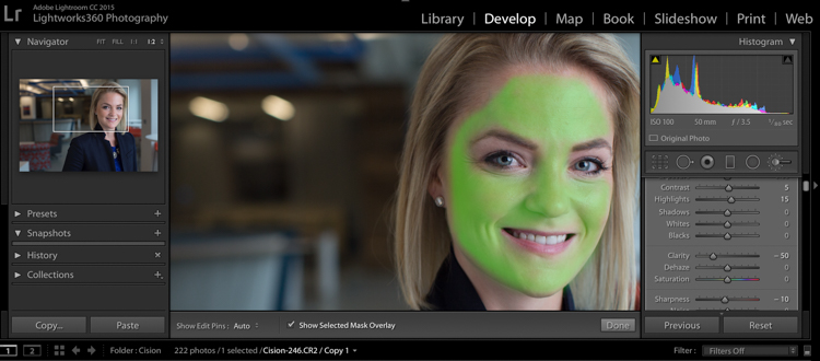
  • Press O to hide or show a mask overlay of the Adjustment Brush tool effect, or use the Show Selected Mask Overlay option in the toolbar. This is helpful so you can see exactly what areas you’re affecting. It also makes editing at a coffeeshop or plane pretty funny because whoever peeks over your shoulder thinks you’re turning all your subjects into the Incredible Hulk. (Shift+O will tile through the overlay colors: white, black, red, green).
  • Press Ctrl+Z (Windows) or Command+Z (Mac OS) to undo your adjustment history.
  • Hold Alt to take away any mask you’ve put in (holding Alt while you use the paintbrush turns it into an eraser to paint away). This is helpful just to clean up any minor mistakes you made while adding adjustments.

Okay, here are the adjustments I make (in this order too):

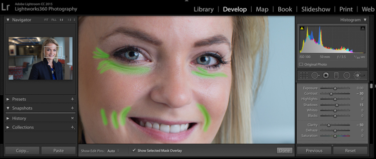
#1 Soften Skin

This helps just to clear up pores and generally be forgiving of any blemishes.

  • Clarity -50
  • Sharpness -10
  • Contrast +5
  • Highlights +15 (to counteract the highlights being muddied by lowering clarity)

I take my brush over the entire face except for the eyes, eyebrows, and lips, so the face is fully Hulkified.

dpsheadshot (1 of 6)

Note that you can change the color of the Mask Overlay (Shift+O), but I just stick with green as it’s nice and easy to see. If you make a mistake and go over any of the areas you want unaffected, just use the Alt key to turn the brush into an eraser and paint them away.

#2 Diminish Lines

I put this in to give an overall softening of shadows created with any kind of wrinkle or smile line.

  • Contrast -30
  • Shadows +15
  • Clarity -50
  • Sharpness -10

dpsheadshot (2 of 6)

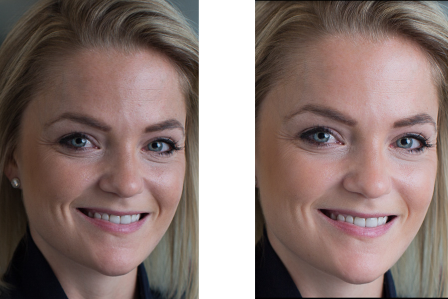
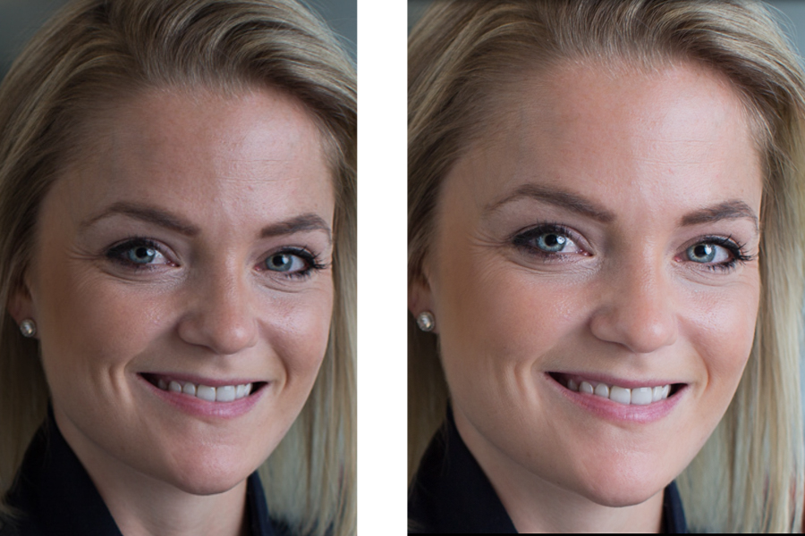
So let’s look at the before and after of what we have so far. You’ll see that the the skin is more even throughout, and the deep shadows of the lines are reduced and softened, but not removed completely. The goal is to freshen, not make them look like a plastic doll.

dpssidebysideskin

Next up, let’s get those eyes popping a little more. This is easy to overdo, so be judicious with this step.

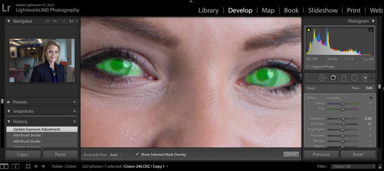
#3 Brigthen Eyes

Get the whole eye in this first adjustment:

  • Exposure +0.2
  • Contrast +10
  • Clarity +10

dpsheadshot (4 of 6)

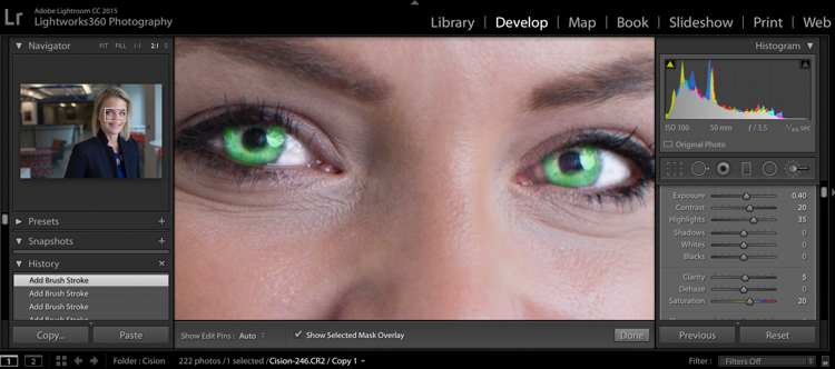
#4 Enhance the Iris

Now we’ll focus on just the colorful part of the eye, the iris. We’ll add a little more exposure and a touch of saturation:

  • Exposure +0.40
  • Contrast +20
  • Highlights +35
  • Clarity +5
  • Saturation +20

dpsheadshot (3 of 6)

Let’s check back in with a before and after comparison:

dpssidebysideeyes

It’s subtle, but there’s just enough pop around the eyes, without it being overdone.

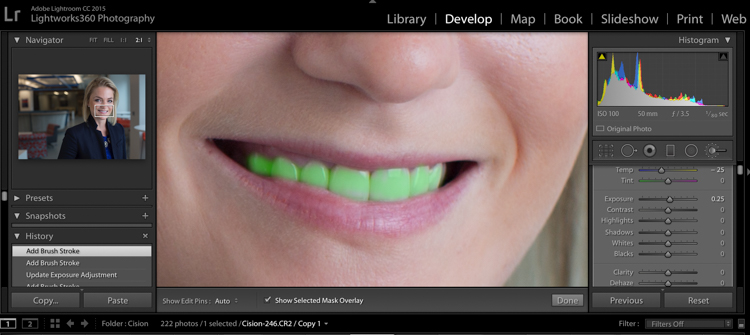
#5 Whiten the Teeth

Let’s make their dentist proud:

  • Temp -25 (adding blue takes out any yellow in the teeth)
  • Exposure +0.25
  • Saturation -20

dpsheadshot (5 of 6)

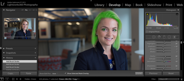
#6 Hair and Eyelashes

For this final touch, it’s nice to give a little definition to the hair and eyelashes.

  • Contrast +10
  • Highlights +20
  • Shadows -10
  • Clarity +30
  • Saturation +10
  • Sharpness +30

dpsheadshot (6 of 6)

Cute wig, right?

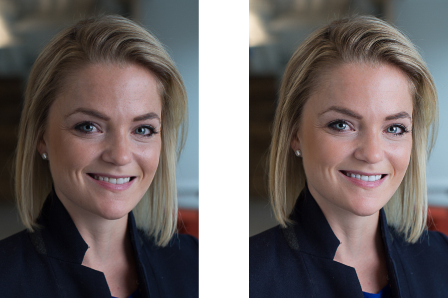
Let’s look at the final before and after now:

dpsheadshotsidebysidefinal

And here’s the photo that was delivered to the client:

dpsheadshotdeliver (1 of 1)

All of these changes are delicate. Done right, and they’re almost imperceptible. Retouching your corporate headshots doesn’t need to be an hours-long endeavor. Your clients don’t need to be on the cover of Vogue– they need a no-fuss photo that’s Linkedin ready, and shows them at their best.

googletag.cmd.push(function() {
tablet_slots.push( googletag.defineSlot( “/1005424/_dPSv4_tab-all-article-bottom_(300×250)”, [300, 250], “pb-ad-78623” ).addService( googletag.pubads() ) ); } );

googletag.cmd.push(function() {
mobile_slots.push( googletag.defineSlot( “/1005424/_dPSv4_mob-all-article-bottom_(300×250)”, [300, 250], “pb-ad-78158” ).addService( googletag.pubads() ) ); } );

The post How to Edit Corporate Headshots in Lightroom by Tim Sullivan appeared first on Digital Photography School.


Digital Photography School

 
Comments Off on How to Edit Corporate Headshots in Lightroom

Posted in Photography