RSS
 

Posts Tagged ‘Discovered’

Instagram ‘Public Collections’ feature discovered in Android app code

28 Feb
A view of the ‘Saved’ post section of the iOS Instagram app, also known as ‘Collections.’

Two years ago, Instagram released a feature called Collections that enables users to privately group posts together for organized safekeeping. The company now appears to be testing a new setting that would allow these users to make their Collections public. The discovery was made by software engineer Jane Manchun Wong, who has an excellent history with uncovering unannounced features in mobile apps.

The new public setting for Collections is not available to users, but Wong recently published a screenshot of what the feature currently looks like. Instagram told TechCrunch that it is not testing the feature, which indicates it is still in development. It’s possible the new option may appear for some users in the future when (if) public testing starts.

With the public option, Instagram users would be able to create curated Collections featuring a variety of content from different Instagram users. Based on the above screenshot, it appears Instagram would enable users to add contributors to their public Collections.

Public Collections would help address the issue of unauthorized content sharing via screenshots, as well as offering an alternative to Pinterest ‘boards.’ As with any unannounced feature, it’s possible the final product will differ from the version still in development. Likewise, Instagram may scrap the project and never release the ‘public’ Collections setting.

Articles: Digital Photography Review (dpreview.com)

 
Comments Off on Instagram ‘Public Collections’ feature discovered in Android app code

Posted in Uncategorized


Top 10 Luminar 2018 Features That I Discovered by Accident

07 Feb

Luminar’s powerful, customizable approach to image editing is wrapped in a cloak of simplicity which is great for photographers who tend to feel intimidated by the hundreds of buttons, menu options, and sliders available in other post-processing programs. The more you use it the more you will likely realize that there is far more to Luminar 2018 than a handful of presets and filters. You will probably stumble across some neat hidden features that can do a lot to improve your editing and workflow.

Here are 10 of my favorite features, in no particular order, that I found just by poking around and going about my usual business of editing photos with Luminar. Not all of these will change your life, but several might make you react like I did, by thinking “Hey now, that’s really useful!”

Top 10 Luminar 2018 Features That I Discovered by Accident

Luminar has a host of small but useful features up its sleeve to help novices and professionals alike.

#1 – Before/after preview slider

As a longtime user of Lightroom, the idea of having a before/after preview is nothing new. With one click you can see your image split in two, with one half as the original and the other half showing the edits. Luminar has this feature as well but it kicks things up one notch by allowing you to move the preview slider back and forth.

This lets you see your edits applied to any part of the image you want, and it updates instantaneously as you move the slider. It’s an incredibly useful feature that you might not notice at first, but once you do could seriously improve your editing.

Top 10 Luminar 2018 Features That I Discovered by Accident

#2 – Lasso tool for erasing

Sometimes you need the Spot Healing tool to remove unwanted blemishes and imperfections from an image, but sometimes that very same tool can drive you crazy due to its imprecise nature and circular application brush. When I first started using Luminar I was well aware of its healing tool that functioned much like similar tools in other applications, but I didn’t realize that it was also possible to use the same technology with a lasso-style implementation.

To erase oddly-shaped portions of an image select Tools>Erase, then select the lasso tool, and then click to outline the spot that you want to erase. When you are finished, click “done” and Luminar will eliminate it like it was never even there.

Top 10 Luminar 2018 Features That I Discovered by Accident

I liked this image but was not happy with the orange banner in the background.

Top 10 Luminar 2018 Features That I Discovered by Accident

The Lasso Erase tool let me select just the banner and then remove it from the photo with one click.

Top 10 Luminar 2018 Features That I Discovered by Accident

The final image is much improved, and it took very little effort to do so.

#3 – Single View Mode

As you add filters to an image it can get a little cumbersome having to deal with an ever-expanding vertical list of image adjustments. Thankfully there is an easy way to tame your filters. Just click on the Filters label at the top of the list and choose Single View Mode.

This collapses all of your filters and allows you to work with just one at a time, dynamically collapsing it when you click on another one. This single tip has saved me countless headaches as I scroll up and down my filters workspace to find the one I need, and I don’t think I could ever go back to any other way of editing.

Top 10 Luminar 2018 Features That I Discovered by Accident

#4 – Edit multiple images at one time

This one requires a bit of legwork but it can really come in handy depending on your editing needs. If you want to work with multiple images at one time, each on its own layer and with its own set of filters, click the + button in the Layers panel and add a new Image Layer. This new layer is added on top of your existing layer and can be combined with another layer with tools like masking and by changing the opacity.

However, you can also work on both images side-by-side by using the Free Transform option in the Tools menu. First select one of the layers, then click Tools > Free Transform, and re-size the image so it’s on one side of your screen. Do the same for the other layer, and you now have a workspace that allows you to edit multiple images at the same time.

Top 10 Luminar 2018 Features That I Discovered by Accident

#5 – Crop to Facebook cover

If you have ever uploaded a picture to your Facebook page as a Cover Photo you may have been disappointed to see your painstakingly-edited picture re-cropped and re-sized so the final result is a shadow of what you intended.

Luminar’s crop tool has a way to mitigate this issue entirely by including a Crop to Facebook Cover option in the crop tool. This will ensure that your resulting image will be just the right dimensions to fit perfectly on top of your Facebook profile page without any annoying automated edits from Mark Zuckerberg and his company.

Top 10 Luminar 2018 Features That I Discovered by Accident

#6 – Click the histogram to show color channels

It’s no secret that Luminar has a histogram view, and in fact, it would be kind of surprising if any image editor worth its salt didn’t have this tool. But what’s a little different here is that you can click the histogram to show individual color channels one by one.

This might not be something you use every single day but can really come in handy if you want to see the exposure level of the reds, blues, and greens.

Top 10 Luminar 2018 Features That I Discovered by Accident

#7 – Apply user presets during batch processing

Luminar’s workflow generally revolves around the idea of applying filters. You can also instantly apply many filters at once using a preset. What I find more useful, though, is that you can combine different filters to make your own presets, such as one that I use quite often called “Clarignette” that applies a bit of clarity while also adding a vignette.

It’s a simple but effective preset that I tend to use on many images, and Luminar’s batch processing tool makes this even easier. When you load a series of images for batch processing you can apply any of Luminar’s existing presets in addition to any custom presets you create yourself. This can dramatically speed up your editing if you find yourself doing the same types of editing operations on many of your photos.

Top 10 Luminar 2018 Features That I Discovered by Accident

#8 – Drag-and-drop layer reordering

Luminar’s layer-based workflow functions much like Photoshop and other editing applications. While this particular tip might not be especially groundbreaking it is something I found to be very handy. You can, of course, rename layers by double-clicking on their name and use blend modes by right-clicking on them (or control-clicking on a Mac).

But one thing I didn’t realize at first was how easy it was to reorder the layers in Luminar 2018. A simple drag-and-drop can be used to adjust which layer comes first. Since your edits are applied in a top-down fashion this can have a big impact on your overall image.

Top 10 Luminar 2018 Features That I Discovered by Accident

#9 – Change editing background color with one click

As a longtime user of Lightroom I have developed a pretty consistent set of editing preferences, and I have found that a light gray background helps me focus on editing my images without straining my eyes too much. However, sometimes I want to change the background color.

Luminar handles this with one click, which makes it a lot easier and more practical. Simply right-click (or control-click on a Mac) anywhere in the background area of your editing workspace to change the color.

Top 10 Luminar 2018 Features That I Discovered by Accident

#10 – One-Click Preset Updates

It’s not uncommon for me to create a preset and then change it over time as my editing evolves, but for a while I used a cumbersome process to do this. It involved clicking on a preset, changing its parameters, saving it as a new preset. Then I’d navigate to the Preset folder on my computer to delete the original preset and finally change the name of the revised preset.

It was a chore and often resulted in a Preset folder littered with old versions that I didn’t use anymore, but thankfully there is a much easier way to do this. Simply click the name of one of your Custom Presets in the tray at the bottom of the screen and choose “Update with current settings” and your preset will be updated without any other work on your part.

Top 10 Luminar 2018 Features That I Discovered by Accident

More to discover

While some of these tips might not be new to you at all, each was something I stumbled across by accident while using Luminar 2018. They served as a reminder to me of how I appreciate this program’s ability to surprise and delight.

I enjoy finding useful tips and tools by accident, and Luminar is full of these sorts of hidden, helpful features. What sorts of things have you come across while using Luminar? Do you have a favorite tip or trick to share? Please leave your thoughts in the comments below.

Disclaimer: Macphun, soon to be Skylum, is a dPS advertising partner.

The post Top 10 Luminar 2018 Features That I Discovered by Accident by Simon Ringsmuth appeared first on Digital Photography School.


Digital Photography School

 
Comments Off on Top 10 Luminar 2018 Features That I Discovered by Accident

Posted in Photography


3 Handy Lightroom Features I Discovered by Accident

27 Jan

When I first started to dabble in photography, I knew very little about post-processing. I used Picasa to edit my photos. It’s free and easy to use. I experimented with the different settings and created some pretty interesting images (they weren’t very good). Needless to say, I had no idea what I was doing.

This was the extent of my early post-processing attempts. I created collages in Picasa.

This was the extent of my early post-processing attempts. I created collages in Picasa.

Self-learning methods and benefits

Like many of you, I am a self-taught photographer. My degree is in English Literature, and photography was something I dabbled in as a hobby. I learned photography by reading books, participating in online forums and through trial and error. It’s been a long hard road but it’s been well worthwhile.

I learned most of my post-processing by watching YouTube videos. It has become one of my favorite ways to learn. There’s some inspirational stuff available that you can use to teach yourself all kinds of different skills. It’s a lot of fun, and the benefit of learning in this way is that you can go at your pace.

This type of learning is perfect for my lifestyle, and I’m sure for many of you the same factors apply. It always amazes me what we can teach ourselves when we put our minds to it. Check out this video. Sean Tucker experiments with landscape photography and discusses how important it is to continue to learn and push ourselves.

Three Lightroom Features Discovered by Accident

Now that we are on the path to self-directed learning I would like to share with you three Lightroom shortcuts, hacks, tricks, or whatever you want to call them, that I learned completely by accident. I just pushed buttons to see what would happen. By just experimenting, the results paid off. I learned some very efficient ways to manage my post-processing workflow, and I want to share them with you.

Accidental Discovery #1 – the Alt key

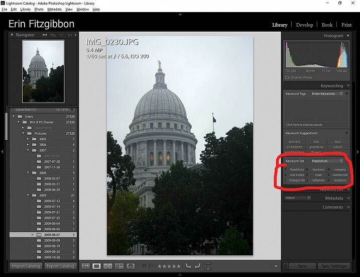
By simply pushing buttons I discovered some pretty cool functions. If you hold down the Alt key while in the Library module, little numbers appear by each keyword. You can then simply hit the number, and the module will tag your images with that keyword. Brilliant!!!

If you create a set keywords, this little trick becomes even more useful. The keyword set is then added to your images by simply typing in the correct number.

Alt key Lightroom Library module

This little discovery saves me loads of time.

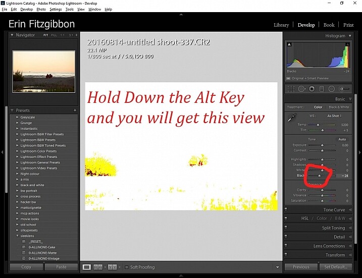
In the Develop module, the Alt key is very useful when setting black and white points in your images. Hold down the Alt key while hovering your cursor over the Blacks slider. The image will go completely white and as you move the slider from side to side (move it left to darken or add black) you will be able to see when the blacks begin to clip in your image.

This is a great way to adjust your image and super easy to see (and adjust) how much contrast range it will have. You can use the same principle to adjust the white points in your image. Give it a try. It’s one of the first steps I take when editing my work.

Note: It’s okay and even desired to have some blacks clipping in your image, but ideally you want to keep any whites from doing so. Clipping means areas with no detail in that tonal range.

Alt key Lightroom Develop module black point slider.

Here’s a screen shot of the black point slider.

Accidental Discovery #2 – Navigator Window

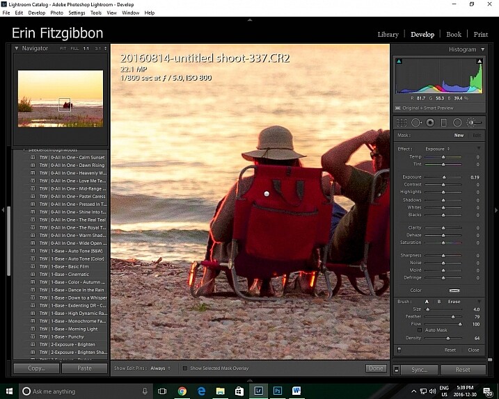
The Navigator window is very useful when you need to zoom in. This is probably really obvious and silly to those who have formal Lightroom training. Before discovering this little trick, I would zoom in and out applying the adjustment brush to small sections of the image. It was very tedious.

Then one day I discovered that if I click the 1:1 button on the Navigator (preview) window and then slide the square around on the screen, I could apply the adjustment brush without the tedium of closing the adjustment brush and moving out to the full-screen view.

Lightroom features 1:1 preview window

When I need to apply the same brush to several different areas of an image I click on the 1:1 feature and slide around the image making adjustments.

Accidental Discovery #3 – Lights Out in the Library

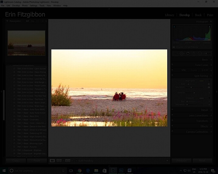
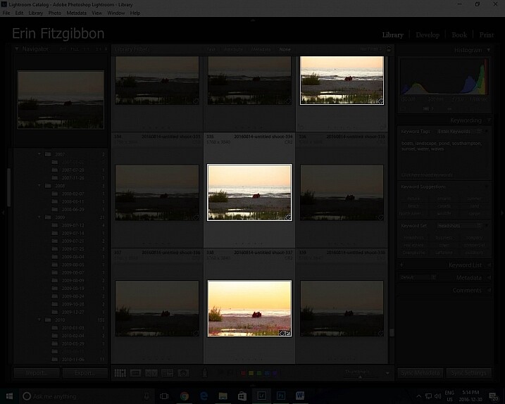
It took me a little while to figure out this trick. Again, I was just experimenting and pushing buttons. I had learned to use the Lights Out feature in the develop module.  When you press the letter L on your keyboard, it dims the surrounding panels so that you can focus more on the image at hand (press L again for total black around your image, and once more to return to normal). This same tool works well in the library module. I now use the “Lights Out” feature to isolate specific images. Simply select the images you wish highlight then hit the “L” button. It’s a neat little trick.

This same tool works well in the library module. I now use the Lights Out feature to isolate specific images. Simply select the images you wish highlight then hit the “L” button. It’s a neat little trick.

Lightroom features Lights Out in Library module

I use this feature to help me analyze an image before I decide it’s finished.

Lightroom features Lights Out in Library module

Look how easy it is to isolate specific images in the library module.

Conclusion

Experimentation is never a bad thing. We live in an age when we are lucky to have so many resources available to us. The internet is a true cornucopia of opportunity. Don’t be afraid to try different things. You really can’t break the program.

Sure there have been times when I have had to call Adobe and ask for assistance because I’ve pushed some button and haven’t been able to reset the program, but those times have been very few and far between.

Let me know about some of the tricks you use when post-processing. I’m sure there’s so much out there I still need to learn and I’m hoping you can add to my list of discoveries. What have you taught yourself about post-processing or using Lightroom in general? Please share in the comments below.

googletag.cmd.push(function() {
tablet_slots.push( googletag.defineSlot( “/1005424/_dPSv4_tab-all-article-bottom_(300×250)”, [300, 250], “pb-ad-78623” ).addService( googletag.pubads() ) ); } );

googletag.cmd.push(function() {
mobile_slots.push( googletag.defineSlot( “/1005424/_dPSv4_mob-all-article-bottom_(300×250)”, [300, 250], “pb-ad-78158” ).addService( googletag.pubads() ) ); } );

The post 3 Handy Lightroom Features I Discovered by Accident by Erin Fitzgibbon appeared first on Digital Photography School.


Digital Photography School

 
Comments Off on 3 Handy Lightroom Features I Discovered by Accident

Posted in Photography


Abandoned Ship: Spacecraft Discovered in Huge Derelict Hangar

18 Sep

[ By WebUrbanist in Abandoned Places & Architecture. ]

space shuttle destroyed prototype

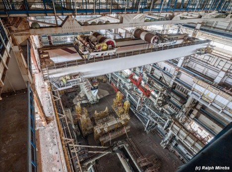
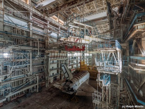
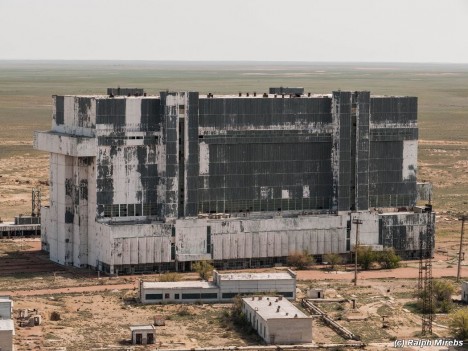
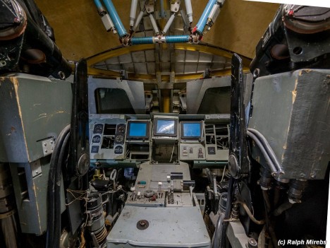
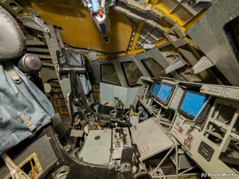
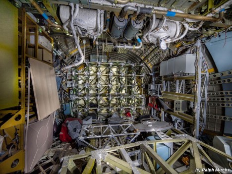
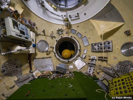
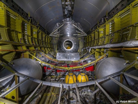
Remarkably intact and beautifully documented by a Russian urban explorer, this space shuttle prototype rests in a massive above-ground graveyard at the Baikonur Cosmodrome, deserted due to the collapse of the Soviet Union. Originally destined to dock with Soviet space station Mir, the model was almost finished and had even completed a test flight when the facility was shut down in the early 1990s.

space shuttle view above

space shuttle interior angle

space craft close up

space shuttle tail section

space shuttle building exterior

Photographer Ralph Mirebs identified the massive (yet somehow still unassuming) structure as an excellent target for exploration, but did not know just how many surprises were in store for him when he took his camera into the ruins. Positioning himself on catwalks and even entering spacecraft models, he was able to take pictures of an amazing array of spaces and equipment.

space shuttle cockpit view

space shuttle cockpit side

space shuttle interior debris

space shuttle inside

space shuttle looking back

As incredible as the outside of the craft may be, the insides are all the more fascinating, filled with the equipment intended to take it to space that somehow seems surprisingly fragile right here on the ground.

Next Page – Click Below to Read More:
Abandoned Ship Spacecraft Discovered In Huge Derelict Hangar

Share on Facebook


[ By WebUrbanist in Abandoned Places & Architecture. ]

[ WebUrbanist | Archives | Galleries | Privacy | TOS ]


WebUrbanist

 
Comments Off on Abandoned Ship: Spacecraft Discovered in Huge Derelict Hangar

Posted in Creativity


10 Things I Discovered at the WPPI 2015 Trade Show

18 Mar

Vegas-Mar2015-0117-600px.jpgWedding and Portrait Photographers International (WPPI) holds an annual conference and trade show. It’s a massive photography convention with over 10,000 attendees converging on Las Vegas, Nevada each year. I’ve personally attended it over 12 times – both as photographer and trade representative. This year I decided to go just to see some old friends I haven’t seen in way too long, meet some others I’ve only ever seen online, and to make some new contacts.

In this article I’ll share with you my top 10 things I discovered at the trade show this year at WPPI 2015, and how you could apply some things to your photography:

10 things I discovered at the WPPI 2015 trade show

#1 Westcott’s Ice Light

This seemed to be the hot ticket item of the show with constant line ups just to see and order one. Weighing in at just 1.3lbs (0.58kg), The Ice Light is an ultra-portable, battery operated, LED light you can take anywhere. It’s not cheap though – while the light itself is light, the price is a bit heavy at $ 450 USD.

This finn promo video will give you an idea what it’s all about:

Will it help you take better photos? Probably not – educating yourself will do that. But it might be a fun tool (aka toy) in your arsenal if the budget allows.

#2 Photographer’s Ignite

From Wikipedia: Ignite is a style of presentation where participants are given five minutes to speak on a subject accompanied by 20 slides. Each slide is displayed for 15 seconds, and slides are automatically advanced.

Photographer’s Ignite started in 2006 and has become really popular. As the last event at WPPI 2015 the large room was filled pretty much to capacity. You can see some sessions from their archives which I shared the other day.

There were some really great five minute talks, many of which inspirational. A great way to end a conference and head home – with ideas in your head. But remember, only taking action will move you forward. So watch as many of the sessions as you want – then get moving and DO something.

#3 Some really cool camera bags for ladies

Sorry guys there were man-style bags too, lots of them – I just didn’t scope them out this time around. One of my favourites (unisex) are ThinkTank – check those out!

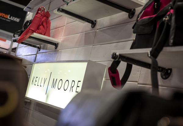
Kelly Moore Bags

This were literally flying off the shelves at the show, I even saw men purchasing them for their wives and people arguing over the last one of a particular style. They were that hot.
Vegas Mar2015 0111 600px

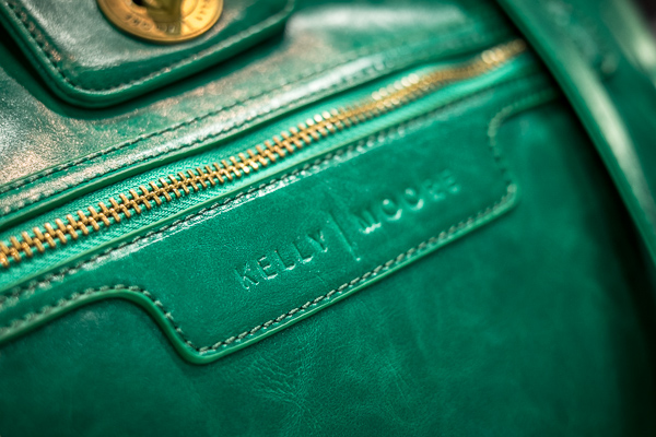
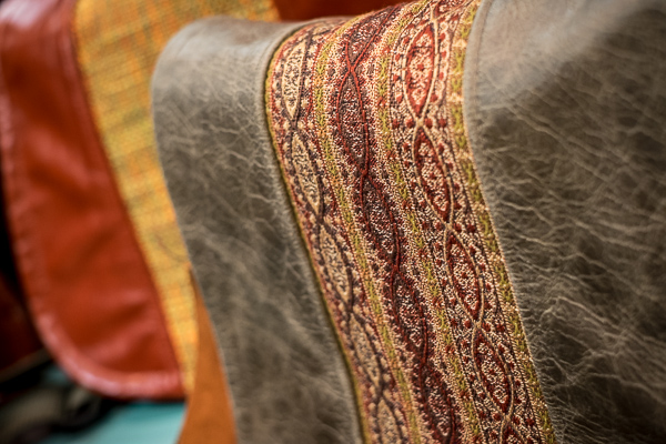
What’s so great about Kelly Moore bags? Well, they don’t look like a camera bags – they look like purses. The inserts come out too so you can put in lots of camera gear and fill them, half gear and personal stuff, or just use it as a purse without inserts. I know many female pro photographers that swear by these bags. Some can even double as a diaper bag for mom photographers.
Vegas Mar2015 0114 600px

They look pretty well made and stylish, I have to say.

Porteen Gear’s design your own bags

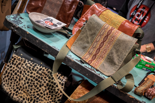
I found these online a while ago but hadn’t seen one in person. One of the booth’s had some on display and they lived up to my expectations.
Vegas Mar2015 0123 600px

Well made, high-quality materials, and you get to pick all the materials and colours so you can make a totally unique bag that only you own. You can even play with their Bag Builder tool online to see your bag virtually before you order. Select your bag size and style, leather color, accent color, the interior lining material and the strap and see your bag built in front of your eyes. With over 30 leathers and 100+ accent colours – you can be conservative or go crazy and show your style!
Vegas Mar2015 0126 600px

#4 – Some of our dPS trusted suppliers

As Editor of dPS I also took some time to stop in and meet some of our trusted vendors and suppliers like Tamron (who will be supplying one of our writers with their new 15-30mm f/2.8 lens to review for you), B&H Photo Video, and Adorama (more than a camera store). If you’re even in New York City, stop in and visit both of those stores. They are massive and you can get lost inside – but I do forewarn you – you may want to leave your credit card behind for safety!

I also found some new companies and make a few connections with some third party brands to see if we can get some items to review for you. Stay tuned to the Cameras and Equipment section for more when that’s available. Two products I found particularly interesting were the Nissin flashes and Sirui tripods.

#5 Storage and backup solutions

Vegas Mar2015 0049 600px

No the photo above has nothing to do with storage but photos of hard drives is a bit boring, so it’s a the token photos of an Elvis impersonator singing the Beach Boys instead. Only in Vegas!

How to save, backup and archive your images can be a big issue. I’ve been researching (okay my tech husband has) solutions for a while. One we’ve been looking at is the Synology system. I found three others I hadn’t heard of before at the show as well. Here is a list of them – keep in mind this is not a recommendation only a list as I know very little about them. Before purchasing and setting up any backup system do your due diligence and research to find the one that’s right for your situation.

  • Qnap – might be an excellent option for a small home user or photographer.
  • CRU – have a free backup information booklet available on their site.
  • G-Technology – these guys had a lot of really well known photographers endorsing their products. The only thing I disliked about them was that you have to use their drives, they are proprietary. Most other systems allow you to put any brand of drive into the system.

All of these are available on Amazon, but remember, please do your research before buying anything.

#6 Friends

Attending a photography workshop or conference is a great chance to make new friends, or see old ones. I did a little of both on this trip.

Longtime friends

Vegas Mar2015 0037 600px

One of my past incarnations, and why I’ve been to so many WPPI conferences, was the role of client support (North American representative) with Queensberry albums in New Zealand. They make some of the best wedding albums for professional photography studios (for wholesale resale to clients only). I worked with them for over nine years and made lifelong friends with my fellow workers and the company owners. Above you see Sonya (company director, used to be my boss), and Raktim (he’s my brother from different parents, mine in Canada, his in India).

Vegas Mar2015 0033 600px

It’s been six years since we have been in the same room together and we all agreed it’s been too long. Have you made friends at a conference or event in the past? Did you keep in touch? It’s a small world now – there’s no excuse not to – reach out to your “old” friends now.
Vegas Mar2015 0017 600px

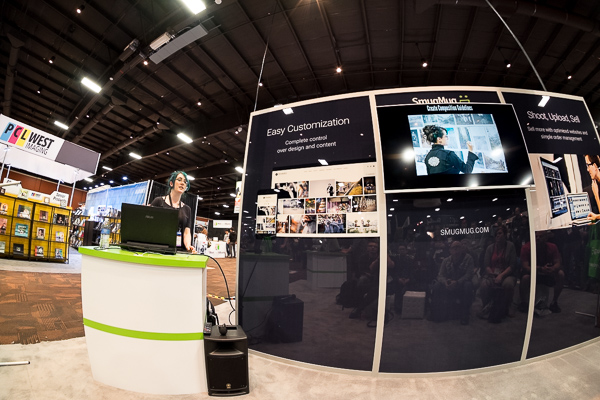
I also got to see my friend, photographer Renee Robyn speak for the first time. She does amazing work with models, Photoshop and light. She’s travels regularly and does workshops all over the world. If this style is up your alley check out her work. I will warn you she’s not G-rated though (her images and her language), so enter with caution if you’re sensitive.

New and online friends

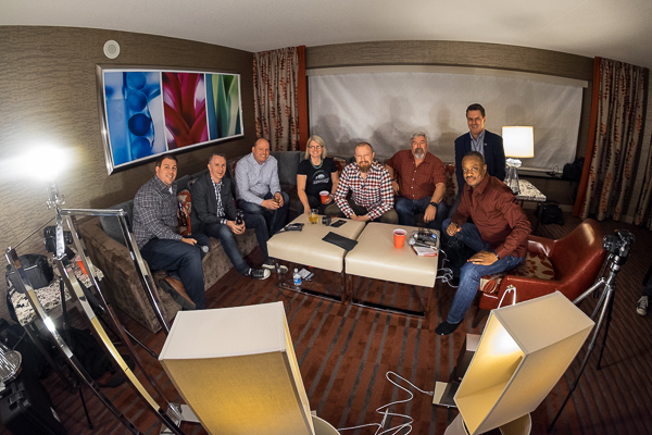
Along with connecting with some longtime friends I also met some of my online or virtual ones for the first time. That included Mr. Frederick Van Johnson who’s podcast This Week in Photo I’ve had the honour of guest hosting several times. We even recorded an episode from a hotel room in Vegas (it was me and about nine other guys in the room, could have used dPS writer and another TWiP host Valerie Jardin for some extra female energy).
Vegas Mar2015 0081 600px

Don’t you just love the high-tech lighting going on here for the video? They had every lamp in the room in front of us. It was a lot of fun as we discussed the show, where photography is going, what’s hot and more. You can watch or listen to the episode here.

I was also honoured to be interviewed by Frederick in the Panasonic booth for a women photography entrepreneurs Q&A session, with Catherine Hall.

Vegas Mar2015 0137 600px

#7 Education overload

There were LOTS of choices opportunities for learning including: books, workshops, DVDs, online courses, and more – an almost overwhelming number of choices are available. The best plan is to pick one or two sources for education and stick to those – we hope you pick dPS – and then focus on doing and putting it into practice. We even discussed this on the podcast (link above), that learning + action is one of the keys to doing better photography.

#8 – That an 8mm fisheye lens is a really cool toy
Vegas Mar2015 0274 600px

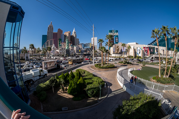
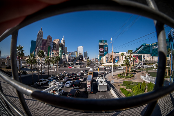
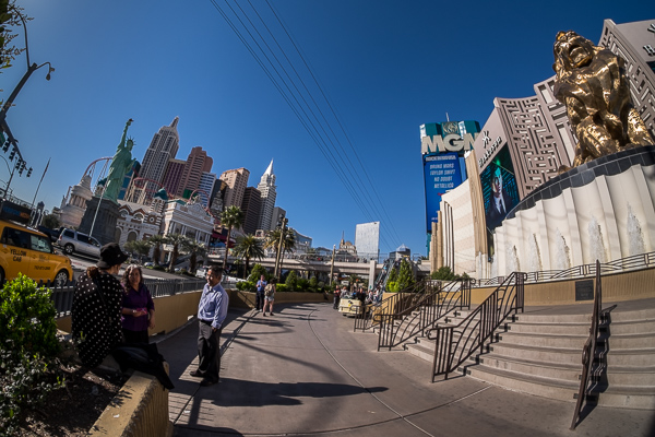
Just days before I left for Vegas my much anticipated Amazon shipment arrived with a new Rokinon 8mm fisheye lens, for my Fuji X-T1 mirrorless camera (APS-C sensor). On the cropped sensor it’s equal to about 12mm and man is it cool.

It’s completely manual (manual focus and exposure) and the camera doesn’t even recognize it. I have to shoot in a mode that tells the camera there is no lens on the front. But the camera does still adjust the exposure. Focus is a bit tricky but using the focus peaking feature on my camera helps. I have more than a few out of focus shots, so more use of the lens and practice is required yet.
Vegas Mar2015 0276 600px

Notice how wide the angle of view is; I had the lens touching the fence in this image and it’s still in the shot.
 

Vegas Mar2015 0256 600px

If you’ve never tried a fisheye lens give it a go, you can be super creative. But learn to use it wisely. You must put something in the frame close to the lens as the subject or you’ll just have a wide mess of nothing. See if you can borrow or rent one, or perhaps even pick up an old film lens and adaptor.

Vegas Mar2015 0301 600px

An obligatory selfie in the car’s reflective surface.

#9 That I really love travelling with the Fuji X-T1

A few months ago I invested in a mirrorless system and chose the Fuji X-T1. I admit I’ve had some issues with it, including it completely quitting on me in Nicaragua and having to be shipped back to Canada. But it’s got a new motherboard now and that seems to have been the issue (I got a dud – great!) as it has had no further issues.

The whole reason I added this camera (I didn’t switch, I still use my Canon 5D MkIII for portraits) to my lineup is for travel. I’ve been doing this a long time and I’m getting tired of hauling around so much heavy gear all the time. On this occasion I just grabbed the camera, 35mm f/1.4 lens (super light-weight and small) and the Rokinon 8mm. With the camera and lens around my neck, I was able to walk around every day carrying just my purse and extra lens inside. It was awesome!

Not convinced – read some dPS articles on mirrorless cameras and you decide if it’s right for you. It may be – it may not be.

#10 Sometimes getting away is a good recharge

You’ve probably heard this before, but getting away from home – if even only for a couple days – can be a great energy reboot and boost for your creativity. You don’t even have to go far – a neighbouring town, a drive in the country for the afternoon even, just a change of scenery and routine can be just the thing you need.

So that’s what I discovered at the 2015 WPPI show. Have you attended WPPI or any other photography conference? What were your take aways?

googletag.cmd.push(function() {
tablet_slots.push( googletag.defineSlot( “/1005424/_dPSv4_tab-all-article-bottom_(300×250)”, [300, 250], “pb-ad-78623” ).addService( googletag.pubads() ) ); googletag.pubads().enableSingleRequest();
googletag.pubads().disableInitialLoad();
googletag.pubads().collapseEmptyDivs( true );
googletag.enableServices();
} );

googletag.cmd.push( function() { googletag.display( ‘pb-ad-78623’ ); } );

googletag.cmd.push(function() {
mobile_slots.push( googletag.defineSlot( “/1005424/_dPSv4_mob-all-article-bottom_(300×250)”, [300, 250], “pb-ad-78158” ).addService( googletag.pubads() ) ); googletag.pubads().enableSingleRequest();
googletag.pubads().disableInitialLoad();
googletag.pubads().collapseEmptyDivs( true );
googletag.enableServices();
} );

googletag.cmd.push( function() { googletag.display( ‘pb-ad-78158’ ); } );

The post 10 Things I Discovered at the WPPI 2015 Trade Show by Darlene Hildebrandt appeared first on Digital Photography School.


Digital Photography School

 
Comments Off on 10 Things I Discovered at the WPPI 2015 Trade Show

Posted in Photography