Google unveiled significant new innovation in the world of online photography this morning, continuing their rapid development pace on Google+. All in, Google+ pushed out 41 new features today.
Much of the new work is focused on post production photography to make people’s photographs look better than they can straight out of the camera.
Some have suggested that part of Instagram’s success has been their ability to enhance users’ photos with very simple, one touch filters. Instagram has focused on a faux film aesthetic which actually highlights the flaws in many photos to give them more of an artistic, old school feel. By contrast, Google’s easily and automatically applied post production tools, released today, work to make photos look more vivid, life like and realistic.
By using simple techniques like skin softening, clarity adjustment, smart vignetting, HDR and other enhancements, Google, by default, now offers an enhanced photo for every photo uploaded by users to Google+. Also, with this new tech, Google will give you the ability to view the before and after results and decide which you prefer to use. For photographers who do not want their photos altered in any way, these users can turn this default functionality off.
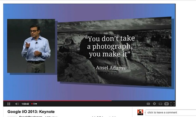
As a photographer, I have long been a believer of photo manipulation and post processing technology. Ansel Adams said “you don’t take a photograph, you make it,” as highlighted in Google Social Chief Vic Gundotra’s keynote this morning. Much of Ansel Adams’ genius has been attributed to the work that he did in the darkroom with his photos, his zone system, his post production technology of his time.
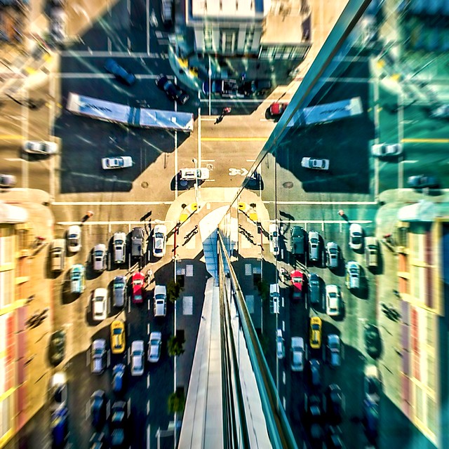
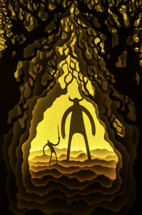
I post process all of my photos. The photo at the top of this post is the very first photo that I made with my new Google Glass that I bought yesterday. While I was able to get the composition to a point where I wanted in camera, much of the pop of that image is done with my own post production technique and style.
Many of my photographer friends also spend a great deal of time post processing their images — but the vast majority of the people out there really don’t post process at all. These people don’t own Lightroom and Photoshop or Nik Suite or Aperture or whatever else they might use to improve their photos. These are every day non-photographers who are still enamored with photography and imagery.
By applying some very basic algorithmic based enhancements, Google can make photos for the masses look much better than straight out of the camera. This is a very smart move on Google’s part. Where Instagram makes your bad photos look purposefully worse, Google now makes your bad photos look purposefully better! I stole that line from an unnamed source, btw. 
Where this new tech is especially powerful is in photos of people. By using basic skin softening post production tech, photos of people will look better on Google+ than on other social networks. By appealing to our vanity, this gives Google a big advantage. If people can post photos of themselves on Google+ that make them look BETTER than on other networks, many more people will choose to post their photos on G+. Just watch as people post photos of themselves on G+ for auto beautification and even download and post them to other networks I bet.
All of this sort of fancy post production *can* be done today by skilled post production photographers who spend hours and hours behind Photoshop. Now much of it will be automated and released to the masses.
There will undoubtedly be some naysayers about this tech. The same folks who moaned about the Instagramification of mobile photography will probably also complain about this new tech too. Google was smart here by giving users a very simple way to deal with this, by simply turning off this feature.
While the photo enhancements were the sizzle of Google’s announcements today, there were many other significant enhancements added to Google Photos.
Google will now begin to analyze your images and auto tag them. This is no trick where low paid overseas workers are manually reviewing your images; Googles’ algorithms now can look at the context of your photo and the actual subjects in your photos to identify possible tags for the images. If you post a photo of the Eiffel Tower, Google can detect the Eiffel Tower in your photo and add that tag for you. If Google gets the tag wrong, for whatever reason, it’s simple for you to just remove it.
What this means is that more of your photos will be seen in search by people using Google products. Many photographers are looking for more traffic and views on their photos. Who better to provide this traffic than Google Search, yes, using Google auto applied tags. This is the future of image search. If you are a photographer, especially one who depends on photography for your living, you cannot afford to ignore the significance of Google Search. Many of my own photo sales are made by people finding my photos while searching on Google. By uploading your photos to Google+, your photos will rank better in search and now even moreso with this new auto-keywording functionality.

Google also introduced a new smart algorithm that can analyze your photos and show you which ones Google thinks are the best of the batch, offering you highlights. Oftentimes we will “spray and pray,” taking 20 images of one person or subject. Google will analyze all of the images and suggest the best one for you. Google uses not just technical information about a photo (is it blurry or underexposed?) but they are using human tested aesthetics to look for what is most appealing.
But there’s more! In addition to the tech released above, Google has also added some very easy tools which will auto generate gifs for you of your photos, auto HDR bracketed shots, and suggest other compelling ways for you to present your photography to the world. Almost miraculously, Google can even look at photos of multiple people and merge the photos into a single photo that takes the best expression of each individual from *different* photos.
All of this also comes with an awesome new look and layout of Google+ which better highlights photography on the network. Popular photos will now be featured in jumbo new oversized form across a three column layout. For non highlighted photos, Google also made portrait oriented photos, especially, look better and bigger. In the past, the portrait format was the worst looking photo format on Google+, now it’s the best — that’s worth noting.  For folks who don’t like the three column layout, they can switch back to a single column if they’d like.
A couple of other notes: all of this work that Google does with your photos is done behind the scenes for your eyes only. You can use the tech or not use the tech. If you use the tech and like it, *you* then choose to share the image to Google+. Nothing is shared until you choose to share it.
The new technology will only work with the JPG format (hopefully Google comes out with RAW support down the road). Google increased everyone’s storage to 15GB of online storage, but note that any photo sized 2048 px or smaller does not count towards your 15GB storage limit (you can also buy more storage if you want to). Google allows unlimited uploading of photos that you either manually resize or allow Google to resize to 2048 px. There is an option on Google where you can set whether or not you want to upload full high res photos or resized 2048 sized images.
I upload some of my photos full res, and many of them I resize manually myself to 2048 px.
Google also introduced a free, stand alone hangout app that you can now use with your mobile phone or desktop device bridging text, photos and real time group video into a single app that preserves conversations (at your choice) over long periods of time. Hangouts have been one of the most popular Google+ feature and several photography related shows have been built around them.
More detail on these changes at Google here. More from Matthew Hanley here. Trey Ratcliff wrote insightful commentary here.
Thomas Hawk Digital Connection















You must be logged in to post a comment.