RSS
 

Posts Tagged ‘creatively’

Creatively Using the New Lightroom Hue Control

06 Aug

The post Creatively Using the New Lightroom Hue Control appeared first on Digital Photography School. It was authored by Rick Ohnsman.

Shop for items online and you’re often offered color choices. Would you like that hat in red, orange, blue, green, tan or teal? Click on the item, select your desired color, and the item will change to reflect your color choice.

Now, how about if you could selectively change the color of items in your photos without affecting other colors in the image? Maybe you bought the orange hat, took a photo of yourself in it, and wished you’d instead picked the blue one. No problem, don’t return the hat; you can change its color in your photo with the new Adobe Lightroom Hue Control.

One shot, multiple colors with new Lightroom Local Hue Adjustment tool
One photo, many color variations using the Lightroom Hue Control tool.

Global versus local adjustments

Reach for the Exposure slider in the Develop Module of Lightroom, and slide it left and right. You will see the entire image get lighter or darker. Any of the other sliders will affect the image similarly. Controls which affect the entire image are called global.

What if you want to adjust just a portion of the image? Brighten up that one tree, do some dodging and burning, bring up the saturation of a sunset, make adjustments that affect only certain areas?

To you so you need to be able to make local adjustments. Lightroom offers three tools with this capability: the Adjustment Brush, the Radial Filter, and the Graduated Filter. Using those tools to add masks to the image will then allow you to apply the effects of the other sliders to just the masked areas.

Adobe photo editing programs

Adobe Photo Editing programs
Choose your weapon: Lightroom Classic, Lightroom, Photoshop, or Adobe Camera Raw.

In discussing the use of the Lightroom Hue Control, I’ll be using the Adobe product I typically work with: Lightroom Classic. (The new logo now shows LrC.)

This is the version that runs on your local computer and stores images on your own hard drives. There is another version that Adobe simply calls Lightroom (LR). It has a slightly different interface and stores images online in the “cloud.” Then there is Photoshop (PS) with its accompanying tool, Adobe Camera Raw (ACR). Both versions of Lightroom have the new Hue Control, as does Adobe Camera RAW, so what we cover here can be done with any of those programs.

(Just a gripe with Adobe: Could you not have avoided confusion and named these programs differently?)

Wouldn’t Photoshop be better?

Before we discuss how to change colors in an image using the Lightroom Hue Control tool, I want to briefly address the Photoshop devotees in the crowd. More than a few times when I’ve told seasoned editors that I use Lightroom to edit my images, they will scoff and tell me that “real” photo editors use Photoshop. So let’s get this out of the way, especially as we discuss changing colors in an image.

I will be the first to admit that Photoshop has more sophisticated and precise tools, the ability to make selections, create layers, use color channels, and bring much greater control to what we’ll be showing here. However, Photoshop also has a much steeper learning curve. It also requires more steps to accomplish the task. Can you do a better and more precise job changing the colors of things in a photo with Photoshop? Most likely. But can you often get acceptable results with Lightroom (LrC, LR, or ACR)? Learn the techniques in this article and then you tell me.

What is hue?

Ask a child to hand you the red crayon from the box and they can probably do so. They know what the color “red” looks like. But in the digital photography world, we have different ways of describing color.

Cameras can only “see” three colors: red (R), green (G), and blue (B). And there are only 256 values of each.

That’s why you can describe any color by its RGB value. Pure red is 255, 0, 0; pure green is 0, 255, 0; pure yellow (a combination of red and green) is 255, 255, 0.

In the printing world, where inks and pigments are used to make colors, cyan (C), magenta (M), yellow (Y), and black (K) are the primary colors, and any color can be created with a CMYK combination (i.e., red is 0, 100, 100, 0).

Defining color using the HSL model.
One way of defining digital color is using the HSL model: Hue, Saturation, and Lightness (or Luminosity).

There is another way of describing color, and that’s the one we’re interested in when using the Lightroom Hue Control. This uses a Hue (H), Saturation (S), and Lightness (or Luminosity) (L) description. Here, hue is synonymous with what we typically call color. Saturation refers to the intensity of the color, with zero saturation being shades of gray. Lightness/Luminosity is how light or dark the color is, with zero being black and 255 being pure white.

A new hue for you

So what we’re able to adjust with the Lightroom Hue Control is just that: the hue. We can make an orange hat blue without changing the saturation (S) or lightness (L). In doing so, we retain the tone and texture in an image while changing its hue/color (H).

Making it local

Lightroom has had tools for globally adjusting color in an image, such as the temperature and tint sliders and the HSL/Color controls, for some time. But those tools worked globally or had limited control over color. With the newest version of Lightroom released in June of 2020 (LrC 9.3, LR 3.3, ACR 12.3), the ability to combine hue adjustment with other tools was added. Now, color can be controlled much more precisely, exactly where you want it, and in combination with other tools. Local control is the ticket.

New Local Hue Control in Lightroom
If you’ve installed the latest version of Lightroom (LrC) or LR or ACR, you will now see this tool.

When, where, and how to use local hue adjustments

Perhaps a good way to learn how to use the new tool is to work through a photo and use it to selectively change some colors. We’ll use the image below of my grandson, William, (who to me in this shot looks like the Peanuts cartoon strip character Linus in the pumpkin patch awaiting the arrival of the “Great Pumpkin.”)

Original colors in this photo
This is the edited photo of William (aka “Linus” in this setting). These are the original colors of the image.

The hat trick: Step-by-step

Let’s take this step by step and change the orange hat to blue using the Lightroom Hue Control.

Local adjustment tools in Lightroom
There are three local adjustment tools in Lightroom: The Graduated Filter, The Radial Filter, and the Adjustment Brush.

We want local adjustment control, and I mentioned Lightroom has three tools that allow this: the Adjustment Brush, the Radial Filter, and the Graduated Filter. The Adjustment Brush is the best choice for selecting only the hat.

Select the Adjustment Brush, and turn on the mask overlay by hitting “O” on your keyboard or by checking the box that says Show Selected Mask Overlay.

Rough application of mask with Adjustment brush
Use the Adjustment Brush to roughly paint over the hat. Have the overlay on to see what you’re doing. Here I’ve made the overlay green to see it better.

Start painting over the hat with the Adjustment Brush. You may find that the overlay is red and hard to see on the orange hat, so you can cycle through the overlay colors by tapping Shift and O on your keyboard. I’d recommend turning the mask overlay green, which is much easier to see on the orange hat.

You are going to refine your selection in a minute, so for now, don’t worry about being precise.

Refining your selection

In Photoshop, we would likely make a selection of the hat using the tools provided. And once the hat was selected, we would see what has come to be called the “marching ants” dashed outline of our selection. Don’t look for the ants in Lightroom. There are no “selection” tools here. Instead, we use what are called masks to define where we want our effects applied. There are several ways to refine our selection. They are:

  • Use the add and erase features of the Adjustment Brush. You can add to the mask simply by brushing where you want. This is the default and you will see a “+” symbol inside the tool indicating you are adding to the mask. Want to erase or subtract parts of the mask? Hold down the Alt key (Option on a Mac), and the + will turn to a – symbol, indicating you are now subtracting from the mask. Zooming in close and working with a small brush will allow you to fine-tune the mask.
  • Another option is to check the Auto Mask box as you paint with the Adjustment Brush.
  • A fairly new addition to Lightroom is the Range Mask tool. You have the option to use Color or Luminance to create your mask. Because the hat we are masking is all fairly close to the same color orange here, a range mask should work well.
Using Lightroom Automask
Think of Auto Mask as an edge detection tool. Check the Auto Mask box and then use the Adjustment Brush to add (+) or subtract (-) from your mask.
Add to (+) or Subtract from (-) the mask
If the Adjustment Brush shows a + sign, you can add to the mask. Hold down the Alt key (Option on a Mac) to remove portions of the mask.

Home on the range

So let’s refine our selection of the hat with the Color Range Mask. Here are the steps:

  • Select the rough mask that you’ve already created. Then choose Color from the Range Mask dropdown.
  • An eyedropper tool will appear next to the Range Mask menu. Click to pick it up, then bring it over the hat.
  • Click the left mouse button and drag a small square over a portion of the hat to select a range of the orange colors. (Don’t worry about your mask overlay. It’s selecting the colors underneath.)
  • When you let go of the mouse button, the mask will be refined to now cover only the color range you selected. (A tip here: Put the eyedropper back when you are done with this range selection.)
  • To better see what was selected, hold down the Alt (Option) key on your keyboard and click the Amount slider for the Range Mask. You can drag the slider to refine the mask even further while doing this. Moving the slider to the right will increase the range of the selection; moving the slider to the left will decrease the range.
The Range Mask in Lightroom
The Range Mask will allow you to refine your mask using Color or Luminance.
Lightroom Hue Control
Using the eyedropper tool in the Color Range Mask, drag a box including samples of the color you wish to mask. Alternatively, click a spot, hold down Shift, and click another spot to choose multiple sample areas. When you let go, the mask will be refined.
Seeing the Range Mask selection
To better see what the Range Mask has selected, hold down the Alt key (Option on a Mac) and click and hold the Amount slider.

A whole new hue

Once we’re happy with our selection, it’s time to change the color. Here’s where we will use the new Lightroom Hue Control. Here are the steps:

  • It’s best to turn off the overlay option so you can better see the color shift, so press “O” on the keyboard. The overlay will disappear, but as long as the pin for your selection is still selected, you’ll be working with the right selection.
  • Go to the rainbow-like Hue control slider. You will see the top slider is set at the existing color; in our case, this is orange. Now, drag the bottom slider toward the color (on the top slider) you wish to change to. You will see the color change in the masked area of the image as you do this. Release the mouse button when the color gets close to the new color you want.
  • To further tweak the color, check the Use Fine Adjustment box. Now drag the slider left and right to refine the color as you like (it will barely move).
  • You may find you need to refine your mask if areas were missed or overflowed outside your desired area. Use the methods outlined above to fine-tune your mask further.
Changing colors with the Lightroom Hue Control
With your mask selected, use the Hue slider to choose the new color you want.

Further tuning

While your mask is still selected, most of the rest of the Lightroom sliders can be used and will affect only the area in that mask. For example, if the new color is too light or dark, the Exposure, Contrast, Highlights, Shadows, Whites, and Blacks sliders can all be used. You may want to explore what some of the other sliders can do for the newly recolored area.

Using other controls to refine the new LR color
You may want to use some of the other sliders in Lightroom to refine your new color. Most will work locally within your mask while it is selected.

When you are finished with all the tweaks and recoloring, don’t forget to click the Done button.

Before and After using the Lightroom Hue Control
Here’s a Before and an After. Notice I also changed some of the diamonds on his sweater using other masks, each done the same way.

Multiple masks and recolored areas

If you need to recolor another area of your image, simply make new selections and repeat the same process:

  • Make a rough selection with the Adjustment Brush, Graduated Filter, or Radial Filter. Do this with the overlay on to see where you’re working.
  • Fine-tune your selection
  • Change the hue as desired. Check the Use Fine Adjustment box to get the color you want.
  • Further fine-tune your area with the other sliders in Lightroom

Not just for clothing color changes

In the example above, the color change to the hat was pretty dramatic; we took it from the original orange color to the complete opposite complementary color on the color wheel (blue). Sometimes, though, you only want a subtle change. Perhaps you want to change the shade of green on the leaves of a tree, take out a color cast on a certain object in your shot, or slightly change the color of portions of the sky.

You might also want to omit the step of refining a mask, and simply use the Adjustment Brush, change the color with the Hue slider, and start painting. Subtle color changes to portions of your image might be a way to get the look you want.

Use the Lightroom Hue Control for landscape images
The camas blooms are probably closer to the blue shade in the before shot, but for dramatic effect I used the Lightroom Hue Control technique here to make them more purple.

Snapshots along the way

When working on an image in Lightroom and trying new things, it can be a good practice to make Snapshots as you go. That way, if you want to go back to any point in your editing process, you can.

Click the + symbol in the Snapshot panel (or use the shortcut Control/Command + N), give the snapshot a name, and then continue your work. Later, you’ll be able to go back to the snapshot if required. Perhaps you want to show the various color versions of an item but don’t want to save multiple files. Change the color, make a snapshot, change it again, make another snapshot, and so forth. Later, you can bring up the image, go to the named snapshot, and see that color version.

Multiple versions without multiple copies in Lightroom
A real plus of Lightroom is being able to make multiple versions without making multiple copies of a file. Work through your image, make multiple color versions, and use the Snapshot feature to save each color variation (all in the same file!). Also, notice here what a nice job the Color Range Mask did of selecting the background color of the blouse and allowing me to change it to purple while retaining the color of the flowers in the pattern.

Color your world

As Adobe adds new tools to its products, we have new ways of editing our photos. We can better achieve the creative looks we like and even have various versions of the same image (all without having to take multiple photos or make multiple copies of an image). I hope you’ll give the new Lightroom Hue Control a try.

And then post some of your before/after images in the comments. I look forward to seeing your creativity.

The post Creatively Using the New Lightroom Hue Control appeared first on Digital Photography School. It was authored by Rick Ohnsman.


Digital Photography School

 
Comments Off on Creatively Using the New Lightroom Hue Control

Posted in Photography


CineStill’s new developer kits make it easier than ever to creatively control slide film development

20 May

CineStill has introduced a new 3-bath processing system for slide film users that allows photographers a choice of three color and contrast profiles for the same type of film. Users can opt for a straight development to bring out the default characteristics of the film, or choose a tungsten balanced look or one with a warm tone and lower contrast. The Cs6 Creative Slide 3-Bath processing system allows photographers to get three quite different looks from the same emulsion by using a different developing solution.

The developers are part of a new 3-bath system that comprises a first developer that determines the color and contrast profile of the end result, followed by a combined the second developer and reversal process, and then a third bath that contains the bleach and the fix. CineStill claims the chemicals are easy to use and that temperature control is not as critical as in normal E6 processes, so successful home processing is much more achievable.

The three choices for the first developer are D6 DaylightChrome, D9 DynamicChrome and T6 TungstenChrome. The DaylightChrome developer is said to produce a neutral result with slightly enhanced color saturation and a usable dynamic range of 6 stops.

DynamicChrome produces a warm tone with enhanced contrast and color saturation but at the same time preserves highlight and shadow detail to offer a useable DR of 9 stops and extended exposure latitude. The TungstenChrome developer shifts the film’s color to correct for the use of warm tungsten lights saving the bother and light-lose of using a color-correction filter over the lens.

Photo by Sandy Phimester on Kodak E100 processed with CineStill Cs6 DynamicChrome

The one-liter kits contain enough chemistry to process 16 rolls or 100ft of film and are priced from $ 39 including all three baths, while the individual developers are available from $ 12.99. The chemicals are available now from the CineStill website, and from retailers in the USA and Europe from the summer.

Press release

Introducing: Cs6 “Creative Slide” 3-Bath process for color-timing E-6 reversal film at home

Chrome unlocked!

Want to shoot slide film? Want it to be quick and easy to process? Want to still have creative control over how your images look? Introducing the CineStill Cs6 “Creative Slide” 3-Bath Process for simple creative control of your E-6 film.

The reversal process is the purest of analog processes and it’s now more creative and accessible than ever! The colors of slide film are unrivaled and now you can color-time and control dynamic range with alternative 1st developers. For the first time ever, you can change the color profile of your slides. With limited slide film options available today, CineStill is tripling the choices available for slide film, and demystifying slide processing with only 3 baths to appreciate a beautiful photograph. Your slides should be superior to color-corrected negative scans, without sacrificing creative control.

For the past several years CineStill has been developing ways to bridge the gap between mail-order photo labs and instant photography. Whether it be a Monobath for B&W film, a simplified 2-Bath process for color negatives, a Temperature Control System for mixing and heating chemicals, or various partnerships to make daylight processing accessible… There’s no longer a need for a darkroom, professional lab or high-tech equipment to create analog photographs. You can now create beautiful color transparencies at home through one simple process.

With the Cs6 “Creative Slide” 3-Bath Process comes 5 new products

1. D6 “DaylightChrome” Neutral-tone 5500K 1st Developer
Renders approximately 6+ stops of usable dynamic-range* with bright whites and moderately enhanced color saturation, just like conventional E-6 processing. Daylight-balanced for conventional slides in daylight or with electronic flash. Single-use 1+1 dilution develops 8-16 rolls or 100ft of slide Film.
Kodak E100 DaylightChrome

2. D9 “DynamicChrome” Warm-tone 1st Developer
Renders approximately 9+ stops of usable dynamic-range*, while maintaining vibrant color-contrast and rich warm tones with preserved highlight and shadow detail (optimized for scanning) for a more cinematic look. Extended exposure latitude increases the usable dynamic-range* of slide film from 6 to 9+ stops! Conventional E-6 processing renders approximately 6 stops of usable dynamic-range*. Perfect for high contrast lighting or backlit subjects in daylight, shade or with electronic flash. Single-use 1+1 dilution develops 8-16 rolls or 100ft of slide Film.

3. T6 “TungstenChrome” Cool-tone 3200K 1st Developer
Renders approximately 6+ stops of usable dynamic-range* with cleaner whites, and moderately enhanced color saturation. Shoot in artificial light without sacrificing 2 stops of exposure to color filtering! Kodak’s published technical data sheet recommends exposing E100 at EI 25 with an 80A Filter in Tungsten (3200 K) light. Now you can expose at box speed in low-light or even push to EI 200 or 400, and color-time your slides in processing. With conventional E-6 processing this would require color filtration and a 2-4 stop exposure compensation. Single-use 1+1 dilution develops 8-16 rolls or 100ft of Ektachrome®.

4. Cr6 “Color&Reversal” 2-in-1 Slide Solution
Combines the reversal step with color development. 6min minimum process time for completion with flexible temperature range of 80-104°f (27-40°C)**. Reusable solution reverses 16+ rolls of developed slide film.

5. Bf6 “Bleaches&Fixer” 3-in-1 Slide Solution
Combines the bleach and conditioner steps with the fixing step. 6min minimum process time for completion with flexible temperature range of 75 -104°f (23-40°C)**. Reusable solution clears 24+ rolls of reversal Film.

* ”Usable dynamic-range” is the amount of full stops of exposure value that renders acceptable detail and color. “Total dynamic-range” however, is the maximum range containing tonal separation rendering any detail, and is often twice the usable-dynamic range. The usable dynamic-range of conventional slide film is between 6-8 stops (total 14-16 stops). Color negative is between 9-13 stops (total 16-21 stops). Digital sensors are mostly between 7-10 stops (total 12-15 stops).

** Maintaining temperature is not essential beyond pouring in a 1st developer. When a temperature control bath is not available, simply preheat the 1st Developer +2ºF warmer, and the other baths will automatically process-to-completion as they cool down. Only the 1st developer is time and temperature critical because it controls contrast and color.

Cs6 “Creative Slide” 3-Bath Kits for Reversal and E-6 Film

CineStill Cs6 3-Bath Kits will be available from $ 39. The 1000ml/Quart Kits can process 16+ Rolls or 100ft of Slide Film and the 3-2-1 Chemical Reuse Kits processes 32+ Rolls of film.
Included In Cs6 3-Bath Kits:

  • D9 “DynamicChrome”, D6 “DaylightChrome”, or T6 “TungstenChrome” 1st Developer
  • Cr6 “Color&Reversal” 2-in-1 Slide Solution
  • Bf6 “Bleaches&Fixer” 3-in-1 Slide Solution

The CineStill Cs6 3-Bath Kits and separate components are available for purchase now at CineStillFilm.com, and throughout the U.S. and E.U. markets later this summer.

Articles: Digital Photography Review (dpreview.com)

 
Comments Off on CineStill’s new developer kits make it easier than ever to creatively control slide film development

Posted in Uncategorized


5 Ways to Shoot Architecture More Creatively

04 Mar

The post 5 Ways to Shoot Architecture More Creatively appeared first on Digital Photography School. It was authored by Jeremy Flint.

ways-to-shoot-architecture-more-creatively

Architecture photography is an enjoyable genre of photography that can be photographed almost anywhere. With the expansion of the built environment globally, opportunities for photographing urban scenes have increased significantly. This makes architecture photography an attractive proposition. Buildings can make very rewarding photography subjects, especially as they are generally designed to be attractive to the eye. As buildings are a permanent part of our urban landscapes, you have as much time as you like to photograph the architecture. So, it is just a case of finding different ways to shoot architecture more creatively.

Read on to discover some useful techniques to help you with your architecture photography.

1. Shoot from afar

A popular choice for shooting architecture is from directly in front of it. Once you have captured architecture from nearby, try and find another viewpoint further away.

Shooting from afar is one of the best ways to shoot architecture more creatively. If you position yourself at a distance from the building, you will be able to get more of the structure in your scene and some of the surroundings. Is the building near a waterfront? If so, capture the reflection of the building in the water or take photos of the boats going by the building.

Alternatively, you may want to capture the bustle of the crowds around the building too.

You can capture an epic angle from a distance just by walking a bit further away and changing your perspective.

ways to shoot architecture more creatively

2. Find a higher vantage point

When looking for other ways to shoot architecture more creatively, try finding a higher vantage point for an alternative point of view. Buildings can look great shot from above.

Climbing up a flight of stairs or jumping in a lift can lead to other great vantage points to photograph structures from. From up high, buildings can look fascinating where you can be innovative with your shots and do justice to the people who designed the building.

Aim to fill the frame with your chosen subject and reveal some of its details. Alternatively, capture the structure as part of the wider cityscape.

5 Ways to Shoot Architecture More Creatively

3. Go inside

Not only is architecture designed to look beautiful on the outside, but their structures can also be just as great on the inside.

There are places all over the world that have great interior structures. Places like castles, cathedrals or famous landmarks can look great on the inside. Windsor Castle, Westminster Abbey and the Tower of London in England, for example. Other structures can have attractive stairwells, whilst some will house ornate rooms with decorative features.

The lighting inside buildings can also add to the drama of a place. This can either be from lanterns placed inside a building, interior lights or external light shining through providing shadows that transform the area.

You may need to learn more about capturing ambient lighting. See an article here.

ways to shoot architecture more creatively

4. Look for interesting patterns

Another brilliant way to shoot architecture more creatively is to explore the different aspects of a building and look for interesting patterns.

Look for leading lines, geometry, structures, and shapes. Walk around and change your viewpoint to convey the various features and reveal something different.

Shooting centerpieces or components on a wall are great ways to shoot architecture more creatively. Try to find a good angle from which to present the building and show it in a unique way that is not the same as the familiar-looking, regularly-captured shots.

5 Ways to Shoot Architecture More Creatively

5. Shoot the old and new

Whether you like to capture the latest structural designs or traditional buildings, both modern and ancient architecture can be beautiful.

To create an interesting image of a modern masterpiece or an ancient structure, you will need to interpret the building pleasingly.

You can achieve this with a good composition that draws on your own creative vision. Look up and capture its expanse, for example, to photograph the building uniquely.

Alternatively, look out for appealing surfaces and take a photo of something unusual. Original structures can be more rustic-looking, whilst newer buildings provide more modern and decorative aspects of architecture.

ways to shoot architecture more creatively

Photographing old and new architecture on bright sunny days is one of the best ways to shoot architecture more creatively. The play of light can be great for photographing strong shadows and deep contrasts.

The intensified shapes that result from the contrasting light are ideal for showing up form, bringing out texture and giving strong color. Sunlight can, therefore, enliven an image and make it more impressive.

Conclusion

In summary, architecture photography is becoming a popular genre of photography especially with the expansion of urban developments.

Some of the best ways to shoot architecture more creatively include photographing from afar, shooting inside as well as outside and capturing interesting patterns such as unusual geometry and shapes.

Finally, shoot old and new structures in an interesting way with your unique vision.

Do you have any further suggestions to shoot architecture more creatively? Share your comments and pictures with us below.

The post 5 Ways to Shoot Architecture More Creatively appeared first on Digital Photography School. It was authored by Jeremy Flint.


Digital Photography School

 
Comments Off on 5 Ways to Shoot Architecture More Creatively

Posted in Photography


9 Ways to use Reflections more Creatively for Stunning Photography

20 Sep

The post 9 Ways to use Reflections more Creatively for Stunning Photography appeared first on Digital Photography School. It was authored by Ana Mireles.

Mirrors or windows, ponds or lakes, it really doesn’t matter where you find them, reflections are eye-catching. In this tutorial, I’ll give you some ideas and inspiration on how to use reflections more creatively for stunning photography.

Creative use of reflections for stunning photography tutorial

We’re fascinated by reflections ever since we discover ourselves in a mirror, it’s no wonder we remain captivated by them. If you want to know about the technical aspect of reflections check out Rick Ohnsman’s article Understand Light and Color to Improve your Photography. Here, I’ll tell you nine ways to use them in your photographs.

1. Avoid a dull sky

The first tip to use reflections more creatively is to photograph them during bad weather. After the rain we usually find the sky to be grey and dull. Luckily the rain creates puddles, and water is a great reflector. Next time you find yourself shooting during a rainy day try looking down to the ground instead of up to the sky.

Look for water reflection for bad weather conditions

If you want to take this idea to the next level, you can add a flash to your photo-shoot. To learn how to do it check this article: Using Rain Puddles to Create Unique Reflection Photos.

2. Fill empty spaces

Similar to the dull sky problem, you can have an area that lacks detail or any visual interest. If it’s made of a reflective material the answer is easy, just find the right angle to capture it. What may have been a boring object, is suddenly filled with details that complement your composition.

Search for the right angle to add reflections

3. Create texture

Reflections don’t necessarily have to be mirrored images of reality. The texture of the material or surface will distort the image and you can use that to capture color and shapes. For example, the ripples of water reflecting buildings.

Reflections create textures

Remember that you can also zoom-in and photograph the reflection as a texture to use later in other images.

4. Abstract photography

Speaking of photographing a texture alone, this can give you some inspiration for doing abstract photography. There are many different angles to approach this subject and reflections are definitely a good one. Here’s an example, but if you feel interested in going deeper into it, check out some Abstract Photos to Inspire You.

Textures alone are great for abstract photography

5. Change perspective

Shooting common places or subjects that are not interesting enough is always a challenge. Photographing its reflection can be a great alternative to capture it creatively. This forces you to move, crouch, and generally change your point of view. Also, you’ll be looking at the subject backward, and sometimes just a little shift can make the difference.

Look for the reflection to change perspective

6. Creates symmetric shapes

Symmetry is beautiful and pleasing. On a subconscious level, it gives us a soothing feeling. I don’t mean just placing your subject in the center and make it identical on both sides. Of course, this is an option, but it’s not the only way. Reflections can create symmetric shapes that can help the overall image become more interesting.

Symmetry helps your composition

7. Frame your subject

You can also use reflections as a way to direct the viewer’s attention to your subject. For example, placing your subject as a reflection in a mirror or a window literally frames it. If you want to get more creative you can also use a pair of eyeglasses or a spoon.

Frame your subject

8. Overlapping planes

One of my favorite qualities of reflections is that they show you two, or more scenes on the same plane. When you look at a mirror you are also seeing what is behind you. With a window, you can even add a third plane when you also add the scene from inside the room, and so on. If you compose the subjects from each scene in a harmonic way you can create a surreal or dream-like image.

Compose different scenes in one

9. The reflection IS the subject

Last but not least, a reflection can be a subject in itself. You can make a project or a series just about reflections, it’s just a matter of finding a concept to build upon. If you need some inspiration, I highly advise you to read this Guide to Creating Unique Conceptual Photography.

Use reflections as the main subject

Come up with an idea and just run with it. I hope this article sparked some inspiration so you can use reflections more creatively! Share your reflection photos in the comments section below and, most of all, have fun!


use-reflections-more-creatively

The post 9 Ways to use Reflections more Creatively for Stunning Photography appeared first on Digital Photography School. It was authored by Ana Mireles.


Digital Photography School

 
Comments Off on 9 Ways to use Reflections more Creatively for Stunning Photography

Posted in Photography


How to Edit Fireworks Photos Creatively

05 Jul

The post How to Edit Fireworks Photos Creatively appeared first on Digital Photography School. It was authored by Rick Ohnsman.

I hope you had a chance to read my previous article, “Eight Tips for Better Fireworks Photos” before going out to make your fireworks images and found that helpful.  If so, you should have some good shots to work with here.  If not, these techniques will still work for you if you have some other good fireworks photos.  Either way, let’s see if I can teach you how to do the basic editing on your fireworks images. Then, how to creatively composite your shots and take the “wow factor” up another notch.

How to Edit Fireworks Photos

You shot in Raw, yes?

I realize that beginning photographers may be making their images with their camera set to save only the .jpg file, perhaps not having the editing tools or having learned to edit a Raw file.  While that’s not a deal-breaker, you will find doing so causes the camera to do much of the editing itself, using the camera’s built-in .jpg algorithm to “cook” the final image for you.  Perhaps while you are still a novice image editor, (cook), editing raw files can seem intimidating, and you may feel the camera is a better cook than you are.

The trouble is, with something like your fireworks photos, you will want as much latitude for creative editing as possible as well as much file information as the camera originally captured.  Letting the camera create a .jpg image lets it make the creative decisions and also throws away information you might have needed.

You will still be able to use the steps outlined here to edit a .jpg file.  Just understand things might not work as well.  One final plug for shooting Raw files before moving on – Almost all pros do, and that’s the level of work you want to create, right?  ‘Nuff said.

2 - How to Edit Fireworks Photos

This effect is what I call the “boom-zoom-bloom.” You’ll have to read Part One of this series if you missed how to create it.

Editing tools

The workflow described here assumes you will be using the editing programs I use for working with my images; Adobe Lightroom Classic and Photoshop.  Other editing programs may work equally well such as Photoshop Elements or another favorite of mine, Corel Paintshop Pro.  Use what you have and know; just understand the steps here are using the Adobe programs.  I will also sometimes use plug-in filters such as those in the Nik suite, Topaz Labs or Aurora.

Basic editing of a fireworks photo with Lightroom

This is my workflow with an image in Lightroom.  Much of the work simply involves moving each adjustment slider up and down to see what you like.  Playing is encouraged.

  • White Balance – You shot in Raw, right? Good, because if so, you can take the white balance wherever you like. Play with the Temperature and Tint sliders and get the colors you like.  Because fireworks have no “correct” color your viewer expects, you can pretty much adjust white balance however you like.  Although, if you’ve included foreground objects, you may want to use those as a reference in determining what is realistic.
  • Basic Controls – Play with the Exposure, Contrast, and other sliders to bring the image to your liking. If your highlights are a little bright, (but still not blown out), you can bring them back with the Highlights slider. You might also want to bring down the Blacks if the sky needs darkening
  • Adjust colors with the HSL/Color sliders. You can play with the Hue, Saturation, and Luminance sliders to tweak colors to your liking. Don’t forget to try the Targeted Adjustment Tool to pick and adjust specific colors in your image.
  • 3 - How to Edit Fireworks Photos
  • Dehaze – The Dehaze tool could be your friend and help reduce smoke in the shot if it became a problem.
  • Clarity and Texture  – These controls can give your fireworks images extra sharpness and pop.  Also, try sliding these controls toward the left for different looks.
  • Vibrance and Saturation – With standard photography, these two are typically used conservatively, particularly Saturation which is a bit of a sledgehammer. With firework images, however, often you are going for “pow,” so go ahead and play… it’s your shot.  Oversaturation will blow out details.  Watch each histogram RGB channel.  A histogram off the right edge means you’ve oversaturated that color.
  • Detail – Some sharpening can be good. The two best tools in this group for fireworks images are the Masking Tool and Noise Reduction/Luminance. Sharpen your image as desired.  Then, hold down the Alt key, (Option on Mac), and drag the Masking slider to the right.  What appears white will be sharpened, what is black will not.  The idea to allow the fireworks to be sharpened, but not the dark sky. As for Noise Reduction, if you shot at a low ISO you probably won’t need much. Use as little as needed here.
  • Consider saving settings as a Preset.  If you’ve used the sliders to get your image just right, you might want to apply the same settings to some of your other fireworks photos.  Saving the settings as a preset will allow you to apply the same look with a single click.

Other tools

I mentioned using plugins as options in your editing.  The sky really is the limit here.  Here are a few I have and sometimes find useful with fireworks photos:

Nik – Color Efex Pro, Viveza

Topaz Labs – Adjust, Denoise, (probably others too, I just I don’t have them).

Aurora HDR – You can work with a single image here not needing multiple shots as with traditional HDR work and can get some interesting looks.

Compositing for drama

Sometimes the best fireworks photo is a composite of several photos.  You can layer multiple images and create your own grand finale.  You can also put fireworks over places where they weren’t, but to your thinking should have been.

Confession time.

The image of the Boise (Idaho) Depot I used in the previous article, (and repeated above), is a composite.

They do have fireworks shows over this iconic landmark in our city; I’ve just never been there for a show.  I did, however, have nice nighttime images of the depot and also fireworks photos from another time and place.  With compositing, I created the image I wished I could have captured live but wasn’t there for.  What can I say, creative license, right?

So, you have a great fireworks photo.  You have a great night shot of a landmark or scene where you’d have liked to have captured a fireworks show.  Here’s how you make those come together.

Time for layers

If you only edit with Lightroom, this will be the end of the road for you.  Lightroom doesn’t do layers and they are a must for this technique.  Photoshop does layers, as does Photoshop Elements, Corel Paintshop Pro, and probably a few other editing programs.  Layers capabilities are a must for compositing. So, your editing tool of choice must have them.

Compositing images is a pretty advanced technique in some cases. However, because the background of your fireworks photo is likely to be black or very dark, things become much easier.  Learning compositing using fireworks images can be a great way to begin learning about layers, masks, and compositing in general.

Step-by-step compositing

  1. Open your fireworks image in Photoshop (or your editing program of choice).  You can open Photoshop first and then open the image or send it from Lightroom – (Photo/Edit In/Edit in Adobe Photoshop)

    How to send an image from Lightroom to Photoshop for editing. You can also send multiple images as layers in Photoshop, useful when doing the “Grand Finale” composites described later in this article.

  2. Open your other location photo, also in Photoshop.  You will have the fireworks photo and the scene photo each on separate tabs at this point. Just a note when selecting the scene photo: Select one that has a logical view, angle, and lighting that it will seem consistent with having fireworks in the shot.  Obviously, a daytime image or an image without much sky is just going to look weird.
  3. Go to the image of the fireworks.  Crop it to include just the fireworks section you want if you didn’t do this in Lightroom first.  Then Select All (Ctrl-A, Cmd-A on a Mac), Copy (Ctrl/Cmd-C)
  4. Go to the other tab with the Scene and hit Ctrl/Cmd-V for Paste.  The firework image will be placed as a layer on top of the scene image.
  5. With the fireworks layer selected, select the Screen blending mode.  The dark parts of the sky will become transparent and the fireworks will be superimposed over the underlying Scene image.

    Use the Screen blending mode and the black in the fireworks photo will become transparent showing the underlying image.

  6. You will need to place and size the fireworks where you want them over the Scene shot.  Use Free Transform for that.  With the fireworks layer still the one selected, Ctrl/Cmd-T.  Then hold down Shift and drag from a corner handle to resize while maintaining the aspect ratio of the fireworks image.  Click, hold and drag in the middle of the shot to move the overlying fireworks where you like.  Don’t worry about some of the fireworks perhaps appearing in front of things.  You’ll handle that in the next step.

    The fireworks moved and sized to put them where desired. Note: leaving a little overlap will add depth and make the composite look more realistic. You’ll clean-up in the next step.

  7. To touch up areas where the fireworks might overlap an area they should be behind, (note the fireworks overlapping the tower in my shot and the roof at the bottom), you will create a Layer Mask. Click the icon that looks like a rectangle with the dark circle in the center  A mask will be added to your fireworks layer.
  8.  With Black selected as your foreground color and the mask selected, use the brush tool to paint out areas where the fireworks overlap the foreground.  You want the fireworks to look like they are behind any foreground objects.
  9.  You may find areas in the fireworks layer weren’t black enough that the Screen blending mode eliminated them.  This might work for you –  With the fireworks layer selected, (not the mask, the layer itself), open the Camera Raw Filter (Ctrl-Shift-A).  Just the fireworks layer will appear in Camera Raw.  Take the Blacks slider down (left) to see if you can darken the problem areas.  Also, try the Shadows and Exposure sliders, but pay attention to how the fireworks are affected.  When you click OK, you will be returned to the Photoshop main window.  See if the problem is gone.  If not, use the brush on the mask as you did in step 8 to clean up any remaining areas.
How to Edit Fireworks Photos

This grand finale was captured in one 6-second shot and is not a composite.

The Grand Finale

The most exciting part of a fireworks show is when they shoot off a flurry of fireworks in rapid-fire fashion.  It can also be one of the harder parts of the show to photograph.  Sometimes the intensity of so many fireworks bursting in the air can result in a blown-out, overexposed mess with the settings used for most of the show not right now.

What to do?  How about creating your own finale with the compositing technique we just explored but this time, layering several fireworks images to build-up your finale shot.

How to Edit Fireworks Photos

When things really got crazy during the grand finale, the same 6-seconds was too much and the image was blown out. Look at the histogram. There’s no recovering highlights when they are pushed off the right side of the histogram. Way too overexposed!

Use the same steps as with the composite image we just covered. Stack up several layers of fireworks shots each on its own Photoshop layer.  Then turn on the Screen blending mode on all layers but the bottom one.  Use the technique as before, blending and masking as necessary.

Here’s what that might look like.

Position and clean each layer with a mask as before where necessary.  Voila!  Your own grand finale.

How to Edit Fireworks Photos

Fun even when the smoke clears

For most spectators, the fun of a fireworks show is over when the last boom is heard, and the smoke clears. As a photographer with editing skills, however, you can continue to create all kinds of exciting images with the fireworks shots you captured.  Using the editing and compositing techniques here will not only help you produce some great fireworks images but grow your editing skills in general.

Now, go have a “blast.”

Feel free to share your fireworks images with us in the comments below.


How to Edit your Fireworks Photos Creatively


The post How to Edit Fireworks Photos Creatively appeared first on Digital Photography School. It was authored by Rick Ohnsman.


Digital Photography School

 
Comments Off on How to Edit Fireworks Photos Creatively

Posted in Photography


How to Use ND Filters Creatively to Make the Most of a Scene

12 Feb

Photography is the art of capturing light. In many instances, harnessing the light and properly exposing a scene means controlling it first. This is necessary for many landscape scenes where contrast is high. You have likely seen high contrast many times: a sunset with dark foreground elements, a church with deep shadows, or a moonrise over a snow-filled background. Each of these situations (and many others like it) will present a challenge for you to overcome.

One of the tools that you have at your disposal to alter the amount of light hitting your camera’s sensor is neutral density filters (ND). These dark gray pieces of glass come in many styles (graduated, 1-stop, 2-stop, 10-stop, etc.) and do not alter the color of your image but do restrict the amount of light.

How to Use Neutral Density Filters Creatively to Make the Most of a Scene

I stacked a Graduated ND filter and ND Stopper for this image to control the gray sky and flatten the water around the island with a long exposure.

They provide an opportunity to control your exposure or create long exposures that emphasize static elements. This article will focus on Graduated ND filters that are clear on one half and dark on the other, as well as ND stoppers which are completely dark.

You can find more info here on dPS for learning about the fundamentals of using in ND filters. The rest of this article will focus on a few creative ways that you can experiment with ND filter angles, grades, and techniques to create unique shots.

Stack ‘em

You can easily combine ND filters to control more light in the scene as filter holders usually have more than one slot for multiple filters. Having multiple slots is a huge advantage because it allows you to stack filters on top of each other to control the light.

Be sure to think about creative combinations of filters to give you the most out of a scene. For instance, you may want to shoot a really long exposure to flatten out the water in a sunset, or you may want to control very bright highlights such as the sun. The table below outlines some of the possibilities that stacking filters can provide you.

ND GRADUATED ND STOPPER
GRADUATED FILTERS Graduated ND filters can be stacked on top of each other to control light and feathering at the horizon. Try stacking a hard-edged grad with a soft-edged grad to control more light high in the scene and then feather into a lighter foreground. An ND stopper filter will evenly stop out the light in the scene. You still need to control the highlights! Add an ND grad to control highlights in the scene and bring up the foreground shadows.
ND STOPPER You can combine an ND stopper with a flipped ND grad (i.e, put the dark side of the grad on the bottom). This approach is non-conventional but could be used if your highlights are at the bottom of a scene. See the Flip ‘em section of this article for more. Stacking ND stoppers on top of each other can give you very long (>1 minute) exposures even in the brightest conditions. This is a great tool for you to use to extend creativity mid-day.
How to Use Neutral Density Filters Creatively to Make the Most of a Scene

For this image, the boats in the harbor were important to complement the sunrise overhead. I stacked a Graduated ND filter and ND Stopper to control the sunrise and raise the foreground shadows.

How to Use Neutral Density Filters Creatively to Make the Most of a Scene

Preserving foreground highlights and shooting sunbursts can be difficult because of the extremely high contrast. I double-stacked graduated filters for this shot to give me a firm control of the highlights (the sun) and maintain the snowy landscape in front.

How to Use Neutral Density Filters Creatively to Make the Most of a Scene

This image was captured on a cold night in Minnesota (about -25F). At those temperatures, the sky after sunset has a purple hue, which was exacerbated by the double-stacked graduate filters that I used to control the light of the moon and allow you to see its craters.

Rotate ‘em

ND filter holders rotate easily around the lens giving you flexibility in the angle you choose. ND graduated filters are often aligned to the horizon by the photographer. This makes great sense if you have a flat horizon, but what if a mountain range is sticking up in front of you? You can take a little bit of creative license and easily align the ND filters to the angle of the mountains. Examine your scene and think about how the orientation and filters could emphasize foreground elements or draw the viewer’s eye.

In the images of Nugget Falls (below) in Juneau, Alaska I shot one image with a graduated filter flipped with the dark side of the sky and one over the falls. Although I personally prefer the images with the brighter falls, you can see how the lighter sky draws your eye to the mountain and glacier beyond the falls.

How to Use Neutral Density Filters Creatively to Make the Most of a Scene

How to Use Neutral Density Filters Creatively to Make the Most of a Scene

Hold ‘em

Let’s face it, you are not going to have a filter holder for every lens in your kit. However, that does not mean you cannot use filters! You can also hand hold a filter in front of your lens in a pinch.

I recommend that you mount your camera on a tripod before trying to hand hold filters. It will make them the easier to handle and allow you to compose your scene before adding the filter.

How to Use Neutral Density Filters Creatively to Make the Most of a Scene

I was not carrying a filter holder for a 100mm lens, but handheld the filter on this shot to raise the foreground shadows. Sometimes you have to make due with what you have.

Practicing in the Field

As you begin to use and experiment with ND filters you are going to grow as a photographer. Keep creativity in mind to give your shots a distinguished and unique look. As I like to say, “pixels are cheap” so be sure to make lots of pixels as you experiment with your ND filters.

I would love to hear how you have extended your photography through creative uses of ND filters.

The post How to Use ND Filters Creatively to Make the Most of a Scene by Ian Johnson appeared first on Digital Photography School.


Digital Photography School

 
Comments Off on How to Use ND Filters Creatively to Make the Most of a Scene

Posted in Photography


How to Shoot High-Traffic Locations Creatively

17 Nov

The experience of the hustle and bustle that comes from shooting in high-traffic, highly photographed areas is a pain that most photographers know all too well. People can be packed into overlooks and pull-offs with hardly even room to stand let alone set up a tripod.

It seems as if everyone is trying to get the same shot. Not that there’s something incredibly wrong with making photographs just like the person standing next to you. If you are simply after a snapshot to record where you’ve been then a quick capture or two taken from the herd will do just fine.

How to Shoot High-Traffic Locations Creatively

However, if you’re like me, you probably want more from a location than just a cookie cutter photo. When I visit a well-known photo spot that is crowded with people all shooting the exact same thing, I feel a need to produce something that is more of an artistic expression of how I view the scene.

While recently shooting in Yosemite National Park, I observed this situation in full force. But how can you shoot in these high-traffic areas creatively? Believe it or not, in some cases it doesn’t require too much effort in order to breathe new life into a stale or overshot scene. In this article, we’re going to talk about three ways that can help you break the monotony and guide you toward making your photos of well-known areas less ordinary.

#1 – Get High…Get Low

Changing from the common perspective to one that is either more or less elevated can have a huge impact on the final interest of your photographs. Often times, the majority of photographers shoot from the same plane of view each and every time which often produces literal “photocopies” of the same location.

This changeup doesn’t have to be anything drastic, either. It can be as simple as holding your camera at waist level or even above your head.

How to Shoot High-Traffic Locations Creatively

If you’re able to be more adventurous, then search for even more unique vantage points. Ones which can show people a well-known place from a different angle than what they’re used to seeing. This is the key to setting yourself apart as a photographer.

How to Shoot High-Traffic Locations Creatively

This was just up the road from the famous Tunnel View in Yosemite. While it’s virtually the same landscape, the higher elevation adds a different feel to the scene.

#2 – Shoot at Night

This is likely the easiest and most powerful methods of creatively photographing popular locations. There’s almost always less crowding (unless it’s a spot popular exclusively at night) which will give you much more room and creates a more relaxed experience.

However, the most obvious benefit that comes from shooting at night is the instant change in the visual appeal of the landscape.

How to Shoot High-Traffic Locations Creatively

The inclusion of stars and moonlight or even bright city lights and cars can add so much to a scene that has been completely worn out during the day. If it can be done safely, I urge you try out shooting a popular destination at night during your next photo excursion. You just might get hooked.

#3 – Ignore the Popular Subject

Yeah I know, this is one idea that is difficult for some people to get a handle on initially. Please don’t misunderstand me here, I’m not talking about completely disregarding the main attraction. Rather, place the popular subject within your photograph in such a way that is still recognizable but doesn’t consume the composition.

How to Shoot High-Traffic Locations Creatively

Just remember that if you want to produce something truly unique you will have to learn how to think critically and creatively about what you’re shooting and why. This means coming up with new ways to display the subject in a way that might not have been considered by many others.

How to Shoot High-Traffic Locations Creatively

This image was made while standing shoulder to shoulder with about 25 other folks. I happened to notice the reflection of Half Dome in the water and decided to approach the scene in a more surreal, abstract way.

Some Final Thoughts

There will be times when a location becomes almost too popular for its own good. Even beautifully majestic locations can become artistically depleted. This is when we as photographers have to stretch our creative legs to produce more unique images.

While there’s nothing wrong with shooting alongside the masses, the overall power of an image can be lessened if every photo of a place looks exactly the same as the next 50 images. Here’s a recap of some ways you can shoot a little more creatively:

  • Change your perspective. Try shooting from a higher or lower vantage point than is usually seen.
  • Try the nighttime. Popular locations are often deserted at night. Night photography will also give you the opportunity to present the scene in a way that might not be common.
  • Move the primary subject to the back burner. Try setting the commonly shot subject matter as the secondary subject.

Adding a little spice to your images taken in such high-traffic places can be a lot easier than you might think and can work wonders for your photography. A little effort truly goes a long way.

The post How to Shoot High-Traffic Locations Creatively by Adam Welch appeared first on Digital Photography School.


Digital Photography School

 
Comments Off on How to Shoot High-Traffic Locations Creatively

Posted in Photography


3 Tips for Experimenting with Shutter Speed Creatively

08 Nov

So what exactly is shutter speed? In its simplest form, shutter speed refers to the length of time that your camera sensor is exposed to light (the shutter stays open) while taking a photo. A faster shutter speed thus lets in less light and a slower shutter speed lets in more light.

3 Tips for Experimenting with Shutter Speed Creatively

You may already be aware that shutter speed is one of the three elements of the Exposure Triangle that work in tandem. Thus changing your shutter speed leads to changing one of the two other elements (aperture and ISO) to compensate for your exposure.

Of the three, shutter speed is the one that allows you the most creative versatility. If you want to use shutter speed to make more artistic choices, let’s start with some basics.

1) Freezing Motion

Freezing action or motion happens at faster shutter speeds and literally captures a moment in time. If the shutter is open for a long time and your subject is moving, it looks blurred. On the converse side, when you have a faster shutter speed, any movement (blur) is less noticeable as it’s more frozen.

3 Tips for Experimenting with Shutter Speed Creatively

Sports photographers especially, take advantage of freezing motion techniques. Capturing that moment a player strikes a ball, crossing a finish line or just as that knockout punch is delivered is important in that genre of photography.

2) Panning

Panning is a technique where your moving object appears in focus, but the background appears to be moving at a higher speed. When using this technique, pick a subject that moves across your field of vision from side to side and not coming toward or moving away from you.

3 Tips for Experimenting with Shutter Speed Creatively

Pre-focusing at the distance where the subject will be when you shoot is a good habit. This is because autofocus can easily switch your camera focus to the background, instead of keeping it on the subject.

Lastly, your follow-through is a very important aspect of panning.

3 Tips for Experimenting with Shutter Speed Creatively

For example, if you are shooting a car, pre-focus on the road or area where the car will be. Then aim your camera in the direction that the car is coming from, and when it is almost in front of you, hold down the shutter button (make sure to set it to high-speed burst mode) and move your camera with the car’s movements.

Note: Pre-focusing helps you minimize shutter lag.

3 Tips for Experimenting with Shutter Speed Creatively

This technique takes some practice but is a lot of fun. If you find that your background is still sharp, use a slower shutter speed and retry. For best results, try and match the speed at which you pan with the speed of the object.

3) Slowing it down

Slow shutter times are when you leave the camera shutter open for much longer than normal. This is a highly creative effect and helps you show motion like movement in a crowd, light trails or fast flowing water. With slower shutter speeds, a tripod is an essential asset to avoid camera shake. You can also invest in a remote trigger or cable release to minimize shake even more.

3 Tips for Experimenting with Shutter Speed Creatively

When your shutter is open for long periods of time, you risk having too much light enter your camera. To help with this, you can use a smaller aperture (higher f-number), shoot at a low ISO, or cut the amount of light using filters.

Neutral Density (ND) filters are a landscape photographer’s best friend when it comes to shooting long exposures during the day. Slower shutter shooting is more widely known as long exposure photography.

3 Tips for Experimenting with Shutter Speed Creatively

An extremely long exposure here has made the water smooth and dreamy.

3 Tips for Experimenting with Shutter Speed Creatively

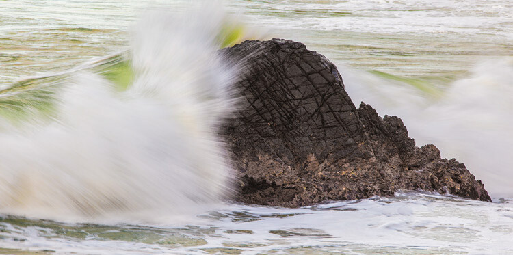
A faster shutter speed here has partially frozen the crashing wave.

Bonus: light painting with the shutter opened

This technique, also called light painting, is where you make images in a dark place (usually) by moving a hand-held light source (or by moving the camera), while your shutter is open. If you are moving the light source, you need the camera to be steady.

3 Tips for Experimenting with Shutter Speed Creatively

As in the previous tip, a tripod is recommended, but nothing is wrong with embracing blur as part of your creative technique. Once you are ready, dial in a slow shutter speed and set up a timer. Now use any handheld light source (e.g. torch, flashlight, light-stick or cellphone) to “paint” in your scene. It’s a cool approach you can use when storytelling.

Conclusion

Do you have a favorite way to use shutter speed creatively? Are you a fan of freezing motion or do you prefer long exposures? Have you ever tried panning or light painting? Share some of your work with us in the comments below.

The post 3 Tips for Experimenting with Shutter Speed Creatively by Nisha Ramroop appeared first on Digital Photography School.


Digital Photography School

 
Comments Off on 3 Tips for Experimenting with Shutter Speed Creatively

Posted in Photography


How to Use a Tilt-Shift Lens Creatively and for Perspective Control

14 Sep

When you hear tilt-shift lens or tilt-shift photography, there is a probability that an image looking like a miniature model crossed your mind. That is because, over the years, tilt-shift lenses have become synonymous with this style. The miniature look is interchangeably referred to as the tilt-shift effect and you can even recreate it in post-processing. These lenses though have quite a few other strengths that are worth considering.

tilt-shift lens - miniature effect

The miniature look that is affiliated with tilt-shift lenses.

So why use a tilt-shift lens?

The simple answer here is for perspective control. If you compare your regular lenses to a tilt-shift lens, you will notice they are built differently. The latter is designed to physically move (tilt, shift and rotate) independent of the camera and each other. This design feature gives you remarkable control over perspective and depth of field. In fact, a tilt-shift lens is also known as a perspective control lens.

How to Use a Tilt-Shift Lens Creatively and for Perspective Control

Left: Shot with the camera pointing up to capture the entire scene. Right: Lens shifted to minimize distortion.

Tilt Versus Shift

The tilt function gives you the ability to keep different elements of focus on different planes. Thus you can shoot two subjects at two different distances. With a regular lens if you want to shoot at a wide aperture, you usually have to make a focus choice of either the foreground or background. A tilt-shift lens allows you to have both your subjects in focus.

The shift function allows you to minimize distortion (common when using wide angle lenses) when you are shooting from a high or low angle. It also helps correct vertical line convergence (tilting buildings).

Tilt-Shift Lens Uses

Architecture

When photographing architecture, the shift function helps you maintain proper perspective. Ordinarily, when you want an entire building in your frame, you tilt your camera up. If you have ever tried this, you will be familiar with images where the buildings appear to be leaning backwards.

How to Use a Tilt-Shift Lens Creatively and for Perspective Control

Church shot at 24mm with a standard lens.

This skew is caused by the sensor plane of the camera being titled in relation to the building. Ideally, you want the sensor perpendicular to the ground and pointing straight ahead/centered. With a tilt-shift lens, instead of angling your camera upward, you “shift” the lens. Since the camera stays put and only the lens physically shifts, your building will be straight. This technique is very helpful when shooting interiors with high ceilings.

Church shot at 24mm with a tilt-shift lens.

Landscapes

In landscape photography, one of the primary uses of a tilt-shift lens is to minimize wide angle lens distortion. Another great way to use this lens is for panoramic shots. A common challenge with panoramas is after the shots are stitched together there is still some distortion to be corrected. When this distortion is corrected in post-production, you may lose part of your scene. By using the shift function of the lens, you can create high resolution distortion free panoramas with negligible post-processing work.

Creative uses of tilt-shift lenses

Miniatures

The tilt function of the lens is responsible for that miniature look you are likely familiar with. A miniature effect is when you take a life-sized scene and make it appear as if it’s on a miniature scale. The lens here is used to add blur to the photo which simulates shallow depth of field. This mimics the look you get when you use a macro lens to shoot a miniature scale model.

How to Use a Tilt-Shift Lens Creatively and for Perspective Control - miniature effect

The blur above and below creates a perception that your camera is only inches away from the scene.

To create this type of look, you need to be elevated at least 10 feet /3 meters (recommended higher if possible). Elevation gives you that same perspective as if you were looking down on a miniature model. So other than the subject, a high vantage point is key for these types of photos.

How to Use a Tilt-Shift Lens Creatively and for Perspective Control

The tilt function allows you to creatively add blur (in this image the blur is on the right side).

Note: Shooting wider gives you a better sense of place.

Portraits

Shooting portraits with a tilt-shift lens can be quite creative. At the very basic level, you are now able to capture in focus two subjects (or a group), even though they may be at different distances from the lens.

Another creative use is capturing someone walking towards or away from you. As you know, a moving person can quickly be out of focus. But with a tilt-shift lens, you have the ability to extend your plane of focus to the front and back of your walking subject so they stay sharp even at different distances.

Bonus: The Scheimpflug Principle

The Scheimpflug Principle is where more of your subject plane is in focus (from near to far) and refers to what looks like a near-infinite depth of field. To achieve this great “depth of field”, you tilt the plane of focus in the same direction as the plane of the subject – which puts the image in focus at various points along the subject plane.

By Fil Hunter at English Wikipedia – Transferred from en.wikipedia to Commons by Jacopo Werther., Public Domain

For example, if you are shooting a field of flowers going off into the distance and you want to have all of the flowers in focus. Shooting at a small aperture will work, but may (based on your lighting) increase your shutter speed – which reduces your chance of sharp flowers. By changing the plane of focus, your tilt-shift lens allows you to shoot at a wider aperture and still get all your flowers in focus.

Conclusion

The perspective control that tilt-shift lenses offer will save you a lot of time in post-processing and is also a great way to correct for depth of field limitations of most lenses. These lenses also give you a lot of depth without the need to use smaller apertures. So besides straightening tall buildings, what have you used, or hope to use tilt-shift lenses for?

Here are some other creative ideas for you. Please share your tilt-shift images in the comments below.

The post How to Use a Tilt-Shift Lens Creatively and for Perspective Control by Nisha Ramroop appeared first on Digital Photography School.


Digital Photography School

 
Comments Off on How to Use a Tilt-Shift Lens Creatively and for Perspective Control

Posted in Photography


Stealth Campers and DIY RVs: 15 Creatively Converted Vans

07 Mar

[ By SA Rogers in Technology & Vehicles & Mods. ]

sportsmobile van 4

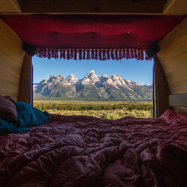
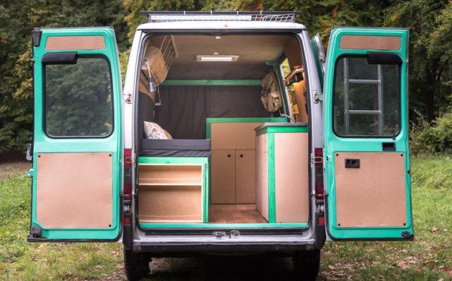
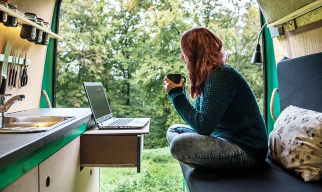
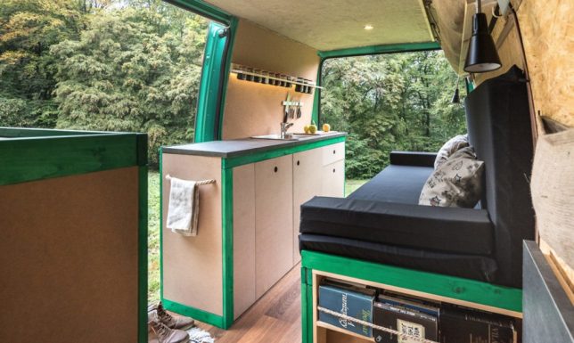
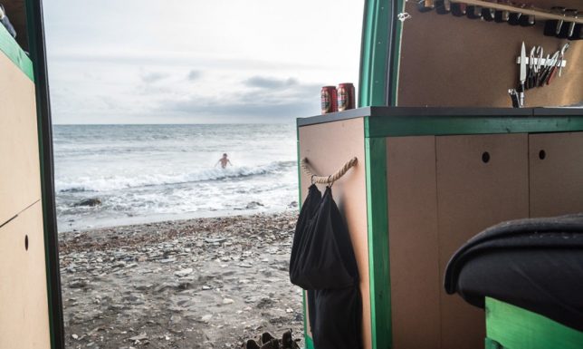
Lurking in a windowless white van gets significantly less creepy when you’ve custom-outfitted the interior with wood flooring, storage space, a kitchenette and a queen-sized bed – right? At least, it does for most of these creative conversions. Typically using standard cargo vans or the taller, newer Sprinter vans as a base, these DIY camper projects often emphasize stealth, so you can park them in urban areas next to a bunch of work vans and stay overnight without anyone batting an eye or calling the cops. While some definitely blend right in, others are a bit more conspicuous once you lift the suspension, add all-terrain tires and otherwise turn them into off-roading beasts.

Adam’s Former NYPD Van

adam's van 1

adam's van 2

adam's van 4

adam's van 5

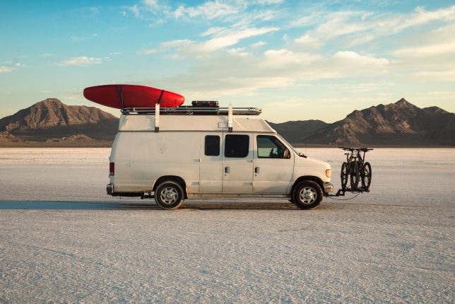
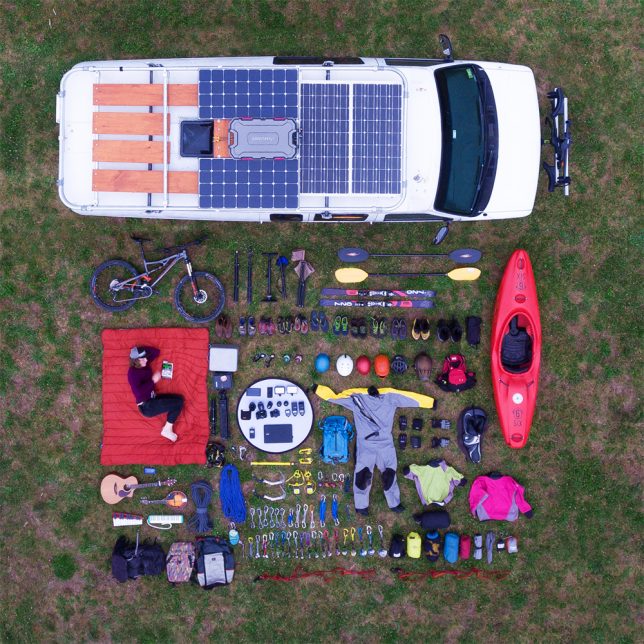
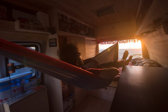
Taking a scroll through Adam Nawrot’s Instagram feed might just make you question what you’re doing with your life. The photographer purchased a used NYPD crime scene investigation van for $ 2,200, custom-built out the interior by hand, and now uses it as a home base for extensive travels across the United States. He’s got kayaks strapped to the top, bikes mounted on the front, solar panels on the roof, drawers full of climbing gear, and room for up to five friends to travel with him. His adventures loo pretty epic, and he clearly has quite an eye for capturing them.

Chevy Van to Mobile Studio

converted vans zach both 1

converted vans zach both 2

converted vans zach both 3

converted vans zach both 4

converted vans zach both 5

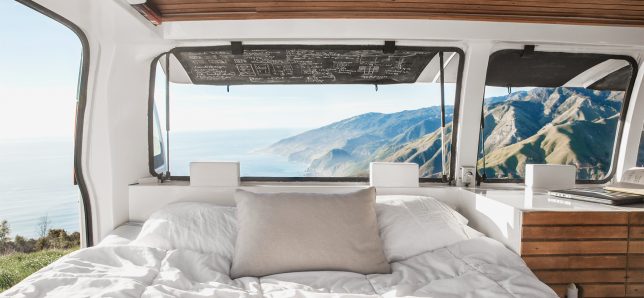
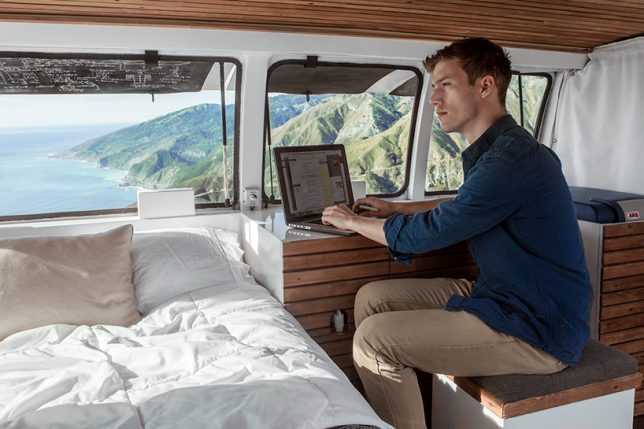
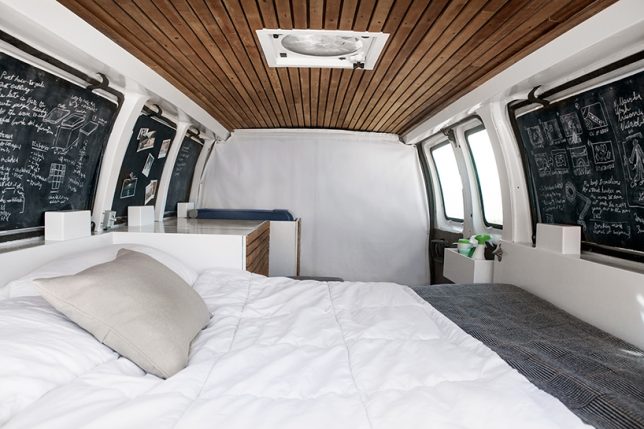
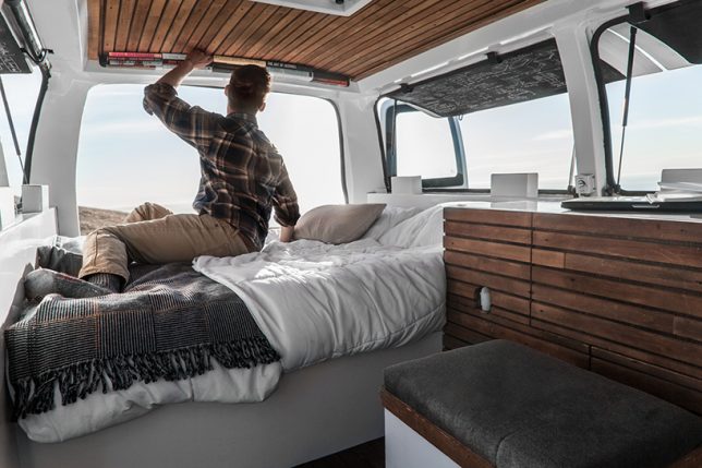
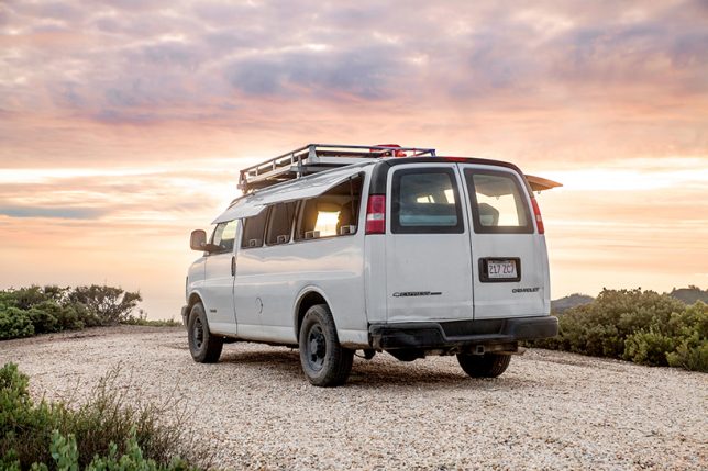
Filmmaker Zach Both converted a work van, too, this one a decade-old Chevy with pop-out panels that happen to make perfect camper windows. He designed and built the kitchen area and bed platform, and salvaged wood from a 19th century church in Cleveland for the finishing treatments. The space is now used as both a mobile home and a work studio. Both offers a free guide called ‘The Vanual’ for anyone who wants to DIY their own camper van.

Sportsmobile Heavy-Duty Van Conversions

sportsmobile adventure van

sportsmobile adventure van 2

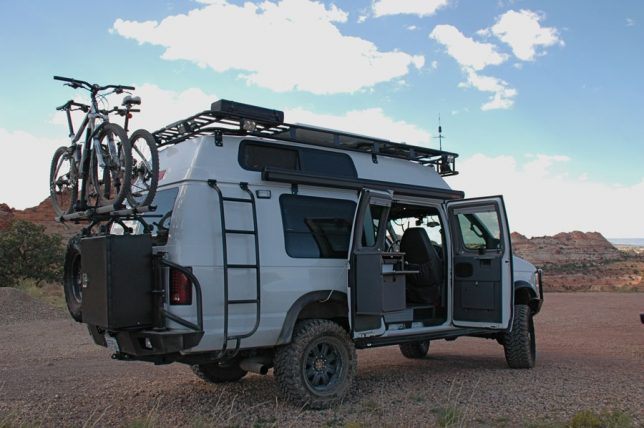
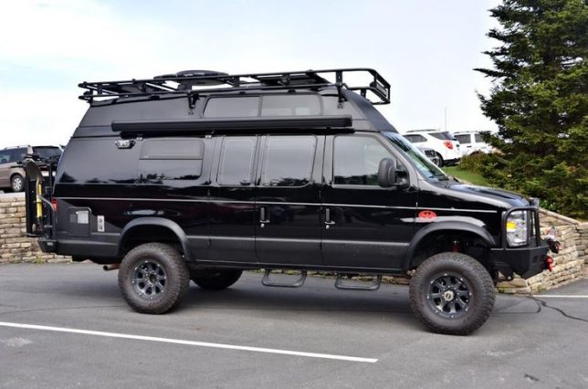
If the typical camper van just isn’t quite rugged and badass enough for you, Sportsmobile can probably help you out with that, assuming you have $ 100K to spend. The company customizes Mercedes Sprinters, Ford Transits, Dodge Promasters and Chevy vans into serious adventure vehicles with pop-up tops, heavy-duty cargo racks and contemporary interiors designed to their customers’ specifications, and you can even get 4×4 versions.

Solar Powered Home on Wheels

solar powered van 1

solar powered van 2

solar powered van 3

solar powered van 4

solar powered van 5

A young couple transformed a 16-year-old VW van into a sweet and simple solar-powered home they use to travel through Southern Europe and Morocco. Considering that the interior of this type of van is much smaller than that of a cargo or conversion van, they did an incredible job making use of the space, adding a kitchen, lots of storage and a pull-out bed.

Minivan Camper for an Italian Woman and Her Dog

minivan camper 1

minivan camper 2

minivan camper 3

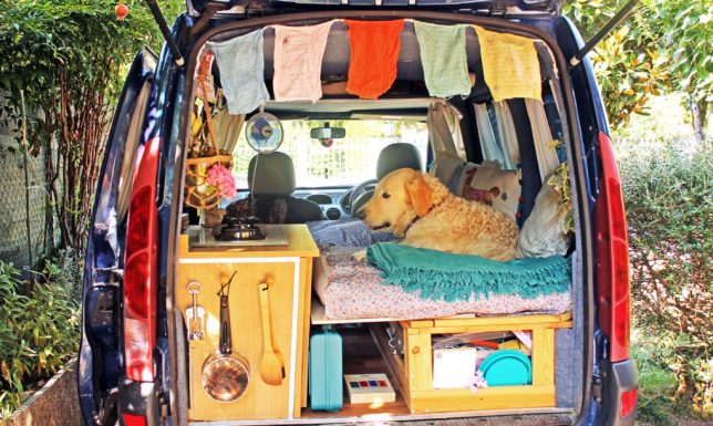
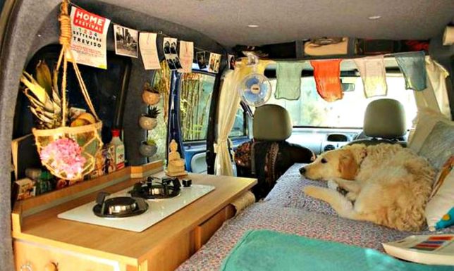
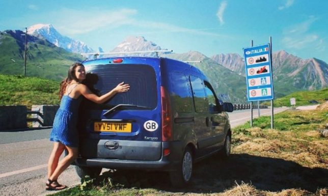
This conversion uses an even smaller vehicle as a base, ending up with just enough space for an Italian woman and her dog to travel Europe. Marina Piro dreamed of seeing the world, but didn’t want to leave her dog, Odie, behind. She turned a 2001 Renault Kangaroo Van into ‘Pam the Van,’ insulating the floor, adding a fold-out bed and a tiny kitchen. As you can probably imagine, traveling in a van with a giant hairy dog has its complications, but it sounds like Pam is having a lot of fun.

Next Page – Click Below to Read More:
Stealth Campers And Diy Rvs 15 Creatively Converted Vans

Share on Facebook


[ By SA Rogers in Technology & Vehicles & Mods. ]

[ WebUrbanist | Archives | Galleries | Privacy | TOS ]


WebUrbanist

 
Comments Off on Stealth Campers and DIY RVs: 15 Creatively Converted Vans

Posted in Creativity