RSS
 

Posts Tagged ‘Creating’

A Guide to Creating Stunning HDR Images

27 Sep

The simple contrast between light and shadow can have a powerful effect on a photographic image. In fact, quite often you may find that contrast is what inspires you to photograph a particular scene or subject in the first place. Sometimes, however, the contrast of a scene exceeds the ability of your camera to contain all of that information. Fortunately, with the help of powerful software such as Aurora HDR 2018, you can transform a scene with high contrast into a stunning photographic image with tremendous detail. In this article, I’ll show you how it’s done.

Photographing the Scene

The first step in creating a high dynamic range (HDR) image is to capture a sequence of photos. Put simply, when you aren’t able to capture a single photo that includes detail in the darkest shadows and the brightest highlights of a scene, you’ll want to capture multiple exposures and blend them together with software such as Aurora HDR 2018.

Bracketed Exposures A Guide To Creating Stunning HDR Images

Most cameras include an automatic exposure bracketing (AEB) feature that can help streamline the process of capturing the several exposures which are needed to create an HDR result. If your camera only enables you to capture a bracket of three exposures, you can separate the exposures by two stops each. If you are able to capture a bracketed sequence of five or more photos you can separate the exposures by one stop each. It is highly recommended that you use the RAW capture mode for these exposures, to ensure there is maximum information available for creating your final image.

In most cases you will want to keep the lens aperture setting fixed, altering the shutter speed for each frame to adjust the exposure. This will help ensure consistent depth of field in the scene. The ultimate goal is to be sure that you have one exposure that is dark enough to include full detail in the bright areas of the scene, one exposure that is bright enough to include full detail in the dark areas of the scene, and exposures in steps of one or two stops to transition between the darkest and brightest exposures.

Creating the Initial HDR

There are two basic steps to creating a final HDR image. The first is to assemble the multiple exposures into a single image with a tremendous amount of information. The second is to perform what is referred to as “tone mapping” or translating the huge range of tonal and color values into the range of values available for a “normal” photographic image.

With Aurora HDR 2018, there are a couple of ways you can start the process of creating the initial HDR image. If you’re using other software such as Lightroom or Photoshop as the foundation of your overall workflow, you can employ Aurora HDR 2018 as a plug-in for these other software tools. The other option is to simply open the original captures directly from within Aurora HDR 2018.

Open your images

When you initially launch Aurora HDR 2018 you’ll see the “Open Image” button. You can click that button, or choose File > Open from the menu to get started. Note, by the way, that you could also take advantage of the “Batch Processing” option to assemble multiple HDR images in a single process.

Aurora Open Images - A Guide To Creating Stunning HDR Images

After selecting the option to open images, you can navigate to the folder containing the photos you want to assemble into an HDR image, and select those images. Then click the Open button to initiate the process of creating your HDR image.

The images you selected will then be presented as thumbnails so you can confirm which photos are going to be assembled into an HDR image. More importantly, however, you can adjust the settings for how the individual captures should be combined.

HDR options and settings

Almost without exception, you’ll want to turn on the “Alignment” checkbox. Even if you used a tripod when capturing the bracketed frames, it is possible that there was a tiny movement of the camera during the capture process. By having the Alignment checkbox turned on, Aurora HDR 2018 will analyze the contents of the images and fine-tune the positioning of each to ensure perfect alignment.

Aurora Initial Settings - A Guide To Creating Stunning HDR Images

Next, click the popup with the gear icon to adjust the settings for assembling your HDR image. If there was any movement of subjects within the frame, such as people or cars, or even trees blowing in the breeze, you’ll want to turn on the “Ghost Reduction” checkbox. In many cases having this option enabled can completely eliminate the “ghost” effect that results from objects moving within the frame from one exposure to the next.

Once you have turned on the “Ghost Reduction” checkbox, you can choose which exposure to prioritize by selecting it from the “Reference image” popup. In most cases, you will want to choose the image that would provide the best overall exposure if you hadn’t captured bracketed exposures in the first place.

You can also choose the strength setting for ghost reduction, depending on how much movement there was in the scene you were photographing. If there was minimal movement in the scene you can use the “Low” option. However, there are also settings for Medium, High, and Highest to help you achieve good results even when there was considerable movement within the scene you photographed.

Other settings

For many situations where you might employ HDR techniques, you may be photographing a scene with relatively low light levels. If so, you can turn on the “Color Denoise” checkbox to apply noise reduction to your original captures as Aurora HDR 2018 is processing them.

It can also be helpful to turn on the “Chromatic Aberration Removal” checkbox so that any color fringing that appears in the captures can be removed. This fringing is most common when using a wide-angle lens to photograph a high-contrast scene, but it can also occur with other lenses or photographic situations.

Once you have established the desired settings for the assembly of your HDR image, click the “Create HDR” button. Aurora HDR 2018 will then combine the multiple exposures you selected into a single high dynamic range result.

Presets and Beyond

Put simply, an HDR image contains a greater range of tonal information that can actually be displayed on a computer monitor or presented in a printed output. It is, therefore, necessary to translate that huge range of information into the range used for a normal digital photo. That process is referred to as “tone mapping”. Fortunately, Aurora HDR 2018 makes it easy to exercise considerable control over the interpretation of your image during this process.

One of the great features of Aurora HDR 2018 is the ability to use a variety of presets to quickly achieve the optimal look for your image. Even better, these presets are presented as thumbnails that provide an actual preview of the effect you’ll achieve with each preset. In other words, there is no guessing involved. You can browse the preset thumbnails, and easily find a good starting point for processing your photo.

Preset Categories - A Guide To Creating Stunning HDR Images

The presets are organized into categories, so you can start by clicking the “Categories” popup at the center of the thumbnail display at the bottom of the Aurora HDR 2018 interface. Choose a category from the popup (including an option to view all presets at once), and then browse the thumbnails to find a preset that looks good to you. To apply the effect, simply click on the thumbnail for the desired preset.

Adjust to your taste

Of course, the presets are merely a starting point in the process of optimizing your interpretation of the HDR image. You can still exercise tremendous control over the image with a variety of adjustments.

First, you can tone down the effect of the selected preset by reducing the strength with the “Amount” slider. As soon as you select a preset, you’ll see a slider on the thumbnail for that preset. Simply drag that slider to a lower value if you want to reduce the strength of the overall effect.

In addition, there is a wide variety of adjustment controls available on the right panel within Aurora HDR 2018. The preset you selected will have changed the value for many of these controls, but you can go far beyond the effect applied by that preset.

You will probably want to get started in the “HDR Basic” set of controls, where you can fine-tune the overall color and tonality of the image. For example, you can bring out more detail in darker areas of the image by increasing the value for Shadows. In the Color section, you can adjust the intensity of colors in the photo.

HDR Basic A Guide To Creating Stunning HDR Images

Many options available

You’ll then want to move on to some of the other powerful adjustments available. The HDR Structure section provides controls for enhancing the overall appearance of detail in the image. You’ll also find a variety of special effects available, including a polarizing filter effect, graduated adjustments to refine the top or bottom areas of the image, color tinting, dodging and burning, a vignette effect, and much more.

Be sure to also take a look at the Lens Correction and Transform controls available via a popup at the top of the right panel in Aurora HDR 2018. These enable you to correct for lens distortion as well as perspective issues caused by your position relative to the subject you photographed.

As you refine the settings for the many available adjustments in Aurora HDR 2018, you will likely find it helpful to see a “before” and “after” view of the image. You can click and hold your mouse on the “Quick Preview” button (the eye icon) at the top-center of the Aurora HDR 2018 interface to see the image without any adjustments applied. Then release the mouse to see the final effect. You can also enable the Compare view with the button to the right of the Quick Preview button.

Compare View A Guide to Creating Stunning HDR Images

Tone mapping a single image

By its nature, creating a high dynamic range image involves capturing multiple exposures and combining them into a single image with tremendous detail. However, the powerful adjustments available in Aurora HDR 2018 can also be used to improve the appearance of a single photo.

To use Aurora HDR 2018 to process a single image, you can simply open that image. Instead of selecting multiple exposures when you initiate the process of working in Aurora HDR 2018, you can select a single image. The overall workflow is exactly the same as when assembling an HDR image from multiple exposures, and all of the same adjustments are available.

So after getting familiar with the use of Aurora HDR 2018 to process a series of exposures into a single stunning HDR result, you can use the same basic process to apply similar adjustments to individual photos.

Single Image - A Guide to Creating Stunning HDR Images

Special Pre-Order Offer Now Available!

Don’t miss this opportunity to pre-order Aurora HDR 2018 with over $ 150 worth of bonuses, all for only $ 89. (For a limited time.)


Only the beginning

The ability to assemble multiple exposures into a single image containing a tremendous amount of detail and texture provides you with incredible creative control as a photographer. Aurora HDR 2018 provides a powerful solution for creating high-quality HDR images and creating unique interpretations of those images with a variety of features and effects.

In this article, you’ve learned the basic process of creating great HDR images using Aurora HDR 2018. But this is only the beginning. If you spend a little time exploring the many adjustments available within Aurora HDR 2018, you’ll be able to create stunning HDR images with ease.

Disclaimer: Machpun is a Paid Partner of dPS

The post A Guide to Creating Stunning HDR Images by Tim Grey appeared first on Digital Photography School.
Digital Photography School

 
Comments Off on A Guide to Creating Stunning HDR Images

Posted in Photography


4 Beginner Tips for Creating Dramatic Portraits with One Flash

02 Feb

In this article, I will explain how you can use a transmitter/receiver, or transceiver system to achieve simple dramatic portraits using only one flash. Below is a step-by-step guide on how to get you started.

Background

I used to fear using anything other than natural light. One of the reasons was that I had a notion that using artificial lights such as off-camera flash and strobes is too difficult and requires deep technical knowledge. Well, yes and no. To master it, you have to understand lighting ratios and learn to make mental calculations of light from various sources and suchlike. But to start using it, not really.

My first experience of off-camera flash was using the Creative Lighting System (Nikon) capability between my speedlight and my camera. Most of my early attempts were unsuccessful especially with the limitations of the line of sight infrared system. It was unreliable too, especially when shooting under pressure or caught on the hoof. I also used overexposed my light with my very untrained and inexperienced eye when I was just starting out.

4 Beginner Tips for Creating Dramatic Portraits with One Flash

Wireless triggers

Enter wireless radio transmitters and receivers (or transceivers) such as the Pocket Wizard, CyberSyncs, brand’s own (Nikon and Canon) and the super affordable Yongnous. A transmitter which is connected to your camera sends the message to the receiver which is attached to the flash unit. Transceiver units, on the other hand, can act as both receiver and transmitter so that you can use them on either the camera or the speedlight but you would still need one unit to attach to each piece of equipment.

These wireless transceivers are a game changer without a doubt. They are simple to use and are reliable most of the time as well. I use Cybersyncs for my studio strobes and Yongnous for my speedlights and find the Yongnous are incredibly reliable and user-friendly with hardly any misses. However, the Yongnous cannot be used for strobes.

#1 Choose the look and mood for your portrait

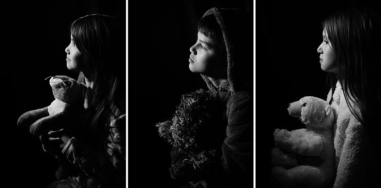
Do you want super dramatic low key portraits or the other end of the spectrum – high key, bright and airy? The mood of your picture will dictate your background and of course the camera and flash settings. I have chosen a black background for these portraits to achieve a high contrast between the brightest parts of the image and the shadows. This will keep the overall mood dramatic and the lighting low key with plenty of black areas.

#2 Set up your equipment

If you have transmitter and receiver units, attach the transmitter to the hotshoe of your camera while the receiver needs to be attached to the flash (speedlight or strobe). If you have a transceiver, this can go on either camera or flash but you still need two units, one on each piece of equipment.

It’s also a good idea to put your flash unit on a light stand. I used a studio strobe mounted on a light stand but attached it to a boom arm for more flexibility in angling the light. Note: A boom arm is not necessary at all for a simple beginner setup. Without a light stand, you can always mount your flash on a cabinet or steady surface, making sure it doesn’t topple over. Most speedlights come with little plastic feet that are handy for this purpose.

4 Beginner Tips for Creating Dramatic Portraits with One Flash

#3 Modify your light

One of my rules is to always modify the light. The only time I shoot with a bare flash is when I use it as a kicker light at wedding receptions or to light a backdrop. At all other times, I will always modify it somehow or bounce it to maximize the softness of the light or to minimize the harshness depending on the situation.

For this look, I wanted the flash to point directly at the subject, in a narrow beam and not have any spill onto the background. A gridded snoot would do the job controlling the light direction, but I didn’t have one. Plus I probably would have found that the light was still a bit harsh without further modification. I ended up McGyvering my own modified snoot using a black card and the diffuser panel of a 5-in-1 reflector. I twisted the reflector (like you would when putting it away) so that it was only a fraction of its size and I then had a 3-layer diffusion panel. This was taped to the strobe and with black card wrapped around it to direct the light onto my subject like a beam.

There are two factors that are crucial for getting soft light; the distance between your subject and the light and the size of the light. The closer the light is to the subject, the softer it is. The larger your light source is, the softer it will be. My light source was not very big at all, so to leverage maximum softness I decreased the distance to the subject. The light was positioned about an arm’s length away from the subject, quite high up at a 45-degree angle. This was to mimic natural light coming from a high window.

#4 Try various settings

I wanted to shoot at f/8 so I metered the flash. You don’t require a handheld light meter to do this, by the way, you can just start with a few trial and error test shots to find the correct setting. I started off with the lowest power on my strobe but ended up cranking it up as the 3-layer diffusion cut out quite a lot of the light. My settings for these were: f/8, 1/60th,  ISO 400 and my strobe power high at 7. The strobe settings will vary depending on the brand you are using.

4 Beginner Tips for Creating Dramatic Portraits with One Flash

This is just one of the many ways you can create portraits with one flash. Try it and experiment with other angles, moods, and light settings and you may be amazed at what one light can do!

Share your portraits here too in the comments below.

googletag.cmd.push(function() {
tablet_slots.push( googletag.defineSlot( “/1005424/_dPSv4_tab-all-article-bottom_(300×250)”, [300, 250], “pb-ad-78623” ).addService( googletag.pubads() ) ); } );

googletag.cmd.push(function() {
mobile_slots.push( googletag.defineSlot( “/1005424/_dPSv4_mob-all-article-bottom_(300×250)”, [300, 250], “pb-ad-78158” ).addService( googletag.pubads() ) ); } );

The post 4 Beginner Tips for Creating Dramatic Portraits with One Flash by Lily Sawyer appeared first on Digital Photography School.

Digital Photography School

 
Comments Off on 4 Beginner Tips for Creating Dramatic Portraits with One Flash

Posted in Photography


5 Tips for Creating Romantic Portraits of Couples

11 Jan

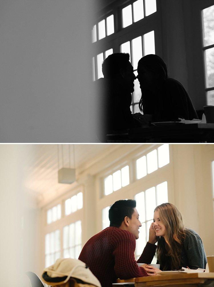
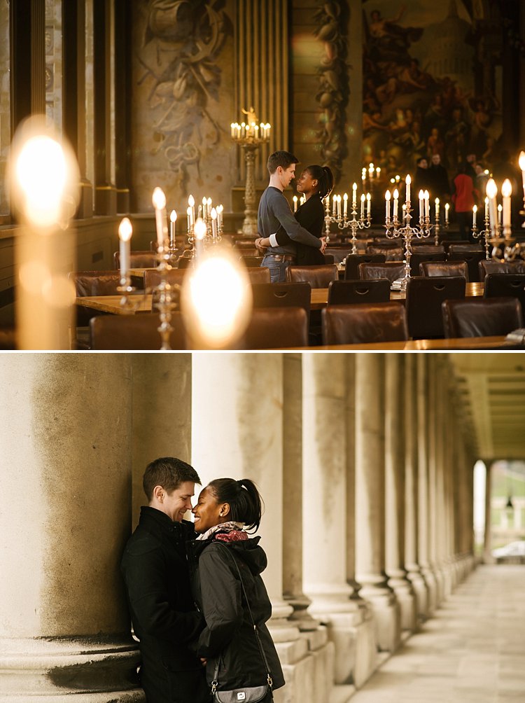
When I hear the word romantic, what comes to mind is a dreamy, poetic, passionate image, full of unspoken affection and sometimes, a touch of mystery. However, when it comes to romantic portraits of couples, I don’t want romantic to translate as cheesy or cliche. I think I would want something a little bit more artistic but definitely leaning more on the natural side.

romantic photography of couples

I photograph weddings and often do an engagement shoot with the couple beforehand. For many of my couples, it’s their first time being photographed together in an intimate way where they are expected to be super affectionate and loving towards each other in public. I would feel very awkward if I were in their places. As part of my job, I aim to make the whole experience pain-free for them, hopefully, fun too, and still end up with some super romantic shots without being too corny, cliche or cheesy.

The warm-up

The first 15-20 minutes of the shoot is always a warm-up. I do give them some suggestions which you can find here; Tips for Taking More Natural Engagement Portraits. I then tell the couple I’m just going to start taking photos and that there is no pressure for anything to be perfect. Instead, we will have a warm-up to get used to the camera, to feeling really silly about it all and that they can laugh as much as they like at themselves and how silly they may feel.

They are given permission to feel awkward and laugh at themselves. I encourage them to be themselves and help them throw off any self-conscious feelings. I tell them to just laugh it all off, not to mind passers-by, and to ignore any stares. After all, they will never see those people again.

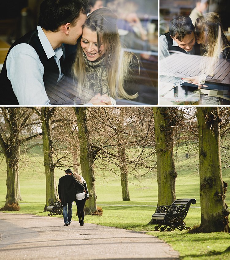
romantic portraits of couples

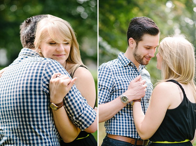
I take plenty of shots during the warm-up for them to get used to me but I’m always intentional in what I’m looking for – that fleeting glance at each other, the split-second expression, a warm squeeze and cuddle they allow themselves to have. It’s the in-between moments that are crucial to capture. It’s that moment when they start to relax into each other’s arms after the first few seconds of feeling rather tense or self-conscious.

I also talk to them a lot and give them directions as clearly as I possibly can. Reminding them that on the wedding day they will hardly see me at all so for the engagement shoot I ask them to indulge the camera. I thank them for being very amenable having me pretty much in their face during the entire photo session.

Here are my five tips for creating romantic portraits of couples.

#1 – Find or make the perfect light

romantic portraits of couples

romantic portraits of couples

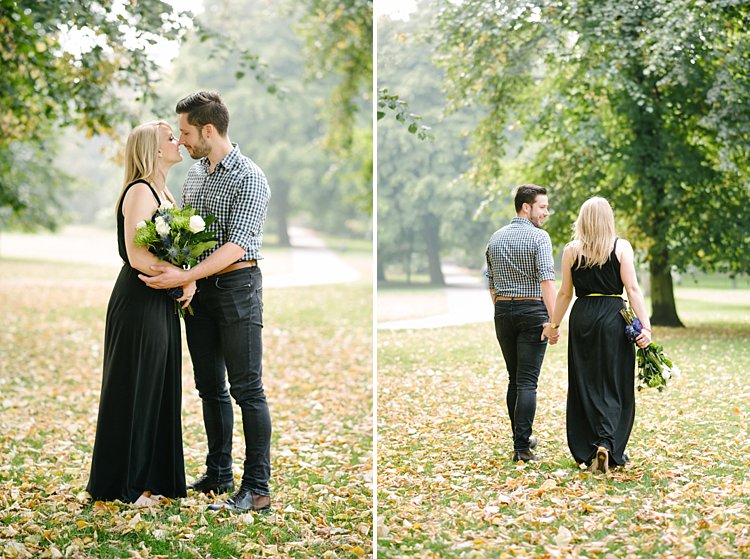
Romantic light is a poetic light that evokes that cocooning feeling. Early morning and late afternoon light is soft and dream,y so if possible schedule your shoot during those windows. I try and avoid flat light or harsh overhead light which tends to kill any romantic ambience.

By flat light, I mean a light source which is directly in front of them so that it eliminates gradations of shadows and tones of light fall-off on the sides of their faces. Look for directional light, usually coming from the side or at an angle. To achieve this, position your couple in relation to the light, or move around yourself so that you are in the best place to capture the directional light.

romantic portraits of couples

If there is no such light, especially if the location is quite dark or the lights are all overhead, I tend to use my flash. Remember to bounce it so that there is directional light coming from the flash.  The important thing is to avoid flatness and create an atmosphere of light and shadow.

Window light is one of the best natural directional light sources available. However, don’t make your couple face the window as that becomes flat light on their faces. Instead, position them at an angle or sideways where there is some light on one side of their face and the other side has shadows.

#2 – Consider the location, background, or scenery

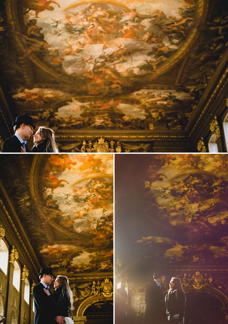
romantic portraits of couples

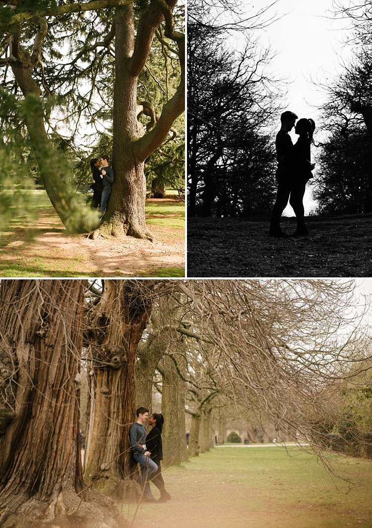
The location or setting has a lot to do with how romantic a picture turns out. Sunsets, although in danger of being cliche, especially sunset silhouettes, produce strong and striking images.

Don’t forget that you can leverage location and all the elements within the setting and not completely rely on light alone. For example, what season of the year is it? If it’s autumn, take advantage of the changing colors of the leaves, use the outfits of the season that make your couple feel warm and cozy – long boots, scarfs, hats.

If it’s winter use the whiteness of the snow or the bleak bare branches of the trees to create a romantic story for your couple. Go to a cafe and take pictures of your couple having a nice hot chocolate with marshmallows by the crackling fire to keep warm. If it’s summer, find the early and late light to avoid the harshness of the midday sun or use props such as parasols, flowers, balloons, kites to celebrate the warmth of the sunshine.

romantic portraits of couples

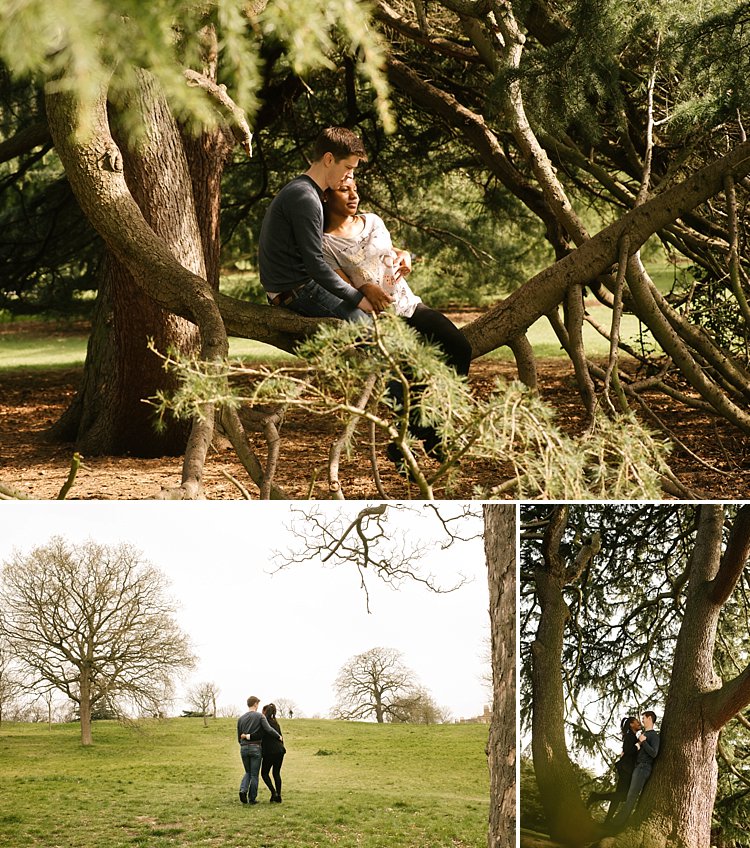
When you are shooting in the city, wait until that light hits the buildings or some iconic landmarks, or in the country, feature the soft rolling hills or vastness of the landscape. If you are shooting in the spring, look for cherry blossoms, maybe the first bud of the season, the first crack of ice or the last of the frost. The goal is to put your couples in context and leverage that to create their romantic story.

romantic portraits of couples

#3 – Hide and use layering in your shots

romantic portraits of couples

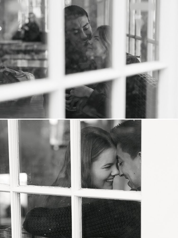
In this article on creative ways to improve your photography, I have written about layering. Layering is a great tool for romantic images. It lets you hide behind something and makes you invisible. The great thing about it is that it puts the viewer of the photo in your place as if they are just passing by and happen to catch a glimpse of the couple.

Layering is one of my favorite tricks and can even be done without you hiding from the couple. You can shoot in a completely open space and still utilize layering. Just grab something, put it in front of your lens and pretend that the camera is peeking through a gap. Layering can be as simple as that. I often pick up a leaf and use it as a layer between the camera and the couple. A bit of fabric, cellophane wrapped around the lens, a prism dangled in front of the lens to create a sun flare all add layers…the possibilities are endless.

romantic portraits of couples

#4 – Encourage contact between the couple

romantic portraits of couples

romantic portraits of couples

To me, the epitome of romantic photographs is when it evokes total privacy – there is no one there other than the couple. In normal portrait situations, I would want a connection between the viewer and the subject. Eye contact with the camera is great for that. It draws the viewer in and invites them to have a conversation with the image. However, for romantic portraits, I prefer no eye contact, except between the couple alone.

There is no one there sharing the moment with them; it is their very own special private time. The goal is to capture the scene as if it were true and real. There must be a strong connection between the couple, whether that be looking directly into each other’s eyes, hands touching, or whispering in each other’s ears, but absolutely no contact with anyone else. This is my personal opinion of course and I’m sure it’s different for other photographers.

romantic portraits of couples

#5 – Write a story in pictures

A picture that tells no story has no soul. With practically a limitless number of photos you can take with a digital camera, you can write a novel. Go to a session with a story in mind – a beginning, a middle, and an end. That is the way I approach every engagement shoot and wedding that I photograph.

These don’t have to be very specific pictures, that would depend on where you are. Rather, it’s more of a mindset. What would be your opening scene in a novel? Is your couple walking hand in hand, having a coffee, whispering sweet nothings, or reading a book? What happens in the middle of the story? Are they shopping in a market, admiring some landmarks, doing an activity they both love?

romantic portraits of couples

How does the story end? Do they walk away from you into a tunnel or cinema? Or do they sit and relax, put their feet up on a bench after a long day? Do they kiss? Or do they have a dramatic ending like a silhouette or looking out into the horizon with the sun fading or the moon rising?

Each couple has their own unique story. When you meet them you will get a feel of their personalities, their likes, and dislikes. Soon, you will be able to piece that story together and it will be like no other.

romantic portraits of couples

I hope you find the above tips helpful. Do share other tips for capturing romantic portraits of couples in the comment section below.

googletag.cmd.push(function() {
tablet_slots.push( googletag.defineSlot( “/1005424/_dPSv4_tab-all-article-bottom_(300×250)”, [300, 250], “pb-ad-78623” ).addService( googletag.pubads() ) ); } );

googletag.cmd.push(function() {
mobile_slots.push( googletag.defineSlot( “/1005424/_dPSv4_mob-all-article-bottom_(300×250)”, [300, 250], “pb-ad-78158” ).addService( googletag.pubads() ) ); } );

The post 5 Tips for Creating Romantic Portraits of Couples by Lily Sawyer appeared first on Digital Photography School.

Digital Photography School

 
Comments Off on 5 Tips for Creating Romantic Portraits of Couples

Posted in Photography


3 Tips for Creating Double Exposures In-Camera Using Flash

20 Oct

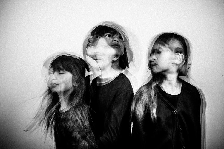
Have you ever wondered how double exposures are done in digital cameras? I have. Back in film days, we knew that to double expose a frame, all you needed to do is rewind it back to the frame you have just exposed, thereby taking two separate shots using one frame of the film. Nowadays with digital SLRs, there is no film to re-expose and no rewind mechanism to go back to a previous photo so you can re-shoot on top of it. However, double exposure and multiple exposures can be done in post-production quite easily. But this little tutorial will focus on how to take double exposure in-camera using a digital camera.

double-exposures-in-camera-tutorial

Equipment needed for double exposures

What you will need:

  • A tripod.
  • Your camera.
  • Remote trigger, receiver or transceiver.
  • Flash guns (speedlights) or strobes (one or two).
  • Some light modifiers (optional) such as umbrellas, softboxes, or octaboxes.
  • A backdrop or wall.

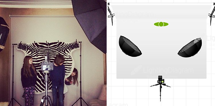
For my experiment below, I used two strobes mounted on stands and modified by gridded octaboxes. I used Paul Buff’s Cybersyncs for the wireless remote transceiver system. I also had three backdrops: one black, one beige and one patterned. See the image below for my studio setup and an iPhone picture of behind the scenes.

double-exposure-tutorial-in-camera

The camera and flash settings

The strobes were kept on a constant setting and I chose the lowest power. My ISO was also on the lowest setting (ISO 100) for most of the shots except for the f/16 ones where I cranked it up a little. The aperture varied between f/8 – f/16, depending on the look I was after and the length of my exposure. Shutter speed also varied between one second to a few seconds, to bulb. In other words, experiment until you get the look right.

How to take the double exposure

This is the trick. While the camera is exposing the image so that the shutter is open, keep triggering the flash. For these shots, I triggered the flash 2-4 times depending on the length of the exposure and how fast I could press the trigger button. The flash freezes the action so the more time the flash fires the more frozen actions you get on your image.

This leads us nicely to the first tip.

#1 Exaggerated movement is key

double-exposures-in-camera-tutorial

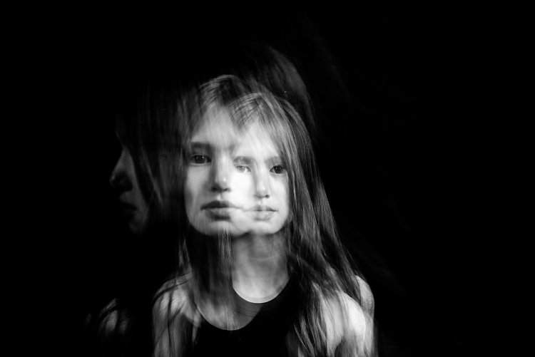
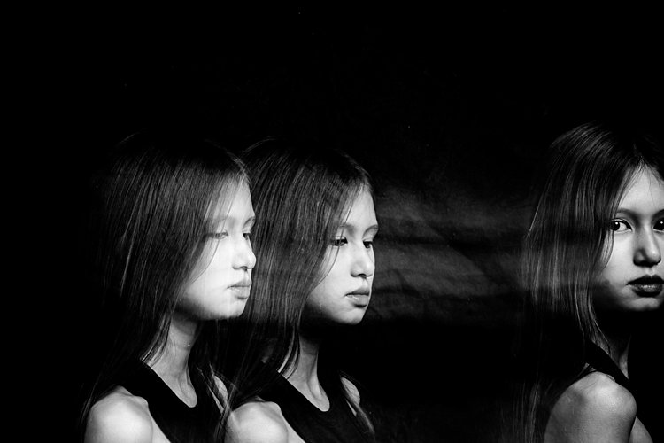
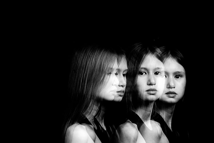
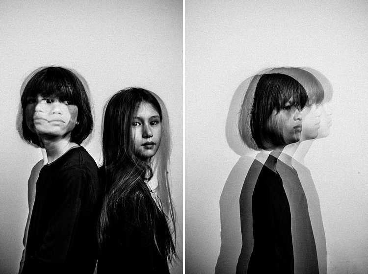
If your subject makes very small and minor movements, the likelihood is the images will sit on top of each other. This may result in one final image that looks like a blurry mess as in the photo above rather than many separate frozen images on a single photo as shown in the photo below. It is better to tell your subject to move distinctly away from the first position so the movements are separate. The camera still captures the trail of movement as a blur. But when you trigger the flash, that particular moment is rendered sharp and still.

double-exposures-in-camera-tutorial

I asked my kids to walk across the frame, counting each step and on a certain count to turn their heads. I would trigger the flash when they moved sideways or turned their heads. At other times I asked one of the children to only join the frame on the third flash so that there is only one of her that registers. I also got them to walk towards me (see photo at top of article). It was at that stage that I changed my aperture to the smallest my lens allowed, in this case, f/16 so that I could still get the head sharp at various depths of field.

double-exposures-in-camera-tutorial

In the photo below, I got my kids to shake their heads as fast and as many times as they could. I wanted the focus here to be the movement rather than their frozen faces. Don’t be afraid to experiment. The beauty of digital is that unlike film, you have an infinite number of frames at your disposal so can afford to make many mistakes until you get what you are looking for.

double-exposures-in-camera-tutorial

#2 A dark background is better

Compare the image above with the light background to the other images with the black background. The difference in the final image is vast. I prefer the dark background where my intention was to freeze several portraits and the lighter background where my focus was on capturing the trail of movements. Overall I shot and preferred more of the images with a dark background as the delineation between actions and the clarity of subjects are easier to see. Contrast between the skin and other lighter parts of the image was also easier to achieve compared to images shot with the beige background. In the photo below, I edited quite aggressively to get the contrast I wanted. I also added grain to simulate a film look.

double-exposures-in-camera-tutorial

#3 Experiment with materials and textures

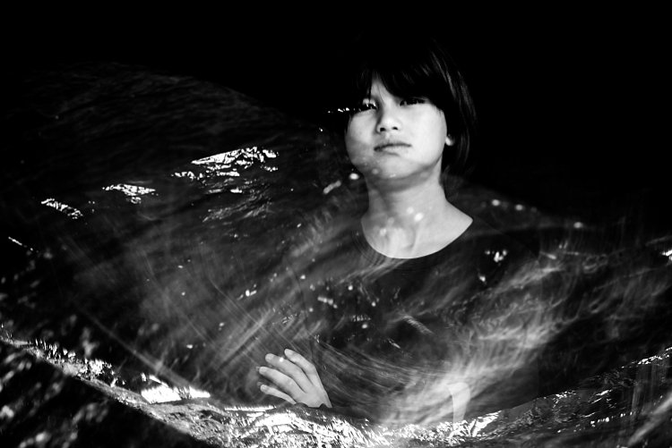
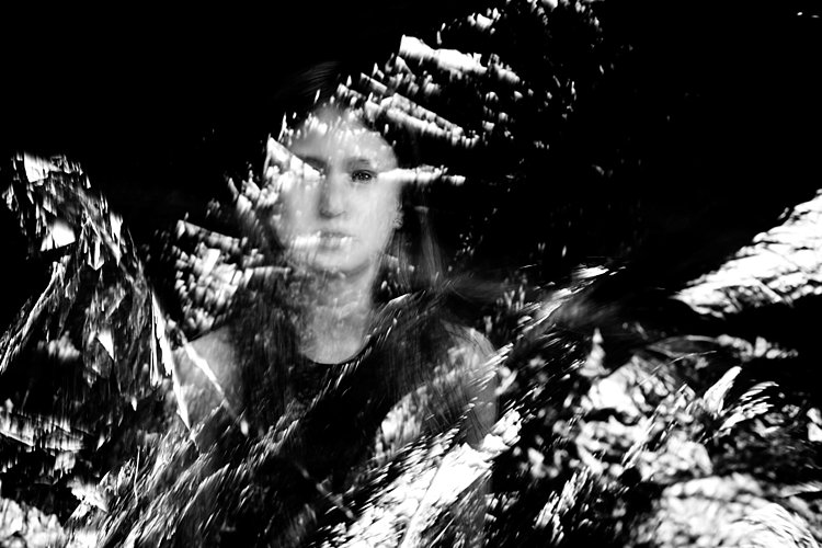
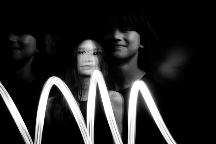
Bring in other materials such as aluminum foil. This one here is an emergency blanket. Two of my kids stood on either side, held and waved the blanket up and down in front of the middle child so the slow shutter captured some of the movement of the foil. The kids also carried  a torch (flash light) and did some light painting. The problem I found with both photos was the blurry look of their faces. Because they did not do big movements with their bodies, hence the frozen photos captured by each flash just got stacked up in roughly the same spot. Other things you can use are glow sticks, flashing lights, moving lights, iPhone and iPad screens – pretty much anything that reflects or emits light.

double-exposures-in-camera-tutorial

double-exposures-in-camera-tutorial

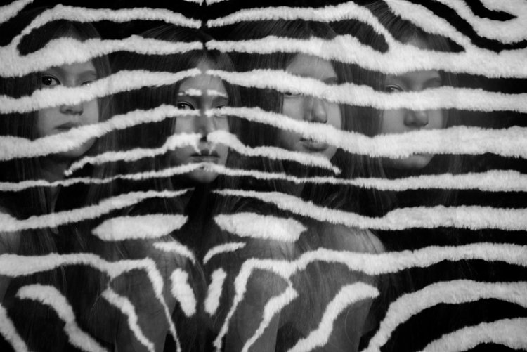
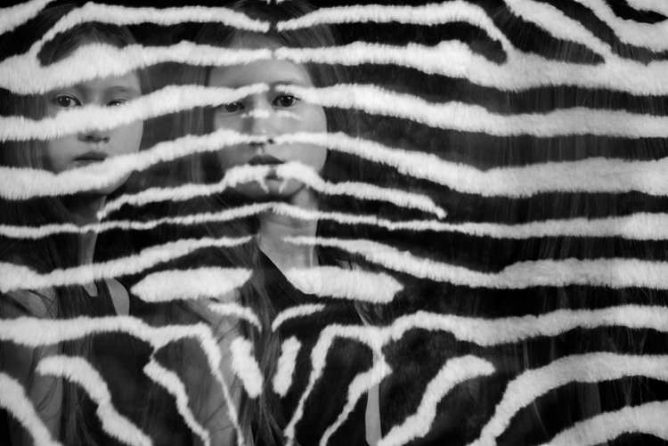
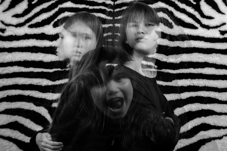
Don’t be afraid to experiment with backgrounds too. In the photos below, I changed the background to a zebra striped black and white rug just because I wanted to see what would happen. I used the same movement techniques as above and the same camera and light settings but the results were very different and unique. The last image below was a happy accident. My third child popped her head up on the third flash, but she came closer to the camera than I had intended so the flash didn’t quite illuminate her face enough. However, I thought this looked really effective as it provided the gray tone of the image as well as a solid form in the middle thereby making the overall image more dynamic and interesting.

double-exposures-in-camera-tutorial

double-exposures-in-camera-tutorial

double-exposures-in-camera-tutorial

I hope you enjoyed this little tutorial on in-camera double exposures using flash. If you have more ideas, do share them here in the comments below!

googletag.cmd.push(function() {
tablet_slots.push( googletag.defineSlot( “/1005424/_dPSv4_tab-all-article-bottom_(300×250)”, [300, 250], “pb-ad-78623” ).addService( googletag.pubads() ) ); } );

googletag.cmd.push(function() {
mobile_slots.push( googletag.defineSlot( “/1005424/_dPSv4_mob-all-article-bottom_(300×250)”, [300, 250], “pb-ad-78158” ).addService( googletag.pubads() ) ); } );

The post 3 Tips for Creating Double Exposures In-Camera Using Flash by Lily Sawyer appeared first on Digital Photography School.

Digital Photography School

 
Comments Off on 3 Tips for Creating Double Exposures In-Camera Using Flash

Posted in Photography


9 Tips for Creating Great Street Portraits

02 Oct

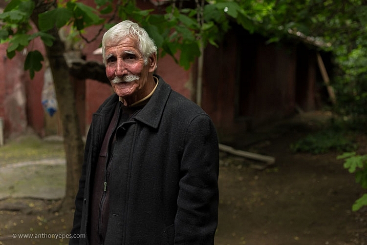
I love taking street portraits. Whether the people you are photographing are posing or just going about their day-to-day life, humans are the most captivating, strange and interesting of subjects.

9-tips-for-creating-great-street-portraits-01

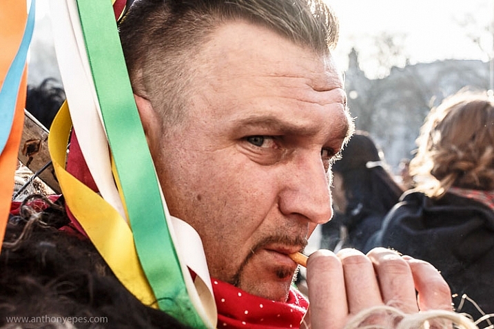
Most of my portraits taken out on the street are shot with the permission of the subject. That’s my style. I love looking for people who intrigue me. I often signal them with a smile and gesture of my camera, then watch for their reaction. But I also shoot unposed portraits and life on the street, whatever catches my eye.

I know from my workshops that a lot of people find photographing strangers difficult and even, sometimes, terrifying. What is important to remember though, is that most people like to be noticed. It’s a compliment to be seen and thought of as interesting. But if they don’t like it, then the worst that can happen is that you have to delete the photo. Simple. Plus the more you do this, the easier it gets.

9-tips-for-creating-great-street-portraits-02

Here are some tips for creating interesting and evocative street portraits:

#1 – Simplicity

“The one guiding idea was to strip away the visual noise of the street so that the people emerge in a different and hopefully more surprising way.” Eamonn Doyle

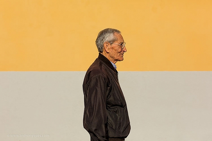
I am a lover of simplicity in my composition and when it comes to street portraits, simplicity really is your friend. One thing that ruins so many portraits is a busy, complicated background. A background that’s too busy will make your image look flat because your camera can’t capture the depth that your eye can. You have to create depth yourself with your composition. A busy background will swallow up your subject and distract your eye.

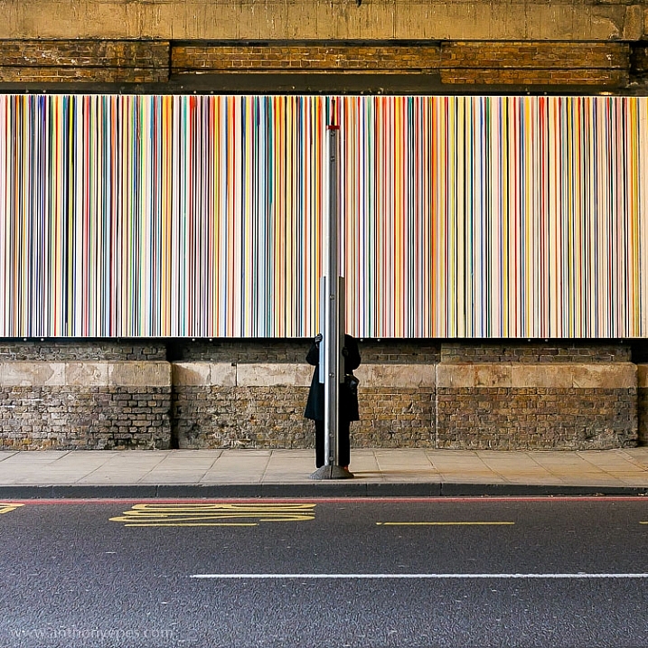
One of my favourite types of backgrounds for street portraits is something clean, colourful, and strong, like the image below. The line in the middle creates a really strong balancing element for the subject. The strength of the colours and line contrast nicely with this older man, who with that slight smile looks like he knows a thing or two about life.

7-tips-for-creating-great-street-portraits-03

#2 – Break the world down into elements

You can simplify the purpose of composition into the idea that you are simply breaking down the world into elements and organizing them in an interesting way.

I find it really helpful to look at composition with this in mind – that all you are doing is organizing the world’s elements. It helps because our eyes make things very complicated for us photographically as we see everything in 3D. Not only do we see and sense hundreds of thousands of pieces of visual information every minute from all around us, but our senses can pick up on things happening behind us as well.

street-portrait-tips-6

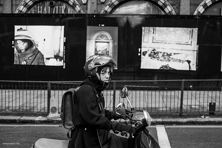
To break this visual overload created by your eyes when you are bringing the world into your frame, start by breaking down what you see around you into elements – an interesting mural, strong lines on the road, beautiful shadows, etc. Then build your composition up from there. You only need one or two interesting elements to make a photo. Ones that work together and say something through their balance, shape, or placement.

An example

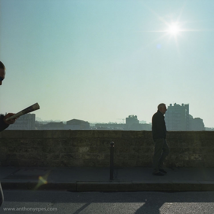
This photo below is super simple. Very little going on, but I like it. What do you think makes it work? There are a couple of strong elements here that make it an interesting photo. Firstly it’s the hand holding the newspaper with a glimpse of the face reading. Then the man farther ahead walking.

Now these two men, combined with that strong line of the wall, makes it look to me like a conveyor belt. You know that it’s morning, partly because of the sun, and then the newspaper, that’s the kind of thing you do on the way to work right? So now you have a little story, perhaps about the repetitiveness and the monotony of the human experience?

street-portrait-tips-2

I don’t always see a story in an image when I am shooting; often that comes after when I’m looking at my photos and sharing them. But what I do concentrate on is looking for interesting elements and figuring out how to place them together to make an interesting composition.

#3 – It’s all in the eyes

“The face is a picture of the mind as the eyes are its interpreter.” Marcus Tullius Cicero

When you are starting out taking photos of people it can be a scary experience. So much so that you often rush too much – perhaps in an effort to get it done as quickly as possible and to not offend or upset anyone. But the more you shoot street portraits, and the more effort you make to relax into the experience, the more you can work on revealing the deeper emotions of your subject.

When you take a more relaxed and patient approach you give people the space to unfold and reveal their thoughts and feelings through their bodies, faces and, most powerfully, their eyes. Eyes tell you how the subject is feeling, and often thinking.

7-tips-for-creating-great-street-portraits-07

This is where having a camera is an advantage. As humans we don’t usually look into someone’s eyes for long periods of time. It’s too powerful! It takes the interaction with that human to another level. If you have a camera between you and your subject though, it acts as a sort of safe barrier. So you can then spend time observing them, seeing what their face is doing, looking into their eyes, and seeing how they really feel.

7-tips-for-creating-great-street-portraits-13

#4 – Be patient humans do funny things

“You don’t have to enhance reality. There is nothing stranger than truth.” Annie Leibovitz

9-tips-for-creating-great-street-portraits-09

street-portrait-tips-23

For me taking photos of people on the street is all about opening yourself up to, and noticing the comedy of being human, as Elliot Erwitt calls it.

“You can find pictures anywhere. It’s simply a matter of noticing things and organizing them. You just have to care about what’s around you and have a concern with humanity and the human comedy.” Elliott Erwitt

#5 – Find a great background and wait

There is a tradition in street photography that you find an interesting location; a background, a road, or sign, and then you wait for someone or something to happen in front of it. It requires patience, which is a very good thing to develop. I’ve noticed that patience is something that beginners often lack. Possibly because we live in a world that is so used to immediate gratification that we expect good shots to come in abundance.

It rarely works like that. I therefore like this idea of finding something interesting out on the street – some elements, or a place that fascinates you, then waiting for something to happen. It’s a great way to train your eye, and perfect your timing. Plus, when you continually gaze at one place you become very familiar, very intimate with it. You’ll notice things that initially you didn’t see.

street-portrait-tips-8

#6 – Use colour

“I paint because colour is a significant language to me.” Georgia O’Keeffe.

Colour is also a significant language for me and I have always preferred shooting colour over black and white. I love the feeling you can communicate with colour and I think it moves me as much as light. So for me it’s an integral part of my style.

Street photography is often dominated by black and white photography. Although what I am doing is often not strict street photography (however, Bruce Gilden, controversial street photographer extraordinaire, did say “If you can smell the street by looking at the photo, it’s a street photograph.”).

street-portrait-tips-26

Whether you use colour or black and white, do what excites you the most. The more excited you are by your subject and what you are creating, the more you’ll imbue your photos will feeling and depth.

Colours communicate different feelings and ideas (e.g., yellow is warm and happy, green is peaceful, red signals confidence and aliveness). I love to use them to contribute to the story that I am telling with my images.

street-portrait-tips-14

#7 – Your camera is your licence to be curious

“I love that having a camera basically gives you a license to go up to anyone and ask them what they’re doing and why.” Andrew Hinderaker

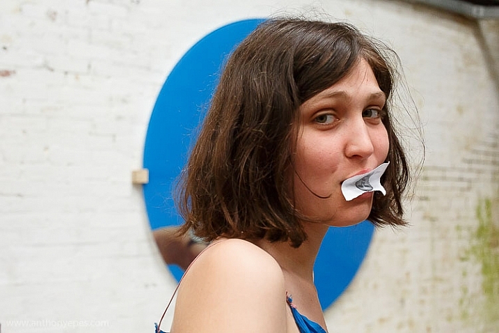
Most people are perfectly happy to be photographed. That’s the key when you’re going out and about. My mantra when taking photos of strangers is – be confident (this comes with practice), friendly, curious, and ethical. In other words, I prefer to photograph people who are okay with the experience. I don’t generally photograph kids and the obviously vulnerable, etc. That’s my ethical line. For me photography is an exchange and I respect everyone whom I photograph.

7-tips-for-creating-great-street-portraits-10

Humans are built to want to connect with other humans, and photography is a powerful form of connection when you use it as such. When you are taking someone’s photo you are basically saying – I see you, you interest me. And for most people that’s a wonderful compliment.

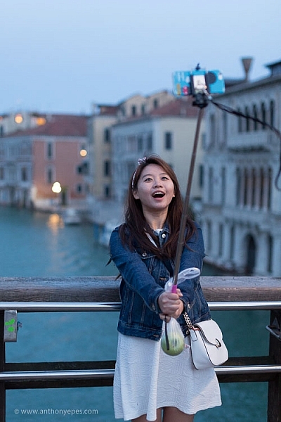
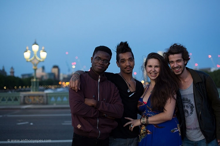
For me the portrait above is about two things, the light and the couple smiling. The warmth of their smiles match the warmth of the light, as well as the lush, summery background of grass and trees. I took this photo by just smiling at the couple and gesturing with my camera. Of course the fact that it was a beautiful summer’s evening and we were in the park helped. People who are relaxing and enjoying themselves are, of course, easier subjects to approach.

#8 – The power of the gesture

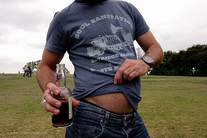
The more closely you watch humans the more you see how they reveal themselves in so many ways. This was a photo I took for a project I was doing on people’s bellies. Each photo was totally different because the way that people presented their bellies and the gestures they made, showed so much about their personalities, what they felt about themselves, and their bodies.

street-portrait-tips-18

Keep watch of people’s gestures. Along with the eyes, hands are very revealing of people’s feelings and thoughts (and apparently hands are easier to read than eyes if you want to tell if someone is lying).

#9 – The key to original, interesting photos is to be yourself

“I’m photographing myself out there. Not myself physically, but mentally. It’s my take on the world.” Bruce Gilden

A lot of people in workshops worry about how over-photographed the world seems now and will they ever have anything interesting or original to contribute? Hasn’t it all been done before? Well, this is the wrong way to think about it. Of course the world is very photographed now. Especially places that I visit, London, Paris, Venice, Istanbul, etc.

But the world isn’t a staid thing – it’s an ever-changing, ever moving, organism. Nothing stays the same. Having humans moving around the world makes the possibilities for original and interesting photos infinite.

street-portrait-tips-4

More importantly though, photography is an expression of who you are. When you start out perhaps you’ll take photos like everyone else. But the more you do it, the more you’ll create something unique and original that’s a total expression of who you are – your passions, experience, style, and way of seeing the world. This creates the unique and interesting photographs that you are aiming for. It’s just like famous jazz musician Miles Davis says:

“Sometimes you have to play a long time to be able to play like yourself.”

Conclusion

I’d love to know what you think. What do you do to create interesting street portraits? Comment below, I’d love to hear your ideas!


Taking street portraits and exploring the street life of cities with your camera is an exhilarating experience. Learn how to conquer your fears of street photography and to create compelling compositions with Anthony’s popular street photography workshops in some of the most vibrant cities Europe.

googletag.cmd.push(function() {
tablet_slots.push( googletag.defineSlot( “/1005424/_dPSv4_tab-all-article-bottom_(300×250)”, [300, 250], “pb-ad-78623” ).addService( googletag.pubads() ) ); } );

googletag.cmd.push(function() {
mobile_slots.push( googletag.defineSlot( “/1005424/_dPSv4_mob-all-article-bottom_(300×250)”, [300, 250], “pb-ad-78158” ).addService( googletag.pubads() ) ); } );

The post 9 Tips for Creating Great Street Portraits by Anthony Epes appeared first on Digital Photography School.

Digital Photography School

 
Comments Off on 9 Tips for Creating Great Street Portraits

Posted in Photography


4 Tips to Creating More Unique Images

30 Aug

You can call it the “Intelligent Eye”. The ability of you, the photographer, to see something unique, unusual or comical in your surroundings, then have the awareness to capture it for storytelling. With practice, you can develop the skill of capturing those interesting moments or opportunities, that many would miss or otherwise ignore. As a result, your photography will stand out from the rest because it will be distinctive and specific to your own personal experience. It’s good to be different! Read on to get tips for creating more unique images.

Photograph 10

Okay, so how do you achieve, or improve this ability to see unique things, and all of the interesting opportunities in your environment?

TIP #1 – Practice Observing

Practice observing. To be great at just about anything requires practice, or actually doing that thing. Yes, some people have natural talents and they don’t require extensive practice, but for others, myself included, practice is the best way to improve.

Photograph 3

Take some time, daily if you can, and throw yourself into a busy street (not literally!) and observe. Walk slowly, or sit, and simply observe your environment. Notice the colours, shadows, words, and the things people do. People do the most fascinating things if you pay attention.

My only gripe is people staring at their smart phones, and yes, I can be guilty of that at times too. Imagine all of the interesting things people could be doing, if only they put down their phones. Of course, they may say the same thing about us standing there with our cameras.

Focus on the smallest of details. Maybe you notice someone walking across the street without shoes, or someone with interesting hair or clothes, or maybe there is nothing interesting and that’s okay too. Move on, remain aware of your environment, and keep practicing the skill of observation. Over time, you will begin to notice more opportunities for some great photographs, and you’ll make unique images.

Photograph 5

TIP#2 – Practice Without a Camera

More practice. Okay, this may seem redundant, but I’m talking about practice without a camera. You can practice this skill at any time, no matter where you are in the world, or what you are doing. Carefully observe and study your environment.

I don’t know how many times I’ve seen something clever or interesting, and got a little frustrated because I didn’t have a camera. You must begin to make a habit out of always observing, seeking out the unusual, studying the world and people around you.

Photograph 9

Keep in mind, the greatest artists become obsessed with their work, so make it a habit to always be focused on your skill of seeing, with or without a camera. Over time, you will be amazed at how many things you would have missed or ignored without this improved skill.

TIP #3 – Be Different

It’s good to be different. Share your work, and enjoy the works of others, but please, don’t become overly concerned about how many likes or hearts or comments you get. It’s not important! You can conform, and begin to manipulate your work to become popular and fit with what is expected, or you can be original and create something unique to your own personal experience and creative spirit.

Photograph 12

There are some great online communities, but it’s disappointing to see so many works of art looking the same, lacking originality. Yes, the basics of post-processing are important, but it will be difficult for you to stand out from the crowd if your artwork looks the same as every other artist.

Capturing your unique experience and environment will help you stand out. You may or may not become famous, but at least you had the courage to be different, to tap into your own unique creative abilities. Finally, embrace your uniqueness, and remember that life is complex and messy, so it’s okay to create photographs not in line with what is expected. Focus on tapping into your personal and unique creative spirit.

Photograph 7 Photograph 6

TIP #4 – Be Present

This is the most important tip. Enjoy living and creating in the present moment as much as possible. Whether you are in the field, in a darkroom, or behind a computer – get lost in the moment, focus on your environment and enjoy the experience of life and witnessing the world as it unfolds.

Photograph 15

Do you have any other tips for finding and creating more unique images? Please share in the comments below.

googletag.cmd.push(function() {
tablet_slots.push( googletag.defineSlot( “/1005424/_dPSv4_tab-all-article-bottom_(300×250)”, [300, 250], “pb-ad-78623” ).addService( googletag.pubads() ) ); } );

googletag.cmd.push(function() {
mobile_slots.push( googletag.defineSlot( “/1005424/_dPSv4_mob-all-article-bottom_(300×250)”, [300, 250], “pb-ad-78158” ).addService( googletag.pubads() ) ); } );

The post 4 Tips to Creating More Unique Images by Jason Lowry appeared first on Digital Photography School.

Digital Photography School

 
Comments Off on 4 Tips to Creating More Unique Images

Posted in Photography


Tips for Creating a Personal Photography Project

16 Aug

One of the best ways to grow your photography is by working on a personal photography project. As a professional photographer, I am always working on personal projects. It’s a way to keep myself inspired, and to feel challenged to grow. It’s also a great way to keep my portfolio fresh, try out new ideas, and grow my vision as a photographer.

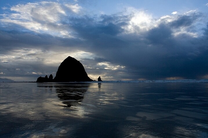
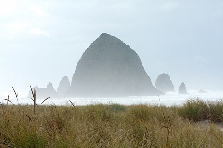
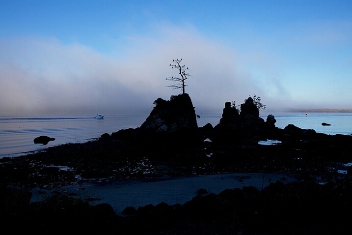
Shooting a place more than one time gives you the opportunity to capture the place in the perfect light. I had visited this part of the Oregon Coast more than a dozen times before the perfect scene appeared.

Shooting a place more than one time gives you the opportunity to capture the place in the perfect light. I had visited this part of the Oregon coast more than a dozen times before the perfect scene appeared.

In this article, I will share with you:

  1. What is a personal photography project?
  2. What’s the value of working on personal projects?
  3. What makes a good project?
  4. How to be successful
  5. Ideas for personal photography projects of your own

What is a personal photography project?

I define a personal photography project as choosing a subject to shoot over and over again over time. It can be as simple as shooting your kid’s sporting event every weekend, photographing an intriguing building near your home six times, or creating a series of portraits of your friends.

Personal-Projects-Oregon-Beach-CBB

I photographed about 60 miles along the northern Oregon coast over a period of six months. I created a route that I drove whenever I could. By shooting the same place over and over again, I was able to truly capture the personality of the places.

2 – What’s the value of personal projects?

Some photographers are reluctant to shoot the same subject over and over again, but by photographing it more than once, it gives you some great opportunities to grow as a photographer.

  1. It gives you the chance to get it right. Have you ever said, “I wish I would have done X better?” By going back and shooting something more than one time, you create the opportunity to analyze your mistakes, and go back and do it again. In this exercise, you shoot one day, analyze what you can do better, then tweak your shooting until you learn to nail it every time.
  2. It gives you some structure. When you have some free time, you don’t have to wonder what you are going to shoot. If you have committed to photographing the City Hall in your town six times, you can just go shoot it. On the other side of the coin, you can also put your shoots on your calendar weeks, or months, ahead of time.
A different mood of Cannon Beach, Oregon.

A different mood of Cannon Beach, Oregon.

A Project could look like this – Shoot City hall at:

  1. Sunrise
  2. Sunset,
  3. Morning light
  4. Afternoon light
  5. Golden hour
  6. Dusk
  7. With the moon
  8. On a sunny day
  9. On a cloudy day
  10. On a rainy day
  11. On a Snowy day
  12. During each of Spring, Winter, Fall, and Summer

Can you begin to see the many opportunities, and how to create different pictures of just one thing?

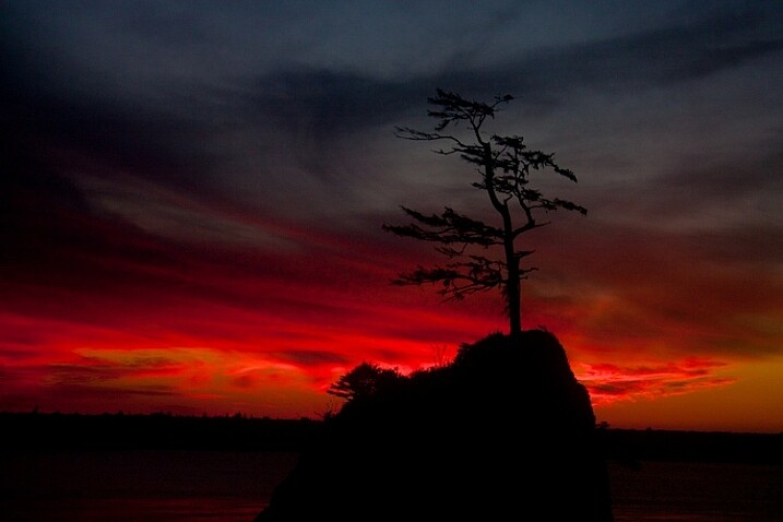
I was fascinated by this lone tree growing out of a huge rock near Garlibaldi, Oregon but I wanted to get it with a beautiful sky.

I was fascinated by this lone tree growing out of a huge rock near Garlibaldi, Oregon, but I wanted to get it with a beautiful sky.

It took many evenings of watching for the perfect sunset, but the photo was well worth it.

It took many evenings of watching for the perfect sunset, but the photo was well worth it.

Once you nail the technical part of a situation, you can challenge yourself to do something really different. This is the point the great photos come in!

The great photos don’t come when you are trying to figure out how to focus your camera, use your flash, or what is the right exposure or camera angle. Once you’ve got all that nailed, the real creativity begins! That’s when the great pictures happen. Here’s an example:

Posey-Personal-Projects

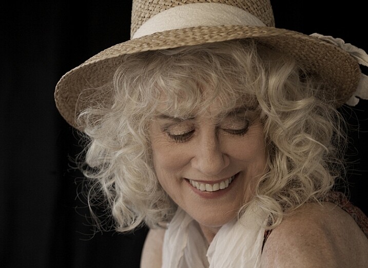
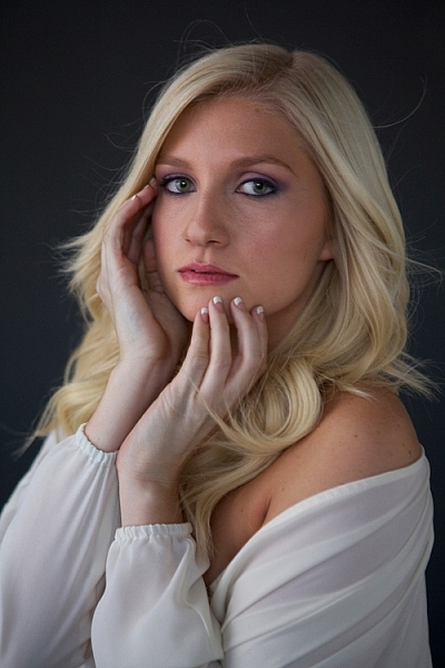
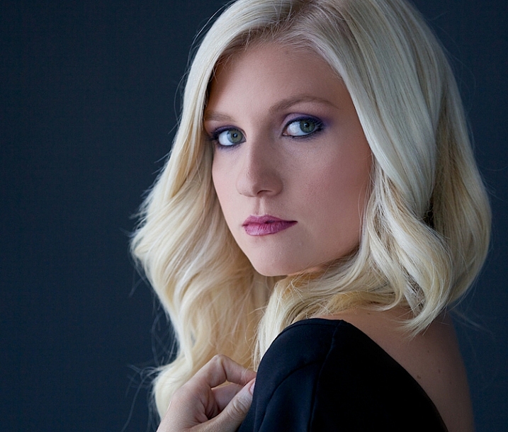
This was my first glamour shoot. I just practiced finding the perfect window light in my studio. And, as a journalistic photographer, I rarely do any retouching, but this subject offered the opportunity to pull out some new retouching tools, and also reminded me to pose the subject in such a way to hide skin imperfections.

I fell in love with the work of a glamour photographer, Sue Bryce. She does beautiful work and doesn’t use studio lighting, she uses window light in a very sophisticated way. I decided to emulate her work by studying her technique. I had never studied glamour photography, so not only would the lighting be a challenge, but the posing would be too. Here’s what I did:

  • I studied her technique, watched some YouTube videos, and took detailed notes.
  • I practiced posing myself in front of the mirror.
  • I did some tests with window light in my studio to find the best times of day to shoot, and to decide what kind of reflectors, props, and backdrops I needed.
  • I found a few make-up artists who wanted to build their portfolio, and offered to work with me for prints.
  • I scheduled several friends for shoots.
Suzanne-personal-projects

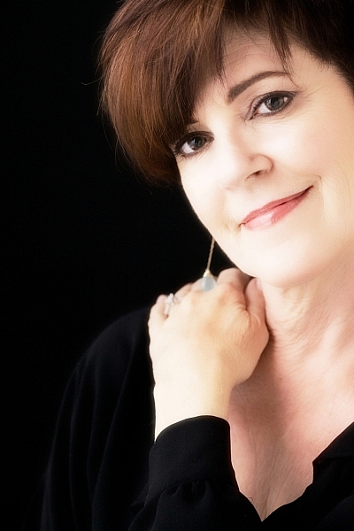
This was my second shoot. I practiced using a different kind of light, a little bit harder with more fill.

I also had the chance to work with posing and hands. It felt awkward to me, and I didn’t really get the subject to do what I wanted her to. It was time to go back to the mirror and practice with my own hands, then create language that would help my subject move into those poses.

allie-personal-projects

This shoot went much better. I was learning, developing skills, having fun, and building my confidence in this new world of glamour photography.

Tyler2-personal-projects

By my fourth subject, I had learned how to direct my subject into a pose, and had a great feel for window light.

Tyler-personal-projects

I had a few new pieces for my portfolio, not to mention a few happy friends with prints.

Let’s back up a few steps and review some of the ideas we’ve touched on so far.

3 – What makes a good photo project?

  1. Have an objective, a goal. Be clear on your outcome. It can be to master a new skill, to create a series of prints, or to make a calendar as a gift.
  2. Select a subject that you can return to over and over again.
  3. Choose something you are really interested in, and passionate about. For ideas, think about the activities you and your family are involved in. Would any of your hobbies make a good project? Are there places you love to visit or photograph?
  4. Find something to shoot within 10 or 20 minutes of your home.
  5. Commit to something that either happens on a regular basis at a scheduled time, or a place you can just show up and shoot anytime. For example, a ballet class that happens every week or a favorite park, botanical garden, or lake.
  6. Choose a subject with a variety of visual possibilities.
  7. Choose a subject with a learning goal, or end product in mind. You might want to learn more about light, or shooting in manual mode, or photographing people.
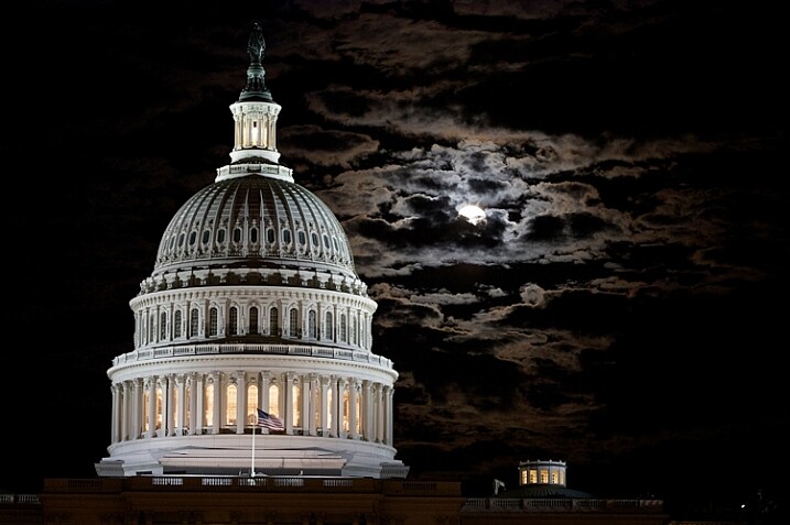
The Capital Building in Washington DC is stunning at night, and I wanted to capture the full moon rising behind it. This was the sixth night I made a trip to the monument. Persistence paid off.

The Capitol Building in Washington, DC is stunning at night, and I wanted to capture the full moon rising behind it. This was the sixth night I made a trip to the monument. Persistence paid off.

Several years ago, while living in Washington, DC, I chose to shoot the monuments with a full moon. Why was this a good project? Let’s look at the checklist above and compare

  1. I love documenting history, enjoy being out in the evenings taking pictures at night, and I always feel a sense of wonder seeing the Washington, DC monuments.
  2. I wanted to create a set of prints that I could share and offer to my corporate clients.
  3. Getting to the monuments was easy for me.
  4. I could write the full moon dates in my calendar months ahead of time and keep my schedule clear. (Although I did get strange looks when I told friends I couldn’t join them for dinner because it was a full moon!)
  5. There are lots of monuments to photograph within walking distance.

I loved having something on my calendar to shoot. It provided some structure, and gave me something to shoot for several months without having to come up with a new idea. And, now I have a beautiful collection of photograph for my portfolio.

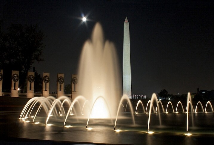
This is the World War II Memorial in Washington DC with the Washington Monument in the background. Committing to shooting a personal project is fun, rewarding and builds your self-confidence.

This is the World War II Memorial in Washington, DC with the Washington Monument in the background. Committing to shoot a personal project is fun, rewarding, and builds your self-confidence.

4 – How to be successful

  1. Make a commitment and write out the whys of doing the project.
  2. Find an accountability partner, a coach, a class, or a photo group, to share your progress.
  3. Put the time commitments on the calendar. Treat this as a new ritual. Plan the time and treat it as sacred.

5 – Ideas for your own personal photography projects

Here are some ideas to get you started on your own personal project.

  • Find a photographer or a style you love and try to mimic that style. I fell in love with Georgia O’Keefe’s paintings and her use of color. Ultimately, studying her art led me to creating these photographs. 
  • Shoot the full moon every month for six months. I chose to shoot the monuments in Washington, DC with a full moon and created a beautiful series of art prints.
  • Photograph a local park 10 different times, at different times of day. This is a simpler version of my Oregon Coast project.
  • Shoot a local landmark at all times of the day. It could be a building, for example the City Hall, a mountain, or a river. This project will give you an opportunity to learn about the quality of light at different times of days, the right angles, and it’s simple! Buildings and mountains are always there for you.
  • Shoot a kid’s sporting event every weekend. This will help you refine your skills with stopping action and learning focus.
  • Make portraits of your relatives and create a beautiful coffee table as a Christmas gift for the family. A great way to take care of that holiday gift list, as well as learn more about photographing people and developing a style of your own.
  • Photograph pets. Pets can be a real challenge. It will be an opportunity to learn about capturing action as well as learning about light.

Shooting projects is an amazing way to grow your portfolio and your self-confidence. Do you have an idea for a project? Share it with me in the comment section below, I’d love to hear about it or see your images.

googletag.cmd.push(function() {
tablet_slots.push( googletag.defineSlot( “/1005424/_dPSv4_tab-all-article-bottom_(300×250)”, [300, 250], “pb-ad-78623” ).addService( googletag.pubads() ) ); } );

googletag.cmd.push(function() {
mobile_slots.push( googletag.defineSlot( “/1005424/_dPSv4_mob-all-article-bottom_(300×250)”, [300, 250], “pb-ad-78158” ).addService( googletag.pubads() ) ); } );

The post Tips for Creating a Personal Photography Project by Vickie Lewis appeared first on Digital Photography School.

Digital Photography School

 
Comments Off on Tips for Creating a Personal Photography Project

Posted in Photography


Creating a Lens Flare Effect and Dust Particles in Photoshop

07 May

This article isn’t about how to magically transform your images using Photoshop. The real magic of Photoshop is trying to convince the viewer that no effects were added at all, and that the image was captured in camera. Photoshop can add that little extra to your imagery. Conversely, it can also ruin an image if it’s overdone.

I shoot to capture the best possible image as I can get at the time, but more often than not, time is not on my side. If I am shooting for a client, time is money. Deadlines and strict schedules are uppermost when dealing with a client. When shooting outdoors, I am dealing with natural light which is constantly changing and weather conditions, which may force me to shoot faster or abandon the shoot completely.

So, when I get to look at my image(s) on the computer, I take the time to critically review them. As I shoot RAW, I need to apply basic post-processing to all my images. In some cases, I may need to add an extra enhancement, but that will depend on the image and what I need it to say.

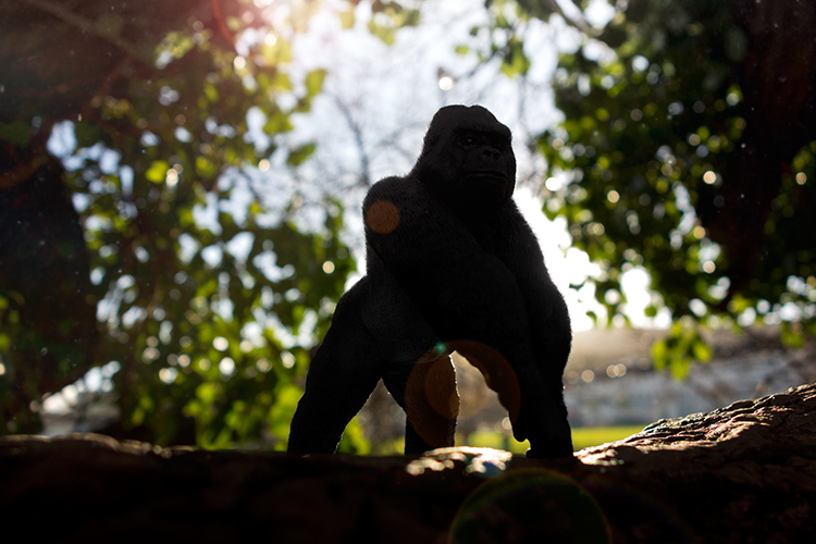
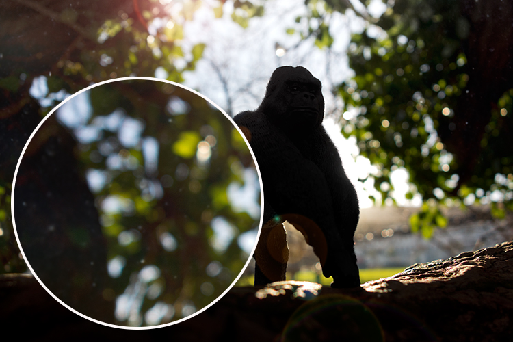
Gorilla-with-lens-flare-and-dust-particles

Lens Flare and dust particles added using Photoshop

This is the power of post editing. To be able to add an enhancement to the image, to give it that extra drama or a desired effect that you wanted to convey in your image in the first place. It can be as subtle as adding dust particles, or a bit more dramatic such as a lens flare effect. Both of these effects, whether you use one or both together, can add that little bit of oomph!

When applying any Photoshop effects, It’s not just about technique, although the know-how is important, but it is the application which is key:

  • How to execute the technique – different methods to achieve the same end result
  • When to use it – some images suit this technique over others
  • By how much?
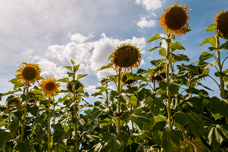
Before

Before

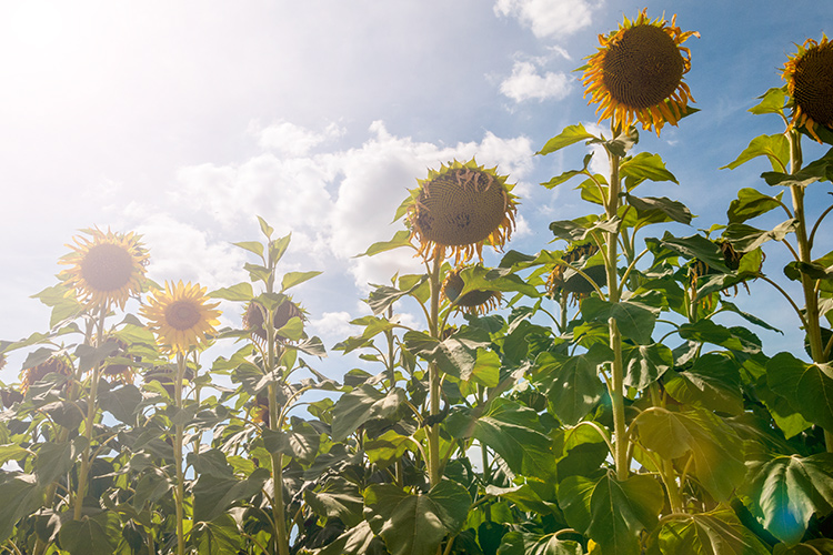
After

After

The above may sound quite obvious and fundamental, but I can’t stress it enough, especially if you are new to creating effects in Photoshop.

  • HOW = the technique. I will demonstrate how to create a lens flare effect non-destructively in Photoshop using the Lens Flare filter. I will also describe how to create your own simple custom dust particle brush. Plus, I’ll show you my own unique in-camera method to capture dust particles.
  • WHEN = you deciding if this technique will work on the particular image in question. Just because you know how to use a technique doesn’t mean you have to apply it to every image. Yes, by all means practice on your images until you have refined the process.
  • HOW MUCH = knowing how little of the technique to apply – less is more. Don’t be afraid to reduce the opacity on the layer that you have applied the technique on.

This is where beginners can get carried away when learning post-processing techniques in Photoshop, for the first time. As tempting as it is, you want to show off your new skill and see the effect on your image in a dramatic way, try and keep it subtle.

What is Lens Flare?

Flare is particularly caused by a very bright light sources either in the image – which produces visible artifacts – or shining into the lens but not in the image – which produces a haze. Most commonly, this occurs when shooting into the sun (when the sun is in frame or the lens is pointed in the direction of the sun), and is reduced by using a lens hood or other shade. – as seen in Wikipedia

If applied well, the lens flare effect really does convey that good-feeling summer shot.

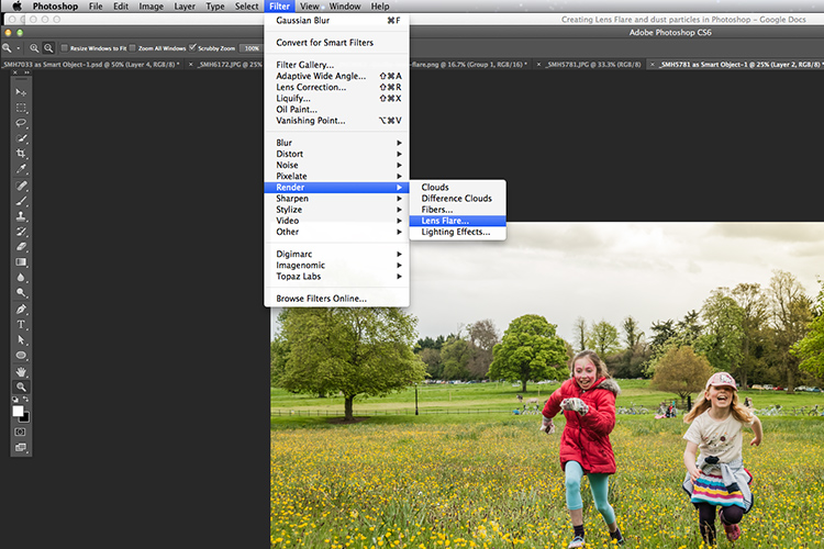
The Lens Flare Filter in Photoshop

Filter-render-lens-flare

The Lens Flare filter is found under Filter > Render > Lens Flare.

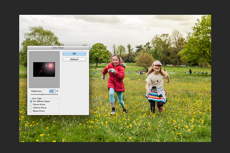
The Lens Flare is found under Filter>Render>Lens Flare. However, this doesn’t work in the same way as an Adjustment Layer, as in non-destructively. The effect works directly on the image itself. It also won’t work on an empty layer. So, create a new layer above the image and fill it with black. Change the blend mode to Screen. Go up to the Menu Bar and go to Filter > Render > Lens Flare.

As you can see in the image below, a small pop up dialog box appears with a preview window, and shows the four different types of lens flare available. Click inside the preview window to move the Lens Flare to whatever position you want.

Filter-render-lens-flare

The Lens Flare dialog box.

50-300mm-zoom-lens-flare

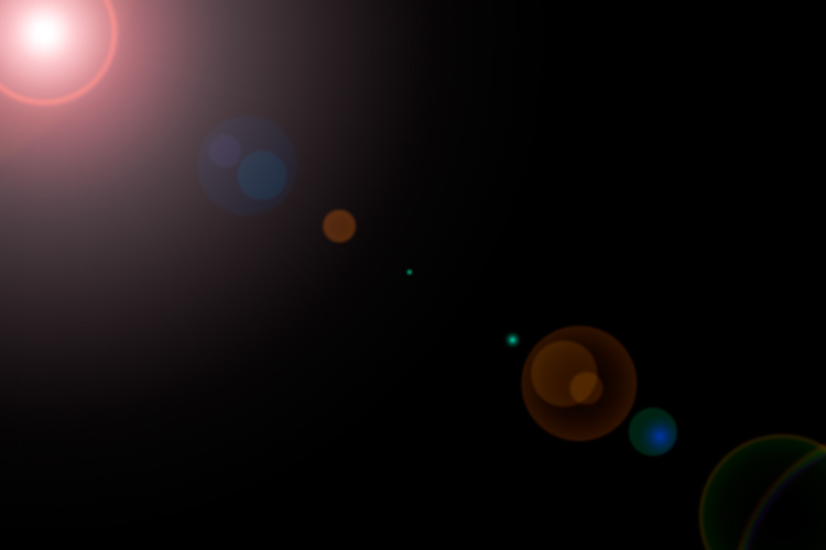
This is the 50-300mm zoom Lens Flare effect on a layer filled with Black.

105m-prime-lens-flare

This is the 105mm Lens Flare effect on a layer filled with Black.

Becky-and-Amy-with-lens-flare-applied

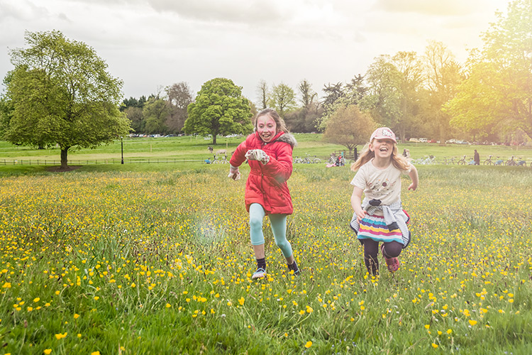
Lens flare applied

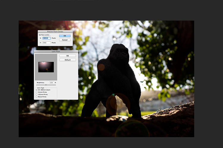
Tip: To get a more precise position for the lens flare, bring up the Info Panel, and move your cursor over the spot on your image where you want the flare to be positioned. The x and y coordinates tell you the exact position in pixels. When you have the Lens Flare dialog box open, click on the preview window while holding down the Alt/Option button, and the precise Flare Center dialog box appears. Type in the x and y coordinates and click OK.

Gorilla-precise-flare-center

The precise Flare Center dialog box appears when you click on the preview window of the Lens Flare while holding down the Alt key on a Mac (Option on PC).

How to create your own custom dust particle brush in Photoshop

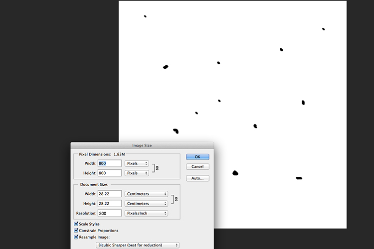
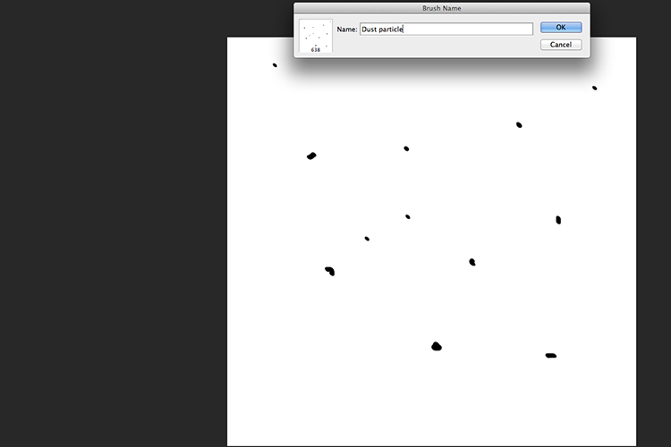
To create your own custom dust particle brush in Photoshop is relatively simple. Open a new document in Photoshop, I made mine 800×800 pixels on a white background, set the dpi to 240 or 300. Use a small brush, hardness set to 25%, and use the color black. Create random small dots on the canvas. Not too many. Go up to the Menu Bar > Edit > Define Brush Preset. Type the name of your new brush and click OK.

creating-new-document-custom-dust-particle-brush

Create a new document with a white background 800px x 800px.

naming-dust-particle-custom-brush

Go to Edit > Define Brush Preset and name your new custom brush.

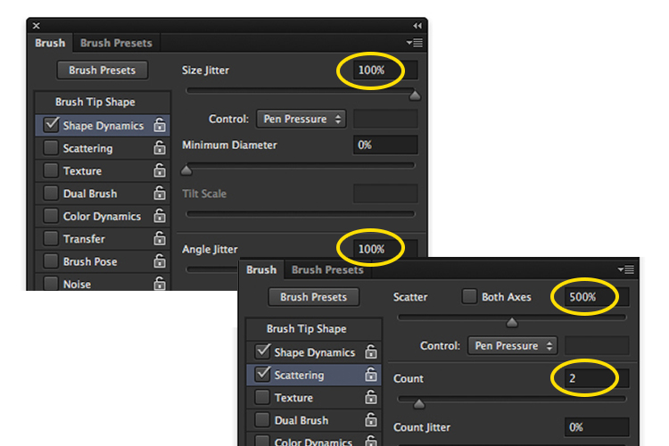
Before you start using your brush, you need to change a few properties of the brush so that it behaves like dust particles. Go up to Window > Brush. This brings up the brush dialog box. Use the following brush settings (see below screenshots also) Change the spacing to 100%, click on the Shape Dynamics box and move the Size Jitter and the Angle Jitter sliders to 100%. Next click on the Scattering tick box. I moved the Scatter slider over to 500%. Tick on Both Axes. Keep the Count Jitter at 2.

custom-brush-settings

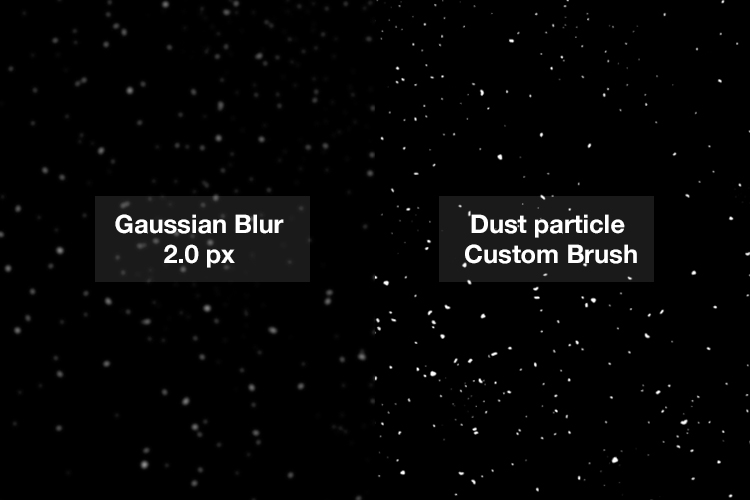
Create a new blank layer over your image and fill it with black. Using the custom brush, set to white, start creating dust particles across the canvas. Change the blend mode to Screen and now you can see the dust particles as white specks. Add some Gaussian Blur and reduce the opacity down to around 75%. You can always add a new layer to build up the effect too.

Dust-particles-with-custom-brush

How to create dust particles in-camera

I have to admit, this technique made me smile. I had been wracking my brains for a while for a possible solution to capture dust in-camera. The other morning, I got up early, as usual, to get my girls off to school. I looked out the kitchen window, the skyline was a lovely orange from the sun.

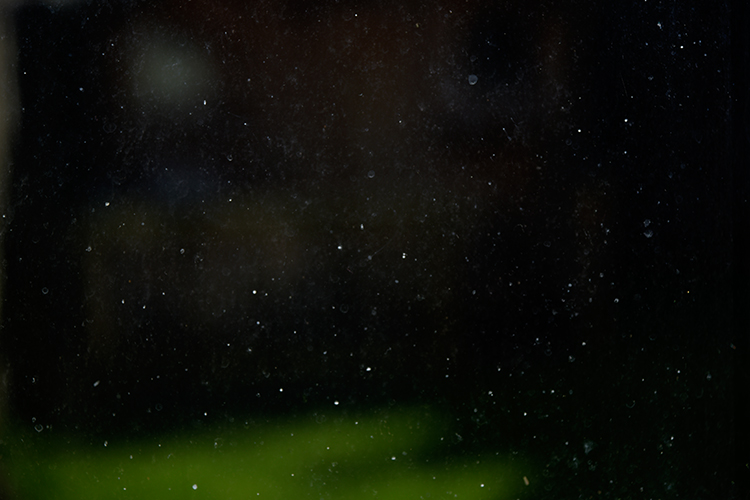
I then noticed all the specks (dirt) on the window and I had an eureka moment, I grabbed my camera and I focused on the specks using an aperture f/4. I also underexposed it by two stops. I wanted the specks to show through a dark background. I brought this image into Photoshop and applied a Levels Curve Adjustment to darken the image even more. I placed this image on the photo of the Gorilla. I then changed the blend mode to screen. I added some Gaussian Blur and reduced the opacity. Not bad for what is essentially dirt on a window.

Dust-particles-on-a-window

Dust and dirt particles on a window.

small-toy-plastic-gorilla

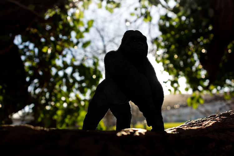
The image of the Gorilla without the Lens Flare effect and dust particles.

zoomed-in-dust-particles

Zoomed in area to show the dust particles I took of my own window!

Disclaimer: I had to persist with dirty windows for weeks in the name of photography. That’s my story and I am sticking with it!

Have you got a technique for creating your own flare or dust particles in Photoshop? If so, please share in the comments below.

googletag.cmd.push(function() {
tablet_slots.push( googletag.defineSlot( “/1005424/_dPSv4_tab-all-article-bottom_(300×250)”, [300, 250], “pb-ad-78623” ).addService( googletag.pubads() ) ); } );

googletag.cmd.push(function() {
mobile_slots.push( googletag.defineSlot( “/1005424/_dPSv4_mob-all-article-bottom_(300×250)”, [300, 250], “pb-ad-78158” ).addService( googletag.pubads() ) ); } );

The post Creating a Lens Flare Effect and Dust Particles in Photoshop by Sarah Hipwell appeared first on Digital Photography School.

Digital Photography School

 
Comments Off on Creating a Lens Flare Effect and Dust Particles in Photoshop

Posted in Photography


5 Steps to Creating a Printed Photo Collection as Wall Art

28 Apr

In this digital age, where we wander about with thousands of digital images held captive in our smart phones, there is something special about printed photographs. They represent something tangible and reverent – something that was worth transforming into an enduring piece of artwork, to remind us of what is important in our lives.

One of the most rewarding aspects of my job is seeing the photographs I create for my clients hanging on their walls. To me, it is the icing on the cake, the cherry on top, the grand finale that tells me I have fulfilled my promise to the people who put their trust in me as a professional.

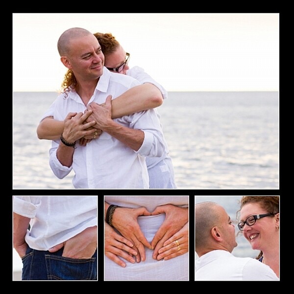
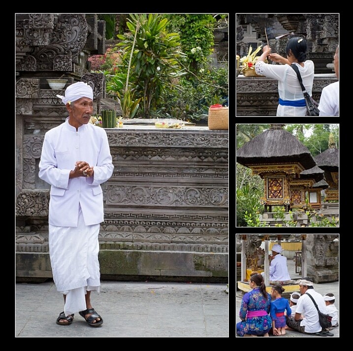
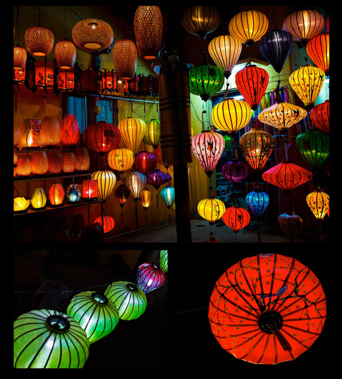
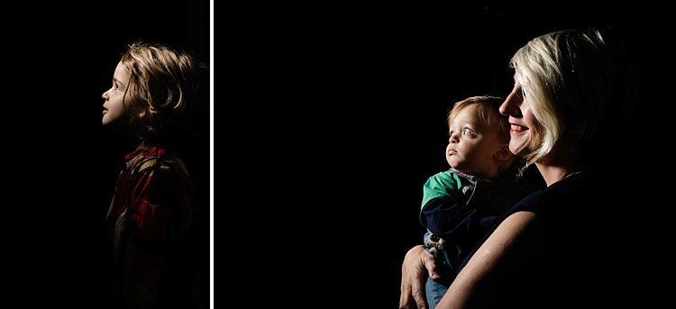
collection-dps-01

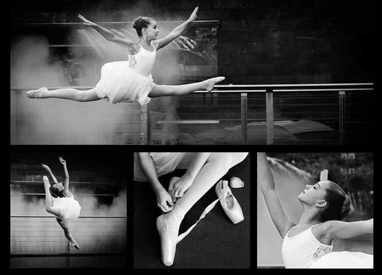
This image set by Darlene Hildebrandt

Like many portrait photographers, I began my career selling digital files on a USB stick. I found it disheartening and unfulfilling. Wall art collections were a revelation to me. As a photographer, they gave me a structure and framework to shoot within. My session times became shorter, because I was shooting with purpose. I now had something meaningful and lasting to offer my clients; collections that tell their story in all its detail, and represent something deep that they have revealed to me.

Photo collections can be about anything. In my case, they are invariably portraits, but if your thing is landscapes, travel, macro, nature etc., you can create collections that add life and personality to you home or office, and serve as visual reminders of what is important to you.

Step #1: Consider the space you want to fill

Think about the photographs you are capturing. What is the subject matter? What do these photos mean to you? Do you want to remember a favourite holiday destination, or how confident your son looks when he plays the violin? Do you want to capture the beauty of a rare flower you grew, or your young adult daughter who is about to leave home for college?

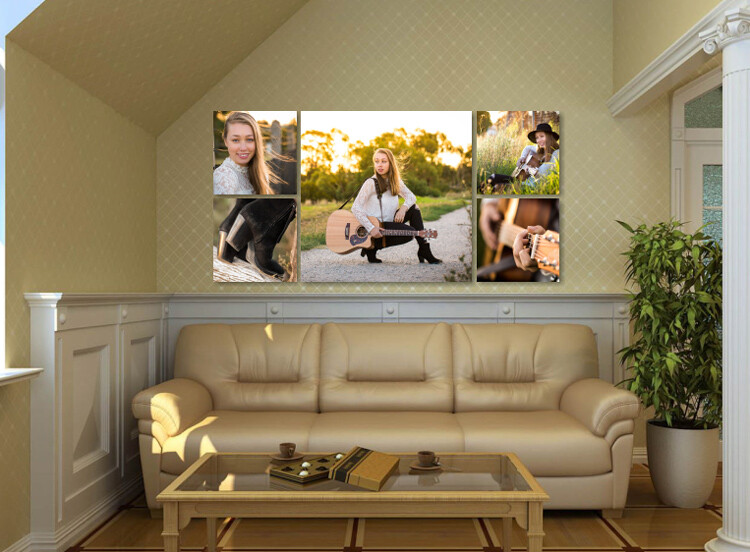
With this in mind, think about where in your home or office you would like to see these photographs every day. Consider how appropriate the subject matter is for where you want to display it, and take into account the style of the decor and other furnishings in the room. Often photographs are displayed above a piece of furniture – above your bed or the sofa, at the end of a breakfast nook, on the wall of a study, or cascading down a flight of stairs.

image showing photo collections

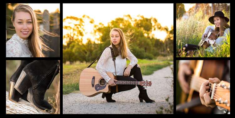
A collection to fit a long, narrow space.

Once you have decided where you want to display your photos, you should have a clear idea of what the layout should look like. Big spaces demand big photos, narrow spaces require long and thin, and a stairwell may need a staggered combination of large and small photos.

image showing photo collections

A different configuration using images from the same session. This would suit a larger space.

Step #2: Decide the layout before you pick up the camera

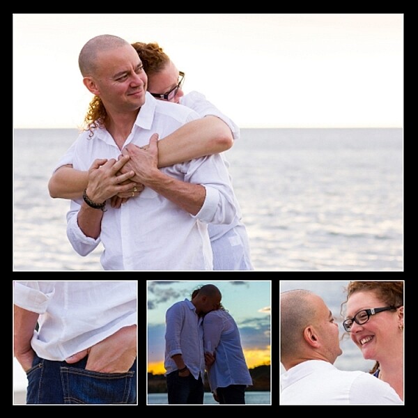
Think carefully about the configuration of your collection before you start photographing. For example, if you have a wide space to fill and you envisage a panoramic with two or three smaller prints underneath, your main photo will need lots of space to crop it into a panoramic shape, without compromising the composition or the quality of the image. You will be hard pressed to get a panoramic crop if you’re shooting in a vertical (portrait) orientation. When I’m shooting for a collection, I allow more space around my subjects than usual. This gives me some versatility when it comes to cropping.

Likewise with the smaller prints. Think about how you would like each photo to be oriented, and ensure you shoot from an angle that will enable this. I like to orient my detail shots inward, toward the main photo.

Image showing photo collections

It helps if you know how you are going to display each photo before you capture it.

Image showing photo collections

This shows how the collection would appear on a wall.

Step #3: Keep the lighting consistent

A collection looks most cohesive when the lighting is consistent throughout. If three out of four photos in the collection are high key images with lots of white, a dark photo, or one with lots of colour, will look out of place. So, if you photographed your dog on the beach at sunset, that photo you took of him earlier in the bright midday sun will look mismatched, regardless of how adorable his expression is.

In the photo collections below, the silhouetted sunset image stands out as a mismatch. In the second version, it is replaced with an image that better matches the lighting.

Image showing photo collections

The silhouetted sunset shot in the middle looks out of place.

Image showing photo collections

In this collection, the images are unified by similar lighting.

Step #4: Stick to one subject per collection

Avoid the temptation to create a hodge podge by cramming every member of a family, or every flower in the garden, into one collection. Allow your subject to shine by devoting a whole collection to him, her (or it, in the case of an inanimate object). As a portrait photographer, my collections usually consist of one full body photo, and several detail shots which help tell a story.

The photo collection below, taken at a water temple in Bali, depicts a sacred ritual. I took so many other photos I loved at the water temple, but to put them all together would detract from the story. I will save the other photos for a different collection.

image showing photo collections

Although it is tempting to cram every photo you love into a collection, the result is much more pleasing when you stick to one subject.

image showing photo collections

My main photograph in this collection is full of colour and a variety of shapes. To complete the collection, I have chosen closer-up detail shots of just two of the many lanterns.

Step #5: Collage or collection?

A photo collection can be made up of separate pieces displayed together, or you can create a collage to print as a single piece. Your decision will be influenced by the space you want to fill, the material you want to print on, and your budget.

A collection of separate pieces tends to look more luxurious than a collage. With some configurations such as stairs, it may be your only option. Another benefit of printing each piece separately is that you can change the layout later if you want to. Also, if one piece is not working quite the way you imagined, you can swap it out for a new one.

The photos below, taken at dawn on a beach in Vietnam, will be printed as separate pieces and hung together as shown.

image showing photo collections

Displayed together, the four photos tell a story.

On the flip side, printing multiple pieces can be expensive, and it can be tricky to hang a multi-piece collection with the accuracy it deserves. Some configurations, such as the black and whites below, can look itsy-bitsy when printed separately, and look better printed as a single piece.

You can create hi-res collages like this in Photoshop, Lightroom, or the professional version of Proselect. Alternatively, you can buy ready-to-hang frames with cut-out mats designed for collections, or you can ask a framer to create a customized mat for your frame.

This collage was designed to be hung above a dining table, so the long narrow shape worked well. Background and borders are white to match the colour scheme of my clients’ home, and it is printed on metal to suit their contemporary decor.

image showing photo collections

This was designed to be printed as a single piece.

Collections and collages are a fun and interesting way to display your favourite images. With a little care and thought, they can make breathtaking displays that will last for a great many years. I hope this article inspires you to go and rescue those beautiful images of yours that are trapped in the digital world, and bring them to life!

Share in the comments section below your favourite photo collections or collages, or any hints or tips you have learned along the way.

googletag.cmd.push(function() {
tablet_slots.push( googletag.defineSlot( “/1005424/_dPSv4_tab-all-article-bottom_(300×250)”, [300, 250], “pb-ad-78623” ).addService( googletag.pubads() ) ); } );

googletag.cmd.push(function() {
mobile_slots.push( googletag.defineSlot( “/1005424/_dPSv4_mob-all-article-bottom_(300×250)”, [300, 250], “pb-ad-78158” ).addService( googletag.pubads() ) ); } );

The post 5 Steps to Creating a Printed Photo Collection as Wall Art by Karen Quist appeared first on Digital Photography School.
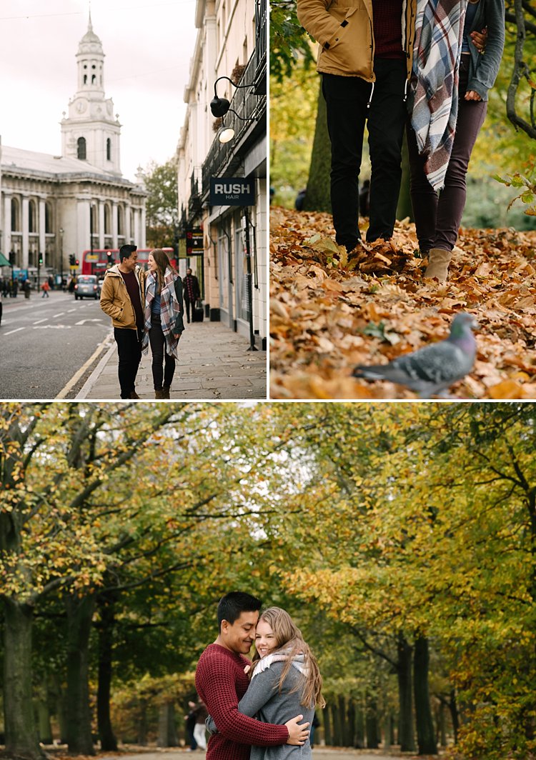

Digital Photography School

 
Comments Off on 5 Steps to Creating a Printed Photo Collection as Wall Art

Posted in Photography


14 Essential Rain Photography Tips for Creating Dramatic Images

16 Apr

Wherever you travel, you are always free to take that perfect shot from the best angle. Not when it’s pouring down heavily, though. Winter is not always the best climate for comfortable outdoor photography. But guess what, if you are a clever photographer, you can take even better photos in the rain than on sunny days. Cold and stormy weather Continue Reading
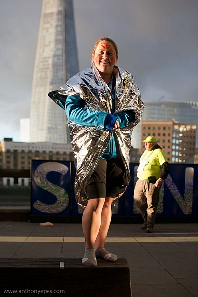
The post 14 Essential Rain Photography Tips for Creating Dramatic Images appeared first on Photodoto.


Photodoto

 
Comments Off on 14 Essential Rain Photography Tips for Creating Dramatic Images

Posted in Photography