RSS
 

Posts Tagged ‘conversion’

Phase One updates tethering and Raw conversion with Capture One 8.1

30 Dec

Camera and software manufacturer Phase One has released a new version of its Capture One Raw file converter that includes new tools, added flexibility and options, as well as support for additional cameras. Updating the version 8 that was made available in September 2014, Capture One 8.1 allows users to edit files in other applications, such as Photoshop, from inside the program and it now allows up to 16 adjustment layers to be used at one time. Read more

Articles: Digital Photography Review (dpreview.com)

 
Comments Off on Phase One updates tethering and Raw conversion with Capture One 8.1

Posted in Uncategorized


Macphun’s Tonality Pro Versus Lightroom 5 for Black and White Conversion

13 Sep

Tonality Pro vs. Lightroom

MacPhun Software recently released Tonality Pro (use this link to get 20% off, for dPS readers only), a powerful black and white converter for Mac. In this article I’m going to compare it to Lightroom so you can see how the conversion process differs between the two programs.

Windows users please don’t stop reading now – I’ll look at some other black and white plug-ins at the end of the article, all of which are cross-platform.

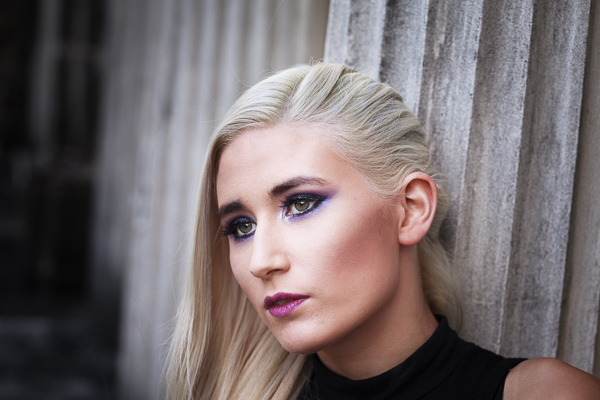
To start, here’s the colour photo that I’m going to convert to black and white.

Tonality Pro vs. Lightroom

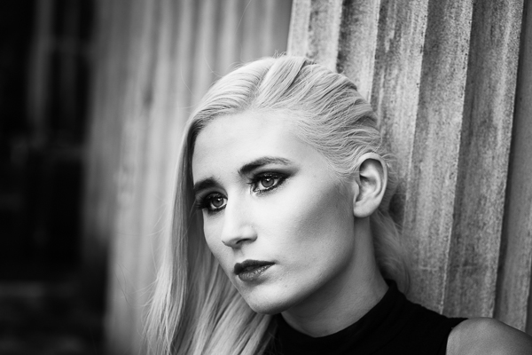
Here’s the black and white version I created in Lightroom.

Tonality Pro vs. Lightroom

It’s a fairly straightforward conversion. I increased Clarity and Contrast, and added a vignette using the Radial Filter. I didn’t touch the Black and White Mix panel, and I didn’t add Split Toning.

All these tools will be familiar to Lightroom users. So, how does Tonality Pro differ? Let’s take a look.

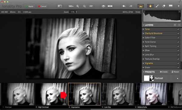
Tonality Pro uses presets

Tonality Pro’s presets give you a variety of ready made black and white conversions. Of course, not all of them will be suitable for your photo, but with over 150 to choose from, you are bound to find at least a few that do good things for your images. If you don’t like using presets, just skip them and go straight to the other panels to do your work.

Tonality Pro’s presets are similar to Lightroom’s Develop Presets. The main difference is that Tonality Pro comes supplied with a full set, while Lightroom only has a limited range of built-in monochrome presets. If you want a decent set of black and white presets for Lightroom, you will have to buy them.

Tonality Pro’s presets have two features that make them a very powerful and versatile feature.

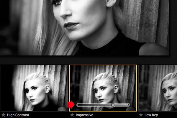
The first is a slider that lets you adjust the strength of the preset. This is useful because the number one problem with presets of any sort is that they can be too strong. A subtle touch is better when it comes to post-processing and many presets are far from subtle. The opacity slider in Tonality Pro helps you deal with that. Let’s say you apply the Impressive preset to your photo. Here’s how it looks.

Tonality Pro vs. Lightroom

Too strong? It’s easy to reduce the strength of the effect until it looks just right.

Tonality Pro vs. Lightroom

The second feature (I’m really excited about this) is that Tonality Pro has layers. With layers, you can apply a preset on a new layer, then create a mask using Brush mode so that the preset is only applied to part of your image.

Take a moment to think about what that means. For example, you could apply one preset to the subject (in this case the girl in the photo) on one layer, and another to the background on another layer. It’s got the potential to be very powerful, and it’s something that I haven’t seen in any other plug-in.

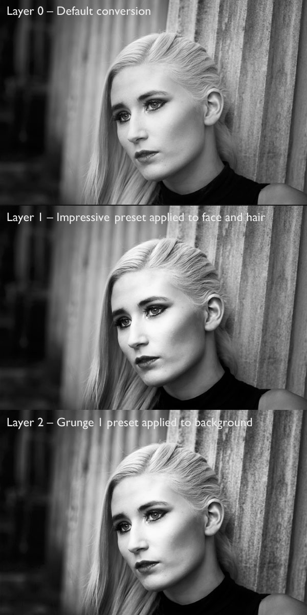
Here’s how it works. In these examples I’ve applied the Impressive preset to the model’s face, and the Grunge 1 preset to the background using layers. I used the opacity sliders to keep the effect subtle. These three images show the result.

Tonality Pro vs. Lightroom

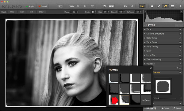
Next I added a frame.

Tonality Pro vs. Lightroom

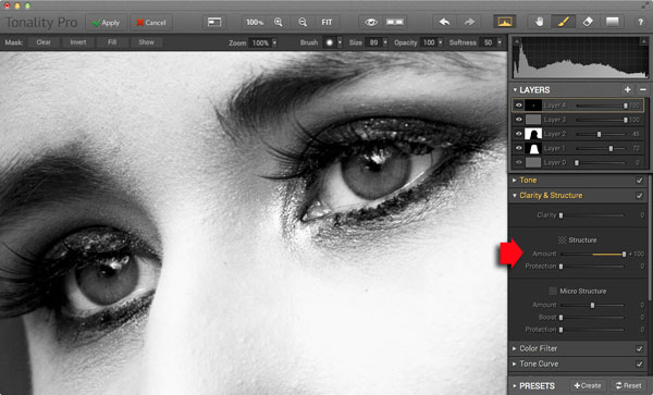
Finally I added some Structure to the eyes, and increased Adaptive Exposure a little to compensate for the way Structure tends to make things darker as well as add detail. You can achieve a similar effect in Lightroom with Clarity, but you will be interested to know that you can adjust Structure in Tonality Pro as well as Clarity (Structure is better than Clarity for bringing out detail).

Tonality Pro vs. Lightroom

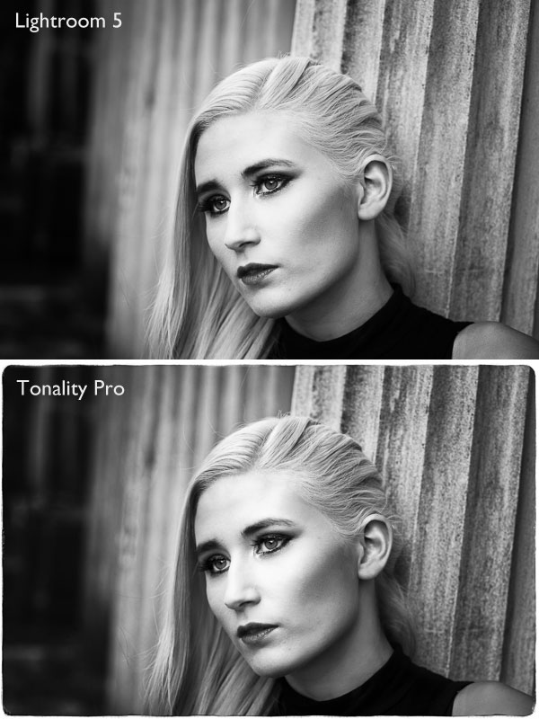
Here’s the final comparison of the two versions of the photo.

Tonality Pro vs. Lightroom

As you can see, apart from the border, most of the differences are subtle. But the way I got there, the editing process itself, was very different.

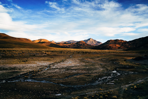
Now I’m going to show you another application of Tonality Pro that you definitely can’t do in Lightroom. Here’s the original colour photo.

Tonality Pro vs. Lightroom

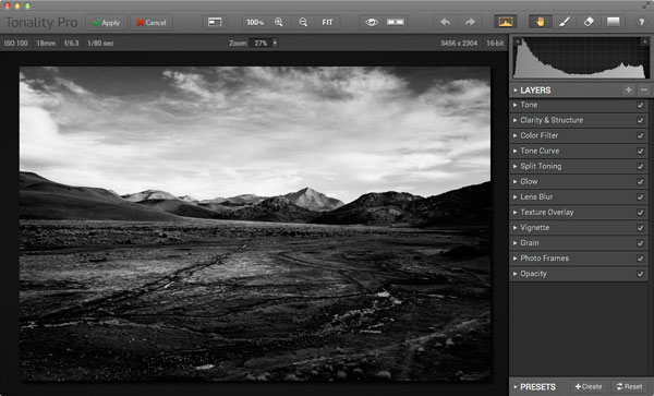
Here’s the initial black and white conversion:

Tonality Pro vs. Lightroom

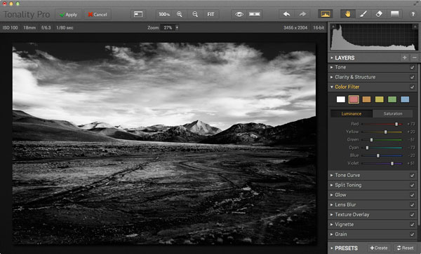
This is the same photo processed in Tonality Pro with a red colour filter applied to darken the sky and add drama to the distant mountains.

Tonality Pro vs. Lightroom

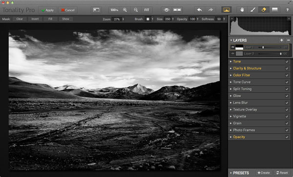
Here I’ve added another layer and applied the El Captain preset, reduced the opacity of the layer to 20 (to keep the effect subtle), and used a mask to apply the preset to the foreground only, not the mountains or sky.

Tonality Pro vs. Lightroom

All this took just a couple of minutes to carry out.

The verdict

This is a simple demonstration but hopefully it’s given you a taste for what Tonality Pro can do, and how it compares to Lightroom.

I’ve only scratched the surface in this article, Tonality Pro has lots more interesting features. Another dPS writer,  Phillip VanNostrand has done a full review here, it covers the software in more depth, so check that out also. In the meantime, if you want to test out Tonality Pro for yourself, or learn more about the program, then you can do so at MacPhun’s website (get 20% off for dPS readers using this link).

How Tonality Pro compares to other plug-ins

Tonality Pro isn’t the only black and white plug-in out there, and you may be interested to know how it compares to some of the others. Don’t forget they all have different features and strengths, and the best one for you depends on what you want to do with your black and white images. You can download trials of all the plug-ins to help you make your mind up. Here’s a brief guide:

Silver Efex Pro 2

Until Tonality Pro came along this was the single best black and white conversion plug-in you could buy. To be honest, I haven’t used Tonality Pro enough yet to say whether it is better than Silver Efex Pro 2. But, there’s no doubt that the layers feature in Tonality Pro means that it is a versatile program that gives Silver Efex Pro 2 a good run for its money.

Silver Efex Pro 2 is more expensive (more than double the price) but it does come as part of the Nik Collection, so you do get the benefit of the other programs within it (Viveza, Color Efex Pro and so on). Silver Efex Pro 2 also has a powerful history function that Tonality Pro lacks.

Alien Skin Exposure 6

One of my favourite plug-ins, Exposure 6 is designed to give your digital photos an analog look. You can use it for both black and white and color photos, and in my opinion it’s stronger on the colour side than monochrome. But it’s still a powerful black and white converter.

It’s more expensive than Tonality Pro, but you get the advantage of being able to use it to process colour photos too. It can be used as stand-alone program as well as a plug-in (as can Tonality Pro).

Topaz Black & White Effects 2

Black & White Effects 2 is a nifty black and white plug-in. Its main benefit is an extensive range of creative presets, including several sets that imitate old processes such as cyanotype, albumen and van dyke brown. It’s also good for emphasizing detail and texture.

Perfect Black & White

onOne Software’s Perfect Photo Suite includes the Perfect Black & White module. Like Silver Efex Pro 2, you get the benefit of the other modules in the suite. But unlike Silver Efex Pro 2, all the modules work together and you can switch seamlessly from one to the other.

One of my favourite modules is Perfect Mask. I use it to blend two versions of landscape photos, one processed for the sky and the other for the foreground. Combined with Perfect Black & White it helps you create powerful and dramatic black and white landscapes. It also works as a stand-alone program.

Discussion time

In my review of MacPhun’s Intensify Pro one reader gave an opinion that photographers who use plug-ins instead of Photoshop are lazy. It’s an interesting topic for discussion, so please let us know what you think in the comments. Do you use plug-ins to process your photos? If you do, which are your favourites and why? Or do you agree with the view that plug-ins are for lazy photographers?


Mastering Lightroom: Book Three – Black & White

Masterlng Lightroom: Book Three – Black & White by Andrew S GibsonMy ebook Mastering Lightroom: Book Three – Black & White goes into the topic of black and white in depth. It explains everything you need to know to make dramatic and beautiful monochrome conversions in Lightroom, including how to use the most popular black and white plug-ins. Click the link to visit my website and learn more.

The post Macphun’s Tonality Pro Versus Lightroom 5 for Black and White Conversion by Andrew S. Gibson appeared first on Digital Photography School.


Digital Photography School

 
Comments Off on Macphun’s Tonality Pro Versus Lightroom 5 for Black and White Conversion

Posted in Photography


Secular Conversion: Historic Chapel Turned Modern Library

22 Nov

[ By Steph in Architecture & Public & Institutional. ]

Historic Chapel Modern Library Renovation
A beautiful old chapel in the Italian town of Lonate Ceppino has been transformed into a modern library with a  perforated aluminum tower that adds to the building without compromising its historic character. Italian architects DAP studio restored the traditional architectural features of the Oratory of San Michele before converting it for a new use with the sleek white extension.

Historic Chapel Modern Library Renovation 2

Historic Chapel Modern Library Renovation 4

The new two-story volume stands off to one side of the original structure, connected via stairways. The top part tapers inward to allow for the preservation of the chapel’s overhang. The new volume contains bathrooms, archives and technical systems, while the bright open spaces of the church hold the books.

Historic Chapel Modern Library Renovation 5

Where one building is solid and opaque, the other is translucent, shimmering in the sunlight. The small volume connecting the chapel and the extension features a glazed roof to let in more sunlight without substantially altering the architecture of the historic structure.

Historic Chapel Modern Library Renovation 3

This library is hardly alone in making creative use of old churches, monasteries and temples. Check out the incredibly grand ‘Waanders In de Broeren’ 15th-century Dominican church-turned-library, and many other religious-to-secular conversions.

Share on Facebook


[ By Steph in Architecture & Public & Institutional. ]

[ WebUrbanist | Archives | Galleries | Privacy | TOS ]


WebUrbanist

 
Comments Off on Secular Conversion: Historic Chapel Turned Modern Library

Posted in Creativity


Newborn Photography Black and White Conversion in Lightroom

25 Oct

Introduction

The Following is an excerpt from the SLR Lounge Lightroom Preset System v5 and accompanying workshop.  The Lightroom Preset System is designed to take you from Ordinary to Extraordinary photos in just a few seconds and clicks. In this tutorial we’re going to be creating a nice soft black and white portrait for a newborn baby captured from the Newborn Photography Workshop where we teach photographers how to take beautiful newborn with any camera using simply natural window light and a reflector.

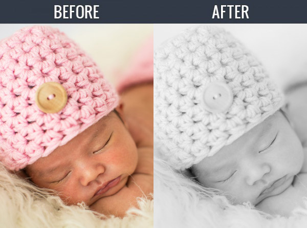
The complete written tutorial is below, and you can also watched the video tutorial at the end of this article. Here’s a sneak peak at what our image will look like before and after our edit.

newbeforeafter


Black and White Conversion for Newborns

The first thing we did to this image was adjust our Color Tempurature to taste, and in this case we used the Eye Dropper Tool (W) taking a reading from the fur that the newborn is sleeping on.

After our Color Temperature adjustment we used our “01-10 Base – Soft: 12b Super Soft – B&W” preset to edit our photo. This preset does all of our work for us and after this preset is applied our photo edit is pretty much finished. So let’s go over exactly what this preset did.

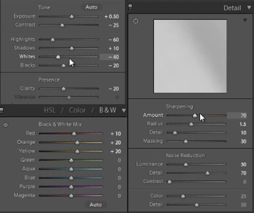
First, the Highlights and Whites have been taken down to -60 and -40. This is to smooth out highlights by bringing them closer to the mid-tones and shadows. This adjustment has the effect of softening highlights over skin tones giving us much more evenly lit skin.

Next, Clarity is being dropped to -20 in order to reduce mid-tone contrast. The reduction of mid-tone contrast again helps us achieve a softer and more flattering look. However, I would caution not to take the Clarity slider down too far as it can create an overly-soft looking image completely lacking in contrast and mid-tone detail.

In this black and white conversion the Reds, Oranges, and Yellows in the HSL are being raised, which again is primarily for skin tones. This brightens up the skin tones, further enhancing the soft flattering look.

We have our standard amount of Sharpening for portraits applied to this image which you can see below.

Also worth noting, the preset we selected dialed in a Noise Reduction Luminance setting of +30. Noise reduction was added to the preset in order to quickly reduce a little bit of the pore detail in the skin giving it a slightly smoother overall look. At an amount of +30, we will see a nice smoothing effect over skin, while retaining the majority of our fine detail in the hair, eyes and so forth.

Below is a snapshot of all of our final settings to achieve this look.

developsettings

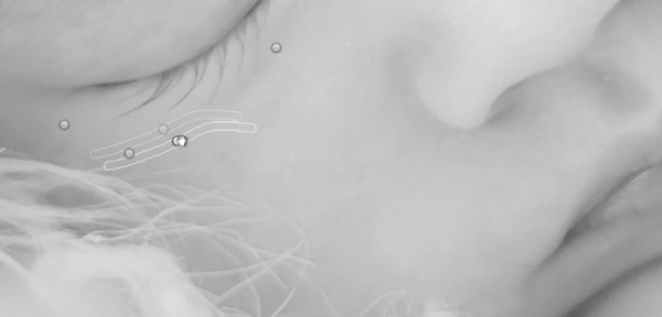
To clean up the skin a little we can use the Lightroom 5 Spot Removal Tool to remove some of the more obvious bits of dry skin and hair. Adobe has modified the Spot Removal Tool in Lightroom 5 to operate more like a brush making the tool much more powerful than in previous editions of Lightroom.

Just remember to keep your Spot Removal Tool size small and just large enough for the area you are working so that it doesn’t look unnatural.

Screen-Shot-2013-07-30-at-9.59.27-PM-650x313

Black and White Conversion for Newborns

Here’s  a look at the final before and after of our newborn black and white portrait.

Before

lightroom-5-tutorial-soft-black-and-white-newborn-0001

After

lightroom-5-tutorial-soft-black-and-white-newborn-0002

Watch the Video Tutorial

If you would like to see exactly how all of the settings and adjustments were applied, please watch the video below from the SLR Lounge YouTube Channel.

Conclusion and Learn More

We hope you all enjoyed this tutorial. If you are interested in learning more or purchasing the SLR Lounge Lightroom Preset System v5 or the newly released Lightroom Workshop Collection v5, please click any of the links in this article. If you are interested in Newborn Photography Workshop please also check out our Newborn Workshop Collection and Lightroom Presets now available via digital download.

Post originally from: Digital Photography Tips.

Check out our more Photography Tips at Photography Tips for Beginners, Portrait Photography Tips and Wedding Photography Tips.

Newborn Photography Black and White Conversion in Lightroom

The post Newborn Photography Black and White Conversion in Lightroom by Post Production Pye appeared first on Digital Photography School.


Digital Photography School

 
Comments Off on Newborn Photography Black and White Conversion in Lightroom

Posted in Photography


Google+ gets improved Raw-to-JPEG conversion

27 Sep

shared:google.png

Google+ has introduced improved Raw-to-JPEG conversion for a number of cameras with some help from Nik Photography. As before, Raw files may be uploaded to Google+ for storage, and are automatically converted to JPEGs for previewing. The conversion from Raw has been fine-tuned for about 70 cameras, including high-end models like the Canon EOS 5D Mark III, Nikon D800 and D800E. Click through for the full list of cameras and see how it handles a Raw file from the Sony RX100.

News: Digital Photography Review (dpreview.com)

 
Comments Off on Google+ gets improved Raw-to-JPEG conversion

Posted in Uncategorized


Sigma US announces Mount Conversion Service for recent lenses

01 Aug

Sigma_logo.png

Sigma has announced a ‘Mount Conversion Service’ for any of its recent ‘Global Vision’ lenses – a paid-for service designed to reduce the uncertainty of changing camera systems. The company says it will charge between $ 80 and $ 250, plus shipping costs, depending on the specific lens. The Global Vision range currently includes seven lenses – from the huge 120-30mm F2.8 DG OS Sport for full-frame DSLRs, down to the 19mm F2.8 DN Art for Micro Four Thirds. The company has also extended the warranties on all new products to four years.

News: Digital Photography Review (dpreview.com)

 
Comments Off on Sigma US announces Mount Conversion Service for recent lenses

Posted in Uncategorized


3 Tips for Better Black and White Conversion using Lightroom

16 Jan

Ever wondered how the professional photographers get those dreamy black and white or sepia toned images? Wonder why yours come out looking dull and flat looking?  I’m going to give you 3 tips to help you do better black and white conversions using Adobe Lightroom, and solve that problem!

Today’s cameras are pretty smart, and many of them offer a black and white setting or shooting mode. I recommend using those to start, especially if you’ve never done any black and white (B&W) or if you are not currently doing any post processing or image editing on your files. BUT, if you have some experience with b/w photography, and you are processing your images, I recommend doing the conversion yourself as you have more control over the look of the final image.  I’m going to show you a few ways of converting them into B&W using Lightroom.

Note:  for the most part these tips will work in Photoshop as well, using the Adobe Camera Raw features and sliders.

First a quick note about my background. Back when I took my photography degree (dare I say, in 1987-88, and date myself) I spent the entire first year shooting black & white only, using a 4×5 view camera no less. I processed my own film and made my own prints. I spent a lot of time in a black & white darkroom, so I’m pretty well versed in how it works and how to control it to my advantage.

To grab some info from those film days, it’s important to note and understand that your camera sees light and colours differently than does the human eye. Black and white film sees blue tones much lighter than our eyes, for example.  Coloured filters were used to shift how the B&W film “saw” and rendered the scene.  Using a red filter would lighten anything red in the image and darken blue tones.  So if you were a landscape photographer you’d often use a red filter to darken the sky and make it less washed out.   A green filter would lighten green and blue tones and darken red and orange.  So photographers used the appropriate filter to capture the scene as they envisioned it.

In Lightroom and ACR (Adobe Camera Raw) in Photoshop you have the same tools at your disposal!  So without the use of filters, you can adjust how the scene is rendered in B&W.  That brings me to the first tip.

Tip #1 – use the B&W mix to do your conversions

In Lightroom’s Develop module (and ACR) there are a few ways that you can convert your images into B&W.  You can just pull the saturation slider all the way to left to -100. You can also do similar with the Vibrance slider, but it may not give you a 100% B&W image, depending on the image. Both of those options will give you a black & white result. However, they give you no control over how the colours render into the various shades of grey. A better choice, in my opinion, is to use the B&W mix, located on the third panel down on the right in Develop – see below.
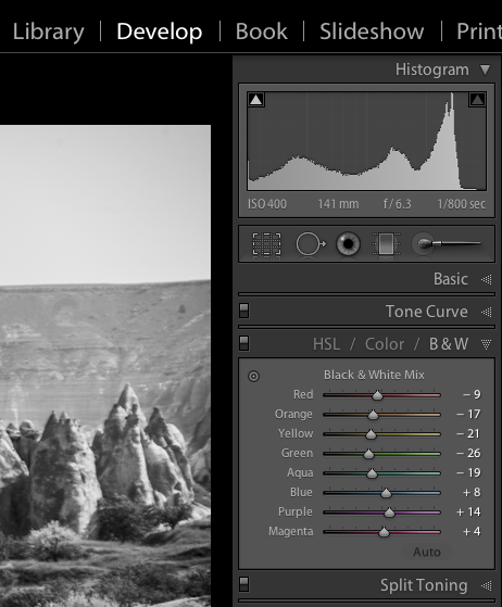
Black and white mix panel in Lightroom Develop module

Let’s take a look at an example using the same image.

Original colour image
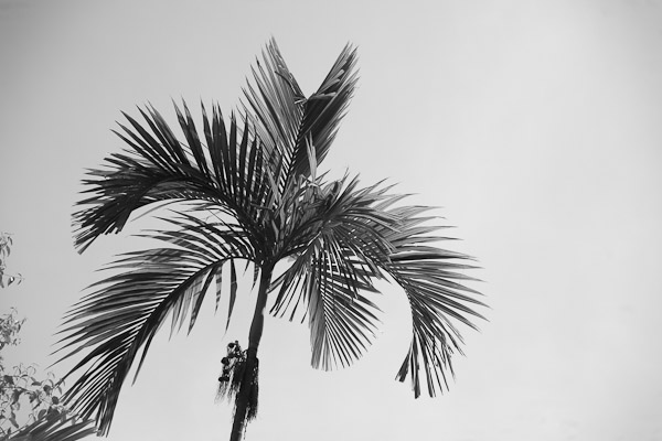
B&W conversion done using the Saturation slider at -100
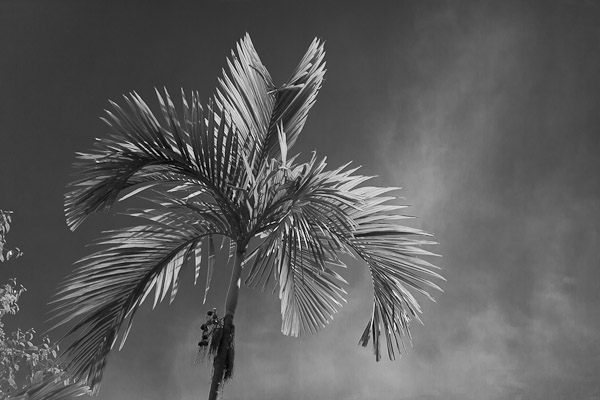
B&W conversion done using the B&W mix in LR

In the images above, notice how the blue sky went really light using the desaturate method?  This is often the case when you have a lot of blue sky in an image, as I explained above.  Using the B&W mix and pulling a few of the sliders I was able to get very different tones.  This is what my sliders in the B&W Mix panel look like on the third image:
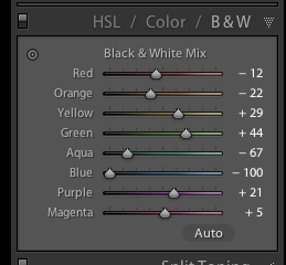
Notice the blue slider is pulled all the way to the left to -100.  That is what is darkening my sky.  Also worth noting is the green and yellow sliders are moved in the opposite or plus direction.  This lightens both yellows and greens (most grass and trees are often a mix of green and yellow, sometimes more yellow than green).  I have not done any selective adjustments to darken the sky here, just the sliders you see to the right!  How very different this image is from the desaturated one, and so simple to do using this method!

Also on this panel notice there is an “Auto” button.  Clicking it will allow Lightroom to apply a predetermined B&W mix for you.  You can also set up in your Lightroom preferences to apply that for you when B&W mix is selected, then you can just fine tune from there.  Otherwise all the sliders will start at “0″.

Another little known trick for using these sliders is the funny looking little double circle thing on the top left.  As you move the mouse over it, you will see this:
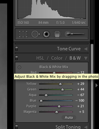
Adjust Black & White Mix by dragging in photo. So what on earth does that mean, you may wonder?!  If you click on the little circle your mouse pointer will now have little up and down arrows, as well as your cursor showing the same icon as you hover over the image. Click anywhere on the image, hold and drag, and it will adjust ONLY the colours that you’ve clicked on.   Drag up to move the sliders to the right (+) and drag down to move them to the left (-). How cool is that?!

This is very helpful if you do not know which sliders to adjust.  Just select the area of your image you’d like to adjust the tones on and drag away!

Tip #2 – don’t just stop there, add some punch

Sometimes even using the B&W mix sliders the resulting image still looks a bit flat and dull looking.  Take it up a notch by adding some punch to your image.  I do the following to most of my B&W images:

  • increase the clarity:  if it’s a scenic I’ll push it quite far like +60 or higher, if it’s a person I keep it under +30 or they start to look a bit crunchy and overly wrinkled (especially if the photo is of your mom or your spouse, they tend not to be too happy about that)
  • lower the black slider, until it looks good.  Highly scientific, yes! Here’s a little trick for you as well using the Blacks slider:  if you click and hold the Opt/Alt button while you slide it, you will get to see exactly where your blacks are clipping (meaning going off the chart on the histogram and having no detail). You can use that information to make sure you have just enough blacks, but make sure you keep all the detail in important areas.
  • increase the contrast either using the Contrast slider or Curves

Occasionally after making these contrast adjustments it will affect the overall image and you may want to go back and rework the B&W sliders a bit too.  It’s a dance, play them back and forth until you get a mix you like.   Here’s the final version of the image above, with contrast and punch adjustments applied.

Notice how much more snap it has, while still maintaining that nice rich, dark sky!

Secret to making great B&W images that the pros won’t tell you . . .

Black!  That’s it.  Make sure you actually have some black, and some white in your image.  Check the histogram and use my little tip on seeing the clipped bits. Add contrast or increase the blacks, whites, or both to get a full range of tones.  No matter what the subject is in the photograph, having enough contrast to have pure white, and pure black is key to having a stunning B&W image.  Otherwise you’re just left with a bunch of grey mud.

Tip #3 – creating selective coloured images

There are a couple ways to make selectively coloured images, and also to create that faded look that is really popular. Once again you can use the Vibrance and Saturation sliders in the Basic panel, however they will affect colours in the entire image the same.  You can also use the Adjustment Brush and paint in a lower saturation onto parts of your image where you want to fade out the colour.  I use that method quite often, even on full colour images, to do tone control on items in the background that are distracting.

Lastly you can use the sliders in the HSL panel.  By sliding selected colours to the left you can desaturate only those colours.  You can also use the little Click and Drag tool we used earlier to do the B&W Mix to click on your image and pick the areas to fade.   Here’s an example using each of these methods.  None is right or wrong, just give you a different look and some have more control than others.  Choose the one that works for you on in individual image basis.
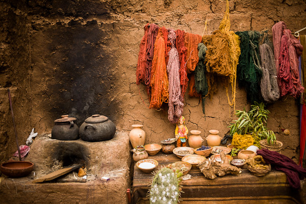
Original colour image
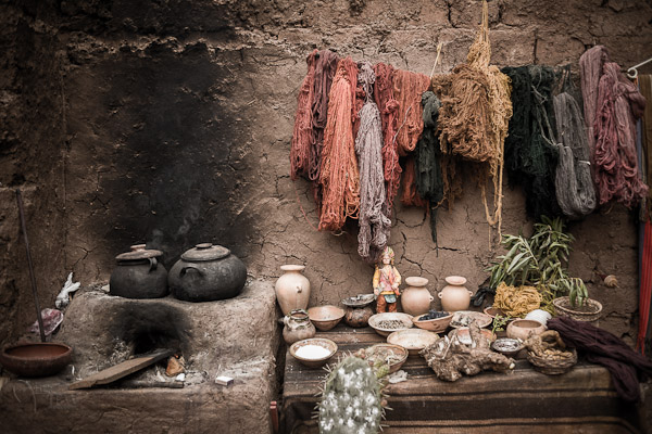
Vibrance slider set to -75

Saturation slider set to -75

Adjustment brush used to paint in saturation at -75 to the whole image except for the wool
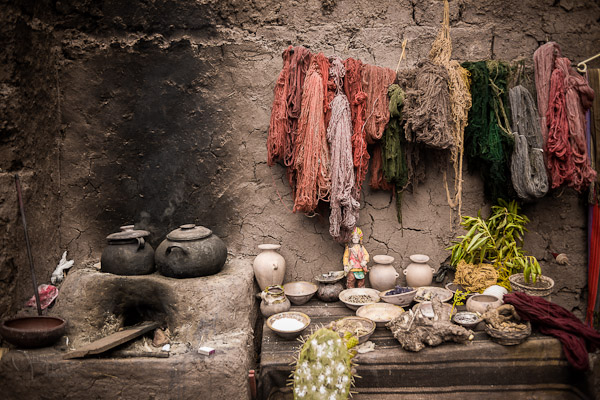
HSL sliders used to desaturate by separate colours

*Bonus Tip – making a nice duotone or sepia toned image

A little extra bonus tip for you.  Adobe has made it super easy to create a really nice duotone (just means two tones, go figure!) image, which includes Sepia.  Just go to the Split Toning panel after you’ve done your B&W conversion, it’s the fourth one down.
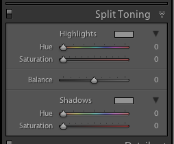
You will see sliders for both Highlights, and Shadows.  My personal tip on how to keep a nice clean sepia or toned image is to use ONLY the Shadows sliders and do not touch Highlights.  That will leave you with clean, crisp white highlights even after you’ve applied the toning.

How to create the duotone

First start by choosing the Hue slider (for Shadows).  If you want a nice brown colour, start with it around 40-45. Each image tones slightly differently, so start there and adjust to your taste and style.  You may notice that nothing happened, right?  That is because you need to increase the Saturation slider before the tone will show up.  The more you increase saturation, the deeper and more vibrant the colour tone will become.  Again, there is no right or wrong, it’s all about preference.  For a subtle, dark, chocolate brown try 10-20.  For a deeper colour go higher with saturation (NOTE: make sure the “balance” slider is set to zero)

If you want a different tone just move the Hue slider.  You can create some really neat affects this way including Blue Tone or a true Duotone.

Example using a portrait

For this final example I’ll show all the steps we’ve just covered using a portrait.  This is applicable to any people photos, you don’t need to make portraits to use this information.
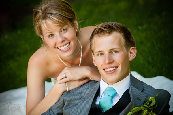
Original colour image
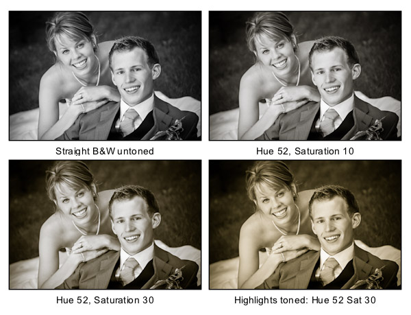

Notice the last image where I’ve added in colour to the Highlights and how it completely changes the look of the image. The whites have a yellow tint now instead of a nice clean look. I personally prefer the third one but there are times I do use this option. Do what feels right for your image, you’ll know what to do.
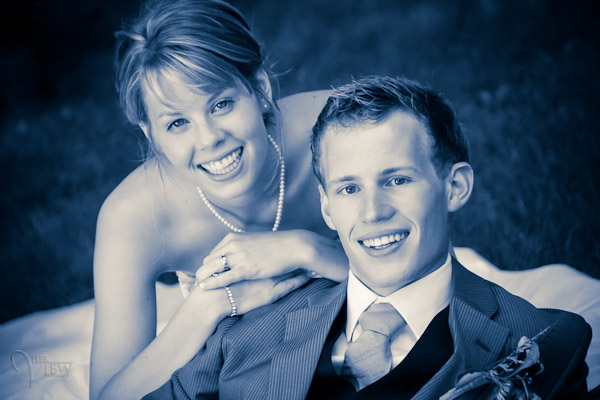
A "duo" tone using different colours for the Highlights and Shadows. Shadow settings: Hue 232, Sat 70 – Highlight settings: Hue 52, Sat 37. I did move Balance to -27 to skew the colours more towards the Shadows as well.

What next?

As always I encourage experimentation.  If you have another way that you like better, that’s awesome!  Please share it with us if you will.  Another way to do some really quick B&W inside Lightroom is to find some good presets. There are literally tens of thousands of Lightroom Develop presets available for free on the internet.  Try a Google search for:   Free lightroom b&w presets.  Then just pick the ones you like and install them.

Now get out there and go make some images and let’s see what you can do in Black & White!


Post originally from: Digital Photography Tips.

Check out our more Photography Tips at Photography Tips for Beginners, Portrait Photography Tips and Wedding Photography Tips.

3 Tips for Better Black and White Conversion using Lightroom


Digital Photography School
 
Comments Off on 3 Tips for Better Black and White Conversion using Lightroom

Posted in Photography


Retro Redial: 8 Creative Phone Booth Conversion Projects

15 Jan

[ By WebUrbanist in Technology & Vintage & Retro. ]

phone booth banksy art

As you may recall (and please, forgive the pun), pay phones used to be ubiquitous – in many places they remain a physical presence, but without a use. As Banksy‘s work (above) points out, their primary purpose is arguably quite dead – but, on the upside, that leaves room for all kinds of radical rebirths.

phone booth data hub

Around the world, old phone booths are also becoming high-tech data hubs. Consider New York City, which has just unrolled a pilot program to turn 250 old phone booths into information centers, providing basic maps, directions and directories to tourists, but also up-to-the-minute emergency information and safety alerts in case of serious storms or other natural disasters.

phone booth library nyc

Local architect John Locke has come up with another, lower-tech, even-easier reuse project for some of the 10,000+ remaining unused public phones on the streets of Manhattan – easily-fabricated micro-libraries that can be slotted into existing boxes, taking advantage of their robust framework and shelter. No fasteners needed for this efficient and inexepensive flat-pack solution.

phone booth media swap

Across the pond, iconic red-box phone booths of England may be even more well-suited to this particular kind of conversion, being closeable and thus, while not 100% weatherproof, still more completely sealed from the elements. The result is one of “the country’s smallest lending libraries – stocking 100 books. Villagers from Westbury-sub-Mendip in Somerset can use the library around the clock, selecting books, DVDs and CDs. Users simply stock it with a book they have read, swapping it for one they have not.”

phone booth charging station

Turning back toward the high-tech, Telekom Austria is tackling over ten thousand disused phone booths, turning them into recharging stations for the nation’s estimated growth toward over a half-million electric vehicles in the next decade. But enough about functional conversions – what about the artistic side? See below for homeless shelters, aquariums, even outhouses made of old phone booths.

Next Page:
Retro Redial 8 Creative Phone Booth Conversion Projects

Share on Facebook


[ By WebUrbanist in Technology & Vintage & Retro. ]

[ WebUrbanist | Archives | Galleries | Privacy | TOS ]


WebUrbanist

 
Comments Off on Retro Redial: 8 Creative Phone Booth Conversion Projects

Posted in Creativity


NAB 2010 – Simple Stereo Conversion

12 Nov

Eric Westphal shows how you can use Fusion to produce a simple stereo conversion of an image using displacement. Recorded at NAB 2010.
Video Rating: 4 / 5

CINEMA 4D Studio Release 13 is sure to revolutionize your character animation workflow. The new Character Object allows you to quickly rig characters based on pre-built templates. CMotion generates procedural animation, based on the relationship between objects and individual cyclic actions that can be customized via a spline graph. An all-new Muscles system allows you to pin muscle objects to multiple joints or objects, and deform the mesh as the distance between the objects changes. The Visual Selector has been completely redesigned, and now allows multiple tabbed views within a single tag. www.cineversity.com Note CINEMA 4D R13 is due to ship in September. For more info see www.maxon.net
Video Rating: 4 / 5

 
Comments Off on NAB 2010 – Simple Stereo Conversion

Posted in 3D Videos


Quintessential Conversion: The Ultimate Warehouse Loft

25 Oct

[ By Steph in Architecture & Houses & Residential. ]

A historic 1880′s warehouse in Melbourne, Australia has been converted into a stunning luxury home with high ceilings, exposed red bricks walls and dramatic archways. The addition of new wood floors, white drywall and a modern kitchen make the space livable without overpowering it.

The renovated apartment is located in ‘Leicester House’, a five-story Neo-Gothic building in downtown Melbourne with deep cornices and detailed Florentine arches on the exterior. Most of the spaces within it are still in use as offices.

While many aficionados of warehouse conversions would likely prefer to see less carpeting and more modern furnishings, the space itself exudes all the historic charm that you could wish for in a building of this age, particularly in the ceiling and the brick walls.

Rustic, recycled, modern and minimalist – apartment remodels come in all varieties, whether they’re redesigned from an out-of-date state or completely converted from something else. Check out 9 more amazing apartment designs and cool condo plans, and 11 lofty additions to urban rooftops.


Want More? Click for Great Related Content on WebUrbanist:

9 Amazing Apartment Designs & Cool Condo Plans

Color, pattern, unexpected materials and careful editing of rustic historic architectural details make these apartment and condo remodels one-of-a-kind.
2 Comments – Click Here to Read More »»


7 Brilliant Building Conversion Projects: Superb Examples of Architectural Adaptive Reuse

Know of other recycled design or amazing architecture projects? Be sure to list them in the comments below!
40 Comments – Click Here to Read More »»


Share on Facebook


[ By Steph in Architecture & Houses & Residential. ]

[ WebUrbanist | Archives | Galleries | Privacy | TOS ]


WebUrbanist

 
Comments Off on Quintessential Conversion: The Ultimate Warehouse Loft

Posted in Creativity