RSS
 

Posts Tagged ‘conversion’

Sigma’s three new EF-M mount lenses and mount conversion service now have release dates

04 Oct

Back in July, Sigma announced it was working to bring three of its DC DN lenses to Canon’s APS-C EF-M mount. Now, we have an official release date for the 16mm F1.4, 30mm F1.4 and 56mm F1.4 lenses.

In a statement on Sigma Global’s website (translated), Sigma says the lenses will be released on October 18th. An additional mount conversion service will also be offered for those who own the MFT or E mount versions of these lenses who would like them adapted for Canon’s M mount. To start the conversion process, Sigma requests you contact your nearest authorized Sigma service center starting October 19.

Based on the information provided on Sigma Global’s website, the Canon M mount versions of the 16mm F1.4, 30mm F1.4 and 56mm F1.4 lenses will cost the same as the other mount options — $ 399, $ 289 and $ 429, respectively. Sigma also offers kits with all three lenses for both E mount and MFT cameras, so it’s not a stretch to imagine the same kit will be offered for the M mount versions as well.

Articles: Digital Photography Review (dpreview.com)

 
Comments Off on Sigma’s three new EF-M mount lenses and mount conversion service now have release dates

Posted in Uncategorized


Sigma releases X3F Raw conversion plugin for Photoshop

25 Dec

Sigma has released ‘Sigma X3F Plug-in for Photoshop’, a Raw conversion plugin for processing files from its Foveon Merrill and Quattro cameras.

The plugin allows users of the DP Merrill and dp Quattro large sensor compacts, along with Quattro mirrorless camera shooters to bring X3F files into Photoshop without having to use Sigma Photo Pro. The SD1 and SD1 Merrill cameras are also supported.

Both Mac and PC versions of the plugin are available.

As the name suggests, Sigma X3F Plug-in for Photoshop only supports X3F files: X3I files generated by the multi-shot ‘Super-fine detail’ mode will still need to be process with Sigma Photo Pro.

Users of older Foveon camera are advised to use Adobe Camera Raw or SPP.

On Twitter, CEO Kazuto Yamaki described the software as ‘a small Christmas present to our camera users’, adding ‘Ho, ho, ho!’

The download page can be found here

Articles: Digital Photography Review (dpreview.com)

 
Comments Off on Sigma releases X3F Raw conversion plugin for Photoshop

Posted in Uncategorized


Luminar Jupiter update brings new Raw conversion engine and big performance boost

17 Apr

Skylum Software—the artist formerly known as Macphun—has released a major update to its photo editing program Luminar. The update, known as Luminar Jupiter, brings more than 300 updates and improvements, including a big performance boost for both Mac and Windows users, automatic lens correction tools, a new Raw conversion engine, and much more.

One of the biggest improvements Luminar Jupiter brings is speed. According to Skylum, the update improves performance by up to 5x on Windows devices and a whopping 12x on MacOS, as illustrated in the graphics below:

Comparison charts for Luminar 2018 running on a Mid-2015 15″ MacBook Pro.
Comparison charts for Luminar 2018 running on a custom-built PC.

Beyond speed, the core of the update is two new features available in both the Windows and MacOS versions of Luminar 2018. They are: automatic lens correction controls and an improved Raw conversion engine that’s said to yield better exposure calculation, cleaner gradients, minimized chromatic aberrations and more robust camera compatibility.

Windows users in particular gain numerous new features including batch processing, an improved cloning tool, and better masking controls, while Mac users gain advanced digital camera profiles.

$ (document).ready(function() { SampleGalleryV2({“containerId”:”embeddedSampleGallery_1182252186″,”galleryId”:”1182252186″,”isEmbeddedWidget”:true,”selectedImageIndex”:0,”isMobile”:false}) });

The Luminar Jupiter update is available now as a free update to owners of Luminar 2018. Luminar 2017 owners can upgrade for $ 50, while entirely new users can grab the most recent version of Luminar for $ 70. To find out more or to purchase Luminar 2018 for yourself, head over to the Skylum Software website.

Press Release


CORRECTION: Luminar 2018 for new users costs $ 70 for new users, not $ 60 as this article previously stated.

Skylum Updates Award-Winning Software with Luminar 2018 Jupiter

Includes Enormous Speed Increases/New Features and Functions

WHO: Skylum Software, creators of multi-award-winning Luminar 2018 imaging software, has added new and improved features with Luminar 2018 Jupiter.

WHAT: Luminar 2018 Jupiter now provides processing speeds up to 5X faster with Windows and 12X faster with Mac.

Additional new features and updates include:

  • Automatic lens correction features (NEW for Mac and Windows)
  • Improved RAW Conversion engine (Mac and Windows)
  • Advanced Digital Camera Profiles (DCP) for Mac

10 NEW features for Windows users including:

  • Batch Processing
  • Free Transform, Flip and Rotate Tools
  • Overall, more than 300 updates and improvements to software

WHEN: Luminar 2018 Jupiter is available now as a free update to current owners of Luminar 2018. Luminar 2017 owners can upgrade for $ 49 and new customers can purchase Luminar Jupiter for $ 69 (No annual subscription or software renewal needed). Download software here

WHY: Through the efforts of its internal product development team, Skylum Software has developed one of the fastest, easiest, and most affordable universal image processing software in the world. A one time, low-cost purchase with no annual subscription.

DETAILS: Luminar 2018 Jupiter is taking the most complete and cost-effective image processing software and making it a whole lot better by:

  • Increased performance speed by up to 5X (Windows) and 12X (Mac)
  • Automatic Lens Distortion correction (Mac and Windows)
  • Improved RAW Conversion Engine (Mac and Windows)
  • Better exposure calculation
  • Cleaner gradients
  • Fewer halos
  • More cameras, better compatibility
  • Eliminate chromatic aberrations

New Features for Windows

  • Batch processing
  • Better cloning
  • Better masking controls, cleaner zooms, easy transformations
  • Improved workflow with other applications (as a plugin)
  • Share workspaces (remote sharing)

“Our loyal community of users continues to offer ideas for additional features that would benefit their respective workflows, and we continued to listen, learn, and improve,” said Alex Tsepko, CEO of Skylum. “Our goal is to produce a fast, easy, and feature-rich imaging software that can offer both single-click solutions as well as custom functions for those want absolute control.

Articles: Digital Photography Review (dpreview.com)

 
Comments Off on Luminar Jupiter update brings new Raw conversion engine and big performance boost

Posted in Uncategorized


How to do Black and White Conversion with ACDSee Photo Studio Ultimate

22 Jan

Now that we’ve poked around ACD System’s most capable software – having worked out a decent Photo Studio Ultimate workflow, as well as ways to make migration as easy as it can be – I think it may be time to actually use it.

After all, photography is the whole point, right? And, as much as we may sometimes dislike this fact, post-processing is very much part of it. So, this time, no ratings, no color labels, keywords, or metadata. No presets, either. In fact, we’ll only be touching on a small part of the Photo Studio package. Mainly the Develop mode, or however much of it we might need for a black and white portrait of an immensely charming lady. This is refreshing.

An important disclaimer: As has been stated on numerous occasions (so many times, in fact, that you may have learned this paragraph by heart) the license for this copy of ACDSee Photo Studio Ultimate has been provided by ACD Systems. Having said that, the article has not been dictated by the company in the slightest, not even the task itself. My words are always my own, so take that for what it’s worth.

About the Portrait

The curious and geeky among you may wonder about the context behind this unusually-composed photograph, and I will gladly satisfy said curiosity and geekiness. The lady’s name is Ona (or Anna, if you will). She is a 94-year-old ex-partisan and exile survivor from my hometown, known better here by her codename, Acacia. Along with that, she is an immensely lovely old woman with a brilliantly sharp mind and memory.

I find her beautiful, most of all because, after being betrayed by her loved one, stabbed, shot, imprisoned and tortured, there is little bitterness to be found in her words. This portrait was taken as we met for the second time when I took her on a promised trip to a nearby forest.

The best part of this process we call taking portraits is everything that happens before the click and after the camera is cozy in its bag again. This is the part to savor, not the visual proof, the byproduct of simple human interaction. Whether you like the given portrait or find it exceedingly average, the experience is beyond all that. It was a lovely evening, and lovely company to be in.

The data

Unlike a different portrait of Acacia keen-eyed readers may have noticed in one of my previous articles, this one’s not an already-perfectly-black-and-white Ilford HP5 Plus negative. Instead, it’s a Fujifilm X-Pro2 RAW file, taken with the XF 23mm f/1.4 R lens, then converted to DNG. And, upon close examination, this is a lovely, natural-looking image. ACDSee Photo Studio is handling it very well.

But none of it matters. Not the camera, or the lens, or the aperture (f/2) and ISO (that’s at base 200). Not the image sensor, the size of it, or the resolution. Before we even start talking about tones and their curves, here’s a secret about portraits, whether black and white or of gentle color – it’s about the light. Really, if there was one thing for you to take from this article, repeat after me— it is all about the light.

Even when it’s as unassuming, as undramatic and soft as it was on that warm May evening, this is where you start your post-processing. Beforehand. It’s the crucial first step.

Get the light right, and you’ll have the most fun, and the simplest time at the computer bringing about the final touches. Photo Studio will help you here and make the task easy. Get the light wrong, and no effects, no HDRs, clarity sliders, and dynamic ranges will save the image.

With the romantic bit out of the way, let’s get to it.

Black and White Conversion with ACDSee Photo Studio Ultimate

Bump the Contrast to high. Using the Tone Curves, deepen the shadows further, and bring out the highlights until they are almost white. Use the Sharpness slider liberally to emphasize the wrinkles. Something missing? Finish up with a dash of vignetting. Skin as bright as the sky, shadows as deep as … something else vaguely poetic. All the experience reflecting in the now-shocking creases on her face.

This is everything we are not going to do.

Not to say that there is something wrong with high-contrast black and white photography, but thinking every portrait of an older person needs to be accompanied by a healthy (read – senseless) dose of clarity/contrast is a cliché I will gladly call out. Acacia is soft in her expression. The light is soft. Her feather-light hair is soft. Let’s keep it that way. Let’s not bring drama where there is only calm. Let’s not try to change what seems to come naturally from all this softness. Let’s, instead, start with color.

Strange as it may sound, converting a digital image file to black and white means working with color. In fact, from a certain point, it’s almost no different than working with a color image. Especially when post-processing with portraits, understanding skin tones and what colors lie there is extremely important (a lot of red), because that, along with the light, will dictate a large part of the adjustments to be made. And, as ever is the case when working with color…

1. White Balance

Setting the White Balance (to taste) is mandatory, and is the natural first step. Now, Fujifilm is usually so very, very accurate when it comes to color temperature. It doesn’t really do the “warm glow” thing and sticks to a more neutral tone overall. Some might even call it cool (in both a color temperature and the “it rocks” sense of the word)

How to do Black and White Conversion with ACDSee Photo Studio Ultimate

My White Balance adjustment is subtle and verging on unnecessary. A bump of just around 500 degrees towards the warm side (from 5000K to 5500K). I may come back to this setting at some point, but before diving into gray tones, I tend to give myself a technically good starting point, a decently-exposed, decently-toned image. This small adjustment seems to have done the trick for now.

Speaking of technical things, I also tend to fix any visibly-irritating distortion, vignetting, and image straightness at the very start, when necessary.

Black and White Portraits with ACDSee Photo Studio Ultimate

NOTE: Jumping ahead a bit, I will show you what I mean about white balance and black and white photography. Notice how adjusting this one setting that is seemingly unrelated to black and white conversion (from around 2450K degrees to our chosen 5500K) changes the overall look of the image.

The impact of warmer or cooler color introduced with WB adjustment depends on how dark/light and prevalent certain color ranges are. As you tweak Tone Curves and lightness/darkness of individual color ranges using Color EQ/Advanced Black & White tools, the effect of the WB adjustment will become more noticeable. But it’s a complex process and quite difficult to accurately predict.

2. Convert to Black and White

There are three ways to do black and white conversions with ACDSee Photo Studio Develop mode.

The first one involves adjusting the Saturation slider (General tab) to -100. The second involves desaturating each individual color range using the Color EQ tool. Obviously, neither way is particularly practical. Unsurprisingly, the third option proves to make the most sense – simply change the Treatment setting from Color to Black & White at the very top of the General tab, above the Exposure slider.

All three options render the exact same initial conversion, so using the most convenient (and most easily reversed) method is, well – you get the idea. Using the Treatment method will disable the Saturation adjustment slider and replace the Color EQ tool with the Advanced Black & White tool.

How to do Black and White Conversion with ACDSee Photo Studio Ultimate

Change the Treatment setting from Color to Black & White on the General tab.

3. Overall Contrast

I have likely noticed that the initial conversion is fairly low-contrast. For me, that’s good. I like to start off with a flat look and work from there (and I already love how soft and beautifully toned the hair is). For the general contrast of the image, I tend to use the Tone Curves. The contrast slider is fine for adjusting general contrast by just a smidge but is too imprecise when a more pronounced or more controlled adjustment is needed.

Tone Curves is an exceedingly powerful tool, of course, and I keep coming back to it again and again during post-processing, just to make tiny adjustments. When using the Tone Curve, I don’t pay too much attention to areas that I know are of mostly one specific color, like trees and grass. Even if these areas are a little off, I’ll be adjusting them later on using the color tools.

What matters to me is the general look, the shadows, and the highlights. Here, a mild adjustment of the shadows is enough.

Black and White Portraits with ACDSee Photo Studio Ultimate

Before Tone Curves

Black and White Portraits with ACDSee Photo Studio Ultimate

After Tone Curves has been tweaked.

To keep the image subtle and calm, I’ve left the highlights as they were and only really pulled the shadows down a touch. Nothing too drastic, just enough to emphasize that soft light. Note how the bright tones of Acacia’s face and hair remain almost identical, but the deeper shadows have corrected the sense of flatness to a degree.

We are not quite done yet, but this is now closer to what I envisioned.

4. Back to Color

I think it’s possible to do a decent black and white conversion using just the Tone Curves, or alternatively just the color adjustments. At least if the first step is done well – remember my point about the light? But, when used together, these tools work at their best.

Switching to the Luminance tab of the Color EQ tool allows us to adjust the brightness of each individual color channel. In other words, I can adjust how dark or bright my reds, blues, greens, and other colors, each separately. This means two things; you have a very high degree of control, and also unlimited ways to mess something up. I’d say we should avoid the latter.

My issue with this image lies mostly in the grassy area. You see, there are at least two things that I can do to emphasize Acacia’s face. I can go down the “clarity and contrast everything” route and just keep working those Tone Curves further. Alternatively, (this is clearly my preferred choice) I can de-emphasize the area that surrounds the main visual element, to make her stand out a bit more.

In other words, I’ll just pull down the grass tones to make them slightly darker using the Advanced Black & White adjustments. As I’ve mentioned before, this tool allows control over the luminance of individual color ranges. The Advanced Black & White tab allows grab-and-pull action on the image itself if you’re ever unsure what colors are in that area. In this particular case, I know it’s mostly green and yellow.

Black and White Portraits with ACDSee Photo Studio Ultimate

Again, this is a subtle adjustment, but it has helped make Acacia’s face stand out more. As ever, there’s plenty of room to push further. But, knowing I’d be making some more adjustments afterward, I didn’t. Keep in mind I’m doing this all to personal taste.

One might proceed to adjust the tonality of skin, for example. But I’ve found it to be to my liking already, so why tweak something just for the sake of it? And if you’re curious about the Purple and Magenta colors, that’s for the hair and sweater. We are now nearly done!

5. Final Critical Touches

The last adjustments (not counting any going back and forth with the tools that have already been used) are made using the Light EQ tool. What this tool does is give you precise control over shadows and highlights, the same way Color EQ/Advanced Black & White allows precise control over colors.

Light EQ is actually not that different from Tone Curves but can be a little easier to use and it doesn’t seem like such a global adjustment. I use it when I only need to make small changes like save a highlight here and there, or bring out a shadow or two. A subtler operation is easier with Light EQ than with Tone Curves.

My goal here was to make sure all the shadows and highlights of Acacia’s face were in order and not too harsh. But because I knew I’d be printing this on a fairly textured paper (PermaJet Portfolio Rag), I also knew I had to bring it all up a notch.

Black and White Portraits with ACDSee Photo Studio Ultimate

Black and White Portraits with ACDSee Photo Studio Ultimate

Notice how the last step, the Light EQ tool, is also perhaps the most prominent. I could have done pretty much the same with the Tone Curves, but Light EQ has made it easier. I also find the Standard mode the most user-friendly, while still offering plenty of control.

After setting the Tone Bands to 9 from the default 5, I could make the adjustments with enough precision. The image is nowhere near as flat as it was when we started off, but the fundamentals are very much the same.

6. Final Less Critical Touches

Once the overall look of the portraits is as I envisioned, it’s time to take care of the little things, like sharpness, noise reduction, and such.

That’s It!

Over the years, I’ve found that when it comes to photography the less you tweak the better. The simpler tools you use, the more you learn to focus on the image itself rather than effects and wow-factors. I believe this article is a supporting example of such a point of view and I hope you’ve picked up some tips for black and white conversion using ACDSee’s Photo Studio Ultimate.


Disclaimer: ACD Systems is a paid partner of dPS

The post How to do Black and White Conversion with ACDSee Photo Studio Ultimate by Romanas Naryškin appeared first on Digital Photography School.


Digital Photography School

 
Comments Off on How to do Black and White Conversion with ACDSee Photo Studio Ultimate

Posted in Photography


Photo Mate Raw conversion app for Android goes freemium

28 Nov

Photo Mate, arguably the most comprehensive image viewer and Raw-developer application for Android devices, has been updated to version R3 3.2. But that’s not the exciting part: the best part is that it’s now available as a free ad-supported version.

The new version still offers most of the features available in the full app—such as decoding and basic editing of raw files, cropping, exporting, rating and image stacking. The workflow has just been augmented with ads, which will be visible in the gallery, and users have to watch a video ad before switching to editing mode.

Users who already own the app continue to get the full feature set and ad-free experience, while new users can decide between the ad-supported version or upgrade to the full version via an in-app purchase that removes ads and gets you access to the following extra-features:

  • Luminance and Sharpening
  • Layer editing
  • Custom export presets
  • Organizing and filtering of images in a library
  • Batch renaming and export
  • Custom watermarks
  • Display calibration
  • Side-by-side image comparison
  • Display of geo-tagged images on map

An upgrade to the full version will cost you $ 6.50 on Google Play, and more information is available on the Photo Mate website. You can also still read our comprehensive review of the app below:

Review of Photo Mate R2

Articles: Digital Photography Review (dpreview.com)

 
Comments Off on Photo Mate Raw conversion app for Android goes freemium

Posted in Uncategorized


Fujifilm Japan announces X Raw Studio conversion software

08 Sep

With the announcement of several new lenses and a new X-series body, Fujifilm also snuck in news of a new Raw conversion program. X Raw Studio, which will debut in November, works when the camera is connected to a Mac or PC via USB and uses the camera’s own image processing engine to convert Raw files to JPEGs. The software will support single image and batch conversions.

The GFX 50S, X-T2, X-Pro2 and X100F will be compatible with X Raw Studio, with support arriving first for the 50S and X-T2. Mac users will get the software first, in November 2017, with a Windows version arriving in January 2018.

Fujifilm announces development of new RAW conversion system “FUJIFILM X RAW STUDIO”.

September 7, 2017

FUJIFILM Corporation (President: Kenji Sukeno) has announced that it is developing a new RAW conversion system, “FUJIFILM X RAW STUDIO”.

“FUJIFILM X RAW STUDIO” enables users to quickly and easily convert RAW files with outstanding image quality, once a camera is connected to a Mac or PC via USB cable.

Exceptional image quality is retained, as the X RAW STUDIO system utilizes the X Processor Pro in the camera instead of the CPU in the computer,

Due to the increasing size of RAW files, users have found batch conversion to be an issue, as it takes more and more time as a result. However, using the high performance “X Processor Pro” processor, this batch conversion is handled far more efficiently as a result.

This new software is due to be available from late November 2017.

<Main Features>

– Convert RAW images on the computer (Single / Batch Process)
– Preview converting images
– Save, load, or copy conversion profiles.
* Specifications, window images subject to change without notice.
* RAW conversion is compatible with a RAW file taken by the same model as the connected camera.

<Due Release>

Application Software “FUJIFILM X RAW STUDIO”

for Mac : Late November 2017
for Windows : Late January 2018

“FUJIFILM X RAW STUDIO” system compatible camera firmware

FUJIFILM GFX 50S: Late November 2017 (Ver.2.00)
FUJIFILM X-T2: Late November 2017 (Ver.3.00)
FUJIFILM X-Pro2: Late December 2017 (Ver.4.00)
FUJIFILM X100F: Late December 2017 (Ver.2.00)

Articles: Digital Photography Review (dpreview.com)

 
Comments Off on Fujifilm Japan announces X Raw Studio conversion software

Posted in Uncategorized


A Guide to Black and White Conversion in Photoshop

04 Sep

Black and white photography is as popular as ever. If you’re one of the many photographers who adore it, you know why that is the case. On one hand, black and white conversion removes the distraction of color from an image. It can help you to create evocative and dramatic images, that concentrate on the forms and shapes of a subject as a whole. On another level, black and white photographs can be reminiscent of a time gone by, one of film canisters and darkroom chemicals.

With digital photography, it doesn’t matter whether you come to black and white from a stance of nostalgia, or approach it as a tool for visual storytelling. The tools to create it are the same either way. These tools, however, are many, and can be confusing if you’re approaching Photoshop (or any post-processing tool) for the first time.
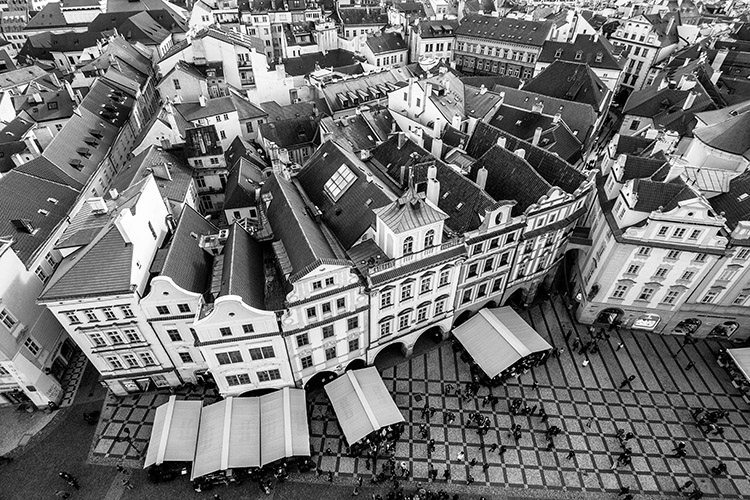
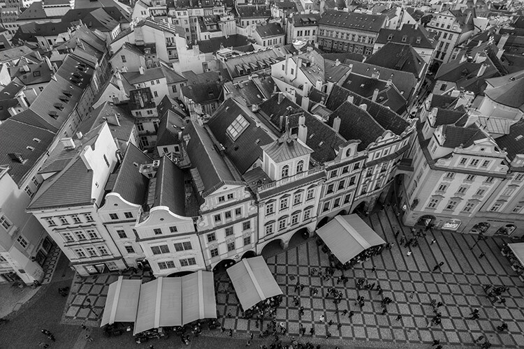
Black and White Conversion in Photoshop image of a city

Photoshop conversions

Photoshop alone has many methods to create black and white conversions. Some of them are quite useless, and should be avoided. Others are very powerful, yet won’t work well in every instance. However, it is important to know and understand as many of the tools as possible. No two images are alike, and every image requires its own treatment. While one tool may provide perfect results, another image from the same shoot might require the use of an entirely different tool for the best results.

In this tutorial, we’ll work through nine different methods for black and white conversions in Photoshop. By following along with your own images, you will be able to quickly develop an understanding of the many tools available. Some of these methods work at the press of a button. While others take a few minutes, they offer absolute control over every aspect of the tonality of your photographs.

The basic techniques

The first four black and white conversion techniques are very basic, and will not lead to good results in most instances. I can already hear you asking; “If they’re so bad, why are they in this article?” They are here so that you will be aware of them, and know to avoid them. Also, some of them (like the Grayscale method) are among the few clearly labeled in Photoshop as black and white conversions. By actively knowing about them, you will be able to save time later when you come across a tool you previously weren’t familiar with.

This isn’t to say that they don’t have their uses. Often these techniques can be used as part of a much larger retouching workflow. But, for straight black and white conversions, these methods will leave you with muddy tones and lacklustre results.

It’s important to note, that this article concentrates on the black and white conversion process only. With the exception of the Gradient Map tool, you will still need to consider using some other post-processing techniques (blemish removal, contrast adjustments) on your images, for the best results.

1) Grayscale mode
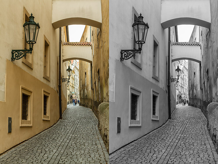
black-and-white-conversions-in-photoshop-greyscale-example

Converting your images to Grayscale is fast, but the cost is a loss of control, and a lot of file information.

This method is as simple as it gets. In Photoshop, go to your toolbar and click Image > Mode > Grayscale. When prompted to discard your color information, click discard.
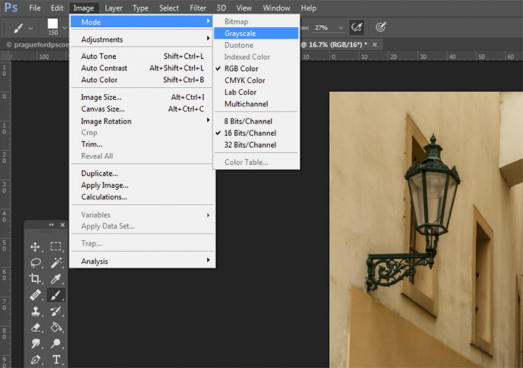
black-and-white-conversions-in-photoshop-greyscale-method

Out of all of the options, this is the one to avoid at all costs. The act of discarding all of the color information from your images is a destructive technique. That makes it difficult, if not impossible, to make changes later if you decide you don’t like the output. Also, as you’ll see in later techniques, that discarded color information is what gives you the most control over the tonality in your images.
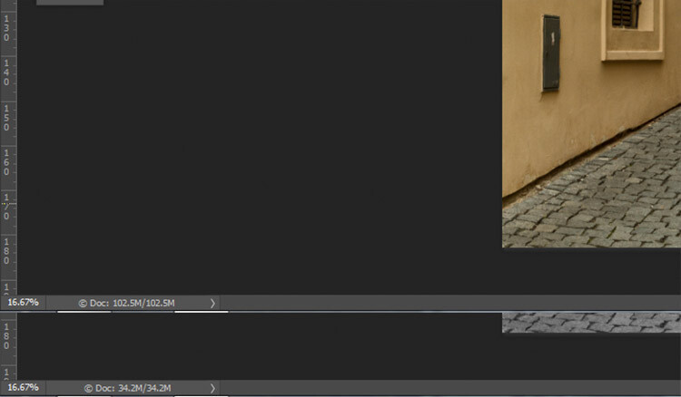
black-and-white-conversions-in-photoshop-greyscale-filesizes

Here, you can see how much data was lost when converted to Grayscale. The converted image (bottom) has nearly 2/3 less data than the original image (top).

The best advice for this conversion method is to try it, acknowledge it, and then avoid it at all costs.

2) Desaturate
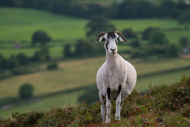
black-and-white-conversions-in-photoshop-desaturate-color-example

Original Image

black-and-white-conversions-in-photoshop-desaturate-bw-example

Converted to black and white using the Desaturate command.

Unlike the Grayscale method, using the Desaturate command does not discard the color information from your image. It is, however, still a destructive technique, as it does not allow you to alter or control any aspects of the conversion once it’s made.

To Desaturate your image, go to your toolbar in Photoshop and choose Image > Adjustments > Desaturate
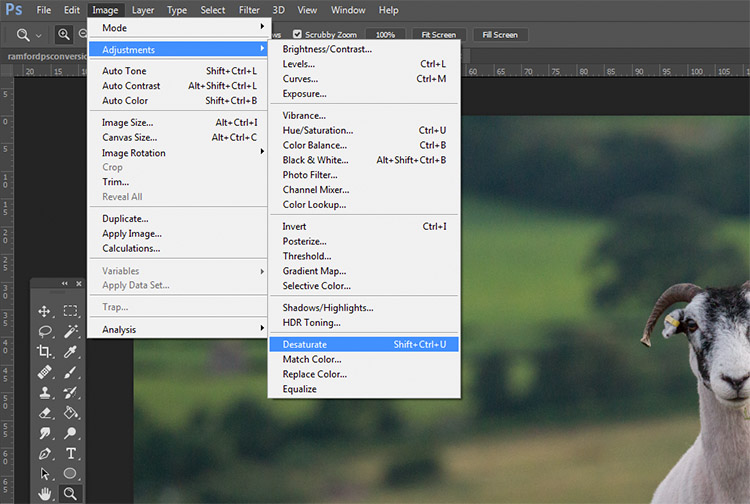
black-and-white-conversions-in-photoshop-desaturate-method

Once again, as a destructive technique, I encourage you to avoid this tool whenever possible.

3) Hue/ Saturation layer
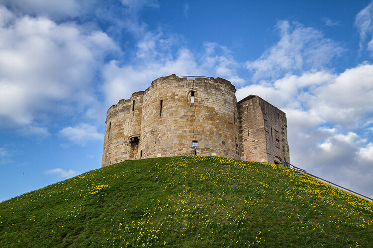
black-and-white-conversions-in-photoshop-huesaturation-color-example

Original image

black-and-white-conversions-in-photoshop-huesaturation-bw-example

Converted to black and white using a Hue/Saturation adjustment layer.

By using a Hue/Saturation adjustment layer, you will get the exact same results as the Desaturate method, with one exception. Because this is an adjustment layer, it can be changed or discarded at any time, without any alteration to your original image, making this a non-destructive technique.

To convert your image with this method, find the Create new fill or adjustment layer button (circle that is half dark, half white) at the bottom of the Layers Palette and choose Hue/Saturation (you can also select it from the Adjustments panel if you have it visible).
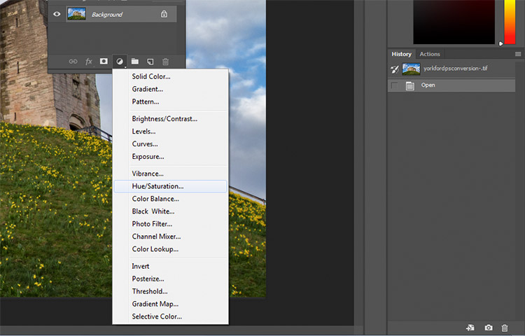
black-and-white-conversions-in-photoshop-huesaturation-method1

In the layer properties tab that should have opened, find the Saturation slider and move it across to -100.
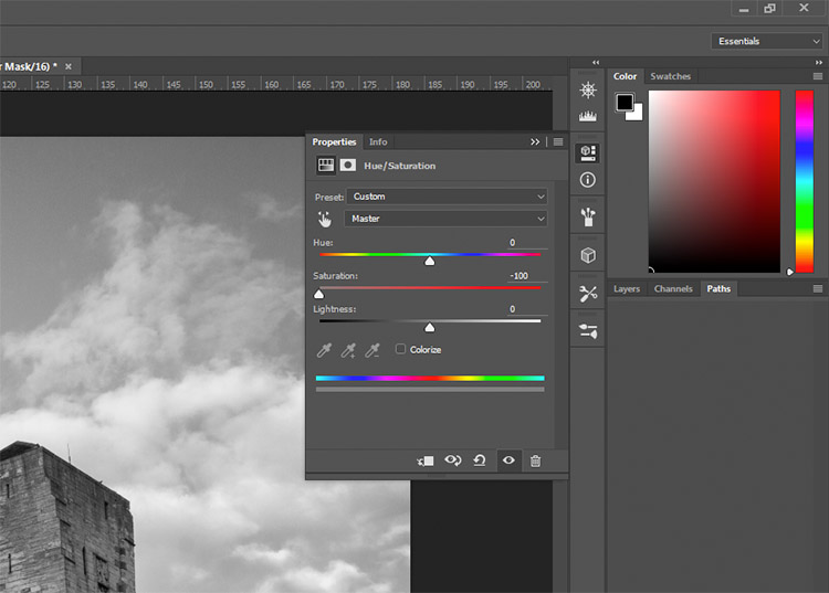
black-and-white-conversions-in-photoshop-huesaturation-method2

This is still not an ideal method, as it offers no control in the actual conversion process.

4) Solid black or white layer
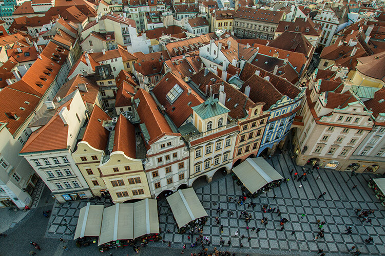
black-and-white-conversions-in-photoshop-blacklayer-color-example

Original image

black-and-white-conversions-in-photoshop-blacklayer-bw-example

Converted to black and white using a solid black layer, set to the Color blending mode.

Another easy method of converting your image to black and white is to create a new layer filled with black or white, then set the blending mode to Color. Again, this technique offers no control over the actual conversion, so it’s best avoided.

To do this, create a new empty layer by pressing the New Layer button on the layer palette (ctrl/cmd+shift+N).
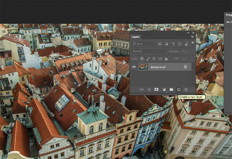
black-and-white-conversions-in-photoshop-blacklayer-newlayer

With the empty layer selected go to Edit>Fill (shift+f5) and choose either black or white. Your image should now be filled with the color you selected.
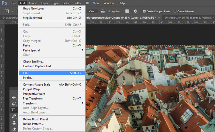
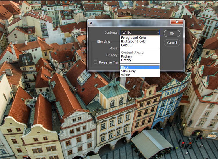
black-and-white-conversions-in-photoshop-blacklayer-fillblack-and-white-conversions-in-photoshop-blacklayer-fill2

On the layer palette, find the drop down menu for the blending modes and choose color.
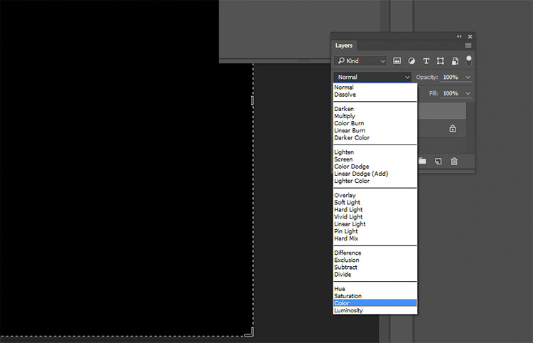
black-and-white-conversions-in-photoshop-blacklayer-blending

Intermediate Techniques

The previous four techniques are very basic, and offer you very little control, if any, over the actual conversion of your image to black and white. Now that you’re aware of them, you know what to avoid if you want the best results. The following techniques offer you a range of control over your black and white conversions, however, they take a bit more effort to get right.

5) Channels
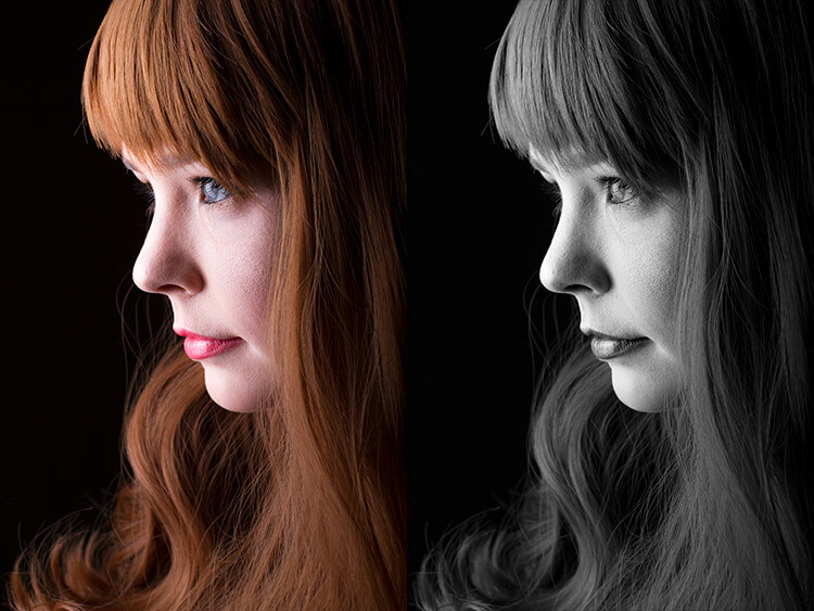
black-and-white-conversions-in-photoshop-channels-example

Left: Original image
Right: Converted to black and white by using Channels

Out of all of the techniques presented in this tutorial, this one may be the least obvious. To start, you want to make sure that you can see the Channels tab in your layer palette. If it’s not visible, go to Window in the top menu bar and make sure Channels is ticked.
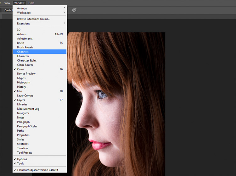
black-and-white-conversions-in-photoshop-channels-window

This is a destructive technique, so please make sure you are working on a copy of your original image in case it goes wrong. If you’re unsure, go to Image>Duplicate to have Photoshop create a second instance of your file to work with.

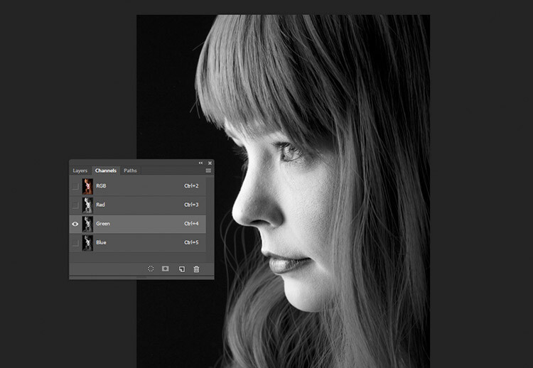
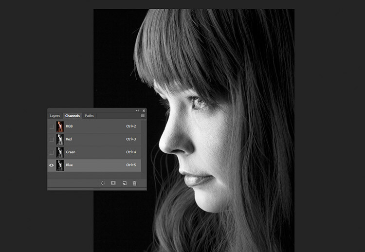
With the Channels tab selected, you should see four sections (they appear as layers would in the Layer Palette) labeled RGB, Red, Green and Blue. If you select the Red, Green and Blue Channels in turn, you will see variations of your image in black and white as it relates to the color information in your image.
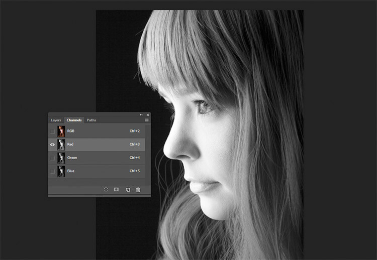
black-and-white-conversions-in-photoshop-channels-redchannel

Red Channel

black-and-white-conversions-in-photoshop-channels-grenchannel

Green Channel

black-and-white-conversions-in-photoshop-channels-bluechannel

Blue Channel

To use this to convert your image, choose the channel that has the most pleasing effect on your image. This will vary depending on your subject, and the range of colors in your photos. Once you’ve made your choice, make sure you click on the channel you wish to work with. Now, on the toolbar, choose Select>All (ctrl+A or cmd+A). With the selection active go to Edit>Copy (ctrl/cmd+C)

The next step is to paste the selected channel into the other two. In this case, Green is copied and pasted into the Blue and Red channels. One at a time, select the other two channels and go to Edit>Paste (ctrl/cmd+V).

Once that is done, click on the RGB channel and you should see that your image has been converted to black and white. While this technique does not offer complete control over the conversion, it can still be used to great effect.
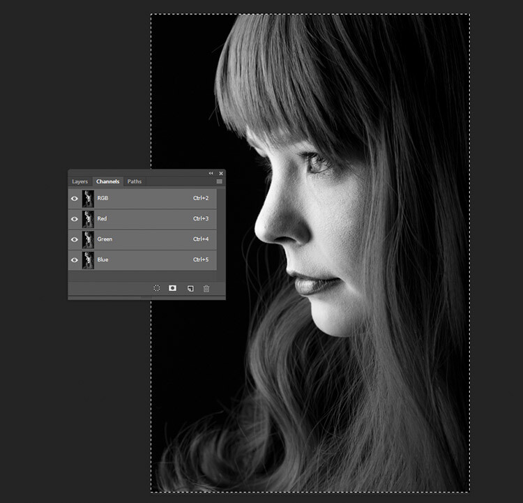
black-and-white-conversions-in-photoshop-channels-pasted

The final result with the Green channel, pasted into the Red and Blue channels.

6) Channel Mixer adjustment layer

black-and-white-conversions-in-photoshop-channelmixer-colorexample

Original Image

black-and-white-conversions-in-photoshop-channelmixer-bwexample

Converted to black and white using a Channel Mixer adjustment layer.

For a bit more control, you can use a Channel Mixer adjustment layer, as a non-destructive technique. On the Layer Palette, find the Create new fill or adjustment layer button and choose Channel Mixer (or select it from the Adjustments panel).
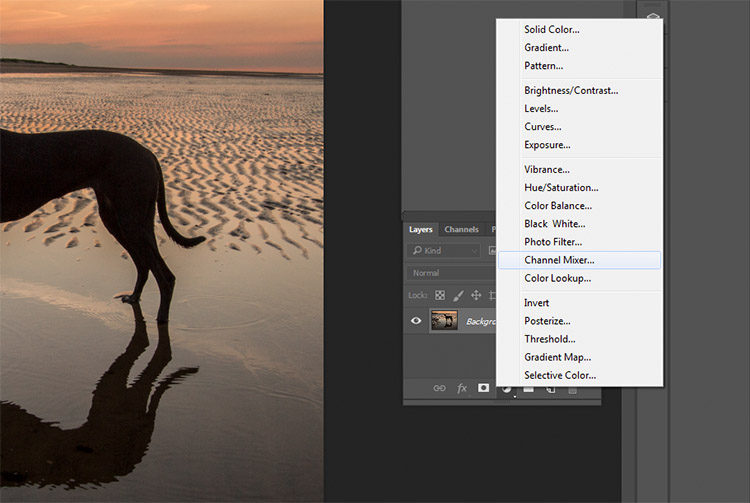
black-and-white-conversions-in-photoshop-channelmixer-layer

On the properties tab for the Channel Mixer layer, click the box that says Monochrome.

To fine tune your image, you can adjust the red, blue and green sliders until you get the effect you desire. These sliders are not very forgiving, so try to keep the adjustments small to avoid destroying the highlights and shadows in your image.
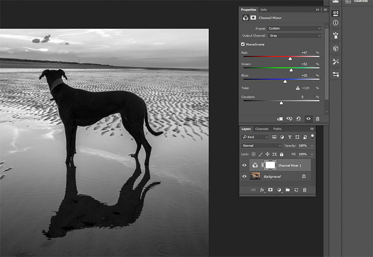
black-and-white-conversions-in-photoshop-channelmixer-layerproperties

7) Black and White adjustment layer

black-and-white-conversions-in-photoshop-blackandwhitelayer-color-example

Original image

black-and-white-conversions-in-photoshop-blackandwhitelayer-bw-example

Converted to black and white using a Black and White adjustment layer.

Okay, this one’s pretty obvious in function. It’s also pretty powerful, but it’s not always the best choice. However, it is a good starting point in many cases. As such, this technique will likely become your go-to black and white conversion method, especially if you’re just starting out.

To start, find the Create new fill or adjustment layer on the Layer Palette and choose Black and White (or select it on the Adjustments panel).
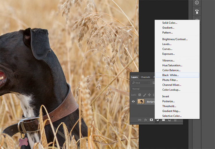
black-and-white-conversions-in-photoshop-blackandwhitelayer-method

Your image will be converted to black and white, and in the properties tab, you will now see an array of color sliders. Moving these sliders to the right will brighten any tones associated with that color. Moving them to the left will darken those tones. The idea behind these sliders is to emulate the effect that colored lens filters used to have on black and white film.
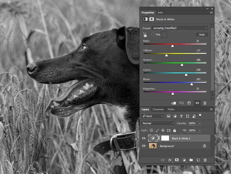
black-and-white-conversions-in-photoshop-blackandwhitelayer-sliders

Moving the Reds and Yellows slider to the left brings out the detail in the grass by darkening the tones associated with those colors.

For portraits, the most noticeable changes will come from moving the red and yellow sliders. For landscapes, the blue and green sliders will be more useful.

As with any adjustment layer, if you change your mind later, you only need to return to the properties tab and alter the sliders to your heart’s content. This is non-destructive editing.

8) Gradient Map
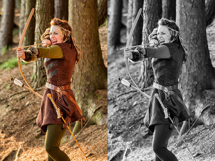
black-and-white-conversions-in-photoshop-gradientmap-example

Left: Original Image
Right: Converted to black and white using a Gradient Map adjustment layer.

The Gradient Map is easily the most powerful of all the black and white conversion tools. It allows you to control every aspect of the tonality of your image. Because of this control, it’s also the most complicated and hardest to use. It is worth knowing though, and a bit of practice will make it an invaluable tool on your belt.

Make sure your foreground and background colours are set to black and white. You can do this by pressing D on your keyboard. Now, find the Create new fill or adjustment layer on the Layer Palette and choose Gradient Map.
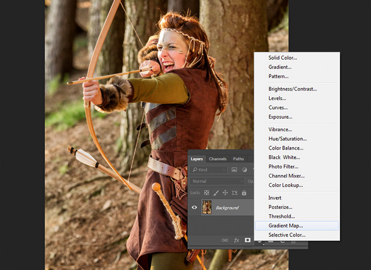
black-and-white-conversions-in-photoshop-gradientmap-layercreation

Make sure the gradient that is selected is black to white. Your image is now monochromatic, and you may notice that this technique gives it higher contrast to begin with, than the other methods.
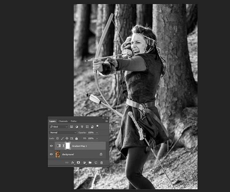
black-and-white-conversions-in-photoshop-gradientmap-basigradient-example

This is an example of how an image might look with a Gradient Map layer, and no further adjustments.

Note: If your image looks like a negative after making the adjustment layer, just click the Reverse box in the layer’s properties tab.
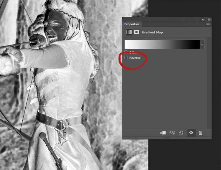
black-and-white-conversions-in-photoshop-gradientmap-reverse

If your image looks like a negative, it just means your foreground and background colors are backwards. Just click the Reverse box in the Gradient Map’s properties tab.

If you forgot to reset your foreground and background colors, your image probably looks like a colored mess. Just click in the gradient in the properties tab, and choose the black and white gradient to fix this with little error.
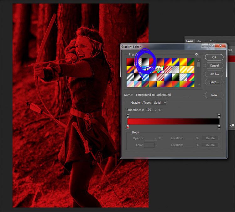
black-and-white-conversions-in-photoshop-gradientmap-colorgradient

Forgetting to reset your foreground and background colors may result in something like this image. To fix it, just choose the black and white gradient (circled in blue) in the presets section of the Gradient Editor.

At this stage, you may feel that this enough. However, the Gradient Map offers a lot more in terms of control over tonality of the image.

In the properties tab, if you double click the image of the gradient, the Gradient Editor will open. Towards the bottom of this screen, you will see a visual representation of your gradient. There are also be a set of sliders that show either black or white.

If you move the bottom sliders inward, you will increase the contrast in your image. Moving the black slider in, will deepen the shadows, while moving the white slider in will brighten the highlights (which direction those are will depend on whether you have reversed the gradient or not). This is an effective way to increase contrast in your image without leaving the conversion layer. Do watch your histogram for shadow and highlight clipping though.
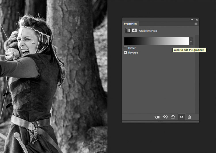
Click into the image of the gradient to enter the Gradient Editor.

Click into the image of the gradient to enter the Gradient Editor (note my gradient here is reversed)
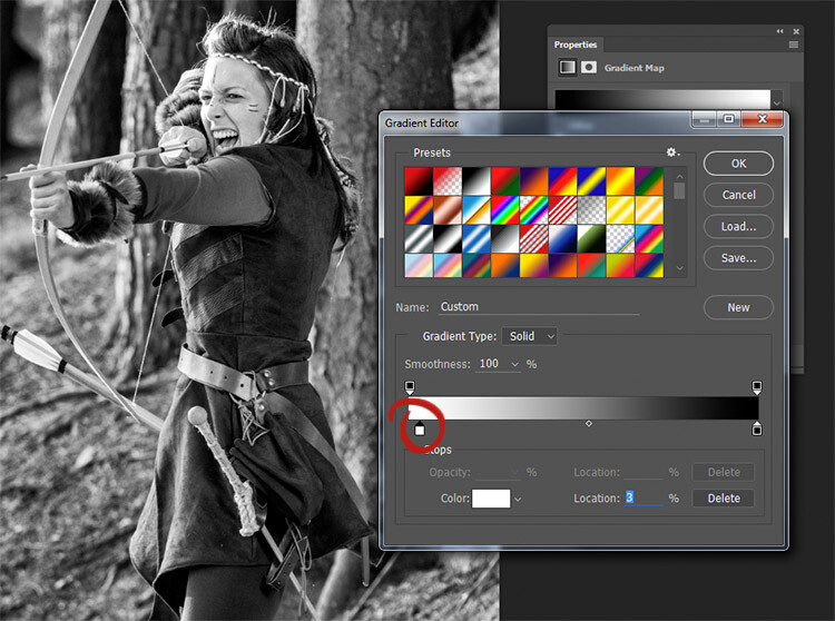
black-and-white-conversions-in-photoshop-gradientmap-whiteslide

Moving the white slider to the right (circled in red) will brighten the highlight tones in this image. Moving the lower black slider (to the left) will deepen your shadows.
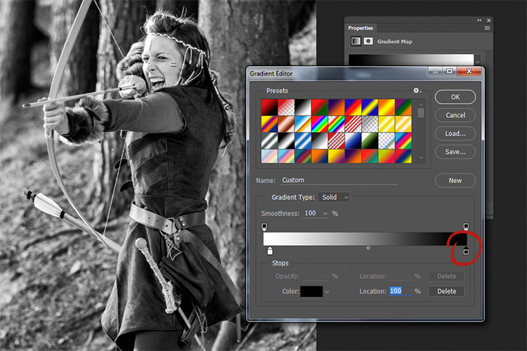
black-and-white-conversions-in-photoshop-gradientmap-clickslide

If you wanted to darken your highlights or brighten your shadows, you can change the colour of the sliders. To do this, double click on one of sliders. In this image, the dark tones are more intense than I would like, so I double-clicked the shadow slider as circled in the above image.

You should then see a Color Picker colour palette (if you don’t see red as shown below, just click the H for Hue). Click into the far left hand side of the palette, and slide the cursor up and down until you get the tone you want for your darkest shadows(or highlights if you chose them). Try to only use colours all the way to the left in the palette. Anything even a bit to the right will have a color tint to it.
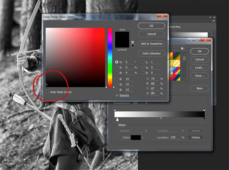
black-and-white-conversions-in-photoshop-gradientmap-blacktones

By selecting a colour just above pure black, the shadow tones in the image are brightened significantly.

To really take control over your image’s tonality, you can also control your mid-tones with the Gradient Map. Click just underneath the gradient bar and create a new slider.
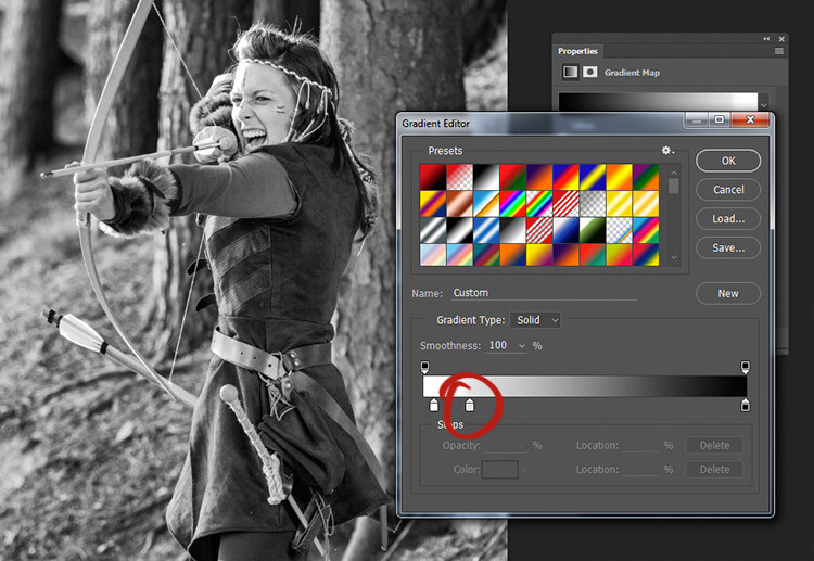
black-and-white-conversions-in-photoshop-gradientmap-newslider

To control the mid-tones in your image, create a new slider in the Gradient editor by clicking and dragging under the gradient.

Double clicking this slider will open a color palette. Choose a grey tone (light if you want to alter lighter tones, dark if you want to alter darker tones) and press okay.
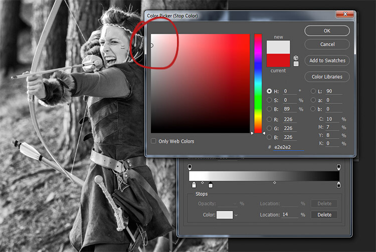
black-and-white-conversions-in-photoshop-gradientmap-newwhitetones

Choose a color relevant to the tones you want to alter in your image.

Now drag the slider to a point where it affects the image in the way you desire. If your tone is wrong, just double click the slider again and pick a new shade. You can make as many of these sliders as you need. This gives you absolute control over every tone in your image.

At first, it may be difficult to get used to this tool, but practice will make it easier. The Gradient Map is by far the most powerful black and white conversion tool for your images.

9) Adobe Camera Raw
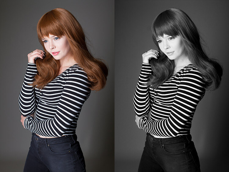
black-and-white-conversions-in-photoshop-ACR-example

Left: Original Image
Right: Converted to Black and White in Adobe Camera Raw

The last method involves converting your image to black and white at the raw processing stage. Doing this, doesn’t grant you absolute control over your tonality, but it is still quite a powerful possibility. Because you’re working with a raw file, no matter what changes you make, the file information will remain untouched, making this a completely non-destructive technique. It also grants you access to the rest of the tools available in raw processing after you’ve converted your image, giving you a more polished result without having to open your image in Photoshop.

To start, open your image in ACR (Adobe Camera Raw) by opening your raw file with Photoshop. On the toolbar to the right, you should see a row of icons. Find the one that’s called HSL/Grayscale and click it.
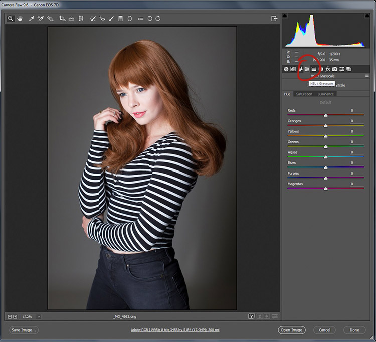
black-and-white-conversions-in-photoshop-ACR-HSL

You should see a box labeled Convert to Grayscale. Click it.
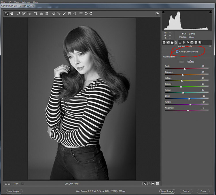
black-and-white-conversions-in-photoshop-ACR-mono

To convert your raw file to black and white in ACR, click the Convert to Grayscale box in the HSL tab.

From here, you have access to a bunch of sliders that act the same way as if you were using a Black and White adjustment layer in Photoshop. Play around with them until you’re happy with the way the tones appear in your image.
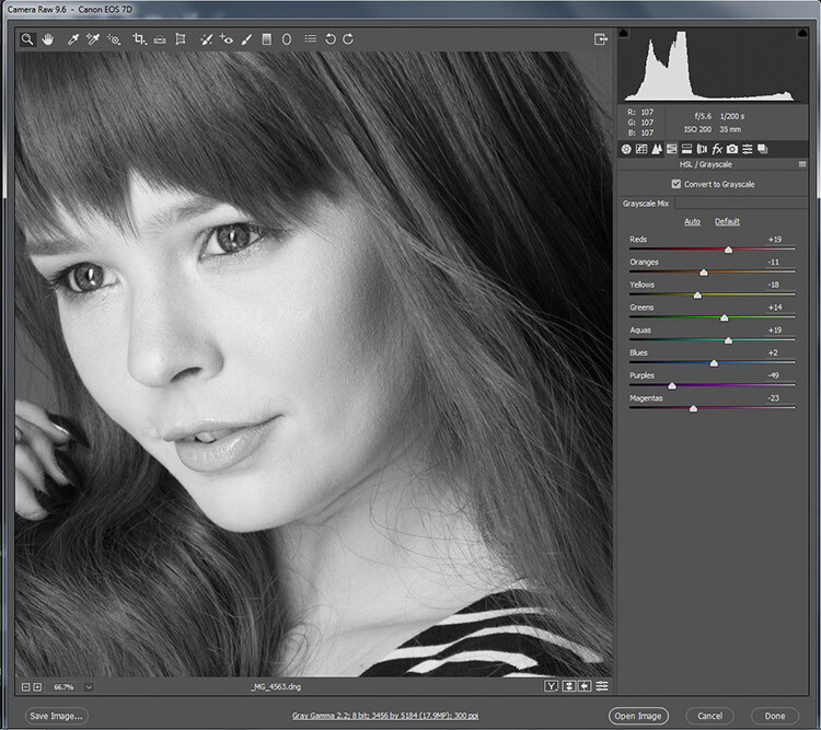
black-and-white-conversions-in-photoshop-ACR-zoom

While adjusting the sliders, zoom in to areas like skin tones, so you can watch exactly how the sliders are affecting your image.

If you go back to the Basic panel, you have access to all of the basic functionality in ACR. Here you can process your raw file as normal, and you can go back to the HSL panel to alter your sliders at any point (before you leave ACR).
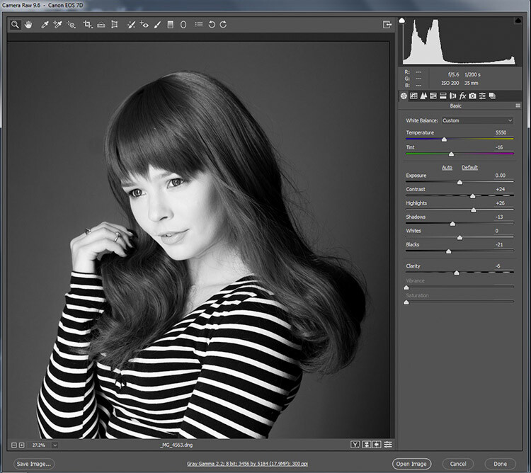
black-and-white-conversions-in-photoshop-ACR-rawcontrols

By doing your black and white conversion at the raw stage, you still have access to all of the processing tools in ACR. Take advantage of these to get a more polished result, before even entering Photoshop.

Once you’re done, export your image in your preferred format (or open it directly into Photoshop) and there you have it.

The right tool for the job

If you’ve followed each of these tutorials through, you will have gained at least a basic understanding of how to use each for black and white conversions in Photoshop. Now, ask yourself the following questions:

  • Which of these tools worked best for me?
  • Which of these tools did I enjoy using?
  • Which of these tools did I hate using?
  • Which of these tools created results that fit my tastes?

In the end, the best tool for the job is the one that gets you the results that you are looking for (even if it’s the tools that I’ve urged you to avoid). Just keep practicing, and you’ll be able to figure out which tool is best, before you even start working on your image.

How do you use Photoshop for your black and white conversions? Please share in the comments below.

googletag.cmd.push(function() {
tablet_slots.push( googletag.defineSlot( “/1005424/_dPSv4_tab-all-article-bottom_(300×250)”, [300, 250], “pb-ad-78623” ).addService( googletag.pubads() ) ); } );

googletag.cmd.push(function() {
mobile_slots.push( googletag.defineSlot( “/1005424/_dPSv4_mob-all-article-bottom_(300×250)”, [300, 250], “pb-ad-78158” ).addService( googletag.pubads() ) ); } );

The post A Guide to Black and White Conversion in Photoshop by John McIntire appeared first on Digital Photography School.


Digital Photography School

 
Comments Off on A Guide to Black and White Conversion in Photoshop

Posted in Photography


Midcentury Grain Silo to Modern Home: Incredibly Cozy Conversion

17 Mar

[ By Steph in Architecture & Houses & Residential. ]

silo house 10

With an entirely custom-built interior, a nine-foot-wide sliding glass door and a warm modern aesthetic, this grain silo converted to a compact home seems worlds away from its humble farmyard origins. Architect Christoph Kaiser purchased the 1955 corrugated steel wall silo from a Kansas farmer and had it dismantled and shipped to downtown Phoenix, Arizona on the back of a pickup truck to begin the renovation process that would transform it into a beautiful, cozy and affordable two-story residence.

silo house 7

silo house 8

silo house 13

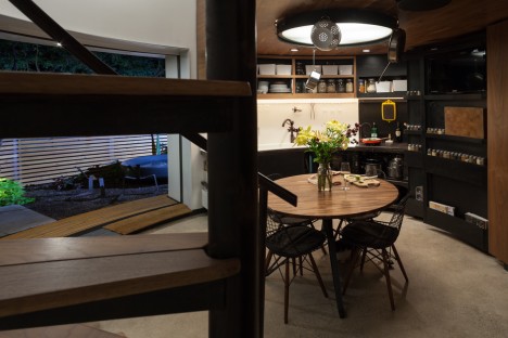
Once set in place in the up-and-coming Garfield Historic District, the silo began its dramatic makeover process. Large doors and windows were added to bring light into the previously darkened space, and the oculus at the top used to promote air circulation to the stored grain was turned into a skylight. Views of the Phoenix skyline are strategically framed, with the other windows looking out onto a spacious private garden.

silo house 4

silo house 8

silo house 5   silo house 16

With the silo’s tiny footprint, maximizing the interior space was a top priority. Kaiser designed a built-in, all-in-one solution that’s essentially one big piece of furniture to accommodate all of the residents’ daily living needs. Curved to match the line of the walls, the custom interior is clad mostly in reclaimed walnut flooring scored on Craigslist. Kaiser even designed a one-of-a-kind ceiling lamp with hooks for hanging pots and pans to save space. The Eames wire chairs are the only elements that weren’t custom-made for the home.

silo house 2

silo house 15

silo home 15

silo house 1

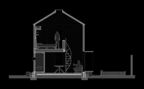
A spiraling staircase leads to the sleeping loft, which is equipped with a digital projector so the couple has their very own mini movie theater in their bedroom. The bathroom, finished in glossy floor-to-ceiling penny tile, boasts a rounded custom vanity and compact Duravit toilet. When the nine-foot window is opened to the garden in nice weather, the home seems to expand.

silo house 12

silo house 3

silo house 6

“It was love at first sight: an affordable, challenging prospect,” the architect tells World Architecture News. “The thought of assembling a kit of parts that fits in the bed of a truck, and ending up with a home for two was a tantalizing challenge, very appealing from a carbon-footprint, sustainability, and shall we say, ‘architectural rigor’ standpoint.”

Share on Facebook


[ By Steph in Architecture & Houses & Residential. ]

[ WebUrbanist | Archives | Galleries | Privacy | TOS ]


WebUrbanist

 
Comments Off on Midcentury Grain Silo to Modern Home: Incredibly Cozy Conversion

Posted in Creativity


A Guide to Black and White Conversion in Lightroom

24 Aug

Vintage, retro, moody, classic are all adjectives that might be used to describe black and white photographs. It may seem counter-intuitive in an age where cameras are lauded for their abilities to render colors and skin tones in super accurate or pleasing ways, to just go and eliminate all the colors in post-processing. Nevertheless, the timeless qualities of grayscale images continue to persist, and the alluring beauty shows no sign of subsiding.

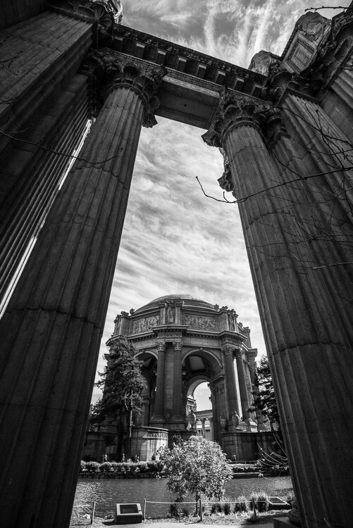
A black and white architectural photo

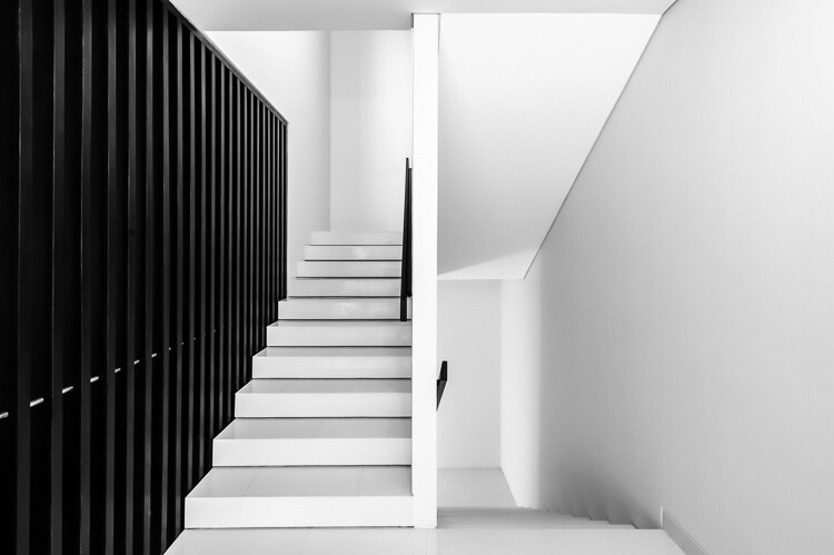
Since most of us see in color, black and white images seem to be inherently abstract.

In Lightroom (LR), the transformation of a photo from color to black and white is simple – drag the Saturation slider all the way to the left. The end.

I’m only half-joking. Although this will drain all of the color from the photo, there are many other considerations to mull over, various entry points to begin the process, and an immense amount of control and fine-tuning to explore.

Image Selection

Naturally you will need to start with a photo, so the decision as to which photo is a good candidate to make the transformation to black and white is your first task.

There are a few characteristics in a photo that would make it qualify as a good candidate. Obviously any photo that has strong colors, which add strength or appeal may not make the cut. You would be doing yourself a disservice by taking a beautiful, saturated sunset shot only to rob it of its finest feature.

I prefer to convert photos which have a lot of repetitive detail, high contrast, or have an inherent look that would be accentuated by converting to black and white. Architectural shots work well, and sweeping landscapes with puffy clouds against a blue sky stretching off into the horizon can be dramatized tastefully.

Without any colors to lean on, black and white images must have other strengths. Your black and white images just may have to rely a tiny bit more on the subject, composition, emotion or lighting. This is a good thing. Thinking in black and white can help train your eye to look for other photographic strengths which will make your color images that much stronger as well.

Where to Start

In Lightroom there are several features built-in that enable you to control the look of your black and white images. Let’s take a look at their dedicated black and white converter.

LR-bw-conversion

The B&W sub-panel gets your images to grayscale in one click.

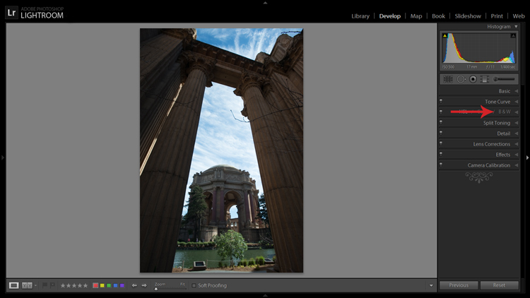
If you simply click on the B&W panel in the Develop module, LR converts the image to gray scale. The same thing can be accomplished at the top of the Basic panel where it says Treatment by selecting Black & White.

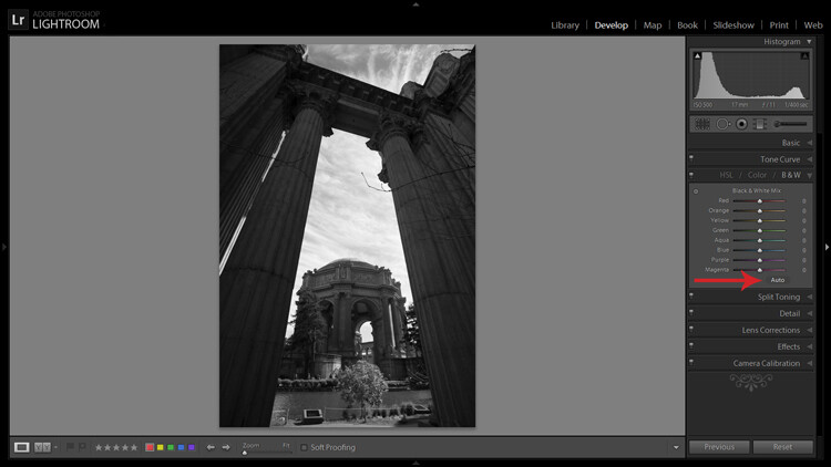
Note that when you do this the eight Black & White Mix sliders are all zeroed out. You may also note that there is a curious little oval-shaped Auto button hanging out underneath the sliders. What might this do? In case you didn’t guess, LR will use its own infinite wisdom to evaluate your image and adjust the color tones to what it thinks is appropriate. I’ve never clicked that button and said “wow” but you never know.

LR-bw-conversion-2

The Auto button adjusts tones as LR sees fit, but I find further editing is usually necessary.

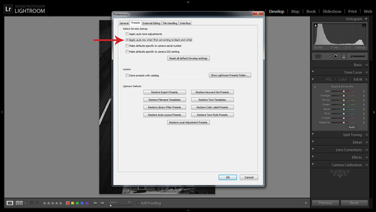
If you like the settings that LR chooses for you with the Auto setting you can have it applied automatically every time you convert an image to black and white by navigating to Edit>Preferences and under the Presets tab, check the box that says: Apply auto mix when first converting to black and white, as shown below.

LR-bw-conversion-3

You can have LR instantly apply its automatic black and white settings upon conversion by navigating to Edit>Preferences and checking the appropriate box.

Filters

Before you open Pandora’s Box and start dragging sliders all over the place, let’s see what other kind of shortcuts LR has to offer.

Within the Navigator panel is the handy Presets menu. The first three selections are dedicated black and white preset menus including Filter Presets, Presets and Toned Presets. The 25 presets found within these menus are pretty cool and are way more powerful one-click options than the Auto button.

A sample of LR's black and white filters

LR is loaded with 25 black and white presets to give you some quick conversion options.

The filters can also be used as jumping-off points from which to work in your editing endeavours.

Start with the Basics

I would like to preface this section with something to keep in mind when converting an image to black and white and processing it: LR edits that may appear to affect colors only, also effect tones and contrast in grayscale images. For example, although I never change them in my black and white processing, the White Balance and Tint sliders are active, and can be used to alter tones in your black and white photo.

The rest of the sliders, in both the Basic and Tone Curve panels, do the same for a black and white image as they do for a color one. You can be more zealous with contrast since there are no colors to be over/under saturated. I also find that the Clarity slider works especially well to tease out tons of detail in black and white images. Beware, however, that it can be unkind to wrinkles and blemishes in portraits, unless that is the look you are going for.

Simply increasing the Clarity on a black and white image can add a lot of drama. No other edits have been made to the above photo except increasing the Clarity to 100 per cent.

Simply increasing the Clarity on a black and white image can add a lot of drama. No other edits have been made to the above photo except increasing the Clarity to 100 per cent.

The HSL/Color/B&W Panel

I briefly touched on this earlier when mentioning the the Auto setting. So what happens when you start messing around with all of those sliders? Well, if you’re anything like me when I was fumbling my way through LR back in the day, you’ve already gone through and started indiscriminately throwing sliders all over the place.

What they do is increase or decrease the luminosity of the corresponding color in the original image, which is now represented in various shades of gray. If you’ve already applied one of LR’s black and white filters these sliders may not be zeroed out any longer.

In addition to adjusting the individual sliders, there is also a click and drag (target adjustment) tool similar to the one found in the Tone Curve panel, and it’s pretty sweet. Once you activate the tool, click on an area in your image and start dragging, you will notice that LR will not only adjust one slider, but will combine multiple sliders to pinpoint the tones you wish to adjust.

LR-bw-conversion-4

The Targeted Adjustment Tool (left arrow) works well to isolate colors to desaturate. Holding the Alt key presents you with the option to reset all the sliders at once to start fresh (arrow on the right) – this option is available in many of LR’s adjustment panels.

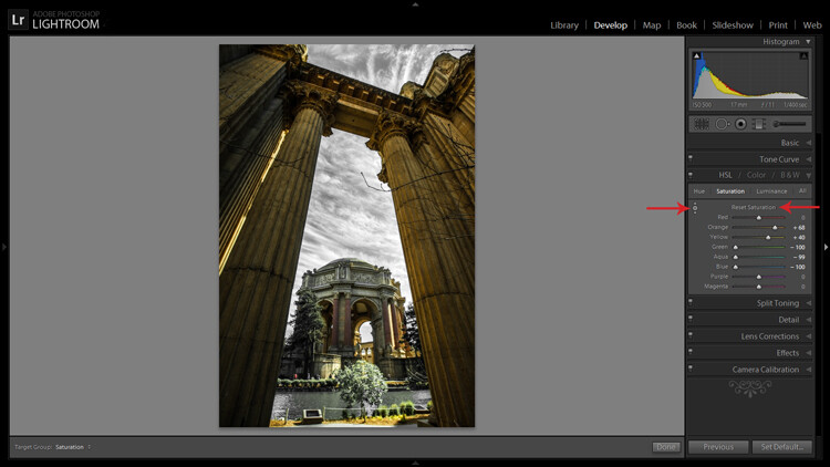
Another approach to this whole black and white post-processing thing can also be initiated in the HSL/Color/B&W panel. If you select HSL and choose the Saturation sub-panel, you will be presented with another set of eight color sliders.

These sliders provide you a quick and easy way to achieve selective color effects. You can start by dragging all of the sliders down to -100 and then add the colors you want to preserve. You also have a click and drag tool that works the same sort of magic as the one mentioned earlier.

You can also select the All sub-menu which reveals all of the Hue, Saturation and Luminance sliders. Adjusting the Luminance sliders gives you control over the brightness of individual colors now represented in black and white.

Utilizing the controls found within the Camera Calibration panel can give you similar, yet much more limited, control over your black and white tones.

Split Toning

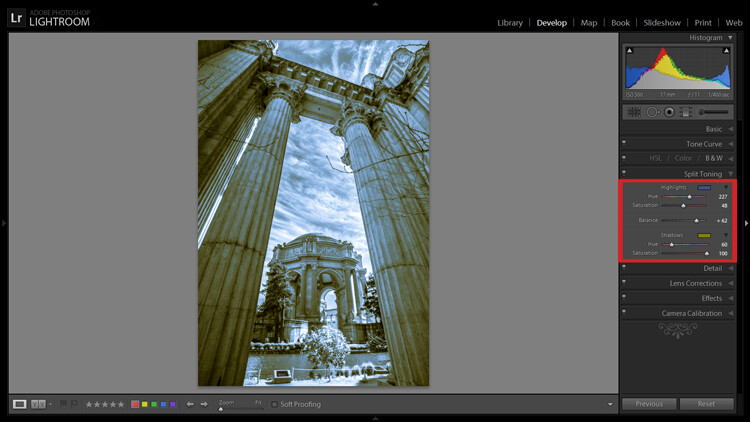
If you’re looking to add a radical tint to your black and white images, the Split Toning panel is where you want to be. Okay, so it doesn’t have to be too radical but a little tinting can help alter the mood of your image.

The tool gives you control over the intensity of highlight and shadow tint colors, and the ability to balance the two however you wish. Subtle use of this effect can be a fantastic way to sneak a hint of color back into your photo, while still maintaining the charm of black and white.

Split Toning allows you to tint an image's highlights and shadows different colors.

Split Toning allows you to tint an image’s highlights and shadows different colors.

The Split Toning panel is also where you can apply, and fine-tune, sepia toning effects to get that warm antique look that gives images a grungy and elegant look at the same time.

As you have probably found out by this point, LR does a pretty thorough job at giving you a ton of control processing black and white images – from big global adjustments to small tweaks to tease out just the look you are going for. Don’t forget that you can get really creative by throwing the Adjustment Brush and Gradient tools into the mix, not to mention the plethora of plugins available on the market that give you even more options.

Have you been met with some success in black and white conversion with Lightroom? Show off your results in the comments below.

googletag.cmd.push(function() {
tablet_slots.push( googletag.defineSlot( “/1005424/_dPSv4_tab-all-article-bottom_(300×250)”, [300, 250], “pb-ad-78623” ).addService( googletag.pubads() ) ); } );

googletag.cmd.push(function() {
mobile_slots.push( googletag.defineSlot( “/1005424/_dPSv4_mob-all-article-bottom_(300×250)”, [300, 250], “pb-ad-78158” ).addService( googletag.pubads() ) ); } );

The post A Guide to Black and White Conversion in Lightroom by Jeremie Schatz appeared first on Digital Photography School.


Digital Photography School

 
Comments Off on A Guide to Black and White Conversion in Lightroom

Posted in Photography


Cantilevered Conversion: Sleek Modern Cargo Container Office

16 Mar

[ By WebUrbanist in Architecture & Offices & Commercial. ]

cargo container office design

While many intermodal freight crate transformations turn steel boxes into comfortable spaces, this project goes a step further both by taking maximum advantage of its material origins while still making the aesthetic result more than the sum of its parts.

cantilevered office design conversion

Repurposed as an office by and for architect Patrick Bradley, this 45-foot cargo container (re)creation makes use of existing openings on either end and requires as few cuts in the surface of the sides as possible (an energy- and cost-efficient approach). Each of these openings is in turn taken advantage of, in one case to create an entry sequence and, at the other end, to facilitate a lovely little balcony extension.

cantilevered shipping container office

Further, the design leverages the strength of the container to cantilever it out over a steep-sloping cliff already on the site, saving money, time and energy landscaping the lot. Simple modular cladding manages to transform the exterior appearance with ease as well.

cargo container office design

In the end, there is little about the project that screams ‘shipping container’ at first glance, yet the overall shape and structural advantages of that core element are maintained and utilized throughout – a brilliant blend of old and new.

Share on Facebook


[ By WebUrbanist in Architecture & Offices & Commercial. ]

[ WebUrbanist | Archives | Galleries | Privacy | TOS ]


WebUrbanist

 
Comments Off on Cantilevered Conversion: Sleek Modern Cargo Container Office

Posted in Creativity