RSS
 

Posts Tagged ‘Compositional’

6 Important Compositional Elements to Consider When Shooting Landscapes

25 Jun

The post 6 Important Compositional Elements to Consider When Shooting Landscapes appeared first on Digital Photography School. It was authored by Jeremy Flint.

There are many pleasures associated with photographing landscapes; from being in the great outdoors, to breathing in the fresh air and taking in the attractive views whilst capturing nature’s beauty all around you.

Taking good landscape photos is more challenging than you may think. People often tell me when they return home from capturing landscapes that they are often disappointed with their results. Part of this may be due to the subject, the weather, the photographer, or most likely the composition. To help you improve your composition, here are 6 fundamental elements worth considering when you next venture out with your camera to shoot landscapes.

1. Diagonal lines

Firstly, it is worth considering the term ‘composition’. Composition refers to “the nature of something’s ingredients or constituents” such as the formation and contents that make-up an image. When it comes to photography, there are many theories and factors that constitute what makes a good composition. One major component worth acknowledging is diagonal lines.

Landscape composition 01

© Jeremy Flint

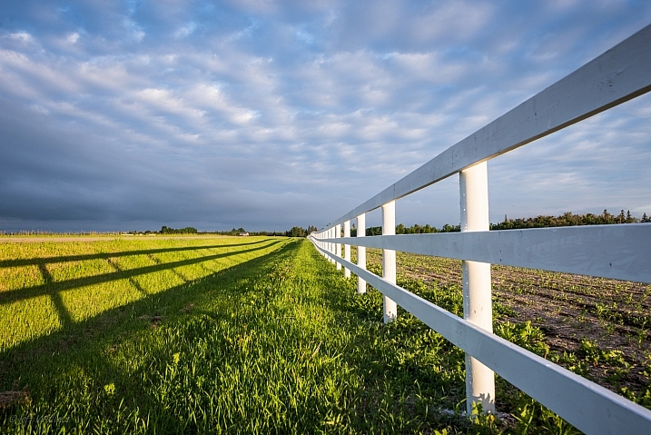
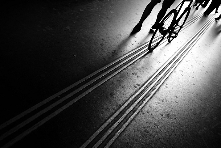
Diagonal lines can be a useful tool to use in your images. Carefully consider how you might use diagonal lines in your images. One proven way is to lead a viewer’s eye through the frame along a diagonal. These can go from left to right or right to left. They can be slightly horizontal or vertical and can be individual or repeated throughout the image. Leading diagonal lines can be a great way to naturally point towards an interesting part of your landscape, such as rows of flowers navigating towards a tree or a building.

2. Geometric shapes

Landscape composition 02

© Jeremy Flint

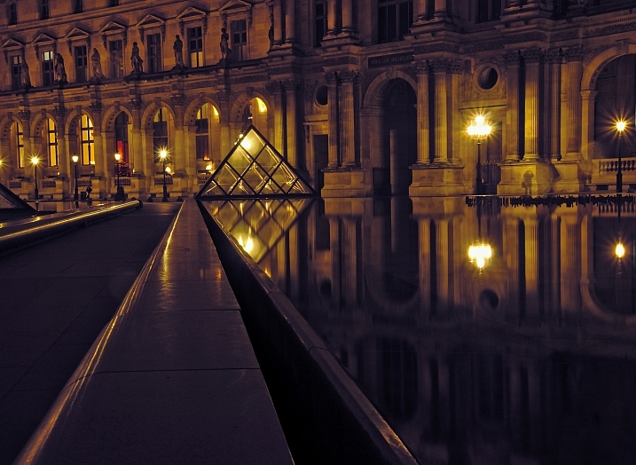
When it comes to shapes and patterns, there are no hard and fast rules as to what works well together. Whilst seeing the landscape as a whole, be conscious of what geometric shapes you want to include in the frame. You may look for shapes that complement each other or that are opposite to one another. Consider their relationship and how they may be used together to bring balance to the image.

3. The rule of thirds

Landscape composition 03

© Jeremy Flint

Have you ever produced pictures of landscapes that you were not pleased with and wondered why this could be? Well, one reason could be to do with the rule of thirds. The rule of thirds is an essential technique that can be applied to improve the composition and harmony of your landscape images. In essence, it involves dividing your image by thirds using 2 horizontal and 2 vertical lines. The idea is that you then place the important elements of your scene along those lines or at the point where they intersect.

In your landscape shots, try placing the horizon on the lower third and top third of the image and see which makes a more pleasing composition. You can also include an interesting object such as a tree where the lines meet. This gives a natural focal point for the scene.

Rule of Thirds Grid

4. Framing images

Landscape composition 04

© Jeremy Flint

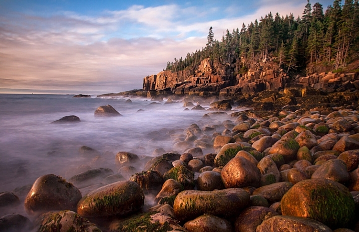
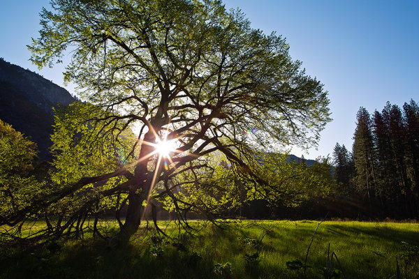
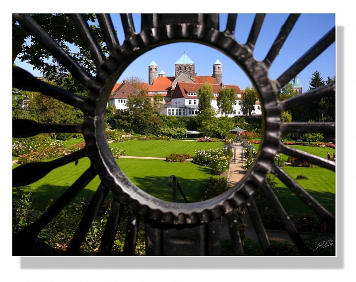
How you frame your images of nature can make the difference between a good and a great photograph. When framing your shots, create a visually effective image that communicates with the viewer in the way you envisaged. Overhanging leaves or branches can be used to form a natural frame to shape your picture. This helps to emphasize the subject and mask unwanted elements in the scene.

5. Foreground elements

Foreground elements can add more dynamism to your landscape images. Placing features in the foreground can give a sense of receding distance. For example, a rock, flowers, or snow are individual components that can be used to provide scale. Find an interesting subject to show in the lower part of your frame and see how this changes the composition of your landscape images.

6. Break the rules

Landscape composition 05

© Jeremy Flint

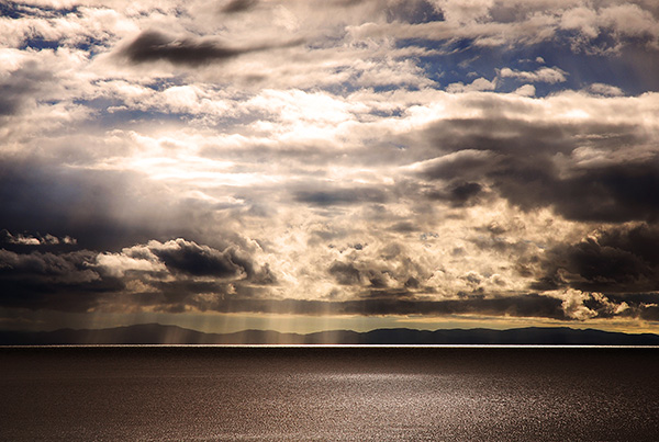
Don’t feel you have to stick to the rules of composition outlined above. As with all rules, they don’t always give the best result and you can break them. Sometimes positioning the horizon along the center of the frame can produce a much more eye-catching photo. In addition, you can even place your main subject in the center of your frame. Don’t be afraid to try out different compositions and experiment to see which looks best.

Conclusion

While you can break the rules, it is worth learning the rules of composition effectively before you try to break them. They were introduced to benefit your photos in the first place, so remember to put them to good use. Diagonal lines, the rule of thirds, foreground details, and framing your images can all be used to enhance your landscape photos.

Now it’s over to you to put these tips into practice! Share the images you take and any comments with us below.

6 Important Compositional Elements to Consider When Shooting Landscapes

The post 6 Important Compositional Elements to Consider When Shooting Landscapes appeared first on Digital Photography School. It was authored by Jeremy Flint.


Digital Photography School

 
Comments Off on 6 Important Compositional Elements to Consider When Shooting Landscapes

Posted in Photography


How to Apply Compositional Theory to Still Life Photography

21 Nov

The so-called ‘rules of composition’ aren’t so much rules as guiding principles.

Rules of Composition for Still Life Photography-Darina Kopcok-DPS

Why? Because not every compositional tool works for every image. Art is subjective, and what works well for one image may not work so well for another.

That being said, good photography involves not only technical skill but also choosing the right composition.

It’s especially true in still life photography, where composition can really make or break an image. So here are some tips on how you can apply these compositional ‘rules’ to your still life photography.

Rules of Composition for Still Life Photography-Darina Kopcok-Dps

The Golden Ratio

If you’re new to photography, you may have not heard of the ‘Golden Ratio’ (also known as the ‘Divine Proportion,’ the ‘Golden Mean,’ and the ‘Greek Letter ?’).

Don’t worry if you haven’t heard of them. While artists and architects have been using this principle for hundreds (if not thousands) of years, I was well into my stint at photography school before I’d even heard about it.

It’s a mathematical expression that can describe a wide variety of phenomena found in nature. But when it’s used in art, the results are harmonious and aesthetically pleasant compositions.

You can find the Golden Ratio everywhere – from the works of Michelangelo to the great Egyptian pyramids to a nautilus shell. It’s also found in the human face and body, and even in our DNA.

Rule of Thirds Grid

Most photographers are familiar with the ‘Rule of Thirds.’ This compositional guideline divides an image into nine equal sections using two horizontal and two vertical lines, just like a tic-tac-toe board. The important elements in the scene should fall along these lines or at the points where they intersect.

Rule of Thirds

The rule of thirds works well for images such as landscapes but can be limiting for still life photography. The resulting images often feel awkward or unbalanced.

The Phi Grid

The ‘Phi Grid’ uses a similar concept but is much more powerful than the Rule of Thirds. Its center lines are closer together and express the Golden Ratio of 1:1:618.

Phi Grid

The Phi Grid is one expression of the Golden Ratio.

Rules of Composition for Still Life Photography-Darina Kopcok-DPS

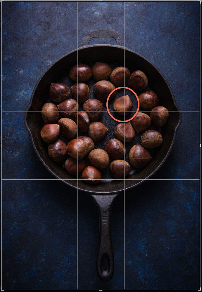
This image uses the Phi Grid. Notice how the chestnut in the focal point is placed differently to the others, drawing the eye.

Fibonacci Spiral

Another expression of the Golden Ratio is the Fibonacci Spiral, which exhibits the same numerical pattern that makes up the Golden Ratio.

You can use this numerical pattern to draw a series of squares. If you draw an arc from one corner to the opposite corner in each square starting from the smallest square, you’ll end up with the Fibonacci Spiral.

This is a guiding principle you can use in your still life photography. By setting your subjects along a curve rather than a straight line you create flow and movement, and help guide the viewer’s eye through the image. It works particularly well in overhead shots that have several elements in the frame.

You can flip or turn the spiral so long as your focal point falls in the smallest part of the spiral. Other important elements should be placed along the curve.

Fibonnaci Spiral

Golden Triangle

Using triangles is a powerful way to create tension in a still life image, and retain the attention of the eye within the frame.

Here’s an image that expresses this principle.

Rules of Composition for Still Life Photography-Darina Kopcok-DPS

Notice the diagonal line going from one corner to the opposite, and the lines meeting that diagonal from the other corners? Where the lines meet are your points of interest, which you should use to place your focal point and divide your frame.

While horizontal and vertical lines suggest stability, triangles add a sense of flow and movement.

You can compose your image to imply triangles, rather than being strict about composing them exactly this way.

Other Helpful Principles

Rule of Odds

In still life photography, having an odd number of elements in a frame is more visually interesting than having an even number of elements.

Odd numbers create harmony, balance and a resting point for the eyes, whereas even numbers compete with each other and can divide our attention.

Aim to have three or five elements in your image. You can have more, but the mind has trouble registering higher numbers meaning your photograph will not have the same effect. If you do have more, put them into groups of odd numbers wherever possible.

Rules of Composition for Still Life Photography-Darina Kopcok-DPS

Odd numbers create tension

Negative Space

Positive space is the area your subjects take up.

Negative space is the empty area where the eye can rest.

Negative space can provide the feeling of movement, and emphasize your subject. Without any space for the eye to rest, a picture can feel chaotic or claustrophobic.

You see negatives space a lot in magazines or product packaging, where it’s used for text placement.

Rules of Composition for Still Life Photography-Darina Kopcok-DPS

Color

You may not think of color as a compositional tool. But it’s actually a very important one. It evokes emotion and creates the mood of the photograph.

Cool and dark colors such as navy blue and black recede, while light and warm colors such as yellow bring objects forward.

Color combinations can be monochromatic, or any of those found on the color wheel.

One of the most powerful combinations is complementary colors (i.e. colors that are directly opposite each other on the color wheel). Blue and yellow is one such combination, which you see a lot in food photography.

Take into account the color of the background or surface you’re shooting on. Colors that are too bright can detract from your subject. Make sure your background matches the mood you’re trying to create and works harmoniously with your chosen elements.

Rules of Composition for Still Life Photography-Darina Kopcok-DPS

Complementary colors make your images pop

In Conclusion

It can take years for a photographer to learn to shoot intuitively using compositional principles. Visualizing your focal point on a Phi Grid is one thing, but visualizing the Fibonacci Spiral while you’re shooting may be more difficult.

Thankfully, with still life photography, you can tether your camera to your computer or use its Live View function to estimate where your subject and focal point should fall.

Editing software such as Lightroom and Photoshop can help you place the various elements in your frame with overlays of compositional guides. You can shoot wider than you need for the final result and crop in post-processing.

The more you implement these compositional guidelines and work with them in post the more you’ll internalize them, which can only improve your still life photography.

The post How to Apply Compositional Theory to Still Life Photography appeared first on Digital Photography School.


Digital Photography School

 
Comments Off on How to Apply Compositional Theory to Still Life Photography

Posted in Photography


How to Use Low Graphic Style as a Compositional Tool

05 Jul

In the never-ending search to improve photographic skills, it’s important to push the limits and try projects that push you outside your comfort zone. That’s why a project that involves studying and creating images using low graphic style is an important undertaking that can help to stretch the imagination and push your photography skills to another level.

Low graphic style is not often discussed, but it is worth exploring. The elements of low graphic style often contradict the formal rules of photography. The big question, however, begins with a definition for low graphic style or rather a discussion of the psyche behind creating this style of image.

Low graphic style evolved as a reaction to traditional composition rules and ideas found in photography.

How to Use Low Graphic Style as a Compositional Tool - b/w street scene

This image presents a typical eye level view of a city street in Montreal.

How to Use Low Graphic Style as a Compositional Tool - silhouette at dusk

Compare this image to the one above. Here the horizon is centered but the bold colors and the deep shadows of the silhouettes definitely add some bold graphic elements to the picture.

Low graphic style attempts to create an image that is free of manipulation. The goal is to create an image that shows the plain truth which could have been altered by the use of traditional compositional rules. Whether low graphic style achieves this goal is a philosophical discussion is not suited to this article, but the basic elements of low graphic style should be studied like any other style of photography and understood to push your photography skills to a higher level.

It’s impossible to attempt to photograph in a certain style without completely understanding the elements that make a photograph fall into the realm of low graphic style. So without wasting any more time let’s compare low graphic to the more common high graphic style.

1) Static Balance

Static balance is in contrast to the Rule of Thirds. The idea is that the photographer focuses on creating compositions that utilize symmetrical compositions. The photographer also avoids including dynamic elements like diagonals which might add energy to the image.

2) Square frames and centered horizon lines

The use of a square frame or placing the horizon on the midline instead of alone one of the 3rd lines also helps to create an image that is far more in line with low graphic style.

3) A feeling of passivity

Images which fall into the realm of low graphic style often feel very soft or passive. You won’t find an image in this realm which depicts intense emotions. An image of a group of people running aggressively through the street will not fit into low graphic style.

How to Use Low Graphic Style as a Compositional Tool - b/w of a boy in the road

With the exception of the diagonal shadow, the image fits well into low graphic style. The boy is centered in the frame and the focal length is 50mm. There’s no feeling of movement so a sense of passivity is present within the photo.

How to Use Low Graphic Style as a Compositional Tool - b/w portrait of a woman with sunglasses

Consider the look and feel of this portrait in comparison to the one above. There are many differences and a huge contrast in the effect each image has on the viewer.

4) Normal focal lengths

Typically images that utilize low graphic style use normal focal lengths that mimic the normal range of the eye. Focal lengths like 15mm won’t be used when creating low graphic style photos.

5) Bland colors

Bold bright colors and high contrast are out when trying to achieve a low graphic look. Keep the colors bland and the contrast minimal. The goal is subtlety, not boldness.

How to Use Low Graphic Style as a Compositional Tool - low contrast image

In this image, there’s very little contrast. Also, the colors and lighting are flat. The idea is to plainly portray this hillside without attempting to add emotion or drama.

6) Monochrome

Focusing on black and white conversions will remove any of the emotional content that colour often provides to an image.

monochrome image of Montreal - How to Use Low Graphic Style as a Compositional Tool

Monochromatic images help to remove any emotions that could be evoked by colors.

7) Repetition

Using repeated patterns helps to reduce the possibility of evoking emotion with an image. Also, images that utilize one uniform texture can be considered low graphic style.

rock pattern on a roadway or path - How to Use Low Graphic Style as a Compositional Tool

In this image, we hit several elements of low graphic style. The image is monochrome, depicts a uniform pattern and texture throughout.

Conclusion

Low graphic style might not be for everyone. It suits the aesthetic taste of many, but there are those of us who love bold colors and bright emotional images. There are those of us who love constructed images that push the boundaries of reality.

Whatever style you prefer, trying something out of your comfort zone is never a bad thing. For those who love this look in their photography, by all means, share with us your tips of the trade. We want to hear all about the differences between high graphic style and low graphic style.

How to Use Low Graphic Style as a Compositional Tool - parking garage in b/w

The simple flat view of a parking garage ticks off many of the compositional elements of low graphic style.

The post How to Use Low Graphic Style as a Compositional Tool appeared first on Digital Photography School.


Digital Photography School

 
Comments Off on How to Use Low Graphic Style as a Compositional Tool

Posted in Photography


33 Images that Exemplify Compositional Elements

13 Nov

This week on dPS we’re featuring a series of articles about composition. Many different elements and ways to compose images for more impact. Check out the ones we’ve done so far:

  • Using Framing for More Effective Compositions
  • 7 Tips to Improve Your Skyline Photos

Here’s how some other photographers do it and work with various compositional elements.

Lines

Zoltán Vörös

By Zoltán Vörös

Raymond M.

By Raymond M.

Jeff Wallace

By Jeff Wallace

Thomas Leuthard

By Thomas Leuthard

Georgie Pauwels

By Georgie Pauwels

Gianni Dominici

By Gianni Dominici

Color

Wester

By wester

Umberto Nicoletti

By Umberto Nicoletti

Louis Vest

By Louis Vest

Bill Selak

By Bill Selak

Shandie 8

By shandie 8

Sur Name

By Sur Name

Framing

Fernando Ocaña Fernández

By Fernando Ocaña Fernández

Lawrence OP

By Lawrence OP

Georgie Pauwels

By Georgie Pauwels

Georgie Pauwels

By Georgie Pauwels

Michelle Robinson

By Michelle Robinson

Littlenelly (rare But There)

By littlenelly (rare but there)

Perspective

Patrik Jones

By Patrik Jones

Topher76

By topher76

Vincent Moschetti

By Vincent Moschetti

Joris Louwes

By Joris Louwes

Mike138

By mike138

Perceptions I Sichtweisen

By perceptions I sichtweisen

Andreas Schalk

By Andreas Schalk

Aristocrats-hat

By Aristocrats-hat

Michael Coppola

By Michael Coppola

Chris Bird

By Chris Bird

Simplify

Dave Toussaint

By Dave Toussaint

Dawn Ellner

By Dawn Ellner

Thomas Hawk

By Thomas Hawk

Frédéric Vissault

By Frédéric Vissault

ELKayPics (away)

By eLKayPics (away)

googletag.cmd.push(function() {
tablet_slots.push( googletag.defineSlot( “/1005424/_dPSv4_tab-all-article-bottom_(300×250)”, [300, 250], “pb-ad-78623” ).addService( googletag.pubads() ) ); } );

googletag.cmd.push(function() {
mobile_slots.push( googletag.defineSlot( “/1005424/_dPSv4_mob-all-article-bottom_(300×250)”, [300, 250], “pb-ad-78158” ).addService( googletag.pubads() ) ); } );

The post 33 Images that Exemplify Compositional Elements by Darlene Hildebrandt appeared first on Digital Photography School.


Digital Photography School

 
Comments Off on 33 Images that Exemplify Compositional Elements

Posted in Photography


One Compositional Technique to Transform Your Landscape Photos

09 Nov

GreenRocks

Turning the corner from taking snapshots into taking actual compositions is a hard thing to do. It doesn’t come naturally, and it takes experience. Another reason it is difficult to learn composition is that there is no one, hard and fast rule. You can get caught up in looking for various shapes, patterns, leading lines, and other compositional elements until your head is spinning.

To avoid all of this, I want to share one concrete technique for you to use when you are out shooting landscape photos. It is one way to go about setting up your shot, that will give you a path to setting up a successful composition. Of course, it isn’t the only way to set up your shot, and you won’t use this all the time, but it is great for helping when you are stuck.

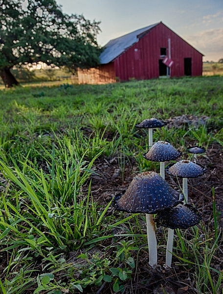
Mushrooms

And the tip is . . .

. . . the next time you are out shooting it a scenic location, just put on your widest angle lens and get right behind something on the ground to take the shot.

I mean right behind it. That something on the ground can be anything from a flower, to a rock, to a pattern in the sand. It does not matter. What matters is that you are down on your knees with your wide-angle lens right behind it.

Clogher

Why it works

The wide-angle lens will give the foreground object an exaggerated sense of proportion, but will also pick up the background. By getting right behind something, you are adding a subject to your picture. You are creating a center of interest. You are going beyond just showing the general scenery. The background will still be in your picture as well, you just do not need to focus on that.

Another benefit is that it gives the viewer a sense that they can walk into the picture. It is providing a real foreground, that adds depth and interest to your photo.

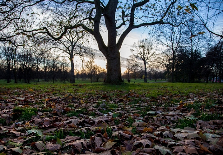
HydePark

What typifies a snapshot, is standing at eye level trying to capture the entire scene before you. For many of us when we are just starting with photography, that just intuitively seems like the way to take pictures. We want to capture the whole scene, and not have it blocked by something on the ground immediately in front of us. The problem is that there is no foreground, subject, or center of interest to speak of. In addition, you are presenting the world in the exact same way as the viewer is used to seeing it, which is bound to be rather boring to them.

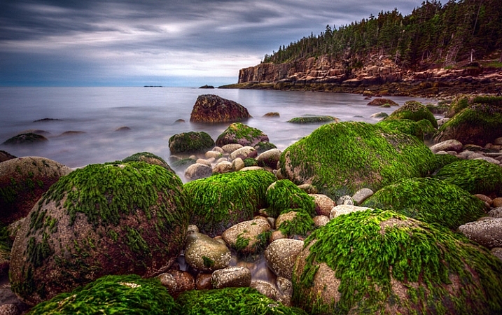
Acadia-low

Putting the tip into action

How you determine what items on the ground will work as your foreground elements, that is the hard part. There is no right answer. You will just have to look. In fact, it will not be obvious even when you are out in the field looking around. There are times when you might have to walk around while looking at the LCD in Live View mode, or with the viewfinder to your face to find something on the ground to use as a foreground.

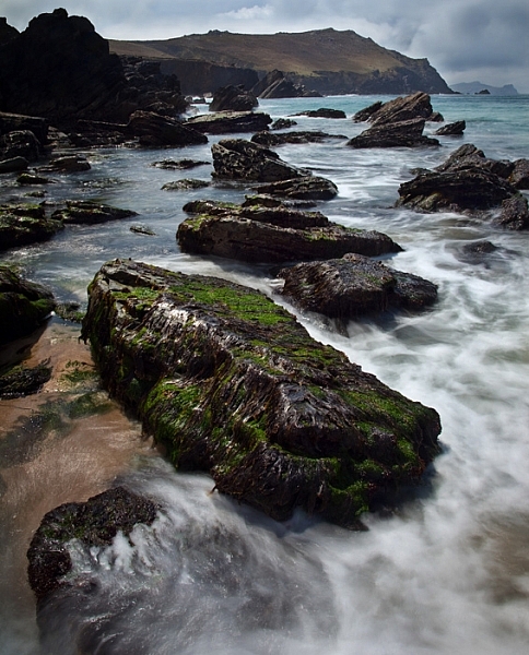
BigBend

Here are some examples of things you can use as foregrounds in different contexts:

  • When photographing water – use a reflection in the water
  • When at the beach or desert – find a pattern in the sand
  • When photographing creeks or coasts – use rocks
  • At midday – use shadows
  • In the fall – use leaves

There are obviously a variety of subjects you can use. Go out and try it next time you are shooting, and if you come across a good item to use in the foreground, leave it in the comments and share your images with us.

googletag.cmd.push(function() {
tablet_slots.push( googletag.defineSlot( “/1005424/_dPSv4_tab-all-article-bottom_(300×250)”, [300, 250], “pb-ad-78623” ).addService( googletag.pubads() ) ); } );

googletag.cmd.push(function() {
mobile_slots.push( googletag.defineSlot( “/1005424/_dPSv4_mob-all-article-bottom_(300×250)”, [300, 250], “pb-ad-78158” ).addService( googletag.pubads() ) ); } );

The post One Compositional Technique to Transform Your Landscape Photos by Jim Hamel appeared first on Digital Photography School.


Digital Photography School

 
Comments Off on One Compositional Technique to Transform Your Landscape Photos

Posted in Photography


Using Depth of Field as a Compositional Tool

05 Aug
In a scene like this, you want all the trees in focus, a deep depth of field is necessary

In a scene like this, you want all the trees in focus, a deep depth of field is necessary

There are many written and unwritten “rules” in Photography. Mostly, they are guidelines, I am not sure that there are rules about any art form, but some guidelines help us out. You have probably heard of the rule of thirds as it relates to composition. You have heard about the golden mean for composition, but have you thought about how depth of field affects your composition?

Composition is one of the easiest techniques to use to improve your images, it is also one of the most overlooked. You may never think about it, but perhaps you really should. Your composition can make a mediocre image strong, just by moving your camera.

Composition has been used by painters for hundreds of years. Many of our current composition tools come from the art world. The master painters worked out how people look at a painting and put a system together that would cause people to stare into their paintings. They used techniques like leading lines, S-curves, symmetry and pattern, repetition and other techniques, to make their paintings more dramatic and compelling. Something they also used was perspective. Perspective gave a three dimensional feel to the painting and made a two dimensional scene seem three dimensional. Leonardo da Vinci mastered this technique and used it to great effect in some of his masterpieces, most notably, The Last Supper and the Mona Lisa. In some ways, Leonardo used depth of field to compose his paintings.

A deep depth of field emphasises the large vista of the scene

A deep depth of field emphasizes the large vista of the scene

1. What is depth of field?

Depth of field is the transition from sharp focus to soft, out of focus areas in the image. The zone of sharp focus, and how much is in focus, is known as the depth of field. You will hear photographers speak of a shallow depth of field or a deep depth of field. The latter means that most or all of the image is in sharp focus. A shallow depth of field means that a small portion of the image is in focus.

How does this work? If you are photographing a landscape scene, you will likely want all of that scene to be in sharp focus. This is called a deep depth of field, and means that the whole scene is in focus. This is good for some forms of photography. At other times you will want only a small portion of your overall image to be in focus. For example, in a close up shot of a flower, you will want the flower to be in focus and everything else to be softly out of focus, this is called a shallow depth of field.

In a city scene, a deep depth of field is good as you want everything in focus.

In a city scene, a deep depth of field is good as you want everything in focus.

2. How does depth of field impact your image?

You have seen images where the one part of the flower is in super sharp focus and the rest is soft and blurry. Some portrait shots also look like this, the person is in sharp focus and the background is out of focus. Why would you want to do that?

The biggest reason is that your eye will naturally go to whatever is in focus in a photograph. So, if you are shooting a wedding and you have a photo of the bride and groom, but they are out of focus and the people behind them are in focus, where do you think viewers will look? They will look at the people behind the couple of course. We assume that if something is out of focus, that we aren’t supposed to look at it. So you can use shallow depth of field to force your viewer to look at your subject. Make sure that whatever your subject is (flower, rock, insect, bride etc) that it is sharp and in focus. If the rest of the image is out of focus, that part of the image will stand out and people will immediately look there.

Everything in focus makes this scene compelling

Everything in focus makes this scene compelling

3. How do I get a shallow depth of field?

Depth of field is determined by the aperture setting on your camera. Your aperture setting is called the F-Stop. Technically speaking, the F-Stop is the focal ratio of the lens. It is the ratio of the lens’s focal length to the diameter of the entrance pupil. Technical, I know, but not critical.

What is critical is that you need to know how the “F” number works. The basic rule of thumb is as follows, the lower the number (i.e. f/2.8, f/4) the shallower the depth of field or only a small amount of your image will be in focus. If you have a higher number (i.e. f/8, f11) the more of your image will be in focus. So if you want the look of having a small part of your image in focus then use an F-Stop of 2.8 or 4.  If you have a lens that goes down to f/2.8 or even f/4 give this a try:

  • Set your camera in manual mode
  • Put your camera on a tripod so that it will be easy to take the shots without moving the camera
  • Focus on a flower or something that will be perfectly still
  • Compose your image, get in as close as you can
  • Set your aperture to f/2.8 and take a shot
  • Then set your aperture to f/4, take a second shot,
  • Then f/5.6 and take a third shot
  • Then two final images, one at f/8 and one at f/11
  • Adjust the shutter speed accordingly to make sure you expose them all correctly

Now take a look at the images, what you will notice is that the f/2.8 image will have a small part of the image in focus, the f/8 and f/11 images will have most of the scene in focus.  This now becomes a compositional choice. You can decide on every image what should be in focus and what can be blurred.

Shallow depth of field isolates the grass and makes it the focal point

Shallow depth of field isolates the grass and makes it the focal point

4. How is this a compositional tool?

As a photographer you have the ability to determine what you want people to look at. By using a shallow depth of field and having only part of the scene in focus, you will make sure that there is no doubt about what the subject is and where you want your viewers to look. A deep depth of field is also important in some images. In landscape photography, you will want a deep depth of field, a shallow depth of field in a landscape image might be confusing. Use your depth of field to determine where you want your viewers to look. Once again, with lots of practice and seeing the results, depth of field will be come an invaluable compositional tool.

I find that the most well known “rules” of composition are a good place to start. Once I have a scene set up, I then think about what I want to be in focus and what I want out of focus, or more precisely, what is my subject or focal point. From there I look at exposure, light, etc., and then I make the image. For me, depth of field has become an important creative tool that I use as often as I can to define my subject. Let me know what you think? Do you use depth of field as a compositional tool or not? If not, will you try it out? Let me know your comments below.
A shallow depth of field isolates the leaves from the soft background

A shallow depth of field isolates the leaves from the soft background


The post Using Depth of Field as a Compositional Tool by Barry J Brady appeared first on Digital Photography School.


Digital Photography School

 
Comments Off on Using Depth of Field as a Compositional Tool

Posted in Photography


Using the Sun As A Compositional Element

29 Mar
As the sun set on Massachusetts Bay, I turned and saw my buddy Joe lining up a shot. I walked around him until the sun was directly behind his head, and dialed my exposure way back to -2 stops to create the sihouette. Canon EOS 50D, EF 70-200 f/2.8L IS USM. ISO 100, 1/6400, f/2.8. Shot in Av mode at -2 exposure compensation.

As the sun set on Massachusetts Bay, I turned and saw my buddy Joe lining up a shot. I walked around him until the sun was directly behind his head, and dialed my exposure way back to -2 stops to create the sihouette. Canon EOS 50D, EF 70-200 f/2.8L IS USM. ISO 100, 1/6400, f/2.8. Shot in Av mode at -2 exposure compensation.

For the most part, as photographers, we avoid shooting into the sun for fear that we’ll get some unsightly flaring.  The sun DOES present some exposure challenges, and of course, flare is a concern, but by carefully composing your shot, and properly exposing, including the sun in your images can create stunning results.

The first secret to using the sun is about positioning.  When you can, position the sun behind something else in your image. In the image of the photographer above, this gives the effect of a halo, helping create the silhouetted image.  By using exposure compensation to darken the exposure, I kept the sun from blowing out, and darkened the main subject into the silhouette. I then adjusted the white balance and color saturation to get the final result. Because the image was shot at f/2.8, the sun appeared as a giant ball in the image. In another example, the image of the daisies, a wide angle lens was used to make the sun smaller in the image, and was then positioned just behind the stem of the daisy. Because the image was shot at a smaller aperture, f/22, the sun appears as a star rather than a ball.  One of the cool things that happens when shooting into the sun with a wide angle lens at a small aperture is that the light falls off in the areas away from the sun, creating dramatic skies that go from near white by the sun, to deep blue in the corners.

This image of daisies was shot with the EOS-1D Mark IV and EF 14mm f/2.8L II. Exposure was 1/100, f/22, ISO 100. Aperture Priority.

This image of daisies was shot with the EOS-1D Mark IV and EF 14mm f/2.8L II. Exposure was 1/100, f/22, ISO 100. Aperture Priority.

Shooting into the sun does pose some exposure challenges.  Shooting into such a bright light can cause underexposure.  That’s not necessarily a problem if you’re going for a silhouette, but if you want some detail in the subjects that are backlit by the sun, you’ll need to dial in some exposure compensation to counter the brightness of the sun.  In the image of the Elm In Cook’s Meadow, the image at what the camera said was the proper exposure was a bit dark, and devoid of shadow detail.  Thankfully, for this image, I shot several images at varying exposures (also called bracketing). The image you see here was shot at +1.6 exposure compensation, in aperture priority mode.  This allowed for a level of detail in the shadow areas, while not allowing the highlights to blow out.

For this shot in Yosemite National Park, I shot in Aperture Priority, with exposure comensation set to +1.6.  EOS 5D Mark III, EF 24mm f/1.4L II. ISO 100, 1/30, f/16.

For this shot in Yosemite National Park, I shot in Aperture Priority, with exposure comensation set to +1.6. EOS 5D Mark III, EF 24mm f/1.4L II. ISO 100, 1/30, f/16.

By bracketing your exposures, you can see how changing your exposure will affect the look of the image.  Normally, I set my aperture and bracket my exposures by changing shutter speed, as I will generally know what I want my depth of field to be.  There are times to try it the other way, setting your shutter speed and adjusting your aperture. This will affect your depth of field, however, so be aware of what’s in focus and what’s not.  Your final option is to adjust the ISO.  The risks here are that when you raise the ISO to achieve the overexposure, you run the risk of introducing unwanted noise into your image, depending on how high you set the ISO.  This technique can give your several options when working with the contrast ranges you deal with when shooting into the sun.

Don’t be afraid to include the sun in your shots, using it as a strong compositional element. Too often we forget to use the sun in the image, simply using its light.   Including the sun in the shot creates new possibilities that can make for some dramatic images.
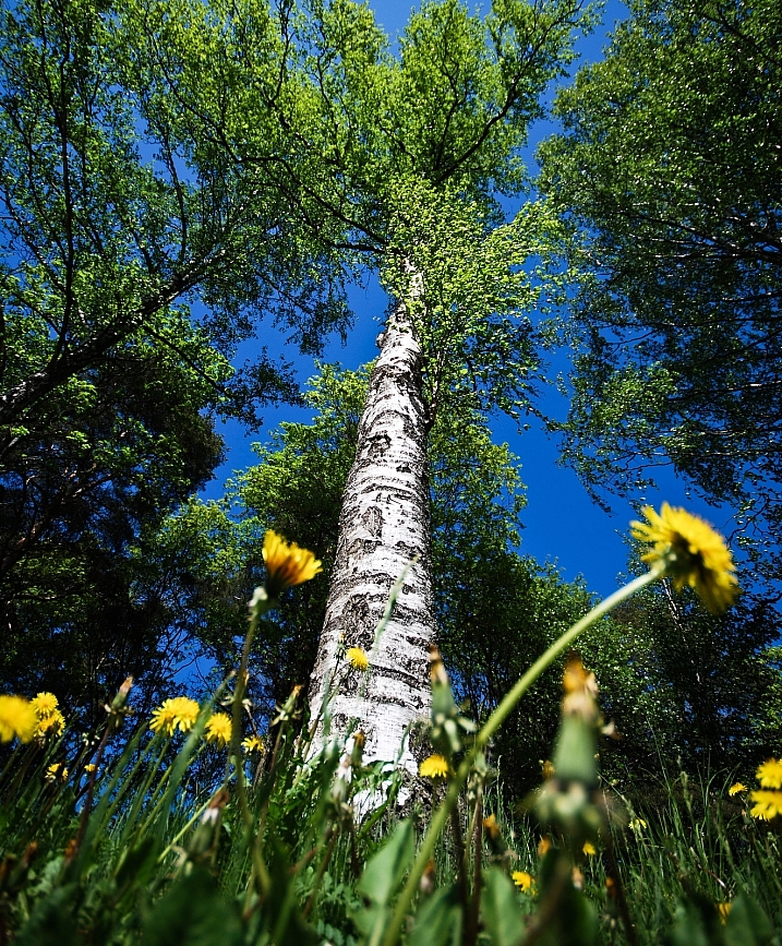
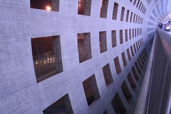
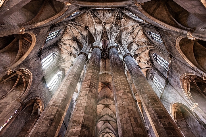
This shot of the canopy of autumn leaves in upstate NY was taken with a fisheye lens. The sun shining through the gap in the leaves added just the touch of drama I needed. EOS-1D X, EF 8-15mm f/4L.  1/60, f/16, ISO 100.

This shot of the canopy of autumn leaves in upstate NY was taken with a fisheye lens. The sun shining through the gap in the leaves added just the touch of drama I needed. EOS-1D X, EF 8-15mm f/4L. 1/60, f/16, ISO 100.

Post originally from: Digital Photography Tips.

Check out our more Photography Tips at Photography Tips for Beginners, Portrait Photography Tips and Wedding Photography Tips.

Using the Sun As A Compositional Element


Digital Photography School

 
Comments Off on Using the Sun As A Compositional Element

Posted in Photography


Article: Breaking Compositional Rules

11 Nov

thomas-park-sushi.jpg

Photographers have no shortage of compositional rules to turn to when trying to create better images. Pro shooter and educator Thomas Park shows how you can actually make more compelling images by breaking these rules – as long as you understand them first.

News: Digital Photography Review (dpreview.com)

 
Comments Off on Article: Breaking Compositional Rules

Posted in Uncategorized