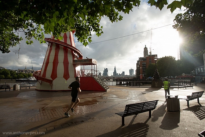
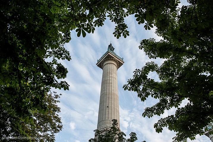
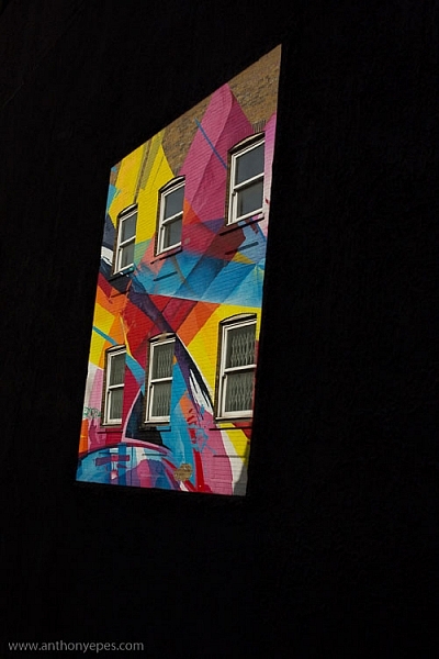
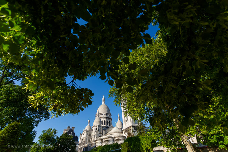
RSS
 

Posts Tagged ‘Composition’

An Unconventional Composition Technique to Improve Your Photos

01 Feb

Last month I sat down and reread Michael Freeman’s book, “The Photographer’s Mind.” which I do occasionally. I find that by revisiting the words of other photographers I remind myself of the multitude of tools available to us. There’s so much we can do to create fresh and amazing photographs.

One of those ways is to push our skills and update our thinking. I think I’ve read through Freeman’s book about two or three times now. Every few years I take it off the shelf again. His books are insightful and interesting to read. Freeman offers up unique ideas for composition using both conventional and unconventional techniques. The books are readily available. You can also check out our review of one of Freeman’s other books here; “The Photographer’s Eye”. In this article, let’s journey through one of the concepts he discusses in his book, “Engineered Disorder”.

An Unconventional Composition Technique to Improve Your Photos

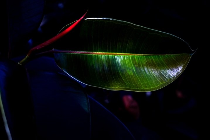
The details of the image are broken up into sections by the heavy shadows.

What is Engineered Disorder?

Freeman explains that Engineered Disorder is the active effort of a photographer to use non-conventional methods of composing photographs. Essentially, we are breaking the rules to create interesting images. Engineered Disorder means that we forget about conventional methods like unifying elements within the frame. We might allow ourselves to create uncluttered compositions. In one chapter Freeman talks about different methods of creating Engineered Disorder and bucking the system. He mentions using techniques such as disconnects, disruptive foreground, breaking the frame, superimposed layers and extremes of contrast. Maybe these terms sound complicated and a little too complex to understand, but they don’t have to be.

Let’s break down one of these techniques and see what’s involved in creating Engineered Disorder. We will discuss the use of extreme lighting or chiaroscuro to create disconnect within an image. It’s one of my favorite techniques. I love to include deep blacks and bright highlights in my compositions.

Chiaroscuro

Chiaroscuro – chi·a·ro·scu·ro – the treatment of light and shade in drawing, painting, and photography.

Using this technique means that we employ very hard lighting to break up the unity of a composition. The image becomes a series of pieces that communicate meaning but are broken up by dark shadows and bright highlights. Conventional composition techniques would say that using this type of technique makes for a bad photograph, but remember we are pushing the elements of composition.

An Unconventional Composition Technique to Improve Your Photos

The strong shadows in this image hide some details from the viewer. The leaf can only be viewed in pieces. This means a viewer has to pause and take in each part of the image separately and then piece together the whole scene. Making a viewer stop and study your image is important. Given the number of photographs out there you want to make viewers take some time to digest your images rather than scan through and move on. 


Experimenting with dark and light

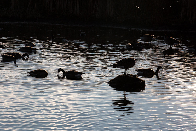
Consider my careful experimentation with Chiaroscuro. This image portrays the common Canada goose in a much more unique fashion. In the opening moments of golden hours, these geese become elegant shadows. The different sections of light and dark create interesting graphic qualities within the image.

An Unconventional Composition Technique to Improve Your Photos

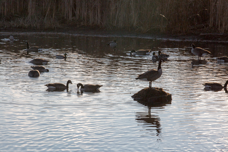
In this second image, I’ve used auto tone to create a more conventional image. While the actual shot is very similar, these two different treatments create considerably different photographs. Which one do you prefer?

An Unconventional Composition Technique to Improve Your Photos

A more conventional exposure.

Other examples

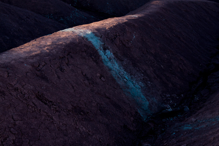
Here’s another example of Chiaroscuro. This is a photograph of a unique area near my home. Everyone calls this place The Badlands. The red and gray clay create these beautiful graphic designs which draw visitors to the area. The hills are in danger of being destroyed by visitors, but the area is truly beautiful. The shadows and the light create beautiful diagonal lines in this particular image.

An Unconventional Composition Technique to Improve Your Photos

This are is now off limits to visitors because of the damage caused by walking on the hills.

In this final image, the light and darks highlight different circular objects. Perhaps this image isn’t as disconnected as the others but it still presents a unique treatment for the door of a fishing boat. The image focuses on graphic design elements of the boat rather than the uses of the vessel. The image has been turned into an abstract and most viewers will need to analyze the image before they can determine the exact subject matter.

An Unconventional Composition Technique to Improve Your Photos

Conclusion – your turn

Experimenting with different techniques is never a bad thing. You can learn and improve your photos by playing with unconventional techniques. Creating these images certainly pushed the dynamic capabilities of my camera. Exposing for deep shadows can be a challenge all on its own, but it’s a lot of fun to try out these different techniques.

While we’ve only discussed one of the methods for creating Engineered Disorder, these three examples clearly highlight the technique. It’s better to fully understand just one compositional method rather than scratching the surface of several techniques. Give it a try, and go a little bit extreme. Break away from the conventional and search for ways to compose images that harness the power of Engineered Disorder in your photography. Please share your results in the comments below.

googletag.cmd.push(function() {
tablet_slots.push( googletag.defineSlot( “/1005424/_dPSv4_tab-all-article-bottom_(300×250)”, [300, 250], “pb-ad-78623” ).addService( googletag.pubads() ) ); } );

googletag.cmd.push(function() {
mobile_slots.push( googletag.defineSlot( “/1005424/_dPSv4_mob-all-article-bottom_(300×250)”, [300, 250], “pb-ad-78158” ).addService( googletag.pubads() ) ); } );

The post An Unconventional Composition Technique to Improve Your Photos by Erin Fitzgibbon appeared first on Digital Photography School.


Digital Photography School

 
Comments Off on An Unconventional Composition Technique to Improve Your Photos

Posted in Photography


Pushing your Composition to the Edge

25 Sep

The world is filled with photographs. I did a bit of research and found the following statistic. Researchers estimate that the average individual is now exposed to approximately 250 different images per day. It’s no secret that we are now inundated with visual stimulus. Everyone owns a camera and everyone is shooting images. In 1857 Francis Frith took photographs of the pyramids and the Sphinx. The general public was mesmerized by images of a faraway and exotic location. Today, if I search “Images of the Pyramids” I get 7 million results; everyone knows what the pyramids look like. This whole phenomenon translates into a challenge for photographers. How do you shoot something different and unique when the world uploads 1.8 billion photographs a day?

Image 7

There is no easy answer. I don’t know how many times I have heard someone say, “That’s a beautiful image of the shoreline. You are a really great photographer but take a look at this. I shot the same thing last year on vacation.” Some photographers may become frustrated with this occurrence, but perhaps we should look upon this as a challenge. What can you do to make your photographs more unique?

Live on the edge – of composition

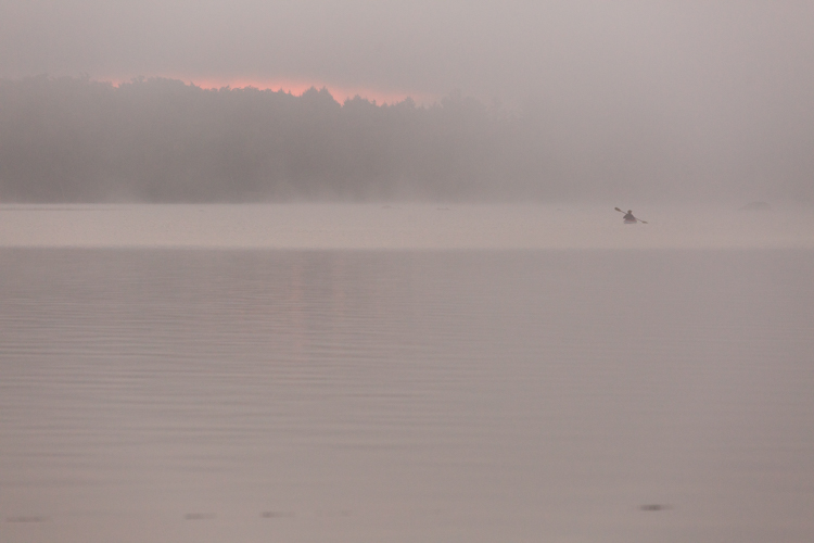
We all want people to view our images and say, “That’s amazing! I’ve never seen that before!” It’s going to be tough but it’s worth a try. It’s time to push your composition skills to their limits. Consider using techniques or viewpoints that are a little unconventional. Try pushing the main subject of your composition towards the edge of your frame. Let’s consider this photograph of a kayaker.

Image 1

In this version, the image is composed using the rule of thirds. The scene has a pretty unique atmosphere as the sun struggles to break through the morning mist. Shouldn’t that be enough to make the viewer stop and take notice? It’s a beautiful image and it was a fantastic morning. I know people will love this image. But what if it was recomposed to push the kayaker to the edge of the frame? Does this make the image even more appealing? Consider the difference.

Image 2

This second image is cropped way down to illustrate a point. What did you look at first? Hopefully, your answer is the red light on the left of the frame and then your eye moved over the image to discover the kayaker. This technique is called “the delay” which means that the viewer is delayed by other details before focusing on the main subject. This means that the viewer notices the details in a much slower and more deliberate manner. You might even create the emotion of surprise when your viewer discovers the full extent of your composition. That’s a good thing. Creating emotions within the viewer ensures they will remember your image.

When the rule of thirds is not the best choice

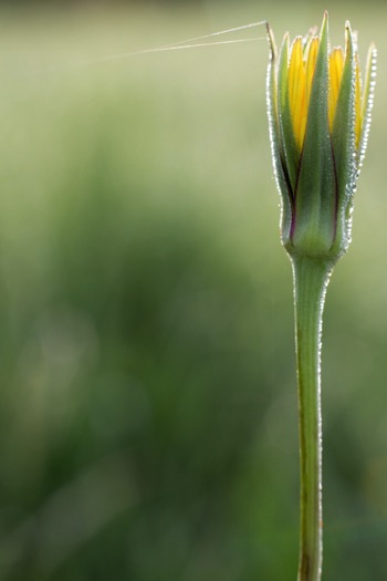
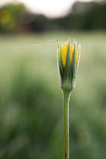
Let’s take a look at another image. In this case the main subject, the flower bud, has been pushed right to the edge of the frame.

Image 3 Image 4

By placing the main subject closer to the edge of the frame you can create more tension within your image (above left). The image is certainly more dynamic and interesting than this conventional version which focuses on placing the flower bud along the rule of thirds (above right).

In this shot of the boxer and his trainer I was disappointed and considered it a failure because it didn’t follow any of the rules of composition. The autofocus locked onto the training gloves, not the boxer. But after consultation with the magazine editor, he decided to use it because the angle was so unique. The composition told the story in a different way. Notice the trainer’s nose is just in view in the top corner. The editor loved that element and it sealed his choice.

Image 5

Sometimes you will be surprised by what works.

Finding the right balance

Of course, there are times when this technique doesn’t work and the resulting image just feels unbalanced and awkward. This image of a decaying pier in Lake Huron is a good example of when placing the subject close to the edge unbalances the shot.

Image 6

There’s just too much visual weight placed on the right side of the frame and the image is not successful. But that’s okay because at least something was learned about the importance of creating visual balance when pushing the subject matter to the very edge of the frame. Try to balance the weight of the object along the edge with the visual weight of the rest of the space.

Conclusions

Image 9

However, you choose to compose your images the challenge will always be to create something unique that stands out from the crowd. The reality is the crowd of images is only going to get bigger.

Are you up to the challenge? Are you willing to continue experimenting with the methods you use for composing your images? I say push things a little further each time you take a photograph and experiment with how you can use the edge of the image to create interest in your work.

Please share your compose on the edge images and thoughts in the comments below.

googletag.cmd.push(function() {
tablet_slots.push( googletag.defineSlot( “/1005424/_dPSv4_tab-all-article-bottom_(300×250)”, [300, 250], “pb-ad-78623” ).addService( googletag.pubads() ) ); } );

googletag.cmd.push(function() {
mobile_slots.push( googletag.defineSlot( “/1005424/_dPSv4_mob-all-article-bottom_(300×250)”, [300, 250], “pb-ad-78158” ).addService( googletag.pubads() ) ); } );

The post Pushing your Composition to the Edge by Erin Fitzgibbon appeared first on Digital Photography School.


Digital Photography School

 
Comments Off on Pushing your Composition to the Edge

Posted in Photography


How to Tell a Story with Portraits by Using Creative Composition

21 Aug

In this article, we will explore new ways of using composition and creative framing to tell a story in your portraits. We’ll do so by understanding the marvellous ways our brain (as viewers) construct a sense of story.

The common principle of the techniques I will describe here, is that they are all based on our mind’s ability to fill in missing gaps of information. A skill that helps us survive in a world of uncertainty.

F11A2018

Two things to note about creativity before we start

Skill, is not just a talent: Just like working on the flexibility of a muscle, I believe we can work on our creativity, with the “muscle” being our vision.

Being creative for the purpose of being creative: Creative compositions should be a vehicle for a purpose – an emotion or a story you want to evoke in the image. If you choose to add creativity to your images, just to be more creative, it will be an empty gimmick.

Half close up portrait – a full story

By showing only half of a close-up portrait, you stimulate the viewer’s mind and almost force it to delve into the image. We do so by activating their mind’s need to fill in gaps of missing information. This ability is rooted in us since ancient times, from which we evolved to understand that the two blurry spots between the trees, could be the hidden face of a tiger.

F11A6628

Good to know:

For best results, you can practice framing this kind of composition by using the crop tool in your editing software. Once you become comfortable with this technique (and framing); it will be easier to achieve a “half close-up portrait” in the field, without the need to crop it in the post-processing stage.

This kind of framing is like an exclamation mark, which one cannot ignore. Therefore, use it only on the most interesting faces, and not on every portrait.

F11A8534

Environmental portrait – a person in context

For me, this the most challenging and rewarding portrait framing style, the environmental portrait. This shows not only the person, which is the hero of your image, but also his or her environment: home, work place, country, etc. By doing so, you use the mind’s ability to conclude and understand a situation by connecting pieces of information.

14 the sleep

Good to know:

The biggest challenge in this type of composition is the balance between the main figure (hero) and environment. Keep in mind that the main figure must be dominant, and not overtaken by the background. Use light, color, and sharpness to make your subject significant.

Using a wide lens (below 50mm) is recommended for the environmental portrait framing, as it will allow you to capture the environment of your hero, even in small spaces.

F11A4931

Detail portrait – telling the story with small details

Like with the half portrait technique, in the detail framing we use the brain’s ability to fill in the gaps, by showing only a small fraction of the entire story. For a good detail shot, choose some with a connection to your subject. It can be a connection of similarity or difference. For example: take a close-up shot of his or her hands, shoes, the reading books on the shelf, the subject’s regular chair or smoking pipe, you name it! As long as this object, represent something which is bigger than the object itself.

12970960 1147522381976706 3379301587067512747 o

Good to know:

A good place to start is by examining your subject from head To toe. Looking for anything that other people might miss in that person. Did you spot anything special? Like a unique piece jewelry, a tattoo, or just a hole in their shoe.

Some of my best ideas came from my subjects. Ask your subject to show you an object to which he or she feel a strong connection. You do not even need to have any human presence in the detail shot, as long as the object represents or tell us something about its owner.

IMG 4005

Kuleshov effect – creating a meaning by interaction

In this technique, based on the groundbreaking experiment by the Soviet filmmaker Lev Kuleshov, we will use the brain’s ability to derive meaning from the interaction. Kuleshov demonstrated that the audience constructs the story not only by the content, but also by the order in which the images appear, and the connection between them.

In the experiment, Kuleshov used two different shots, which he put in sequence one after the other. The first shot, a close-up shot of the face of silent film actor Ivan Ilyich Mozzhukhin, remained the same throughout the experiment, while the second shot was replaced with every round of projection; a plate of soup, a dead young girl, a woman on a divan (sofa).

The audience praised the actor’s ability to express different feelings such as sadness and even hunger, using only his facial expressions, without knowing that they watched the same shot over and over, and the only thing that was changed was the second image.

Page 18

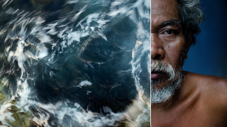
To use this effect in your work, just place two images side by side and try to evoke a connection between them. In the example, I combined between the portrait of Net, which I did with the half close-up composition, with an image of a swirling sea. Where does it take you?

Good to know:

You will be amazed by the power of creative composition. Challenge your audience. Don’t be afraid to create a connection which is too complicated to understand.

A good creative exercise which you can do is by collaborating with a different photographer. You will provide the first image, he or she will provide the second. In there you will have a connection, not only between the two side-by-side images but by two different points of view.

The author would like to thank Nicholas Orloff for his assistant in writing this article.

googletag.cmd.push(function() {
tablet_slots.push( googletag.defineSlot( “/1005424/_dPSv4_tab-all-article-bottom_(300×250)”, [300, 250], “pb-ad-78623” ).addService( googletag.pubads() ) ); } );

googletag.cmd.push(function() {
mobile_slots.push( googletag.defineSlot( “/1005424/_dPSv4_mob-all-article-bottom_(300×250)”, [300, 250], “pb-ad-78158” ).addService( googletag.pubads() ) ); } );

The post How to Tell a Story with Portraits by Using Creative Composition by Oded Wagenstein appeared first on Digital Photography School.


Digital Photography School

 
Comments Off on How to Tell a Story with Portraits by Using Creative Composition

Posted in Photography


Using Lightroom’s Transform and Crop Tools to Improve Composition

30 Jul

Everybody loves to get it right in camera. But if you don’t, you have plenty of tools to help you make it right. Lightroom is one of the best available, and the easiest to use. In this article I’ll show you how you can use Lightroom’s Transform and Crop Tools to improve your composition.

The Transform Tab

First, let’s talk about the Transform tab, in the Develop module. Transform is relatively new to Lightroom. It’s an improved version, split-off of the Lens Correction tab. Essentially, Transform helps you straighten crooked or skewed images.

IMAGE 1

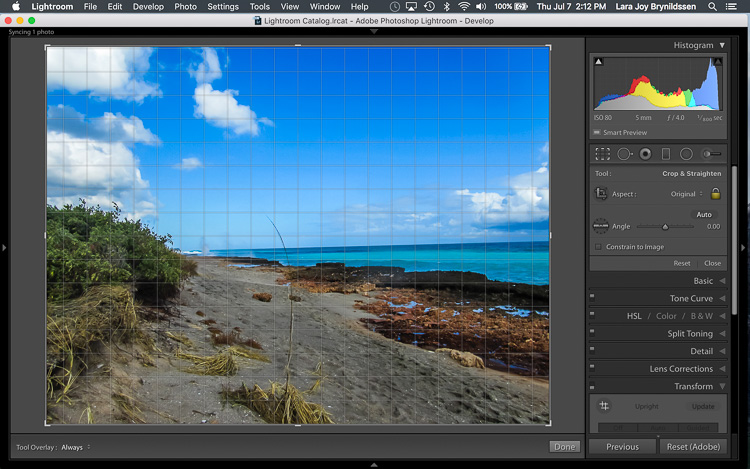
Here, in the first example above – a lovely seascape – there is a crooked horizon. Before opening the Transform tab, press the R key to activate the Crop Tool. Now press the O key (letter not number) to toggle the Grid overlay. With the Crop Tool still activated, click on the Transform tab in Lightroom and choose Level.

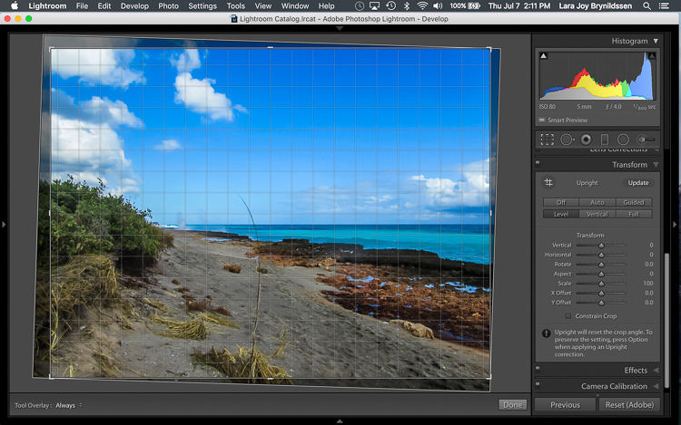
IMAGE 2

The Level option is perfect for images like this, when there are no strong vertical lines that need correction. It simply straightens the horizon so it no longer slopes crookedly. With the Grid overlay turned on, it’s easy to verify that the horizon is now straight. Here’s the image after the crop is applied.

IMAGE 3

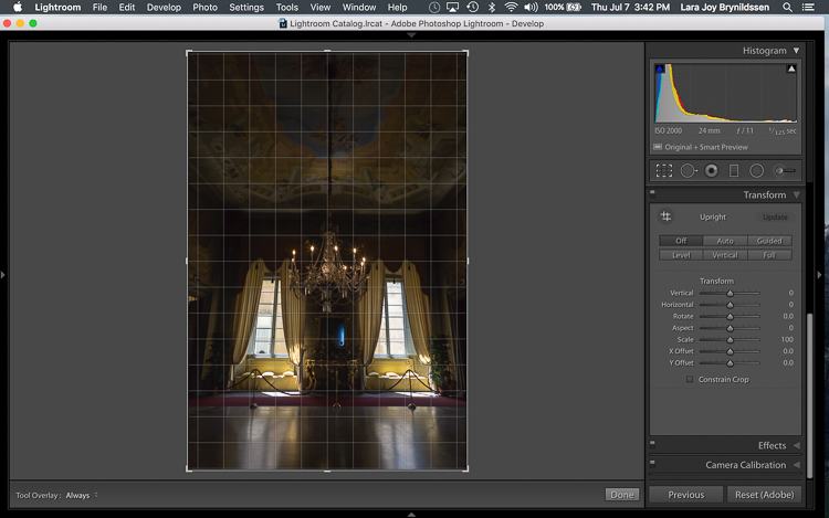
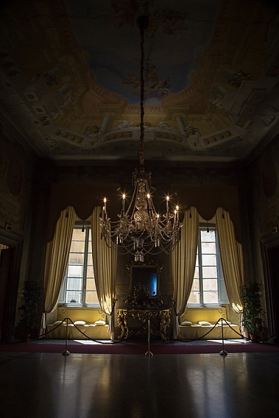
In this next example (below) – an interior image of an old Italian mansion – the windows are falling over backwards.

IMAGE 4

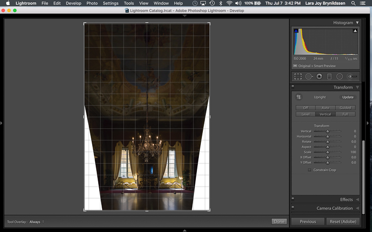
Here the Vertical option in the Transform tab does a great job of straightening the perspective. The windows align perfectly with the horizontal and vertical lines of the Grid overlay.

IMAGE 5

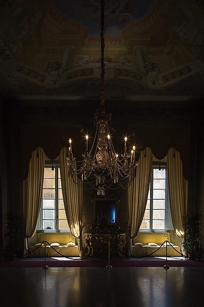
But as you can see, straightening the image has created a few problems. The image was so crooked (perspective distortion) that now there is a lot of white space to crop out. The good news is that when fixing these issues, composition can be improved too.

Composing with the Crop Tool in Lightroom

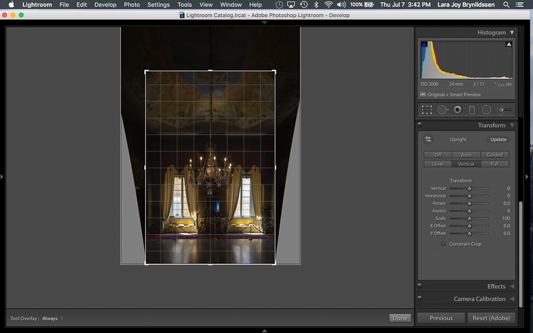
The white space can be eliminated, and the composition strengthened, by creatively using the Crop Tool in Lightroom. The next step is to adjust the composition with the Crop Tool by moving it around the image.

IMAGE 6

In this image, to eliminate all of the white space and direct the viewer’s focus to the chandelier and windows, grab the Crop Tool at the top centre point, and draw down. This eliminates both the unnecessary ceiling, and the white spaces on either side of the image.

Now that the image is starting to look better, scroll through the Crop Tool overlays and review the newly cropped image to see which ones work. By reviewing your images with different Crop Tool overlays, you can strengthen your intuitive sense of strong composition.

To review each of the overlays, press the O (oh not zero)) key. You’ll toggle through the following:

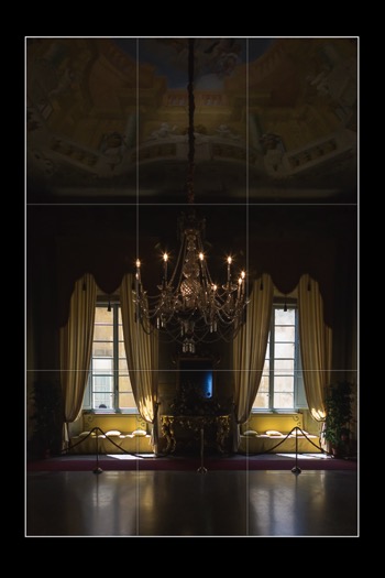
  • Rule of Thirds (below left)
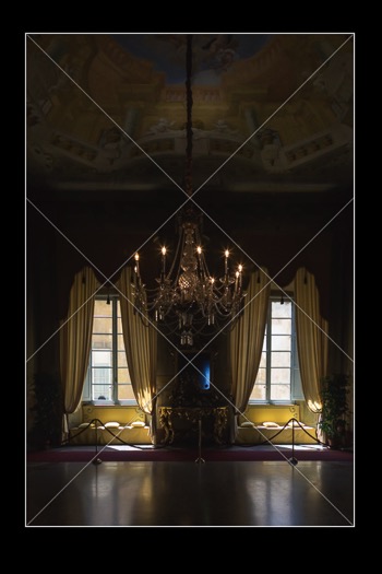
  • Diagonal (below right)
  • Golden Triangle
  • Golden Ratio (similar to the Rule of Thirds overlay)
  • Golden Spiral
  • Aspect Ratios
  • Grid
IMAGE 7 IMAGE 8

In the example images above, both the Rule of Thirds and the Diagonal overlays clearly show that the composition is strong.

Before

Before

IMAGE-9.jpg

Final image.


Here’s the final image (before correction is above left, after is on the right). Now let’s take a quick peek at one more image, and one more feature in Lightroom.

Flipping the Golden Spiral and Golden Triangle Overlays

You’ve probably toggled through the overlays and disregarded both the Golden Triangle and the Golden Spiral because they just never work. Unlike most of the overlays, neither the Golden Spiral nor the Golden Triangle is symmetrical. That means that you need to flip the overlays around a few times to find the orientation that aligns with your image. By pressing the Shift key and the O key at the same time, you can change the orientation of both the Golden Spiral and the Golden Triangle. Changing the orientation makes those overlays a lot more useful.

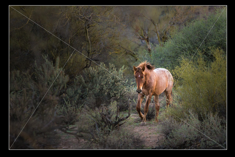
Here, in this image of a wild stallion (below), before flipping the Golden Triangle orientation, this overlay doesn’t work at all. Looking at it you might question whether or not the image had a strong enough composition to start with.

IMAGE 11

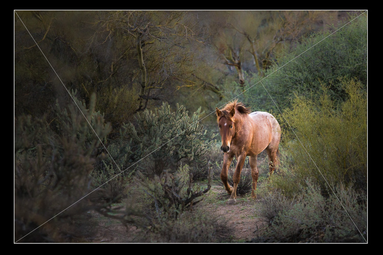
By pressing Shift plus the O key, and flipping the overlay orientation, the stallion fits neatly into his own triangle. His legs and nose are also no longer bisected by one of the diagonals. In addition, he’s positioned towards the back of the triangle. The top diagonal edge of the triangle that contains the stallion shows us that he is moving forward into the composition, towards the viewer, which is naturally pleasing to the eye. The other triangles neatly organize the foliage surrounding the stallion. Even the beam of sunlight highlighting the stallion falls within the main triangle, further confirming that this image is well composed.

IMAGE 12

With a little practice, some judicious use of the Transform tab and Crop Tool, you’ll master composition in no time. How do you use these tools to help you? Please share in the comments below.

googletag.cmd.push(function() {
tablet_slots.push( googletag.defineSlot( “/1005424/_dPSv4_tab-all-article-bottom_(300×250)”, [300, 250], “pb-ad-78623” ).addService( googletag.pubads() ) ); } );

googletag.cmd.push(function() {
mobile_slots.push( googletag.defineSlot( “/1005424/_dPSv4_mob-all-article-bottom_(300×250)”, [300, 250], “pb-ad-78158” ).addService( googletag.pubads() ) ); } );

The post Using Lightroom’s Transform and Crop Tools to Improve Composition by Lara Joy Brynildssen appeared first on Digital Photography School.


Digital Photography School

 
Comments Off on Using Lightroom’s Transform and Crop Tools to Improve Composition

Posted in Photography


Tips for Using Natural Framing to Improve Your Composition

14 Jul

To help you compose more exciting and beautiful photographs, there are certain key composition techniques that you can use. Natural framing is one that is widely known, but needs careful and thoughtful application. Using framing can create extremely impressive and elegant images when done right. Here are some tips to help you.

natural-framing-tips--10

Natural framing is when you use an element within your image to frame the subject. This draws the eye into the photo and highlights the actual subject.

This internal frame can be constructed using a multitude of things you’ll find anywhere – branches, archways, tunnels, door frames etc., as well as things that aren’t solid like light, shadows, rain, fog, etc. – it doesn’t matter what you use.

Framing is a technique to use sparingly – but when it’s totally right, it looks natural. So few people use it well that if you can master it, you can create some fantastic shots.

natural-framing-tips--2
Why you should use natural framing:

  • It easily draws your viewer’s eye into the photo and emphasizes the subject.
  • It isolates and separates your subject from what’s around it.
  • It brings a sense of order and structure to a photo – and the eye loves order.

When to use natural framing

  • To obscure boring sky (my favourite).
  • To add depth to an image – especially when the item acting as the frame is not in focus.
  • To bring contrasting elements into the photo without detracting from the subject.
  • To create structure.
  • To create a feeling of a self-contained image, particularly if you are photographing something quite ordinary and simple, a frame will help give depth to the subject.

natural-framing-tips--12

Traditionally the frame should be distinctly separate from the subject, so that it’s not confusing to the eye. But I will also show you where I haven’t done that, and the photo still works. I will show you both how to use this technique as well as where else you can take it – how to let it inspire you to develop your images.

Rules are made to followed, bent and broken

Like anything that is considered a technique or rule, people can feel very passionately for or against their use.

“Consulting the rules of composition before taking a photograph, is like consulting the laws of gravity before going for a walk.” Edward Weston

But for me, it comes down to not using any of the rules so much, that your photos end up all looking the same. Don’t let rules keep you stuck in a box. They are a great springboard for your photography, or a way to help refresh your vision, so that you start composing in a different way.

natural-framing-15

When I was starting out, I worked hard to get really familiar with the key compositional techniques, but then after a while, once I’d embedded them, I started to develop my own way of using these techniques, my own style.

I also encourage you to think of all these techniques and rules as opportunities to see and learn to organise the elements within your photos differently. In my workshops I’ve noticed that one of hardest things for people is to break the world down into elements, and then learn how to organise these elements to create striking compositions.

Natural framing isn’t an add-on

Natural framing is one of the harder rules to pull off well. I think many people use it to make a boring landscape or scene more interesting. But to me, if your subject is boring, no technique is going to liven it up. Framing should be used as an additional interesting element – not as an overlay to a mundane scene (just search: “natural framing” on Google images and you’ll see what I mean).

natural-framing-tips--3

I find natural framing is most interesting when used in the loosest possible interpretation. It has to be employed in a way that enhances the photo, and feels like it is a natural part of the composition.

“There is no better time to crop a bad composition than just before you press the shutter release.” Bryan Peterson

With those caveats – now it’s time to relax, have fun, and play with it!

Creating your frame

natural-framing-20

You don’t need to have a frame around all four sides of your photo for it to work – in fact I’d encourage you not to do that. I think more often than not, it looks more natural and pleasing to the eye for the frame to take up just two or three sides of the image. But like every recommendation – use your own personal judgement.

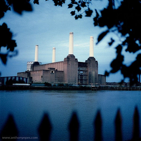
The photo above of Battersea Power station is probably one of my most traditional interpretations of natural framing. I have framed the building with the branches and leaves at the top, and the outline of a fence at the bottom. Two important things to point out in this photo:

  • When the frame is out of focus it create a sense of depth to the image.
  • The frame can be made from different elements: I’ve used two different elements but their colour is the same, and they are both interesting shapes – so they have some common qualities.

Obscuring boring sky

natural-framing-tips--7

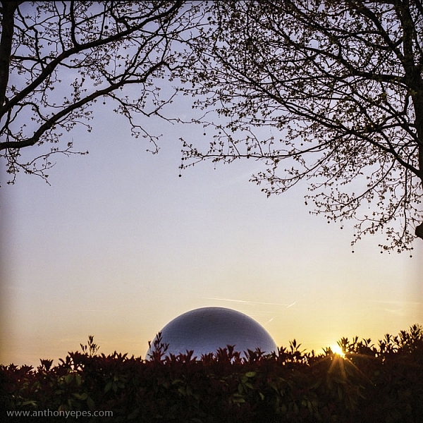
In the photo above, I wanted to capture the shiny dome and the rising sun. But that wasn’t enough to make an interesting photo. There was some pretty endless sky, so I added a silhouette of the bare branches above. I seem to use a lot of tree branches in my natural framing compositions. In this case, I love how they create this beautiful, wild, chaotic pattern, above the very clean and shiny dome. Then I’ve added this little almost tuft of leaves below, which balances the photo out.

I love using framing elements that have great texture – again they add depth. Just remember to keep it well organized and clear so people can see what you are trying to do. This photo is really about the simple contrasting shapes – and by using natural framing it creates a nicely ordered photo, constructed from the available elements.

natural-framing-17

So once you’ve got a grasp of the concept you can start using the technique in other ways – have fun!

You are in control of how the viewer sees the image

Naturally framing is a very good way to remember that you are in control of how the viewer’s eye will go around the image. It doesn’t matter how big the photo is, the eye won’t see the complete image all at once. The eye will be drawn to one part and then move around the image depending on where the elements are placed. Your job as a photographer is to direct the eye.

natural-framing-tips--4

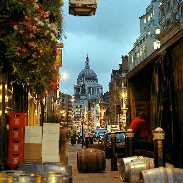
Here the subject is St Paul’s Cathedral, bang in the centre of the image. But all around it there are buildings, streets, cars, etc. When you first see the image, all of that other detail bleeds into one, creating a natural frame for the cathedral. But then gradually you start to see the details, so the image becomes something quite different.

This photo is a good example of how you can use framing to create order to a very busy scene, and give the viewer a way into the photo. It’s also a good example of how your eye moves around an image.

The one-sided frame

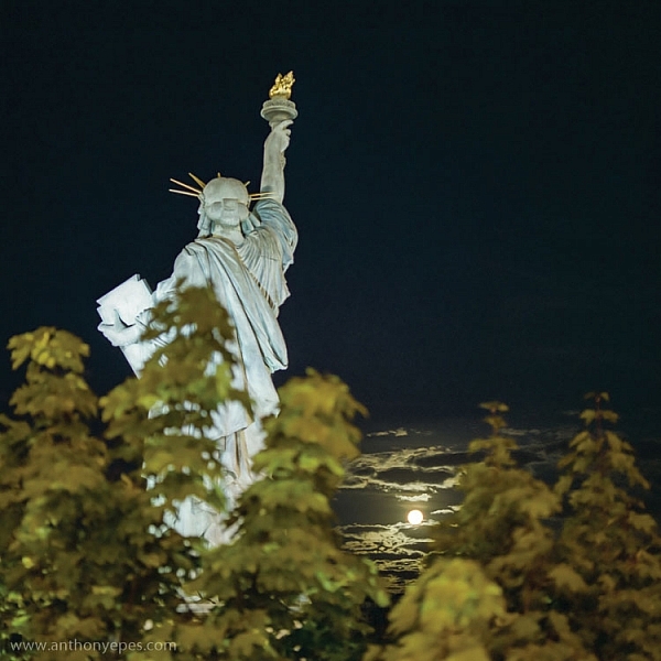
It is possible to do a one-sided frame, and it works! Below, even though the foliage is only running along the bottom, it creates a great grounding effect, and pushes the eye up toward the moon and the Statue of Liberty. Therefore, in my book, it adheres to the principal of drawing your eye towards the real subject of the photo. This isn’t even a strong line that’s creating the framing element – it’s simply the power of suggestion.

natural-framing-tips--6
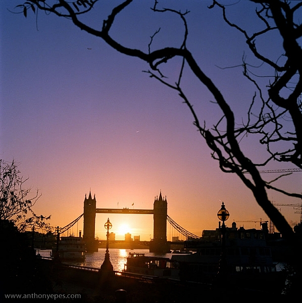
In the photo below you’ll see some framing which is going across the corner of the photo. So it’s still drawing your eye to the subject – which is the rising sun and Tower Bridge – but it’s quite subtle. I would perhaps suggest that the bottom elements are creating a second framing element, grounding the photo, and framing the sun. What do you think?

natural-framing-tips--8

When I am shooting photos with big sky – which is favourite subject of mine – what I often do is shoot when small objects appear in the sky, like above. If you look closely you can see a very small plane. Or sometimes a tiny bird appears, or some other random object. People often ask me why I don’t Photoshop it out because it can look like a piece of dust or a mistake, but I love these little surprising elements. It’s great if there can be tiny details that create layers of interest in your shots, so your viewers don’t see everything all at once. (Or as Henri Cartier-Bresson said, “The little, human detail can become a Leitmotiv.”)

Here is another photo that is truly on the edge of being framing. But I think it shows how you can play with the idea (and there is nothing more fun than playing with all these different concepts and ideas, and making them your own).

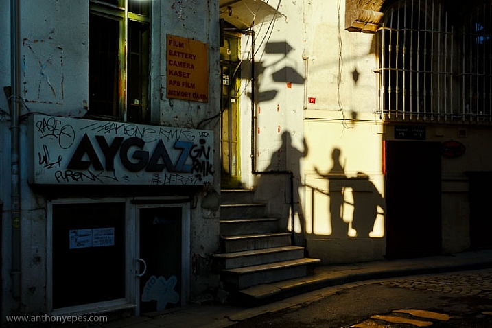
Greeting Shadows

I looked at this photo and thought – wow, I’ve framed the image of the shadows of the people with the surrounding dark shadow. It is doing what natural framing tells us to – which is use a frame to draw attention to the real subject of the photo, so I think it fits.

Use multiple frames within one image

I am a little bit obsessed with photographing things I find on the street. I love photographing very ordinary things – like chewing gum or lines on the road, disconnecting them from their wider context, and just playing with their shapes. This is also another way to help train you to practice breaking the world down into elements, so that you can then start to organize them in a more constructive way.

You can go further still by making the frame within your image just a part of the image, and not the whole thing. It could even be just a suggestion of a frame, like I did here.

natural-framing-tips--5

I love using very simple backgrounds with strong colours for my portraits. This is because firstly, I want the background to not distract from subject, so a simple background is usually best. The camera can’t easily recreate the layers that we see with our awesome 3D eyes. So if, for example, you put a subject in front of a crowd, you will get a flat image without depth.

Homeless World Cup Hasselblad Portraits

Plus, I like to have the colour and texture of the background really fit with the subject – maybe with their clothes, their posture, their expression, etc. This photo is a good example of my philosophy on this point.

Now back to framing! One key reason the photo above works is the added dimension of some framing. Yes, again not a totally traditional use of it, but you can see that the yellow arch shape and the blue strips either side are adding some great structure and form to the image. You’ve also got a sense of them confining the subject, which gives a nice balance to his strong, proud posture. That feeling of being confined is something you can do well with natural framing, and adds a curious feeling to the photo (since the posture of the subject is so proud and strong, you can’t imagine him being confined, right?).

Everything within your frame has a message

natural-framing-19

As the photographer, you need to make sure that everything you put in the frame is saying something that you want it to – that the elements are all working together to form the idea and feeling that you seek. If you don’t know what that’s supposed to be – just ask yourself:

  • What am I feeling here?
  • What is interesting to me in this scene?
  • Why is this important?

It’s these feelings that you will be communicating through your images, if you’ve done it well and created a strong photograph.

In the image below I framed the Shard, with buildings on the side and a fence along the bottom. There is a risk that it could all have blended in together, but that bright blue sky has created a natural space around the subject.

natural-framing-tips--1

If this is all feeling like a bit too much, don’t worry, as it all becomes instinctive after a while. As a final note, I like this thought from Henri Cartier-Bresson:

“You just have to live and life will give you pictures.”

It’s a great way to live.

I’d love to know what you think of natural framing – do you use this technique? What do you think of the examples I’ve given here? Have you been inspired to try this out if you’ve never used it before? If you have any photos you’d like to post here I’d love to see them.

googletag.cmd.push(function() {
tablet_slots.push( googletag.defineSlot( “/1005424/_dPSv4_tab-all-article-bottom_(300×250)”, [300, 250], “pb-ad-78623” ).addService( googletag.pubads() ) ); } );

googletag.cmd.push(function() {
mobile_slots.push( googletag.defineSlot( “/1005424/_dPSv4_mob-all-article-bottom_(300×250)”, [300, 250], “pb-ad-78158” ).addService( googletag.pubads() ) ); } );

The post Tips for Using Natural Framing to Improve Your Composition by Anthony Epes appeared first on Digital Photography School.


Digital Photography School

 
Comments Off on Tips for Using Natural Framing to Improve Your Composition

Posted in Photography


How to Use Lightroom to Learn Composition in Photography

06 Jul

If you want more Lightroom help from Viktor, get 50% OFF his Four Seasons Lightroom Preset Collection, on now at Snapdeals (only until July 19th, 2016)

When you start learning about photography, the whole process can be overwhelming with its complexity. But, when you break it down into smaller pieces that you can tackle one at a time, you quickly realize that photography isn’t rocket science at all. By then, it’s only a matter of time before you understand the whole picture, and are comfortable with the different aspects and techniques.

Images Composition in Lightroom 01

I still find one aspect of photography is more challenging than the rest, however. That is composition, which is difficult to learn and even more difficult to teach.

Why? The main reason is because of its subjective nature. It is not easy to quantify composition. In other words, there is no right or wrong; everything is open to interpretation. As a result, learning and mastering composition is usually a long and gradual process.

I want to share with you an exercise that you can perform using Lightroom, in the comfort of your home, that can accelerate the composition learning cycle. This approach was incredibly helpful in building my comfort with, and understanding of composition, in my photography. I hope you find it useful too.

Images Composition in Lightroom 02

The way I approach composition today is different, compared to my approach five years ago. The reason for that is because of new publishing channels.

As a photographer who runs a popular blog dedicated to travel photography, I have multiple channels where I publish my photographs. It all begins on the blog, then moves to social media networks like Facebook, Instagram, G+, and Pinterest. Plus, I often prepare an extra version for printing purposes as well.

Typically, different publishing channels require different versions of the same photograph. For example, if the original photograph has a landscape orientation with the aspect ratio of 3 x 2, Instagram requires a square 1 x 1 version, and Pinterest requires a vertically oriented image. I might need a panoramic version for print.

Even though creating multiple versions of the same photo with meaningful composition takes more time and effort, I find this exercise is extremely valuable in learning and mastering composition in photography.

Exercise in a Real Life Scenario

I took this photo just after the sunrise on O’ahu Island in Hawaii.

Images Composition in Lightroom 03

From the very beginning, I could see the potential of the scene and was confident that I would use it on my blog, and maybe even in my portfolio.

I intentionally took the shot of the scene wider than I would want for a regular 3 x 2 landscape composition. I left some room to have more freedom when creating different versions for publishing. I have no problem with cropping and trimming my photographs in post-processing, because 24 Mpx sensor on my Sony a6000 gives me enough pixels even for very aggressive cropping.

I started the editing process by applying few of my favorite presets from my Landscape collection, and when I was happy with the result I started working on composition.

Images Composition in Lightroom 4

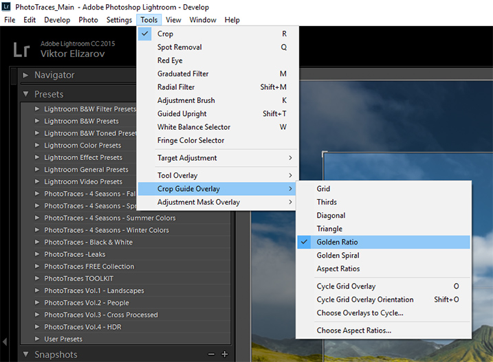
First, I set up the Crop tool Overlay options, setting it to Golden Ratio. I know that Thirds is the most popular option among visual guides, but I find that Golden Ratio helps me to create more balanced compositions.

Images Composition in Lightroom 05

You can also scroll through the various overlay options by repeatedly hitting the O key on your keyboard, until you find the one you want.

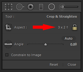
I set the aspect ratio to 2×3 and lock it.

Images Composition in Lightroom 06

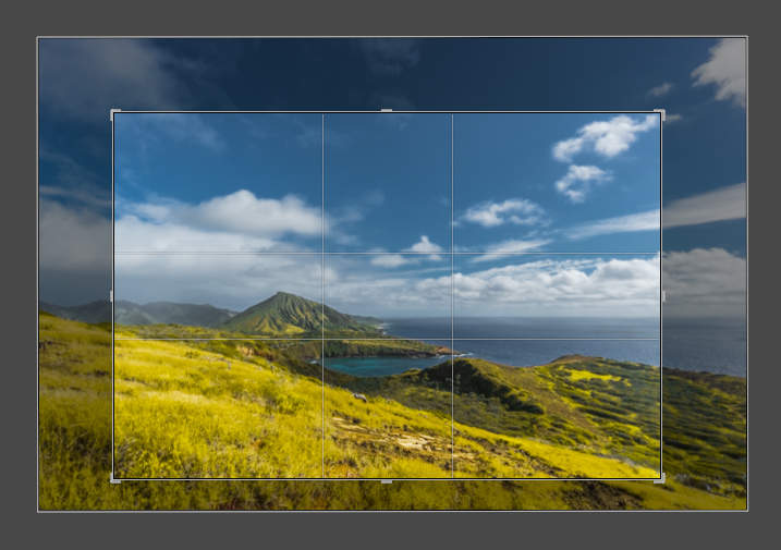
I create my first version by simply making the composition tighter.

Images Composition in Lightroom 07

Images Composition in Lightroom 09

Version 1 – Aspect Ratio 3 x 2

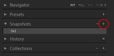
When I am happy with the result I use the Snapshot functionality of Lightroom to save my version as a new Snapshot, and name it 3 x 2.

Images Composition in Lightroom 08

Then, I move on to the next version.

Images Composition in Lightroom 10

Version 2 – Aspect Ratio 1 x 1 (Instagram)

Images Composition in Lightroom 11

Version 3 – Aspect Ratio 2 x 1

Images Composition in Lightroom 12

Version 4 – Aspect Ratio 4 x 3

Images Composition in Lightroom 13

Version 5 – Aspect Ratio 16 x 9

Images Composition in Lightroom 14

Version 5 – Aspect Ratio 3 x 4 (Pinterest)

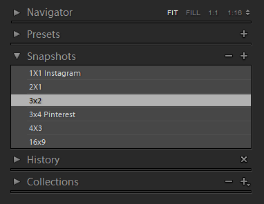
When I am done I have the Snapshot Panel filled with six newly saved versions (snapshots).

Images Composition in Lightroom 15

Another alternative is to use the Virtual Copy functionality for each version I create. bu I prefer the Snapshot panel, which makes Lightroom less cluttered.

Now, I can review each version by clicking on an individual Snapshot version, and if I am happy with the results, I am ready to start publishing.

Conclusion

The only way to learn composition in photography is to practice on a regular basis. I highly recommend the exercise I outlined above. Make a habit of creating at least two extra versions for each photograph you edit, one for Instagram and another for Pinterest. I can guarantee you it will help you to accelerate the process of learning.

If you want more Lightroom help from Viktor, get 50% OFF his Four Seasons Lightroom Preset Collection, on now at Snapdeals (only until July 19th, 2016)

googletag.cmd.push(function() {
tablet_slots.push( googletag.defineSlot( “/1005424/_dPSv4_tab-all-article-bottom_(300×250)”, [300, 250], “pb-ad-78623” ).addService( googletag.pubads() ) ); } );

googletag.cmd.push(function() {
mobile_slots.push( googletag.defineSlot( “/1005424/_dPSv4_mob-all-article-bottom_(300×250)”, [300, 250], “pb-ad-78158” ).addService( googletag.pubads() ) ); } );

The post How to Use Lightroom to Learn Composition in Photography by Viktor Elizarov appeared first on Digital Photography School.


Digital Photography School

 
Comments Off on How to Use Lightroom to Learn Composition in Photography

Posted in Photography


How to Improve Composition by Placing your Subject Off-Center

29 Jun

You may be wondering – shouldn’t you always place your subject or main point of interest off-center? Isn’t that what the rule of thirds is about? If so, I suggest you refer back to my earlier article about creating strong compositions with a centrally placed subject. It makes the point that it’s perfectly possible to create a well composed image with the subject placed centrally.

Central composition

Equally, there are times when you should place the main point of interest away from the center of the frame. Not necessarily on a third, but anywhere between the centre of the frame and the edge, centered neither vertically nor horizontally.

I firmly believe that you should never ask yourself whether you should place the main subject or focal point on a third when you take a photo. There are much better questions to ask, such as:

  • Is there enough space around the subject to give it room to breathe?
  • Are there any highlights near the edge of the frame that take the viewer’s eye out of the photo?
  • How does the viewer’s eye move through the photo? This question may be partly answered during post-processing, where you can darken or lighten parts of the image to guide the viewer’s eye.
  • How do I make this photo as interesting as possible?

The answers to these questions influence the decisions you make in composition, and help you decide where to place the main point of interest. Let’s look at some examples.

Examples of off-centered compositions

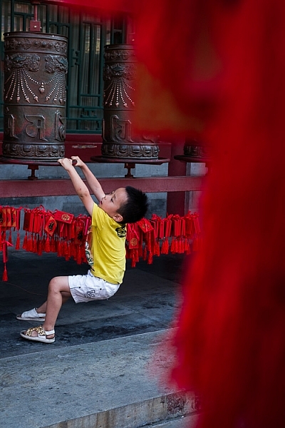
I took the following photo in a historical building in Beijing called Prince Gong’s mansion. There was a courtyard inside, with Tibetan prayer wheels down one side. As people walked into the courtyard, most of them walked down past the prayer wheels, spinning them as they went. This boy decided to join in the fun.

Composition and placement

I placed him off-center because was shooting through some red tags (like the ones you see behind the boy) hanging from another structure. I used an aperture of f/5 to make sure the tags were out of focus. They create a frame that adds a sense of depth, and also pushes the eye towards the boy. It helps that his yellow T-shirt contrasts with the surrounding red hues.

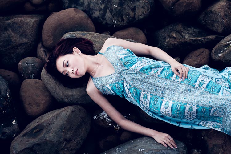
The next image was taken in New Zealand. I found these beautiful stones by the sea, and asked my model Ashley to lay down on them.

Composition and placement

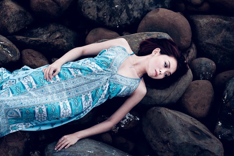
I liked the way the blue dress contrasted against the more subdued colors of the rocks. I framed the photo so that Ashley’s body formed a diagonal that takes the viewer’s eye from the right side of the photo, to the left. Her face, which is the main focal point of the image, had to be placed off-centre. If it was central there would be lots of empty space on the left-hand side of the image, and it would be unbalanced.

Incidentally, there is an idea that it is better to compose photos to work with the natural tendency to read a page from left to right. As this photo does the opposite and takes the eye from the right of the frame to the left, I flipped it so that you can see the difference.

Composition and placement

Which version of the photo do you think works best? If you have an opinion please let me know in the comments below. I know which version I think is better, but I’d be interested to hear it from people seeing the photo with fresh eyes.

The next photo was taken in the Great Mosque in Xi’an, China. The boy was trying to catch the cat, and I took a photo as he ran after it.

Composition and placement

The boy is the focal point of the image, and because he is moving from left to right in the frame he needs some space to move into – the empty space on the right of the frame provides this. If the boy was centered in the frame there would be too much space on his left.

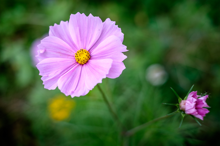
The next photo, a close-up of a flower, is interesting because it has two focal points.

Composition and placement

The main focal point is provided by the open flower on the left. But the closed flower on the right is a second focal point that also pulls the eye. The result is that the viewer’s eye moves back and forth between the two points. When you have two focal points in a photo like this, it makes sense for them to be on opposite sides of the frame, and therefore off-centre, so that they fill the frame adequately.

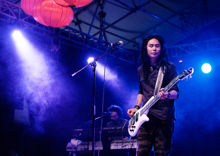
I took the next photo at a concert in Auckland, New Zealand.

Composition and placement

I placed the guitarist off-centre so that I could show him in context. Behind him you have another band member on the keyboard, and three spotlights. You can also see some Chinese lanterns (this photo was taken at the Chinese Lantern Festival in Auckland). The lights also provide leading lines to draw the viewer’s eye to the guitarist.

For the next photo we return to Beijing, this time to the Forbidden City.

Composition and placement

I was sitting on a bench resting, when I realized that the doors and pillars you see in the photo lined up nicely when viewed through my 35mm lens. I waited, and took photos as people passed through, hoping to get a good image. Until finally the little boy you see in this image walked through the doorway and hid. A few seconds later he jumped out to surprise someone – as a man, presumably his father, walked through the doorway.

The boy is so small in the frame that you may not have noticed him right away. It is good for photos to contain surprises like this, as a kind of reward for the viewer when they finally spot it.

The colors in this photo also harmonize well. The yellow of the boys’ shorts echoes the yellow around the door frame, and the yellow tiles on the pillars. This is purely luck, but it’s the kind of luck that presents itself when you are present with your camera.

What do you think? What factors do you consider when deciding where to place the main focal points? Let me know in the comments.


Mastering Composition

If you’d like to learn more about composition then please check out my ebook Mastering Composition: A Photographer’s Guide to Seeing.

googletag.cmd.push(function() {
tablet_slots.push( googletag.defineSlot( “/1005424/_dPSv4_tab-all-article-bottom_(300×250)”, [300, 250], “pb-ad-78623” ).addService( googletag.pubads() ) ); } );

googletag.cmd.push(function() {
mobile_slots.push( googletag.defineSlot( “/1005424/_dPSv4_mob-all-article-bottom_(300×250)”, [300, 250], “pb-ad-78158” ).addService( googletag.pubads() ) ); } );

The post How to Improve Composition by Placing your Subject Off-Center by Andrew S. Gibson appeared first on Digital Photography School.


Digital Photography School

 
Comments Off on How to Improve Composition by Placing your Subject Off-Center

Posted in Photography


How to Create a Strong Composition by Centring the Subject

24 Jun

Central composition

I’m a strong believer that there are no rules when it comes to composition in photography, only guidelines. The rule of thirds is misnamed (but guideline of thirds is not nearly so catchy), and while it is helpful for newcomers to photography realize that you can often improve composition by placing the subject off-centre, it is not a rule.

The rule of thirds, and other similar guidelines that you may read about (golden section, golden triangle, Fibonacci sequence, etc.) are really about placement. The question you are looking to get answered is, where in the frame should the main subject be placed? Secondary questions are how large should the subject be in the frame, and how does it relate to other elements that may be included?

In simplistic terms: sometimes the best place for the subject is in the centre of the frame, and sometimes it is not. In this article we’re going to look at some examples where the subject is centred, and talk about how that central placement actually makes the image stronger, not weaker.

Central composition

In the photo above I placed the girl in the centre of the frame (horizontally) because that was the best way to include the metal statue she was sitting on. If I moved the camera to the left (to place her on a third) then the statue’s head would be cut off. If I moved the camera right then there would be an empty space to the right of the statue’s head.

Here, the question of whether or not to place the subject (the girl) on a third, is the wrong question to ask. A better question is – What’s the best way to include everything that needs to be in the frame, and nothing more? Different question, and a different thought process.

The image also shows a strong use of tonal and color contrast. The girl’s white clothing contrasts against the surrounding dark tones, pulling the viewer’s eye to her. The eye also moves between the girl and the pink umbrella lying on the ground. The pink tones (umbrella, shoes, wristband, hair ribbon) stand out because the rest of the scene is fairly monochromatic.

Central composition

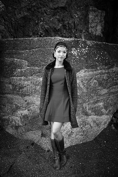
The photo above is interesting because it utilizes symmetry. I asked the model to stand at the corner of concrete structure, built into the base of the cliff. The sides of the walls, the textured pattern on them, even the way the pebbles lie against the base of the walls all mirror each other. She is placed in the centre of the frame (horizontally) so she doesn’t break the symmetry of the background. The model, however, is not symmetrical. I asked her to put her weight on one foot, creating an S-curve with her body, to break the symmetry created by the background.

Consider also the size of the subject within the frame. If I had placed her on a third by moving the camera to the right or the left, I would have both broken the symmetry and been left with a large area of empty space. This can work when there is something interesting in that space, but it doesn’t always, and should be considered when deciding where to place the subject.

Central composition

In this portrait you can see that the model’s sharp eye, is right in the centre of the frame. There’s a good reason for that – I took the photo with an EOS 5D Mark II, which has just one cross-type autofocus (AF) point in the centre of the frame. When you are using wide apertures, as I was in this case (f/2.5), it’s essential to use a cross-type autofocus point, as it’s the most accurate. One of the weaknesses of this camera is that it forced me to base my composition of portraits around its central AF point.

That’s the practical reason for using a central composition, but the portrait works. I moved in close so there wasn’t much empty space in the photo, The central composition takes the viewer’s eye to her face, eyes and hair, which are the important parts of the image. If I had moved back a little and placed her face on a third, then there would be a lot more empty space around her, and less emphasis on her features.

Central composition

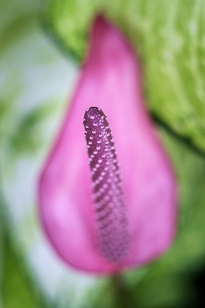
This close-up photo of a flower (above) is another example of using a central composition for impact. I focused on the flower’s stamen and let the petals go out of focus. Visually, you can divide the photo into three. At the centre there’s the stamen, which is the sharp part of the image. Around that is the petal of the flower, and around that the green leaves. If I moved the camera further away and placed the flower on a third, rather than the centre, then it would lose impact and be a completely different photo.

Central composition

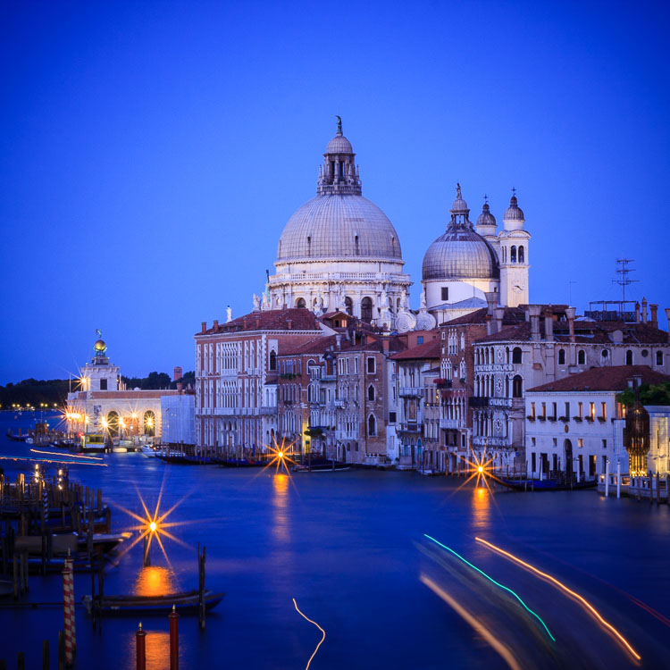
The final example uses the square format. You’ll see central compositions in the square format, far more than you will with a rectangular aspect ratio, because the square format lends itself to strong, graphic compositions that utilize shape.

In this example the domes of the Venetian church (centered horizontally) are the strongest shapes, and the focal point of the image. It helps that the lines formed by moving boats from the bottom right of the frame pull the eye towards the church in the distance.

What do you think? Are there times when you use central composition or do you prefer to place the subject off-centre? Let us know in the comments below.


Mastering Composition

If you’d like to learn more about composition then please check out my ebook Mastering Composition: A Photographer’s Guide to Seeing.

googletag.cmd.push(function() {
tablet_slots.push( googletag.defineSlot( “/1005424/_dPSv4_tab-all-article-bottom_(300×250)”, [300, 250], “pb-ad-78623” ).addService( googletag.pubads() ) ); } );

googletag.cmd.push(function() {
mobile_slots.push( googletag.defineSlot( “/1005424/_dPSv4_mob-all-article-bottom_(300×250)”, [300, 250], “pb-ad-78158” ).addService( googletag.pubads() ) ); } );

The post How to Create a Strong Composition by Centring the Subject by Andrew S. Gibson appeared first on Digital Photography School.


Digital Photography School

 
Comments Off on How to Create a Strong Composition by Centring the Subject

Posted in Photography


Photo Composition Tips from Bob Holmes – Composition in Travel Photos

23 May

Who better to get photo composition tips from than four-time Travel Photographer of the Year award-winner, Bob Holmes? He shares some techniques you can use to work with composition and take better photos, no matter where your travels may take you.

Havana 012016 1314 Thumb dPS

Bob has been all over the world, and his travel photos have appeared in National Geographic, Departures, and 46 books as the sole photographer. Working outdoors on most of his trips, Holmes is an expert at using natural lighting in photos.

He loves looking for composition that grabs you, and his unique tip is that you need to “get in the zone” and be fully responsible for everything in the frame. The key to learning composition is to practice – you can’t become a great photographer in a week, but you will get there by shooting as much as you can.

Bob Holmes dPS

Watch this video interview I did with Bob Holmes, then look below the video for more helpful resources.

Check out these dPS resources for more info:

  • LIFE IN NATURAL LIGHT- The Ultimate Guide to a photographer’s most powerful tool
  • NATURAL LIGHT – Mastering a Photographer’s Most Powerful Tool
  • TRANSCENDING TRAVEL – A guide to captivating travel photography

googletag.cmd.push(function() {
tablet_slots.push( googletag.defineSlot( “/1005424/_dPSv4_tab-all-article-bottom_(300×250)”, [300, 250], “pb-ad-78623” ).addService( googletag.pubads() ) ); } );

googletag.cmd.push(function() {
mobile_slots.push( googletag.defineSlot( “/1005424/_dPSv4_mob-all-article-bottom_(300×250)”, [300, 250], “pb-ad-78158” ).addService( googletag.pubads() ) ); } );

The post Photo Composition Tips from Bob Holmes – Composition in Travel Photos by Marc Silber appeared first on Digital Photography School.


Digital Photography School

 
Comments Off on Photo Composition Tips from Bob Holmes – Composition in Travel Photos

Posted in Photography


10 Ideas to Instantly Improve Your Photography Composition

14 Apr

It is an illusion that photos are made with the camera; they are made with the eye, heart and head. – Henri Cartier-Bresson

My photography training took place back in the early 90s, at an intense technical photo school in California. I love tech in all forms, and I love reading my camera manual. I love the precision and procedure of processing my own colour film, and I love learning the ever-advancing skills on photo software – I am a total tech nerd. But technical knowledge will only get you so far; it’s really the second part of the story in photography. Photography composition is the first part.
EPESTENIDEASDPS 01

The first part is your vision of what you want your photography to be, and learning the ability to compose compelling images. Your technical knowledge will only give you the ability to execute your vision, and make the most of the composition that you have created. It can’t replace the ability to see and to compose stunning compositions.

So all things should flow from a good composition. And when we are learning about composition I like to keep in mind that quote that may or may not have been spoken by Picasso (it’s under dispute on the internet): “Learn the rules like a pro and break them like an artist.” Rules, guidelines, ideas about composition will give you a place to start, help develop your skills and propel you out of a rut. But they should not be followed slavishly or forever.

Here are my ideas on what you can do to make your compositions more captivating. But, bear in mind that creating totally unique compositions comes down to creating your own style . So don’t be swayed too much by other photographers’ advice on this subject. Photography is an examination of the world through your eyes, it’s totally subjective, totally about connecting with what inspires and excites you. Just pick up ideas that make sense and motivate you.
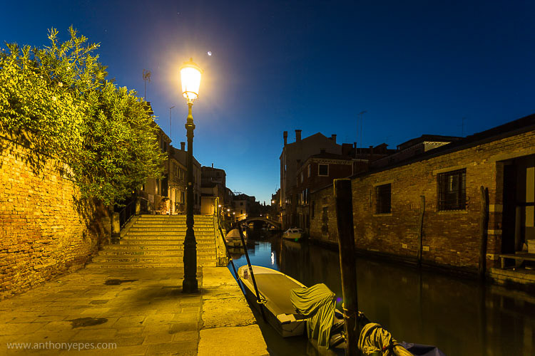
EPESTENIDEASDPS 02

To practice, pick one concept from below that jumps out. Don’t take all these ideas and try to incorporate them into your photography all at once. Pick one and really embrace it – then the results will come.

So here are my 10 favourite tips on how you can instantly improve your composition.

1. Light

“Light makes photography. Embrace light. Admire it. Love it. But above all, know light. Know it for all you are worth, and you will know the key to photography.” George Eastman

For me more than anything, photography is about light, and learning to identify interesting light is one of the best skills to learn. Light that is doing something interesting, or is beautiful or colourful; will take a good subject and turn it into something completely amazing.

Light is my starting point when I am taking photos. It is the thing I consider first, and what affects me the most when deciding what to photograph. Look for light doing strange and wonderful things – creating long shadows, diffused light falling over a broken wall, reflecting, creating bursts of colour. Look for the colour of light, too: the cool blue light before dawn, the cold, almost transparent light of a winter’s afternoon, the rich orange light of near twilight – and how that affects your subject. Think always: how can I get the best out of the light that I am photographing?
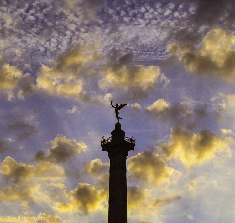
EPESTENIDEASDPS 03

In the photograph above, the beautiful light is obvious. I have used the silhouette of the column, to contrast the dappled light which is illuminating the clouds beautifully. This contrast makes the light look spectacular because it’s showing off its range of colours and depth against the heavy dark column.

Learning to notice light in all its forms and colours is an excellent way to improve your compositions.

When you see a subject you wish to photograph, look at the light around it. If it’s not interesting light – if it’s flat, boring, or draining the sense of colour – have a look at what else is happening with the weather. Maybe you can wait for clouds to pass, come back later or earlier in the day, see if you can organize the composition to incorporate light from other sources. It doesn’t have to be natural light. Artificial light, and particularly the play of natural and artificial light, can make an inspirational combination.

Here’s another photo where the main subject is the light, but this one is more subtle. The absence of light is most pronounced in this shot, and then all of sudden the glow of dawn light is reflected in the windows. Again, there is a contrast of darkness against light.
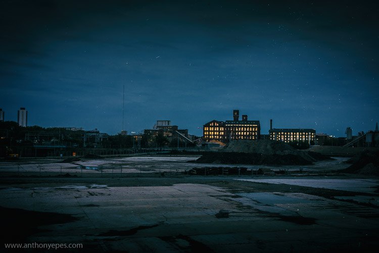
EPESTENIDEASDPS 04

There is lots of negative space in this photo, an overload of industrial blandness, wastelands. And then these two buildings and the sudden glow of the charming light.

2. Simplicity: think in threes

“The ability to simplify means to eliminate the unnecessary so that the necessary may speak.” Hans Hofmann

Simplicity is often very hard to accomplish, and can be more challenging than more complex compositions. I find there can be a misunderstanding about how to achieve simplicity in your photos. People often think it’s about taking a photo of one subject. But actually I rarely take photos which contain only one subject. Usually there has to be one subject with at least one, but usually, two supporting elements. So I like to say – think in threes.

Humans love to think in threes – (breakfast, lunch, dinner; past, present, future; and small, medium, large). We like to find rhythms and patterns in everything.
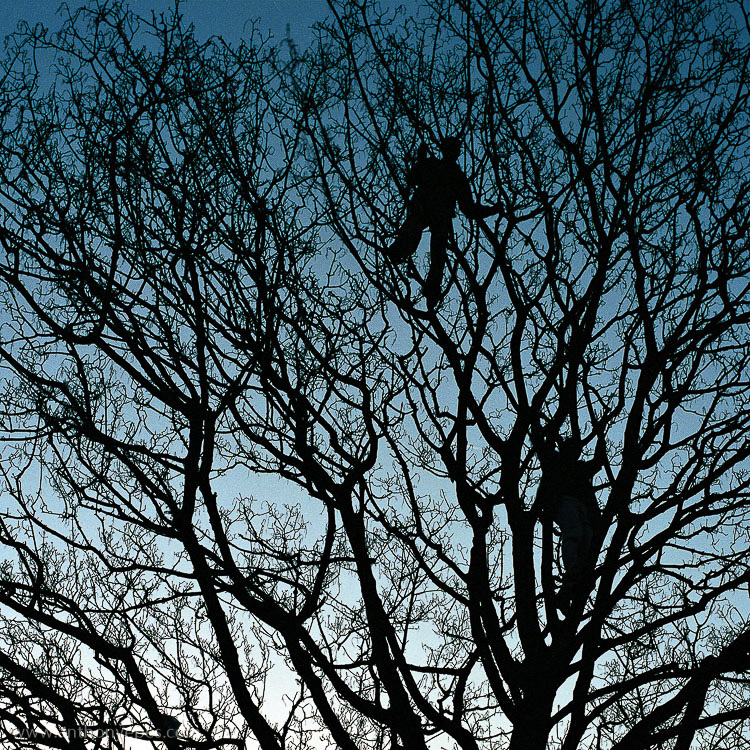
EPESTENIDEASDPS 05

This photo above is a very good example. How many elements make up this photo? Well, first you have the beautiful blue gradated sky, then the wild, chaotic pattern of the bare branches. That’s all very nice, but it’s the third element that is the subject, and that really makes the photo – the two men blending into the branches, while creating distinct human shapes. The photo without any one of the elements wouldn’t be as interesting.

I am a particular fan of very simple compositions when photographing people and I often use plain and colourful backgrounds. In the photo below, again there are three strong elements: bright pastel colours, the two guys and the strong lines.
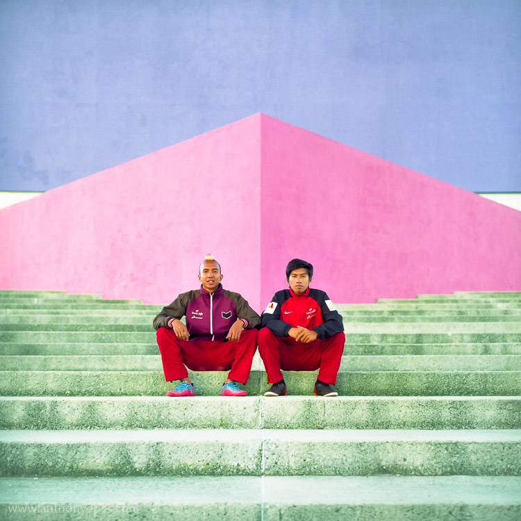
EPESTENIDEASDPS 06

It also works when photographing pigeons! Another photo with three elements: the grey, slightly dishevelled pigeon, the wash of colour, and the texture and lines of the wet paving stones.
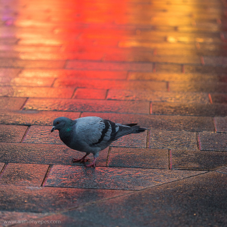
EPESTENIDEASDPS 07

3. Move your feet

When you are looking at a professional photographer’s work, one thing that they do more than an amateur photographer is move. You may have a killer shot laid out before you, but you still have to find the killer angle that will make the shot really special. Every shot has a perfect angle, and it’s your job to find it. If you are shooting a subject you love and then look at your images and are disappointed with what you find, I guarantee it’s because you haven’t found the perfect angle.

Get up on that roof, lie on the floor, move your feet around until what you see in frame is the best possible angle, the best possible position you can manoeuvre yourself into. Get dirty if you have to. This requires patience (and good knees), and patience is one thing I think most amateur photographers need to develop more of.
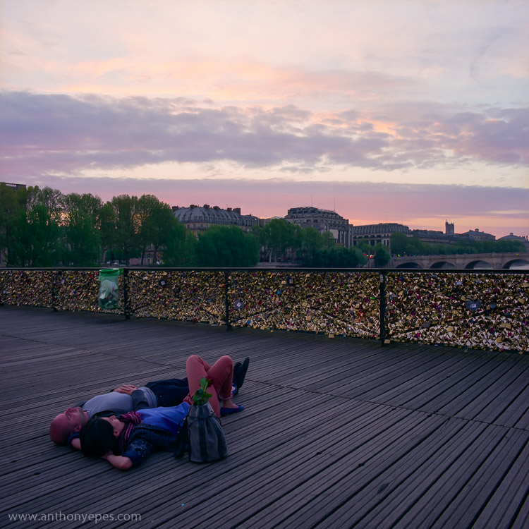
EPESTENIDEASDPS 08

There is one particular culprit in our kit that discourages us to move, and makes many of us lazy – a zoom lens. This should NEVER be a replacement for moving around a scene and finding the best angle. Do not fall into the trap that just because you have the subject in frame you can just zoom in to get it. Compose your best possible shot in frame, zooming in only if it’s totally the right thing to do , and not as a default option for moving. My best advice for zooming is pick a focal length, then move your feet and find the angle you need.

4. Get closer

Robert Capa said – “If your pictures aren’t good enough, you are not close enough.”

This concept reminds me of when I once read about a famous chef, who believes that the difference between home cooks and professionals is that home cooks are afraid of heat, and don’t turn their gas hobs up high enough. It’s the same with photography – obviously!

EPESTENIDEASDPS 09

If you feel yourself not wanting to get closer, then this is definitely an idea you should explore. You will almost be able to notice in your images that barrier of fear you set up of getting closer because there will be a distance to your subject. Push through that fear, and your images will benefit from more intimate images. The iconic travel photographer Steve McCurry always photographs subjects within a few feet of himself. For him that is the distance that feels most intimate. That is his style.

Take a deep breathe, hold your fear in check, and just get closer. Investigate as though nothing is holding you back.

5. Build your photo

When I am out wandering around looking for things to shoot, I am looking for elements that I can combine. Often it starts with one thing; it could be anything – an odd looking person, a beautiful shaft of light, a piece of amazing graffiti on a pockmarked concrete wall. If one thing strikes me, I start to look around to find something else to build on that first element to make it more interesting.
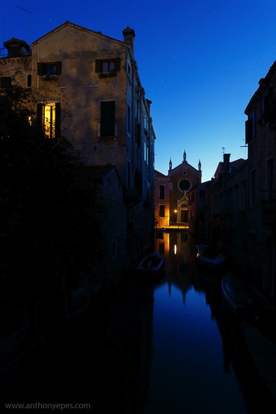
EPESTENIDEASDPS 10

In this photo above I think you’ll agree that if you took away the light in the window you’d have a perfectly lovely shot. But that light is what makes it work. It’s that additional element, creating another layer of depth, and providing an echo almost of the church light of the same colour. I passed this spot on many mornings and often took this particular shot, but one morning the window light was on and it changed it from a beautiful scene into a great image.

6. Look behind you

I shoot in places where I often find myself surrounded by other photographers – the Eiffel Tower at Dawn, sunset on Westminster Bridge – and it continuously stuns me that almost every (or even every) photographer will be pointing the same way and shooting the same thing. Now of course a purple pink sunset over the Houses of Parliament is gorgeous – but that light will also be doing incredible things to everything around you. So, while everyone is going nuts at the obvious, do something different – turn around, walk down that alley way, do what everyone else is not doing.

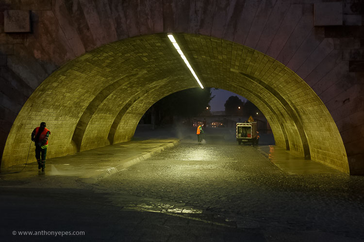
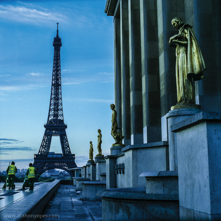
When I was in Paris I was intimidated about shooting the city. It’s the most visited city on earth (hence the most photographed). It is a small city and much of what’s amazing to photograph has been shot to death. I wanted to shoot the Eiffel Tower differently. Here is one shot I liked. You’ve got opulent gold, beautiful dawn sky, the iconic Eiffel Tower – all pretty so far – but then you have this injection of something that most photographers would have avoided – the cleaners.

Have the patience to explore other angles.
EPESTENIDEASDPS 11

The streets cleaners are a vivid contrast against the opulent gold, and while I kept the iconic Eiffel Tower in the shot, it’s really only as a background. Paris is obsessed with tidying itself, so this is also a nice little comment on the city.

7. Simplify your kit (and get really familiar with it)

I think most people generally have too much kit. If you have a lot and you don’t use it daily or even weekly, you’re not going to have that intimate knowledge of how it responds to situations and subjects. Try reducing to just one lens for a while and really get to know it.

When you have a lens that you know exactly what it will do in every situation, you’ll be able to execute even more interesting compositions, as you aren’t leaving things to chance. Chance is something that professional photographers will go out of their way to avoid.

8. Find beauty in the mundane

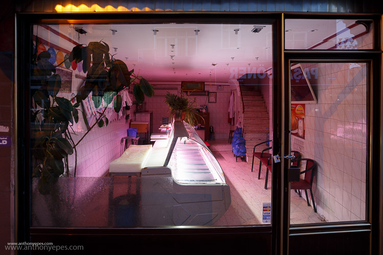
It’s easy to get a spectacular shot when you have a spectacular subject. But to make simple, boring, or mundane things look interesting – now that’s a challenge! But it’s a challenge I invite you to take up, because it’s an amazing way to train your eye to reveal the beauty of any subject.

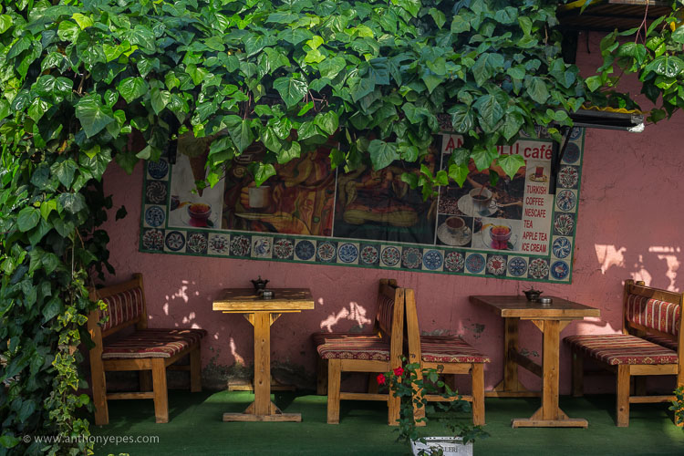
This for me is a good example. There are three things that are interesting in this photo (can you guess?) You have the bold colours, and then a little bit of light falling on the wall to create a contrast, and the lines. Now if light was falling on the whole wall, or if there was no light at all, the photo would be totally boring. But can you see how just three simple elements working together can make a photo?

EPESTENIDEASDPS 12

And as I am obsessed with colour and light, I admire this shot.
EPESTENIDEASDPS 13

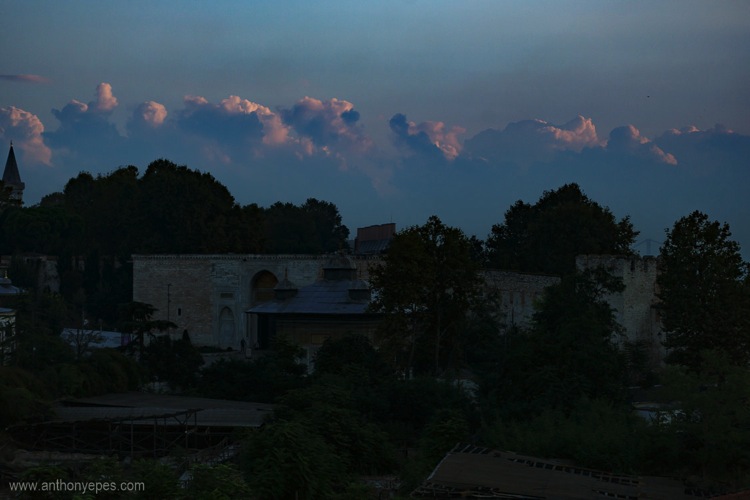
It’s part of a longer story I am working on in Istanbul at dawn, but to me it shows that there is no subject that isn’t worthy of attention from your camera.

9. Pre-visualize

I love my digital camera, but I also still use film, and now that I’m mainly digital I appreciate the discipline and grounding I received from training in film. I use these skills to help me now.

One super important skill that will really help your compositions is pre-visualizing. It’s a skill you had to have when you shot film, because otherwise you were just shooting randomly.

Pre-visualizing is, “the ability to anticipate a finished image before making the exposure” (Ansel Adams said that, not me). What I love about this, is that it’s about creating space between seeing a shot, and taking it. It’s about being prepared, thinking through what you want to capture, looking at all of the elements of light, positioning, etc., and then picturing in your mind what the final image will look like. For example, imagine your final output was a print. Imagine the print in your hands. What would it look like? If you can see it clearly then your are pre-visualizing. If not, then keep working at it until you see the image in your head. When you have a solid picture in mind, take the shot.
EPESTENIDEASDPS 14

You can also use pre-visualization when you think about timing. A lot of landscape photography is really about waiting around for the perfect moment, that great light. Here is one situation (above) where I knew the scene had potential, but was pretty flat, and if nothing else happened it wouldn’t be interesting. So, I waited for the sun to rise just that little bit more and ping, the clouds were filled with pink light giving the photo more depth.

10. Look for patterns
EPESTENIDEASDPS 15

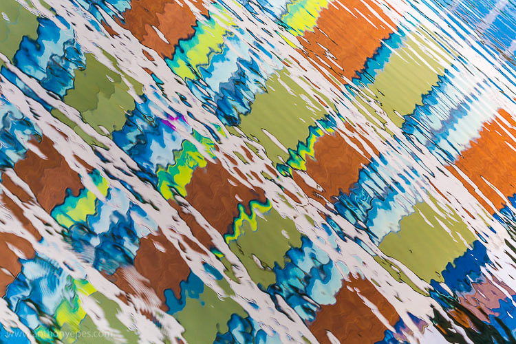
Patterns come in many forms, and are extremely pleasing to the eye. A pattern is anything that is repetitive, that turns your subject from its innate quality, into something more abstract. So people will look and respond more to the pattern and shape that it makes, and less to the subject itself.

“Whatever emotional response a single design element arouses is multiplied when it is repeated in a pattern.” – Bryan Peterson

Patterns are particularly effective when you fill the frame with your subject, and totally cut off the rest of it. These are particularly interesting to look at.
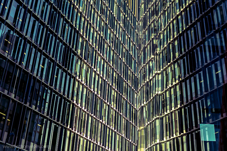
EPESTENIDEASDPS 16

Another way to create patterns is reflections. I love playing with reflections. Anywhere you have a bit of water, even just rain on the street, or shiny surfaces, you have the ability to play with reflections.
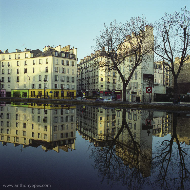
EPESTENIDEASDPS 17

Once you start looking out for patterns you’ll start seeing them everywhere.

Time to practice

I’d love to know what you think of these ideas, and if you put any into practice. Which compositional techniques do you use to enhance your photos?

googletag.cmd.push(function() {
tablet_slots.push( googletag.defineSlot( “/1005424/_dPSv4_tab-all-article-bottom_(300×250)”, [300, 250], “pb-ad-78623” ).addService( googletag.pubads() ) ); } );

googletag.cmd.push(function() {
mobile_slots.push( googletag.defineSlot( “/1005424/_dPSv4_mob-all-article-bottom_(300×250)”, [300, 250], “pb-ad-78158” ).addService( googletag.pubads() ) ); } );

The post 10 Ideas to Instantly Improve Your Photography Composition by Anthony Epes appeared first on Digital Photography School.


Digital Photography School
 
Comments Off on 10 Ideas to Instantly Improve Your Photography Composition

Posted in Photography