The world is filled with photographs. I did a bit of research and found the following statistic. Researchers estimate that the average individual is now exposed to approximately 250 different images per day. It’s no secret that we are now inundated with visual stimulus. Everyone owns a camera and everyone is shooting images. In 1857 Francis Frith took photographs of the pyramids and the Sphinx. The general public was mesmerized by images of a faraway and exotic location. Today, if I search “Images of the Pyramids” I get 7 million results; everyone knows what the pyramids look like. This whole phenomenon translates into a challenge for photographers. How do you shoot something different and unique when the world uploads 1.8 billion photographs a day?
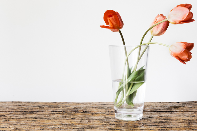
There is no easy answer. I don’t know how many times I have heard someone say, “That’s a beautiful image of the shoreline. You are a really great photographer but take a look at this. I shot the same thing last year on vacation.” Some photographers may become frustrated with this occurrence, but perhaps we should look upon this as a challenge. What can you do to make your photographs more unique?
Live on the edge – of composition
We all want people to view our images and say, “That’s amazing! I’ve never seen that before!” It’s going to be tough but it’s worth a try. It’s time to push your composition skills to their limits. Consider using techniques or viewpoints that are a little unconventional. Try pushing the main subject of your composition towards the edge of your frame. Let’s consider this photograph of a kayaker.
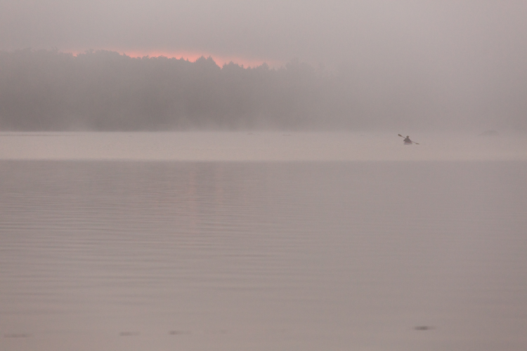
In this version, the image is composed using the rule of thirds. The scene has a pretty unique atmosphere as the sun struggles to break through the morning mist. Shouldn’t that be enough to make the viewer stop and take notice? It’s a beautiful image and it was a fantastic morning. I know people will love this image. But what if it was recomposed to push the kayaker to the edge of the frame? Does this make the image even more appealing? Consider the difference.

This second image is cropped way down to illustrate a point. What did you look at first? Hopefully, your answer is the red light on the left of the frame and then your eye moved over the image to discover the kayaker. This technique is called “the delay” which means that the viewer is delayed by other details before focusing on the main subject. This means that the viewer notices the details in a much slower and more deliberate manner. You might even create the emotion of surprise when your viewer discovers the full extent of your composition. That’s a good thing. Creating emotions within the viewer ensures they will remember your image.
When the rule of thirds is not the best choice
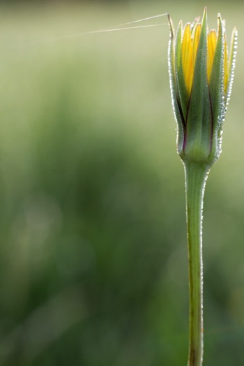
Let’s take a look at another image. In this case the main subject, the flower bud, has been pushed right to the edge of the frame.
 |
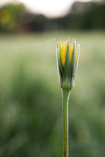 |
By placing the main subject closer to the edge of the frame you can create more tension within your image (above left). The image is certainly more dynamic and interesting than this conventional version which focuses on placing the flower bud along the rule of thirds (above right).
In this shot of the boxer and his trainer I was disappointed and considered it a failure because it didn’t follow any of the rules of composition. The autofocus locked onto the training gloves, not the boxer. But after consultation with the magazine editor, he decided to use it because the angle was so unique. The composition told the story in a different way. Notice the trainer’s nose is just in view in the top corner. The editor loved that element and it sealed his choice.
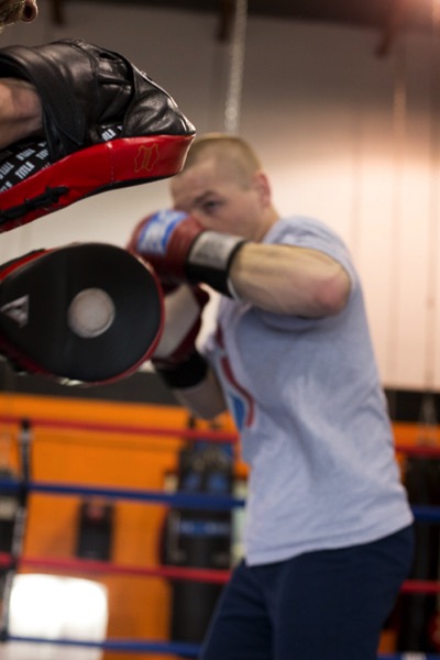
Sometimes you will be surprised by what works.
Finding the right balance
Of course, there are times when this technique doesn’t work and the resulting image just feels unbalanced and awkward. This image of a decaying pier in Lake Huron is a good example of when placing the subject close to the edge unbalances the shot.

There’s just too much visual weight placed on the right side of the frame and the image is not successful. But that’s okay because at least something was learned about the importance of creating visual balance when pushing the subject matter to the very edge of the frame. Try to balance the weight of the object along the edge with the visual weight of the rest of the space.
Conclusions
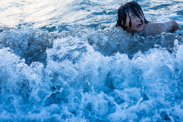
However, you choose to compose your images the challenge will always be to create something unique that stands out from the crowd. The reality is the crowd of images is only going to get bigger.
Are you up to the challenge? Are you willing to continue experimenting with the methods you use for composing your images? I say push things a little further each time you take a photograph and experiment with how you can use the edge of the image to create interest in your work.
Please share your compose on the edge images and thoughts in the comments below.
googletag.cmd.push(function() {
tablet_slots.push( googletag.defineSlot( “/1005424/_dPSv4_tab-all-article-bottom_(300×250)”, [300, 250], “pb-ad-78623” ).addService( googletag.pubads() ) ); } );
googletag.cmd.push(function() {
mobile_slots.push( googletag.defineSlot( “/1005424/_dPSv4_mob-all-article-bottom_(300×250)”, [300, 250], “pb-ad-78158” ).addService( googletag.pubads() ) ); } );
The post Pushing your Composition to the Edge by Erin Fitzgibbon appeared first on Digital Photography School.