RSS
 

Posts Tagged ‘campaign’

Apple emphasizes iPhone 7 low light capabilities in “One Night” ad campaign

02 Feb

$ (document).ready(function() { SampleGalleryV2({“containerId”:”embeddedSampleGallery_7980537670″,”galleryId”:”7980537670″,”isEmbeddedWidget”:true,”standalone”:false,”selectedImageIndex”:0,”startInCommentsView”:false,”isMobile”:false}) });

Apple’s ‘Shot on iPhone’ ads have been a familiar sight on billboards and on TV for quite some time now. For the latest round of advertising Apple is now focusing on the iPhone 7’s low light capabilities. The campaign’s title is ‘One Night,’ because all images were taken by a group of photographers around the world on the night of November 5th, 2016.

The group captured life around them from dusk to dawn, only using the iPhone’s camera. Like most smartphone cameras, with its small image sensor the mobile device has a distinct disadvantage compared to DSLRs and other system cameras in low light, but with its fast F1.8 aperture, improved optical image stabilization and a clever multi-frame mode, it’s a step into the right direction and a noticeable improvement over the previous iPhone 6 generation. 

You can read and view the samples in our own comprehensive review of the iPhone 7 Plus or view a selection of the campaign images in full size in our gallery above. 

Articles: Digital Photography Review (dpreview.com)

 
Comments Off on Apple emphasizes iPhone 7 low light capabilities in “One Night” ad campaign

Posted in Uncategorized


Steadicam launches Kickstarter campaign for motorized smartphone stabilization rig

08 Jan

Camera stabilization system manufacturer Steadicam is hoping to introduce a new motorized rig for smartphone videographers called the Steadicam Volt. The new device is designed to accept a wide range of smartphones via an adjustable clamp and weights, and uses a battery-powered gyro that offers modes for shooting sport and for movie-making. The company says the rechargeable lithium-ion battery has a life of eight hours, and that the rig can still be used in manual mode when the battery is flat.

The Volt folds for storage, and offers Bluetooth and USB connectivity for updates and for working with the app that lets the device know which phone is in use. The company intends to fund the development of the Volt via a Kickstarter campaign and is seeking $ 100,000 to start production.

The Steadicam Volt has a projected retail price of $ 200, but early pledgers can reserve one for $ 119. If the campaign is successful the company says it will begin shipping in June.
For more information see the Steadicam website and the Steadicam Volt Kickstarter page.

Press Release

STEADICAM VOLT; 3- AXIS MOTORIZED SMARTPHONE CAMERA STABILIZER

Steadicam, a division of The Tiffen Company, will soon be releasing the Steadicam Volt, a 3-axis motorized smartphone camera stabilizer. As the first in its class to offer the user complete control of image framing and composition, the Volt serves as a versatile tool for content creation, easily operated by a wide range of users. With the Steadicam Volt, consumers will have the opportunity to capture outstanding Steadicam quality video right from their smartphone.

Product Benefits:
• Lightweight and folding design enable easy storage and transportation
• Accompanying iOS APP allows for precise balance and tuning
• Haptic control utilizes Simulated Inertia™ Dual operating modes for beginners and experienced users
• Uses long life rechargeable Lithium Ion batteries
• Accommodates phone sizes with or without case from 100 – 200g in weight and 58 to 80mm wide
• Bluetooth enabled
Engineered to provide the utmost precision and control, the Steadicam Volt will enable smartphone users to capture high quality video content with ease.
Additionally, the simulated feeling of inertia on the pan axis will improve the overall handing of the gimbal, giving users the stability they need to film with remarkable precision.

Articles: Digital Photography Review (dpreview.com)

 
Comments Off on Steadicam launches Kickstarter campaign for motorized smartphone stabilization rig

Posted in Uncategorized


Concept To Creation: Editorial Versus Campaign

18 Jul

Editorial vs. Campaign


Hey FashionPhotographyBlog.com readers.


Thanks for joining us on our “Concept to Creation” series where we walk you through the process of taking an idea into an image. If you were here with us last time, we investigated examples of how working fashion photographers in the industry turn their inspirations into a concepts.


Concept – crucial to binding your images together. You’ll find that any high end magazine only published editorials that has a concept holding the story together so today we are going discuss the difference between editorial and campaign images and how these can affect the concept for your shoots.


There’s a bit of a formula to it all. A set of rules that can, and are, broken.. But for the most part hold true to all editorials and campaigns you see.


Campaigns


Typical, successful campaigns do a few things. Obviously, they showcase the clothing. If you can’t see the clothing, you’re not getting paid. In fashion, clothing is king. It comes before all else.


You’ll notice that campaigns shot on location tend to stick to one area. If you’re on a sofa in a house- you’re on that sofa, in that house, for all of the images. A lot of campaign images tend to look the same. That’s a job well done! It’s this repetition that makes you remember “Oh, the girl on the blue couch with a million men is that Brian Atwood campaign.” So every time you see a girl on a blue couch with a million men, what do you think? That’s right! Subconsciously you recall Brian Atwood’s name!


Brian Atwood’s Fall 2012 Campaign by Mert & Marcus:


Notice all the images have the same general perspective, are in the same place, and are essentially the same image (with variations).

brian-atwood-fall-2012-campaign-by-mert-and-marcusbrian-atwood-fall-2012-campaign-by-mert-and-marcusbrian-atwood-fall-2012-campaign-by-mert-and-marcus


Louis Vuitton Spring 2012 by Steven Meisel

Notice a pattern?louis-vuitton-2012-by-steven-meisellouis-vuitton-2012-by-steven-meisel

EDITORIALS


With an editorial, you have more freedom! You’re not glued to one location, you can play with lighting (it should be relatively consistent but doesn’t necessarily have to be exactly the same in every shot), you can play with angles, etc.


As long as all the images are tied together via concept, have some fun with it. Editorials do showcase clothing however you can be a bit more liberal and artistic with how it’s shown. And one day, if you have enough power in the fashion world like Steven Meisel or Steven Klein, you can sometimes get away with having the dress you’re supposed to feature laying on the floor or hardly showing. (This only applies to the big players in the fashion photography industry.. don’t get any ideas!)


Steven Klein for Interview Magazine


Observe that there is a definite concept. However, unlike a campaign, there is more variation between the shots.

steven-klein-for-interview-magazinesteven-klein-for-interview-magazinesteven-klein-for-interview-magazinesteven-klein-for-interview-magazine 

Tim Walker (& Tim Burton!) for Harper’s Bazaar


tim-walker-and-tim-burton-for-harpers-bazaartim-walker-and-tim-burton-for-harpers-bazaartim-walker-and-tim-burton-for-harpers-bazaartim-walker-and-tim-burton-for-harpers-bazaar

I hope you all enjoyed discovering the difference between editorial and campaign images. It’s definitely something you want to keep in mind when you’re translating your inspirations into concepts. With a better understanding of the concept to creation process, you’ll be able to turn your shoot ideas into reality.

As always, if you have any questions, feel free to shoot over an email!


Alana


IMAGE SOURCE:

Feature image & images 1-3: Mert & Marcus for Brian Atwood’s Fall 2012 Campaign

Images 4 & 5: Steven Meisel for Louis Vuitton Spring 2012 by Steven Meisel

Images 6-9: Steven Klein for Interview Magazine

Images 10-13: Tim Walker (& Tim Burton!) for Harper’s Bazaar


Fashion Photography Blog

 
Comments Off on Concept To Creation: Editorial Versus Campaign

Posted in Uncategorized


Concept To Creation: Editorial Versus Campaign

17 Jul

Editorial vs. Campaign


Hey FashionPhotographyBlog.com readers.


Thanks for joining us on our “Concept to Creation” series where we walk you through the process of taking an idea into an image. If you were here with us last time, we investigated examples of how working fashion photographers in the industry turn their inspirations into a concepts.


Concept – crucial to binding your images together. You’ll find that any high end magazine only published editorials that has a concept holding the story together so today we are going discuss the difference between editorial and campaign images and how these can affect the concept for your shoots.


There’s a bit of a formula to it all. A set of rules that can, and are, broken.. But for the most part hold true to all editorials and campaigns you see.


Campaigns


Typical, successful campaigns do a few things. Obviously, they showcase the clothing. If you can’t see the clothing, you’re not getting paid. In fashion, clothing is king. It comes before all else.


You’ll notice that campaigns shot on location tend to stick to one area. If you’re on a sofa in a house- you’re on that sofa, in that house, for all of the images. A lot of campaign images tend to look the same. That’s a job well done! It’s this repetition that makes you remember “Oh, the girl on the blue couch with a million men is that Brian Atwood campaign.” So every time you see a girl on a blue couch with a million men, what do you think? That’s right! Subconsciously you recall Brian Atwood’s name!


Brian Atwood’s Fall 2012 Campaign by Mert & Marcus:


Notice all the images have the same general perspective, are in the same place, and are essentially the same image (with variations).

brian-atwood-fall-2012-campaign-by-mert-and-marcusbrian-atwood-fall-2012-campaign-by-mert-and-marcusbrian-atwood-fall-2012-campaign-by-mert-and-marcus


Louis Vuitton Spring 2012 by Steven Meisel

Notice a pattern?louis-vuitton-2012-by-steven-meisellouis-vuitton-2012-by-steven-meisel

EDITORIALS


With an editorial, you have more freedom! You’re not glued to one location, you can play with lighting (it should be relatively consistent but doesn’t necessarily have to be exactly the same in every shot), you can play with angles, etc.


As long as all the images are tied together via concept, have some fun with it. Editorials do showcase clothing however you can be a bit more liberal and artistic with how it’s shown. And one day, if you have enough power in the fashion world like Steven Meisel or Steven Klein, you can sometimes get away with having the dress you’re supposed to feature laying on the floor or hardly showing. (This only applies to the big players in the fashion photography industry.. don’t get any ideas!)


Steven Klein for Interview Magazine


Observe that there is a definite concept. However, unlike a campaign, there is more variation between the shots.

steven-klein-for-interview-magazinesteven-klein-for-interview-magazinesteven-klein-for-interview-magazinesteven-klein-for-interview-magazine 

Tim Walker (& Tim Burton!) for Harper’s Bazaar


tim-walker-and-tim-burton-for-harpers-bazaartim-walker-and-tim-burton-for-harpers-bazaartim-walker-and-tim-burton-for-harpers-bazaartim-walker-and-tim-burton-for-harpers-bazaar

I hope you all enjoyed discovering the difference between editorial and campaign images. It’s definitely something you want to keep in mind when you’re translating your inspirations into concepts. With a better understanding of the concept to creation process, you’ll be able to turn your shoot ideas into reality.

As always, if you have any questions, feel free to shoot over an email!


Alana


IMAGE SOURCE:

Feature image & images 1-3: Mert & Marcus for Brian Atwood’s Fall 2012 Campaign

Images 4 & 5: Steven Meisel for Louis Vuitton Spring 2012 by Steven Meisel

Images 6-9: Steven Klein for Interview Magazine

Images 10-13: Tim Walker (& Tim Burton!) for Harper’s Bazaar


Fashion Photography Blog

 
Comments Off on Concept To Creation: Editorial Versus Campaign

Posted in Uncategorized


Concept To Creation: Editorial Versus Campaign

15 Jul

Editorial vs. Campaign


Hey FashionPhotographyBlog.com readers.


Thanks for joining us on our “Concept to Creation” series where we walk you through the process of taking an idea into an image. If you were here with us last time, we investigated examples of how working fashion photographers in the industry turn their inspirations into a concepts.


Concept – crucial to binding your images together. You’ll find that any high end magazine only published editorials that has a concept holding the story together so today we are going discuss the difference between editorial and campaign images and how these can affect the concept for your shoots.


There’s a bit of a formula to it all. A set of rules that can, and are, broken.. But for the most part hold true to all editorials and campaigns you see.


Campaigns


Typical, successful campaigns do a few things. Obviously, they showcase the clothing. If you can’t see the clothing, you’re not getting paid. In fashion, clothing is king. It comes before all else.


You’ll notice that campaigns shot on location tend to stick to one area. If you’re on a sofa in a house- you’re on that sofa, in that house, for all of the images. A lot of campaign images tend to look the same. That’s a job well done! It’s this repetition that makes you remember “Oh, the girl on the blue couch with a million men is that Brian Atwood campaign.” So every time you see a girl on a blue couch with a million men, what do you think? That’s right! Subconsciously you recall Brian Atwood’s name!


Brian Atwood’s Fall 2012 Campaign by Mert & Marcus:


Notice all the images have the same general perspective, are in the same place, and are essentially the same image (with variations).

brian-atwood-fall-2012-campaign-by-mert-and-marcusbrian-atwood-fall-2012-campaign-by-mert-and-marcusbrian-atwood-fall-2012-campaign-by-mert-and-marcus


Louis Vuitton Spring 2012 by Steven Meisel

Notice a pattern?
louis-vuitton-2012-by-steven-meisellouis-vuitton-2012-by-steven-meisel

EDITORIALS


With an editorial, you have more freedom! You’re not glued to one location, you can play with lighting (it should be relatively consistent but doesn’t necessarily have to be exactly the same in every shot), you can play with angles, etc.


As long as all the images are tied together via concept, have some fun with it. Editorials do showcase clothing however you can be a bit more liberal and artistic with how it’s shown. And one day, if you have enough power in the fashion world like Steven Meisel or Steven Klein, you can sometimes get away with having the dress you’re supposed to feature laying on the floor or hardly showing. (This only applies to the big players in the fashion photography industry.. don’t get any ideas!)


Steven Klein for Interview Magazine


Observe that there is a definite concept. However, unlike a campaign, there is more variation between the shots.

steven-klein-for-interview-magazinesteven-klein-for-interview-magazinesteven-klein-for-interview-magazinesteven-klein-for-interview-magazine 

Tim Walker (& Tim Burton!) for Harper’s Bazaar


tim-walker-and-tim-burton-for-harpers-bazaartim-walker-and-tim-burton-for-harpers-bazaartim-walker-and-tim-burton-for-harpers-bazaartim-walker-and-tim-burton-for-harpers-bazaar

I hope you all enjoyed discovering the difference between editorial and campaign images. It’s definitely something you want to keep in mind when you’re translating your inspirations into concepts. With a better understanding of the concept to creation process, you’ll be able to turn your shoot ideas into reality.

As always, if you have any questions, feel free to shoot over an email!


Alana


IMAGE SOURCE:

Feature image & images 1-3: Mert & Marcus for Brian Atwood’s Fall 2012 Campaign

Images 4 & 5: Steven Meisel for Louis Vuitton Spring 2012 by Steven Meisel

Images 6-9: Steven Klein for Interview Magazine

Images 10-13: Tim Walker (& Tim Burton!) for Harper’s Bazaar


Fashion Photography Blog

 
Comments Off on Concept To Creation: Editorial Versus Campaign

Posted in Uncategorized


Globell launches Kickstarter campaign for new screen calibration device

15 Jul

Globell, a software distributor and the company behind Meyer-Optik Gorlitz lenses, has announced it plans to introduce a new screen calibration device if it gets enough support from the Kickstarter campaign it has just begun. The company claims its proposed globellColorMeter can calibrate almost any computer monitor in three steps that take less than five minutes, and that the device will remain accurate for years.

The meter uses a lens developed with Meyer-Optik and a glass cover that won’t dis-color, according to Globell. Designed and built in Germany, the company says its device offers an alternative to calibration systems that are ‘technically ambitious but complicated and expensive to use‘ or ‘easy to use and affordable, but unable to function at a sufficiently high standard‘. Globell describes the globellColor, which comes with software for PC and Mac, as ‘affordable‘ and ‘the most precise, easy-to-use product in its price range‘.

The company expects the product to retail at $ 250, but is offering early-bird deals from $ 99. For more information see the Kickstarter page.

Press release:

globellColor: Color management on Kickstarter

Color management made in Germany: leading color management company Globell is launching a Kickstarter project for its new globellColor product range at www.globell.com/kickstarter.

Tegelen, July 2016 – Natural colors on all monitors and in printed photos: the globellColor product range makes color management simpler, better and faster. In order to get the word out to an international audience, Globell has started a worldwide Kickstarter campaign at www.globell.com/kickstarter.

This Globell solution is 100% made in Germany and delivers accurate calibration for all major monitor types and other display devices for both Mac and Windows. This benefits private users, photographers, design agencies and gamers.

True colors on all display devices
globellColor is affordable for everyone, easy to use and delivers professional quality calibration. To ensure this, the company developed its own colorimeter based on the latest technology and drew on expert knowledge and the optical expertise of lens specialists Meyer-Optik-Görlitz. The durable glass filter of the globellColorMeter will always provide accurate and consistently correct calibration and profiling – even after several years of use. The solution also includes powerful and user-friendly software for both Windows and Mac.

“We combine modern sensor technology and durability with sophisticated software to create an ideal tool for any professional or amateur photographer,” explains Thomas Kuligowski, globellColor Product Manager. “As a long-standing innovation partner for digital image processing, we are pleased to launch globellColor, a complete color management solution that is made in Germany. On completion of the successful Kickstarter project, we will expand the globellColor product range further to include more products.”

The Kickstarter campaign launches today (July 13, 2016) and ends on August 14, 2016. Supporters have the unique opportunity to acquire the innovative globellColor technology at an exceptionally low price starting at $ 99, with the RRP expected to be $ 249. After the products are delivered to campaign supporters this fall, they will be launched on the market.

globellColor features
– Fast and accurate calibration and profiling
– Easy to use: no experience required
– Can be used immediately: predefined calibration settings
– Also for professionals: customizable calibration settings
– Ability to examine results: before/after comparison
– Can be used with almost all monitor technologies
– Measure multiple monitors in a workplace
– High-quality glass lenses powered by Meyer-Optik-Görlitz
– Non-ageing glass filter
– View of the representable color space as a 3D model
– Many hardware-calibratable monitors supported
– Software also supports some third-party sensors
– Compatible with Windows and Mac

Technical requirements
Minimum RAM: 512MB, min. 150MB of free hard disk space, Windows (32-bit and 64-bit): XP, Vista, Win 7, Win 8.X, Win 10, Pentium or AMD K7; Mac OS: Mac 10.6, 10.7, 10.8, 10.9, 10.10, 10.11, Intel Hardware, Mac processors: Intel only. PowerPC not supported, USB connection

Articles: Digital Photography Review (dpreview.com)

 
Comments Off on Globell launches Kickstarter campaign for new screen calibration device

Posted in Uncategorized


Meyer-Optik launches Kickstarter campaign for 50mm ‘Soap Bubble Bokeh’ Trioplan lens

15 Apr

$ (document).ready(function() { SampleGalleryV2({“containerId”:”embeddedSampleGallery_3223429076″,”galleryId”:”3223429076″,”isEmbeddedWidget”:true,”standalone”:false,”selectedImageIndex”:0,”startInCommentsView”:false,”isMobile”:false}) });

German optical manufacturer Meyer-Optik Gorlitz has begun a Kickstarter campaign to raise funds to produce a modern 50mm F2.9 version of its Trioplan lens. The Trioplan design is known for its exaggerated circular bokeh which earned it the nickname ‘Soap Bubble Lens’ in its original version. The company has recently released a 100mm F2.8 Trioplan after a similar Kickstarter campaign that raised almost $ 360,000. On this occasion the company is hoping to reach an initial target of $ 50,000 – which is going swimmingly, as it met that goal within hours of the campaign going live.

The new lens will be an updated version of the company’s original 50mm Trioplan but using glass from the Schott factory and with modern coatings and production standards. The new 50mm Trioplan also has a movable front element that allows much better close focusing and a maximum reproduction ratio of 1:4.

The lens uses a basic Triplet design with three elements in three groups with a 12-bladed iris designed to help produce smooth and circular out-of-focus highlights at all apertures.

Meyer Optik plans to produce the manual focus lens in mounts for:

  • Canon EF
  • Nikon F
  • Sony
  • FujiX
  • Micro Four Thirds
  • M42
  • Leica M (rangefinder not supported/focusing via live view)

The expected price is $ 1299 though discounts can be had by backing the Kickstarter campaign. For more information visit the Meyer-Optik Gorlitz website.


Press release:

Today Is the Day.
Support the Historic and Innovative Trioplan 50 Now!  

We just launched our Kickstarter for the Trioplan f2.9/50, a special new lens that returns the tradition of a versatile soap bubble bokeh lens to the Meyer Optik line up. Order the art lens that you will always keep attached to your camera body now!  In addition to its regular focus element, the Trioplan f2.9/50 features a second front focus element that opens a whole new horizon of creativity to the world of photography.

These elements and the quality of the glass used takes the legendary Trioplan 50mm soap bubble bokeh lens to a wider variety of creative photographic situations, including events, travel, street, nature, portraits, macro and so many more scenes.  

The new Trioplan f2,9/50 is the one lens you can use for every situation. It is ultra compact and features an innovative front focusing element putting incredible amounts of creative opportunity into the palm of your hand. The movable front lens reduces the minimum focusing distance to less than 30 cm (under 12 inches) and raises the image ratio up to 1:4.

This feature takes the Trioplan 50 into the Macro-Spheres.  Carrying a heavy set of lenses is something that most photographers choose to shed at some point, but they do not want to cut back on their creativity. We give you the best of both worlds in one lens – with only 200 g or about 7 ounces — it has never felt so light to be this prepared.

The Trioplan 50 produces smaller, finer soap bubbles that turn into a small swirl effect in the corner of the image. Sharpness and contrast are also the highest yet of any Trioplan lens.  

Surprisingly, for a 50 mm lens it is a perfect tool for portraiture especially including awesome landscapes in the image. Moreover the possibilities in street photography are awesome and the macro capabilities are stunning. This is more than just a nostalgic art lens. It is the most modern innovative lens you can imagine.

The lens will be available with mounts for
* Canon EF
* Nikon F
* Sony
* FujiX
* Micro Four Thirds
* M42
* Leica M (rangefinder not supported/focusing via live view)

The most creative historic lens you have ever held in your hands is available to Kickstarter Backers starting at $ 449!

The lens is estimated list price is $ 1299. Restore 100 Years of Tradition with the Most Versatile Soap Bubble Bokeh Lens.

What better way to bring back the Trioplan lens than with the most versatile version possible, the f2.9/50 with its new innovative front variable element? Innovating upon the classic, modernizing the traditional, extending soap-bubble bokeh creativity to a new modern era. Help us bring back the Trioplan 50. Pledge your support now !  Click the Link to visit our Kickstarter campaign.

Sincerely,
Dr. Stefan Immes and the whole MOG team.

Articles: Digital Photography Review (dpreview.com)

 
Comments Off on Meyer-Optik launches Kickstarter campaign for 50mm ‘Soap Bubble Bokeh’ Trioplan lens

Posted in Uncategorized


For Shame! Anti-Littering Campaign Uses Sly DNA Collection

08 May

[ By Delana in Design & Guerilla Ads & Marketing. ]

hong kong cleanup

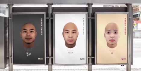
Litterbugs usually like to keep their polluting crimes a dirty little secret – but Hong Kong Cleanup wanted to show them that there is no way to hide from the all-seeing eyes of technology. They created an environmental campaign called “The Faces of Litter” which used DNA phenotyping to create portraits of people who littered.

identifying litterers with dna

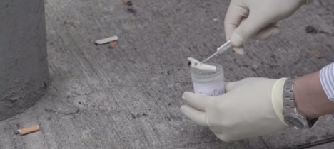
The rather Orwellian campaign illustrated garbage police collecting refuse with traces of DNA from around Hong Kong. In the campaign video, cigarette butts, coffee cups, and even a used condom were picked up and taken to a lab for analysis.

snapshot dna analysis

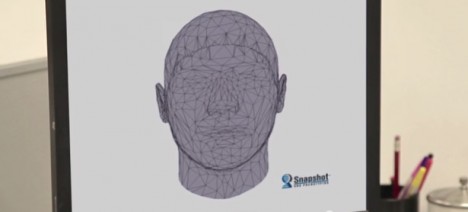
Once the DNA had been isolated, scientists used a program called Snapshot DNA Phenotyping to create a realistic 3D image of the litterbug. These faces could then be displayed in public places as a shame campaign to deter future littering.

The technology involved in this concept is indeed available, but The Faces of Litter was only an awareness-raising campaign. Photos were indeed displayed at Hong Kong transit stations, but they weren’t of real criminals – the faces were created using the DNA of volunteers.

snapshot dna phenotyping

The Hong Kong Cleanup project highlights the fact that littering is out of control in Hong Kong despite fines equivalent to $ 200 US. The video warns would-be trash droppers: “Don’t let it be your face,” hopefully inspiring them to think twice before flicking a cigarette butt or flinging an empty coffee cup.

Share on Facebook


[ By Delana in Design & Guerilla Ads & Marketing. ]

[ WebUrbanist | Archives | Galleries | Privacy | TOS ]


WebUrbanist

 
Comments Off on For Shame! Anti-Littering Campaign Uses Sly DNA Collection

Posted in Creativity


Floating Beach: Recreational River Barge Campaign for NYC

05 Jul

[ By Steph in Architecture & Cities & Urbanism. ]

Manhattan City Beach 1

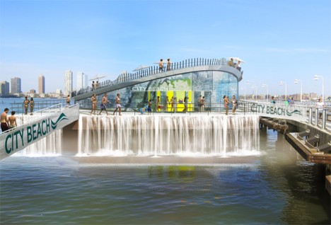
Manhattan is packed full of world-class restaurants, a vast array of shops, a beautiful nature preserve and virtually everything else required to satisfy the modern urbanite – except for a beach. That might seem obvious; it’s an island built up from swampland, cut off from the sea. But that doesn’t mean beach-craving creative thinkers can’t come up with a way to incorporate one into America’s most densely populated city. City Beach NYC is a project seeking to build a floating beach park on a barge in the Hudson River.

Manhattan City Beach 2

Starting with a reclaimed barge, the project would create a two-level destination with shops and restaurants tucked beneath a curving, sand-covered platform overlooking the water. You can’t exactly swim in the Hudson, but the park would have misters for cooling off, as well as a large water feature that mimics the sound of the sea, drowning out the city cacophony.

Manhattan City Beach 3

Changing rooms, a surf shop and a marine science lab would also be incorporated into the 260-foot park. The plan is to permanently moor it on the west side of Manhattan, with the possibility of renting small personal watercraft like kayaks and paddle boards.

Manhattan City Beach 4

The creators of City Beach NYC are currently raising the first round of funding on Indiegogo to hire a team to develop the operational plan; additional milestones will build scaled 3D models, fund the services of architects and engineers, and gain permits. They’re hoping that the people of Manhattan want a beach badly enough to come together and donate. Sure, you could just cross a bridge and go to Coney Island or Brighton or Rockaway, with access to the actual ocean, but a floating beach with views of the city would certainly be a novelty.

Share on Facebook


[ By Steph in Architecture & Cities & Urbanism. ]

[ WebUrbanist | Archives | Galleries | Privacy | TOS ]


WebUrbanist

 
Comments Off on Floating Beach: Recreational River Barge Campaign for NYC

Posted in Creativity


Smear Campaign: Guerrilla Artist Remixes Adverts with Acid

26 Feb

[ By WebUrbanist in Design & Guerilla Ads & Marketing. ]

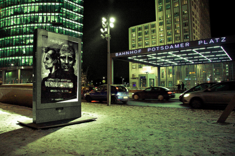
vermibus repainted art poster

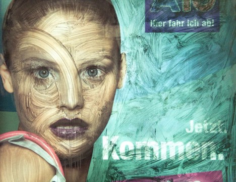
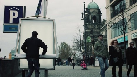
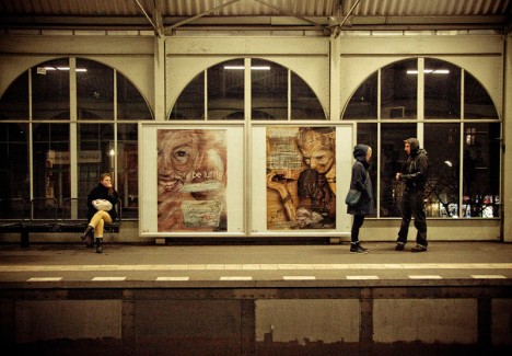
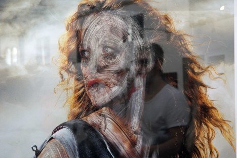
Mutating works of public advertising with corrosive acid, this cunning urban interventionist hijacks posters from bus stops and subway stations, then adds his own message into the mix.

vermibus steals ad poster

vermibus process

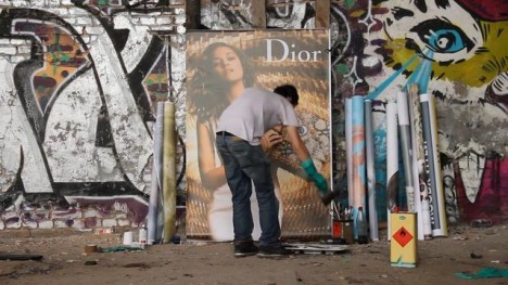
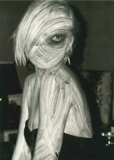
Vermibus takes posters then employs solvents to remake each surface in his studio, dissolving inks and colors already there and reusing materials from each de facto ‘canvass’ to make something new.

acid remixed street art

vermibus berlin movie posters

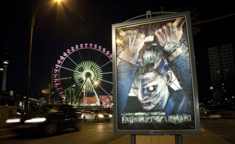
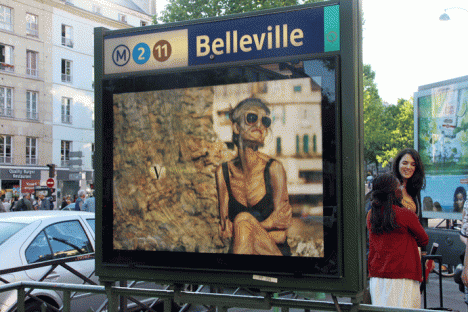
He then puts his transformed works back where he found the original or, in many cases, an entirely different site, city or even country, blending them back into the urban environment.

vermibus disturbing art example

Having taken them off the streets, Vermibus brushes the idealized figures, slowly morphing them into surrealist versions of their former selves. He has repeated this unusual artistic process in various major cities, including and beyond his home town of Berlin.

vermibus metro stop art

vermibus mobile metro installation

Sometimes the commentary is clear – a model made intentionally skeletal, for instance – while others evolve (or devolve) into abstractions and parodies that seem almost inhuman.

vermibus surreal figure remodel

The three fascinating short films embedded throughout this article (above and below) show his process, various examples of his work around Europe and his organization of and participation in the No-Ad Project. “Using a dubious inter-rail ticket, Vermibus set out with a set of 90 keys and his pallet of solvents to physically and temporally hijack the Western Worlds of advertisements in the name of fine art.”

Next Page – Click Below to Read More:
Smear Campaign Guerrilla Artist Remixes Adverts With Acid

Share on Facebook


[ By WebUrbanist in Design & Guerilla Ads & Marketing. ]

[ WebUrbanist | Archives | Galleries | Privacy | TOS ]


WebUrbanist

 
Comments Off on Smear Campaign: Guerrilla Artist Remixes Adverts with Acid

Posted in Creativity