RSS
 

Posts Tagged ‘Between’

Finding Balance Between Photography and Friends When Travelling

18 Sep

If there is one common thing that gets photographers fired up and excited, it’s the prospect of travel. Just like most other artists, you need your creative fire stoked and it’s hard to beat a walkabout to some exotic foreign land (or even a Cow Safari).

The new surroundings, different cultures, or new experiences are the perfect excuse to charge your batteries, clean your lenses and format those memory cards (you do format your cards before you use them, right?).

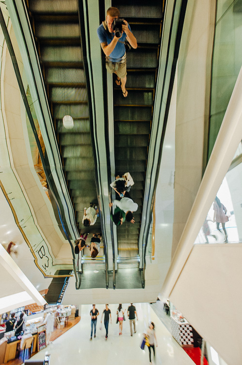
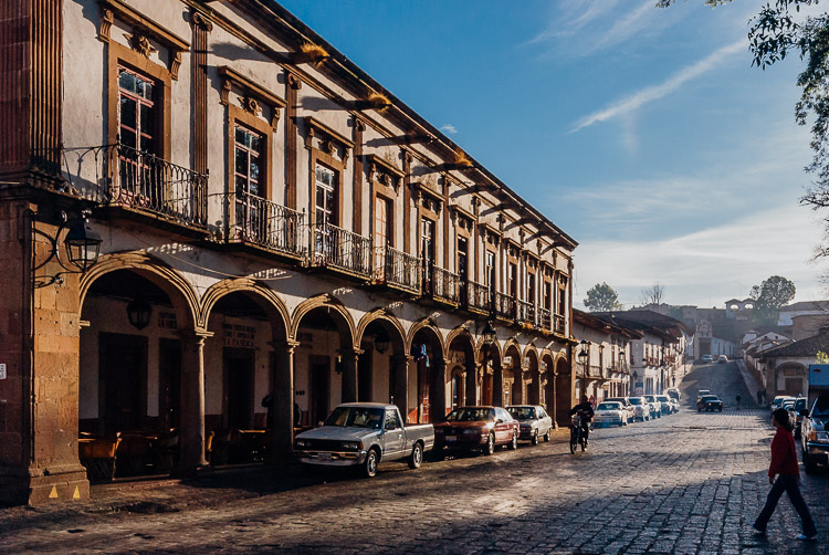
Colonial architecture in a historical Mexican town

Exotic lands just might be the ideal catalyst to get the creative juices flowing.

If you’re wandering out into the world solo, you have full photographic freedom to choose where you go and how much time you spend there. However, you may often find yourself with accompaniment on these excursions in the form of friends, your significant other, or family. The more obsessive of a shutterbug you become, the more challenges you are going to face, in order to strike a balance between being selfish for your own passions, and trying to appease everyone.

I can’t tell you how many times I’ve wandered off into the photographic zone, and inadvertently ignored my traveling companion. Once I realize, I glance around thinking they probably abandoned me, only to see them half asleep on a bench or standing hands on hips, not looking happy.

If your travel partner (s) are as psyched about photography as you are, read no further, you have it made. Unfortunately this isn’t usually the case so we need to muster up some diplomacy to keep things running smooth.

The trade-off

While traveling, whether with a significant other or friends, one method that will help you reach that middle ground is to make a conscious effort to take photos of them along the trip, in exchange for you being able to wander around a little more, or spend some extra time shooting. Of course this doesn’t necessarily have to be a spoken exchange, but often it will just work out this way.

Capture photos of traveling companions

Capturing some fun shots of your traveling companions goes a long way towards striking the balance between photography and sharing the experience.

To make this work well, you need to actually put some time, effort, and thought into the shots. You can’t just snap a quick shot of them by the doors of an old church, then spend an hour on various compositions of the doors themselves. Get a remote flash and use it off-camera to get some nice lighting and flattering portraits. Have them pose in interesting positions and underexpose some shots to create cool silhouettes.

The concept is to not only get some memorable shots of them in the exciting places you’re traveling to, but to engage them in your process, and make them feel like they’re not traveling alone.

Careful planning

Although a big part of traveling is embracing surprises and the discovery of new things, a little diligence in planning can help you get the shots you want without sacrificing your relationships.

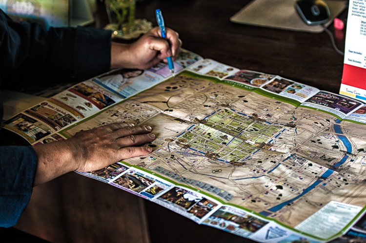
Using a city map to plan the day

A little forethought and planning can help make adventures run smoother.

If you think ahead about the places you want to photograph and when the light will be best, you can work up an itinerary that can flow more smoothly without waiting around for the light. Want a sunset shot on the coast or golden hour light for that cityscape panorama? Think about planning for dinner on the water, and showing up a little early or find a rooftop bar for a drink.

There are apps that can help you with this planning such as Stuck On Earth or even Google Earth.

Breathing room

While traveling or going on vacation with others can be a blast, there’s nothing wrong with splitting up sometimes. Especially on long trips, it can be a strain on relationships to spend every waking moment together, and a couple hours of solo-exploring can be a nice respite.

Solo adventure

A few hours of splitting up to pursue varying interests can work wonders.

Again, if you can figure out how to plan this ahead of time, all the better. Maybe there is some cool architecture near a shopping mall or an outdoor market that can provide activities for all involved.

Go with the flow

Then there is, of course, the path of least resistance. If you are willing to sacrifice the time-consuming or contrived shots, you can always wing it and see what happens. This is also the default position you might find yourself in anyways – after all, plans are made to be broken.

This approach can also be a good exercise in picking up your pace, and developing a keener eye. Maybe this entails ditching the tripod at the hotel, and venturing out with only one lens (tragic, I know). Be resourceful instead; find a firm surface and use the self-timer for dark shots, and use a zoom lens or challenge yourself to rely on a fixed focal length lens for your compositions.

Life is all about compromises. It’s important to keep in mind that not everyone shares the same passions, and you should do your best to try and see the situation through your travel partners’ eyes.

“Learn the wisdom of compromise, for it is better to bend a little than to break.”

googletag.cmd.push(function() {
tablet_slots.push( googletag.defineSlot( “/1005424/_dPSv4_tab-all-article-bottom_(300×250)”, [300, 250], “pb-ad-78623” ).addService( googletag.pubads() ) ); } );

googletag.cmd.push(function() {
mobile_slots.push( googletag.defineSlot( “/1005424/_dPSv4_mob-all-article-bottom_(300×250)”, [300, 250], “pb-ad-78158” ).addService( googletag.pubads() ) ); } );

The post Finding Balance Between Photography and Friends When Travelling by Jeremie Schatz appeared first on Digital Photography School.


Digital Photography School

 
Comments Off on Finding Balance Between Photography and Friends When Travelling

Posted in Photography


4 Tips to Help you Decide Between Black and White or Color for your Image

09 Jul

Why do black and white photographs speak to us? In nature, colors are meant to attract, and cause things to catch our attention. Still, even without color, black and white images are a mainstay of our craft, and are powerful representations of the artistic spirit.

Half Color

There are many differing opinions when it comes to black and white photography. Some photographers love it, and shoot black and white exclusively, while other photographers absolutely shun the notion and shoot only in color. Then you have the majority of our lot who fall somewhere in between the love and hate poles. Luckily, the digital imaging age allows photographers to decide after the fact whether our images make us happier in full color, or in black and white. However, this ease of conversion can become somewhat of a problem because it is in fact so simple to switch from color to black and white, that it can cause conflicting feelings about which route to take. While there is really no absolute magic formula to determine the best choice for your particular image, there are some guidelines that you can follow to make your decision a little easier.

Here are four tips to help you decide if an image will be more appealing in black and white than in color.

Black and white or color?

#1 Does color have a large impact on the image?

This may seem like an easy judgment to make, but it is not always so simple. Color can be a fickle thing, and can either add to, or unintentionally detract interest from a photograph. Ask yourself, “does this image rely exclusively on color or are there other interesting aspects that can be emphasized?” Just how nice would it be to look at as a colorless rainbow? This not to say that all colorful objects and scenes won’t do well as black and white, but as a general rule most highly or diversely colored subjects should remain just that – colorful.

Silhouette
This image really had nothing to say in the way of color, so I made use of the heavy backlighting to create a strong contrast with the subject.

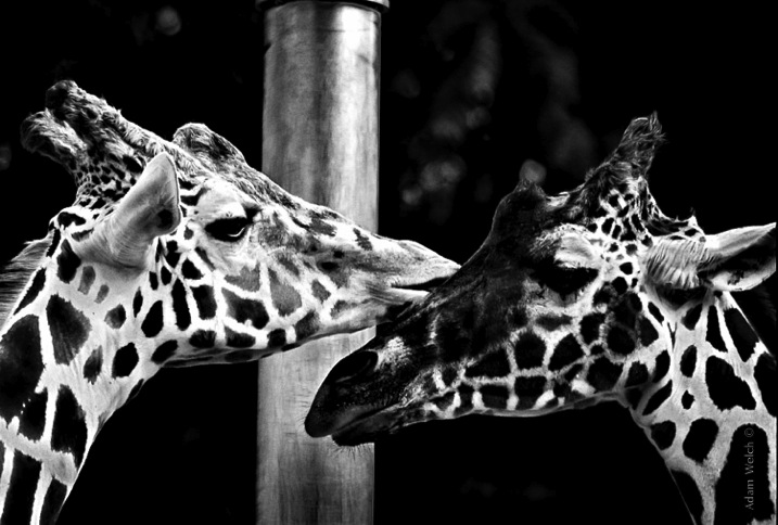
Two Giraffes
The original image didn’t have a lot going on as far as color, so I choose to convert it to black and white to really make the patterns pop.

The opposite of this usually proves to be true also. When you have an inherently bland scene or subdued colors, the image will usually do well when converted to black and white and this leads us to tip #2.

#2 Are there interesting light or contrasts?

This is where new photographers tend to encounter a little bit of difficulty because seeing good light or contrasts usually requires quite a bit of pre-visualization. Don’t worry! Developing an eye takes, well, some developing. The more you force yourself to look past what is readily apparent, the more you will learn to almost see in black and white.

When you remove color from the photographic equation, you are left with only differences in tone; lights and darks. These differences are what truly make good black and white images, and the differences in light and shadow bring contrast to the photograph. So, when you see that a given scene or subject presents the opportunity to exploit stark contrasts and unique lighting or shadow, it might be a great opportunity to try black and white. Take a look at this image of the leaf of a house plant.

Plant Leaf

I used a single flash behind the leaf to really bring out the contrasts within. Ordinarily these details might have gone unnoticed, and the black and white treatment really compliments the lighting.

The great Ansel Adam’s said that he; “could convey a greater sense of color with well executed black and white images using only light, shadow, and even subtleties in texture to express the qualities of the photo”. It’s that last variable, texture, that brings us to tip #3.

#3 Are there interesting textures?

When we think of texture, we can easily describe it in terms of how things feel physically, when we perceive them through our sense of touch. Texture in photography, however, can be a little more challenging to put into words. Texture in a photograph has to be perceived with our eyes and then we determine if it’s smooth, rough, or coarse. Transforming the tactile tangible into a visually tangible image takes practice and a trained eye, and this is where working in black and white can be the best choice. Examples of textures that work well for black and white photos are wood, metals and stone, even plants and human skin. Directional lighting (light from largely one source coming from the side) compliments, and helps emphasize textures.

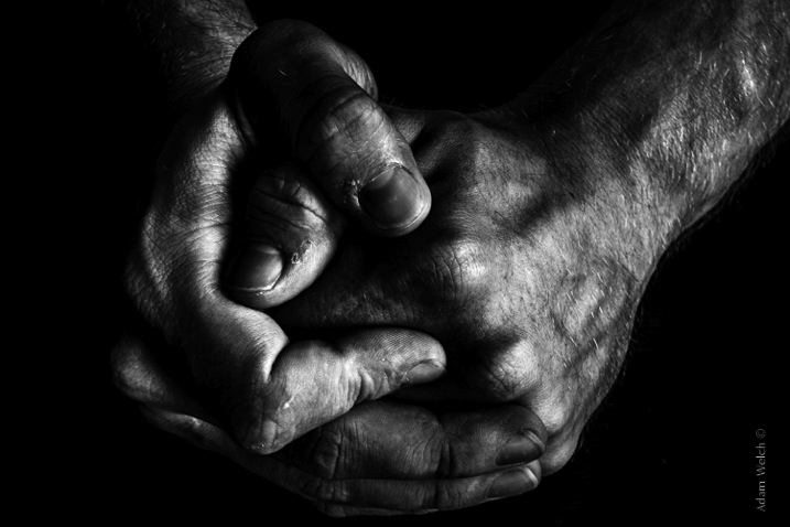
This image was made with natural lighting coming in directly from one side. This really brings out the texture, imperfections, and grittiness of the photograph.

Hands

This last tip goes beyond the physical attributes of an image and delves into the feelings we want to convey through a photograph. This is where black and white photography can really shine.

#4 What is the mood you want to create?

Have you ever looked a photograph, and been immediately struck by how the photograph felt? This is often referred to as the mood of a photo. It could be a bleak and rainy street scene, or an image of a warm and welcoming sunset. In any case, using black and white is a good way to convey a sense of mood in your photography. Admittedly, black and white usually imparts dark, bleak, somber, or an etherial overtone to a photograph, but that does not mean that it doesn’t work well for more upbeat images. Convert some of your landscapes to black and white to see how the mood can change. Experiment with black and white portraits which can portray your subject with a more stoic and brooding persona.

This photo of a hot day on Boston Common had lots of differences in lighting, along with some great coloring especially in the sky. Still, I chose black and white because it simply felt better to me, and matched what I saw in my mind more closely.

Boston Common

Keep in mind that you may run into some different terms if you decide to work more with black and white photography. These terms are usually interchanged, but in reality they are not all the same. It will help you to understand the differences in each so you can know what to expect.

Monochrome

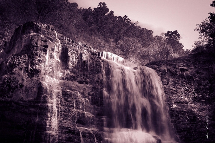
Monochrome simply means varying shades of only one color are used to make an image. This is often thought of as black and white (which are technically monochromatic) but in reality any color can be used. Sepia toned photographs are a good example of images which are monochrome.

This is an example of a monochromatic photograph that is not black and white.

Sepia Waterfall (2)


Grayscale

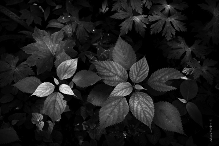
The term grayscale is another one that gets thrown around to label black and white images. Though not completely incorrect, grayscale images use only varying shades of gray (256 to be exact), and no other color. Grayscale can be a very bland when no other edits are used because it tends to leave the entire photo as middle gray. Notice how bland and uninteresting the below image looks when it’s converted to grayscale.

Grayscale

True Black and White

As I have said, black and white images are indeed monochromatic but not all monochrome images are black and white. True black and white photos use only black and white to produce the image although the majority still use a mix of gray tones.

This is the same image as above after it has been further processed to be closer to a true black and white photo. The differences in tones become becomes more apparent, and the photo becomes much more pleasing.

True BW

Black and white photography has been a staple genre since literally the inception of photography, and has evolved into a high art-form. Of course there are some people who simply do not like black and white images and prefer everything in color. Still, black and white photography is something that should not be discounted, and certainly not underestimated in terms of artistic expression. Today’s processing software makes converting color images to black and white nearly effortless, so use these tips and give it a try!

googletag.cmd.push(function() {
tablet_slots.push( googletag.defineSlot( “/1005424/_dPSv4_tab-all-article-bottom_(300×250)”, [300, 250], “pb-ad-78623” ).addService( googletag.pubads() ) ); } );

googletag.cmd.push(function() {
mobile_slots.push( googletag.defineSlot( “/1005424/_dPSv4_mob-all-article-bottom_(300×250)”, [300, 250], “pb-ad-78158” ).addService( googletag.pubads() ) ); } );

The post 4 Tips to Help you Decide Between Black and White or Color for your Image by Adam Welch appeared first on Digital Photography School.


Digital Photography School

 
Comments Off on 4 Tips to Help you Decide Between Black and White or Color for your Image

Posted in Photography


Table for Two: Window as Bridge & Barrier Between Shared Seat

22 Mar

[ By WebUrbanist in Art & Installation & Sound. ]

table public art piece

Putting you in the spotlight with a stranger, this installation in New York City is a perhaps-paradoxical commentary on both connection and isolation in urban environments.

table for two project

Located at 7th Avenue and Carmine Street in Manhattan, Table for Two by Parisian native Shani Ha was designed to separate the participants with a window, yet by its placement and proximity makes simultaneously for intimately-shared moments.

table glass nyc art

Vicky Gan describes it as “part sculpture, part performance art, it challenges those who sit down to look up from their smartphones and into the eyes of a friend, a stranger, or their own reflections in the glass. A self-conscious homage to Edward Hopper’s Nighthawks, the work realizes the age-old concept of the big, crowded city as a lonely, isolating place.”

table for two corner art

Like any good piece of interactive art, the stories about its usage are what show it works – deaf people communicating in sign language across the glass in one case or a couple talking to each other (like in prison) on phones in another.

table for two new york

Technology, claims the artist, is responsible “making us more self-centered because [it gives] us the power to access only the people we decide to access,” whereas the intention in this piece is “to break the bridge between the outside and the inside, and allow a new form of interaction between people.”

Share on Facebook


[ By WebUrbanist in Art & Installation & Sound. ]

[ WebUrbanist | Archives | Galleries | Privacy | TOS ]


WebUrbanist

 
Comments Off on Table for Two: Window as Bridge & Barrier Between Shared Seat

Posted in Creativity


Understanding the Difference Between Photoshop and Lightroom

20 Mar

One of the most common questions I hear from people just starting out in photography is, “What program should I use to edit my photos?”. There are many free options such as iPhoto, Picasa, GIMP, and other commercial programs such as AfterShot Pro and Pixelmator but the most popular programs are Photoshop and Lightroom.

That question is usually followed by another, which seems quite logical, “What’s the difference between Photoshop and Lightroom?”. While the two programs do share many similarities, and are both widely used by the photographic community, they each serve a unique purpose and are quite different in some very major ways. Understanding what makes them similar, as well as different, can help you make an informed choice when selecting the right software for your needs.

PhotoshopLightroomQuestionMark

If you’re not sure what the difference is between Photoshop and Lightroom, you’re not alone.

Similarities

At the core level both programs do essentially the same thing, edit images. How they go about handling that task, as well as how you actually use each program, is quite different – but if you are simply looking for software that will allow you to alter, tweak, and enhance your photographs, either one will suffice. Both are capable of handling multiple file types such as: JPEG, PNG, TIFF, and a perennial favorite of many photographers, RAW. In fact both Photoshop and Lightroom use the Adobe Camera Raw (ACR) processing engine to handle RAW files. So, you can expect similar controls and editing options in both programs when doing things like adjusting saturation, working with curves, and correcting for lens distortions.
Both Photoshop and Lightroom are powerful additions to any photographer's digital toolbox, but understanding what makes each one unique can help you choose one that suits your needs.

Both Photoshop and Lightroom are powerful additions to any photographer’s digital toolbox, but understanding what makes each one unique can help you choose the one that suits your needs best.

Both programs also feature an extensive set of editing and manipulation tools allowing you to do everything from; basic edits like cropping and adjusting exposure, to advanced alterations such as working with brushes, tone curves, and graduated filters. You will find a variety of built-in effects in both programs that will allow you to instantly apply edits such as black and white, sepia, and other artistic styles. The two programs are quite powerful image editors. I know some photographers who use Lightroom exclusively and never touch Photoshop, as well as plenty of others who spend all day in Photoshop and never open Lightroom. However, in order to understand which one is best for you it might help to see how they are also quite different from each other.

Difference #1: File Handling

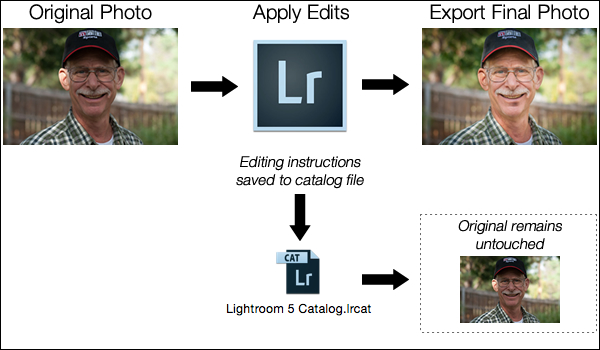
One of the most significant ways in which Lightroom is different from Photoshop is that it does not actually edit photos, nor does it move your images around to different locations on your computer. Instead all the changes you implement are kept in a separate file called the Catalog, which is sort of like a recipe book of instructions for how each photo should be processed. When you apply some type of edit, like a radial filter or adjustment brush, Lightroom is essentially keeping a log of the alterations in a database, while leaving the original image intact. It’s a technique called nondestructive editing, which stands in stark contrast to how Photoshop operates.

For example, several months ago I sent my father this photo I took of him, which I had subsequently edited in Lightroom.

simon-dad-edited

Since the original file was left unchanged I can go back and re-edit the photo any time I want. The edits in Lightroom are a set of instructions for how to process the file, similar to how a recipe is a set of instructions for making food like a cake or casserole. After you finish making changes to an image in Lightroom the photo must be exported at which point it can be printed, shared, or posted online. Because the original photo remains on your computer fully intact and untouched you can go back to Lightroom at any point in the future and re-edit the photo however you want.

Another benefit of this approach is that the catalog itself is quite small, often taking up only a few hundred megabytes on your hard drive even if you have several thousand images in Lightroom.
LightroomEditingWorkflow

A basic diagram of the Lightroom workflow: editing instructions are stored in the Catalog file and no changes are made to your original images.

Photoshop, on the other hand, operates quite differently. When you edit a picture such as a JPG, PNG, or RAW file in Photoshop you are always working on the original file itself, unless you save a copy as a Photoshop PSD file that is usually several dozen megabytes in size. This PSD file contains all the changes made to a photo, and in order to share a given image it must then be saved to a final format such as JPG, PNG, etc. In essence, if you want to perform nondestructive edits in Photoshop you will end up with three separate files: the original camera RAW file, a PSD, and the final copy saved into a shareable format from the PSD. The process works something like this:

PhotoshopEditingWorkflow

A basic diagram of the Photoshop workflow: If you want to edit an image later it must be saved as a separate PSD file.

FileDifferencesThe two processes look somewhat similar on the surface with one major difference; in Lightroom all your changes for every photo are saved in one single, relatively small, catalog file. In Photoshop all your changes are saved in unique files for every single picture you edit. This means much more space on your hard drive will be taken up as you work with multiple files in Photoshop, and you will end up with multiple versions of each image as well. So why would you want choose to use Photoshop instead of Lightroom? In a word, power.

Difference #2: Editing Tools

Lightroom is kind of like an all-terrain-vehicle you might see on some farms. It’s fast, nimble, and can be used for a variety of tasks like hauling small objects and towing little trailers. But it simply cannot match the sheer power of a massive farm truck when it comes to getting big, serious jobs done like transporting massive bales of hay, pulling a horse trailer, or ploughing through mud and snow.

Nearly a decade ago Adobe realized that not everyone needed the capability of Photoshop, particularly photographers who were returning from events with hundreds of images to edit quickly. What this new generation of digital photographers demanded was the essential editing tools of Photoshop in one easy-to-use package which resulted in Lightroom.
PhotoshopLayers

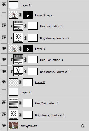
Photoshop uses layers, which can be intimidating for beginners but offers incredible versatility that Lightroom simply can’t match.

Photoshop contains a dizzying array of filters, brushes, and other tools that allow you to perform all manner of edits and changes to your images. But more than that, Photoshop operates by letting you create different layers on which your edits actually take place. For example, the image on the right shows the various layers I used to edit the image of the statue, and each layer can be edited independently of the others. This might look like a lot, but it is not uncommon for a digital artist to use dozens of layers when editing an image. Lightroom, by contrast, works in a much more linear fashion with no layers, fewer editing tools and less overall flexibility. Both programs contain a history panel that lets you step back in time to any of your edits, but working with layers gives you infinitely more control over exactly how you edit your image.

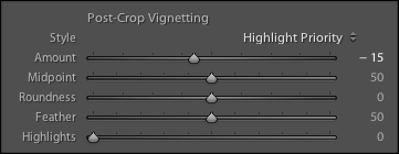
Case in point, let’s say you want to add a vignette to a portrait. In Lightroom it’s as simple as clicking the “Vignette” option and changing a few basic parameters like the amount, how big the untouched middle portion should be, and how gradually the vignette should fade from the center. It’s a quick no-fuss solution that is incredibly useful for all sorts of photography situations, and if you want a bit more control you can click on the Radial Filter for a few more options.

SereteanStatueFinal

After image


SereteanStatueOriginal

Before


To do the same thing in Photoshop would require adding a special layer to your photo called an Adjustment Layer such as  Levels. Then you’d adjust the levels to darken the image in the highlights and overall, and apply a mask to the layer to only darken the outer edges. You could also change the opacity of the layer (lightening the effect) or the Blend Mode,  or you could apply a Dodge and Burn layer – and that’s just the beginning. While all these additional steps might seem hopelessly convoluted, the more you learn how to use the tools Photoshop has to offer the greater degree of control you will have over the editing process.
LightroomVignette

In Lightroom adding a vignette is as simple as clicking a button. In Photoshop it’s much more complicated but you get much more control as well.

With all of its options and features (including support for text, 3D graphics, and even video) Photoshop is ideal for almost any image-editing situation. Lightroom essentially distills Photoshop down to the tools that Photographers use most, which is one reason it is so appealing to many shutterbugs.

Difference #3: Workflow

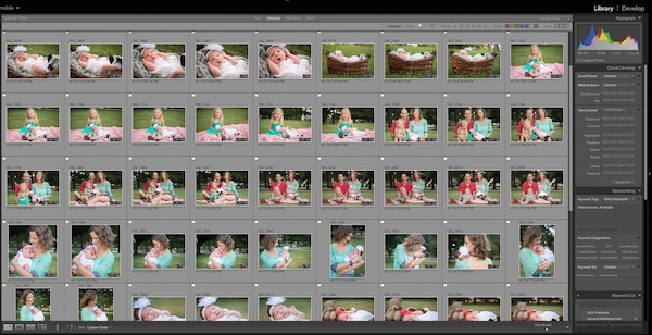
Features and file options aside, the trump card that Lightroom has over its big brother involves its end-to-end workflow solution for photographers. Since it is designed specifically to address the needs of photography enthusiasts and professionals, it handles everything from importing photos from your memory card, to organizing, editing, sharing, and finally printing them. Lightroom has support for keywords and virtual folders to help you keep track of your images, and you can even use it to create a slideshow or photo book. Many photographers, even professionals, will go weeks or months without ever opening Photoshop, because Lightroom takes care of everything they need.
LightroomLibraryModule

Lightroom’s Library module lets you quickly sort, organize, and manage all your photos.

On the other end of the spectrum is Photoshop which doesn’t transfer files, won’t organize your images, and certainly can’t make slide shows or photo books. But again, it’s all about the tradeoffs you are willing to accept. Nothing else can even come close to Photoshop in terms of sheer editing power. However, you can use Adobe Bridge to handle some workflow-based tasks like importing photos and organizing the digital media on your computer, which when paired with Photoshop, does offer a more comprehensive Lightroom-esque workflow experience. It’s not quite as streamlined as working in Lightroom alone, but it does provide a welcome degree of automation as opposed to manually organizing all your PSDs, JPGs, and other photos by hand.
Sometimes the best solution involves both programs. I used Lightroom to import this photo from my camera and do some basic edits, and then used Photoshop to add some more extensive tweaks.

Sometimes the best solution involves both programs. I used Lightroom to import this photo from my camera and do some basic edits and then used Photoshop to add some more extensive tweaks.

Which one is right for you?

By now you probably realize that this is a question only you can answer, and until recently it meant spending $ 150 on Lightroom or several times that amount on Photoshop. Thankfully, Adobe has made the decision much easier with its release of Creative Cloud and you can now get both programs for $ 10/month. If you don’t like the idea of subscribing to software, you can still buy Lightroom by itself, and Adobe has stated they will continue to sell the standalone version for all future versions as well.

This article could be much, much longer and in many ways it seems like I have just scratched the surface, but I hope you have a better understanding of what makes these programs similar and different.

What about you? What differences do you think are worth noting between both programs, and what purpose does each serve for you? Leave your input in the comments section below.

googletag.cmd.push(function() {
tablet_slots.push( googletag.defineSlot( “/1005424/_dPSv4_tab-all-article-bottom_(300×250)”, [300, 250], “pb-ad-78623” ).addService( googletag.pubads() ) ); googletag.pubads().enableSingleRequest();
googletag.pubads().disableInitialLoad();
googletag.pubads().collapseEmptyDivs( true );
googletag.enableServices();
} );

googletag.cmd.push( function() { googletag.display( ‘pb-ad-78623’ ); } );

googletag.cmd.push(function() {
mobile_slots.push( googletag.defineSlot( “/1005424/_dPSv4_mob-all-article-bottom_(300×250)”, [300, 250], “pb-ad-78158” ).addService( googletag.pubads() ) ); googletag.pubads().enableSingleRequest();
googletag.pubads().disableInitialLoad();
googletag.pubads().collapseEmptyDivs( true );
googletag.enableServices();
} );

googletag.cmd.push( function() { googletag.display( ‘pb-ad-78158’ ); } );

The post Understanding the Difference Between Photoshop and Lightroom by Simon Ringsmuth appeared first on Digital Photography School.


Digital Photography School
 
Comments Off on Understanding the Difference Between Photoshop and Lightroom

Posted in Photography


Capturing Better Portraits Between Poses

13 Aug

1-Mike_Bataki

If you do portraiture of any kind you are probably used to people giving one look when the camera is away from them and another when it is on them. This is the unfortunate game of the portrait photographer.

For my own work, I find that many of the most poignant portraits of people are the ones in between the actual ‘portraits’ taken during a session. These are the moments when your subject is at ease, in their element, thinking about something, and when they have the most interesting expressions.

So how do you capture these and take better portraits?

Paul KostabiThere is an important reason for taking your time to do a portrait session. It gives your subject time to get comfortable with you and the way you work. You can go through multiple backgrounds and ideas, and it is common for subjects to get over the initial portrait trepidation as the time goes on. That deer in headlights look will often (but not always) go away as they get used to how you work and what you want from them. This is the reason that you do not want to start off right away with your best idea because that will often be at their most uncomfortable moment.  Wait until they seem comfortable and in the right mindset.

Give them direction, especially at first. When people do a portrait session they want to be told what to do, even if you want them to just be natural. Talk to them about what you’re doing and what you want from them. Do you want them to give you an emotion? How are their hands and arms? How is their posture?  Where should they stand? I personally prefer to engage the subject and get them standing and interacting in a natural way, but often I will pose people at the beginning just so they feel confident that I know what I’m doing. Then over time I will start trying to get them to pose in ways that feel the most natural for them, as they get more comfortable with what they are doing.

The main key to this is that you want to get them interacting with you. Some types of shots are better posed of course, but you want them in some sort of moment. When they feel something, or think about something interesting, that feeling will shine through in the photograph.

Talk about the person’s life. Get to know them. Ask them questions and get them thinking introspectively. Tell them this is part of the process so they don’t feel uncomfortable or unsure of what to do when they are talking. This is one of the reasons that I sometimes like to interview people as part of portrait sessions. Then, within the interview, right after they have finished talking about something interesting or emotional, I will stop them and ask them to stay just like that and I will take their photo.

Portraits

Sometimes you even have to fake people out. Tell them that you are just taking a few shots to test the light and to relax for a moment. Some of my best images have been taken that way.

There are ebbs and flows in a portrait session. Sometimes it makes you feel like a boxer, bobbing and weaving with what they give you. Other times you will feel like a psychiatrist, trying to bring something out of them. If someone starts to look more and more uncomfortable, don’t keep photographing them hoping they’ll start to get better. Break them out of it by asking them to move to another location or take a break. Keep them on their toes and engaged.

All subjects are different and will react differently to you, but the key is always that you must find ways to get through to them . Then to have the wherewithal to be able to catch the moment once they finally give it to you, because often the best moments are quick and fleeting.

The post Capturing Better Portraits Between Poses by James Maher appeared first on Digital Photography School.


Digital Photography School

 
Comments Off on Capturing Better Portraits Between Poses

Posted in Photography


Pop-Up Portfolio: Mobile Furniture Folds Flat Between Pages

12 May

[ By WebUrbanist in Design & Furniture & Decor. ]

flat pack furniture set

It is not unusual to see art and design students walking around with portfolios under their arms, but few open up to reveal such creative results as these.
flat pack chair closed

flat pack green chair

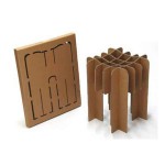
Inspired by campus folder cases, origami and pop-up books, Japanese designer Mariko Tsujimoto created this series of unfolding furnishings that deploy into surprisingly solid (if small) functional objects.

flat pack table open

flat pack table closed

Set in vivid colors to distinguish their functionality, the set includes a chair, table, desk and bookshelf, each of which refolds automatically when the end pages are closed.

flat pack shelf closed

flat pack book shelf

flat pack in motion

These quite literal portfolio pieces are just plastic prototypes for now, but rendered in a more solid material they could provide the conceptual groundwork for a full-fledged furnishing set.

Share on Facebook


[ By WebUrbanist in Design & Furniture & Decor. ]

[ WebUrbanist | Archives | Galleries | Privacy | TOS ]


WebUrbanist

 
Comments Off on Pop-Up Portfolio: Mobile Furniture Folds Flat Between Pages

Posted in Creativity


Nokia shootout: A sibling rivalry between the Lumia 920, 925, and 928

05 Nov

nokia_trio_2.JPG

While Nokia’s 41MP Lumia 1020 smartphone has received more than its fair share of publicity this year, the Finnish handset maker also launched two additional phones this year. The Lumia 925 and Lumia 928 are interesting imaging devices in their own right, while software updates have kept last year’s Lumia 920 competitive as well. We take another look at the Lumia 900 series in our shootout on connect.dpreview.com.

News: Digital Photography Review (dpreview.com)

 
Comments Off on Nokia shootout: A sibling rivalry between the Lumia 920, 925, and 928

Posted in Uncategorized


Live Between Buildings: Narrow Micro-Homes Fill City Gaps

05 Sep

[ By WebUrbanist in Architecture & Houses & Residential. ]

narrow home competition entry

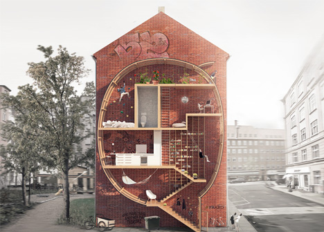
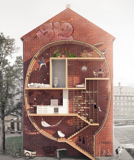
Playful yet thought-provoking, this project asks: what do we do with small leftover spaces in cities … particularly in urban areas where even a few square feet of real estate can cost a fortune?

narrow house competition winners

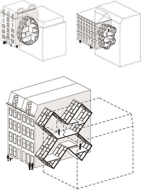
Live between Buildings by Ole Robin Storjohann and Mateusz Mastalski won first place in a Loft 2 competition held by FAKRO, which challenged contestants to rethink loft living and material efficiency without sacrificing light and space.

narrow interstitial house concept

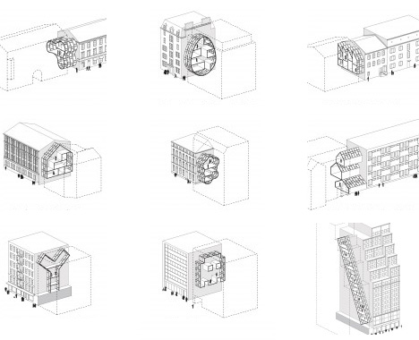
Their various prototype proposals have nearly no ground footprint, being instead suspended in part or entirely between existing structures. In testing the idea, they took actual buildings and voids, abstracted and simplified their forms, all to show how such interventions would work in major cities from New York and London to Amsterdam and Tokyo.

narrow home architectural entries

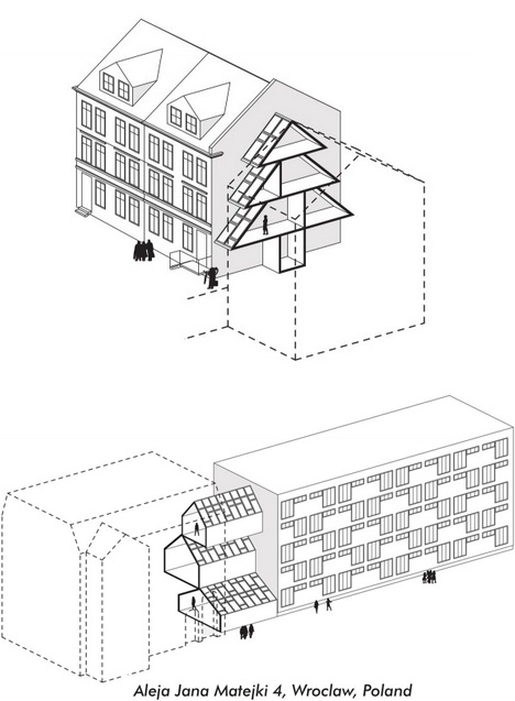
A wide selection of shapes suggests many possibilities using modular pieces, including half-serious and semi-practical suggestions, such as egg and X shapes, as well as outright silly ones, like a Christmas-tree home or cloud-bubble house, more intended just to illustrate the potential flexibility.

narrow home case studies

Out of a variety of compelling entries, just why did this pair win the award? “The Jury appreciated the way the basic idea – creating small infill-dwellings in-between existing buildings – has been worked out in extended research, thus providing models for various housing types in different cities. The plan can be realized entirely out of roof windows (with some technical adjustments) and offers an innovative idea for using empty spaces in urban fabric. The possibility of shapes is endless. The project was very beautifully drawn and communicated on a single sheet, the section describing both the architectural idea and the exciting occupation of the proposed building.””

Share on Facebook


[ By WebUrbanist in Architecture & Houses & Residential. ]

[ WebUrbanist | Archives | Galleries | Privacy | TOS ]


WebUrbanist

 
Comments Off on Live Between Buildings: Narrow Micro-Homes Fill City Gaps

Posted in Creativity


Fill in the Blanks: Illustrated Sky Spaces Between Buildings

29 Apr

[ By WebUrbanist in Art & Drawing & Digital. ]

sky art

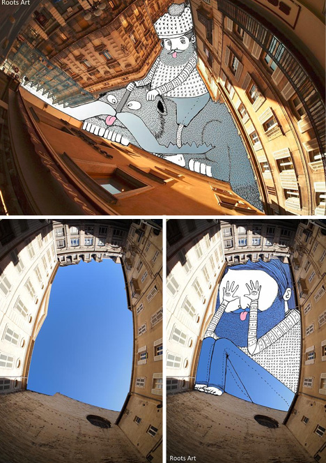
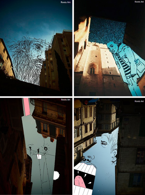
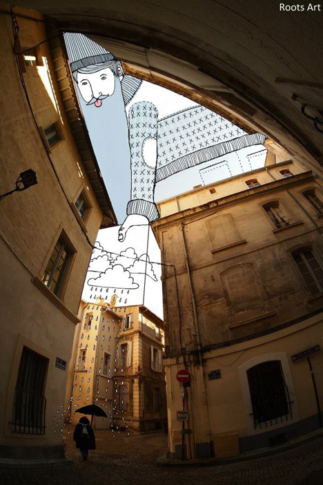
Street art uses roads, sidewalks, walls and infrastructure as canvasses, but one of the brightest and blankest slates of all may be the spaces in between.

sky scape cloud canvass

Thomas Lamadieu, a French artist, looks up and sees subject, not void, in blue and clouded city skies, then uses his imagination to fill in the picture, playing on notions of figure and ground.

sky art infill drawings

His Sky Art series shows a given and take between shapes being worked with and what he puts in, often working with minimalist lines and splashes of color.

sky art interactive sketch

In the process, he turns tapering alleys into uncomfortable figures, sinuous spaces into leaning ladies, and cramped courtyards into crouching pranksters, all the while challenging us to see back and forth between positive and negative space (and selectively breaking the boundaries in between).

Share on Facebook


[ By WebUrbanist in Art & Drawing & Digital. ]

[ WebUrbanist | Archives | Galleries | Privacy | TOS ]


WebUrbanist

 
Comments Off on Fill in the Blanks: Illustrated Sky Spaces Between Buildings

Posted in Creativity


When the line blurs between photography and photojournalism

20 Apr

The-second-explosion-at-t-001.jpg

British sports photographer Tom Jenkins has written a thought-provoking article for The Guardian about how quickly sports stories can turn into breaking news events. In the aftermath of the bomb attacks at the Boston Marathon, Jenkins draws parallels with past tragedies including the Hillsborough disaster, which occurred on the same day 24 years earlier. Jenkins also adds personal reminiscences about how he has made the transition from sports to ‘news’ photography in the past. Click through for excerpts and a link to the full article at The Guardian.

News: Digital Photography Review (dpreview.com)

 
Comments Off on When the line blurs between photography and photojournalism

Posted in Uncategorized