RSS
 

Posts Tagged ‘Achieve’

The Easiest Way to Achieve Rich Skin Tones in Photoshop!

10 Aug

The post The Easiest Way to Achieve Rich Skin Tones in Photoshop! appeared first on Digital Photography School. It was authored by Caz Nowaczyk.

In this video by PiXimperfect, you’ll learn the easiest way to achieve rich and beautiful skin tones in Photoshop.

?

In this tutorial, advanced Photoshop masking tools are used to target only the skin tones in the image. After selecting the skin tones, adjustment layers are used to add color to it.

The easiest way to achieve rich skin tones in Photoshop:

  1. Open your image in Photoshop.
  2. To begin your selection of the skin, go to Menu->Select->Color Range.
  3. To select the skin correctly, be sure to select “Sample Colors” (not “Skin Tones” because this feature doesn’t capture the skin tones with accuracy).
  4. Firstly, decrease the Fuzziness value to around 15, and then select the first Eyedropper tool. Using the eyedropper tool, click on one part of the skin in your image. To see what your selection is, ensure that you mark Selection in the Color Range window.
  5. Now select the second Eyedropper with the + symbol to extend the selection of the skin range. To do this, click and drag your Eyedropper tool across all skin tones until you have selected them all. Make sure no area is left out.
  6. You don’t want to keep the selection harsh, so go to the Fuzziness Slider and change it to around 55, and then click OK.
  7. Now that you have a selection of your skin tones, or colors similar to your skin tones, click on the Adjustment Layer icon in the Layers Palette. Choose “Solid Color.” This opens up the color palette window. In the RGB section, put in the following numbers – R: 255, G: 46, B: 1, and click OK.
  8. Change the Blend Mode in your Layers Palette from “Normal” to “Linear Light.” Rather than lower the Layer opacity, you are going to lower the “Fill” to around 5-10%.
  9. Take a look at your image and see if any areas have turned out too harsh with the blend. If so, choose your mask, then select the Paintbrush tool and paint those areas (with your brush color set to White) to soften the transition. You can decrease your brush flow if you want to.

That’s it!

Do you have any other tips you’d like to share with us? Do so in the comments section!

You may also find the following helpful:

Basic Skin Smoothing in Photoshop

Understanding Masking in Photoshop

How to Blend in Adjustments Using Layer Masking in Photoshop

How to Use the Clone Stamp Tool in Photoshop to Make Clear Skin

How to Correct Skin Blemishes Using the Patch Tool in Photoshop

How to Replace Colors in Your Images Using Photoshop

How to Enhance Colors Using Photoshop’s Color Range Tool


The post The Easiest Way to Achieve Rich Skin Tones in Photoshop! appeared first on Digital Photography School. It was authored by Caz Nowaczyk.


Digital Photography School

 
Comments Off on The Easiest Way to Achieve Rich Skin Tones in Photoshop!

Posted in Photography


How to Achieve Great Black and White Photos in Editing

26 Jul

The post How to Achieve Great Black and White Photos in Editing appeared first on Digital Photography School. It was authored by Nisha Ramroop.

achieve-great-black-and-white-photos

While every image has the potential to convert to black and white, it is no secret that some translate better. Whether you shoot in color (and convert) or shoot monochromatic, black and white photography is an art form from capture to post-processing. If you see black and white/monochromatic photography as a creative choice though, here are a few tips to consider to achieve great black and white photos.

Before delving into some of the simpler ways to edit black and white images, three things to consider when capturing (and processing) are contrast, texture, and composition.

Note: While the terms “black and white” and “monochrome” are used interchangeably they are not identical. Monochrome means a single color, so may contain a tint (of one color). True black and white imagery have no coloring at all, thus is essentially black, white and gray.

1. Contrast

Thinking with the end result of black and white in mind means thinking in contrasts. Thus look out for high contrast scenes when capturing your image. The interrelation between the light and dark areas allows you to create and emphasize shapes, edges, and forms. These include strong or interesting shadows and extremes between areas of brightness and shadow within your frame.

2. Texture

When you choose monochrome, texture is that element that takes your image to the next level. It gives your image added dimension by providing a variance in the tonal range. Texture lends more realistic detail to your frame when it evokes a sense of touch. Some textures that work well in black and white images include dirt, stone, metals, and wood. Trees, water and aged skin also translate well.

3. Composition

Oftentimes you may find it difficult to pre-visualize your scene without color. Your camera (DSLR or DSLM) most likely allows you the option of shooting both RAW and JPEG images simultaneously. By choosing the setting on your camera for black and white (also called monochrome), the images on your camera’s LCD will appear black and white, so you can revise your composition while shooting. In this scenario, you still maintain your color RAW file for processing later on, but can “see” what you will be working with.

As you work more with black and white imagery, you start to see differently. When color is absent, the other compositional elements of the image become more important. Some of these include lines, shapes, framing, and perspective.

achieve-great-black-and-white-photos

The river as a leading line

One of the strongest compositional elements is leading lines that pull your eyes into the frame. Any line or elements that make up a line, that recedes towards the horizon is called a leading line. There are numerous examples of these and they include rivers, streets, coastlines, railway tracks, and even buildings.

Sometimes when you convert an image to black and white, this compositional element becomes even stronger, which makes you reconsider your final crop or presentation of the image.

Black and white editing

When shooting color images to later convert to black and white, you have many options. The simplest is desaturating all the color and ending up with varying shades of gray. This is sometimes the ending point for high contrasts scenes as it may need nothing more.

Do not be so quick to desaturate everything though! Depending on what you want to achieve, these captured color ranges can be used to your advantage.

A high contrast rainy day image is a good candidate for a black & white

HSL (Hue, Saturation, Luminosity)

The HSL Panel can be found in Adobe Lightroom and Camera Raw and comparable to using a Black and White Adjustment layer in Photoshop. It is widely used and thus highly probable to find these three adjustments in other editing software as well. These adjustments are worth learning and are not as daunting as they first appear.

The first step in ACR is to check the Convert to Grayscale box

As the name implies, HSL adjusts the hue, saturation, and luminosity of the color in your image. There are individual color sliders for red, orange, yellow, green, cyan, blue and magenta. So why exactly is this a factor when the topic is black and white processing?

With the HSL panel, when you convert to black and white, you still have access to the color information of the image. You are now able to adjust these using the sliders and can end up with a drastically different image. You can control how light or dark each color is and achieve greater separation in your tones.

Using the color sliders, and pushing the blue on the HSL panel

Tonal contrast

Where complementary and analogous colors bring the image to life in a color photo; in a black and white photo, tonal contrast can take that image to the next level.

Unlike color photography, black and white has traditionally been a “contrasty” medium. Contrast is the difference between the light and dark areas in your image. Tonal contrast is the difference in the brightness (light intensity) among the various elements in an image. Thus in a black and white image, it is the difference in the range of white to gray to black.

achieve-great-black-and-white-photos

Tonal contrast is one of the main benefits of shooting black and white HDR (high dynamic range) images. HDR refers to the difference between the brightest and darkest areas of your image, thus it is only fitting that it will translate well as a black and white image.

You can easily take control of your contrast though using the various tools available in your editing software. There are a number of sliders and tools to adjust contrast available in the more popular ones like Adobe Lightroom and Photoshop. In Lightroom, these include the contrast slider, which adjusts the global contrast of the image. There are also black and white specific sliders and the HSL panel above. In Photoshop, you can use either the Levels or Curves tool.

Conclusion

The thought process of what will help you achieve great black and white photos, to capture and processing them is a great journey to take. Look for contrast and texture and try to visualize your end result. If you captured your image in color, you can maximize the color range for your black and white post-processing.

Feel free to share some of your monochromatic takes below.


achieve-great-black-and-white-photos

The post How to Achieve Great Black and White Photos in Editing appeared first on Digital Photography School. It was authored by Nisha Ramroop.


Digital Photography School

 
Comments Off on How to Achieve Great Black and White Photos in Editing

Posted in Photography


How to Achieve an Airy, Light and Bright Look in Photography

25 May

The post How to Achieve an Airy, Light and Bright Look in Photography appeared first on Digital Photography School. It was authored by Karthika Gupta.

The beauty of photography is that there really is no right or wrong way to take pictures (excluding any technical camera issues). It is such a subjective medium – what someone may consider a bad photograph, others might consider artistic. There are many different styles of photography. Dark and moody versus light and bright, or HDR and oversaturated versus desaturated and selective coloring. And there’s many more. But no matter your imaging preference, there is bound to be a market for that particular style of photography.

Karthika Gupta CulturallyOurs Light Bright Airy Photography Style

Having said that, I gravitate toward images that have a clean, natural look. My aesthetic style lends itself toward light, soft pastels, and bright images that have a sense of freshness. I find that I am my most creative self when I put myself in situations that give me the ability to photograph in this way.

Give me a dark room, or a scene with lots of bold, warm colors and tons of contrast, and I feel mentally bogged down. I almost start to feel claustrophobic with all that color and contrast. Now perhaps this might seem a little silly, but that is my personal preference. It also goes back to my earlier comment about photography being a very subjective art form.

I get asked quite frequently about how I achieve this “light, pastel, and airy” look in my photographs. It’s not that hard. It boils down to a few simple tips. These tips will help you to better visualize your intended photograph, and thus help you to achieve the light, pastel look.

1. Lighting

I can’t stress enough how important the lighting is when using it to achieve a particular look for your photography. Not all lighting is equal. And I have to say that there is no such thing as bad light. Light is just different at different times of the day. Sometimes the light is perfect – that warm, soft glow that translates beautifully in pictures. Other times, the lighting is harsh and strong. I wouldn’t say that type of lighting is always bad; it is just not the same every time.

Once you train your eye to read the different types of light, and what the light can do to your images, you will be able to analyze your imagery better. You’ll also get photos closer to the style you like without wasting too much time in post-processing. No amount of editing can really fix an image taken in poor lighting.

a. Golden Hour light

Karthika Gupta CulturallyOurs Light Bright Airy Photography Style

For outdoor photography, if you want those warm, creamy tones, then schedule your photo sessions as close to sunset as possible. That last hour, the Golden Hour, is when you will get some of the best light. This is because as the sun sets closer to the horizon, the range of light is broad and spreads more evenly.

This type of light also lends itself well to the light, bright, and airy look that so many of us love in photographs. One thing to be aware of when you are using the Golden Hour lighting (a.k.a. shooting around sunset), make sure that you don’t photograph directly into the setting sun. This leads to a lot of sun flare entering your frame. It can also make the shot appear muddy and blown out to the point of not being able to see the subjects clearly, as shown in this image.

When all else fails, a little bit of editing in post-production can fix it.

b. Soft morning light

Soft morning light is another favorite lighting scheme of mine because the light is subtle and soft. It tends to be more even-toned than when the sun is high up in the sky.

Karthika Gupta CulturallyOurs Light Bright Airy Photography Style

c. Harsh midday sunlight

High noon lighting can be thought of as a spotlight directly over your head. This overhead lighting tends to create unflattering shadows. These shadows result from the angles and protrusions on your face, like your nose and eyebrows. If you wait until the sun hits the horizon, you will be pleasantly surprised to see how soft the tones are and how beautiful and even the lighting is. At this time of day, you can open up your aperture to smooth out the background.

Sometimes when you are traveling or taking landscape shots, you cannot always control the time of travel. Here, you must make the best of the lighting situation and photograph scenes that will lend themselves to the light and airy look when tweaked in post-processing.

Karthika Gupta CulturallyOurs Light Bright Airy Photography Style

I added a bit of contrast and brought down the blues in post-production just to keep with my style. I have nothing against blue skies but maybe not so much blue in my photos!

d. Overcast light/diffused light

This type of light is also great for images where you want an even tone. The clouds act as a natural diffuser and help to balance out the light falling from the sun. However, this light does tend to be a little flat. But the good news here is, when there is cloud cover or an overcast sky, you can shoot at any time during the day without worrying about harsh, strong shadows.

Karthika Gupta CulturallyOurs Light Bright Airy Photography Style

This day in the marina was overcast with a lot of clouds. Considering most of the boats were also white, I had to blow out the sky a bit and use the accessories (like the yellow kayak) to add a pop of color.

e. Backlighting/open shade lighting

The bright, even lighting of open shade plays well into the light and airy style of photography. However, playing with backlit sunlight is another way to get that bright, fresh look. Light and airy photographers shoot backlight about 80% of the time.

This means the sun is somewhere behind the subject. This is the tricky part. It’s more than just having the sun behind your subject. If you only do this, you’ll find that your images have a lot of sun flare – to the point of haze – and your camera autofocus may have trouble grabbing focus, resulting in out-of-focus shots.

The trick here is to block the sun from actually hitting your lens. My favorite way to do this is the use of trees. The branches and leaves act as a type of diffuser that filters the sun’s light rays from hitting your lens.

What you will get is called rim light from the rear of your subject. In front of your subject, you will achieve an even unshadowed lighting scheme. You might have to look for a natural reflector to bounce light back onto your subject’s face. Sometimes it is as simple as wearing something white so you can act as a natural reflector.

Yup, being a photographer also means being aware of fashion and color trends!

Another trick is to overexpose the skin tones by at least half a stop. Your highlights may blow out a little, but your subjects’ skin tones will look great. Of course, if you have a very interesting sky that you want to retain, you may not be able to overexpose your image. Most light and airy style photographers are okay with blowing out the details in the sky because this slight overexposure lends itself to a brighter image that is part of the light and airy look. If the background is important, you must consider that in your exposure calculations.

Karthika Gupta CulturallyOurs Light Bright Airy Photography Style

90% of my shots have the sky blown out and I am okay with that. My style is consistent with what my personal preference is with my images. To each their own.

2. Scenery or background

Personally, I feel like scenery or background is as important as the lighting for a great image – no matter what the style. Gorgeous mountainous backdrops with tall pine trees will look more majestic than a messy backyard with overgrown grass and a swing set in the shot.

But don’t let a simple background deter you from taking a shot.

Every place has hidden treasures, and it is up to you as the photographer to seek them out. I have been known to clear out a client’s home if I feel some furniture or clutter is getting in the way of the shot.

For outdoors and travel photos, I wait patiently for crowds to clear if I feel all the other elements are there to make a great shot. After you’ve established where the good lighting falls, you can then search for the pretty scenery.

For light and airy photos, look for backgrounds that are white or have pastel colors. White or light colored backgrounds add even more “airiness” to the image. It is hard to achieve a light, bright look if you have a dark or black wall in the background.

Remember that both the lighting and scenery combined make for a natural recipe to that “light and airy look” that you want to achieve in your image.

When in doubt, choose a clean neutral-colored background that can make the subject pop even more by eliminating any distractions.

Karthika Gupta CulturallyOurs Light Bright Airy Photography Style

3. Details

Often, as photographers, we tend to only focus on the lighting, location, and subject. We feel that once we have these three elements, all else will magically fall into place.

However, remember this; every single detail that is a part of the frame helps to make or break the image.

If you have the perfect soft light, perfect background, and perfect subject, but they happened to show up wearing a graphic t-shirt with neon shoes, then that is not going to get you that light and airy image! In fact, details like the clothing, accessories, and props play a huge part in the overall look and feel of an image.

For my portrait and editorial work, I am not afraid to send clothing and prop choices to my clients. It is there for them to use if they need it. This gives them an idea of “the look” that I am going for, and it helps me to get the images that I want for my portfolio based upon my style and my brand aesthetics. Props don’t have to be elaborate or expensive. Sometimes it is the little things like a simple off-white napkin that can do the trick.

Karthika Gupta CulturallyOurs Light Bright Airy Photography Style

Clothing choices and color preference is given but my clients have the freedom to choose what they want to wear at the end of the day!

4. Camera settings

If you are shooting digital and have a camera that allows you to photograph in RAW format, then definitely do so. Images created in RAW format retain more of the original details than a JPEG file format. The RAW file format also provides the most leeway for making edits to the image in post- processing when looking to achieve a specific “look.”

Avoid extreme bright spots in your photograph by using the histogram feature on your camera. Digital images don’t handle the result of huge overexposure very well, so you’ll want to watch for that.

Karthika Gupta CulturallyOurs Light Bright Airy Photography Style

Having said that, I tend to overexpose my images by about 1/2 a stop about 95% of the time. I find that editing an underexposed image to the “light and airy look” is more difficult than adjusting a slightly overexposed image. I am less concerned about blown-out highlights than I am about dense shadows.

5. Consistency in photography and editing styles

Consistency in photography and editing styles is huge, and not something that too many photographers pay attention to. Photographic style develops over time. It takes a lot of practice, continuous shooting, and consistent editing procedure to make our pictures look a certain way and convey certain emotions. This is my 9th year in business, and my style has taken time to develop. After a lot of trial and error, I know what I like and how I want my images to look and feel – even if it is just for me!

Some people jump on the latest editing bandwagon and are all over the place in terms of trying everything out there. Tempting as it may be, I have found that it just leads to more frustration and anxiety when finding one’s style. When you are just starting out, go ahead and try out all the different styles of photography. See what you like and dislike. Once you have narrowed down your personal style, stick to it. That way, it becomes second nature and helps you develop a consistent and strong portfolio.


The post How to Achieve an Airy, Light and Bright Look in Photography appeared first on Digital Photography School. It was authored by Karthika Gupta.


Digital Photography School

 
Comments Off on How to Achieve an Airy, Light and Bright Look in Photography

Posted in Photography


How to Achieve Cool Urban Cityscapes

14 May

The post How to Achieve Cool Urban Cityscapes appeared first on Digital Photography School. It was authored by Mark C Hughes.

Cool Urban Landscapes through post-processing

Creating an emotional response

How you present your images can really affect one’s emotional response to them. Certain styles of image lend themselves to stylistic changes because they can create a specific emotional response when the viewer sees them. For example, film-based black and white images, when done well, present a sense of timelessness and can make things seem more serious. Similarly, high dynamic range images (HDR), when done well, can add “pop” to landscape photography. One particular style of image that lends itself to stylized treatments through post-processing is urban landscapes. Particularly if you are trying to make an already interesting image look more appealing based upon the lighting already present.

Crushed black and blown highlights on a street scene

Gritting and moody

Similar to black and white images, a high-contrast, selectively saturated look works well to create urban landscapes with a gritty and moody feel.

Using filters for effect

Nowadays, smartphone and some consumer cameras, have a great deal of pre-packaged stylistic treatments available that you can apply to photographs to try to evoke an emotional response. Someone, somewhere, has spent a great deal of time creating those filters to make your images feel as though they are from a different time or place.

For example, the classic 1970s snapshot look is full of color shifts and light leaks. They were common at that time because of the use of unstable film stocks and cheap cameras. Digital cameras don’t suffer the same issues that were present at that time. So, to simulate these conditions, adding light leaks and color shifts can make images feel vintage. There are many filters out there – each with their own effects.

Lit up Las Vegas

Make your own filters

To put the idea of emotional response to images in context, think about a familiar treatment that you are probably already aware of: black and white images. These photographs are rarely just images with the color drained. Good black and white images are contrast-rich with deep blacks and bright whites. The grey middle ground of many images can lose their impact when drained of color. Many black and white films had specific response curves that created the contrast-rich images. So now, with digitally-captured images that are black and white, they can appear a little sterile and plain. Adding high-contrast effects and grain to simulate film black and white tends to create an emotional response and mood.

To improve as a photographer, most people start, at some point, to try to take a more artistic approach to their images. Many newer photographers may start with simple prepackaged filters and presets, and apply them to their images. Currently, there is no end to the filters available in pretty much any photo sharing application and many cameras. From terms like “cool,” “50s,” “vintage,” and “grunge,” all these filters are stylizing the image for an emotional effect. Instagram was built on filters. People are very used to stylized images.

Old Montreal

Creating your own style

Becoming a better photographer involves the deliberate use of styles to create your desired effect. You may find there are particular filters you gravitate towards; styles that evoke an emotional response you like.

This is the beginning of finding your own style of image making. As you advance, you might explore manipulating images with Adobe Lightroom, Adobe Photoshop, Skylum Luminar or some similar program.

When you get to the point where you are working with and creating your own filters, you create your style. You can start by playing with filters or dissect other photographer’s images that you really like to see if you can recreate that style.

Surprisingly, creating set styles in many photo imaging software packages is quite easy. It allows you to recreate your style and apply it repeatedly to multiple images.

Notre Dame in Montreal

Create your filter

Let’s consider the urban, gritty look for urban landscapes.

Here are two treatments of the same image, split for comparison. On the right is the Straight Out Of the Camera (SOOC) jpeg and on the right is the treatment with the blacks crushed, highlights blown, oranges highlighted and an almost selective color approach.

It is easy to create for yourself with whatever tweaks you like to create a style for yourself.

Comparison of straight out of the camera to the final product

A word of warning is necessary at this point. When you start stylizing your images with intentionally weird effects, you may generate some negative comments from people who don’t like the look you create. This does not mean you have failed to create something interesting. However, it means you have generated an emotional response to your image by someone who doesn’t care for that look.

Remember that some people find that they can only validate their work by diminishing others. Whereas, most find growth in encouraging others to take risks with their art. A true artist picks their vision and follows it. Sometimes it can be a bumpy road if you are only expecting validation from others.

It is important at some time for you to consider yourself an artist and not just a recorder of images.

All art is about creating an emotional response. Beyond capturing a moment, it is how that moment makes you feel. Emotional responses can be positive or negative.

Atwater Market in Montreal

It turns out this crushed-blacks, blown highlights, contrasty, desaturated, and the almost selective color look isn’t that tough to create for yourself. However, for this particular effect, you may do some damage to your photos by intentionally making some parts too black and other parts too bright.

So let’s look at the images I think work for this type of treatment. Shots typically taken at dusk/night, with artificial illumination present, add interesting artistic character for the urban landscapes shot.

Use a Raw Image Processor or Lightroom

I use Adobe Camera Raw to do most of the edits to these images, but you can use Lightroom or any image processing software to create a similar style. My suggestion is you modify and tweak it to your liking to get the desired effect.  The tools are similar, but just in different places. Also, even though I process these images with a raw converter, you don’t have to use a RAW image (although that is always the best starting point) and can use a JPEG or DNG file.  The treatment will look very similar.

To start, open your image with the raw converter.

Opening up the Raw Processor


With your raw converter, you have access to many parameters that act globally on your image.

Change the sliders as shown on the panel below.

Specifically, you want to make sure you have the desired white balance (it may be fine from what your camera selected, or you may want to resample).  You want to up the Contrast hard, more than you probably have done previously to make those hard edges at the light and dark parts of your image. You then do two things that seem contrary – you are going to pull the details out of the shadows (increase the Shadow slider) and make the Blacks blacker (crushing the blacks).

Finally, boosting the Clarity increases the midtone contrasts, boosting the Vibrance boosts the midtone colors and toning down the Saturation prevents them from looking too candy-colored.

Here’s my panel for example:


Adjustments for the effect

Once you have made a look that you like the effect of, you can make this a repeatable look by creating a user preset.

Switch to the presets tab and then make a new preset.

You will be prompted to add a preset name. Pick something relevant to your style and save it. Next time you pull up an image (or multiple images) in your raw processor, you can simply highlight them all and apply the presets at once.

How to save the effect

A lot of these settings may cause parts of your image to clip. The crushed blacks mean that much of the detail in the blacks disappear. The boosted colors lead to clipped highlights. However, in the end, that’s okay because that is the desired effect.

Here’s a Pro-Tip: All those presets you can buy for Lightroom and Photoshop essentially do a version of this. You can create those presets if you have the time and the inclination to do it yourself. By doing it yourself, you create an image style that appeals to you.

Edmonton Skyline

Conclusion

Art is about evoking an emotion. Sometimes photographers try too hard to make an image that looks too lifelike and loses emotional impact. You can create urban landscape images that are moody and gritty by making them dark with blasted colors and blown highlights. It also opens doors to other types of manipulations used for images warranting other types of emotional reactions.

Old building in the Westmount area of Montreal


The post How to Achieve Cool Urban Cityscapes appeared first on Digital Photography School. It was authored by Mark C Hughes.


Digital Photography School

 
Comments Off on How to Achieve Cool Urban Cityscapes

Posted in Photography


How to Achieve Monitor Calibration on a Budget

27 Feb

The post How to Achieve Monitor Calibration on a Budget appeared first on Digital Photography School. It was authored by Glenn Harper.

Photographers will often tell you to buy a calibration device for your monitor. It’s the pro thing to do. But do you need one? After all, most of the photo world manages without such a device and still enjoys its pictures.

Monitor calibration X-rite i1 Display Pro

Even among “serious” photographers, many do not have a workflow that fully utilizes calibration. Plus, there are differences between monitors and other devices that calibration cannot always bridge. Color management is not a perfect science.

Calibration versus Profiling

Before going any further, it’s useful to distinguish between calibration and profiling. If you use a hardware device (e.g. colorimeter), it will calibrate your monitor. It then builds a profile based on the calibrated state you just created.
 
A profile describes the monitor so that color-managed programs display colors accurately. Included among calibration settings are black level (brightness), white level (contrast), white point (color temp) and gamma.
Monitor calibration - 3D gamut profile

A custom profile reflects the output of your monitor. This image shows the gamut of my monitor enveloping (mostly) the sRGB color space.

If you don’t own a calibration device, you can still calibrate a monitor manually, but you can’t profile it.

The disadvantages of calibrating a monitor without a device are as follows:

  • Human eyesight is unreliable, so the more you “eyeball” during the calibration process, the further astray you may go.
  • You cannot physically measure the monitor’s condition (e.g. luminance in cd/m2). That means you can’t return it to the same state with each calibration.
Monitor calibration weakness of human vision

This optical illusion demonstrates how easily deceived the eyes are. Squares A and B are identical in tone. Image source: Wikimedia Commons

Do you need a calibration device?

A calibration device isn’t expensive compared to camera bodies and lenses, but the best can cost a couple of hundred dollars or more. The $ 200 question, then, is do you need one?

Yes: if you use an inkjet printer and want “what-you-see-is-what-you-get” results. In that case, a calibrator is vital. You need accurate profiles for soft-proofing, where you preview print colors before printing.

Yes: if you’re a pro or semi-pro shooting color-critical subjects (e.g. products, fashion).

Probably: if you pay for Photoshop CC, otherwise you are undermining its color capabilities. That said, many Adobe features are not dependent on pin-point color accuracy.

Maybe not: if you’re a stock photographer, since there is no direct client or color-managed chain. One of the world’s biggest libraries, Alamy, has millions of non-color-managed photos on its website.

Maybe not: if you get your prints done at the mall or via the Internet. In that case, the need for a calibration device is less. Why? Because most labs are not color managed. So, a disconnect exists even if you calibrate and profile.

Monitor calibration soft proofing

In Photoshop CC, the ability to “proof colors” depends on an accurate monitor profile as well as an output profile. If you identify a need for this feature, you also need a calibration device.

The need for a calibration device might hinge on your approach. Content is almost everything in photos. Most people viewing your pictures will not be privy to the color you saw on your monitor.

Black & white level calibration

The less you do to a monitor, the less you cause problems like banding, and the better it performs. You needn’t adjust all the settings a monitor has. Even when using a calibration device, many people leave gamma and white point in their “native” condition.

monitor calibration gradient test

You’ll be in a minority if you can view this gradient without seeing any banding, lines or colors (it’s in grayscale). The more you adjust your monitor, the worse this effect will be. But it will only rarely affect photos.

With the above in mind, you could just calibrate the black and white levels. This ensures you can see shadow and highlight detail while editing, preferably in subdued lighting. The process would be something like this:

  • Reset the monitor to default settings.
  • Using black level patches, lower the brightness setting until the darkest patch (#1) is not visible, then brighten it so it is — barely.
  • Using white level patches, adjust contrast if necessary to make the brightest patch (#254) just about visible.

(The #254 pattern on the Lagom site is hard to see except under very subdued light, so #253 will suffice.)

The numbers used to set black and white levels are the same as in an 8-bit image or a levels adjustment (i.e. 0-255). Thus, “0” is pitch black and “255” is the whitest white. All levels in between should be visible.

Most monitors are too bright out of the box. Aside from being poor for editing, this reduces the lifespan of the backlighting.

Free calibration software

There are a couple of free software-only calibration programs. Although they create a profile for you, this profile is not based on the output of your monitor since no measuring takes place. At best, it will be a generic profile taken from your monitor’s EDID data, which may be better than the sRGB alternative.

QuickGamma (Windows)

QuickGamma is a free program that lets you calibrate gamma and black level, but I’d suggest calibrating the latter as described earlier. (I think scrutinizing individual patches is less error prone than squinting at a ramp.) One benefit of QuickGamma v4 is that it can calibrate multiple monitors.

Budget monitor calibration - QuickGamma software

Screenshots of the QuickGamma utility program.

 
If you want to adjust gamma, follow the instructions supplied with the download. I’d advise against adjusting red, green and blue levels unless you see a color cast in the gray bands. Stick to adjusting the gray level if possible. Should you want to adjust the red, blue and green levels, try using this page with the software.

QuickGamma creates a profile based on generic monitor EDID data or sRGB. The first should be more accurate. The profile carries the calibration data, which loads separately on startup. (Windows Desktop does not use the profile.)

Calibrize (Windows)

Calibrize is a simple utility for adjusting black level, white level, and gamma. Unlike QuickGamma, it can only handle single monitors. It doesn’t let you set gray gamma, so you are forced to tweak red, green and blue levels. Adjusting these RGB levels is easier than in QuickGamma, but you’ll still need to squint at the screen to do it.

To build a profile, Calibrize also uses the EDID color data within most monitors. If this is unavailable, I’d guess it uses sRGB.

Budget monitor calibration - Calibrize software

The first and second screens of Calibrize software.

Windows & Mac built-in calibration

Apple and recent Windows operating systems have built-in calibration tools. Personally, I find third-party calibration tools and pages to be better than the Windows utility, particularly regarding the target images used.

I’d suggest these choices for Apple calibration: generic monitor profile, native or 2.2 gamma, native white point. Note again that native settings better preserve the capability of the monitor.

Budget monitor calibration - Windows calibration

This is the image for setting black level (brightness) in Windows. To me, the black “X” seems too bright, which results in a screen that’s too dark.

A paradox exists in calibration in that, the less you do, the better a result you may get. Ironically, you often have to pay for the privilege of doing less in calibration software. Basic programs don’t always allow it.

DisplayCal

Another way you can save money is to buy a basic calibration package and pair the included device with DisplayCal software. In some cases, it’s the complexity of the software that dictates the cost of the calibrator. DisplayCal is one of the best calibration programs, so you’ll gain all the features you need for less money. Be sure to check its compatibility with any device you intend buying.

(DisplayCal is free, though you may wish to contribute towards its upkeep.)

Budget monitor calibration - DisplayCal powered by ArgyllCMS

Screenshots from DisplayCal, which pairs with many calibration devices on the market.

Your call

The aim of this article is not to talk you out of buying a calibrator. If you’re just starting out in photography, you needn’t rush into buying one. Equally, if you don’t like color management or can’t get to grips with it, there is less need to gauge monitor output.

Calibration devices aren’t so expensive, but anyone on a budget has my sympathy. Photography isn’t so cheap. I can also understand the desire to keep things simple. If you can identify with any of that, I hope this article has given you some useful low-cost calibration ideas.

The post How to Achieve Monitor Calibration on a Budget appeared first on Digital Photography School. It was authored by Glenn Harper.


Digital Photography School

 
Comments Off on How to Achieve Monitor Calibration on a Budget

Posted in Photography


How to Achieve Color Accuracy in your Photos

31 Jan

The post How to Achieve Color Accuracy in your Photos appeared first on Digital Photography School. It was authored by Karthika Gupta.

Ricardo Gomez Angel

Next to light, color accuracy is another important element in photography. Color temperature is annoying enough to deal with in terms of camera settings and editing. You spend all this time and effort on editing your photos and making sure they match your photography style. But sometimes the final product can be off if viewed on an uncalibrated screen. While having an accurately calibrated screen is ideal, there are still some things you can do to ensure that the colors are as close to the real deal as possible.

1. Photographing in raw

Karthika Gupta Photography - Memorable Jaunts DPS Article Color Accuracy in Images

Completely overexposed sunset in the Grand Cayman. I love the little sailboat in the distance and tried to correct the image in post.

Karthika Gupta Photography - Memorable Jaunts DPS Article Color Accuracy in Images

The sun is still overexposed and not perfect, but because I photograph in Raw 100% of the time, I could put down the exposure, highlights, contrast and my other normal editing steps. I was able to get some of the details back.

This really is key and I am a huge proponent of photographing in RAW 100% of the time. The colors can be adjusted easily on raw files in editing software like Lightroom, Photoshop, and others. But with jpegs, they’re already baked in. It is not impossible just harder to achieve the exact match.

In Raw files, all the original image data is preserved. In fact, when RAW files are opened in post-production software like Lightroom, a virtual copy is made and used. Edits are made in a non-destructive format so the original RAW file is always available for changes at a later stage. This is very useful when you want to edit images in different ways at different times in your photographic career.

Since a JPEG image is essentially a RAW image compressed in-camera, the camera’s computer makes decisions on what data to retain and which to toss out when compressing the file. JPEG files tend to have a smaller dynamic range of information that is stored and this often means less ability to preserve both highlights and shadow details in the image.

2. Use Kelvin WB mode on your camera

If photographing RAW is not something you can do, or don’t have space for on your flash drives (RAW files tend to be really huge), try photographing using Kelvin White Balance mode instead of Auto White Balance. Not all cameras may have this function, so check your camera manual to figure out the exact menu option and also how to adjust the value. Kelvin lets you adjust the white balance in camera rather than in post. In general, in your camera manual are the ranges of Kelvin values for the various lighting setups. You will have to tweak the values depending on your style and how you want the final image to look.

3. Use a good display screen/monitor

Cheaper screens have smaller color ranges, so the better your screen, the more colors that can be displayed. This is where you’ll be looking at the photos, so you don’t want your image to be limited in that way. At the very minimum, if you’re editing photos, you need a 99% sRGB screen. 100% Adobe RGB capable screens (which is generally better) are also relatively affordable now. That said, most media on the web generally uses sRGB format, so sRGB is perfectly adequate. People generally recommend editing in that color space anyway. In general, for built-in displays like laptops, most modern Mac screens have really good color accuracy and distribution.

Karthika Gupta Photography - Memorable Jaunts DPS Article Color Accuracy in Images

This outdoor space was very hazy when we visited because of many forest fires in the area. That haze and overall air quality and temperature gave a very pink glow to all my images, one that I missed the first time I edited my images on my computer. But then I went back and edited to a more accurate representation of what the scene actually looked like.

4. Calibrate your monitor

Not enough people realize how big a difference calibrating your monitor makes. If your entire computer screen is shifted to be purple, when you look at your final images in a color-calibrated medium, it’s going to end up green. There are several in the market that do a good job like Datacolor Spyder 5 or X-Rite ColorMunki. At the end of the day, they all essentially have the same functionality. Plug in the color sensor, put it against your screen, run the software, and it will automatically install the color profile for you.

5. Edit in a color neutral workspace

Where you sit and work can also make a difference to how you edit. As funny as it may sound, it is true. If you have bright warm sunlight flooding your computer screen, you will likely edit cooler. The eye is automatically going to compensate for the warmth by gravitating towards cooler tones. If you have cool indoor lighting flooding your editing room, that might not work either. Believe it or not, the ideal editing environment is actually a totally dark room, so you don’t pollute any of the colors. I know I cannot edit in a dark room because starting at the screen for too long in that space gives me a headache. If you must edit somewhere with another light source, do your color calibration in that room. The Spyder and ColorMunki can both accommodate the ambient light in your environment.

Karthika Gupta Photography - Memorable Jaunts DPS Article Color Accuracy in Images

The image was shot and edited in the same room with side lighting. Had I not seen this in another room and on another computer, I would have missed the uneven lighting and tonality from the left to the right side of the image, giving it a look of almost photographing with a flash, which was not my intention.

Karthika Gupta Photography - Memorable Jaunts DPS Article Color Accuracy in Images

6. Use multiple devices to spot check color

If you are really doubting your color tones and edits, double check them on another device. Most people have iPhones these days, and iPhones are surprisingly well-calibrated. Unfortunately, you can’t use the calibrators on most phones, to the best of my knowledge, so just send your photos over to your phone, and you should get an idea of how most people are seeing your images.

Karthika Gupta Photography - Memorable Jaunts DPS Article Color Accuracy in Images

The blueish tone in the image here would have been completely missed had I not seen the image on an iPad and an iPhone prior to sending out to a client. I prefer true to form white backgrounds when working with stock photos.

Unfortunately, most people, including myself, don’t pay too much attention to color accuracy in their photos. Most of the color matching stops at editing. Sometimes we even call it ‘photography style’ and leave it at that. But if you really want to understand color and how images can actually look versus relying on a specific style or edit, try one or all these steps. It is actually fairly simple once it clicks.

What techniques do you use for maintaining your color? Share with us in the comments below.

The post How to Achieve Color Accuracy in your Photos appeared first on Digital Photography School. It was authored by Karthika Gupta.


Digital Photography School

 
Comments Off on How to Achieve Color Accuracy in your Photos

Posted in Photography


Indemnis Nexus parachute for DJI drones is first to achieve crowd safety standard

12 Jan

Indemnis has announced its Nexus parachute system designed for DJI drones is the first to be certified as compliant with the ASTM F3322-18 standard. The system is designed to prevent a faulty DJI drone from free-falling to the ground by deploying a small parachute, which slows the drone’s descent for a safer, more gentle landing.

Both the US and UK require drone operators to get permission before operating a small UAV (sUAV) above a crowd, a limitation that intends to protect innocent bystanders from injury in the event of a drone crash. Waivers are offered on a case-by-case basis by both the US’s FAA and the UK’s CAA, but require operators to show how people below will be protected if the drone experiences a failure mid-flight.

The FAA granted its first waiver in October 2017, when it gave CNN permission to fly a Vantage Robotics Snap drone featuring protective rotor cages over a group of people. A parachute system like the Indemnis Nexus offers a different type of protection, one that is the first ever to meet the international ASTM F3322-18 standard for small UAVs.

The standard covers deployable sUAV parachute systems, including design, fabrication, and testing, and was designed to help drone operators get permission for flying over crowds from agencies like the FAA and CAA.

According to Indemnis, it was required to pass a series of 45 functionality tests spread across five drone failure scenarios. Testing took place at New York’s Griffiss International Airport in a controlled airspace; the Northeast UAS Airspace Integration Research Alliance oversaw the process.

The Indemnis Nexus system is designed to strap onto existing DJI drones, which it monitors using sensors. If the sensors detect a flight disruption, a ballistic launcher deploys a parachute at 90MPH / 144kmh. The tube containing the parachute is designed to inflate in order to protect the parachute from the drone’s rotors and body.

The drone was validated for use with the DJI Inspire 2, but may be offered for the Matrice 200 and 600 series, as well, by the end of the year.

Articles: Digital Photography Review (dpreview.com)

 
Comments Off on Indemnis Nexus parachute for DJI drones is first to achieve crowd safety standard

Posted in Uncategorized


How to Achieve a Consistent and Clean Photo Editing Style

07 Oct

As a photographer, achieving a consistent and clean photo editing style is important for developing your work.

Depending on your photographic niche, the way you choose to post produce and edit your images is a key factor in achieving cohesiveness in your portfolio. Utilizing editing software such as Adobe Lightroom or Photoshop can help you develop a style and aesthetic that is personal to you.

Let’s discuss some of the necessary elements for achieving a consistent and clean photo editing style. 

Focus on Lighting to Achieve a Consistent and Clean Photo Editing Style

In order for your images to look polished and professional, you will want to focus the majority of your edits on making lighting corrections. It is important to note that shooting in camera RAW mode will allow you to make the most of your editing process. If you have this capability, change your image capture mode prior to shooting. 

Lighting corrections in post-production include changes to exposure, highlights, shadows and adjusting your black and white points. By shooting in RAW mode, you can bring details back into the image that may have been lost while shooting by increasing or decreasing some of these lighting values. This allows you to set a base for your images that define your editing style.

Whether you want to create bright, airy images or darker, moody edits – these can all be achieved by manipulating your lighting. 

Take a look at the clean photo editing style in the before and after of the images below. 

How to Achieve a Consistent and Clean Photo Editing Style - Focus on Lighting example 01


How to Achieve a Consistent and Clean Photo Editing Style - Focus on Lighting example 02

How to Achieve a Consistent and Clean Photo Editing Style - Focus on Lighting example 03

Avoid Harsh Color Edits 

While using editing programs including Lightroom or Photoshop, it can be easy to over-manipulate the color of your image. With tools such as the RGB curve, HSL or Split Toning, these capabilities can be very powerful and effective when used properly. When aiming to create a consistent and clean photo editing style, avoid harsh or dramatic color edits that appear inauthentic to the original image. 

In order to stay true to the original tones of your image, consider adjusting your white balance to ‘AUTO’ within your camera before shooting. You can manually adjust this using Lightroom if your images are shot in RAW format. The white balance ‘Auto’ mode on your camera is designed to achieve the most authentic and true-to-life color under most shooting circumstances. During the editing process, color adjustments can be made by changing values such as temperature, tint, saturation, hue and tone. 

Each photographer has a colour editing style that is specific and recognizable to their work. Whilst you can create a color style that is unique to you, be sure to remember that professional images maintain accurate color consistency. You want to make sure to change your image color values with intention, and use this same method across your body of work.

How to Achieve a Consistent and Clean Photo Editing Style - Color Editing - Example 01

How to Achieve a Consistent and Clean Photo Editing Style - Color Editing - Example 02

Eliminate Distracting or Unnecessary Elements

Another tip to creating a consistent and clean photo editing style is to remove distracting elements from your images. This may include background elements, imperfections of your subject, or even poor composition. Many of these imperfections can be fixed by utilizing removal tools such as healing brushes or the clone stamp.

The overall composition of the image can also be improved by altering the cropping and fixing alignment problems with straightening. In order for your work to have a professional appearance, you must remember to fix the imperfections and pay attention to the smaller details of your images.  

For example, in the image below,  I wanted more of the sky and less of the tree branches. Using the Lightroom Clone Stamp tool, I was able to remove some of the branches by replacing it with the blue detail of the sky. You can change your image as you see fit to avoid an image with distracting or unnecessary elements. 

How to Achieve a Consistent and Clean Photo Editing Style - Using the Clone Stamp - Example 01

Create Tools for Consistency

The most effective way to create consistent editing in your post-production workflow is to create tools such as presets in Lightroom or actions in Photoshop. These capabilities were created so you can save edits and reapply them across multiple sets of images. Depending on the editing software you prefer to use, presets and actions are both fairly simple to create and integrate into your editing workflow. 

Presets

Presets are used in Adobe Lightroom to copy and paste edits from one image to another. In order to create a preset, you must first make edits to an original image. To do this:

  1. Open your original image in the Develop Module in Lightroom. 
  2. Apply the color edits and lighting adjustments you want to make. 
  3. Once satisfied with your results, navigate to your keyboard and press ‘Command + C’ (the shortcut for copy). 
  4. The Copy Settings dialog box will appear, guiding you to choose the settings you would like to copy. Make your selection and press ‘Copy’. 
  5. Navigate to the left tool bar and find the tab labeled ‘Presets’
  6. Press the ‘+’ button and choose the option of ‘Create Preset’ or alternatively, go to the menu bar, choose ‘Develop’ and then select ‘New Preset’.
  7. A ‘New Develop Preset’ box will appear asking you to name your preset and choose the settings you want to save. 
  8. After you have determined these values, press ‘Create’ and your preset will now show in the ‘User Presets’ tab in the Develop Module.
  9. You can now apply this preset to any of your images with one simple click to paste the edits. 

How to Achieve a Consistent and Clean Photo Editing Style - Using Presets in Lightroom


Here is an example of a before and after edit with one of my personal Lightroom image presets. 

How to Achieve a Consistent and Clean Photo Editing Style - Using Presets in Lightroom Example image

Actions

Actions are created in Adobe Photoshop by recording adjustments made in the program. Unlike presets, actions are developed by pressing the ‘RECORD’ button while editing your image. Once satisfied with an edit, press the ‘STOP’ button and your action is created. Actions are used for specific adjustments to an image such as color, light and retouching. 

To create an Action, you will need to go to the right side panel and find the ‘play’ button denoted as a triangle pointing to the right. 

  1. Choose the paper icon to ‘Create New Action’.
  2. Name your Action and press ‘RECORD’.
  3. Photoshop will record your adjustments and save them to your new Action.
  4. When you are satisfied with your changes, press the ‘Stop’ button to save it. 
  5. Once your Action is complete it can be applied to your images by selecting the name of your action and pressing the ‘Play’ button.

How to Achieve a Consistent and Clean Photo Editing Style - Using Action in Photoshop


Actions can be very effective for portrait photographers who need to retouch and fine tune the facial features of their subject. You can create actions to smooth skin, remove blemishes and even for methods such as frequency separation.   

Here is an example of a before and after edit with one of my personal Photoshop Color Actions.

How to Achieve a Consistent and Clean Photo Editing Style - Using Action in Photoshop Example image


As you can see, a consistent and clean photo editing style is achieved through integrating techniques such as; lighting adjustments, natural color edits, and the elimination of distracting elements. It is also achieved by using tools such as Lightroom Presets or Photoshop Actions. In your body of work, having an editing style that is cohesive and visually appealing will give your images a truly professional touch.

Do you have any tips for creating consistent and clean photo editing styles in either Lightroom or Photoshop? Share with us in the comments below.

The post How to Achieve a Consistent and Clean Photo Editing Style appeared first on Digital Photography School.


Digital Photography School

 
Comments Off on How to Achieve a Consistent and Clean Photo Editing Style

Posted in Photography


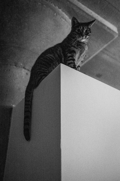
5 Steps to Achieve the Look of Black and White Film Using Lightroom

10 Nov

As a hobbyist, amateur, or professional photographer, you may be interested in achieving the look and feel of black and white film without the hassle and investment in equipment and gear. You can edit a digital image using Lightroom with this goal without having your hands smell like rotten eggs (developing chemicals). If you shoot black and white film often, as I do, then you might actually love that smell. If not, then you might want to read on.

Look feel black white film Lightroom01

The feel of black and white film – research first

The objective here is to provide you with a few basic steps to get you started on the path to edit your digital images to look like they were shot on black and white film, without the mess. If you are not familiar with the qualities of film images or have not examined them closely, it would be a good idea to do so. Try to pick up and look closely at some actual prints on photographic paper. You might find these in your grandmother’s attic or your local museum. Photography books or online searches will yield many reprinted or scanned examples as well.

First, consider the subject of style as it relates to film photography. Film photographs generally have a certain nostalgic or vintage look and quality to them that distinguish them from the clarity and realistic look of a well-composed digital image. Film tends to render subjects and scenes in a more abstract manner. Although you can make tack sharp and very realistic looking images using today’s film and gear, that’s not really the role of film photography.

Look feel black white film Lightroom02

If you want clean, shoot digital. Film should look old, slightly out of focus, and definitely grainy. All film has some or a lot of grain and it is basically the equivalent of digital noise. While you may prefer some of your images to look super sharp and smooth, you may also find it pleasing to add a little (or a lot) of grain from time to time.

Film adds an air of mystery

You might want to experiment with this more abstract style or look of film that comes with a distinctive aesthetic. One advantage of presenting this style of image is that the viewer is given the task of filling in the blanks, so to speak. Subjects in your image that are not entirely in focus or even blurry can be representative of anything or anyone. Your image can be more open to interpretation by the viewer as compared to an image that was sharply composed with a subject that is obvious. In other words, you might want to leave some room for mystery in your images. Film photography, or working towards the look and feel of film, can do that for your images.

Look feel black white film Lightroom03

Like digital, film is really just another medium in which we can express ourselves as artists and photographers. I love many things about both film and digital and each has a place in my professional and personal photography life.

5 steps to getting the look and feel of film using Lightroom

If you shoot digital and are looking to achieve the look and feel of film, below are five easy steps using Lightroom.

1. Set your ISO high

ISO should be set to somewhere between 1600 and 6400. Digital noise is the modern day equivalent of the grain in film. The grain or digital noise creates atmosphere and the look or aesthetic that you are trying to emulate.

2. Make an image of something interesting

Look feel black white film Lightroom04

Choose a subject. Framing and composition should be pleasing, and be careful to avoid too many distractions. Emotion is usually a good idea to include if there are people or animals in your photo. Any additional compositional techniques can be applied to the image. The subject could be in focus or blurry. This is completely up to you and your vision.

3. Convert the image to black and white

To convert your image to black and white, press V or use another method for black and white conversion in Lightroom. You can stay in color, but the look and feel of color film is more difficult to achieve and will require some additional steps.

4. Open the Develop module in Lightroom

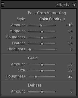
Look feel black white film Lightroom11In the bottom panel of the Develop module called Effects, make the following adjustments:

  • Using the sliders, set the Post-Crop Vignetting to -10. Older camera lenses tended to impart some vignetting onto the image. This will give the image an authentic older film quality to it. Ansel Adams famously burned (darkened) the edges to all of his prints.
  • Set the Grain Amount slider to 50.
  • Adjust the Grain Size to 50.
  • Set the Grain Roughness to 25.

5. Review your image and make the finishing touches

Adjust the sliders to increase or decrease the three Grain options to achieve your vision for the given image. You can also dial in or out the vignette as well. All images are different and all digital image files will respond differently to these adjustments based on the sharpness and ISO settings.

Look feel black white film Lightroom05

You may want to consider the following questions to evaluate your adjustments at this point. Do these edits help the image? Does it assist in the presentation of the image as more abstract so that it might connect better with the viewer? Did the adjustments achieve the look at feel of film that you were gong for? You can decide on the answers to these questions and make editing decisions as you see fit or recruit a friend to provide a critique.

If you like your results and would like to explore this topic further, there are free online software programs such as Analog Efex Pro that are part of Google’s Nik Collection. Presets are also available that will aid you in this process and even help you to achieve the look and feel of color film. You might want to consider making your own presets and applying them en masse to a given photo shoot or batch of images as well.

Look feel black white film Lightroom06

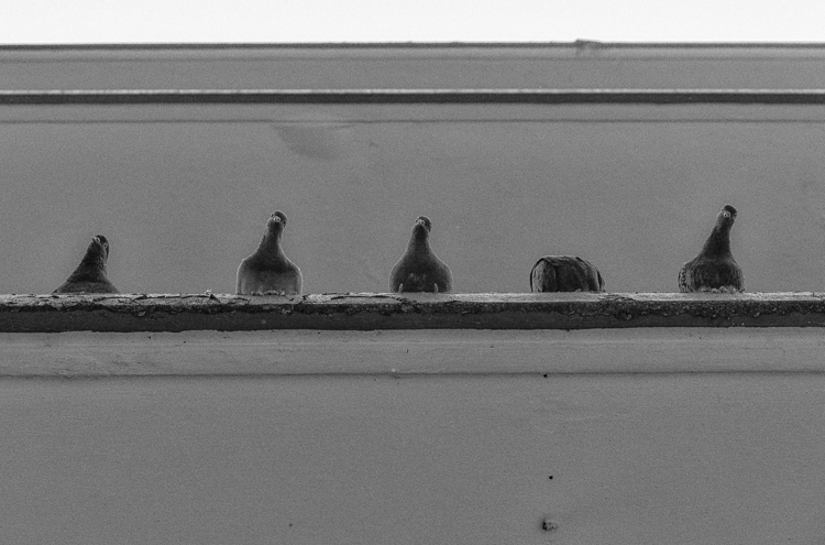
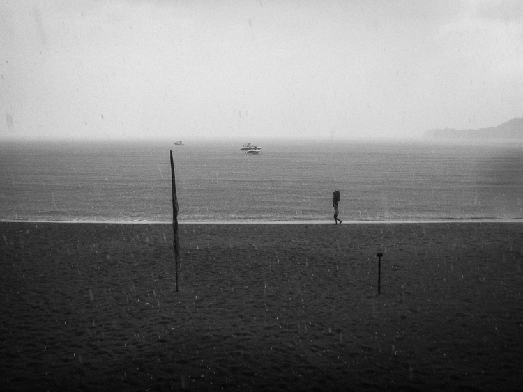
Below are a few images representing multiple genres that I made with a digital camera then edited to achieve the look I was going for using the settings in the Effects panel above.

Look feel black white film Lightroom07

Look feel black white film Lightroom08

Look feel black white film Lightroom09

Look feel black white film Lightroom10

Do you enjoy shooting film or reproducing the look of it using digital methods? Do you have a favorite way to achieve it? Please share in the comments below.

googletag.cmd.push(function() {
tablet_slots.push( googletag.defineSlot( “/1005424/_dPSv4_tab-all-article-bottom_(300×250)”, [300, 250], “pb-ad-78623” ).addService( googletag.pubads() ) ); } );

googletag.cmd.push(function() {
mobile_slots.push( googletag.defineSlot( “/1005424/_dPSv4_mob-all-article-bottom_(300×250)”, [300, 250], “pb-ad-78158” ).addService( googletag.pubads() ) ); } );

The post 5 Steps to Achieve the Look of Black and White Film Using Lightroom by Jeremy H. Greenberg appeared first on Digital Photography School.


Digital Photography School

 
Comments Off on 5 Steps to Achieve the Look of Black and White Film Using Lightroom

Posted in Photography


How to Use Two LED Lights to Achieve Moody Portraits

02 Aug

Any kind of light is a must for photography. You just cannot photograph without light. There are various types of light that no doubt you are familiar with:

  • Natural light from the sun
  • Ambient light (could be natural or manmade)
  • Artificial light such as strobes, incandescent or tungsten, fluorescent, flash and LED lights
  • Infrared light

achieving-moody-portrait-2-LEDs-tips

This article will give you tips for using two LED lights to achieve moody portraits.

Tip #1 – Modify your light

The best light is always modified. Even sunlight is better with a diffuser. Direct sunlight produces hard shadows and harsh light. Clouds soften and diffuse sunlight (by making it spread over a larger area). On a bright cloudless day, shooting in open shade minimizes the harshness, but still takes advantage of the beautiful natural light. Shooting in shadows, located next to reflective surfaces, also leverages any bounced natural light. These techniques are simply modifiers of natural and available light.

Modifiers are more obvious for artificial light. There is a plethora of choice when it comes to these: soft boxes, diffusers, reflectors, foam cores panels, umbrellas, flags to name a few.

The same is true for LEDs when it comes to the need for modifiers. There are many types of LED lights, including ones that you can adjust their brightness as well as colour temperature. But, just like the above, regardless of brightness intensity of the continuous light, it is essential to modify LEDs to get soft, pleasing, beautiful light -overall a better quality of light.

I’m going to show you a setup using modified LEDs to create moody portraits.

achieving-moody-portrait-2-LEDs-tips

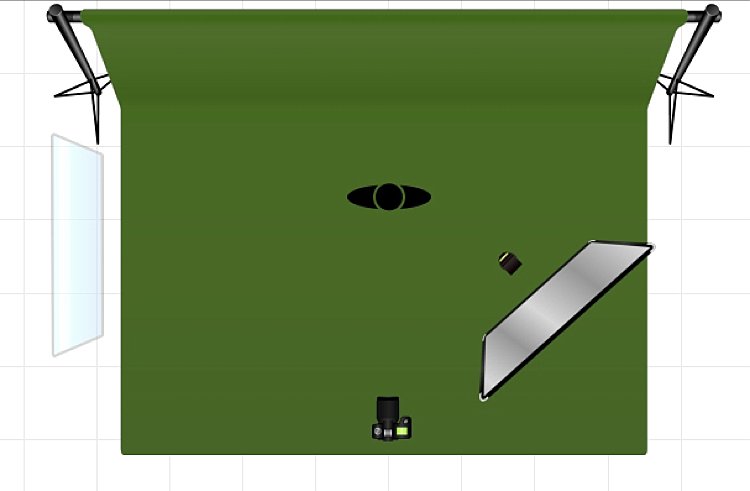
Using a window to camera left and an LED, bounced into a diffusion panel, to the right.


The main light I used here is the Magic Tube, the cheaper alternative to Westcott Ice Light. You can adjust the brightness of the light, and it comes with a tungsten gel if you need it. Apart from looking lightsaber Star Wars cool, the Magic Tube also comes with a charger that allows continuous charging while it is being used. So you can always have access to power by just plugging it in if the battery charge runs out.

You can also use window light and just one LED for this setup. Substitute the main light with your window light, but make sure you are diffusing the light coming from a window with a sheer voile, or fabric to soften it.

To diffuse the main light, I covered it with the Rogue Bender diffuser for the strip light. This is just a piece of rectangular translucent material which simply covers the light.

Tip #2 – Position your lights for contrast

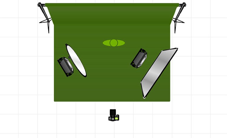
Position the main light at 45 degrees to the subject, up high to emulate light coming from a tall window. Use a diffusion panel or a piece of sheer fabric. The less opaque the fabric, the more diffuse your light will be. To further modify the Magic Tube after I have attached the Rogue Bender diffuser, I also used the diffusion (translucent part) panel of a 5-in-1 reflector and had an assistant hold the panel in front of the main light. Having these two diffusers together reduces the strength of the light, but also greatly softens its quality.

achieving-moody-portrait-2-LEDs-tips

The second light is also an LED, this time a small video light positioned to camera right, at 45 degrees, but at the same height as the subject. However, instead of using a diffuser to modify this light, you can turn it around so the light faces away from the subject, and put a reflector in place to bounce the light on. The subject (filling in the shadows) gets illuminated by the soft bounced light from the reflector.

achieving-moody-portrait-2-LEDs-tips

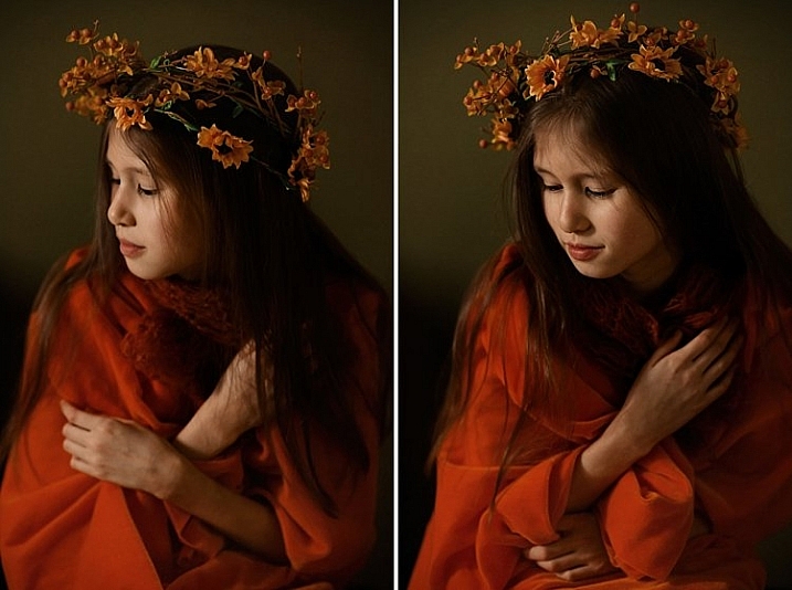
For a moody look it is essential to have both light and shadow in the portrait. You need to watch where the main light falls, and the shadow it’s creating. You want the shadowed area to still have some detail, instead of being completely black. The bounced light from the reflector takes care of this.

Tip #3 – Use a dark background

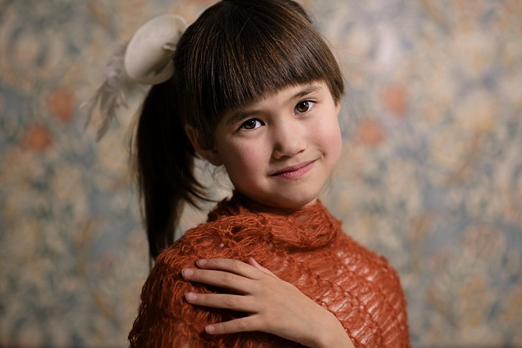
I tried the exact same setup, although the lights were positioned the opposite way, with the main light on camera right. This setup had a lighter background, in this case lightly patterned, and the results were far from moody. I did not want to shoot at a smaller aperture as I wanted to blur the pattern of the wallpaper in the background. I also wanted to emulate sunlight shining through a window illuminating a dark room, and this setup just did not work to achieve that look.

I’m sure if I had gridded the main LED to avoid spill into the light background, while increasing my shutter speed, the background would have gone darker, but I would have lost the soft and atmospheric look I was after. Compare this photo below to the one underneath it, and it’s pretty obvious the darker background is most definitely better at achieving the moody look.

tutorial-using-2-led-lights-for-portraits-photography

achieving-moody-portrait-2-LEDs-tips

I hope this article gave you new ideas to try. Do share other tips you have to achieve moody portraits!

googletag.cmd.push(function() {
tablet_slots.push( googletag.defineSlot( “/1005424/_dPSv4_tab-all-article-bottom_(300×250)”, [300, 250], “pb-ad-78623” ).addService( googletag.pubads() ) ); } );

googletag.cmd.push(function() {
mobile_slots.push( googletag.defineSlot( “/1005424/_dPSv4_mob-all-article-bottom_(300×250)”, [300, 250], “pb-ad-78158” ).addService( googletag.pubads() ) ); } );

The post How to Use Two LED Lights to Achieve Moody Portraits by Lily Sawyer appeared first on Digital Photography School.


Digital Photography School

 
Comments Off on How to Use Two LED Lights to Achieve Moody Portraits

Posted in Photography