RSS
 

Posts Tagged ‘Accident’

Australian Nikon ambassador Dale Sharpe, 36, killed in tragic roadside accident

23 Jun

Dale Sharpe, an Australian storm-chaser, landscape photographer and Nikon Ambassador has passed away after a tragic roadside accident while in the United States.

According to The Wichita Eagle, a local paper in Kansas, Sharpe was killed when he was hit by a vehicle after suffering car problems of his own.

The report says Sharpe was traveling northbound on highway K-2 when his vehicle made contact with a deer and ultimately came to a stop in the southbound lane due to the damage not long after midnight on June 20, 2019, according to the Kansas Highway Patrol crash report.

In an effort to seek safety while making a call for assistance, Sharpe moved to the side of the road. Shortly after, a vehicle traveling southbound attempted to avoid Sharpe’s broken-down vehicle when it swerved off the road and into the same ditch Sharpe had attempted to run to for safety. Sharpe was taken to Harper County Community Hospital, where he was pronounced dead at 2:14 a.m. local time.

View this post on Instagram

A post shared by Dale & Karlie | Gold Coast ?? (@dkphotographyau) on

The driver of the vehicle who hit Sharpe was unharmed. A Kansas Highway Patrol spokesperson told The Wichita Eagle that the 45-year-old man driving the vehicle was ‘driving in accordance to the law and will not be charged.’

Sharpe, who was 36 years old, is survived by his wife, Karlie Russell, who served as a partner in their photography business, DK Photography, as well as his daughter, Mia.

View this post on Instagram

A post shared by Dale & Karlie | Gold Coast ?? (@dkphotographyau) on

In a statement to DPReview, Nikon Inc. said ‘We are deeply saddened to hear about the loss of Dale Sharpe. He was a talented photographer and a valued member of our community. We extend our heartfelt sympathy to his family, friends and all those that he inspired through his work.’

Two separate GoFundMe campaigns (’Bring Dale Home’ and ‘Memorial Fund for Dale Sharpe DK Photography’) have been set up for the Russell family. Per the DK Photography Facebook post, DPReview did not contact anyone to verify the GoFundMe campaigns out of respect for their privacy.

Articles: Digital Photography Review (dpreview.com)

 
Comments Off on Australian Nikon ambassador Dale Sharpe, 36, killed in tragic roadside accident

Posted in Uncategorized


Top 10 Luminar 2018 Features That I Discovered by Accident

07 Feb

Luminar’s powerful, customizable approach to image editing is wrapped in a cloak of simplicity which is great for photographers who tend to feel intimidated by the hundreds of buttons, menu options, and sliders available in other post-processing programs. The more you use it the more you will likely realize that there is far more to Luminar 2018 than a handful of presets and filters. You will probably stumble across some neat hidden features that can do a lot to improve your editing and workflow.

Here are 10 of my favorite features, in no particular order, that I found just by poking around and going about my usual business of editing photos with Luminar. Not all of these will change your life, but several might make you react like I did, by thinking “Hey now, that’s really useful!”

Top 10 Luminar 2018 Features That I Discovered by Accident

Luminar has a host of small but useful features up its sleeve to help novices and professionals alike.

#1 – Before/after preview slider

As a longtime user of Lightroom, the idea of having a before/after preview is nothing new. With one click you can see your image split in two, with one half as the original and the other half showing the edits. Luminar has this feature as well but it kicks things up one notch by allowing you to move the preview slider back and forth.

This lets you see your edits applied to any part of the image you want, and it updates instantaneously as you move the slider. It’s an incredibly useful feature that you might not notice at first, but once you do could seriously improve your editing.

Top 10 Luminar 2018 Features That I Discovered by Accident

#2 – Lasso tool for erasing

Sometimes you need the Spot Healing tool to remove unwanted blemishes and imperfections from an image, but sometimes that very same tool can drive you crazy due to its imprecise nature and circular application brush. When I first started using Luminar I was well aware of its healing tool that functioned much like similar tools in other applications, but I didn’t realize that it was also possible to use the same technology with a lasso-style implementation.

To erase oddly-shaped portions of an image select Tools>Erase, then select the lasso tool, and then click to outline the spot that you want to erase. When you are finished, click “done” and Luminar will eliminate it like it was never even there.

Top 10 Luminar 2018 Features That I Discovered by Accident

I liked this image but was not happy with the orange banner in the background.

Top 10 Luminar 2018 Features That I Discovered by Accident

The Lasso Erase tool let me select just the banner and then remove it from the photo with one click.

Top 10 Luminar 2018 Features That I Discovered by Accident

The final image is much improved, and it took very little effort to do so.

#3 – Single View Mode

As you add filters to an image it can get a little cumbersome having to deal with an ever-expanding vertical list of image adjustments. Thankfully there is an easy way to tame your filters. Just click on the Filters label at the top of the list and choose Single View Mode.

This collapses all of your filters and allows you to work with just one at a time, dynamically collapsing it when you click on another one. This single tip has saved me countless headaches as I scroll up and down my filters workspace to find the one I need, and I don’t think I could ever go back to any other way of editing.

Top 10 Luminar 2018 Features That I Discovered by Accident

#4 – Edit multiple images at one time

This one requires a bit of legwork but it can really come in handy depending on your editing needs. If you want to work with multiple images at one time, each on its own layer and with its own set of filters, click the + button in the Layers panel and add a new Image Layer. This new layer is added on top of your existing layer and can be combined with another layer with tools like masking and by changing the opacity.

However, you can also work on both images side-by-side by using the Free Transform option in the Tools menu. First select one of the layers, then click Tools > Free Transform, and re-size the image so it’s on one side of your screen. Do the same for the other layer, and you now have a workspace that allows you to edit multiple images at the same time.

Top 10 Luminar 2018 Features That I Discovered by Accident

#5 – Crop to Facebook cover

If you have ever uploaded a picture to your Facebook page as a Cover Photo you may have been disappointed to see your painstakingly-edited picture re-cropped and re-sized so the final result is a shadow of what you intended.

Luminar’s crop tool has a way to mitigate this issue entirely by including a Crop to Facebook Cover option in the crop tool. This will ensure that your resulting image will be just the right dimensions to fit perfectly on top of your Facebook profile page without any annoying automated edits from Mark Zuckerberg and his company.

Top 10 Luminar 2018 Features That I Discovered by Accident

#6 – Click the histogram to show color channels

It’s no secret that Luminar has a histogram view, and in fact, it would be kind of surprising if any image editor worth its salt didn’t have this tool. But what’s a little different here is that you can click the histogram to show individual color channels one by one.

This might not be something you use every single day but can really come in handy if you want to see the exposure level of the reds, blues, and greens.

Top 10 Luminar 2018 Features That I Discovered by Accident

#7 – Apply user presets during batch processing

Luminar’s workflow generally revolves around the idea of applying filters. You can also instantly apply many filters at once using a preset. What I find more useful, though, is that you can combine different filters to make your own presets, such as one that I use quite often called “Clarignette” that applies a bit of clarity while also adding a vignette.

It’s a simple but effective preset that I tend to use on many images, and Luminar’s batch processing tool makes this even easier. When you load a series of images for batch processing you can apply any of Luminar’s existing presets in addition to any custom presets you create yourself. This can dramatically speed up your editing if you find yourself doing the same types of editing operations on many of your photos.

Top 10 Luminar 2018 Features That I Discovered by Accident

#8 – Drag-and-drop layer reordering

Luminar’s layer-based workflow functions much like Photoshop and other editing applications. While this particular tip might not be especially groundbreaking it is something I found to be very handy. You can, of course, rename layers by double-clicking on their name and use blend modes by right-clicking on them (or control-clicking on a Mac).

But one thing I didn’t realize at first was how easy it was to reorder the layers in Luminar 2018. A simple drag-and-drop can be used to adjust which layer comes first. Since your edits are applied in a top-down fashion this can have a big impact on your overall image.

Top 10 Luminar 2018 Features That I Discovered by Accident

#9 – Change editing background color with one click

As a longtime user of Lightroom I have developed a pretty consistent set of editing preferences, and I have found that a light gray background helps me focus on editing my images without straining my eyes too much. However, sometimes I want to change the background color.

Luminar handles this with one click, which makes it a lot easier and more practical. Simply right-click (or control-click on a Mac) anywhere in the background area of your editing workspace to change the color.

Top 10 Luminar 2018 Features That I Discovered by Accident

#10 – One-Click Preset Updates

It’s not uncommon for me to create a preset and then change it over time as my editing evolves, but for a while I used a cumbersome process to do this. It involved clicking on a preset, changing its parameters, saving it as a new preset. Then I’d navigate to the Preset folder on my computer to delete the original preset and finally change the name of the revised preset.

It was a chore and often resulted in a Preset folder littered with old versions that I didn’t use anymore, but thankfully there is a much easier way to do this. Simply click the name of one of your Custom Presets in the tray at the bottom of the screen and choose “Update with current settings” and your preset will be updated without any other work on your part.

Top 10 Luminar 2018 Features That I Discovered by Accident

More to discover

While some of these tips might not be new to you at all, each was something I stumbled across by accident while using Luminar 2018. They served as a reminder to me of how I appreciate this program’s ability to surprise and delight.

I enjoy finding useful tips and tools by accident, and Luminar is full of these sorts of hidden, helpful features. What sorts of things have you come across while using Luminar? Do you have a favorite tip or trick to share? Please leave your thoughts in the comments below.

Disclaimer: Macphun, soon to be Skylum, is a dPS advertising partner.

The post Top 10 Luminar 2018 Features That I Discovered by Accident by Simon Ringsmuth appeared first on Digital Photography School.


Digital Photography School

 
Comments Off on Top 10 Luminar 2018 Features That I Discovered by Accident

Posted in Photography


3 Handy Lightroom Features I Discovered by Accident

27 Jan

When I first started to dabble in photography, I knew very little about post-processing. I used Picasa to edit my photos. It’s free and easy to use. I experimented with the different settings and created some pretty interesting images (they weren’t very good). Needless to say, I had no idea what I was doing.

This was the extent of my early post-processing attempts. I created collages in Picasa.

This was the extent of my early post-processing attempts. I created collages in Picasa.

Self-learning methods and benefits

Like many of you, I am a self-taught photographer. My degree is in English Literature, and photography was something I dabbled in as a hobby. I learned photography by reading books, participating in online forums and through trial and error. It’s been a long hard road but it’s been well worthwhile.

I learned most of my post-processing by watching YouTube videos. It has become one of my favorite ways to learn. There’s some inspirational stuff available that you can use to teach yourself all kinds of different skills. It’s a lot of fun, and the benefit of learning in this way is that you can go at your pace.

This type of learning is perfect for my lifestyle, and I’m sure for many of you the same factors apply. It always amazes me what we can teach ourselves when we put our minds to it. Check out this video. Sean Tucker experiments with landscape photography and discusses how important it is to continue to learn and push ourselves.

Three Lightroom Features Discovered by Accident

Now that we are on the path to self-directed learning I would like to share with you three Lightroom shortcuts, hacks, tricks, or whatever you want to call them, that I learned completely by accident. I just pushed buttons to see what would happen. By just experimenting, the results paid off. I learned some very efficient ways to manage my post-processing workflow, and I want to share them with you.

Accidental Discovery #1 – the Alt key

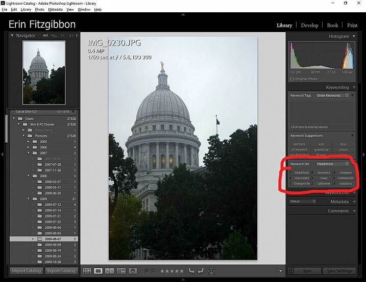
By simply pushing buttons I discovered some pretty cool functions. If you hold down the Alt key while in the Library module, little numbers appear by each keyword. You can then simply hit the number, and the module will tag your images with that keyword. Brilliant!!!

If you create a set keywords, this little trick becomes even more useful. The keyword set is then added to your images by simply typing in the correct number.

Alt key Lightroom Library module

This little discovery saves me loads of time.

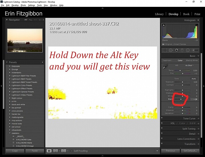
In the Develop module, the Alt key is very useful when setting black and white points in your images. Hold down the Alt key while hovering your cursor over the Blacks slider. The image will go completely white and as you move the slider from side to side (move it left to darken or add black) you will be able to see when the blacks begin to clip in your image.

This is a great way to adjust your image and super easy to see (and adjust) how much contrast range it will have. You can use the same principle to adjust the white points in your image. Give it a try. It’s one of the first steps I take when editing my work.

Note: It’s okay and even desired to have some blacks clipping in your image, but ideally you want to keep any whites from doing so. Clipping means areas with no detail in that tonal range.

Alt key Lightroom Develop module black point slider.

Here’s a screen shot of the black point slider.

Accidental Discovery #2 – Navigator Window

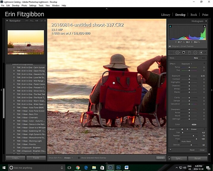
The Navigator window is very useful when you need to zoom in. This is probably really obvious and silly to those who have formal Lightroom training. Before discovering this little trick, I would zoom in and out applying the adjustment brush to small sections of the image. It was very tedious.

Then one day I discovered that if I click the 1:1 button on the Navigator (preview) window and then slide the square around on the screen, I could apply the adjustment brush without the tedium of closing the adjustment brush and moving out to the full-screen view.

Lightroom features 1:1 preview window

When I need to apply the same brush to several different areas of an image I click on the 1:1 feature and slide around the image making adjustments.

Accidental Discovery #3 – Lights Out in the Library

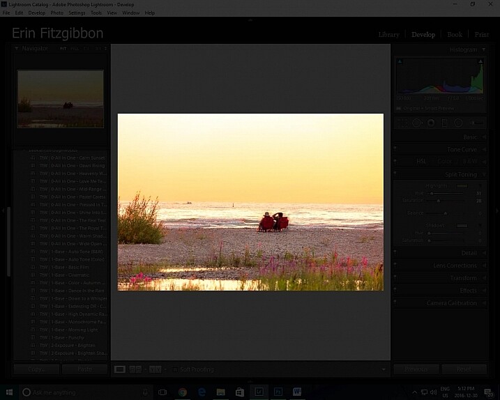
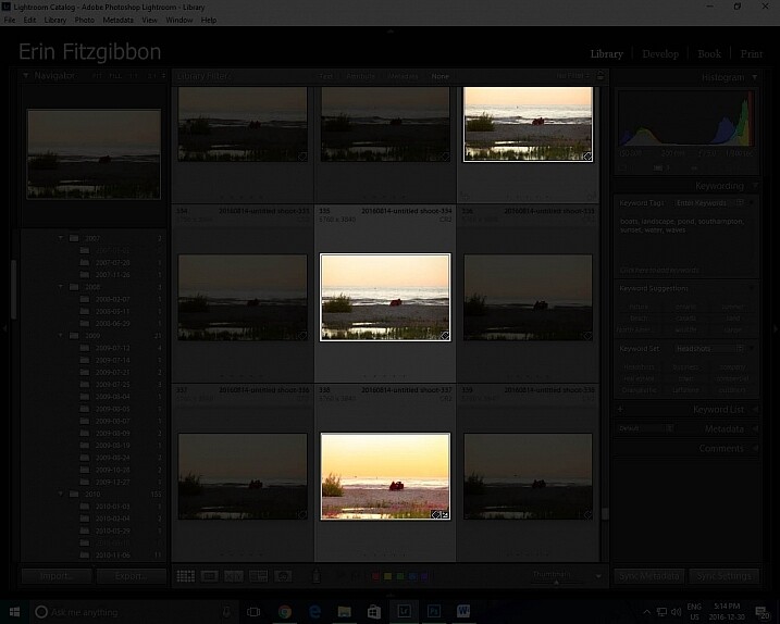
It took me a little while to figure out this trick. Again, I was just experimenting and pushing buttons. I had learned to use the Lights Out feature in the develop module.  When you press the letter L on your keyboard, it dims the surrounding panels so that you can focus more on the image at hand (press L again for total black around your image, and once more to return to normal). This same tool works well in the library module. I now use the “Lights Out” feature to isolate specific images. Simply select the images you wish highlight then hit the “L” button. It’s a neat little trick.

This same tool works well in the library module. I now use the Lights Out feature to isolate specific images. Simply select the images you wish highlight then hit the “L” button. It’s a neat little trick.

Lightroom features Lights Out in Library module

I use this feature to help me analyze an image before I decide it’s finished.

Lightroom features Lights Out in Library module

Look how easy it is to isolate specific images in the library module.

Conclusion

Experimentation is never a bad thing. We live in an age when we are lucky to have so many resources available to us. The internet is a true cornucopia of opportunity. Don’t be afraid to try different things. You really can’t break the program.

Sure there have been times when I have had to call Adobe and ask for assistance because I’ve pushed some button and haven’t been able to reset the program, but those times have been very few and far between.

Let me know about some of the tricks you use when post-processing. I’m sure there’s so much out there I still need to learn and I’m hoping you can add to my list of discoveries. What have you taught yourself about post-processing or using Lightroom in general? Please share in the comments below.

googletag.cmd.push(function() {
tablet_slots.push( googletag.defineSlot( “/1005424/_dPSv4_tab-all-article-bottom_(300×250)”, [300, 250], “pb-ad-78623” ).addService( googletag.pubads() ) ); } );

googletag.cmd.push(function() {
mobile_slots.push( googletag.defineSlot( “/1005424/_dPSv4_mob-all-article-bottom_(300×250)”, [300, 250], “pb-ad-78158” ).addService( googletag.pubads() ) ); } );

The post 3 Handy Lightroom Features I Discovered by Accident by Erin Fitzgibbon appeared first on Digital Photography School.


Digital Photography School

 
Comments Off on 3 Handy Lightroom Features I Discovered by Accident

Posted in Photography


Blood Red: 30 Vintage Soviet Accident Prevention Posters

03 Jul

[ By Steve in Design & Graphics & Branding. ]

soviet-accident-prevention-poster-0
In Soviet Russia, accident prevent you! That’s the message rendered in classic commie-propaganda style via these thirty soviet accident prevention posters.

soviet-accident-prevention-poster-1

soviet-accident-prevention-poster-3

Graphic workplace accident prevention posters are nothing new, neither are they the purview of any one nation. That said, this selection of vintage Soviet accident prevention posters reflects a period in Russian history that was drenched in blood, sorrow, violence and loss – and not only on the factory floor.

soviet-accident-prevention-poster-2

soviet-accident-prevention-poster-4

soviet-accident-prevention-poster-5

Oleg Atbashian, a former citizen of the Soviet Union who moved to the United States in 1994, doesn’t recall ever seeing these horrifying-to-the-point-of-being-comical posters. Atbashian worked as a metal worker apprentice at a large Ukrainian factory when he was a teenager and later, as a visual agitprop (agitation and propaganda) artist specializing in posters directed at construction workers. Atbashian was in the right place; just at the wrong time.

soviet-accident-prevention-poster-6

soviet-accident-prevention-poster-7

soviet-accident-prevention-poster-8

Indeed, Atbashian’s USSR of the 1970s was quite a different place from the fledgling “communist paradise” of Lenin and Stalin. “They (the posters) reflect the zeitgeist of a completely different, less sensitive generation of Soviet citizens,” explains Atbashian, “who were so used to being disciplined, humiliated, and terrorized by the authorities that the least of their concerns would be to question some silly presumptive posters that described them as a herd of bumbling idiots being gored by machinery.” Geez Oleg, tell us what you really think!

soviet-accident-prevention-poster-30

soviet-accident-prevention-poster-13

Just as the communist system of government represented a clean break from the Czarist regimes which preceded it, graphic art in the nascent Soviet Union aspired to blaze a new trail in lockstep with the policies and philosophies of the Red Revolution.

Next Page – Click Below to Read More:
Blood Red 30 Vintage Soviet Accident Prevention Posters

Share on Facebook


[ By Steve in Design & Graphics & Branding. ]

[ WebUrbanist | Archives | Galleries | Privacy | TOS ]


WebUrbanist

 
Comments Off on Blood Red: 30 Vintage Soviet Accident Prevention Posters

Posted in Creativity