RSS
 

Archive for June, 2015

Urban Playscapes: 14 Interactive Installations in NYC

30 Jun

[ By Steph in Art & Installation & Sound. ]

tight spot 1

New York City is essentially one massively oversized playground, with interactive art installations ranging from vibrating inflatable globes stuffed under the High Line to mazes in Madison Square Garden just waiting to be discovered by passersby. At any given time, there are dozens of playful outdoor exhibits inviting visitors to climb, touch, listen, connect or simply gaze up in wonder.

City of Dreams Pavilion by Izaskun Chinichilla Architects

nyc city of dreams 1

nyc city of dreams 2

A colorful pavilion made of reclaimed materials has sprouted up on Governors Island in New York City. ‘City of Dreams’ by Izaskun Chinichilla Architects is a visualization of the need to be flexible when designing and carrying out architectural projects, adjusting to changes in budget, specifications and other requirements in an imaginative and intuitive way. Get close and you’ll see all of the broken umbrellas, damaged bicycles, car rims, stools and other waste products that were used to create it.

Please Touch the Art by Jeppe Hein

nyc please touch 2

nyc please touch 3

nyc please touch 4

nyc please touch 1

Unlike many art installations, which ask you to look but not touch, this series of sculptural projects by Jeppe Hein beg passersby to interact with them. ‘Please Touch the Art’ is an exhibition of 10 sculptures including benches, a mirror maze and rooms made of water spouts, all located within the waterfront Brooklyn Bridge Park.

Clouds by Olaf Breuning

nyc clouds

nyc clouds 2

nyc clouds 3

At an entrance to Central Park, childlike clouds in shades of blue hover against a backdrop of winter-bare trees and snow. The effect is that of a stage set for a play, positioning passersby as actors participating in an as-yet-unknown piece of performance. The clouds tower 35 feet above the park on steel ladders.

Cloud City on the Roof of the Met by Thomas Saraceno

nyc cloud cities 1

nyc cloud cities 2

nyc cloud cities 3

Sixteen interconnected modules come together to form ‘Cloud City,’ a geodesic dome installed on the roof of New York City’s Metropolitan Museum of Art. Argentinian artist Tomas Saraceno, who has installed similar domes in unexpected locations around the world, created the site-specific installation as a fusion of architecture, geometry, biology and ‘human involvement in order.’ Some facets of the modules are mirrored and some aren’t, distorting the view of the city’s skyline and the treetops of Central Park.

Pet Sounds by Charles Long

nyc pet sounds

pet sounds 2

Strange, colorful globs glisten on park benches, along playground railings and in the grass at Madison Square Park, creating new paths and converging around a common seating area. And if anyone is brave enough to actually touch these strange-looking things, they’re rewarded with a variety of sounds and vibrations. ‘Pet Sounds’ by California sculptor Charles Long invites people to add an aural landscape to the physical one in the park. “My re-occuring interest in the uncanny over many years is in full effect here in the Pet Sounds project where something as familiar and literally grounding as a handrail morphs into an unnamable blob that has a very physical presence with some power to dialog with the viewer’s own somatic sense. As one pets the blobs, a wide range of sounds are triggered and are coming from within the bodies of the forms.”

Next Page – Click Below to Read More:
Urban Playscapes 14 Interactive Installations In Nyc

Share on Facebook


[ By Steph in Art & Installation & Sound. ]

[ WebUrbanist | Archives | Galleries | Privacy | TOS ]


WebUrbanist

 
Comments Off on Urban Playscapes: 14 Interactive Installations in NYC

Posted in Creativity


7 Tips for Better Skyline Photography

30 Jun

Reminder: now until July 7th (AUS EST) the Landscapes, Cityscapes & Photography Tricks eBook is on 50% off at Snapndeals.

When we talk about cityscape photography, one of the most basic and trademark shots is the full skyline; the artificial horizon, made of buildings and towers jutting up and down into the sky above. Skylines can be jagged and coarse, or faint and smooth, often depending on the nature of the city itself.

Follow these tips for better skyline photography:

1. Find a Good Vantage Point Outside the City

Skyline image1

To find the city, escape it. One surefire way to capture a city skyline is to leave the city itself. If it’s sitting on a river, hop across; if it’s in a valley, climb the mountain outside. There are terrific vantage points outside cities, like hills, islands and boats, but all will involve a fair bit of travel time and some physical stamina to keep moving until you find a wide enough angle.

Take, for example, downtown Los Angeles: to capture this magnificent skyline, most photographers would hike up a nearby hill or visit the Griffith Observatory until they find a good angle. If you want to include major sites, you’ll need to go even farther: take a boat down to the islands south of Toronto, and you’ll find a clear shot of the CN Tower amid one of the world’s most recognizable downtown skylines. You’ll have to venture to uncommon places to find these angles.

2. Focus on the Corner of a Building

Finding the right focus can be difficult with the city miles away, especially in low light. In LiveView mode, use the LCD screen to zoom in on the corner of a building, and then manually focus until it is crisp.

Skyline image2

This will help ensure that your skyline comes out crisp, and not fuzzy with the autofocus guessing game.

3. Take Some Shots During the Blue Hour

Skylines can light up right after the golden hour, in what’s known as the Blue Hour, that short moment in twilight when the sky is still blue, but the city lights have already turned on. Shooting in pitch-blackness is harder to get good results, and not as visually stimulating, assuming you’re keeping your shot in color. Blue Hour will give your skyline a hearty azure backdrop, and make your image that much more interesting.

Skyline image3

4. Go Wide Angle

For skylines and cityscapes, focal lengths between 12mm-35mm are a good bet. It’s not a necessity, but you will appreciate the wide angle more often than not. This will allow you to capture a nice skyline without having to be miles outside the city.

Skyline image4

5. Use a Deeper Depth of Field

If you want a deeper depth of field, you’ll need a narrower aperture, something like f/11 – f/16, which will create a consistently detailed image.

Skyline image5

Typically, when capturing cities and landscapes, deeper depths of field is more desirable, so every detail of the frame appears in focus. This calls for a narrow aperture, or high f-stop.

6. Consider a Panorama

Sometimes even with a wide angle lens skylines are too long to fit in one photo, that’s when you’ll find a perfect opportunity to try capturing it as a panorama.

Skyline image6

A panorama is where you take multiple photos in a row with overlapping edges, then stitch them together to make a single image. Naturally, this shot is wider than most, long and narrow, it can capture a full skyline, bypassing adding in too much excess sky or ground.

7. Use Your Self-Timer and Bracket at Night

Just after sundown, I usually try and take five bracketed shot sequences in cities; the variety of light, between the bright street lights and the cooling sky, makes for a full palette of color and light that should be captured as accurately as possible. By capturing all these exposure levels you can ensure you are capturing all the light in the scene. You can choose which is best later or combine them with HDR processing techniques.

Skyline image7

Later into the evening, as shutter speeds get longer, I usually condense that to just three bracketed shots because of time. Sometimes even single exposures can do the trick, if I’m spending too long on a shot.

If you set your 2-second self-timer, and use a DSLR with exposure bracketing features – you can click the shutter and the camera will fire off all the shots without you needing to hold it, which risks blur from shaky hands (very useful on a cold rooftop).

Hope these tips have been helpful getting you started, have fun out there!


For Further Training:

SnapnDeals currently has a discount on this new in-depth eBook designed to help you master challenging lighting conditions no matter your experience level, take more compelling photos, post-process them to perfection, and delve even further into long exposure tricks so you know all the possibilities. Get Landscapes, Cityscapes & Photography Tricks at 50% Off now.

googletag.cmd.push(function() {
tablet_slots.push( googletag.defineSlot( “/1005424/_dPSv4_tab-all-article-bottom_(300×250)”, [300, 250], “pb-ad-78623” ).addService( googletag.pubads() ) ); } );

googletag.cmd.push(function() {
mobile_slots.push( googletag.defineSlot( “/1005424/_dPSv4_mob-all-article-bottom_(300×250)”, [300, 250], “pb-ad-78158” ).addService( googletag.pubads() ) ); } );

The post 7 Tips for Better Skyline Photography by Richard Schneider appeared first on Digital Photography School.


Digital Photography School

 
Comments Off on 7 Tips for Better Skyline Photography

Posted in Photography


Nifty Fifty Flash Sale!

30 Jun

Today only, we’re throwing a Flash Sale with five products at 50% off and YOU choose which five! We trust your opinion.

VOTE for your faves from now until 12PM EST

Winners go on sale from 12PM-2PM EST.

Nifty, eh?

Cast your vote as many times as you want and enlist your friends to vote … maybe even bribe them into voting for your favorite.

Get your vote on!


© Erin for Photojojo, 2015. |
Permalink |
No comment |
Add to
del.icio.us

Post tags:


Photojojo

 
Comments Off on Nifty Fifty Flash Sale!

Posted in Equipment


How to Photograph Fireworks: Happy 4th of July

30 Jun

The hot dogs have all been eaten and the blazing hot sun is finally setting. Time to grab your blanket and head out to your community 4th of July fireworks display. This year instead of coming back with just fond memories, grab your camera and follow these simple tips to photograph fireworks as well. Use Tripod If you’re using a Continue Reading

The post How to Photograph Fireworks: Happy 4th of July appeared first on Photodoto.


Photodoto

 
Comments Off on How to Photograph Fireworks: Happy 4th of July

Posted in Photography


How to Watermark Your Images Using Lightroom and Photoshop CC

29 Jun

Watermarks, love them or hate them, are a way of protecting your images. Although, just because you have one on your image doesn’t mean it won’t be stolen. If you are like me, I do it as a deterrent.

There are many ways to watermark your images. In this article I’m going to show you how to add a watermark to your images using Adobe Lightroom and Photoshop CC.

Lightroom (6) CC

Lightroom makes watermarking your images very easy, there are a couple of ways of doing it. Once you have processed your images and are ready to export them, then it is also time to watermark them.

Exporting Your Images

Select the images you want to export and watermark. You need to make sure you are in the Library module, then click on Export.

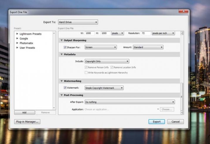
The Export Window will come up. We aren’t going to go through how to export your images, there are other tutorials that will show you how to do that. For this purpose we are concerned with the section down near the bottom, so scroll down until you see Watermarking. Take a look at the following image.
watermarking-1

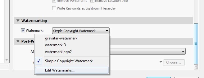
If it hasn’t been ticked, then check the box for Watermark. Next to that is a drop down menu click on that.

Simple Watermark
watermarking-2

If you’ve never watermarked anything before, then you could simply click on Simple Copyright Watermark and it will just put your name on the photos. Though you must be registered in order for Lightroom to know your name.

Another option under that drop down menu is Edit Watermarks, so let’s go through that option.

Edit Watermarks

In this section you can edit the text for the water, or what you want it to look like.

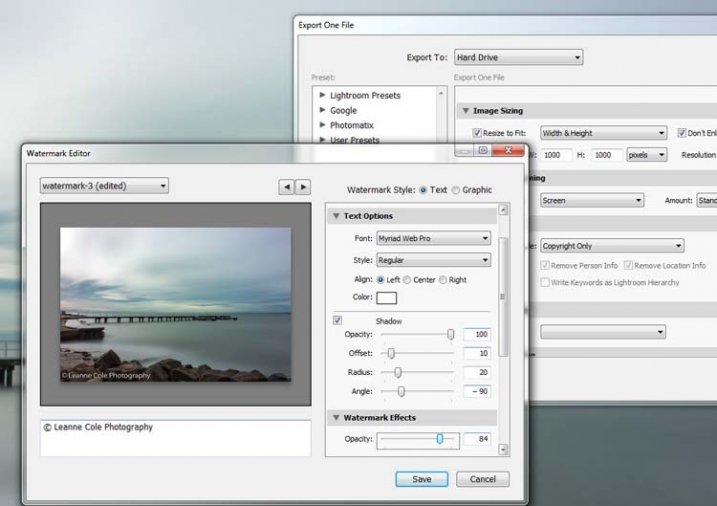
Before you can change the simple watermark you will have to make sure that at the top where it says Watermark Style, you have selected Text. In the image below you can see the window for the Watermark Editor and in the top right corner you can see Watermark Style.
watermarking-3

In the box underneath the image you can see the simple watermark, you can now select that and delete it, and write anything you like. The most common thing to do is put the copyright symbol, ©, with your name or business name after it. To make the copyright character on Windows simply press the Alt key and type the number 0169, on a Mac press Option+G.

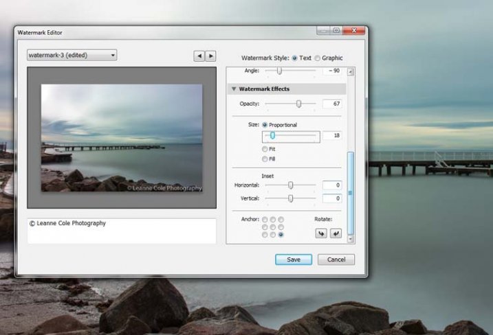
There are various sliders in the Watermark editor as well, one allows you to change the opacity of the watermark. How opaque you make it is up to you. I like to make mine so that you can barely see it. A lot of people looking at images can find watermarks distracting, so it is something you should keep in mind when you are adding them to your images.

There are different things you can do to adjust the watermark, for example changing its position. There is also a size slider to make it bigger or smaller.
watermarking-4

Add a Logo or Unique Watermark

If you have a logo or a special watermark you can use this in Lightroom too.

In the same window that we have been using, go back to the top and select graphic. Directly underneath you will see Image Options where you can load your file. You can make the same changes in regards to size, opacity and location as you did with the text watermark.
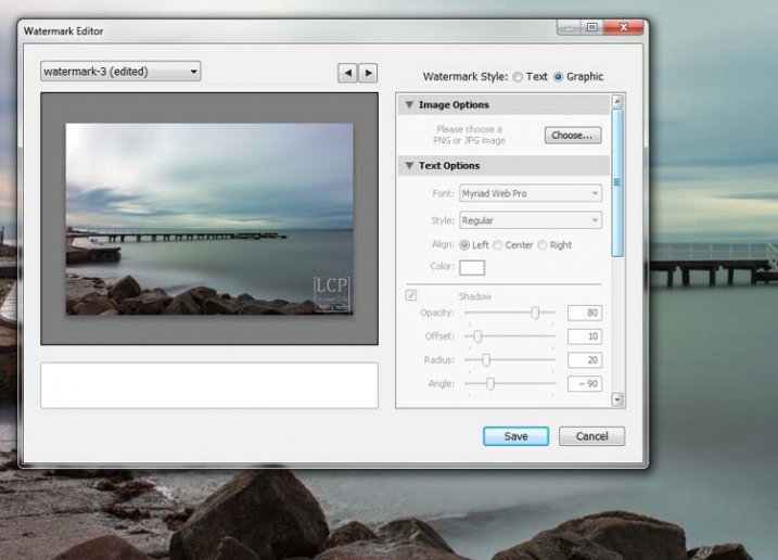
watermarking-5

Saving the Watermark Preset

Once you have worked it all out, you don’t have to do all that every time you want to export images. You can save what you have done as a watermark preset, and give it a name (pull down the menu top left where is says “Custom” to find Save Current Settings as New Preset – select that to see the pop-up box below) . The next time you want to watermark an image, just look in the same drop down menu that you used earlier to edit the watermark, and you will find your saved preset there.
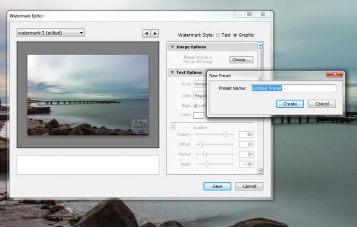
watermarking-6

Here you can see that I have called one of my presets: watermark-3.

Photoshop CC

There are also some simple ways of watermarking in Photoshop CC as well. It is a little different, but not harder.

Prepare your image as usual, then get it ready for its designated use and how you want to add a watermark to protect it. I resize every image I put online, that is my choice, it is up to you whether you decide to or not.

Easy Watermark

Once you are ready to save your image, read for use, one of the easiest ways of watermarking it is to simply use the text tool, located in the tool bar on the left of your workspace. The image below shows where it is located.

Click on the image where you want to put the watermark, and start typing. Remember you can also add the copyright symbol the same as you did using Lightroom.

You can change the size and colour of the text at the top, in the tool options bar below the main menu (or choose Window>Character to show the text adjustment panel). Select the text to change it. You can also move it around when it is highlighted as well. The opacity slider is above the layers panel on the right, you can change it to suit your preference.

watermarking-7

Making Your Own Logo or Watermark

You always have the option of making a custom watermark, which can be saved and used any time you need it, and can also be used in Lightroom.

To start, go to File in the main menu and click New (File>New). I usually make the size of the new image match my final image size, so the longest side is 1000 pixels. Make the width that size for this example. For the height, it doesn’t have to be that big, it just depends on what you are going to do. For this one it was 300 pixels. You will also need to make sure the Background Contents setting is set to transparent, see below.
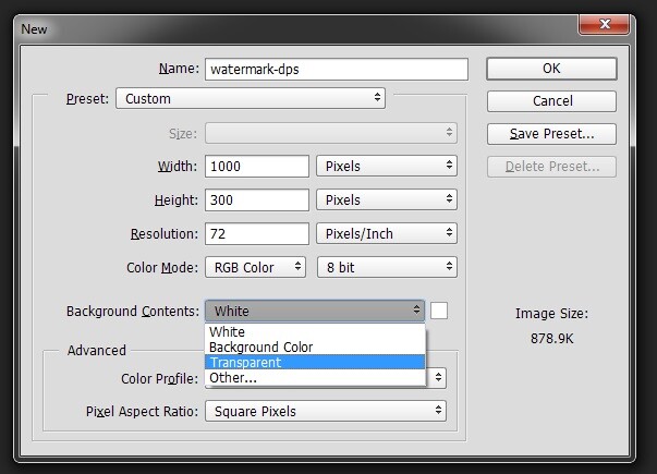
watermarking-8

So you can see what you are doing, you could add a new layer. Do that from the new layer icon at the bottom of the Layers Panel, or go to the main menu at the top and select Layer>New>Layer and click OK. Once that is in place use the Paint Bucket Tool which is in your tool bar, it is under the Gradient Tool icon. We are going to make the layer black, so make sure the foreground colour is black. The foreground and background colour selection is also in the tool bar, down near the bottom. There are two squares, one black and one white (click D on your keyboard which defaults the colors to black in the foreground, white in the background). Click on your new layer and it should be filled with all black.

Select the text tool (T) and make sure that white is now the foreground colour (click X on your keyboard to switch the foreground/background colors so white is now on top). Click on your image and start typing. Like you did for the Easy Watermark you can highlight it, then change the size. Once you’ve done that, you can crop it further so just the text appears.

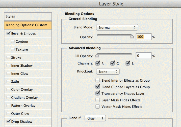
Double click on text layer, towards the right side, and you should get the following window, Layer Style.
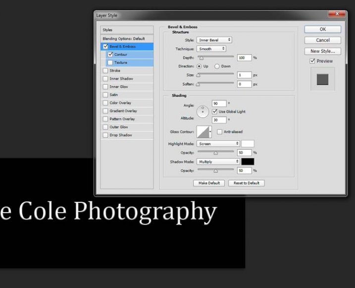
watermarking-10

You can see I have checked Bevel Emboss, and the Contour option underneath. You can play around with the sliders, but just ticking those did enough for this purpose. Then the black layer is deleted. You can do that by dragging it to the rubbish bin (trash can) in the bottom right corner. You can also right click on the layer and find delete. The easiest way is to highlight the layer by clicking on it, and pressing delete on the keyboard.

It is very important when you save this file that you do so as a .png or a .psd, otherwise the transparent part of the layer will be made white and you will no longer have the watermark that you desired.

watermarking-11

That is an easy way of doing a watermark that you can save so you can use again, but you could make a logo or something similar as well. One thing that quite a few people do is add a signature, like below.

signature-watermark

There are a couple of ways of doing this, but the most common is using a tablet with a pen, I use a Wacom Intuos Pro. Do everything the same as you did for the last one, but instead of using the text tool, get your brush, make it small enough using the left square bracket key, then write your name.

If you find the surface too slippery, try putting a piece of paper over the top, it will help add some resistance. You can also try doing it with a mouse or touch pad. Again, save it the same way.

Easy Way of Adding Watermarks

One of the easiest ways to use the watermark you have just created is to open it, then select all (Ctrl+A on a PC and Command+A on a Mac), then copy it, (Control+C on a PC and Command+C on a Mac). Go over to your image and press Ctrl+V or Command+V to paste it; the watermark should now be in the middle of your image.

You can use the move tool (V), which is the first one in your tool panel, and move it to where you want, like you did with the Easy Watermark.

Hiding Your Watermark in the Image

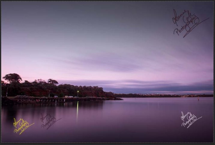
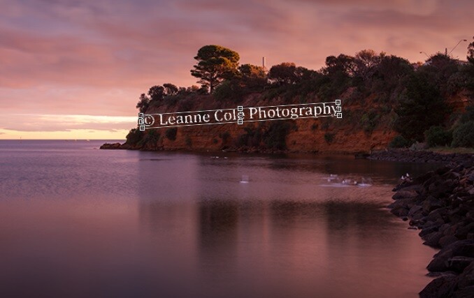
With a simple watermark you can also put it into the image and sort of hide it. This is the method I use for many of my fine art images. I try to place it where it isn’t obvious, and where it could be more difficult to remove.

Once your image is ready, copy and paste your watermark onto your image. Now you need Transform it; Edit>Transform in the main menu, or by pressing Ctrl+T/Command+T. You will notice a framework around your image, as shown below.

watermarking-12

By clicking and dragging on the corners, or in the middle of the lines, you can change the size. Click and drag to make it bigger or smaller (hold Shift down to keep the proportions the same, otherwise it will stretch out of shape). If you want to rotate it, hover around just outside a corner and a small curve arrow will appear, then you can turn it around. You can also move it by clicking in the middle and moving it where you want. As I said, find somewhere to hide your watermark in the image, hopefully somewhere not too noticeable, as demonstrated in the image below.
watermarking-13

To apply the Transform Tool you can double click inside the box, press Enter or click it with the move tool. Then the opacity of the watermark layer is changed to help it blend, see below.

watkinsbaywatermarked-2

Once you get good using Transform, you can experiment with what else the tool does.

Using a Brush to Watermark Your Images

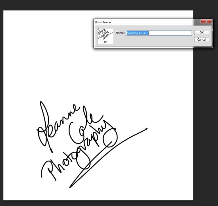
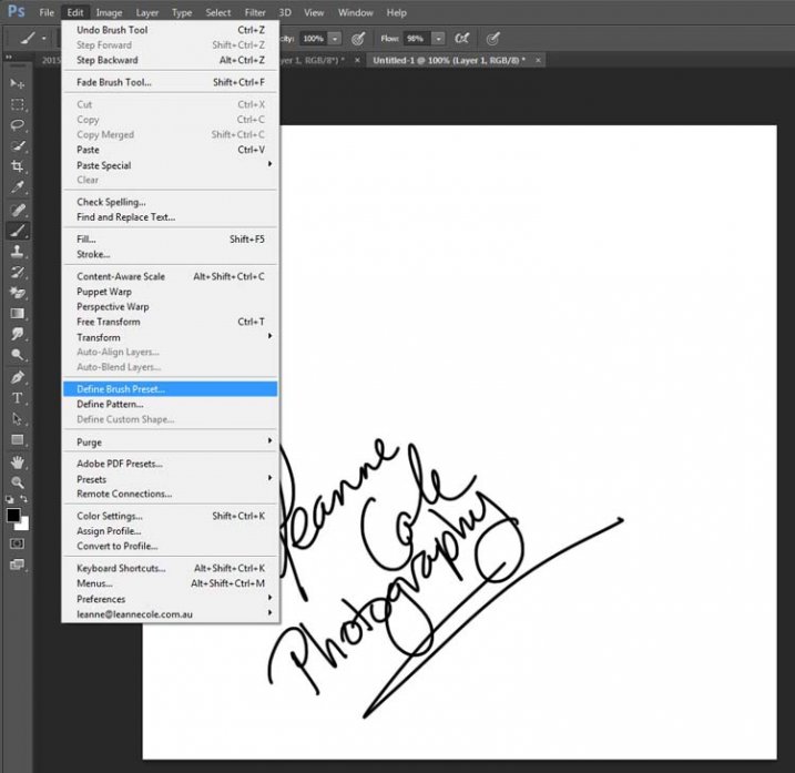
watermarking-14There is a very easy way of doing your watermark, but it takes a bit to set it up. Getting the watermark ready pretty much works the same as before, only this time you want a white background, and you need to use black to create it. Take a look at the image on the right.

Note: create your new file 2500 pixels wide as that is the maximum size for a brush. You can always make the brush smaller when you apply it to your image, but making it the largest size now will give you the best quality.

I created the signature with my Wacom Tablet, but you could also use a pen or black marker on a piece of paper and scan it, that will work just as well.

Once you have your signature, you can now make your custom brush. Go to the Edit menu and choose Define Brush Preset, and click on it.
watermarking-15

watermarking-16Next, you will see another window pop up window ,asking you to give your brush a name. You can name it what you like, perhaps something that will remind you what it is later; I called mine Brush Signature Watermark.

Now your watermark will work just like a brush, you can make it smaller or larger (remember if you made it 2500 pixels it will hold quality up to that size with out pixelating), you can also change the colour. It works exactly the same way as the normal brush does; use the square bracket keys to make it bigger or smaller. If you want to change the colour, click on the foreground colour and the Color Picker window will appear.

I would suggest adding your watermark to a new transparent layer, so you can also change the opacity as needed.

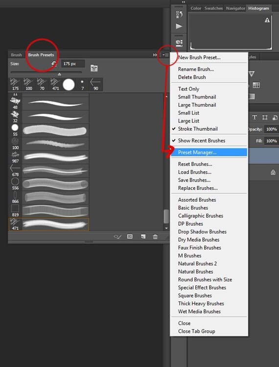
To find your new brush, go to your brush presets, they are over on the side of your layers panel, and click on the icon that looks like small lines at the top where a drop down menu should appear.
watermarking-18

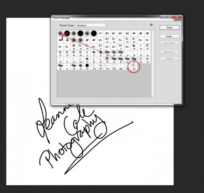
Go down to Preset Manager and click. A new window will appear with all your brushes. Now you can click, and drag the brush you just created to a spot where it will be easier to find, like up to the top.
watermarking-19

You are now ready to use your new watermark brush any time you want.

As I said, you can change the size of it using the square bracket keys [ ] on your keyboard. You can change its colour by clicking on the foreground colour in the tool panel and selecting a new one. You can also add layer effects like a drop shadow, emboss, etc., you can even make the text itself transparent and only leave behind the shadow.
layer-effects

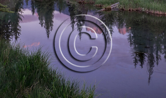
To make text “invisible” change the Fill Opacity Under Blending Options, in the Advanced Blending section to 0%.

It will look something like this and will blend into any area:
layer-effects-transparent

Here is one I played with:

watermarking-17

There are so many different ways to do a watermark and it is really up to you to work out which one will work best for you. Do you have any other tips for watermarks or methods  you use to make them? Please share in the comments below.

googletag.cmd.push(function() {
tablet_slots.push( googletag.defineSlot( “/1005424/_dPSv4_tab-all-article-bottom_(300×250)”, [300, 250], “pb-ad-78623” ).addService( googletag.pubads() ) ); } );

googletag.cmd.push(function() {
mobile_slots.push( googletag.defineSlot( “/1005424/_dPSv4_mob-all-article-bottom_(300×250)”, [300, 250], “pb-ad-78158” ).addService( googletag.pubads() ) ); } );

The post How to Watermark Your Images Using Lightroom and Photoshop CC by Leanne Cole appeared first on Digital Photography School.


Digital Photography School
 
Comments Off on How to Watermark Your Images Using Lightroom and Photoshop CC

Posted in Photography


Otus Readings: the Zeiss 85 F1.4 Otus Comparison

29 Jun

When the Zeiss 85mm F1.4 Otus rolled into our office in both Canon and Nikon mounts, we knew what had to be done. We proudly present to you the 85mm F1.4 Otus, one of the nicest things we’ve ever held, mounted on the 5DS R and the Nikon D810 for your peeping pleasure. You can even see how it compares with an old Canon EF 85mm F1.8… Read on

Articles: Digital Photography Review (dpreview.com)

 
Comments Off on Otus Readings: the Zeiss 85 F1.4 Otus Comparison

Posted in Uncategorized


Der kwerfeldein Award

29 Jun

Kwerfeldein Award

Liebe Leserinnen und Leser, endlich ist es soweit. Nach Monaten intensiver Vorbereitungen präsentieren wir Euch den kwerfeldein Award. Was der Award ist, um was es dabei geht und wie Ihr teilnehmen könnt, erklären wir Euch in den folgenden Zeilen.
kwerfeldein – Fotografie Magazin | Fotocommunity

 
Comments Off on Der kwerfeldein Award

Posted in Equipment


Instant Cities: 3D-Print Your Favorite NYC Blocks on Demand

29 Jun

[ By WebUrbanist in Gaming & Computing & Technology. ]

3d printing

We are accustomed to being able to click a few buttons and get 2D prints of cities, blocks or buildings, and now a new web app allows you to create your own 3D model just as easily, picking and printing your favorite parts of Manhattan.

Inspired by Terrafab, a similar app that lets you print out custom selected, scoped and scaled sections of Norway’s gorgeous natural topographies, ibldi uses a similar approach but turns it toward America’s largest cityscape.

terrafab 3d print norway

For now, Terrafab offers more functionality and versatility, spanning an entire country, letting users customize their viewport and allowing selections ranging from tiny to gigantic. It is not hard to imagine, though, similar open map APIs in the near future allowing any section of the planet to be likewise selected and printed.

terrafab 3d printed landscape

From Terrafab: “Arguably, Norway has one of the top five most incredible terrains in the known universe. Now you can create your own 3D-printed genuine gypsum heirloom mantelpiece display replica of your favorite part of this formidable landscape in two easy steps.”

Share on Facebook


[ By WebUrbanist in Gaming & Computing & Technology. ]

[ WebUrbanist | Archives | Galleries | Privacy | TOS ]


WebUrbanist

 
Comments Off on Instant Cities: 3D-Print Your Favorite NYC Blocks on Demand

Posted in Creativity


Making the Mundane Magnificent: Finding Inspiration in Everyday Objects

29 Jun

Chances are you have a tourist attraction in your town. Each day people crowd around and line up to take photographs of it. If you think of the most photographed tourist spots in the United States, you probably come up with the Statue of Liberty, San Francisco Golden Gate Bridge, or Grand Canyon.

Thousands of pictures a year are taken at these destinations, however despite all of the mundane images some people can still produce incredibly unique and breathtaking photographs of these attractions.

If you study the most impressive photos you will find consistent aspects that make the mundane magnificent. To fully appreciate the qualities of such fine art, you should consider working backwards, finding inspiration in everyday objects.

A simple way to make better photos of ordinary objects

Step one – pick something, anything

Pick a simple object from around your house that you see everyday. It doesn’t have to be anything special, just something you use mindlessly each day. It could be anything from your car keys, to a spoon, or a pencil.

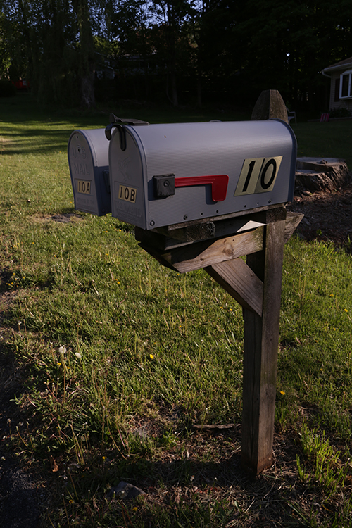
PHOTO 1

In this example we’ll try to make a picture of an ordinary mailbox unique and interesting. This first photo is an example of a mundane run-of-the-mill photograph of a mailbox (above). You should duplicate a similar photograph of your object. Use your camera or camera-phone, and without giving it much thought, just snap a picture of the scene.

Step two – choose a unique camera angle

There are a few variables involved in composing a unique image, but an important one we can explore is camera angle. Beginner and amateur photographers tend to take pictures at the angles in which we are used to naturally seeing things (eye level). One example is a photograph of a pet taken from a standing position looking down at the pet. This is the most common perspective of pet photographs, thus it also tends to be the least interesting or unique. While this is a often heard tip, it gets to the heart of why the angle of a photo is so important. Getting down at ground level provides a perspective that adults are not used to seeing of a pet.

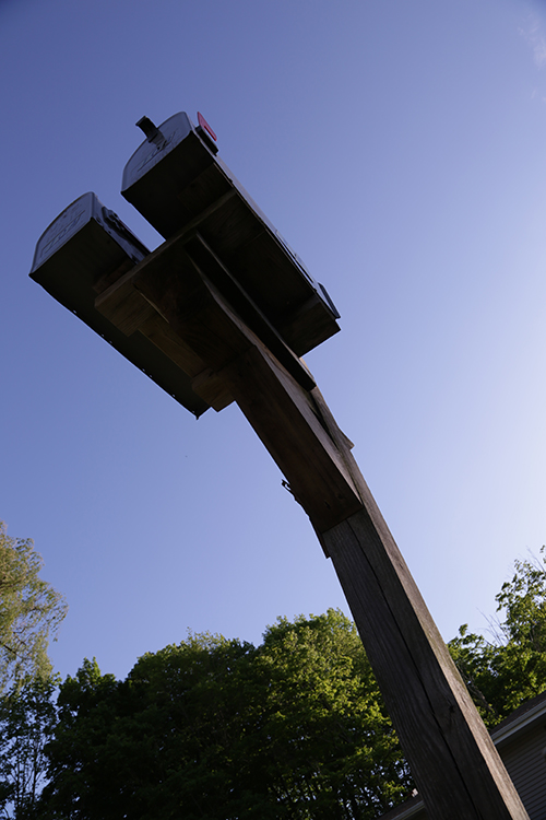
PHOTO 2

Start to think about atypical angles to which people are not generally accustomed. In the pet example, simply lying on the floor and taking a photograph from the perspective of the ground, creates a much more interesting perspective.

In the mailbox example, this photograph (below) was taken from the ground, looking up. By shooting the mailbox at a wide angle, the post of the mailbox becomes slightly distorted and creates a powerful and aggressive look. The mailbox looks much farther away than it is in real life. Furthermore, who ever looks at their mailbox from the ground? It’s a perspective most people are not used to seeing so it creates a unique presentation.

PHOTO 3

In this next image you are seeing the mailbox from the perspective of the flag. The subject becomes the flag, and creates a sensation that the flag has a meaningful and powerful purpose; there is mail that needs to be picked up!

PHOTO 4

That’s it!

When taking pictures think about how you can present the photo in a unique fashion. Is there any interesting angle you can get? Can you lie on the ground and look up? Can you get far above and provide a birds-eye view? Look at the people around you, and try to do something different from what everyone else is doing. Often we might see photographers in these awkward positions and think they look silly, but the result is usually a great photograph.

Go beyond just shooting the easy way

Chances are if the picture you are taking is convenient and easy, it won’t be original and breathtaking. Try to get to a place no one else is willing to get to, like climbing a wall, or laying on the ground, or holding the camera high up above your head. These unique angles, blended with the willingness to get into positions others aren’t willing do, typically provides photographic results that are above and beyond the norm.

Even with the most mundane objects, taking some time to think about how you can take the photo differently, can result in a stunning perspective, or unique angle, that makes the ordinary extraordinary and the mundane interesting.

googletag.cmd.push(function() {
tablet_slots.push( googletag.defineSlot( “/1005424/_dPSv4_tab-all-article-bottom_(300×250)”, [300, 250], “pb-ad-78623” ).addService( googletag.pubads() ) ); } );

googletag.cmd.push(function() {
mobile_slots.push( googletag.defineSlot( “/1005424/_dPSv4_mob-all-article-bottom_(300×250)”, [300, 250], “pb-ad-78158” ).addService( googletag.pubads() ) ); } );

The post Making the Mundane Magnificent: Finding Inspiration in Everyday Objects by Justin Varuzzo appeared first on Digital Photography School.


Digital Photography School

 
Comments Off on Making the Mundane Magnificent: Finding Inspiration in Everyday Objects

Posted in Photography


Die 5 Fotobücher des Monats

29 Jun

Ein Stapel Foto-Bücher und Bände sitzen auf einem älteren Sessel.

Ein Beitrag von: Martin Gommel

Architektur, Landschaft, opulente Tableaux und Dokumentationen sind die Hauptthemen der fünf Bücher dieses Monats. Auch dieses Mal fiel es uns beim Sichten der vielen Neuerscheinungen schwer, nur fünf Bücher aus der großen Menge der interessanten Publikationen auszuwählen. Manche behaupten, dass Fotobücher ein Indikator für die steigende Popularität der Fotografie sind, nicht zuletzt, weil mit den Smartphones eigentlich jeder zum Fotografen wird und damit auch das Interesse am Thema steigt.
kwerfeldein – Fotografie Magazin | Fotocommunity

 
Comments Off on Die 5 Fotobücher des Monats

Posted in Equipment