RSS
 

Archive for May, 2014

Adobe Creative Cloud update brings ability to download previous versions

29 May

shared:AdobeLogo.png

Adobe has rolled out version 1.6.0.393 of Adobe Creative Cloud, bringing some new features and improved file transfer support. The biggest addition that this update brings to Creative Cloud is the ability to install previous versions of Adobe’s design tools directly from the Creative Cloud installer. Graphics professionals and creatives will be able to maintain legacy versions of CC apps without having to juggle multiple serial numbers. Read more

News: Digital Photography Review (dpreview.com)

 
Comments Off on Adobe Creative Cloud update brings ability to download previous versions

Posted in Uncategorized


Facebook SDE blogs about copyright theft in 2012, gets flamed in 2014

29 May

Screen_Shot_2014-05-28_at_1.25.30_PM.png

Back in 2012, Jesse Chen – now an engineer at Facebook, but then a fresh graduate – wrote a blog post. In that post he explains how to get rid of the ‘ugly copyright overlay’ typically used in image proofs, posted online or sent out by professional photographers after events. Essentially a short guide to image theft, the post went unnoticed at the time, but two years later it has come back to haunt Chen, creating a storm of righteous anger from photographers on social media. Read more

News: Digital Photography Review (dpreview.com)

 
Comments Off on Facebook SDE blogs about copyright theft in 2012, gets flamed in 2014

Posted in Uncategorized


Wonderland with Kelli

29 May

There is a spot in northern Utah that my friend and sometimes assistant Chelsey Ott discovered near her home. A small trail off the road and into some trees reveals an expansive opening of all sorts of amazing places and things to shoot.
Jake Garn Photography

 
Comments Off on Wonderland with Kelli

Posted in Uncategorized


Are You Guilty of these 5 Over-Processing Sins?

29 May
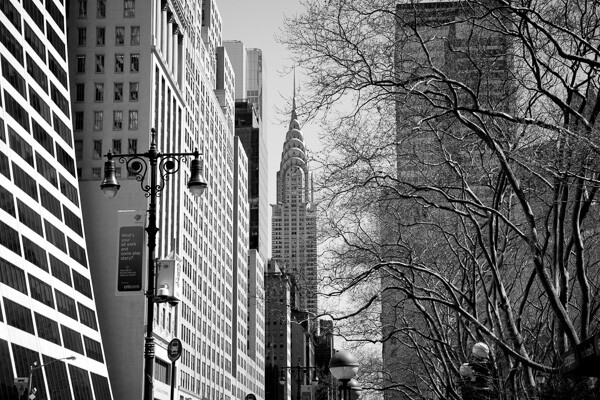
Chrysler Building

Chrysler Building

My most common critique when looking at digital images is that they look over-processed. It is so easy to do this and such a common mistake, that it is important to understand the main mistakes that photographers make when retouching their images.

Keep in mind that I am not referring to images that purposely are made to look like fairy tales or use creative color for a specific purpose, but I am referring to heavy handed post-processing when it is not necessary.

Good photographs do not make you notice the post-processing first. Good post-processing is subtle, aims to stay out of the way and not become the focal point of the image. But you need to be careful not to overdo it. With a program like Adobe Lightroom, it becomes so easy to move the sliders and increase the contrast and saturation significantly, and before you know it the image does not resemble a photograph anymore.

So here are the most common mistakes that I see when people over-process their images.

**This article is assuming that you shoot in RAW. If you don’t, I highly suggest that you do. Yes, it makes the files larger, but to get the highest quality image and have the most latitude to process your images well, it is necessary to shoot in RAW.

1. Over sharpening
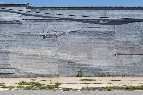
Wall, Gowanus

Wall, Gowanus.

Over sharpening is one of the most rampant problems for digital photographers. The reality is that most digital photographs need very little sharpening, if any. If the image is sharp when it is captured, meaning there is no handheld camera shake, the correct aperture is used, and the most important element is perfectly in focus, then you are a majority of the way there for sharpness.

You do not want the sharp areas to look like they are jumping off the print. You want them to be sharp, but more importantly you want them to look realistic. The second that your sharpening makes the photo even slightly unrealistic, then you’ve gone overboard. When in doubt, always keep in mind that it is much better to be slightly under sharpened than over sharpened.  I have many images that were taken with a good digital camera and sharp lens with the perfect settings, and they don’t need any sharpening at all. None. This is not every image, but some.

Also, always make sure to sharpen your image after you have sized it to the final print size. It is a bad practice to sharpen your image and then convert it to a different size.

2. Over colorized images and heavy-handed White Balance changes
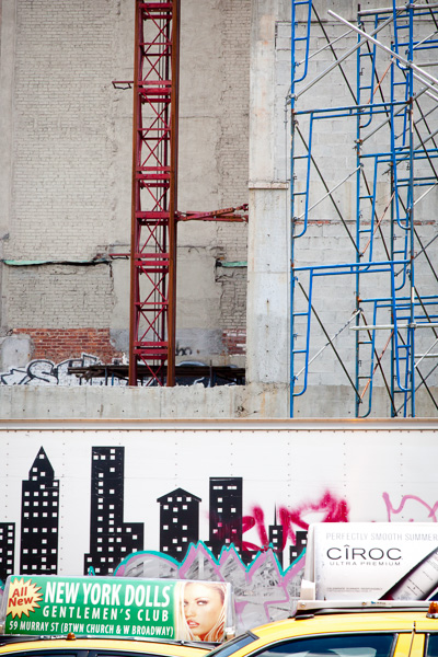
Layers of a City.

Layers of a City. Strong colors but not too strong or unrealistic.

In my opinion, color is the toughest aspect to get correct in digital photography. It takes a lot of experience to become skilled at working with color.

To be able to do good color work, it is vital to have a solid monitor and a color calibrator. You should calibrate your monitor every few weeks. If your monitor’s colors are off, then what looks good to you is not how the image will look to others when you share it on the web or when you create a print.  While there are a lot of great options for monitors in every budget, I prefer the NEC SpectraView line and an X-Rite i1 Display calibrator.

Color is subjective. I might prefer realistic and subtle colors, while another person might prefer dreamlike and surreal colors. That is fine, but always be careful about overdoing it with color. Over saturating an image might make it more noticeable at first, but it can easily look heavy-handed and fake.  Always use caution when pushing the saturation slider to the plus side. Sometimes this can work when done a slight amount, especially in hazy light, but too often it will make the colors in the image look unrealistic.

In addition, some people also frequently go overboard with tinting images. It’s the Instagram effect. For instance, if all of your images have a warm or red tint, then there’s a good chance you are being too heavy-handed.  This is not true for all cases, of course, but it is important to keep this in mind. Tinting, especially slightly, can be very important, but not every image should look red. Always pay attention to the White Balance of an image and fiddle with it. See how the image will look both without a tint and with one, and print out test images. This will train your eye to see  color.

Also, when you do a lot of editing to an image, such as when increasing the contrast, that can make the colors look too strong. It often helps to pull back the saturation slightly in these cases.

3. Too much contrast
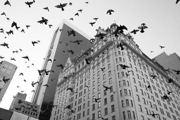
Plaza Hotel

Plaza Hotel.

Most cameras will purposely capture images with flat contrast in RAW settings, so often some contrast increase is needed. However, it can be easy to overdo it and add too much contrast to your images. This is a problem that I have frequently, and I often have to catch myself and pull back the contrast.

This is another issue where balance is important. There is a very small range where the contrast is perfect. Too little and your image will look flat; too much and it will look fake. Creating images with too much contrast is a very frequent problem, especially with black and white images.

Sometimes, instead of increasing the contrast, you really just want to turn the darkest grays into black by lowering the blacks slider. You will find that this will give you the effect that you want without overdoing the general contrast of an image.

Finally, pay attention to the light sources in your image, because they will determine how much contrast is needed. If the sun is shining directly on your scene, then much less contrast will be needed, because the natural light will be providing the contrast. If the sun is behind your image, then you will often need to darken the blacks or increase the contrast, unless you want to emphasize the haziness of the scene. Shooting into the sun, then not increasing the contrast much is how many of those gorgeous, hazy engagement and wedding photographs are done.

4. Too much vignette
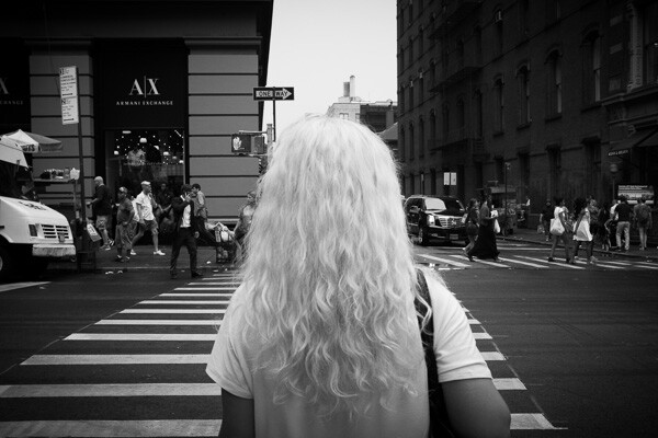
White Hair, SoHo

White Hair, SoHo.

I love vignettes. They can look great and be very important to keep the eyes within the scene. However, be careful about overdoing it, because it can easily look fake and over-processed. That being said, some photographers use harsh vignettes as a style and it looks fantastic, so take this tip with a grain of salt. Use it when needed, but be aware of overdoing it.

5. Not getting the photo right in the camera
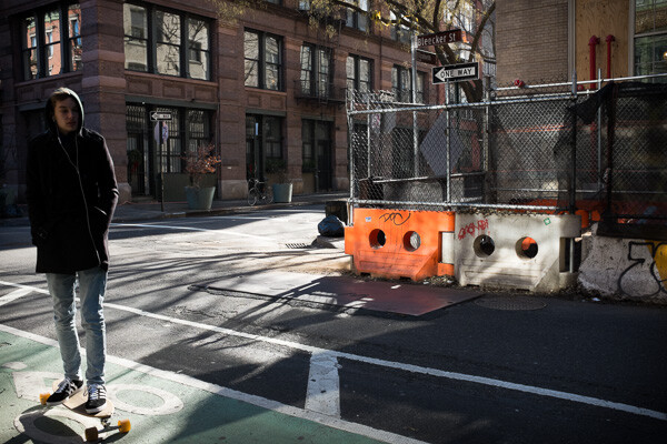
Skater, Bleecker Street

Skater, Bleecker Street

I find that the most common situations where over-processing occurs is when the image was not taken correctly in the camera. Perhaps the lighting at the time of the capture wasn’t ideal or the exposure was off. It’s easy to think you can just fix this in post-processing, and sometimes you can, but it’s hard and it’s not the same as getting it right in the camera. The image will look different if it is captured perfectly versus captured with the wrong settings and then fixed. I find that in their quest to fix poorly captured images,  this is when photographers will most often get heavy handed with post-processing.

If you go out to capture the image at the right time of day, in the right lighting, and get the exposure and sharpness correct, then you will only need to do a very subtle amount of processing to get the image perfect. This is the recipe to create a gorgeous print, and while it’s not always possible, it is what you should be aiming for. It is so much easier to create a good image this way.  If you are spending an hour to fix an image then most likely something was wrong with the image to start with.

True photography starts with the camera and post-processing is meant to improve the image, not fix it.

How do you feel about this topic? Are you or have you been guilty of any of these? Do you have others you’d add to this list? Please share in the comments below.

The post Are You Guilty of these 5 Over-Processing Sins? by James Maher appeared first on Digital Photography School.


Digital Photography School

 
Comments Off on Are You Guilty of these 5 Over-Processing Sins?

Posted in Photography


28. Mai 2014

28 May

Ein Beitrag von: Anne Puhlmann

Mehrfachbelichtung einer Frau in schwarzweiß.


kwerfeldein – Fotografie Magazin | Fotocommunity

 
Comments Off on 28. Mai 2014

Posted in Equipment


Imperial Remnants: 7 Abandoned Wonders of Historic India

28 May

[ By Steph in Uncategorized. ]

Abandoned India Main

The remains of once-flourishing empires of India, from the ancient Mughal to the British colonies, now stand in varying states of decay, from the perfectly-preserved to the ruinous. Ghost stories, legends of curses and the shadow of thousands of fatalities hover about these historic abandonments located throughout the Southeast Asian nation.

Ross Island British Colony

Abandoned India Ross Island 2
Abandoned India Ross Island 1

Tree roots strange the remains of bunkers and other structures of Ross Island, a former British colonial settlement in the Andaman Islands of India first inhabited by Westerners in 1788. Poor weather conditions led to a high mortality rate in its first years as a colony, and it was abandoned, but in 1887, after a number of Indian uprisings, it was repopulated for use as a jail and penal colony. In 1942, Japanese troops invaded, but the British regained control after World War II was over and eventually passed the island onto the Indian Navy. Ross Island was established as a tourist attraction by 1993, and today, brick pathways enable visitors to explore the wild remains.

Bhangarh, India, “The Most Haunted Place in Asia”

Abandoned India Bhangarh
Abandoned India Bhangarh 2

Remote and rarely visited, the ghost village of Bhangarh is reputed to be ‘the most haunted place in Asia.’ Its location between the cities of Delhi and Jaipur, with no nearby shops or restaurants, makes it somewhat difficult to access. Established in 1573, the town began to decline by 1630 and was entirely uninhabited by 1783 after political strife an a famine. Entry is strictly prohibited between dusk and dawn, with locals claiming that anyone who does disappears, but during the day, occasional hardy tourists who have heard the legends about paranormal activity among the ruins trickle through. As the legend goes, the city of Bhangarh was cursed byt he Guru Balu, who sanctioned construction of the town, but warned “The moment the shadows of your palaces touch me, the city shall be no more!” A prince ignored the threat, raising a palace high enough to cast a shadow on Balu Nath’s retreat, resulting in a curse.

Whatever the reason for its decline, Bhangarh is a place of incredible beauty, the half-fallen village set against lush greenery and rocky cliffs.

Ancient Mandu

Abandoned India Mandu
Abandoned India Mandu 2

The ancient settlement of Mandu was the capital city of a northern Indian Muslim state between 1401 and 1561, but has lain abandoned for 400 years. Located in the Malwa region of western Madhya Pradesh, it’s a fortress town full of impressively ornate stone mosques, palaces, Jain temples and other structures and encircled by a battlemented wall. Places of interest include a ship palace between two artificial lakes, so named because it appears to float, as well as a royal complex that still bears witness to the once-great society its residents ruled. Rarely visited by Western tourists, the ruins are a bit of a hidden gem.

Kalavantin Durg, India’s Most Dangerous Fortress

Abandoned India Kalavantin Durg

Reputedly the most dangerous fortress in the world, Kalavantin Durg can only be accessed via an extremely strenuous trek up the side of a near-vertical mountain. Today, stairs make it a little easier for visiting tourists to access the top for views that reach all the way to Mumbai. The fort is believed to have been built around the time of Buddha, roughly 500 BCE, for a queen named Kalavantin, but that’s about all anyone knows of its origins. The local Adivasi people climb to the top of the fort on every Shimga Festival of Holi. It hasn’t been in use as a fort for centuries.

Next Page – Click Below to Read More:
Imperial Remnants 7 Abandoned Wonders Of Historic India

Share on Facebook


[ By Steph in Uncategorized. ]

[ WebUrbanist | Archives | Galleries | Privacy | TOS ]


WebUrbanist

 
Comments Off on Imperial Remnants: 7 Abandoned Wonders of Historic India

Posted in Creativity


Fujifilm X-T1 Mirrorless Camera Review

28 May
Supplied by Fujifilm

The weather resistant Fujifilm X-T1 Mirrorless Camera

I was thrilled when Fujifilm Canada sent me their brand new X-T1 to play with just over a month ago. Along with the camera body itself they sent me three lenses including the XF 55-200mm F3.5-4.8 R LM OIS, the XF 35mm F1.4R and the XF 60mm F2.4 R macro lenses. Upon removing these items from the box I was immediately impressed with the professional fit and finish of the camera body, lenses and lens hoods. Larger companies like Canon could learn a thing about lens hood design from Fujifilm. While the camera body is weather resistant, none of the lenses currently available at the time of this review shard that characteristic.

Electronic viewfinder

Mirrorless cameras seem to be all the rage these days and for good reason. Leaving the mirror out of the light path allows for smaller, lighter, less mechanically complex cameras to be built. But, without a mirror to reflect light into the viewfinder, mirrorless cameras are dependent on providing a viewfinder image via an electronic viewfinder (think of a tiny monitor). Past attempts at electronic viewfinders by Fujifilm and other manufacturers has generally resulted in sub-standard results due to laggy (slow to respond) electronic viewfinders with hard to view results.

Supplied by Fujifilm Canada

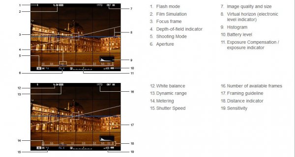
Fujifilm Viewfinder Layout

The X-T1’s viewfinder suffers from none of these problems. The viewfinder is large, bright and very responsive. I normally shoot with one of Canon’s pro cameras and the X-T1’s viewfinder was, surprisingly, a tiny bit larger. An advantage of the electronic viewfinder is that extra information can be superimposed over the image, allowing photographers to make real-time adjustments to exposures before the image is made by glancing at a histogram, instead of having to wait until after the photo is made as is the case on a standard digital SLR camera.

Autofocus

Another issue plaguing many mirrorless cameras has been their autofocus performance. Fujifilm has tackled this head-on by providing 49 focus points spread out across the entire image and those focus points are adjustable in size so that you can customize them based on the type of subject you are photographing. Where most mirrorless cameras rely on a type of autofocus system detecting contrast to determine whether the image is in focus or not, the central nine focus points on the X-T1 use the faster, more accurate phase modulation focus system for superior results.

Image quality

I found the images produced by the sensor of the X-T1 to be especially nice; low in noise and more resolution than I was expecting from a 16 megapixel APS-C sized sensor. That could be due to the fact that the X-Trans CMOS II sensor in the X-T1 uses a unique arrangement of colour filters which supposedly eliminate the need for an optical low-pass filter thereby resulting in increased resolution and perceived sharpness.

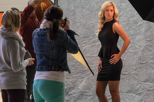
© Paul Burwell Photography

Students photographing model – ISO 3200 – XF55-200mm F3.5-4.8 R LM OIS Lens
1/25 at F6.4, ISO 3200, 95mm

WiFi

The X-T1 also has built in WiFi capabilities that allow you to download a free app for your smart device. This app allows you to remotely control your camera from a distance. A nifty application that requires additional hardware on most other current cameras to achieve similar results.

Supplied by Fujifilm

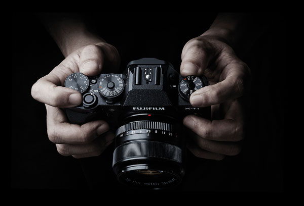
Controls on top of the camera

Camera controls

What I became especially fond of while working with the X-T1 is the controls for aperture, shutter speed, ISO and exposure compensation. Aperture is controlled by rotating a ring on the lens, just next to the body. ISO, shutter speed and exposure compensation are all controlled via dials on the top of the camera. Reminded me of some of my old-school SLR cameras, but it took me virtually no time to adapt from the Canon cameras I’ve used for the last 20 years or so.

Size and weight

The camera body itself is extremely light-weight but fit comfortably in my somewhat gigantor hands. I suspect adding the optional battery grip and/or hand grip would make it even better and of course battery grips always help with the making of vertical photographs. That said, most of the controls were easily accessible and with the body itself weighing in at just 440g (15.4 ounces), it is a camera that I could easily carry and shoot with for extended periods of time with little or no hand/shoulder/arm fatigue setting in. Even with the 55-200mm lens attached, the weight was just 1020g (36 ounces).

Customization

Another pro-camera feature I was thrilled to find on the X-T1 was a total of six different completely configurable multi-function buttons. This allowed me to fine-tune access to features like selecting focus points, depth-of-field preview, macro mode, autofocus mode and white balance so that I could program the buttons most convenient for me to the functions I use most.

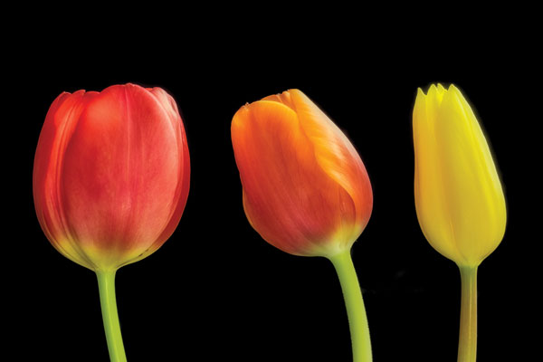
© Paul Burwell Photography

Studio Tulips – XF60mm F2.4 R Macro Lens
5.3 Seconds at F8.0, ISO 200, 60mm

Dislikes

If you’re wondering if there is anything I didn’t like about the camera, there is. I strongly dislike the four-way controller on the back of the camera. Where the other buttons on the camera offer tactile feedback when pressed, that feedback is absent on the four-way controller. Since I needed to use the four-way controller to select different focus points, I was constantly using (or trying to) the four-way controller. I found it virtually impossible to use without glancing towards it (thus removing my eye from the viewfinder and missing a chance at retiring via a photo of a brief appearance by Sasquatch if that circumstance had occurred) and continually frustrated by it. Living where I live in Canada and therefore in cooler temperatures, it is absolutely impossible to use with any sort of gloves in conjunction with the four-way controller, and on a mostly professional-feel camera like this, it was a bad design or manufacturing decision.

Another quality issue on the camera body is the door that slides opens to allow for the removal of the SD memory card. It feels ridiculously flimsy and I felt lucky to be able to send the camera back to Fujifilm with the door intact because it always felt like it was about to break off.

© Paul Burwell Photography

Red-breasted Nuthatch – XF55-200mm F3.5-4.8 R LM OIS Lens
1/800 at f4.8, ISO 800, 200mm

Overall

Overall though, this camera is a gigantic win for Fujifilm in my opinion. I’m a wildlife photographer by nature and for the most part, that’s the type of shooting I did with the camera. I was suitably impressed with the autofocus, and was thrilled with the quality of the lenses and sort of images that the sensor produced. Regardless of the situation (high or low ISO), the images were always impressive and the camera did a great job at judging the white balance although I always shot in RAW mode just to give me that extra flexibility in case the camera got in terribly wrong.

Need for longer lenses

For a wildlife photographer though, Fujifilm’s biggest weakness is the lack of larger lenses. The biggest lens I could get my hands on was the 55-200mm (84-305mm equivalent on a full-frame camera). While that’s okay for casual wildlife photography, it stops well short of “real” telephoto focal lengths. For instance, just a couple of days ago I was out at my favourite marsh with my camera, 500mm lens with two teleconverters attached (2.0x and 1.4x) for a grand total of 1400mm of image magnification. However, Fujifilm representatives tell me they have plans for bigger glass in the future and if that comes to be, I know that it would make a tempting package for me to have in my kit.

Snowshoe Hare - XF55-200mm F3.5-4.8 R LM OIS Lens 1/200 at f 4.8, ISO 400, 200mm

Snowshoe Hare – XF55-200mm F3.5-4.8 R LM OIS Lens
1/200 at f 4.8, ISO 400, 200mm

Room for improvement in some areas

Another area that still needs some work is the autofocus system. While the X-T1 is a great improvement over other mirrorless systems I’ve tried, it still suffers from performance issues with moving subjects rapidly changing distances between shots. Theoretically, the X-T1 can shoot 8 frames-per-second in continuous drive and focus modes. However, if the subject you’re focused on is rapidly moving towards you, the camera’s processing slows down and I was lucky to get 2 or 3 frames per second.

An additional improvement I’d like to see is an expansion in the number of phase-detect autofocus points. Nine out of forty-nine isn’t a bad ratio, but more would be better. I love the control over the size of focus points, but having more of the high-performance phase-detect points would help a lot too for composition on moving subjects.

For accurate exposures, I love having a live histogram overlaid on my image in the viewfinder. However, it was frustrating to have that histogram disappear when I half-pressed the shutter button to focus on my subject. While in continuous focus mode, having the histogram remain visible would help me make better exposures overall.

© Paul Burwell Photography

Red-breasted Nuthatch – XF55-200mm F3.5-4.8 R LM OIS Lens
1/800 at f5.6, ISO 400, 200mm

Final word

Overall, I highly recommend this camera. I teach hundreds of photography students each year the basics of operating their interchangeable lens cameras. I can confidently state that a student with this camera system would probably find learning the basics a bit easier than with a standard digital SLR camera system if for no other reason than the live histogram available in the electronic viewfinder and the easy to access, logically laid out controls. Further, for the seasoned user, the X-T1 body and lenses make a great combination for producing high-quality professional results.

The post Fujifilm X-T1 Mirrorless Camera Review by Paul Burwell appeared first on Digital Photography School.


Digital Photography School

 
Comments Off on Fujifilm X-T1 Mirrorless Camera Review

Posted in Photography


The best 50 yet? Our Sigma 50mm F1.4 DG HSM in-depth review

28 May

50mm-news-520.png

The Sigma 50mm F1.4 DG HSM ‘Art’ is a fast normal prime for full frame cameras, with an unusually complex optical design. However at $ 950 / £850 it’s substantially more expensive than either its predecessor, or Canon and Nikon’s 50mm F1.4 lenses. We’ve already published lab test data showing that its optically excellent, but what does this mean in real-world use? Read our detailed review to find out.

News: Digital Photography Review (dpreview.com)

 
Comments Off on The best 50 yet? Our Sigma 50mm F1.4 DG HSM in-depth review

Posted in Uncategorized


Halber Himmel

28 May

„Half the Sky“ ist eine Fotoserie der französischen Fotografin Floriane de Lassée. Sie zeigt in ihren Bildern Frauen aus aller Welt. Für Floriane tragen Frauen die Welt, weshalb sie sie hell erstrahlen lässt. Um diese Portraits gibt es jedoch viel Raum. Dennoch schafft es jedes Foto durch den gekonnten Lichteinsatz und den Bildaufbau, die Frauen in den Mittelpunkt zu stellen.

Von 2004 bis 2011 arbeitete Floriane an ihrer Serie „Inside Views“, ein Projekt über Privatsphäre in Großstädten. Das Women’s Forum und die L’Oréal-Gruppe entdeckten die vielversprechende Fotografin und finanzierten ihr eine Weltreise, um ihr Projekt über Frauen fortführen zu können.

So entstanden die poetischen Portraits rund um die Welt und es finden sich Bilder aus Tokyo, der Türkei, Indien, Namibia und vielen weiteren Orten. Floriane arbeitet immer mit der Umgebung, in der die Frauen leben und bezieht ihr Privatleben und persönliche Geschichten in ihre Bilder mit ein.

Eine Karawanserei. Blick auf Häuser, die durch Treppen miteinander verbunden sind. In einem hellerleuchteten Fenster sitzt eine Frau.

Eine Häuserfront. Eine Frau am Fenster schlägt eine Decke aus.

Nachtaufnahme. Im Vordergrund eine Frau, die von einer Aussichtsplattform auf die nächtlichen Lichter der Stadt blickt.

Zwei Mädchen am Rande eines Pavillons.

Eine Frau läuft über einen Steg über dem Wasser.

Frauen in bunten Gewändern stehen auf dem Dach eines Hauses.

Kinder klettern auf einem Baum.

Die bisherigen Bilder der Fotoserie könnt Ihr auf der Webseite von Floriane de Lassée ansehen. Hier findet Ihr auch die bereits erwähnte Serie „Inside Views“.


kwerfeldein – Fotografie Magazin | Fotocommunity

 
Comments Off on Halber Himmel

Posted in Equipment


Being Too Beautiful With Nicole Luneburg

28 May

Photographer Nicole Luneburg interviews with Fashion Photography Blog (FashionPhotographyBlog.com)

FashionPhotographyBlog.com was able to catch up with another of our past Photo of The Week winners, Australia-based photographer, Nicole Luneburg. We were curious to discover what she has been up to since taking the photo that won her the title of photo of the week and we were delighted to hear about her more recent work.

I asked Nicole where in her photography journey does she think she is at now, she kindly told that “It has taken a few years with many up and down periods.  I’ve finally reached a new place where I’m consistently able to produce quality work. I’m also able to access a larger amount of creative minded people and models who want to work with me. It’s a great feeling! I’m looking forward to seeing where this year and the future will take me!”

Photographer Nicole Luneburg interviews with Fashion Photography Blog (FashionPhotographyBlog.com)

How has her photography changed since taking “Pretty In Pink”, the photo that won her Photo Of the Week, I was curious to ask. I wanted to know what is different now in the way that she shoots, she revealed that, she has evolved as a photographer since ”I used to put a lot of pressure on myself. Now I accept the things I cannot control on the day of the shoot, I’m able to adapt much better now. No that’s a little lie I still put pressure on myself ;). I focus less now on the technical side of photography and try to capture and post process to create what I love in the first place, creating what my mind sees.”

Photographer Nicole Luneburg interviews with Fashion Photography Blog (FashionPhotographyBlog.com)

In regards to shoots that Nicole shot recently, she shared with us some of her stories. She told us that “I did a nude shoot with model Amy Heather and makeup artist Ali Stewart was inspired by amazing artists Julie Bell and Boris Vallejo. I wanted an emoting image that showed the realization of a woman’s own feminine beauty, absolutely free and without shame. I specifically picked a model who I knew would be able to realize this image for me perfectly.

Another recent shoot with black and white images of a blonde with a cigarette and a Minolta X-300 was with model Olivia Meehl and makeup artist Mel Philippou. I was inspired by the style of Priscilla Presley and Lana Del Rey combined. I modernized it a bit and applied my style to it with a sense of the scene being a movie still. It was a very exciting thing for me to do. “

Photographer Nicole Luneburg interviews with Fashion Photography Blog (FashionPhotographyBlog.com)

To shoot these shoots and for her more recent work, Nicole explained that “A large amount of my work was taken with the Canon 350D and a Canon 50mm lens. In the past 2 years, I’ve been using the Canon 5D Mark II and the lenses I use are predominantly the Canon 135mm and Canon 50mm. I also use a Canon 580 EX II through various light diffusers.”

Nicole continues to detail that the change in photography equipment also meant a change in the way she approaches lighting, “I shoot with a Canon 580 EX II usually through a soft box or a beauty dish. More recently I have been getting into natural light. It’s something I like to do when I want to focus back into my zone – just me and the model, no one else, no lighting. Once I’m back in touch with what I feel is the pureness of what I love to do, I am able to continue again with the various forms.

So after all the shoots she has done over the year, what has been Nicole’s top accomplishment to date you might ask? Well, the photographer says that it would have to be her portfolio, “I think my greatest achievement is having a body of work that people can see and allows them to put a lot of trust in me to photograph for them. I’m very proud of this as it means the hard work and effort I and my team mates have put into my work has opened up a lot of creative opportunities for me.”

Photographer Nicole Luneburg interviews with Fashion Photography Blog (FashionPhotographyBlog.com)

To find out more about Nicole Lüneburg and her work, you can visit her website: http://www.nicoleluneburg.com or via her Facebook page “Nicole Lüneburg Photography

Photo Credits:

Photographer – Nicole Luneburg

Pictures 1 & 2: Justin @ The Couturist (designer), Anita Rutter (MUA), Lauren Frensham (model) & Mark Boros (BTS)

Picture 3: Shannen Buckland (model)

Do you like Nicole’s new work now compared to her previous entry? Please comment below.


Fashion Photography Blog

 
Comments Off on Being Too Beautiful With Nicole Luneburg

Posted in Uncategorized