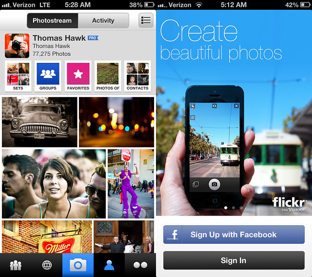
My photostream and the new Flickr splash screen for their new iPhone app.
Hot damn. Well Christmas is coming early this year for Flickr iPhone users. This morning Flickr is rolling out a brand spanking new Flickr iPhone app and it is that good — really, really, really, really mind blowingly fantastic good. It not only smokes every other previous mobile version of Flickr it smokes every other mobile photo sharing app on the market today.
I had some time to play around with the app yesterday and it is pretty much does 100% exactly what you’d want a Flickr mobile app to do. It’s nice to finally see a decent Instagram competitor out there.
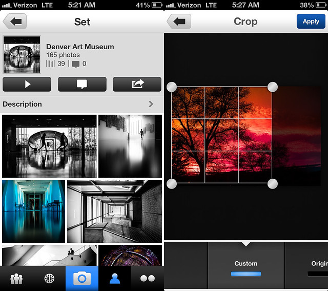
First the basics. The app takes photos. It has some pretty good simple editing tools powered by Aviary. You can crop photos, straighten photos, increase contrast, stuff like this. You can select different points for focus and exposure when you snap your photo. You can then apply one of about 15 different Instagrammy sort of filters that are all named after animals in the app. This stuff is probably super important to the average minor league user, but is actually pretty boring to me. It’s a solid decent camera app.
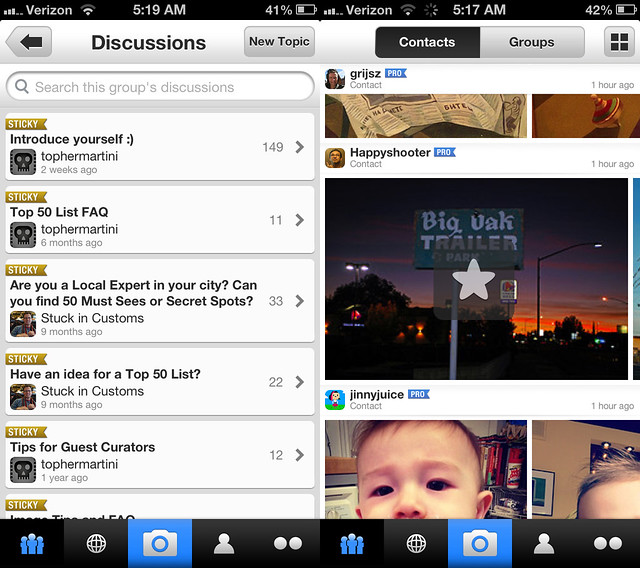
Where the app starts to get exciting for me though is the browsing of photos. Here Flickr delivers and delivers big. The best basic view is of your contacts’ most recent photos. As you vertical scroll down the screen it shows the last photos uploaded by all your favorite people that you follow. You can just keep scrolling down the page (infinitely) to see new photos by all your contacts or at any individual contact you can stop and start scrolling horizontally (infinitely) to go through their entire photostream, very, very fast.

Browsing group discussions and faving a contacts’ photo in the new Flickr iPhone app.
For newer users who don’t have a lot of contacts yet that might browse through their entire contacts list, new recommended photographers are added so that a user never runs out of contacts’ photos to see. Who and how these individuals are selected and included is Flickr secret sauce, but it should make sure that you never have a shortage of photos to see even if you’re new.
EVEN BETTER. Tap tap = fave. Yep, Instagram gave us the first big fave inflation tool by allowing us to tap tap fave our way through life and Flickr now has adopted that protocol allowing you to tap tap fave photos by all your favorite photographers.
What does this mean? It means that all of a sudden you are going to start noticing a ton more faves on your Flickr photos. Every time your friends have 10 minutes in line at the bakery they are going to be all up in your Flickrstream faving things like crazy. It’s so easy now. Flickr is also now going to begin counting mobile views of your photos as views for your photo stats (previously mobile views were not counted) so expect both the views and faves on your photos to sky rocket.
In addition to viewing your contacts’ most recent photos and going fave bombastic Billy Wilson style you’re also now able to view all kinds of other areas of Flickr in a beautiful mosaic photo layout — your own photostream and sets, group photo pools, other people’s sets, Explore, all have a justified photo layout that just invite you to go tap tap crazy.
Speaking of Flickr groups, with this new app Flickr introduces a really nice basic thread reader that will allow you to stay on top of all of your favorite threads while you’re mobile. The reader is super simple and does exactly what it’s supposed to do, it lets you easily read your threads and respond if you want from mobile. The previous version of Flickr’s mobile app lacked this important feature. Some of Flickr’s biggest power users live in these threads and this is an important improvement because it will help keep people plugged into their Flickr groups more often.
Another nice feature of the new app is that if you want to see any photo you are looking at full screen size you just tilt your iphone sideways and the photo immediately fills up the entire screen. You can then swipe from photo to photo as you scroll your way through whatever stream, set, group, etc. you are in. Flickr also uses a larger higher res version of your photo for this view so you get to see the photo with amazing clarity even if you pinch in to see a section in detail.
Flickr also includes lots of other detail on a photo page that you can access if you want to see it — EXIF data, location data, people tags, etc. Flickr also partnered with Foursquare to give you a list of venues to easily geotag your own photos as you upload them.

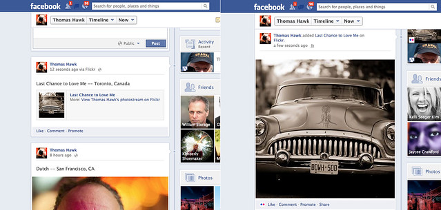
Flickr photos are now full-sized when you share them to Facebook and Twitter — before vs. after.
What about sharing your photos beyond Flickr? Yes! What about sharing your photos beyond Flickr? With the new Flickr app you can now share your Flickr photos to Facebook, Twitter, Tumblr or by email. Where it gets exciting though is how your photos are shared on these other sites. Beginning today, photos shared from Flickr to Facebook will now be shared full sized just like your Facebook photos are. In the past Flickr photos were given the downsized thumbnail treatment. Now your Flickr photos shared to Facebook will look as gloriously large as your photos shared directly on Facebook. This not only applies for your photos shared from the new app by the way, but from your photos shared via the web as well.
Likewise Flickr has now adopted Twitter’s envelope and your Flickr photos posted to Twitter will be seen full sized as well. What Twitter/Instagram taketh away Twitter/Flickr giveth back.

A Flickr set and editing a photo in the new Flickr iPhone app.
The only downside to today’s announcement is that as is usually the case, iPhone users get all the love while us Android fan boys get left out in the cold yet again. Flickr Product Head Markus Spiering did confirm that Flickr is working on future versions of their app for both Android and iPad though and said that Flickr hoped to have feature parity with today’s new iPhone app, but couldn’t confirm what the time frame might be on these future apps. He did emphasize that Flickr and Yahoo both are very committed to mobile going forward.
Flickr is also rolling out a few new enhancements to the web version of Flickr today as well. They’ve redesigned the global navigation and menus so that they are more intuitive and added their new justified photo view that they’ve been rolling out to various areas earlier this year to Explore. Explore is much easier to browse now as one big infinite scroll mosaic to go through each day. Hopefully Flickr’s awesome justified photo mosaic layout will be coming to sets and search next. ![]()
The new Flickr for iPhone app is available to download in Apple App Store this morning. Run, don’t walk and get it NOW! Trust me, you won’t be disappointed.
Stephen Shankland’s review over at CNET here. Review at the Next Web here. A blog post from the Flickr blog here.
Update: Pro Tip. Anil Dash points out that with the new “Find Friends” feature on the app you can find Facebook and Twitter friends’ flickr accounts that you may not know about. Try this feature and you many find a whole bunch of new Flickr contacts to add.
Video on the new Flickr app.
Thomas Hawk Digital Connection