RSS
 

Posts Tagged ‘Fantastic’

10 Quick Beginner Tips for Fantastic Mobile Phone Photography

24 Dec

The post 10 Quick Beginner Tips for Fantastic Mobile Phone Photography appeared first on Digital Photography School. It was authored by Karthika Gupta.

mobile-phone-photography-tips

Photography is such an important part of our everyday life, and now we have photography at our fingertips with mobile phones. This article will share with you some simple tips so you can achieve awesome, and memorable mobile phone photography.

Photography is an incredible medium to document, share and preserve all those fleeting moments in time that seem to go by so quickly. I have to admit, I am a complete sap when it comes to taking pictures. I take way too many of my family because I really want to preserve each and every moment. Like the time when my husband surprised me and took me to New Zealand for our honeymoon, or the time when my kids hung out with their grandmother taking photos right by our front porch.

Little did we know that this would be the last time we would get to spend time with my mom. She lost her battle to cancer later that year and those images are priceless to me!

10 tips for mobile photography by Karthika Gupta

And even though I am a professional photographer, I find that I use my phone more often than not to capture precious everyday moments. After all, they say that the best camera is the one that you have with you, right?

So here are 10 tips to improve your mobile phone photography to make the best of your images. And just to be completely transparent, all the images shown in this post are through my iPhone (a mix of the 6s, 8 and 10 versions).

1. Clean your lens

This one is really basic, but you will be amazed at how many times I have reached for my phone only to find lots of smudges and dirt from little hands that think they are helping with everything and anything.

So, do yourself a favor and get into the habit of quickly wiping your phone camera lens before taking a shot. It does make a world of difference to the picture quality.

2. Manually set focus

Just like a real camera, your phone camera is also a sophisticated piece of technology. A lot of times, it is too smart for your own good! Typically when you point your phone camera at something, the phone will take an educated guess at what you want to photograph. If it recognizes faces, that’s what it will pick. To manually change focus from one subject to another, simply tap on the phone screen and choose your focus point.

Karthika Gupta 10 tips to improve mobile photography

3. Don’t use flash

Your phone camera has a flash, and it sucks! Sorry, there simply isn’t a way to sugarcoat this. The flash on your phone camera is not the most flattering for photos, and if you use natural light, also known as daylight or sunlight (take photos during the day), there is no reason to use flash.

Simply tap on the flash button to turn it off and use natural light (sunlight or ambient light) creatively. If you have to use flash, try not to point it directly at the subject. One way to avoid this is to have a second phone flash, a mobile phone light, or even flashlight pointing to the subject from the side. That way, you are avoiding that harsh flashlight from pointing at your subject.

4. Manually set exposure

Just as tip #2, you can adjust the exposure (also known as brightness of the photo) manually on your phone camera. This helps control how dark or how bright the photo will turn out when you press the shutter.

To adjust, simply tap on the screen and when you see the sunburst symbol or sunlight symbol, use your finger to swipe up or down to adjust or reduce the exposure accordingly.

Karthika Gupta 10 tips to improve mobile photography

5. Compose your photos creatively

This simply means avoid placing your subject in the center of the image all the time. There are many different creative composition rules, but the most famous of them all is ‘Rule of thirds.’

Here, the subject is placed in just one-third of the image, so the eye is drawn to that part of the image to make it aesthetically pleasing.

Karthika Gupta 10 tips to improve mobile photography

6. Rule of odds

Another tip for fantastic mobile phone photography is using the Rule of Odds. This means that when you have many subjects, try to have an odd number like 3, 5, 7, etc.

An odd number of subjects or focus elements are also perceived to be more aesthetically pleasing to the eye than an even number of elements in the frame. Do keep in mind that these rules are simply suggested photography concepts…not following them does not make the photo bad!

7. Straighten the horizon

One of the most aggravating things in a beautiful image is a crooked horizon. It throws the whole image out of whack! So take a moment and straighten any horizon lines in the frame. This can be done by selecting the grid function on your phone and making sure that horizontal lines are in line with the grid lines.

8. Use leading lines

Leading lines are a great way to lead the viewer into the frame and drawing attention to the subject matter. Roads, buildings, or even furniture placed creatively, can act as leading lines to draw the viewer into the image – almost inviting them to stay awhile and rest their eyes.

Karthika Gupta 10 tips to improve mobile photography

9. Photograph in natural light

There is something so pure and clean about photographing in natural light.

Natural light is simply outdoor light. No matter what the time of day, natural light has a very distinct quality. Photograph at different times of day outdoors and see how light affects the image.

The image below of a foggy morning out on Lake Michigan was actually taken from a moving car in burst mode. I really wanted to capture those orange posts against the blue-green water. You can also edit your images using a variety of mobile apps out there.

My personal favorites are SnapSeed and VSCO.

Karthika Gupta 10 tips to improve mobile photography

10. Try not to zoom

My final tip for fantastic mobile phone photography is to try not to zoom. The digital zoom of the phone camera is not very powerful – no matter what phone companies will have you believe.

When you use the digital zoom, a lot of noise and distortion is introduced in the frame. If possible, try to move your feet to get closer to the subject as opposed to using digital zoom.

Conclusion

There you have it – 10 quick and easy tips to help you improve your mobile phone photography and take it up a notch. Remember, oftentimes the best camera is the one you have at hand. And if you are like me, that phone literally lives with you 24×7, so might as well use it as a tool to not only document your everyday life but also improve your photography skills.

The post 10 Quick Beginner Tips for Fantastic Mobile Phone Photography appeared first on Digital Photography School. It was authored by Karthika Gupta.


Digital Photography School

 
Comments Off on 10 Quick Beginner Tips for Fantastic Mobile Phone Photography

Posted in Photography


How to Photograph Fantastic Portraits with One Flash

20 Dec

The post How to Photograph Fantastic Portraits with One Flash appeared first on Digital Photography School. It was authored by Jackie Lamas.

fantastic-portraits-with-one-flash

Using a flash for portraits can be a great way to enter the world of studio lighting without having to spend too much on an expensive lighting kit. While there are affordable systems, using a flash is both easy to set up and use when you know how to do it right. After some practice, you’ll achieve looks that have that studio quality and creative lighting all-in-one.

Image: Use one flash for portraits and bounce light off the ceiling for an even light on your client...

Use one flash for portraits and bounce light off the ceiling for an even light on your client’s face.

Why use flash for portraits?

Flash can give you the portability that you’re looking for in a lighting system without having to carry extra gear just to use it. You can use a flash on or off-camera. It offers versatility in use so that you can achieve the look you want in your portraits.

Image: Use one flash on-camera to light your clients against a sunset sky.

Use one flash on-camera to light your clients against a sunset sky.

Also, when you need to fill in light, say during sunset or compete with afternoon lighting, using a flash can help you get better exposure from frame-to-frame during your sessions. This gives both you and your clients more final images to choose from that are correctly exposed. You’ll also spend less time working on the images in an editing program.

What kind of flash is best to use for portraits?

While most flash systems are pretty good in their own right, you’ll want to invest a bit in a flash that is able to be used in both manual and TTL modes. Having a flash that has the ability to use both modes will give you more range during your portrait sessions.

Image: Difference between flash and no flash. Notice the background in both pictures. This was using...

Difference between flash and no flash. Notice the background in both pictures. This was using one flash on-camera.

Choose a flash system that is compatible with your camera. It doesn’t have to be of the same brand family. However, choose one that is made to work with your camera brand. It will give you better results and have fewer faults when the time comes to set it up and use it. You will spend less time learning how to use it on your camera and more time experimenting with it instead!

Modes on flash

There are two main modes on a flash and both have their purpose when it comes to portraits: TTL and manual.

How to Photograph Fantastic Portraits with One Flash

One mode is TTL, which means “through the lens.” It’s when the flash meters the light and then chooses how much light it will fire when you take the photo. This result can sometimes be inconsistent lighting frame-to-frame, but it’s helpful when you need to work quickly without having much time to change the settings.

TTL does come with flash compensation, however, so you can choose it to output more light or less light depending on what you want to achieve for your portraits. This will still allow the flash to meter and adjust accordingly on its own – thinking for you.

Image: Use TTL when you need to fire the flash quickly without wasting time with the settings. Use f...

Use TTL when you need to fire the flash quickly without wasting time with the settings. Use for moments that seem like they’ll pass quickly like fireworks. The flash meters the light and sets what it thinks is the correct power output.

The other main mode is Manual.

Manual allows you to set the power output from full (1/1), down to 1/128, on some flashes. This gives you control over how much light you want the flash to fire onto your subject and you can adjust as you go along. Manual gives you more consistent output and light since you only need to set it once. You can then leave it until your lighting situation changes or until you want to try something different.

Image: Taken with one flash on-camera at half-power to compensate for the fading light.

Taken with one flash on-camera at half-power to compensate for the fading light.

Both modes are great to explore when using flash on or off-camera to achieve your desired look in the portraits you take.

What happens when you use flash during sessions?

When you use flash during portrait sessions, you’re essentially taking a photo of the ambient light and the flash in one photo together.

Flash happens quickly. This is why many cameras often won’t allow you to use a shutter speed faster than 1/200th of a second so that your camera has time to capture the light in a scene. Some flashes come with an “h” button for high-speed sync, where it gives you the option to use a high shutter speed with the flash.

Image: Hitt the “H” button to be able to use the high-speed sync mode and photograph por...

Hitt the “H” button to be able to use the high-speed sync mode and photograph portraits with a shutter speed faster than 1/200th of a second.

Changing your shutter speed only changes the amount of ambient light. Whereas, when you change or adjust the ISO and aperture, both change the flash and ambient exposure. Changing the flash power only changes the flash exposure.

All are important to take into consideration when you use flash, whether on-camera or off so that you can correctly expose.

Image: In the photo on the left, I used one flash off-camera to camera right near the couple. On the...

In the photo on the left, I used one flash off-camera to camera right near the couple. On the right, no flash, same location and time.

For example, you can leave the flash power at a consistent output and change the ISO and aperture to achieve the desired look you want.

Image: Single flash tilted about 60 degrees toward the top with the bounce card up to bounce light b...

Single flash tilted about 60 degrees toward the top with the bounce card up to bounce light back onto the girl’s face.

When you’re getting started in using flash for portraits, keep in mind that you’re taking two photos in one exposure. A photo of what the flash lights and what it doesn’t. It takes some practice to achieve good results, so don’t worry if you don’t get it right the first time.

On-camera vs. off-camera

On-camera

Flash, on-camera, works really well during portraits when you need to add a pop of light, or to bounce light to fill in shadows. It’s also great when you can angle it in a creative way to add some interesting light to your portraits.

Most often, you can use the flash on the camera and get the right look for your portraits. Especially if they are families, weddings, and other similar types of portraits.

Image: One flash on-camera pointed toward the client at night.

One flash on-camera pointed toward the client at night.

The great thing about external flashes is that they come with the ability to angle at different degrees. They also give you the option to rotate the head and get the flash to fire in the direction and angle that best fits your situation. For example, a bride getting ready in a room with low light is the perfect time to use the flash, either bouncing from the ceiling or wall perpendicular to the bride.

Image: The photo on the left is with the flash angled to the side. For the photo on the right, I poi...

The photo on the left is with the flash angled to the side. For the photo on the right, I pointed the single flash toward the ceiling to bounce light back into the bride’s face.

Using the flash on-camera, angled at the ceiling will give you nice even lighting, especially if the ceiling is white. Additionally, if you use the flash pointed sideways, it will bounce light at an angle that will give your bride some shadows and thus more drama and depth.

At a beach, for example, place the flash on the camera and angle it toward your clients. Here, you can make sure your clients are lit while the sun rises or sets. Depending on where you’re located, you can light them evenly while getting the colors in the sky exposed correctly as well.

Image: Both portraits are lit with a single flash on-camera.

Both portraits are lit with a single flash on-camera.

If you’re competing with midday sunlight, with the flash on your camera, you can fill in shadows as you photograph your client. This is a good alternative to using a reflector or having an extra pair of hands to help reflect light.

Another great advantage of having your flash on-camera is that it moves with you. You take your light where you need it. For example, if you’re following a child running along the seashore, your on-camera flash goes with you and fires each time you hit the shutter fully. That way, you don’t have to worry about moving the flash while trying to capture this fleeting moment for your clients.

Image: Single flash on-camera pointed directly at the clients to be able to expose for both the back...

Single flash on-camera pointed directly at the clients to be able to expose for both the background and clients.

Another pro is that when the flash is on your camera, it’s faster to set or change your settings for the particular situation you’re photographing. Let’s say you need to work quickly while photographing the portraits for a bride and groom right after the ceremony.

Having your camera on your flash will make it easier to adjust the settings and power output for smaller or larger groups as they can change from frame-to-frame. Or when you’re photographing in sunlight that keeps hiding and coming out from behind moving clouds. You can adjust your settings at each change of sunlight so that you can expose your clients perfectly.

Image: Both photos use a single flash on-camera to light the client. Flash can be used indoors and o...

Both photos use a single flash on-camera to light the client. Flash can be used indoors and outdoors.

Off-camera

You’re more likely to achieve more studio-like lighting to your portraits using off-camera flash. It’s also an excellent choice when you’re photographing individuals, couples, or in a closed space. The ability to trigger your flash while not attached to your camera can offer lots of different creative lighting angles too. It can give you results that more closely resemble what you had visualized.

Image: Only one flash was used to camera left pointed at clients directly while I stood about 45 deg...

Only one flash was used to camera left pointed at clients directly while I stood about 45 degrees from the flash.

For example, in the photo above, the couple was walking along the shore. The cloudy sky didn’t offer us much light before setting behind the horizon. Having the flash off-camera angled at them, but also angled so that it lit the sand below, helped create more drama.

Image: The photo on the left has no flash. However, the portrait on the right is using the flash off...

The photo on the left has no flash. However, the portrait on the right is using the flash off-camera left. Notice the difference in the ambient light temperature (the lamp post lights are warmer in the photo with flash).

With the flash off-camera and on a light stand, you have the ability to photograph portraits with a longer focal length without having to worry about changing settings.

Let’s say you want to light a portrait with the light at 45-degrees of your client, and pointed down so it adds a little bit of drama to the scene.

Set the flash and adjust the settings on a stand. Now you use a longer lens like an 85mm, 100mm, or the 70-200mm lens at about 10-feet of distance. You get the same results with other focal lengths because you don’t have to move your flash around.

Image: A single flash was positioned closer to the client in front of me while I stepped about 10-fe...

A single flash was positioned closer to the client in front of me while I stepped about 10-feet back to use my 50mm lens and get some interesting light on the portraits.

The advantage of off-camera flash is that you get consistent lighting without having to worry about moving it around the scene even when you use a different lens and are farther from your subject.

In addition, while the flash is on a stand, you’re able to use attachments like an umbrella or softbox with your flash and not have to worry about it falling over or moving it at all.

Image: Single flash used off-camera on a stand. I placed it high to mimic the sun in a small bedroom...

Single flash used off-camera on a stand. I placed it high to mimic the sun in a small bedroom.

With off-camera flash, you’ll need to use a radio transmitter/trigger of some sort. That way, your flash, and camera can communicate wirelessly and achieve different lighting techniques.

Some transmitters come with receivers, and you’ll need to physically touch the flash to change the settings. Other transmitters come with a built-in LCD screen where you can change the settings of the flash from your camera. This is a huge advantage if you are at a distance from the flash.

Image: Single flash used off-camera on a light stand. I made the photos warmer in post-production.

Single flash used off-camera on a light stand. I made the photos warmer in post-production.

In conclusion

How to Photograph Fantastic Portraits with One Flash

Taking portraits with one flash can be a much easier setup and offer many different lighting opportunities for your portraits. Whether you use the flash on or off-camera, you will be able to create and manipulate the light in your portrait both inside and out on location.

Have you used flash during portraits before? Share with us your setup and experiences.

The post How to Photograph Fantastic Portraits with One Flash appeared first on Digital Photography School. It was authored by Jackie Lamas.


Digital Photography School

 
Comments Off on How to Photograph Fantastic Portraits with One Flash

Posted in Photography


Hands-on with the quirky, retro fantastic Fujifilm X-Pro3

23 Oct

Hands-on with the Fujifilm X-Pro3

Fujifilm has just announced the X-Pro3 – an X-mount mirrorless camera which is styled to look like a classic rangefinder camera, but is built around a modern 26MP APS-C sensor. From a purely specs-based point of view, there’s not a whole lot separating the X-Pro3 from Fujifilm’s other high-end APS-C camera, the X-T3, so the company has doubled down on design philosophy and ergonomics as the main differentiators between the two.

We were certainly curious not only about how the camera would handle, but how some of its out-of-the-ordinary features would impact how we used it. Click through for a closer look at our pre-production X-Pro3.

The rear screen(s)

The X-Pro3 features a unique dual-screen system, which is intended to both encourage use of the hybrid optical / electronic viewfinder (more on that later) and inspire a bit of nostalgia.

The rear status panel, pictured here, defaults to showing you which film simulation you’ve chosen, as well as your white balance and ISO setting. The nostalgia sets in when you notice that the on-screen display changes depending on which film simulation you use, with looks that are inspired by the packaging of Fujifilm’s classic film stocks. It’s the digital equivalent of ripping a portion of the film packaging off the box and tucking it into a slot on the back of your camera – ah, the good ‘ole days.

Though the legibility of the screen is reasonably good (despite fairly low resolution), it lacks a backlight, so you’ll need to rely on ambient lighting to be able to make out what it’s showing. Also, if you’ve programmed any custom buttons to change any of the options shown, be aware that the option you’re changing doesn’t become highlighted. So if you’re still learning the camera, you may hit a custom button intending to change the ISO value, but end up changing the white balance instead.

The rear screen(s)

When the camera is powered down, this is the view that you’ll see – it shows the remaining number of shots on the memory card, your exposure compensation setting (though if you move the exposure compensation dial when the camera is off, the screen will not update until you power it back on) as well as remaining battery life.

Oh, and if film-box nostalgia isn’t your thing, you can configure the panel to show a screen similar to this when the camera is on and in use, and you can customize which options you want to be shown. In this regard, the monitor is akin to a rear-mounted version of the top-plate display on the Fujifilm X-H1.

Flipping out

Now, the bottom-hinged design is where we expect a bit of controversy. It’s a touch-enabled screen, so you can place your desired autofocus point by touching anywhere, and it’s very sharp with a resolution of 1.62 million dots. But the bottom hinge makes it inconvenient and unwieldy for general use. Fujifilm really seems to want you to use the viewfinder.

In our time with the camera, the screen design did indeed encourage us to rely on the viewfinder more than we generally would while still allowing us to get ground-level shots without laying on our stomachs. But of course, some photographers just won’t be able to stomach this design choice, and that’s fine – within Fujifilm’s own lineup there’s always the X-T3’s more conventional screen if you need it.

Hybrid viewfinder

The hybrid viewfinder has always been a big element of what set the X-Pro series apart, and with the X-Pro3, Fujifilm has completely redesigned it. Let’s start with the viewfinder in its optical mode.

The optics in the finder are a reverse Galilean implementation with an electronic overlay, but the optical formula is all new and offers 0.52x magnification. Unfortunately, gone is the option to change the magnification if you want to use more telephoto lenses. Basically, shooting with anything over 75mm-equivalent will be difficult, as the actual image area corresponds to a pretty small portion of the viewfinder frame. But for Fujifilm’s 23mm, 35mm and 50mm F2 primes, it’s a good fit (the 16mm F2.8 prime actually captures a wider area than the optical viewfinder can show you).

Lastly, you also have to bear in mind the parallax effect when using the optical viewfinder, particularly when changing from nearby to faraway subjects and vice versa – this is because you’re getting a different view than what the sensor is getting through the lens. Unfortunately, Fujifilm has done away with the ability to see where your focus point would show up at infinity as well as where it would show up at minimum focus distance; it only shows your current focus distance, and the minimum. This can make it hard to estimate framing with changing subject distances.

Hybrid viewfinder

A lever on the front of the camera allows you to switch from the optical viewfinder to a fully-electronic display, similar to what you’d see on other mirrorless cameras. It offers great quality, having 3.69M dots of resolution on a 0.5-inch OLED panel. With a 50mm-equivalent lens, you’re getting 0.66x magnification.

But if you’re not sure whether to choose EVF or OVF, Fujifilm goes one step further by letting you use both, in a way. The viewfinder lever also allows you to enable a pop-up display tab in the corner, showing a live digital view of the portion of your frame that’s directly under your focus area. It’s a handy way to check your critical focus without losing the immediacy the optical finder provides.

Rear panel controls

The rear panel of the X-Pro3 has seen some further changes; the four-way controller is gone, and the ‘View Mode’ button from its predecessor has departed as well. The 8-way AF joystick works well for navigating the menus, and that rear control dial can be pushed inwards, as well as scrolled.

Typically for Fujifilm, the X-Pro 3 features a lot of customization options as well. You can adjust the functionality of the AE-L/AF-L button, the rear dial click-in action, and customize the blank button above the Q button. The Q button gives you access to a Q menu, which can be customized with your choice of 4, 8 12 or 16 commonly used settings.

Top plate controls

The X-Pro3’s top plate controls will be familiar to Fujifilm users, with a dedicated exposure compensation dial and a dual-function shutter speed and ISO dial (you lift this dial to change the ISO value). There’s one custom function button near the shutter and the on/off switch as well.

It’s also worth pointing out that the top and bottom plates of the X-Pro3 are both now made of titanium. This is the base black model, but ‘Duratect’ coated ‘Dura Black’ and ‘Dura Silver’ versions feature increased scratch resistance for a $ 200 price premium.

Updated sensor and front controls

Here you can see the new 26MP APS-C X-Trans sensor that we first saw in Fujifilm’s X-T3. Given equivalent lenses, this sensor should offer identical image quality and autofocus performance (at least when using the screen or electronic viewfinder) as the X-T3 offers – and we’ve been pretty impressed with what the X-T3 is capable of.

You can also clearly see the EVF / OVF lever here to the upper right of the lens mount, and this has a customizable button within it. There is also a customizable front control dial and the single-continuous-manual focus switch on the bottom right.

Card slots

The X-Pro3 comes with dual card slots, which is a nice touch. One could argue, of course, that for the way this camera is meant to be used, it’s unlikely that this is a deal-breaking feature for potential buyers. But then again, given the premium pricing, we’re still glad to see them. They can be set up so that Raw and JPEG files are split between them, so that still and movie files are split between them, and also so that one is a redundant backup of the other.

Battery

No surprise, the X-Pro3 uses the same NP-W126S battery that is ubiquitous among Fujifilm’s current APS-C mirrorless lineup. The camera is CIPA rated to 440 shots per charge if you use the optical viewfinder, and 370 if you use the EVF – not amazing numbers, but certainly not bad. In our experience, a rating of around 400 shots per charge is likely to last you a day of heavy shooting, or several days of more lighter use.

And of course, you can top the camera battery up over USB-C, which brings us to…

Ports

The X-Pro3 has a USB type C port as well as a 2.5mm remote / headphone jack. As mentioned, the USB port supports in-camera battery charging, though with the proper adapter, it can be used as a headphone port for monitoring audio while shooting video. And not that we think this is really a camera for video shooters, but the quality and feature set its capable of are honestly quite impressive. You can read more about its video feature set in our initial review.

Fujifilm X-Pro3 hands-on

And that about does it. There’s no doubt that the X-Pro3 is a strikingly handsome camera. It feels great in the hand, and the controls are excellent and highly customizable. With the right lenses, it’s a fun camera to carry around and shoot. But the screen mechanism and likewise the optical viewfinder, with the limitations that both create, are going to limit the broader appeal of the X-Pro3. But that’s the point – if you want something that has more of a personality to it, get the X-Pro3. You want a generalist camera? The X-T3 might be a better option.

But we’re curious – let us know what you think in the comments. Are you drawn in by the X-Pro 3’s redesigned optical viewfinder and unconventional rear screen? Or, would you rather just have the X-T3? Let us know.

Articles: Digital Photography Review (dpreview.com)

 
Comments Off on Hands-on with the quirky, retro fantastic Fujifilm X-Pro3

Posted in Uncategorized


Fantastic footage of fjords with the DJI Mavic Pro

12 May

This footage, filmed by CreateOne film production on a DJI Mavic Pro high above Norway has us all checking our vacation days and airline ticket prices. The processing is a little heavy in some places and there’s a couple of odd jello-tastic shots, but it’s well worth the two minutes of your time if you’re looking for a quick break from your day.

Articles: Digital Photography Review (dpreview.com)

 
Comments Off on Fantastic footage of fjords with the DJI Mavic Pro

Posted in Uncategorized


Flickr’s New Home Page is Fantastic!

10 Sep

New Flickr Feed on the Flickr Home Page

Even in the new Instagram, Facebook, Snapchatty world, Flickr still remains my favorite place to share photos. I have now posted over 120,000 photos to Flickr and it remains my primary online archive for my body of work. Even though you don’t hear about Flickr as much in the headlines these days, there is still a very robust community there who shares great work every single day. I usually post two batches of photos each day to Flickr, once in the morning and once in the evening.

The value proposition for Flickr is compelling. Both free and $ 49/year Pro accounts offer 1 terabyte of storage for your photos. One terabyte should be enough for almost every photographer out there today. Fortunately for me, I’ve been grandfathered into the old Flickr Pro account structure, which allows *unlimited* photo storage. I have already passed 1 terabyte at Flickr, but I am a very rare outlier. 99.9% of the photographers using Flickr today are nowhere close to this limit.

In addition to generous storage, Flickr also gives both Pro and free accounts a terrific iPhone/Android app and a beautiful web experience. Where Facebook and Instagram downsize and degrade your photos, Flickr allows you to host your full high resolution original JPGs. This also makes Flickr a great place as an additional layer of backup for published JPG images. Pro accounts also get ad free browsing and sharing (that’s why even free accounts don’t see advertisements on my photo pages) which makes the account worth the $ 49 a year alone. There are also some nice additional benefits to going Pro.

Recently Flickr made a very significant change to the web version of the site. Flickr.com, the main home page has been completely redesigned and in my opinion is 1000% better.

You may or may not have the new home page yet, but they are slowly rolling it out to everybody over time. If you haven’t been to flickr.com in a while I’d encourage you to check the new feed page out. You have to be logged in to see the new changes, but they make following your Flickr friend’s photos such a better experience.

Several new design elements have been brought into the new feed page.

1. There is now a three column layout. Photos are easy to browse and you can just scroll down the page looking at photos from your contacts.

Previews in the New Flickr Feed Look Awesome!

2. Preview. This is my favorite feature of the new feed. If you see a photo on a page that you want to see larger you just click on it. The photo instantly blows up big and beautiful in a very clean version on your screen. Even better, Flickr has incorporated keyboard commands to the large view of these previews, so if I like a photo and want to favorite it or comment on it I can just press the F or C key on my keyboard. If someone has uploaded multiple photos in a batch (like I usually do) I can also easily use the forward and backward arrow keys to go through a batch of photos, easily interacting with each image with my keyboard commands.

Once you are done looking and interacting with a batch of photos using preview, you can just hit the escape key and it takes you right back where you were to your place in feed. Very slick!

Previously if I wanted to go through my contacts’ photos I would have to go to the “People” menu item which was a very glitchy page that bounced around too much on page reloads. I still use the People tab because it allows me to filter between friends/contacts photos and sometimes I just have time to look at my friend’s images, but I’m finding that I’m spending the majority of my time following my contacts’ images through the new feed page. I also like that it includes entire batches of photos that I can click through if I want whereas the old People page only would show the last 1 or 5 images depending on how I set it.

In addition to providing a great new way to look at your contacts’ photos huge, the new page is very fluid and very fast. It feels like a big tech breakthrough vs. the old People page.

Please, Please, Please Make this Load More Button Go Away

My only complaint about the new page is that like other pages on Flickr it still makes you hit the dreaded “load more” button when you get to the bottom of the page. I wish that Flickr used true infinite scroll like Facebook does. It is such a better experience.

At first I did not like that you cannot fave/comment on batches of photos directly from the page, but after playing around with preview and seeing how well it worked and how fast it was, combined with awesome keyboard shortcut commands, I became a convert and now flickr.com has earned a coveted spot on my bookmarks bar. Hats off to the Flickr design and engineering team for such an awesome improvement to the site. ?

There is a help forum thread on the new Flickr feed where you can read more about the new Flickr feed and see what others think of it here.

You can follow my work on Flickr here. ?


Thomas Hawk Digital Connection

 
Comments Off on Flickr’s New Home Page is Fantastic!

Posted in Photography


24 Fantastic Photos of our Fine Feathered Friends – Birds

23 Jul

As we just wrapped up a week of nature photography related articles I wanted to round it out with a few images of our feathered friends, the birds.

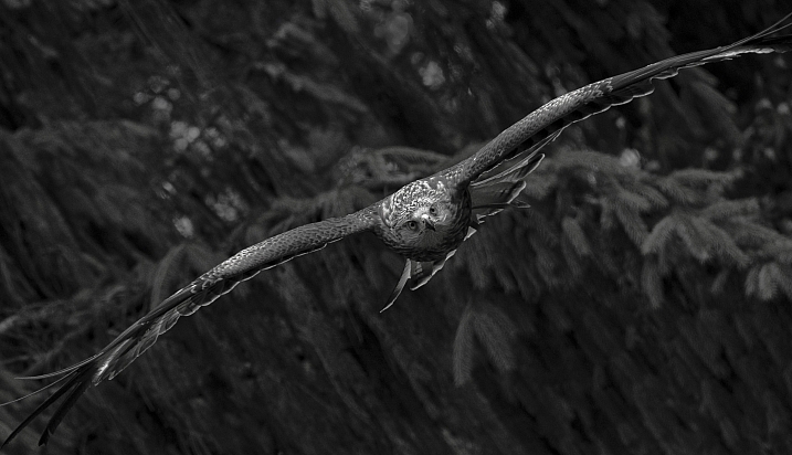
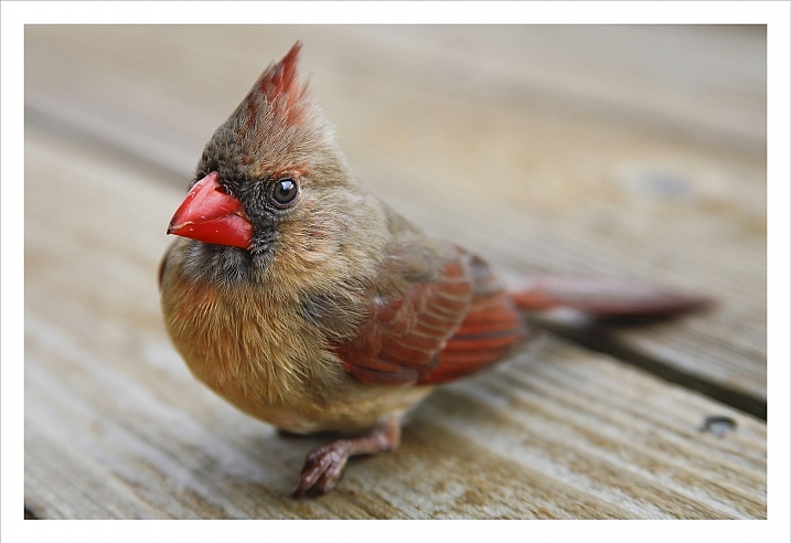
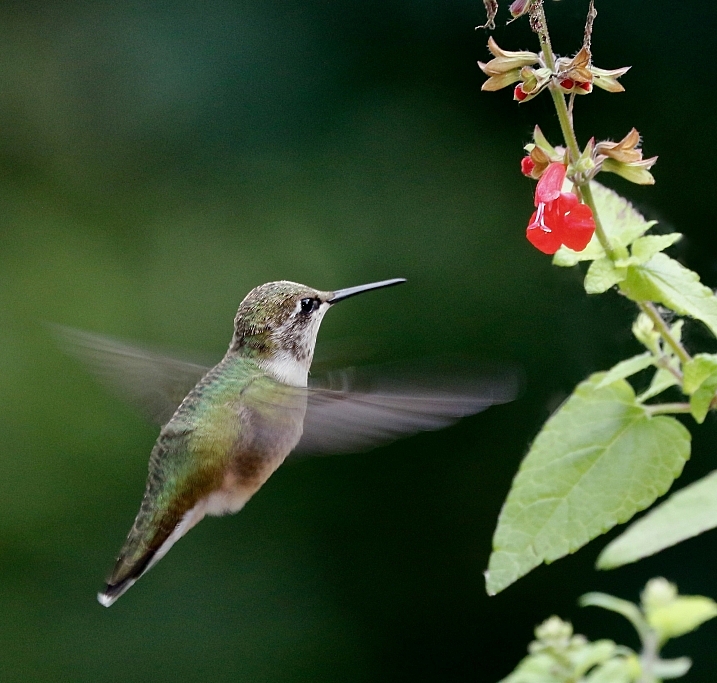
Birds are incredibly hard to photograph when in motion, luckily some stick to the ground or are slower than others. Let’s see some fantastic examples of bird photography (I’ll even throw in a few of my images) – enjoy!

Irene Mei

By Irene Mei

Darlene Hildebrandt

By Darlene Hildebrandt

Darlene Hildebrandt

By Darlene Hildebrandt

Deven Dadbhawala

By Deven Dadbhawala

Amro

By Amro

Glasseyes View

By glasseyes view

Carolyn Lehrke

By Carolyn Lehrke

Sadie Hart

By Sadie Hart

Susanne Nilsson

By Susanne Nilsson

Ken Mattison

By Ken Mattison

Vikramdeep Sidhu

By Vikramdeep Sidhu

Alessandro Caproni

By Alessandro Caproni

Bee Thalin

By Bee Thalin

Rosanne Haaland

By Rosanne Haaland

Zach Stern

By Zach Stern

Christopher Michel

By Christopher Michel

Ian McMorran

By Ian McMorran

Teddy Llovet

By Teddy Llovet

Irene Mei

By Irene Mei

Smudge 9000

By Smudge 9000

Jon Dunne

By Jon Dunne

Matt Knoth

By matt knoth

RayMorris1

By RayMorris1

Daniel Schiersner

By Daniel Schiersner

googletag.cmd.push(function() {
tablet_slots.push( googletag.defineSlot( “/1005424/_dPSv4_tab-all-article-bottom_(300×250)”, [300, 250], “pb-ad-78623” ).addService( googletag.pubads() ) ); } );

googletag.cmd.push(function() {
mobile_slots.push( googletag.defineSlot( “/1005424/_dPSv4_mob-all-article-bottom_(300×250)”, [300, 250], “pb-ad-78158” ).addService( googletag.pubads() ) ); } );

The post 24 Fantastic Photos of our Fine Feathered Friends – Birds by Darlene Hildebrandt appeared first on Digital Photography School.


Digital Photography School

 
Comments Off on 24 Fantastic Photos of our Fine Feathered Friends – Birds

Posted in Photography


10 Fantastic Natural Wedding Posing Tips

16 Jun

It’s been a long time since the 80s and 90s formal wedding portraits in studios, that have given wedding photography a bad name in some circles. Nowadays there are really amazing wedding photographers creating images that look like art and capture true emotion, not staged photos. If you are thinking about getting into wedding photography or want an insiders look at how some of that beautiful, natural wedding posing is created, here are 10 tips to help keep it real.

1. Stay in Touch

There is something very intimate and powerful about seeing people touching. This might seem obvious to you, but I think a mistake can be made by leaving space between couples or groups. Tell your groups “Get real close- don’t be afraid of each other!” Or something silly like “Pretend you like each other!” with a big smile on your face. With the groomsmen, I love getting them in a line for something formal, and then telling everyone to “Harass the groom!”

digitalphotographyschool-1-6

Standard photo of groomsmen.

digitalphotographyschool-1-7

Look at the difference in a photo when you have people connecting physically. It doesn’t always have to be romantic to get a great photo.

digitalphotographyschool-1-9

Telling the bridesmaids to get as close as possible, and then lean towards me, gets them connecting physically with each other and elicits natural smiles.

2. Walk Away and Come Back

This is my go to wedding posing instruction for most brides and grooms. I tell them to “Walk away, talk about what you’re going to do tomorrow.” Then after a few good shots I tell them to “Come back.” It’s the easiest thing for them to do, they aren’t thinking about themselves or me because I’m far enough away, and it looks natural because it is natural.

digitalphotographyschool-1-10

digitalphotographyschool-2-3

digitalphotographyschool-1-11
digitalphotographyschool-1-12

3. Look at Your Shoes

This is a fun one that I’ve discovered makes for a very pretty glamour shot with the brides. Often I’ll see them look over their side at their shoes or the bottom of their dress, and the moment always seems fresh and natural and pretty, especially showcasing their profile. If they aren’t doing that naturally, you can always say “Look over your shoulder at your shoes.” Be ready to click in a moment!

digitalphotographyschool-1-13

digitalphotographyschool-1-14

4. Button Up

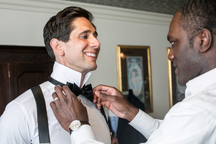
There are some great natural wedding posing moments with the groom as he is getting ready. As the title suggests, tell the groom to unbutton and button his jacket up. Or put on his cufflinks. Or adjust his bowtie/tie. This gives him something to do, the moment looks natural and masculine, and if you are near some nice window light, you’ve got your money shot.

digitalphotographyschool-1-17

digitalphotographyschool-1-21

5. Help the Groom Get Ready

This also involves the groom, but is a slight variant on the last tip. Have the groom’s father or best man (or anyone, really) help adjust something on the groom. Ideally his bowtie, tie, or boutonniere. If they aren’t doing it already, ask a groomsman if he can “make sure the groom’s tie is on right.” This creates a natural moment that looks great, and also involves tip #1, Stay in Touch.

digitalphotographyschool-1-18

digitalphotographyschool-1-20

6. Spin

If the bride has got the dress, use it! With the right personality and dress combination, you can bring out your bride’s inner child with this fun wedding posing tip. Ask her to spin! Slow down your shutter speed for a fun movement photo.

digitalphotographyschool-1-22

7. Something with Personality!

I like doing this during photos with the wedding party. I typically will take a photo with the groom and each of his groomsmen separately, and the bride and each of her bridesmaids separately. To make it fun for them (and if the group seems like the type to do it) after each standard photo I’ll tell them to give me “something with personality!” This is typically what comes out, completely on their own:

digitalphotographyschool-1-24

digitalphotographyschool-1-52

digitalphotographyschool-1-25

digitalphotographyschool-2-5

There are always lots of laughs during this time, and everyone enjoys something that could potentially be a bit tedious.

8. Look Away, Look at Me

Good portrait photographers know there is a fleeting moment that occurs half a second before a person focuses their vision on something. It’s a completely natural moment that is entirely unselfconscious. The person is busy deciding where to look and in that moment they are truly themselves, unaware of the camera or how they look. Take advantage of that moment. You can create this moment by telling your bride or groom to “look away…now look at me”, then *snap* you’ve got it.

digitalphotographyschool-2-6

digitalphotographyschool-1-54

Bonus – looking away is also a nice photo moment that is unselfconscious.

9. Compliment

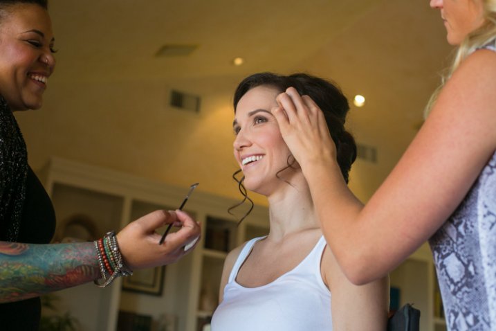
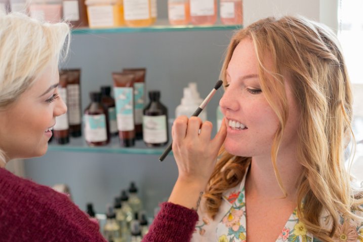
Don’t be afraid to compliment your brides – or their mothers, sisters, grandmothers, etc. – this one is mainly for the ladies. I use this wedding posing tip at the beginning of the day, usually when makeup is being applied. Nothing brings out a natural smile like a genuine compliment. “You look amazing!” “So beautiful.” I’ve heard married guys say they have a hard time doing this, but it doesn’t have to be creepy and I’m never overstepping any boundaries when I tell someone I think they look fantastic. Doing this turns a bored getting-makeup-done look, into a lovely smile.

digitalphotographyschool-1-55

digitalphotographyschool-1-56

digitalphotographyschool-1-57

10. The Almost Kiss

A little secret in the wedding photography industry is something called the “almost kiss.” This is used to create fantastic natural wedding posing. Kisses are fine but can sometimes be sloppy, maybe too intimate, and they give it all away. You can create palpable tension by telling a bride and groom to “get close for a kiss, but you are not allowed to kiss. Don’t do it!” This creates the best photo moments ever. In the end, give them what they want and let them kiss.
digitalphotographyschool-1-15

digitalphotographyschool-1-16

Hopefully some of these tips have given you some inspiring ideas! Feel free to add your own awesome natural wedding posing tips in the comments below. I know there are many more great ways to make your wedding photos fantastic. Thanks for reading- Phil

googletag.cmd.push(function() {
tablet_slots.push( googletag.defineSlot( “/1005424/_dPSv4_tab-all-article-bottom_(300×250)”, [300, 250], “pb-ad-78623” ).addService( googletag.pubads() ) ); } );

googletag.cmd.push(function() {
mobile_slots.push( googletag.defineSlot( “/1005424/_dPSv4_mob-all-article-bottom_(300×250)”, [300, 250], “pb-ad-78158” ).addService( googletag.pubads() ) ); } );

The post 10 Fantastic Natural Wedding Posing Tips by Phillip Van Nostrand appeared first on Digital Photography School.


Digital Photography School

 
Comments Off on 10 Fantastic Natural Wedding Posing Tips

Posted in Photography


Fantastic Cities: 48-Page Urban Coloring Book Made for Adults

19 Apr

[ By WebUrbanist in Art & Drawing & Digital. ]

fantastic aerial view

Coloring books are no longer just for kids, as this one designed for adult colorists illustrates in beautiful black and white. Showing urban scenes both real and imagined, these fictional, actual and hybrid views could take hours each for enthusiasts to fill in, and, psychologists argue, may even profit mental health benefits beyond the fun of simply reliving a childhood activity.

fantastic citiesss

fantastic cities book

Canadian artist Steve McDonald, the man behind Fantastic Cities, is known for works of a similar style, but these have historically been found in galleries and collections: “small on-site studies that are usually done with pencil/chalk on colored paper and large format studio work which is usually done with pencil & charcoal/chalk with acrylic washes on paper. Steve has also gained a lot of attention for his highly detailed ‘ bird’s eye view ‘ renderings of villages, cities and rural scenes as well as his compositions of machinery and his popular flying vehicle series.”

fantastic landscape

fantastic filled in color

In this book, Steve selected scenes from major cities like New York and San Francisco, providing aerial drawings of real places but also stylized works based on the architectural and urban character of other cities, all with extreme levels of detail that leave readers with much to color.

fantastic cities urban cityscape

There may even be psychological benefits to coloring: “by engaging multiple parts of the brain, coloring allows us to focus on the lines, movements, and colors in front of us, use our imaginations and be creative, and de-stress.” More about the book: “This unique coloring book features immersive aerial views of real cities from around the world alongside gorgeously illustrated, Inception-like architectural mandalas. Available July 7th from Chronicle Books.”

fantastic cities books

fantastic cities black white

Nor is this an isolated piece – according to the New York Times, “major publishers are seizing on the trend. This year, Little, Brown will release four illustrated coloring books for adults, all subtitled ‘Color Your Way to Calm.’ The books, ‘Splendid Cities’ by the British artists Rosie Goodwin and Alice Chadwick and three titles by the French illustrator Zoé de Las Cases, feature detailed cityscapes with famous landmarks, cafes and street life. Promotional materials for the books emphasize the health benefits of ‘mindful coloring,’ noting that the activity “has been shown to be a stress reliever for adults.”

Share on Facebook


[ By WebUrbanist in Art & Drawing & Digital. ]

[ WebUrbanist | Archives | Galleries | Privacy | TOS ]


WebUrbanist

 
Comments Off on Fantastic Cities: 48-Page Urban Coloring Book Made for Adults

Posted in Creativity


20+ Fantastic Free Photoshop Actions for Your Photography Toolkit

11 Feb

Photoshop actions are an amazing tool that can help you to automate your workflow and to add creativity to your photo library. Using actions, you can apply a photo effect to one or many images from your collection. It’s extremely useful when you need to edit a lot of images from the wedding photo shoot, for example, and make them Continue Reading

The post 20+ Fantastic Free Photoshop Actions for Your Photography Toolkit appeared first on Photodoto.


Photodoto

 
Comments Off on 20+ Fantastic Free Photoshop Actions for Your Photography Toolkit

Posted in Photography


How to Capture Fantastic Photos in Low Light

21 Jan

It is a simple, unavoidable fact that light is necessary for photography. Life, however, doesn’t restrict itself to times when the sun is bright and plentiful. Unless you only shoot in a controlled environment, chances are you’re going to want to takes photos when the lighting is less than ideal. You are not powerless, though. It is possible to make Continue Reading

The post How to Capture Fantastic Photos in Low Light appeared first on Photodoto.


Photodoto

 
Comments Off on How to Capture Fantastic Photos in Low Light

Posted in Photography