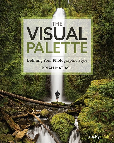
Brian Matiash is a photographer based in Portland, Oregon. The Visual Palette is his first book published by Rocky Nook.
As the title suggests this is not a technical book. It’s aimed at evolving photographers who grasp the basics, but need some guidance in developing the creative side of their photography. The book is divided into three sections – Composition, Post-Processing and Stylization, and Sharing Your Work and Your Brand. Each section builds on the lessons learned in the one before.
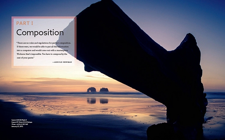
Screenshot from The Visual Palette
The book starts with composition. How you see, compose, and tell stories with photos is a major factor that sets your work apart from another. This section covers techniques like the rule-of-thirds, creating depth and using leading lines, as well as giving tips for photographing familiar subjects and learning to see.
The book continues with post-processing and stylization. This is where you bring further individuality to your work by the style in which you chose to process. It suggests separating photo editing into two distinct skills – post-processing and stylization.
- Post-processing is the preparation work – preparing a clean image that gives an accurate representation of the scene.
- Stylization is the process of adding your own artistic interpretation to the image.
I really like this idea, and think there is a lot to be gained by separating the concepts.
The book covers the tools you can use to achieve both skills. Be forewarned – there is a lot of grungy HDR in this section, and the processing may look a bit over the top for those of you not into this style of photography.
On the other hand, Brian does explain how he has moved from a grungy HDR style to a more natural one over the years – a journey that many photographers will probably identify with.
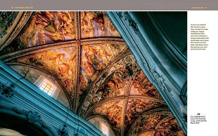
Screenshot from The Visual Palette
The final part of the book explores the process of sharing your work and building your personal brand. This will appeal to a wide spectrum of readers, from those who simply want to share their photos on Flickr or 500px, to professional photographers who need to build a brand to promote their work. If you haven’t put much thought much into how you share and promote your work, then you will find this section very useful.
Personal stories
As Brian explores the ideas in the book he relates his own experiences, giving you an insight to his thought processes, and his development as a photographer.
It could be argued that dividing the book into three topics results in a lightweight treatment of each. In a way that’s true – if you want to learn more about composition, for example, you would be better off buying a book dedicated to the topic. However, the aim of this book is to give you a primer in each of the areas it covers. You can then follow up by buying a book that explores the topics that interest you most in more depth.
For these reasons, The Visual Palette is more likely to appeal to beginners than advanced photographers.
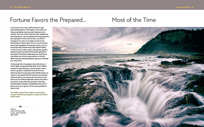
Screenshot from The Visual Palette.
Annoyances and niggles
The review copy was provided in PDF form, and there were a couple of problems that stopped me fully enjoying the experience of reading it.
The first is related to layout. In iBooks or Acrobat Reader (on an iPad) you can only view one page at a time (on a computer you can view page spreads in Reader). Given that the book is designed as a series of double page spreads, and that many photos cross the gutter, this prevented me from seeing the photos properly. You can’t look at, and appreciate the photo, when it is split into two by the formatting. It greatly lessened the enjoyment of the book, and to be honest, put me off buying another ebook from Rocky Nook.
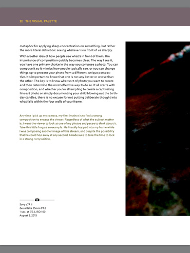
Here’s an example of what I mean. This is a screenshot from iBooks, which presents the pages one at a time. Not good when you have lot of photos that cross the gutter.
The solution would be to format the book especially for viewing on the iPad (and other tablets), so that each page in the PDF document contains a double page spread from the book. ILEX do this already with their ebooks (note: ILEX don’t publish PDF ebooks any more, restricting ebook sales to the Amazon Kindle store), and I’d like to see Rocky Nook follow suit.
It is possible to see spreads in Goodreader, but that brings me to the next point.
The second annoyance relates to color management. Adobe Acrobat Reader is the only PDF reader that accurately displays the colors and tones of the photos in the book on an iPad. However, Acrobat Reader only lets you view one page at a time, so we are back to the first problem.

This screenshot is from Adobe Acrobat Reader. Now we can see the photo with the correct brightness and contrast. But you can’t view two pages together, and the photo is still cut off.
In Goodreader and iBooks the photos are too dark, have too much contrast, and the colors are inaccurate.
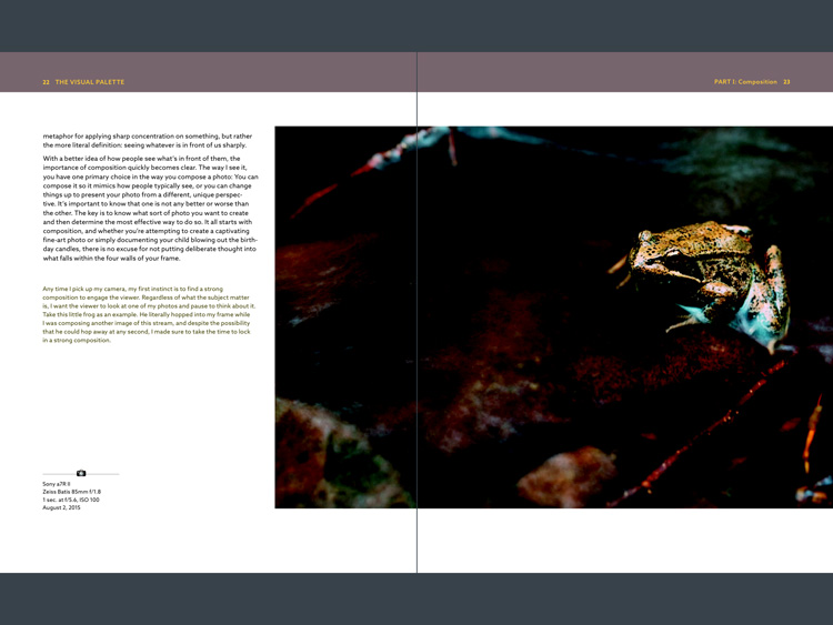
This is a screenshot from Goodreader, which can display two pages together, as the designer intended them to be seen. Great – now you can see the entire photo. But that’s not much use when the photo is too dark to see properly.
I hope someone from Rocky Nook reads this and takes some action to put it right. Anybody who buys the PDF version of this book and tries to view it in iBooks or Goodreader will be disappointed with the quality.
Conclusion
The Visual Palette is well written, well thought out, and full of useful ideas. While little of the content will be new to advanced photographers, most of it will be useful to people starting out.
There are some good photos in the book (and unfortunately a few weak ones), although the heavy-handed treatment of some of them may put readers off who feel that there is a little more to stylization than using HDR techniques. However, if you ignore that, you’ll find a lot of good ideas in the written content.
I’m giving this book three and a half stars for the content. I recommend the printed book over the PDF ebook which is virtually unreadable in its current format.
Given my experience with the PDF version of this book I thought it would be interesting to ask your opinion about ebooks in general. Have you bought any? What did you think of the design? What format do you prefer, PDFs or epub/mobi? What feedback would you give publishers regarding design and content?
And of course, if you have read The Visual Palette and would like to let us know what you think, or if you have any questions regarding the book, please let us know in the comments below.
googletag.cmd.push(function() {
tablet_slots.push( googletag.defineSlot( “/1005424/_dPSv4_tab-all-article-bottom_(300×250)”, [300, 250], “pb-ad-78623” ).addService( googletag.pubads() ) ); } );
googletag.cmd.push(function() {
mobile_slots.push( googletag.defineSlot( “/1005424/_dPSv4_mob-all-article-bottom_(300×250)”, [300, 250], “pb-ad-78158” ).addService( googletag.pubads() ) ); } );
The post Book Review: The Visual Palette by Brian Matiash by Andrew S. Gibson appeared first on Digital Photography School.
You must be logged in to post a comment.