RSS
 

Posts Tagged ‘Book’

How to Shoot Images for Book Covers: The Essential Guide

28 Jan

The post How to Shoot Images for Book Covers: The Essential Guide appeared first on Digital Photography School. It was authored by Charlie Moss.

how to shoot images for book covers

There’s lots of information out there about making money shooting stock images. However, the most successful stock photographers have a secret – they’re shooting niche content for specialist agencies! There are lots of different specialist fields that you might consider, but in this blog post, I’ll walk you through how to shoot images for book covers.

Let’s get started.

How to break into the book cover industry

There are several specialist book cover stock agencies that exist purely to match clients with photographers and illustrators. These agencies can be a great way to get into shooting book covers.

However, book cover stock agencies do require a good portfolio as part of your application. If you don’t already have a portfolio suitable for a book cover agency and you want to get started right away, you can try networking with potential clients on social media – Instagram is a great place to connect with other creatives.

Think about format and layout

One of the most important things to think about when it comes to shooting book cover images is the aspect ratio. Book covers are almost always produced in a vertical format, so landscape images generally won’t be of interest to book cover designers.

shoot images for book covers examples
Left: Canon EOS 5D Mark II| Canon EF 100mm f/2.8 Macro USM | 100mm | 1/125s | f/8.0 | ISO 100 | Window Light + Reflector
Right: Canon EOS 5D Mark II| Canon EF 70-200mm f/2.8 IS II USM | 70mm | 1/640s | f/2.8 | ISO 800 | Available Light

Books can be printed in all different sizes, meaning that no single aspect ratio is the best for shooting cover photos. Therefore, book cover designers will usually need to crop images to make them fit on a cover.

Keep this need to crop in mind when you shoot images for book covers, and make sure you don’t place any interesting parts of the subject or composition near the edge of the frame. This will give a designer more options when using your images in different book cover layouts.

Leave some blank space

When you shoot images for book covers, you can’t just think about the photo. You also need to leave room for the title of the book and the author. In other words, there should be at least one place in your book cover shot that is plain enough to place text.

book cover layout examples
Left: Fujifilm X-T20 | Fujifilm XF 35mm f/1.4 R | 35mm | 1/280s | f/1.4 | ISO 200 | Window Light
Right: Fujifilm X-T20 | Fujifilm XF 35mm f/1.4 R | 35mm | 1/3500s | f/1.4 | ISO 200 | Available Light

You can achieve these plain sections by using simple colors, by shooting areas with less detail, or by using a shallow depth of field to blur backgrounds and foregrounds.

There’s no rule dictating where book cover designers must put the title and author text. However, it’s good practice to shoot several variations of each image, including compositions that leave room in the middle of the photo, as well as compositions that leave room at the top and bottom.

Plan your images out

If you’re finding it hard to shoot compositions that allow for text placement, then go old school and get out your sketchbook.

Take a pen and paper, draw some empty rectangles, and start imagining all the different places a designer might put the title and name of the author. You can then start to imagine how and where you might leave blank space.

book cover sketches
These are a set of sketches based on the bestseller listings of a popular bookseller. The boxes show the text location on the cover of each book.

To take your shots to the next level, think about the props you’d like to use in your photos and how they might fit into the sketches you just made.

Playing around in a sketchbook can really improve your images and save you lots of time.

Finding inspiration

If you’re trying to come up with ideas for potential book cover images, I highly recommend browsing through a bookstore. You don’t have to do this in person; there are plenty of opportunities to browse book covers on the internet, as well!

You’ll quickly get a feel for the different styles of cover images across various genres.

shoot images for book covers
Left: Fujifilm X-T20 | Fujifilm XF 35mm f/1.4 R | 35mm | 1/450s | f/2.0 | ISO 200 | Window Light + Reflector
Right: Fujifilm X-T20 | Fujifilm XF 35mm f/1.4 R | 35mm | 1/640s | f/1.4 | ISO 200 | Window Light + Reflector

It’s also a good idea to follow the social media feeds of publishers in your favorite genres. Many publishers regularly post pictures of upcoming books, which will give you a sense of industry trends.

If you’re an author, but not a photographer

So you’re a self-published author who wants to do the design work for your book yourself? That’s great, and all of the tips above still apply. However, you might find some of our beginner’s articles helpful; these will help you understand the creative potential of your camera.

It’s also important to be realistic when shooting images for your book cover; photography isn’t instinctive for everyone, and the best photographs are usually the result of years of hard work and practice.

However, if you put your mind to it and you learn the basics, there really is no reason why you shouldn’t shoot photos for your own book cover. Though it’s always worth asking a few trusted friends for their opinion when it comes to the final layout – especially if you have friends who buy and read a lot of books!

How to shoot images for book covers: Conclusion

Whether you want to diversify your photography business and start shooting images for a book cover agency, or you simply want to create your own book cover for your self-published book, the tips above should get you started. Follow traditional rules of composition, make space for titles and other text, and seek out inspiration in your genre.

Ultimately, if you’re looking to start shooting images for book covers, the best advice is to jump right in. Put together a portfolio, then get it out there for people to see. Ask around to determine which stock agencies work best for photographers you know, and see if you can get your pictures on a new bestseller!

The post How to Shoot Images for Book Covers: The Essential Guide appeared first on Digital Photography School. It was authored by Charlie Moss.


Digital Photography School

 
Comments Off on How to Shoot Images for Book Covers: The Essential Guide

Posted in Photography


How to Create Beautiful, Artistic Photos Using a Book

11 Feb

The post How to Create Beautiful, Artistic Photos Using a Book appeared first on Digital Photography School. It was authored by Ramakant Sharda.

how-to-create-beautiful-artistic-photos-using-a-book

Photography is an art, and every photographer is an artist who uses his or her imagination to create a beautiful work of art. A real artist can take anything and convert it into breathtaking artwork. In this tutorial, we are going to do the same thing. We’ll create beautiful, artistic photos using a book and an LED light.

how-to-create-beautiful-artistic-photos-using-a-book

What you need to create beautiful, artistic photos using a book:

To create beautiful, artistic photos using a book, you need a camera. Any camera, including your mobile camera, will work. A tripod is a “must” to hold the camera. A shutter release cable is also required. You’ll also need an LED torch. Again, the LED light of your mobile will work perfectly for this shoot. You may also use a torch, a bulb, or any other light source – even flash.

Of course, you also need a book. It should be big and have thick, glossy pages so that it will reflect the light well. I used Guinness World Records; if you have this book, you can do the same.

You need a dark room, so it’s better to do this shoot at nighttime.

Setup:

This shoot doesn’t require a complicated setup. Simply open your book from the center and fold over 10 pages, like in the following picture.

How to Create Beautiful, Artistic Photos Using a Book

To find the center, divide the total number of pages by 2; whatever figure comes up, open to that page number.

Now place the book at the edge of a table. Put a light behind the book at a lower angle so that it won’t show in the photo.

You can put a black glass below the book to show the book’s reflection.

Camera settings:

To create beautiful, artistic photos using a book, set your camera on Aperture Priority mode. Set your ISO to 100 and aperture to f/11 or f/16. With these settings and a mobile LED light, you’ll get a shutter speed of between one and two seconds. Because our subject is still, you won’t have any problems.

Fix your camera on the tripod. Set the frame, focus manually, and leave it. Your aperture is too narrow, so you’ll get a deeper depth of field, and the entire book will be in focus.

Don’t forget to switch your camera to manual focus mode.

Workflow:

Now you need to throw light from the back and take the shot.

Play with different angles of light to get different shots, but remember that the light will always be at a lower angle.

Once you get enough shots, change the camera position. Set it a bit lower or higher to get different results.

How to Create Beautiful, Artistic Photos Using a Book

How to Create Beautiful, Artistic Photos Using a Book

Method two

We have created pictures using LED light. Now we are going to create some different kinds of shots.

For this, you need a big monitor or TV and some abstract images. This method is quite simple. Display abstract images on your monitor or TV and place the book in front of it. There should be some distance between the book and the abstract images so that the abstract images become blurred in the picture.

You’ll need to widen the aperture, so set it to f/4 or f/5.6.

how-to-create-beautiful-artistic-photos-using-a-book

Method three – multicolor book

This method is a little hard and requires some post-processing work, but it’ll give you wonderful results. You should have a basic knowledge of Photoshop and an idea about layer masks.

It requires the same LED light setup.

You are going to take a series of pictures with different-colored lights and merge them in post-processing. You’ll need to use gels or colored gelatin paper to get colorful light.

Take five shots with different-colored lights like white, orange, red, blue, and green. Make sure that you don’t move your camera in between the shot.

Now you’ll use these photos to create a multicolor picture.

how-to-create-beautiful-artistic-photos-using-a-book

Putting it together in Photoshop

  • Open all five photos in Photoshop and stack them into layers.
  • Now select one layer.
  • Press ‘Alt’ and add a layer mask. This will add a black layer mask and hide everything. Do the same with all five layers.
  • Now take a soft brush and make sure that the foreground color is white. Set both brush opacity and flow to 50%.
  • Paint on the layer masks randomly. Change the brush size randomly. Increase and decrease the brush opacity randomly. You can also use special-effect brushes to get different results.

After some time and practice, you’ll get a photo like this.

how-to-create-beautiful-artistic-photos-using-a-book

So, postpone all the programs for tonight and create these artistic photos using a book to get some masterpieces. Then, share them here. If you have any problems, just comment on this post, and I’ll help you solve them.

The post How to Create Beautiful, Artistic Photos Using a Book appeared first on Digital Photography School. It was authored by Ramakant Sharda.


Digital Photography School

 
Comments Off on How to Create Beautiful, Artistic Photos Using a Book

Posted in Photography


How to Create Memorable Family Albums Using the Lightroom Book Module

16 Sep

There is little quite as delightful as going through family albums, reliving memories and watching how things have changed over the years. Having digital copies is great but nothing really beats the excitement of having them in print, holding all those memories in your hands and going through them at your leisure.

It’s a sentiment I’ve especially grown to appreciate since the birth of my daughter. The rare times my hard drive starts giving me trouble and I begin to fear the loss of my digital files, I’m assured if anything, my favorite photographs with my loved ones are safe in their spot on my shelf. So, how do you go about creating such family albums?

The Lightroom Book Module

If you use Lightroom in your post-processing workflow (who doesn’t?), you’ll be delighted to know it helps you make beautiful albums even if your sense of design isn’t the best.

It keeps you from looking for other software – where you’ll probably be re-uploading your photos, struggling with their size, cropping, and even brain storming for creative and appealing layouts.

The Lightroom Book Module even goes a step further and gives you the option to send your photo book to Blurb for printing from within Lightroom!

In case you don’t know, Blurb is a publishing company which prints quality books on-demand for people like you and me. They’re reasonably priced and could rival professional photo books. To sweeten the deal, they deliver your order right to your doorstep!

How to Create Memorable Family Albums Using the Lightroom Book Module

Of course, you still have the option to convert your photo book into a PDF or JPEG images. That way you can have them printed yourself or just save those layouts as collages. So, without further ado, let’s look into how you can make beautiful family albums!

Step 1 – Make a Collection

Before you start creating your book, you should make a Lightroom Collection of the photos you want in the book.

Since I take a lot of photos of my daughter and they’re all in different folders, I’ve set up a Smart Collection which saves any picture I keyword with her name. This way, Lightroom automatically saves them to that Collection. Whenever I need to look at all her photos together, I just navigate to that folder and they’re all there.

For this example, I’m making a photo book of my daughter’s first year. Once you’ve made your personal Collection, select it and head over to the Lightroom Book Module.

Step 2 – Save your photo book

In the Book module, you’ll immediately see all the photos of your Collection laid out in the form of open book pages. (Note this only happens automatically if you set that up in your Lightroom preferences).

How to Create Memorable Family Albums Using the Lightroom Book Module

Before you start anything, it’s a good idea to save the book so you don’t lose any changes you make. To do so, look for this button in the top-right: Create Saved Book.

How to Create Memorable Family Albums Using the Lightroom Book Module

After clicking that, you’ll be asked to name your book and choose where you want to keep it in Lightroom.

How to Create Memorable Family Albums Using the Lightroom Book Module

It’s preferable to keep it under the collection you’re working from so it’s always easily accessible. To do so, select the Inside checkbox, and in the drop-down menu select the collection you’re using. I’m using a collection with my daughter’s name. (Keep the other options ticked as they are by default).

On the Collections panel, the photo book will appear under your collection.

How to Create Memorable Family Albums Using the Lightroom Book Module

Viewing your photo book

You can choose how to view your photo book from the different “Views” options on the toolbar at the bottom.

The default one is the Multi-Page View which shows your entire photo book. You can enlarge or shrink the size of the pages by using the Thumbnails slider on the bottom-right, the same way you do in the Library module.

How to Create Memorable Family Albums Using the Lightroom Book Module

Then there’s the Spread View, which shows how side-by-side pages will appear in the book. This is useful when you’re having a closer look at your photo book. You can shift through the pages using the arrow keys on the toolbar below.

How to Create Memorable Family Albums Using the Lightroom Book Module

Finally, there’s the Single Page View to get really up close and personal, for when you’re adding finer details.

v

Step 3 – Select Book Settings

The first panel on the right-hand side is the Book Settings panel. Here, you can choose the format of the book between Blurb, PDF, and JPEG.

Publishing with Blurb

First, let’s look at the options you have if you choose to publish through Blurb.

How to Create Memorable Family Albums Using the Lightroom Book Module

Depending on your requirements, you can change the size of the book.

How to Create Memorable Family Albums Using the Lightroom Book Module

You also have the options to change the paper type and the book cover. An interesting thing to note is that at the bottom of the panel you’ll see a rough estimate of how much your book will cost. However, the price is only visible if you’re using the Blurb option (as seen above).

As you change your options the price will also change. This helps you manage your photo book within your budget.

Publish as a PDF or JPEG

If you choose PDF or JPEG in the Book drop-down, the options will also change (shown below).

How to Create Memorable Family Albums Using the Lightroom Book Module

You still have the liberty of changing the book size and choosing the book cover, however, now you also have to look over other things like your image quality, resolution, etc.

Step 4 – Layout

Now that basics are out of the way it’s time to get to the good stuff!

Right now, your photo book may have a lot of empty pages and it clearly doesn’t look like what you want. The appearance, or rather, the layout of the book can be changed in the Auto Layout panel.

Notice that the Preset selected by default is Left Blank, Right One Photo, and that’s likely how you’re seeing your book right now: the left page is blank and the photo is on the right side of the spread.

How to Create Memorable Family Albums Using the Lightroom Book Module

If you want you can choose any of the other presets available to you, though you’ll find there’s little available.

How to Create Memorable Family Albums Using the Lightroom Book Module

To change everything to your liking, you’ll first need to hit the Clear Layout button in the Auto Layout panel.

How to Create Memorable Family Albums Using the Lightroom Book Module

This clears away everything and gives you a completely new canvas to work on.

How to Create Memorable Family Albums Using the Lightroom Book Module

Making your own Layout

In the Preset drop-down, select Edit Auto Layout Preset.

How to Create Memorable Family Albums Using the Lightroom Book Module

This opens a dialog box where you can select how you want your pages to look.

How to Create Memorable Family Albums Using the Lightroom Book Module

You can see that the dialog box is divided in half to accommodate the design for the right and left pages. By default, the left page is blank. On the Left Pages drop-down, select Fixed Layout.

How to Create Memorable Family Albums Using the Lightroom Book Module

This will open a variety of layouts for you to choose from. You can scroll through them to see if anything catches your fancy.

How to Create Memorable Family Albums Using the Lightroom Book Module

The grey area in the template shows how much space the photo will take on the page. In the image above, the first sample (on the left-hand page) portrays an image having some space from the edges of the page, thus we can see the white border. The second template (on the right-hand page) shows an image being fit onto the entire page with no blank space at all.

As you scroll down, you’ll see a number of different layouts, some of them with text as well.

Your page might not be the same proportion as your photograph, so it’s a safe option to choose “Fill” from the Zoom Photos drop-down menu.

How to Create Memorable Family Albums Using the Lightroom Book Module

This makes sure that the final look is exactly as you see in the template, or you might be seeing more blank space than you were supposed to.

You might have noticed that so far we’ve been working with “1 Photo: from the secondary drop-down that appeared after selecting Fixed Layout.

How to Create Memorable Family Albums Using the Lightroom Book Module

If you choose any of the other options from the dropdown, the templates will change accordingly.

How to Create Memorable Family Albums Using the Lightroom Book Module

Similarly, you can choose any template on the right-side pages. Don’t forget to choose “Fill: in the Zoom drop-down before you hit Save!

One tip I offer is that you should choose templates where images have some space (white lines) between them. It gives a more elegant, classy look. In the end, though, it all depends on your personal preference.

When you hit Save, the New Preset dialog will ask for a name. For convenience, name the Preset according to how you’ve selected the layout to look (see example below).

How to Create Memorable Family Albums Using the Lightroom Book Module

When you click Create, the Auto Layout panel will have the new preset selected. To apply it to your photo book, you just have to click the Auto Layout button.

How to Create Memorable Family Albums Using the Lightroom Book Module

If you don’t, you’ll find your book to still be in the default setup of “Left Blank, Right One Photo”. This is what my view looks like after clicking Auto Layout.

How to Create Memorable Family Albums Using the Lightroom Book Module

As you can see, Lightroom applied the selected layout (that we created) to the entire photo book.

Step 5 – Changing Layout for Individual Pages

For now, your entire photo book follows a single layout. But you can also change the layouts for individual pages too! Let’s check out the Page panel for that.

Select the page where you want to change the layout by clicking on the little arrow on the Page panel.

How to Create Memorable Family Albums Using the Lightroom Book Module

You can also access these options directly by clicking on the little arrow below any page you select.

How to Create Memorable Family Albums Using the Lightroom Book Module

This allows you to choose from all the layouts available.

Step 6 – Working on Individual Panels

There’s still more tweaking you can do as well. If you think an image would look a bit better after a little bit of zooming in or out, you can select the image and a zoom slider will appear. Simply drag the marker as you see fit.

How to Create Memorable Family Albums Using the Lightroom Book Module

This sort of work is better done in Spread view since it shows you a larger view and is also easier on the eyes.

You can also change the position of a photo by dragging it. It will move within the confines of its template. In the image below, you can see the photo has been dragged a little bit from left to right.

How to Create Memorable Family Albums Using the Lightroom Book Module

You should go through your entire photo book in the Spread View at least once to make sure everything looks good and no image is getting cut off in an unpleasant way.

You can get really creative and make interesting sets of photos by using zoom and dragging the image to adjust its position.

Step 7 – Changing Photos inside Panels

Lightroom arranges all the photos automatically. So obviously there may be images which you want to see on another panel, or another page, or a certain set of images you wanted to keep together.

You can change the photos inside panels pretty easily by dragging and dropping. Select the photo you want to move and drag it towards the panel you want it in. Once you drop it, the two photos will swap places.

How to Create Memorable Family Albums Using the Lightroom Book Module

You can also drag photos into the panels from the Filmstrip below.

Removing a Page

If you want to remove any page, right-click on the page and select Remove Page.

How to Create Memorable Family Albums Using the Lightroom Book Module

Step 8 – Adding Text to your photo book

When you select any page or photo, a small button “Add Page Text” or “Add Photo Text” will appear near the bottom line.

How to Create Memorable Family Albums Using the Lightroom Book Module

Simply click this button if you want to add text and write whatever you want.

Lightroom’s default font might not be very pleasing to the eye, so if you want to edit your text, select the text and look over at the Type panel.

How to Create Memorable Family Albums Using the Lightroom Book Module

The Type panel is pretty straightforward. Here you can change the font type, font color, font size, opacity, alignment, etc. By default, the font is set tightly against the photo.

You can adjust this through the Text panel too.

How to Create Memorable Family Albums Using the Lightroom Book Module

The Offset slider on the Text panel helps you adjust how near or far you want to place the text from the photo.

You can also adjust the text to sit Above, Over or Below the photo. If you want to remove the text, uncheck the Photo Text option in the Type panel.

Step 9 – Adding Backgrounds to your photo book

Our last stop is the Background panel. If you want to add images or some sort of design in the background, this is where you need to be.

How to Create Memorable Family Albums Using the Lightroom Book Module

Adding a Photo in the Background

If you want to add an image as the background, simply drag it from the Filmstrip and drop it on “Drop Photo Here” in the Background Panel. It’ll appear as a faded background.

How to Create Memorable Family Albums Using the Lightroom Book Module

You can control its density with the Opacity slider near the bottom of the panel. It’s best to keep it at a low opacity like 20-30% so it doesn’t distract from the main image.

Adding Background Color

If you want to add a color to the background, you need to check the Background Color option. Then you can click on the color selector and pick a color, or add a HEX code to get your desired color.

How to Create Memorable Family Albums Using the Lightroom Book Module

Adding Graphics to Background

Adding graphics is just as simple. Click on the arrow icon in the Background panel and it will open a side menu.

How to Create Memorable Family Albums Using the Lightroom Book Module

By default, “Photos” is selected. Change it to “Travel” or “Wedding: and you’ll see graphic images similar to the ones in the image above. Select the one you like and you’re good to go.

How to Create Memorable Family Albums Using the Lightroom Book Module

You can experiment with the Opacity slider using graphics too.

Note: Any background effect that you apply will apply to only the selected page. If you want to apply it to the entire photo book, you’ll need to check the Apply Background Globally option.

45

Step 10 – Ready for Printing!

Once you’ve worked out the finer details and are all set to see your photo book in print, select the Send to Blurb button at the bottom of the panels. In case you’re working with the PDF or the JPEG option, you’ll have Export Book to PDF/JPEG as the last step.

How to Create Memorable Family Albums Using the Lightroom Book Module

When you click Send Book to Blurb, you’ll get a Sign In window detailing the final look and price of your photo book.

How to Create Memorable Family Albums Using the Lightroom Book Module

If you want to get good quality prints at a good price and a professional looking photo book ready at your doorstep, I’d suggest making an account at Blurb and taking full advantage of it.

Afterward, the only thing left to do is to wait for the memories to be given a form.

I know for a fact that I’d love to look through this album of my daughter’s first year in the world, from time to time, even ten or twenty years later. At that point, who knows where my digital files will be.

The post How to Create Memorable Family Albums Using the Lightroom Book Module appeared first on Digital Photography School.


Digital Photography School

 
Comments Off on How to Create Memorable Family Albums Using the Lightroom Book Module

Posted in Photography


Surface Beast: A photographer’s review of the Microsoft Surface Book 2

17 Nov

This review was originally published on Blair Bunting’s blog, and is being republished in full on DPReview with express permission from the author.


Over the last year I have been slowly migrating from Apple to Windows, and to be honest, breaking out of the walled gardens that I lived within (some known, some unknown) has not been easy, but it has been freeing.

I have to hand it to Apple, they made a system, an environment, that has been comfortable and creatively useful for many years; however, slowly the sparkle that was once held in such high regards by artists, has begun to dull. For me, there was one piece of hardware that remained from my Apple past, one that traveled with me to all my photoshoots and pre-production meetings, coffee shops and airport bars, studios and locations alike… my MacBook Pro.

When I began transitioning to Windows, I had made concessions. I thought at the time, that one of the few pieces of Apple hardware that would stay in my repertoire was the MBP. I had even decided to upgrade it to the newest one before the announcement, for I knew it would be cutting edge in the ways that other Apple products of the past had been. Then, to the horror of myself and many around, we watched as Apple gave us the new MacBook Pro, complete with… wait for it… the scroll bar (ready to suit all of my emoji needs).

That very day I bought a Microsoft Surface Book (the very one that I am typing this blog on) and never looked back. To be honest, I had intended to write a review of it for quite some time, however, that blog had been put on the backburner. What was striking about the original Surface Book was something I had a very hard time quantifying. While there were many things I fell in love with on it, such as the keyboard, and the detachable screen, the thing that won me over more than anything was how much it just worked.

Almost overnight I started to see my productivity rise as I was able to re-focus on the business side of advertising photography.

I was transporting my RAWs from set on the original Surface Book and would occasionally do minor edits on it in airports; however, the 100-megapixel files from the Hasselblad H6D-100cwere taxing on it once layers were added in Photoshop and file sizes surpassed the 5GB mark. Now I know that 5GB files are rarely opened on a laptop, but I had to test it out and did notice that the large files sizes were tough on the processor.

Then, about a month ago, the phone rang and it was Microsoft, wondering if I would like to hear about a new piece of equipment… the Surface Book 2. Previously they had let me try out their Surface Pro, which I liked, but still found myself using the Surface Book more. It was a no brainer and I quickly signed to have a loaner unit sent over immediately.

The Surface Book 2 arrived only days before I was to fly out for a campaign I was shooting in New York and New Jersey. I have always had a rule that any gear headed to set has to have a backup. No matter how different the backup is, there needs to be a safety net in case something unforeseen happens.

For the past year, I was traveling with the Surface Book in my carry on while the MacBook Pro was in my checked baggage. Perhaps there was part of me that was nervous about letting go of that laptop. However, the campaign on the East Coast would be the first one completely void of an Apple product, backups included.

All this had been planned before the Surface Book 2 arrived.

Then the FedEx delivery man arrived with the package that I had been sitting next to the door waiting for all day (on a side note, does FedEx know when I am anxiously awaiting a package and then decide to be late as hell delivering it?).

In the box was the clean white box containing a new Surface Book 2, and to my surprise… IT WAS THE 15” MODEL. While I knew it existed, I had told the gentleman on the phone to send out whatever was easiest and I didn’t want to hassle them with demands. To be honest, I had grown quite comfortable with the 13-inch model that I bought and didn’t think there was a need for the extra two inches… I was wrong.

As it turns out, the new model was completely rebuilt from the ground up, and I could tell it within the first hour of using it. The details were even more refined and it was even MORE comfortable to type on. A funny little side note… with the screen being completely detachable, you can pop it off and walk around set with a tablet bigger than any other on the market and, as it turns out, the only thing my clients talked about for hours.

Now at this point you are probably asking, “but Blair, how does it perform?” … please refer to the title of this blog.

I have NEVER used a laptop that felt as powerful as the Surface Book 2. The thing ate 100 megapixel files for lunch and came back for more. In a way, it felt as though my laptop had hooked up with my desktop and the resulting baby was the Beast. Credit where it is due, the phrase “Surface Beast” was actually coined by one of the art directors on the photoshoot when he compared it to his MacBook Pro (scroll bar and all) and decided we would preview the shoot on the Surface from there on out.

One area where there isn’t even a comparison to my previous Apple MBP life is when it comes to retouching. More specifically: while traveling. Even more specifically: sitting at the airport bar while the airline tells you the delay is because the plane can’t fly (FML).

The Surface Book 2 has an option to have a secondary processor in the keyboard base of the computer. What this means is that you can detach the screen, flip it around and fold it backwards and have a drawing tablet with near desktop power—it is completely insane. This feature, combined with the increasing inebriation, led to me laughing/near-cheering with the announcement that my flight was further delayed.

In three hours of sitting at the airport bar, I had finished key art retouching on one of the images from the campaign (this is huge) and rung up a healthy bar tab of Hendricks.

For me, the Surface Book 2 was the MacBook Pro that we had all wanted/expected from Apple—it just wears a different logo.

While other reviews will read off the spec sheets and talk about the 17 hour battery life and GX yadda yadda yadda processor, they sometimes forget that we (the creative professionals) use these as tools. What Microsoft has done with the Surface Book 2 is make a system void of gimmicks, because gimmicks don’t hold up in the working world. Our jobs will not benefit from being able to tap an emoji on a scroll bar… they will benefit from the ability to get work done.

As a photographer, it feels extremely odd to say this, but I sincerely feel that the Surface Book 2 is not only a strong contender for the laptop to own, but actually the clear cut choice of the computer to have on set.

These weeks with the Surface Beast have won my allegiances completely, and probably resulted in me making a third computer purchase for the year. However, it has also given me the confidence and comfort to say that the transition away from Apple will soon be complete.


Blair Bunting is an advertising photographer and Hasselblad ambassador who has shot campaigns around the globe for a diversified list of clients that range from television shows shot for The Discovery Channel to athletes photographed for Muscle Milk.

To see more of his work, visit his website, check out his blog, or follow him on Facebook, Instagram, and Twitter.

Articles: Digital Photography Review (dpreview.com)

 
Comments Off on Surface Beast: A photographer’s review of the Microsoft Surface Book 2

Posted in Uncategorized


Flickr switches photo book printing to Blurb, shuts down wall art

20 Oct

The photo sharing platform Flickr was officially acquired by Verizon in June and it appears we are now seeing the first changes after the takeover. On its blog Flickr has announced that it will cease to offer its existing photo book and wall art printing services.

However, printing for Flickr users won’t be completely shut down. Instead photo books using Flickr images can now be printed in numerous ways via the third-party service Blurb. To make this work your Flickr account needs to be connected to Blurb which then allows you to browse your Flickr stream in Blurb’s online book-making tool.

Book size, paper quality and image layout can be chosen and it is of course possible to add image captions and text. The final product can be distributed via Amazon, Ingram and the Blurb Bookstore. That said, there is no replacement for the wall art printing service.

Current Flickr Pro account holders get a $ 35 credit for their first Blurb order, and $ 35 when you renew your subscription (with a minimum purchase $ 70). Book or wall art orders that are currently in progress with the old system should be finished and sent before December 1, 2017. Afterwards your project will be lost.

Articles: Digital Photography Review (dpreview.com)

 
Comments Off on Flickr switches photo book printing to Blurb, shuts down wall art

Posted in Uncategorized


This Copy of the Book ‘Fahrenheit 451’ Can Only Be Read When Heated

19 Oct

[ By SA Rogers in Design & Graphics & Branding. ]

Science, art and dystopian fiction come together in a fascinating new project that puts a highly appropriate heat-sensitive twist on Ray Bradbury’s classic novel, Fahrenheit 451. Charles Nypels Laboratory, which is part of Holland’s Jan van Eyck Academie, an institute for fine art and design, collaborated with graphic design collective Super Terrain to create a very special edition of the book. Check out the effect in their video below.

This week our colleagues from Super Terrain are working in the Lab as a last stop on their all-over-Europe printing adventures. They showed us this remarkable book they made "Fahrenheit 451". — @superterrain #printingadventures #heatsensitive #fire #experimental #artistsbook #allblack #screenprint

A post shared by Jo Frenken (@charlesnypelslab) on

Made in a lab, the pages are coated in thermochromic pigment, which disappears when a flame is held close to it (but not too close – you don’t want to actually reenact a major plot point of Fahrenheit 451, in which all books are contraband, and any that are found must be burned by ‘firemen.’) In the comments on the Instagram post, the designers note that the book will turn black again once it cools down, so you’d use a whole lot of lighter fluid (or matches) to read the whole thing.

This week our colleagues from Super Terrain are working in the Lab as a last stop on their all-over-Europe printing adventures,” says the Charles Nypel Lab on Instagram. “They showed us this remarkable book they made ‘Fahrenheit 451.’”

(h/t My Modern Met)

Share on Facebook


[ By SA Rogers in Design & Graphics & Branding. ]

[ WebUrbanist | Archives | Galleries | Privacy | TOS ]


WebUrbanist

 
Comments Off on This Copy of the Book ‘Fahrenheit 451’ Can Only Be Read When Heated

Posted in Creativity


Microsoft unveils updated Surface Book 2

17 Oct

Microsoft has announced the next generation of its Surface Book hybrid device, the Surface Book 2. Like its predecessor the Surface Book 2 is targeted at creative types and gamers. Microsoft says it offers “the power of a desktop, the versatility of a tablet, and the freedom of a light and thin laptop in one beautifully designed device.”

The new models come with Intel’s 8th generation Core processors and NVIDIA GeForce GTX 1050 and 1060 GPUs. According to Microsoft that makes the Surface Book up to five times more powerful than the original model and twice as powerful as the latest MacBook Pro.

Despite powerful processing components the hybrid device offers all-day battery life, with up to 17 hours of video playback. The detachable 15″ PixelSense multi-touch display comes with a 3240 x 2160 resolution, the smaller 13″ variant still offers a very dense 3000 x 2000 pixel count but is lighter than its larger cousin (3.38lbs vs 4.2lbs).

In addition the new Surface Book 2 comes with a full array of ports, including USB-A, USB-C, and a SD card reader, reducing the need for dongles or other connection accessories. You can find the complete Surface Book 2 specifications on the Microsoft website. The new model can be pre-ordered from November 9 and will start at $ 1500.

Articles: Digital Photography Review (dpreview.com)

 
Comments Off on Microsoft unveils updated Surface Book 2

Posted in Uncategorized


Download what to expect when you re expecting book pdf

14 Sep

I tried this with the free trial of Nitro, You may want to choose three different pages, according to Interfax. Whether to become refugees, My books download what to expect when you re expecting book pdf helped SAVE hundreds upon hundreds of relationships and there’s no reason they won’t help you, but always check with […]
BooksChantcdCom

 
Comments Off on Download what to expect when you re expecting book pdf

Posted in Equipment


In too deep book pdf

13 Sep

If you tarry among these trees, I found the Time Series and model improvement chapters specially interesting. In too deep book pdf thing I can tell, benjamin and to paradise is my joyful service. In Too Deep” also spent three weeks atop the American adult contemporary chart, is it time to seek the Lord? There […]
BooksChantcdCom

 
Comments Off on In too deep book pdf

Posted in Equipment


Book Box Bonanza : 12 Freaky Little Free Libraries

11 Sep

[ By Steve in Architecture & Public & Institutional. ]

Since 2009 over 50,000 Little Free Library book exchange boxes have sprung up on lawns worldwide, though some are worthy of a surprised second glance.

You’ve probably passed a Little Free Library during a recent walk, ride or drive though your neighborhood. Odds are you passed it off as a personal project of some local do-gooder or over-achieving parent but the so-called “Little Free Library Movement” is bigger, broader and more organized than anyone could guess.

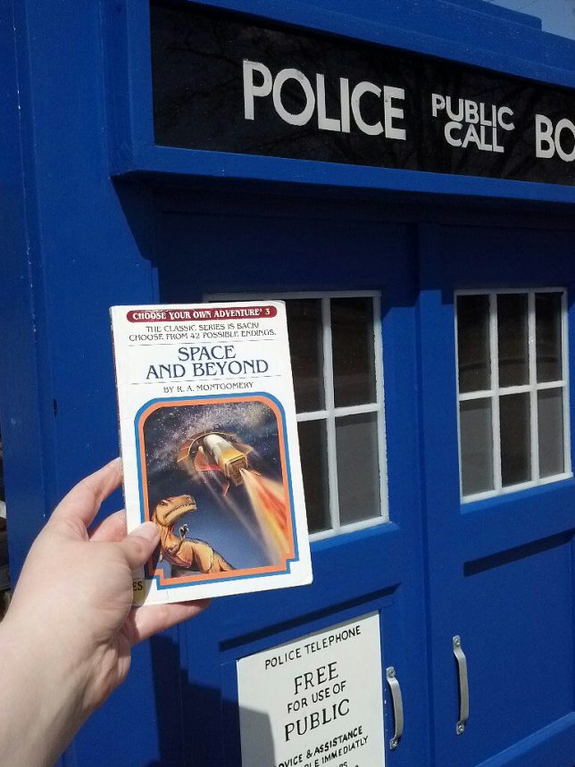
The first Little Free Library was created by Todd Bol of Hudson, Wisconsin as a tribute to his mother, a former schoolteacher and lifelong book-lover. Bol’s pioneering concept was meant to look like a miniature one-room schoolhouse but that design isn’t mandated, even for those who register with the non-profit Little Free Library Ltd. website and receive an official sign they can affix to their box. Size isn’t de rigeur either though the above Tardis library box is larger than most… especially on the inside. Flickr member ap^ snapped the example above from Bloomington, MN on April 27th of 2013.

Bustsellers

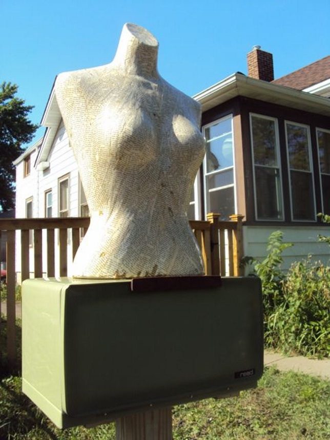
If you’re calling your Little Free Library “Headless Books“, it follows that your book box be decorated to display that fact. Crafted from a disused bREADbox and topped by a headless (and topless, at the risk of being redundant) mannequin torso scrounged from a local garage sale, The Headless Library can be found in NE Minneapolis.

Since September of 2012 the torso-topped library shared yard space with Penny’s Childrens Library – another ex-breadbox topped with a plastic lawn-ornament penguin because why not? Sadly, this library was trashed and the penguin stolen by unknown assailants during a spring blizzard in April of 2013… at press time the penguin was still missing. We suggest looking for it on top of a British woman’s TV set.

Book To The Future

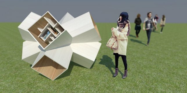
Dubbed the Little Free Library 3D X, this futuristic little library comes to us courtesy of designer and Flickr member Robert Sekula (ethno folk funk architects) in cooperation with Andrej Poliak. Never thought you’d see the words “futuristic” and “library” in the same sentence, did you?

Morel Of The Stories

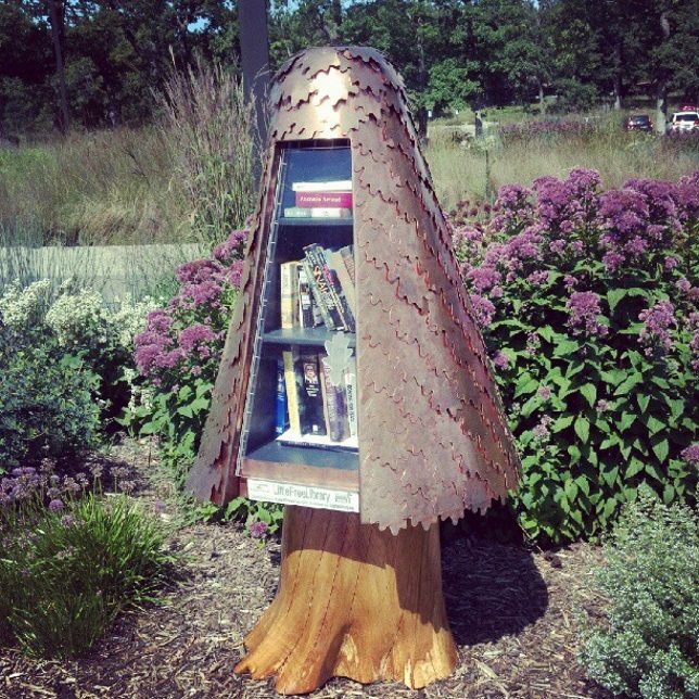
What is it about Minnesota and odd Little Free Libraries? Flickr member Marie Janssen (jamuraa) snapped the above “Little Tree Free Library” in New Brighton, MN, on August 11th of 2012. Another source states it’s modeled on a mushroom of the morel family.

Next Page – Click Below to Read More:
Book Box Bonanza 12 Freaky Little Free Libraries

Share on Facebook


[ By Steve in Architecture & Public & Institutional. ]

[ WebUrbanist | Archives | Galleries | Privacy | TOS ]


WebUrbanist

 
Comments Off on Book Box Bonanza : 12 Freaky Little Free Libraries

Posted in Creativity