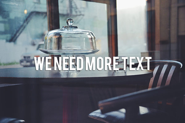
There are many reasons that you might want to add words over your images. Text on photos makes great promotional items such as postcards; you can create your own social media messages with quotes or inspirational sayings; and you can add your name or your website URL. I’m sure that once you understand all the creative options for adding text, you’ll come up with hundreds of other things you can create with your photos.
This article will guide you through the many ways you can work with text in Photoshop to create beautiful and eye-catching messages with your photos.
Basic Text Tools
It may seem like a pretty simple topic, but Photoshop has a really versatile selection of tools for working with text. Like so may other Photoshop goodies though, some of the best ones aren’t really obvious. So, in this section you’ll learn the various ways to add, adjust, and work with text.
Here are the basic text tools in Photoshop:
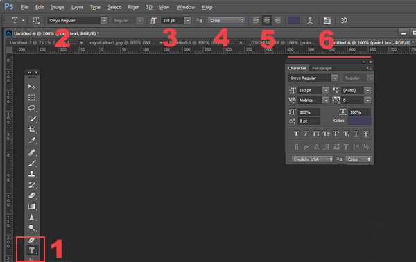
- When you click the Text Tool in the Tools Palette (#1), the context menu on top will display most of your text tools.
- #2 Select your font (the typeface ), font style, bold, italic, etc.
- #3 Font size (TIP: you can type any number in here, you’re not limited to the numbers that are displayed so your text can be ANY size you like – type 500 into this space and see what happens!)
- #4 Anti-aliasing options
- #5 Alignment of the text
- #6 Text adjustments pop out
There are a few more tools in here but we’ll talk about them later. So now that you know the lay of the land, lets add some text and play with it.
Playing with Text
There are 2 ways of adding text, and it’s critical that you know when to use one way, and when to choose the other. The first way is how most people use text, by using what is called the Point text tool. You simply click on the Text Tool in the tools palette, click back on your image and start typing. The second way is to use Paragraph Text. Let’s try both.
Open a new document in Photoshop, and click on the Text tool (keyboard shortcut = T). Start typing. you’ll see something like this:
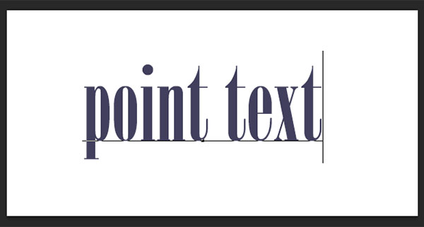
Your text will have an underline and a cursor will show where you are inserting the next letter. If you keep typing, the text will continue along in one long single line. To get text on a new line you have to hit ENTER. You have just created text using the POINT TEXT tool. Save this and call it “point text.”
Open another document, click on the Text tool if it’s not already clicked, now take the text tool and DRAG it out to make a rectangle. You should see something like this.
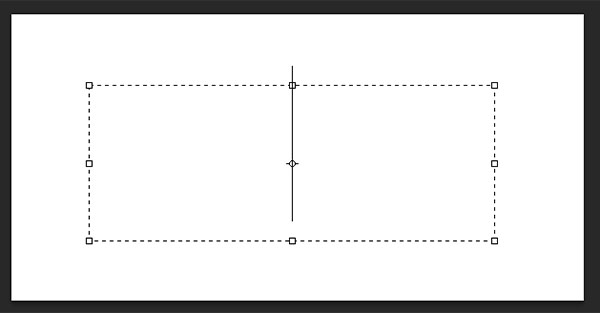
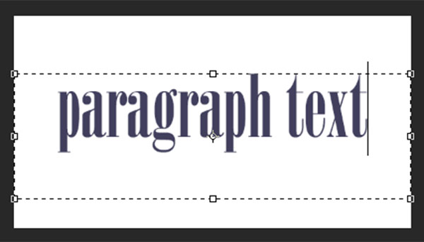
Go ahead and type. Type a lot of text. See how the text is constrained by the size of the box? This is Paragraph text. You can grab the text box handles (the little boxes on the middles and corners) to define the size of the area in which you want the text to appear. You can see this is great for larger areas of text. Because you can change the size of the text box, you have great flexibility using paragraph text.
You can use the MOVE tool to position the entire block of text anywhere on your page.
Paragraph text is also easier to center on your page. To center your text, just grab one of the handles and drag it to the right edge of your page. Drag the left box to the left edge of your page, then up in the context menu, click the CENTER text icon where number 5 is on the diagram above. It’s a little miracle! Your text is now precisely centered horizontally on your document. No more guessing.
Transforming letters in text
To give your text variety, you can also change the spacing of the individual letters, the height of the letters, and the width of letters. You can also instantly change a block of upper case text to lowercase, and vice versa. Sometimes the font you are using might be missing the italic version. You can create faux italic in Photoshop. So let’s explore the Text Character pop up box where you can try out all the nifty tricks.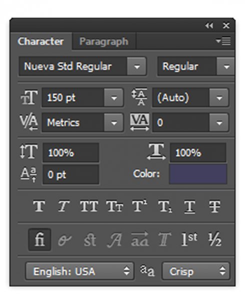
You’ll find this box in the context menu – so make sure you have your Text Tool selected, and look where number 6 is in the diagram above. Click the icon that looks like a sheet of paper (above the #6 above). This will open the Character Transform panel. If you’re editing Point text, your text layer needs to be selected for these edits to work. If you’re using Paragraph text, you’ll need to select the text you want to transform. So, choose your text, and try going through all these options. Hovering over an item will cause a tool tip to pop up that gives you a brief explanation of what each does.
Transforming blocks of text
You can easily create attention-grabbing text by angling or slanting it. With your text layer or text selected, go to the main menu, and select EDIT>Transform>Skew. Grab a handle one of the corners and drag. You should see something like this:

You can do the same with Edit>Transform>Scale and Edit>Transform>Rotate. Easy peasy!
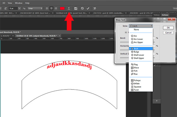
To make text follow a curve, use the Warp Text tool (select the text tool in the tools palette and look between 5 and 6 on the context menu – it looks like the letter T with a curve underneath).
Create some text, and make sure you are on the text layer. Click the Warp Text Tool to open the section popup box. Here you can select what type of shape to give your text, it’s so easy!
Three simple ways to make text really pop
Sometimes when you add text to a photo it can get a bit lost in the image. Even if you make it larger it just doesn’t seem to be crisp or clear. There are a few options:
A) It may be your anti-aliasing settings, #4 on the top context menu. Make sure this drop down is NOT set to None. This is particularly important on images that you will be using online. Select any of the other options and see how they change the edges of the text. These chooses are personal preferences, as to what type of smoothing look you prefer.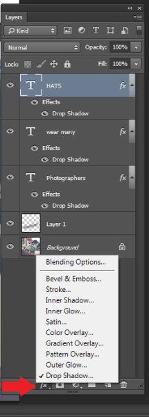
B) It may be your choice of colors. Often white works best as it has a clean, elegant look. But it’s easy for white text to get lost in the details of the image. Here’s an old web designer’s trick to make light colored text really pop. Add a drop shadow of black. But not just any random drop shadow. This one will be almost invisible but the subtle punch it adds is tremendous. Here’s how:
First select the text layer you want the drop shadow on. Go to your layers palette and select the Layer FX icon at the bottom, then select Drop Shadow.
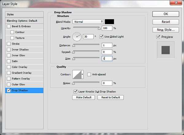
In the Drop Shadow dialog box make your drop shadow with these settings. If you are working on a high res image from print, change the shadow size from 1 to 10. You may need to adjust these setting depending on the size of your image, just make sure they are both the same number.
See how the white text pops in this image even though the image is all soft shades? No cheesy 1990’s drop shadows here. It gives just enough edge separation and dimension to make the text obvious, without being obnoxious.

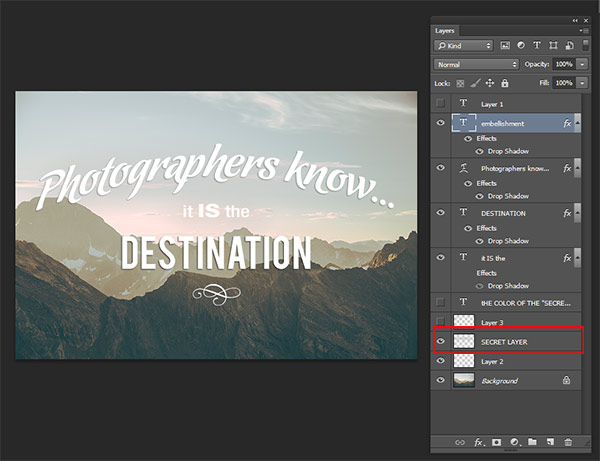
C) Finally, another text popping trick from the graphic design world – add a “secret” layer behind your text and use layer blending modes to darken it down just a bit, to give your text a darker background for more contrast.
In the example below, you want to get rid of the clouds behind the text, and make the sky just a touch darker to make the text stand out more. Select a soft-edged brush, and use the eye-dropper tool to select a mid-tone brush color – in this image I selected the sky just above the “P”. Make the brush diameter equal to the height of the letters. Now add a new layer between the photo and your text, this is your secret layer, and just brush over the text – which will really be under the text as your layer is “under” the text. Change the blending mode to Darker Color or Darken ( this will depend on the color you’re using) and then you can adjust the layer’s opacity to suit.
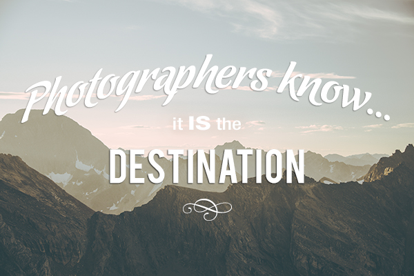
Text before the secret layer.
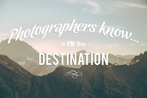
With the secret layer added.
Text embellishments and decorations
One of the most common questions I get asked about text on photos is how did I make the swooshes and swirly decorations and embellishments. These in most cases are simply fonts that are decorations rather than letters. There are hundreds of free fonts like this. Here’s one place you can get started: Embellishment fonts. Be sure to check the licensing restrictions on free fonts – some require payment or donations if you are selling your images.
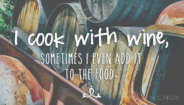
So there you go – the basics of adding creative text you your photographs. You can now elegantly add messages, taglines, quotes, and verses to your images. You can make text grab your viewers’ attention by placing it at an angle or on a curve; you can make it really stand out by using a few simple techniques, and you can add interest and artistic flair by adding embellishments and decorations. Unleash your inner graphic artist – you have the technology!
Give it a try – I’d love to see what kinds of messages you add to your images!
googletag.cmd.push(function() {
tablet_slots.push( googletag.defineSlot( “/1005424/_dPSv4_tab-all-article-bottom_(300×250)”, [300, 250], “pb-ad-78623” ).addService( googletag.pubads() ) ); } );
googletag.cmd.push(function() {
mobile_slots.push( googletag.defineSlot( “/1005424/_dPSv4_mob-all-article-bottom_(300×250)”, [300, 250], “pb-ad-78158” ).addService( googletag.pubads() ) ); } );
The post How to Use the Text Tool in Photoshop by Alex Morrison appeared first on Digital Photography School.
You must be logged in to post a comment.