RSS
 

Posts Tagged ‘Welcome’

Welcome to the new DPReview analog forum!

26 Feb

DPReview.com has long been a place for all things, well, digital photography-related. But that doesn’t mean that we don’t love film too.

In recent years, as film photography and traditional processes have been enjoying something of a resurgence, we’ve been working to expand our coverage. As part of that effort, we’re pleased to announce the launch of a dedicated forum for discussion of film photography and all things analog.

We’d like this forum to be a place where both seasoned film shooters and first-timers can feel at home

Partnering with us on this launch is Hamish Gill, founder of 35mmc.com, one of our favorite sites and the Internet’s premiere destination for analog coverage.

As well as the new forum, our partnership with Hamish and 35mmc will also mean more film-related content on DPReview. So dust off that old Yashica that smells like 30 years of cigarette smoke, dig through the back of your freezer for those long expired rolls of Portra, hunt down some fresh batteries and get ready to feel the analog love.

You can find the new forum here, and we’d love you to get involved by starting threads, asking questions, and sharing tips and advice with fellow analog fanatics.

Visit our new film photography forum


Please note: We’d like this forum to be a place where both seasoned film shooters and first-timers can feel at home. While threads will be moderated according to established DPReview guidelines, please note that we will be taking a zero-tolerance approach to any behavior which does not reflect our community values.

Articles: Digital Photography Review (dpreview.com)

 
Comments Off on Welcome to the new DPReview analog forum!

Posted in Uncategorized


500px tells photo artist it once praised that his work is no longer welcome on platform

25 Jun

Online photography community 500px has alerted one of its most prominent users, Polish photo artist Michal Karcz, that his work is no longer welcome on the platform. According to a post Karcz published on Facebook, 500px warned the artist that ‘non-photographic content’ on his account is now in violation of the company’s Terms of Service.

The decision to ban Karcz’s digital artwork highlights a major change in policy for 500px, which historically not only welcomed Karcz’s work, but also repeatedly praised it with multiple ‘Editor’s Choice’ and ‘Year’s Best’ designations. According to Karcz’s Facebook post, his work on 500px has received more than 7 million views, 168k ‘Affections,’ and his account has nearly 35,000 followers.

One of the photo illustrations Karcz shared on his 500px account. Used with permission

Karcz’s was declared a ‘Photoshop master’ in an article 500px published on its blog to showcase his work. The content blends photography and digital art to present viewers with unique, in some cases other-worldly, images of reality. These same images are now in violation of the 500px guidelines, a representative clarified to Karcz in a second message:

Hi there, Unfortunately photomanipulations based on photography is not photography and our website in the current iteration is evolving into a purely photography website. Not only that, our terms of service require you to be the copyright owner of the images you upload so if you’re editing bits and pieces of other peoples imagery then you’re in violation of that. I personally am a fan of your artwork but unfortunately it doesn’t fit within the conditions of our site at the moment.

Another photo illustration Karcz shared on his 500px account. Used with permission.

Karcz’s 500px account is still live on the service at this time and still features the same ‘non-photographic content.’ It’s unclear whether the account will be deleted, but Karcz’s work remains live on Facebook and his personal website.

Articles: Digital Photography Review (dpreview.com)

 
Comments Off on 500px tells photo artist it once praised that his work is no longer welcome on platform

Posted in Uncategorized


Out Of Limits: 15 Retro-Futuristic Soviet Town Welcome Signs

08 Jan

[ By Steve in Design & Graphics & Branding. ]

soviet-town-signs-1a

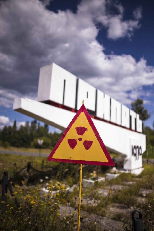
In Soviet Russia, town welcome you… with retro-futuristic city limits signs that promised more than the blustery, blustering Cold War-era USSR could deliver.

soviet-town-signs-1b

The welcome is, er, radiant in Pripyat, the now-abandoned city established in 1970 to house support staff and workers at the nearby Chernobyl Nuclear Power Plant. Pripyat’s population grew to almost 50,000 by 1986, plummeting to zero when the town was evacuated the day after the plant’s No.4 reactor exploded. Flickr user jesper karstensen snapped our lead image of Pripyat’s forward-looking sign on August 12th of 2013. Flickr user Stanislav (LieErr) captured a view of the sign from a disturbingly different angle five days later on August 17th.

Brave Nuked World

soviet-town-signs-1h

soviet-town-signs-1c

soviet-town-signs-1d

The city of Chernobyl is often confused with Pripyat though the former’s history dates back to the year 1193. Situated just 9 miles from the nuclear power plant whose name it shares, the city was home to about 14,000 people before its evacuation in 1986 – only 704 live there today. The city’s sign was erected in the Soviet era and originally featured a prominent hammer-and-sickle logo as seen in the guide book image at top. Sometime after the fall of the USSR, the logo was covered by a roundel displaying the symbol of the MHC – the Ukrainian Ministry of Emergency Situations.

soviet-town-signs-1e

soviet-town-signs-1f

soviet-town-signs-1g

Photographs taken after 2010-11 show a modified radioactivity symbol fitted in place of the MHC roundel, as seen in Flickr user Steve Messerer‘s images above. Several years later, perhaps due to the current Russia-Ukraine conflict, the radioactivity logo was removed revealing the original embossed soviet logo. The more things change, the more they stay the same, eh comrades?

Welcome to Exclusion Zone

soviet-town-signs-2a

The so-called Chernobyl Disaster spewed radioactive fallout over a wide swath of central Europe and led to the establishment of an Exclusion Zone that spread across the Ukraine’s northern border into neighboring Belarus. Flickr user Ilya Kuzniatsou (belarusian) snapped the above photo of a city sign welcoming visitors to an evacuated town. Call it passive-aggression, post-Soviet style.

You Are My Density

soviet-town-signs-3a

soviet-town-signs-3b

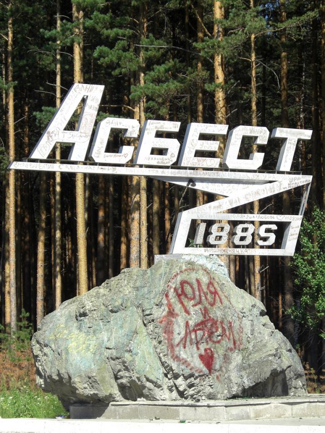
“Asbest is my town and destiny”, proclaims the ominously prophetic welcome sign for the mining town of Asbest, founded in 1885. If you haven’t guessed yet, they extract asbestos there from a mine half the size of Manhattan and 1,000 feet deep – how about that, Todd Hoffman? Asbest‘s population has dropped from over 84,000 in 1989 to about 69,000 in 2010… we’re not sure why *cough*.

Next Page – Click Below to Read More:
Out Of Limits 15 Retro Futuristic Soviet Town Welcome Signs

Share on Facebook


[ By Steve in Design & Graphics & Branding. ]

[ WebUrbanist | Archives | Galleries | Privacy | TOS ]


WebUrbanist

 
Comments Off on Out Of Limits: 15 Retro-Futuristic Soviet Town Welcome Signs

Posted in Creativity


Welcome to Yosemite: The Man Behind The Sign

12 May

yosemite-sign2-edit-800c

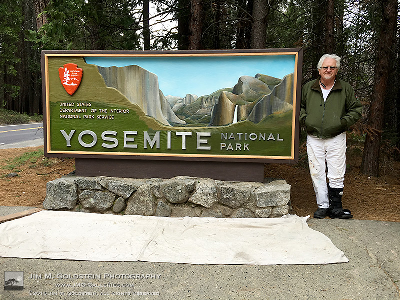
If and when you enter Yosemite National Park you’re likely to see an iconic painted sign welcoming you to the park. I’ve passed by this particular sign at the northwest entrance numerous time. The difference on my last trip was that it was getting a fresh coat of paint and being restored by artist Mark Switlik. I should clarify, while technically it was being restored, it was also being transformed to have a much warmer, more realistic and colorful look. You can see how the sign used to look at the end of this post.

I consider myself quite lucky to have met Mark and had the opportunity to talk with him albeit quickly. He had been working on the sign for sometime before my trip and I had seen early photos from others of its transformation. I wasn’t sure if it’d be done by the time I made it to the park back in April. I don’t know about you but I like Mark’s take on the sign versus the old. It’s a bit more welcoming. What do you think?

yosemite-sign1-edit-800c

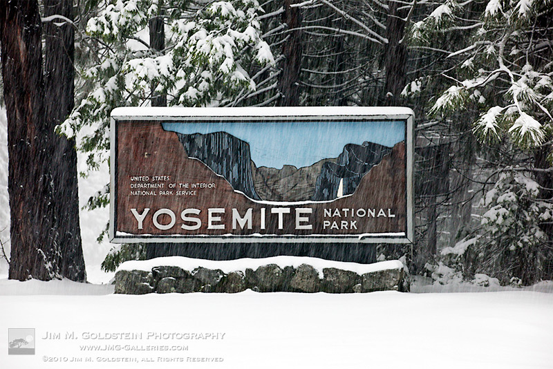
If you don’t remember what the old sign used to look like here is a photo I took of it in a snow storm several years ago. It has a much more stark appearance.

yosemite-sign3-edit-800c

The post Welcome to Yosemite: The Man Behind The Sign appeared first on JMG-Galleries – Landscape, Nature & Travel Photography.


JMG-Galleries – Landscape, Nature & Travel Photography

 
Comments Off on Welcome to Yosemite: The Man Behind The Sign

Posted in Equipment


Bold Border Checkpoint: Cantilevered Curves Welcome Visitors

15 Oct

[ By Steph in Architecture & Public & Institutional. ]

sarpi checkpoint main

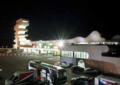
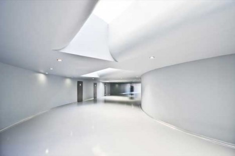
Passing over the border between Turkey and Georgia isn’t an experience you’re soon to forget thanks to the surreal, undulating concrete customs checkpoint structure looming over the Black Sea. A major stop for business travelers, yet located in the sleepy village of Sarpi, the building offered a chance for the client – Georgia’s Ministry of Finance – to make a lasting impression on visitors, representing the new, modern incarnation of the formerly Soviet-run country.

Sarpi checkpoint 1

sarpi checkpoint 4

sarpi checkpoint 5

sarpi checkpoint 3

sarpi checkpoint 9

The main volume of the building is low and long, lean as a ship, as if it’s making its way through the streets to launch itself into the water. From one end of this structure rises a strange tower with multiple cantilevered levels overlooking the coastline. It’s topped with a viewing platform, and in addition to the customs facilities, houses a cafeteria, staff rooms and a conference room.

sarpi checkpoint 6

sarpi checkpoint 3

sarpi checkpoint 7

sarpi checkpoint 8

Berlin-based architect J. Mayer H. wanted to represent “the progressive upsurge of the country” in visual form, departing from the usual architectural style of the region. While the highly unorthodox shape of the building fits in well with the rest of the architect’s oeuvre, including the Georgia rest stop pictured below, it’s also somehow fitting for a region still filled with bizarre Soviet monuments.

j mayer h rest stop 2

j mayer h rest stop

With its sculptural profile, the structure almost seems more like an oversized piece of public art than a functional building, reminiscent of the incredible futuristic concrete monuments built by the Soviets that can still be found in Yugoslavia today. In this sense, the Sarpi checkpoint almost seems retrofuturistic. Some people say it looks like an abstracted profile of Snoopy.

Share on Facebook


[ By Steph in Architecture & Public & Institutional. ]

[ WebUrbanist | Archives | Galleries | Privacy | TOS ]


WebUrbanist

 
Comments Off on Bold Border Checkpoint: Cantilevered Curves Welcome Visitors

Posted in Creativity


Happy New Year from dPS – Welcome 2015

31 Dec
Amodiovalerio Verde

By Amodiovalerio Verde

This is the end – of another year that is. Was it a good one for you? We certainly hope so.

What are you plans for 2015? Will you ring it in with a bang? Do you make resolutions? The beginning of the year is always a good time to look back and reflect on what you’ve accomplished and makes plans for the coming 12 months.

We would like to wish you the happiest new year from all of us here as dPS!

Happy New Year 2015!

Randy Tan [RnD.de.Portraits]

By Randy Tan [RnD.de.Portraits]

googletag.cmd.push(function() {
tablet_slots.push( googletag.defineSlot( “/1005424/_dPSv4_tab-all-article-bottom_(300×250)”, [300, 250], “pb-ad-78623” ).addService( googletag.pubads() ) ); } );

googletag.cmd.push(function() {
mobile_slots.push( googletag.defineSlot( “/1005424/_dPSv4_mob-all-article-bottom_(300×250)”, [300, 250], “pb-ad-78158” ).addService( googletag.pubads() ) ); } );

The post Happy New Year from dPS – Welcome 2015 by Darlene Hildebrandt appeared first on Digital Photography School.


Digital Photography School

 
Comments Off on Happy New Year from dPS – Welcome 2015

Posted in Photography


Welcome to the Future of Photography Websites with MotoCMS 3.0

17 Nov

Modern web is focused on photographers. It is stated in devices more and more improving screen resolution. And especially with an introduction of Retina Display that brings the image quality to the forefront. Despite a wide range of photography-focused social networks available like Flickr, Tumblr, Pinterest, and even Instagram, a personal website still matters for photographers. It’s a private sphere Continue Reading

The post Welcome to the Future of Photography Websites with MotoCMS 3.0 appeared first on Photodoto.


Photodoto

 
Comments Off on Welcome to the Future of Photography Websites with MotoCMS 3.0

Posted in Photography


In iOS 8, Apple brings welcome refinements to Photos app

03 Jun

wwdc-2014-brandnew-100260150-gallery.png

As we’ve come to expect, Apple is using its annual developers’ conference in San Francisco to announce new versions of its desktop and mobile operating systems. Along with a host of refinements in iOS 8 is a revamped Photos app, with improved native retouching options, better search, more complete iCloud integration and support for third party retouching apps as ‘extensions’. Click through for more details.

News: Digital Photography Review (dpreview.com)

 
Comments Off on In iOS 8, Apple brings welcome refinements to Photos app

Posted in Uncategorized


8 October, 2013 – Welcome to the NEW Look

09 Oct

Welcome to the NEW Look of Luminous-Landscape.  We are happy to introduce what we feel is an easier to read and easier to navigate web site.  Watch our NEW Intro Video and read the article to learn some of the new features.  Explore the site and take a moment to read some of the content.  Everything can be accessed with the easy to use pull down menus. 

 In addition we have launched our NEW Video Service as well as the NEW Capture One 7 Video Tutorial.  Please come back often.  You can use our RSS feed if you use RSS Feed readers.  If you haven’t visited the Forums lately stop on by there too.  Always some interesting discussions going on, a number of relevant topics.


The Luminous Landscape – What’s New

 
Comments Off on 8 October, 2013 – Welcome to the NEW Look

Posted in News


Welcome to The f/64 Club: A Front Row Seat at the 2013 GPP Shootout

18 Mar

Sure, the Gulf Photo Plus shootout might be fun to watch. But for the photographers competing, it is all about a week of anticipation, stress and nervousness. And come shootout day, all of that is on display live in front of an audience of 350 armchair quarterback photographers.

Below, the shootout video, how each photographer handled the stress and a challenge for you.

Read more »
Strobist

 
Comments Off on Welcome to The f/64 Club: A Front Row Seat at the 2013 GPP Shootout

Posted in Photography