RSS
 

Posts Tagged ‘Websites’

10 Tips And WordPress Photography Themes For Portfolio Websites

19 May

If you want to give a presentation of your artwork online which converts to sales, you need a portfolio website. This type of website is optimal for professionals in the niches of photography, digital art, creative writing, music and more. It may seem that creating an appealing and easy-to-browse portfolio website takes an expert. Well, indeed, powering a modern animated Continue Reading

The post 10 Tips And WordPress Photography Themes For Portfolio Websites appeared first on Photodoto.


Photodoto

 
Comments Off on 10 Tips And WordPress Photography Themes For Portfolio Websites

Posted in Photography


Nikon KeyMission action cameras listed as discontinued on maker’s websites

19 Jul

Nikon now lists its KeyMission action cameras as discontinued on its UK and Japan websites, a change first spotted by Nikon Rumors. The maker’s UK website lists the KeyMission 80 as “discontinued,” though neither the KeyMission 170 or 360 models show the same notice. The Nikon Japan website lists the KeyMission 360 as an “old product,” but doesn’t include the KeyMission 80 or 170 models under its discontinued action camera page.

The Nikon USA website does not currently list any of the KeyMission cameras as discontinued and is still selling all three models. The Nikon UK website is still selling the KeyMission 360 model, but lists the 170 as out of stock and the 80 as discontinued. Existing inventory is still available to purchase through online retailers like B&H Photo.

We have reached out to Nikon for an official statement.

Via: Nikon Rumors

Articles: Digital Photography Review (dpreview.com)

 
Comments Off on Nikon KeyMission action cameras listed as discontinued on maker’s websites

Posted in Uncategorized


Free Versus Paid Photography Portfolio Websites – Which is Best for You?

13 May

One of the joys of photography is sharing it with the world. Once upon a time, a photography portfolio was a collection of prints, but digital photography and the internet have changed everything. Photography portfolios these days come in many forms, and they are almost exclusively online.

So, do you need a portfolio, and how do you decide where to proudly display your photos for the world to see?

Long exposure landscape photo of rocks at sunset, Mt Maunganui, New Zealand - photography portfolio

Why You Need a Photography Portfolio

You may be asking why you need a portfolio at all. Maybe you’re happy keeping your photos to yourself and never sharing or printing them for anyone else to see? It’s your photography, and you can do what you like with it. But, there are a few benefits that only come from sharing your work, though.

A photography portfolio allows other people to see and enjoy your creations. I’m betting you love not only the process of creating images but also the final product. So why not let others appreciate your artwork too?

You will be driven to stretch yourself and work on improving your photography if you put it out there for others to see. This is often a quiet voice nudging you to try a new technique or take a workshop or develop your post-production skills. A portfolio opens your photography up to critique, which is a little daunting, but I’ve found it to be positive and helpful most of the time.

noosa heads sunshine coast queensland australia - photography portfolio

A portfolio is also necessary if you ever plan to sell your photography. This isn’t for everyone, and I wouldn’t recommend that this be your primary motivation, but it’s worth considering. You may not think you want to make money with your photography, or not yet at least, but if and when that time comes, you will be better prepared if you already have an online presence and portfolio.

Free Versus Paid Photography Portfolio Websites

The options for displaying your photography portfolio online can be a little overwhelming. A quick google search for “photography portfolio website” returns 48 million results. The first question you need to ask is whether a paid or free service is best for you? There are many options within each category, but they each have their pros and cons.

It’s also worth noting that “photography portfolio” doesn’t necessarily look how you expect. In fact, you may already have a portfolio online, you just aren’t thinking about it in that way yet. Let’s look at a few of the options and you’ll see what I mean.

Free Services

If you’ve ever shared any of your photos online, whether on social media or on a photo-sharing website, then you already have an online portfolio. Although not generally considered portfolio websites, some social networks actually make great free portfolios.

Photo sharing websites are a great place to display your portfolio for free. They’re aimed more towards photographers than most social networks, so often include features that may assist you in using them as your primary portfolio.

Sunrise at Urangan Pier, Hervey Bay, Fraser Coast, Queensland, Australia - photography portfolio

Pros

Other than being free, the biggest advantage of free services is the volume of traffic. The larger websites are among the biggest on the internet, so the potential for people seeing your photos is far greater. With all these visitors and traffic comes community. The ability to engage with other users is a huge advantage in my opinion. They have become the modern camera club. They are places where you can not only find an audience for your work, but other photographers to inspire you and network with.

Free services are constantly pushing forward with new features and technology, so you get to be on the cutting edge. The regular updates can be frustrating at times, but I think the good far outweighs the bad in this regard.

These are also the places that you are likely to be found by buyers. One of my first magazine features was an image that was found on Flickr by a photo editor searching for a specific image to buy. Again, this isn’t for everyone, but something worth considering if you are wanting to sell your photos.

Landscape photo of Two Mile Bay, Lake Taupo, New Zealand - photography portfolio

Cons

There are downsides to using a free service, though. The biggest one for me is that you are depending on someone else’s platform to build your portfolio. Their primary interest is profit, not making you rich or famous. They can and will change things whenever they like and you have no say in the matter. If they close down or are sold to a new owner, that can mean a lot of hard work goes down the drain.

You have little or no ability to customize your profile page, meaning you have no options for how your portfolio looks. This may not be something you’re concerned about, but it’s worth considering. Free services make money by either selling ads (social networks) or offering premium features to users (photo sharing sites). This is fine, as it keeps the service free for those who don’t want to pay, but it means you’ll miss out on some of the best features the service has to offer.

You’re probably already using one or more free portfolio services, or are at least aware of them. Let’s take a look at a few of the biggest ones and see if they’re right for you.

Flickr

The photo-sharing website Flickr has been around forever and was one of the first places I began sharing my photography when I started out. With around 75 million users, it is a giant in the photo-sharing world. Flickr’s biggest strength lies in its communities. I have been involved with many Flickr groups where I have met lots of other photographers and learned a ton.

flickr free vs paid photography portfolio websites

Flickr’s popularity has declined over the last few years as users have moved on to other things, and the Yahoo-owned website (recently acquired by SmugMug) hasn’t done itself any favors by being incredibly slow to innovate and keep up with the competition.That being said, it still has a thriving photography community and is worth considering.

500px

Like many Flickr users, I abandoned ship when I discovered 500px, a newer photo sharing website that offered many of the same features but with a fresh new user experience. 500px also used an algorithm that meant you were far more likely to see amazing photography on its “popular” page. The standard of photography seemed higher, so it naturally attracted a lot of photographers.

500px has never reached the same volume of users as Flickr, with current numbers sitting around 12 million, but the service has added new features like communities and their “Marketplace”, which is essentially a way to license your images to sell as prints or stock.

500px free vs paid photography portfolio websites

500px has made headlines recently in the photography world after it was sold to VCG, the “Getty Images of China”. This has been a hugely controversial issue for 500px users, and there has been a mass exodus of previously loyal users. Don’t let that be the deciding factor for you, as 500px still has a lot to offer as far as free portfolio websites go.

Instagram

You may think of Instagram as just another social network, but you might be surprised how many photographers are now using it as their primary portfolio.

I’m sure I don’t need to tell you that Instagram is currently the world’s number one photography app, and for good reason. People want to go where the masses are. With over 800 million users, there is no question as to whether it’s a place to consider sharing your portfolio.

instagram free vs paid photography portfolio websites

Instagram can be used in many different ways, but if you choose to use it as a portfolio, you must learn to be selective about what you share. Try to resist the temptation to share every photo. Curate your feed well, and you will have a portfolio that will attract people to it. If you must share photos of your cat, try using Instagram’s awesome Stories feature.

Pinterest

Just like Instagram, Pinterest has grown into a social network with a massive number of users, and it has the added advantage of being heavily visual. It’s a great place to be able to share your portfolio with the potential of being seen by a large audience.

Pinterest allows you to create boards and then “pin” your photos to as many boards as you like. You can create a different board for each photography category or location, such as “Weddings” or “Australia”. You can even have a “Portfolio” board where you only pin your best photos.
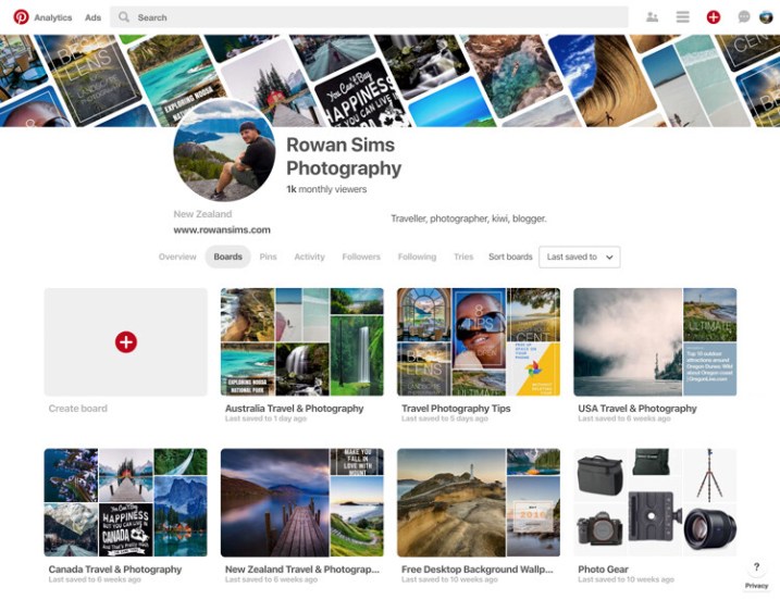
pinterest free vs paid photography portfolio websites

Pinterest also allows you to pin web pages, so if you have a blog you can pin your posts. The ability for others to re-pin your pins to their own boards means your work can be seen by a lot more people. You can also create inspiration boards for re-pinning other photographers’ pins. With all these features, Pinterest is definitely worth considering as a place to share your photography portfolio for free.

Paid Services

When it comes to paid photography portfolio websites, there aren’t as many options, but the ones that are available give you pretty amazing bang for your buck. Most professional photographers use one of these services these days, but that doesn’t mean you have to be a professional to use one.

They all have a range of options that vary in cost and features, but if you are considering a paid service for your portfolio, I’m sure you can find something that will fit your budget and needs.

Pros and Advantages

As with the free options, these services have their pros and cons. The biggest advantage, in my opinion, is the ability to customize how your portfolio looks and feels. You can change colors, layouts, text, logos, etc., all without needing to know how to code websites.

noosa national park sunshine coast queensland australia - photography portfolio

Most of them include unlimited storage for your photos, meaning you can upload as many high-resolution images as you want. This not only means you never have to delete another photo to make space for new ones, but you also have a copy of your photos backed up in the cloud.

The ability to sell your photos as prints or license them as stock directly from the website is a major attraction for many photographers. Each service’s e-commerce system works differently, but if this is a feature you want, you will find something that works for you. Some paid portfolio websites also allow you to deliver image files directly to clients, which works great if you’re a wedding or portrait photographer, or if you want to deliver files directly to a magazine, etc.

If you have a blog, some of these services will allow you to integrate your domain with your portfolio. For example, you can make your portfolio URL something like “portfolio.yourdomainname.com” rather than “yourname.photoshelter.com”. Visitors to your portfolio won’t even know that they’re on another website.

Driftwood bench seat on sand dunes overlooking Mount Maunganui Beach at sunset. - photography portfolio

Cons or Disadvantages

As you’re paying for premium features, there aren’t as many disadvantages of using a paid service. The main one is that they don’t have the social element that you get with photo-sharing sites or social networks. Getting your portfolio in front of eyeballs is a lot harder without the ability for viewers to engage with your work like they can on social media.

Although you have far more options to customize the way your portfolio appears, you’re still at the whim of the website that it is hosted on, and therefore how it functions. If you don’t like the features a website offers, it’s take-it-or-leave-it.

The following paid photography portfolio websites are by no means an exhaustive list, but these are some of the largest and most popular amongst photographers.

PhotoShelter

This is the first paid portfolio service I used for my own photography. PhotoShelter offers some of the best photography portfolios money can buy. Their websites look and work great, and their e-commerce features are second-to-none.

You can sell and license your photos directly through the website, and they even offer self-fulfilled printing if you want to print and ship images yourself. Although it’s one of the most expensive services, PhotoShelter is a solid option.

photoshelter free vs paid photography portfolio websites

SmugMug

I switched from PhotoShelter to SmugMug a few years ago after running an experiment to see how the two big boys compared in terms of Google search traffic. SmugMug won hands-down, so I moved my portfolio over. The two are very comparable in terms of cost and features.

If you want a beautiful portfolio website that works well and offers unlimited storage, I would definitely consider SmugMug. They also offer a solid e-commerce system, although they let themselves down with their refusal to allow self-fulfilled printing, despite users requesting it for years.

smugmug free vs paid photography portfolio websites

Zenfolio

I haven’t used Zenfolio personally, but from what I’ve seen and heard from other photographers, it’s a service worth considering. Their websites look great, although aren’t as customizable as the competition. Zenfolio is one of the more affordable services available, especially if you aren’t planning to sell your photos. It’s definitely, worth a look.

zenfolio free vs paid photography portfolio websites

Editor’s note: I personally use Zenfolio (screenshot below) and have used their print fulfillment services for clients, as well as for file downloads. It all works seamlessly and you can set your own prices with the Pro or Advanced plans. So, I can add my recommendation for this service. 

Zenfolio photography portfolio of Darlene Hildebrandt, dPS Managing Editor.

Self-Hosted Website and Portfolio

The last option sits somewhere between paid and free, and is yet another option to consider. If you want total freedom to customize and run your portfolio website however you want, you need your own self-hosted website.

The easiest way to do this is with an installation of WordPress on your own domain. It’s cheap and easy to set up with a service like BlueHost. Once it’s up and running, the options for your portfolio are endless. There are many free and paid gallery plugins, and if you want to sell your photos you can do it directly from your own website with a plugin like WooCommerce, all without having to pay anyone else a commission, so you get 100% of the profit.

If you have time (and are technology savvy) and you like to have total control over how things look and work, this is a great option. It does require a lot more user input, though, so be careful about rushing into it. If you prefer something that’s easier to set up and does most of the heavy lifting for you, one of the paid services is probably best.

tea tree bay sunset noosa heads queensland australia - photography portfolio

How do you choose?

With so many options, it’s hard to know which is best for you. The good news is that whatever you choose, nothing is permanent. I have used almost all of the services that I’ve mentioned in this article. They all worked for me at the time that I used them, and then I moved on when they no longer served my needs.

Try one or two of the free ones and see if you like them. If you think one of the paid services might be for you, they all offer free trials, so you don’t need to commit until you’re ready.

Whatever you decide, remember to have fun and don’t take it too seriously. Sharing your photos with the world can be one of the most enjoyable parts of photography. I would love to know about your experiences with portfolio websites. Have you used any of the websites mentioned? Are there any others you would recommend? Questions? Let me know in the comments area below.

The post Free Versus Paid Photography Portfolio Websites – Which is Best for You? appeared first on Digital Photography School.


Digital Photography School

 
Comments Off on Free Versus Paid Photography Portfolio Websites – Which is Best for You?

Posted in Photography


Adobe Portfolio brings customizable personal websites to Creative Cloud

27 Jan

Adobe has introduced Adobe Portfolio, a website creation platform similar to Squarespace. Part of Creative Cloud, Adobe Portfolio is offered under three subscription tiers and aims to provide creatives and professionals with a simple way to showcase their work online.

The Adobe Portfolio service offers pre-made layouts, as well as customization options for website elements like the header, logo, navigation, background and footer. The designs are responsive, able to scale for various screen sizes and there’s an option for a personalized website URL. Features include galleries for showcasing content, password-protected pages and website analytics. Subscribers can also integrate a Behance account with Portfolio for seamless content syncing.

Adobe Portfolio is available to individuals under three Creative Cloud pricing tiers: $ 9.99 USD/month with included access to Photoshop CC and Lightroom CC, $ 19.99 USD/month with access to 20GB of cloud storage and one desktop app and $ 49.99 USD/month with access to all Adobe creative apps.

Via: Adobe Blog

Articles: Digital Photography Review (dpreview.com)

 
Comments Off on Adobe Portfolio brings customizable personal websites to Creative Cloud

Posted in Uncategorized


The Future of Photography Websites – Understanding and Adapting to Trends Continued

31 May

In an earlier article (The Future of Photography Websites – Understanding and Adapting to Trends) on this topic, you can read about a couple of major trends in the web-design industry (as they relate to photo websites). Here’s a quick review:

  • The huge number of new websites being built and ways to rise above the noise including: Choosing a photography niche (specializing); Differentiating yourself as a photographer; Using quality platforms and website templates; Simplifying and prioritizing elements on your site; Understanding and focusing on your target audience.
  • New website performance standards and their effect on browsing habits: Why and how to make your website faster; Editing down your content and creating a smooth browsing experience; Having clear website navigation.

Now we’re going to continue exploring many other important aspects you should take into consideration when building your photography website (whether it’s an online portfolio, a stock website, or centred around a photo blog). All combined, these notes should give you a more clear picture of how to build your photography website and steer towards a more successful photo business.

3. Mobile devices are omnipresent and powerful

This is fairly obvious to see in the world around us, but what implications does it have on photography websites?

a. The old adage: stop using flash on your site

No need for me to dwell on this, but it’s hard to write an article on photography websites without mentioning Flash, and with good reason. I hope you’re in the position to skip this paragraph, but if you’re still using Flash, continue reading and consider making some changes soon.

Besides the well-known SEO limitations, Flash websites are slower, not compatible with Apple devices, harder to update, and can be almost entirely replaced today using modern HTML5, CSS3 and Javascript components (and surely surpassed in many aspects).

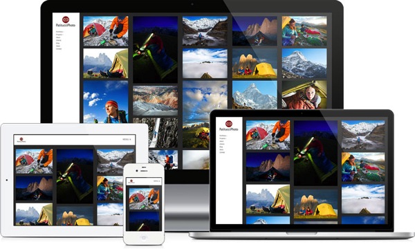
b. Make your website mobile-friendly (responsive)

Many photographers are reporting that almost half of their website traffic comes from mobile users (smartphones and tablets), and we can expect this number to rise further.

So you can no longer afford not to have a mobile-friendly website. Google confirmed this by announcing they will now penalize non mobile-friendly sites. While this is just one of the many factors Google uses to rank websites, it’s a strong signal to take note of this issue.

This is especially important for photography websites where users interact with the site more (using slideshows, doing searches, buying images etc.) Slideshows and static images (along with the entire layout, of course) should automatically resize and adapt to any screen size.

Example 7a responsive

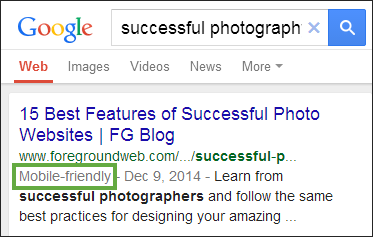
To emphasize the importance of a mobile-friendly browsing experience, Google provides a free testing tool for your site and rewards responsive websites in mobile search results:

Example 7b mobile friendly badge

c. Once again, make your website fast

You can read about website performance in the first article, however, it’s worth mentioning here again. The load times of a website are even more important to mobile users (with mobile networks being somewhat slower and less reliable than home broadband connections).

4. Content-consumption rates are increasing (a lot)

Not only are more users coming online (and using more devices than ever before), but they’re also consuming a lot more content. This should come as no surprise, and it’s worth considering for its web-design implications. Since users want more content, here are some ways to help them out:

a. Make your site easily shareable

That means leveraging social media buttons on your website (even when you don’t have your own profiles on those specific social media sites), making it easy for people to recommend your images and pages.

Example 8 social shares

Don’t neglect tweaking your site to display pretty permalinks: a page URL like this www.johndoe.com/?p=789 is much uglier than something like www.johndoe.com/gallery/great-description-here/. Besides the SEO implications, pretty permalinks are also important for people sharing your content: if a URL is more inviting, it will naturally get more shares and visits.

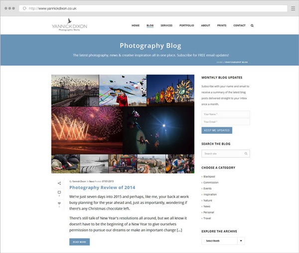
b. Keep the content fresh

Example 9 yannickdixon blog

While everybody knows that blogs should frequently be updated, you need to refresh the rest of your website once in a while too.

  • Make sure your contact information is up to date.
  • Have some featured galleries on the homepage? Change or rotate them from time to time.
  • Have a slideshow? Rearrange some of its images, or add new ones. Returning visitors will notice that.
  • Recently worked on a project or received an award? Make sure it’s there on your site.
  • Consider keeping a Recently Updated gallery or section on your site’s homepage, depending on your layout.
  • Schedule and do such a site review regularly.

You’re not making a good impression if your site is becoming stale after months of inactivity, and let’s not even talk about Google (who values fresh content as much as users do).

c. Consider offering an email newsletter

Email marketing is becoming huge these days. While everybody hates inbox clutter, getting unique and valuable content via email is always good. This is especially important if you have a photography blog. Sure, people can come to your site to check for new content (or subscribe to an RSS feed), but sending them content directly via email can be very effective.

Example 10 kenkaminesky newsletter

The people who subscribe to your mailing list are already targeted; they’re interested in your content to start with,
and want to see more of it. You can look into tools like MailChimp (free for up to 2000 subscribers) and follow their best practices for creating, and managing your mailing list.

5. People are searching more, not just exploring

Remember we mentioned impatience. With things happening so fast online, people expect to be able to search for content if they can’t find what they’re looking for in a few clicks. It comes down (again) to how you organize your site structure (and having clear site navigation), but it’s also about providing metadata and search options where appropriate:

a. Don’t ignore text content

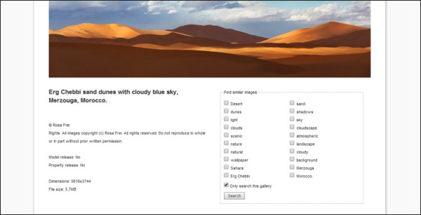
Okay, you have a photography site, so it’s supposed to be image-heavy and visually impressive. The homepage is sometimes a good place to do that, but throughout the site, you need to also have quality text content to provide context.

Example 11 rosafrei metadata

We’re not even attacking this point from an SEO perspective. It’s important to your users that you describe every piece of content you have:

  • What are these images about? (IPTC captions and keywords displayed on the page).
  • What is this entire gallery about? (Gallery descriptions).
  • What is this page about? (On-page intro paragraphs, SEO titles and meta descriptions to help users when seeing search results).
  • What is this blog post about? (Text inside blog posts too, not just one image per post).
  • What is this entire site about? (Titles and descriptions once again, text on the About page, text on other pages describing your work/services).

b. Allow (and track) image searches on your site

Once again, this comes down to properly captioning and keywording your images, along with having an easy-to-find search functionality. This entire process is time-consuming, for sure, but you’ll reap the benefits in the long run. How you add all this searchable image IPTC metadata is also important and shouldn’t be taken lightly. Nobody will do a search on your site for “DSC0023”, so you need to provide real value to users that need to search, by describing your images for:

  • Abstract meanings.
  • Scientific names where appropriate.
  • Actual persons/locations/objects depicted in them< ./li>
  • More creative captions describing your process, experience, gear, etc.

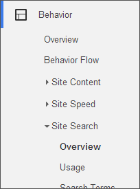
Example 12 analytics site search

You can obviously write unlimited keywords for your images (sometimes overdoing it with all the possible synonyms), but it’s usually recommended to go for 10-20 keywords per image depending on the type of photography you do.

Once images are on your site and people are searching for them, be sure to also track those searches in Google Analytics to learn more about popular search queries (informing you about content demands). There are exceptions to this: simple portfolio websites (with just a small selection of best-of images) don’t really need a search functionality. For larger stock archives or anybody selling prints/licenses though, it’s a must.

If you have a popular blog on your site, a blog search option also comes in handy. Just make sure it doesn’t get into a fight for attention with the image search box – they need to be clearly separated. Choose whichever is most important to make prominent (like having an image search box in the header throughout the site, and a discreet blog search option in the blog sidebar only).

6. Search engines are looking at user satisfaction as a huge ranking factor

There’s obviously a huge buzz around SEO and how to rank higher for certain keywords. Google is always one step ahead, continually changing their algorithms to prevent any dishonest or spammy tactics. How do they do that? They constantly figure out how people make browsing choices, and turn those into ranking factors.

When writing SEO titles and meta descriptions, think about how they would look in search results, how to best encourage users to give you their clicks. Don’t just stuff them with keywords for Google’s sake.

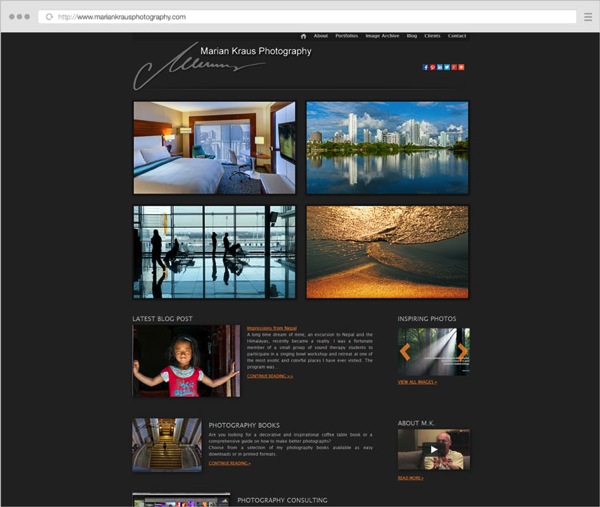
Example 13 mariankraus

For every main page on your website, ask yourself:

  • What do people come to this page for?
  • Can users quickly find the information they’re after?
  • What would you want to see on this page if you came here for the first time?
  • Where should visitors go to after viewing this page?
  • What elements on the page are probably not useful to people?

This change in mindset is the one thing that can set you apart and differentiate your photo website. Sure, there are many SEO-specific actions you need to take care of, but you should always go above and beyond in providing value to people. Do that, and it will be impossible not to rank well in search engines.

7. Social media websites come and go

You probably can no longer build a successful business without some sort of social media presence. But you would be taking too many risks to only setup camp there, without building your own website. Social media companies can always get sold or shut down (acquisitions, natural life cycles, new competitors etc.), so you don’t really own your profiles there.

Whereas a website is an asset you can control, that you have copyright over. You’re interested in buying instead of just renting online real-estate. Social media sites are excellent marketing hubs, and they’ll always be there to drive business forward in one shape or another. But building your strong personal website should be the core of your focus.

With this in mind, it’s obviously important to leverage all the social media tools you have (by placing profile links and sharing buttons on your site). Use them as much as you want, just don’t rely solely on them, it’s more important to build your own online presence.

8. Web platforms and tools are maturing, and eCommerce is exploding

A lot of photographers these days are looking for hybrid solutions instead of having multiple separate sites. They want a place where they can blog, and showcase and sell their photos if they want. So it makes sense that some platforms are starting to offer that, and the days of having separate portfolio and blog sites are coming to an end.

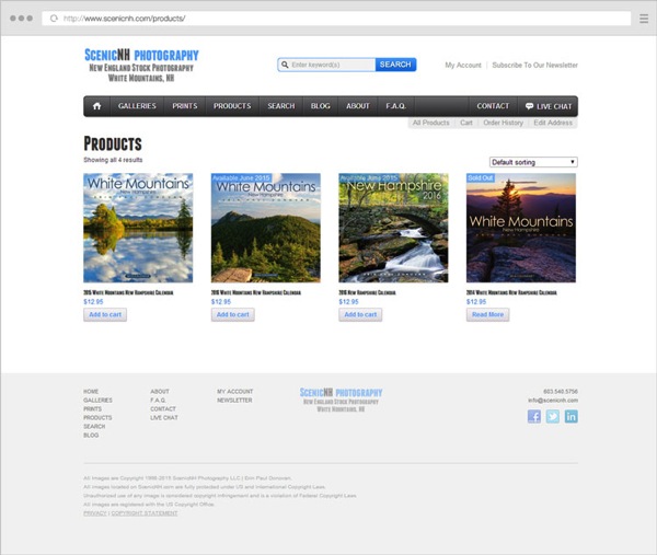
Current established companies (like PhotoShelter or SmugMug) are getting strong competition from WordPress plugins like NextGen Gallery (with its Pro version) or WooCommerce (with its new Photography extension).

Example 14 scenicnh products

If you want to start selling prints/products, now is a good time. Since online sales keep growing, it’s natural to see many photographers shift (at least partially) from services to products, basically trying to build a passive income from their photography business. They do that through books, prints, courses, workshops, etc.

9. Design aesthetics are changing

Change is the only constant. I won’t recommend you use any particular flat design elements, any colors or layouts because those are just like fashion trends. They come and go.

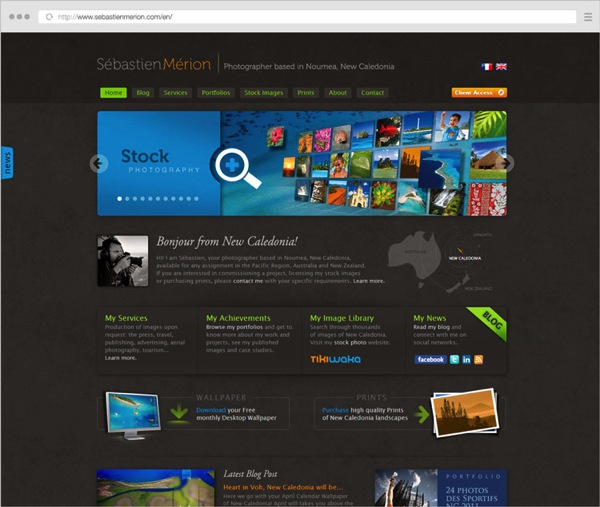
What is here to stay is simplicity. I can’t imagine a time when having a cluttered header area (with 10-12 menu items, six social media links, a search box and a subscribe box, all crowded together) will be in fashion. A clean website is not about using big fonts or a lot of white. It’s about prioritizing your business goals and the elements on your site.

Applying this mindset to the number of galleries you feature on your homepage or the products and services you offer is important. When visitors have fewer and more clear choices to make, they have a better browsing experience and are more likely to trust your website and keep coming back for more.
Example 15 sebastienmerion

Conclusion

Along with part one of this article, this was an overview of the important web-design trends you should be aware of as a photographer.

Constant improvement is the only way to be successful with an online photography business. You know this to be true for your photo technique and composition skills (since you’re reading this on dPS, after all). The mindset can be applied to your online presence as well; it’s a continuous effort to get better and adapt to the industry.

Success does not depend on cool slideshows and flat designs. Sure, you have to make your photography website beautiful, and, therefore comply with the latest web design fashion trends sometimes, but not at the expense of helpfulness and clarity.

googletag.cmd.push(function() {
tablet_slots.push( googletag.defineSlot( “/1005424/_dPSv4_tab-all-article-bottom_(300×250)”, [300, 250], “pb-ad-78623” ).addService( googletag.pubads() ) ); } );

googletag.cmd.push(function() {
mobile_slots.push( googletag.defineSlot( “/1005424/_dPSv4_mob-all-article-bottom_(300×250)”, [300, 250], “pb-ad-78158” ).addService( googletag.pubads() ) ); } );

The post The Future of Photography Websites – Understanding and Adapting to Trends Continued by Alex Vita appeared first on Digital Photography School.


Digital Photography School

 
Comments Off on The Future of Photography Websites – Understanding and Adapting to Trends Continued

Posted in Photography


The Future of Photography Websites – Understanding and Adapting to Trends

03 May

Right off the bat, this is not an article about what background colors to use, what plugins to install, or other shallow web design fashion trends. Focusing blindly on bells and whistles (flat design, parallax scrolling, full-width page layouts) won’t actually make your photo website better. Sure, it might make it pretty, but it won’t necessarily be effective.

Getting the bigger picture and understanding the WHY behind web design trends will make you better equipped to build a successful photography business.

Having worked on over two hundred photography websites in the past few years, I’ve developed an eye for all the details that make up a great photo website and have recognized some important mindset shifts. My aim with this article is to give you a good overview of where the web design industry is heading (as it relates to photography websites), and how you can stay ahead of the curve.

Focusing on trends that truly matter allows you to then provide real value to your audience.

Change is inevitable

Web design trends are just a result of an ever-changing landscape. That’s why building your photography website should not be considered a one-time effort. It’s your responsibility to keep an eye on the industry and adapt as you go along.

So, what is driving all the web design changes in the photography industry, and what can you do about it?

#1 – The sheer number of online users

The web design world is rapidly evolving in order to manage the Internet boom:

There were more than 3 billion (with a “b”) Internet users in 2014, representing 43% of the world’s population.

So if you think the Internet has grown in recent years, we have yet to reach the tipping point. Not to mention how fast and easy it is to create a new basic photo website these days, instead of just being a content consumer. Everybody is getting online, which is the obvious cause of many web design changes.

Let’s explore some strategies to differentiate your photo website and rise above the surface:

a) Choose a niche

When the market becomes over-saturated, you’re somewhat forced to specialize in a smaller niche and become an expert in it. Your target audience will be smaller, but you’ll also be a better fit for their needs.

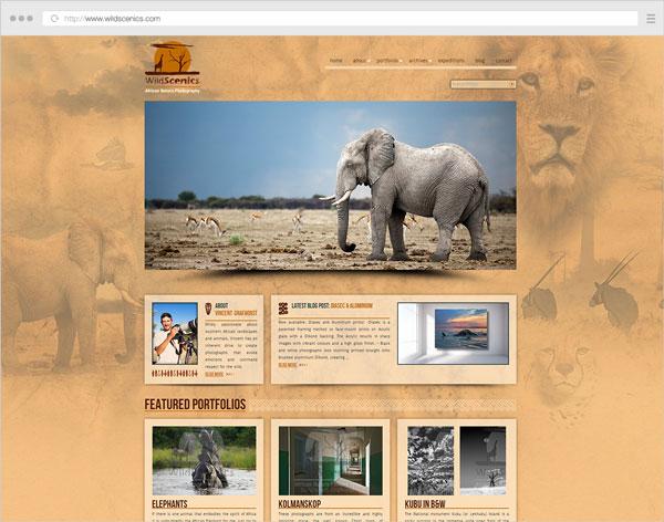
Example 1 wildscenics

Niching down can usually be done through:

  • The type of photography you specialize in (instead of being a jack-of-all-trades).
  • The physical area you cover (only accepting clients from a certain city).
  • How you promote yourself online (blogging, publications, events etc.)

This also has a great impact on how you structure your website. Having a clear target audience in mind, allows you to craft your message and tailor your site’s landing pages better.

If a first-time visitor comes to your site and is greeted with 10+ galleries from completely separate photography domains, (s)he might start exploring some of them, but will surely be a little confused and ask “What is this photographer actually good at?”.

b) Differentiate yourself and show your personality

Besides having great images (which should be a constant focus in your career), your website is an important way to showcase your personality. Just like you’re trying to craft a unique style in your photos, you should also infuse your style into the way you build your website.

How do you do that?

Your words have a lot of power. What you write (and the tone you write in) can make a lot of difference:

  • Using your sense of humor in blog posts and your About page (within reason).
  • Having a good self-portrait (did you nail the right facial expression?).
  • Describe your work/services in a friendly manner.
  • Write about your experiences in your own words, as if you’re talking to a friend using natural language. Forget about SEO for now.

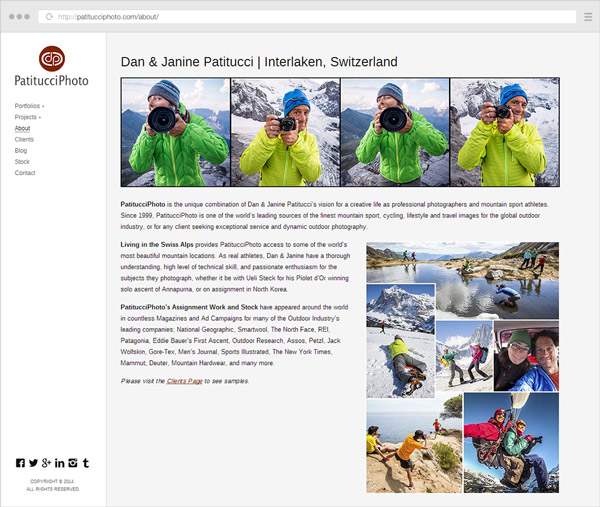
Example 2 patitucciphoto

Furthermore, it’s obviously not enough to use a great website template, thousands of other photographers might use the same one. The branding and design of your website are also important differentiators:

  • Defining who/what your audience is (to inform what site structure, colors and fonts to use).
  • Choosing whether to brand the site under your personal name or a business name.
  • The general mood created by the site (minimalist, strict and professional, very joyful, retro, dark and intriguing etc.)

To dive deeper into how you can infuse personality into your website, look no further than this excellent article from Smashing Magazine: The Personality Layer.

c) Use quality platforms and themes/templates

Using free blogging platforms like blogger.com or wordpress.com (not to be confused with the self-hosted software from wordpress.org), you get what you pay for. I don’t want to sound harsh, because they’re useful to many people, but they’re targeted at beginners, so you also let out that impression when using them.

Using the right platform (like wordpress.org for your blog and/or PhotoShelter, Smugmug, or Zenfolio for your portfolio or archive, to give a few examples) allows you to build your site under your own terms, with SEO advantages and more design flexibility. But then you also have to pay attention to the theme or template you’re using on these platforms. Choosing a weak one (and not even customizing it in any way) makes your site very similar to many other ones out there.

Even if you’re not in the position to hire a professional web designer or developer, or you’re just starting out, it’s important to do a little research first and choose a strong theme as the foundation for your site.

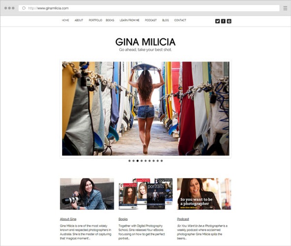
Example 3 ginamilicia

Website of our own Gina Milica – dPS writer and ebook author

If using WordPress, one of the best places to look for quality themes is ThemeForest (this link automatically filters for the term “photography” in the WordPress category, sorted by bestsellers and does not use any referral code).

Once you have a theme, it’s worth browsing the theme demo, reading its documentation, and getting acquainted with all the various layouts and options it has – they’re building blocks from which you can build your own WordPress-based website.

d) Learn to prioritize and simplify your website

You can tell a lot about a photographer’s personality from his website layout. Cluttered headers and overwhelming navigation can leave users confused and make them abandon the site (or at least browse to less important pages).
By letting go of clutter and focusing on quality over quantity, you can provide a better browsing experience for your users:

  • Provide simpler (and fewer) navigation options. Try to keep menu items around five to seven choice at most.
  • Any new piece of content should replace an older one, instead of just being crammed in there with all the existing content.
  • Leave the header area distraction free (that means: no big blocks of text, client logos or obtrusive subscribe boxes). Just your logo (linking to the homepage), main navigation items and maybe a couple of social media links.
  • Forget about only placing content above the fold (in the first few hundred pixels from the top). People scroll a lot these days (if the content is worth it). So leave some breathing room (whitespace) between elements – it adds legibility and creates a more modern and elegant look.
  • Choose one or two accent colors for the site and go with them, consistently, throughout the site.
  • Question the purpose of every element on your site: Is it distracting people from the main content? Would it be better placed somewhere else? Do you enjoy seeing/using similar elements on other websites?

Notice I did not mention minimalism in particular, or using the now-popular flat design elements. Prioritizing your content and focusing on a clean design are key ingredients to being more successful with your site.

e) Focus on your audience

Your photo website should obviously showcase your work and let your personality shine, but it shouldn’t be built around what YOU like (as the website owner). Instead, you should embark on the long process of defining your target audience and figuring out their likes and needs:

  • Read industry blogs (What shifts are there in the industry? What tools are popular these days?).
  • Get inspiration from other successful sites in your niche (How are other photographers writing to their audience?)
  • Continually get feedback from your readers/clients (Can you see some patterns in the contact messages you get from readers? Can you ask a few clients why they chose you?)
  • Understand the process a client goes through to find a photographer like you, and draw conclusions to inform your website copy and marketing efforts (Where do my target clients go looking for photographers? What are their most common questions and concerns?).
  • Think about what visitors on a page are most likely looking for, and make sure that’s front and center (Does a reader come to your About page to vaguely see if you’re passionate about photography, or in fact to quickly view your experience and location?)

Answering questions like this should, in time, create a strong new mindset for building a site that’s useful and appealing to your audience. What a great place to mention this quote from marketing expert Seth Godin:

“The only reason to build a website is to change someone. If you can’t tell me the change and you can’t tell me the someone, then you’re wasting your time.” – Seth Godin

Example 4 jasonmyers

2. High-speed internet is becoming the norm

The spread of broadband connections and mobile networks are changing the way we browse websites. No longer are people expecting to wait too long for a page to load, or to sit and read very long texts (except maybe for long-form articles like this one).

High-speed connections bring many benefits, but also impatience and superficiality (users not staying long enough on a site to dive deeper into a topic). This has a few important affects on the way you should build your online presence:

a) Make your website fast, people expect that

Google expects that too. Photography websites usually have a problem with site speed, due to the nature of the image-heavy pages which require more bandwidth and are slower to load. While using a quality hosting provider is obviously important, the three main performance factors are:

  • The quality of your theme or template (see notes above on this topic).
  • The content you add to the site – unless you’re selling prints or licenses, you should only upload lower-resolution images (at the size displayed by the template, usually no more than 800-1000 pixels on the longest side, maybe larger for home pages or slideshows). With some exceptions, JPG files at a 60-70% quality level is a good compromise (in order to keep file sizes low while maintaining acceptable image quality).
  • Page caching – using performance plugins like W3 Total Cache (and integrating with a CDN (Content Delivery Network) or enabling similar caching features on your platform) can greatly improve your site’s load speed.

Quality content comes first, but a big chunk of users leave your site if it takes too long to load. As technologies advance, this performance expectation will only get stronger.

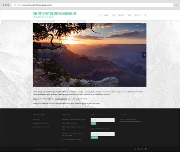
Example 5 fineearthphotography

b) Make your pages easy to skim through

Make no mistake – with faster websites, users’ patience is also stretched thin. In this era of distractions and (false) multi-tasking, rarely do people sit for long periods of time on a single page. Even if they’re fond of your work, the social media feed in the other browser tab pulls them away from your site and back to their notifications. It is, therefore, important to create a smooth browsing experience:

  • Be brief – when writing blog posts or your biography text, try to stick to what matters and get to the point. Quality over quantity, again.
  • Showcase only your best images – having tens or hundreds of images in a slideshow will only dilute the visual impact, and you can’t really expect people to sit through all of it. Especially annoying are very similar variations of certain images. Unless it’s for a client project, show visitors a different thing, not the same subject shot from three different angles.
  • If you have many galleries, try grouping them into collections/categories. A user is more likely to choose from five categories and dive deeper into sub-galleries, instead of choosing from 30 galleries right from the start. It’s the jam experiment all over again.
  • Properly format your text – you can increase legibility by breaking texts into paragraphs with spacing, highlighting important sentences/words and using headlines and sub-headlines. Notice how this article is quite long, yet (hopefully) easy to skim through with all the sub-headlines and bullet points.

c) Have a clear site navigation, people want to quickly jump from one thing to another

Since people are so distracted these days, you might be thinking of grabbing their attention and making them stay on your site longer. But this can be done in both good and bad ways. You can either use annoying pop-ups and write bombastic words to trick them into staying, or you can instead create a clean and simple website that’s a joy to use.

When you visit a website and can quickly find what you’re looking for, you’re a happy reader and more likely to go there again. Don’t you also feel the same way when shopping in a neatly organized store? Whereas on websites where you’re wasting time searching or navigating, your frustration level might prevent you from ever going there again.

What are the main ways to create a great website experience, you ask?

  • Once again, simplify your navigation – I’m not saying to just have three or four menu items, because that might actually create even more work for the reader to dig out your other pages. Just try to place your important site areas in the navigation, and remove the rest. You can always link to your other less-important pages in other places.
  • Position the navigation consistently – people expect to find the menu in the same spot throughout the site. This is especially important for people with multiple/separate websites. When a visitor reaches your blog, can (s)he see the same menu items and in the same position? Or do they have to learn a new layout again? It’s not difficult, but it’s a hindrance.
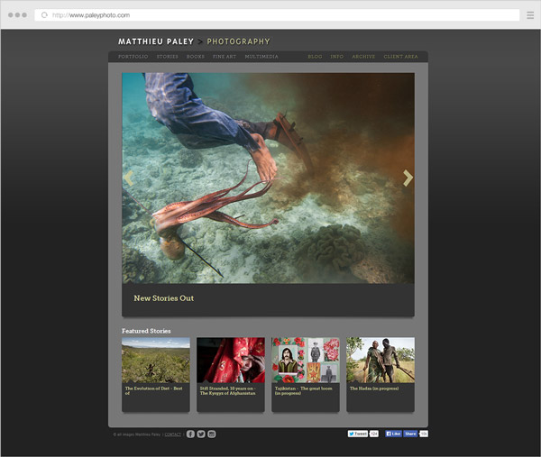
  • Provide clear calls-to-action – when users reach the end of the page, where should they go next? Depending on the page, you can let them explore the main menu on their own, or you can guide their actions by having buttons linking to where you want them to browse next (or subscribe to something, or leave you a contact message).

Example 6 paleyphoto

Conclusion

The web design industry is evolving. It’s heading towards clarity and simplification, forced by the expanding number of websites out there.

There are many other aspects to take into consideration (the rise of mobile devices, higher content consumption rates, new browsing habits, SEO and social media implications, and many more), but they’re the topic of a future article here on dPS.

If you closely read all the points above, you’ll spot the common thread; helping your readers and always asking yourself how to make things better for them.

Focusing more on the quality of your work and on providing an honest and friendly browsing experience to your readers can go a long way.

googletag.cmd.push(function() {
tablet_slots.push( googletag.defineSlot( “/1005424/_dPSv4_tab-all-article-bottom_(300×250)”, [300, 250], “pb-ad-78623” ).addService( googletag.pubads() ) ); } );

googletag.cmd.push(function() {
mobile_slots.push( googletag.defineSlot( “/1005424/_dPSv4_mob-all-article-bottom_(300×250)”, [300, 250], “pb-ad-78158” ).addService( googletag.pubads() ) ); } );

The post The Future of Photography Websites – Understanding and Adapting to Trends by Alex Vita appeared first on Digital Photography School.


Digital Photography School

 
Comments Off on The Future of Photography Websites – Understanding and Adapting to Trends

Posted in Photography


Upload Your Photos to Multiple Social Media Websites with Expojure

19 Feb

How many social media websites do you upload photos to regularly? I have five – a Facebook page, my personal Facebook profile, Google+, Flickr and 500px. Some people have more. For photographers who want to get their work out there, this seems like a must. Yet it’s time consuming and, truth be told, an inefficient way of working.

If this is you, then you’ll be interested in new photo sharing website, Expojure. A startup based in Mumbai, it lets you upload the photos you want to share to a central Expojure account, arrange them in Collections, add keywords, titles, tags and descriptions, then upload them to as many as six photo sharing websites (the five listed above plus SmugMug).

Expojure review

I’ve been using Expojure for a few weeks now and I’m very impressed with the setup. The website is well-designed and easy to use. The layout is simple, doing exactly what most people will need it to, without adding unnecessary extras.

There’s also a plug-in for uploading photos to your Expojure account directly from Lightroom.

How Expojure works

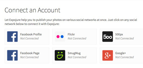
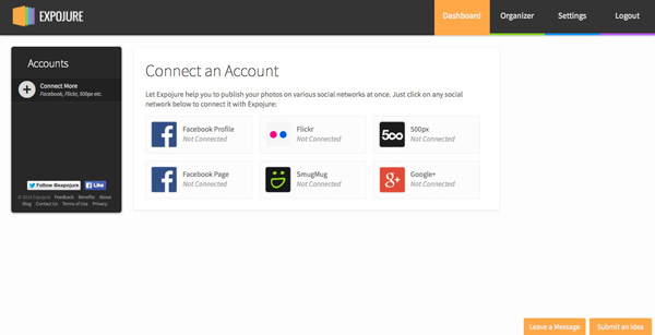
When you sign in to Expojure you’ll see a page that looks something like this – it is your Dashboard. If you’ve uploaded any photos to Expojure already, you will see them here. If not, you’re presented with the option to sign into the photo sharing accounts you wish to use. Just click the buttons to do so. Connected accounts are shown afterwards on the left.

Expojure review

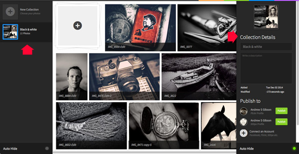
Once you’ve connected to some photo sharing websites, it’s time to go to the Organizer and add photos. Uploaded photos are automatically placed in a new Collection. You can rename the Collection and add a description using the panel on the right. You can also move photos around between Collections.

Expojure review

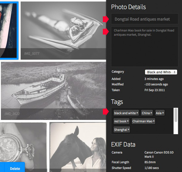
You can add or amend details of individual photos by clicking on them and entering the new information on the right. If you haven’t already added a title, description, or tags now is your chance to do so.

Expojure review

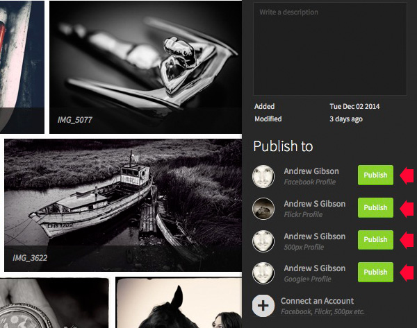
Click the green Publish buttons in the bottom right corner to upload the photos. Expojure places all the photos in the Collection into a new Set on your selected website.

Expojure review

Every photo in the Collection is sent to the chosen website. If you want to upload a single image, you need to create a new Collection and add the chosen photo to that first.

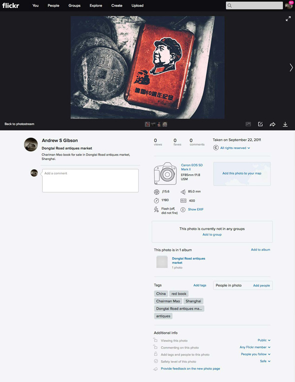
Here’s a photo that I uploaded to Flickr. The title, description, EXIF data and tags have been successfully added. The only thing left to do is add the photo to any Groups or mark the location on the map.

Expojure review

Expojure Lightroom plug-in

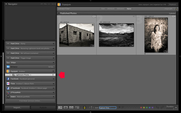
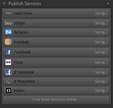
If you click on the Settings tab at the top of the Expojure website page you can download a free plug-in for Lightroom. Use Plug-in manager to add it. It shows up in Lightroom’s Publish Services.

Once installed, you can create new Publish Collections containing photos to upload to your Expojure account. Lightroom uploads them when you press the Publish button. The images are held there until you log in and distribute them to your photo sharing websites.

Expojure review

Notes about Expojure

At the time of writing Expojure is free to use, and has been since the service went live. However, at some point (most likely after this article has been written, but before it is published) Expojure is switching to a subscription model. There will still be a free account, which limits you to uploading 20 photos a week and connection to two social media accounts. Paid accounts retain unlimited photo uploads and unlimited social media accounts.

If you have a free 500px account, you will receive an error message when you upload photos to it. This is because free accounts don’t support Sets. However, your photos are still successfully uploaded to 500px, despite the error message.

Expojure will add more features, and more services to its supported photo sharing websites over the next few weeks. Some of these may be active by the time you read this article.

Alternatives to Expojure

The only alternative to Expojure that I’m aware of is Lightroom’s Publish Services (please let us know in the comments if you know of any others). The benefit of Lightroom’s Publish Services is that it is free (once you own Lightroom). However it’s not as efficient or easy to use as Expojure and doesn’t support websites like Google+ out of the box (plug-ins are available for many photo sharing websites).

Expojure review

Conclusion

Expojure is a well thought out service that greatly simplifies the task of uploading photos to social media websites. If you find the process of adding images to multiple websites frustrating, then please take a look at Expojure’s website, you’ll be glad you did. The video posted at the top of the article gives you a good overview of how it works.

Which photo sharing accounts do you use and how do you manage them? Please let us know in the comments.


The Mastering Lightroom Collection

Mastering Lightroom ebooksMy Mastering Lightroom ebooks will help you get the most out of Lightroom 4 and Lightroom 5. They cover every aspect of the software from the Library module through to creating beautiful images in the Develop module. Click the link to learn more or buy.

googletag.cmd.push(function() {
tablet_slots.push( googletag.defineSlot( “/1005424/_dPSv4_tab-all-article-bottom_(300×250)”, [300, 250], “pb-ad-78623” ).addService( googletag.pubads() ) ); } );

googletag.cmd.push(function() {
mobile_slots.push( googletag.defineSlot( “/1005424/_dPSv4_mob-all-article-bottom_(300×250)”, [300, 250], “pb-ad-78158” ).addService( googletag.pubads() ) ); } );

The post Upload Your Photos to Multiple Social Media Websites with Expojure by Andrew S. Gibson appeared first on Digital Photography School.


Digital Photography School

 
Comments Off on Upload Your Photos to Multiple Social Media Websites with Expojure
Posted in Photography


Welcome to the Future of Photography Websites with MotoCMS 3.0

17 Nov

Modern web is focused on photographers. It is stated in devices more and more improving screen resolution. And especially with an introduction of Retina Display that brings the image quality to the forefront. Despite a wide range of photography-focused social networks available like Flickr, Tumblr, Pinterest, and even Instagram, a personal website still matters for photographers. It’s a private sphere Continue Reading

The post Welcome to the Future of Photography Websites with MotoCMS 3.0 appeared first on Photodoto.


Photodoto

 
Comments Off on Welcome to the Future of Photography Websites with MotoCMS 3.0

Posted in Photography


33 Inspiring Websites of Landscape & Travel Photographers

16 Jul

Landscape and travel photography are closely intertwined with each other. Travel photography, as many sub-genres of art and photography are, is largely undefined and encompasses a wide range of people, locations, cultures and ideas, including landscape photography. Such kinds of photos express the feeling of time and place, its mood and atmosphere without geographic limitations. The borders between amateur and Continue Reading

The post 33 Inspiring Websites of Landscape & Travel Photographers appeared first on Photodoto.


Photodoto

 
Comments Off on 33 Inspiring Websites of Landscape & Travel Photographers

Posted in Photography


Internet Explorer 11 – Allow Some Websites to Show Popups

14 Apr

Tell IE11 that banking, electronic mail, intranet, or other trusted websites should always allow pop-up windows to be shown.

By default, Internet Explorer 11 attempts to block all pop-up windows from appearing, assuming most pop-ups are nuisance advertisements you don’t want to see. There are cases, however, where you want pop-ups to show, and if you perform an action that initiates a pop-up, IE11 may ask if you want the site to let the pop-up window appear.

If you are performing online banking activities, reading electronic mail, or viewing sites on your corporate intranet, you may grow tired of seeing these warnings and just want the browser to allow pop-ups to always appear. You can configure Internet Explorer 11 to allow pop-ups on a site-by-site basis by doing the following:…

Read more at MalekTips.
New Computer and Technology Help and Tips – MalekTips.Com

 
Comments Off on Internet Explorer 11 – Allow Some Websites to Show Popups

Posted in Technology