RSS
 

Posts Tagged ‘Warehouse’

Glittering Wave-Shaped Concert Hall Placed Atop Old Warehouse Building

26 Jul

[ By SA Rogers in Architecture & Public & Institutional. ]
herzog de meuron concert hall 1

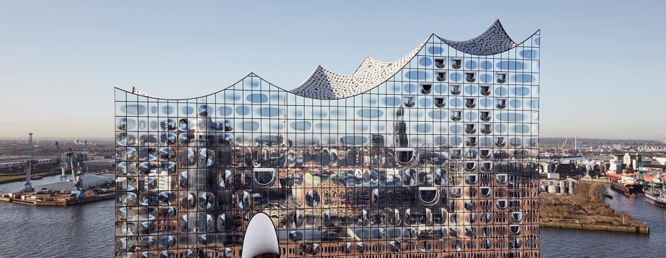
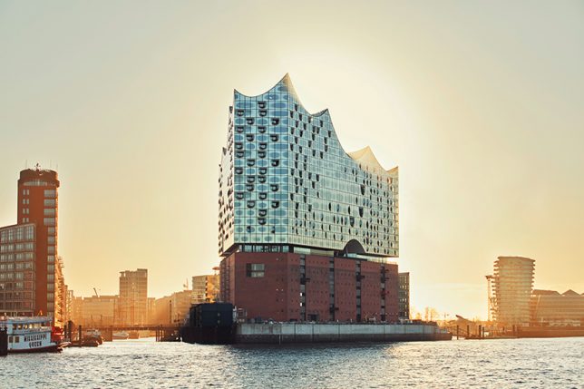
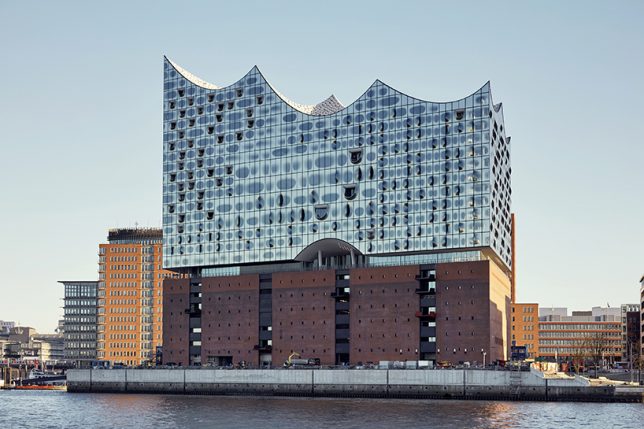
German concertgoers are so excited about the stunning new Elbphilharmonie building in Hamburg by architecture firm Herzog & De Meuron, they’re already snapping up tickets for the first events scheduled after its inauguration on January 11th, 2017. The glittering wave-shaped addition is a bold ultramodern example of adaptive reuse, delicately hovering over an existing brick warehouse building to assist with soundproofing its 2,100-seat arena. The project is finally nearing its completion after nearly a decade of construction, with all of its interior fittings set to be in place in time for its handover to its operators on October 31st, 2016.
herzog de meuron concert hall 2

herzog de meuron concert hall 4

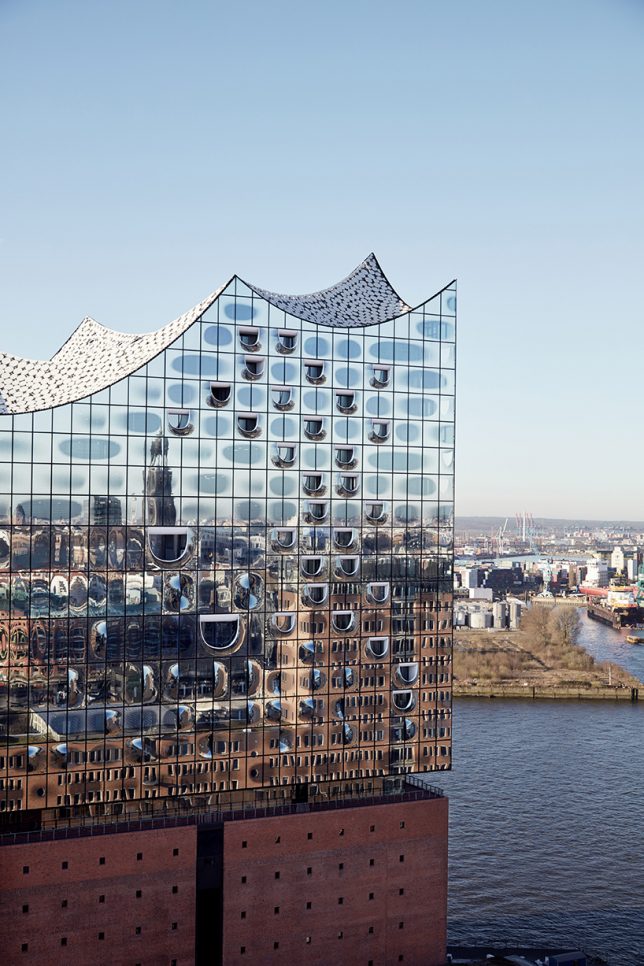
With anticipation building for such a long time, it’s a good thing the final result is so impressive. Located in Hamburg’s Hafencity quarter on a peninsula jutting out onto the River Elbe, the complex not only mimics the adjacent surface of the water, it literally mirrors it with 1,100 panes of reflective cladding punctuated by convex elements and D-shaped windows reminiscent of fish mouths. Reflective basalt grey dots prevent the structure from overheating and add to the shimmering effect.
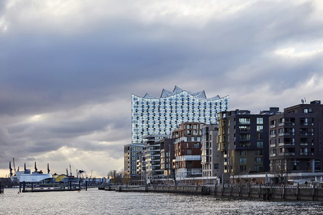
herzog de meuron concert hall 3

herzog de meuron concert hall 5

The complex also houses a 250-room hotel, 45 private apartments, two additional concert halls and a public viewing area with panoramic vistas of the waterfront. Reusing the old building pays tribute to the neighborhood’s industrial past even as Hafencity – a new urban redevelopment scheme that enlarges the Hamburg City Center by 40 percent – blossoms as a cultural hub. The scheme is seen as a blueprint for Hamburg’s development into the 21st century, reestablishing it as a modern maritime city.
interior 2

interior

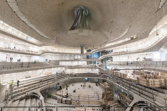
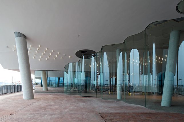
Inside, the careful selection of state-of-the-art materials helps explain the long delay in construction, as an organically textured white ‘skin’ made of dense gypsum-fiberboard panels enhances acoustics and makes the space even more visually expansive. Other details, like a flowing glass wall on the panoramic ‘plaza,’ continue the aquatic theme.

Share on Facebook


[ By SA Rogers in Architecture & Public & Institutional. ]

[ WebUrbanist | Archives | Galleries | Privacy | TOS ]

WebUrbanist

 
Comments Off on Glittering Wave-Shaped Concert Hall Placed Atop Old Warehouse Building

Posted in Creativity


Caviar Warehouse to Modern Home: 14 Converted Residences

31 Dec

[ By Steph in Architecture & Houses & Residential. ]

converted caviar warehouse 1

You wouldn’t mind living in a stable, boathouse, boiler room, post office or even a wartime bunker once they undergo modern renovations like these, contrasting the original historic architectural elements with smooth new wood surfaces and lots of glass. A former caviar warehouse in New York City gets a lantern-like sunken courtyard, a bridge connects two old brick food factory buildings, a Victorian church goes contemporary and priests party it up in a seminary turned retirement home.

Concrete Bunker to Hidden Home, Netherlands
converted bunker 1

converted bunker 2

converted bunker 3

converted bunker 4

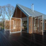
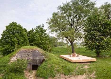
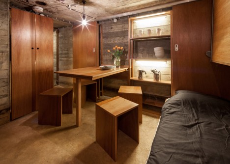
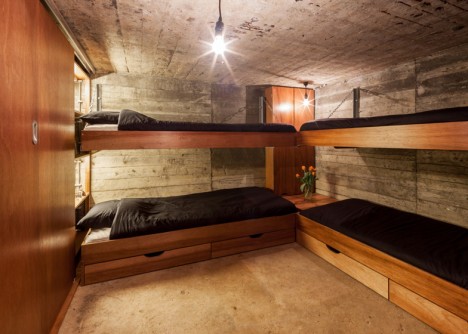
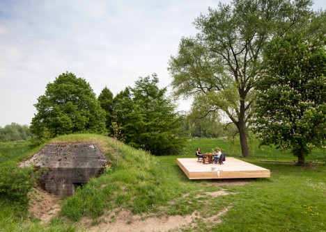
If not for the incongruously new and modern deck positioned adjacent to the entrance, you’d never imagine that this wartime bunker in Belgium is actually a functional residence. Architecture studio B-ILD transformed the half-buried structure into a vacation retreat big enough to sleep four people, but made no attempt to disguise its original purpose, leaving most of it stark and unfinished.

Bakery Warehouse, Australia
converted bakery 1

converted bakery 2

converted bakery 3

converted bakery 4

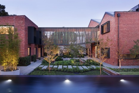
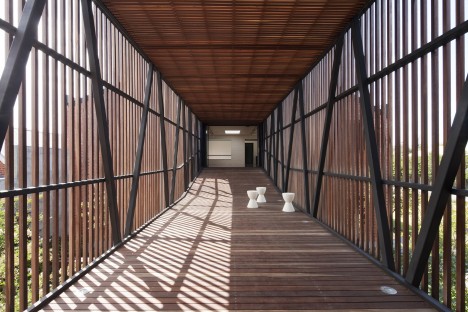
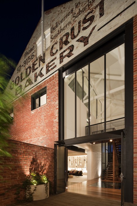
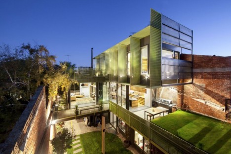
Two brick buildings in a former bakery warehouse complex stretch out to each other from across verdant courtyard with the addition of a new wooden bridge. What was once the Golden Crust Bakery in Melbourne is now a luxury residence large enough to house a Brady Bunch-like extended family, with the teenagers in one building and the parents with their younger children in the other.

Stable to Off-Grid Home, Spain
converted stable 1

converted stable, 2

converted stable 3

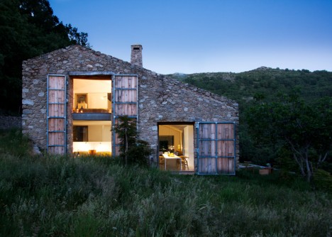
A crumbling stone stable in a remote area of western Spain is now an off-grid home with the help of Madrid-based studio Abaton. Oriented to maximize solar heat gain, the home sits within the restored stone exterior, its deep glazed windows hidden behind operable stable doors acting as shutters. A freshwater swimming pool in the front doubles as an irrigation tank.

Caviar Warehouse with Sunken Interior Courtyard, New York
converted caviar warehouse 2

converted caviar warehouse 3

converted caviar warehouse 1

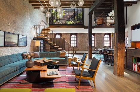
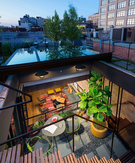
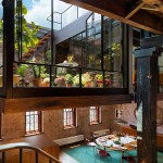
A glass-walled courtyard sinks from the landscaped rooftop of a former caviar warehouse in Manhattan by Andrew Franz into the renovated interior, acting as an oversized skylight. A retractible roof lets air flow into what was previously a poorly ventilated and ill-lit space. Within the living quarters, modern elements contrast with original factory materials, like a staircase made from the old roof joists.

Victorian Church, London, UK
converted church london 1

converted church london 2

converted church london 3

converted victorian church 4

converted victorian church 5
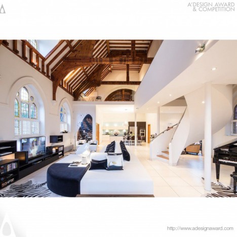
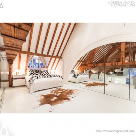
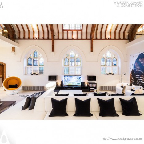
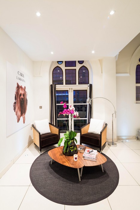
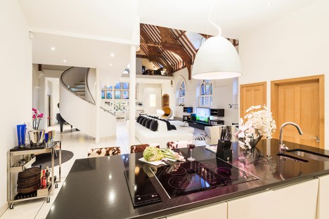
Look beyond the copious animal print and oversized dog paintings to the architectural bones of this Victorian-church-to-home conversion in London by Gianna Camilotti architectural studio. While the design is a bit heavy-handed on the contemporary additions, the beautiful timber elements and windows of the original structure still shine.

Next Page – Click Below to Read More:
Caviar Warehouse To Modern Home 14 Converted Residences

Share on Facebook


[ By Steph in Architecture & Houses & Residential. ]

[ WebUrbanist | Archives | Galleries | Privacy | TOS ]


WebUrbanist

 
Comments Off on Caviar Warehouse to Modern Home: 14 Converted Residences

Posted in Creativity


City Museum: Abandoned Warehouse Full of Caves, Rides & Slides

19 Aug

[ By WebUrbanist in Architecture & Public & Institutional. ]

city museum exterior playground

Somewhere between a huge funhouse, playground and circus, the City Museum of St. Louis may be the most entertaining and interactive urban architectural experiment in the world. And if you are not having a good time, you can always hop on the 10-story slide, a remnant of the structure’s days as a shoe factory (originally designed to send products down the side of the building).

city museum bridge

Eclectic from its stylings to its offerings, this unique place features everything from recycled buses and airplanes to giant multi-story slides and artificial caverns as well as more conventional kid-friendly fun in the form of skate parks and ball pits.

city museum ball pit

city museum indoor cavern

Various other imported, salvaged and upcycled oddities can be found throughout, including a vault and safety deposit boxes from a Chicago bank. And the place is constantly changing, being reconfigured and hacked away at by the Cassilly Crew.

city museum slides

What started inside of a derelict structure in the late 1990s has burst from the walls of the building, featuring an array of exterior ‘exhibits’ as well. Visitors can climb ramps, bridges and tunnels to access a high-hanging plane and other repurposed spaces. Up on the roof sits a small Ferris Wheel while a bus hangs over the edge of the building (and of course: people are welcome to climb inside).

city museum roof bus

city museum ferris wheel

The owners boast that they are “always building,” and Gallery Hip summarizes the strange paradoxes of this ever-changing place: “popular among residents and tourists, the museum bills itself as an ‘eclectic mixture of children’s playground, funhouse, surrealistic pavilion, and architectural marvel.’ Visitors are encouraged to feel, touch, climb on, and play in the various exhibits.” Or, as Colossal describes it: “hundreds of feet of tunnels that traverse from floor to floor, an aquarium, ball pits, a shoe lace factory, a circus arts facility, restaurants, and even a bar… because why not?”

city museum bridge system

city museum tower plane

Faced with this amazing place, one is left to wonder: would such an unusual endeavor be approved of were it being started from scratch today, or would safety-minded citizens suck the fun out before it got started? Like Adventure Playgrounds, also more popular in an era now past, it is hard to imagine this kind of project getting off the ground, but thankfully there is a precedent: it is hard to argue with the success of the City Museum.

Share on Facebook


[ By WebUrbanist in Architecture & Public & Institutional. ]

[ WebUrbanist | Archives | Galleries | Privacy | TOS ]

WebUrbanist

 
Comments Off on City Museum: Abandoned Warehouse Full of Caves, Rides & Slides

Posted in Creativity


Soylent 3.0: 100K Sq Ft Warehouse Could Feed 4 Million People

09 Aug

[ By WebUrbanist in Conceptual & Futuristic & Technology. ]

Photobioreactor PBR 4000 G IGV Biotech

The first generation of Soylent is a powdered food substitute for all your nutritional needs, the second will be a premixed beverage boasting the addition of algae, but the ultimate target is fully-grown, ultra-efficient food equivalent. An eco-friendly paradigm shift, this would allow vast amounts of healthy calories to be created in very small spaces, a single small factory space supplying enough for to sustain the entire city of Los Angeles.

soylent in a bottle

In just a few years, Soylent went from an experimental substance to the household name in food replacement, but its creator’s endgame is far more ambitious than the current niche product might suggest. Soylent 1.0 remains relatively cost-intensive to produce and expensive to consume – it provides simplicity, but only for those who can afford it. Soylent 2.0 will begin targeting broader markets and introduce algae-grown components, but a future version (3.0, perhaps) could truly revolutionize food production and distribution.

soylent powder

Imagine using just water, sunlight, air and a single algae superorganism to generate the complex nutrients (including carbohydrates, proteins and lipids) needed to sustain life, with applications in rich and poor countries (or in space). Then consider having this substance available on tap, piped right into your home like water or power. Alternatively, you might buy your own household bioreactor, churning out Soylent 3.0 directly in your kitchen on demand. Rob Rhinehart’s vision takes various forms, but it comes down to the same thing: an alternative to conventional food and potential solution to unsustainable agricultural practices, available to all those who wish to take part.

Not everyone will want to subsist partially (let alone entirely) on Soylent, now or ever, but that is also not the point – it can always be used in conjunction with other meals by those so inclined or deployed to places otherwise without sufficient food for subsistence. Meanwhile, for the next round (from Motherboard), “The algae [called AlgaWise] in Soylent 2.0 is grown by the biotech company Solazyme, in a facility owned by the Archer Daniels Midland, the food processing giant. The oil is then pressed out much like olive oil. It’s amazingly efficient. Entire tanks can be filled in days.” Solazyme calls the stuff AlgaWise.”

soylent boxes

More from Rhinehart on current and next steps: “In the interest of building a sustainable business to fund our research we’ve been focused primarily on product improvements and new products, like the launch today, but I’ve also worked on setting up infrastructure including lab building and recruiting and drawn up a roadmap for reaching the goal of cell synthesis, starting with protein. This process has two modules: one strain engineering to develop and optimize the organism that produces, the other bioreactor engineering to make an ideal growth environment for the strain(s).”

Share on Facebook


[ By WebUrbanist in Conceptual & Futuristic & Technology. ]

[ WebUrbanist | Archives | Galleries | Privacy | TOS ]

WebUrbanist

 
Comments Off on Soylent 3.0: 100K Sq Ft Warehouse Could Feed 4 Million People

Posted in Creativity


Sunken Sky: Courtyard Light Well Suspended in Warehouse Loft

20 Feb

[ By Steph in Architecture & Houses & Residential. ]

converted warehouse 1

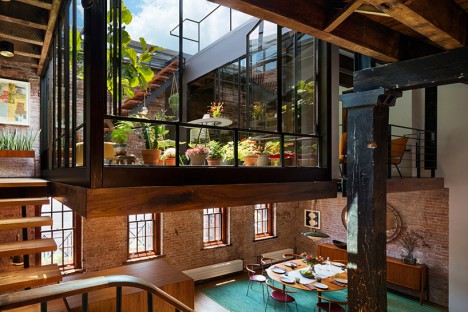
A formerly dark, poorly ventilated caviar warehouse is illuminated naturally thanks to a sunken courtyard with a retractible glass roof, connecting the interior spaces to an outdoor terrace, acting as both a space and a sort of floating lantern in the unit. Many of the historic details of the 1884 building in Manhattan’s Tribeca North have been preserved in the renovation, including weathered roof joists, antique windows and brick walls.

converted warehouse 2

converted warehouse 3

The converted loft by architect Andrew Franz occupies the top floor and roof of the old industrial building, reusing as many of the original materials as possible. The glass courtyard functions as a mid-level in the open-plan space, with a new staircase with reclaimed walnut roof joists as the treads and landing leading up to the transparent indoor/outdoor room.

converted warehouse 4

converted warehouse 5

When the retractible roof is open, fresh air flows freely into the living space. When closed, it functions as a 150-square-foot skylight during the day. An additional staircase provides access to a rooftop garden planted with native, low-water plant species.

converted warehouse 6

converted warehouse 8

New walnut cabinetry connects the modern elements of the loft to the historic, highlighting the building’s industrial past and simultaneously creating a space that feels warm and comfortable. Vivid orange in the kitchen backsplash and furniture add pops of color throughout the mostly-neutral space.

Share on Facebook


[ By Steph in Architecture & Houses & Residential. ]

[ WebUrbanist | Archives | Galleries | Privacy | TOS ]

WebUrbanist

 
Comments Off on Sunken Sky: Courtyard Light Well Suspended in Warehouse Loft

Posted in Creativity


Making Faces: Huge Military Warehouse Mural Spans 48 Windows

10 Dec

[ By WebUrbanist in Art & Street Art & Graffiti. ]

giant building mural blu

Covering two sides of a three-story building in Rome, this ground-to-roof artwork is massive, even by the standards of a big-thinking street artist like BLU used to large-scale works.

blu building in progress

blu giant street mural

Various window and door openings are incorporated into colorful characters with a” rainbow range of painted personalities,” some of which play off of the existing architectural details or structural quirks of the building.

blu colorful face art

blu window door mural

BLU lives in Bologna and has been active in the street art scene since 1999 – he is well-known for his large-scale works around the world. Like Banksy, he keeps his identity a closely-guarded secret.

blu rainbow giant characters

blu building corner

About the artist: “His graphic mania is directly proportional to the epic scale of his murals. His paintings seem to interpret the architectural language of public spaces and reinvent them into new shapes. Thus, his murals are never detached from the places where they were conceived because Blu is a painter in the landscape, urban or industrial. He always tries to communicate with the society which inhabits those spaces, searching for the uniqueness of each place.”

Share on Facebook


[ By WebUrbanist in Art & Street Art & Graffiti. ]

[ WebUrbanist | Archives | Galleries | Privacy | TOS ]

WebUrbanist

 
Comments Off on Making Faces: Huge Military Warehouse Mural Spans 48 Windows

Posted in Creativity


Quintessential Conversion: The Ultimate Warehouse Loft

25 Oct

[ By Steph in Architecture & Houses & Residential. ]

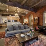
A historic 1880′s warehouse in Melbourne, Australia has been converted into a stunning luxury home with high ceilings, exposed red bricks walls and dramatic archways. The addition of new wood floors, white drywall and a modern kitchen make the space livable without overpowering it.

The renovated apartment is located in ‘Leicester House’, a five-story Neo-Gothic building in downtown Melbourne with deep cornices and detailed Florentine arches on the exterior. Most of the spaces within it are still in use as offices.

While many aficionados of warehouse conversions would likely prefer to see less carpeting and more modern furnishings, the space itself exudes all the historic charm that you could wish for in a building of this age, particularly in the ceiling and the brick walls.

Rustic, recycled, modern and minimalist – apartment remodels come in all varieties, whether they’re redesigned from an out-of-date state or completely converted from something else. Check out 9 more amazing apartment designs and cool condo plans, and 11 lofty additions to urban rooftops.


Want More? Click for Great Related Content on WebUrbanist:

9 Amazing Apartment Designs & Cool Condo Plans

Color, pattern, unexpected materials and careful editing of rustic historic architectural details make these apartment and condo remodels one-of-a-kind.
2 Comments – Click Here to Read More »»


7 Brilliant Building Conversion Projects: Superb Examples of Architectural Adaptive Reuse

Know of other recycled design or amazing architecture projects? Be sure to list them in the comments below!
40 Comments – Click Here to Read More »»


Share on Facebook


[ By Steph in Architecture & Houses & Residential. ]

[ WebUrbanist | Archives | Galleries | Privacy | TOS ]

WebUrbanist

 
Comments Off on Quintessential Conversion: The Ultimate Warehouse Loft

Posted in Creativity


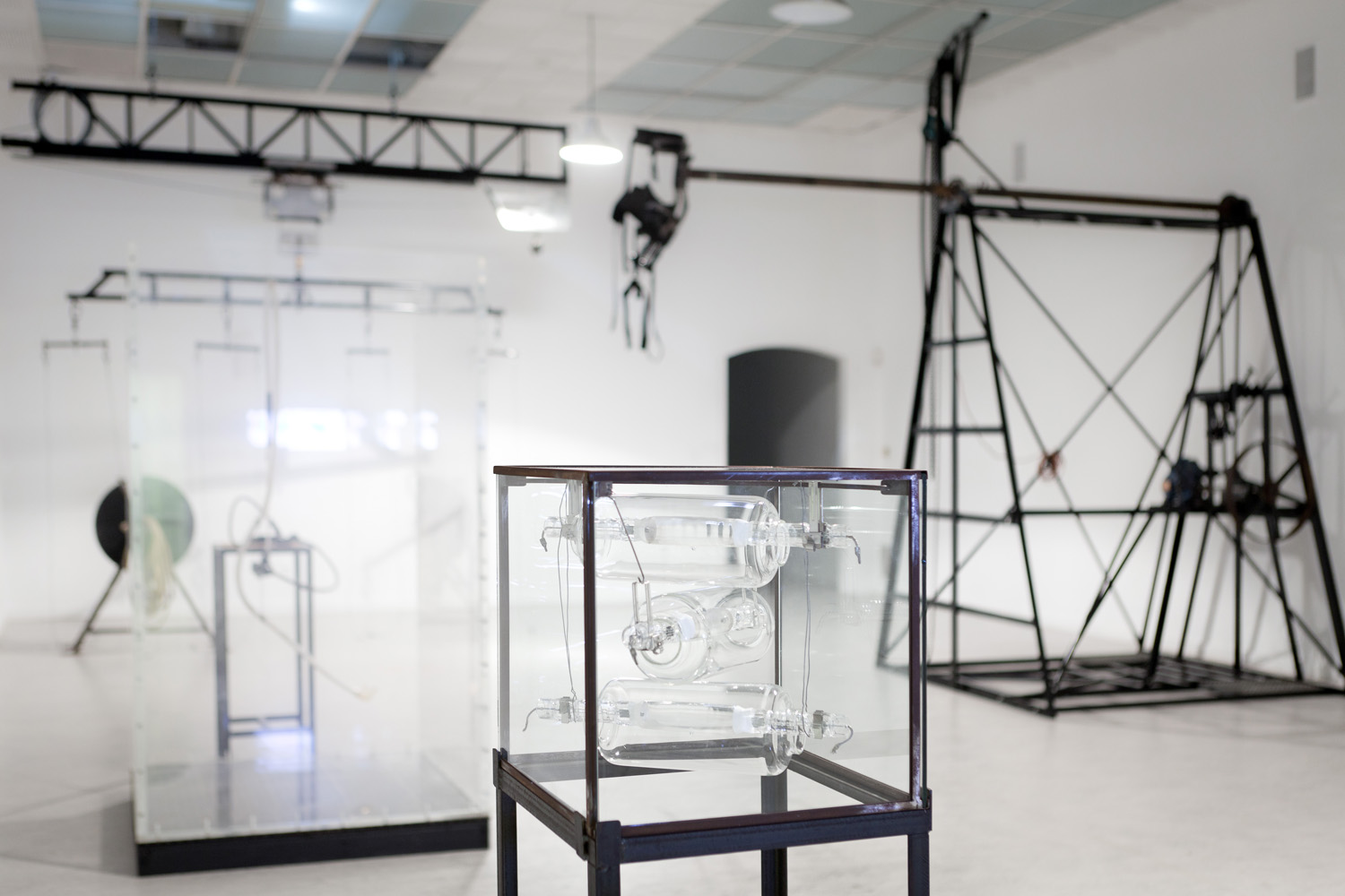
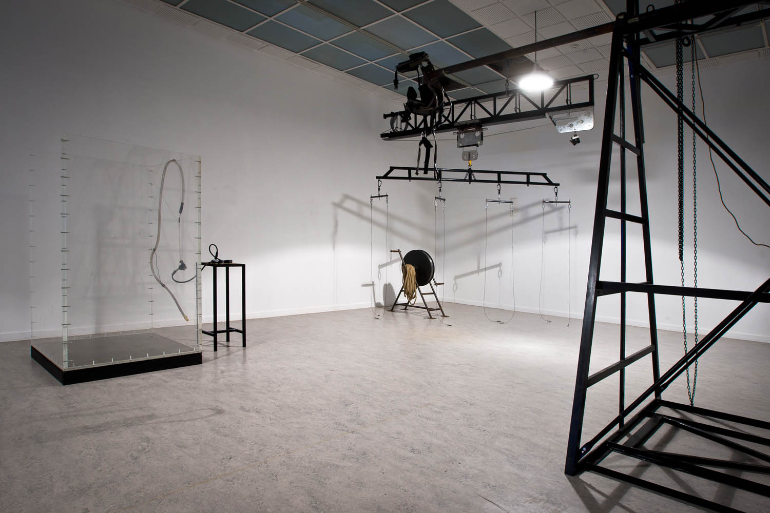
Kris Verdonck – EXHIBITION #1 – Warehouse of machinery, used in performances / installations (1995 – present)

22 Dec

Check out these visual art images:

Kris Verdonck – EXHIBITION #1 – Warehouse of machinery, used in performances / installations (1995 – present)
visual art
Image by Z33 art centre, Hasselt
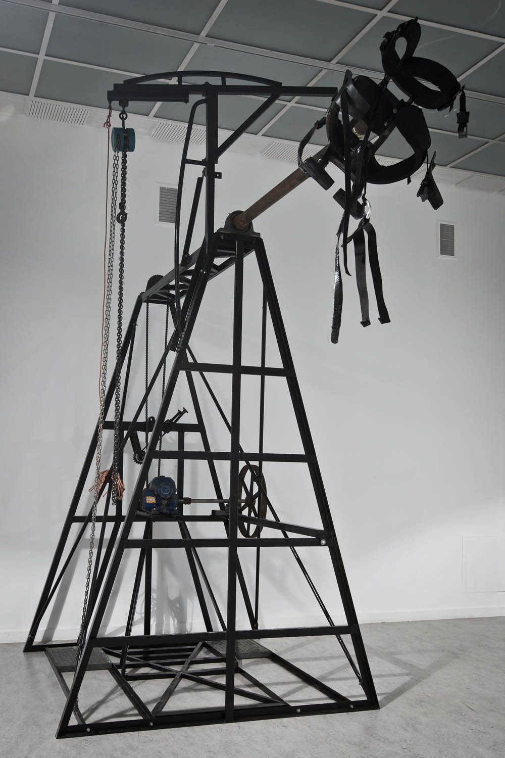
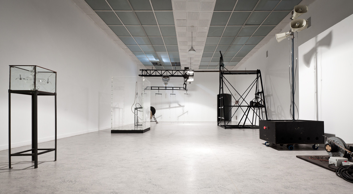
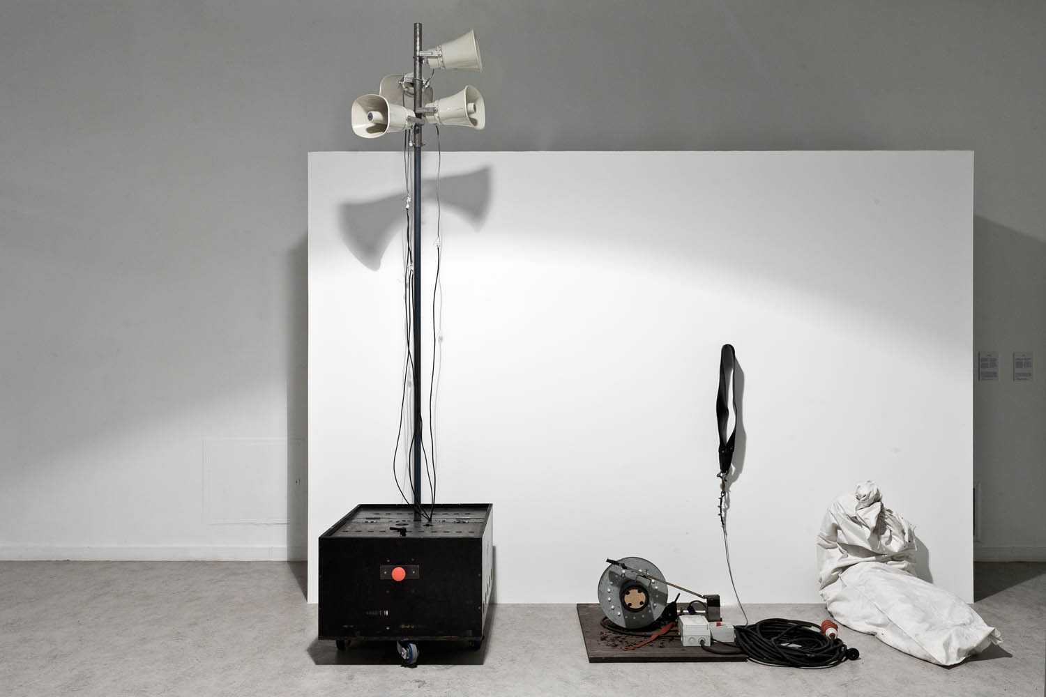
These appliances and objects are normally situated behind the scenes of a performance or show. The machines often look like medieval instruments (of torture). At the same time, they are often high-technological objects, that fulfil complex functions. They form a large contrast with the extreme esthetical images that they produce.

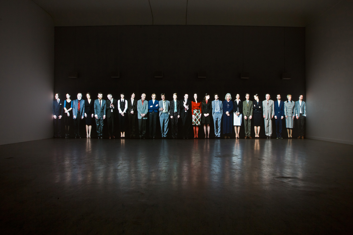
The overview of machines by Kris Verdonck addresses the field of tension between man and machine in today’s society. What relationship can/must/do people want to enter into with technology? How difficult is the balancing act between human control and submission to machines?

credits:
Kris Verdonck – EXHIBITION #1 – Warehouse of machinery, used in performances / installations (1995 – present)
photo: Kristof Vrancken / Z33

Kris Verdonck – EXHIBITION #1 – Warehouse of machinery, used in performances / installations (1995 – present)
visual art
Image by Z33 art centre, Hasselt
These appliances and objects are normally situated behind the scenes of a performance or show. The machines often look like medieval instruments (of torture). At the same time, they are often high-technological objects, that fulfil complex functions. They form a large contrast with the extreme esthetical images that they produce.

The overview of machines by Kris Verdonck addresses the field of tension between man and machine in today’s society. What relationship can/must/do people want to enter into with technology? How difficult is the balancing act between human control and submission to machines?

credits:
Kris Verdonck – EXHIBITION #1 – Warehouse of machinery, used in performances / installations (1995 – present)
photo: Kristof Vrancken / Z33

 
Comments Off on Kris Verdonck – EXHIBITION #1 – Warehouse of machinery, used in performances / installations (1995 – present)

Posted in Photographs


Kris Verdonck – EXHIBITION #1 – Warehouse of machinery, used in performances / installations (1995 – present)

11 Nov

Check out these visual art images:

Kris Verdonck – EXHIBITION #1 – Warehouse of machinery, used in performances / installations (1995 – present)
visual art
Image by Z33 art centre, Hasselt
These appliances and objects are normally situated behind the scenes of a performance or show. The machines often look like medieval instruments (of torture). At the same time, they are often high-technological objects, that fulfil complex functions. They form a large contrast with the extreme esthetical images that they produce.

The overview of machines by Kris Verdonck addresses the field of tension between man and machine in today’s society. What relationship can/must/do people want to enter into with technology? How difficult is the balancing act between human control and submission to machines?

credits:
Kris Verdonck – EXHIBITION #1 – Warehouse of machinery, used in performances / installations (1995 – present)
photo: Kristof Vrancken / Z33

Kris Verdonck – EXHIBITION #1 – Warehouse of machinery, used in performances / installations (1995 – present)
visual art
Image by Z33 art centre, Hasselt
These appliances and objects are normally situated behind the scenes of a performance or show. The machines often look like medieval instruments (of torture). At the same time, they are often high-technological objects, that fulfil complex functions. They form a large contrast with the extreme esthetical images that they produce.

The overview of machines by Kris Verdonck addresses the field of tension between man and machine in today’s society. What relationship can/must/do people want to enter into with technology? How difficult is the balancing act between human control and submission to machines?

credits:
Kris Verdonck – EXHIBITION #1 – Warehouse of machinery, used in performances / installations (1995 – present)
photo: Kristof Vrancken / Z33

Kris Verdonck – EXHIBITION #1 – GOSSIP
visual art
Image by Z33 art centre, Hasselt
The garden installation EXOTE shapes a spatial environment for the characters of Kris Verdonck’s Kafka-esque world. This end-of-the-world landscape houses a selection of the most invasive alien species (plants and animals) in Belgium, which constitute a genuine threat to biodiversity, the economy and public health. Due to man’s interference, the species have been brought out of their natural environment and now form a threat for other, native species. EXOTE stands as a metaphor for a world in which man is increasingly forced to protect himself from an environment that he himself has created.

As certain non-native species in the installation present a potential threat to biodiversity in Hasselt and the surrounding areas, visitors need to be aware that even the smallest seed or animal cannot be allowed to escape. The evolution of the garden, the protective clothing and the safety provisions involved in the installation form an essential and necessary part of the artwork.

Opening night 30.04.2011

credits:
EXOTE (2011), by Kris Verdonck
Produced for the exhibition Kris Verdonck – EXHIBITION at #1
photo: Kristof Vrancken / Z33

 
Comments Off on Kris Verdonck – EXHIBITION #1 – Warehouse of machinery, used in performances / installations (1995 – present)

Posted in Photographs