RSS
 

Posts Tagged ‘Wall’

See Wall: Graffiti Praising & Parodying Donald Trump

22 Jan

[ By Steve in Art & Street Art & Graffiti. ]

trump-graffiti-1b

Donald Trump is destined to leave his mark on the world stage but the world’s graffiti artists have been leaving Trump-related marks for some time.

trump-graffiti-1f

The notorious “wall” Trump has theatrically threatened to build along the US-Mexico border already exists – in parts – and older sections have been renewed, reinforced and in some places made redundant. One example of the latter can be found about a mile west of Tijuana airport: the so-called “old border wall” situated on American territory.

trump-graffiti-1c

trump-graffiti-1e

Graffiti collective Indecline created the above “¡Rape Trump!” mural on a section of the rusty, corrugated sheet metal wall in late 2015, roughly six months before Trump clinched the Republican nomination for the U.S. presidency. Check out this video by Indecline posted at their website. The caption “¡Rape Trump!”, by the way, is a sort of Spanish pun – the word “rape” translates roughly to crop, trim, shave or snuff while the ball gag adds a dash of kinkiness to the mix.

Great Brickin’

trump-graffiti-2a

trump-graffiti-2b

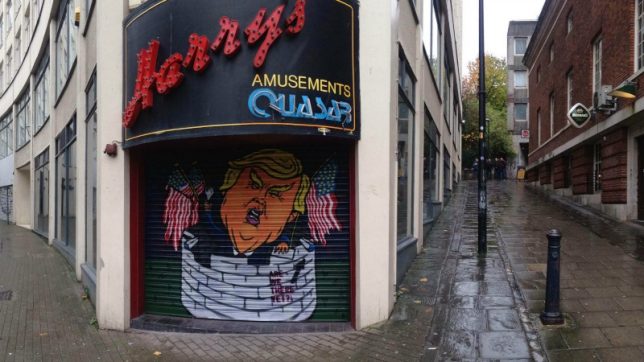
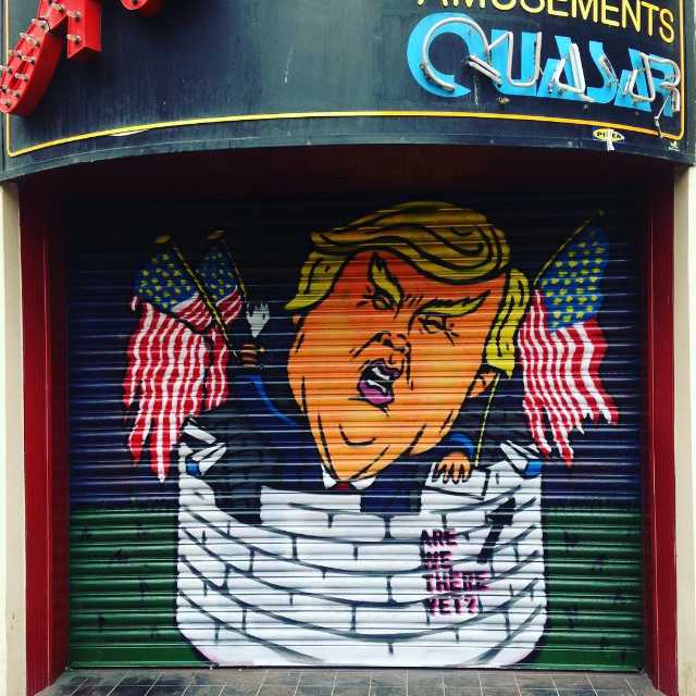
So crowdfunding graffiti is a thing now: graffiti artists The Paintsmiths paid for the above mural through online sales of their photo-book Are We There Yet? The artwork features Trump figuratively and literally walling himself in, and can be found at the corner of Nelson Street and All Saints Street in Bristol, UK.

Where’s Wall-Donald?

trump-graffiti-3a

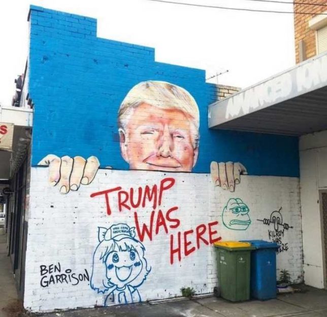
It’s not as if Donald Trump just popped up out of nowhere: the larger-than-life real estate developer took over The Trump Organization way back in 1971 when The Donald was only 25 years old. Indeed Trump was here, was there, and now it seems he’s everywhere.

Punchdrunk Trump

trump-graffiti-4d

trump-graffiti-4c

trump-graffiti-4b

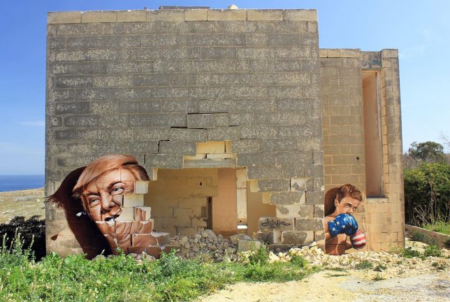
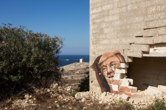
The island nation of Malta is chock-a-block with ruins of all ages, many of which have been co-opted by graffiti artists under the government’s benign gaze. The unusual and intriguing work above, by Czech artist ChemiS, complements abandoned and deteriorated architecture by featuring a young boxer and Donald Trump. Whatever one’s political bent, you can’t deny this particular work is a knockout.

Next Page – Click Below to Read More:
See Wall Graffiti Praising Parodying Donald Trump

Share on Facebook


[ By Steve in Art & Street Art & Graffiti. ]

[ WebUrbanist | Archives | Galleries | Privacy | TOS ]


WebUrbanist

 
Comments Off on See Wall: Graffiti Praising & Parodying Donald Trump

Posted in Creativity


Pretty in Pink: Trump’s Border Wall as Envisioned by Mexican Architects

22 Oct

[ By SA Rogers in Architecture & Cities & Urbanism. ]

trump-border-wall-6

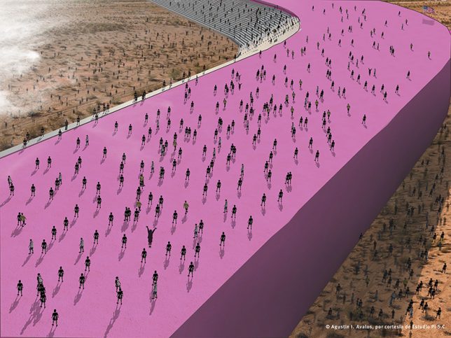
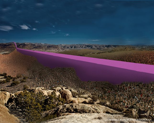
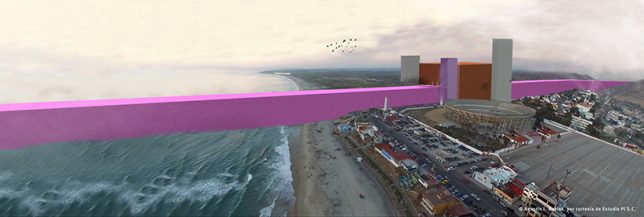
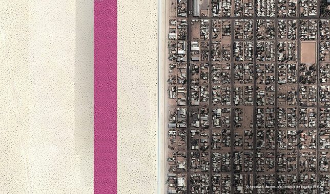
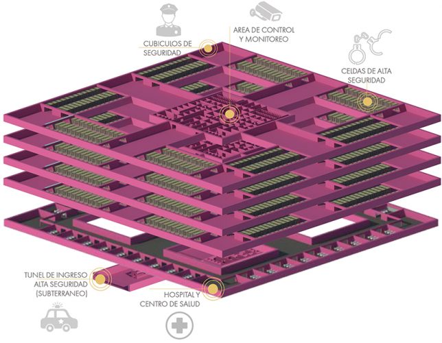
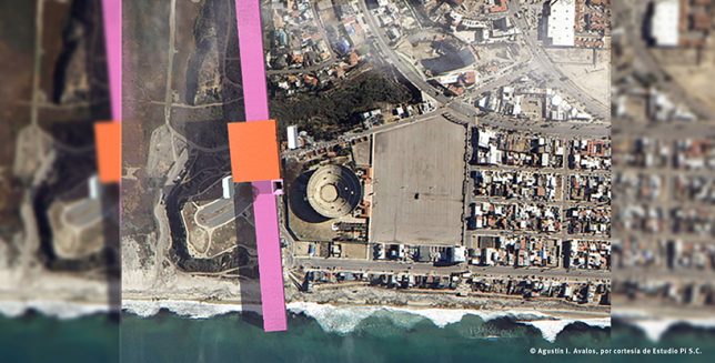
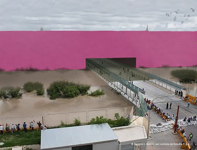
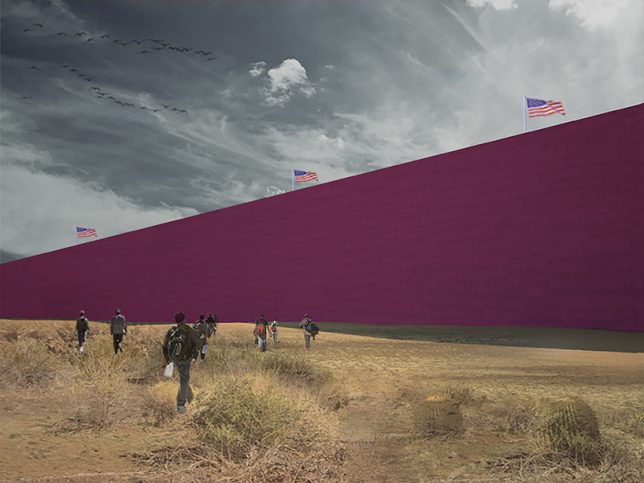
Donald Trump has promised that if he becomes President of the United States, he’ll build a “beautiful and impenetrable” wall and force Mexico to pay for it – so a group of Mexican architects have taken on the task of designing it for him, too. The firm Estudio 3.14 has envisioned the “gorgeous perversity” of the proposal in a vibrant shade of neon pink, a solid architectural ribbon running from the Pacific Ocean to the Gulf of Mexico and packed full of prisons.

trump-border-wall-1

trump-border-wall-2

“I will build a great wall – and nobody builds walls better than me, believe me – and I’ll build them very inexpensively,” Trump said during his candidacy announcement speech in June 2015. “I will build a great, great wall on our southern border, and I will make Mexico pay for that wall. Mark my words.”

trump-border-wall-7

trump-border-wall-8

Estudio 3.14 presents a series of renderings of the structure in the various types of border landscapes one finds along that 1,954-mile stretch. The wall is painted pink in honor of Pritzker Prize-winning Mexican architect Luis Barragán. To understand exactly what the architects are getting at with this project, it’s best to hear it described in their own words.

trump-border-wall4

trump-border-wall-5

“Based on Trump’s statements, the economic, ecological and financial aspects have been called into question. However, he continues with his verbal plan. As architects and designers, we have the capacity to imagine and interpret what Trump is saying, and we are convinced that if we can make people see it, they can assess his words and the perversity in his proposal.”

“Because the wall has to be beautiful, it has been inspired in by Luis Barragán’s pink walls that are emblematic of Mexico. It also takes advantage of the tradition in architecture of megalomaniac wall building. Moreover, the wall is not only a wall – as you can see in the hill landscape cross-section it is a prison where 11 million undocumented people will be processed, classified, indoctrinated, and/or deported.”

trump-border-wall-9

“The relation between the discipline of architecture and political perversity and/or megalomania has already been seen through previous characters such as Adolf Hitler and Benito Mussolini, who relied on the imaginative architects of their words and the creators, who materialized their macabre ideas. The proposal is made from the disciplinary field that has worked, since the existence of humanity, for the status quo and benefits from this tradition.”

Share on Facebook


[ By SA Rogers in Architecture & Cities & Urbanism. ]

[ WebUrbanist | Archives | Galleries | Privacy | TOS ]


WebUrbanist

 
Comments Off on Pretty in Pink: Trump’s Border Wall as Envisioned by Mexican Architects

Posted in Creativity


Display your camera collection in style with these 3D-printed wall mounts

30 Aug

$ (document).ready(function() { SampleGalleryV2({“containerId”:”embeddedSampleGallery_4952012233″,”galleryId”:”4952012233″,”isEmbeddedWidget”:true,”standalone”:false,”selectedImageIndex”:0,”startInCommentsView”:false,”isMobile”:false}) });

Looking for a sleek, minimalist display for your vintage camera collection? LaudWorks, a purveyor of DIY project tools, has launched a small accessory called Hangie for easily mounting a camera on a wall. The 3D-printed mount is offered in both steel and plastic versions with multiple color options, and is nearly invisible when used, giving the impression that the camera is floating on the wall.

The Hangie mount is simple to install: first, attach the mount to a wall using two screws, then secure the camera using a tripod mount screw. The metal version of Hangie is made from bronze-infused stainless steel and is designed for heavier cameras; LaudWorks says it tested this version with a Canon EOS 7D and a EF-S 17-55mm lens attachment (1500g / 3.3lb). The plastic version, meanwhile, is made from white nylon plastic and is made for ‘small, lightweight cameras.’

Both products are available from Shapeways; the plastic version is $ 4 and the metal version is $ 21. 

Via: PetaPixel

Articles: Digital Photography Review (dpreview.com)

 
Comments Off on Display your camera collection in style with these 3D-printed wall mounts

Posted in Uncategorized


Prismatic Graffiti: Bending Light into a Spectrum of Wall Murals

20 Aug

[ By WebUrbanist in Art & Installation & Sound. ]

light art making

These intricately choreographed dances of light and color are at once static but ephemeral, lasting longer than conventional light graffiti but nonetheless made of impermanent light.

light wall art

light art graffiti

Stephen Knapp is a sculptor and muralist who has worked in metal and glass, but his latest array of light paintings turn the latter toward a new and more indirect purpose.

light in gallery museum

light art glass detail

His pieces are not sketched, programmed or otherwise visualized in advanced, but emerge as he begins cutting, polishing, shaping and places pieces of glass on the wall. Unlike many light graffiti artists, the work does not rely on a photographer capturing a fleeting moment, but can be put up on museum walls indefinitely.

light art prisms

light reflected art mural

“The fun of what I do with light, is that there is nothing in our visual memory that prepares us for what I’m doing,” says Knapp. “The fact that what I create can just be done with light, that there is no paint on these panels, is absolutely astounding to people. What I am trying to do most of all here is challenge any traditional notion of perception. What is it? Is it real? Is it not real? Does it matter?”

His work has been featured in galleries around the world from Boise to Naples and a solo exhibition is currently on display at the Pensacola Museum of Art.

Share on Facebook


[ By WebUrbanist in Art & Installation & Sound. ]

[ WebUrbanist | Archives | Galleries | Privacy | TOS ]


WebUrbanist

 
Comments Off on Prismatic Graffiti: Bending Light into a Spectrum of Wall Murals

Posted in Creativity


Digital Dynamo: Massive Motion-Activated Media Wall Animates Office

16 Aug

[ By WebUrbanist in Art & Installation & Sound. ]

motion activated display

Spanning 1,700 square feet of interior walls in a Washington, DC office building, this stunning digital display cycles through different settings and seasons, reacting to workers as they walk through the building.

Designed by ESI, the bright and dynamic lobby installation is also visible through expansive glass panels at the front of the building, making it visually accessible to the public as well.

seasons lifecycle media

seasons series

The design shifts between three core programs: Color Play, Cityscape and Seasons. The scenes are constantly shifting, generated by algorithms that keep them fresh from one day to the next. Ambient sounds play in the background, adding a layer of effect to the visual experience.

series rose blossoms

exterior view

The installation is 80 feet wide and 13 feet high, seamlessly integrated into the architectural surfaces. In Season mode, it displays DC’s famous cherry trees through periods of the year. In Color Play, bright patterns light up the walls. In Cityscape, iconic architecture, statues and transportation settings are shown.

color play interactive

motion display

“The different media create distinct rhythms to give terrell place a unique identity and strong street presence,” says Michael Schneider, Senior Creative Technology Designer at ESI design. “Each of the media scenes reflects the time of day and the movement of people through the lobby, acting almost as a large abstract data-visualization of the ebb and flow of Terrell Place.”

Share on Facebook


[ By WebUrbanist in Art & Installation & Sound. ]

[ WebUrbanist | Archives | Galleries | Privacy | TOS ]


WebUrbanist

 
Comments Off on Digital Dynamo: Massive Motion-Activated Media Wall Animates Office

Posted in Creativity


Subtractive Art: Botanical Wall Graffiti Crafted by Cutting Vines

04 Jun

[ By WebUrbanist in Art & Street Art & Graffiti. ]

spy wall art botanical

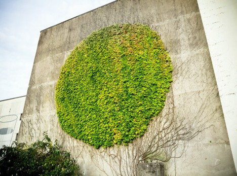
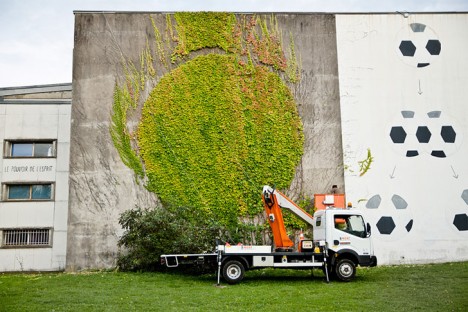
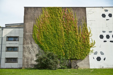
Taking cues from both tree sculpting and reverse graffiti traditions, SpY’s work in Besancon, France, turns pruning into a mural-making technique, shaping vines into a circular work of wall art.

spy wild vines carved

spy in man lift

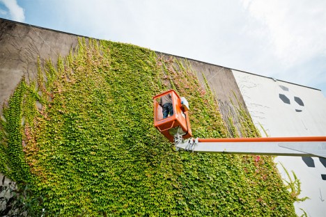
Seeing a shape hiding in the wild-growing vines, the artist rented an elevated work platform and began to cut into the vines, picking and trimming his way around key branches to create a perfect circle.

spy work progress

spy finished mural

The result is rather stealthy, easy to mistake as perhaps some kind of natural pattern, and well-composed, a round shape against a rectangular backdrop, with nods both to nature and architecture. As an organic work, it must be maintained, or perhaps part of the art is in how it goes wild all over again.

Share on Facebook


[ By WebUrbanist in Art & Street Art & Graffiti. ]

[ WebUrbanist | Archives | Galleries | Privacy | TOS ]


WebUrbanist

 
Comments Off on Subtractive Art: Botanical Wall Graffiti Crafted by Cutting Vines

Posted in Creativity


Flat-Pack Wall Furniture Folds into its Own Isometric Projection

02 Jun

[ By WebUrbanist in Design & Furniture & Decor. ]

3d wall flat pack

This furniture series not only folks up to pack flat for shipping or storage, but also hangs on the wall, each piece in the shape of a two-dimensional isometric drawing of itself.

De-Dimension by Jongha Choi uses a set of hinges and locking pins to fold out and lock into position, providing support when the pieces are used as seats and tables. Like other flat-pack furniture designs, this set boasts reduced weight and space requirements, though arguably at the expense of long-term durability and stability (depending in part on hidden bracing and the quality of components used).

3d furniture designs

The set is in part a commentary on representation versus reality, two-dimensional forms versus three-dimensional figures. From the designer: “Even the advent of 3D printing skills shake our fundamental notion of the image. Unlike the past, we are not only seeing the image as a means of reproducing objects, but also giving essential identity to the image itself. In other words, though the image still shows its visual effect on a flat plane, it is not just an expression of representation, but a making real an experience.

3d wall furniture

“In our current situation, in which modern society experiences the image, in relation to advertising, image circulation and the internet, why do we not question an images’ confinement to a flat surface. Why don’t we try to get more stereoscopic and attempt for direct experience with the image. My question started with this point and I tried several experiments in order to realize this idea from a personal point of view.”

Share on Facebook


[ By WebUrbanist in Design & Furniture & Decor. ]

[ WebUrbanist | Archives | Galleries | Privacy | TOS ]


WebUrbanist

 
Comments Off on Flat-Pack Wall Furniture Folds into its Own Isometric Projection

Posted in Creativity


5 Steps to Creating a Printed Photo Collection as Wall Art

28 Apr

In this digital age, where we wander about with thousands of digital images held captive in our smart phones, there is something special about printed photographs. They represent something tangible and reverent – something that was worth transforming into an enduring piece of artwork, to remind us of what is important in our lives.

One of the most rewarding aspects of my job is seeing the photographs I create for my clients hanging on their walls. To me, it is the icing on the cake, the cherry on top, the grand finale that tells me I have fulfilled my promise to the people who put their trust in me as a professional.
collection-dps-01

This image set by Darlene Hildebrandt

Like many portrait photographers, I began my career selling digital files on a USB stick. I found it disheartening and unfulfilling. Wall art collections were a revelation to me. As a photographer, they gave me a structure and framework to shoot within. My session times became shorter, because I was shooting with purpose. I now had something meaningful and lasting to offer my clients; collections that tell their story in all its detail, and represent something deep that they have revealed to me.

Photo collections can be about anything. In my case, they are invariably portraits, but if your thing is landscapes, travel, macro, nature etc., you can create collections that add life and personality to you home or office, and serve as visual reminders of what is important to you.

Step #1: Consider the space you want to fill

Think about the photographs you are capturing. What is the subject matter? What do these photos mean to you? Do you want to remember a favourite holiday destination, or how confident your son looks when he plays the violin? Do you want to capture the beauty of a rare flower you grew, or your young adult daughter who is about to leave home for college?

With this in mind, think about where in your home or office you would like to see these photographs every day. Consider how appropriate the subject matter is for where you want to display it, and take into account the style of the decor and other furnishings in the room. Often photographs are displayed above a piece of furniture – above your bed or the sofa, at the end of a breakfast nook, on the wall of a study, or cascading down a flight of stairs.

image showing photo collections

A collection to fit a long, narrow space.

Once you have decided where you want to display your photos, you should have a clear idea of what the layout should look like. Big spaces demand big photos, narrow spaces require long and thin, and a stairwell may need a staggered combination of large and small photos.
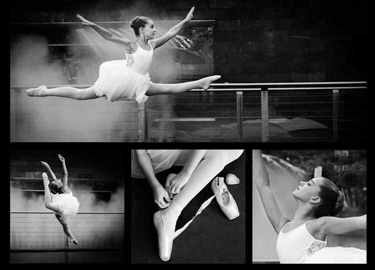
image showing photo collections

A different configuration using images from the same session. This would suit a larger space.

Step #2: Decide the layout before you pick up the camera

Think carefully about the configuration of your collection before you start photographing. For example, if you have a wide space to fill and you envisage a panoramic with two or three smaller prints underneath, your main photo will need lots of space to crop it into a panoramic shape, without compromising the composition or the quality of the image. You will be hard pressed to get a panoramic crop if you’re shooting in a vertical (portrait) orientation. When I’m shooting for a collection, I allow more space around my subjects than usual. This gives me some versatility when it comes to cropping.

Likewise with the smaller prints. Think about how you would like each photo to be oriented, and ensure you shoot from an angle that will enable this. I like to orient my detail shots inward, toward the main photo.
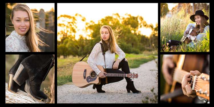
Image showing photo collections

It helps if you know how you are going to display each photo before you capture it.
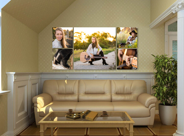
Image showing photo collections

This shows how the collection would appear on a wall.

Step #3: Keep the lighting consistent

A collection looks most cohesive when the lighting is consistent throughout. If three out of four photos in the collection are high key images with lots of white, a dark photo, or one with lots of colour, will look out of place. So, if you photographed your dog on the beach at sunset, that photo you took of him earlier in the bright midday sun will look mismatched, regardless of how adorable his expression is.

In the photo collections below, the silhouetted sunset image stands out as a mismatch. In the second version, it is replaced with an image that better matches the lighting.

Image showing photo collections

The silhouetted sunset shot in the middle looks out of place.

Image showing photo collections

In this collection, the images are unified by similar lighting.

Step #4: Stick to one subject per collection

Avoid the temptation to create a hodge podge by cramming every member of a family, or every flower in the garden, into one collection. Allow your subject to shine by devoting a whole collection to him, her (or it, in the case of an inanimate object). As a portrait photographer, my collections usually consist of one full body photo, and several detail shots which help tell a story.

The photo collection below, taken at a water temple in Bali, depicts a sacred ritual. I took so many other photos I loved at the water temple, but to put them all together would detract from the story. I will save the other photos for a different collection.

image showing photo collections

Although it is tempting to cram every photo you love into a collection, the result is much more pleasing when you stick to one subject.
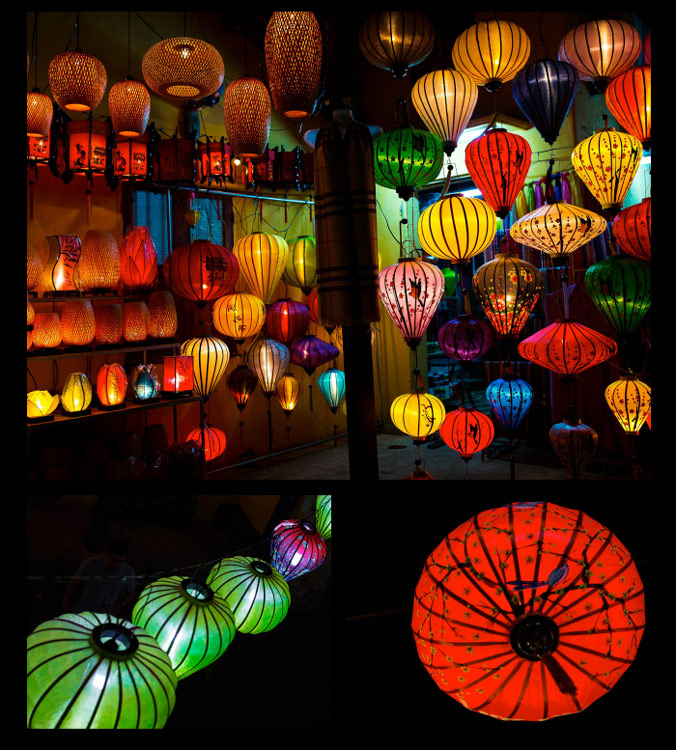
image showing photo collections

My main photograph in this collection is full of colour and a variety of shapes. To complete the collection, I have chosen closer-up detail shots of just two of the many lanterns.

Step #5: Collage or collection?

A photo collection can be made up of separate pieces displayed together, or you can create a collage to print as a single piece. Your decision will be influenced by the space you want to fill, the material you want to print on, and your budget.

A collection of separate pieces tends to look more luxurious than a collage. With some configurations such as stairs, it may be your only option. Another benefit of printing each piece separately is that you can change the layout later if you want to. Also, if one piece is not working quite the way you imagined, you can swap it out for a new one.

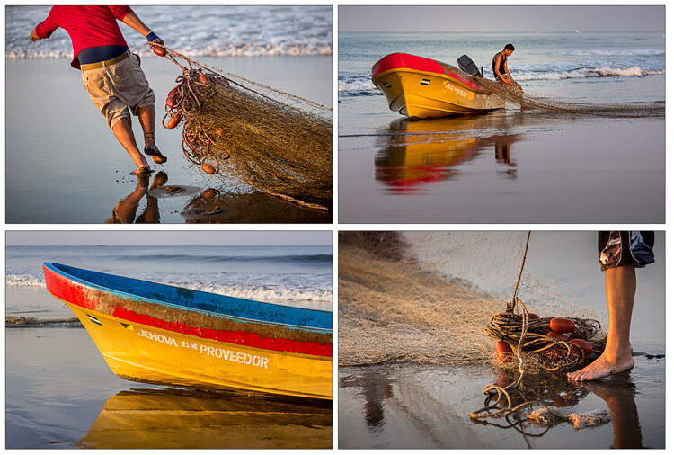
The photos below, taken at dawn on a beach in Vietnam, will be printed as separate pieces and hung together as shown.

image showing photo collections

Displayed together, the four photos tell a story.

On the flip side, printing multiple pieces can be expensive, and it can be tricky to hang a multi-piece collection with the accuracy it deserves. Some configurations, such as the black and whites below, can look itsy-bitsy when printed separately, and look better printed as a single piece.

You can create hi-res collages like this in Photoshop, Lightroom, or the professional version of Proselect. Alternatively, you can buy ready-to-hang frames with cut-out mats designed for collections, or you can ask a framer to create a customized mat for your frame.

This collage was designed to be hung above a dining table, so the long narrow shape worked well. Background and borders are white to match the colour scheme of my clients’ home, and it is printed on metal to suit their contemporary decor.

image showing photo collections

This was designed to be printed as a single piece.

Collections and collages are a fun and interesting way to display your favourite images. With a little care and thought, they can make breathtaking displays that will last for a great many years. I hope this article inspires you to go and rescue those beautiful images of yours that are trapped in the digital world, and bring them to life!

Share in the comments section below your favourite photo collections or collages, or any hints or tips you have learned along the way.

googletag.cmd.push(function() {
tablet_slots.push( googletag.defineSlot( “/1005424/_dPSv4_tab-all-article-bottom_(300×250)”, [300, 250], “pb-ad-78623” ).addService( googletag.pubads() ) ); } );

googletag.cmd.push(function() {
mobile_slots.push( googletag.defineSlot( “/1005424/_dPSv4_mob-all-article-bottom_(300×250)”, [300, 250], “pb-ad-78158” ).addService( googletag.pubads() ) ); } );

The post 5 Steps to Creating a Printed Photo Collection as Wall Art by Karen Quist appeared first on Digital Photography School.


Digital Photography School

 
Comments Off on 5 Steps to Creating a Printed Photo Collection as Wall Art
Posted in Photography


Wall on Wheels: Sliding Facade Swaps Indoor for Outdoor Space

01 Oct

[ By WebUrbanist in Boutique & Art Hotels & Travel. ]

modular hutong wall facade

Tucked into an historic winding Hutong of Beijing, this work of convertible architecture featuring a modular moving wall to make maximum use of flexible interior and exterior space on demand.

aniwall

The so-called Humble Hostel by Chinese architect Cao Pu is a tiny 130-square-foot apartment with beds that can be rented out for just $ 20 a night. Its novel modularity is a reflection of complex courtyard politics of these intertwined neighborhoods.

modular hostel front door

modular workstation area

modular bunk beds

Over centuries the lines have become blurred regarding ownership of communal open pedestrian space shared by the aged dwellings that surround them, attached organically over time to branching streets, paths and alleys.

modular hostel front view

modular shared courtyard seating

In pulling back the facade of the structure, the design effectively gives space back for public use when the interior volume is not needed, creating space for seating and socializing in otherwise cramped quarters. The resulting roofed patio can host card games, a tea table, pop-up shop or temporary bar.

Next Page – Click Below to Read More:
Wall On Wheels Sliding Facade Swaps Indoor For Outdoor Space

Share on Facebook


[ By WebUrbanist in Boutique & Art Hotels & Travel. ]

[ WebUrbanist | Archives | Galleries | Privacy | TOS ]


WebUrbanist

 
Comments Off on Wall on Wheels: Sliding Facade Swaps Indoor for Outdoor Space

Posted in Creativity


Vegan Antlers: Mount Wall Trophy Plants Instead of Animals

14 Sep

[ By WebUrbanist in Design & Fixtures & Interiors. ]

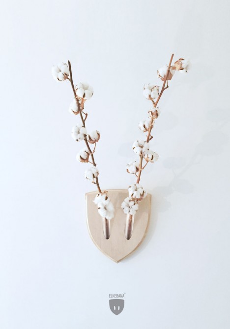
wall mounted deer

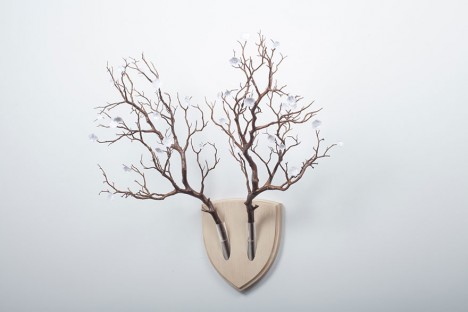
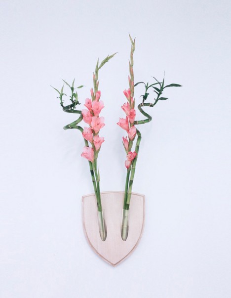
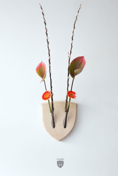
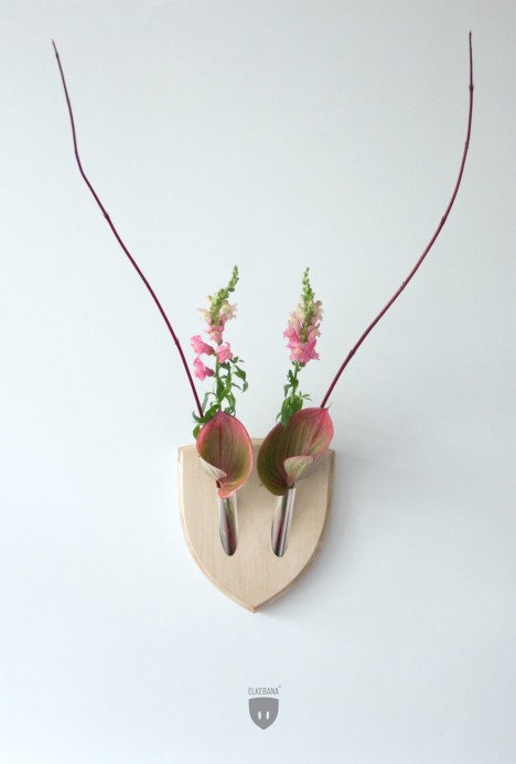
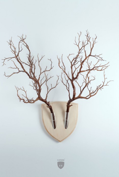
Combining a Japanese floral arrangement tradition (ikebana) with the hunting convention of mounted trophies, these plant holders allow for clever, colorful and ever-changing organic displays.

wall mounted flower pink

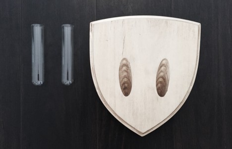
The Elkebana consists of a pair of glass flower holders set into a familiar wooden wall plaque, designed by Fabio Milito & Paula Studio and hand-crafted in Italy.

wall flower horns design

Its creators have had quite a bit of fun naming some of their experimental arrangements, including Nora the Angora, Girgenta the Goat, Jason the Aries, Isidoro the Oryx and Frank the Buck.

wall mounted creative flowers

Unlike the more morbid mounts that inspired this creation, there is also a greater degree of flexibility – change the flowers or their organization and you change the piece.

wall mounted plant antlers

And unlike traditional tabletop vessels for botanical displays, this one works well for small living spaces where surface area cannot be sacrificed.

wall mount maker

wall mount glass wood

Made of high quality birch plywood, solid walnut, solid oak or cork shield, the wall mounts hold your botanical arrangements in the two hand-blown glass vases.

wall mount branches spoof

From its makers: “The ‘ikebana is the ancient Japanese art of arranging floral elements in harmonious compositions. Elkebana brings the ancient art of ikebana to the wall, in order to transform the wall trophy idea into a continuously mutating, colourful creature.”

Share on Facebook


[ By WebUrbanist in Design & Fixtures & Interiors. ]

[ WebUrbanist | Archives | Galleries | Privacy | TOS ]


WebUrbanist

 
Comments Off on Vegan Antlers: Mount Wall Trophy Plants Instead of Animals

Posted in Creativity