RSS
 

Posts Tagged ‘Void’

Filling the Void: 25 Resin-Inlaid Wood Furniture Designs Become Whole Again

11 Apr

[ By SA Rogers in Design & Furniture & Decor. ]

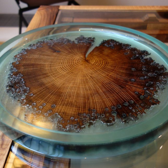
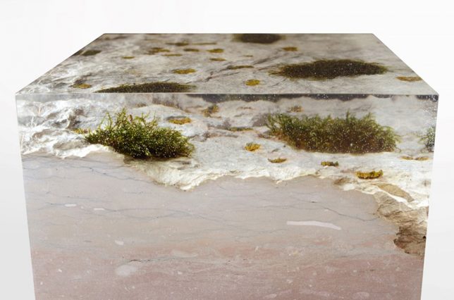
When married with clear resin, voids in wood or stone created by years of use, natural burls, intentional damage and even shipworms are made whole again, while leaving their ‘wounds’ visible. Broken furniture is repaired with ghostly additions, splintery snapped boards are made smooth and literally ancient time-worn wood is preserved for posterity like insects caught in amber. The results not only salvage items though to be beyond repair, but also make them feel like museum-worthy artifacts.

Disappearing Furniture: Broken Pieces Healed with Resin
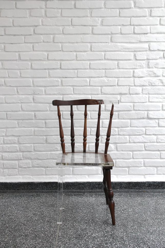
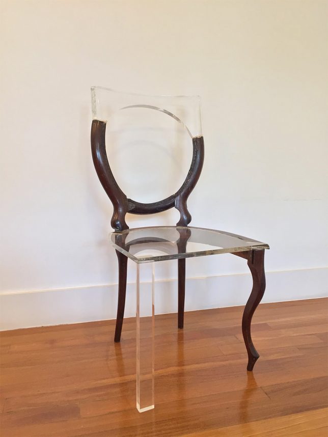
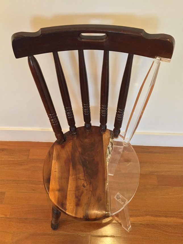
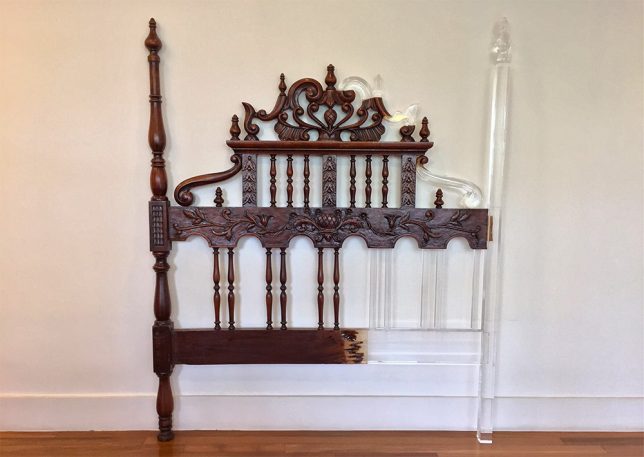
Pieces of furniture that seem broken beyond repair are proven salvageable after all, with their missing pieces seemingly made invisible. Tatiane Freitas created the series ‘My Old New chair’ using translucent acrylic, the new elements matching the scale of the older pieces but not the style. The results intentionally leave the ‘wounds’ of the old furniture visible and highly noticeable, as if the acrylic is a ghost of what once was or a hint at what it could evolve into.

Broken Board Series by Jack Craig
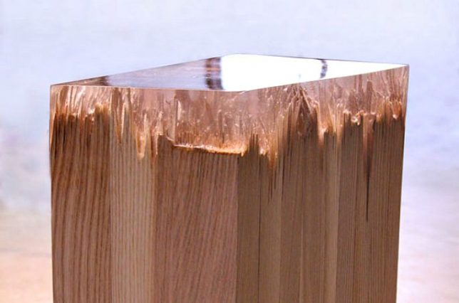
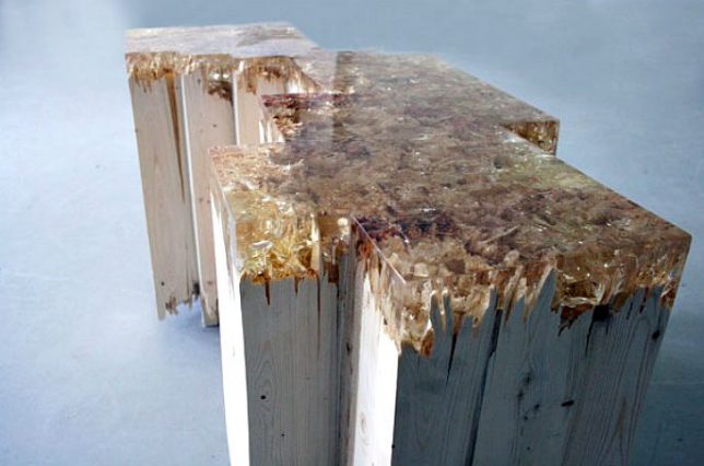
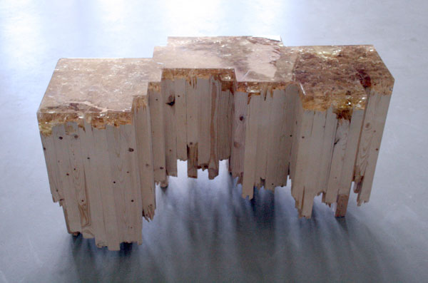
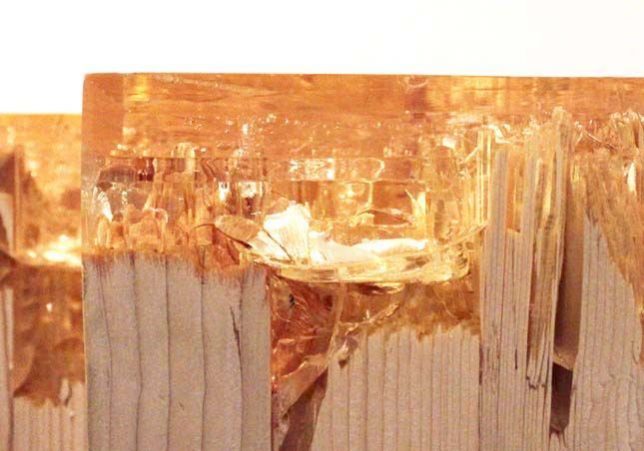
Smashed and reconstituted pine wood gets a whole new purpose – and surface – thanks to Detroit-based industrial designer Jack Craig, who seals them with caramelized resin for his ‘Broken Board Series.’ The splintered ends of the wood are visible through the resin for an interesting textural effect.

Forest Artifacts by Alcarol
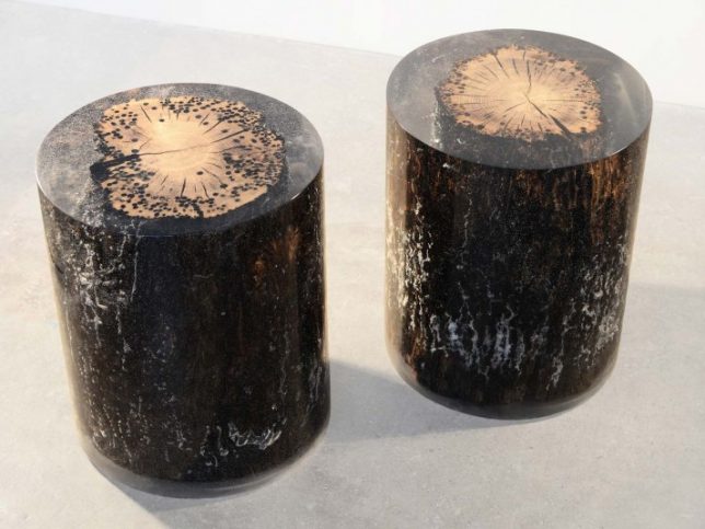
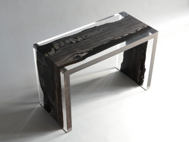
Design duo Alcarol creates ‘forest artifacts’ by pairing wood and resin in various designs, from an irregular wooden bench made sharply rectilinear to ‘fisheye stools,’ the latter of which features timber poles salvaged from the foundations of the city of Venice. The poles, the designers explain, were “driven into the lagoon’s caranto layer – a mixture of solid clay and sand situated at great depths. In spite of everything, Venice continues its fight against the muddy ground and ever increasing water levels. Fish Eye, which is sculpted by water, salt, shipworms and time, is a tribute to this epic submarine struggle that has transcended millennia. During their stay in the Laguna, these Oak logs are deeply sculpted by Teredo Navalis, shipworms that leave traces of their passing on the wooden surface producing striking patterns of circular holes, whilst avoiding the inner core of the log, allowing it to maintain its health and strength. This creates a beautiful contrast between other decay and inner robustness.”

MANUFRACT Furniture Inspired by Self-Healing Trees

The MANUFRACT series of furniture by Marcel Dunger mimics the way trees heal themselves by releasing resin into their ‘wounds.’ The hand-crafted furniture is made of broken wood patched with tinted resin in a manner reminiscent of kintsugi, the Japanese art of repairing a broken piece of pottery with gold.

VOLIS by Atelier Insolite
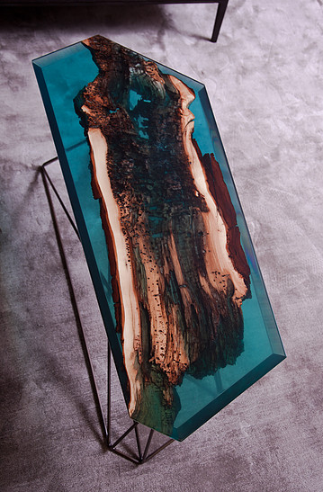
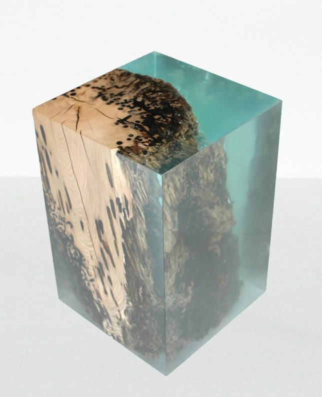
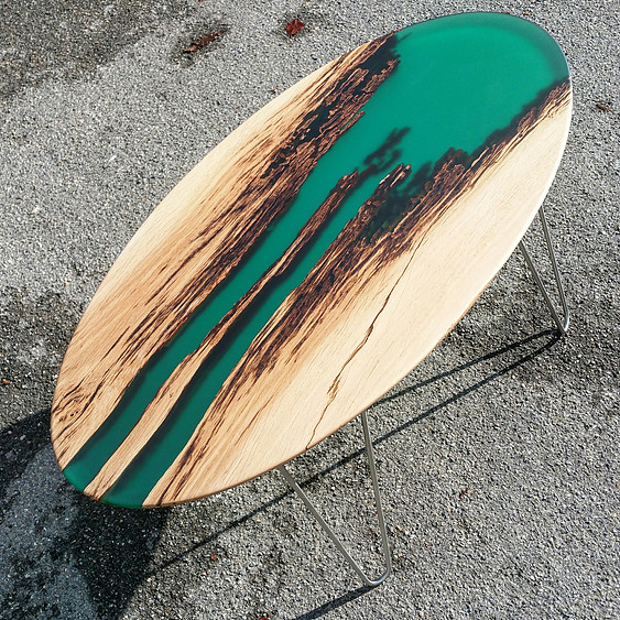
The ‘VOLIS’ series by Atelier Insolite embeds objects with resin, including shelves, side tables, coffee tables, consoles and other furniture items. The designers intentionally seek out wood with natural voids and broken-off elements so they can fill in the spaces with blue-tinted resin, giving the finished pieces an oceanic feel.

Next Page – Click Below to Read More:
Filling The Void 25 Resin Inlaid Wood Stone Furniture Designs

Share on Facebook


[ By SA Rogers in Design & Furniture & Decor. ]

[ WebUrbanist | Archives | Galleries | Privacy | TOS ]


WebUrbanist

 
Comments Off on Filling the Void: 25 Resin-Inlaid Wood Furniture Designs Become Whole Again

Posted in Creativity


Enter the Void: 14 Creatively Concave & Sliced-Out Structures

24 Jun

[ By Steph in Architecture & Public & Institutional. ]

concave twin moon 2

Cutting curves or slices into the facades of buildings doesn’t just make them more visually dynamic, it can create terraces, divert prevailing winds, concentrate sunlight and direct the eye to particular views.  These seemingly random depressions and voids completely transform the shapes of each structure, often leading to an alien appearance.

Twin Moon Cut-Outs

concave twin moon 3

concave moon 5

concave twin moon 1

Two buildings set side-by-side look like they were dented by a massive sphere, the concave cut-out creating two moon shapes recessed into the concrete facades. Architect Moon Hoon designed the mixed-use Two Moon buildings for a South Korean client who needed one building for himself and another for his brother. The structures were envisioned as twins, with one sitting ever-so-slightly closer to the street than the other.

TEK Building by BIG Architects

concave tek 2

concave tek 3

concave tek 4

concave tek

Each ‘slice’ that you see in the main volume of the TEK building by BIG Architects is a functional step, with the entrance spiraling throughout the interior to create one big continuous outdoor staircase leading to a series of terrace-like spaces before finally exiting onto the roof. The building, which is full of exhibitions paces, conference rooms, shops, restaurants and galleries, consists of a system of stacked plate-like pieces that also create solar shading for the interior spaces.

Barn House Sliced Like a Cake

concave barn house 1

concave barn house 2

concave barn house 3

This barn-shaped house looks like a massive black-frosted cake that’s had slices randomly taken from its perimeters, revealing its white interior. These concave cut-outs act as terraces, reflecting and maximizing natural light.

DUO Skyscrapers with Concave Walls

concave duo skyscrapers

Singapore’s historic Kampong Glam district is set to get a pair of curving skyscrapers arranged in a half-circle, one containing apartments, the other offices and a hotel. The DUO towers by Buro Ole Scheeren feature a stepped design that creates large outdoor spaces at various levels, and are covered in a distinctive grid of hexagonal windows.

The Bow by Foster + Partners

concave the bow 1

concave the bow 2
Calgary’s tallest building, The Bow by Foster + Partners is a 58-story wave-like structure with a concave side gathering sunlight and a convex side reducing the load of prevailing winds. Atriums within the concave side separate the glass facade from the offices within, offering meeting spaces, lounges and sky gardens.

Next Page – Click Below to Read More:
Enter The Void 14 Creatively Concave Sliced Out Structures

Share on Facebook


[ By Steph in Architecture & Public & Institutional. ]

[ WebUrbanist | Archives | Galleries | Privacy | TOS ]


WebUrbanist

 
Comments Off on Enter the Void: 14 Creatively Concave & Sliced-Out Structures

Posted in Creativity


The Void: World’s First Virtual Reality Theme Park Coming Soon

14 May

[ By Steph in Gaming & Computing & Technology. ]

The Void 1

“Why play a game when you can live it?” ask the creators of The Void, the world’s first virtual reality theme park slated to open in Utah in summer 2016. Gamers will soon be able to immerse themselves in 4D environments, with all sorts of eye-popping effects layered onto real spaces. Imagine: first-person shooters meet paintball or laser tag – this is the future of gaming.

Screen Shot 2015-05-13 at 1.07.31 PM

The flagship Pleasant Grove location will feature sixteen 60-by-60-foot rooms with different themes for different experiences, and they even plan to change these virtual stages every three months so repeat players never get bored.

Want to find out what it feels like to wander around in the jungle during the Jurassic age, or explore a truly terrifying haunted house? Zoom around skyscrapers in a flying car? The Void basically enables you to star in your own action movie, alone or with a group of friends, in a VR experience that far surpasses anything you could do with a headset on your couch.

Screen Shot 2015-05-13 at 1.06.30 PM

Each stage not only has custom architecture and sculptures to make it feel more real – you’ll also feel blasts of air and shifts in temperature, take in scents and strap yourself into motion simulators for activities like flying. Individual rooms hold up to 10 gamers at a time who can work as a team or play against each other. The Void has created a virtual reality headset of its own design, called Rapture HMD.

Screen Shot 2015-05-13 at 1.07.04 PM

Screen Shot 2015-05-13 at 1.06.49 PM

You won’t necessarily have to fly to Utah to experience it, either – they’re planning on opening other locations around the world.

Share on Facebook


[ By Steph in Gaming & Computing & Technology. ]

[ WebUrbanist | Archives | Galleries | Privacy | TOS ]


WebUrbanist

 
Comments Off on The Void: World’s First Virtual Reality Theme Park Coming Soon

Posted in Creativity


Hole in the Ground: 5 Ideas to Fill Downtown Chicago Spire Void

01 Apr

[ By WebUrbanist in Architecture & Cities & Urbanism. ]

chicago spire

Designed by a world-famous architect, the Chicago Spire was set to be the second-tallest building in the world, but now that plans for its construction have been abandoned local firms are stepping up to suggest novel ways to reuse the voided project’s remnant space.

chicago spire void

Submitted to Chicago Magazine, these various schemes to replace the failed vision of Santiago Calatrava are bound to resonate with residents, created by and for the local population and context, featuring everything from underground performance spaces and wildlife sanctuaries to urban lighthouses and swimming holes.

chicago spire amphitheater

One proposal invites people to occupy the hole in the form of a seven-story underground amphitheater, allowing loud late-night events to operate freely in the subterranean space. This Underground Amphitheater scheme by SPACE Architects + Planners is likened to a headphone buried in the Earth, its emissions audible when you get up close and keep an ear to the ground.

chicago spire bird sanctuary

A radically different tactic suggests a steel aviary trellis surrounded by native vegetation. serving as a stopping point and bird-watching spot for migratory species. Dubbed Birds in Horto by designer Hoerr Schaudt, the void in this case remains inaccessible, a mystery at the center of a larger natural park space. “A 10-story spiraling trellis of steel and wood serves as armature for nesting and perching, while a surrounding thicket of native plants, such as crabapple and plum trees, offers sustenance. An elevated walkway lets you observe the warblers, cardinals, and sparrows without disturbing them.”

Next Page – Click Below to Read More:
Hole In The Ground 5 Ideas Fill Downtown Chicago Spire Void

Share on Facebook


[ By WebUrbanist in Architecture & Cities & Urbanism. ]

[ WebUrbanist | Archives | Galleries | Privacy | TOS ]


WebUrbanist

 
Comments Off on Hole in the Ground: 5 Ideas to Fill Downtown Chicago Spire Void

Posted in Creativity


Monument & Void: Massive Stone Museum of Mayan History

07 Feb

[ By WebUrbanist in Architecture & Public & Institutional. ]

mayan museum central void

Commissioned for Guatemala City, this weighty megalithic structure is set to be the largest museum commemorating Mayan culture and history in Central America. Its architectural success, however, comes as much from its empty spaces as from its imposing structure, as evidenced by the eight-story central void shown above.

mayan museum plynth megalith

At a glance, the building looks like a monolithic box set upon a piecemeal plinth, the latter helping to give the former a sense of impossible mass. This humbling exterior gives way to an only somewhat-more-human-scaled series of spatial experiences inside.

maya museum monolithic void

Heavy stone-clad walls pierced by patchwork voids conspire to reinforce the sense of visual thickness that permeates the project, referencing ancient Mayan temples in terms of architectural materials and concepts but also sheer scale.

mayan museum exterior forest

This region-referencing design resulted from international collaboration between Harry Gugger Studio of Switzerland and Over,Under of Boston. More details from these firms below.

mayan museum gallery room

“The new Museo Maya de América is among the most ambitious cultural projects under development in Central America. It is planned to house one of the world’s most significant collections of objects, artefacts, artworks, textiles and knowledge relating to the history and culture of the Mayan Civilisation.”

mayan museum scale figure

“Located on the northern edge of L’Aurora Park, the new museum building will form the culmination of a cultural axis that includes the Guatemalan Museum of Contemporary Art and the Children’s Museum. This dense cluster of cultural institutions, in tandem with the large open spaces of the adjacent park will become a focal point for tourists and residents alike.”

mayan museum monolithic facade

An open central “void extends down in to the parking levels below ground, providing an interesting route up into the museum and a special place to display underworld-related artefacts. The landscaped roof of the museum is once again given back to the public with a series of different areas including a restaurant and terrace, roof gardens and viewing decks all accessible from the Cenote.”

mayan museum exploded axon

mayan museum central void

“The large surface of the roof will also be used to collect rainwater in a manner recalling traditional Maya practices by drawing water through a series of channels into the Cenote, enhancing the museums commitment to the environment through water recycling.”

Share on Facebook


[ By WebUrbanist in Architecture & Public & Institutional. ]

[ WebUrbanist | Archives | Galleries | Privacy | TOS ]


WebUrbanist

 
Comments Off on Monument & Void: Massive Stone Museum of Mayan History

Posted in Creativity


Ship Shaped: Undergound Maritime Museum in Dry Dock Void

29 Nov

[ By WebUrbanist in Architecture & Public & Institutional. ]

ship nautical museum void

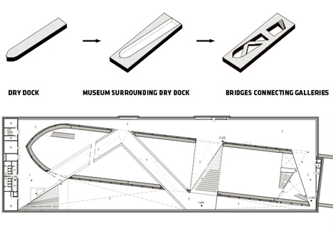
Using the existing vessel-shaped space of a six-decades-old dry dock, the Danish National Maritime Museum in Helsingor, Denmark takes visitors on a unique subterranean tour of the areas used to build, maintain and repair ships.

ship sea vessel museum

ship museum plans diagrams

Historically, the zone would be drained to bring in or assemble vessels then flooded to send them back out into open waters. Today, thanks to BIG architects (images by Rasmus Hjortshøj and Luca Santiago Mora), people can follow a staircase directly down and enter the area at the lower levels then cross through it via interior sloping skyways.

ship auditorium presentation space

ship lower level spaces

maritime museum bridge entry

Alternatively, a grand entry path begins above via the bridge system that zigs and zags along the length of the museum to a main entry just below ground level. This route offers a gentle slope and stellar views of everything happening below and on all sides. Passers by can also enjoy a good look down when traversing a smaller connecting bridge that simply spans from one side to the other.

ship museum bridge design

ship surrounding area view

ship void site context

The main museum exhibition, auditorium, classroom, office and cafe areas are arrayed around the outdoor void on the levels below. Their borders are in turn defined by an off-axis rectangle the emphasizes their contrast with the curved ship shape of the center space and connect to other nearby attractions, monuments and landmarks.

Share on Facebook


[ By WebUrbanist in Architecture & Public & Institutional. ]

[ WebUrbanist | Archives | Galleries | Privacy | TOS ]


WebUrbanist

 
Comments Off on Ship Shaped: Undergound Maritime Museum in Dry Dock Void

Posted in Creativity


Art of Absence: Brick Street Mural Made of Unpainted Void

24 Jul

[ By WebUrbanist in Art & Street Art & Graffiti. ]

subtractive white brick mural

White wall frames cracked red bricks shaped like rust-colored autumn leaves, all trailing down to a black silhouette of a painter and his bucket – but looks can be deceiving, and this lovely mural was not made in the way you might first guess.

subtractive muralist art detail


It looks deceptively subtractive at first glance, but Spanish street artist Pejac did not chip away at existing paint to create this piece. Instead, he carefully added layers around bricks he wished to shape, almost like a sculpture carving away at a rough block with a careful hand, revealing an object by removal.

subtractive art in context

Thanks to careful site selection, the faux leaves and branches in the mural are visually tied both to surrounding greenery – they also related to the reddish surfaces of other nearby painted and brick structures. Meanwhile, the black figure at the base stands out against the colorful environs.

subtractive street artist illusions

An adept photographer, illustrator and installation artist, Pejac’s other works include cleverly altered street signs and carefully orchestrated urban fantasies, the latter created using paper cutouts attached to windows.

Share on Facebook


[ By WebUrbanist in Art & Street Art & Graffiti. ]

[ WebUrbanist | Archives | Galleries | Privacy | TOS ]


WebUrbanist

 
Comments Off on Art of Absence: Brick Street Mural Made of Unpainted Void

Posted in Creativity


Miss FD – Enter The Void – Official Music Video

03 Feb

Download from iTunes: itunes.apple.com (c) Quantum Release Records 2010 Directed by Danny Rendo, Enter the Void is the first official music video from Miss FD’s full length studio album, Monsters in the Industry. Monsters in the Industry is available through: Amazon.com www.amazon.com iTunes itunes.apple.com and Miss FD’s official website www.MissFD.com
Video Rating: 4 / 5


Ad-Free Advertising: A Void Billboard of Nothingness

01 Jan

[ By Steph in Art & Sculpture & Craft. ]

Void Billboard Lead Pencil 1

Passing over the border between the United States and Canada near Vancouver, travelers take in this unexpected sight: an odd metal billboard advertising nothing but air. Clean air. ‘Non-Sign II‘ by Lead Pencil Studio was commissioned by the U.S. government to draw attention not to some product or service, but to the landscape.

Void Billboard Lead Pencil 2

From afar, it looks like it could be a flock of black birds, or particles of matter coming together to form the edges of a rectangle. The metal sculpture measures 30 feet high and 50 feet wide.

Void Billboard Lead Pencil 3

What is framed in that open rectangle that would normally contain an appeal to your consumerist impulses is simply sky.

Void Billboard Lead Pencil 4

Lead Pencil Studio consists of Seattle duo Annie Han and Daniel Mihalyo, whose respective backgrounds in art and architecture meet somewhere in the middle in each of their works. Says Mihalyo, “Why shouldn’t there be a whole realm of architecture that’s nonfunctional…and really just meant for experiencing space for its own sake with no practical purpose whatsoever?”

Share on Facebook


[ By Steph in Art & Sculpture & Craft. ]

[ WebUrbanist | Archives | Galleries | Privacy | TOS ]


WebUrbanist

 
Comments Off on Ad-Free Advertising: A Void Billboard of Nothingness

Posted in Creativity


Ep 09: “Endless Void’

17 Oct

Naoe searches for and confronts the evil beast Tsutsuga.