The post Vanishing Point in Photoshop: The Essential Guide appeared first on Digital Photography School. It was authored by Ana Mireles.

Have you ever used Vanishing Point in Photoshop? If you’re only using the Transform tools to give perspective to image elements, you’re missing out on a fantastic opportunity.
The Vanishing Point filter is often overlooked; most photographers believe it’s only useful in a 3D workspace.
But here’s the truth:
Vanishing Point is actually a hugely useful tool, one that I absolutely recommend you learn how to use.
In this article, I’ll explain what the Vanishing Point filter is – and how you can use it to simplify and improve your photography.
Let’s get started!
What is Vanishing Point in Photoshop?

Vanishing Point is a Photoshop filter that allows objects and edits in your image to be scaled and oriented according to the image’s perspective.
You can find Vanishing Point under the Filter menu (simply click Filter, then Vanishing Point).
Once you’ve selected the Vanishing Point filter, Photoshop opens a special workspace for all your in-perspective edits.
Why is Vanishing Point important?
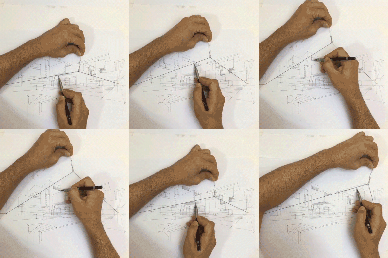
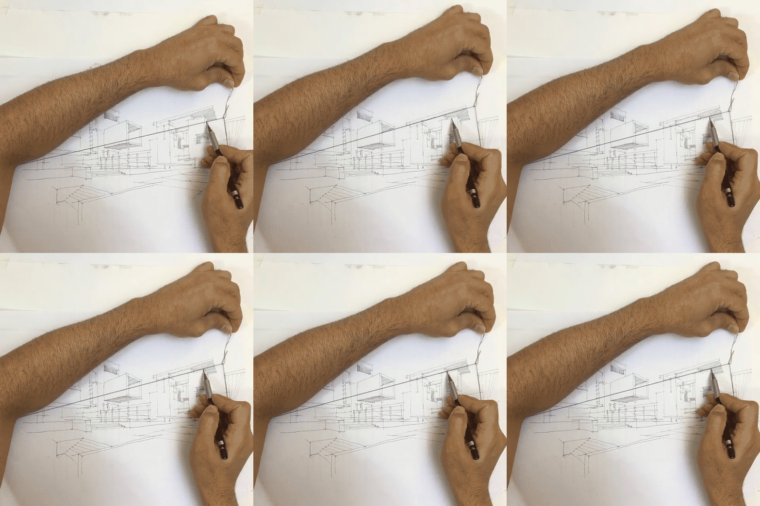
A vanishing point is what gives depth to an image.
For example, if you photograph a wall parallel to your camera’s sensor, the wall (and the overall image) should look flat.
But if you instead photograph the wall at an angle and you capture the way it vanishes toward a point in the distance, the wall – and the scene – appears three-dimensional.

Take a look at the arrows in the image above.
The wall is flat, with no depth.
But the railing moves toward the horizon, where (if it continued to stretch onward) it would vanish.
The Vanishing Point filter allows you to make adjustments to your photos in perspective, so that you achieve a realistic final result that perfectly mirrors the scene’s perspective.
(Do you see how the arrow stretching along the railing appears to fade into the scene? That’s because I added it with Vanishing Point!)
Working with Vanishing Point: The basics
When you launch the Vanishing Point filter, you might be wondering what to do and how to use it.
It looks similar to the normal Photoshop interface, but where do you start?
Here are the answers to some of the most common Vanishing Point questions:
How do you create a perspective plane?
Click the Create Plane Tool at the top of the toolbar on the left.
Then click on the corners of the plane you want to create.
(Here, you need to carefully follow in-perspective elements.)
Photoshop will immediately add your plane to the image, like this:

Now, when the lines that form the plane are blue, it means everything is working well. Yellow or red lines mean that Photoshop doesn’t accept the plane you’re tracing.
Once you’ve created a plane, try moving the corner points until you get it right. You can zoom in if you need to be more precise.
Everything you paste and everything you edit inside that plane (while you’re in the Vanishing Point workspace) will be put into that perspective.
How do you save a perspective plane?
When you’re done working inside Vanishing Point, click OK (in the top right) to accept the changes. This will add the perspective plane as part of your file.
If you save and close your image, the perspective plane will be saved, too. When you open your file again, you can launch the Vanishing Point filter, and the perspective plane(s) that you created will be present and editable.
How do you delete a perspective plane?
To delete a plane, simply select it, then press the Backspace key.
To select your plane, just click on it using the Edit Plane Tool. You’ll know your plane is selected if you can see the edge nodes around it.
Can you create more than one plane?
Yes, you can create multiple planes. And these can be separate or connected.
If you want to create a separate second plane, just finish working on your first plane, then click another part of the image and start afresh.
If you want to have your two planes connected, you need to tear the second plane off from the first. To do this, press the Ctrl/Cmd key and drag one of the edge nodes to create the next plane.
By default, the second plane will be at a 90-degree angle from the first. If this is not the way you want it, you can use the Angle controller you’ll find in the toolbar at the top of the Vanishing Point window:

How do you use Vanishing Point in Photoshop to paste objects in perspective?
First, make sure the object you want to add in perspective is present on a layer. Select the object (you can use Ctrl/Cmd + A to select all), then hit Ctrl/Cmd + C to copy it to your clipboard.
Once you have the object on your clipboard, add a new blank layer above the background image. This is because anything you do inside the Vanishing Point workspace will be applied to the layer that is selected when you actually open the filter.
Next, open the Vanishing Point filter and create a perspective plane that follows the perspective you want to give to the new element.
Once this is done, paste the new element into the Vanishing Point workspace by pressing Ctrl/Cmd + V. It will be pasted as a floating selection without perspective, but that’s okay.

Feel free to scale or modify the object. Then, once you’re satisfied with its shape and size, click on it and drag it inside the plane.
You’ll notice that the object will change shape and size according to its position in the plane. It will get smaller as it gets farther away from the camera, and bigger as it gets closer to the camera.

That’s it – now you can click OK to get back to the normal workspace. You’ll find the pasted element (in perspective) on the new layer. You can then use the Layer Style options to add shadows and create more realistic composites.
You can use this paste-in-perspective technique to showcase your photos on a billboard, create graffiti on a wall, or apply logos to product packaging photographs.
Advanced tips and techniques for working with Vanishing Point
Pasting elements in perspective is one of the most common uses for the Vanishing Point filter in Photoshop.
However, there are some other cool things you can do with the feature, including:
Painting in Vanishing Point

Inside the Vanishing Point workspace, you’ll find a Brush tool. With it, you can paint, write, or draw in perspective.
Therefore, the brushstrokes will get smaller as they move farther away from the viewer (to simulate depth).
You can choose the size of the brush, the hardness, and the color. Unfortunately, you can’t use brushes you’ve loaded into the normal workspace.
Cloning in Vanishing Point
You can also clone with the Vanishing Point filter. This is very useful, because the Clone Stamp tool will follow the angle and the size of the perspective plane.
Choose the size and hardness of your Stamp Tool in the top toolbar. Make sure that Heal is turned off.
Then source the pixels that you want to clone. To do this, hold the Alt/Option key and click on the target pixels (note that you must click somewhere inside the perspective plane).
Finally, clone the pixels onto a different part of the perspective plane.
You can clone the same way you’d use the regular Clone Stamp tool. However, the results will be very different.
Look at the composite below, which shows an original image, the image modified with standard Clone Stamp methods, and the image modified with the Stamp Tool in Vanishing Point.

When I sourced the pixels from the top of the brick wall using the regular Clone Stamp tool, the bricks had a different angle; when I cloned them from the side, they had a different size.
However, when I used the Vanishing Point Stamp Tool, I was able to add pixels in-perspective.
You can also use the Vanishing Point Stamp Tool as a Healing Brush by turning on the Heal option in the top toolbar.
Using the Marquee Tool in Vanishing Point
The Marquee Tool is the only selection instrument available inside the Vanishing Point workspace.
It’s very straightforward to use; just click and drag around the area that you want to select.
If you have two connected planes, the selection will “bend” to follow the perspective in both planes.

This is extremely useful if you want to duplicate elements that run through two planes. Look at the example above – I just selected an area, copied it, and pasted it again. It behaved according to the perspective of the plane, which allowed me to keep any depth and make the entire duplication job look more natural.
For better blending, you can feather the selection, just as you would in the regular workspace.
How to use Vanishing Point in Photoshop: Conclusion
Vanishing Point in Photoshop can make your work easier and faster when you’re dealing with perspective.
So make sure to give it a try!
Now it’s your turn:
What do you think of Vanishing Point? Is it a tool you plan to use in the future? Share your thoughts, questions, and tips in the comments below!
The post Vanishing Point in Photoshop: The Essential Guide appeared first on Digital Photography School. It was authored by Ana Mireles.


You must be logged in to post a comment.