RSS
 

Posts Tagged ‘Useful’

Equivalence is useful if you have any interest in light (and as a photographer, you probably should)

23 Aug

Photography is all about light, something you’ll quickly discover even if you’re not familiar with the word’s Greek origins. Most of the time, we use a standard framework (the standard exposure model) to discuss how much light your camera is receiving. However, this isn’t the only way of looking at things.

‘Equivalence’ gives us another way of looking at light, that just happens to give a clearer understanding of the capabilities of different formats. It’s a common misconception that equivalence and the more familiar standard exposure model are at odds with each other, but the two systems aren’t contradictory – they just tell different parts of the same story.

The Standard Exposure Model

The standard exposure model uses shutter speed and F-number (the ratio of a lens’s focal length, relative to its exit pupil) to describe how much light your camera is receiving. Using this ratio normalizes the behavior of lenses based on how much light they project per unit area, meaning it works consistently across different focal lengths. The available light and the exposure you can devote to it tend to dictate most of the noise in your image, so are the most effective way of reducing it.

A third factor (which is applied after the light has been captured, so doesn’t affect exposure, per se) is sensitivity (ISO) which, at its most basic can be thought of as essentially ‘whatever amplification or brightening is needed to provide the expected image brightness from a given exposure.’ This has the effect of ensuring that the exposure system works, regardless of what format you’re shooting on.

Lightmeters are designed to express the light level in terms of the standard exposure model. Since this system is, by design, independent of format so are their results.

There are many benefits to this system. It means that you never have to think about what format you’re shooting with: everything from your smartphone to a medium-format back will work using the same settings in the same lighting conditions. This is the reason light meters are able to work without giving a fig for what camera you’ve got.

The main downside to this*, is that it obscures the effects of format. There’s nothing wrong with thinking in terms of exposure, but it leads to slightly wooly conclusions such as ‘full-frame sensors can give less depth of field and are better in low light’ which is generally correct but not very precise. In turn, this can lead to confusion about why this is the case. ‘Something to do with bigger pixels?**

Equivalence: the whole image perspective

Equivalence is simply a different way of looking at the same thing. Instead of thinking about light per unit area, it looks at the total amount of light that goes to make up the whole image. As a result, it assumes you’re trying to take a specific picture (matched framing, shot from the same position) and also requires you to compare images at the same size. In other words, it’s about pictures, not pixel peeping.

It’s not a matter of faith, nor does it contradict anything that the exposure model says, it’s simply a question of geometry. In the film era, where most people used a single format and only a generally knowledgeable minority used medium and large formats, the same underlying effects were usually discussed in terms of enlargement. But, since there’s no fundamental link between the size of your pixels and the size you choose to view or print them, ‘enlargement’ becomes a slightly arcane way of thinking about it.

Equivalence is simply a way of looking at how much light a system gets, and just happens to use the 135 film format as the baseline for those comparisons (because it was the dominant system in the film era, which saw it being used as the basis of comparison for focal lengths, when the many and various sensor formats emerged at the beginning of the digital era).

Equivalence, the basics

Equivalent f-numbers are a means of considering the combined effect of the aperture and sensor size.

In the same way that equivalent focal lengths describe the effect of sensor size on the field-of-view a lens gives, equivalent apertures describe the effect of sensor size on the properties that aperture affects (depth of field, diffraction, total light projected). In both instances, the underlying properties are not changed: neither the focal length or F-number of a lens is changed by different sensor sizes, only their effects.

  • F-number = focal length/aperture diameter
  • Equivalent f-number = equivalent focal length/aperture diameter

Comparing equivalent apertures allows you to understand how much control a lens will give you over depth-of-field. It also gives a good idea of how low-light performance will compare between two cameras of different sensor sizes, since it tells you how much total light is making up the final image (most noise is most images comes from the amount of light captured).

However, because the exposure and ISO system is, by design, independent of sensor size, equivalent apertures should only be used to understand camera/lens capability, not exposure.

To keep things real-world relevant, equivalence assumes you’re shooting the same framing from the same position and then viewing the images at the same output size.

Looking at total light or light per image, means we can better recognize the effect of light on depth-of-field, diffraction and noise. Rather than vaguely saying that ‘full-frame is, er, better than APS-C’ we can understand why and how much more or less light a larger or smaller sensor will receive at the same exposure settings (same shutter speed and same F-number), by calculating what the equivalent F-numbers are.

So, since a 50mm F2 lens used on APS-C behaves equivalently to a 75mm F3 lens on full-frame, we can see that a full-frame camera with a 75mm F2 could receive up to one and a sixth stops more light, if you opened the lens up to its maximum aperture. You can see this would give a shallower depth of field and a little over one stop of noise improvement, assuming comparable sensor performance.

Looking at it this way not only shows us the boundaries of the capabilities of each system but also gives us a meaningful way to assess whether either system is under or over-performing, relative to other systems, since it gives us a set of expectations about what it should be capable of.

This really shouldn’t be controversial

You do not need to consider equivalence for a moment when choosing an exposure. You do not have to multiply the F-number by the crop factor, unless you want to understand its behavior, relative to another system. However, it is completely legitimate to do so. The logic behind it is mathematically sound***, it holds up to real-world testing and it can be informative, if you’re interested. It’s an effective tool, whether you have need for it or not.

For more information, with real-world examples, read our more in-depth article on the subject.


* …beyond the flexibility in the ISO standard that means cameras don’t actually have to produce the image brightness you expect, and the fact that ISO as used by camera makers has very little meaning in terms of Raw shooting. [Back to text]

** If you view two images at the same size, the ones taken with the larger sensor at the same field of view, F-number and shutter speed will usually be cleaner in close proportion to the sensor size increase, almost regardless of the pixel size. Whether you have the same number of larger pixels or a larger number of the same sized pixels generally makes very little difference. [Back to text]

*** As Andy Rowlands’ Physics of Digital Photography points out, equivalence works at most normal photographic distances but, because it’s based on a slightly simplified depth of field equation, doesn’t hold true as you approach the close focus distances used for macro photography. This is equally true for focal length equivalence. [Back to text]

Articles: Digital Photography Review (dpreview.com)

 
Comments Off on Equivalence is useful if you have any interest in light (and as a photographer, you probably should)

Posted in Uncategorized


Five useful photo apps for travelers

12 Aug

Photo apps for travelers

Photographers take great care in choosing the right gear for a trip. Why not make sure your smartphone is well equipped for photography too? After all, it’s probably the camera you’ll have with you in the event that your DSLR battery comes up short, or your shoulders need a break from the weight of your photo bag.

While the stock camera app will serve most people just fine, there are a huge number of photo apps that go a step further – offering unique shooting features and clever editing options. Whether it’s a late summer getaway or just a trip to the park, these five iPhone apps (a couple of which are available for Android, too) can help you get a better shot to remember the journey by.

SKRWT
iOS/Android | $ 1.99

Travels often take photographers to new cities, but accurately rendering tall buildings and structures with the iPhone’s wide-angle lens alone can be problematic. SKRWT (pronounced Screw It — seriously) is handy for correcting perspective and lens distortion.

When you compose a shot that is angled upwards at a building, for example, the resulting picture often shows lines that converge at the top. SKRWT focuses exclusively on straightening horizontal or vertical lines so the picture depicts more of what the eye perceives. With SKRWT, applying corrections takes a bit of user input, including prepping the image for the vertical correction filter and moving the slider to align the image with the grid. The app provides full auto cropping, vignette correction, ratio adjustments, and an EXIF reader alongside Mobile, Wide, Fisheye, and GoPro modes.

You can save the corrected photo to a dedicated gallery or directly to your camera roll. SKRWT also features two in-app extensions: MRRW (pronounced Mirror), a mirroring tool, and 4PNTs (pronounced Four Points), a four-point-perspective tool for skewing and transforming images. Both apps are available as in-app purchases for 99 cents each.

If you find yourself drawn to taking photos of local architecture and wishing you could correct some of the distortion on the fly, SKRWT is a nice option.

Hydra
iOS | $ 4.99

Hydra shoots, processes and merges multiple images in an effort to produce a higher quality image. It offers five capture modes: HDR, Video-HDR, Lo-light, Zoom, and Hi-Res. Depending on available light, Hydra can merge up to 60 frames to create a single high-resolution shot, with an output of up to 32-megapixel images.

Hydra’s best use case is dimly lit, moody landscapes or interiors where you are able to hold your phone stock still — the app will not complete a shot if there’s too much motion. The HDR mode captures up to 20 images in challenging lighting conditions while the Video-HDR setting uses single-image tone mapping or a special sensor mode (for the iPhone 6), and then offers a choice of light intensities and video resolutions.

Zoom mode aims to correct motion blur, though as with other modes, it’s best to hold your phone steady to avoid unexpected results. Hydra is designed for specialized circumstances as a complement to rather than a substitute for the built-in iPhone camera app, but it’s great to have on hand for quiet, dark places.

Think you may end up printing low light photos from your trip? Hydra is worth having on hand.

ProCam 4
iOS | $ 4.99

ProCam 4 is a classic photographer’s app that aims to pack plenty of manual controls — as well as a robust photo editor — into your iPhone. Its wide assortment of settings comes in an easy-to-use format that won’t throw you off track when you’re in a hurry. The shooting app, which includes both photo and video mode, offers specialized settings like Night Mode, Burst Mode, Slow Shutter, Video, and Time Lapse.

You can manually select ISO, shutter speed, exposure, bracketing, white balance, and stabilization. A histogram helps with exposure settings, and in addition Raw support, manual focus, and focus peaking are offered. If you have an iPhone 7 Plus, try shooting some Wigglegram 3D photos with the iSight Duo camera — two photos taken at the same time by each of the phone’s cameras alternate in quick succession to produce a 3D effect that you can save as a GIF or video. In addition to broad shooting options, you can also edit photos and videos with controls for saturation, white balance, exposure, brightness and contrast, perspective correction, and a mix of special effects filters.

If your smartphone is occasionally asked to stand in for your dedicated camera, ProCam is worth downloading for its complete set of manual controls.

Google Street View
iOS/Android | Free

While you’re hiking the trail or strolling the city, anytime is a good time to create a Google Street View 360-degree photo. You can shoot it right from the app on your iPhone — no special equipment needed. The app does most of the work of indicating when to shoot as you pick a scenic spot and start rotating your body to follow the orange circle on your screen. Start with your phone’s camera and follow the app prompts until you have all angles of your image filled in.

As you shoot, the circle automatically repositions itself to help you complete your photo. When you’re done, the app stitches the panels together. Then, publish to Google Maps to share your photo spheres. The app lets you manage public and private images, observe contributions from others, and view your captures in Cardboard mode with a VR viewer. You can also share your photo spheres on Facebook, Twitter, or privately via email.

Those who rarely use their smartphone camera may still enjoy Google Street View’s easy 360-degree photo creation and documentation features. Plus, it’s a handy way to scope out nearby locations for photo opportunities.

Enlight
iOS | $ 3.99

Enlight is an advanced mobile photo shooter and editor that works independently or with the iOS photos app to offer advanced editing options and visual effects. With its hide-show main menu, coupled with a tap-and-drag interface, you get total control over your photo’s details, tone, color, and special effects. Each menu item opens into a variety of options, letting you crop, adjust, apply filters, sharpen, and add a host of artistic elements using adjustable presets, tools, and masks.

Masking features let you blend effects, while artistic and film-based presets let you add grain, black and white conversion, sketching effects, patterned surfaces, and more. A photo mixer lets you merge two photos together for double exposure, and montage. Enlight’s art filters can transform your photo into a watercolor, oil painting, or sketch. Want to start with the basics? No problem: Simple improvements like crop, skew, color adjustment, and healing are available, and then easily combined with decorative borders and frames, vignette lighting, gradients, and vintage filters. Top it off with doodles, decals, special effects, and customized text.

If you’d like your camera to come with a side of stylized editing options, consider Enlight.

Best free and paid options

These five apps work well, especially for the popular, specialized shots and circumstances for which they were designed. But if you only want to download one or two before you hit the road, here are our picks.

Best free option

The only free app in the group — Google Street View for iOS or Android — is a standout in its own right. With this app, dipping a toe into 360-degree image creation requires no special camera or photographic skill. The app’s integrated instructions provide everything you need to start shooting and posting impressive scenic landscapes that viewers worldwide can enjoy. If you’re carrying a dedicated camera, it provides a nice way to complement your traditional photos with something a little bit different – and with no penalty of carrying an extra device.

Best paid option

On the paid side, ProCam 4 gets the nod as the best app for its range of pro-level options, including detailed shooting controls, DSLR-style functionality, Raw support, and a variety of editing features.


The apps above are a tiny sample of creative mobile photo shooters and editors. If you have a favorite that was not mentioned, be sure to share it in the comments.

Articles: Digital Photography Review (dpreview.com)

 
Comments Off on Five useful photo apps for travelers

Posted in Uncategorized


3 Useful Accessories for Landscape Photography

09 May

With photography being more popular than ever been before, it’s no surprise that there are also a whole bunch of accessories available on the market. Many of these are completely unnecessary items that you’ll most likely never need. In this article, I’ll introduce you to three accessories for landscape photography that you can manage without BUT will probably be used more than anything else. I wouldn’t be surprised if they end up as your favorite accessories that you can’t imagine photographing without.

L-Bracket

I’ve been using an L-Bracket for so long that I don’t even consider it to be an accessory anymore. For me, it’s become part of my equipment and I honestly don’t remember what my camera looks like without one.

An L-Bracket is a plate that is fastened to your camera body and serves as a connector between the tripod and the camera. The L-bracket is used instead of a regular quick release plate as it’s a much more flexible option. A clamp is placed on the tripod’s head to connect it with the camera.

3 Useful Accessories for Landscape Photography

Advantages of an L-Bracket

Now, you might be asking, “Why is that a better option than the regular plate which comes with the tripod?” Simply put, it eases your workflow.

Let’s say that you’re standing in the middle of a river and photographing a waterfall. You’re taking a horizontal image and you’ve got a good composition. After taking some images you realize that a vertical image will work better for that scene. With a regular plate, you’ll need to adjust your tripod head so the camera is tilted vertically. By doing this you most likely have to set up the composition all over again since you’re camera has now moved several inches to another side.

With an L-bracket, however, you avoid this problem. Simply disconnect the camera and clip it back into place vertically. In this case, the tripod hasn’t been moved which means you still have the same composition, just vertically instead.

Manfrotto L-bracket mounting a camera vertically on the tripod.

It wasn’t until I “lost” the clamp (connection between camera and tripod) in Iceland that I realized how valuable this tool has become in my workflow (I did find it again later at the airport – in my backpack…) Being able to seamlessly switch between a vertical and horizontal format has made this my favorite accessory. It does add some extra weight to your equipment but it will also protect the camera if you should be unlucky and drop it (still, I don’t recommend dropping it!)
Spirit Level

While this is a built-in function in many high-end DSLR cameras, a spirit level is an accessory that I strongly recommend one if you own a camera without the virtual horizon function.

Capturing images with a straight horizon can be difficult without a spirit level, especially when you’re photographing a scene that doesn’t have a defined horizon (in which case the grid view will help a lot). The spirit level is a handy little tool that will make this process much easier.

The spirit level is placed on the hot shoe (where you connect a flash to the camera). Many choose to leave it there at all times to avoid accidentally forgetting it at home. It’s not the most popular tool for those who don’t use a tripod since it’s placed on top of the camera. If you’re using a tripod, however, it can be essential.

Pre-Moistened Wipes

The last accessory I recommend is one that I have in my backpack at all times. In fact, I get worried if I only have one left.

Pre-moistened wipes are a landscape photographer’s best friend out in the field. We all know that creating beautiful images of landscapes often involve being outdoors in less than ideal weather. Either it’s windy, rainy or large waves are spraying you, having a couple pre-moistened wipes nearby will help you keep the lens clean at any time.

zeiss lens wipes - 3 Useful Accessories for Landscape Photography

Dust spots or dirt on the lens are constant battles and when it gets really bad it has the potential to ruin an image. (Unless you’re a post-processing ninja who’s willing to spend hours in Photoshop cleaning it up.)

I tend to always have a couple pre-moistened wipes plus a microfiber cloth in my pocket when I’m shooting out in the field. Most of the time, regular microfiber cloths will work great but in the most challenging conditions, you will want to use wet ones. This is especially true when photographing seascapes and the lens gets a thin layer of salt over it.

Zeiss lens cleaning wipes.

What are your faves?

These are some of the accessories I recommend for landscape photography. What are your favorites?

The post 3 Useful Accessories for Landscape Photography by Christian Hoiberg appeared first on Digital Photography School.


Digital Photography School

 
Comments Off on 3 Useful Accessories for Landscape Photography

Posted in Photography


13 Useful Tips You Need To Shoot Stress-Free Fashion Events

14 Sep

13 Useful Tips You Need To Shoot Stress-Free Fashion Events

Hi there FashionPhotographyBlog.com readers, today we have a Peter Werner on our site. He has been a long time follower of FPBlog for many years and took time out of his day to write us a response to an article we posted before titled on how to shoot fashion shows. We at FPBlog thought that his reply had great insights and brought another viewpoint to our previous post, that we want to share it with you, because we know it will be useful to photographers currently shooting at fashion events, or thinking about doing it soon. 


We have invited Peter Werner to share with our community, his tips for shooting at fashion events so photographers can get a sneak peak into what to expect as well as how to prepare themselves so they don’t miss great photo moments in the middle of all the commotion at fashion events.


Just a word of warning before we dive into Peter’s tips – fashion shows and fashion events may not be suited for everyone. There are lots of people running around at these fashion events; triggers are going off everywhere, peak noise levels and you are constantly on your feet lugging around your photography gear. Then again, you could be an adventure seeker and live for the adrenaline rush. We just want you to be wary so you can be on point, focused on the shooting great photos and not getting distracted by all the commotion all around you. The stage is now all yours, Peter!


Fashion Events: How To Shoot Without The Stress


Thanks for the post (great stuff as usual)! I haven’t shot a fashion show yet, but I have shot several other types of fashion events so far. I absolutely hate it, too, but I think it is very good training for problem-solving when you have to move fast on a regular photo shoot. Here are a few things I have learned the hard way:


1. Don’t use the biggest memory card you have. If it dies or gets stolen, all your photos will be lost, and that’s a great way to destroy all the reputation you have built. Instead, use smaller ones.


2. If one memory card is full, continue shooting with your other camera body until you have time to change cards, don’t trade important moments for a card change.


3. Keep the full memory cards and the empty ones in separate pockets so you don’t lose time by re-inserting a full one by accident.


4. Use the two-pocket system for your flash batteries.


5. Don’t waste time deleting failures. You are very likely to miss your second chance to get it right.


6. Only check your images occasionally to make sure nothing is wrong (like a leftover exposure compensation or something like that). But don’t look at every single image you take right away.


7. Do take multiple shots of the same subject. The auto focus system sometimes focuses on the background, people have their eyes closed etc. So you want to have a backup in such a situation, plus you get to choose the best one of the set when you’re doing your editing. I usually take two or three shots per subject, depending on how much time there is, but you definitely need more for groups.


8. Always shoot RAW (even if you usually don’t), especially if you are using bounce flash a lot. Lighting often changes very quickly and people sometimes move in unexpected ways, so it is hard to get the exposure perfect every time. By shooting RAW, you can compensate for problems to a certain degree. Plus, you get between 12 and 16 bits of color depth instead of 8 with JPEG. Don’t rely on RAW’s ability to save you, though, you still need to expose as well as you can.


9. Get ear plugs. Not only can music be annoying, it can also be very loud. This is probably more relevant to concerts, but ear plugs also allow you to position yourself right in front of the speakers, where usually nobody is standing (or not for long), not even photographers, even if it gives you a perfect view on what’s happening.


10. Use a fast lens. Both Nikon and Canon make very sharp very fast zoom lenses. That way you can use more of the available light and thus get better recycle times on your flashFast lenses also enable you to use a shallow depth of field if you have to deal with a very busy background and but don’t have a chance to move.


The fast zooms are usually the more professional ones and, therefore, tend to give you sharper images, and they maintain their minimum aperture throughout the whole zoom range. And you can take non-shaky pictures at greater focal lengths if flash is not permitted or your flash does not reach far enough.


Even if you don’t use the aperture wide open, fast lenses are stopped down more at identical apertures, thus you are more likely to photograph on the lens’ sweet spot if you use an f2.8 lens at f4.5 than an f4.5 lens at f4.5. The Nikon VR system is great for low light, too.


11. If you know an important shot is coming up, make sure you don’t press the shutter release a few seconds before because your flash may not be ready again in time.


12, If you don’t own a good lens, you can always rent one, it’s worth it.


13. Also, be sure to get all the info you can in advance. If you know how the lighting is going to change, what the durations of individual segments are etc., you can plan in advance and for instance use a fresh card if you know you won’t have time to swap in the next 20 minutes. If you know that very shiny dresses are coming up, you can switch to spot metering and so on. Knowledge is power.


All those things can not only help in getting the pictures you want, they also help differentiate your images from those of the seven other guys right next to you with the exact same equipment as you have. I hope this is helpful for those of my fellow readers who are doing fashion events. Thanks again for this awesome blog, it is really an invaluable resource for the “secret” stuff that can’t be found anywhere else on the internet. Keep up the great work!


Peter Werner 


Did you find Peter’s tips for fashion events helpful? Please share this post on social media if you did. If you have tips of your own that were not covered in Peter’s list, please write them down for us in the comments box. below We would love to hear your tips!


Lastly, if you would like to be featured as a guest writer like Peter Werner, do send us a message and get in touch with us. We’d love to hear from you! For more details on how to contribute to FashionPhotographyBlog.com click here –> CONTRIBUTE TO FPBLOG HERE


Fashion Photography Blog

 
Comments Off on 13 Useful Tips You Need To Shoot Stress-Free Fashion Events

Posted in Uncategorized


Two Useful Lightroom Print Module Custom Layouts

14 Aug

On sale now at Snapndeals: August 11-25th get 20% OFF Andrew’s ebooks – Mastering Lightroom Complete Collection: Lightroom 6 & CC Update. 

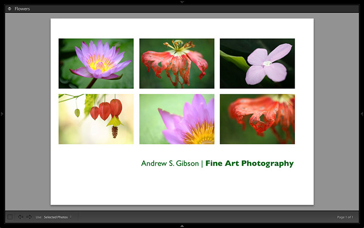
With a little imagination and know-how you can use the Lightroom Print module to create amazing layouts, which in turn you can use to create prints, postcards or even business cards. I’m going to give you a couple of examples, which you can copy or adapt to your own requirements. Let them inspire you to come up with your own creative designs!

Custom Layout #1: Single Image / Contact Sheet

This is the first custom layout we are going to create. It uses the Single Image / Contact Sheet Layout Style. With this Layout Style, each selected photo in the Collection is added to the layout just once, in the order that they appear.

Lightroom Print module

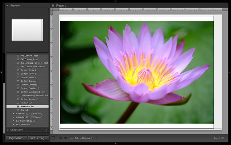
1. Maximize template

Go to the Template Browser panel in the Lightroom Print module and select the Maximize Size template. This simple template is an ideal starting point for creating your own layouts.

Note: I started with paper size set to A4 (click the Page Setup button to set paper size and orientation). If your paper size is different, you will require different measurements to those used here. The same applies if your page bleed area, which depends on the printer model, is different.

Lightroom Print module

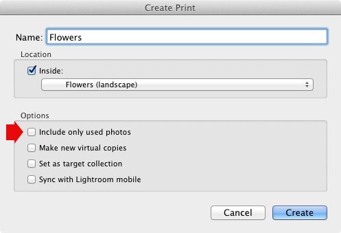
2. Save Print

Before you go any further, click the Create Saved Print button. The Create Print window appears. Give the print a name, and make sure the Include only used photos box is unticked. Click Create, and Lightroom creates a new Collection called a Print Collection (marked by a printer icon in the Collections panel) containing the photos in the original Collection. Now it’s impossible for you to lose your work – you can leave and come back to the Print Collection at any time.

Lightroom Print module

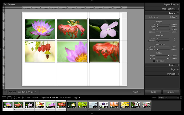
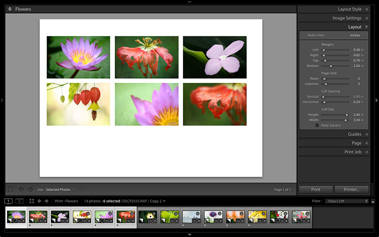
3. Set up the page layout

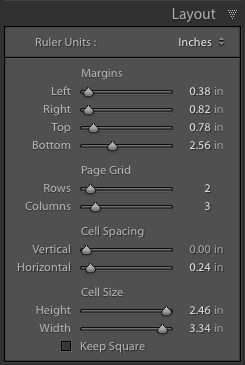
Go to the Layout panel and under Page Grid; set Rows to 2 and Columns to 3. Only selected photos appear in the layout, so in the Filmstrip, select the photos that you want to appear, clicking and dragging to rearrange the order if necessary. Note: If you select more than six images, Lightroom creates a second page to automatically fit them onto.

Adjust the Margins, Cell Spacing and Cell Size settings to add space between the photos and create the style you see below. The layout is shown both with the guides on and off (tick/untick the Show Guides box in the Guides panel) for clarity. Remember to centre the photos between the grey border representing the page bleed area, not the page itself.

Lightroom Print module

This screenshot shows the layout with Guides enabled. Note the page bleed area around the edge (shown in grey) and the black lines showing the dimensions of the Photo Cells.

Lightroom Print module

The layout is much easier to see with the Guides turned off.

The idea is to keep the spaces between the photos as even as possible (or as close as you can get according to the restrictions of your selected paper size). The settings I used are shown below, but yours may differ if you are using a different paper size, or if your photos have a different aspect ratio.

Lightroom Print module

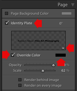
4. Set up the Identity Plate

Go to the Page panel and tick the Identity Plate box. Click the white arrow icon (down facing one) and choose a Styled Text Identity Plate to go at the bottom of the layout – if you don’t have a suitable one already, you can create a new one by selecting Edit from the menu. Tick the Override Color box and click the rectangle to the right of it to select a colour for the Identity Plate text.

Lightroom Print module

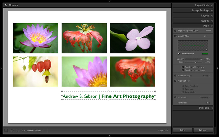
5. Set size of identity plate to match two columns

If possible, resize the Identity Plate so it is the same width as the last two columns. As long as the text doesn’t look too large or too small (you’ll have to exercise your own judgement), aligning it with the photos this way adds a professional touch to the design.

Lightroom Print module

Custom Layout #2: Custom Package

The Print module contains nine templates that work with the Custom Package Layout Style. This Layout Style is like the Single Image / Contact Sheet Layout Style, except that it lets you add the same image to a page more than once, and also overlap photos.

Another difference between the Custom Package Layout Style and the others, is that Lightroom doesn’t add photos automatically to the layout. Instead, you add them yourself by clicking and dragging them from the Filmstrip. This makes it easy to move photos around without having to rearrange them in the Filmstrip, and to add the same photo to a page more than once.

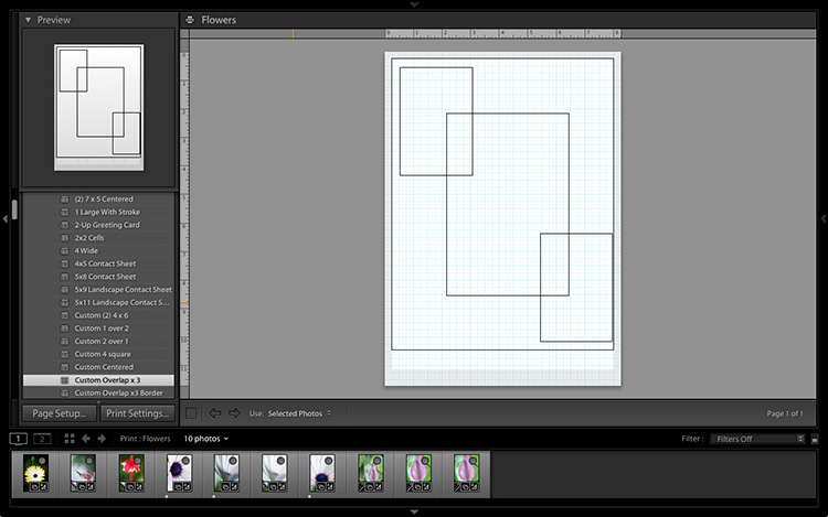
1. Select the Custom Overlap x3 template

Go to the Template Browser panel and select the Custom Overlap x 3 template. Don’t forget to click the Save Print button to create a new Print Collection.

Lightroom Print module

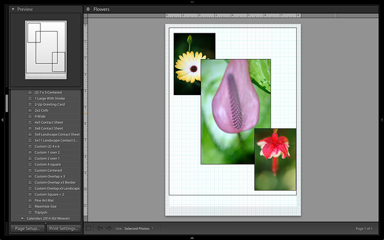
2. Add the photos by dragging and dropping them

Unlike the previous example the template doesn’t automatically populate with selected images. Instead, you have to click and drag photos from the Filmstrip. Here’s how it looks with photos added.

Lightroom Print module

3. Resize images to suit

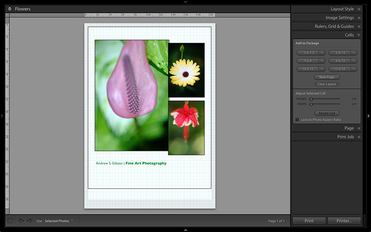
The overlapping images are less than ideal, but unlike the Single Image / Contact Sheet Layout Style used in the first example, you can drag and resize the Photo Cells to something that suits you. You can adjust the size of the Photo Cells precisely in the Cells panel (and add new ones), and keep them aligned by going to the Rulers, Grids & Guides panel and setting Grid Snap to Grid.

Right-click on a Photo Cell and select Send to Front to bring it on top of the others.

You can also add a Styled Text Identity Plate the same way as in the first example. A little tweaking enabled me to come up with the following design.

Lightroom Print module

Hopefully these examples will show you just how flexible the layouts in the Print module are when you take the time to explore the possibilities. But did you know that you can also create triptychs and calendars quite easily in the Print module? The following articles show you how to do it.

  • How to Create a 2015 Calendar in the Lightroom Print Module
  • How to Make a Triptych in Lightroom

The Mastering Lightroom CollectionMastering Lightroom ebooks

On sale now at Snapndeals: August 11-25th get 20% OFF Andrew’s ebooks – Mastering Lightroom Complete Collection: Lightroom 6 & CC Update. 

googletag.cmd.push(function() {
tablet_slots.push( googletag.defineSlot( “/1005424/_dPSv4_tab-all-article-bottom_(300×250)”, [300, 250], “pb-ad-78623” ).addService( googletag.pubads() ) ); } );

googletag.cmd.push(function() {
mobile_slots.push( googletag.defineSlot( “/1005424/_dPSv4_mob-all-article-bottom_(300×250)”, [300, 250], “pb-ad-78158” ).addService( googletag.pubads() ) ); } );

The post Two Useful Lightroom Print Module Custom Layouts by Andrew S. Gibson appeared first on Digital Photography School.


Digital Photography School

 
Comments Off on Two Useful Lightroom Print Module Custom Layouts

Posted in Photography


3 Useful Photoshop Techniques for Making Images Exposure Corrections

20 Jul
Title-correct-exposure

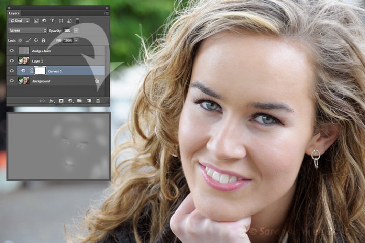
Using a Curves Adjustment Layer with the Blend Mode set to Screen to correct exposure in Photoshop.

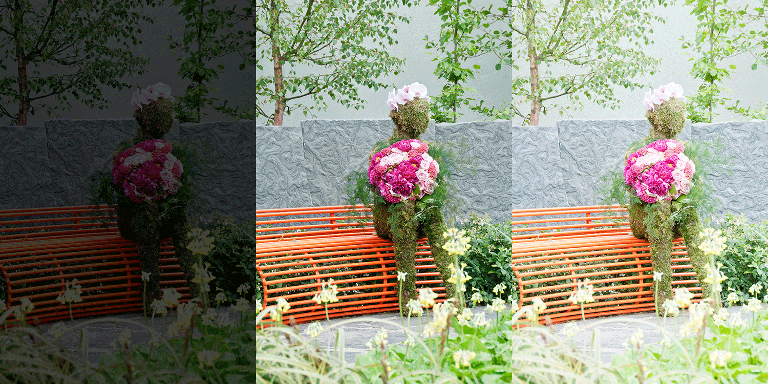
In general, where images are too dark, this is referred to as underexposed. Conversely, images that are too light are overexposed. Photos taken on sunny days are prone to being overexposed.

exposure

An animated gif to illustrate a correct exposure, an underexposed shot and an overexposed one.

In an ideal situation, the aim is to try and get the correct exposure in-camera. In doing so, less time will be spent in front of your computer post-processing.

In this article, I will describe how to easily correct photos that are underexposed (photos that are too dark) and overexposed (photos that too light) using Adjustment Layers and Blend Modes in Photoshop. I will then describe how the Dodge and Burn tools work to target specific areas to brighten or darken your image.

The following techniques are not new, but have been around for quite some time in Photoshop. The methods are still very effective, quick and easy to do.

  • Overexposed photos – Blend Mode: Screen with Curves Adjustment Layer.
  • Underexposed photos – Blend Mode: Multiply with Curves Adjustment layer.
  • Dodge & Burn tools – New Layer above the image filled with 50% gray – Blend Mode: Overlay/Softlight.

Read:  The First 3 Photoshop Blend Modes You Need to Understand

All of the images I used in this article are the jpegs straight out of the camera, completely unedited. I want to demonstrate how effective these techniques are when applied.

Correcting Overexposed Images

Becky-overexposed

A typical washed-out look from an overexposed photo.

As you can see, from the first overexposed shot. The subject has that washed-out look. The subject is overexposed by a stop and a half. I applied a Curves Adjustment Layer and changed the Blend Mode to Multiply. Straight away, the contrast of the image has dramatically increased.

Becky-curves-multiply

The result is quite dramatic when the Curves Adjustment Layer (with Multiply blend mode) has been applied, but there is a noticeable change in color shift.

The Multiply Blend Mode can cause a shift in color, but this is easily remedied. To adjust the color balance, go to the Properties panel (CS6) and choose the channel you want by clicking on the menu left of the Auto button. In this case, the color was too cool, so I adjusted the three channels (Red, Green and Blue) to get the result I wanted.

Becky-correct-exposure

The color balance has now been modified by adjusting the red, green and blue channels in the the properties panel for the Curves layer.

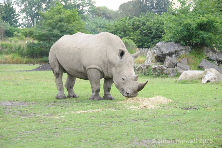
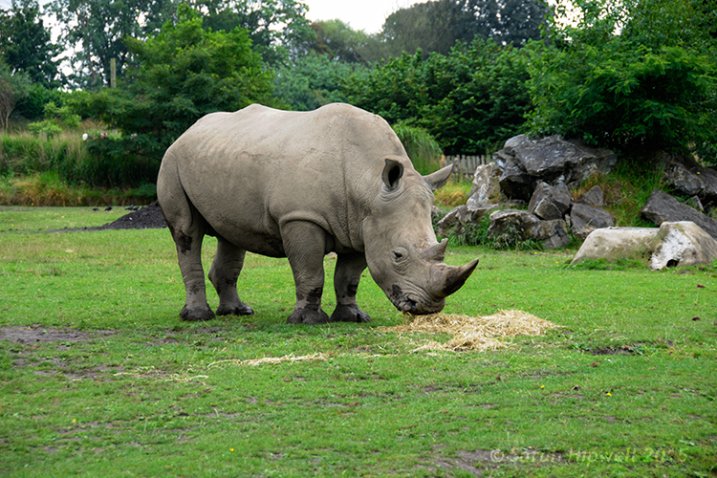
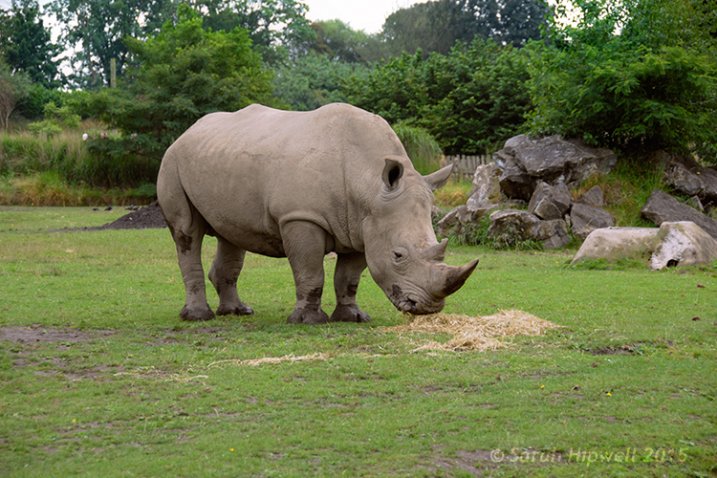
In the image of the Rhino below, when I applied the adjustment layer and changed the Blend Mode to Multiply, the effect caused a color shift to green, and the intensity of the effect was too dramatic. I adjusted the color balance by choosing the green and red channels in the Properties panel. I then reduced the Opacity to 55% of the layer to further fine-tune the image.

Rhino-underexposed

Overexposed photo of a Rhino taken at Dublin Zoo.

Rhino-curves-multiply

A Curves Adjustment layer with the Blend Mode set to Multiply.

Rhino-correct-exposure

I reduced the Opacity of the Curves Adjustment Layer as the effect was too much. I then adjusted the color balance by tweaking the red, green and blue channels.

Correcting Underexposed Images

Underexposed shots are typical when working outdoors on sunny days. Usually, the background is properly exposed but your subject is silhouetted. Similarly, if the background is washed out but your mode/subject is exposed correctly.

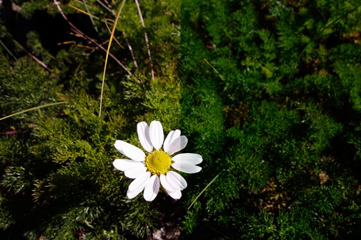
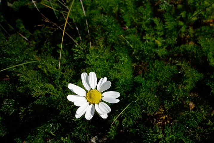
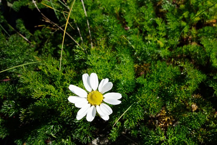
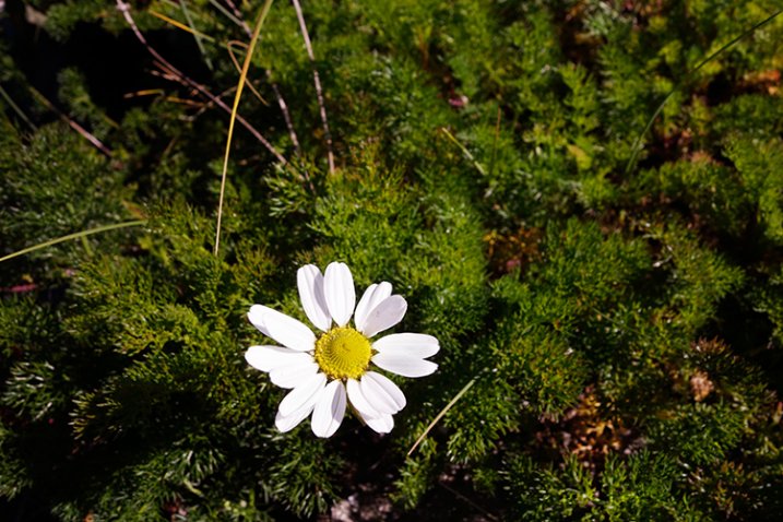
For example, the photo of the flower was taken at the beach on a very sunny day. I focused and exposed for the flower, which meant the background was way too dark. I applied a Curves Adjustment Layer and changed the Blend Mode to Screen. The shadows became lighter, but I duplicated this layer again as I wanted more detail in the shadows. (In most cases, this effect of using the one Adjustment Layer is enough but if your photo is very washed out, or very dark, you may need to duplicate the Adjustment Layer and adjust the opacity accordingly.)

flower-underexposed

An underexposed flower in green foliage.

I reduced the opacity of both layers and added a mask to bring back the highlights on the flower’s petals. Similar to the Multiply Blend Mode, the Screen Mode can cause a shift in color. In this instance, the photo had too much green. Similar to the photo above, I was able to adjust the color balance in the Properties panel and chose the green channel to modify the color balance.

flower-curves-screen

Two Curves Adjustment Layers were applied to this photo. I wanted to bring out more detail in the shadows.

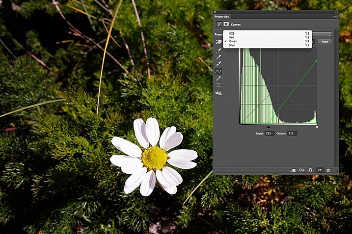
flower-changing-to-green-channel

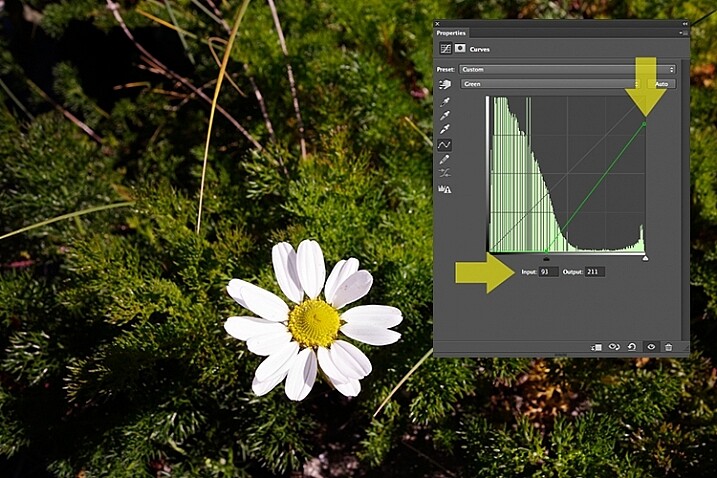
flower-input-output-sliders

By going into the different channels, it’s easier to target the specific colour that needs adjusting. In the image of the flower, I wanted to reduce the green colour. So by clicking on the top right point of the graph (output) and dragging it down. I then moved this Input slider to the right to bring in some magenta. As this an adjustment layer, you can play around with each of the colour channels and experiment using the input and Output sliders in an non-destructive way.

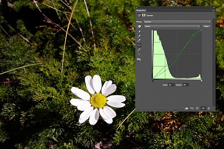
flower-green-channel-S-curve

A more accurate way would be to plot different points on the grid to get that classic S shape, which is what the Curves Adjustment is know for.

flower-correct-exposure

Opacity was reduced on each of the two Curves Adjustmnet layers. The green channel was adjusted to modify the color balance.

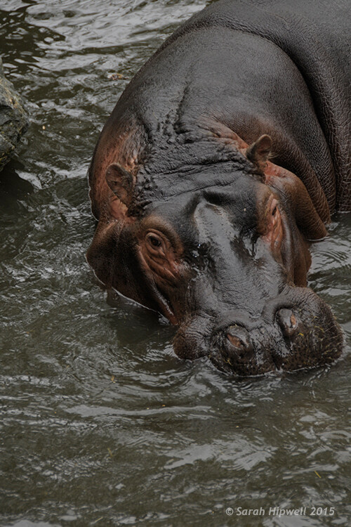
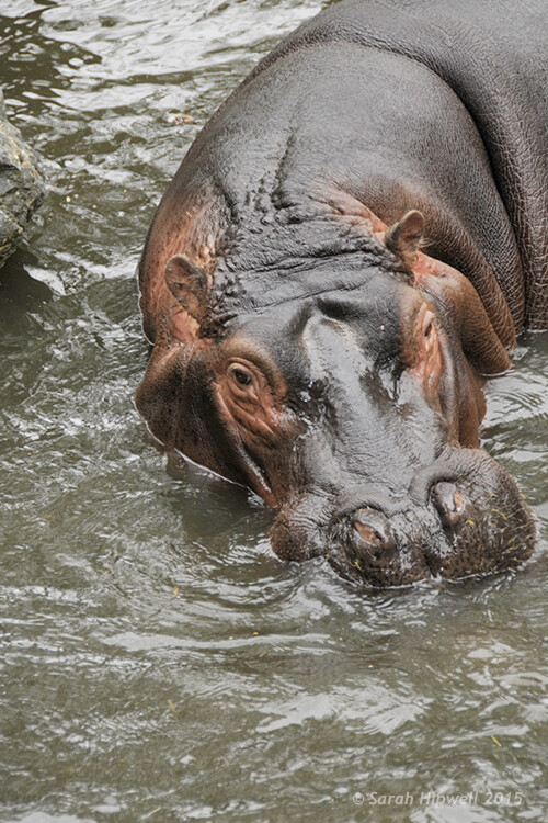
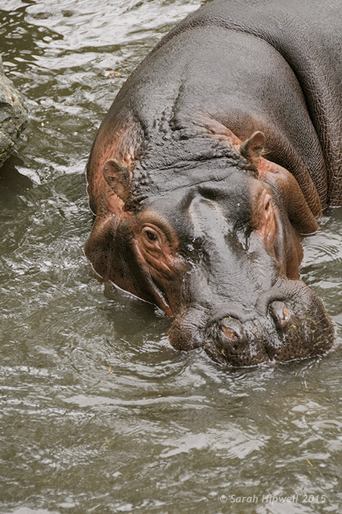
The shot of the hippo below was taken at Dublin Zoo and the day was quite overcast. As before, I added a Curves Adjustment layer and changed the Blend Mode to Screen. I then adjusted the red, green and blue channels to correct the color balance. I reduced the opacity on the Adjustment Layer only slightly.

Hippo-underexposed

A underexposed shot of a hippopotamus taken at Dublin Zoo

Hippo-curves-screen

A Curves Adjustment layer with the Blend Mode set to Screen.

The shot of the Hippo was taken at Dublin Zoo and the day was quite overcast. As before, I added a Curves Adjustment layer and changed the Blend Mode to Screen. I then adjusted the red, green and blue channels to correct the color balance. I reduced the opacity on the Adjustment Layer only slightly.

Hippo-correct-exposure

The Opacity was only slightly reduced for this image but the color balance again had to be adjusted in all the channels.

So by using an adjustment layer and changing the Blend Mode to Multiply or Screen, overexposed and underexposed shots can be easily fixed in a few steps. But what if specific areas of your image only need the exposure corrected?

Dodge and Burn

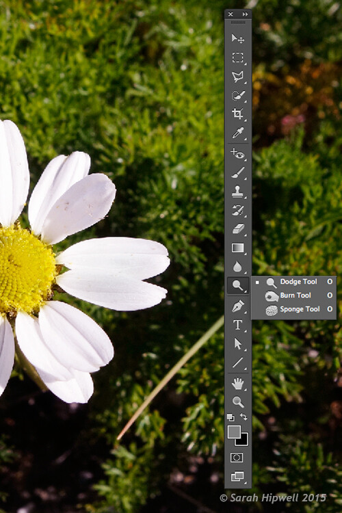
The Dodge tool lightens and the Burn tool darkens specific areas of your photo. This is why the Dodge and Burn tools are really useful if you don’t need to apply a global exposure correction.

I use these tools a lot in my workflow, it can create highlights in hair. When I shoot headshots, the eyes are important and the Dodge and Burn tools can also really enhance eyes and make them sparkle. Other forms or parts of the body can also be accentuated and given more depth by using these tools.

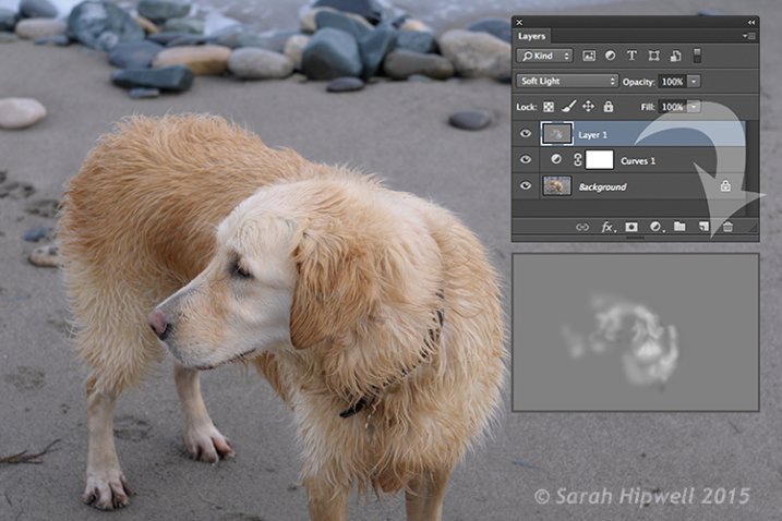
However, the Dodge and Burn tools, if used directly on a image, work in a destructive way. So to use these tools non-destructively, you will need to create a new blank layer above the image that you are working on, fill it with 50% gray and change the Blend Mode to Overlay or Softlight.

Dodge-Burn-tools

Where to locate the Dodge and Burn tools in Photoshop.

Before you begin, use a brush with the hardness set to soft (0-30). In the Tools Options Bar, make sure that you set the Range to Midtones, Exposure is set to low (8-10%) and that the Protect Tones is checked, as shown below.

Midtones+Exposure+Protect-Tonespsd

Set the Range to Midtones. Keep Exposure at a low setting. Make sure the Protect Tones box has been checked.

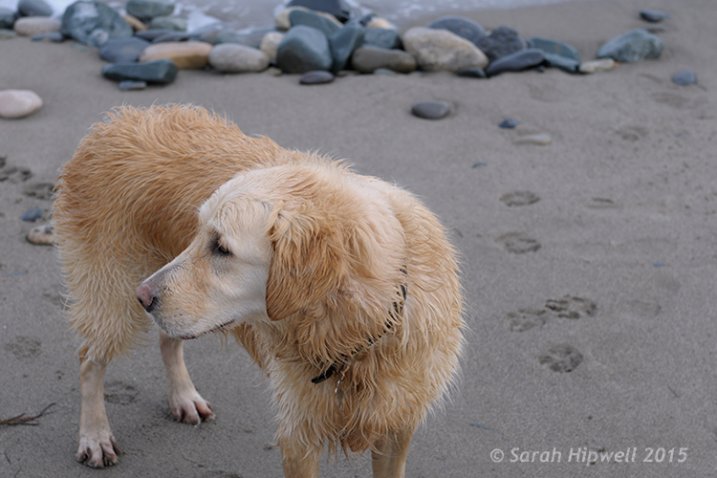
dog

In this photo of the dog, I want to create some highlights on the dog’s fur. Well, fur is like hair!

Dog-dodge-burn

You can see the difference in what a little dodging can do in this image of the dog with the photo above.

If you feel that you have overdone either the Dodge or the Burn tool, just lower the opacity of the layer.

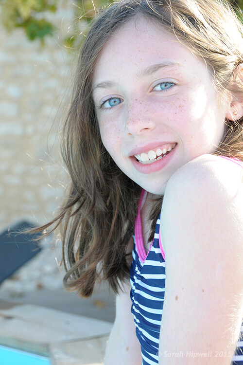
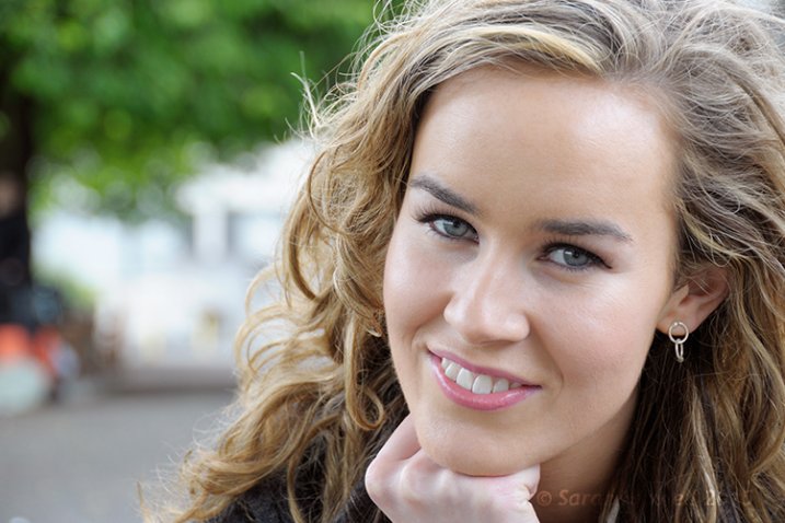
Lisa

Lisa, before any Dodging or Burning has been applied to the image.

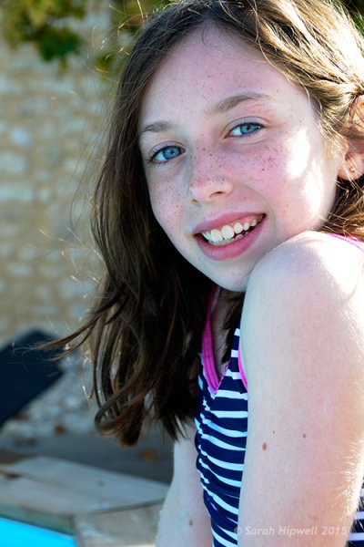
Lisa-dodge-burn

Just a little dodge and burn can make a difference to your photo.

Even subtle differences can enhance your images. In this image of Lisa, I applied some dodging to her eyes, I used the Burn tool to emphasize her lips. I then added a bit more dodging to the face and hair.

I hope you find these techniques useful? Maybe, you have some of your own? If so please share in the comments below.

googletag.cmd.push(function() {
tablet_slots.push( googletag.defineSlot( “/1005424/_dPSv4_tab-all-article-bottom_(300×250)”, [300, 250], “pb-ad-78623” ).addService( googletag.pubads() ) ); } );

googletag.cmd.push(function() {
mobile_slots.push( googletag.defineSlot( “/1005424/_dPSv4_mob-all-article-bottom_(300×250)”, [300, 250], “pb-ad-78158” ).addService( googletag.pubads() ) ); } );

The post 3 Useful Photoshop Techniques for Making Images Exposure Corrections by Sarah Hipwell appeared first on Digital Photography School.


Digital Photography School

 
Comments Off on 3 Useful Photoshop Techniques for Making Images Exposure Corrections

Posted in Photography


Five Useful Lightroom Keyboard Shortcuts

16 Apr

Lightroom shortcuts

Adobe makes life easier for Lightroom users by building in keyboard shortcuts. You probably know some of the more important ones by heart (e.g.: T to reveal or hide the Toolbar, \ to toggle between before and after views, and O to reveal the Adjustment Brush overlay). But I’m also betting there are quite a few shortcuts you didn’t even know existed. Here are some of the more useful, lesser known ones.

1. Reveal all Shortcuts

Keyboard shortcuts are difficult to remember, especially if you don’t use them that often. But if you press Ctrl + / (PC) or Cmd + / (Mac), Lightroom displays a list of the shortcuts available in the current module. When you’re done, click anywhere on the shortcut list to hide it.

Lightroom shortcuts

Library module shortcuts.

Lightroom shortcuts

Develop module shortcuts.

Note: The rest of these keyboard shortcuts are for the Develop module. Not all of them are shown on the shortcuts list.

2. Rotate the Crop Overlay

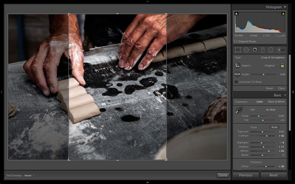
If you’ve ever tried to make a portrait crop from a landscape image you’ll have experienced the frustration of trying to rotate the Crop Overlay (press R to go straight to that tool).

Lightroom automatically gives the Crop Overlay the same orientation as the photo, with no immediately obvious way of rotating it. To do so, simply press X.

Lightroom shortcuts

By default the Crop Overlay is automatically given the same size and orientation as the original frame.

Lightroom shortcuts

Press X to rotate the Crop Overlay and make an extreme crop.

3. Resample Spot Removal Tool

The good thing about the Spot Removal Tool (which you can activate by pressing Q) is that Lightroom is quite good at guessing which part of the image it should sample, in order to heal the selected area. But it doesn’t get it right all the time. If you don’t like the result, press the / key and Lightroom will choose a different area to sample. Repeat as often as you like.

Lightroom shortcuts

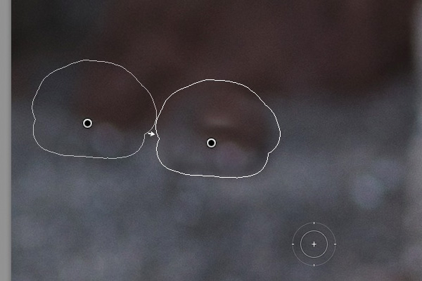
In this example I wanted to get rid of this dark blob in the background because it’s a distraction.

Lightroom shortcuts

Lightroom’s first guess doesn’t really work.

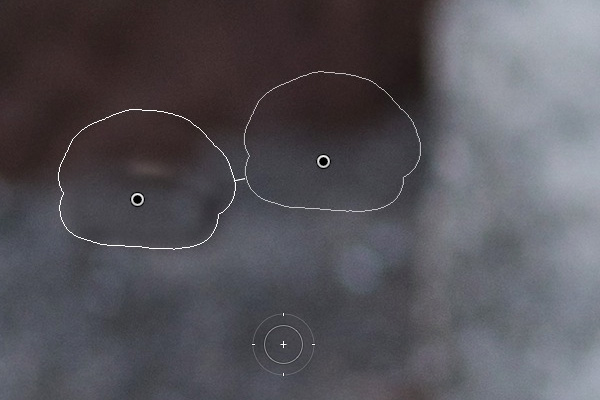
Lightroom shortcuts

But the second one is much better. You can of course fine-tune it by moving the pin indicating the sampled area manually.

4. Automatic White and Black points

If you double-click on the Whites and Blacks sliders in the Basic panel, Lightroom resets them to zero. If you hold the Shift key down while you do it, Lightroom calculates the best settings, working out where to position both sliders so that the histogram stretches all the way from the left side of the graph (shadows) to the right (highlights) without any gaps. This quick fix makes most photos look better right away. The flatter the original photo, the more extreme the settings required.

Lightroom shortcuts

Double-click the Whites and Blacks sliders while holding the Shift key down. Make sure you double-click the words and not the slider itself.

5. Flip a Graduated Filter

Press the apostrophe key to flip (invert) a Graduated Filter. One practical use for this is as follows:

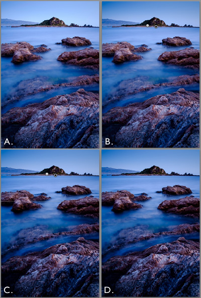
  • Create a Graduated Filter over the sky of a landscape image (hold the Shift key down while you do so to keep the Graduated Filter straight) and move the Exposure slider left to darken that area.
  • Right-click on the Graduated Filter’s pin and select Duplicate. This creates a new Graduated Filter with exactly the same settings as the first.
  • Press the apostrophe key to flip the Graduated Filter. Now the minus Exposure setting is applied to the foreground. We don’t want to make the foreground darker, so double-click the Exposure slider to return it to zero. Now we are ready to use this new Graduated Filter to enhance the foreground.
  • Move the Clarity slider right to emphasise the texture in the foreground. You may also need to move the Exposure slider left if this brightens the foreground too much.

The net result is that you have applied two Graduated Filters, one to the sky, and the other to the foreground.

***By the way, the apostrophe shortcut also works with the Radial Filter.

Lightroom shortcuts

(A) Original photo. (B) Graduated Filter with minus Exposure applied to sky. (C) Duplicated and flipped Graduated Filter applied to foreground, with plus Clarity and minus Exposure. (D) Final result.

Your turn

What keyboard shortcuts do you use in Lightroom and why? Please let us know in the comments.


The Mastering Lightroom Collection

Mastering Lightroom ebooksMy Mastering Lightroom ebooks will help you get the most out of Lightroom 4 and Lightroom 5. They cover every aspect of the software from the Library module through to creating beautiful images in the Develop module. Click the link to learn more or buy.

googletag.cmd.push(function() {
tablet_slots.push( googletag.defineSlot( “/1005424/_dPSv4_tab-all-article-bottom_(300×250)”, [300, 250], “pb-ad-78623” ).addService( googletag.pubads() ) ); } );

googletag.cmd.push(function() {
mobile_slots.push( googletag.defineSlot( “/1005424/_dPSv4_mob-all-article-bottom_(300×250)”, [300, 250], “pb-ad-78158” ).addService( googletag.pubads() ) ); } );

The post Five Useful Lightroom Keyboard Shortcuts by Andrew S. Gibson appeared first on Digital Photography School.


Digital Photography School

 
Comments Off on Five Useful Lightroom Keyboard Shortcuts

Posted in Photography


How a Step Ladder is Useful for your Photography

11 Jan
An-assistant

The invaluable photography assistant

Normally assistants play a key role on commercial shoots. They are integral to the team effort that is required to ensure a photo shoot goes as planned. They do a lot of the donkey work; moving lighting gear from one position to another; lugging camera gear around in general, and much more. The work of an assistant is unglamorous, tedious, and the hours are long.

Assistants salaries will vary according to their level of skill, experience and employer, and they generally work freelance.

When you are starting out in your photography career/hobby, a lot of time you are working solo trying build a nice portfolio, be it portraits, stock, etc. You don’t need to hire an assistant but an extra pair of hands is always welcome.

I’ll paint a scenario. You have enlisted a family member or friend to volunteer for some portrait shots outdoors. You’ve also got another friend to help out as you need that extra pair of hands to hold a reflector. This is great way to keep costs down.

However, such is life, your friend can’t make it on the day planned for the shoot. He/she has been struck down with a tummy bug! Blast, now what do you do? I’ve yet to work out how to hold a reflector and press the shutter button at the same time.

Here are some of your options:

  1. You can still go ahead and work solo – you may not get the required lighting on your subject but you are getting the shooting practice which is always a good thing.
  2. Use your cell phone to call yet another friend.
  3. Ask a blank stranger who happens to be walking by.

The first option is probably the safest. The other two require potentially losing a friend and trusting a blank stranger is risky.

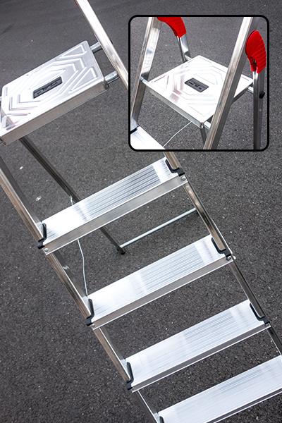
Let me introduce you to the 5-step aluminium ladder. This is by no means a replacement for an actual pair of hands. But I have found it quite useful, and anything that helps is better than nothing at all.

5-Step-Aluminium-ladder

This 5-step aluminium ladder is very versatile and extremely lightweight.

 5 tips for using a step ladder in photography

  1. Portability – This particular ladder that I have weighs only 4.2kg/9.2Ibs. It can fit into my Volkswagon Golf car on the inside. If you have a roof rack, this is a better option, as it is so light to put it up and take it down. It is extremely easy to move it around with one hand.
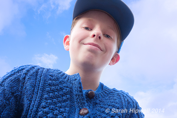
  2. Point of view – Getting that extra height for an overhead shot by standing on the fourth step and resting your knee on the top platform gives you more stability. A small child could sit on the top shelf and you could get a nice shot from underneath with a blue sky as the background.
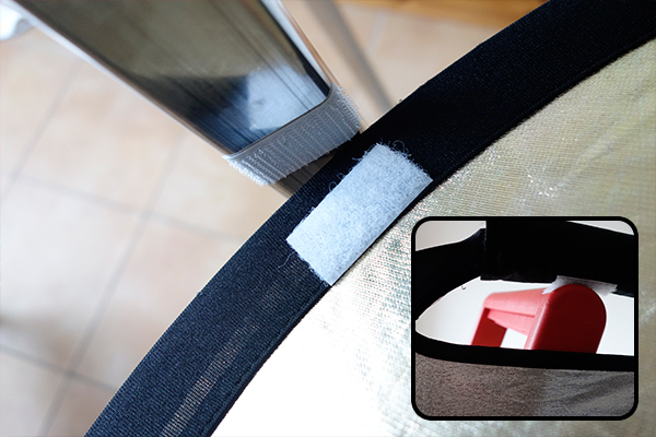
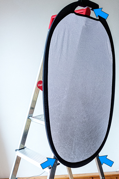
  3. Reflector holder – I find using reflectors for taking portrait shots indispensable, especially outdoors. For my reflector, I cut three self-adhesive velcro strips and attached them to the reflector and to the corresponding areas on the ladder. Once in place, you can then direct your subject from behind the camera on how far or near they stand next to the reflector. I tried it out on a really windy day. The day was overcast and I chose a spot under a tree to really test out the reflector. The reflector was securely attached using the velcro strips but as the ladder is so light, it was inclined to take off in the wind. I placed my camera bag on the top rung of the ladder which acted like a sandbag to stabilize it. Although crude, it did work.
  4. Helps eliminate camera shake – Hand holding your camera and resting your elbows on the top platform helps to reduce camera shake and provides added stability when holding your camera.
  5. As a make-shift light stand – You want to use one of your flashes off-camera but you have forgotten your light stand. Light stands can topple over if there is a gust of wind. Although, you could use sand bags arranged around the base of the stand to make it more stable. But, that is assuming you have such an item(s) or thought to bring them in the first place! This is where the extra pair of hands is great to hold the light stand.
POV_worm_eye_view

The top rung of this ladder is quite narrow, so there is only room for a small child.

Velcro_strips_on_reflector_and_ladder

Velcro self-adhesive strips on the reflector and on one of the ladder legs.

Shot_reflector-in-place

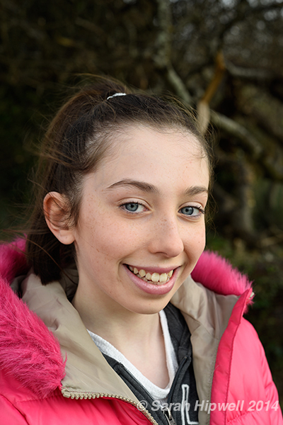
The reflector is attached to the ladder on left of the subject.

reflector_ladder_self-adhesive_velcro-tape

The reflector is attached to the ladder using three self-adhesive velcro strips.

The design of this ladder is very stable considering how light weight it is.

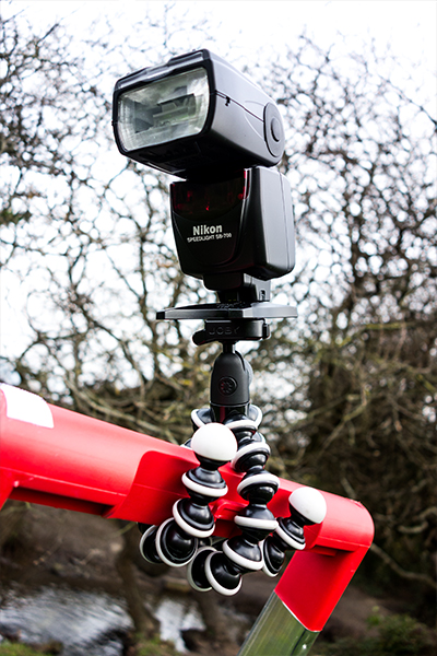
I really love this Joby tripod where you pop on your flash and wrap it around the top part of the ladder. It is then easy to move the head of the flash in the direction you want.

Flash_on_ladder

Flash attached to the ladder using a Joby tripod.

This type of ladder can be found in most people’s garages. Even if you don’t use it for your photography, it is still a very useful item to have. At this time of year, if you buy fir trees to decorate with baubles, tinsel and fairy lights, a step ladder is handy to put that star or whatever on top. In a few weeks time, you’ll need that step-up to take it down.

googletag.cmd.push(function() {
tablet_slots.push( googletag.defineSlot( “/1005424/_dPSv4_tab-all-article-bottom_(300×250)”, [300, 250], “pb-ad-78623” ).addService( googletag.pubads() ) ); } );

googletag.cmd.push(function() {
mobile_slots.push( googletag.defineSlot( “/1005424/_dPSv4_mob-all-article-bottom_(300×250)”, [300, 250], “pb-ad-78158” ).addService( googletag.pubads() ) ); } );

The post How a Step Ladder is Useful for your Photography by Sarah Hipwell appeared first on Digital Photography School.


Digital Photography School

 
Comments Off on How a Step Ladder is Useful for your Photography

Posted in Photography


5 Useful Tools to Run Your Holiday Promotions for Christmas 2014

12 Dec

Christmas is around the corner. Holidays are a great opportunity to promote your photography brand as most people strive to capture those special moments with magic Xmas feeling running all through. So make a game plan, grab some tools, and go ahead to make the most out of this busy season. In today’s list we collected 5 online marketing tools Continue Reading

The post 5 Useful Tools to Run Your Holiday Promotions for Christmas 2014 appeared first on Photodoto.


Photodoto

 
Comments Off on 5 Useful Tools to Run Your Holiday Promotions for Christmas 2014

Posted in Photography


10 Useful Guides on How to Shoot Cars Like a Superstar

12 Sep

If diamonds are women’s best friends, than cars are certainly men’s. Cars are attractive in many ways: the interior and exterior style, the sounds they produce and speed they’re able to achieve. Car photography is not that easy task as it may seem from the first glance. Various techniques are used on whether car is moving along the street or Continue Reading
Photodoto

 
Comments Off on 10 Useful Guides on How to Shoot Cars Like a Superstar

Posted in Photography