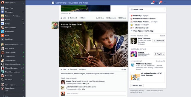
I got the new Facebook news feed last night. The screenshot above is what it looks like. It’s super awesome. A very small minority of people will hate it — because a very small minority of people will hate EVERYTHING. I’m not kidding. The way some people love to bitch blows my mind sometimes. Haters gonna hate.
Most of you will love it though. I think it’s the most significant improvement made to Facebook since Facebook started. If you’re a photographer, you especially will love it. Photos are bigger. Bigger photos have more impact. Bigger photos look better.
When you’re eligible for it you’ll notice a little “coming soon, less clutter, more stories” box on your news feed. There is a green button to press to give it a try. If you press that green button you get the loading message. I think there was one other notice window that popped up telling me that I couldn’t go back if I went forward with it, but I can’t remember 100% on this. After this loading box the new news feed pops up.
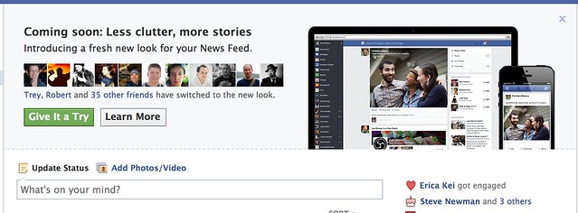
Woah! What’s this?
Almost there!
I’ve only played with the new news feed for a few hours, but here are just a few early observations.
1. Content in the new news feed feels ALOT like Google+. I’m not saying Facebook copied Google+ here, and imitation is, of course, the sincerest form of flattery and all that, but check out the two content envelopes side by side in the photo below. They are pretty darn close.
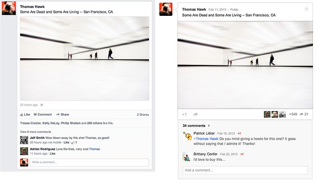
Separated at Birth. Facebook new news feed on the left, Google+ on the right. Or wait, is it the other way around?
Personally speaking I have no problem with this by the way. I love competition on the web. With competition users win. Everybody should rip everybody off and make everything look as awesome as it possibly can.
2. Pictures are bigger and stand out more, but unfortunately so do all of those crappy memes and worse, sponsored posts (ugh! advertising — the new advertisement for McDonald’s new fish McNuggets feels even more intrusive). Please Facebook, let us pay you for a Pro account and let us opt out of all the horrible ads.
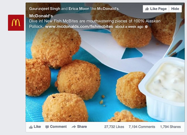
That’s an awfully big advertisement for those new Fish McNuggets that McDonalds is selling.
The meme’s are really my own fault though. When I started Facebook years ago, I simply accepted every single friend request, whether I knew somebody or not. Hey, I’m a friendly guy. I now realize that was a mistake. I think as I unfriend the most egregious of the meme sharers this should improve a bit for me.
Sometimes though there is just that one person that for whatever reason you CAN’T unfriend. You know who I’m talking about. They’d take it really hard. Yet it’s that one person who keeps sharing the crappiest meme things on Facebook 50 times a day. If you’re that guy, knock it off. Sometimes I wish there was an easy way to permanently hide someone’s content without actually unfriending them.
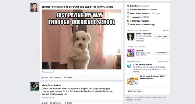
Attack of the killer Facebook meme’s, now even bigger than ever!
Hey it’s a dog, hey it’s stripping. AWESOME!!!! I think I’ll reshare this on Facebook!
3. The hide button is broken. One of the things that I like about Facebook is their move fast and break things moto. Sometimes though this means that everything doesn’t work so well. I haven’t been able to reposition photos on my timeline for weeks now. My wife can’t upload photos directly to Facebook at all. She has to upload to an album and share from the album.
What I’ve found on the new news feed is that when I hide content, it doesn’t stay hidden. It stays hidden for that session, but if I refresh the page it comes back. I don’t know if this is just a bug for me or for everyone, but if I actually HATE something enough to hide it, I really, really don’t like it — and after I went through the pain of a two click effort, I’d really like it to stay permanently hidden from my news feed.
4. I still haven’t figured out exactly how Facebook is repositioning photos that are less ideal for their new envelope. It seems like some portrait aspect and square aspect photos are being stuffed into a landscape frame. It also seems like some are not though — it’s weird why some are and some aren’t. I wonder if there is some sort of algorithm at play here as well, because when photos are repositioned, a lot of the time it’s a pretty smart natural reposition. Like Facebook is focusing on the eyes in photos of people.
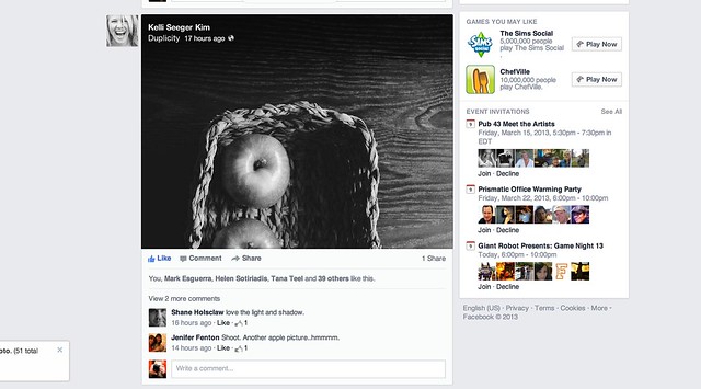
The apple screensheet below is from my friend Kelli Seeger Kim. It’s actually a portrait oriented photograph of two apples in a basket. If you click through the image you’ll see it correctly, but in the news feed the crop is less than ideal. So sometimes this feels a little awkward.
Overall the new design is clean and light and lovely. It feels very smooth and really nice. Photos really pop now that they are bigger. I’d give this redesign two thumbs up!
Congrats to the Facebook team on the great work! You can find me on Facebook here. Come find me and let’s be friendly.
Thomas Hawk Digital Connection

















You must be logged in to post a comment.