RSS
 

Posts Tagged ‘Trick’

The Rule of Odds in Photography (An Easy Trick for Better Compositions)

03 Mar

The post The Rule of Odds in Photography (An Easy Trick for Better Compositions) appeared first on Digital Photography School. It was authored by Rick Ohnsman.

the rule of odds in photography

When you create a photograph, you’re hoping to manipulate the mind of your viewer.

While photos are simple, two-dimensional representations of reality, you – as the photographer – hope to let the viewer see what you saw, feel what you felt, and experience the world as you did.

And that’s what the rule of odds in photography is all about:

Tapping into the brain of the viewer to create a more pleasing composition.

So if you’d like to make better photos, read on!

The rule of odds in photography - three tulips
The choice of three tulips for this shot was very purposeful. I tapped into the rule of odds!

What is the rule of odds in photography?

The rule of odds states that, whenever possible, a composition should have an odd number of objects, not an even number of objects. So an image should have three flowers rather than two, and five people rather than four.

Why?

The rule of odds taps into the brain’s propensity to create order.

You see, when viewing a group of objects, we unconsciously want to group them in pairs.

But when we’re faced with three, five, or seven objects in a photograph…

…we have a group that can’t be easily organized.

With an odd number of objects, one may become dominant. At the very least, the viewer will look longer at the image, moving between the individual elements.

That is the power of the rule of odds in photography:

It creates a composition that makes the viewer’s brain work a little harder and look a little longer.

The rule of odds in photography - three umbrellas
Three repeating shapes play to the rule of odds. You can line them up…
three flowers in an implied triangle
…or arrange them to form an implied triangle, as with these three flowers.
three apples

Three, five, or seven objects can work well.

Once you move beyond these single-digit numbers, we tend to treat all of the objects as a group – even if they’re odd.

the rule of odds in photography - five bottles
Five objects also adhere to the rule of odds!

Creating compositions with the rule of odds

Certain genres of photography give you, the photographer, complete power over your composition.

So you can arrange and compose your scene to include an odd number of subjects.

You can also arrange the odd number of subjects in pleasing ways; for instance, you can include strong compositional elements such as lines and triangles. In fact, these compositional tools are one more way to tap into the viewer’s brain as it works to find lines and patterns.

Often in still life compositions, we have the ability to arrange our subjects, choosing what, where, and how many objects are placed.

And that makes it easy to apply the rule of odds, as I did in the photo below:

rule of odds still life with lantern
When you set up a still life photo, you have full control over what to include and exclude. Here, the lantern, gloved hand, and pickaxe are the three key elements in this composition, so it follows the rule of odds.

Of course, it’s not enough to think only about the number of objects. You still need to think about natural pairs, because while a cup, a saucer, and a spoon might make a pleasing composition, a cup, a saucer, and a screwdriver would likely puzzle your viewer – even though it follows the rule of odds!

violin, music, and flower still life
It was no accident that I chose a stem of flowers with three roses. And note the three objects in this light-painted still life: the violin, the sheet music, and the flowers.

Flowers can make great subjects for tapping into the rule of odds. If you are arranging the flowers in the scene yourself, think about using a group of three or five rather than an even number.

If you’re shooting flowers in nature, perhaps you can frame your shot to include an odd number of subjects. (You could also clone out a flower afterward.)

three flowers together
This was a matter of framing the shot to include just these three flowers.
three leaves with water droplets
In this case, I framed the shot to only include three leaves.
tree before a lake
This triple-trunked tree was a perfect rule of odds subject.

The rule of odds for other subjects

Out in nature, perhaps shooting landscapes, you usually don’t have the option of moving around subjects.

Instead, spend time exploring your scene – and find compositions that take advantage of the rule of odds in photography.

When shooting outdoors, see what you can do to create compositions with an odd number of major objects, be it mountain peaks, trees, rocks, or clouds.

Note that you can still apply the rule during post-processing; if you have four elements instead of three, you can always clone one out, as I did in the image below:

four birds cloned down to three
The three posts worked well for this rule of odds shot, but four birds were on the front post. No problem; just clone one out! Do you agree that three is better than four?

Whether you’re composing in the field or editing on your computer, the rule will usually still apply. An odd number of objects will create a stronger image.

three seagulls for the rule of odds
There was a whole flock of gulls perched on this fence, but cropping down to just these three let me follow the rule of odds.
the rule of odds in photography - three Canada geese
This shot was mostly about the great reflections in the water, but the three geese worked with the rule of odds and enhanced the story.
groups of rocks on the sand
Three or five? The top shot was the original composition. There are six rocks, but because two of them are closely grouped, you could consider them five objects. Still, I think the cropped version – with just three rocks – is better.
seascape with huge rocks
When you can’t move objects, such as in landscape photography, you can still take advantage of the rule of odds. Just keep it in mind when composing your shot.
four trees on the left and three trees on the right
The simpler shot at the right has just three objects. It works better than the shot at the left with four.
windows in a row of five
The same goes for architectural photography. Here, the five-in-a-row repetition works well.
the rule of odds in photography -three bikers in a race
We’re used to a first, second, and third place winner in sporting events. So not only did the rule of odds improve the composition, but it also helped tell a story!
kayak racers
The original shot contained six kayak racers. I cloned one out to drop the count to five.

Exceptions to the rule

Do photography for a while, and you’ll hear all kinds of “rules” – the rule of thirds, the reciprocal rule, the left-to-right rule, and all manner of other compositional and camera operation rules.

Of course, there are always exceptions to the rules. And there are times when it’s good to break the rules for an even better composition.

So when should you break the rule of odds?

First, when photographing people, you shouldn’t always stick to the rule. If you’re shooting a couple, then it wouldn’t make sense to have a third person (and this, in fact, would lend a new meaning to the rule of “odds”).

Of course, should that couple have a child, great; the group of three would make a nice rule of odds composition. Then, if the couple were to have another child, you’ll have to find a different way to pose them that works around the rule of odds.

Here’s another time to break the rule of odds:

If you’re taking a photo of Mount Rushmore. Who are you going to leave out to adhere to the rule of odds?

Therefore, the rule of odds should be like the rule of thirds. Use it when it works to enhance your composition, but don’t feel constrained by it if your subject just doesn’t permit its use.

five men in front of a train
It was just luck that this group consisted of five guys, but it was helpful for composing the shot.
three police officers with lights and guns
Triple threat. There just happened to be three individuals in this group, and who was I to argue?

The odd one

Perhaps you’ve heard the song on Sesame Street, “One of these things is not like the others.” It’s a little game the show uses to teach children observational thinking.

Well, you can play a similar game with the mind of a viewer.

Simply seek out scenes and compositions where something in the image is odd, different, out of place, or doesn’t match.

Such images can be powerful. They engage the mind of your viewer, drawing attention to the odd object and making your viewer look a little longer at your photo.

The rule of odds in photography - one dark tree in front of lighter rows of trees
Which of these things is not like the others? The nonconformist tree makes for a more interesting image.

Does the power of an “odd one out” image have anything to do with the number of objects in your photo? It might, or it might not. Perhaps it doesn’t conform to the standard definition of the rule of odds.

Still, it’s a powerful technique, and a great way to make captivating photos that engage your viewer.

The rule of odds in photography - one pink flower surrounded by yellow flowers
Where does your eye immediately go in this shot? Yeah, I confess that I colored the one flower pink – but the point is that the odd one out immediately becomes the focus of attention.

The rule of odds in photography: Final words

When someone tells you your photos are odd, take that as a compliment!

Seriously, they aren’t likely to say that, but if you can find ways to embrace the rule of odds in photography, you will have another trick in your bag.

Not only is it hip to be square, but it’s also cool to be odd!

Now over to you:

What do you think of the rule of odds? Will you try it out in your compositions? Do you have any rule of odds photos that you’re proud of? Share your thoughts and images in the comments below!

What is the rule of odds?

The rule of odds states that an odd number of objects in a photograph (3,5,7, etc.) will be more engaging to the viewer than an even number of objects.

In what kind of photography is the rule of odds most easily used?

Probably still life photography, where you have full control over the number of objects in your shot and how they are arranged.

Can I use the rule of odds in landscape photography?

Yes, you often can! Even when you can’t move objects in your scene, you can carefully compose and frame your image to capitalize on an odd number of subjects.
Sometimes, you can also crop your image in editing or add/remove objects to create an odd number of subjects.

What is the “odd one out” method of composition?

A good technique can be to look for things that break the norm or “stand out” because they’re different from the rest of a photo. Such objects will immediately draw the viewer’s eye and become the focal point in your photo. Think of a red flower in a field of yellow ones, a fork in a line of spoons, and maybe a baby chick in a carton of eleven eggs, and you’ll get the idea.

The post The Rule of Odds in Photography (An Easy Trick for Better Compositions) appeared first on Digital Photography School. It was authored by Rick Ohnsman.


Digital Photography School

 
Comments Off on The Rule of Odds in Photography (An Easy Trick for Better Compositions)

Posted in Photography


Samyang’s new compact AF 75mm F1.8 FE lens has a neat little trick up its sleeve

22 Apr

Samyang (also branded as Rokinon and Bower in other markets), has released its new AF 75mm F1.8 FE lens for full-frame Sony camera systems.

Aside from the rather unusual focal length (I think we can all appreciate the decision not to add yet another 85mm FE lens to the market), the lens has another interesting feature. On the barrel of the lens, Samyang has included a ‘Custom’ switch that will turn the ring on the barrel from a focus ring (Mode 1) to an aperture ring (Mode 2). It’s not a dedicated aperture ring, but the ability to switch on-the-fly is a nice addition, especially for a lens from a budget manufacturer.

Onto the more standard specifications, the lens is constructed of ten elements in nine groups, including two high-refractive (HR) elements and three extra-low dispersion (ED) elements. It offers an aperture range between F1.8 and F22, has a minimum focusing distance of 69cm (27″), features a nine-blade aperture diaphragm and uses a 58mm front filter thread. The lens weighs just 230g (8oz) and measures in at 65mm in diameter (2.56in) and 69mm (2.72″) long, making it an incredibly compact and lightweight lens for its focal length.

Below are a few sample photos, provided by Samyang:

$ (document).ready(function() { SampleGalleryV2({“containerId”:”embeddedSampleGallery_8520968293″,”galleryId”:”8520968293″,”isEmbeddedWidget”:true,”selectedImageIndex”:0,”isMobile”:false}) });

Samyang hasn’t shared pricing or availability information yet, but we have contacted the manufacturer and will update the article accordingly when we receive a response.

Articles: Digital Photography Review (dpreview.com)

 
Comments Off on Samyang’s new compact AF 75mm F1.8 FE lens has a neat little trick up its sleeve

Posted in Uncategorized


Video: Adobe Lightroom trick makes it easy to search images for sensor spots

04 Jan

Professional photographer Anthony Morganti of ‘I Am Mr Photographer’ has published a new video that shows viewers how to systematically search for sensor spots (or water droplets and other unwanted specks) in an image using Adobe Lightroom Classic. The method is very simple and relies on a few keyboard shortcuts, as Morganti explains in his video.

Using this method, Lightroom users zoom in on the image and set the zoom box to the upper left-hand side of the image. From there, Morganti simply uses his computer’s Page Down function to scan through zoomed portions of the image in columns. The video includes instructions for viewers using Mac and viewers whose keyboards lack dedicated shortcut keys, among other things.

Articles: Digital Photography Review (dpreview.com)

 
Comments Off on Video: Adobe Lightroom trick makes it easy to search images for sensor spots

Posted in Uncategorized


How To Trick Someone Into Thinking You’re Really, Really, Ridiculously Photogenic

04 Oct

In a world of digital keepsakes and endless selfies, there’s a definite pressure to be camera-ready at any moment. Between Youtuber friends and Instagram-addicts, you never know when you’ll next be thrown under the lens, so it never hurts to have a few tricks up your sleeve to help you look as good as you can, and feel happy with Continue Reading

The post How To Trick Someone Into Thinking You’re Really, Really, Ridiculously Photogenic appeared first on Photodoto.


Photodoto

 
Comments Off on How To Trick Someone Into Thinking You’re Really, Really, Ridiculously Photogenic

Posted in Photography


Photo Pranks To Trick Your Pals

29 Mar

It’s April Fools’ Day!*

*APRIL FOOLS. It’s really not till Friday.

You still have time to plan the perfect photo prank.

So, we’ve rounded up our favorite ways to trick our buddies. Oh, and there’s a spider on your shoulder.

(…)
Read the rest of Photo Pranks To Trick Your Pals (0 words)


© laurel for Photojojo, 2016. |
Permalink |
No comment |
Add to
del.icio.us

Post tags:


Photojojo

 
Comments Off on Photo Pranks To Trick Your Pals

Posted in Equipment


Trick Photography: Creating Appealing Illusions with Your Camera

16 Apr

Trick photography – creating appealing illusions with your camera Trick photography helps in creating an illusion of the scene through the ideas of the photographer. While there’re many, some of the popular trick photography ideas include tilt-shift, infrared, high speed, light painting, zoom & panoramic photography. Trick photography is a way to make a scene look more appealing and attractive Continue Reading

The post Trick Photography: Creating Appealing Illusions with Your Camera appeared first on Photodoto.


Photodoto

 
Comments Off on Trick Photography: Creating Appealing Illusions with Your Camera

Posted in Photography


Deceptively Reflective: 12 Mirrored Buildings Trick the Eye

18 Dec

[ By Steph in Architecture & Houses & Residential. ]

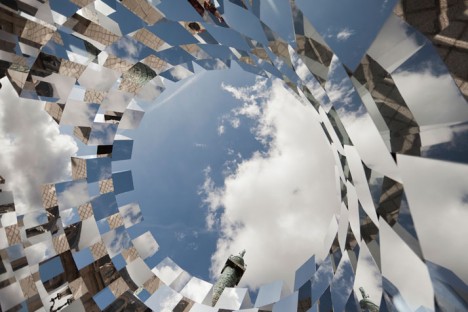
mirror buildings ring lapierre 3

Intentionally fooling the eye to either completely disorient you or focus your vision on a certain part of a scene, these mirrored buildings reflect their surroundings, often seeming to disappear entirely when viewed from certain angles. Hopefully, all of these deceptive reflective surfaces aren’t killing too many birds.

Reflective Roadside Cafe
mirror buildings roadside cafe 1

mirror buildings roadside cafe 2

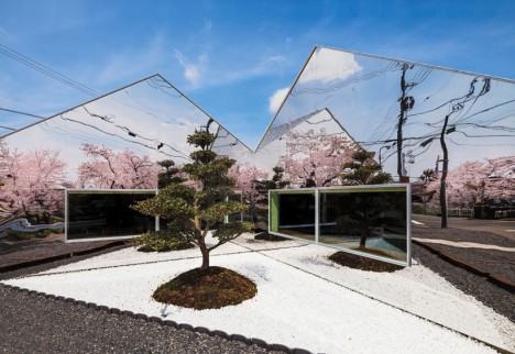
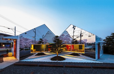
The branches of an adjacent row of cherry trees are multiplied many times over in the polished mirrored surfaces of this roadside cafe by japanese firm Bandesign. The trees are a tourist draw during bloom season, so putting the focus on them helps draw in business for the cafe owners.

Chateau de Rentilly: Mirror-Clad French Country House
mirror buildings chateau 1

mirror buildings chateau 2

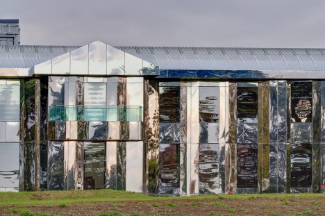
Mirrored panels completely transform a 1960s country house, Le Château de Rentilly, in the French countryside. Architecture studio Bona-LeMercier worked with artist Xavier Veilhan and set designer Alexis Bertrand to enhance the structure itself and also put the focus on the picturesque hillside setting. The former home is now a permanent gallery for Frac Île-de-France, the region’s contemporary art fund.

Invisible Barn

mirror buildings invisible barn 1

mirror buildings invisible barn 2

mirror buildings invisible barn 3

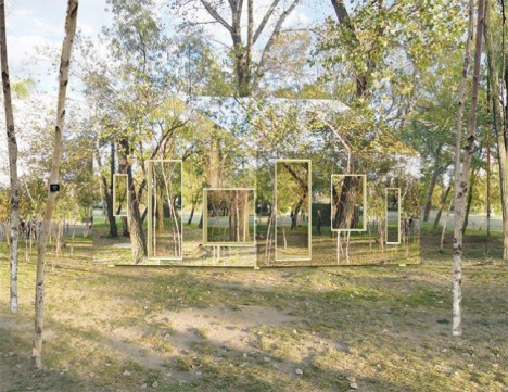
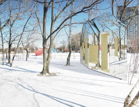
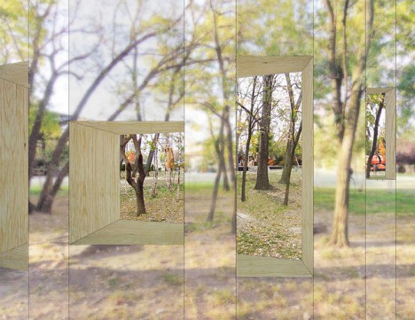
A combination of see-through portals and mirrored surfaces make this structure seem like a mirage as you approach the little park in which it stands. Designed for the 2014 Folly Competition, the mirrored barn isn’t actually a three-dimensional structure but rather a house-shaped wall.

Optical Illusion Street Facade Art

mirror buildings street facade 1

mirror buildings street facade 2

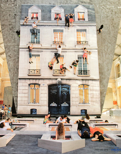
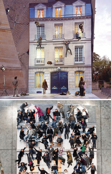
Ordinary passersby suddenly become talented acrobats when they interact with ‘Bâtiment,’ an installation by Leandro Erlich on display at Le 14 in paris as part of the In_Perceptions exhibition. The project added a massive mirror to the vertical facade of a real building, reflecting a fake facade that was applied to the sidewalk in front of it. The result is a fun optical illusion that made participants appear to defy gravity.

Next Page – Click Below to Read More:
Deceptively Reflective 12 Mirrored Buildings Trick The Eye

Share on Facebook


[ By Steph in Architecture & Houses & Residential. ]

[ WebUrbanist | Archives | Galleries | Privacy | TOS ]


WebUrbanist

 
Comments Off on Deceptively Reflective: 12 Mirrored Buildings Trick the Eye

Posted in Creativity


When to Trick Your Camera to get a Good Exposure

28 Jul

Hacking_photography_somerstyle-9526

I bought the Sony A7 camera recently and have been taking it out quite a bit to get a feel for it.

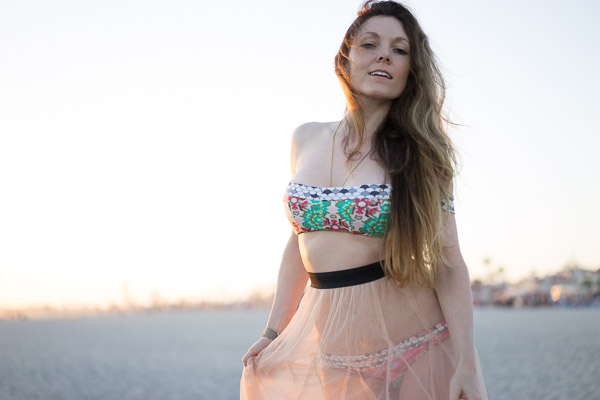
My wife is starting a fashion blog so I thought I would take her out for a fashion shoot at the beach. I was shooting a high-contrast scene and realized. . .

The camera doesn’t always know what’s best

Your camera always has the best intentions, but it doesn’t always get it right. Sometimes the sensor will think you want to expose a scene one way when you actually want it to expose it another.

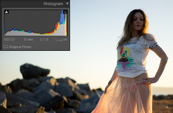
I’ll show you an example. I put the camera on aperture priority and shot this:

Hacking_photography_somerstyle-9425

To most people, this image would be considered underexposed because the model is dark. This happens because the scene has a lot of contrast. In other words, there is a lot of bright pixels (the sky) and a lot of dark pixels (the rocks, ground, and model).

Why doesn’t the camera always get the exposure correct?

The camera sensor is trying to create an average of dark pixels to light pixels. The histogram shows the dark pixels on the left of the graph and the bright pixels on the right.

A “properly exposed” photo means the balance between the blacks and whites is mostly even. The graph isn’t pushed into the left wall which would be very underexposed, or pushed into the right wall which would be very overexposed. The problem is that to expose properly for the model we need more bright pixels, we need to increase the exposure. Sometimes you will need to trick the camera to get a good exposure.

Using exposure compensation

Sometimes you just need a little bit more or a little bit less. In this case I had the ISO and the aperture exactly where I wanted them. I had my camera set up so the front dial controls the exposure compensation.

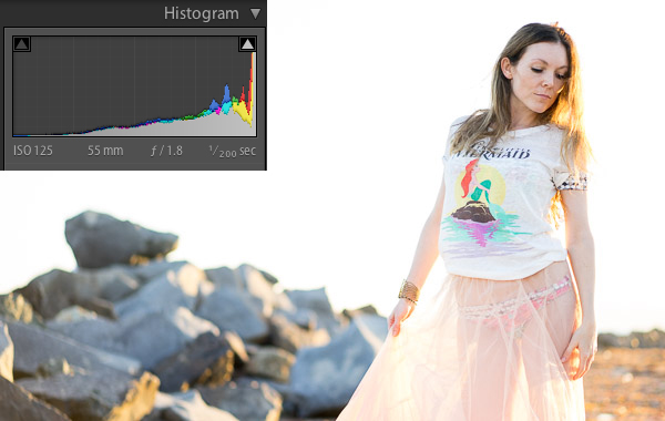
In this case, exposure compensation is set up to slightly change the shutter speed to either increase or decrease the exposure. I twisted the exposure compensation dial until the image looked good which was a shutter speed of 1/200.

Hacking_photography_somerstyle-9426

This looks much better. The model is properly exposed now but the sky is now overexposed. Because the sky is now white, you can see the histogram is pushed to the far right.

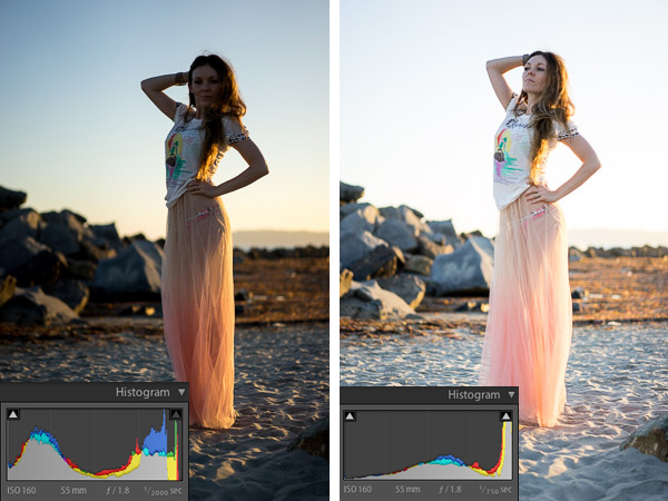
This typically means the image is overexposed but in this case it’s simply because the sky has a lot of white pixels in it that register on the right of the histogram. Let’s see it in another example:

Hacking_Photography_Somerstyle

I just used the exposure compensation to bump up the exposure again so the model was properly exposed and the sky was overexposed in the image on the right.

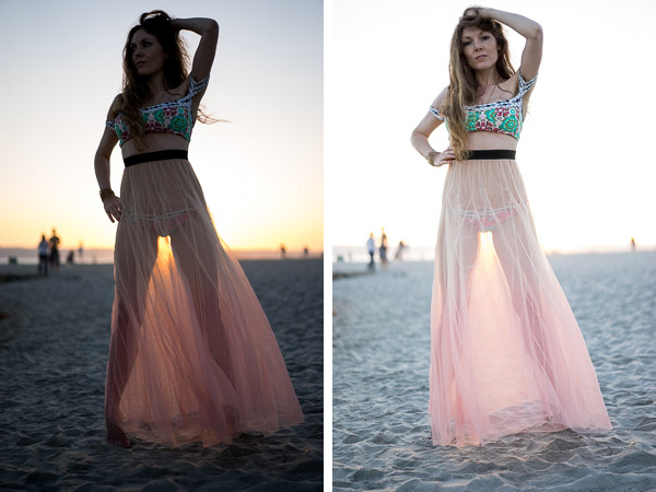
This happens a lot when subjects are backlit

Hacking_Photography_somerstyle_diptic

When you shoot with the sun behind your subject, the camera will sometimes struggle to decide whether to properly expose the background or the subject. The camera is trying to figure out which one you want exposed.

If you are shooting for a silhouette you can underexpose the subject to create a dark outline of their figure. If you want to properly expose the subject you will overexpose the background in high contrast light.

Decisions, decisions

Ultimately it’s up to you how you would like the image to look. I like the high-key look of some of these images. The final touch once you have the light and exposure the way you like it is to edit the image.

Here is one of my favorite photos straight out of camera:

Hacking_photography_somerstyle_pre-9523

I used one of the 1-Click Hacking Photography Lightroom presets in the Old School Color set called “Warm Film” and came up with this final image:

Hacking_photography_somerstyle_post-9523

Overall it was a good shoot on the beach with my wife, I had fun running more tests on the Sony A7, and created some great images in the making!

The post When to Trick Your Camera to get a Good Exposure by Mike Newton appeared first on Digital Photography School.


Digital Photography School

 
Comments Off on When to Trick Your Camera to get a Good Exposure

Posted in Photography


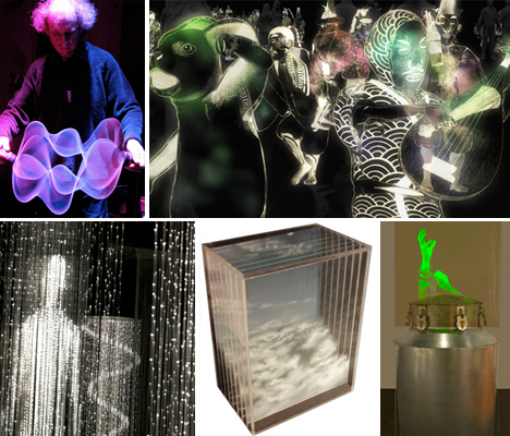
Trick of the Light: 12 Shining Works of Holographic Art

21 Jan

[ By Steph in Art & Drawing & Digital. ]

Holography Art Main
Holograms suggest a depth and dimension that isn’t really there, an illusion of matter in space that can range from a low-tech flickering image in a children’s book to ghostly computer-generated projections of people on stage. No matter how simple or complex the techniques used, it’s all a trick of the light, a way of fooling our eyes – whether they’re just images painted onto layers of glass or created with three-dimensional HDTV video.

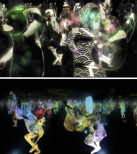
Dancing Japanese Holograms by Teamlab

Hologram Art Dancing Japanese Teamlab

Visitors to the Singapore Art Museum found themselves surrounded by ghostly dancing figures, some playing instruments, in what seemed like a book of Japanese illustrations come to vivid, kinetic life. The maze of holograms is a digital installation by Teamlab, inviting anyone entering the darkened gallery to move within and even interact with the figures. Each figure senses the presence of the viewer and responds by playing music, creating a ripple effect in other nearby holograms.

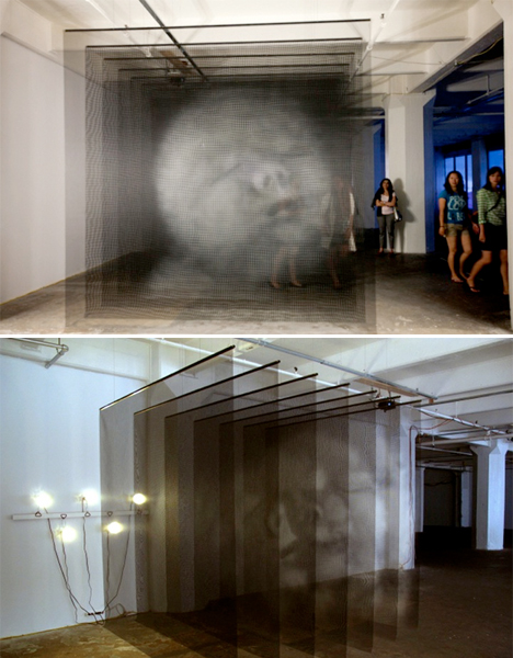
Three-Dimensional Mesh Portraits

Hologram Art Mesh Portraits

Depending on where you stand when you view these three-dimensional works by artist Seth Wulsin, you’ll see either a jumble of different facial features or a holographic image that seems to move slightly. The large-scale pieces, entitled Ánimas, consists of portraits painted on suspended mesh screens. When viewed from the front, they come together into a sort of holographic image. Moving closer or further away gives each portrait extra dimension.

Holographic Trees in a Landscape

Hologram Art Trees Landscape

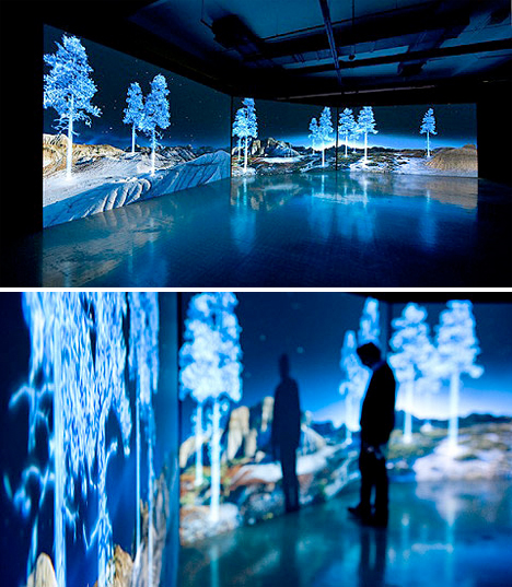
Vivid blue holograms of trees appear in unlikely places, like the desert, in this high-tech installation by Kelly Richardson. The artist uses high definition video and three-channel projection to create the illusion. Says Richardson of the work, “Mining the aesthetics of cinema and science fiction, The Erudition presents a lunar-esque looking landscape with what appears to be an unlikely monument or proposal, consisting of holographic trees blowing in fictional wind. Is this slightly malfunctioning display a forgotten site for proposed colonization? Better yet, is this some kind of alien artwork?”

Ghostly Holographic Art Drawn on Panels of Glass

Hologram Art Panes of Glass

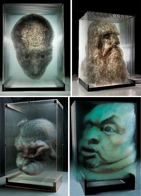
Beijing-ased artist Xia Xiaowan paints imagery onto panes of glass with special colored pencils, and then layers the glass to create a three-dimensional appearance. This sort of ‘painted hologram’ achieves the same effects as high-tech holographic art in an entirely manual, low-tech way. Each image is made up of 14 to 30 panes of glass, seeming to move and shift as you walk around it and view it from different perspectives.

Next Page – Click Below to Read More:
Trick Of The Light 12 Shining Works Of Holographic Art

Share on Facebook


[ By Steph in Art & Drawing & Digital. ]

[ WebUrbanist | Archives | Galleries | Privacy | TOS ]


WebUrbanist

 
Comments Off on Trick of the Light: 12 Shining Works of Holographic Art

Posted in Creativity


Lightroom How To – One Tip and One Trick

06 Jan

Recently we asked what post-production software to you use the most often?

So far of the over 15,000 of you that have voted on the poll (use the link above if you wish to vote), the overwhelming winner is Lightroom with a whopping 43%!

what-processing-software

Today I want to share with you a couple of short videos by Adobe Photoshop Lightroom expert, Matt Kloskowski. Matt is one of “The Photoshop guys”, runs a website called Lightroom Killer Tips and teacher with NAPP and Photoshop World. He really knows his stuff!  So take it away Matt:

Lightroom how to – one tip and one trick

QUICK TIP – THE MOST USEFUL BUTTON IN LIGHTROOM

QUICK TRICK – WORKING WITH SKIES

 Want more? You can find more Lightroom articles here:

  • Lightroom Tips for the Develop Module – the Magic Alt Key
  • 3 Lightroom History Tips
  • 4 Quick Tips For Getting The Most Out of Lightroom Presets
  • How to use the new Radial Filter Tool in Lightroom 5

The post Lightroom How To – One Tip and One Trick by Darlene Hildebrandt appeared first on Digital Photography School.


Digital Photography School

 
Comments Off on Lightroom How To – One Tip and One Trick

Posted in Photography