RSS
 

Posts Tagged ‘Transforming’

Synology NAS – Transforming Your Workspace to be More Productive

08 Jul

The post Synology NAS – Transforming Your Workspace to be More Productive appeared first on Digital Photography School. It was authored by Sime.

Synology NAS storage

Messy People Have More Creative And Productive Minds, Science Says

While science may well say this, I’ve got to admit after deciding that I had ‘no room to swing a cat’ with my stuff everywhere, that I’ve taken some time during this COVID-19 lock-in to plan and execute my office clean-up! Along with that office clean up, I’ve reorganized my external storage, my raw image archiving, and my general day-to-day workflow, and I wanted to share that process with you.

Synology NAS – Transforming Your Workspace to be More Productive

I’ve been using a large external ‘DAS’ for a good while – a raid array (external disk) with a Thunderbolt 3 connection. Without spending a shed-load of cash on a very expensive cable, I wasn’t able to get it a suitable distance away from my workspace.

So, all of those pretty glowing blue lights and the accompanying whir of drives had to be right beside me. Not necessarily a terrible thing – it’s a very well behaved Raid array – however, it wasn’t very quiet. And, it was kinda ugly in my new small, streamlined office.

Synology NAS – Transforming Your Workspace to be More Productive

I had the idea to ‘kill the clutter’ and switch to a complete NAS (Network Attached Storage) setup with a single direct attached drive at the back of my iMac. Then I tucked the second NAS away in my “server room” (a cupboard in the corner of my office with some powerpoints and a Cat6 patch panel).

This would move the big whirring, glowing drive out of my office space and tuck my main image archiving server away, out of sight.

I also added a second monitor to my setup, a stunning 27″ EIZO. I highly recommend checking them out! It’s very easy on the eye.

Synology NAS – Transforming Your Workspace to be More Productive

So I loaded six of my regular-flavor hard disks into the Synology DS1618, the 6tb WD Red disks – the same drives I have in all of my Synology NAS gear.

Setting the NAS up using Synology’s SHR (Synology Hybrid Raid) and splitting my data across the drives for some hardware failure redundancy, is a very simple process I’ve written about here. My workflow with the second NAS has changed considerably and, after a month or so of testing, is working exactly as I’d like it to.

Synology NAS – Transforming Your Workspace to be More Productive

Now when I import from an SD card, I import directly into my external USB-C disk (Invariably, a G-Technology 4-8TB) and at the same time import to my backup location which is an identical library on the freshly installed Synology DS1618, where previously I’d import to the blue whirring beast (It was a Promise R8, an amazing unit, but just not what I wanted in my new space) and the USB-C drive. Over Cat6 the import of RAW files to my NAS doesn’t register as taking too long and hasn’t bothered me once. 

Now, when I import from an SD card, I import directly into my external USB-C disk (invariably, a G-Technology 4-8TB) and to my backup location – an identical library on the freshly installed Synology DS1618. Previously I’d import to the USB-C drive and the blue whirring beast (a Promise R8. An amazing unit, but just not what I wanted in my new space). Over Cat6, the import of RAW files to my NAS doesn’t register as taking too long and hasn’t bothered me once.

Synology NAS – Transforming Your Workspace to be More Productive

Indirect benefits of the NAS running DSM as a second image storage location are, I can put any RAW files (or all of them), after conversion by the NAS, into a piece of Synology software called “PhotoStation.” This automagically creates good-looking web albums and can group and organize your photos in many ways. In this modern age of never printing anything and having dinner-table arguments discussions about ‘never seeing any of the photos we take’ is a very good thing!

The other main reason for the setup change is that I consult and, from time to time, have people into my home office to chat. Having my servers out and about, with cables hanging around to trip people over, was not a good look! Now, with everything tucked away, there’s no fear of that happening! I also spend a lot of time in my office, and I like to enjoy the space, so I am very happy with the transformation!

Synology NAS – Transforming Your Workspace to be More Productive

Since we talked last about storage, backups and NAS, my home/office internet has joined the (almost) 20th century in the form of 100Mb NBN. This means that my digital delivery to clients directly from my NAS is MUCH faster. I’m able to share albums and full-res finished images directly from my Disk Station, all from the privacy of my cupboard! 

In closing, the process of de-cluttering your workspace is really very simple these days and can be quite cathartic! A small to medium-sized Synology NAS tucked away in your cupboard, and you’re good to go. 

Together, Synology and WD provided the equipment for this test setup, but the opinions expressed are my own. 

Have you got a storage set-up you’d like to share? Please let us know in the comments section.

The post Synology NAS – Transforming Your Workspace to be More Productive appeared first on Digital Photography School. It was authored by Sime.
Digital Photography School

 
Comments Off on Synology NAS – Transforming Your Workspace to be More Productive

Posted in Photography


Transforming Quadrant House: Rotating Terrace Follows the Sun

28 Aug

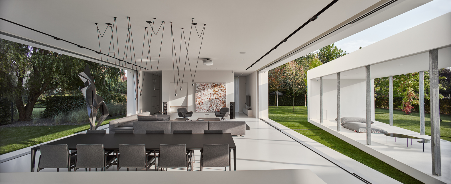
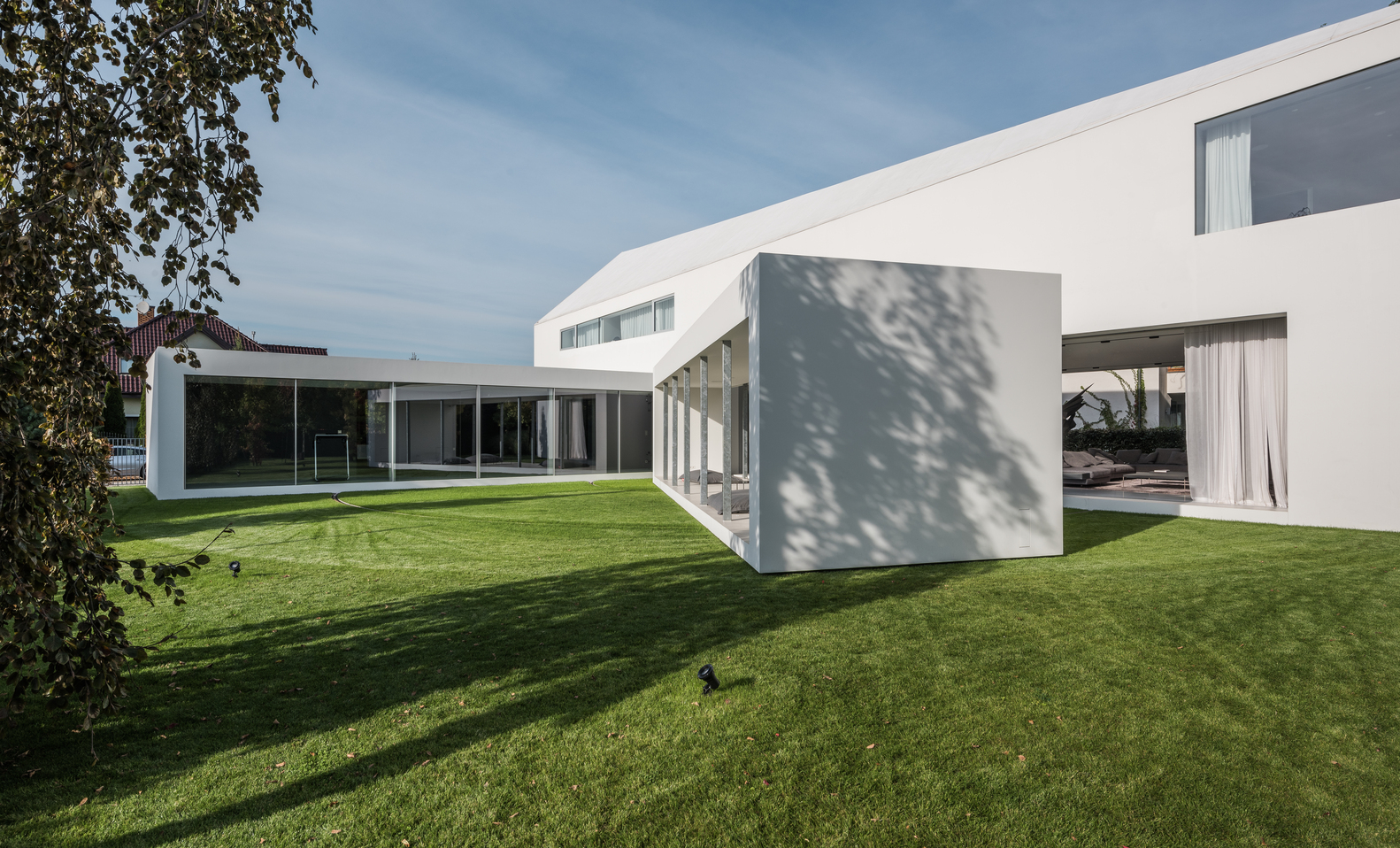
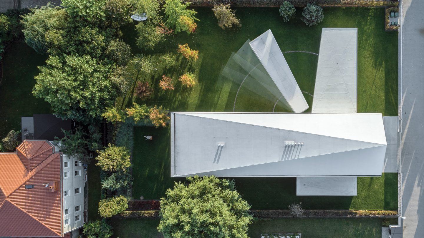
More than anything, the owners of a new transforming house in Poland wanted constant, direct access to sunlight. They commissioned the local firm KWK Promes to realize their unusual vision, and the result is definitely one of a kind.

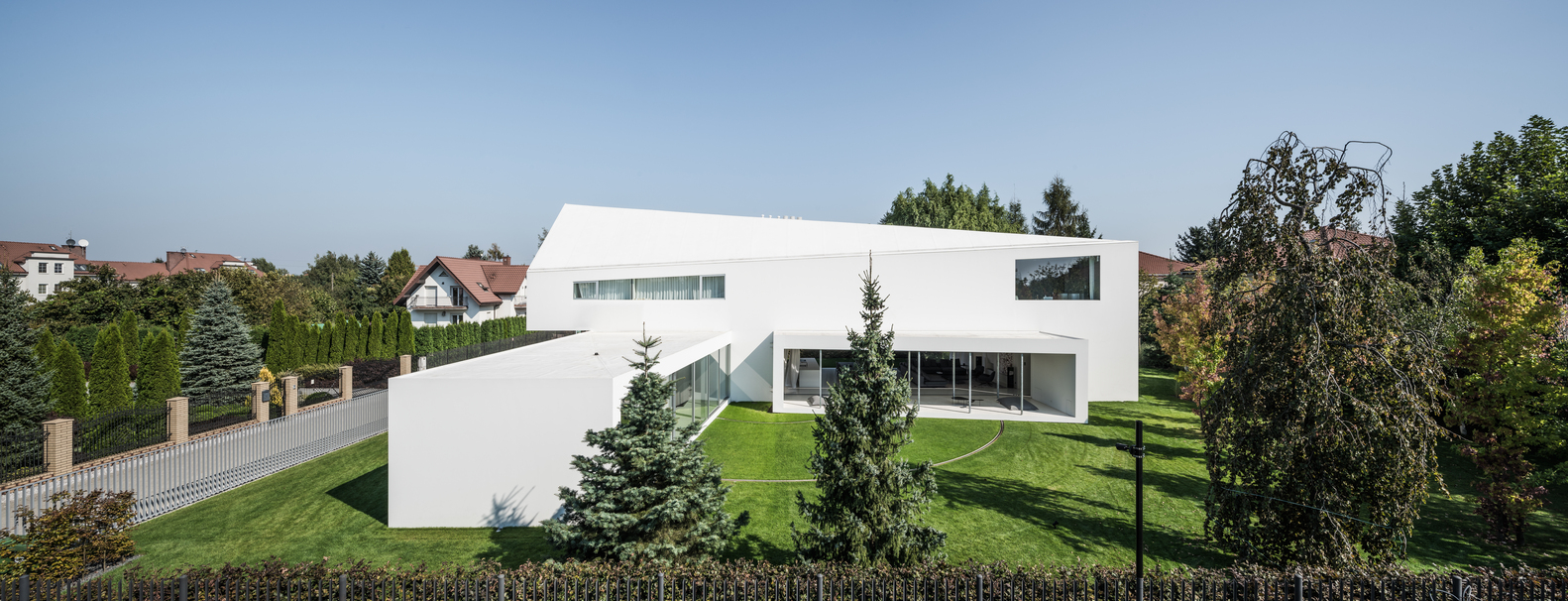
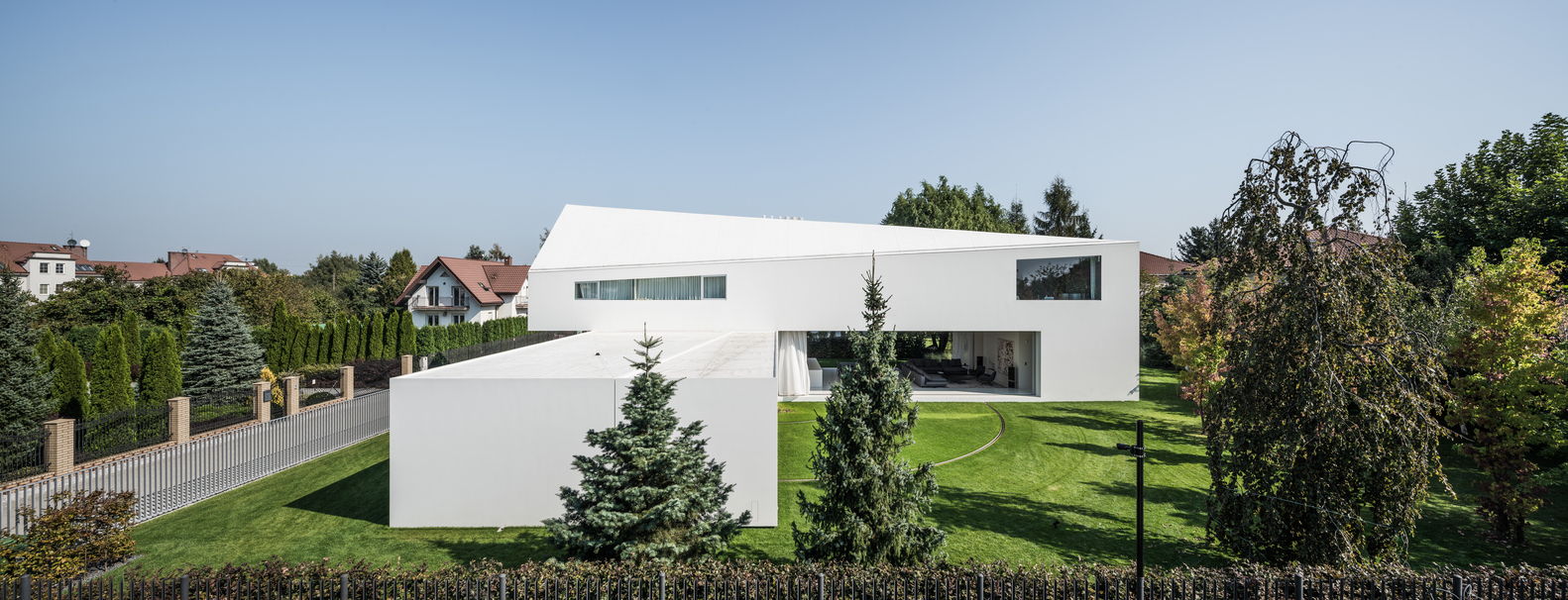
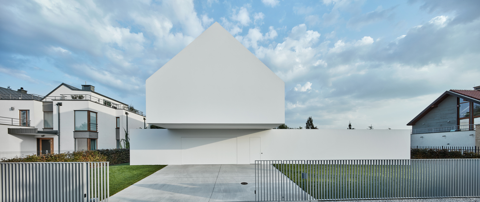
“Quadrant House” sits on a grassy suburban plot surrounded by trees. The name comes from both the word referring to the quarters of a circle and a historical instrument used to determine the angle of the sun’s elevation in astronomy. Even without a moving element, the house stands out from its neighbors with its stacked white volumes, blind facades facing the street.

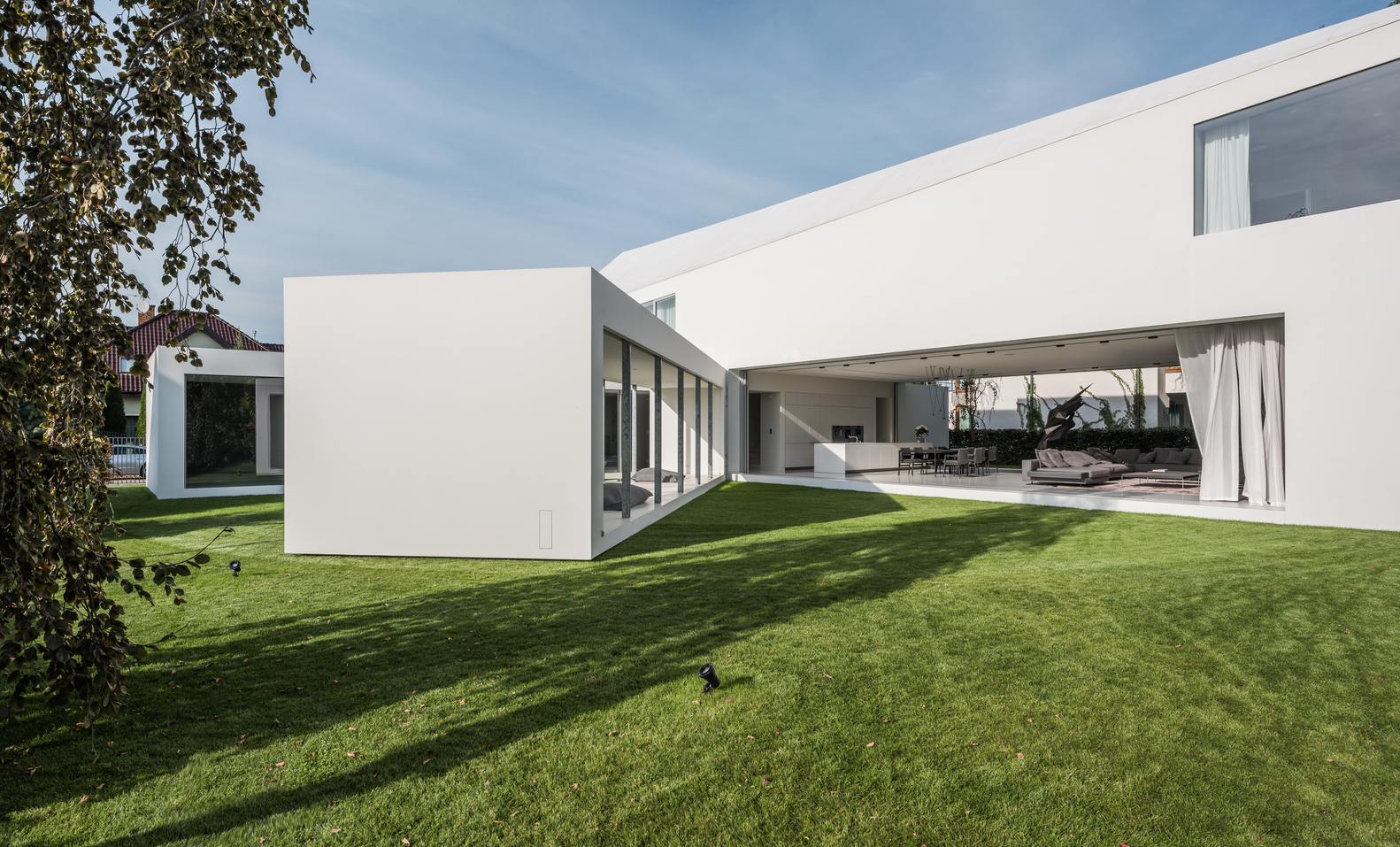
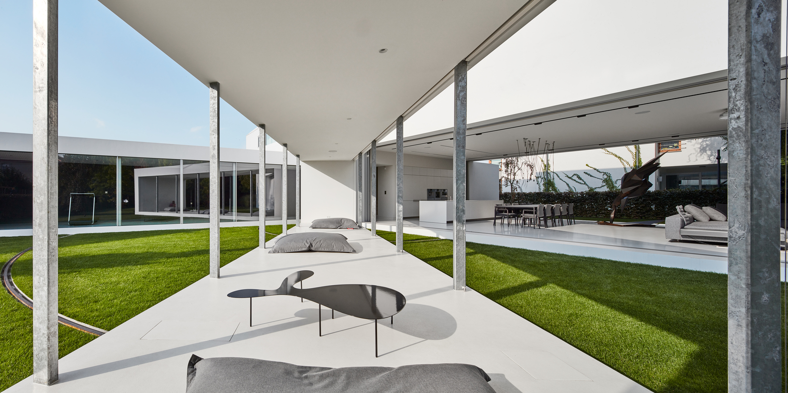
But of course, the star of the show is definitely that kinetic terrace. When it’s flat up against the side of the house, it almost doubles the living space. Moving silently and automatically, the volume swings out a full 90 degrees, allowing more or less sunlight to reach the indoor living room as desired. Sliding glass panels make it possible to open this entire section of the home to the outdoors.

“Clients wanted most simple, sunny and relaxing house, somehow reacting to the movement of the Sun. They also liked our Safe House, its changeability and mechanisms that create relations with the surroundings. The starting point was a regular shape unbuilt site, located in the suburbs among the average single-family housing. We placed a rectangular solid on it, corresponding to the wishes of investors in terms of the functional program.”

“Then we turned the part belonging to the ground floor to get as much privacy as possible from the side of the road. In the ‘cut’ space was located a living room, roofed floor and open to the garden – a similar solution can be found in Living Garden House, where the night zone is on the floor and the day zone becomes part of the garden – the boundaries between architecture and the landscape are blurred.”

Though they hoped for a flat roof, local code requires a gabled shape. The architects found a compromise by angling the gable toward the street-facing facade so that its back edge tapers down toward the yard, giving it a flat appearance from that angle, at least.
And if you’re wondering whether it might actually be dangerous to have a section of your home automatically changing positions according to the movement of the sun across the sky, don’t worry – the architects thought of that. Sensors make sure nothing is in the way of the movable volume, stopping the motion when obstacles are present.


WebUrbanist

 
Comments Off on Transforming Quadrant House: Rotating Terrace Follows the Sun

Posted in Creativity


Slinky Chairs: Accordion-Style Transforming Furniture Stretches & Bends

06 Oct

[ By SA Rogers in Design & Furniture & Decor. ]

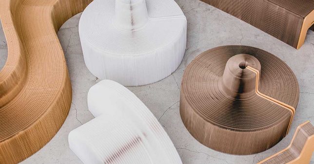
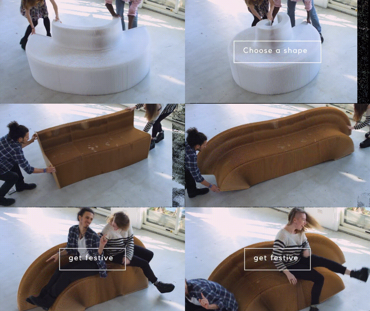
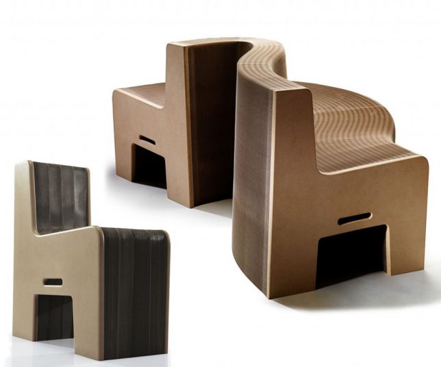
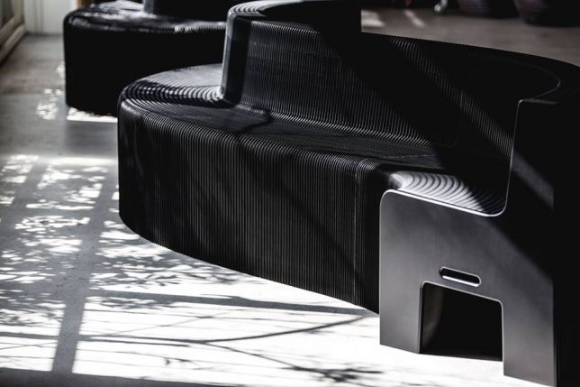
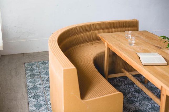
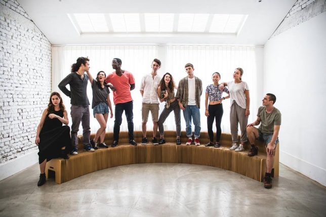
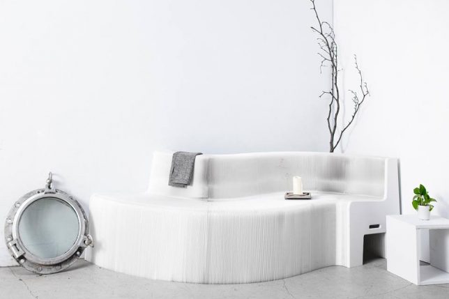
What starts as a flat, stackable, highly portable package expands more than ten times its original size when you pull on either end, bending and curling to become a sofa for a group. The Flexible Love Sofa and Chair are made from 100% recycled paper, yet they’re surprisingly strong, with the longer sofa holding up to 4,232 pounds at once when fully expanded. Designed in Taiwan, the series is available in ‘marble’ white, ‘lava’ black and ‘earth’ brown, and measures just over 5 inches across when collapsed.

The Flexible Love company shows off what the seats can do in a series of videos, so you can see it in action. It looks remarkably easy to manipulate, and somehow stays in place when you curl it into an S-shape or bend one end to the ground. If you’re skeptical that it can really hold as much weight as the company claims when expanded to its full 30-foot width, they’ve provided several images in which a group of people all stand on the seat at once.

With furniture like this, you’d never need to worry about accommodating extra guests again. It’s fun to see the different ways in which it can be arranged around tables. Each piece is hand-crafted of FSC-certified materials, assembly-free, recyclable and made with non-toxic finishing. Though the Flexible Love website is currently down for maintenance, you can purchase both the sofa and chair model at Expand Furniture in the meantime, with prices starting at $ 380.

Share on Facebook


[ By SA Rogers in Design & Furniture & Decor. ]

[ WebUrbanist | Archives | Galleries | Privacy | TOS ]


WebUrbanist

 
Comments Off on Slinky Chairs: Accordion-Style Transforming Furniture Stretches & Bends

Posted in Creativity


Living Light: 11 Transforming Kinetic & Illuminated Art Installations

22 Jun

[ By SA Rogers in Art & Installation & Sound. ]

Rippling, unfolding, slithering and glowing like bioluminescent creatures, these kinetic and illuminated works of art are mesmerizing to watch. We can’t help being fascinated by the combination of light and motion, especially when it’s integrated into clothing, responds to our gaze or voices, or is engineered into monumental interactive installations of laser beams for our slack-jawed amusement.

Sound Activated Clothing by Ying Gao

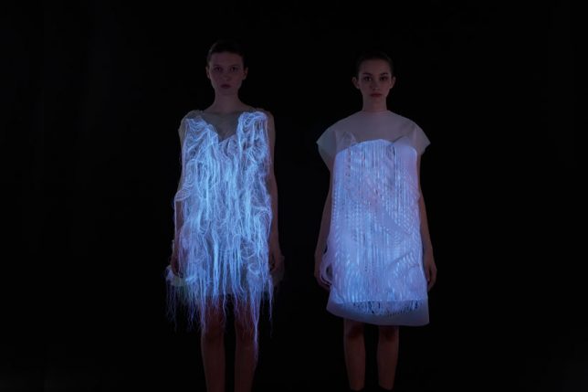
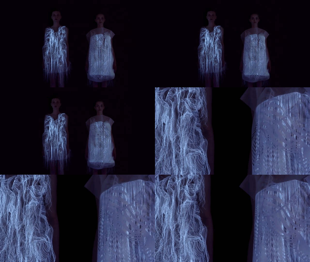
‘Incertitudes’ and ‘(NO)Where (NOW)here’ by fashion designer Ying Gao are two series of unusual reactive garments – the former covered in rippling dressmaker pins, and the latter moving like a living creature while glowing eerily in the dark. The photo luminescent thread works with eye tracking technology to activate movement by the gaze of spectators, while the pins respond to spectators’ voices.

Experimental Kinetic Glass Installations by LASVIT

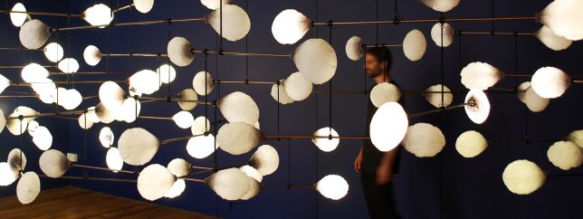
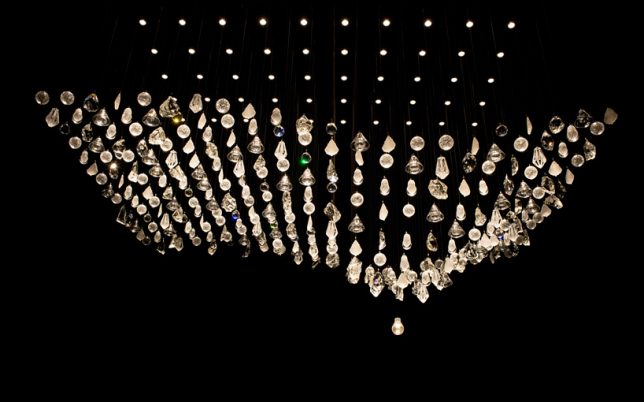
Czech lighting company LASVIT presents a series of experimental kinetic glass installations during Milan Design Week, creating immersive illuminated environments that move and shift in synchronized rhythms.

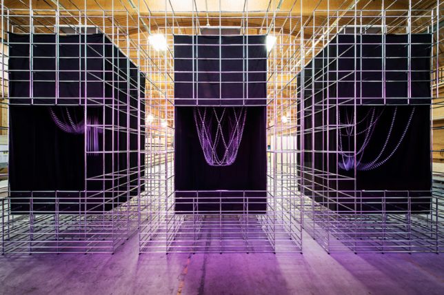
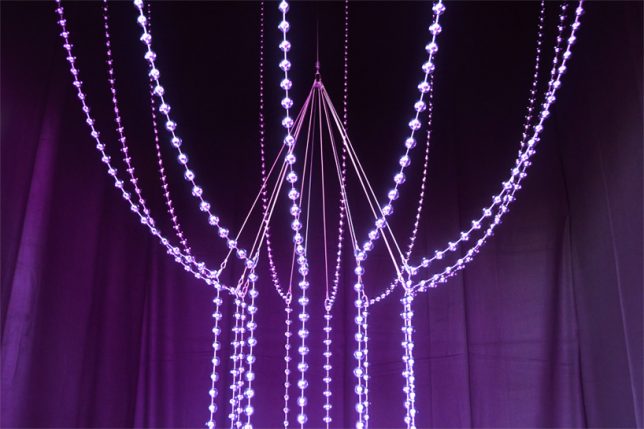
La Vie en Rose by Atelier Öi & USM

A company called USM produces a network of industrial components known as USM Haller Systems that offer infinite reuse and reconfiguration possibilities. For Designer’s Saturday 2014 in Switzerland, the company commissioned Atelier Öi to use these parts as a base for a kinetic art installation expressing these possibilities. ‘La Vie en Rose’ is the result.

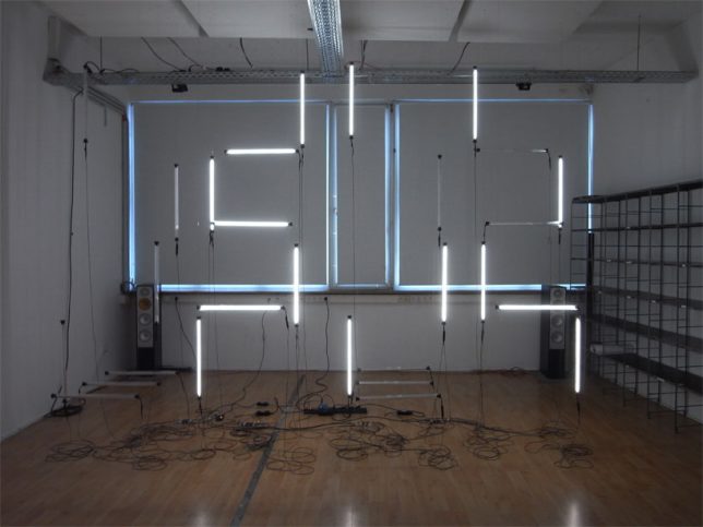
CL:OC Installation by GROSSE 8

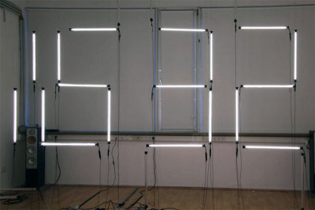
Hanging flurorescent tubes powered by twenty-eight motors hang in the air, constantly rearranging themselves to display the time in digital numbers. Created by German design collective GROSSE 8, the sculpture debuted at Interior Design Week Cologne.

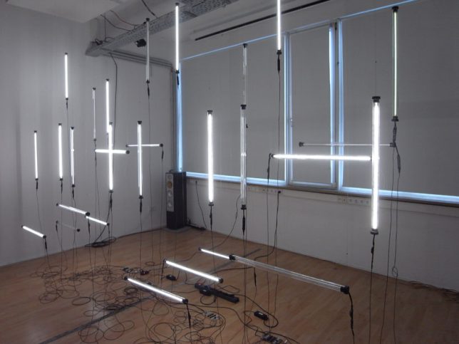
Big Dipper: Helical Kinetic Sculpture by Michael Candy

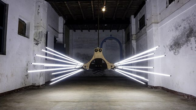
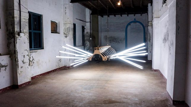
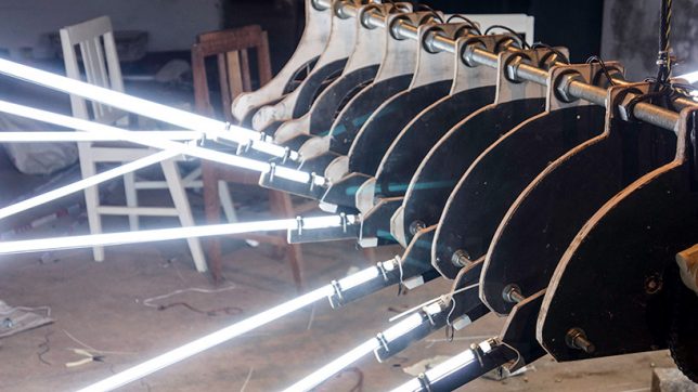
Looming in the air like some kind of monstrous mechanical spider, BIG DIPPER by Michael Candy is suspended within an old warehouse in India, just waiting to scare the pants off a passerby. It features 18 fluorescent tubes sticking out of a plywood and metal body.

Next Page – Click Below to Read More:
Living Light 11 Transforming Kinetic Illuminated Art Installations

Share on Facebook


[ By SA Rogers in Art & Installation & Sound. ]

[ WebUrbanist | Archives | Galleries | Privacy | TOS ]


WebUrbanist

 
Comments Off on Living Light: 11 Transforming Kinetic & Illuminated Art Installations

Posted in Creativity


Transforming ordinary landmark photos one paper cutout at a time

31 Mar

Rich McCor’s clever paper cutout photography

Getting a fresh shot of a thoroughly-photographed landmark is tough. So Rich McCor takes a different approach: his clever paper cutouts add an unexpected element of humor to what would otherwise be just your average photo. Take a look at some of his work here and find out more about his process in our Q&A.

Follow him on Instagram to keep up with his latest work. What are you tricks for getting unique photos of often-photographed subjects? Let us know in the comments.

What inspired you to start making your paper cutout images?

It began when I realised that after four years of living in London I wasn’t really appreciating the landmarks, the sights and all the things that people fly thousands of miles to see. So I used photography as an excuse to go and explore my city a little more, and through doing so I joined Instagram. However I realised that all the photos I was taking were the same as everyone elses’, so that’s when I decided to add a twist to my images with paper cutouts.

What’s the process like creating one of these images?

It used to be that I’d wander around and wait for ideas and then cut them out on the spot. I’m a bit more strategic now in that I research destinations before I visit them, and I hunt down the best vantage points through various photo websites and image libraries. That said, I still take my paper cutting equipment and black card with me in case I see something that sparks an idea.

How long have you been making these images?

My first paper transformation was in June 2015, but I’ve been into paper cutting since my early twenties when I used to make stop motion music videos for my friend’s band.

Is there anywhere you haven’t been yet that you’re itching to go to and photograph?

Tokyo. It’s full of quirky architecture, bold skyscrapers and colourful scenery. It’s the perfect playground for what I do.

Do you have any suggestions or advice for your average photographer trying to take a picture of a famous landmark?

I’d suggest walking around it 360, just to see if there’s an interesting vantage point that might not be obvious. I remember walking behind the Statue of Liberty when the sun was in front of her and it creating a perfect silhouette which was an image of the statue I hadn’t seen that often. I think, as any photographer will tell you, patience is the key. Patience for the light to do something interesting, patience for tourists to get out of the way, patience for experimenting with your style. Most of all of course, have fun and experiment with your own style of photography.

Articles: Digital Photography Review (dpreview.com)

 
Comments Off on Transforming ordinary landmark photos one paper cutout at a time

Posted in Uncategorized


Just Pull Some Strings: 8 Easy Transforming Furniture Designs for Lazy People

21 Mar

[ By SA Rogers in Design & Furniture & Decor. ]

gesture controlled transforming furniture

When you’re lazy, even the most intuitive transforming furniture isn’t easy enough to operate unless it’s on the same level as clapping your lights on and off. Luckily for those of us who fall into this category, some furniture makers are creating multifunctional designs for small spaces that work their magic at the push of a button, the pull of a string, a flick of the wrist or even a mere gesture.

Retractible Ollie Chair by RockPaperRobot

ollie chair gif

ollie chair flat pack

ollie chair

ollie chair

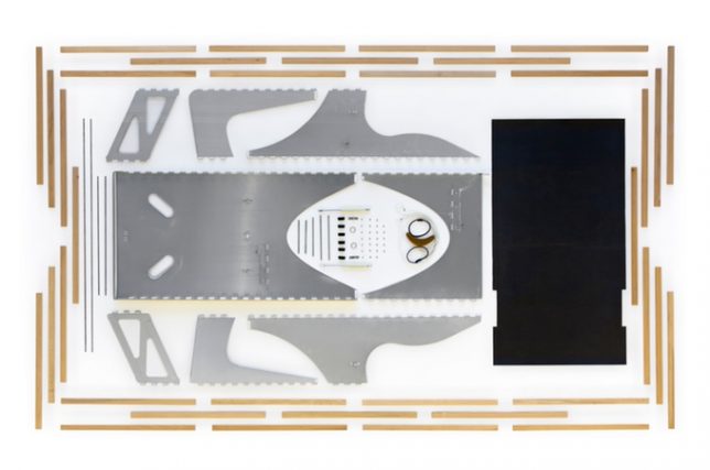
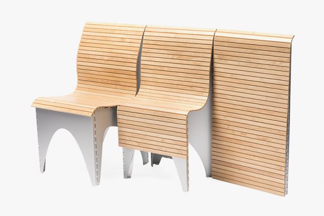
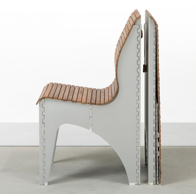
You really have to watch the video of how this chair works to fully appreciate its brilliant simplicity. It starts as an entirely flat panel of slatted teak wood with a slight curve at the top. Pick it up, pull a string and the whole thing unfurls into a seat in a single fluid motion that’s very satisfying to watch, and it works the same way in reverse. The slats are affixed to a textile canvas to make the seating flexible, and the rest takes folding inspiration from origami.

A-Board Flat-Pack Shelf

a-board

a-board 2

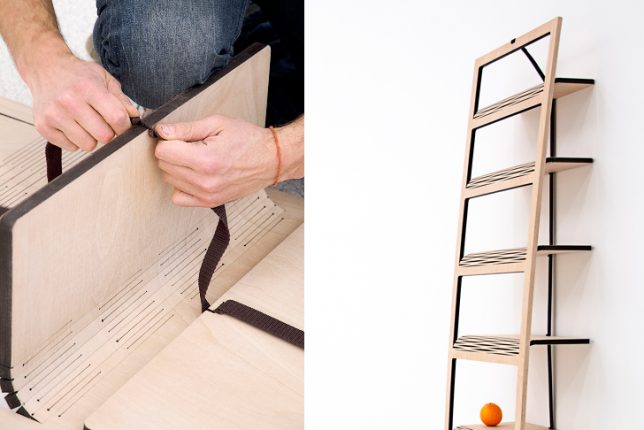
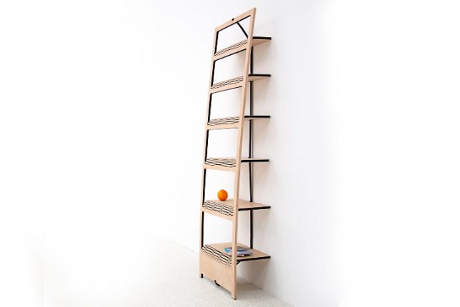
This bookshelf starts as a flat piece of laser-cut plywood. Yang the orange ribbon on the back, and it will pull the shelves down perpendicular to the face so you can rest the whole thing against a wall and use it as a bookshelf. Designer Tomas Schön used a laser-cutting technique to bend the wood instead of hinges, and there’s no other hardware or even glue involved.

MIT Media Lab CityHome

MIT cityhome

MIT cityhome 2

MIT cityhome 3

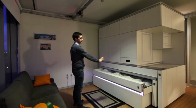
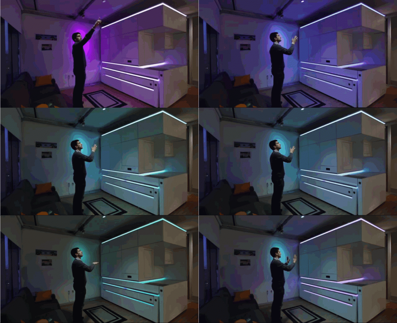
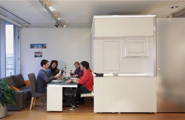
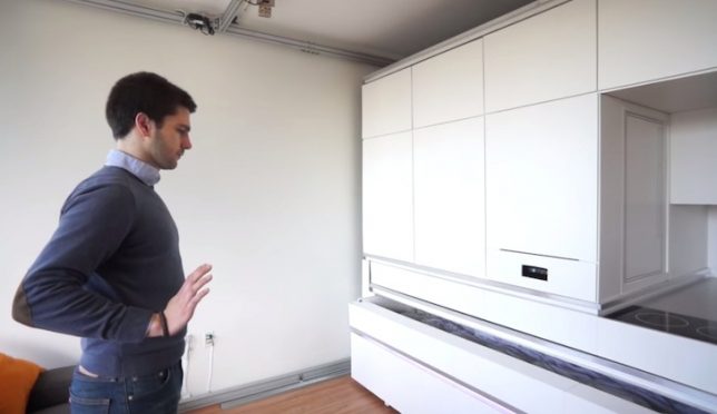
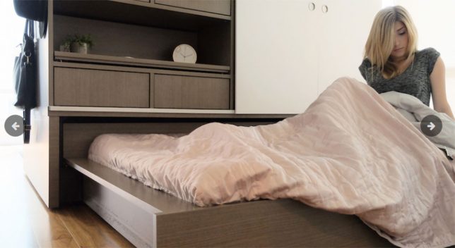
Still not easy enough for you? How about commanding your bed to slide out with a gesture of your hands? MIT’s robotic ‘home in a box’ can pack a full, spacious-feeling apartment into 200 square feet of space, including a bed, workspace, dining table for dix, storage and a mini kitchen. The box uses built-in sensors, motors, LED lights and low-friction rollers to respond to your voice commands or gestures.

Ori Robotic Home Controlled via Smartphone App

ori robotic home

ori robotic home 2

ori robotic home 3

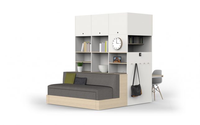
There are all sorts of complex transforming furniture systems designed to fit maximum function into small spaces, but how many of them are operated through a smartphone app? The Ori system (taking its name from the prefix of ‘origami’) runs on robotic technology, featuring an on-device user interface as well as an app for your handheld device so you can press a button to initiate various configurations, like the bed sliding out, the table folding down or the entire unit moving to tuck itself against a wall to open up the floor area.

Next Page – Click Below to Read More:
Just Pull Some Strings 8 Easy Transforming Furniture Designs For Lazy People

Share on Facebook


[ By SA Rogers in Design & Furniture & Decor. ]

[ WebUrbanist | Archives | Galleries | Privacy | TOS ]


WebUrbanist

 
Comments Off on Just Pull Some Strings: 8 Easy Transforming Furniture Designs for Lazy People

Posted in Creativity


The City is a Canvas: 31 Murals Transforming Urban Spaces

22 Nov

[ By SA Rogers in Art & Street Art & Graffiti. ]

colorful-street-art-main

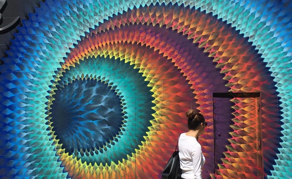
Psychedelic portals beckon you to enter another dimension, sea monsters lurk at the bottom of the stairs and illustrated figures playfully interact with urban infrastructure in works of art that bring color, levity and natural imagery to urban environments.

Sea Monster Stair Steps by Skurk

interactive-street-art-sea-monster-1

interactive-street-art-sea-monster-mural-2

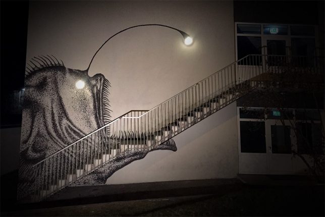
The creepy sea creature lurking at the base of these stairs is enough to make anyone nervous, even in broad daylight – but just wait until the sun goes down. Street artist Skurk used two existing lamps affixed to the building’s exterior as the eye and lure of an anglerfish to terrifying and delightful effect.

Site-Specific Wheatpastes by Levalet

street-art-levalet-1

interactive-street-art-levalet-2

interactive-street-art-levalet-3

interactive-street-art-levalet-4

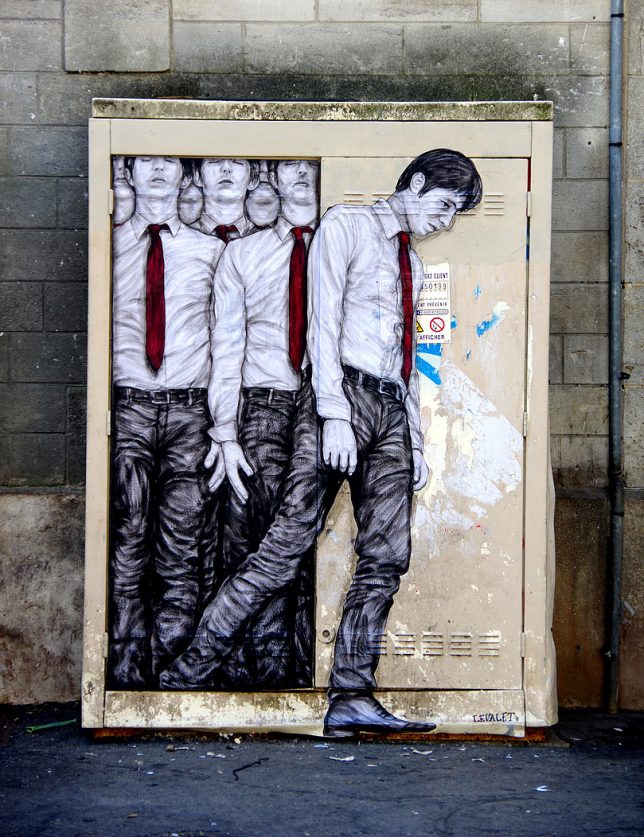
Paris-based artist Levalet (Charles Leval) works with existing textures, colors and fixtures in urban environments to create playful site-specific works of art. Some are playful, some are a bit disturbing, but all of them pair sketched human and animal figures with fountain heads, drains, windows, utility boxes, staircases and other elements of the city.

Massive Murals in Italy by Millo

interactive-street-art-millo-2

interactive-street-art-millo-3

interactive-street-art-millo-4

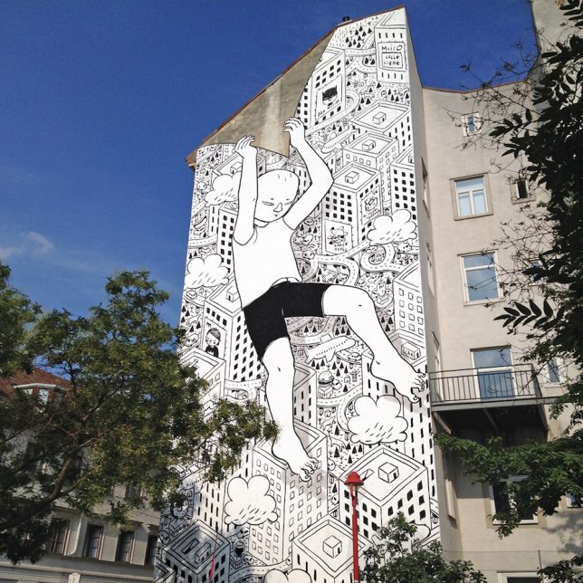
An illustrative black-and-white style accented by carefully chosen splashes of bold color characterizes the ground-to-roof murals painted onto buildings by Italian street artist Millo.

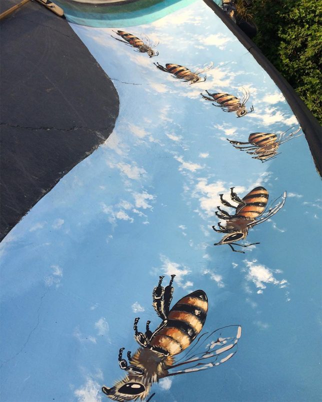
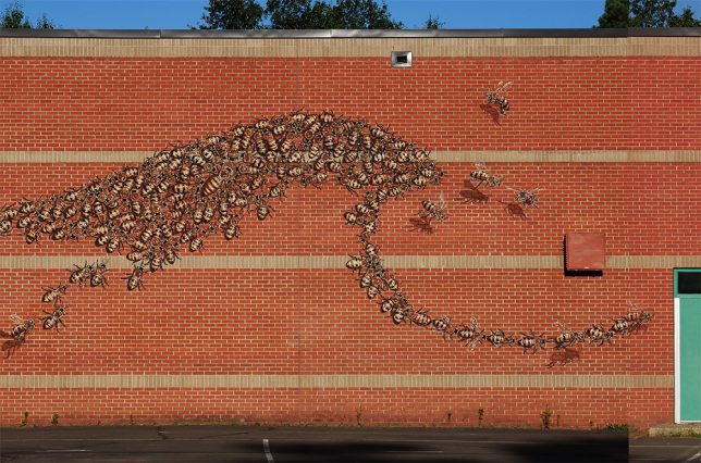
Giant Bees by Matthew Willey

interactive-street-art-bees-1

interactive-street-art-bees-2

interactive-street-art-bees-4

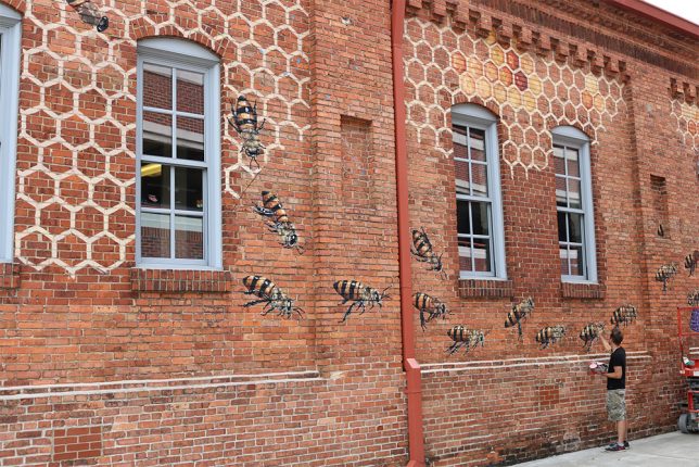
50,000 bees now adorn surfaces around the world as part of the Good of the Hive Initiative, a project by artist Matt Willey aiming to raise awareness about the plight of the honey bee. Willey traveled all over the globe to paint a few dozen bees at a time in each location, with the goal number representing how many bees it takes to sustain a healthy hive.

Next Page – Click Below to Read More:
The City Is A Canvas 31 Murals Transforming Urban Spaces

Share on Facebook


[ By SA Rogers in Art & Street Art & Graffiti. ]

[ WebUrbanist | Archives | Galleries | Privacy | TOS ]


WebUrbanist

 
Comments Off on The City is a Canvas: 31 Murals Transforming Urban Spaces

Posted in Creativity


Small Space Shape Shifters: 13 Transforming Furniture Designs

26 May

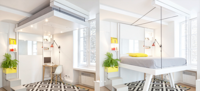
Bed-Up Space-Saving Furniture


Almost no space is too small to live in when you’ve got furniture that lowers from the ceiling, pulls out of the walls, transforms for multiple functions or even folds up flat to hang in the closet like clothing. These smart space-saving furniture designs cram maximum use into the most compact packages, often with beautiful, modern results. You’ll never look at a metal storage trunk the same way again.

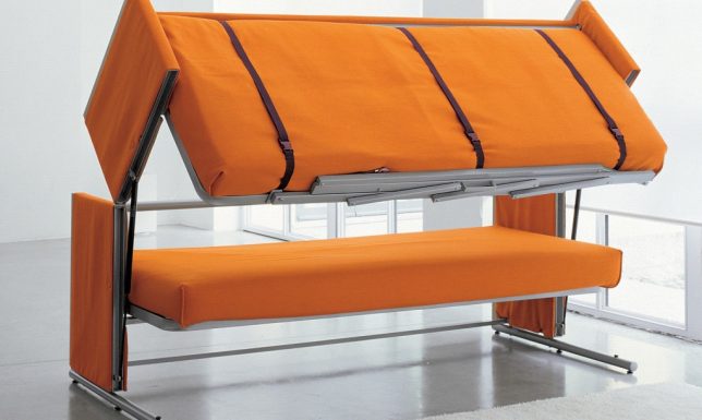
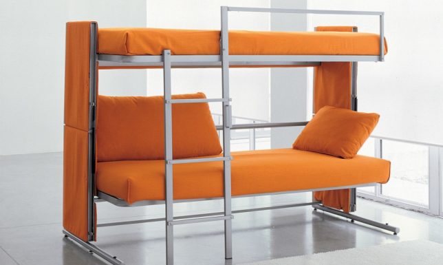
Bunk Bed Sofa

space saving bunk bed sofa 1

space saving bunk bed sofa 3

space saving bunk bed sofa 2


This is more than just a sofa bed – there are actually two beds hiding within its sleek contours thanks to a brilliant folding design. The Doc is a sofa by day, bunk bed by night, creating sleeping space for two guests in seconds.

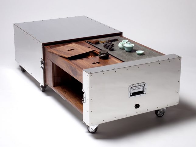
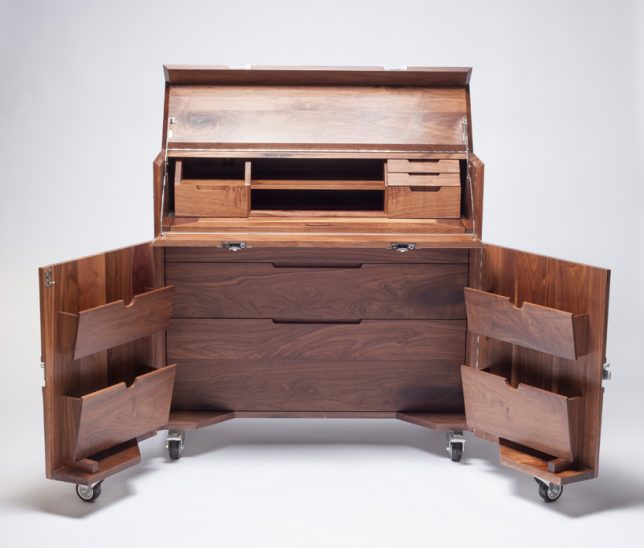
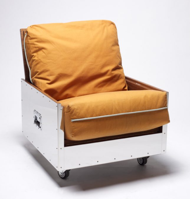
Furniture Functions Hidden in Metal Crates

transforming furniture metal crates

transforming furniture metal crates 2

transforming furniture metal crates 3

Traveling artists and other restless types can tote an entire studio apartment full of furniture with them quickly and easily with these mobile objects that transform into rugged metal crates on wheels. Designer Naihan Lee, an artist who has had to move often while living in Beijing, created the ‘Crates’ series to ensure that she would have beautiful, high quality furniture no matter where she ends up. The portable units include a bookshelf, single sofa, tea table, mobile bar, entertainment center, kitchen unit and writing desk.

Shape-Shifting Chair

space saving exocet chair

space saving exocet chair 2

space saving exocet chair 3

space saving exocet chair 4

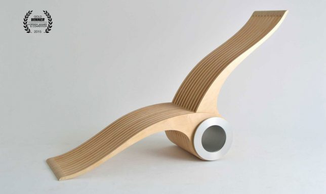
Better at conforming to the human body in any single position than the traditionally-shaped chairs humans have been using for thousands of years, the Exocet features two wooden ‘wings’ on a rotating steel axis that interlace to create virtually limitless sitting and lounging possibilities. Use it as a stool, a lounge chair, a high-back chair, a floor mat, a recliner, a seat for two or whatever else you can come up with.

Bed Hidden in a Desk

space saving bed in a desk

space saving bed in a desk 2

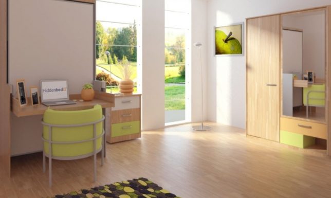
Even once you learned that this desk isn’t what it appears, you might imagine that it would be a pain to remove everything from its surfaces before transforming it into a bed. But the Hiddenbed system unfolds in a way that rests the desk surface on the floor beneath the mattress, leaving everything intact, including power cords. When you decide you want to lay down, it takes just a few seconds to pull out a couple pins and unfold it. Pillows even stay in place when you put the bed back up.

Transforming Tiny Apartment

space saving tiny apartment 1

space saving tiny apartment 2

space saving tiny apartment 3

space saving tiny apartment 4

space saving tiny apartment 5

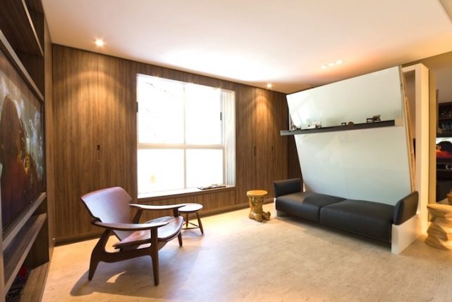
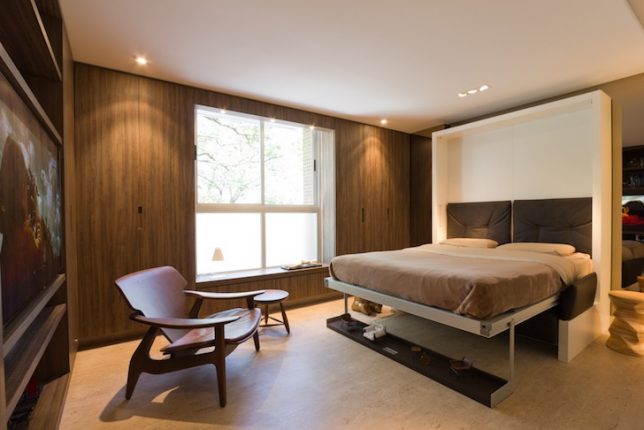
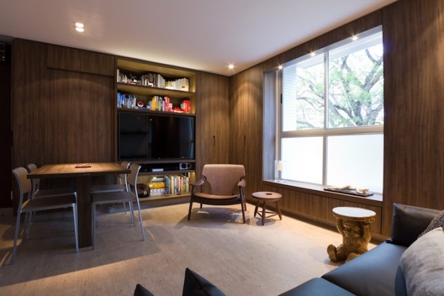
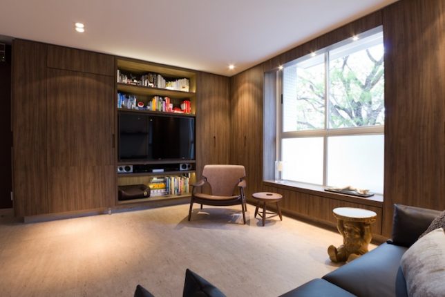
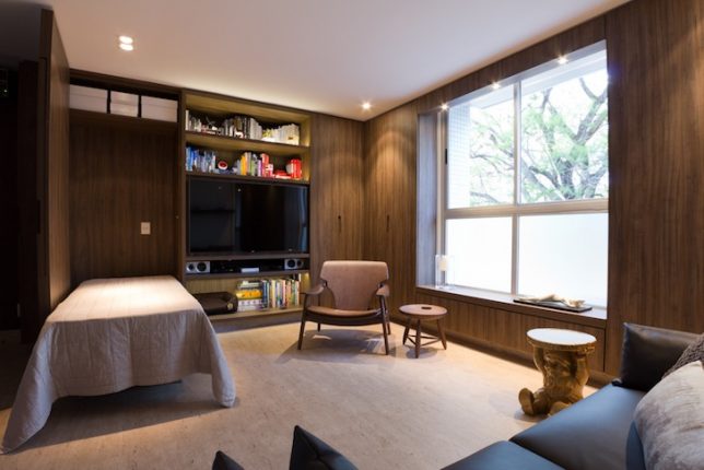
All sorts of tricks hide behind the surfaces of this 290-square-foot apartment in Brazil, custom-made by architect Fabio Cherman for his own use. Features include a compact sofa bed that uses a wall shelf as support (again, leaving your displayed objects intact), and on the other side of the room, there’s a wall panel that folds down to become a tabletop or a guest bed.


WebUrbanist

 
Comments Off on Small Space Shape Shifters: 13 Transforming Furniture Designs

Posted in Creativity


Sound Sculptures: Music Translated Into Transforming Objects

03 Dec

[ By Steph in Gadgets & Geekery & Technology. ]

sound sculptures 1

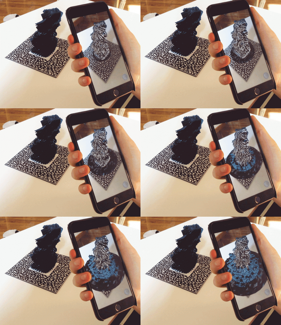
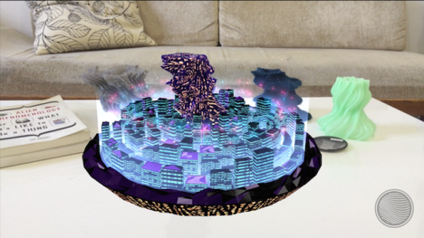
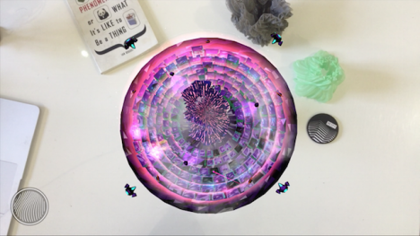
An experiment in intentional synesthesia, this combination of sculpture, music and technology enables us to actually see the physical form of individual songs. ‘Reify’ is a collaborative project that creates a new way to experience music, transforming it into a tangible object that transforms before our eyes. So-called ‘totems’ are made to visually represent an artist’s song, and encoded with music and interactive visual experiences that can be viewed on a smartphone or tablet.

sound sculptures 2

Musicians, sculptors and app designers got together to build a platform that lets artists express their music in physical form. Each totem is a sculptural object in its own right, entirely unique in shape, 3D-printed from plastic or cast in bronze. Simply gazing upon these visual translations of sound is cool enough, but then comes the app that truly brings them to life.

sound sculptures 3 sound sculptures 4

Load up the Stylus app, point your mobile device at the totem and you’ll be treated to an interactive visual experience that plays along with the song. “Each experience is unique in style and content,” say the designers. “Some are game-like. Some are conceptual explorations. Others are both… and neither. All are direct expressions of the artist’s creative vision.”

sound sculptures 5 sound sculptures 6

While a Kickstarter campaign held in July didn’t raise enough funds to move forward with the project, it’s a really cool look into how various forms of creative expression will continue to evolve along with technology, and the potential for more crossover. Check out another cool project exploring what music looks like in 3D.

Share on Facebook


[ By Steph in Gadgets & Geekery & Technology. ]

[ WebUrbanist | Archives | Galleries | Privacy | TOS ]


WebUrbanist

 
Comments Off on Sound Sculptures: Music Translated Into Transforming Objects

Posted in Creativity


Architecturally Alive: 16 Transforming Kinetic Buildings

14 Jul

[ By Steph in Architecture & Cities & Urbanism. ]

moving architecture kundig 2

Will the cities of tomorrow be filled with intelligent kinetic architecture that moves and transforms of its own accord, as if it has a life of its own? The designers of these 16 structures seem to think so, whether they’re making use of ancient pulley-powered systems or engineering remarkably responsive auto-adaptations to change the look of a structure, shield it from the sun, or make it seem like a living creature in a bid to foster deeper connections between humans and architecture.

Adaptable Snow Cone Lifeguard Station

moving architecture snow cone 1

moving architecture snow cone 2

movign architecture snow cone 3

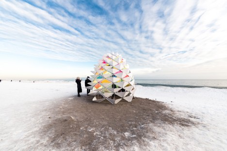
Modeled on a pine cone, this lifeguard post by RAW Design, Ferris + Associates and Curio adapts to weather conditions on Toronto beaches. The white ‘petals’ can move to either offer shade during the hot summer months or to collect snow in the winter for extra insulation. The petals can also be retracted on one side and closed on the other to guard against heavy winds but still let sunshine in. It was fabricated in three weeks and then re-assembled on-site within 6 hours.

Penumbra Adaptive Window Shading System

kinetic facade 1

moving architecture penumbra 3

moving architecture penumbra 2

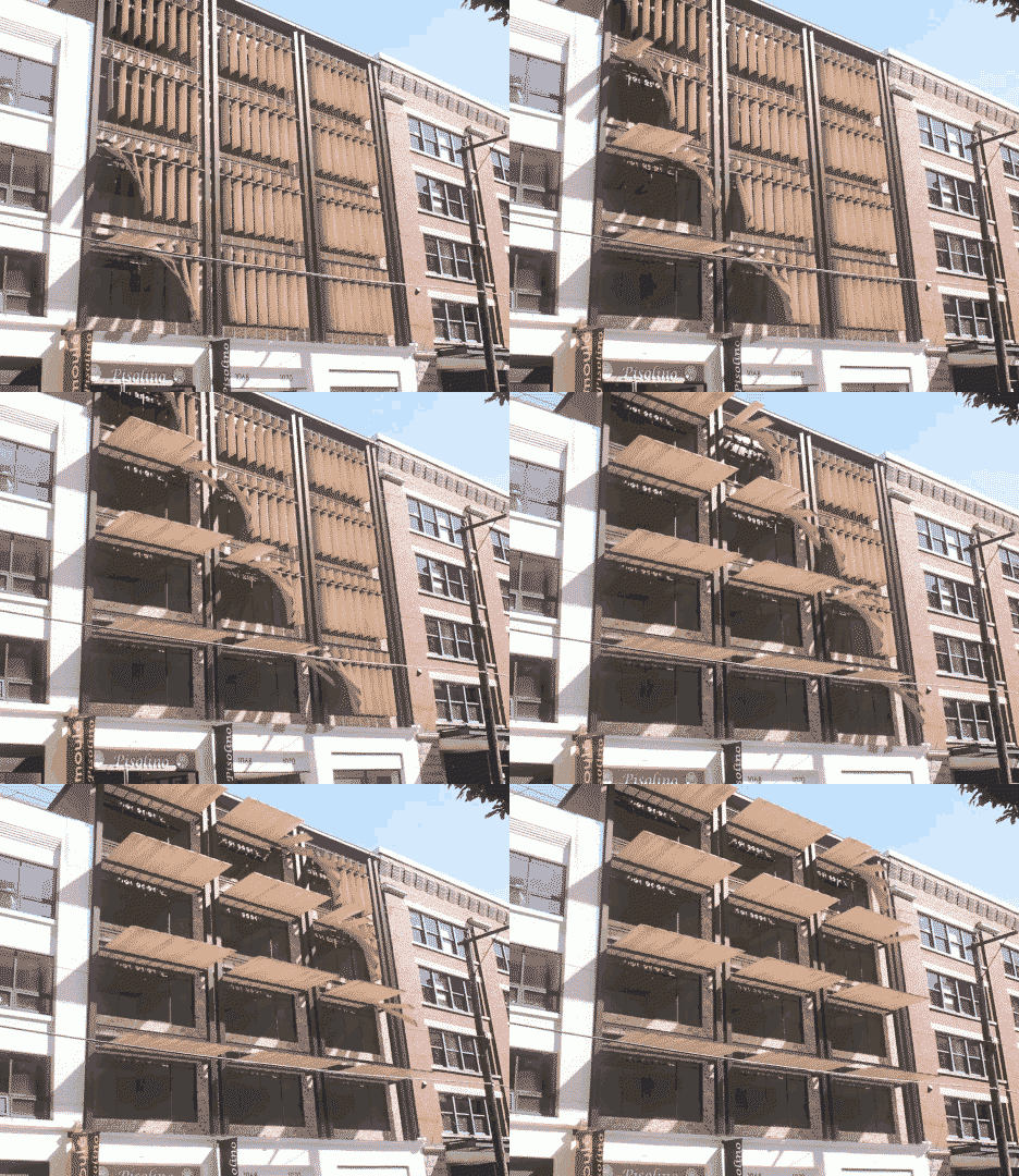
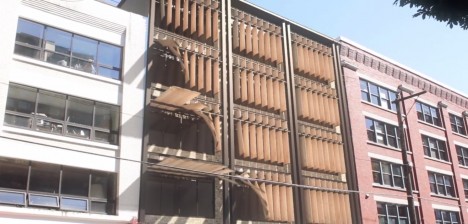
The Penumbra system by Tyler Short is “designed to offer a kinetic and mechanical solution to a problem that would otherwise be nearly impossible to solve with static architectural components: providing shading across a building facade for both low evening sun and high afternoon sun conditions.” The various kinetic elements of the shade system can shift in different ways to deflect light as needed.

Moving Parts by Olson Kundig Architects

moving architecture kundig 4

moving architecture kundig 5

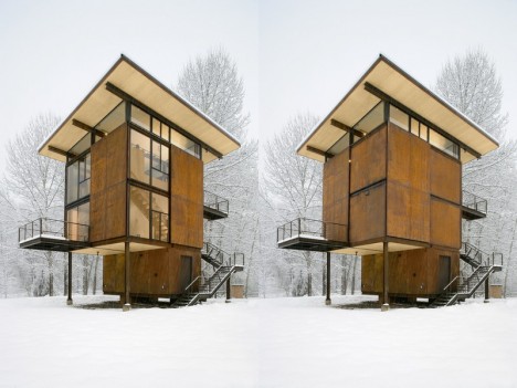
moving architecture delta shelter

moving architecture delta shelter 2

Architect: Tom Kundig

Architect: Tom Kundig

Architect: Tom Kundig

Architect: Tom Kundig

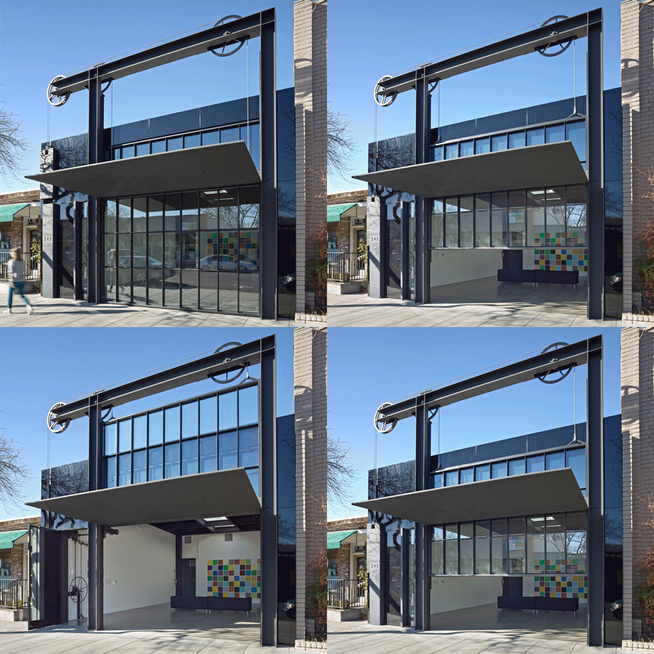
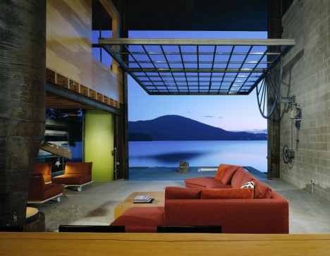
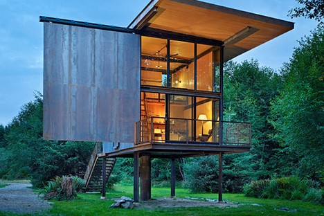
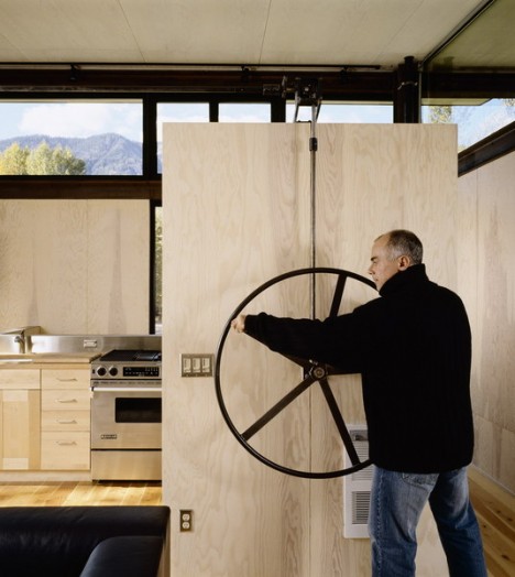
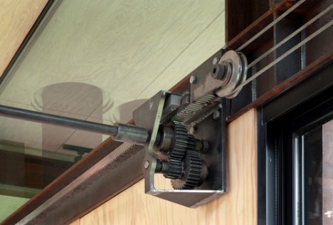
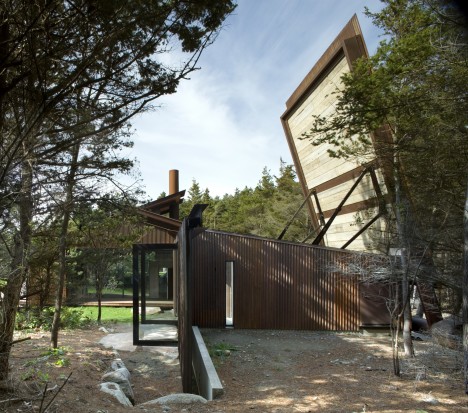
A home with a roof that opens vertically, an art gallery with a hoist-and-pulley facade and a ‘virtually indestructible’ cabin with operable steel panels are among the kinetic projects by Tom Kundig of the firm Olson Kundig. The architect says early exposure to mining, logging and farming industries led to a lifelong fascination with machinery, which he has integrated into all sorts of architectural projects. The idea is to move something large using very little energy, encouraging user participation in the transformation of the space in concert with geometry and physics.

Next Page – Click Below to Read More:
Architecture Thats Alive 16 Transforming Kinetic Buildings

Share on Facebook


[ By Steph in Architecture & Cities & Urbanism. ]

[ WebUrbanist | Archives | Galleries | Privacy | TOS ]


WebUrbanist

 
Comments Off on Architecturally Alive: 16 Transforming Kinetic Buildings

Posted in Creativity